Transcripts
1. Hellooo & Welcome to the Class: Watercolor is one of the most unpredictable and uncontrollable
painting medium that gives you an immense amount
of happiness just to see the pigment floating on
the water on your paper. There are a lot of
techniques and effects that you can create
with watercolors. Which might make someone who
is just starting out with this beautiful medium
to feel overwhelmed. I'm here to help you with overcoming all the
fears of gaining control over the spectacular
medium. Hello everyone. I am Geethu, an engineer, a watercolor artist, and an instructor based
out of the UK. My Instagram handle
is colourfulmystique. Many times people have
asked me how I managed to create watercolor
paintings, Skillshare classes, editing videos for Instagram, skillshare and vitriol all along with my full-time job
as an aerospace engineer. I think it has got
to do with embracing the creative practice and
accepting an artist mindset. If you think of painting as a relaxing process after
a day's work at home or office and not see it as another task and paint
completely with your heart, then I think everybody
can find time to paint. With practice everyone
can be perfect. Imagine doing something
passionately for 100 days, don't you think you
will be a pro in it? That is the reason why I have come up with
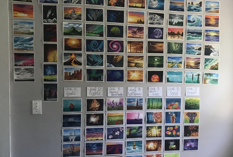
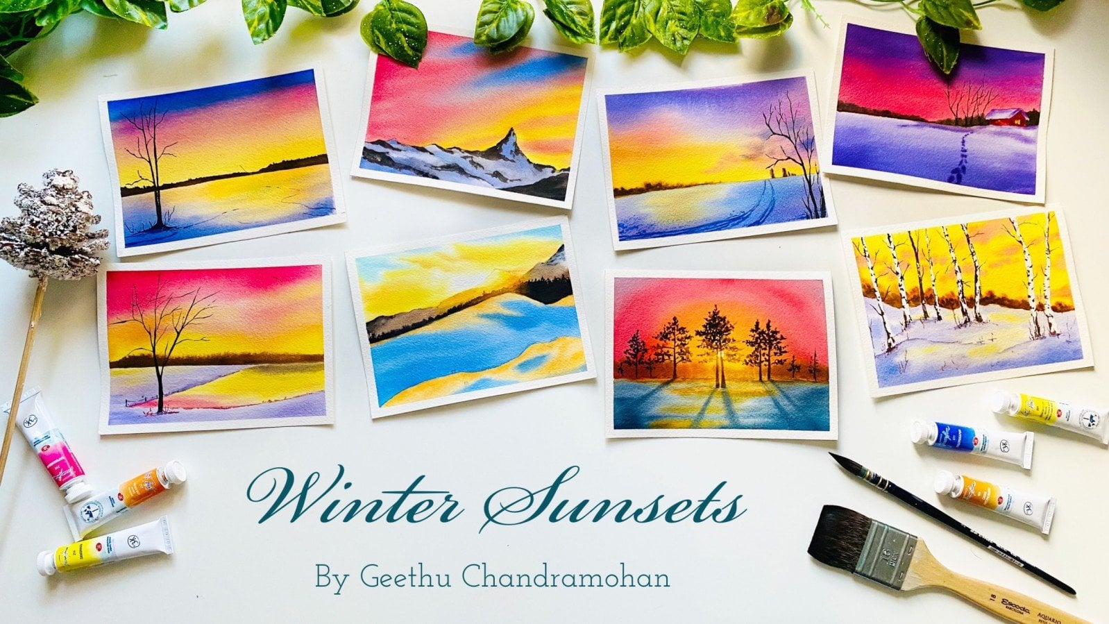
this class today, A 100 Day Watercolor
Project to help you master this medium
to the fullest. I will help you let go off
every fear you have when attempting watercolors and make you smile with each painting. Imagine how within
just 100 days, you can change from a beginner artists
to an expert artist, all from someone who paints randomly to someone
who pains every day. If you decide to join me, then 400 days of your life, I will be teaching you
everything about watercolors. We're going to venture into
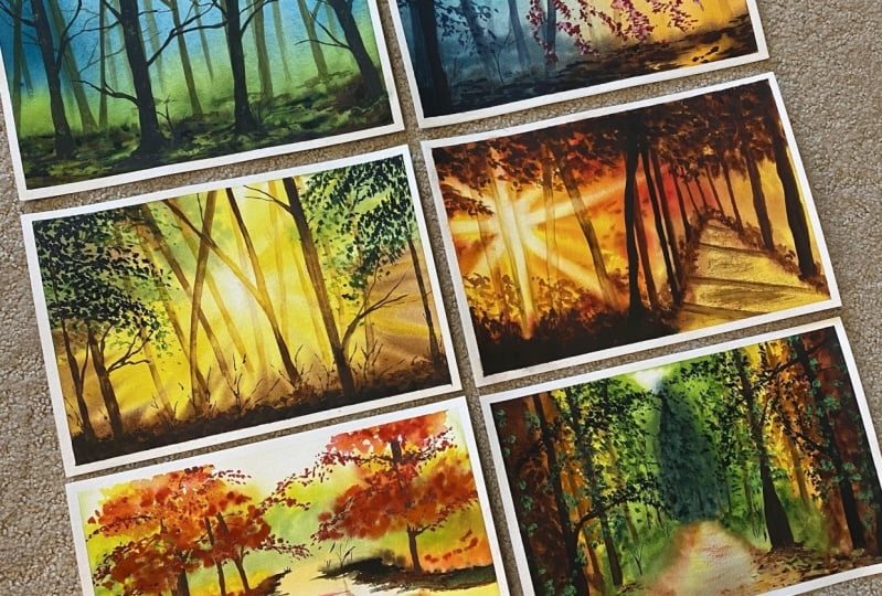
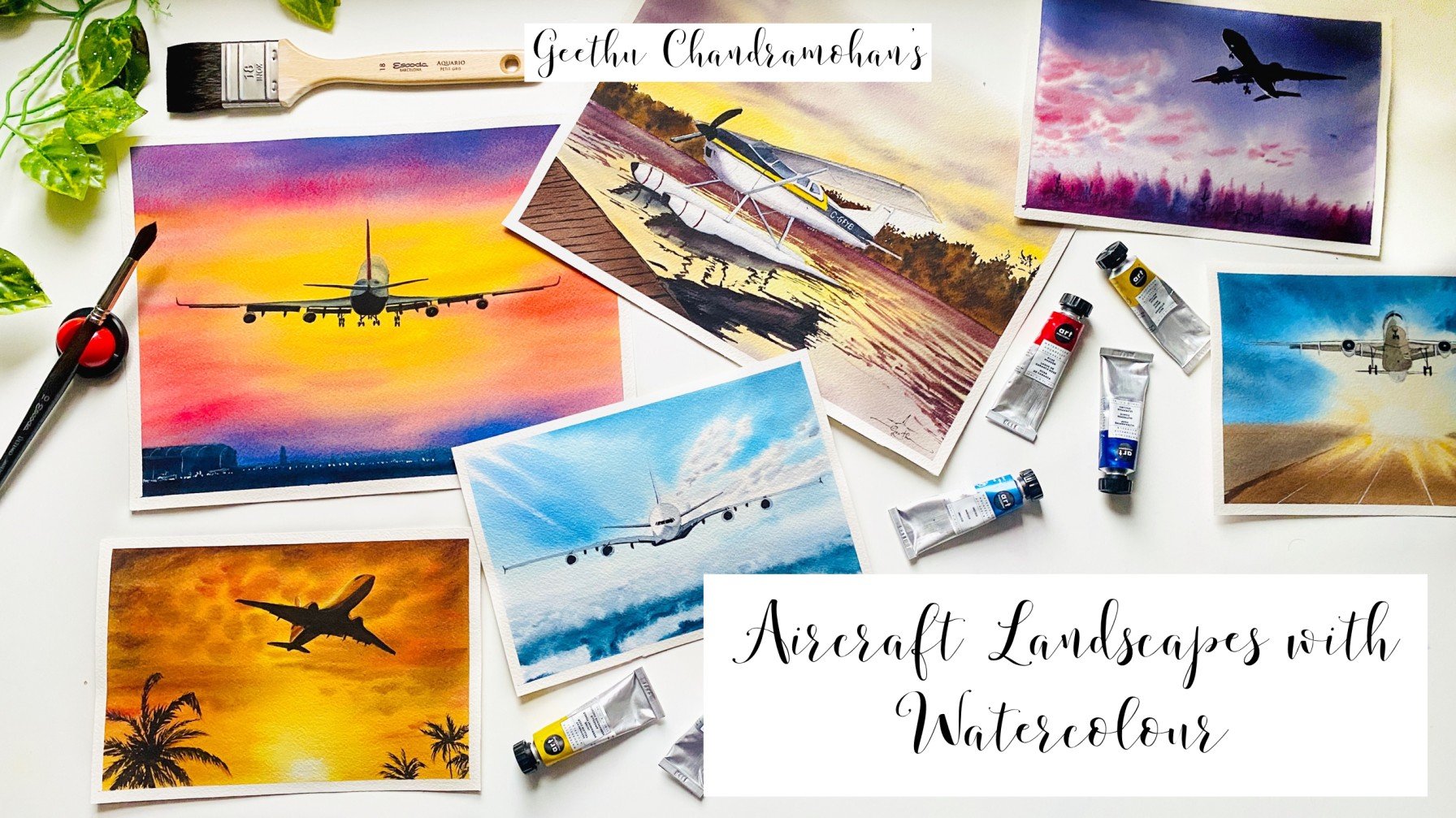
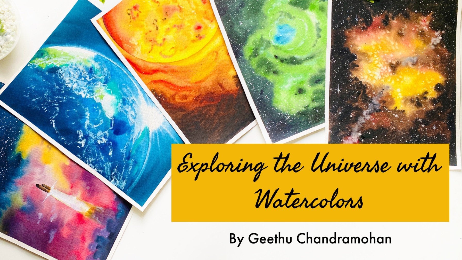
one new subject a week, like skies, galaxies,
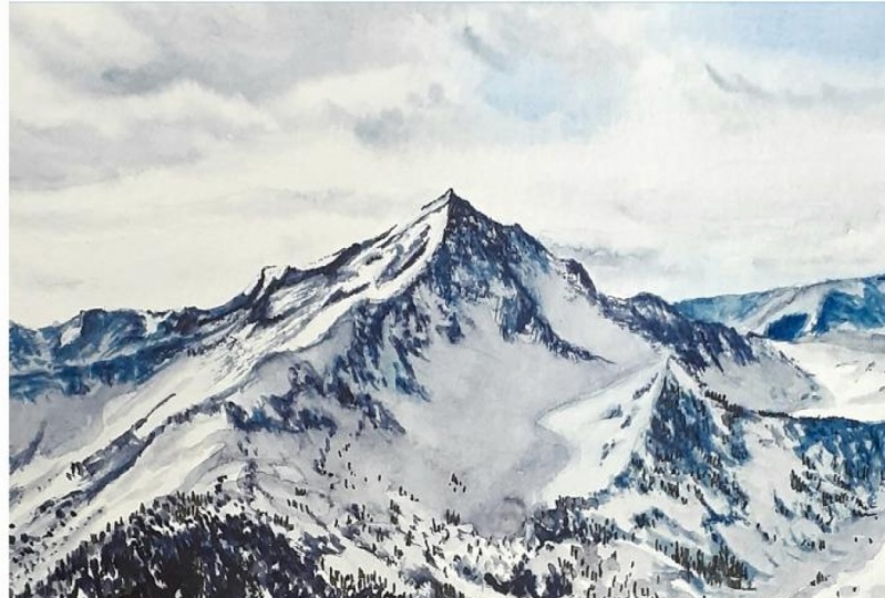
landscapes, mountains, Northern Lights,
beach, ocean, water, sunset, food, everything that one needs
to master this medium. We will paint six
paintings every week, followed by a taste break. The topics for each week
are designed to help you progress towards becoming
a professional artist. You can take as many
breaks as you want and you can always come back to
the point where you left off. This class will be the ultimate
watercolor masterclass to guide you into all the most sought out
topics with watercolors. The class is perfectly
suited for beginners. People who have a
full-time job like me, or people who can't find a lot
of time to paint in a day. All you need is 30 minutes
of your time in a day, and you will become an
expert with watercolors. You will end up with 100 of your original masterpieces and a lot of painting memories. After this class with my help and your passion
towards this medium, painting every day will
be a part of your life. We're going to start with
skies for the first week, so get ready with your
supplies and join me on the spot to becoming a
master in watercolors.
2. Art Supplies: Let us have a look at
all the art supplies that we need for this class. First of all, what we
need is watercolor paper. When we think of starting
watercolor painting, we always go for
brushes and paints, and we forget about
watercolor paper, because we think that
we can just go for some random paper that's
available in our house, but that's not the case, we need watercolor paper. It is really important, and that is actually the most important thing when it comes to
watercolor painting. Order of importance
goes from paper, paint, and then brushes. Paper is the most
important thing. This is because if you want
to get the beautiful textures and effects that you want to create with
watercolor painting, then you need to go for artist grade watercolor
papers itself. There are so many
brands out there. For this class, I will be using this paper as well as this, so paper from both
of these pads. This is Canson
Heritage, 300 GSM. The GSM means the
thickness of the paper. Watercolor paper is
usually very thick. You can see the thickness. Since that is the
GSM of the paper, so we need a minimum of 300 GSM paper in order
for our paper to withstand all the
watercolor techniques to different washes of water that we will apply on the paper. Also, I will be going
for 100% cotton paper. Because it is 100% cotton paper, it means that my paper will stay wet for a longer
duration of time. That is the reason mainly
why I use 100% cotton paper. This one is Arches. This is also 300 GSM or 140 lb, and it is 100% cotton paper. Either of these, or you can actually go with any watercolor paper
that you have. I'm just suggesting that
for the best results, and to get great satisfaction
with your paintings, it is better to go with any
paper that is artist grade, minimum 300 GSM and
100% cotton paper. These sheets here,
they are 9*12 inches, both of these in fact. This is 23, 31, this is also 23, 31, which is 9*12 inches. That means it's almost
similar to an A4. I think it's just
slightly larger than A4. What I'm going to be doing is, I'm going to be cutting
these paper into two, and we will be painting all the 100 day projects
on an A5 sheet. That's approximately 9*6 inches. That is what we will
be painting in class. Here are some of the sheets
that I have already cut out. This is where I was telling. This is A5 sheet, and this is what we
are going to be using. This is Canson paper
from this pad, which I have taken out, and I have cut into
half. There you go. This is what we will be
using for this class paper, but you can join me with
whatever paper that you have. It is important also to
learn the techniques, and to understand
the brush strokes. We can also focus on that. The next thing that [NOISE]
we need is watercolor paints. I will be using paints from these two brands for this class. This is White Nights
and Art Philosophical. I'm a band ambassador for
both of these paints. I love both of these, and this is the
reason why I will be using these two
brands, specifically. Also, I don't have the violet color from
either of these brands yet, so that is why I'm
going for this brand, which is Pwc, but don't worry. I will tell you what exactly the shades are in
each of the lessons, so you don't need to
worry about that. You can also join me with
the most basic palette. We don't need very
advanced colors or any color that's not
there in the basic palette. Also in case if we're going
to use any of such colors, I would always suggest
alternative options in how you can mix to make
that color that I'm using. You can join me with whatever
paints that you have. Your paints can be either in
the form of tubes or it can be in full bands like
this or even half bands. You can join me with any basic watercolor
set that you have. This is just an exercise
lesson for the next 100 days to teach you about all the different topics and the different
techniques in watercolors. I really think that you can join me with whatever watercolor paint that you have, if you're using paint
in tubes and you need a palette to
mix your paints. Here is my palette, and I have already
squeezed out the paints that we are going to
use for this class. I will show you exactly each of the colors that is
there in my palette. Don't worry. We definitely
need a mixing palette. You can either use
a plastic palette like this one or you
can use a metallic one, or there are ceramic ones. If you don't have
either of these, a dinner plate, which is of ceramic material,
would suffice. You can even use
that as a palette. It really doesn't matter. Just choose whatever
you have with you. The next most
important thing that we need is watercolor brush. Different kinds of brush. We don't need a lot of variety. It would be better if
you have a flat brush, a larger size brush. You can also have a mop brush
or a larger size brush, such as Size 12 or Size 10. Then I will also be using this flat brush to apply
water on my paper, because it covers a larger area, but you don't need
all of these brushes. You can just go for one single brush and use that
to apply the water as well. Then we need a
medium-size brush. You can either go for a Size
4 brush or a Size 6 brush, and then of course,
a detailer brush to add some details
onto our paintings. You can either go for a
Size 1 brush or a Size 0, or even a Size 2 brush. The brushes that we use for our watercolor painting
is really important, because if you look
at these brushes, observe the pointed edge
that we have, even this one. When we dip this in water, this will have a
nice pointed edge, and all the hairs will
be joined together. The pointed tip has a really great importance
in watercolor painting, because you can hold the
brush in different angles and at different positions to get different techniques
and different effects. I'll be showing all of these
in the coming projects, so don't worry about that. Mainly what I'm saying is, what you need is a
larger size brush, a medium-size brush, and a
smaller one for the detailing. Ideally, just make sure that you try to get a brush that has a pointed edge so that we can achieve some
of the details. That's it, so there. I will be using board board like this one to tape my paper onto. I'll not be using my surface because I always prefer
to tape down my paper. Because in case if we want to lift our paper to
achieve some effects, then it is better to
have it taped onto a surface that can be
lifted, unlike a table. You don't necessarily need
a cardboard like this one, you can go for a hard
book top, a magazine, or any surface that you can find so that you can just
tape your paper on, and it is easy to lift as well. Why do we tape the paper? We tape the paper so that it will be held in place
while painting, and also it will
prevent the paper from buckling or bending when we
apply the water on the paper. Thirdly, we will have a nice
border for our paintings. That's the main reason why
we tape down our paper. You can use a masking
tape for that. In case you don't
have a masking tape, you can also use a cellotape. Any tape is fine. I have noticed in my
experience that if you find your masking tape
or the tape that you're using to be tearing the paper, it is usually the paper
itself that's the culprit, and not a tape. If the paper is a
good-quality 300 GSM paper, then it will not tear up
easily with masking tape. Usually, paper is always
the most important thing. As I said, you need a masking
tape as well, a pencil, a ruler, and an eraser to make some rough sketches
for our painting. This is my pencil. I use a mechanical
pencil like this one. I use this because
I can just fill up the lead in it instead
of sharpening it, and I would always
have a pointed tip. This is the reason why I
use a mechanical pencil, and obviously, an
eraser and a ruler. We will also need some tissues. This is to dab our brush and clean it up to
remove any excess water. Also, we might use it for
some techniques on the paper, like you can use it for lifting. Always keep some paper
towels or tissues in hand. We can also use a cotton float, just something that you can wipe your brush or wipe
the paper with. It will come in handy. You can see this paper, I've already used it
in some paintings, and it has few brush
strokes on this. We will also need
two jars of water. Water, obviously, because we're doing
watercolor painting, and two jars, because one for rinsing off our brush with the excess
paint that's on it, this to wash off our brushes, and the other one to
take fresh paint, and also to apply the water on our paper so that we
apply clean water. Because imagine, while
in-between painting, you wash your brushes off
in the different colors, one of the jars would
definitely turn muddy. The next time you want to
apply the water on your paper, if you do not have a
clean jar of water, you would be applying this muddy water back
onto your paper. This is the reason why we need
to use two jars of water. You don't need such a
large jar like this, you can go for a small cup also. Anything is fine, just that
we need two jars of water. You will also need white
gouache or white watercolors. I'll be using this
designers gouache, zinc white color from
Winsor & Newton, but you don't necessarily
need gouache paint itself. You can also use
white watercolors. This is titanium white
from [inaudible]. You can use whatever white
watercolor that you have got. You don't necessarily need
the gouache paint itself. We will also need
some table salt. This is just a bowl in which
I have got some table salt. You can see this is the normal table salt
that we use for cooking. This is great to achieve
different watercolor techniques. We will see that in some
of the projects, so salt. Now, let us have a look at
the colors in my palette.
3. My Colour Palette: Let us have a look at the palette that I will
be using for this class. Here it is. This is just
a basic 18 bell palette. I have just filled up the
colors in this palette. Let us have a look at all the colors that I will
be using in this class. I will also list down
the exact colors for each lesson corresponding
to that when we start them. I will also state the
colors that is in my palette and attach it to the references
section in Skillshare. The first color
is Indian yellow, Indian gold, transparent
orange, carmine, permanent red, cobalt blue, ultramarine blue, bright
blue or pale blue, indigo. Then this is emerald
green or viridian. Then this is green
from White Nights. This is violet, raw
sienna, burnt sienna. Then this is permanent
brown from Art Philosophy, burnt umber, sepia,
and Payne's gray. These are the colors that
is there in my palette. But we can add more colors as and when we need them when we
move on to each project. Don't worry, I will be
mentioning the colors exactly, and also the alternative
colors that we need. This is not actually part of this palette that I just set up, but this was there
on the palette. I bought this few months
ago but never used them, but just squeezed out few paints and I think I used it
for a previous class. This is there from then. I didn't want to clean it up and waste these paints so
that's why I left it. I think this is Naples yellow, this is yellow ocher
and this is sap green. This is the same green as
this one one is the green 725 from White
Nights. That's it. This is my palette
that we will be using. Again, as I'm telling
you, don't worry, I will always suggest the
alternative shades that you can use for this class. Here you go.
4. Before You Start :): Before you start
with this series, I just want to give
you some tips to get you started every day. Once you finish a day is
painting and you have removed the masking tape
and put the paper aside. If you can try to keep the
paper ready for the next day. That is why using
a board would be helpful because
if you don't have a table which is assigned
for painting like I do have some of you may be using your dining table or work table, then you can stack away this board a bit and have
the paper ready on it. But then you can just
stack away your board, your palette ready, and your brushes along with
it somewhere else. The next day, you
can just come and load everything onto your table with your paper ready to paint. I see that as more easier way rather
than coming and adding the masking tape onto it each day because this makes
us ready for painting. It's like okay, I
have some time. I can just go ahead
and start painting. This is one thing
that you can do. Have the paper ready
and also your palette. You can clean your palette ready for the next
day if you want. But I usually prefer
to leave it as that and I just painted
on other areas. But for this class,
when I'm showing you, I'm cleaning my
palette, of course, but you don't have to
essentially clean your palette. Then remember to take fresh clean water
every day and don't leave the same old
water overnight because it might create
molds on your jar. It's not good to leave
the water overnight. In case if you do really want to leave the
water overnight, then you can use
something like this. This is actually a coaster, but you can see how
it's turned out. I use it to cover my water jars. I cover it every time I get up from my table and I go somewhere because I don't want dust or anything to
go into the water, but don't leave it for many
days or multiple days. That's just the key. Then there will be six paintings a week
with a gap of one day. You can either use this
one-day gap to relax or if you fear that this will create a break for your daily
painting exercise, then you can choose a
reference picture of your own for that week's topic. Like if it's the first
week, then it skies. Then you can choose the sky and paint it with your
learnings from that week. In case if you find any trouble finding
a reference image, I will attach two
reference images for that week's topic in the
resources section in Skillshare. You can download that and
try it out for yourself. I believe that this would be a perfect learning curve and
painting exercise for you. Because then you
will be implementing everything you have learned
during the week on your own. If you really get motivated, then you can also go
ahead and try out exercises and projects
from my other classes. Especially if you want
to learn theoretically about all the basic watercolor
techniques in detail, then you definitely
need to check out my class on Ultimate
Guide to Watercolors, which addresses almost all of the watercolor
techniques in detail. There is also a free
e-book from my site, which covers so many things
about watercolor basics, which is already
added as a resource in the Ultimate Guide
to Watercolor class. But I will also add
it here for you to download in case you
haven't already got it. I think that's enough
of my boring chitchat. Let's get started right
away into prepping our paper and the
Day 1 exercise.
5. Taping the Paper: Let us have a look at
taping down our paper. Here is my paper and board. I'm going to show you how
to tape down the paper. I'm showing you this because
it is really important, here is my masking tape. I just leave a very small border because I like to have a small
border for my paintings. Just stick the four corners
first, the four sides. There you go, but now I'll
show you what is important. We think that we have this
taped down our paper, but I prefer to press
it down a little more, and make sure that
my paper is secure. So I usually use a
ruler like this, and I press along the side so that my paper won't
lift-off while painting. First, I press on
the side like that, but that would have created
some gaps in between. Here, there is a gap, I don't know if you can
see clearly anyway, so then I run my ruler along the tape like this and stick
it properly to my paper. This ensures that I don't
create any gaps in between, and my paint will not bleed onto the edges of the
paper, so there. Now, my paper is secure
and ready for painting. Once you have taped
down your paper, come join me in the first
day of our 100 day project.
6. Day 01 - Blue Sky: Welcome to the first day
of our 100-day project. Let us have a look
at the colors that we are going to start
our series with. It is going to be bright
blue, raw sienna, burnt sienna, green, and you can also use sap green. My green is really dark, so I mix it with a bit of
Indian yellow to get sap green. Keep some yellow and green
in handy, that's all. If you don't have burnt sienna, you can also use burnt umber. Let us get started with our
class project straight away. Here I have taped
down the paper on all the four edges like we just showed in
the last lesson. Now I'm going to apply
water on my paper. There is no pencil
sketch for this one. We're just going to
directly start painting and all our strokes are
going to be with our brush. I am going to be using my flat brush just
because it covers a larger area while
I'm applying the water but you don't necessarily
need a flat brush itself. You can use any
brush that you have, even if it's your mop brush
or your round-size brush, you don't need to worry about the exact same brush
that I'm using. I'm picking up water from my jar and I'm applying
it onto the paper. Make sure that we have to
apply the water evenly. In this exercise,
what we're going to learn is the first
sky, of course, but we're also going
to learn how to apply the water to control the amount of water that
we apply on the paper, to know how much
water it's needed on your paper for getting
nice wet-on-wet strokes. That's what we're
trying to learn today. You can see I've already applied
water all over my paper. Every part of my
paper is wet but I'm going to reapply multiple times, as many times as I can because even though this
is 100% cotton paper, it might dry quickly. The technique that
I use to make sure that my paper stays wet
for a longer duration of time is to keep applying the water multiple times
and here's something. If you are not using
100% cotton paper, then what you can do
is apply the water, then wait for like two minutes for the
water on your paper to start drying and go down
into the pose of the paper, then reapply the water. When you reapply the water then, your paper is going
to stay wet for a slightly longer duration
of time just because this paper already
has some paper in the fibers beneath that is in the layers that
is underneath this. The second time when
you apply the water, it will take slightly
longer time for that water to sink into
the underlying fibers. So it will give you
some extra amount of time to work on the
wet-on-wet technique. Here I'm applying
the water nicely. We don't want to create
any large pools. Always make sure that you
wash away your brush on your paper in an
even direction so that you don't form any
pools on the paper. I can show you. Do you see the sheen of
water on my paper? That's all there is. See, there is no water flowing. There is no extra large blobs of water or anything
on my paper. We'll just apply like this all
over the paper. That's it. I hope you can see clearly
there is no sheen. There is only sheen no
extra pool of water on the paper and then we are
going to start painting. I'm going to use my
size 2 mop brush and we're going to go with our
first blue simple sky first. I'm going to be using
phthalo blue or bright blue. It is a very beautiful, vibrant blue but you don't need the exact blue
that I'm using. Don't worry. Go with the blue that is there
on your palette. Pick up the blue nicely
on your brush and see the consistency of
the blue that I'm taking. Not using a lot of water. I dipped my brush in water, I cleaned and drained
excess water. Then I'm picking
up paint and I'm mixing it on my
palette because I'm trying to get an even
consistency amount of paint on my brush. Now there is a lot of paint on my brush and we are
going to start painting. We're going to start at the
top and we are going to apply our paint in a straight
line like this. You can see the edge
of that straight line. It is spreading. It is spreading because we have
applied the water. This is what is known as
the wet-on-wet method. Now we are going to go over
the blue region again. But now, we're only going
to create the proper sky. We've applied at the top. Now we're going to create
our strokes in some angles. I'm going to go at
an angle like this. See that? Then I'm going
to cover up the whole of that area inside and
then I'm going to start, leave a slight gap
there because that's what's going to form a cloud in my sky and I'm joining
it to the upper end. Always note here, when
I'm painting skies, I try to hold my brush like
this and I don't drop paint. I don't have my
brush in 90 degree, but always at an
angle like this. This is how I paint
skies because that gives the best stroke
for the skies. You see that? Now I'm just dragging
my brush along. We're going to drag our
brush along all the while, leaving as many small
gaps as you can. Every time I pick up fresh
paint from my palette, I paint the top part because as I've moved
towards the bottom, I want my strokes to be lighter. The first stroke, after
I picked up new paint, I apply it on the top
because the top can be the darkest part and as we
move towards the bottom, we want it to be lighter. Here, I've applied the
darkest tone to the top. Then now my brush is lighter, so I'm applying the lightest
tone to the bottom. You see it's very light and also when you slide,
don't press it. Just slide very lightly and like this just
some lines like that. That's it. I'm going
to leave it like this, and I'm going to let my sky dry. This is very simple, isn't it? That's all that was for the sky. Here I've washed my brush, cleaned all the
paint from my brush. This is as simple as it was, and you can see the sky
is darker at the top, and I've loaded up lighter paint towards the bottom by
just drawing some lines. It's just in line like
this using this motion. Always use the side and
the tip of the brush. Do not paint like this, but at an angle and you'll
get these nice strokes. But don't worry if you don't get these nice strokes at
the beginning itself. It is all right, because we're just starting
out if you are a beginner. But if you are an
intermediate artist, then I think you will
surely get this. This is very easy to make. Now we're going to wait
for the sky region to dry because we need to, let's add something at the bottom to make this
painting interesting. Otherwise it's just the skies, but if you prefer to leave
it just with the sky, then that is also fine. If you're just going to learn skies today
and nothing else, then you can stop here, wait for the painting
to dry and frame it, or keep it aside, or whatever. But I'm just going to add
few mountains at the bottom. I've been waiting for a long
time for my paper to dry. You can see the top
part is still wet because we applied a lot
of paint over there, but the bottom part is now dry, which is enough for
me because I'm going to be painting only
at the bottom part. Taking my brush again, we're going to add
few mountains. We'll look at
mountains in detail in the later coming weeks, but let us just add something to make this
painting interesting. So I'm picking up raw sienna. You can see I'm
taking raw sienna, but I'm going to take it in
a very diluted consistency. Observe the paint here. It's in a very
diluted consistency. Lot of water in my
paint, you see? It's not the same as we
pick the tailor blue. This has a lot of water, and we're just going to
add some random mountains. Now, we're going
to use the tip of the brush and observe where
I'm holding the brush. Earlier when I was
painting the sky, I held my hands on
the brush here. Now I'm holding it closer because I want
to get nice tools. This is how you control your brush when you're doing different strokes
on your painting. When you want loose strokes, you hold it in the middle. When you want even
looser strokes, you hold it at the tip. But when you want
your strokes to be somewhat detailed and
very nice detailed, then you hold it closer to
the hairs of the brush. Now I want it to be slightly
detailed mountains, but some faraway mountains. That's why I'm going for closer. I'm making some normal
random shapes of a mountain. You can see that. When I'm applying
the raw sienna, you can see it's
making the raw sienna with the bright blue to mix and form a slight greenish tint. But that's all right. These areas should
be pretty simple. Just make as many random shape of the mountain as you can. Don't go all the
way round making the mountains because we
just need to fill it up, otherwise the edges of
these lines might dry. So that's why I
keep filling it up. Okay, there. I've filled the entire bottom mountain
[NOISE] with paint, raw sienna, and I'm just going to wait for this
one to dry as well. This has now dried. I knew that there is a lot of waiting around for
our paper to dry, but that's the hardest part. But if you want
to make it quick, what you can do is you can use a hair dryer to
quickly dry it up. I'm using a hair dryer because I'm shooting this
and I'm sitting here, and I don't want to
lose the daylight. So that's why I'm
using a hair dryer. But if you have other work to do while your people waits, you can go into
that and come back. But otherwise, you can
just use a hair dryer. We're going to add some
mountains in the front. Next I'm picking up
some burnt sienna. But don't worry if you
don't have burnt sienna, you can just use burnt umber and mix a little bit of
red in it if you want to get the exact same color. Otherwise, you can go
for burnt umber itself. Now we're just adding some
mountains to the front. Here I have added burnt sienna, and I'm just going to add
some strokes like this. [NOISE] But then I'm going to mix it up a little and
create some beauty. What I'm going to do is I'm
going to pick up green shade. This is green; pick up
some nice green shade. This is a dark green
from White Nights. If your green is
not dark enough, you can mix it up with a little bit of indigo
or a dark blue, and you'll get a
nice dark green, but you don't need
exactly the same green. You can also go for
sap green as well. Here, I've mixed it
up with burnt sienna. I think if you want, you can use another
brush or you can wash your brush off each time, and pick up the paint, and create a nice mixture. It just adds beauty
to our painting. You see just some greenery in between the rocky
mountain, probably. [NOISE] Some green,
I'm going to add. But we have to make sure that the strokes that we
apply do not dry. If we create it just
while doing this, then this is not going
to turn out well. That is why we have
to immediately apply the paint right after we
apply the previous stroke. Just trying to create
some mountain shapes. This is just totally random. I don't have any
picture and I'm just going with my instincts
there. That's it. This seems to not
have blended well. Now that's better. Now
towards the right, let's add these greens. What I'm going to do is I'm
going to create sap green. For that, I'm going to mix my green with a
little bit of yellow. This is because my
green is too dark, but you can get a lighter green. If you already have
that, you can use that, or you can use sap green itself. Here here, I'm
going to use that, and paint the whole of
the right side with this. I'm going to add some dark, green spots onto it. This is the foreground and so it can be
slightly detailed. I'm just trying to add some detailing so that
it looks interesting. You can also add to
the other areas. Don't paint here because
I think this is now dry. I can show you. See
this area is now dry. If I apply the wet paint, then it's just not
going to spread, and it'll create dark edges. If you're going to do the
wet-on-wet technique, then only apply
these small lines only in the areas where
the paint is still wet. This is probably still
a little bit wet. I can add there.
Actually, that's it. I'm going to leave it like this. This looks already
very interesting. But I want to get rid of these green stone to my
mountains because of the sky. What I'm going to do is
I'm going to pick up some burnt sienna, and I'm going to run it over onto the
mountains like that. It is just going to create some different tones
on our mountains. That's it. But it's
going to look beautiful. Like that. Some lines do not join it with
the green at all. You're just creating some lines. The green is still
not coming yet, [LAUGHTER] but that's all right. If you want, you can spread out
the edge there. [NOISE] That is all
for this painting. But again, the highlight of this painting is the sky
and not the mountains. But this is just
something that we created to make it
look beautiful. At the bottom, it's just
some random mountains. We'll have a look at the
mountains in detail later on. It's the beautiful sky that
we are concerned about. That is all for this painting. We have to wait for this
bottom part to dry in order to remove the tape because if
we remove the tape now, this area because
it's still wet, it'll pull off some paint onto
the outside of the paper. So we need to prevent that. Let's wait for it to dry before
we can peel off the tape. Now it's almost dry. I'm going to take off the tape. [NOISE] There you go. That's our simple painting for the first day. There you go. What have we learned? We learned to apply
some clouds in the sky, white clouds by just leaving some gaps and also
giving depth to our painting by
applying a darker color at the top and going
lighter towards the bottom. This gives some
more lighter depths to our painting. There you go.
7. Day 02 - Sunset Sky: Let us have a look at
the colors that we need. We need Indian yellow, transparent orange, or
any orange in fact, Carmine rose any pink
shade that you have, a bit of ultramarine
blue or cobalt blue, and lastly, Payne's
gray or black. Welcome to Day 2. Here I have my paper ready. Let us start. Here, I have my paper ready. There is not going to be any
pencil sketch for this one. We're just going to
simply apply the water. I'm using my flat brush
and we're going to apply the water evenly
onto the paper. You might have to apply the
water multiple times in order to make your paper
soak in the water nicely. Oops, my brush. Here again, you can see the sheen of water that I
have applied onto my paper. If there is any excess water, just swipe them off the paper
because we don't want to create uneven surfaces
of water on the paper. [NOISE] There you go. I'm going to use my DaVinci size
two brush as usual. We are going to create
a nice sunset sky. We'll start with Indian yellow. Indian yellow is a nice,
beautiful yellow color. You can see how vibrant it is. Don't worry if you don't
have Indian yellow, you can just go with whatever
color that you have. You don't need exactly
the same color. Don't worry about that. I'm going to be starting
somewhere at the bottom and here we have the sun
rays or the sunlight which needs to be white
so I'm just applying it onto the wet paper like this. You can note my strokes, I'm holding the brush
like this and then just pull like that and there. I'm going to leave
a huge gap here because my paint will flow, so we leave a huge
gap for the light. It's just this.
I'm doing my brush like this and there. Now we have applied our Indian yellow there. Wash off your brush nicely
and then we're going to move on to the next color,
which is orange. I'm using transparent
orange here. You can see how
beautiful the orange is. It's transparent orange, mix that nicely
and we're going to apply it right right top
of the Indian yellow. Again, I'm moving my brush using the pointed tip and then
just sliding it across. You can see and I'm also going to apply it to
some areas where there is already the yellow paint and
towards the bottom as well. Here on the left side. Then I'm going to apply
at an angle at the top. Always my brushstrokes
are exactly the same. I'm just starting
at the tip and then extending my brush and pulling it off so as I'm pulling it off, this is why the end
has a pointed edge. There. We're going to create
multiple lines like this, which are slightly angled
and the same here. Make sure you have applied
water nicely on your paper. This is why 100%
cotton paper would really help because
the paper would stay wet for a longer duration
of time giving you enough time to work on
the wet-on-wet technique. Here now I'm going
to do like this, just trying to create
some random shapes in the sky. That's all. Now we're done with the orange. Let's move on to the next color. I'm going to take a bit of
Carmine or you can take any pink shade and we'll mix that slightly with the orange that's already
there on our palate. So it's going to create
a nice reddish shade with more on the pink side so that's what
we're going to use. We're going to apply
it on top of the sky. You can mix your
orange and pink shade together and you'll get
this nice reddish shade and we're going to apply
it on the top like that and do some areas, where there is
already the orange and fill any gaps of
orange which are white. So here there was a gap of
white, I've filled that. We're going to add some
strokes, random strokes here. You can see my strokes
are like this. This is what we're
trying to get. Let's get some more yellow. Do you see the
oranges mix slightly? I'm going to just
correct it like that and do the areas
that I have left white, some of the areas so that
the spreading is uniform. That's what we're trying to do. Now the bottom
part already looks interesting so we just have
to cover the top area. For the top area, I'm going to make
it slightly violet. What I'm going to do is, with the red mixture that
we already have. Let's add a bit of blue into it. So that like too much blue, let me add more red. That gives a nice
dark bluish kind and that's what
exactly what we want. We're going to fill
the areas with that blue color, that
purple-red-purple shade. All the other areas in which the areas that are left
white, we'll fill that up. For this, actually
you'd need your paper to be really nice and wet, and always 100% cotton
paper will help. But I know that
many of you may not have 100% cotton paper
and you might be trying it on a 25% cotton
paper or no cotton at all. But don't worry if you
don't have cotton paper because what you
can do is you can apply the water multiple
times on your paper. Just apply multiple times and make sure that your paper is really wet before
you start painting. That is one key thing that you can do to
keep your people wet. I've now covered all of the
areas that we painted with the I mean, we left white. Now I'm going to just, oops, that's too
much blue again. Take more pink and create the purple shade.
That's too much water. You see I've applied
too much water there and it's already
creating a harsh edge. See that separation,
but we can correct it. Just dry your brush quickly
and move your strokes over. That's what the key thing is about the wet-on-wet technique. We're not supposed to
apply any more water onto the paper than there
is already on the paper. This is the 101 rule of the wet on wet
technique, that is, do not add any more water onto the paper than there is already if you're
applying the paint. You can see, I don't want
to apply any more water. This mixture here is
really dry, not dry, but you can see that there
is not a lot of water here as opposed to the ones we were using when we were
painting with yellow. This is the reason why
it does not create any harsh edge because there
is not too much water. Now I've mixed a lot of
pink and blue together, and now we're going for another sheen on the
top with the pink, the reddish purplish shade that we get a nice beautiful sky. You can go over some of the orange areas that
you have painted. I think if you want, you can stop here but I just like to make my
paintings vibrant so that's why I add
more yellow on the top. But again, this time
when I picked up Yellow, see there is not a lot of water. Very less because our
paper has already started to dry so we really can't afford to add
any more water onto our paper. What did I do here? There is a drop of water. I think I might
have accidentally dropped some water onto
it while I was dipping my brush but I'll
just correct it. I'm going to pick up
some more orange. Very less water because there is already this too much water in this area which I'm
trying to cover up. There, now that's
better, isn't it? I think I've done that. This area had dried
and I applied the water so that's why
it's not blended well. But make sure your brush is dry. I can pick up some
more yellow and just blend the edges of it so
that it doesn't look uneven. There, that's better, isn't it? Now we have to wait
for our sky to dry before we can add some
birds on to this painting. Let us wait for it to dry. Here our painting has now dried and we can see the
light area as well. Let us now add some birds
on to our painting. For adding the birds, I'm going to use a
smaller size brush. I'm going to be using
my Size 4 brush from silver black velvet. This is a smaller size because
when I dip it in water, I'll get a really nice
pointed tip like this. This is what we're going
to use for our birds. We're going to be using Payne's gray so I'm picking
Payne's gray. Nice consistency
of Payne's gray. You can see it's a nice and dark consistency
of Payne's gray. We're going to add our buds. It is going to be really simple, just a few strokes, I will show you. See how I have added, it was just joined here
and then a separation. We're going to be doing
this in different angles or different directions
which will mean as if the wings of the birds are spread in
different directions. You can see, this one is towards this side. We'll add some bigger
but towards this side. Bigger as in just slightly
bigger, not too big. Let's add some
smaller ones, there. That's all. This one
I think I messed it up but let's make that pointed. Now that's better, isn't it? There you go. What we have done is we have painted
very gorgeous, vibrant sunset sky, and we have added some
birds on our painting. That is all for today's lesson. Let us remove the tape because we can remove the tape
because the edges are dry. We just painted the birds in
the center, so it's fine. [NOISE] There you go. Isn't that beautiful? Love the gorgeous sky. So I hope you enjoyed
today's lesson. See you all tomorrow.
8. Day 03 - Cloudy Sky: Let us have a look at the
colors that we need for today. So it's going to be raw sienna, cobalt blue, Payne's Gray. Don't worry if you don't
have Payne's Gray, you can mix gray using
the primaries like red, blue, and yellow. Or you can mix black and white mixture
to get a gray shade. Then burnt sienna, green. My green is really dark and I mix it with Indian
yellow to get a sap green, and to get an even darker
shade I mix it with indigo. Keep green, indigo, or sap green and yellow ready. That's all. These are
the colors that we need. After looking at the two
skies in the past two days, we're going to look at yet another beautiful
sky landscape today. I'm going to apply water
to the whole of my paper. I'm dipping my brush in my water jar and I'm going to apply to the whole of my paper. There is no pencil
sketch for this one because it's just
going to be simple, and the strokes are going
to be using a brush. That's the reason why we are just applying
the water directly. Remember, make sure
that the water that you apply to your paper is even. I run my brush
multiple times over the paper so that my
paper gets soaked nicely. But we don't want to
create any pools. As I always say, just slide your brush across
the paper multiple times, that would make it wet enough. There, I think that's
enough for now. If you can see the
sheen of water, there, you see that? That is what we are going
to be painting with. Here, I'm switching
to my brush again, and we're going to create
a sky with a bit of clouds and few blue sky areas as well, and just a simple land
at the bottom part. First, we are going to
start with raw sienna. Pick up very little
amount of the raw sienna. We don't want it to be
in a darker consistency, just a very lighter tone there. Then always use the
side part of the brush, not the pointed tip. I'm just applying
some random strokes. Some towards the left side, and then I'm going to add
more towards the right side. There. That's it. Washing off my brush. Then the next color
that I'm going to be taking is cobalt blue. Before that, let me just
clear up my palette. This is from
yesterday's painting, I haven't cleared it off. I think I should have done
that before starting. The next color that we are
going to apply is cobalt blue. I'm picking my cobalt blue. You can see, picking
in a nice consistency, and I'm going to apply
to my sky region. I'm still using the
side of my brush. Remember to use the
side of your brush. We've covered the
whole top area. Then using the
side of the brush, I'm just applying some
random strokes like this. I'm always using the side of my brush holding it like this. Towards the bottom you can see my tones have started
to getting lighter, because I am not picking
up any more paint, but I'm just going
on painting with the existing paint that's already there on my brush,
which is very less. Here the reason that we apply raw sienna is because it is very hard to mix raw sienna and blue together
to create a green. They would mix and form green if you mix
it on a palette, but on a paper,
they wouldn't flow easily and create
a green mixture. The next shade that we
can take is Payne's Gray. We can take Payne's Gray and
we're going to add this now. Again, use the side
of your brush. Using the side of my brush, I'm applying to
the areas right in between the raw sienna
that I had applied. Also do some of the
areas where you have left white in-between
your cobalt blue. Maybe add few lines. We've already seen how we can draw few lines with a brush. That's exactly what
we're doing here. I'm always using the
side of my brush. Next I'm going to pick
up a very lighter tone. We want it to be lighter
and not a lot of water. If we dip our brush, and dab our brush on the tissue. That's still too much of paint. There. Now I've got
ridden of the paint, I just dabbed it on my tissue, and we are going to
apply onto the paper. We have created a nice blue
sky with some lighter areas. This forms the light
in the clouds. It adds a volume or depth to your painting because your
clouds have some value, but we have lighter value. Now we need darker
value for the clouds, so we go with
Payne's Gray again, but this time make
sure that there is very less water
in your brush. You can see my mixture. It doesn't have a lot of water, just more of paint. Also make sure that you
dab all the water from your brush and then we
will add this to the top. This will add volume and this, we will dab this
onto some areas of the clouds just to create
some darker clouds. Not darker by adding
depth to our clouds. Maybe few lines like this. And then wash off our brush. You see what we have done here first we applied
the Payne's gray, then on the torque by taking very little
water on our brush, we dabbed it on the top. Because there was
very little water, it will not spread
the existing paint. But instead, if you had
added more water onto it, then it would have just spread and would have
created dark edges. In order to avoid
those dark edges, [inaudible] We dubbed off
all the existing water and made sure that our
brush is just having paint. Now, let us go ahead and paint some bottom part
for the landscape. For that, I think I will
go with burnt sienna. I'm just mix a bit
of burnt sienna, and I'm going to add
it. Let's add here. Your people might be already
dry or it might not be dry, but it doesn't matter. Just add some few strokes
like that at the bottom. If it's not dry,
it might spread. You can see some areas
here that has spread. If it doesn't spread, then also it's
fine Then we'll go with some green [inaudible]. Then we'll go with
some nice green tone. I will add a bit of raw
sienna into my green. That's what we'll add
from the right side, and join this burnt sienna area, then I want to paint the edge of my burnt sienna
and mix it with the green. More burnt sienna. Then just
mixing it with the green. But here, I just let the water spread the paint but
not a lot of green. Now, we'll add more green
tones to the right. I'm picking up my green paint and we'll add it to the right. Still not dark enough,
that's alright. To make your green dark, you can add a bit of indigo. Now that's very dark,
and apply that. Then let us maybe add some
small shrubs and bushes. Just in the coner here. You can see in the corner here, I'm going to add some small, tiny dots which would act like some tiny
shrubs and bushes. Let me pick up more of my
indigo and the green mixture. I'm going to create
a random tree shape. Now, I want sap green again. I'm mixing my green with
a bit of my yellow, because my green is very dark. Then I'll just run my brush over the middle part.
Just like that. That's it. Here is the green that I have added. Let's add more greens. You can add more onto the area on
top of the burnt sienna. Here you can see what I'm doing, just a few strokes like this. Now, I'm using the
tip of my brush, and just adding it there. That's it, I think I'm
going to now let it dry. That's all there is
for this painting. It was just a simple one. What we're trying
to achieve was to learn the sky, mostly. The landscape was just
an addition to that sky. Let us wait for it to dry before we can remove
the masking tape, because this part here is wet. Our painting is now dry. I just used my hairdryer
to dry this off. Let us now take off
the masking tape. To be very careful and pull
the tape away from the paper, otherwise you might
risk tearing it off. This was canson paper and see, it's tearing off a bit. But it's not taking
part of my painting because I'm tearing it
away from the paper. Here is our beautiful
painting with the clouds, with more dimension and depth. I hope you liked this one.
9. Day 04 - Turquoise Sky: Welcome to Day 4. Let us have a look at all the
colors that we need today. We will be needing emerald
green or viridian, phthalo blue or bright blue, quinacridone gold, tone body. If you don't have this color, you can mix yellow and orange together and you will
get a nice golden sheet. Then burnt umber, indigo and burnt sienna. After our three
main sky paintings, we are going to look at a magical sky today.
Let us start. That is again, no pencil
sketch for this magical sky. We're just going to start
with applying the water because we're going to be doing
the wet-on-wet technique. Take water and apply it
evenly onto the paper. As I always say, just make sure that
you wet your paper nicely without forming
any large boards, without creating any bends. A bend or the
warping of the paper is created when there is
uneven water on your paper. In order to avoid that, one thing we have done is
we have taped the edges of the paper and also we are
applying the water evenly. If you create a pool
of water somewhere, then the areas surrounding
that area is going to bend. This is one of the main
reasons why your paper bends because it
is uneven water. We have to make sure
that the water is even so you can either tilt your
board and apply the water. This would make sure
that all the water would flow down due to the
force of gravity. That's one reason why you can tape your paper onto a board or a surface that you can lift
rather than to your table. Here, all the water would accumulate at the bottom
when you lift it off. You can just use some random
tissue to just wipe off the end like that and dab off any extra
water from the corner. There, that's it. I think I'm going to
apply the water one more time because it seems as it's still not soaked
enough yet evenly. If your paper is not
100% cotton paper, then here's one tip for you. What you can do is you
can apply the water, then wait for two minutes for the water to soak
in and the paper to almost dry and then
reapply the water. When you apply the
water the second time, your paper will stay wet for
a longer duration of time mainly because the
underlying layers of the paper is already wet. It will take longer time for the second layer
of water to sink in. That way you get much more time for you to work on the
wet-on-wet technique. Picking up my size
to more brush again. This time, we're going to create a magical sky like I said. I'm going to mix a green
and a blue together to create some like a
turquoise blue color. If you have turquoise blue, you can go with that directly. I'm using emerald green and I'm going to mix
the phthalo together. Here's my phthalo blue
and my emerald green. Wow, that's beautiful, isn't it? That's a beautiful
turquoise blue color and that's what I'm going to be
using. I'm going to start. Always when I paint the skies, my angle of the brush is
like this and not pointed. There. I will be
leaving a lot of gaps. Here, when you mix emerald
green with phthalo blue, you want more of blue
and very little of the emerald green
so that you would get more like a turquoise blue, it's not turquoise green. That's what I'm saying. Try to create lots
of white gaps. Your paint would obviously flow and fill them all
up. That's fine. But we're just trying to create as much white gaps as we can. You can have some bigger
gaps if you want. I'm going in a slanting manner
towards the right side. Now I'm going to make my
mixture more concentrated. I've made a very
concentrated mixture. Putting up more of my
phthalo blue there. Now, my brush has a lot of concentrated paint and
I'm going to go over it again to get
some darker tones. The other parts let it
flow. It's all right. You can see that most
of it is flowing and see the shape that it has
created here. That's fine. Now, wash off the brush and we're going
to take our next color, which is quinacridone gold. Don't worry if you don't
have quinacridone gold, you can just mix orange
and yellow together. Either orange and
yellow or red and yellow and you'll get
a nice golden shade. This is what we will apply. But when we are applying, leave a slight gap
between the two areas. Again, we will leave
a large number of white gaps in our painting. You can see the
area that joint has created a green shade here. I'm just going entirely
over the bottom. Now we need to add
some darker tones. What I'm going to do is, I'm going to pick
up burnt umber. That is burnt umber and
I'm going to mix it with the golden shade so that we have an underlying
tone of the golden, mix it with the burnt umber. But you can see the burnt umber, it has a lot of water here, and my brush has a lot of water. If we apply this onto the paper, then it's going to spread a lot and it's going to
create dark edges. Make sure you take off
all the excess water. Now, we have taken off all the excess water and I've just dabbed
it with paint again. Here, now this side, the consistency is better. This is what we're
going to paint. Now it doesn't spread a lot and then we're again
going to use the side of the brush to create
some nice cloudy forms. The area where our paint just spread and created
those green areas, you can paint over it with the brown and cover
up any green areas. Now that looks better, isn't it? Now we need to add some more darker tones and darker clouds to the blue area. What I'm going to do is I'm
going to pick up indigo and mix it with the same
mixture that we created, the turquoise blue
so that again, we have an underlying tone
of the turquoise blue. That's too much of paint there. You can see there
is very less water, not a lot of water. But make sure that we do
dip off extra water because this area is almost dry and we might ruin it if we
introduce any more water. There using the blue, we will add clouds. Add the clouds right next
to the brown areas as well. Do some of the areas right next to the areas that where
you have left white. So this will make it and
give it more dimension. Just run your brush
along the side at an angle like we just did. I'm picking up more brown. The brown is what
I'm going to use to create the transition
from my turquoise blue. You can see I've my
brushes almost dry, that's why it's creating
this weird shape. If it had water, it
wouldn't create the weird. See this is almost dry. Because if I add any more
water on to these area, then it's just going to
ruin the whole thing. That's why I'm not adding water, but rather I'm just
adding paint there. I think I might add some
here as well because I feel that it looks separated. See, my brush is dry because my paper starts getting
dry and dry each time. It's not feasible to add any
more water onto your paper. As I said, that's
the number one rule when it comes to
watercolor painting, do not add any more water onto your paper than there is
already on your paper. I think we're done with the
beautiful sky as it is. Let's now go ahead and add something to the bottom to make this thing interesting. What color should we add? Let's go with burnt sienna, because that would match
with the whole picture. So I'm just going to add. Your paper might still be wet
and it might flow a little, but that's all right. Let it flow. Pick up nice consistency
of the burnt sienna. Again, note my brush
is not that wet. It's got more paint
and less of water. We're just creating a small
hill or mountain shape. Maybe you can add
a little bit of burnt umber to give a
color variety to it. It's just that when you
paint with a single color, it might not look interesting. So that's the reason why we can try to make it
look more interesting. Now there is a burnt sienna, and as we move towards here, we have added the burnt umber, so it's got a variation
in the color. Another way that you can
add the variation is, you know the mix that
we created for the sky. Use the same mixture, that would mix with the
brown and create like a gray sepia shade and use that, mix it with the same
burnt umber stroke. What we have done
here is we have the color that we used
for the sky and mixed it with the color that we used for the brown areas so that the whole picture
seems harmonious. That's what we're
trying to create. Always just try to bring in different variety of
shades to your picture. That's all you need to do. I want to add a bit more brown, so I'm taking burnt umber
and I'm adding to it. Add some burnt umber here, because it's too
light this area. But I've made this
area lighter just because and also I've added the burnt
umber at the bottom. But note what has happened here, we made this area lighter
because this light from the yellow region is being reflected on the mountain
just in some areas. The bottom part is like we've made it darker
with the burnt umber. Now it looks
beautiful, isn't it? Being reflected
by the mountains. So that's what we're
trying to achieve. This side is more
dark. That's it. The mountain does not
have a clear border. This is because it's
like very far away. We don't want it to have clear
borders, so minor spread. But if it does have
clear borders for you, then also it's fine. Just try to mix the
paints and bringing that differentiates to
your painting. That's all. Our painting is now complete. Let's wait for this to dry before we can take
off the masking tape. Now our mountain is dry. Let us remove the tape. [NOISE] Remember to pull away from the paper. There, here's our
beautiful painting. I hope you liked today's sky. What have we learned?
We just learned to make a magical night sky and add some light onto
our mountains. I hope you liked today's lesson. See you all tomorrow.
10. Day 05 - Pink Sky: Welcome to Day 5. Let us have a look at the
colors that we need for today. We only need three colors
for this painting which are; indigo, carmine, and
Payne's gray or black. The carmine, you can either
use anything or rose shade. For indigo you can mix blue and black together to
get a darker blue shade. For the Payne's gray, it's either a darker
version of Payne's gray because you can see
in the painting it's completely dark, so you can go for black also. That's it. After having a look at all the full skies
from the first four days, let us now look at
another beautiful sky somehow like this one, a different and using
different colors. Here's our paper. We will start with
watering our paper again because as I said, for the sky is always it is the wet on wet technique
that's the best. I'm dipping my flat brush in water and I'm applying
it onto the paper. Remember, you can apply the water using any
brush that you have. You necessarily don't need
the flat brush itself. Let's apply the water
multiple times and go over it multiple times so that our paper stays wet for a longer
duration of time. If you're not using
100% cotton paper, remember what I said, you can apply the water
first and then wait for like two minutes for
the paper to start drying and for the water
to be not too visible, not completely dry just
while it starts drying, then reapply the water. When you do like that, you will make sure that
your paper can stay wet for a longer
duration of time. Now, here I have
applied the water. Let us start painting. First we are going
to use indigo, so take a nice consistency of the indigo paint and
mix it in your palette. It's almost like a very
cloudy sunset sky, almost dark, but it's
not night sky yet, so this is the reason. Still we're going for a
very nice beautiful kind of cloudy sky but sunset. Beautiful sunset in fact. Remember to use your brushstrokes
at an angle like this. We want the dark portion
to be as dark as possible. Here you can apply smaller
strokes like this, and we can also apply
towards the left side, but we don't want
more paint there. But very light shin of paint. The darkest portion
should be at the top. That's why I'm just applying. You can see the brush
movement that I'm making. Just swift motion like this. Now, I'm going to wash off
the paint from my brush, and then make sure there
is no extra water, and then I'm just
going to dab and create that lighter tone
towards the bottom. See that? That created
a lighter tone there. Let's add some more paint
towards the left side. That is that darkness at the top and then lighter
towards the bottom. We want to be more dark. Take your indigo paint in nice dark consistency and
apply it at the top again, because watercolor paint
starts to get absorbed into the paper and becomes lighter
as time goes forward, that is, as it dries. We might have to add
multiple layers if we want our paintings to be
vibrant and dark. Then the next color that we are going to use is we're going
to use carmine or pink. Mix a nice quantity of
the carmine or any pink, queen rose or whatever pink shade that you have,
it doesn't matter. We are going to add this
right next to the indigo. It can go over the
top of the indigo, it would just create a
beautiful violet shade. That's all right. You can already see my strokes
are using the sides of the brush and even if I'm using the pointed side of the brush, I don't drop my paint
but rather I move in a left and right direction
rather than dropping my paint. Towards the left top corner, we're just going to
apply our paint. Notice here my paper
has started to dry, so I'm not picking
any more water, but rather I'll just
apply the paint. If we introduce any more
water to that area, then your paper will have dark edges which we do not want. We can't have any lighter
areas or white areas, we have to cover
it up with paint. What we're doing is now
when we leave some white, we will cover it up with indigo. Let's add more paint on
top of the indigo areas. We're trying to create smaller
clouds towards the bottom. This and some really smaller
clouds to this side. I'm using the tip of my brush but again I'm not
dropping paint. I'm using the small
left and right motion. You can see that. There. We have to work
faster on this one, mainly because our paper
will start to dry and we will not work
anymore on the paper. Here, now I've taken a
very dark consistency of indigo and there is
very less water, and I'm also taking
away all the water, because I want to
darken the top area. So you can already see
because it's drying, it will create harsh edges. In order to avoid
the harsh edges, make sure that you
take only paint. Notice here, my paint
is almost no water, just paint and very little water that's there on my brush. That's what we are
going to apply. We'll use that to
apply on the top. As I said, all those areas
that you had left white, we don't want it to be white, so we are covering
it up with indigo. The top portion should be
as dark as you can make it. Here now it's like almost black, and I'm applying that. We'd also apply to the top here. But you can see it's
created a harsh edge will just soften
it. Don't worry. I will always teach
you how to soften your harsh edges or where
your paint has not spread. I've just washed off
the indigo and I'm dabbing my brush to
remove all excess water. Then we will go with the carmine again or
the rules that you have used and that we will apply
it right next to the indigo. Now, you can see we've created that blend between the indigo and the rows and we've
created a purple shade there. So now the sky is dark in
that region. If you want, you can mix a bit
of indigo to get that purple shade and add more
strokes towards the left. But notice there is
no water on my brush. I'm not picking any
more water only paint. That is most important. There you go. I think
now the sky is perfect. We don't want to
work on it anymore. Let us just wait
for this thing to dry before we can add some
foliage at the bottom. So we'll have to
wait for it to dry. Here, my top part is still wet, but this area here has dried. It's actually because I use a hair dryer to quickly
dry off this part. You can also use a hair
dryer if you want, or you can wait for
it to dry naturally. The color that we
are going to use is Payne's gray and actually, I think I'm going to switch
to a smaller size brush. I'm taking my silver
velvet size 4 brush and I'm going to pick up Payne's gray in a darker consistency. Don't worry. You
can also use black. You necessarily don't
need Payne's gray. I just love to use Payne's
gray for my black paint. You can see I'm taking it
in a very dark consistency, which means it's
like really dark, and this is what
we're going to apply, which is going to
make some small trees and some smaller foliage
at the bottom. That's it. Some smaller trees
and bigger trees just some trees in any
random shape that you want and cover the bottom part. You can see it's very dark. I'm using almost black. So you can just go
ahead and use black. You necessarily don't
need Payne's gray itself. So this, I am
painting a pine tree. I will show you one
more time how I'm doing it to make it easy for
you to follow along. Let us first do one
thing before we do that. Let's complete the bottom part. Just create some there and
then let's fill it up. There you go. Now,
I have filled it up and I'm going to show you how we are making those piny trees. Pick up the nice dark
consistency of your paint. What I'm doing is, I'm just painting
around the areas. I'm using the tip of my brush, and using the tip, I'm just doing this. When you move this side, you can go towards the outside, and then paint the inside part. See that? This is what
I'm doing so we can do some trees closer. It doesn't have to be perfect. That's the key thing that
we have to understand here. It doesn't really
have to be perfect, just whatever strokes
that you can make. See the stroke that was
not at all perfect. That's what I really
wanted to tell you. It doesn't have to be perfect. Do whatever you can. Because this is like trees. They can form any shape, they can form, however, you really can't imagine
what shapes the trees make. There, that's it. So this painting, that's
all for this painting. Now, we have to wait
for everything to dry, as we may have to wait for
this edge and this edge to dry before we can remove the
paper. Let's wait for that. Now everything has dried. Let us remove the tape. [NOISE] There you go. That's our gorgeous
sky for today. I hope you liked it. What did we learn from this? We just learned to
apply two colors and always to use our
brush like this, the brush strokes at an angle and we also
learned how to make some simple tree forms just by adding some
random strokes. That's it. I hope you
liked today's lesson. See you all tomorrow.
11. Day 06 - Rainy Day Sky: Welcome to Day 6. Today is the last
day for the skies. After having looked
at different skies, today we are going to look
at the monochromatic sky. But not really just
monochromatic, it's going to be a
rainy day at the sea so we are just going to use one single color
which is Payne's gray. This is the reason
why I'm calling it monochromatic because it's
not having any other colors. Monochromatic
painting means that you paint with a single color and you also achieve all the
effects and the darkness, the lightness by just
using a single color, by evading the tone of it. That is, if you use a darker
tone or use a lighter tone, and depending upon the
different tones that you use, you can add depth
to your painting. So that is what we're
going to look at today. We're going to see
a rainy day at the sea and the only color
we're using is Payne's gray. Also we don't need any pencil sketch so let's
just start painting. We are going to apply the
water evenly on our paper. Just apply the water onto the whole of the paper as
usual and make sure that you make your paper
stay wet as long as you can so apply multiple
times if you want. Still applying my
water because I want my paper to stay wet as
long as I can make it. Any extra water at the bottom, I'm just going to dab
it off with my tissue. There, so now I have a very good sheen of
water on my paper, you can see that. It's not flowing in any areas, it's just a sheen of water, very nice on the paper. You can hold your
paper like this for a bit of time so that
all the water would flow down and would give you nice sheen and not
accumulate at any places. There was still a
lot of water that's why it created a pool
at the bottom again. But it's out of the paper so I'm just dabbing it off
with a tissue there. This is the amount of
water that we want then I'm picking up
my size 2 brush, dab off all extra water, and we are going to be
using Payne's gray. Here is my Payne's gray mixture. We'll mix your Payne's gray in a nice consistency and again, we are going to have a
slanting stroke for our sky. We are going to
start at the top, and we are going to do this. Do you see the slanting
strokes that I made? We will also do some here. Now I want to make it lighter
towards the bottom and I'm going to do these
slight strokes. I've covered the
whole right area and then you can see lots of
gaps that I have left. Then I'm just doing
these small strokes and more towards the left side. As I reach the left
side I'm making few straight strokes. That's it. Now, I want to
create some depth. I'm just going to
add a bit more, that's too much paint. Let's dab off all the paint from our brush and pick
up the Payne's gray. I think that's a
better consistency. It's not too much but
that's too much water so I need to dab it off and then
I will add it on the top. You can see, I'm just
trying to create some depth so I will add it to the top of my existing
strokes at the top. The top is where
I want to create the depth so that's
why I'm applying. We've learned these
angular strokes, that is the side
strokes with your brush for five days in a row now, so this is the sixth day. I'm pretty sure that
you will have learned how to do the strokes by
now. They won't vary. It's not that tough
but with practice, you will gain it. When we progress to the other lessons and
we're adding skies, this will be very useful to you. Now, our sky is almost finished. We just need to add the sea now. Make sure you remove
all the excess water on your brush and then
pick up the paint. I'm taking the
Payne's gray again, medium consistency so that's
the medium consistency and then I'm going to add a
straight line with my brush. It is going to spread
but not a lot. This is because
it is a rainy day and we actually do not want our sea to have a defining line. It's just we're trying
to show that the sea is joined by the sky in
the far off horizon. That's what we're
trying to show. Pick up the paint. Our paper is wet
that's why there is no clear border for our
sea but the only thing that we have to do is we
have to make sure that the line that we
draw is straight. You can see mine is
still a little bend so I'm just correcting it and it's lesser this side, so I'm going to add more. This will also give control over your brushstrokes because
there is no defining line. Don't add a pencil sketch because if you add
a pencil sketch, then we will never
learn how to make those perfect straight line
strokes with our brush. This is just for practice, so don't really worry and
try to add varying tones. Here I've left a
bit of light area, and then I'm going to add some darker tone
towards the right. Now use the tip of your brush and make these lines
almost towards the bottom like that
and that's actually it. I think my sea is
still slanted here. It doesn't really look
like the sea here, but no, my point is, this is how a rainy day in the
sea would look like if you were out in the sea far off and you're looking at the horizon and
taking a picture, this was probably
the simplest of all. I just wanted to
make it simple for the last day of the skies, and also how a rainy
day would look like. When now we are going with our next subjects and trying to add a rainy
day into a picture, you will remember this painting and you will remember, oh, it's Payne's gray
or you can also go with indigo actually
instead of Payne's gray. If you have the
darker indigo color, that would also be perfect
to show a rainy day. The next time you
think of a rainy day, you will visualize
this color and the sky so that's why
we did this exercise. Let us wait for this painting to dry before we can remove
the masking tape. Here, our painting has dried, our clouds and rainy day clouds
are looking so beautiful. Let us now remove the tape. [NOISE] Here is our final picture. I hope you like this one. See you all in the next
day with our next subject, which is going to be night
skies. I hope you like it. This was mostly daytime
and sunsets skies but next we're going to look
at real night skies, beautiful, gorgeous
magical skies. That's all for today.
See you-all next day.
12. Day 07 - Violet Night Sky: This is the painting that
we're going to do today. Let us have a look at
the colors that we need. The four colors are
violet, indigo, bright blue or halo blue, and Payne's gray, or
you can use black. We only need these galleries. Let us start with
our first night sky. Again, I'm going to have my paper in
the landscape mode, and we're going to apply water to the whole of
the paper because we're going to be painting
the night sky with the wet on wet technique. Here I am using my flat
brush and I'm going to apply water to the
whole of my paper. Apply the water evenly
without forming any large pools are
blobs of water. You might have to
apply multiple times, as I always say, just make sure that your paper has a nice amount of water. But that doesn't mean it
should form any pools. It just means that
you need to do these strokes multiple times to make sure that the
paper gets enough water to soak into its fibers. I think that's better now. You can see the sheen
of water on the paper. That's how much we need. Let us get started. Here I am switching to
my size 2 mop brush, and the first color
that I'm going to be using is halo blue. This is already halo
blue on my palette. This is, I tried another
version of this painting first, which I did not record. That's why I already have the
colors here on my palette. The one that we're
going to be using for this same painting, so here is halo blue. You can also use bright
blue, ultramarine blue, cobalt blue, whatever
glue that you have, it doesn't really matter. What you need is a blue color. I'm going with halo blue. We are going to have
an angled motion. Observe how I'm holding the
brush at an angle like this. My strokes are at an angle like this by pulling my brush
in the direction that I want and then towards
the left side like that. This is what I'm doing. I just created a V shape and
then I painted inside it. That's what I'm doing. You can see. There, that's it. Then wash your brush. We'll pick up our next color, which is going to be violet. We're going to paint the rest of the night sky with violet. Load up your brush with violet and we can start from the top. The whole other areas. We are going to
paint with violet. This should be pretty
easy because we just having a normal wash
down stroke at the top. But at the top we
need it to be darker. Then move down your paint like this so that we get a nice
flat wash at the top. Then near the blue, we're just going to run
it over like that in the same direction and cover
the rest of the areas see. I've covered. But now
toward the blue area, we are just going to create
some lines such that they form some lines bleeding
into the blue like this. Observe my paper is wet enough. That's why we are able
to create this perfect bleeds into the blue.
That's what we need. Like that. Then I'm going to wash off my brush
and remove any excess water. Towards the bottom
I'm just going with a lighter tone of the violet. You can see this is
a very lighter tone as opposed to the top area. I've just run my brush over this is just an empty
brush. There's no paint. That's why I'm running over the blue region and then
just trying to blend. Now we have created a
blend But now we need to paint more and create a
vibrancy to this painting. We're going to pick
up more violet, pick up as much as
violet as you can, but make sure that your paint doesn't have a lot of
water observed here. It doesn't have a lot of water. Then we are going to start from the top because we need our
painting to be vibrant. The reason why I'm
lifting it up is because your paint will flow down and it will mix with the
rest of the areas, creating a perfect blend if you don't lift it up or if
you don't pick it up, it might stay in one place
and it will not flow. In order to make it flow, that's why if you can hold it
and give it a slight angle, that would be great. This is the reason why I asked you to tape down your paper onto a board or a magazine or whatever that you can find and not the surface
of your table. It is okay if it is
on your surface of your table and you are unable to lift it
off. That's fine. Just make sure that you try to blend it all the way
towards the bottom. Here I'm darkening the
violet at the top. You can see and some
towards the side as well. Then I'm creating these line strokes just like we
did for our night sky. For all other skies. Now what we're going to do
is we're going to create some smaller clouds
on our night sky. Pick up a nice consistency
of the violet. Also you can mix a slight
amount of indigo to it. I'm picking up indigo and I'm
mixing it with my violet. You can see I'm getting a
very nice darker shade now. That is indigo mixed with a violet and there
is very less water. You can see how the
consistency of the paint is. We are going to use, and we are going to add it
to our night sky like this. Again, my brushstrokes
are slanted you can see. We're just going to
add it like this. Some slanted strokes
to our night sky. We can pick up more. Then I'm going to add some clouds on top of
the blue region as well. When you apply on top
of the blue region, make sure that the
clouds are really small. I'm using the tip and the
portion until here of my brush, not the whole part. Just using the side,
always use the side. I'm not dropping my
paints like this. Note that. You can have some small lines
as well like this. That looks better. Now, we can have some
more dark colors towards the top but makes sure that your
brushes really dry. Because the paper here is
already started to dry, so we don't want it to create
any bleeds or dark edges. There you go. Now what I'm
going to do is I'm going to just apply my violet paint towards the top area because I want that
area to be really dark, like that there. Just add. This is going to
be the sky of our night sky. We have to wait for this to dry before we can
add in the mountains so let's just wait or we can use a hairdryer
to dry it up. The bottom part is now dry. The top part is maybe
still wet I just dried the bottom part because that's where we're
going to paint. Let us pick up the
color that we want, we're going to be using violet, but this time I'm taking a very diluted consistency
of violet see that? I want my paint to be diluted, lot of water. There you go. A lot of water on my paint, but then when we
apply to the paper, we don't want a lot of water, only the mixing palette
should have a lot of water. When you add a lot of
water to the paint, it becomes diluted so
the color is lighter, but on your brush,
make sure that there is no a lot of water. What we're going to do is, we're going to create some
mountains so you see, the tone is lighter, but I'm not adding a lot
of water onto my paper. Fill up the whole of the
mountain with the paint, make any shape you want
it doesn't have to be the exact shape that I'm doing so no need to
stress on that at all. Fill up the whole of
your mountain with a nice violet shade, lighter tone of
violet so we're using a very lighter tone
of violet then now, I just painted this
violet on the mountain, so the whole thing is still wet so what I'm going to do is, you know that mixture where we used the violet and the indigo. I'm going to pick up
some darker paint from there or if you don't have
that mixture on your palette, you can mix indigo with your
violet and create it again, but we don't want
it to be diluted, so I'm adding water
and loosening it up and then I'm
going to use that. I'm going to apply
it to the mountain. Not the whole part
so that means, this area of the mountain, I'm darkening it, but the right side is
going to be lighter. This is because these
dark spots in the sky, that part is giving a nice darkness to the mountains at the
bottom, that is why. Now we're done with the
mountains again and we have to dry it up before we can add some detailing
on to the mountains. I've dried off my mountain
so now I'm switching to my smaller size brush
and I'm going to be using Payne's gray and also a undiluted consistency. You can see there is very less water because I'm going to create
some dry brush strokes. For the dry brush technique, what we need to do is we need to pick up the paint
and then make sure that our brush is dry
by dabbing it on a tissue and remove all
of the excess water. Now my brush has only paint, and not water and
then we're going to rub this over again in
an angle like that. Hold your brush at an
angle and rub it over so then you will get the nice
dry strokes like this. The dry strokes, they happen
because our paper texture, so that's why we need
a cold pressed or rough surface paper
and the texture on the paper is allowing
the strokes to only go into the top areas of the paper and not into
the pores of the paper. That prevents it from
getting into all of the areas and creates a very
beautiful dry brush stroke. Just add some dry brush stroke randomly at certain places we don't want it to be in all of the places so
this is the mountain. Now since my brush is dry, I'm picking up more paint, but there is literally
no water on my brush. See, it's very dry,
when it's very dry, it's really hard to achieve
the dry brush technique, we need a tiny amount of water. What I'm going to do is
I'm going to just dip the end of my brush so that there is a
little bit of water. See, now that it's
slightly mixing, there is a very little
amount of water and that makes it better, so it should not
be too dry as well the correct word for it is
your brush should be damp. Using the damp
brush, go over it. Now towards the left side, I think I want it to be having a bit more black areas on the mountain so I'm going
to pick up Payne's gray, nice consistency of it and
paint on the left side. Keep painting, such that
don't pick up any more paint, just keep painting and
there will be a time when the paint on your brush finishes and you'll start
getting those dry strokes. Use that because what
we're trying to do is, these left area of paint, we are trying to convert it naturally into a
dry brush stroke, but I think we need
some more paint at the bottom so pick up the paint and applying it
at the bottom like this. Let's see the rest of the areas. I'm converting it into a dry
brush stroke so that's it. Just at the bottom
is where I want it to be the black paint. I'm using Payne's
gray for black, but you can also go with any
black paint that you want to use, that's it. Now we have a natural gradient from the wet or dry technique
to the dry brush technique. What I did was I
picked up my paint on my brush and
then I went across naturally letting it
dry without picking up more paint so that's
how we can do that. Now let's just add another
mountain maybe in the front. For that, we need nice amount of Payne's gray or black
paint and we'll just add part of another mountain like that and fill
the whole thing up. There. Now we are done
with the mountain part. We will learn mountains
in detail so this was just a part for the night sky. The sky was the most
important part, if you want to just paint the sky and not the
mountains at all, you can also do that
but the next thing that we need to do is add
some stars into our sky. For adding the stars, we don't need the stars on our mountains so I'm going
to be using a tissue. You can also use a paper
or whatever you have to cover up the areas where you don't want your white
paint to splatter on. Here's the bow that I
use for my white paint. What I usually use
is this designer, gouache from Winsor and Newton. It is zinc white you can also
use titanium white instead. It doesn't really matter
which paint you're using, or you can use white
watercolors as well. We're going to take my
gouache paint so here I have my gouache paint and I'm
going to load up my brush with a nice consistency of
the gouache paint, see. What I'm going to do is
I'm going to tap it, so you can either tap holding
your brush like this, and tapping like that or you can use another brush
and tap it on the top. Whichever method you prefer, just tap it, this will drop the
paint onto your paper. Just move your brush in
different directions so that when you're tapping, all of the paint falls
in different directions, otherwise it might
form in a line. I prefer to tap it like this because I feel this
is more controlled, the other way is tapping
it all over would splatter paint all
over my table. I've got my laptop here, everything would just
be covered in paint so I actually prefer to tap like this because it's a little
bit more controlled [NOISE] Think we can stop there. Now that looks better. You can add some bigger stars
if you want so just load up your brush with some
white paint and just drop some larger paint
just some larger dots, I mean so some larger
dots wherever you want. That could form as the
larger stars, there. Adding smaller and larger
stars would give it a dimension so I
think this is it, our beautiful night sky. Isn't it looking gorgeous? Let us now remove the tape. I hope this doesn't
ruin because this is still wet but I think
it's all right. There you go. Isn't this looking
really beautiful? I really love this one. This is one of the favorite I have done
till now in this class. I think mostly it's because of the violet and the blue shade. Don't worry particularly
about the mountains, we'll have a detailed class
on mountains when we go into the week for mountains but
this week it's for night skys. Thank you all for
joining me today. I hope you like this one, see you all tomorrow.
13. Day 08 - Black Galaxy Night Sky: Welcome to the next day. Here I have my paper ready. Here is the pallet. There is no ventral sketch, we're just going to
straight away start. Let us start with
applying the water. I'm going to use my flat brush here it is and I'm going
to pick up freshwater. Use any brush that you have to apply water all over your paper. We're going to paint a very
beautiful night sky today. Just a hole of your
paper with water because we will work with the wet
on wet technique best. On the whole of the
paper, apply the water. We have to make sure
that the water is even. I know I say this every day, but that's really important, and also, another
important thing is that if you're not using
100% cotton paper, then do this, applying off the water onto your
paper multiple times, as many times as you can, the more you do, the more you'll make
your paper stay wet for the longer time. Just keep doing that as many times as you can so
that you can make your paper stay wet for a very
long duration. There I think that's enough
for now for me, for my paper. If your paper is not that
wet or you feel that you should apply the water
a bit more, then go ahead. I'm switching to my
size two more brush, and the first color
that we are going to use is Payne's gray. In fact, this is just one of the two colors that
we will be using today. This painting is going
to have only two colors. Pick up a nice consistency
of the Payne's gray. You can see it's very dark. You can also go for black. You don't need
Payne's gray itself. Just go for whatever
color that you have. I'm going to apply the whole of my paper with Payne's gray. I think this painting is
going to be really simple. The main key key is
we are going to cover our entire paper with
Payne's gray or black. Pitch black, as
black as you can. Well, if we're going to apply the whole of our
paper with black, you might have this
question in your mind. Then why are we using the
wet on wet technique? It is simply because the
blended surface looks better with the wet on wet
rather than on the wet on dry. If you were to apply this black color in
the wet on dry method, then you might end up with some uneven blend
and harsh edges, which we really want to avoid. This is the reason
why we are going for the wet on wet method. See you have to apply a lot of times because I
really want to get it dark. Payne's gray, is
gray and not black. It needs multiple strokes of paint to get that darkness
that I'm looking for. I could actually go for black, but I don't know why. I don't like to use
black in my paintings. Rather I prefer the
darkness of Payne's gray. That is what I'm
going to go with, and actually somewhere
around the middle here, I'm going to leave it a
slightly grayish tone and not apply a lot
of Payne's gray. But around the outside, I will apply a lot
of Payne's gray. Picking up more see it's really dark towards
the outside now. I'll make sure that it is
dark to all the areas, and also note watercolors, they tend to get
lighter when they dry. We have to make sure also
that this Payne's gray of mine doesn't turn into
lighter shade after it dries. No. I want it to be black
as black like as possible. Just leaving some
gray area here. But the rest of the
areas I'm going to cover it up
with Payne's gray. But I think it's just fun to see the whole blackness building
up on our sheet, isn't it? When you're painting,
don't introduce any more extra water because that would
displace the paint. It would form blooms. I know I dip my brush sometimes to the water but it's just
because it is too dry. I only dip it slightly to get a little amount
of water on my brush. I don't dip it fully
into the water. Just very lightly so that I can get a little amount of water on my brush.
I'll just show you. See, I still don't
have a lot of water. This is not flowing consistency. This is still very
concentrated amount of paint even though
I just dipped it. That's why I'm
saying I only pick up a very little
amount of water. I don't pick up a lot of water. I think now this is
good enough, isn't it? It looks really nice. This is much better, isn't it? Maybe a bit here
it looks lighter. Now, that looks better. Washing off my brush, and the next thing
we are going to do is we're going to
create like a slight, beautiful night sky galaxy
effect, and for that, I'm going to use my
white wash paint. But you can also use your white watercolors,
don't forget that. We can use watercolor also. It doesn't really matter. Here is my wash paint and
I'm going to use that. I'm just switching to
my size full brush, and we are going to pick up a nice consistency
of the white paint, and we are going to drop it on our sky on the white paint. Obviously, you know
black and white, they're going to
form a gray tone. But that's all right. Can you see, I'm
just going around with my brush in
circles like this. Circles. I want to
go all the way up, but the white paint in
my brush is finished. I need to pick up
more white paint. But this brush has a
lot of black on it. I'm not going to dip this
into the white, rather, I'm going to wash it up so
that all the black is gone. It's gone. Then I
pick up more white. You see now it's just white. Otherwise I would
just make a gray in my white palette,
which I don't want. Now we get fresh white again, and we're just going
to create a long line. This is just trying to
create some galaxy effect. I'm going to do this again, but I need to wash my brush. Each time you want to pick up the white, wash your brush, otherwise you'll create a
black shade in your palette, which I don't want. I'm going to create
another one right to it. Let's keep adding. See, I've just picked up
my brush from the paper. See what happens. See, I
created a gray shade there. This is the reason why
I said that we should wash away our brush so that when you pick
up the white paint, it is white and not gray. I'm going to drop
it in the center so you can see
towards the outside. Oops, I dropped a lot of water. Towards the outside,
it is almost gray and to the center I'm
applying the white paint. I'm going to go all the
way to the top like that. I think that's enough for now. I'm just going to make sure that my paper is really more black. I'm going to pick up more
Payne's gray and paint it in the edges and also in some of the areas right next
to the white paint. Here there was a
gap that we left, I wanted the gap to be here but this area
has got a lot of gap. I'm going to fill it
up with Payne's gray. You get the gist of it. We're just trying to
create something with a little bit of white in the sky and the rest of the areas
are going to be black. I'm just going to
blend and create a gray right outside
the white areas. I think that's it. I'm going to now let the
whole thing dry before we can add in any of the other elements that we
want to add into our painting. We have to wait for this
whole thing to dry. Let's wait. Our
background has now dried. Let us go ahead and add
some stars to this. We are going to use
the white paint again. I'm going to use my
smaller sized brush, and I'm going to load
a nice consistency of the white paint onto my
brush as you can see. Like a very creamy consistency and we're just going to
tap it onto our paper. My brush has a
creamy consistency, so it's creating
these smaller stars. Let us add the
smaller stars first. I would use another brush
and tap on the top, but then that creates a lot of white marks on my table
and everywhere else. I feel that this is a bit
more controlled even though this also give it on top
of the table as well, but it's less riskier
[LAUGHTER] than the other one. Now we've got a lot
of stars in our sky. Let us add few larger stars. For that, I'm going to pick
up the paint again but this time my paint has
a bit more water. But when I say water, you also need a lot of paint otherwise your white will
not be really white. A lot of water and
a lot of white. Now this one is going to
create a larger stars. See, we just got
some larger stars. That's it. Next, we are going to switch to
a smaller sized brush to add some shooting
stars in the sky. I'm loading my smaller size. When I say smaller size I mean, we should have a
nice pointed tip, so observe this brush. It has a very nice pointed tip. What we are going to do is, we're going to choose
one of the stars. Let's say we choose this, and from there we're going to draw a line towards the top, but draw a line such that you lift off as you draw the line
to it's like this, and you lift off so that you get like a tail to
the shooting star. I'll just show you. I'm choosing this star and we're
going to draw the line. See that? When I did that, I lifted my hand off so that I
got like a thinner deal. If you don't lift off, then you're going to end up with the same length for the width, so let's not do that. Let's try to lift off. I'm choosing this star now. This star I broke in between, but we can join that. It's not that bad. I'm going
to add another small star here so that will look like
a small shooting star. But you see what I mean. [LAUGHTER] You see we
all make mistakes. But the key thing
to do is like that. Smaller ones, bigger ones you can add as many as you want. I'm also going to drop some larger drops for the stars in some areas. See? Next, let us add something
interesting at the bottom. What I'm going to do is, I'm going to switch to
my size four brush again and we're going to pick
up some more white paint. But this time, we
need to make sure that the white paint on
our brush is really dry. I'm going to pick up paint, and then I dab my brush on
the tissue and make sure that my brush is only
damp and not wet. Using this, we are going
to add some mountains. That's already too dry. Just some shapes for the mountains like that. That's much better.
Now we are going to add some lines into
the mountains. For that, we need the brush
to be damp and not wet, so a damp brush and we're going to do
the dry brush technique. We're just going to
pull it at an angle. You can see I'm holding the
brush at an angle and I'm pulling it downwards like that. We can actually
create some splits in the mountain and have our dry brush strokes
from those splits. All towards the edge
of the mountain, I'm going to have white strokes. Then away from the edge I
will have dry brush strokes. We can have the
dry brush strokes in different directions. They always don't have
to be towards this side so observe the
strokes I'm doing. I'm doing towards
the edges because I want to get rid of
the line that we drew because that
would look like the mountain is having a line. This is the reason if you draw the dry brush strokes
along the line, then you will get rid
off that line itself. I will explain the dry
brush stroke once more. It is just basically
using your brush, hold it at an angle and the brush is just damp
and a lot of paint. When the brush is just damp, it will create some
extra like this. This is mainly due to the
texture of the paper. You can see the paper
has got some texture, this is because it is cold
pressed so you can either use a cold pressed or
rough surface paper, which is the best for
this dry brush technique. Seeing my brushes really dry and it doesn't
have any paint, which is the reason why
I'm getting those strokes. Even when I'm dipping
my brush in water, I just dip the tip of it to load a slight
amount of water, otherwise it'll be too dry. See. Create lots of small dry brush
strokes like that. Now I'm going to pick up more white paint and go over some of the areas
that I have already applied. See when we applied on top of
the Payne's gray and white, it is slightly grayish in color. We're going to add
more white to just some of the areas
so it will make the mountains look
more interesting with different shades of
white and gray on it. Not the whole places, just in some areas, we are going to add
the white strokes. Adding more white on top of the existing white will
make it more white. Now you can see now we've got varying shades on our mountain. First are slightly
grayish tone because our white mixed with the
black to form gray. Now we're adding more
white on top of it so it's giving us a
nice white tone. I think that's it. See. Now, our painting is already
very beautiful, isn't it? That's all for the painting. We can remove the tape because all of these strokes
were dry brush strokes, it doesn't need to dry. We can remove the tape. I just hope none of
it is blended it out. No, not at all. Maybe in the corners. That's fine as well. Make sure that you remove the tape away from the
paper like I'm doing. There, that's our gorgeous
painting for today. Do you guys like it? This is another
night sky painting.
14. Day 09 - Fiery Night Sky: Welcome to the next day. Here I have my paper ready. Let's go for the next night sky. Here's my flat brush. We are going to apply the water. There is no sketch
for this one either. Let's go ahead and start
applying the water. As I always say, make sure
that your water is even, with no large blobs
or pools of water. Just go around on your
people multiple times. If your paper is not
100% cotton paper, then this is
absolutely necessary. Keep applying the water. I do this a lot of times. You obviously knew that by now. This is what makes our paper stay wet long
enough for us to paint. Especially if your paper
is not 100% cotton paper, then you need to
make sure that you apply the water multiple times. I think that's enough for now and I'm going to
switch to my Size 2 brush. The first color that
I'm going to be using is this pink shade. Let's take the pink in a nice consistency and let us add it to the
top, to the left side. I'm going to just make
some lines like this, like that, and then
another few lines. I've left a slight gap here. We are painting with the
wet paint as you can see and on a wet paper,
so it's wet-on-dry. This one was large,
this is medium. This is just small. Towards the bottom, I'm going to go for
another medium one again and I'm going to just leave some lines
like that in the middle. That's it. Wash our pink off. Next, I'm going to
pick up some red shade and I'm going to drop it
towards the middle of that pink shade in some areas, like here, there. Now the next color we are going
to add to this is indigo. Pick up a nice amount of indigo shade and we're going to cover the rest
of our sky with indigo. This is as simple as it is. Around the areas of the pink, we are going to add indigo. You can see those areas where I've left
slight white gaps. I'm also filling all of
them up with indigo. I will just show you. Let me show it to you here. Here, for example,
we have a tip here. I'm going to pull my paint
here and as I move here, I'm going to lift my brush
so that it ends there. Or another way that you can
do is you can start with the tip and then spread your
whole brush and paint it. This exercise is also really to help you with
your brush strokes. This is going to teach
you a lot about how you can move around your brush
to get nice strokes. The rest of the areas, let's fill it up. Oops, wrong paint. You can see, the indigo is
bleeding into the pink. We will correct all
of that. Don't worry. For now, let us fill up the indigo to the
rest of the areas. We need to work fast, otherwise, our paper will start to dry, which we cannot afford. That's why we need to
paint as fast as you can and start applying all
the areas with indigo. Now I have covered almost so
many areas with the indigo. Now I'm just going over it again so that I darken
my paint strokes. The next thing we're going to do is we're going to
pick up more of the pink shade that we applied. But this time, since the pink
might have started to dry, observe the consistency
of the paint. It's concentrated almost. Don't add a lot of water, otherwise, you'll
create harsh edges. We are going to paint along the lines of indigo
that will turn into a slightly purple shade because the pink will mix with
the indigo to form purple. That's all right. It's
just the corners or the borders. Let's do purple. Now I'm going to wash
my brush and pick up more fresh pink and add it. Whenever I create
a lot of purple, I wash my brush and
pick up fresh pink. Otherwise, the whole
thing will turn into a large blob of purple. We just want to blend it and
create a beautiful mixture. That's why wash your brush each time when it turns into a lot of purple and pick up
fresh pink again. When you pick up the fresh
pink again and apply it right next to the pink that
you have already applied, it will not turn into purple. Then I'm going to go for the red and fill up the middle areas. This is turning too vibrant, isn't it very beautiful? We'll fill up some of
the areas with ink, and then I'm going
to go with indigo again to the other areas, and to make sure that we have pitch darkness
towards the right side. This is just some
random night sky that came straight
out from my head. I don't have any
reference picture. I'm just going
with my instincts. I just felt this looks like
a fire or, I didn't know. I have no idea even
to what to call this. But I just like it. I tried it on a rough
piece of paper first, just to dumping my ideas. There, so now we have
darkened certain areas. Just creating some low edges and blend, just playing around. This is just like
we are trying to create some uneven blends and here I'm picking up pink and I'm going
to add it here, and indigo. There, that's it. Then I want to create some more darkness
towards the right side. I'm going to take paints gray and I'm going to apply
it towards the right. This will mix up with the
indigo and create pitch black. Don't take a lot of water
in your brush, just paint. Otherwise you're going
to create blooms, which we don't want. There. Now this
side looks black. Now we have to wait for this to dry before we can
add in some stars. Now our painting has dried, everything, the
background has dried. We are going to add some stars. For that, I'm going to take
my white gouache paint again. You can also use
white watercolors. Don't forget that, you don't need the gouache paint itself. Here is my gouache paint, and I'm going to dip my brush
in water just a little. I'm going to create a creamy consistency of
the paint on my brush. That looks really creamy, and I'm going to splatter these. I'm going to splatter most of the stars to the right side. I'm going to skip the left side. Some of it may fall towards
the left, that's all right. There, that's it. It's looking already
really beautiful, right? I'm going to add some shooting stars now and
some stars into our sky. For that, I'm switching to
my smallest size brush. This is small, as I mean
is it's got a pointed tip. Take a brush which has got the really smallest point because that's what we need
to make those tiny stars, and I'm going to fill my
brush with white paint. Not a lot of water, otherwise, we'll end up creating a very
bad star with lot of water, so less water, and more
of the white paint. What we are going to do is, we're going to take
one of the stars, choose one of the stars, and we're going to make a
cross over it like that. Then we're going to create
an x in the middle, small x. The cross was large, but the x is going to be small, that's how I do the stars. See, so now this looks as if
it's sparkling, isn't it? Let's try once more. Whoops, my hands got paint. If I don't wipe it I'll end up dropping it somewhere
on my painting. I'll show you
somewhere else now. Let's add one here. A cross like that. I mean a plus and
then cross there. Now we've got two
twinkling stars. Let's also add a shooting star. For shooting star, what we do is choose one of the stars, and then we're going
to draw a line. But as we draw the line, we're going to pull away from
the paper so that the line tapers to papers at the end. Like that. See, that was very small. I can go for a bigger
one. Maybe here. That's still small. How
about let's try one here. I think I'm lifting off
my hand too quickly. See, nothing can go
wrong with adding such shooting stars,
that's my point. You can either
create smaller ones, you can create bigger ones. There. Now, that's better. That's a very beautiful
shooting star. I think I'm going to
leave it at that, this is a beautiful night sky. Let's clean our brush
and remove our tape. Wow, this is really beautiful. [NOISE] Here it is a
beautiful night sky. Oh, I love this one a lot. This is looking just so
beautiful. Look at the blends. We got that blend between
the indigo and the pink, and it's likely to
undo a purple shade. Some lighter areas, the red in the middle. This is all looking too
gorgeous, isn't it? Look at my hands, it's full of the indigo and the pink shade. It's just joys of painting, isn't it? Here you go.
15. Day 10 - Simple Night Sky: The colors we need
for this one are, Indian yellow, burnt umber, sepia and Payne's gray. If you don't have
sepia, don't worry, you can just mix a brown and black together
to create sepia. Instead of Payne's gray, you can also use black. It doesn't really
matter. Let us start. Today, we're going to be doing
it in the portrait mode, and no pencil sketch, we're just going to start
straight away with our water. Dipping my brush in water, and I'm going to apply
the water onto the paper. Honestly speaking,
I feel that this is the most time-consuming part of the painting where
you have to water your paper very nicely. By now, you know that I
spend at least 1/1/2, two minutes entirely
just watering the paper. You must have seen in
the previous videos how long I do that. That's the key thing because it's really important that
your paper stays wet. Many students have been messaging me and saying
that their paper is drying despite them applying
the water multiple times. This might be the case
because you're not using 100% cotton paper. My paper is 100% cotton paper, and yet I apply
the water for one, 1/1/2, two minutes. So if you're not using
100% cotton paper, try applying a bit more. You can actually
make sure that you drop a lot of water like this. If you drop a lot of
water onto your paper. But don't leave it
there as a pool, but rather wipe it off. Just wipe it off and make
sure that it's even. You see, I add a lot of pool of water and it's got more water, and will flow when
I lift my paper. So we just have to make sure that the paper has enough water. It always depends upon the different papers
that we're all using. Hundred percent
cotton paper is not necessary, it's not compulsory. You can use other
papers as well. But the gsm is really important, that is the thickness
of the paper. Because if you're using
just a normal printer paper and you apply this much water, then it's just going
to buckle and tear up. So the weight of the
paper is very important. Like 300 gsm, you need that. Then if it's 100% cotton,
then even better. But maybe some of you can't get access to it or can't afford. So it's really alright, don't stress out on that fact, but just make sure
that you apply the water on your paper a lot. A lot means really a lot. That's it. I think I'm
going to stop for now. My paper looks good. I think I have enough water. You can see the sheen of water. Yes, that's good, isn't it? So let's start painting. For this painting, here, I'm switching to my
size two more brush. I'm going to start with
Indian yellow first. A nice amount of Indian yellow. This is from the
previous painting. I did not clean my palette. I don't know somehow I feel
very bad when I waste paint. I think I can make
another night sky or something with these
remaining paints. I really hate to waste paint, so that's why I never do it. Okay, so for this night sky, we're going to have
a nice blending or grading effect to the side. Usually, we have the
blending in straight lines. But we're going to
have it at an angle. Let's see how that goes. I'm going to start from
the corner here and I'm going to apply like
this to the top. Do you see I'm
applying to the top? If I take my brush and I apply to the top like
this at an angle, creating as much angle I can. Like this, it's like
spread out from here. That's better. We move this slightly. [NOISE] That part now looks better. I do like to apply
my paint multiple times just to make sure
that it is vibrant. That is, but the reason why I'm applying the Indian yellow again because your watercolor tends to get lighter
when it dries The more layer you add on top
of it is like an advantage. I'm washing off my brush. The next color that I'm
going to take is brown. This is burnt umber. Any brown shade that
you have will work, which is going to
create a nice sky. This one, we're
going to start in the opposite direction and
make it join the yellow. That's what we're going
to do. Like that. Let's fill it up first. Don't bother the
blending for now, just go ahead and
fill up the area. Like this. Let's pick up more paint, and just keep filling up. Now we've covered it up, the whole paper I mean, but this blend here is uneven, which we want to even out. Let's start doing that. My blending that I'm trying to achieve is
like an arc over here, and to make sure that the brown gets mixed
like in an arc and create a nice light
effect like that. Keep those lines,
for now, it's fine. We'll blend that with
yellow once more later on. There like that. That's a really nice light
effect on our painting. We'll keep adding more and
more brown towards the sides. You can see the sides
here are very light now, so we need to make it as dark as possible because
this is the light. So it gets darker and
darker towards the edges. That's what we're trying to do. Pick up more of the brown. We'll pick up even more
darker shades later on. But for now, let me just
fill it up with the brown. We'll fill it up with brown first before we can move
on to any darker shades. That looks good for now. But before we add
any darker shade, we need to blend
smoothly into the brown, otherwise the our yellow
that we applied will dry. What I mean to say is if we don't touch that yellow
for a long time, then it's going to dry
completely. This is the reason. Let's use the splits between
the yellow and brown, and we just going to
create, blend like this. Pick up yellow each time
because when you pull out your brush is going
to have a brown shade. Don't use it too much. That's better. I'm going to stretch it all the
way to the bottom. But see I'm creating
these lines. I want to get rid
of those lines. What I'm going to do is, I'm going to use my
brush and a tissue. I've taken out all the
water and now see, this is what I'm
saying will happen. So I just pushed my
brush all the way here, and then I replied the same brush stroke right
next after that stroke. This brought the
brown from here to here because the brown
was there on my brush. What we are going to do
is we can pick up more yellow and just get
rid of it quickly. After each time and you have a brown stroke, you can do this. Just slowly blend it
in words like that. Let me pick up more brown. Let's see, there is
a separation here, which I want to get rid of. So I'm picking up more brown, and we'll add to that area. I think now, it's
really looking better. It's much better
when this dries, this will even out. So the light effect
is now much better. I'm going to go for a darker
shade towards the top. So I'm taking sepia. Sepia is like a really
dark brown shade. If you don't have sepia, don't worry because you can just go ahead and mix a little bit of black with your brown
and you get sepia. So that's all you need. Observe here, I'm
picking up the paint, but then I'm drying it off
on my tissue that is drying my brush off because
this part here already might be dry and
having very less water. So I don't want to ruin it by adding any more water
onto the paper. This is the reason why
I'm drying it off. See now we are applying the sepia and we're creating
a nice transitioning blend. It's like from light
to the darkest areas. You can see a lot of
lines on our paper. We're just going to
get rid of all that. I'm using my brown. We're just going to
create a nice even blend. I think that looks much better. I can see some darker areas
and lighter areas there. You can cover that up. But I think I'm pulling
away paint now. Anyway, that looks much better. See that, that
looks much better. If you lift your paper like
this and give it a twirl, it would mix the paints
wherever it's not too much mixed and give it a
nice blended look. I think this is that. I'm going to wait for
this to dry before I can start applying the stars and any additional things
onto this painting. Here is our painting
which has now dried. What we're going to do
is we're going to add some random trees and shrubs in the bottom part, just very less. But before that, let's
add the stars because otherwise the white
paint is going to interfere with our
trees that is going to appear on the top
of the trees which would make it look like snow, as if it's snowfall. We're not looking for snowfall, we're trying to create some
stars here in the sky region. This region doesn't
need to have any stars. I'm just going to
cover this region up with tissue and here
Here my white paint. I'm going to just take up
some white gouache paint. Don't worry, don't need
white gouache itself. You can use white
watercolors as well. I'm going to dip my brush and pick up a
really nice consistency of the white paint to create some beautiful stars in the sky. I think that is good enough
consistency of the paint. I'm just going to tap
onto my paper like this. I seriously prefer
the tapping method because I think it's a bit more controlled and saves my table, my palette and everything else. Even then, it is still dropping
paint on other places. But this is much better
than the toothbrush method. If you really want
to learn this one, it's holding your
brush like this. Then using your
index finger to tap. I think that's enough and that's a really good demand
of stars there. Let us add some bigger
stars in the sky. I'm picking up the white paint and I'm going to add some stars. I showed you previously
how it's done, but I think I'm going to switch the brush because
this one is like a Size 4 and it's too
big to draw a star. It doesn't have the
really nice pointed tip that a star should have. I'm shifting to my Size 1 brush. I'm going to pick
up the white paint. This will create a nice star for me so maybe I'll add one here. There, I think that
looks beautiful. Maybe another one here. I'm going to add
some smaller stars. I'll show you how it's done. What I do is I just make
some small Xs like this. It's just a very small x and
I added two random cases, so from far, it looks as though it's twinkling and
those are smaller stars. These are the really
big twinkling stars, the others, you can just add
a small twinkle like that. Those are the smaller stars. Now, let's go ahead
and start painting some background tree
easier just to make this painting interesting
because this looks blank. What I'm going to
do is I'm going to be using Payne's gray. Because the Payne's gray
is what I use for black. You can go for black also. Here is my Payne's
gray mixture, there. I'm using my Payne's gray and I'm just going
to add some trees. The way I do the trees
is really simple. Use the pointed tip of
your brush and just draw. Then for the branches, draw something and then lift off your brush so that you
have a tapering end, that's what I try to do. The branches can have
a thickness towards the bottom for the
tree branches. We can see, make
it in any shape. But just make sure that
whenever you are extending out, you lift your brush so that
it tapers towards the end. See? That's what we
are trying to do. Just add as many smaller
branches as you want. This is why I say use the
smallest brush that you have. It will help a lot. We're not going to stop with one tree there that
looks really odd. Let me add another tree or maybe some sharp or
something there. This looks interesting
and it has volume because otherwise it looks as though if
it's a lone tree. Although that's not a problem
adding just a lone tree, but I just prefer to have
some volume to my branches. Now that looks interesting
because there's two of them. Then how do we make
it more interesting? I don't want to
leave it as just is. I'm switching back
to my Size 4 brush, which is also small, but not really small enough, but I think it's good enough to add anything
towards the bottom. I'm just going to
add some shrubs or whatever to the bottom so that it doesn't look as to its
too alone and has something. See it's just something
randomly that I'm adding. You can add smaller
lines like this. I don't want to add all
the way from the left, so only slightly somewhere
from the middle, there. Maybe I'll add another
smaller branch there like that, you can add as many smaller
branches and twigs. I think that's it. The whole point of this exercise was to teach you how we can make this blending like the rays coming out of some
light source here. This blending from the
light to the darkest shade. That was the whole point
of this night sky. I hope you have
learned that right now and this was just
an addition to it. After this is dry, we can remove the tape off. This is now dry and let
us remove the tape. [NOISE] Here is our night sky
painting for today. I hope you like
this. There you go. We have added few stars and some smaller stars and
some tree branches. We'll look at trees more in
detail in the coming weeks, but for now it's just
some few branches.
16. Day 11 - Mountain Night Sky: Let us see the colors
that we need today. First of all, we
need bright blue, indigo, Payne's gray, a dark green, a yellow, and ultramarine blue, and we also need whitewash
or white watercolors. If you don't have dark green, you can mix a sap green are
the green that you have with black or indigo to
create a darker shade. Instead of Payne's gray, you can also use black. Today, we are going to create yet another magical night sky. This one also will be
in the portrait mode. Here is my paper, and I'm going to start
applying the water. Let us apply the
water onto the paper. Always wet-on-wet
technique is the best to achieve the
background layers for night skies for skies. I think be it any
painting for the background wet-on-wet
technique is what we should be painting with. You know my mom calls me a
name in Malayalam just to say, oh, she just throws a lot
of water on her paper. [LAUGHTER] I'm applying the
water onto my paper. I do this multiple times. You might know by now, every day you see me do this. Keep doing this,
and especially if your paper is not
100% cotton paper, apply this multiple times, even more than the number
of times that I'm doing, because your paper
really need to soak in all the water and need to have a lot of water
on your paper. I think that's enough for now. I'm going to switch to
my size to mop brush, and let us start painting. It's going to be like you've already seen the picture
when I showed the colors. We're going to have
a mountain here and some foliage
here at the bottom, like maybe the foreground
mountain here at the bottom, and then start a night sky. I'm going to be starting
with bright blue. Bright blue is tailor blue. The pigment is BB15. It's a really beautiful pigment. We're going to start
somewhere in the middle, and we're just going to apply it directly onto the paper, and all the way towards
the top actually, because we want to
create an even blend between the bright blue
and indigo at the top. But first we will
apply the bright blue and just create the even
blend on the paper. Not even blend, the magical
night sky in the paper. Now we have given it a
nice bright blue color. I'm just going to add
a few more strokes just to make it vibrant enough. For this one, you can see that I'm not using
my brushstrokes, but rather I'm just dropping my paint just as
randomly as I can. Because of the
water on the paper, this is like spreading and just flowing around
in the water. Let it do that. Instead of halfway across, this is like almost
not even half, this is still at the top. I think I would go a
bit more downwards. I don't want to stop
in the top area. I want my mountain to
be somewhere down here. The main reason is, there is a rule in
watercolor paintings. Not a rule, but
like in paintings, a rule that most artists
follow is to have your horizon or the main element of your picture
somewhere at the bottom. It's not good to have it
exactly in the center. In case of photography,
it's quite different. In photography, photographers try to have their
picture in the center, the centerpiece of attention. But for watercolor paintings, it makes it more interesting
if your subject is either one by third at the top or one by
third at the bottom. This is a reason why
I'm trying to bring down my mountain
to one by third of the paper bottom part so that there is that harmony
in my picture. Here, now I have applied
the bright blue. I'm going to go with indigo
now. This is indigo. This is the way I reuse my painting [LAUGHTER]
here, indigo. Now, I'm going to apply
this indigo on to the top. You see that. We're creating a
darkness to this area. That's why I'm applying the indigo and apply it and
make it as dark as you can. Don't worry if your indigo is
not this dark or if you're making indigo by mixing some colors like black
and blue together, then all you can do
is add more black to it so it makes it as
dark as possible. But don't paint
completely with black. I would rather say
is the best shade or a mixture of blue and black because you need
that bluish tone. When this dries, this is
going to turn slightly lighter and it will show up that there is
a blue tint to it. This is the reason
why I'm using indigo. I've washed off my brush. Now, I'm going to
pick up the tailor blue again because
I want to create that blend here between
the indigo and the blue. Right where the
indigo is ending, I'm applying my
tailor blue again. You see I've created a
mix here a transition, because otherwise it would
be like an abrupt transition between the lightest tone
and the darkest tone. In order to avoid that, I pick up more of
the bright blue, and I apply it right
where my indigo is ending and just mix it slightly. See, I created that mix, and mix it slightly
and blended like that. Now, this place and all
the places where I apply the indigo looks more
even I would say. I think yeah,
that's much better. Mix it up like that
within the sky. Yeah, that's really much better. You can see my paint
has flown down here. It doesn't matter, just
spread it out. [NOISE] We're focusing on
the sky for now, so it doesn't really matter. Washing my brush off. Next thing what I'm
going to do is, I'm going to create some
magic part into the sky. For that, I'm going to take off my white paint and I'm
switching to my size full brush and pick up the
paint nicely, white shade. We're going to create some
galaxy effect like this, adding the white paint in
a line just like that. Now, I've added enough
of the white paint. I'm not going to dip this back into my white
because it will add the blue so I
wash my brush first, remove any excess water, and then pick the paint again. So this way my white is saved and I like to
keep it that way. I don't want to add in more
blue to my white paint. Let's do the same
procedure again. Now, I'm going to add
something in parallel here. I think that's enough. Another thing is, this
thing is going to spread out as it wants to. Let it spread. I'm not bothered. I just wanted to
create a line there. That is done. Now it's up
to the paint to spread. This is the beauty and the
magic of watercolors that we could just let it spread
and create it's magic. So let's go ahead. I'm picking indigo
here because I think it's done
slightly lighter here. I'm just adding a bit more through the corners
especially because the corners are the most
likely place where it usually lightens up because
the paint gets absorbed towards
the other sides. That's why I'm just
applying it at the corner. Now, let's focus on
the bottom part. So for the bottom part, I think what I'm going
to do is I'm going to create maybe a misty effect. So for the misty effect, what I'm going to do is, let's pick up some yellow. Obviously, the yellow is
going to mix up with some of the blue and create a greenish shade. But
that's all right. So I'm just dropping
my paint like this. You can see it's just some
random strokes like that. It's mixing up with the blue and creating some
greens on the paper itself. It's totally fine. Then what I'm going to do is I have the yellow at
the bottom now, so I'm going to pick
up another blue. So this is ultramarine blue. It's all right if you used ultramarine blue
in the beginning. We can have the same color here. It doesn't really
matter, so don't stress. Again, there are lots of
gaps that I'm leaving. I'm just adding some normal
random strokes like that. This is just me trying to create some mist or some clouds. See, I just added the blue
on top of the yellow. This was just to show you that this is not
something planned. I just wanted the
paint to flow and create whatever nonsense
here at the bottom. That's what I'm trying to do. Here I'm going to pick
up the ultramarine blue and just cover up the
rest of the bottom. This was very light so lightly, I've covered the
bottom part. See that? Don't stress out on this, just drop your paint
into the water. You have to make sure
that your paper is wet. This is the reason why
we have to keep applying the water multiple
times before so that it stays wet for as long as we can work
on the top and still have enough
water at the bottom. But let me say one thing, when you were working
all the way down to your paper and this
region had dried, you can reapply the water. Here is what you can do. In order to reapply the water, lift the dark portion
of your paper. I really want to show you, but there is a
pool of paint here which would flow down
if I lift this board, which is why I'm not
lifting and showing you. What you can do is lift your
board slightly and then apply the water at the bottom part if
your paper has dried. That way, because when
your paper is lifted, it will not flow up and ruin the colors that
you applied on the top. This will help you to reapply
the water at the bottom. The water would only flow down. That's one thing you can do. Now, let us wait for this
to dry before we can apply the mountain and the foreground details
onto this painting. Now, I have quickly
dried this up using my hairdryer and we're going to add our
beautiful mountain here. For that, we're going to
use Payne's gray first. My Size 2 brush and Payne's gray and I'm going to draw
a mountain shape here. So what I'm going to be doing is first creating the shape of the mountain like that and then I'm going to fill up the inside area of the mountain. See that? Now I want to create the misty effect. Here, I left a slight gap there and also towards the end. We have to be very quick. Wash off our brush very quick because otherwise
it'll create a dark edge, take water and just
blend at the bottom. That will remove
off the harsh edge. Just quickly run your brush like that and here at the end. See I got rid of whatever was there and now that
area looks blended, but we have this dark line because of the water
that we applied so we just keep moving that
line towards the bottom. All the way towards the bottom. You might have to re-do on the paper on
top of the yellow. That's fine. If your
paper is completely dry, it will not affect much of the
yellow and ruin the paint. Just make sure that each time
you run your brush over, dip the brush in water, remove excess water,
and just run it over. See, now that's better. So it's created that even blend. I'm removing any excess water. If you see that
there is a lot of excess water that is
seeping into your paint, you can run your brush over
and pull up paint from the Payne's gray area like
this and just drop it off. That's much better. So I don't want to
create any break there. I'm trying to just create a misty effect to that mountain. Now that mountain looks as
though it's in the mist. So we'll leave it at that. We're going to dab my
tissue at the edge here. See it's created a big white bar there because that area is wet. So I can just move my brush
around and create that edge, move my paint towards that area. If I want, I can add a bit
of Payne's gray to show a light transition
of the mountain in that area like that. That really looks better. Now, again, the next
task is to wait for our mountain to dry before we can add the next foreground. The mountain is now dry, let us add the
foreground details. For that, I'm going to be taking this dark green
from white nights. Don't worry if you're
green is not dark enough, you can add a little bit
of indigo or black to your green and you'll make
it as dark like this. So I'm just going to be
applying my green like that and creating some
texture to the mountains. It's not going to
be too detailed, just some random
lines like that. Also, I'm going to fill
up the paint inside. So if I don't fill it up
before I reach the end then it's going to
create a dark edge here which I do not want. This is the reason why I
fill it up soon enough. Just create different
heights and what do you say? Terrain to the
mountains like that. Now, let me just fill up
the whole thing with green. This is a really dark
green. You can see that. If you don't have dark green, mix your black shade of
Payne's gray with the green that you have and you'll get such a nice
dark shade. There. That's really nice
and beautiful. I want to give it a
further darker shade. I'm going to pick up a
nice dark shade of indigo. I'm really trying to
make this more dark. If you actually
mixed indigo with the green to get a darker shade, drop indigo here now
at the bottom part. Now, you can see there is
a lighter green here and the bottom part is really dark. That's what I'm trying to do, create darkness at the bottom. It's just a foreground. This is the foreground there. Now I'm going to switch to my smaller size brush and
we're going to create some beautiful smaller trees to the foreground just to
make this interesting. Here, I have my brush
and I'm just going to add some smaller
shapes like that. I will show you one
more time clearly what is it that I'm
doing. Here it is. What I'm trying to
do is I draw a line first and then I just add some random strokes to it and make sure that my strokes are
thinner towards the bottom. Now this resembles
like a pine tree, so it doesn't have to be
that clear or perfect. That's my point. A small line. We can also start from the top. Smaller at the top
and then make it fat towards the bottom
there like that. Actually that's it. We don't need to add any more. You can add some small branches
like that if you want, or additional pine tree details, but it's really not necessary. You can stop there. Now the last thing is to add the stars and the mountain snow. Here, switching to
my size 4 brush, you can use a medium-size
brush as well. You don't need the
size 4 brush itself. These white paints
are totally dry. I need to add more,
there you go. Now I'm picking up my white paint and I'm going
to apply to the mountain. When you apply the white
paint on top of the black, it's going to turn
slightly grayish after drying and that's
exactly what we want. We don't want it to be too wide. It's creating these
lines on the mountain. See this cover the
entire top part. But towards the bottom, we are trying to create
the mouth of the mountain. This is probably like Mt. Fuji or I don't know, I can only think of Mt. Fuji. Anyway there like that. I think that's enough. If
we just leave it at that. If you want, you can add some random detailing to other parts of the mountain like that. I think I'm going to stop there. The next thing would
be to add the stars, which would be the last thing. But I'm taking my tissue and covering the
bottom part because I don't want the stars to be on my mountain and the foreground. Picking up a nice consistency of the white paint on my brush, and I'm going to drop
it onto my paper. Another use of using the
tapping method for adding the stars is you could tap and your paint
would appear in a line. Usually, if you tap
see, it's only here. I'm going to add more stars
to this line that we added. Like that. Just going
on dabbing right there. It creates more centralized
stars at that place. More paint. It drops more paint to just that area rather than
the whole of the paper. I want more stars to be
focused on this area. This is the reason why
I'm dabbing only here. I think that looks much better. It's gotten much lesser stars in the other area
and more stars here. You can add even more
if you want there. I think that's it. Now that looks beautiful. I don't want to add any
shooting stars or anything. I'm just going to let this dry so that we
can remove the tape. This is now dry. Let us remove the tape. Here's a beautiful night
sky painting for today. We learned how to create some transition,
some foreground. Most of all, we
learned how to achieve that dabbing method transition
between the night sky of indigo and bright
blue that we used or any blue that you
used that transition here without making
it too evident there. I hope you liked it. That's all for today. See you-all tomorrow.
17. Day 12 - Pine Tree Night Sky: Let us look at the
colors that we need. We need indigo, rose,
and Payne's gray. These are the only three colors that we need for
today's painting. Here is my paper
taped and ready. We're going to go for
our portrait mode. Again, that is like this our paper and we're going to start
by applying water. Dip your brush in
water and apply the whole of your paper with
water in a nice consistency. We want the water on
our paper to be even. Make sure you apply it very even without any pools of water. That is why a flat
brush is very good for that purpose but don't worry if you don't
have a flat brush, use the larger size
brush you have. Actually, I want to
show you how it is okay to use a size 2
brush to apply the water. Size 2 mop brush. This is quite large size. You can see that. I'm just going to use this
to apply the water. I know that many of you may not have a flat brush
like I'm using. I painted another painting with bright blue just before and I did not wash my brush and
I can see it on my paper. You see that blue strokes, the bright blue or the teal
blue that I'm using SPB 15, which is like a very
much staining pigment. It stays on your brush and it's also very hard to lift
off from the paper. You actually need to
wash your brush with a soap to make sure that
you get rid of the paint, otherwise, it'll end
up like this but since I'm going to be
using a blue tone, I'm not worried about it now. I'm using my mop brush
to show you it's okay to use your normal
brush to apply the water. This is the process
that you will do. Apply like this. Go on doing this multiple times. If you started from the
top in the first wash, then go from the bottom up so that there's enough
water because there is a possibility that when you moved all the
way down the water on your brush finished and that is not enough water
at the bottom. We'll start at the
bottom as well and go all the way to the top. We can also do
vertically like this. I'm just going to run one
more time. That's it. I think that's really
good enough for now. I'm going to start with indigo. For this paintin, I'm going
to start with top-down. I'm picking up indigo and I'm
going to apply it at top. See? Like that. Then I'm going to
bring my paint down. We need the top part to
be as dark as possible. Pick up as much indigo
paint as you can. This is one of the reasons
why I use paint from tubes because if we use
the pain from cakes, we can't get it as
vibrant as this. That's the only thing you sacrifice but please
don't worry if you're using cakes because we
are trying to learn the techniques here
and the vibrancy of the painting wouldn't
really matter if your mind is into the
learning process. Don't bother about
the vibrancy for now. When I reached the bottom, I'm just not going to
pick up any more paint because there's
already a lot of paint on my brush and I want
it to be lighter. I'm just going to add lines and I'm trying to make it lighter tone so that I'm applying the
lighter tone now. This is where I'm going
to leave the huge gap. We will apply a
different color there. You already know which
color because you've seen the colors part. Here at the bottom, I'm just going to
apply like this. What I'm going to
do is I'm going to wash my brush off and remove all the excess indigo
paint because I want to have just a light chain of indigo towards the
bottom like that. See that? Now that's a very lighter tone of
indigo towards the bottom. We left a huge gap there. Let's paint the
color that we intend to paint there You
know what it is, it's rows or carmine, pink. Here is my pink shade. This is me reusing my palette. This is from a previous
painting. It's already there. I hate to wash it off
and waste my paints. That's one of the reasons
I don't do it but if I don't have space and I want to
use some other colors, then I might wash it off. I'm using my pink shade and adding it. It's
going to form. I think we already did a
color combination between the indigo and the
Carmine before. It's just something
extension to that. I'm just using my
brush movement like that just trying to create. That's it. Now I'm
going to go with more indigo and these lighter areas
that had to be created. Now I'm going to create
some darker tones there but in free
freestyle stroke, the stroke that we
know this so that those lighter tones will be
there and there's extra tone will feel as if though it's the darkest portions
with some cloud effect. We just make the top portion
as dark as possible. Then just going to add
free-form strokes like that. Some of my strokes
are going to be on top of the pink as well. I'm also going to drop paint
and do something like that. Then I also want
some darker tones. Here I'm going to now create the
separation between the horizon and this area, which is going to be
like the bottom part. Now, let us create some
effects on the snow. This is the snow region. That's too much paint. I'm going to wash my
brush off and remove the excess paint and
create that blend there. I think that's better. Just like this, my strokes. This is a lighter area here and darker area
towards the outside. That is the bottom. I think that's better. Now I'm going to create
some more texture. What I'm going to do is I'm going to drop my indigo paint. Using the tip of my brush now, just going to draw as much
small drops like that. This is just going to
create some texture. Don't worry if your paper
has dried. That's it. I'm going to take some of pink
shade and make sure that I blend these areas.
I think that's it. Now, I'm going to switch
to my size 4 brush. Make sure that line is straight. We're going to add some beautiful pine
trees on wet technique. Hear me out now. My paper is still wet. It will stay wet for some
more time because this is 100% cotton paper and I have applied enough
water and paint. This will stay wet for me
to add the pine trees. But your paper may
have started drying. Look at your paper in an angle. You can see mine
in the light here that the water is still
there and it's still wet. If your paper has dried, wait for the complete
thing to dry, then reapply the
water on the paper. When you are reapplying
the water on the paper, apply in single lines, don't rub over it a long time because that
would take away the paint. When you apply, just
apply a single time using a lot of water and
apply it on the top. Now you get some more time to
work on the wet technique. That's what you can do. That's a really
good alternative. Check your paper now
to see if it's dry. If it started to dry, even started to dry, let it dry completely
and reapply water. My paper is wet. That's why I'm still painting. I'm going to be using
Payne's gray here now. I'm going to use a nice dark tone of Payne's gray as dark as I can and also observe
the consistency. Not a lot of water, just paint too much paint. I'm taking very concentrated because I don't want to
introduce more water onto my paper and
we're going to add pine trees like that. So this is wet on
wet pine trees. The strokes are, I
drew a line with the tip of my brush
and then I'm just dropping paint like that in different angles and
direction like that, making sure that I
increase the depth towards the bottom like that, see. Even when I'm dipping my brush, I only dip of it. Otherwise, my brush will
be too dry and I will not be able to drop the
paint. That is the reason. So adding smaller ones. So remember about the
water thing that I said. If it's dried, stop painting, and reapply the water, that's very, very important. You can see my strokes. I'm not focusing on
just drop your paint, making sure to have a tapered edge at the top
and fat towards the bottom. So don't stress out, loosen up your strokes. Just be free, try to work free-handedly. I'm pretty sure that I
might have told a lot of blunders and you
might be laughing. But I really love the process where I'm trying to explain while I'm talking, because there is a lot of
things that you can get while painting rather than
giving voice-over later on. Because I've observed that when you give
voice-over later on, there is a lot of
things that you can't remember what happened
while painting. So I think that doing this
process is really good. So I think that's
beautiful already, look. So let's add some here, closer to us, like here, drop your paint. Don't stress out about the shape of the
pine trees, please. Because pine trees, they
can have any random shape. So don't really stress
out at all about this, just have fun
applying the strokes. The only thing that you need
to be concerned about is checking the amount
of water that's there on your paper. That's all. Just make sure that you have
enough water to work on. Because this is like
the wet-on-wet method. So I've applied some strokes
so I've cleaned my brush now removed the excess water
and I'm going to just blend the bottom
part into my indigo. Taking some paint
and blending it. I think that looks
much, much better. So now we wait for
this to dry so we can add some extra details
on to our painting. So here my paper is now dry. I know that if you
are a beginner, you might find this
painting to be a really difficult
or not the way you want it to be
because you're not getting the strokes right. But please, please
don't stress out, the whole important thing
is about the process. When you're doing it, you learn a lot along the way. For example, if you're
doing these strokes, you observe the movement
of the paint and how it flattened out or
how it spread out. You learn a lot
with the process. I have given all the tips and suggestions on the way as
to how you can improve. So if you are doing
some mistakes, you know how to clear them up
the next time you do this. So I don't know if
you would have time, but maybe you can try this one more time if
you didn't get it right. So my point is, just don't stress out. For the hundred-day project, none of the paintings are for you to stress out and think, I can't do this. It's okay, it's just alright. So we are going to
add some stars into our sky so I'm going to
cover up my pine trees. I don't want any stars
in my pine tree. So I'm going to, oops. That was a lot of indigo
paint on my brush. Picking up a nice consistency
of the white paint. So that looks good, and I'm going to add the stars. So now we've added the
stars to the top and I want to add few more
stars to the other side, but we have this pine tree here. So you can move your tissue in different shapes and angles. I need to take more paint. I want to have more pain towards the middle stars, I mean. I think I'm going to
leave it at that, that looks already
really, really beautiful. Now, let's add some
foreground details. So I'm just going to pick
up Payne's gray and just, maybe some branches
or twigs like that. This is totally unnecessary. I know this painting
is already complete, but I really don't know
why I'm doing this. Honestly speaking, I don't
know why I'm doing this. I think this idea of
adding something at the bottom clicked into my mind and I'm
just going with it. So this is totally unnecessary because this
painting is already beautiful. But here I am still
adding something. So skip this, totally skip this. Don't do it. There, I think that's enough. I'm not going to
ruin the fun of it. Now I feel maybe it was
much better without this. Anyways, so let's go ahead and wait for
this little thing to dry before we can remove
the tape, the masking tape. So now it has dried. Let us remove the tape. I hope you enjoyed all of
the night sky paintings. They were all my favorite. It was really fun painting
these nice skies. I hope you have fun as well. Here we go. Here is
today's painting. I hope you like this. This is really beautiful. Remember my point. Don't stress out. Please, please don't stress out. Don't worry. There you go
18. End of Week 02 - Night Sky :): We are done with the Week 2. Here are the night skies
that we did for Week 2. I hope you liked all of them. Which one is your favorite? Do you have a favorite one? I literally can't choose. I love this, this. No, I love all of them. We're just done with the Week 2, so we'll move on
to the next topic, which is going to be
mountains in the next week. I will upload the video
for mountains pretty soon, the first video
for the mountain. Also now, if you want
to apply your learnings to some of the reference
images that you already have, you can go ahead and do
that in this break day. I have shared four
reference images in the discussions
here on Skillshare, so you can find that
discussion on my profile. I had also send it
out as an email. You can try out
those paintings and attach it or upload it to the project section
here in Skillshare. I'd love to see how you try out those paintings by
applying your learnings. They are all based on the night skies that
we have already done.
19. Before You Start Week 3: Before you start
with this mountain, I just want to give you a
few tips about the supplies. For this mountain where we are having a lot
of dry brush strokes, these strokes here are
dry and it is just using a damp brush and
running it along the paper. I'll be showing you
the entire process. Don't worry about that. But for that, the best is to use a cold press paper or
a rough surfaced paper. I don't know if we can clearly see the texture on this paper. It's rough or cold pressed, that would work with
the dry brush stroke. This is a cold press paper. This is from Archies
and it's got this beautiful texture, which is what actually
gives the dry brush stroke. With regard to the brushes, synthetic brushes are the best to achieve the
dry brush strokes, especially because
they hold less water. This is not synthetic brush. I use the natural hair brush. Don't stress about that. You can use any brushes. If you're a beginner, I assume most of you will be having a synthetic
brush in hand. Because that's actually the
brushes that we start with. Natural hair brushes
are really expensive. Many of you will definitely
be having synthetic brushes, which is actually
the perfect way to get dry brush strokes
because they hold less water. That's the most
important two things, that is to have a paper
with a good texture. In this one, that means that hot press paper is
not going to work. If any of you are
using hot press paper, I'm really sorry
that would not work. But don't stress out. You don't need to have all
your strokes as dry brush. If you're using hot press paper, then you can have your
strokes like this as well. Don't stress about anything. Just calm down, relax and let's paint a
beautiful mountain
20. Day 13 - Snowy Mountain: Welcome to the mountains, CDs, the colors that we need for
today are ultramarine blue, indigo and Payne's gray. With only three colors
we are going to create this gorgeous mountain and learn about all the shadows and
highlights on the mountains. Let us have a look at the first mountain of
the mountain series. Because it's a mountain, we need to have a pencil sketch, so I'm going to be using
my mechanical pencil. We're just going to sketch out the rough sketch of
the mountain that is the outline just so we know where we have to apply
the paint. That's it. Let's start somewhere
around here. With my pencil, I'm just going to make a ragged
shape like this. It's not any straight lines. Just try to make some
ragged sketch like this. It now begins to show the uneven surface of
the mountain, that's it. I'm going to have a
small peak here and then we are going to have
a larger peak towards this side, like that. Then maybe like that. Then let us just add few
lines inside of our mountain to show where the
shadows are going to be or the different
texture of the mountain. I'm going to have
somewhere here like that. There and maybe some lines. Let's add another shadow here
and maybe another one here. Let's add a mountain
to the front. That's it for our pencil sketch. The rest of things we will
be adding with our brush. Let us start to
apply water around the sky region so we already
know how to paint skies. Let us just add the sky first and then we'll
move on to the mountain. The sky is not the main part, its just the addition
because we don't want to just paint the mountain. We'll paint a quick
sky for this. I'm just applying water. Note where I'm
applying the water. I'm applying the water towards the outside area of my mountain. I'm not applying
onto my mountain. Because I'm using a large
brush at the moment, I'm not even touching
the boundaries. I'm just adding the water
onto the paper right now and then I will
use another brush, my size 2 brush to
apply along the edges. See. Now I have
water on my paper, and I'm switching
to my size 2 brush. You necessarily don't
need to do this process, you can just use your normal
brush that you're using. I think there is paint in my
brush still, I washed it. This is the problem if we
use indigo or tailor blue. It's all right because
we are going to be using indigo for our skies so this
is like an addition anyway. Now I'm using my pointed edge of my brush to go around the
mountain and apply the water. Carefully around the edges and like I've said, in the skies and the
night skies lesson, we need to be applying
the water multiple times, multiple times, as in as
many times as you can. Especially, if your paper
is not 100% cotton paper, you just need to keep applying the water for a
very long duration, maybe like 2-5
minutes because that would make sure that the
underlying fibers of the paper has enough
water to let it stay wet for as long
as we want to work on. But since this is
a very quick sky, it's all right for today but when we were doing the skies, it was totally important to have enough
water on the paper. I'm just going to still apply the water there. I like to do these strokes
where I'm continuously doing some lines around my sketches especially because
when I'm taking the video and I have a
camera recording it, this angular or something
it looks really beautiful. Note these tips and tricks. If ever, you're going to record your own videos and you want to know what strokes attracts
to the viewers more. That's really attractive. Just go around here like this and the camera that you're
seeing facing right now, is the side camera. I'm just using two phone
to record this one. That shot really
helps the viewers. Just a small tip in case you
ever want to record videos. Not for this painting, for any other own painting
that you're doing. Now I think we do have
enough water on the paper. We are going to paint
the skies with indigo. Here I already have some
indigo on my palette. I'm going to pick up more indigo and that's
what we're going to use. I'm holding my brush here, which means my strokes
are going to be loose. I don't want it to be detailed. When you want your
strokes to be detailed, you would hold closer to the head and when you
want it to be loose, you'll be holding far
away from the head. I'm holding somewhere
in the middle and I'm just going to go
with a number of skies. Just some random strokes, and the same towards this side. Just make your strokes free. Don't stress at all
about the strokes. Just let your strokes free. Your sky strokes doesn't need to be exactly
the same as mine. Just let it flow, let it do its magic. That's what I feel we should be doing when
we're painting the skies. Because the skies are different, it doesn't have to
be any way similar. It's just totally how
you want to do it. Now I'm picking up more indigo. I'm going to apply to
the side here because I want this corner to be
as dark as possible. That's why there's
more paint there. I'm just applying some
lighter and darker tones, intermediate places. You can see my brush
has a lot of paint. When I'm applying on top
of the existing part, it gets darker and this
corner is obviously very dark like that. I think that's it. Now, there is one thing that I want to do to make our
clouds more interesting. I have my tissue here. I'm going to wipe away all the excess water
because if I add water, then it's going to
ruin the clouds. I'm just going to run around
the edges because you see these bleeding outlines here. I just want to soften
them like that. That's why I'm using my tissue. We're just softening them
so that we don't have those bleeding
outlines. That's it. This step is
completely optional. It's not even necessary
because some of you might feel that those bleeding lines is what actually makes
it look beautiful. It's totally up to
you. That's why. Don't stress that
you need to do this. I just like to soften the edges. That's just me. Don't worry. There. I think I want
to add a bit more here because I feel it's
too white there. I've picked up a very light
consistency of my indigo. I think I'll leave it at that. Now when we paint the mountain, it'll be more interesting. That's it for my sky of this. But we are going to make our
mountain interesting because that's the interesting
part about this lesson of this
lifts the mountain. Let's wait for the sky to
dry or do we really need to. Yes, I think we
need to because if we apply the paint
towards the corners, it will bleed into the sky. Let's wait for the sky to dry. The outer areas next to
the mountains are now dry. This corner is still
wet, but it's all right. We're not going to touch
there, so it's fine. I'm going to use my size 2 mop brush again and we are going
to paint the mountain. For that, first of all, let's add in some
shadows to our mountain. For the shadow, what
I'm going to be using, I'm going to be using
ultramarine blue, which is a nice blue shade. I'm going to mix a
slight amount of Payne's gray into my
ultramarine blue. It's going to turn
out like indigo. But we necessarily
don't want indigo, but a darker blue shade,
somewhat like this. You can mix black with
the blue instead, but not too much. You can see the amount
of black I added, and I added more blue to
make it bluish itself. Here, this blue, we are going to paint
the shadows using this. You know these areas where we made it lines
for the shadows. Those areas, we are going
to fill it up with paint. It's just the shadows
on the mountains. Now when we reach here, I don't want to continue the
shadow all the way there. I'm going to wash my brush
and I'm going to let that soften up and move upwards. I want to reapply because
I'm pulling away paint. I have to apply all the
way till where I started. Otherwise it will
create harsh edges, which I don't want. I think now that's better. Picking up the color again, and we have this area here. Let's apply that area. Just applying the whole
of that area with paint. That's the only
thing we are doing, so it's essentially
like coloring, but we have to work to the edges of our strokes
quickly and continuously. Otherwise it creates
harsh edges. In order to avoid
the harsh edges, all we're doing is right before our previous
stroke dries, we apply along it. See now, it looks like a wet on wet blending
itself or wet on wet paint part because it
doesn't have any bleeds. That's it. Then where
are the other places? I want to add some here. This one I'm going to add with the brush because there
is no pencil sketch. We're just going to go
and add some lines. Obviously the end
of this is going to have edge, not softened edge. That's all right. It's the edge of the shadow. Let's just paint. Here you go. I think that's all
right for now. Now what we're going to
do is we're going to add more interesting features
to our mountain. I've switched to
my size 4 brush. We just need a medium
to small brush. This is my size 4. You can see the hairs. It's that small. We are going
to be using Payne's gray. Let's get to using
Payne's gray there. Using Payne's gray. Now we're going to add more lines and features
to our mountain. What we're going to do
is we're just going to add some random
strokes like this. Just random, it's totally
nothing to be afraid of. We are just going to make
it small, not vague. Use the tip of your brush and just small lines and strokes
like that on our mountain. That's what we're
going to do and we're going to do this for the
whole of the mountain. Let's see. Like that, I'm going to add to the tip. To observe my stroke, I show it to you closely. I'm using this side of my brush and I'm going to
apply like that. Using the side but the
tip, so it's like, how maybe a 30 degree
angle on your paper. We're just applying like that. See, this is totally random. I'm just creating some shapes
on my mountain, that's it. That and we will also be doing a lot
of dry brush strokes. For the dry brush strokes, what we're going to
do is dry brushstroke means that there is very less water on your
brush and more paint. More paint, but the
paint is really dry, so much dry that your strokes are going to be dry and because of the
texture of the paper. There's Arches paper and it's
got a really nice texture. Can you see the texture? This texture is what makes the dry brush strokes because when your brushstrokes are dry, it doesn't allow it to go between all the
pores of the paper, but rather stays
on the top layer. I'll just show you
a dry brush stroke, I think there's so much
water on my brush now. But I'm not going to pick
up anymore paint or water. Eventually the water
on my brush will dry out and my strokes will turn
into a dry brush stroke. I'll show you, it's
already turning dry because we are getting
these strokes. But just keep on doing at
random places and adding them. See, it's already turning
into a dry brush stroke. Just keep doing that. Like that. We will also apply to the shadow region or
basically its shadow. It doesn't mean that there
is no rocky part there. This is like the rocky part right in between
the snow region. See, now it's almost very dry. I'm not getting any
more watery strokes or continuous strokes. It's just going on. This is what is known
as dry brushstroke. Just keep applying on your paper until you lose
all the water on your brush. Now I'm picking up our paint, that is paint and water as well, a little bit, but not as much. It'll create dry brush strokes after awhile, already
started there. Like that. This is
what we will be doing for the whole of the mountain
but at random places. First we start with
a normal stroke. Just make sure that you keep doing and doing
until you lose all the water from the brush so that your stroke converts to a dry brush stroke. Let's just do that. See now, it's still got a
lot of water on my brush. We're still getting
larger strokes. When I'm getting larger strokes, I try to make sure
that I spread out. There is too much area here, but I'm just going to spread
out to other places so that all my larger strokes are
not focused at one point. Let's print them out. Now my strokes are getting dry. Let's add the dry brush strokes. See how my brushes bend, this is because this
is a natural hair, so it'll keep bending, but if you're using
synthetic brush, then it will not bend. But you will still be able
to get the dry brush stroke. Just keep applying even when
you don't have any paint on your brush and try to go in the same
direction all the time. Don't go like this,
like this, like this. That might ruin the beauty of that strokes on the mountain. I'm going to go back to
picking up more paint. Now, it's not going
to be really dry. My dry brush strokes
has now started. We don't want to apply
to all the places, because we want the places to be white and having the snow, so let's not do it
at all the places. We also need to do it
at the place where we have actually applied
the shadow, there. In here as well. I'm going to pick up more paint. First, make sure that my
strokes are continuous with enough water and convert it to a dry brush stroke
by just going on. There. My dry brush
stroke has started, because my brush is dry. I'm just going to keep
brushing over it. Now, I'll pick up more paint. I want to cover a little
bit of the bottom part, so that's why I applied
more of the paint. But then towards the top side, we'll make the strokes
as dry brush stroke. I think that's much better. See how mountain is already
looking so beautiful, I really love it already. Let's paint the
foreground mountain here. This is like the mountain
slightly towards the front. For that, we are going to have much more of the
dry brush strokes. But we will first start
with nice darker strokes. But don't paint the whole of the edge with
the darker strokes. Just maybe toward
the bottom parts. Try to leave a lot of gaps, because this is still going
to be like a snow mountain. There. Now, we've started to get our dry brush stroke and
we are getting it to dry. Yes. I'm going to pick up paint, but I'm making sure
I pick up from the edge where there
is very less water. This pool over here
has a lot of water. But now there is no water at all on my brush to make it
appear on the paper. What we really need is
the brush to be damp. I think it's okay to
pick up from this pool. The whole point of this is to understand your brush and
the amount of water it has. When you apply the
strokes on the paper, you will see, do I
need enough water? Do I need more water? You can sense that, because when you're doing
your strokes and you're not getting anything on the paper, then you can sense that. Then there is not at tone
of water on my paper, so I need to do
something about it. That where you can pick up
more paint, more water. I think this whole thing, you will get it with practice and you don't need
to stress out. It's just trying to
make sure that you do understand the strokes. See my strokes are now dry
again and I'm just applying. I want this mountain on the
foreground to be a bit more black or more rocky and a
little bit of snow only, which is why I'm doing the
dry brush stroke more. But I'm not going to
cover up the whole thing, because I want it to be having a little
amount of snow on it. I think that's much better. I'm just going to
leave it like that. I think our mountain looks
already more interesting, looking very beautiful with the shadow here,
some shadow here. How about we add a
little bit of shadow to some other places
as well just to give, because this part now seems as though the mountain
is too perfect here. What we can do is we are
going to get back to our ultramarine blue and the
Payne's gray mixture. I'm picking up Payne's
gray from here and mixing with my
ultramarine blue here. Now, we're going to use
the tip of the brush, and just only at random places, we are just going to add
some smaller shadow. Just like that. Now, it seems as though there
is a height difference between this level
and this level, so that's why we are adding these shadows there like that. Maybe another one here and maybe some in there. Even if you apply the paint
on top of the Payne's gray, it's not going to ruin it. Don't worry. It's just going to make your mountain
more interesting. I think it's enough. I'm going on adding too much details, I don't want to ruin
the fun of this. Let's just leave it at that. This is our first mountain. I've got a timer here running telling me
it's 30 minutes, so it's already 27 minutes. [LAUGHTER] I don't
want go one more, I can go on adding details
forever, that's just me. You don't have to do that. I think this is totally perfect, and the bottom parts
are already dry. We can just remove the tape. This is our first mountain. I hope you liked it. I know I've shown a lot
of techniques to paint the mountains and you might be overwhelmed if you're
just a beginner, but please don't stress out, we can sort this together. If you would really have
any difficulty achieving the dry brush strokes or the wet on wet parts
of the mountain, I have a mountain class. I'm teaching in detail
how to paint mountains, six different types
of mountains. You can check out that class, not maybe the whole
project section, but you can go through
the techniques and you can see how it's done. Maybe that could help you a lot. If you feel that you know
you want to check it out, so it's the same techniques, I've shown a lot of the
dry brush techniques, how to hold your brush, and a lot of those points
in my mountain class, that was my first ever
Skillshare class. If you really like it, then you can go
check out that also. Here is our first mountain. I hope you liked it.
21. Day 14 - Sunset Mountain: Let us have a look at
the colors that we need. We are going to use
Indian yellow, orange, carmine, Cobalt Blue
or Ultramarine blue, violet, and Payne's gray. After having a look at
our first mountain, let us now have a look at our second mountain of
the mountain series. First of all, we are going to
start with a pencil sketch. Here is the pencil. For mountains, I
think we always need to have a sketch unless
you just want to, randomly do some
mountains like I did for the first
painting of the skies. Here we are just going to
make some random strokes. Remember my strokes,
they were just like, rough than having
a bit of texture. This is for the mountains. Then I'm going to have
a mountain from here. Let's add the face of
this mountain this side, and join the other end
of the mountain here. This is going to be like a slightly mountain
range or something. A lot of mountains at
one place, that's it. I think this is now perfect. First of all, we
are going to paint a very beautiful sky
somehow like a sunset sky. Let's add that. I'm using my flat brush
to apply the water. We're going to be applying
the water the same way we did for the
other mountains. First without touching the
edges of the mountains, just adding the water
onto the paper. There. Then switching to
my size two small brush, and now we're going
to paint the edges. Like that. Now that's perfect. Now I'm just going to strengthen
the water on my paper by adding it as many
times as I can, but since the sky is not the focus and we'll just
quickly be in the sky. Also, this is just like the
half part of the paper. It doesn't have a lot
of area to cover, so we can work quickly, and that means it doesn't
need to have water to stay wet as long as it needs for the
whole paper to work on, like when we're working
with the skies. I think this is now
good enough there. First, we are going to
start with Indian yellow. It's a beautiful yellow, don't worry if you don't
have the same yellow, you can use any
yellow that you have. I'm just going to add
straight-line strokes like this. Remember the second part of the skies where we did
strokes like that. That's what we are going to do, and I'm going to make sure
that it's like a line joining. Now, it's unlike the first
guy where we had to figure, we could have joined. We have a mountain
separation here so we have to make sure that
they go like that. See I accidentally went slightly inside the mountain,
but that's okay. You can just wipe it off. That's it. Now, I'm going to go
with my next color, which is going to be, I think I'll go with orange, and I'm going to
add it in between, and make sure that I join the edges of the
mountain, like that. I think I need more yellow to cover
up the other areas. Now I'm going to
pick up more yellow. Let's add it to the edge
and the other areas. Be careful around the edges, we are using the tip
of the brush and see, this is what I say
about the brush, the way you are
holding your brush, because my mountains have edges and I have to be really
careful around the edges. My strokes are detailed, so that's why I'm
holding it closer to the brush hairs and
adding my strokes. But when I go to here,
I can lose enough. This naturally happens because I know how the strokes
are going to be. It's just moving closer, moving further away, even further away, closer. This way of holding
the brush will come to you naturally as and when you progress
with your paintings. Now it's like loosened up. There, I'm holding
my brush there. I'm going to go with
a bit more orange and cover up these areas. I think now I'll
shift to carmine or pink and cover the next range. But I always make sure
that even though no, I don't want to go into like
a gradual stage of color, so even though I used yellow, I added a bit of orange in
the center, do you see that? The same way, I'm painting
with carmine at the top but then I also like to add like
a streak of line in between. It says, I don't know, I think it just adds a
little bit of extra beauty. Then lastly, I think I'll go with cobalt blue,
that's bright blue. I think I'll go with cobalt
blue and I'll just add it to the top and like I said, you can create some lines, that was too much. You see that it was, I created a really dark stroke. We can cover that up, so I'm taking my carmine
and I'm going over it. I applied the blue over there. See, these are the mistakes
that we always do because there was a blue on my brush and I applied it right
next to the yellow, that's going to create a green. But I think I can
cover it up with more yellow and a
little bit of orange. The orange will
overpower that stroke. If you look closely, it's still showing here, it's a secret,
don't tell anyone. Anyway, so I think this is
just for the sky region, so now how do we
paint the mountain? We have to wait for the sky to first dry before we can
paint the mountain. But for painting the mountain, there is something
that I want to show you what we
are going to do. We're going to add some cloud
in-between the mountains. First let's wait
for this to dry. The edges of the
mountain and now dry, so let's go ahead and paint
the whole of the mountain. Because this is
like a sunset sky, the mountain is going to have some vibrant colors
on it as well, so what we are going to
do is we're going to take a lighter tone of violet, a very lighter tone. See, I have a lot of
water in my brush and I'm using a very
lighter tone of violet and we are going to
use this lighter tone of violet and apply it onto
the whole of the mountain. For now, this process
is very simple. It's just making
sure that we apply this lighter tone of violet
to the whole of the mountain. Use a lot of water, so that will make your strokes continuous and we
have to make sure that we cover the edges of each stroke as quickly
before it dries. Right now I'm painting
here, but see, this one might be getting dry, so there I cover it quickly, so now I get my edge a
little further down point. This is how I move down with
my violet on dry stroke, but trying to keep it
as wet-on-wet itself. This is painting the whole
of our mountain with violet. I think if you have
taken my class on the windows on set, we did a similar project where we are first
painting the snow, because of the sunset sky, we're painting the
snow with violet. I think we did cover
that a little bit. Now I've covered the whole of
this mountain with violet. We will add the details
on to it later on. But for now observe. We are going to deliberately
create something. This is what I was
talking about, so what we are going to do is, here is my brush. I'm going to dip this in water, remove any excess water, but this still has
a lot of water and I'm going to create
blooms on this paper. These blooms are going to form clouds in-between
the mountains. I'm going to drop the water, see it spreads out the paint, so I'm going to do that. Don't worry. We will
correct this up. Right now, it looks
pretty bad, I would say. But this is just us trying to create the effect of clouds. Now, I have dark edges around, so I'm going to join the strokes in the other parts of the mountain to get
rid of that dark edge. But that wide portion is
going to still remain, so picking up water
and then just apply to the whole area where you have formed a dark edge. But you have to apply to
the whole of the paper, otherwise you'll
create dark edges at other places like that. Where you think is the edge of the dark edge that you created
when you apply the water, you apply the whole of
the Mountain with water again to make sure we get
rid of that dark edge. Here, adding more water here and I'm moving
off the paint, so we've created a nice potion of white there and the rest of the areas has violet and let me maybe add it to
some other place as well, just that much, and I just run my brush over the other areas to ensure I'd
get rid of the harsh edge. Can you see that lighter area here and a slight
lighter area here. It's just to create
the effect of mist or clouds on
the mountain itself. First now we have to
wait for this to dry. The whole mountain is now dry. Let us add in our darker
lines off the mountain. For that, I'm going to be
picking up Payne's gray. Pick up a nice consistency
of Payne's gray and we will start painting just like we did for
the first lesson. But here we are going
to have more of the wet on dry strokes like that and I'm going to
make sure that some of these areas where I
tried to add a bloom, I'm going to leave those areas because I want
to create the clouds there. Just observe my strokes. They are just totally
random on the mountain. We have the line of
the mountain here. What I'm going to
do is I'm going to soften the edge of the
strokes by just using water. Here, I dip my brush in water, remove the excess water, and then I just run my brush
over so that my strokes, the end of these strokes
run it around so then the strokes will become
softening the edges. That's what it's called. These are different
techniques in watercolors. As I said, if you take a look at my class in Ultimate
Guide to Watercolors, you will see how each of these techniques are
put into practice. Let's just paint. We had a mountain range
here in the middle, so we're going to leave that and paint the
bottom side of it. Then painting towards the
right face of the mountain. If your brush does go into
some of the dry brush stroke, then it's totally fine. Like here, my
strokes are turning into a slight amount
of dry brush stroke. I'm just letting it
do whatever it wants. Then maybe some now
towards the right side, then some here. All of these strokes that I'm
adding just totally random, please don't worry
and don't stress. It's just however the
way you want to add it, you can just go ahead
and keep adding it. Wherever I had a little bit of yellow going
into my mountain, I tried to cover it up
with these black strokes. This here is the
foreground mountain. I want to cover the entirety of that foreground mountain with a darker version
of Payne's gray, because I don't want
to have it snowy. Just let's make it totally
and entirely dark. But we need to make
sure that the mountain has enough texture there. The same for this one. Pick Payne's gray or black,
whichever you're using, you can also use black because Payne's gray is the
color that I used to get black just to make it to the darkest consistency
and that's how I apply it. Then now let's add just the other lines
and smaller detailing. I'm just going to
leave it at that now. If you like, you can go ahead and add some
dry brush stroke. Remember how the dry
brush stroke was. Speaking of Payne's gray, and in order to get the
dry brush stroke in the first instance
itself without applying and making your
brush go dry all the way, you can dry your
brush on a tissue. Here I'm taking away
all the excess water, so now my brush is dry
and it only has paint. You can use this to
create dry brush strokes. See that? I'm going to just
add some dry brush stroke. Some towards the
top because I think the top was like really empty. We can maybe add some
dry brush stroke. That's enough for this. Now what I want to create is I want to try and add the clouds that
I was talking about. In order to add those clouds, now we have to wait for
this whole thing to dry. That is our painting to dry so that we can add some
clouds on the top. Now my painting is completely
dry. Listen to me. If you find that you
want to stop right here, you can actually stop
right here and not paint the clouds if you feel that you might ruin
the mountains. I'm going to give it a try. I actually don't know how it's
going to turn out either, but I think it's
always about pushing our boundaries and pushing our limits just to
see that next step. In order to make
sure that if you really want to try this out, go ahead and watch
what I'm doing. If you like it, then come
back and do this with me. I have the whole of
my paper here and it's dry and I want
to add the clouds. But when we add the clouds, it's going to be wet on wet. How do we make this paper wet? I'm going to apply
water onto my paper. What I'm going to do is, when you apply the water, you have to apply just
like a one layer of water. Do not go over your brush multiple times like
we do when we are painting the clouds because that would take away all
of these paints and create a blurriness
which we do not want. For now, just once
observe with me, when I run my brush over, that's it. Wash it again. Run my brush over. That's it. At each point, I stopped somewhere here. When I continue allow, see, I did pull off some paint there but that's where we
will be adding the clouds, so it's fine, and there. This is how we apply one layer
of water onto our paper, and then I'm going to be
using my size 2 mop brush, and we are going to
use Payne's gray, but we don't need a lot
of water on our paper. See, it's pulling away
a lot of those paints. This is why I said, do this only if
you're prepared to ruin what you have right now. It's not going
to be ruined. I'm just going to add clouds and I'll show you what I'll do. I have Payne's
gray and I'm going to add it onto the paper. Remember this areas
where we left white, I'm going to add clouds like this and cover those
areas as well. Do this only if you are confident that you
want to try it out. It's really fun. We have the wet paper, make sure that your paint is
not having too much water, and then you can add some
cloud strokes that we learned. Now I'm drying my
brush to get rid of any lines that may have
created around my strokes. Some of the clouds
on the mountains and towards the outside as well. Remember how I applied
the water also, it was just one batch. I think it totally
depends upon your paper because some paper may pull
off the paint too much. If that is the case, then
you do not want to do this. This was like I just wanted
to show you something extra as to how you
would paint the clouds. But like I said, you
can totally skip this. Don't do this if you think that it's going to ruin
your existing painting. I also like that misty effect
that when you pull off, it creates onto the mountains. Otherwise, for me, I think that the whole painting looks
like a perfect shot. I like to keep it water gallery, and with having all
of these effects, which is why I tried
to do that way. But if you like your
paintings to be having that perfect shot-like, I don't know how to say it, but not having the
pulled out strokes, then you don't need to do this. But here is our
painting for today. But we need to wait for this to dry before we can
remove the tape. Everything is now dry. I'm going to take off my tape. There you go. That's our second mountain. It looks difficult, but
trust me, it is not. Like I said, you
can skip the clouds part and just leave it as that. But if you really want to go and push the limits and
try it out, you can. Otherwise you can
just leave it as it was before we added
those clouds. Thank you for joining me today. I hope you like this painting
22. Day 15 - Spring Mountain: Let us have a look at
the colors that we need. We need cobalt blue or
ultramarine blue, Payne's gray, a dark green or sap green, Indian yellow, burnt
sienna, and indigo. These are the colors
that we will be using for this gorgeous
mountain painting. After having looked at
two of our mountains, let us have a look at
the third mountain. This one is going to be
a really simple one and also going to be a beautiful
spring mountain, green one. Let us make the pencil
sketch for this one. Let us have a mountain, which is going to have one
beautiful gorgeous mountain in the center. Maybe some small
background mountains like that and a valley in
the front like that. That is all for
the pencil sketch. We are going to
paint the sky first. This is going to be pretty easy, like we did for
the skies lesson. Let us just apply
the water fast. I'm going to apply all
around the mountain. You can use your size 2 brush. I keep saying size
2 brush because my mop size brush is size 2. Use a size 10 or size 12, the largest brush that you
have for applying the water. I think that's good
with the flat brush. You can go ahead and start
applying the whole thing with your largest brush itself. You necessarily don't
need to use a flat brush. Now we paint around the
edges of the mountains, making sure to skip
the inside part, so just around the
edges very carefully, along the edge of the mountain. This indigo paint doesn't seem to wash off from my brush, there is just too much, I guess there and then just
applying to the hole. I think that's much better. Now we're going to paint skies. What I'm going to be
doing is I'm going to be taking cobalt blue
or ultramarine blue. You can use whichever, it doesn't really matter. I think let's go
with cobalt blue. We are just going to apply some random strokes
onto our sky. I can't remember which one is cobalt blue and ultramarine
blue right now, they both look very similar. Anyway, I'll just use
a mix of these two. What we really want is cobalt
blue and ultramarine blue. We'll just use either of these, it's really doesn't matter. I'm just leaving lot of gaps
and creating some clouds. Like I showed in
the skies lesson, my brush angle is like that. I just try to slide in and
create all these angles. Towards the top, I
want it to be dark, so my strokes, I'm
applying darker strokes. When I approach
towards the bottom, I'm making my
strokes lighter and also just trying to randomly
create some shapes. We can use the same towards
this side, that's it. Then now I'm going to add
some extra clouds in here. Darker clouds, not darker,
medium darker clouds. For that, I'm going to
be using Payne's gray. Here is my Payne's gray mixture. You can see it's
got a lot of water, so it's not dark consistency, but it's a medium
consistency of Payne's gray. This is what we
are going to use. You remember the lesson
where we applied raw sienna, but that raw sienna was for the light and the Payne's
gray was the clouds. In this one, let's not add any light or actually
if you want, you can add light,
it doesn't matter. It's totally up to how
you want to paint it. I'm not going to add any lights
in this one. That's why. Just adding some random
clouds in the sky. You see how I've
added my strokes. Towards the bottom here, I'm just going to add some
smaller drops of paint, so it'll be like smaller clouds. I think I'm going
to need more blue towards the bottom areas. I'm picking up
blue and I'm going to add to just
some random areas. But you can see it's
a very lighter tone of blue as opposed to what
we used at the top here. There, I think we will
leave it like that. But now, like I said, I like to soften the edge of the bleeding
areas like here. What I do is I dab all the
water from my brush and then just try to
move along the edge so that I take away
those bleeding areas. That's just me trying to make this not to have
any leading areas, but it's all right to
have leading areas, so you don't need
to stress on that. I think I'm going to
leave it like that, and we don't need
to wait for the sky to dry for painting the
background mountains. For painting the
background mountains, what I'm going to do is we
are going to take green. This is my green, which is a very
nice darker green. In case you don't have a
dark green, don't worry, you can mix with indigo, but you necessarily
don't need that. What we're going to do is
we're going to mix our green with a little
bit of burnt sienna, so it's brown and green mixed together so that we get
an olive green shade. Do you see the
shade that we got? This with a lot of water and a lighter tone is what we are going to use for
the background mountains. When you touch and apply for
the background mountains, it's going to spread
out and not have a harsh edge because
your background is wet and that's what we want. If your background is not wet
and you're not able to get that spreading edge, then also, it's fine to just
paint the whole of that background mountain
with this color, so a thing minus
spreading a lot. Now I have dried my brush and
I'm going to just run over like that and remove
the bleed like I did for the clouds there. Now you see that mountain
looks as though if it's blurred and it's like in
the further off background, that's exactly what we're
going to do with this one. Picking up my green
and brown mixture, again, I'm going to
paint on this one. For this one, see it's
bleeding some areas. That's it. Having my
brush off all the water, and then I'll just run over the edge and make sure that
I get that blurriness. See, now that's
much, much better. Now is the part, but we wait for everything
to dry so that we can add in the details of the mountain
in the foreground. Now sky and the clouds are dry, let us add the
foreground mountain. For that, we are going to paint with the
wet-on-wet technique. I'm going to water
that mountain, and we need a really dark edge or hard edge for the mountain, which is why we did not apply water at first and painted
along with the skies because this mountain
really needs to be separated from the
sky region because this is in the
foreground and this is the mountain where we will
be adding the details. Let's add the water and paint. Now you can apply water to the whole of the
rest of the paper. I think now the whole
of my paper has water. You can apply the water
multiple times if you feel that your paper is going
to dry, don't forget that. This is arches, so this stays wet as
long as I'm fond, which is just enough for
me to paint the mountains. Here, I have applied
the water and I'm going to start
with Indian yellow. Starting with Indian yellow, I'm going to apply the
Indian yellow onto my paper towards the left side of this mountain like that. It's not yellow, don't worry. We're just trying to create a lighter green so
applying yellow first and then green would make it as light as possible and
giving the effect of light. Then we will go
over it with green. I'm adding green now
to the other places. We'll add on top of it
later on. Don't worry. This is my dark green. This green is from White Nights. You necessarily don't need
the dark green itself. You can use sap
green or whichever green you have, so don't stress. I know I keep saying for
all the part of this class, please don't stress
out at any point. Now, we'll paint
over the yellow. See that that area seems to have a tinge of yellow
and it's lighter. Towards the right side, we'll paint using
the dark green. If your green is not dark, mix it with a bit of
indigo so that you get a nice dark shade of green. Picking up more green and I'm applying darker
shades towards the right. See that area of light, it has a light effect, so that's what I
wanted to show here, and here we'll just go, pipes here is making
some kind of noise. [LAUGHTER] Here I've added the darker tone. We will also add
this darker tone of the dark green towards
the bottom as well. The valley in the front. This stroke apply
in a straight line. There is a lot of difference
in the way you apply the strokes because it
shows up after it dries. If you do a straight
line like this, that will show up
after it dries, that you actually did
paint it straight, so that's why painted
straight like that. Then for the other strokes, that is the green
strokes on the mountain, do it like that. Create a curve shaped like that, just to show as if
there is a separation. There's this lighter yellow, we won't touch it anymore. But these areas,
we'll try to add some darker shades like that. I want to create an even more
darkness towards the right. At this point now, I'm going to add
indigo with my green. If you actually created a dark green using
indigo at this point, add more indigo to it so that becomes even more
darker. That's it. You can see it's
very, very dark. I'm just trying to
create that dark stroke, and towards these regions, we will only add
just random strokes. But towards the edge
make it darker, and this is wet on wet. Remember that? My paper is still wet and I'm
adding the stroke. Using that same darker tone, I'm going to paint this
mountain to the right. I painted one layer
of indigo there. Then next I'm going to add
green to the same part, it has like a mixture of both. Just adding some lines. You see that curve that I added for the
mountain, that's it. Now, this looks like
two perfect there. Now what I'm going to do
is I'm going to shift to my smaller size brush. I'm going to remove
all excess water. I'm going to pick up green, remove all excess
water and I'm just going to add some random
strokes, smaller strokes. I wanted smaller strokes, which is the reason why I shifted towards
smaller size brush. These regions have almost dried. You can see it's creating
like a dry stroke already. It's fine, totally fine. Just some smaller drops of paint and then I'm going
to create a line. Something like that and then
towards the right of it. Not the whole, but
just randomly there. I think this looks
much beautiful now. Now we can add some trees and shrubs and also some detailing
onto the ground. This field part here is the
ultimate foreground that is the most front part
of the painting. We'll pick up green. I'm using my smaller
size brush itself. Let's drop in some
details at the bottom. What I'm doing is just adding some shrubs brushes and
some detailing like that. You can do the same
at random places. Now, we'll add some
trees and shrubs do the separation between the
mountain and the field, so I'm using my dark green. Remember, you can go ahead and use indigo with your
existing sap green or whichever green
that you're using and mix it together to get
a darker green like this. Or you can try mixing
black with your green, which will also give
a nice darker shade. We're just going to now create some shrubs and bushes
here at the end. My strokes are almost, this area is dry
but a little wet, which is why I've
made sure that I have very little water
on my brush because I don't want the whole
thing to be spreading and creating a whole
mess on the paper. We're just creating some bushes. We don't want
bushes all the way, so we can leave slide
gaps at places. At places you can add trees like that or bushes, so small bushes, and maybe some little bit of tiny
detailing at the bottom. This is all just additional. The whole point was the
mountains, you know that. This is just me trying to make this painting rather
than just a mountain, so that's why we are
adding these details. I think that that's
totally enough. I think that's enough. It's looking really
beautiful already. This is the green mountain
that we have learned, the sky, of course. But what we learned here
was to make this light on the mountains by using an underlying yellow and then painting with
a green over it. That created a nice
contrasting effect between the light and the shadow we bought
of the mountain, giving it the most
beautiful depth that we want and also to the foreground. I think with the foreground, maybe if you want, you can add some
dry brush strokes to the foreground here. Here my brush is almost dry, I can dry it up more and add dry strokes just
to give it the effect. Or make sure the strokes
are towards the right, straight and right, that gives like an appearance
of the foreground. Otherwise, you wouldn't create a depth in your painting because this mountain is a bit further
away than the foreground. The mountain cannot be more
detailed than the foreground. That's very important. That's why we are adding more details to the
foreground area here. Just keep going and adding
some dry brush strokes. I think that's it
and that's enough. These are dry brush stroke, so I think it's okay
to remove the tape. Let's remove the tape. Here is our beautiful
green mountain. I hope you like it.
23. Day 16 - Mountain Range: Let us have a look at
the colors that we need. We need Indian
yellow, Indian gold. Don't worry if you
don't have Indian gold, you can mix yellow, orange, and a bit of brown together to create a
nice golden shade. Then we need permanent brown. You can mix a little
bit of red with brown to create the
permanent brown shade. Then the next color
that you need is burnt umber and sepia. For sepia, you can
mix brown and black together to create the
nice dark brown shade, or you can also use
the Van **** brown. We have had three longer
mountains for now. The first one, second one, and the third one. Let's now look at a mountain
range during the sunset. Let's go for a simpler one. It is simple, but it involves quite a lot
of waiting around for our paper to dry because we're going to have different
layers of mountains. Let us see that there
is no pencil sketch, we're just going to do
it with our instincts. Let's just do that. I'm going to start applying
the water onto my paper. I'm going to use my flat brush. You can use any
brush that you have, you necessarily don't need
the flat brush itself. We'll apply water to
the whole of the paper. I'm going to apply
multiple times because I want my
paper to stay wet, but if you know you can work around quickly with
the background layer, you can skip this,
but that is not the case when you're not
using 100% cotton paper. A hundred percent cotton paper is the paper that
would stay wet longer. This is 100% cotton paper, and yet I applied the
water multiple times. This is just because I know
how much I need to apply the water to help me make the paper stay
wet as long as I want. I'll be doing this
multiple times. I think that's enough. I'm going to start painting. I'm switching to my
size 2 mop brush. We are going to start painting. The first color that I'm going
to use is Indian yellow. Use any yellow shade
that you have, pick up a nice consistency
of the yellow shade. I'm going to have my sun
here somewhere around. This is not focused
about the sun, but rather the sunlight
onto the mountains. If there is sunlight
on the mountains, then we need the sun, so that's why I'm going
to be adding the sun. I'm going to leave a
large white space for the sun and large because my paint will flow
all the way inside. In order to prevent that, I need to make it
larger first so that it will get
smaller in the end. Somewhere like this. This is the space or the area that I'm going to
leave for the sun. I'm painting in a circle. You can see that. Let me pick up more
of my Indian yellow. I think there is always an
underlying blue in my brush, which seems to never
go away, anyway. I have added my Indian yellow. You can already
see the big circle getting smaller and smaller. Then the next color that I'm
going to use is Indian gold. Don't worry, if you
don't have Indian gold, you can use a mixture
of orange, yellow, and a little bit of brown to your mixture and you will get
a nice Indian gold shade. You can use that. This
is what I'll use towards the edges of the circle
that I have just made. Towards the edge. Remember our paper is wet, so we are having this nice blending between the edges of each of the shades. Picking up more of Indian
yellow and applying it. Then I'm washing off
the Indian yellow. The next color that I'm going
to take is permanent brown. This is a nice brown shade
from Artphilosophyco. You just need a brown shade to go darker towards the edges. That's why we are picking
up the permanent brown. That is what we will
apply towards the edges, so like a circle. You can see the shade
that we have created, the variation in the shade, we have made it go
in a round shape, we have created that
value on our paper, gradually increasing from
the lightest to the darkest. Here at the bottom, you don't need to
apply much color. I'm just applying one
single layer of color, but we need to focus on the sky, which is the most important part because here it's going
to be mountains anyway. We'll take care of that when
we paint the mountains. Now, I'm going to make
my colors stronger. I'm going to go
add yellow again, and you can see I'm making
my sun smaller now, but this is a very good exercise to control your brush strokes. I'm creating a circular shape with my brush and I've
made my sun smaller, as small as I can. Then I'm going with
my yellow again, around the sun area. It will just spread and create gorgeous blend on our paper. If there is enough water, see there was enough water, even though I did it
in a circular motion, it did not appear too much. Picking up the Indian
yellow and going around in the circle
and trying to create that perfect blend because now you can see that separation
there is already too much yellow when it
is trying to join the brown shade, so that's why. Picking up Indian
yellow each time and creating a nice even blend. There you go. That
seems much better. Now the last thing is I see a direct shift between the
yellow and the Indian yellow, so I'm going to pick
up a bit more of the yellow and apply it right where the Indian yellow is joining
the yellow and go over it. So I think now the joint
is much, much better. So this is the first layer and we have to wait for the
first layer to dry. What I'm going to do
is here I can see some of the yellow bleeding
into my son area. So I'm just going to make it around again by lifting
off some paint. So when you are lifting off just make sure that
you dry your brush on a tissue and also wash your
brush because when you're lifting you lift the paint from the brush and that paint
is there on your brush. So we can't afford to
put that paint back, so that is the reason. So just make sure that you
create that whiteness. See, it's already gone too much because those
paints are spreading. But I think I will leave
it at that for now. Or the best way to
use is if you can get another brush and to use that another brush
to do the lifting, a brush that doesn't
hold a lot of water, so a synthetic brush would
be perfect and there, so that's created a
more better round as I would say and the whole
thing has blend nicely. So if you can lift it and let it flow of the paint that
would also be helpful. But let's just leave
it like that for now. Let the paint do the work, so we have to wait for this to dry or you can use a hairdryer. I'm going to use my hairdryer
to quickly dry this up to add the first
layer of mountains. So everything is now dry. We'll go with our first
layer of mountains. So for that first
layer of mountains I'm going to use
the permanent brown again but I'm going to be using a diluted consistency
of the permanent brown. Note the amount of
water there is, it's got enough water
to make it diluted. So this is the shade that we are going to use for our
first layer of mountains. So for the first layer of
mountains I'm going to start from the right and
somewhere below the sun area, somewhere here and I'm
just going to create like a small random mountain shape like that and I'm going
to stop there actually. Here I fill up the area with the area of the
mountain and then I quickly dab off any
extra water from my brush and I'm
going to soften. See that? I soften the edge of each part of the mountain so that I don't
have a dark edge. So you take water, remove the extra water, and then you just soften
the edge. See that? So this was the first
layer of the mountains. So now we have to wait
for this region to dry. I'm going to quickly dry this
up with my hairdryer and then we can add the next
layer of mountains. So this layer of
mountains is now dry. So this is why I said
this involves a lot of waiting around for
our mountain to dry. That's a little bit
of a tough process. But other than that, this painting is actually
simpler than the ones that we did yesterday or
day before yesterday. So we've got a permanent brown here
again and we're going to use that permanent brown This time we're going to create the mountains from the left. So just some random shape of the mountain that you
can make like that. I'm going to fill
up the inside like this and we have to work around all of
these very quickly. So here I'm dabbing my brush
and softening the edges. Then towards the right
edge we will add Indian yellow because this is the area that has the sunlight, so we need to depict the
sunlight on the mountain. I'm using Indian yellow and
creating a lighter area there and then as I move
towards the right I pick up more of the brown and
I'll add the next shade. I mean, the right side
of the mountains, and just create that. But again, we have to soften
the edge of each part. So this involves
a lot of walking around quickly so that we
can achieve what we want. So towards the right
side I'm going to add more paint because I want to clearly show the
mountains, like that. This area is lighter because
we have the light being reflected on the mountains and since I just
applied the paint, I have to soften the edge. There I'm softening the edge. So now we don't have
any harsh line. Now the next thing
to do is to wait for this big layer to dry so that we can add the
next layer of mountains. So this is just
layering each time. What we're doing
each time is drawing a mountain, softening the edge, and then waiting for
it to dry or drying it in whatever means
that you can and in the center where the
sunlight is we try to add a lighter tone so that we show the sunlight being
reflected on the mountains. So this layer is now dry. I can go ahead with
the next layer. So for the next layer what
I'm going to do is we need to make it
darker and darker as we go towards the bottom. So for making it darker I'm
mixing my permanent brown with burnt umber so that I
get a medium shade of brown. So if you're using
one single brown, what you can do here is you
can go and mix a little bit of black each time so that your brown will get darker
towards the bottom. So let's go ahead and add
the next layer of mountains. So when you're adding
the mountains just be careful to add the peaks
of the mountains in different heights and
different angles than the other ones just so that it is a little bit of uniformity, not uniformity, non uniformity,
that's what I meant. Anyway, so here I've
applied this darker tone. Now I need to soften the edge. We have to be doing this
quickly otherwise we risk this paper to get dry
and create a dark edge. So we work quickly, and also towards the right side. Now, we need to get
a lighter shade, so this was a mixture of
permanent brown and burnt umber. In your case it might be a
mixture of brown and black. For the center we'll go
with just permanent brown. So in your case
just brown so that it is a lighter
shade. You see that? We get a lighter shade
so that you show the light from the sunlight on the mountains and as soon
as you cross that area, go back to adding the mixture of burnt umber and the
permanent brown or the brown and black mixture
towards the right like that and fill up all the areas inside and now I'm going to
quickly soften the edges. We can bram our brush
over like this. Make sure to not
use a lot of water. See, I had a little bit of
extra water on my brush, so that's now creating
a bloom on my paper. This is the reason why you
need to dab your brush on a tissue and make sure that
there is no extra water. Because otherwise
you are going to create those blooms
on the paper. I think now this is better. Now we have to wait for this to dry or dry it
up in whatever means. Now this is completely dry. I think I'm just going to add
the last layer of mountains and just fill up the
rest of the bottom area. For that last layer
of mountains, I'm going to go with sepia. Sepia is a mixture
of brown and black. It's a really nice darker shade. What you can do is you
can mix more of the black with brown and you'll
get the sepia shade. We just start from
where we stopped. For sepia, actually
when we're painting, because this is the
foreground layer, you need not have
that much light. But even then, when
you reach here, let us switch to burnt umber, so that we give it a slightly lighter
shade for the sun area. That's burnt umber
right below the sun. As soon as I cross that, I'll switch back to using sepia. I'm just going to
create like that. There is that reflecting shades all area here and
there is a misty effect here. This all creates just
beauty to our paintings. Let's just fill up
everything now. The whole bottom we'll just
fill it up with sepia. This is just wet on dry stroke. I'm filling up the
whole thing with sepia. Here towards the center, obviously we need burnt umber, so I'm applying burnt umber. Towards the right, you can
apply the sepia again. There is definitely
that light effect here. What we tried to create. Picking a burnt umber and I'm just strengthening my stroke in the middle to make it lighter. It's just somewhat lighter. You can see that.
Towards the edges, it needs to be as
dark as possible. There you go. You
can stop at this. But I like to make it a
little slightly better. What I'm doing is you see the transition of the background
layer that we made here. This seems very odd
in the mountains. It does give a misty effect, but I'd like to add more to it. What I would do is this
was a mixture of the permanent brown and
the burnt umber or the black and brown. We are just going to
add that once more a little bit onto
the top so that that separation is
not clearly seen. Separation between this line. That's what I mean. That
would not be clearly seen. That's what I'm trying to say. But obviously, we have to
soften all of our strokes. Make sure we work quickly
and we soften the edges. When you're softening because
this brown is still wet, don't touch that
with your brush. Just go towards
the outside of it. Don't touch it. Smooth slowly, softening
the edge and use a tissue to dab off any
extra water each time. Honestly, the mountains, they need not be too soft because otherwise we
will not be able to show the light effect and the
transitions clearly. That's why also that I'm
not making it too smooth. I prefer it to be not smooth. It just depends upon different artist's
perspective of how they want to
paint the mountains. For me, this is how I like it. You might like it the
way it was before. If that is the case, then
you need not do this. As I said, it's just entirely perspective
between different artist. You are an artist
and you should take a wise decision as to how
you want the things to be. That's exactly what I want. That is for you to make your own decisions
and to choose between how the final painting should be and how is it
that you want it to be. See that. I think
now this is perfect. I like the way it looks. That sunlight on
the mountains and some misty effect giving a
yellow touch to the mountains. That's really nice, isn't it? Now we'll wait for
the whole thing to dry so that we can
remove the tape. The whole thing is now dry. Let us remove the tape. There you go. That's our mystical sunset
mountains for today. I really love the colors and the transition
between the mountains. These were very light, and then from the
lightest tone we get to the darkest
towards the bottom. I hope you like
this mountain range
24. Day 17 - The Volcano: Let us have a look at the colors that we need for this painting. The colors we need are, Indian yellow,
Indian gold, orange, Payne's gray, indigo, red, burnt umber or Sepia,
and that's all. Instead of burnt umber or sepia, you can also use black. Since we're looking
at mountains, let us have a look at a volcano. It's going to be
quite different. Volcano is a mountain and
I just wanted to try it. Let us see how it goes. We are going to paint
it in landscape mode, like this one, so let
us have our mountain. We are just going to have
one single peak like that, and then there's the mouth of the volcano where the
lava is flowing out. I think that's too much of a curve [NOISE]
that I have added. I'm just going to make it
a better curve like that, and then I'm just going to add some shapes for
the mountain there. This is my volcanic mountain and I don't want to add all the
lava flowing in detail, but just we are going to have
one main stream of lava, that is what we are
going to be adding here. Before that, we will have
one line of lava like this and then it's going to be flowing like a
stream towards this side. That's what we are going
to be doing, so like that. It's thinner here and as it
reaches towards the bottom, it's going to get
thicker because it's coming closer to us. This is somewhere where the
viewer is, and that's right. This is what is going to be our simple mountains
sketch for today. Let us start adding the details, that is the sky and
everything else in the background for now, and then we'll move
on to the mountain. [NOISE] I'm going to
use my flat brush to apply the water. So there. I'm going to apply
the water all around the outside of the mountain. We're just going to work
with the sky first, so we'll apply the water
nicely as much as we can. I've been hearing a lot about where people have been
telling me that your paper is drying out because
the weather is too dry, it's too hot and humid
and it's trying so much. Maybe one thing
that you can do is, don't tave the edges
of the paper and apply the water towards the back side of the
paper [NOISE] as well. That might be really
helpful because when you apply both the backside
and the frontside, it helps to retain the
water on the paper. But applying on the backside
and painting is quite tricky because then you might observe your paint
to be flowing a lot. It might be a little bit
tricky if you are a beginner. I'll show you someday
how we'll paint using applying the
water at the back side, but then you need
some extra materials. For example, you can't
use a wooden board because wood is a material
that absorbs the water. Even if you apply the water at the backside your board is
going to absorb the water. Then it's going to affect the amount of
water on the paper. Again, it's not going
to do much of a help. You need like an acrylic
board or a plastic board to prevent that and to let your water not be absorbed
by the wooden board. That's why it's quite tricky and one of the reasons why I'm not showing that method. Apply the water, think enough on my paper. It has to be even, that's why I'm running along
the edges and pulling away any excess water because I don't want all of that excess
water on my paper. I'm just going to wipe off that excess water from the tape, or the edges, not from my table. There. Now we'll
paint the sky region, and for painting the sky region, we are going to be using
Payne's gray and indigo, and some extra smoke
will add here. How about we add
the smoke first? For adding the smoke
from the volcano, I'm going to be using
Indian yellow and I'm going to apply it right
towards the mouth. This is going to
act like the fire popping out from
the volcanic mouth. Apply the yellow in a nice concentrated
consistency towards the mouth, and then just few dots. You see the dots that I made, and then wash away the
paint from your brush, and then we're going
to add some orange. That's not orange. [LAUGHTER] [NOISE] I did the wrong color,
that's Indian gold. Let's go with orange, that's the nice orange shade. This is again
contributes to the fire. [NOISE] Add and this orange, I'm going to be adding
towards the outside. So you can see, I'm adding
towards the outside, and also add some drops
towards the sky region. This is like the smoke and the fire flowing out
from the volcano. So towards the outside edges of that yellow, we added orange. [NOISE] Now we can paint
the rest of the sky. We need to add a lot
more snow there. For adding the rest of the snow, I'm going to be
adding Payne's gray. Let us take Payne's gray
in a nice consistency. So see, it's like a medium tone. There's a lot of water, but also a lot of paint. So in that medium tone, we are going to add. Just around, see, we are trying to
create that smoke, so it's a thick black
cloudy smoke that we're trying to create, like that. I think that's enough
for that part. Then now let's paint the
remainder of the sky. For the remainder of the sky, the exercise is going to
be pretty simple just as much the way we've
used to paint the skies. We'll just add a gray tone. I want this scene to be
like in a dark situation. That is why I applied the
Payne's gray to the sky. I'm just going to
spread it around and create a dark sky like that. But let's keep it as a tad lighter towards where
the smoke is so that this part
will be darker and the smoke will be
clearly visible. You can see some of my yellow and some of my orange spreading. Wherever it is spreading, just take it off with your
brush and dab it in a tissue, just making sure that area
remains like a smoky region. The yellow flowing out is fine because it just
seem as the lava is flowing out and it's
burning, so we'll just add. Then we'll just paint the sky using the Payne's gray and we'll also
add some indigo to it. Here is indigo and we'll add it towards the
right and the left corners. I always prefer to make the top corners of my
painting dark because that's where the darkness
mostly seems visible. Then the rest of the areas, I'm just adding a lighter
tone of the indigo. You can see we're
getting a mixture of this indigo and
the Payne's gray. As I move towards the bottom, I'm using a lighter tone of indigo because I did not
pick up any more paint, this is just the remaining
paint in my brush and we're just going
to add it to the sky. You remember, my stroke is just this motion creates beautiful stroke
when you do that. From the side, maybe you can pull towards the
inside like that. Keep this area slightly lighter. I just wanted to show
that fiery light, that's why I'm doing that. Towards the other areas, you can add indigo. I've washed my brush and
then I'm just going to spread the existing paint
and move it around. That will create the exact
lightness that I want there. With the indigo here,
we have to be careful, don't push it close to the
yellow because we might create greens and there can not be literally any green
near that yellow, so we have to be careful there. If you want, you can add a
bit more of the yellow at places to strengthen
the colors there. I'm going to make up a
bit more Payne's gray to strengthen the smoke
region like that. I shouldn't have
washed my brush now, I want to add another Payne's
gray stroke at the top. I dropped a huge
drop of water there, I think while I was
washing my brush. You can see the plume
already creating, just going to run my
dry brush quickly over it and get rid of that plume. I have to work pretty quickly, otherwise, the whole
thing will form loose. There I got rid of that, I think that's better now. Now, we can go on to
painting the mountain. We don't need to wait, we can just go ahead
and paint the mountain. I know these side areas are wet and that it might
lead onto the mountain, but we're not going to
touch the sides at first, we'll touch just the outside. Just clear the smoke seeds
forming like hairs outside. That's why I'm just
touching them with my brush and
carrying them there. Now, we are going
to add the lava. We'll start with yellow again. We're going to pick up a good
and nice creamy consistency of the yellow paint and
we are going to add it. It's wet on dry strokes so
I'm not wetting the paper, I'm just using them
directly onto my paper, so just adding the
yellow like that. I'm just adding streaks,
lines like this. The reason why we are
adding the yellow first and then we'll paint the black of the
mountains, later on, is because you know that you cannot paint yellow over black, but then you can paint
black over yellow. It's just as simple as that. This is the reason why we are
painting with yellow first. Although I'm not touching
the outside yet, we'll do that last when
this is almost dry. Just paint some lines like this. I'll show the lava flowing out from the
mountain like that. Then now, we have to
paint the main flow. This is where it
is flowing mainly. I'm just taking the yellow paint and I'm painting all the way
inside of my pencil sketch. We'll add more depth and
value to the lava river soon, but first, let's just keep
on adding yellow. Now, we have added the yellow. Now, let us make things more interesting and add
in the other colors. The next color that I'm
going to be using is, I can use orange or Indian gold. Let's go with Indian gold. Don't worry with
regards to Indian gold, you can just use a mix of brown, orange, and yellow and you
will create this beautiful, gorgeous Indian gold color. Using that, now,
I'm going to add extra streaks of lines on the
same yellow that I added, but leaving lots of
yellow in between. I'll show you that up
closely, like this. See just some lines but right next to the yellow
and leaving the yellow there as well so it will act
as the hot lava flowing, lots of lines like that. Then we will also add it
towards the lava river as well. For adding it to the lava river, just make these strokes again. We just added at
random places on the yellow so that it looks as though this
lava has some texture. You can see, I'm just making
some random strokes on it, there's nothing clear
that I'm doing, it's just random and
I'm painting towards the right corner of
that river area. I think that's already good
color that we have added. Then we now can go
with our next color to make this more interesting
and attractive. We can go with red. If we go with a
nice red tone just to make the fire part
more interesting. But don't add too much of it. I think that too much red can intensify it and
ruin it as well. We'll just add a little bit
of red at random places. You can see I've just
added some red over there. We can also add towards
the end like that and not just the thickness
of the lines possible. I'm adding the lines as thin as possible
because I'm using the tip of the brush and making some thinner
strokes and lines. I just wanted to create
that glow in the fire. That glow happens when you have a good contrast between the
colors that you have used. We have used yellow, Indian gold, and red. That red brings in
the contrast between the red and the yellow. I think that's
really good enough. We can just go ahead and start painting the rest
of the mountain. For painting the rest
of the mountain, I'm going to be using
burnt umber mixed with the black or you can go ahead
and directly use sepia. I think I'll go with
sepia here because I want to make the mountain
as black as possible. I'll mix it with a little
bit of Payne's gray so that my sepia will get
really nice and dark. This is what we are
going to be painting, so just painting the whole of my mountain with that color, but we have to be careful
towards the lava area, we want to leave the lava. Now my sky region is almost dry. It's safe for us to
paint those regions. When it comes to the edges of these yellows and the flow
of lava that we have added. Now what we have to
be very careful and leave those yellows behind. As in we have to
leave those yellows and paint around it with our brown so that we make
the mountain around it. Because it's a dark color. There is no way that we can lift off and get
back our yellow, so we have to be very careful. We have to paint very closely without
leaving a white space, but also without losing the yellow and the red
shapes that we have applied. That's one thing that we have to be careful when
we're doing this one. If you want, you can
use a smaller brush. I might eventually switch
to a smaller brush once I cover all
these larger areas. These are larger areas. You can see I'm painting
closer to them, but I'm not concentrating much on the areas right
next to the yellow. I'm just focusing on
filling up my paint on the other parts of
the mountain for now. I've covered enough
of the mountains, but now I have to move
closer to the mountains. For that, I'm going
to be switching to my smaller size 4 brush. This size 4 brush from
Sigma Black Belt Velvet. I'll pick up the sepia color. Now I'll be very careful
with my brush strokes. Along the edges and very carefully avoiding
any lava area, is I want to leave the
lava area as it is. Covered that much. We're going to do the same
for an entire mountain. In order to prevent
those strove marks, just mix it along with the
same previous brown strokes. See here, I'm painting
very close to the yellow, but then I mix my paint, these area we had
already painted before. If I don't pull my strokes onto the top of the already
existing paint, I'll create harsh edges in between where
I'm painting now. I'm just doing that so that
everything seems to be in a one single
direction of paint. This part of this painting is the only toughest
part I feel, where it takes a bit
of time to paint around each of the strokes. I haven't even got to
the difficult part. These are the difficult part, I'm still around here. That's better. Now getting to the
most difficult parts. We are bound to lose
some part of the yellow. See we can't do
anything about it. We can't control it because
accidentally our strokes are going to go on top of
some of the yellow or the red regions.
It's alright. This is the reason why I applied
more yellow than I need. Actually, you could paint the whole thing
with yellow first. Here is a tip. If some of you didn't
get this right and you want to try this
painting another time. Apply the whole of the
mountain yellow first and then create these darker
lines on top of it. I think that's a
really great tip that you can make use of seriously because
then you don't have to worry about painting around. Imagine the whole
thing was yellow. You would just be painting
freely with your brown, just making sure to
leave some gaps of yellow rather than filling
your brown towards the edges. Now I'm wondering why
I didn't do that way. I should have done
that way, isn't it? It's alright, this is a very good exercise to
get your brush strokes correctly learn how to paint around the lines very closely. By taking care.
Honestly speaking, it is a very good
exercise because it'll strengthen your brush strokes with each try of this painting. I still got more to do and
I'm running out of time. I have to be quick. I promised that the lessons would be less than 30 minutes, so I have to make sure that
it's less than 30 minutes. Now I'm trying to do it fast and I'm losing so many of the
yellow areas, see here. I seriously can't
leave any whitespaces. We're getting close. [NOISE] That's much better. I found some white areas
which I need to cover. Use the tip of your brush
to get the nice strokes. That's good. No, just the mouth of the mountain. I don't want it to be too
much there because it's the mouth and that it is supposed to be
having a lot of fire. We're on to the last
side of the Mountain. Seriously speaking,
once we finished this, we're almost done. We're done and I'm done with less than four seconds
from 30 minutes. There you go. This is already
looking gorgeous, isn't it? The last thing that
you can do just to make this attractive is, do you know if you want, you can take up
some yellow paint, some nice amount of yellow paint on your
brushes and you can add some splatters
here in these areas. Just there. Some splatters. That's it. This is our beautiful, gorgeous
volcanic mountain. We can take off our tape. I finished that within enough time on the
clock, isn't it? Anyways, so here is our beautiful volcanic mountain
with the lava flowing, you can add more of lava
flowing if you want. This is just my version of it and the fire coming
out of the mountains. I hope you like this one.
25. Day 18 - Arizona Mountains: Let us have a look at
the colors that we need. The colors that we need, are ultramarine blue
or cobalt blue, raw sienna, burnt sienna, burnt umber, and green. These are the colors
that we will be using for this beautiful,
gorgeous mountains. Next, we are going to paint
some beautiful mountains, so the pencil sketch is what
we're going to start now, so I'm just going
to get started. We'll have a platform on
which these mountains are. You must have seen pictures, one of the beautiful, I don't know if you can
call it mountains or rocks, but then it's just beautiful. But they're different
shapes and look to it. That's how this side of the
mountain is going to be. Now, let's add to this side. This is our pencil sketch. You can see how it is. It's just few peaks towards the left side and then few
towards the right side. We'll paint the sky
first as usual, so we are going to start
with applying the water. I'm going to use my fat brush, my size two brush itself because it's just
a very small area, so I just want to
cover it up quickly, as quickly as I can, and my size two brush
will be really helpful. Covering up, so these
mountains has a lot of area, in-between these
areas, these peaks, so we'll just cover it
up entirely with water. Always my brush seems to
have underlying tone. No matter what I do, it's not going out. I just washed this brush
really nicely with soap, and yet it has a Payne's gray from one of the previous
paintings that I did. That's why you can
see a gray shade to the water that I'm applying. It's the brush. It's got
still a lot of paint. Now, I have applied the
water at all the places. I'm just going to
strengthen the water that I applied like I always do. I think that's better. Now, I'm going to have
a nice blue cloudy sky, so I'm going to
take cobalt blue, or you can also use
ultramarine blue. There is the beautiful
cobalt blue, and firstly, I'm going
to paint towards the left side in
lines like this. Towards the bottom, I need my strokes to be lighter, so that's why I've removed
the paint on my brush, and now my strokes are lighter. Now, for the top area, it needs to be dark. Towards the right,
I'm just going to add it in the form of small cloudy shapes as small drops of cloud always
but observe my stroke, it's always like this. Just like we have
learned in the skies. That's just that. That's how
I'm going to leave my sky. There's now a lot of white
gaps that we have left, so these are the
clouds in the sky, and that is all for
the sky actually. Now let us paint the mountains. For that, we have to wait for the sky to dry.
Let's wait for that. The sky is now dry and let
us paint the mountains. These mountains towards
the left side, first, I'm going to be painting
them with raw sienna, so we're not doing any
wet-on-wet technique. We'll just go directly with our brush and we'll just
apply it to the mountain. Just raw sienna directly
onto the mountain. I'm going to show you a
very different technique to paint the mountain
and the shadow, so these are different mountain. Just a whole of that mountain we will
paint with raw sienna. You can also use
fringe of course, so that's one alternative
color that you can use there. When you have reached there, now I'm going to shift my
stroke to burnt sienna, so towards the bottom. This is the reason why
when you are applying the raw sienna, make sure that your strokes has a lot of water in
it so that each of your stroke of the next
stroke that you will apply has the possibility
of adding burnt sienna. Otherwise, if your strokes
were completely dry, then you wouldn't
be able to apply the burnt sienna because you
will just have dark edges. In order to avoid
the dark edges, have a lot of water
in your brush and then apply the burnt sienna. That's how you can get
the nice blending. This would be ideally
the wet on dry blending. If you look at my
exercise on wet on dry blending in my ultimate
guide to watercolor class, you will see exactly how
this blending is done. Because this is wet on dry, you're not applying any water
but rather but you're still applying a nice
blend to your paper. It's raw sienna at the top and burnt sienna
towards the bottom. That's how we have
achieved that. We are going to
do the same thing towards the right
side mountains. But we are going to start it with burnt sienna this time
instead of the raw sienna. These mountains are
with burnt sienna. Just apply the whole of the
mountain with burnt sienna. See here, my color is very light and there
is not enough water. We actually need
a lot of water to ensure that our stroke has water at the end so
that when we apply the next stroke
towards the bottom, it will not create a harsh edge. Did you understand that? See the pool of water
that I'm creating. I have made it like a pool
of water because I want my paper to not create
any harsh edge. You need water and a lot
of paint on your brush so that each of your neck stroke mixes nicely
with the previous one. That's how we can get that. A lot of water each time. That's the key thing. But also a lot of paint, your paint should not
be lighter as well. A lot of paint and
lots of water. Then we just keep applying. I make sure that each of
my strokes don't dry. While I was painting there, I came back quickly to this one. Otherwise, this will dry off. The point is, observe your
paper, look at your strokes. By looking at it, you can see that it
is starting to dry. Whenever you see that
it is starting to dry, just go ahead and
add the next sheet. For this one, now, the whole area we have added
burnt sienna up till here. Now what we are going to do is, we're going to provide it with some little bit of greenery. We are going to take
green, a dark green, and we are just going to add some dark green strokes
at the bottom like that. Just some, see these strokes are all just wet on dry strokes. Once I have done that, I'll switch back
to my burnt sienna and apply to the whole
of my paper again. We just have a bit of the
greenery on our mountain. I'll apply right in
between those areas. It's just going to create
a mixture and have a little bit of green on
my mountain that's it. I don't want a lot, but just very little. It's going to mix and create
some olive green there. That's exactly what we want. It's all right if the whole
thing is just creating a dark brown shade because green mixes with
burnt sienna or the brown that you're using
to create a brown shade. But that's all right.
Don't stress out. Clearly see, it just looks
like a messy stroke here. It's all right. I just wondered that little bit of green onto my paper, that's it. Our first layer for
the mountain is done. Now, we need to start adding detail in the shadows
to our mountain. I have to wait for
this layer to dry. Let's wait for that.
Now everything is dry. Let us start adding shadows and detailing
on to our mountain. The first thing I'm
going to be doing is I'm going to be using burnt umber. I'm going to be
mixing my burnt umber with a lot of water. Observe the consistency, it's got a lot of water. I don't want my burnt umber
to be a dark stroke there. This burnt umber, we
are going to apply it on top of our
left-side mountain. This is going to be
the shadow of this on this, like that. Then we'll cover up
the whole thing. Paint the whole thing
all the way down, there that's it. Now we have to make sure
that we dry this up. But while that dries, we can add detailing
to the right. I'm shifting to my
smaller size brush, which is my size 4 brush, and I'm going to add
detailing to the mountains. For that, we are going
to be using burnt umber. You can use any brown
shade that you have. Using this burnt umber, we're just going to add lines and detailing
on to our mountains. It is just lines like this. In between those mountains, we will just add lines and separation to show
how the shadows are. You see that? Now this mountain already has a depth
and a thickness. It looks as though this is a rock and it's got a thickness. That's how we will add detailing for all
of the mountains. Some of them will
have just lines, some of them will
have thicker lines. It's just to show how the
thickness of the mountain is. My strokes are
completely random. Now I'm not focusing on how
exactly my lines should be. They are just totally
random and I'm just adding some lines
at random places. They will form like the
detailing on the mountains. Here we will also have
this kind of mountain. It's more like a rocky place. We'll have some lines
going in the mountain like that and also some darker
lines towards the right side. But do you see my strokes? There were some amount of wet on dry strokes going towards
the right on the mountain. We'll have a lot of lines for the mountains as
well because these are special mountainous
rocks found in the US. If you are from the US, you
might recognize this place. That's why we are just adding a few lines and a
few demarcations. Those demarcations are the
rocky part of the mountain. Here now I've added
a stroke like this, but I need to make
it soften the edge. Here I have my brush
and I'm going to soften the edge here so that it doesn't
create a harsh edge. Like that. Just so many lines and some level of detailing
that you can add. You can also add horizontal
and vertical lines, but don't make it
like a chessboard. Just some random lines. I'm adding some vertical
lines like this here and some horizontal and
some detailing lines. You can already see how
that mountain looks. It's looking gorgeous. This bottom part here actually
is the foreground area. We'll add more detail in there. What we are going to do is we're going to add some
splatters there. Let us cover the rest
of the mountains. I'm going to pick up a nice
consistency of brown shade. I'm going to add splatters
here at the bottom. There at the bottom. Add as many splatters. You can also add larger
strokes and splatters. Then we need to add the detailing on the
left side as well. For the detailing
of the left side, I'm going to be using
permanent brown and sorry, non-permanent brown,
burnt sienna. We are going to add some same way just as we did
for the other mountains. We are going to add
detailing here. Strokes that resemble and give the mountains
some thickness. Just a lot of small lines and as much thickness
lines that you can add. See these thinner lines that I have added in the mountain. Just adding some random details
on to the mountain there. That's it. Maybe we can add some splatters
to this side as well. It's like the ground area. But again, if we're
adding the splatters, we need to cover
the bottom part. For here, I'm going to add
the splatters with green. Here is my green paint, and let us have the splatters. It doesn't really matter with what you're adding
the splatters. The whole point of
this is to just make the bottom
part more detailed. Covering up the
rest of the areas, ensure that the splatters
are not on the top area. I think this is much better now. See, this is a much more
complicated type of mountain. You can go on adding as many lines and
detailing on to these. If you have a photograph of this and you want
to add more detail, you can just go on adding
so much detailing because these mountains essentially
have a lot of lines. You can just go on creating
so much more on to this. But since I wanted
this to be quick and easy process and to show you how exactly
this is done, I made it into a little bit easier for you all
to follow along. But I think if you wanted to go ahead
and add more detailing, you are open to do so. You can just go ahead and add as much detail as you want, but I think I'm going to
leave it at this for now. Let us remove the tape. It's just splatters here. The rest of the areas are dry, so I think it's safe for
us to remove the tape. [NOISE] Here it is. Isn't that looking
gorgeous? There you go.
26. End of Week 03 - Mountains :): Hello, congratulations
on completing Week 3. You have now completed
the mountains as well. We have done six
different types of mountains in this week. We looked at different
color combinations, different kinds of mountains, snowy mountains, a
beautiful spring mountain, a volcanic mountain with
some erupting lava. Then some mountains
in the sunset. Also these gorgeous
mountains rocks in the US. These beautiful
paintings we have done. Now, I have also shared three reference images
for you to go through. But with applying the
learnings from this week, let us see how you do them. You can upload it to the
project section of this class. I would love to see how
you apply your learnings from this week to other projects or other
reference images.
27. Day 19 - Northern Lights: Let us have a look at
the colors that we need today for our first
northern lights painting. It is going to be emerald green, Indian yellow, indigo, and Payne's gray or black. Then for the stars, we will also be using white
watercolors or white gouache. We are going to have a look
at northern lights this week. It's going to be
starting from the easiest to a little bit
of intermediate level, because I'm sure that
you all can do it. For this one, we're
going to have a simple northern lights
with a simple blending. You guys remember this one where we did for the
night sky's week. We did these blend
towards the side. The same thing we are going to do with the colors of
the northern lights, but this painting
is going to be in the landscape mode and we
don't need any pencil sketch. Let's just get started and
apply water onto the paper. Just apply the whole of your
paper with water evenly. Make sure that the water
that you apply is even. As I always say, the paper that you use
is very important. It's really important that we
use at least 300 GSM paper. Because if you're not
using 300 GSM paper, then there is a
high possibility, high chance that your
paper is going to create bends or warps when we are applying the water because the paper is
not able to absorb. Not really absorb, but the paper is not
able to withstand the amount of washes that
we're doing on top of it. That is the reason
your paper is warping. That's why you need
minimum 300 GSM. When I say minimum, that means
you can go up to any high. There are even 640
GSM papers available, but it's really expensive. I'm painting on 300 GSM paper, so you can use that as well. Then another thing is the
amount of cotton on the paper. It's really good if you
have 100% cotton paper. It's really important but I know that many of
you may not be able to afford 100% cotton paper. It's not that expensive. You can go for the Canson one. It's not that expensive. Arches is the one that
is very expensive. Arches, Saunders,
Waterford, Fabriano, all these are really expensive, but Canson is something
that's really affordable. Keep applying the
water multiple times, as many times as you can because you want your paper
to stay really wet. But making the paper wet is not to drop the water
onto your paper, but rather it is
to keep applying multiple times evenly
and flattening it out. This is the reason why
I use a flat brush. But I want to tell
you that it's all right if you don't
have a flat brush and you have a mop brush like
this and all you need to be doing is going back
and forth like this. The only thing with
using a mop brush is that it's going to take slightly little longer to cover the entire
surface of the paper. You might have to spend like 5-10 minutes applying
the water. That's it. But don't underestimate
the power of applying the water on
your paper multiple times. I think I'm done for now. That's a good enough
amount because my paper is 100%
cotton 300 GSM paper. For the northern lights,
what we are going to do is we're going to paint
using emerald green. That's a nice amount
of emerald green. Emerald green is available in
almost all basic palettes, and I'm going to mix
it with a little bit of Indian yellow, so this will give me
a nice lighter color. My Indian yellow is almost
finished so that's why I'm putting my brush over it. It's all right.
I'll just later on wash this up and add
more yellow to it. It's almost finished
in this palette. I'll have to squeeze out more. There the Indian yellow mixed
with the emerald green. That's what we want to be using. We are going to
apply in streaks, just like we did for the
night sky's painting. Just see that streaks of light. That's what we're doing. Just go for streaks like that, so any streaks. See, I've added enough
streaks onto my paper. Now next thing is we can
go for more emerald green without mixing the
yellow with it and we'll go over it
with this on the side. You know it creates a dwell
tone for the northern lights. That's what we're
trying to do here, just along the side. The first streak is there, then along the side, we add another streak
again like that. See. There, that's it. Next thing we are going to
be in the rest of the sky. This northern lights
painting is very simple. The only key thing is to get
that blends correctly when we are mixing the
paints on the paper. I'm going to be going
with indigo and we start from the top and we'll paint
it in the areas in between. Just note here, when I'm going
in between that tiny area, I lift my brush and make
only the pointed part of my brush to go through
that area because it's a very tiny area and
we want to cover it. These exercise teaches us the strokes that is needed in
a painting. You understand? There like that. Then the rest of the painting we'll just
cover with the indigo. Only next to those
lines is where we have to be really
careful to make sure that we follow along
the lines that we made earlier like that. I've covered those areas. Now we have the
areas in the middle. You can go over with your
indigo more times to create that nice darkness or
vibrancy to your painting. Then once you start
adding the next, next layers, make sure that
you remove excess water. See, I'm dropping
all the water onto my paper itself because I
don't need those extra water. We have that gaps in between the northern
lights to paint. That's nice. At this point, it would be really
great if you can lift your paper or the board
slightly and give it a little bit of
angle like that and then apply the
paint because this would allow all the paint to flow down and create
the blends on its own. When the blends are
formed on its own, it's really beautiful
on the paper because watercolor is
really fun that way. You don't have much to do. You just need to
let the water flow. Let the paint do its own magic. That's something that we can do. Here you can see lots of
bleeds happening and now I want to make more
blends on the paper. What I'm going to do
is I'm going to wash my brush because it's got
a lot of indigo paint. Really, a lot of indigo paint, and then I'm going to use a tissue to dab
off all the water. See there's still indigo
left on my brush. Just dab off all
the extra water. Pick up some nice consistency
of the emerald green. I'm just going to
go over this side. Each time you do that, wash the brush because you
will be picking up indigo, so we don't want that indigo on our brush like that on the side. See. I took off those
hairs that was forming. That's what we are trying to do, but each time wash your brush. Do not go over with multiple stroke when your
brush is having indigo. See. I went over it and I got rid of the hairs that
was forming on that one. Let's also do with
the other ones. Here is my tissue and I'm
dabbing my brush each time, and you're moving
all the excess water Just go over it with your brush. You have to make sure that
you remove the excess water. Otherwise, you will be
creating blooms on the paper. Like that. See, I just took off the paint, and then I dab it on my tissue, and this much indigo
was there on my paper. Imagine if you were not washing your brush and
picking up more of the paint, imagine what would
have happened. When we go around
the hairs like that, this is the reason
why we wash it off. See my brush now. I just did a stroke and see. We have that much paint. We don't want to be reloading
that onto another area. This is the reason why we need to make sure that
we don't do it. I've almost gotten rid
of so many of the hairs. You can hold it down like this, lift it so that many of the blends happen
naturally and by itself. Let that happen on
its own, like that. It's good to have the
blend happen by itself. You can add more indigo to
the top areas if you want. But then, now because
it's already getting dry, you have to make sure
that the paint of indigo that you apply is really, your brush is dry to
the extent possible. Only then you will be able to create those beautiful blends. Because now if you introduce
more water onto your paper, it's going to create an
even blend and blooms. See, I'm already having
a dark line here. This is because the paper there is already
starting to dry. I can just blend that. What I'm going to do is
the area where I applied, I washed my brush took
off all the paint, and I'm going to
dab my brush and remove all the excess water. Make sure that there is
really no water on my brush, and then just go over
that area so that that area makes an even blend. That's much better. There is the darkness here. There is that darkness
in this corner. It's just trying to create different kinds of
light in our skies. Now, we have to wait for this whole thing to
dry before we can add some extra mountains or
something onto our painting. Let us wait for this to dry. The paper is now dry. Let us add some
mountains at the bottom. For that, I will
use Payne's gray. I'm going to pick up a nice
consistency of Payne's gray. You can also use black. I mostly use Payne's gray for creating black itself.
This is the reason. You can just use black. With your brush,
we're just going to make some small mountains. Make sure that the mountains
are really towards the bottom and not
towards the top. Just really at the bottom, we just add some
mountains like that, and we'll just paint inside it. There you go. Now let's add some more white
snowy streak lines to our mountains and
then stars in the sky. For that, let's wait for
the mountain to dry. The mountains are now dry
and let us go ahead and add some white stars and some detailing on to the mountains just to make it
look interesting. We'll pick up white paint
with white gouache or white watercolors in a nice
consistency on your brush. Make sure that you
don't need a lot of water because we're going to
do some dry brush strokes. Remember the dry
brush strokes that we learned when we were
painting mountains. That's what we are
going to be doing. Pick up the white paint, and then we dab off all the
extra water from the brush, and then we make those
dry brush strokes. When you're making the
dry brush strokes, try making some valley on the mountain like
that and then apply the dry brush strokes like that. My white paint is really dry. Let me just take up some more. That's better. We can add that on the top
of our mountains. Like that. We can add it to
some other mountains as well. Let's say we'll add
it for this peak. First I create a
valley like shape. I just draw some lines
like that in the mountain, and then I paint the
dry brush strokes. To see the dry brush strokes, how it's creating those beautiful texture
on the mountains, like that, and we'll do the same for maybe
some other areas of the mountains as well. I think that looks really
good enough for now. Those mountains, they
look really beautiful. Now we're going to
add the stars in the sky and what I'm going
to do is I'm going to cover up the mountains
because I don't want dots on my mountains. Just cover up the mountain area, and now we take
our white paint in a nice creamy
consistency like that, and we just add the stars. Just do the splattering
technique and add the stars. In this one, you can
see my splatters are tiny because the
paint is less creamy, as in less water. If you add more water than
you'll get bigger stars. It totally depends upon what
styles you want in your sky. I'm going to go for
smaller one in this. Now maybe I'll add some bigger. I've added more paint
now, more water. See, I got a big, huge one. I think that's it. More than enough
stars in my sky. That's all for today's painting. We can actually
remove the tape now because all the edges are dry, and these strokes were
dry brush techniques. Let us remove the tape. Here is our final gorgeous, beautiful night sky painting. Don't worry if you don't
get the plans correctly. You will eventually learn
how to control the amount of water on your paper, and how you can get
those perfect blends. Please don't be stressed
as to if you don't get those perfect blends between
your lights in the sky. Just don't be stressed. Try it out multiple times, and with each try, you will learn the amount
of water that you need, and you will also learn the mistake that you did
when you were applying the water or the
paint. There you go.
28. Day 20 - Multicoloured Northern Lights: Let us have a look at the colors that we need for this painting. The colors we need are indigo, Indian yellow, emerald green, carmine or rose,
ultramarine blue or cobalt blue,
and Payne's gray. Then for the stars, we will be using white
gouache or white watercolors. We're done with our first
Northern Lights painting yesterday and let us have
a look at a new one today. But what I want to remind you is about you remember
the first two days painting where we did those straight
strokes on the paper? We are going to do
something similar, but the strokes are
going to be vertical. This is again, a practice somewhere
similar to the first day. If you are able to do
this painting nicely, then you are going to love
today's painting as well. Let us get to that. There's no pencil sketch. We are just going to
start painting directly. Let us apply the
water onto a paper. Remember, apply the
water multiple times. I know I say this every day, but I'm just saying to remind some of you or
maybe there's someone who's joining us new today and someone who
just wants to start with the northern lights and they stumbled upon
this painting. I want to tell
them that applying the water multiple
times on the paper is very much necessary
in order to make it stay wet for as long as
we want to work on them. Just keep applying the water for a very long time and also if you're not using
100% cotton paper, then you might
have to apply like maybe like 5-10 minutes. I know it's a tiring process. I said this painting is going to be like less than half an hour, but it all depends upon
the materials that we use. If we are not using
100% cotton paper, then it's going to
take slightly longer. Only because you'd have
to apply the water like extra few
minutes. That's it. Keep applying the water. I think that's good
enough for now. Let us start adding the
streaks of lines for that, I'm going to be using emerald
green like yesterday again. Nice consistency
of emerald green. We are going to mix it with Indian yellow to get that
nice light green color. So pick up a nice
consistency of the yellow and we mix that
with emerald green, so See that, that resembles
almost like a sap green. But it's a nice, gorgeous, creamy yellow, and
green mixed together. It's a very beautiful
green that we have there and we are going to
now create some streaks, just like we did for
the skies, remember? Let us do that. Like that. These lines are exactly like
the ones we did yesterday, but we are adding these streaks. Remember we did that
in the skies lesson. Like that. Now we're
done with that color, but I'm going to add
another beautiful color into our sky now and
that is going to be carmine and we are going to mix it with
a little bit of blue, so that we get like a
reddish purple shade and this shade we are
going to add in-between. It's going to be
beautiful, reddish, purple shade
in-between. See that? Just add some lines like that. You can add the top as well. There, that's it. We can add something
else to the left again and you can go over the green again if you feel that it's
getting lighter. There. Now we are done
with the streak of light. We will go with
painting our sky. For painting the sky, we can go with indigo
or Payne's gray. Whichever color you prefer, I'm going to go with indigo and I'm going to paint the sky. We have to paint this quickly, because my paper already
started to dry at the top. Remember, when we
are going towards the in-between those we
have to lift our brush, so this is very good to
learn some brushstrokes. Like that. In these places, keep adding streaks in-between and then the rest of the places we will just cover
it up with indigo. Now what I'm going to do is
I'm going to lift my paper slightly and let all the
colors mix by themselves. You will observe that
when you're lifting up, the paint from the top
is moving downwards. We would have to add more
paint towards the top. But now when you are
adding the paint, make sure that there
is very little water or no water in your brush. Just pick up only paint. See, I'm just picking up
paint and nothing else. I'm just adding it to the top. Now, for this painting, we are going to do
something else. Pick up another brush. Make sure you remove
all excess water, dab it off in a tissue and
remove all excess water, and then just add these streaks. See what I'm doing? It's like this. Making those indigo
bleed in the form of lines on the green paint. See that? Like that. Then we wash the brush, dry it off completely again. We do this with the
other places as well. Keep your board held
slightly like this so that you can do that motion and also the paint will
flow down by itself. It's both acting naturally as well as doing it on your own. Washing my brush, and
dabbing it off in a tissue. At these bottom places as well. Actually, if you let it hold on like this
for a long time, it would really help
because then it would form those beautiful hairs in the painting and
blend by itself. This is already
blending by itself. I just held it together. I did not touch these areas, but do you see how
those pinkish areas has bled or formed hair-like
structure towards the green? This is what makes
it so beautiful and attractive There was only
very little paint here. I did not touch
much on that area. That's also bled
well and created that little streak
of light over there. I don't want to touch
it and ruin it. I'm actually not even
going to touch there. Now we'll add some nice trees or pine trees in the background. What we are going to do is we are going to
pick up Payne's gray. Pick up a nice consistency of Payne's gray or
you can go for black. Black would be really great. Because if you're creating gray from the primary mixtures, then it wouldn't be as dark
as this one. Go for black. What we're going to
do is we're going to create some beautiful
pine trees. You remember the other exercise where we did wet
on wet pine trees? That was the last lesson
of the night sky is one. Similar to that, we are
going to be doing like that. Just add those trees. Wet-on-wet pine trees and some smaller ones, maybe. Use the tip of your brush
to create the strokes. Also don't worry if your
paper has dried and you're having to go through
wet on dry strokes. I should have said this
before just like I said, with the night sky is one. What I'm trying to say is after when you did
the Northern Lights, if your people had dried, Wait for it naturally
dry completely, and then reapply the
water on your paper. When you reapply, if you're using a flat brush
or whatever brush, just apply only one layer of
[inaudible] on each side. Don't go over it multiple times when you're applying water to an existing paper that has already paint because then that would take
off all the paint. Just apply only once. When you apply only once, then you'll have your paper wet. On that wet paper you
can do these pine trees. This area has already started
to be like wet on dry. There's very little
water on my paper. But that's the beauty of
what I'm talking about. You get these mixture of the wet on dry and
wet-on-wet strokes. It just makes it look even more beautiful because you cant
know which one is which, it's just mesmerizing and all blend together. You
can leave gaps. Maybe I'll add another
bigger one to the side. I think that's really
good enough for now. Let's wait for this
to dry and let us add some dry trees as well that is wet-on-dry strokes
for the trees because that would
look really beautiful, and we also need
to add the stars. Our paper is now dry,
everything has dried. Let us add the stars
in the sky first. Here I'm taking the white paint, white watercolors
or white quash, whichever you prefer
and then we'll just drop in some nice
beautiful stars into the sky. I'm using the tapping
motion because that way my stars are more controlled and it wouldn't fall on
top of my pine trees. You can also use your
hand to prevent any of those stars going
over the pine tree. That's it, I think that's
enough stars on my pine tree and we're just going to add
some wet-on-dry find trees in the front just to make this more
interesting, that's it. We are going to go
with Payne's gray, this time, wet-on-dry because our painting
is completely dry. Pick up a nice amount
of Payne's gray and we will just add
some nice strokes. That is remember this
some of the trees, so we'll Just add
extra bit of volume or some nice
foreground leaves for these pine trees and you can add it in gaps where you didn't add the pine
tree earlier on. Observe how I'm doing
these pine trees so it's just adding these tiny lines and making sure that I go thicker as I move
towards the bottom. You see that? That's how I do the pine trees. That's how one in the foreground here
in the right corner. I don't know if you
can see clearly, I think this angle, you can see clearly
what I'm doing there. Like that. I'm just trying to show you
clearly what I'm doing. This is a really good
for now let's not ruin the fun by adding
more and ruining it, I'm just going to keep
it simple for now. We just have to wait
for this portion to dry before we can take off the tape because these area
is wet and it might bleed. Here everything is now dry
and let us remove the tape. Here is our next Northern
Lights painting. You see that bleeds there
that is what we were trying to achieve when we
lifted the board. Don't worry if you haven't
been able to do this because these things comes with practice and also good-quality
watercolor papers. I just want to
share my experience with you which is one huge, big thing that
I've been a lot of people who've been
trying to tell me that they are not able to
get these plans and maybe these paintings are not beginner level maybe
these are like, you know, advanced
lessons but trust me, everything that
has got to do with not getting the perfect lens
is got to do with paper. I really don't know how
to explain this to you, but it seriously needs a lot of attention that is
the paper that you're using. You are underestimating yourself
with your capabilities, if you think that
you are a beginner and you're not able to do this, if you're using a very
low-quality paper which is not 300 GSM and which is 100% cotton
paper and even there are some brands which say
it is 100% cotton paper but it might not have all the goodness of the good
brands that is out there. I don't want it to go and
buy expensive supplies, but I just want you to be
cautious of what paper you're using it's
really important because if you really look at the paintings that you have in your hand and you don't seem
to get those perfect lens, it is not your fault please don't take it
to your own fault, and please don't
think that you are not able to do it because
you are a beginner, it has got to do with paper. Try changing the paper
just for once maybe try investing a little bit once
in a good quality paper. Canson paper is really
cheap just write out for once and you will
see a huge difference. You will understand
that it was not you, was not your problem it was
paper. Trust me on this. When you do have
good quality paper, it stays wet for a
longer duration, it blends scholar nicely, it bleeds the collar nicely and it doesn't create
harsh edges and you will totally understand
the difference. There you go.
29. Day 21 - Northern Lights Lake: Let us have a look at
the colors that we need. We need Indian yellow,
emerald green, carmine or rose, ultramarine or cobalt blue and Payne's gray. Then for the stars, we will be using white
watercolors or whitewash. After our two Northern
Lights painting, let us have a look at
the third one now. For this one, let us do a pencil sketch
because we are going to have a small lake
in the foreground. We'll start somewhere at the
bottom and we'll add a line. Then maybe just bend. Let it go like that. Then we'll have
some mountains at the farther end of
the lake, like that. There. This is all for the sketch
and let us stop painting. When we start on painting, we can apply water onto the
whole of the paper because the mountains are going to
be with black. It's fine. Let's apply the water on
the whole of the paper. I say this every day, so I'm going to say it again. Apply the water multiple times
as much times as you can. This is something that I don't want you to forget
and I want you to have it in your head always. That applying the water
multiple times is a key key to have the paper stay wet
for as long as you want. Another trick to do is
apply the water like this on all places
evenly then wait. Wait for the paper to
soak in the water, let it to start dry. When it starts to dry, you will see areas
where the paper has no water or the water just
start to sink into the paper. Let me show it to you. See there's water on my paper. See the consistency
of the water. But if we wait like one minute, all of this water is going to sink in and it's going to dry. Let it do that, and then reapply the water. Then what happens is, your paper is composed of
different layers of fibers. The water that you applied, it goes into the layers, into the fibers of the paper. Then when you reapply again, the underlying fiber has water and you have water
on the top layer as well. That makes it to stay wet slightly longer because
the underlying layer is wet and the top layer
will take some time to dig its way into the
underlying layer again. Imagine if you were to
do this multiple times, that is, wait for
your paper to dry. Soak it again. Wait for your
paper to dry, do it again. But don't do it too much because then you will ruin
the sizing of the paper. Sizing is something that
watercolor papers have on the surface to
allow it to paint. I will explain in detail, maybe in some other lesson or maybe a YouTube video.
That would be great. But it's outside the
scope of this lesson, so that's why I'm not going
into detail about sizing. Just my point is, you could
do this applying the water multiple times like
maybe five or six times, that would be enough. Not too much. Now I have applied, I think, enough
water on my paper. Let us go ahead and
start painting. For this painting, what
I'm going to do is, I'm going to start using
Indian yellow first. We are going to go with yellow paint for the
Northern Lights. We're going to apply
this yellow paint in the sky region here
next to the mountains. We're going to do it
in line like that, and observe what I did. I did it in line, and when
I reached towards the end, I lifted my brush off. See that. I'm going to do that. Let's add that Indian
yellow at the bottom here, at the lake area as well, like that in a straight line. Washing the paint from my brush. Wash it, dry your brush. Not too much, just
enough to hold paint. Then the color we are going
to use is emerald green. It's a great color to
use for Northern Lights. One of the best colors to use for Northern
Lights would be this cobalt green from Mijello. Cobalt green is an
expensive pigment, and for this reason, if you're trying to get
to hold onto this tube, it might be slightly expensive. But then this green color is the perfect color
for Northern Lights. I know that many of you may
not be having cobalt green, which is why I did not want
to go for cobalt green. It's not fair to others
who don't have this green. But if you have this green, then you know what to use. You can go ahead and use it
instead of these colors. I've mixed a bit of Indian
yellow into my emerald green. This is what I'm going
to be applying towards the right. Like that. Just some lines and
we'll also apply this to the lake area at
the bottom like this. We've covered the bottom part
of the lake area as well. Now we'll pick up more of
the emerald green and we'll start to add the
other streaky lines of our Northern Lights. See the yellow bleeding. Actually let the
whole thing bleed. We are not going to
create a perfect stroke. We want it to be blended
with watercolory weight. That's what we're trying to do. I'm adding another
stroke at the top there. I'm leaving a gap and
adding another stroke. That looks good. Now
what I'm going to do is remember yesterday we
added some pink strokes. We are going to do that again. This time, pick up a nice pink, mix it with a little bit of
ultramarine or cobalt blue, so that we get a
red purple shade. This, we'll apply it
right next to the green. Again, apply in
streaks like that. You can also apply those streaks towards the yellow like that. I'm just going to stop there. Now, we'll paint our night sky. Today, how about we
use Payne's gray for the night sky part
instead of indigo? Let's take Payne's gray and we start applying
in the other areas. Just pick up Payne's
gray and all the areas. When you approach the red zone, use this motion of the brush, remember, where you want color, but then you're
letting it flow and create that amazing
blend like that. See, it's created
that slanting thing with the pink shade. Then we'll also add
it in-between here. What I'm going to do is
now I'm going to lift my paper and the
whole thing blend and there's Payne's gray
here as well, just slightly. But here I'm using
a lighter tone, observe that, just a
very lighter tone. Now I've dried my
brush and we are going to just do these strokes on the paper so that you're
blending the whole thing. See that? Your paper might
have started to dry. That's why we need our
brushstrokes to be dry as well. Dab your brush and remove
all those extra water. Wherever you are seeing that
the paint is not mixing, just go along the
edges and blend it. Now we have to deal with
the next slide as well. I only want a very
low thing in the sky. This is the reason I let
it bleed in that area. There. That looks much better now. Then we'll pick up some
little amount of Payne's gray and we'll add it to
the leg area as well. Just little see the lightest
tone that I'm using. There, like that. That's it. You can prevent more of the bleeding if you
just go over it, but I'm afraid that if
I go over it again, I might ruin the whole thing, so I'm not going
to touch it again. Let's just leave
it like that and let's wait it for the whole
thing to dry before we can add in the mountains
and the stars in the sky. Adding this Payne's
gray is quite different from
adding the indigo. I just wanted to show
you the different colors and options that we can use. In the previous ones, we mixed the yellow with the
emerald green to create a nice Northern
Lights color, but in this one, we used the yellow itself to give
it that lightest tone. Let us now wait for this to dry. The mountain area is now dry and we can go ahead and paint. I'm switching to
my smaller size, full brush, and we are going
to paint with Payne's gray. Black is enough. I use Payne's gray for black. This is the reason why I'm using Payne's gray.
Don't forget that. Just thick black and apply
it on to the mountains. Along the lake, make sure
to have it a straight line. The screen, the whole of
the mountains with the black or the Payne's
gray in my case. Now, let us paint the area where we
approached to the lake. The lake, remember we added
it like a, bend like that. Just create some
perforations here, that is, don't make
it a straight curve, just tried to add in
some lines and bends in the edge of the lake like that and then just
paint the inside. Now we have added the
regions of the lake. How about we add a little bit of rocky
areas to the lake as well. For that, I'm just adding
some small rocks like that. See how tiny it is? That's all, like that. Just some rocks, that's it, some small rocks Now, let us wait for this to dry to add in the
stars in the sky. The lake region is now dry. Let us add the stars in the sky. I'm using my white watercolors. Let us just, take up more paint, in a nice consistency
on our brush. In a very creamy consistency. You can see that. You can see the
creamy consistency. We are going to
add the splatters. I'm adding all these splatters
to the Payne's gray area, because essentially
the splatters won't be clearly visible on
the northern lights because the light are in this guy and splatters far away in space. Add in as many
stars possible and closer to the
Payne's gray areas. There it is. I didn't
cover up my mountain, so I got a very tiny star here. We can just take that off by applying a little bit
of black on top of it, more Payne's gray in my case. There, that's it. If you want, you can
add some detailing on to the mountains.
Let me show you. I'm just taking white
paint and I dab off all the extra water because I want my strokes to be dry brush. You can just add just a
tiny bit of detailling. These mountains are small, so it's not going to
be very much detail, just small lines, maybe. Something really small. I think that's
really good enough, small, tiny detailing
that we have added. Everything looks perfect. We can actually remove the tape. [NOISE] Here's our Northern
Lights lake painting, I hope you like it, and I'll see you all tomorrow.
30. Day 22 - Magical Northern Lights: Let us have a look at
the colors that we need. We need bright blue
or phthalo blue so if your blue is really dark what we need is a
lighter shade of blue. Mix it with a bit
of white to get that light blue shade then we need indigo
and Payne's gray. For the stars and the
details on the mountains, we need whitewash or
white watercolors. Let us paint another
northern lights now. We don't have a pencil
sketch for this one. We're just going
to paint directly. Let's apply water
onto the paper. This whole exercise is to make you understand
the different strokes and the different techniques that we can paint the
northern lights with. Apply the water
evenly onto a paper, just make sure that
you have even water. That is make sure of the four corners of
the paper as well. As I always say, apply the
water multiple times to ensure that your paper has
enough amount of water. I would also like to bring your attention to something that one of the
students of this class, [inaudible] said to me and she wanted to convey this to all of you who's
taking this class. She was using watercolor
cakes as the paints in all of these lessons and because the cakes were taking so much time to activate, so cakes is those
watercolor paints available in pans or
full pans or Hoffman's. It was taking so long to
activate so she had to use more water on the paints and that was causing
her to use more water, which eventually she
would use that water and those paints onto the paper. Whenever she was doing some wet-on-wet strokes and her
paper had started to dry, she was applying more water with the paints on her
brush just because the cakes were taking
time to activate and she had to use more
water to activate them. This is not relevant
to applying the water, but it's a lesson on water so that's why I'm
telling you right now. I will also show it to
you when we're doing some wet-on-wet strokes and
our paper has started to dry. If you're using
cakes and you need a lot of water to
activate your paints, you can always dry your brush on your palette and remove the excess water
from your palette. That is something that you can do so that you get rid of
the excess amount of water on your brushes and just let it be the paint
itself not a lot of water. This is going to help you a lot. I will show it to you
when we're painting this. I've applied the
water multiple times now and let us get started. For this one, we
are going to create a beautiful aurora or the
northern lights and for that, the first color that
we are going to use is we're going to use
bright blue, phthalo blue. You can use any
blue that you have, but make sure that
the blue that you're using is a lighter tone. If your blue is very dark, try applying it on a
different piece of paper and see the
darkness of your blue. If it's very dark, then mix a little bit of
white with the blue to create a nice lighter blue. We don't want a darker blue. That's very important. Note my string now, we are going to create a spiral. A spiral, as in something beautiful in our
sky, not a galaxy. Is in northern lights spiral. You must have seen those
northern lights form in different shapes so that's
what we're going to do. We're going to start
somewhere in the center and there is paint on my brush. See there's a blue
paint on my brush. This is the blue paint that I'm using and I'm going
to make that spiral. Let's see if there's
a lot of water. I just want to move down the
water so that it stays away from the middle
portion of my paper. I think that's good enough. What I'm going to be doing
is I am going to apply it in a circle like that
and take it upwards. See what I did there. We can do that again. Pick up the blue and
follow along the same line.You can see the blue that I'm using
it's not too dark. It's a lighter tone of blue
and this is what I'm doing. You can see there's a lot
of bleeds, but don't worry, we will add that and
cover it up with indigo but let's just finish off adding the bright
blue strokes again. I want more lights
in my sky so I have this main line and then maybe I'll add
another line there. Maybe something like that. Here, that's it. That's all for the
lights of this sky. Now we get to painting the
darkest tones of our sky. For that, I'm going to be using indigo and here's indigo paint. Now we need to make sure that we have the indigo so I'm painting inside and along the inside. See that? See what I did. Now we have saved the blue parts inside
and along the lines. Then also in the
areas in between our strokes and the
rest of the sky, we'll just paint it with indigo. Quickly with indigo,
the rest of the skies, we'll paint with indigo. My first region has
already started to dry. This is the point
where I'm saying, so if we now use a lot
of water on your paper, it's going to create some
blooms on your paper, and it's just going
to spread a lot. In order to avoid
that spreading, you need lesser amount
of water on your brush. I'm not picking up
any more water. You can see I'm just
picking up paint. This is the point where the good suggestion given by [inaudible] comes into point. She said that because
she was using cakes. She used to take more water just to activate her
paints and get it to work so that applied more
water onto her paper, which was introducing
more water onto the painting and so she suggested that I
tell this to all of you, she is such a great tool
for suggesting this and trying to help
out all of us. That was a really
nice suggestion. Thank you so much for
sharing it with us. Now you can see
what has happened. I'm not going to lift
my board in this one, because then the whole thing
is just going to spread and get rid of those spiral
lines. We don't want that. I'm just leaving my
paper flat and applying. You can see I'm
applying more paint towards the top as
quickly as I can and now you can also
use a bit of Payne's gray so that you get darker
tones towards the top. We need darker tones towards the top so you can use
Payne's gray there. That is a lot of
areas of my blue with the test blended and
gone out of the picture. Too much blending and
these hairs thing. I'm taking bright blue again, but I'm going to make
sure that my brush is dry and that is not
a lot of water. Let's pick up bright blue. See the consistency
of the bright blue. It doesn't have to have
a lot of water and also just slide it on your palette and remove
that extra water. Like I said, if
you're using cakes, remove the extra water like
this and then apply it. See just fun already. I think somewhere here I'm
going to stop and wash my brush and remove
that extra water or the indigo that I have pulled off and I take more
of bright blue. I'm going to use
it and apply it. Now I'm going to do
this repeatedly. Here, I think this is
now joined together. This is the joy of using watercolors because you
just can't predict how the paper is going to have your colors blend
and join together. It's forming hairs again
here so I have my brush dry. I've dried it on my tissue and I'm just going to
run around it so that those hairs things
would move there. We need more of
our indigo paint. Observe now there's
not a lot of water, very little water on my brush and I'm going to apply
indigo towards these areas because I want to create
that separation between the two lines because now it's
not that clearly visible. Always note and observe
my paper, there is water, the paper is still wet, which is why we are
able to paint with wet-on-wet technique
for so long. If your paper is not wet, don't apply more paint because it would
just create bleeds. We don't need bleeds. That now it looks better. I'm going to wash my brush and get rid of any hairs
that has formed again. Here I'm dabbing off all extra water from my
brush and I just going to run around slowly along the edges and see I've
picked up some paint, so I'm wiping it off. Clean your brush again, and do the dabbing again before you move on
to the next area. I think that these are
really good enough. Now, all we have to do is now we have to wait for the
whole thing to dry. Let's wait for it to dry. Everything is now dry. Let us add in some mountain here to
make this interesting. I'm going to be
using Payne's gray. You can go ahead and use black. I'm using Payne's
gray for my black so just use black paint. We are going to add a mountain
peak here, like that, a big mountain peak, and then extending it all the way like that and then we just paint the
whole inside of it. We have already learned
through the mountains. This is why now I'm adding enough of the mountains
into our paintings. We've gone through the lesson
now we know how to paint the mountains using the
dry brush technique and all of the
different techniques. There you go. Now all we have to
do is now we have to wait for this whole thing to dry so that we can add some dry brush strokes and
some styles into our sky. Let's wait for
that. Our mountain is now dry and let us add
the dry brush strokes. Here I have my white gouache. Don't worry you can use
white watercolors also hand. We are going to take the
paint in a nice consistency. This is really creamy now. What I'm going to do is
I'm going to add the stars first because it
is really creamy. Adding the stars
helps at first also, because if you have some
white dots on your mountains, you can cover that up
with snow later on. Here Here just going
to add in the stars. You can see I'm trying
to add the stars, or mostly on to the integral
or the Payne's gray area. Most of the stars to that area. You can see there
are some white dots on our mountains but that's all right because we are just going to add
some dry brush strokes. Pick up paint and
make sure to dab off all the extra water
from the paintbrush. We are going to add first, let's make a valley shape
for our mountain so that it helps in adding the
dry brush stroke like that. Now we'll add the
dry brush stroke. Dry your brush because we want it to be dry
brushstroke, there. My strokes are not dry. Pick up dry paint each time. Do not dip your brush in water, but rather just
pick up the paint and keep adding the
dry brush stroke. You don't have to add
to the whole mountain, you can just add at random
places wherever you want. You can see just random places. You can pick fresh paint
as well each time. Some of the strokes
can be really white, go over it multiple times
so that some areas look really white, like that. Like I said, we can add to some other places wherever
you think that you will need to get rid of those
dotted lines that you create, these splatters, I mean, there. I like to add in more color to certain places so that it doesn't look like a
single color of white. If you add more
color onto white, it becomes more
and more and more white so not to all the places, just to some places. I think this is now
really good enough. Since our strokes are
only dry brush strokes, we are done with this
painting and we can remove the tape because there is
no edges that needs to dry. Let's remove the tape. There's our gorgeous spiral, different-colored
northern lights, and a beautiful mountain at the bottom so I hope
you like this one.
31. Day 23 - Fiery Northern Lights: Let us have a look at the
colors that we need for today. We are going to be
using emerald green, or viridian, bright
blue or phthalo blue. You can use any
blue that you want, and then Payne's gray and also white watercolors
or white gouache. These are the only colors
that we need for today. Four Northern light
paintings done already, so let us get to the next one. Again, for the next one, let's not do anything. Sketch, let's just go with
the flow and try to make one. We are going to start applying
the water onto a paper. Apply the water
evenly onto a paper, without forming any large
blobs or pools of water. Apply the water multiple times, as many times as
you can actually, so that you make sure that the paper stays wet as long as you want
to work on the skies. Keep applying the
water multiple times. Like that. Take your time doing this, do not rush on this process. Whatever are the steps
that you might rush, do not rush on this process where you're
applying the water. Because this is the most
critical part of the painting. This is the most important where you make sure that
your paper stays wet. It's really important. I think that's
enough for my paper. What I'm going to be doing is, I'm going to create a new
mixture of paints today. I have my emerald
green in my palette, so there a lot of emerald green. To the emerald green, I am going to mix bright
blue or phthalo blue. Just mix any blue you have
with your emerald green, you will see, you get a
gorgeous turquoise blue color. Mixing blue with green will give you a nice
turquoise blue color. Have your palette ready and mix enough colors on your palette, because we can't
keep on mixing while we are working on our paper because it might start to dry. Do this process first
and it's actually better if you're not using 100 percent cotton paper because, I mean, doing this now. After you've got
your paints ready, just make sure that you
apply the water once more because you paper
might have started to dry. Apply it one more like this. Now there's freshwater and also the underlying fibers of
the paper has water, there. We also have a beautiful, gorgeous shade of turquoise
blue in our hands. See, I've dropped
down the excess paint from the brush
because we don't need a large pool of pain, so that's why I've dropped it. We are going to paint this. We're going to make
it in an angle. Observe my strokes, like that. I'm doing this. I just created like a triangular
shape probably. I don't know how you
would say it otherwise. Anyway, so it's doing
the same, like that. Maybe some little bit
there, and like that. I think that's really
good enough for now. If you want, you can add more
strokes or lines like this. Now we wash the paints
from our brush, and we can observe
all the bleeds and the hairs forming
on our paper already. We are going to get
rid of all of that, so we are going to
apply the paint. Let's go with Payne's gray. Just note, if you're not
using the Payne's gray from a good brand and it
is not as dark as this. That is, it's not as
dark as this black, then you can go with indigo because that
would be much better. If you don't have indigo, you can mix blue with black
to get a nice dark shade. Here you need to paint
like in those gaps. See that, see my strokes? This is just like we
did when we did with the skies lesson, remember that? Creating strokes or streaks
of light, like that. I've created streaks there now, and the rest of the sky, I'll just paint with
the Payne's gray. Here along the edge, I follow a long the
line like that. There's this some
place in the middle. We have to make sure
that our paper is really wet for this, especially. This is really important. Then you can just paint
the other areas quickly. Here, I've covered most of
the parts of the sky now. Now, all we need to be careful about is to try and
create nice blends. I'm just filling up the areas. You can see that. Lift your board
like that so that you give your paper
a nice angle, and you allow the paint to
flow down on its own and mix. Here, I'm washing my brush now. I've taken all excess
water out of my brush. I'm just going to dry my brush
on the tissue like that, make sure you dry nicely. Then we are going to run along the edges of our turquoise blue. I'm going to blend in the Payne's gray towards the inside. Wherever it's forming hairs, you just blend it towards
the inside. See that? I'm just softening all of the edges so it doesn't
mix all the hairs. When I say hairs, these are these bleeds. Do you see that? Those are
what are called as hairs. You can call it different names. I like to call it hairs. Those just landed. Just mix it along. Then remember to wash
your brush each time. Otherwise, you'll be picking up paint and applying it
to some place else. This is the reason why
we need to wash it. That looks good already. I think I'm going to pick up
a little bit of Payne's gray and add it towards the top. Don't work on it too much if your paper has
started to dry. I'm using 100% cotton paper. That's why it stays long
enough for me to work on it. But if you're not using
100% cotton paper, then stop working as soon as you start to see that it's
not blending anymore, stop working on it
and just let it blend naturally on
the paper that is, let the water do the magic. All you can do is
you can just lift your board in different
angles and move it around like that so that you let the water flow and create
all the blends by itself. That's what I'm doing right now. You can see I'm letting it
do the magic on its own. Let's now wait for
this whole thing to dry before we add in
something at the bottom. The bottom part is
now dry, really dry. I'm going to add some
land at the bottom. We're going to add maybe a
snowy land at the bottom here. For that, I'm going to be using white gouache or
white watercolors. Because we are painting
on top of black, we are going to get a gray
shade when we apply the white. That's all right, because it's a night sky and the snow is not going
to be perfectly white. It's going to have a
grayish tone because it's not really daytime. That's why it's all right to
paint on top of the black. We pick up the white tone as much as you can
in your brush. We are going to just
apply it on our paper. You'll see it starts to create grayish tones,
but that's all right. When we apply the white
multiple times, it'll help. I just added it in a very
straight line, nothing else. You can see that, it's just a straight line. I'm going to wash my
brush because there's a lot of gray in my
brush at the moment. Then I'm going to pick up more
white and add on the top. The more white you
add on the top, you will get it to turn white. But we don't want
it extremely white. We want it to be
slightly grayish itself. Let that grayish tone be
slightly there because this is like night sky and the snow is supposed to be
slightly grayish or having a little
tint of the sky. It can't be perfectly white. Let it have a slight
grayish tone. See I took a lot of
paint in my brush. Now what we are going
to do is we have the whitish tone on the snow. Let us pick up a
little amount of the turquoise blue that
we mixed, very little. We're just going to add
it in the same places, just a little, just a tad. Very little in my brush. Do you see how much
I've picked up? Just that much. That, I'm going to observe where
the light is. It starts here. Right there, I'm going to
just apply some streaks. You see that? A
little bit of light. That's all what we
are going to do. Like that. Just a little
bit in this side as well. Just a little bit of light that adds good beauty
to our paintings. Now, let us wait for
this white to dry. When it dries, it's going
to get even more lighter. If you want, you can have
another go at it with white. That is, you can
just when it dries, go over it once more with white and with the
turquoise blue. That will make it more white. Let us see how it goes. After drying, you
can see this has now turned a bit more lighter. I'm just going to give
it one more coat of white so that I can make it more slightly white,
not too much white. I think another coat of white on top of
it should be fine. We lose the turquoise
blue that we added, but we can just go over
it again, don't worry. Just adding multiple times
helps to retain the color. It's just the same way as with any color that we
apply onto a paper. Adding multiple times
makes it more vibrant, more color to be visible. It's the same with white. If you add 100 layers of
white on top of this black, then you'll
eventually get white. Not 100, you know what I mean. There you go. More whitish now. Now I'm going to pick up
the turquoise blue a little more and apply it to the areas. There. That's it. You can have it blend along with the
white nicely so that it's not too much visible
and you just want a light thinned of the turquoise blue
on your snow, there. I think that's really
much better now. Now let's wait for this
white to dry so that we can add slight detailing or no, I think we should
wait because I want to add some mountains
here at the top. But then I don't want
that mountain color to bleed onto the white. Now everything is dry. Let me just add some
mountains in the background. For that, I'm going to take
my size 4 brush and we are going to use Payne's gray to pick up a nice
creamy consistency of Payne's gray or black. I'm using black Payne's
gray instead of black. You already know that. Just little tiny
mountains further away, not maybe mountains it could be also bushes. You
know what I mean. Let's join it together
and end it there. Let's color the
whole thing inside. [inaudible] whole thing inside with Payne's gray or black,
whichever you're using. There, that looks good. Now, next thing is, I'm going to switch to an
even smaller size brush, size zero or a size 1 brush and we are going
to add some trees. Here is my smaller size brush, It's a size 1 brush. You can see that, so it's size 1 and this is what
we are going to use. Let us pick up the
Payne's gray in a nice creamy consistency and I'm just going to add some
trees here in the right side. Remember we did the
yellow brown night sky and we added some trees. It's the same way. Using a smaller brush. Just add some random branches and add it to the
trees just randomly. Like that. You can
observe the stroke, how I'm doing it, just using the pointed
tip of my brush. It's very important that we use the pointed [inaudible]
brush to get the thinnest of the
lines as possible. There you go, you can add some other smaller
leaves or plans as well. I'm just going to add
another smaller tree there. Like that. I think I always
add two trees like that. Maybe there's something. Well maybe we'll add
another one here. We're just adding
some smaller trees at random places or branches, just branches there like that. That's it. You can improvise and you
can add more if you want. You can add more
trees and can you cover the whole of the
bottom with more trees. It's totally up to
you, what you like. It from the bottom
towards the top. Just add some lines like this. They seem like it's
grass. See that? Not a lot, just a
little because it snow it's going to be
covered in snow lot there. Now, I want to add
stars into the sky. I should have done this before. What I'm going to
do is I'm going to cover up the trees area, but actually I only want the
stars to be here and here. It's actually fine if
we just cover it up, and let us pick up
the white paint, there's still Payne's
gray on my brush. That's why it's turning into
gray. That's much better. Now if I pick up the paint, the white paint in a nice
creamy consistency to make the splatters there, I get small, beautiful splatters in my sky. There you go. That's it. We don't need to add
anymore that it, so if we take it off there. This is all for today. I don't want to
add the stars onto my Northern Lights. That's it. Let's remove the tape. [NOISE] Here is our final painting. This one is now what
we did it using a different color and we added some trees in the
foreground, there.
32. Day 24 - Splashy Northern Lights: Let us have a look at the
colors that we need today. We need indigo, Indian yellow, emerald green or viridian,
and Payne's gray. For the stars and
the snow we need white watercolors or whitewash. Welcome to today's painting. We are going to have
so much fun today. It's going to be different from the others
that we have done. What we are going to
do is we need to start applying the water
of course at first. This one is going
to be really fun. We apply the water
evenly on our paper. For this one, I'm going to do things
slightly differently. [inaudible] we have to
apply the water evenly, make sure that
there are no large lobes or pools of water. This one, we are not going
to do anything of that sort. We are not going to
ensure that there are no large pools of water. In fact, we are
going to drop pools of water onto our paper there. See that, see the pools that I just added.
Let it be there. Then let that water
either on the paper, don't let it flew
out, so add more. There. See that? This technique is known as the pour method or the
water coloring method. I don't know how
we would say it. It's just you're letting all
the things your paints flow. Let it on it own create
the magic on the paper. Now there's like literally
a lot of water on my paper. You can drop in more if you
want. Just not too much. Just enough for it
to flow around. I'm not also not taking it
off the paper into the edges, I'm just making sure the
whole thing is covered. That's really good, we get back to painting. Here is my mop brush, and we are going
to use viridian. See I'm not even resolving
myself to picking, I'm just picking enough
color on my brush. Just dip your brush nicely if you're using
[inaudible] or hands, pick a load of paint
and just apply it. I'm just applying in slight smaller lines
like this. See that? Let's also add some
more, like that. Now let's wash our brush
and let's add more colors. I'm going to be adding
some yellow now, so Indian yellow, pickup a nice consistency of the Indian yellow,
and I had that. Try it below. We have added enough now. Now let's go ahead and
start with indigo. We're going to paint
the darker places. Remember, there is a lot
of water on the paper. Even when you are picking
up indigo as well, make sure that you pick
up a lot of water. We are going to cover
the other areas, the remaining areas
with indigo paint. Let us just do this quickly and the whole thing was totally
random, remember that. We just applied as you wish, a lot of paint because we're going
to do something after we apply the paint. I'm applying a lot of paint. You can see the consistency. There is a lot of water as well. But make sure you pick up equal amounts of paint
because otherwise your colors may form
light, it may turn light. We want it to it as
dark as possible. There. We've applied the colors. Now let us have a look at
what we are going to do. We are going to lift our board. I'm going to let the
water do the job. We're going to just, you can see all the corners has water. Keep a tissue ready to absorb any water that's going
to flow down and away. Like here, there's too
much water. See that? Just absorb them because I
don't want to ruin my table. Let that flow. But then also you will let it flow in different directions. Whoops, see it fall on my table. Let's just take that off. Then let's just move your paper around in
different directions. Just let it flow and any extra water or the
pain that comes out, dab it off with a tissue. But otherwise,
just let it bleed, let it blend, let
it form its magic. Let the watercolors
do the magic. That's just what we're
doing right now. Let the paper, let the paint, let the water do the magic. What we did was to just
apply the paint. See that? See the beautiful blends. Now we can give it more color, more dimension, more depth
because we're lacking color. All the paint had
just flown down. Now I'm going to take indigo. But now when we take paint we make sure that it doesn't
have a lot of water. We're going to apply it, but we keep our board at
an inclined angle still. Pick up the paint and add it to the top like
that and let it flow, let it keep on flowing
the way it wants. The whole thing. Edges as well because it's
lacking a lot of paint. Keep applying more color towards the top
because it'll keep flowing down away from the topic as we are holding
our paper in an angle, and we want the top to
be as dark as possible. So keep adding paint towards
the dark and the edge here, and it'll just
keep flowing down. Let it flow, let
it do its magic. There. Hold your paper like
that for some amount of time so that you let
the paint do its magic, let it flow and
create the blends. You see you remember what all we did was to apply emerald green, some yellow, and indigo all around and
see how it has turned out. Then we added more indigo towards the top
areas to enable it to move around and
creates a dark edges, not dark edge, so dark
tones at the top. I must tell you there is one slight drawback
with this technique is that if your tape is not that really good
or if your paper is bad, this technique is likely
to bleed and cause a lot of bleeds towards
the outside of the paper. That only one slight
small drawback. If you're not careful
you might also end up ruining the
whole of your table. But this is really fun, letting the paint flow, letting it create the
magic on its own. So now I think we have taken all the excess water and it
has bleed or blend enough, but I loved this
bleeding, you know why? Because see those lines, have you seen these streaks of lines when the Northern
lights are formed? That's how beautiful
this has turned out. It's really gorgeous to also let you paint flow on its own. It's really beautiful. Let's add now some pine trees. Remember we added
pine tress in one of the Northern lights
lesson where we added wet on wet pine trees. We are going to do the same
thing but slightly different. We will be adding the pine
trees with Payne's gray, a nice dark tone
of Payne's gray. But make sure that your
paper is still wet, but don't worry if your
paper is still not wet, you can go for wet on
dry strokes as well, so it doesn't really matter. If the paper is dry and
you do want to play with the wet on wet stroke, then wait for this
whole thing to dry and re-apply the water. When you reapply the water, only touch each area once, do not go over it
multiple times with water because then you
will ruin the whole thing. Now I have my Payne's gray and I'm going to
add the pine trees. But I'm really scared. I don't want to add big trees, this whole beauty
might be ruined. I'm going to add it
in this corner then. What you can see,
I'm just adding some wet on wet pine trees. We had to make sure
that the pine tree gets thicker towards the bottom. Added another one, I'm not going to
do anything there. I just love these streaky lines , I don't want to add there. Maybe I'll add one
in the right corner, there. I think that's enough, so now what we are going
to do is we're going to add some snow in our pine trees. For adding the snow, I'm going to take up
some white paint, either white gouache
or white watercolors, and a paper's still wet. If your paper has dried, remember to wait for the whole thing to dry and
then reapply the paint again, that's what I always recommend. Don't go and paint with too much water on a paper
that has started to dry because you
just create blooms. What we are going to
do is we're going to create some snow
effect on the trees, so we'll just add it to the top of the Payne's
gray like that. See that? That's
still wet and we're just adding it to
the top like that. Use the tip of your brush, pick up more white
paint each time. See how it just create these
blends with the white and it just gorgeously
applies on wet method. See that? See that has
turned out beautifully. You can also go and add some
trees directly with white as well, like that. I'm just adding some small
trees here with white, but we will add some
Payne's gray to it because I don't want
to make it look odd. Actually, it's not looking odd, it's looking beautiful, but I think it might
get lighter when it dries because that white paint is too light if I get lighter. Because I don't want
it to get light, I'm just going to give
it one shade more color. There. This is looking gorgeous. All we have to do is now
wait for the whole thing to dry and we'll add some
stars in the sky. Here is how it is
after it has dried, but remember I said that this is going to turn very light. You can't even see the
top of it right now, it's gone, but it's alright, it's still looking so beautiful. We are going to add our stars. In order to add the stars, I'm going to pick up a nice consistency of the white paint. The good thing about this one
is that we can make it look snowy and stary also, which means that we don't
have to worry about the stars or these flatters falling on
top of the pine trees. Just pick up a nice creamy
consistency of the paint, and I'm going to drop it. Drop it in different directions. This painting is such
that you won't even know whether is it stars or
just snowy, who knows? But all we know is that
it's just gorgeous. There it is, our
gorgeous painting. We can remove the tape. We have to be very careful. See the edges might have led and have not of
paint because we just let the water flow and
create too much in between. This is fine. Now, it's going to be hard
to pick up this because this area underneath this wet. Not bad. Here's the
final beautiful thing which was done in a
water colory method, just let it flow,
let the paint flow. You know, you could
do with this in different directions
and the paint would just flow and create a beautiful blend on
the paper, there.
33. End of Week 04 - Northern Lights :): Congratulations on completing
Week 4, northern lights. We have made some beautiful, gorgeous northern
lights. See these ones. Congratulations on
completing that. Now, I'll share three or four
reference images for northern lights and
you can try them out. Please upload it to the
project section in Skillshare.
34. Day 25 - Galaxy Nebula: Let us have a look at the
colors that we need today. We will need Indian
yellow or Indian gold. You don't need
Indian gold itself. You can go for Indian
yellow or any yellow, then rose or carmine, red shade and Payne's gray. For the stars we will be using white watercolors
or white gouache. Then we also need some salt. This week's topic is going
to be a galaxies and space. It's just the universe. Maybe after having this set
of paintings for this week, you can go ahead and check
out my universe class, which has got a little bit of more beginner to
intermediate level of paintings where we add the
sun and few galaxies as well. You can check out that or you can check out your own reference
images and try them out. Let us start our painting. We are going to start
with applying the water. It's going to be magical
galaxy sky for today. I had a hard time choosing
between whether I want to go with the landscape mode
or the portrait mode. Because some of you have
been suggesting to me that, you know, after the night skies, I did it in the portrait
mode because that was how I liked it after
thinking about it a lot. But then some people were, I think, doing it
in sketch books. They want it all to be like
in a single direction. Someone asked me about it. I said I'll dry my maximum to keep it to the
landscape mode. Because if it helps, then that's what I should do. That is why I'm going to go and attend this in a landscape mode. Most of the galaxies
guys that we see are in the portrait mode. I wanted to bring
in some change. Let's see how it turns
out when we do this in the landscape mode rather
than the portrait mode. Here I am applying the
water onto my paper. We have to make sure that
we apply the water evenly. Also because this has
galaxy and for this galaxy, we are going to use
just one single layer. Because we're going to do
only one single layer, I want you to apply
the water evenly. We don't have multiple layers, so we just have to keep applying the water
as many times as you can, especially if your paper is not 100% cotton paper and also not too much
water on the paper. Actually when we are doing
in layers and we want to add more and more layers
on top of each other, then you can actually
have a lot of water that is paint with a bit extra
water on the paper. This is because when you do have extra
water on the paper, the water absorbs
the pigment and turns lighter after it dries. Then you'd have to add another layer on the
top and make it darker. This is how you
work on the layers. But then if you're
not adding layers, then you only need a sheen
of water on the paper. Because otherwise, all that
extra water on your paper is going to cause your
painting to turn lighter. In order to avoid that, makes sure that you
just have that sheen of water see that, that sheen of water on
the paper. That's it. Okay. The first color that we are going to use
is Indian gold. Don't worry, if you
don't have Indian gold, you can mix a little
bit of brown, yellow, and orange,
and you'll get a nice, gorgeous Indian gold shade. Or you can actually also use
just Indian yellow here. You necessarily not, don't
need the Indian gold. My Indian yellow is out
of stock and this is the reason why I'm
using Indian gold. I'm just going to see how
I've dropped the paints. I've just drop the paint
onto my paper like that. Just like that. In this one, we are not going to
have any strokes, but rather we are going
to drop the paint onto the paper in different
forms like that. All the colors, we'll
drop it like that. Then we will go with the filling up the
rest of the paper. First, I've added this color. The next color that I'm
going to be dropping onto my paper is carmine
or pink shade. I'm going to be dropping it
right next to this yellow. Just a random places. I want to create
like a gap there. There's a gap between this
yellow and this yellow. I just applied it on the top. Then we can continue. I am actually just trying to create a shape in
the sky for now. After which we'll fill it up. That's the first and then now
I'll go with a red shade. We're just going to apply
the red closer to that pink. Okay, am going like
a shape like that. Let's pick up pink again, and I'm going to drop it closer to these
areas, to the red. We have to work faster
because this thing is bound to dry,
that is the paper. We have to work as
fast as we can. See. I've made it
a shade like that. Because there's
water on the paper, it spreads all around. That's alright. We let it spread. Let's also just apply some
pink to the edges here. That looks really good to me. Now we'll fill the rest of the sky with black
or Payne's gray. In my case, I'm going
with Payne's gray as usual because that's the color that I always use for black. Pick up a nice creamy
consistency of the Payne's gray. That is what we are going to cover the
rest of this sky with. All of the areas
outside cover it up with Payne's gray or the
black, whichever you're using. When you reach
closer to the area of the colors that
we have added, just drop paints like
this, leaving some shapes. How do I explain this?
Just let it drop. Simply and so I've
created a shape there. That's what we are going to do. We'll do the same
for all the areas. These areas are now
starting to dry. The top area, especially we
have to work really fast. Make sure that it
doesn't dry out. That's our paper, so the top areas are the part that is more likely
to dry quickly. That's why we have
to start applying at the top fast enough. I have applied at the top. Now, let's fill up
the other areas. I'm just filling
up all the areas and I'm just quickly
dropping the paint. You can see I'm just doing
these dabbing method. This is actually called as a dabbing method because you
just dabbing your pains or onto the paper like
that. See that? Okay, so now I've added
the paints all over. Now what I'm going
to do is I'm going to let many of the places bleed. If you can just
hold your paper at an angle in whichever
angle you like actually, so it doesn't have to be, I'm lifting the bottom part
and I'm letting it flow. I'm going to apply paint
at the top because I want the top area to be darker. Any areas that you feel, you want to make the
Payne's gray part darker or the black part
darker, add more darkness. But let the whole thing flow, see how the paint
is just flowing. Remember the pour method in the last lesson where we did
for the northern lights, we let the paint flow and create those magical
strokes on the paper. Just like that, we're going
to let this one flow as well. We'll just hold our paper
in different directions and let it bleed on like
that. Move it around. Let it do the magic on its own. Watercolor is very fun in this way because you are letting it do the magic on its own so that it just
happens on its own. All you have to do is just apply the paint onto the paper. Actually we just watch
because the whole thing just goes and blends by itself. That looks really good to me. If you want, you can
strengthen some areas by dropping more
pink or red shade. I'm just going to
drop some pink shade at certain random
places like that. The Indian gold here, the Payne's gray has
gone on top of it. But we can pick up more and
add some of it. See that? It's just going to create the way it wants to
let it do its job. We are not going to disturb
the flow of the paint. Then now we let us add some white strokes
in there as well. Make sure your
paper is still wet. If it is not wet and
if it has dried, listen to me very carefully. If your paper has started to dry and you can know that
by looking under light, see, my paper is still wet. It is still got
lots of wet paint. I'm able to add
the next strokes. What I'm going to do is, I'm going to add some
white strokes onto this. If your paper has dried, make sure that you wait for
a little amount of time, let it dry completely. That is literally completely. You can use a
hairdryer to dry it. Once it has dried, then you reapply the
water just on the top, a single layer and
then apply this white. Then it will still
blend together. Otherwise, you are going
to create dark edges. Wait for it to completely dry if it has already
started to dry. That's the only thing. I'm going with a smaller brush and I'm picking up white paint. I'm going to drop it
at random places. Wherever you think,
just drop it at random places, totally random. Each time you pick up a lot
of paint from the paper, you have to wash your
brush because otherwise you'll mix your white
with other colors, which we do not want. See, I have been on my brush, so if I go in, see, I'm getting a lot of pink. This is the reason why I said you have to
wash your brush. I wash my brush. Picking up more paint. You can add some lines or
some marks with your white. There. That's all. I'm just going to let the
white spread as well. If your paper is still wet, then your white has enough
space to spread out. See those tentacles forming. Let it spread out. Let it do its job. Now, the next thing that we are going to do is we're
going to add some salt. I do really love this
old method for galaxies. That's why I wanted
to show it first. Here's our table salt. This is just a normal
table salt that we use in our kitchen for cooking. Not a lot, just see a
very little amount. What we are going to do is
we are going to drop it, not in the other
areas of the sky, but in the areas that
we have made the shape. Just randomly to some of the areas that we
added the shape. That's it. I've just
literally added a little tiny amount to the
areas where it's still wet. Let me see if I can show you. See in this angle, you can see the
salt lying there. That's it. Now let's wait for this whole thing to dry and then we'll add
some stars in the sky. Now, everything is dried. You can see what the
marks the salt has done. It created this beautiful
effects on our painting. If there is any
extra bit of salt, you can just wipe it
off from the paper. There. Now, what we're
going to do is we're going to add some stars
into our galaxy. Let us do that. Here is my white paint. I'm going to pick up
the white paint in a nice creamy consistency.
That's what we need. Because we want our
stars to be big, small, and in different sizes. We pick up the white paint in
a very good creamy manner. See that? So that's a lot
of beautiful white paint. We are just going to
splatter it onto the paper. Just splatter it
at random places. I'm trying to mostly splatter
it towards the outside, towards the Payne's gray
areas, the black areas. It's bound to have some of them on those areas, but
that's all right. But we will just splatter. See, it's looking so
gorgeous already. As soon as you add the stars, this cool painting
kind of changes. There was a little bit
of water on my brush and that's dropped onto the paper. Just absorb it out
with the tissue. Now the stars are getting
smaller because the paint on my brush is thicker now
or it's less paint, there's not much paint
to add the splatter, so the stars become thin
or overally say smaller. I want to add lots of
stars towards the outside. You remember our night sky
painting, what we did. We are going to add some
stars into the sky now. These were the smallest stars. Let's add those twinkling stars. For that, I'm switching to
my smaller size one brush, we need a really pointed edge. This is really important that
we have a pointed edge for our brush because we want to add that tiny star in the sky. As soon as you have loaded
the paint on your brush, we are going to add the star, so let us add a star here. I'm just going to use
one of these stars. Let's take this one, a straight line, a plus, and then a cross across. See? That's what we are doing. Let's add in other places as
well. Let's add one here. There. Then let's add
just some small xs. You remember we used to add
x in our night sky painting. Just like that, add certain
x at random places. I think that's
really good enough. You can add xs within these gorgeous galaxy
shape area as well. This is like we
say, it's a galaxy, but this is not
exactly in terms of the universe term
or a space term. This is not a galaxy. This is like the dust
and gas particles that settle in space and
it's different names for it, it can be a nebula, it can be a supernova
explosion, some kinds. It's not actually
galaxy. That's why. This is just a space
painting. There you go. Now let us remove the tape because we
just added stars and there's not much difference
in the other places. Here is our gorgeous galaxy. This is looking
really so beautiful. I hope yours is also looking really beautiful and
don't stress out, it doesn't have to look
exactly like this. All they wanted was to create some shapes
in this guy with all of these colors and effects
with snow, that's it. Your galaxy is going
to be something unique and beautiful. Trust me.
35. Day 26 - Blue Galaxy: The colors we need today are
bright blue or yellow blue. You can use any blue that you have in order to make it light. Mix your blue with a
little amount of white. The second color is indigo. These are the only two
colors that we need today, and for the stars will be using white gouache or
white watercolors. Welcome to the next day of
the Space or Galaxy series. This one we are going
to see how we can apply and learn galaxies
in applying layers. Let us first add water
onto your paper. We'll apply the water evenly. But in this case, because
we are going for layers, you can have a
little extra water on the paper because you just want the whole paint to
flow and create some magic. Also, because you're
adding in layers, even if you have extra water, and you're pinned, dissolves in the water and turns lighter. It's fine because we
will be adding layers. The only most difficult
part about this one is the hard task of waiting for your paper to dry while
each layer dries, that is in between the layers, you have to wait for it to dry. That's like the hardest
task I would say. Keep applying the water. You can see I'm
taking a lot of water and I'm applying
it onto the paper. But still I'm not
creating any large blobs. We don't want any large blocks. We want our water to be even. Here I have applied the water. I'm just going to
dab the excess water out from here on my tape. There you go. Now
we'll start painting. I'm going to switch
to my size two brush, and we are going to
create some magic. So what we are going to
do is we're going to start with bright
blue or tailor blue. Just take any blue
that you have. This is a very light blue. If you don't have a light blue, like bright blue
here that I'm using, then mix your blue with
a little bit of white. You should be able to get
that nice blue shade, and you can see, I'm just dropping my paint. This is again, just
the tapping method. I'm dropping my paint. I'm dropping in some
random direction. I will apply here as well. You can see now this
one has a lot of water than the one that we were
used to working with. You can see that. Okay, there. The words here, I'm going in smaller points because I want to be thinner towards that area. Let's just keep applying there. This is just the dabbing method. Where we are dabbing the
paint and I'm leaving certain white spaces
which will be covered up later when
we add more paint. At the moment,
we're just dropping the paint onto the
paper. You can see that. There. That's really
good enough now. Now we'll start with
our next color. for the next color, how
about we go with indigo? Because indigo is a nice contrasting color
for the light blue, so pick up a nice
amount of indigo, and we'll add it to these areas. The gaps where you have
added, their indigo. Just adding it into the gaps. I'll drop some into these gaps as well like that. These ones are really
simple because all we're doing is we're
just dropping our beans. These white gaps where I left, I'll drop in my
indigo there as well. Then here just go on with the dabbing
method towards here. I think we'll just apply
the whole of indigo because there I want it to be
darkness of the sky area. There. We have applied enough of the paint
in all of the places. Now I'm just going to
go over it again to get that nice, dark, vibrant color. Although we will be
adding in more layers, let's just add some more. I'm also going to add some
more in-between so that I get some lines there. See that? Towards the outside mostly. I think this is good for now. Now what we are going to do
is let us wait for it to dry. I'm actually going
to use my hairdryer, and I'm going to
quickly dry this up because we need to add a
second layer on the top. So we are going to
add it in layers and create a beautiful,
gorgeous galaxy. So let's dry this up now. Now I have dried it up. We are going to add the
second layer on the top, see how it has turned out. I think there was a large
blob of water here, so after it dried,
it formed like this, but it's not to worry because when we add the next layer on the top and we cover it up with a different color,
it'll be fine. Let's go ahead and
water this area. I'll show you now how we can water something that
there's already pinned on. I'm sure you already
know how to do it because you must
have done this when we were painting the pine trees and other exercises where I asked you to wait
for your paper to dry and reapply the water. I'm just going to go ahead
and use my flat brush. You can use whatever brush
that you have, don't worry. The only key thing is to know
that I'm applying my water. I've applied on that layer. I'll not touch that area again. I'll go with the bottom part of that layer and just add water. We are just trying to
cover the entire area. Don't go over it multiple
times because see, I'm already pulling out paint. This is why dual go over
the paint multiple times, just once or twice maximum, because you are pulling out
paint from your people. We don't want to be doing that. We want to not pull
out the paint, so we have to be very careful. Now the whole thing is wet. We have watered it. The top regions have
already started to dry. We'll start with indigo because I don't want
that region to dry out. I'm adding indigo
to the top region. Because this region, you can see it's already started to dry. If I apply the paint now, then we'll keep it wet for some time because
the paint is wet. That'll give us more time. Here I'm applying the indigo to wherever you see that your
paint is drying out fast, apply the paint over
there because that will help to keep it wet longer. This is the reason why I
started with indigo because my edges are the places that
is now drying out quickly. That's why I'm going to
go with my indigo paint, and applying to the edges, pick up more paint and
apply towards the edges. Now, I've covered the edges
so those areas are now wet. Now let's observe
and find out where are the other areas
that are drying out. Let's just finish
with the indigo. The indigo strokes. Some strokes here. We're good with that.
Now let's go with the bright blue again or the
blue that you are using, and we'll add it. I'm going to add
the hole places, but just to places
that you think that you need a bit more color, so see I'm leaving
certain areas behind, so that will form a dwell color. Adding the bright blue. Let me just take
indigo and apply here at the bottom and the corners because the corners are always the places that goes lighter. I think this is now
really good enough. Now we're going to stop at
this layer. Let's try this up. We are going to go
for three layers. Let's try this up and add
one more on top of it. The second layer
is now completely dry and you can see
how it has turned out. See all of these
lighter areas and these bluish areas then
the darkness in the end. This does not come with
a single layer of paint. If you keep on adding
multiple layers and giving that vibrancy or different layers at different stages of the painting or different parts
of the painting, it becomes more attractive. This is really cool now. See we have a lighter area here. This lighter area, we can never achieve it with applying
the white paint. This is the reason
why we go for layers. There are different
ways to paint a galaxy. This is one of them. How about
we go for one more layer? He's not going to be gorgeous. Again, we are going
to apply the water. Carefully pick up the water
and just go over it once, making sure to not move the pigment too much,
so very lightly. I'm just touching
it very lightly. We must see that. Just add. Then we'll start
adding the colors. You can see when I
add those pigments, I am forming these lines. The end of my brush. You can just go ahead
and add the colors. Don't worry, you can
get rid of those lines. Here is some of the lines. If I apply more
indigo on top of it, those lines will be gone. I'm taking indigo
and let me just apply towards the top
areas because like I said, it's prone to drying
out fast, the corners. I'm just going to take
indigo and start applying. Taking more indigo and applying to the right
side and the sides. This is much better. Let's just drop into more indigo
to random places. Now I'm done adding indigo. Let me go ahead and
add more bright blue. We can pick up bright blue and we're just
going to add it. Again, I'm adding it
only at random places. See these areas have dried and I don't want to
add light blue there. What I'm going to do is I'm just going to dip
my brush in water, clean up the stroke, and
then just apply water there. Just the water is also
going to create blends. You don't necessarily
need the paint itself to get rid of
those dark edges. Just use water. Wet your brush,
remove excess water, and then just go
around it again. Now there are some
beautiful white areas. Now what we are going to do is let us drop in some
white paint as well. Not a lot of them,
just a little. There are already light areas, but we also want to
create some white areas. Pick up a little
bit of white paint. Here's my white paint. I'm picking up white paint. I'm going to drop it
at certain places. It's going to mix with
the blue and create some lighter blue
shade, so that's why. We'll just keep on
adding the white. Pick up the white. Just at random places, wherever you think that it's
good to have some white. I think this is
really good enough. Now I'm going to do something else, something
very interesting. I'm going to add some stars now itself while
the paper is wet. This goes for wet on wet stars. It'll be just beautiful and then we'll also add the normal stars. Here's my paint, my brush. Let's just dilute it nicely. Pick up a creamy consistency of the paint and
dropping the stars. Not a lot of them. We will add the
other stars as well, but just dropping those stars. These are now going to form
like wet-on-wet stars. They're going to spread. That's it. Let these spread and create the beautiful
consistency that we want. Now let's wait for
this to dry before we add in the proper stars. Adding the wet-on-wet stars is another way to get a beautiful
shining twinkling star. I'll just show you. Just look at this one. See how this star
has turned out. This one. This one
has already spread, and so are the other ones. They have spread so much. It has made it look into like
a beautiful twinkling star. This is one way that we
can add twinkling stars. Let's wait for this to dry before we add in
the proper stars. Here is the painting
after it has dried. Let us now go ahead and add
the remaining of the stars. We'll just grab our white paint in a nice creamy consistency, and we'll just add it
to the sky, the galaxy. We don't know what this is. This is like somewhere in space, a beautiful gorgeous galaxy. It's probably a
supernova explosion. This looks like an explosion
right somewhere happening. Add as many stars as you can. Now I'm just going to
add some small xs at random places just to
make some smaller stars. I'm just using the
tip of my brush. Switch to a smaller size brush. This is small enough for
me and I'm just going to add small xs at random places. You can add larger
stars as well. See I'm adding a larger blob
here for some larger star. Totally depends on how you
want your stars to be. I think I've added enough
of the larger stars. This is looking
beautiful enough. If you want, you can add
shooting stars as well. Should we add shooting stars? What do you think? I think I'm going to leave it like this. This looks already
so beautiful to me. Let us remove the tape, because we only added the stars and everything else is now dry. See my hands from
touching the tape. Here is our galaxy. We did this by adding
in different layers. This is how we will
paint a galaxy when we are doing different layers. The first day we did
without any layers, that was this one
without any layers and directly applying the
paint multiple times. This one was adding the layers. These are different
techniques to paint galaxies. Thank you for joining me today.
36. Day 27 - The Green Planet: Let us have a look at
the colors that we need. We will be using Indian
yellow, sap green, a dark green, indigo,
and Payne's gray. These are the colors
that we need. Plus we will need white gouache or white watercolors
for the stars. Now, today, let us do a planet. I'm going to teach you a lot of things with regards to planets. Let's have a planet
in the center. I'm just going to
use my circle maker to make a circle in the center. Use a compass or whatever object you have that you can
just make a circle. This is the only pencil sketch
that we are going to have. Roughly in the center. I'm going to add my circle. This is that's all going to be our pencil sketch.
There. That's it. Which one should we paint first? Let's paint the outside first. What we are going to do is, we are going to apply
water along the outside. I'm just going to use
my small flat brush today to apply the water
along the outside. Let me take water and we are going to apply
the water along the outside. Avoiding the part of the circle, the rest of the areas we
will apply the water. Keep applying the water. We have to make sure that
the water that we apply towards the outside
area is even. Like that. Now, I would like to show something. So when you want
to take a video, how you would do is, I like to go around with my
brush as a single stroke just to show it in
[NOISE] the video making process like this. I go around, I'm not touching
the circle. You see? I'm just still going around
with my brush like that. Now that becomes a very
good shot for the video. I usually do that. I'm just sharing
tips and tricks, if you ever want to take videos
of your work, just that. Here I've applied
along the outside. Apply enough. Make sure that you
apply multiple times. It's just a small
area when we take off the center portion
of the circle. So should be fine. I've used my flat brush
and applied all around, but now we need to apply
closer to the circle. For that, I go with my
pointed size brush. With the pointed size brush, I touch along the edges and
apply the water like that. This gives a very good control, makes sure that you retain
the circular shape. That's something that's very important when we are
painting the planet. We just have to retain that
circular shape like that. Go around. This side as well. I accidentally stepped
in a little bit. Let me take that off. That's much better. [NOISE] Now, even with this brush, you can go around and show a circular way of
applying the water. It just make it look beautiful. Now we are going to paint towards the outside
of our planet. We are going to use both
indigo and Payne's gray. Let's start with indigo first. Pick up a nice amount of indigo, and I'm going to apply it
towards the bottom part. Let's also actually
apply to the top. Here I'm applying
indigo towards the top. This planet actually
is whole from my head. I don't have a reference image. I'm just trying out
something that came out in my mind and I wanted to
show you how it's done. Just keep adding. You can see because I want
my strokes to be quicker, I'm not going near the circle yet because when we
go near the circle, we have to be extra careful
and very slow with our lines because we have to
make sure that we retain the shape of our planet. For now, I'm just painting
along the outside. See, I'm not touching
that area yet. So now we've added our indigo. Let's add in the Payne's gray. For that, let's pick up Payne's gray and I'm going to add it
towards the bottom [NOISE]. I've added towards the bottom. Now we need to properly
complete the circle. For that, I'm picking
up indigo again. We have to be very carefully
go around the edge. [NOISE] I need a lot
of space to go closer and carefully, See that? Paint along the outside [NOISE]. I made a slight mistake there. You can see that this is why I said we have to
be very careful. Usually I have my head bend over as closely as
possible to the paper. But this one because
I'm recording, it's actually really hard for me to have my
head bend over, which is why I'm
getting these mistakes. Managed it somehow. Great. These sides, it already flowed next to it, so I'm good [NOISE]. Now we go the other side. How about I turn my paper, and just turn your
paper and do it. I guess that would
be easier for us. Because that is a comfortable
direction for each of us. For me, rather than
going like this, this turning the paper
is easier for me. Actually because this
is just a circle, we can't say which
one is a side. Only after we paint
the planet will know which one is
the bottom or up. There you go. Now, we've completed
the outer part of the planet but I want to
make it as dark as possible. I'm going to go with
whom more Payne's gray, that is towards the bottom. The bottom part is where
I want it to be dark. Apply the Payne's gray towards the bottom making a nice darker consistency,
see the dark. You can also use black. If you're making gray from mixing black and white
then go for black itself. We want it to be dark. I'm using Payne's gray here
for getting that darkness. I always use Payne's gray
for my black, you know that. Just use your black
paint and add it. Make it as dark as possible. That's much better
towards the bottom. Then towards the top, I'm going to go
with indigo again. I've made it as
dark as possible, top side indigo and
bottom side Payne's gray. Now, what we'll do is we'll wait for the whole thing to dry because we want to paint inside. But if we paint the inside
now by applying the water, the paint will flow in. We want to prevent that. I think I also want to add
some light in that area. In order to add that light, what we're going to
do is we're going to use the lifting technique. Have a tissue ready, clean your brush nicely, and then dab off all the
excess water from the brush, literally all the excess water. Make sure your brush
is completely dry. Then from around
halfway of our planet, I'm going to use my brush and move along the edge, see that? I'm pulling away the paint. By around here, my brush is now full of paint, so it's not going to
pull off anymore. Now, I have to wash, dry my brush again, and if I go over the same area, now I should be able to
create more, see that? Done again, wash, and repeat. If your paper is completely dry, then this is not possible. Just make sure that your paper is not dry
when you're doing this. When you come here, I want it to go back to being thinner, so I lift my brush. It's just trying to add some
light. This is how I do. If you've taken the
universe class, you know how I do the
light by lifting and creating a blurred part. It's got color there because
we applied the indigo. You might be wondering then
why did we apply the indigo? Because you see that
undertone of indigo there, that's there, so
let it be there. This is how we apply that
light aura on for our planet. Let that indigo be there.
It doesn't matter. If you see that you're
forming a dark edge, just use your brush
and blend it normally. I think that's enough
aura for the top part, isn't it? What do you think? Now, after the whole
thing has dried, we'll paint our planet inside. Everything is now dry. See the aura around it. It didn't turn perfectly, it's got some little
bit of bleeding, but I think that's fine. Let's paint in the inside now. We're going to go with the
wet-on-wet technique itself. I'm going to apply the
water in the inside part. Apply water, cool off inside of the paper because we are going to do the
wet-on-wet itself. Along the edges of
the circle, again, we have to be very
careful because we don't want to lose the
shape of a circle, it's really, really important, so along the edges, be careful. I'll just show you how these
strokes are, how I do them. I just hold them and then
I pull out and then I am rotating my brush
as I move around. I like to do these
strokes somehow, it's just really fun. When you keep doing those
strokes, your brushstrokes, the control over the brushes on your hand, they
improve drastically. Try imitating or mimicking that and you will see that when you are
attempting this the next time, you will automatically do that. It's just literally fun. Now, the whole thing
has enough of water. We are going to start with
yellow first, Indian yellow. Here, I have my Indian yellow. I'm going to apply it
to the top like that. In fact, I leave that gap there because I want it to be as light as possible. Then the whole of this, I'm going to apply
with Indian yellow. Because the next colors
that we apply on top of it will be green which will blend with it
automatically and create lighter and darker
shades as we want them. The whole inside
with Indian yellow. There we are, we've
painted the whole of the inside with
Indian yellow. This already looks so beautiful I don't want to add any colors. [LAUGHTER] Anyways so next, the color that we are going
to add is we're going to add a nice green on top of it. My green is really dark, so it's going to mix with this Indian yellow to
form a sap green. But don't worry if
your green is not dark because you can make
your green darker by adding black or indigo to it and this I'm
applying on the top. See, it's not that dark here now because it's mixing with
the yellow to form a green, you can also mix it on
the palette by taking yellow and adding it. See, now it's forming a
nice sap green color. I'm going to add this. Now I'm going to add this by
dropping the paint method. Remember that? We just
drop the paint, dabbing. Leave many yellow spaces. This is like somehow
yellow, green planet. We've added lots of green and we've added
it towards the bottom. Now we'll go with more
green, more darker green. I'm just going to give this
whole thing dimension, make it look round. It becomes that round and gets the depth when we
add in the shadows. Not the shadows
but darker spots, and my darker spots are going
to be towards the bottom, mostly, like that. I'm going to follow along
the shape and dark strokes. But it's going to have all of these white strokes
at random places. That's not quite yellow strokes because we are not covering
the whole thing just as much as dropping
the paint allows. The light is at the top, so at the bottom we'll make it darker which will give
this planet a depth. Pick up the green, there. This is already looking really
so beautiful, isn't it? But we are not going
to stop there. We're going to add more details. We're going to make
this more beautiful. How can we get more
darkness at the bottom? Let's think. What
we are going to do is we are going to
take some indigo, initially mixed your green with indigo to create
a darker tone. This is the point
where you just pick up indigo or you can
also go and mix your indigo with a little
bit of black so that you get that dark shade. Now when we are adding
indigo to the top areas, we only going to drop it
at small places like this, not the whole area. But at the bottom, we'll cover a bigger
chunk with indigo because we want it to be dark at the bottom so a nice amount of indigo and applied
at the bottom. You can already see the whole
thing getting a dimension, the lighter areas and
the top and darker towards the bottom.
That's what we will do. I know I'm so sorry I keep
changing the board because [LAUGHTER] it's just my hand how I want to I can't
paint like this. Otherwise, I should have my head all the way up to the paper. In order to show you properly, this is the best
way I can think of. Now we have added so much
darkness towards the bottom. You can go ahead and add
as much as you want. If you want, you can
also go ahead and add some black towards the bottom. Will just make it
look more beautiful. We can have these little
gaps of green here. It's supposed to be
the darkest spot, so we have to have
darkness there. There, that looks much better. Then maybe I'll add a little
bit darker again as well. I'm taking Payne's gray, in your case go with black
and add it to the bottom. Because this looks still like a green tone and I
want to darken it. Just adding at random places This looks much better now. I think this whole thing
looks like a half, half. I'm going to pick
up some more green and I'm just going to
drop it in these areas because I want it to have
a little bit more green there and a little bit of indigo in these places. Now, this looks really so
gorgeous and so beautiful. Now let's wait for this
to dry before we can add some stars and
then we'll be done. Have a look at how
it has turned out. It's so beautiful after drying. Now we'll add some stars
towards the outside. Because we're going to
add stars at the outside, I'm going to just mask my planet because I
don't want any stars to be on my planet and then we'll go ahead and add
in some beautiful stars. Pick up a nice consistency
of the paint and let's drop it to the sky region and each part mask away so I want to add
these top region. Now towards the right. I'm masking that part. Now a little bit at the
bottom. Where are we missing? Just hear a little bit. Now it looks already gorgeous
with the stars that are on this planet thing is
looking really beautiful. My God, I love this painting. Since it's just the stars and the rest of the
areas have dried, we can go ahead and
remove our tape. Here's our planet. It's a green, yellow planet
somewhere in space. One day, we'll all
travel there together. I hope you like this one. Thank you for joining me today.
37. Day 28 - The Spiral: The colors we need
today are indigo, Payne's gray, and a rose. I will be using
bright opera rose. You can go for any
bright pink or bright rose shade that you have to
create these parallel lines. We have done three space
paintings as of now, so let us go on to the next one. I'm going to apply the
water onto the paper. We need the water to
be applied evenly. Let us just do that using my flat brush to
apply the water. This is not going
to be in layers, and also this is not going to
be just around the planet, so we need the water to be staying wet for a
very long duration. Make sure you apply the
water for a long time. If you're not using
100% cotton paper then make sure that you
applied multiple times, and also try applying
the water and then wait for the paper to start drying
and then reapply the water. It needs to be about you understanding the paper
that you're using. Paper is the most
important thing. When you look at
something and you're not getting the
techniques right, you think that you're getting
the techniques right, when actually, the
whole problem was it. It's just a paper, so we really want to avoid
all of these problems. Keep applying the
water onto your paper. Apply the water as many
times as he can to make sure that it stays red long enough for
us to work on it. Take your time doing
this because this is the most essential part
of the painting process, especially when you're doing
night skies, galaxies, and space paintings because
you want to work on a whole wet-on-wet method. Now I have applied
water onto my paper, we're going to use this opera shade from
Art Philosophy group, so this is a very
beautiful shade to draw dry heat galaxies and bright space paintings
with pink shade. You can also go for any
rows or quinacridone rose or any rows in fact, just that it needs to
be like vibrant rows. But don't worry if you
don't have that rows, all you need is to go with
the colors in the palette. We are trying to learn
the techniques here. We're trying to get the beauty of the painting with our techniques and
with our learnings, and the color
doesn't matter here. I'm switching to my
size two more brush, and we are going
to start painting. Here I'm picking up
the opera shade. Pick up the shade in
a nice consistency, and I'm going to start
somewhere in the middle. I'm going to draw my paint and I'm going to
create a spiral. It's like a big spiral
that I am creating, you see, like that. I've extended this
spiral outward. Let us add one more
spiral going this way, so we'll start from the
same place like that. That's it. That's
two huge spiral, and now we'll just
go on to strengthen our existing two spiral legs. Just adding more
paint and trying to strengthen my spiral legs, and the same with the other one. You can see I'm trying
to make it thicker line. That's what I'm trying to do. We can see a lot of
bleeding here and there, but that's all right, we'll cover that up with paint. That's not to worry. Now, we'll pick up a darker
shade, which is indigo. Now, let's take indigo in
a beautiful consistency in our brush and note
here the center part, I'm going to leave it as this. Let's just start from the
corners because that's the area where the paint
starts to dry more quickly. In the corners, and then we follow along with our indigo,
see where I stopped. I went along the
same spiral line and I followed it
alone. See that? Like that, and we'll do the same for all
of the legs of the spiral. That's how we are going to get our beautiful spiral. See that. We might have to add our paints multiple times in order
to get the vibrancy that we are looking for and
that's this corner. Now we're done with
applying the paint to almost all the
places on the paper, so now just we need to
strengthen the paint. We are going to go with
more darker tones of indigo and we'll also add
Payne's gray to the top. Let us pick up nice creamy
amount of Payne's gray, a lot of it so that we
can apply to the corners. We want it to be as
dark as possible. That is the outside
night sky part of it. We want it to be nice and
dark so that's why we are going for a darker tone
towards the outside. You can use black. Remember, if you are using a gray made out from
black and white, then don't use that gray. It's only Payne's
gray that works. That is, gives this dark color when used in a highly
concentrated form, so go with black shade. I just wanted to apply
the indigo first because some places, it'll give that glow of indigo. The whole part won't be
covered in Payne's gray and we have this area as well. Now we have covered lots of
things with the Payne's gray. We need to go over
with our pink shade again to cover up these
hair-like structures. I'm going to pick up
bright opera Rose again. This is opera. Let's go over with
our opera again, and we'll start
towards the center. I'm just going
along the outside. See, now, there's a lot of paint on my brush
which I need to wash off because it mixes with the black or the Payne's
gray to form another color. We have to be careful. Go over it again and see that. Wash your brush each time because otherwise it's
going to create purple shade. All the way. Like that. See how beautifully
it's forming. Wash your brush and remove
excess water each time. Don't forget that,
that's very important. Then along the sides. There's a lot of hairs here, so I'm going to get rid
of that by adding more pink and dragging my brush. See how I did that. We're going to pick up
more of the bright opera. Go around with a damp brush, and you can spread the hairs, hairs as in those bleeds. You can just go over it
very smoothly and you will be able to control the
flow of those smooth hairs. I think I applied a little
bit too much water here, so let me just
spread that around, maybe pick up more
bright rose and add it. Then here, let's just blend that indigo and
the Payne's gray. I'm just blending these
things inward of that spiral, so it's lighter there. See that? That's what I did. We can extend the ends to
have deeper like that. Don't worry, this is not
that difficult as it seems. It only seems difficult
if you don't have your paper as wet as mine is. I'm working on it for a long
time, you can see that. It's only because my
paper is still wet and I'm controlling the bleeds, the blends, everything. That's really good for now. I'm not going to apply
anymore paint or anything. It's just I think I dropped
a bit of water there. I'm going to add Payne's
gray to cover that up. I'll lift my board so that
paint gets blended. That's it. What I'm going to
do now is I'm going to add some wet
on wet splatters. Remember our wet on wet stars, so that is what I'm going to do. I'm going to pick up my
white paint in a nice, beautiful consistency, there. Then I'm going to splatter this. Now there's already
some paints, splatters. Let's wait for the whole
thing to dry before we add in more stars in our spiral galaxy. The whole thing is
now dry so we can go ahead and add some beautiful
stars onto our galaxy. What I'm going to do is, let's take our white paint
and we will add in the stars. Pick up the white paint, make it nice and
creamy on your brush. Note the consistency
of my white paint. See that? Like that, and we are going to splatter it. You got more white paint. Now we have added enough stars, let's go ahead and add
stars closer to each other. I'm going to be adding
along the spiral, I want one galaxy stars there, and also smaller stars as well. This is now looking really
beautiful, just as spirals. It was a simple exercise just to show how we can do a spiral. Let us remove the tape. There is our spiral galaxy. It's really looking
nice, isn't it? With lots of stars. We can add some shooting stars or twinkling stars if you want, but I'm just going to
leave it like this because I really
liked the way it is. I just wanted to show
you how to create a spiral and to create
those beautiful blends. I know that it is quite difficult to get that blend
and you might be frustrated. But please don't be, it's just got to
do with the paper. The paper is the culprit. Whenever you are not able to get the perfect
blend, that is, it is getting too dry or it's having a lot
of bleeds or blends, it's just a paper. It's not your fault, but it's like the
amount of water on the paper matters and also the amount of water
on your brush. As I always say, the amount
of water on your brush when you paint it on the
paper should be lesser, that is, the water on your brush should be lesser than what's there on the paper. If your paper is
starting to really dry, your paper should also be having 90% pigment and just 10% water, that is almost dry. Otherwise, you are
introducing more water onto your paper and then
it just starts to bleed. That's how you can
create a spiral galaxy. I hope you liked this one. Thank you for joining me.
38. Day 29 - The Comet: Let us have a look at
the colors that we need. We need Indian yellow, orange, permanent brown, which you can mix with brown and red to get a
permanent brown shade, burnt umber, Payne's gray, bright blue or Phthalo blue, and some white paint. We have seen four different
space paintings now, so let us have a look
at the next type. It's going to be like maybe some meat or something falling to
the earth's surface. It's going to be really
simple, don't panic. What we're going to do is, we are going to have the meteor. Let us have a
ball-like structure. With our pencil, we'll just sketch some free
ball-like structure. Then from the meteor, we are going to have
the fire, like that, and maybe let's add some
smaller one here. That's it. Then, so now we need the surface just a little
bit that's going to be seen. Let's add that in this corner. That's it. That's all
that's going to be seen. I feel that the angle is
a bit off in this one. I want it to go upward because this is like
the earth surface. If we make it just as an
angle towards the earth, I think that should do there. This is going to be our sketch
and let us start painting. We will first, what
we're going to do is, we are going to paint
the fireball itself, so let us do that first. It's going to be really
simple don't panic, don't worry, it's a very
beautiful, simple painting. I'm going to switch
to my size two brush. Oh I changed my table setting a bit as I moved
my palette to the right. It's because somebody
suggested that while I was going to pick up my
paint from the left side, I was blocking the paper. They suggested I
keep my palette on the right, and I tried it. It's able to set up everything properly
now, so it's okay. I'm taking Indian yellow. That's the first color
that we are going to use. We are going to add the fire
parts of the meteorite. You remember the
exercise where we did the volcano and we painted the fire and then
we painted around it, the parts of the volcano. That's what we're going
to do here for the sky. First what I'm going to do is, I'm going to paint this whole of the meteorite thing
with the Indian yellow. It's just the ball. We'll paint the whole of it, will add more colors, don't worry, so make
sure it's nice and wet. I've added the yellow paint. Now I'm going to add
the fiery parts of it. Like this add streaks of line, see that what I'm doing, just small streaks of lines. Then also towards the outside. Then I'm going to leave
certain places white, so observe that because I want that brightness of the fire, so it's going to stay
white, like that. I'm going on painting
over this yellow, again, because I
want to keep it wet. Just go over it once
more. That's it. I'm just adding streaks
of lines like this. Do you see that?
It's pretty simple. Just add streaks of lines. You can add some
particles like this, tiny bit of particles. There, that's done. Then let's add that more later because otherwise
when we are doing this one, it will dry off. I don't
want that to happen. I'm just going over
these areas again because I want to keep it wet. Now let me wash my brush and pick up the
next color for the fire. For the next color of the fire, I'm going to go with orange. We are going to make that
fiery thing in the sky. The meteors falling onto
the earth, don't panic. Anyway, so they're
just add lines. I'm using the pointed
tip of my brush again. I'm just adding some
lines and a fire part, like that, so just adding lines. Keep adding some lines. Then let's add some fiery
area to the outside as well. Then I want to paint
the meteor surface now. For that, I'm going to go with
a nice brown shade that is permanent brown or you can mix your brown with a little bit of red and you'll get
this beautiful shade. That's what I'm going
to paint like that. This is why we applied
the yellow at first, because now we are
going to paint on top of it with another color, so that yellow would be visible, and it would still
give the effect of the fire on that meteor. Leave gaps of yellow
because we want to show that fiery area because it's
burning. You can see that. Then some parts of the meteor, we'll extend it towards
the yellow like that. Leave the white spaces,
don't forget that. Now, it's already looking
beautiful, isn't it? It's coming live. Mine is a bit wet and
then so it's spreading. But trust me with this, this can even be done
with acrylic paintings. It's okay if your paper is dry and you're
doing dry strokes, that is wet on dry
strokes on top of this, it's really all right.
Don't be tensed. You have to have those wet
on wet and was bleeding. No. This is even can
be done with acrylic. The next dark brown, so I'm going to go with brown. Earlier I told you when
I was taking permanent brown to mix your brown
with a little bit of red, so that you get that shade. Now, we'll go with burnt umber. We just like the darker shade. Using burnt umber, we'll paint the bottom surface
of the meteor. Pick up the burnt umber, and paint the bottom because
I want to give the depth. Remember, always adding depth to any subject in your painting
is the most key thing. You remember when
we made the planet, we had the yellow on the top
and the green at the bottom. The dark green all the
way towards the bottom, that made that ball of planet
or the Titan's surface look as though it's really
having depths in the painting. That's why we always
tried to add the depth. Go with a darker shade of
brown towards the bottom. Imagine if you were an
astronaut and you could see all of these gorgeous
things in the sky. It would be really nice. Just adding certain lines, extending because that's
like part of the meteor. I think we're good now. It's already looking
very beautiful. Maybe we can add a little
more darker shade. I'm going to go
with Payne's gray. Use black now, remember my
Payne's gray is very dark. That's why I'm going
for Payne's gray. I'm going to add further
darkness towards the bottom just to intensify
the depth in my painting, and at certain places like that. Now you can see the fiery ball, this is lighter here and it gets darker towards the bottom. That's what we tried to add. Let's pick up some more yellow. I want to add certain
small alignments maybe towards the outside. Actually we can add splatters
later on if you want. Let's spin that smaller one. That smaller one is going
to be really simple. It's the same
process. Cool thing. With yellow at first, I think maybe you should
go for a smaller brush. I'm just going to
control and see with my same brush and
then extend outside. Now I want to shift
to the next brush that has the smaller brush, because when I'm painting
the next color on top of it, it's very small area. I don't want to ruin it. I'm picking my brush and
the orange shade, there. Now I'll paint with remember,
the permanent brown, which is the mix of brown
and red if you don't have the shade and we're just going to add
some random strokes. Then the next color is going to be burnt umber
or a nice dark brown, which would be at the bottom. Then Payne's gray towards the extreme bottom.
I think we're good. That's all for this part. Then the next thing is let's paint the surface of the earth. So for that, I'm switching to my mop brush again and I'm going to take Taylor blue or
[inaudible] Taylor blue. I rotated my palette
so [LAUGHTER] I'm very confused
with the colors. I was so familiar with
all the colors in the order they are when
they were on the left side, this is Taylor blue. Yes. Taylor blue or bright blue is just
a nice blue color. Don't worry, you don't
need the exact same blue. I just like to use this
Taylor blue for the Earth. What I'm going to do is
I'm going to go with just by [inaudible] because
it's a really tiny, small area, it's okay to
paint with wet on dry. Just covering up
the whole thing, there, within that
pencil sketch. I've covered the whole part and let's also add some beautiful darker strokes
on to the Earth. So for that, I'm going
to be painting with indigo, note indigo paint. I'm going to add some
darker spots on top of it. I can also use Payne's gray because my Payne's
gray is dark itself. Wait, let me get
more indigo paint. Now I've added more indigo
paint in my palette and let's add those darker spots
on the Earth's surface. Just randomly add them
to certain places. The blue stroke that you applied is still there
so we'll let it, before that dries off add
these indigo strokes quickly, very quickly, just randomly. I wanted to move that Payne's gray that I added because it was too black for
me. Anyways, there. Now we have added the blue
and both blue strokes, we'll add some white
spots onto it later on. For now, so let us
paint the sky now. For painting the sky region
what I'm going to do is, let us apply water to
the regions of the sky. Because although this
regions already has paint the other regions
it'll be quicker for us to paint if
we have water on it. We'll skip the
areas of the edges but apply water to the
rest of the areas. I'm going to use my size 2 mop brush itself
to apply the water and I'm going to not
touch the area of the blue because that will spread so I'll wait
for it to dry. While that dries we can apply water to the rest of the areas. We can see I'm
applying the water, same with the other surfaces, all the areas of the sky. Observe here closer to the surface of the Earth I'm
not touching that paint yet because that's still
wet and it has a very huge tendency to
flow because it's wet. As much closer as you can but skip the areas
that you have already painted because we don't want
to make the paint flow out. Just apply and make sure that the water on your paper is even, don't make any large blobs. This is why I always
say you don't actually need a flat brush
to apply the water you can just use your mop
brush, see, there. Now we have applied. What
I'm going to do is I'm going to apply a darker sky. For applying the darker
sky you know what I use. I usually go with Payne's gray
because it's really dark. This is the sky region
so I'm going to go with the Payne's gray, not the sky, the space
region, isn't it? Go with black because I
don't want to use black, I usually use
Payne's gray that's why so just apply the paint. You can see I'm applying
the paint all over, we need to get this
as dark as possible. I might need to go over it multiple times because
I'm using Payne's gray but you might be using black so you don't need
to stress that much. Like that. I think now it's okay
to go towards the blue. I just hope it doesn't
bleed in towards the blue, even if it does we can cover
it up with a little bit of white so it's okay. Here I'm going over the edges of our Earth and I've
joined it there. Now let's paint the other areas. Cover up everything with as much of the
Payne's gray paint, or the black shade that
you are using, whichever. Then, now remember
the part where we painted the
mountains and we had to paint the black shade
for the mountains by skipping the regions so this is exactly what
we're going to do here. We are going to paint
with Payne's gray or the black but we are going
to paint around it. So inside leave as many of the yellow spots
areas that you can, like that, see that? I left some yellow
areas, like that. I've covered that area and I'm reapplying on some of the areas because
I want it to be dark, so before it dries
out that's why I'm quickly applying
the paint over it. I think we've covered this
right side very nicely now, let me go over to
the left side now. Now that area is covered. Now, let's paint the
delicate areas where again, we have to cover up just
between the yellow strokes. Like I said, you can
use a smaller brush, I'm just trying to push my luck and see
if this can be done. There is some here. Gray, blue, and around the other
one, the smaller meteor. There, we have covered that. Now let's cover this one. I'm going to slightly turn
my paper to cover this area. You understand the process. It's just really simple. What you have to
do is try and make sure to cover the white areas. This is just exactly like we did the volcanic mountain
and I asked you to paint by leaving some of the yellow and making
sure to do that slowly. See that, now there's that burning part of
the meteor in the sky. Wherever I'm seeing that it gets lighter when it's drying, that's why I'm reapplying
some of the paint. Don't do this if your
paper has started to dry, mine is still wet and I'm
not picking any more water, I'm only picking paint. I'm controlling the
amount of water that's there on the paper and
on the brush as well. This is really important. See that. Just applying
into the areas in between, and I'm using the pointed tip of my brush, that's
really important. Just some of the areas to
paint and then we're done. Almost done. There, that looks really
beautiful now, isn't it? We have covered the areas in
between all of the areas. Some areas that are
left white here. What I'm going to do is, I want to add some brown
there because I want it to be like the tail of the meteor, which is forming into the sky. Just a little bit
of darker strokes. Just mix it along with the
black that you have applied. When I say mix, it's
just applied along the same line as the black or the Payne's
gray, and it should be fine. Like that. Wherever this
Payne's gray is joining us, I'm just adding some lines. See, that's actually
better, isn't it? Now we're done with
this guy part actually. What we can actually
do is, you see, because I applied the paint
closely to the Earth, it's bleeding a little. What I'm going to do is, I'm going to lift some paint from the surface so
that we create a glow. If you have taken the class on my universe with watercolors, then you will know
exactly how this is done. It's just lifting off technique. right next to the surface we use this lifting
method. That's it. I'm just trying to create
that small glow there. Now we wait for this whole of the painting to dry
before we can apply some white into the Earth and
the stars, and that's it. The painting is now
completely dry. What we're going to
do is, let's add some surface for our
Earth, and that's it. I think maybe a few
stars also, not all. What we're going to do is we are going to pick up
some white paint, and we are going to
add just some strokes onto the surface so that it looks as though
it's the Earth. Because when you
look from the sky, you're supposed to see
some clouds, isn't it? That's what we are doing. Just add some small white areas. That's why I said, these areas where it's
bleeded in, actually, you could cover them up
with clouds in the surface. Maybe let's add some dry brush
strokes because that would also give the nice
effect of the clouds. Oops, that's still
not dry enough. Let me do on the
outside and make my stroke dry. That's
dry enough now. I've added some dry brush stroke and my white is getting
lighter as it dries. I'm just going to go over
it once more because I want some of the clouds to
be really bright and white. Some of them can be lighter. That's why those
dry brush strokes you can see they are lighter. Let them be light. If you want, you can add some more
dry brush strokes. But leaving them as different shades of white is better because that gives
the effect of the clouds. That's it. We are going
to add some stars, and that's all. Let's
add some stars. We're going to take
some nice white paint and drop some into the sky. Not a lot, just a little bit. Just to give that sky, the space part real look. Just be careful that
if you want you can actually cover with your hand. Your hand is going to get
the paint but then it wouldn't fall on your painting. That is another way to cover up. Because this is
just a small part I don't want to cover
it with a tissue. I think we're good. That's
it. How does that look? This looks already so beautiful. Let us now remove the tape. Because everything that
we applied is already dry now so we can
remove the tape. There you go. This
is today's painting. I hope you liked it. The best part about this
was painting these meteor, which was really
fun part for me, and also adding these
strokes of white onto the Earth. There you go.
39. Day 30 - The Planet System: Let us have a look at
the colors that we need. We need bright blue
or phthalo blue, indigo, Payne's
gray, and violet. For the stars, we will
add a little bit of white so you can use white
watercolors or white gouache. For this [inaudible] painting, we are going to have
two planets in the sky. I'm just using whatever
object that I can use. I'm going to add my first circle here, you can use a compass. I don't have one, so that's why I'm using
whatever I can find in my hand. There, that's one planet and maybe I'll add
another one here. I'm using the bottom part now
because I want to make it smaller and just only maybe
a part of it visible. There, like that. This is all that's going to
be for the pencil sketch. Let us just paint
the whole thing now. I'm going to apply
water onto the paper. I'm going to apply
to the whole thing. It doesn't really matter. Let's apply water to
the whole of the paper. [NOISE] Remember, you have to apply the water
evenly and also try to apply it as many times as you can so that your
paper stays wet. I'm going to keep on applying. The longer you take your time to apply
the water, that is, the longer you apply the water, that much longer your paper
is going to stay wet. Keep applying. This
is 100% cotton paper, so it stays wet, but if you're not using
100% cotton paper, then it's absolutely
necessary that you apply the water
as many times as you can because we have a lot of wet-on-wet
working to do, so we'll need the
paper to be wet. I think that's good enough. Let us start painting. What I'm going to
use is I'm going to use bright blue or
phthalo blue first. I'm going to start with just randomly applying
my colors onto the sky. This is just going to be a very fun exercise where
we can just randomly apply the colors and paint the beautiful planet
[inaudible] I don't know, it's just a space painting
that came into my mind. Just random. You can see, I'm not painting on the
surface of the planet here, but some of the paint is going to spread into it and
that's all right. Let it do its thing, let it spread, just don't deliberately paint
on top of it, that's it. Here, I'm applying a lot
of the phthalo blue. Whoops, I picked up indigo. Let me wash my brush. I'm taking phthalo blue again and I'm adding to the top.The same
way with this planet, don't deliberately apply it
on the top, just around it. If it spreads onto it, that's fine, let it spread. Now, we are going to add some
more beauty to this one. We're going to pick
up some violet. Pick up a nice violet
shade and add that. Let us take that violet
shade and add it to the sky. Again, we are applying this
in random and I just want that little bit of violet
towards the side. That's it. You can see some of the violet is going to blend with the blue and create a darker
blue. That's all right. Now, I'm going to take more phthalo blue that
is a darker blue. If you want to get a darker blue or to make it this vibrant, just maybe add a
little bit of black, but I think if you apply a second layer on
the top like this. This is why I said you
need your paper to be staying wet because you really need it to be wet
as much as you can so that you can apply this
stroke again because my paper, if you look at it, it's
still wet and that's why I'm able to add these
strokes on top of it. I'm just adding extra
strokes because I want that. You can see the
different strokes now, the lighter shade
and second shade, because we added on
top of it, like that. Next color that we'll add is, let us take indigo. I'm going to add
indigo on top of this. This is going to get some
darker shades on to our galaxy. Maybe not that dark. Maybe I'll mix it
with a little bit of phthalo blue so that I
get a nice blue shade, but that's all right, this is still going
to be beautiful. This is wet-on-wet also, so it's not going to be
that dark when it dries, it'll eventually turn lighter. Just add as many smaller
drops of indigo paint. Totally random, you can see. Now I'm going to take
more of my phthalo blue and just mix it on
the areas of the indigo. I think that's really good enough for me now. Now, before we wait
for this to dry, I'm going to do the other
trick again where we drop some white paint on
top of this, remember. I'm going to drop
some white paint. What I'm going to do is
I'm going to pick up some nice white paint and we're going to drop it
onto the wet surface. If your paper has dried, don't worry, let
it completely dry, then reapply the water, and then add these
white splatters. Adding these splatters,
they would form wet-on-wet splatters and they
would be really beautiful, so this is the reason
why we add them. We've added some wet-on-wet
splatters. They are there. That will read out and form this gorgeous depth
in our painting. Let us now wait for this to dry. The background is
not completely dry so let us paint
these planets now. For painting the planets, we did not paint on top of it, but rather just some
of the paints flew on top of it and that's alright. Now we are going
to apply the water on to just the surface of
the planet because it's better to add it and paint it on the wet-on-wet technique because when we add multiple colors, it will just blend smoothly, so just inside the surface of the circle that
you have made. I hope it's clearly visible
inside that circle. Add the wet brush
and wet the inside. I usually make mistakes
when speaking when I'm really concentrating on something so I was
just focusing on this edge to make sure that
the water stays inside, so that's when I
made the mistake. There. Now we can paint. What we're going to do is,
let's paint with indigo. Let's pick up a nice amount of indigo paint and
we'll paint inside. This is why I said careful
around the edges because we don't want the paint
to be spreading thinner. You can leave some lighter
areas like I'm doing. I'm not filling it like a
dark version of indigo. I'm just trying to
create something onto my planet so it can be
in different shapes. This is also why
I said that even if your blue spreads
on top of it, that's alright
because now we are painting with a darker
shade, which is indigo. Also I'm not painting
the whole thing. There is that little amount
of blue visible underneath, which I'm going to leave
it like that itself because it's okay to see that. But make sure you
do the edges well because we need to preserve
the round shape nicely. I'm going to wash my brush and observe I have not
painted the top area. I'm going to dry my brush
and then I'm just going to slowly paint towards the top. That means that area is
going to be lighter. You can pick up more indigo
and just make it a smooth and seamless blend to that
area so that area stays white and it's got some
white areas around as well. It's just some planetary surface
that I'm trying to make. Now. I'll take Payne's gray and I'm going to add to
some areas at the bottom. Because remember, we need to
get a depth for our planet. The more darker towards one side and the lighter
in the other side, that's when you get your dent. Just some strokes, I'm
still going to leave some bluish areas like that. See, I can already see. This is the area that I've
chosen to be as dark, and this is the light. Actually, it should
be the opposite, but this really doesn't matter
because it would show as if this surface of the planet or whatever
object this is, had some bluish tone onto it. Then we'll do the same
for the other one. I'm going to apply water
onto it carefully, just along the inside. How about we paint this with
a little bit of purple. I'm going to add purple to it. But leaving light darker ones
on top of it, don't worry. Careful along the edge. Now I've added purple, but I'm going to cover it
up with a bit more indigo. This one, I'm not going
to add any light. Let's not add the
lightest area to both. I'm taking indigo and
I'm going to apply along the edge of it and
cover the planet's surface. This is the reason why
mainly I say that even if the blue paint
underneath was spreading to the planet area, it's fine. Very carefully, I'm sorry, I need to keep rotating this board to get
that edge correctly. Otherwise, I'll ruin it. This is the reason
why I'm rotating it. But I know you can
understand, right? Then, now what we are
going to do this. I'm going to just add
some random strokes. It's got nice
violet, indigo mix. That's it. Now, we need to
make this more interesting. We could actually stop
with this and let it go. I actually do want to, but I had something
in mind and I want to just add
to this painting. It's going to be, let's add some
rocks in this guy. For that, I'm going to switch to my smaller size
brush, size 4 brush. What I'm going to do is I'm going to pick up Payne's gray. Nice Payne's gray on my brush. Go for black because
we want it to be dark. We're going to add just
some rocky surface. Just some shapes. Some triangular
shapes, not circular, so just just some small shapes. I will show it to you closely. Here. What we're going to do is just any shape
that you can make. This is what I
actually had in mind. I wanted to add some random
shapes into the sky. Into this space painting, just as if it's breaking
off from this planet. You could actually add on top, either it's breaking down or it's revolving
around this planet, like an asteroid
belt or something. It just makes it beautiful. Make it in different sizes. Some of them can be
big like this one. I'm making it slightly bigger. Don't make it circular. Payne's gray, and add some smaller dots too if you want because you can
actually do splatters, but then it'll be
spreading all around so I'm just going to add the
smaller dots like that. How about we actually add some around this planet as
well? Let's do that. Around this planet.
I'm going to go for smaller dots like this. It forms a small asteroid
belt or something. Make sure to follow
along the ellipse. Ellipse is a shape like this. A little bit circle, not circular, along
needed circle. Maybe that's good. It doesn't have to be a perfect
circle or anything, you can add at random
places because this is like the asteroid belt. The rocks are found to
be spreading a lot. See now it looks as
though it's encircling this planet and also it's got
something spreading away. That's why you can
add some small rocks and small dots at random places. [LAUGHTER] Now it looks as though somebody is pulling away the
rocks in this area. Anyway, this whole thing
looks too magical. Now, what is the last thing that we need to do, splatters. Yes. I'm going to take
the white paint again. Let us pick up the
white, but be nicely in a brush and add splatters. I'm going to cover this
planet area because I don't want my splat stars
or splatters to be on it. The rest of the areas
I'll add the splatters. I know it won't be
visible for you. Let's see how we can
do it. I'll cover it up and do it in parts. We can add some
shooting stars maybe. Remember our shooting stars, how it was when we
did night skys. It's just pulling off paint, choose one of the stars. Falling off like that. I always tend to pull fast enough and I get
to all shooting stars. I want a longer one. Let me see. I'm bad. I'm going to ruin
this anymore, I'm scared. It's already beautiful. Just scared that I might ruin it if I do
anything more to it. This is it. Let's
remove the tape. Everything is now
dry so this is all. [NOISE] There it is. How do you like this?
Do you like this? I see it as anything. This is like a lasso
holding onto this planet. Anyways, this is our
beautiful painting for today. This is the last of the galaxies or the
space paintings. There.
40. End of Week 05 - Galaxies :): Hello, so we are at
the end of Week 5 now. Oh my God, that's
a lot, isn't it? Here are the space paintings
that we did today, we learned this one where
we applied some salt and also learn to make vibrancy
with a single layer. Then this one was
using multiple layers. We have a beautiful
planet or the Titan moon. Then a nice spiral. Then we made a
meteor and finally, we made some magical space
painting with two planets. If you are so interested in this topic
and you want to pursue this further then I have a class
on Universe paintings. More space paintings
two galaxies, one earth, one sun, and then a takeoff
from the earth. It's actually like a thin
painting, but I did. We are taking off from
the Earth's surface. Then we see the
Earth from the moon. Then we go to the sun, then we go into few galaxies. You can try that out. But earth painting is
my favorite of all. If you like it, you can
go and try that out. But otherwise, I
will also be sharing few reference pictures for space paintings which you
can try out by yourself. This is an hour, it's
going to be a free day you so you're open to try out anything you like
on this topic to strengthen your learnings more from the parts of this class. We've done already
different techniques like the layering and without layers and adding these
planets and all of those. I think you're now going to be confident enough to try
these objects on your own.
41. Day 31 - Sunset Windmill: The colors we need today
are Indian yellow, Indian gold, permanent brown, and black or Payne's gray. For permanent brown, you
can mix a bit of brown and red together to
get that dark color. This week is going
to be sunsets. We have already gone through
a lot of sunset paintings. Like the first week
we had sky sunset. Three of them actually
see the clouds. These are actually
sunset clouds that's why we have these colors
in the sky, sunset, sunrise or whatever, and then we also had a mountain
with the sunset theme. This week, the topic is
actually going to be the sun. We are going to learn
how we can paint the different things related
to sun such as sunset, the misty sunrise, or maybe the sun's rays and
everything and anything related to the sun so that's what we're going
to look at today. We'll have a simple
pencil sketch for today. At the bottom, we are going
to have some small land. This is just a rough sketch, we'll add the detailing
with the brush. This is just a
placeholder for now. There. We'll add small windmill
towards the right side. Use a pencil and a
scale ruler for that. Just adding the legs part, so make sure that it is
slightly spreading out that this tape is thin towards the bottom and is
thicker at the bottom. That's it. Then the blades. Again, for the blades, they are supposed to be
the shape of a fan blade. That's too low because [LAUGHTER] compared to
the height of this, it shouldn't be this long, so let me get that. This is the whole
length of the stand, not the stand with the
tower of that windmill. We should be making the
top bar smaller actually. I think this is good. That's it. The three blades, make sure they are in same size each of them, and another one here. This one needs to be like that. If you look at that, there
is a cylindrical thing at the top and these blades
are attached on it. That's how we are drawing it and let's also maybe add smaller
ones towards the bottom. For the smaller ones, I'm not going to add any
direct sketch with my ruler, just going to directly add it, and because it's far away, we can just quickly add it. That's it, and maybe some
smaller one further off. There. That's it. It's maybe in a line, there are lots of
windmills around. This is just the
pencil sketch for that and we will start painting
the whole of the background. We don't need to
worry about skipping these regions because this
is a sunset scene and that's been best part about
sunset scenes is that you could paint the
whole background and add the foreground later
on top of it because most cases the foreground, when the sunset will be black
or dark brown or darker shades which makes it easier to paint on top of the background. Whatever color it
is your background, it doesn't really matter
because we can always paint the foreground scenes
in a darker color on the top. For this reason, I'm not going to worry about
painting on top of these windmills
that I have added. I'm just going to
go and directly apply the water onto
the whole of the paper. To the whole of the paper, we'll apply the water and make sure that the water
that we apply is even. I will keep saying this for
the whole of the hundred days because that is the
most important part, that is your paper and
the water that you apply. Keeping your paper wet for
as long as you can so that we can work on the wet-on-wet technique is the
most important part. If you've been
following me along from the first day onwards, then hearing this
over and over again might be slightly boring I know, but then there might be
someone who has just joined us today or who just came out
to check out how this is. I don't know I'm just probably covering up for everyone who wants to listen and understand
how applying the water is. That's why I keep saying this. Keep applying the
water multiple times. My paper is 100% cotton paper, so it's okay for me to stop by around two
minutes or something. But if you are not using
100% cotton paper, then you'll have to
keep applying the water multiple times and as
I've told you before, you can wait for this
water to sink in, let it dry for a bit, as in let it sink in and start drying and as soon
as it starts drying, dip your brush in water and pick up some more
water and brush over it. This makes sure that the entire fibers of
the paper will have water so that it'll give you more time to work on
the wet-on-wet technique. If you've been following
me along until now, I'm very sure that
you know how it is, so let's get started and
straight ahead go to painting. The first color that
we are going to use is Indian yellow. It's a nice yellow
that I'm picking up and this is where my sun or the glow of my painting
is going to be, so I'm going to be
applying there, so applying to my
painting there. This is where I want the lightest part of the
sun to be, so that's why. You can see I'm picking up
more yellow and I'm adding to that area and as we've
discussed in the skies lesson, my strokes are like this and this is how I hold my
brush somewhere in the middle because the closer
you hold your brush that's for detailing and when
you hold it further away, your strokes are
going to be loose, so that's why this
is where I hold and see the strokes like that. We've covered that region. Let's take the next color, so the next color I'm going
to take is Indian gold. Don't worry if you
don't have Indian gold. I keep telling this, you can mix orange, brown, and a bit of yellow to
actually get this color if you are using
a basic palette. But if you are using
a nice palette, then a nice palette as
in more vibrant colors, then mix alizarin crimson. I don't have it in here. Alizarin crimson
and Indian yellow, that's BY 150 that's
the pigment name, BY 150 and BR 83 is
Alizarin crimson. Use those two colors, and when you mix it, you will get this
Indian gold shade. Because this Indian gold
shade is from white nights, and it is composed of these two pigments
exactly BY 150 and BR 83. That's Alizarin crimson
and Indian yellow. Just apply directly like this. You can see I've applied
some smaller strokes towards the side, like that, and let that glue area remain so all of the yellow strokes towards this area will
leave it as that. But we will apply the paint like this so that this area is where
it is going to remain light. The other areas
we'll just apply, so you see while
I'm coming here, I'm making my strokes lighter, I'm making sure that I preserve that yellow area because that's where the
sun is going to be. Rest of the areas, I'm
just covering up in paint. That's it for that region, now, I want to go up and
bend a little bit more and add some
Indian gold shade. I'm just going to pick
up my Indian gold and add some smaller strokes
just at random places. Smaller than what I mean
is the thin strokes, it's not that thing
because it's spreading, but then you can see. Now is the most
interesting part. Now what we're going to do is we're going to paint the top, and for painting the top, I'm going to go with
permanent brown. Permanent brown is a
beautiful brown shade. Don't worry if you don't
have the permanent brown, you can mix your burnt amber
with a little bit of red, and you'll get this
permanent brown shade. That's what I'm
adding to the top. I've added to the top, and then I'm going to start applying again in my straight-line
strokes like before. See, I'm painting on
top of the windmill. It's fine, totally fine, not to panic, let it spread. Add these smaller lines. See my paper has
started to dry here, so I'm not going to
pick up any more water, but I'll quickly paint
that region, otherwise, we'll lose the
wetness of the paper. That's nice now. Always my strokes are like
this when I paint the sky. You don't have to be
doing it quickly, you can do it slowly as well, so it'll give a
bit more control. Now we've covered the
entire thing with faint. Next thing we need to do
is we need to add more to cover it up and
any white areas, and also the top region
needs to be darker. As of now, the dark region
is getting lighter, because some of the
paint is flowing out onto the masking tape. We'll apply more towards the top because we need it to
be as dark as possible. Let's apply at the top. At the top, you can see I'm
applying in a straight line, and when I move down, I have this swift left and
right motion with my brush. There, I'll wash my brush again, and you see I've left
a slight gap here, that's because I wanted to
go with Indian gold there, a little bit more Indian
gold, but don't worry, this is just the sky is nothing that you have to worry
about because it doesn't have to be exactly
the same as in mind. Everybody's sky is going to be different and
beautiful. Trust me. I've added some
Indian gold strokes, and I wouldn't had
some in those areas. Here, observe, note the
consistency of my paint, this is like almost very dry. This is the part about
water control because my paper now is like
getting to dry, I can't afford to add any
more water onto my paper. This is why I'm
almost painting dry, so this will not affect my water
consistency on the paper, and will easily blend. I'm going to pick up more
of the permanent brown, to add to the edges. Again, note the
consistency of my paint, it's very, not vibrant, concentrated with less water. See there is a blob
of water here, I'm not touching that
because if I touch that, my brush is going to have water. I'm just touching
this part here, mixing on my palette, and very dry paint because I
want to take that dry paint and apply onto my paper because many areas of my
paper are starting to dry. Now, maybe let's add
some smaller clouds, so remember our clouds
lesson using the site. I'm just going to
do that the same. This is strictly optional, if your paper has
started to dry, then don't attempt it, because I don't want you
to ruin your painting, because I'm pretty sure that
after these blends itself, the painting is already
looking very beautiful, so don't attend this
if it started to dry. I've blended it a little. Just adding some
smaller strokes, you can see I'm using the tip of my brush but at an angle. Not like this, but at an angle which
will be really helpful to add these smaller clouds
and small aligned. See that? I think that's enough, and we'll wait for the
whole thing to dry now. Now everything is dry. Let as paint the windmill first before we paint the ground part, so for painting the windmill, I am going to use Payne's gray. You know what color
to use it's black, I use Payne's gray for
my black that's why. It's just simple follow
along the pencil sketch. I think this part is
almost like coloring. You just had to fill up
the inside of your sketch. Use a smaller brush because these windmill shapes
are very delicate. See I'm already losing the
shape, but it's alright. [LAUGHTER] When I'm painting
such delicate things, I always want my
head to be closer to the painting where I can
actually focus more. Right now, because I've got
these cameras recording this, it really hard for me because, [LAUGHTER] I don't have
my head that close, but I think I did a pretty
good job, it's not that bad. The inside and then the bottom. When you're painting,
try to attend these kinds of
strokes because it actually strengthens your
brushstrokes a lot means a lot. You saw I tried to hold my hand, just steady and make that straight line following
the pencil sketch. You already have
a pencil sketch, so you don't have to worry
about going outside. You already have a reference. Now, all you need is to make sure that you
follow the reference. I'll show you once more, but I'm going to
rotate it because that's my what do you say? My hand way of doing it, I can't if I hold it straight. I don't know how to draw
that line in this angle, so that's why I will
rotate it and observe now. If you have painted
the brush enough, then it just holding straight
and I think maybe on, let me see what it will be. Whole of your hand is moving, but have a point somewhere that's touching the
surface so that you can have that part
to move your arm. It just strengthens
your brushstroke, I'm not saying that you should
do it exactly like this. I'm saying it is just helpful in your learning curve to
have these brushstrokes, or even when you're
taking a video, it's just a good learning. It's okay if you don't want
to do it and you just want to paint the way you
do it, it's fine. I was just showing you
one of the techniques that I like to do when
I'm painting such things. Does this look like a
pine tree now [LAUGHTER]? Anyways, maybe I think I
should extend this to add, then maybe it won't. This one. We have two more, just smaller ones, then another smaller one here. So I think that's it
for that bottom part. Then, now we'll add
the ground area. So as I said, we
have the sun here, so let's add the glowing
part of the sun first. So for adding the glow there, I want to add that glow to my ground because
there is the sun here. So for that, I'm
going to go with that permanent brown again, remember the mix of
brown and red together. So switching to my size two more brush and picking up the
permanent brown shade and this is the lightest area, so applying my paint on
the lightest area there. So that's now light. So this is exactly how we
painted the mountains. Remember when we had the mountain range and we
painted in a similar manner, so this is how it is. First, let us cover up, then we'll add some
structure on volume to it. So that's black and black
all the way here as well. So I'm just covering up for now then we'll add some
beauty and volume to it. So for now, just bear with me
and paint the whole thing. I've painted the whole thing. This looks weird because
we need to blend it, let's take more brown
and blend it evenly. See, just have that movement
so now it looks blended, so it doesn't look
that weird, unblended. That's much better because it's blended and it has the light from the sun on our bush or whatever is
there at the bottom, so it's not going
to be a mountain. I want to add some slight
detailing to the bottom part. So first we just covered up
everything at the bottom. Now is the part there will be lots and bushes
and make this more interesting so it's just
some small bushy shapes or whatever you can add. So the whole of the
windmill is black, so it doesn't really matter. So I think we did a
similar exercise when we were painting the skies for the first week and we added bushes like these at the bottom so you can
add whatever you want, even if you want, you can add
pine trees at the bottom. It's just totally your wish. I'm just going with small
bush or branch like this. Everything inside of
those bushes will be black because this
is a sunset scene. There, let me add
maybe some more here. You can also actually
add some to that area. So this is what I want to show
you because it's a sunset. This is the most important
part about sunsets. Because this is
sunset, that area, even if there are trees, they have to be with a
lighter color as well, so use a lighter tone
of the permanent round or you can also use Indian gold and your trees will also
be in that lighter tone. Just blend smoothly, just adding some random shapes. Actually, there is no [LAUGHTER] specific
thing that I'm doing, just adding random shapes, but I'm making sure
that that area stays lighter than the other
areas, just blended. So you can see how that area
is now clearly blended. Then, go with the black again and add detailing
to the other places. I think that's it. That's good enough for us now, let's wait for this
bottom part to dry before we can
remove the tape. If you want, you
can add some birds. I'm running out of time, but you are not so if you want, you can just add a
few birds in the sky. You already know how to add the birds from the
week ones guys. So let us remove the tape. [NOISE] There it is. I hope you liked today's one. This is just a simple
sunset to start our week, then we'll go on to the, not advanced, but more
beautiful sunsets. So there you go.
42. Day 32 - Sunset Monument: The colors we need today
are Indian yellow, Indian gold, carmine
or quin rose, bright blue or phthalo blue, permanent brown, burnt umber, sepia, and Payne's gray. I know it's a lot of colors, but all we're trying to do is get different
shades of brown. If you don't have
permanent brown, you can mix a brown
and red together. Then for burnt umber, just use the normal
brown that you have. Then for sepia, mix brown
and black together. Payne's gray is almost
the same as black. These are the colors
that we need. Because this one is
going to be like a beautiful glowing city, let us make the
pencil sketch first. It is just at the bottom. We need to have different
parts of the glow, that is light and shadow. We will add that. Just make these small shapes and maybe some shapes
for the buildings. I don't want it to be
like anything similar. I'm just going with my instinct. If you can have a
reference in mind, you can do that, but this is
like totally out of my head. You can see I'm adding
some dome shaped heads for my buildings, just trying to make this
whole thing interesting. Maybe a lot of bigger dome here. Like that. Maybe some more dome shaped. This is like a tower. I'm just adding some
different shapes. I think we're good to go. This is just the pencil sketch. Like I said, because
this is a sunset sky, we are good to paint the whole thing with
pain first and then adding the colors on the
top for the foreground. Let us start by
applying the water. We'll apply the water to
the whole of the paper. It doesn't really
matter if you're applying on top of
the foreground. Just like I said, no, it's all right
because we will be painting it with a darker tone. Apply the whole of the paper. Making sure that
your paper stays wet for a longer
duration of time is the most important
thing when it comes to watercolor
painting and you're starting with the wet
on wet technique. Apply the water evenly. I think that's good
enough for my paper. It depends on your
paper when to stop. Look at your paper, see if you can see some parts of the paper already
starting to dry, then that means your
paper is not wet enough. You need to apply a bit more. That's how you look
at the people. You look at the paper and see if it's drying in some places, then that means you need
to apply the water more. We are going to start. In this painting, let us assume that the sun
is going to be here, Sun or the glow. It's going to be glowing and
it's going to have the light onto the buildings from
this side towards the left. That's what we will add. I'm going to start
with Indian yellow. I'm going to be applying here, but I'll leave a huge gap of yellow or white here
for the glow of my Sun. I'm taking my yellow and
I'm applying like that, but you can see I'm going to
leave that big gap there. This gap, I will leave there and the rest of the
areas will paint with yellow. I've painted the rest of
the areas with yellow. Now the next thing
that I'm going to do is I want to make
this interesting. This yellow area,
the glowy area, just move your
brush on top of it so that you move some of the yellow paint to
that white area, but not the lot. Just to see that that white
area is just a tiny bit. Then the next color that we are going to apply is Indian gold. For Indian gold, I
know if you don't have Indian gold,
mix yellow, orange, and brown together,
or you can mix alizarin crimson and
yellow together. Or even you can use
quinacridone rose, quin rose. If you mix quin rose
and yellow together, you get the beautiful
Indian gold shade. This is what I am applying. I'm applying towards the top. Again, I'm applying in lines. You can also apply some lines towards the bottom like that. I've applied enough lines. Now. I will apply
the next color, which is going to be
the rose or carmine, so quin rose or carmine. This is what we'll apply. You will see that the rose will mix with the Indian gold and the yellow to form a slightly
beautiful red shade. This is the reason why
we are going with pink. It'll do its job on its own and mix to create the
beautiful blends. Now, towards the top
we'll apply blue. For applying the blue, we are going to use bright blue. You can also use cobalt
blue or ultramarine blue. The blue will mix with the
pink to form slightly violet. That's alright,
just let it blend. We have to be very
careful with this one because if you move
all the way down, then the blue is going to mix
with yellow to form green. If you move all the way up and you accidentally
mix yellow, red, and blue together, that's the three primary colors and
it's going to form gray. See if I just pull down yellow from here
and I applied here, the more I'll be getting
a brown shade there, so we don't want that. If you just blend slightly
and whenever you notice that your strokes are getting the brown shade,
immediately stop. Wash your brush because we really don't want to get
that brown shade at the top. It's okay to get
the violet shade, but not the brown shade. If you want, you can mix a little bit of
violet and add it. But then there is
another problem again, violet mixed with
yellow gives brown, so it's not actually
going to help you much. Just apply, and then I'm taking more of Indian yellow and I'm going to
just add some lines, I like to add these
lines in the sky. It's like the different colors
of sunset blend together. I think I've added enough for the Indian gold
and we have the glow here, so we leave that glow. But I can see some of
the paint missing here. I only want the glow
to be at the bottom, so I'll just spread this area. The whole thing is about
observing your painting and deciding how you want to
take it further there. This is just a simple
blend in the sky. Now, we'll wait for
the whole thing to dry so that we can add this light and dark
areas in the city area. Everything is now dry and
we'll go ahead and paint. We are going to start from
the left side because the left side is where we
have the glow of the sun, so it needs to have that. This is just like
the mountains we did on yesterday's lesson. But now we are going to create a gradual increase in the
darkness towards the right, because the right
side is like where it's further away from the sun. We are going to start
with Indian gold. Pick up Indian gold
in a nice consistency because that's the lightest
tone that we can use. We can actually use and
start from yellow itself, and instead of Indian
gold you can also use orange, it doesn't matter. There apply the Indian gold. You can see I'm applying
the Indian gold. I've applied the Indian gold, and almost right after the white point I will
apply the next color, which is going to be like permanent brown,
and I will add it. Permanent brown is the
color that we added yesterday for the glow part. But today we started
with Indian gold. I just want to
create that blend, we'll sort out the blend. Just let us add in. We've added, let's
sort the blend. I'm switching to my smaller size brush because these domes, they are like literally
tiny and I might ruin it. Here I have my brush and then
just spread it around you. Just let that blend. Blend with your brush just to swiftly move the paint across on top of the Indian gold and see. Now we have a great blend there. Let's still go ahead
and paint the rest. Keep adding the next color
which is permanent brown. Observe what I'm doing
here is a sunset scene. The light is from the left side. This is not a
two-dimensional figure, it is a three-dimensional
object. Somewhere, it's a dome. It's a cylindrical shape. In order to get that
cylindrical shape, so towards the right side, apply a darker shade. see that, so the left
side is glowing, and the right side, we will
add more darker shade. You can actually see you
can pick up burnt umber, which is like a dark brown. Burnt umber and use
it on the right side. When you add that burnt
umber to the right side, you're making the left
side to be glowing. The bond number towards
the right side. We have to work fast
because these edges, they should not dry off. Quickly apply the strokes. Each time you might
have to wash your brush and blend with a dry
brush otherwise, your colors might look odd. The same thing I will apply with the permanent brown here. Permanent brown mix of brown and red if
you don't have it. This permanent brown is
from Art Philosophy. It's a beautiful color. You can also actually use [inaudible] Jello,
if you have it. That's also a beautiful shade. Now I'll pick up a burned
umber dark shade and I'm going to add towards the
right side of this, this one, towards the right side so that
adding to that right side, will make this thing look three-dimensional and give it that look of, what do you say? It's a circular object. Now we are almost towards the right side so we'll
paint with burnt umber now towards the right
side and like I said blend the whole thing
with the permanent brown. Now going with the burnt umber, these are wet on dry strokes. I'm not even using water. We have not applied
water at first you can see that this is just
wet on dry strokes. All I'm trying to do
is making sure that I apply the paint on the paper before my
previous stroke is dry. Like I'm talking right now, so while I'm talking, this little end portion of
my previous stroke will dry out but this is 100% cotton paper so it
will stay a bit more, but you might have to work more. You're not talking
so should be fine. There, see, I applied right before
the stroke dried so it looks as though it's a wet on wet blending, although it's not. That's the only thing
we're trying to work on to just make sure that
we apply the next row right before the previous
one dries so we've applied all the way to the
end with a brown shade. Let's paint the tower as well. I'm just adding some random
things and this too. Now, we're not done yet. Let's add some darkness
towards the right. For adding more dark,
you can use sepia, so for Sepia, you can mix
your brown with black. It'll make it more darker. Except here and I'm going to use it the
work the right side. Now that's a really dark and you can see it
getting lighter and lighter towards the side and for the right side of the tower
and the dome on the right, we'll use the sepia. Remember, for sepia, you can mix your
brown with black. There, I think that's
really good enough for now. How can we make this
painting more interesting? Don't we need to make
it more and more interesting and more beautiful. What I'm going to do
is I'm going to add some tiny birds in
the sky just to make it beautiful so let's pick
up Payne's gray or black. It's going to be black. I'm going to take in a darker
consistency so that it is almost like black and
then I'll add the birds. It's going to be very simple. We learned the birds. Just smaller birds
and larger birds add, according to your wish. I need to switch to a smaller
size brush a different one. I think I'll take this,
this is a size 1 brush from Escoda so I'm picking up the Payne's gray
and I will add, you can see I'm just
adding smaller shapes in different directions so
some of them inverted, some of them small. Do them in any way
that you want, it just really doesn't matter
and because they're tiny, they are going to look
beautiful trust me. I'm just adding as many
smaller birds as I can so you can see the tiny shapes that I'm adding they're just really tiny and I'm going to
add towards this side also, but I'm going to make sure
that they are more tiny, so tiny birds towards this side. My hand is touching this
area and it's still wet and I'm having
paint in my hands. I think that's a lot
of birds, I love it. It just adds beauty
to our painting, just a lot of tiny birds. Make sure you use
a small size brush and absorb the
point of this one, see that it's really pointed. Now you can see clearly, you
can see the point that I'm using so that's why I
get these tiny birds. It's good to have a very
smaller size brush which has such a nice point to add all of these bird strokes in our sky. I think this is
really good enough. My main point of this
one was the glow here and get the darker
shades towards the right. Now we have to wait for
this to dry before we can remove the masking tape. This is now dry, let
us remove the tape. There, I really love these
smaller birds make sure you use a very smaller size brush
to get those smaller birds. Some of you told me
that you struggled when you were
adding the birds in the week 1 skies so
maybe try practicing these smaller birds on a different piece
of paper add them. You can see the shape. It's
mostly like a V-shape. Some of them inverted, some of them in the
other direction. It doesn't really have to be perfect because nobody's
going to look at your paintings so closely
to see how the birds are. Just look at it this way. They're all looking great,
so that's what we need. That's why make it
as small as you can. The smaller it is, the
beautiful it's going to be. Because when you make it larger, then you need to add
in all the details on the birds itself so when you don't want to add the
details, make it smaller. There you go, I
hope you like it.
43. Day 33 - Sunset Palm Trees: The colors we need
today are: violet, rose, Indian yellow,
and Indian gold. These are the only
colors that we need, the other colors we'll be
mixing and making them. Indian gold, if
you don't have it, you can mix it with yellow, orange, and brown together,
to make Indian gold. Or you can mix red
and yellow together, that is alizarin crimson, or any crimson shade that
you have with yellow, you'll get the
Indian gold shade, more of yellow, so that
you make it golden. Let us start. There is no pencil
sketch for this one, we're going to
straight away start. No pencil sketch, that's the fun of this one. We'll start with
applying the water. Let's apply the water
evenly onto the paper. Make sure that you cover all the four edges of the paper, because that's where it
starts to dry out quicker. All the four edges. Without forming any large
blobs or pools of water. You can actually do
a board to make sure that all the water flows
down and doesn't stay, and for many pools. Otherwise, use a flat brush. If you're applying
with mop brush, then also it's fine, just make sure to not have any large pools of
blobs of water. Keep applying the water
as many times as you can, to make sure that
your paper stays wet long enough for
you to work on it. I have now applied the
water onto my paper, and we are going to start. We are going to
start with violet, it's such a beautiful
shades in it. Here is violet. We'll be starting a sky
with this violet paint. We are going to
start from the top. We'll apply it all
the way at the top. Then we start with our usual
side-on strokes. Like that. Now we're going to do something interesting to the violet. We are going to mix a
little bit of rose, or carmine, into our violet, so that it turns into
a red-purple shade. See this red-purple shade here? Isn't it beautiful? We'll mix violet
with actually rose, rose that we get that
red-purple shade. That is what we will apply
with our usual strokes. Because we're mixing
these two colors our purple or the
red-purple shade, will have a mix of those
purple and the pink shade, giving it a beautiful look. Let's add that into our sky. As usual, we are going to
have our side strokes. You can add as many
smaller lines. Here I'm using the
pointed tip of my brush because I
want to get that line. If you want to get
lines like this, then you can use
the pointed tip. Otherwise go for these
strokes, like that. Now I'm going to
take the next color, which is going to be yellow. But to my yellow I'm going to mix a little
bit of Indian gold. What you need to do
is, to your yellow, mix a bit of orange, so that you get a
beautiful glowing yellow. This is what we will use. Apply it to the
whole of the bottom, because the bottom is going
to be this color anyways. To the whole of the bottom
area apply this color. Then make up that color again. Now we'll use this in the intermediate areas,
just some areas. We have to be careful, because yellow if mixed with violet will
give brown shade. Extra careful when you're
adding the yellow. Just in the white areas, don't go too much over the red-purple shade
or the violet areas, just so that you go in the areas where
you see white gaps. But it wouldn't mix easily
with the purple shade, because there is a pink in it, so it won't bleed easily or blend to form that brown shade. Mix that yellow and Indian gold, or the orange together to
get that beautiful shade. Keep adding at the random
places in between. Towards the top, not
much, but very little. Is already looking so
gorgeous, isn't it? Now the top is still lighter. I'm going to go and
add more purple. See, I'm adding just
paint and no more water, because my top region
has started to dry. We can't let us add more water, because the whole
thing will bleed. Don't add any more water. Let us now mix and form
that purple shade again. Observe the consistency
of my paint. Now it's almost dry
and no water at all. This is very important
when we move on to adding more on top of
the other existing paint, because our paper has
started to dry and we are trying to create more
strokes on top of it, but we just can't afford
to add more water. This is the reason why
we will just pick up only the paint but
no more extra water. You can already see, in some of the areas it's
forming a slight brownish tone. But it's all right, it's just going to still create some beautiful
effect on the paper. See how the yellow blend in, but it's still creating these
gorgeous shapes in the sky. Now what I'm going to do is this red purple
shade that we made. I'm going to add
some at the bottom, on top of the yellow itself, so it's going to
create a brown shade. This is my deliberate
attempt to create brown. This is why I said, when
you mix these together, it's going to form brown. This is my deliberate attempt to create brown on top of it. This is how we are going
to create the land. This is much more helpful than you adding brown there because this is the natural mixing of watercolors and this is the
color mixing part of it. So brown. We want to create brown at the bottom so what
we're doing is violet and then we're
mixing a bit of rose into it and then
we'll mix it with yellow. Actually, this reminds me, this looks much more like
the permanent brown shades. Remember, I was
saying that if you want to create the
permanent brown, you can actually mix
brown and red together. This is another mixed
etic in use that is, violet, rose, and yellow. This will give a nice
permanent brown shade. See, this is almost like
the permanent brown, oh my God, this is
just too gorgeous. I'm applying this
towards the bottom, my strokes are still wet
because my paper is wet. I'm just trying to
create some land shapes. Think, that's enough. See, this is already
looking so beautiful guys, I love this one. There, we leave the
sky to dry now, this is our beautiful,
gorgeous sunset. Don't worry if your colors
are not blending that way. Don't blame it on yourself. It is the paper that
starts the die culprit, just a start along until you can get 100 percent
cotton paper if yours is not, but don't worry, you can reapply the water
when the entire thing is dried so that you'll
be able to add more blends if it
has started to dry. This is now completely dry, let us add some beautiful
boundaries on to this painting. I just want to bring in
some color mixing exercises to these 100 projects as well. Just, instead of using the natural colors
that we tend to use, I want to show you
how we can mix the colors and make the
whole painting harmonious. Just like, I showed
how we can create that permanent brown
shade here like that. For the palm trees, we are
going to use the colors. By mixing them you could actually go with
the permanent brown. But we are going to do the same, mix it with it so we're
going to mix violet. Add violet then mix the rose shade so that we
create the red-purple shade. Then now we're going
to create brown. Let us take the Indian
gold or the Indian yellow. You can also mix the yellow. You essentially don't need
the Indian gold itself, just mix the yellow
paint in it and see, this is actually the
permanent brown shade, almost similar. I can show it to you here. See, this is the
color that we just created and the
permanent drought shade. It's almost entirely similar. Who can see the difference? This is what we can
do, violet, rose, and Indian yellow or Indian gold together and you'll get this beautiful
permanent brown shade. We are going to go
with that shade. I'm going to just mix and
create some more because I need more of those colors. Now we have created that color. We are going to
make the palm tree. The palm tree, there
is no pencil sketch. We're going to just
randomly do with our brush and that's the trickiest
and the beautiful part. It's just going to be, use your free hand
and make a shape. It doesn't have to
be perfect and it doesn't have to be straight
because boundaries, they're not straight lines, which you can do with a ruler. Like that, see,
that's already good. Add a little bit of violet
to get a darker shade. See the more violet you
add to your mixture, you will get darker shade and use that to add to one side. I always say right, you need to give
whatever it is be it trees or be it any object you need to give
shadow and highlights. I've chosen the right side
for adding the shadows. The right side is what
I have chosen to have applied the darker shade
to the right edge. I don't know if you
can see clearly, see there is that
darker shade towards the right and the left
side has a lighter tone. Now, we'll add the
palm leaves itself. Let us pick up this
shade and it's just simple we'll draw
some lines coming out. Okay, and they don't have to
be in the same direction. See, I did until here and
then I let it fall down because that's just the
stooping part of the boundary. My point is, I like the paintings
to have that watercolor look on it without having that
perfection of a painting. Otherwise, I don't know, I feel that we are painting so it should feel like
a painting, right? So that's why I keep on adding
my strokes and make sure that they have that watercolor
effect if what I mean. Use the pointed tip of the smallest size brush
that you have and just add these strokes like that and do the other side as
well, just smaller strokes. Let me show you
clearly so like that. They are both stooping down. This one we can actually
have in both directions. Some to each side. I'm silent because I'm concentrating on
adding the strokes. It's just very little now. I'm going to add more. See there are the many of
those leaves intertwined. They are not going to be in the same line or all
spread out evenly spaced. We have to let the boundary be itself
and be like a real thing. It's already better. Now let's add some darker tones to it. I'm going to go and
mix some violet onto it and I'll add
the violet lines. This gives a duotone
and a shadow effect. This is the reason
why I'm doing it. Gives the duotone effect
to our boundaries. Now, it's looking
more interesting. I think I want to add
one at the bottom here. A smaller one. Let's add one more pine
tree, just palm tree. Did I say pine tree before? Oh my God, I can't remember now. [LAUGHTER] Anyway, palm tree. Mixing more off the shade and then the Indian
gold or Indian yellow, that would give me the blow. This makes the painting
harmonious mainly because the underlying
colors in the sky are this and what we are seeing on the palm tree is actually
the colors of the sunset. It can't be just black. That's why we are using
the colors that we used for the sky so that
the palm tree looks very harmonious and also it makes the entire
picture complete. I know that many of us tend
to just go and paint with the black color and
it's okay, it's fine. If that's what you
want to do, it's fine. But then I'm just trying to let you know the ways in which you can understand
watercolors to its core, and how you are supposed
to apply the colors. How you can make the entire
painting related to one another that is lacking a composed in a single picture
rather than starting out. Let's add just one
more palm tree. I think I'm going
to make that one smaller and it's
going to be here. Then I'll add the darker
tone to the other side. Might begin violet. Now, add the palm leaves. I've added the
leaves at first now. Now, I'll just add in the
lines for those leaves. Also, let me show
you something else. If you look at palm leaves, they need not be complete. Some of them might
be incomplete, some of them might
have those families. I don't know what to
say it. I forgot. Those sticks, they
tend to fall off and they may not be complete so don't make it entirely perfect. Imperfection is
actually the perfection because that's what
makes it looks real. I've added. Now, let's
add some darker tone towards the top in different places actually
so I've mixed with more violet and I've created a darker shade and I'm going
to apply it to the top. It makes the entire
painting beautiful and relatable to the background
rather than painting on. When I see a picture and I
see background and I see with black object
in front of it, I can't relate to it. I don't know why. What do I say. You don't make it
completely within the painting or to make
it part of a whole. The colors that we use
are very important. It may not be possible
for you to get these perfect strokes
in the first instance. It's all right, you
can just practice pine trees on a spare
piece of paper. It's not going to be
that tough, don't worry. I can actually show it to you on a different
piece of paper because I want you to
get it right, like that. This is what I'm actually doing. If I show it to you on a line. This is what I'm actually
doing. See that. I think this is good enough. What I'm going to do is I'm
going to take this color and apply a little bit to
the bottom so that my palm tree has something at the bottom
because that area that we painted is really at the background
and I don't want my boundary to be standing
in the background alone. That's good enough. Let us wait for this to dry so that
we can remove the tape. Now that it has dried, you'll understand why I applied
some more brown shade to the foreground on top of
the wet on wet stroke. Because see, the palm
tree was earlier just standing out and not blended
with the foreground. But now because I added some strokes and after it
has dried, see how it looks. It looks as if it's blended
and also some parts of the foreground or
the ground area has popped out into the front. So this is the reason
why I did that. Now, let us remove the tape. I think this is my favorite of all the paintings and I
really love this one. If you have any doubt, you can ask me in the
discussion section or even in any method
that you prefer.
44. Day 34 - Sunset Electric Lines: The colors we need today
are Indian yellow, Indian gold, scarlet,
burnt umber, and sepia. For this painting, we will add a small pencil sketch to it just because we want to use the rulers to get
those poles correctly. The first pole, we'll have it on the left side somewhere, just a line like that. Then at the top, we'll have two more poles
towards the right side. This is the halfway
of the paper, somewhere towards the right, because the distance
between the first and the second is
going to be more, and it's also going to be
thinner than the first one, so make it thinner. Then the next one, the distance is going
to be much less, but it's going to be
smaller and thinner, and more closer and thinner. I will explain in a
second why this is. This is the basis
of perspective. Perspective as in, this is all going
like, what did we say? These things are
going further away. It's like too far away. The distance between the
first and the second, because they're closer
to us, is much large. But the distance
between this and this, although it is the same, but when we see it with
our eyes, it decreases. That's why we are decreasing it. I think this is slightly longer. We should actually follow
the perspective lines, and if we can make
it these heights, that's how it should be. But then there can be
varying ground length or the poles' height
might be different. So I'm just going
to decrease this slightly, not too much. I think this much, this is good enough for me. This is the vanishing
point here, further away, there. Now we will start painting. We are going to apply the
whole of the paper with water. This line is okay, it's
not going to be visible, but if you're so concerned, we can drop it off. This was just a line
of reference to get that vanishing point correctly. We'll apply water to
the whole of the paper. Make sure that you
apply the water evenly as many times as you
can so that your paper stays wet for a longer duration. The more water you
apply on your paper, the more your paper
will stay wet, and the more you can work on
the wet-on-wet technique. The top area is what is
most likely to dry faster. Apply a lot of water on the top, but not large pools. Hold your paper in
an angle like this so that your paper will be even. It will flow down if there's a lot of water,
so it'll be even. But if you're holding
it at an angle, make sure to apply the water a lot on the top because all the water
is now flowing down. You can also actually
hold it like this so that all the water is flowing towards
the top region. But we do need to apply the water so much so that
our paper stays wet. I think that's really
good enough for now and we are going to start. We're going to have our
sun in the left here, and we're going to start
with Indian yellow. Pick up a nice
Indian yellow shade and let us leave a circular
shape for the sun. You can see I've left a
larger circular shape. This is because the sun, although it's going to
be small in the end, our paint will flow
because there is water. Make a large circle and
then the rest of the areas, add the yellow shade. I'm just applying
the yellow shade all over the paper like that. I've left some gap here, and I'm just going
to keep applying. Strengthen that circle
as much as you can, but you can see that as
you are strengthening it, you're losing the circle
because the paint is spreading. Very carefully do that. Then next we'll take Indian gold and we'll apply the Indian
gold at random places. But towards the bottom
I've applied now, and then we'll also apply
now towards the top. I like to use the
side stroke a lot; you know that about me. I think that a side stroke makes the sky paintings really beautiful rather than
dropping paint like this. When you drop paint like this, it's not really great. So that's why do
these side strokes, which is really nice when
you're painting skies. Let's apply all the
way towards the top. Indian yellow and Indian gold
is what I'm applying now. So Indian gold, you can mix Alizarin crimson and
Indian yellow together, or you can mix it with
yellow, orange, and brown. Now we've covered the
whole of the top region. Now the next color that
we are going to take, we're going to take burnt umber. Pick up a nice quantity
of the brown shade. See that? That's it. Nice brown shade, and we are going to apply
it towards the top. In this painting,
the darker regions are going to be with
the burnt umber, and it's darker tones. Or maybe we can add a bit of Payne's gray, but let's see. I haven't decided as of now. What I'm going to
do is I'm going to do these sides strokes. Whoops, wrong paint. I'm going to create some
cloudy shapes towards the top using the side of
my brush, you can see. Towards the extreme top, we need it to be as
brown as possible. So apply the brown. I think that's
really good for now. Now, I'm going to add certain brown shades
to the right side, that's why I left
this gap there. Those gaps that I had left, now I'll add brown there. See, I'm not picking a lot of water, this is just paint. Now because we've almost painted a lot and our paper
is starting to dry. We have to be very careful
and only use paint. I've made a line. You can use the
tip of your brush and the sides at some places. See, this is what I'm
trying to create. Let's create one
more here like that. Then I'm going to
create another one to the bottom like that. Then I'm going to create some smaller strokes
using the tip, but again at an angle, I never drop it perpendicularly. That's very, very
important to note. I like these straight
line strokes. Now, in order to make this
a little bit interesting, what I'm going to do is, I'm
going to take my red shade. Here's my red shade, and I'm going to mix it with
a little bit of brown. It's like a darker brown, not as brown as the
permanent brown, so it's more of red and
a little bit of brown. We are going to add this towards the top of that burnt umber
region that we added. It's going to give
that slight red glow to our painting.
Do you see that? We'll do the same to the
top regions as well. I love how this is turning out. We will add now some independent
red strokes as well. You can take more of the
brown and add them if you feel that you're
losing the brown. Like I said, the top needs to be as dark as possible always. I think this is not
really good enough, we'll wait for this
whole thing to dry. Now our painting is dry and
we'll add the bottom details. You can see the Sun
is almost gone, but we can add it
with white later on. What I'm going to
do is I'm going to use burnt umber itself at the bottom and we're
going to add some shapes. What you can do is you can
actually add a little bit of the Indian gold towards the top so that you get
that glow for the Sun. You see, just a little bit of Indian gold at certain places
because the Sun is here, it is going to have some glow. I know we did the glow in a different method but here
I'm trying to show you. Each day, I'm trying to show you different ways we can
add the glow of the sun. Here today it's going to be
a blend of both the colors. I've added Indian gold and then I'm adding
burnt umber now. I'm just mixing both
of them together so that you get that really
nice texture at the bottom. Indian gold and the brown. See, we're getting like
a mixture of each of these and that's what
we're really trying to do. Now towards the right
side because the Sun is here and this is
already not very far away. You can go ahead and just add normal strokes with
the dark brown. Towards the right, I'll add more sepia because I want it to be darker and
darker towards the right. We'll create some parts
of sepia on this. You can see in here was Indian gold and a little bit
of brown at random places. Now this is brown a little
bit of darker tone, which is up here
at random places. The same way, we go
towards the right side. Sepia is already dark, but if you want to add
some darker places at random on top of this sepia, then you can add black. Trust me, it's going
to be more beautiful. Let's add it. Let's not skip it. If I'm taking Payne's gray and I'm adding it
to certain places, there, it's already very
dark and this is the glow. Let me blend that glow. There. Now that's
really nice, isn't it? We have those bowls to paint, which is the most
interesting part. The Sun is here, which
means that this pole is going to have some of
the blue from the sun. What we're going to do
is we're going to take our Indian gold or the
gold mixture that you have made and we'll paint that on
top of the whole area, see? That area of the bowl we have
painted with Indian gold. Right before it dries, pick up burnt umber and mix
it so that the right side has burnt umber and it gives a nice glow
effect the bowl itself. There. Now towards
the top actually we can paint with more
of the burnt umber. If you see that
it's not blended, then dry your brush and just move your paint across and you'll see as
though it looks blended. See I just moved my brush across on top of it and it's now blended Now we'll just
paint all the top areas. I'm rotating it because
this area is wet and my hand is touching there, which is causing problems and my hand is
getting paint on it. There, like that. Towards the top actually, we can also add sepia because
it is the darkest tool. Now we have the gluey area here and towards the top it's dark. This is because this is
the region where the sun is so we needed to
make it like that. Now just paint the rest
of the areas inside. We don't need it to be perfect. I just did it randomly with my, at often free hand. We don't need it to be perfect. Then these ones as well. These ones there is no need for the glue because
it's already like further away from the Sun. I need to turn it again
[LAUGHTER] because I am very comfortable in
drawing a line when my hand is in this direction. It's very confident than this. Just two more. I'm taking sepia or Brandenburg, just a darker tone
of brown for these. I don't want to use black, so that's the reason
I'm not using black. There. So now we've added the poles and what we need to do is adding the pole lines. So this is where it
gets interesting because we are going to add the pole lines and we have to make sure that
is as thin as possible. I'm going to give you
two options here. You can either go for
a smaller size brush like this one, Size 1. This is a rigger brush which has got a thinner tapered line. There. I'll wet the
brush and show you. See the brush. It's
got a longer hairs. So if you think
that this is really tough for you to draw the
line by using a brush, then you can use a sketch pin or fine
liner pen like this. It will add the lines. I would recommend trying it out with the
smaller size brush, but if you think that
your painting is going to be ruined and you
don't want to ruin it, then don't do with
the brush because we need the lines to be
as thin as possible. That's really important. Go with a fine liner pen. See, you can actually draw
with a fine liner pen. I am going to do with this. I am not also perfect. It will not turn out
exactly the way I want it, but still I'm going to do it. In order to get my
hand to work, first, I'm going to add some lines across because it's
just some pole lines. The pole lines can
go in any direction. It doesn't have to be necessarily
in the same direction. It doesn't have to be just
only these pole lines. Here I've loaded my brush
with enough of the brown and I'm going to add, see, so I've gotten a
pole line going there. Maybe there is a pole here
right in front of us, which is why we have that
electric line going like that, and let's add just one more. See, that's another
pole line going. I've got my hands now, but I'm definitely going to
ruin it when I do this one. So the key thing is from the left side of
this one, see that? That is going to come and
join the left side of this. Then the right side of that is going to come
and join the right side, then the middle one is going
to go in the middle one. You already see
how tricky it is. Let's do it. I'm supposed to
reach here. I've started. See. I'm already
breaking up because there's not enough
water or paint. Let me take more paint. I'm going to start with
where I stopped and bent. I did it. There. See, it is even tough for me, so don't limit yourself. Take your time, and
practice does this. It's going to be
really fun and also observe there will be a time
menu or all lines cross. See. Let's add the
third one now. See, when I was making
the second one, I had the first
one as reference. I was following it along and
right when I reach there, I crossed over it and made
it join towards the middle. I'll do the same
for the third one. I'll follow along
for a while and then there I'm crossing over and I'll make a join
there. See that? This is why I said either use a smaller size brush or go
for the fine liner pen. If you tried this on another extra piece of paper and your lines
are not forming thin, then don't ruin your painting. Go for the fine liner pen. Then later on, when you nail this pole line, you can do it. See, I have a break here but
I'm not going to touch it. Those breaks or those lines, uneven lines, is what makes
this a watercolor painting, and that's what I love about it. I'm not going to join
this and make it perfect. The same here. We've
got three dots. We are supposed to join
each of these dots there. Now, this is like
a too bigger gap, so I'm going to join that. I'm taking up a lot. This is not really nice. It didn't turn out that
well, but that's all right. I have another idea
because pole lines, they sometimes tend to overlap
and have multiple lines. What I'm going to
do is, let's say this one has a multiple line. See, I added a
multiple line there. So that's why I said so even if you're not getting it perfect, it's fine because you can work around it and
get those lines. This one is going to be like tiny and clearly not
even visible at all. Let's have this
going farther away. There is another pole
line there further. Maybe it should be
actually closer because of the rule
of perspective. Let's say that whole line
is here then there is here. It's just going further
away into the distance. See. This is our painting. I have enough time. If I want, I can add
some birds here, but I think that already
this is really tough and for you to keep on
practicing these lines, it might take some while, so with five minutes
left on my clock. After I've started the painting, I'm going to stop right here
because I don't want to pressurize you into
adding some birds also, but if you want, you can go
ahead and add some birds. Since we have nothing else
left or anything to dry, because we were just doing these lines and everything
else is dry, we can remove the tape. [NOISE] This is really stuck.
I'll do it this way. There. I'm loving these sunset series. What about you? It's
just a lot of learning. I know it might be really overwhelming
to see all of these, to get these thinner lines, but it just comes with practice. You heard me, you saw how terrified I was
to add those strokes. It's exactly the same. It's the same with
everyone. Don't panic. Try it out on a different
piece of paper. Try it as many times
as you can make it. The key thing to note is try to make it as thin as possible. If you don't have
a thinner brush, then go for a fine
liner pen or like a sketch pen or whatever you can find to get
that thinner lines. It's just that and trust me, with practice, you're
going to be perfect. Don't worry there.
45. Day 35 - Sunset Beach: The colors we need today
are Indian yellow, Indian gold, burnt umber, sepia, and Payne's gray. Today we are going to look
at a beautiful sunset ocean. There needed to be a
pencil sketch actually, but let's just make a quick one. I just wanted to set
it perfect for you. Around, I don't want
it to be halfway, so prefer it below the halfway. Let us draw a straight line. This will be the horizon line of our painting and then let's have a mountain far off on the horizon and then
we'll have the beach. These are the waves or
the lines of the beach. Like that, and this
will be the beach area. This is what the pencil
sketch is going to be. Let's stop painting and we're going to apply
water to the whole paper. We don't need to split
the top portion and the bottom portion because
actually our sunset beach, this part also needs to have
the reflection of the sun, so of the sunlight
or the sunset sky, so that's why we will wet
the whole of the paper. Here's my flat
brush and I'm going to apply water to the
whole of my paper. Make sure that you
apply the water evenly and cover all the four corners
as well because that's the most important and
the place that's likely to skip and also
might get dry faster. The top portion really
gets dry always. Not really just the top also, but you know the
portion where it is attached to the tape
that gets dry quickly. The reason being the paint
would flow out of the tape, not the paint, the water would flow
out of the tape so that you will have
to apply multiple times and also it will keep your paper wet
for a longer duration. Make sure that you apply the water as many
times as you can. Here I am applying the water. You don't necessarily
need a flat brush itself, you can go for anymore brush or the larger size
brush you have. The largest because it helps
to cover a larger area. Otherwise, we will
be simply taking a longer time with a
smaller-sized brush, so just grab your
larger size brush and keep applying the water. Apply the water evenly, so I think this is
enough for my paper and I'm going to use my Size 2 brush and it's the sunset my favorite, so we are going to start
with Indian yellow. Here is Indian yellow. Start with any yellow
that you have and we are going to start on the horizon
line right on top of it. Like that, make a line and then now we're going
to do the slanting type. Remember we did the
slanting strokes when we were painting the skies. Like that. Leave some gaps because I want those
regions to be white. Let the paint flow if it wants, but then deliberately
don't paint on top of it, so like that. Some here as well, so I'm going to make some
lines so that region, now I won't touch it again, it may flow if it
wants but maybe the bottom part I
can paint like that. That region, I'm going to keep
white then now I'll paint this left side and we'll
also paint the top. There are two spots
that I've left white, but you can see it's
bleeding but when it dries that it is going to be lighter than the
rest so it's fine. Join at the bottom.
The top region, I'm going to cover entirely
with my yellow first. Yellow first, because we will add other
colors on the top. Sorry, I've added yellow on the top now, so let's now add
the other colors. My favorite, the next color that we are going to
use, Indian gold. You can mix yellow, orange, and brown to
make Indian gold. Or you can mix alizarin
crimson or queen rose with Indian yellow and you'll
get Indian gold shade. It's just a golden shade
that we are trying to use. It's very nice if you can
use that for the skies. I've added some strokes
towards the left there. Then you remember
that space that we left at the top
and at the bottom, so right in the middle of that, I'm going to add
one line like that. Then the other lines are
going to be at the top again. Like that. I'm just basically drawing some lines on my paper. You remember my
strokes like this? These are my strokes. Then the next color now that we'll take is
right at the top, we are going to apply
some burnt umber. Burnt umber is just any
brown shade that you have, pick up a nice brown
shade on your palette, and then we'll apply the same. You can see, again
doing in the form of some lines and I'm going
to cover the top region now. I'm going to cover
the top region. Making some lines,
you can see that and then the top region,
I'll cover it up. The reason we applied yellow
at first, just so you see, you can still see
that little amount of shade of yellow even when
you're applying the brown, so this is the reason why
we applied the yellow at first and then you
can add lines like this, so make sure that
lines are lighter towards the bottom and always the darkest part
would be at the top, there, the darkest
part it's at the top. If you want to make
it a bit more darker, you can actually go with sepia, which is the darkest brown
and if you don't have sepia, mix your brown with
a little amount of plaque and that will
give you sepia. I'm adding sepia to the top. Then let's go back with burnt umber and I'm going to add some smaller
strokes towards here, so now we're going to add the nice cloudy strokes
to the rest of this guy. Now we'll make sure that
our strokes are thinner, so remember to hold the brush at an angle
like this and also to use the pointed tip
and make smaller lines. See, the lines are not
thicker and neither are they larger, so small lines. Just small lines like that
and I'll also add some here. Now I want to remove
the excess paint. Let me grab my tissue
and I'm going to remove all excess water and
excess paint because I want it to be
very light stroke. There, light stroke. That's still too, so what I'm going to do is
I'm going to clean my brush and then
blend it and now with the yellow so then
it becomes lighter. See? The yellow is there and I blend it
along with the yellow so that it becomes lighter.
You can do the same. You can pick up a
little amount of brown and you can add that to the
yellow regions, like smaller. You can see the little
amount of brown that I'm picking up
because you can see by the shape of
the brush that it doesn't have a lot
of paint or water. It's just a little amount of paint and if you feel that
there's a lot of paint, use a tissue, grab off the
excess water, dab off. Then we can add these
smaller cloudy shapes. See, it's very
fightly over there and all of the dark parts
would be towards the top. You can pick up the
darker shade of sepia and add it to the top. The sky that you are painting doesn't have to be
exactly the same as mine. My point is we're trying
to just add some yellow, then we added some
Indian yellow stroke, you can see those Indian
yellow strokes here, and then we also add brown
at the top and to make it dark contrast
between the lightest and the darkest
tones at the top, we add the darkest
color, which is sepia. That's what we are doing here. And in case you find
it bleeding like this, you can just spread
it around and you will also create some whitespace when
you're spreading, but if you're afraid to touch it and ruin it, don't do it. I'm just trying to get off these hair-like
things coming out of the clouds so that's
why I'm softening them. But as I said, if you're afraid that you'll
ruin your perfect blend, don't touch it because
there is a chance that there is so much
water on your brush and you're adding it to
that area and you might lose it and while we were
actually painting the sky, the bottom part is now dry. We have to paint the bottom part quickly
enough. It is dry. If you think it is dry, go ahead and apply water to
the bottom part, mine is a little bit wet and
I'm going to still paint it because I can just
use the wet on dry blending and I'm
going to do that. I'm going to first apply yellow to the whole
of the bottom part. You can see it is a little bit
dry so it's not spreading, but even if it is not dry and
it spreads towards the top, it's fine because we
already have yellow at the top, and you can see, so this is wet and so it's
spreading onto the mountains, but then we will
paint the mountains later on, so it's fine. Or in fact, actually, you can wait for this
top region to dry before you apply the paint
at the bottom. It's totally up to you
how your paper behaves. It's very important to
understand how our paper behaves and how it
affects our painting. And also that, that's why we need to be very careful on that. I've added the yellow
at the bottom. Now we are going to add the details on the beach
and some of the waves. First we'll go with some Indian yellow and we'll
just add some strokes. This is just the base layer now, I'm adding towards the bottom
and some regions here. Then towards the left, I'll cover up the whole
thing with Indian gold. Then we'll go with
the next color, which is burnt umber. With burnt umber, I'm going
to cover the left part. Observe how I'm going to
paint the burnt umber. There needs to be the
reflection of this part onto the beach area
which is slightly wet. We'll have our strokes
such that they blend into the yellow color
that we painted. Just draw some lines like
this and let it blend. See that? Like that. Here we'll have the darkest brown because
it's going to be the reflection of this mountain which we will paint later on. Then there will be the
burnt umber strokes. Like that. We can also add some darker strokes
towards the left corner, so we'll go with sepia. You can see it's now very dark. The paint that I'm using, dark, but then make sure
that you blend it to the burnt umber
that we just applied. The whole thing is still wet, which is why we are able
to blend it perfectly. The darkest to this corner. See how dark I'm making it, and try to blend it
smoothly onto the paper. Now we've done a lot of blending and you can see some of the paint
flowing towards the top, but that's fine, let it flow. Now we are going to
add few more lines. Just add some smaller, use the tip of the brush
and just add some lines. Here. I'm going to
leave it at that, and now we wait for the
whole thing to dry so that we can just add the beach and the mountains and our
painting will be done. Let's wait for it to dry. Our painting is now
dry. Everything is dry. Let us start adding these
background mountains first. For that, I'm going to be using burnt umber or you can
also actually use sepia. Let's do sepia because it's
more darker, isn't it? Picking up sepia, I'll just add the mountains. So it's just simple filling up the inside part of
the mountain, that's it. Making sure to follow along the horizon line because the
horizon line part needs to be flat, like that. Make it flat and even and cover up the
entire potion inside. Make sure to be very careful. We are having the edge
tapered towards the side, so when we reach here, it's going to be very thin. You can have a little
amount of peaks. I've added a very
small peak here. That's where my background
mountain is going to be. Now let us add in
the beach area. For that, we're going
to go with burnt umber. Let's pick a burnt umber. That's a very nice
amount of burnt umber. I'm going to draw the beach
area, so it's going to be, observe my strokes, I'm using
my smallest size brush. This is a Size 4 brush. My Size 4 brush is really small, the hairs are really small. You can see compared
to my finger, how small it is and
I've got a pointed tip. Essentially use a
Size 2 or a Size 1 brush if your brush
is larger than this, if a Size 4 brush is larger. We're just going to
have some zigzag lines, and that's how we're going
to make the whole of the beach, like that. Draw these zigzag
lines like that. While doing the zigzag, come all the way down there to your pencil sketch was
ending towards this side, and the same way we
have another line. There. I've added the
line of the beach. Now we need to make
it more interesting because this now
looks flat, isn't it? We are going to add
some small lines like that towards the inside. Like that, some smaller
lines towards the inside, and then now we can also have so always use the tip of the brush
and slide it at an angle. Don't paint it like this lines. We want our brush stroke to be at an angle that's how
you would get those lines. This is not dry brush stroke. This is a normal
stroke, but so see, there is a lot of
water and paint, so it's in a nice creamy
consistency of paint. You can observe what
I'm picking up here, and then that's what
we're going to paint. But without having your
brush perpendicularly, you're going to have
it at an angle. At the top region of that, right next to the horizon. Then just keep adding lines
like that smaller lines. That's how we are going to paint the beach area, see that. Just some lines and
sometimes some of those strokes will turn into dry brush strokes
and that's fine. Some of them are not
coming as perfect strokes, they're turning into
the dry brush stroke , and that's alright. There, now that looks better. We will add more colors. Let's do the burnt umber first. We're going to do the
same to this bottom part. Let's just add those. You can
see I am picking up paint, but because I'm doing
multiple times, they turn into dry brush
strokes and that's fine. But don't start with
the dry brush stroke. Let there be paint first, and then let it move on to dry brush stroke like that. See, it's already looking like a very nice wave, isn't it? Let's add some more
interesting color to it. What I'm going to do is I'm going to pick up
the Indian gold. Again in a nice
creamy consistency, see that, and we'll also add the Indian
gold strokes like this. Let it go around
like that and let it converge by itself to a dry
brush stroke that's fine. But don't deliberately start with the dry brush
stroke that's it. Keep on adding and add
it to both the sides. That is, to the
bottom part as well. This is now looking already so beautiful and so interesting. Let's wash our brush and
I think I'm going to add just a few more strokes of
burnt umber at some places, but I think the golden is too
much standing out because I wanted this edge to be having the burnt
umber stroke itself. There I think that's enough. That's already looking
very pretty, isn't it? We can actually
call this complete, but I want to add some birds or some details
so what do we add? Or should we just
leave it like this? Maybe we can just add some smaller birds to make
this look interesting. What should we add the birds? Let's add the birds with black. I'm using Payne's gray.
We'll go with black, and we're going
to use the tip of the brush and very small bird, so remember, I'm making tiny, bird see that it's very tiny. Let's add some tiny birds. The birds are actually
these V-shapes, but make sure that they are
in different directions. You see this one towards this, this one like that, this one
downwards, this one upwards. That's how you would
get the birds. There are other shapes
that you can do as well. You can actually draw with the wings towards
both the sides. But I just don't want to
go into much detail at this point so which is why
I'm just adding these shapes. Also whenever you are
adding these shapes, if you have your V
in different kind, such that, you see this one. This one, the left part was a simple line and the right
side was a bit thicker. That makes a different bird. You can actually go for different themes like that when you're painting the birds. You can have some larger ones, but I'm just going
to add very few. There's a lot of birds
flying in that region. You can add very tiny ones
as well towards the horizon. This is again, the
rule of perspective. These regions are more towards the top and it's
closer to the viewer. But this part here is
the horizon and it's the furthest point
in the painting or the picture so that is why the birds there
should be smaller. Now I'm perfectly satisfied
with this painting, and because the strokes
are almost dry now, and the last thing
we did was the bird, we can actually go ahead
and remove the tape. This is stuck. There it is, our beach with some birds added. If you want it you can add some splatters to this
side, just, you know, not to make this beach
as perfect as it is, but I like it this way that's
why I left it. There we go.
46. Day 36 - Sun Rays: The colors we need today
are Indian Yellow, Indian Gold, permanent brown, burnt umber, and
Payne's gray or black. We're going to look at sun
rays for this last one. I want to make it
quick and simple. We'll have the sun
rays in the center and ocean view at the bottom and because the focus is
not on the ocean, we'll have it very less. Just at the bottom we'll add a line which will be the
horizon line for our ocean. I'm just making
it as small as it could be because we don't
want to focus on the ocean. That's the line for our ocean. Now, what we'll do is
we'll paint the sky part. For this one, essentially, we have to be very
careful about keeping your paper wet as
much as you can. That's very important because
we are going to work on some techniques where you
need to depict the sunlight. Let us pick up water and let's water the
whole of our paper. Make sure that you apply
the water evenly without any large blobs or pools
of water. You know what? Actually this line
is by hard for me. [LAUGHTER] Whenever I'm
applying the water, I keep saying that
over and over. It just comes naturally
out of my head. It's almost by heart now. But it's also very
important that we keep applying the water
as many times as you can, because that's the key thing to making your paper stay wet for as long as you want to
work on all of the techniques. The wet on wet works. Make sure you apply
the water evenly. Mine is 100% cotton paper, so it stays wet for a longer duration than
the other types of paper. If you're not using
100% cotton paper, make sure that you
apply the water evenly for a very long time. I think that's good enough now. I'm going to switch
to my size 2 more brush and let's start painting. For this, we are going to paint the sun rays here in the sky. It's going to be spreading
out in all directions. The first color that
we are going to use is yellow. Any yellow shade. Mine is Indian yellow. Make sure you take the yellow
in a nice consistency. Don't have a lot of
water in your brush. See, I'm doing like
this and taking away the excess water
that was there on my brush because I just
want it to be paint. Let us assume the center. This here is the center portion. Let us leave a huge gap in the center where we
want it to be light. We have to assume that. Just find the center portion
of your paper and then have these lines away from the paper. It's going to be like we are
going to create these lines. You can see what I'm doing. I'm making a big circle there. Away from the circle, all of my lines are going away. See that. Now there is
a huge circle outside. Now what we'll do is we'll
paint from all the corners of the paper towards that
line we have added. You can see we will lose some of those lines that we added. But don't worry, we are going to use the lifting technique here. This is why I said we have
to work quickly on this one. Take up enough paint in
your brush and do this. In each of these directions, we'll always be following along the direction
of the light. The lights are
going to be spread out in all the directions. Make sure you paint
accordingly. You see. Don't worry about
the beach area now, our focus is on the sun. There was a green
and I mixed it. Let me wash my brush. I don't want any
green in the sky. Let me wash that area. There, let's keep adding. See that. Work quickly. You can see I've
left some areas and some lines and those will be forming the
light in the center. Leave that huge gap. If you leave only a small
gap in the beginning, then the whole paint
is going to spread. Our watercolor paint spreads. Assume that it spreads a lot. That's why leave a huge
gap in the beginning. Then just keep on
picking up more paint and adding from all
the directions. It's already coming alive
and beautiful, isn't it? Can you see that? Some light in the center. That's what we were
trying to make. I've removed the
paint from my brush. Now I'm going to have a tissue in my
hand and another brush. This is a smaller size
brush, size 4 brush. What we're going to
do is we're going to use the lifting technique. Make sure your brush
is really dry. From the center, let's
lift off some lines. See when I lift off, I'm lifting off the paint. Wash your brush each time. Then dab off and remove
the excess water , and then do that. Wash, remove excess water, and then keep doing that
in all of the directions. That will strengthen the
sun's rays that we have. Repeat that for
all of the areas. Do not put your brush back on the paper if
you just lifted off. I've just lifted off my
paper has yellow. See that? You will be applying
that back onto the paper if you
lift off so don't. Do that multiple times. You might have to do it again on the same side
that you have done because the pain tends to flow inside and
will create gaps. Not create gaps it
will fill in the gaps. These paint is
going to flow back and we will lose the
white essentially. Because of that, do
it multiple times. Just use the lifting
multiple times and lift it from the center outward
in all of the directions. It's going to be easy to embody. This is why the 100% cotton
paper is very important. Remember about washing
your brush each time and see how I'm lifting
off in all the directions. I think we're good now for now. We can lift off
later on again if we want but I want to add
some more colors into the sky before the paper dries so paper has
already started to dry, so I'm going to pick up paint, but make sure that
my brush is really dry and only picking up paint. I'm taking indeed good
and I'm going to start in the corners
towards the inside. you see that? Because I'm applying
only paint and no more of water it will
spread with the yellow. As in it will blend
with the yellow but if you have a lot of
water on your brush, then it's going
to create blooms. Ideally, if you think
your paper has dried, stop right there and then wait for the whole paper to
dry, reapply the water. Just that when you
reapply the water, try not to move the water onto the white area because we want to preserve the white area. Reapply the water if you
think your paper has dried. Again, we are having these
lines towards the center. Just like we applied
the yellow at first now we are applying
the Indian gold. In all the directions, will be doing that. See, this has already
started to dry, but because I'm picking up very dry paint it will
just blend smoothly. That is the key thing
actually so understanding the amount of water on your
paper, see these areas. How do I show it to you?
See, in this angle. If you're looking
from this direction, this angle, this region
is already very dry. Because that's very dry
and I am picking up, see the paint on my
palette it's very dry. Because I can't afford to add any more water onto my paper
because it will form bleeds. In order to avoid that bleed, what I have to do
is I have to add paint such that they
are really dry. This is the reason
why I'm adding dry paint but like I said, this is 100% cotton paper, so that's why it's
blending nicely. If you think that
it's not blending, then wait for your
paper to dry and then reapply the water
that's very important. Now I have applied the Indian gold let's also
add another deeper color. Again, I'm wiping
my brush clean, I don't want a lot of water and we'll pick up
permanent brown. Permanent brown is like a brown mixed with a
little bit of red. This is permanent down from our Philosophical but make sure that your paint is dry. See that I'm drying it up
because we really can't afford to have any more
water like I said. Apply it towards the center, coming inwards like that and I'm applying it
to the top mostly. Again, like I said,
after you paint the Indian gold, if
your paper is dry, wait for it to completely
dry and only then apply this color because I don't touch your paper
if it has started to dry that's very important point. Keeping your paper wet
for as long as you can is the most important thing
when it comes to painting. I've added more darker colors
towards the top region. If you find that there
are any uneven blends, just dry your brush completely and just move along the edge. See here so that area is like completely having a dry edge. I'm just going to go
over it with water and soften that edge. It's much better than
before but this side, I need to soften that so I'll
soften that edge as well. Each time, just pick up water, wash your brush, and dry your
brush and then soften it. That's how you can soften your strokes and then if you want you can also
lift off some more paint, but this is already too dry so you won't be able
to lift off anymore. Let's now wait for this
to completely dry. Let's wait for this
to dry so that we can add the ocean part
at the bottom. I was also thinking about
adding some clouds in front of these sun's rays but I'm
just scared to ruin that. I think there is a split
here in the sun's rays. I'm just going to lift off
again and make it continue. That's better. That's
more than that out. I think this is good. We'll
add some birds in the sky and let it be that I don't
want to make this difficult. Let's paint the ocean
once this is dried. Our main is now completely dry let us just paint
the bottom part. For that, I'm going
to quickly go with, let's go with permanent brown and add to the
whole of our ocean. The ocean is not the highlight this is just something we
are adding at the bottom so that we cover up and have
something at the bottom. We'll have an ocean
class in detail. I'm just covering up the
whole of the bottom part like that. Cover the whole area, with beautiful brown color. Any brown color that you have [BACKGROUND]. I've covered the whole
of the ocean part. Now, I'm just going to
slightly add a little bit of lines on it to make
it look as though the ocean and some darker tones. I'm going with burnt umber. Using burnt umber,
we'll just add some lines into our ocean like
that onto the other paper. We just applied the
permanent brown. Permanent brown was a
mixture of red and brown. On top of that, just add these small lines or whatever with burnt
umber or a darker brown. There. Now it
doesn't look so odd. We have an ocean. This painting
is actually this simple. But because it looks too simple, let's maybe add few
birds in the sky. When adding the birds, now I'm going to
show you something; how we can manage the colors of the sunset
along with the birds. That's another good exercise
to include in this. Here we're going to have some birds right in the
center spot of the sun. It's right in the
center spot of the sun, so the bird is also
going to have that reflected color on them. The bird in that center
region is going to be in a golden shade or
as light as possible. Actually, let's go with
yellow and golden mixture. More yellow maybe because
it has to be light. Using that light shade, let's add a bird. See, I've added a
bird and it's golden. Now I'll show you
how we can give that different color
transition for the birds. Into that golden,
now let's add a bit more brown to our golden color. That would be somewhere outside towards
the yellow region, our birds are going to
be slightly darker. You can add more birds. When you paint on the yellow, make it with the brown
shade that we just did. Then when we paint a little
bit more further away, let's add an even
more darker shade. I'm going with the
permanent brown, and that would be here. There. Permanent brown. As you move away towards
the further end, your birds now
going to be darker, so then you would use
Payne's gray or black. I use Payne's gray for black, that's why. Remember that. See on towards the golden region and the permanent brown region, I'm using Payne's gray or black. Can add more birds. I need my head down closer to get
these birds' detailing, otherwise, they're
always ruined up. Let's add some more brown birds, and they would be here
on the yellow region. Here on the yellow region,
they would be brown. Make sure that you
make the birds smaller when you go
towards the horizon. There. Then maybe we'll add some more birds
towards the center. For adding those
birds in the center, you would take the golden shade. This is because they
are being reflected. The sunlight is being reflected, so they'll seem as light. See what I did? This bird here, I made
it slightly dual-tone. What I did is I started
with Indian gold, and then at the end, I applied a little bit of brown
toward the end. It's in a transition
area, isn't it? Some part of it is in shade
and some part is in darkness. That's what I'm trying to do. These are the birds. You can add more. See? You can add as
many birds as you want. Think this is good enough. I don't like this bird. How can I correct it? I can make it bigger. There. That's better. It's because when I'm usually
painting bad or something, I want my head really
focused there, otherwise I tend to ruin it. There. Have made
those two better. Towards the horizon, as I said before, the
rule of perspective, make the birds as smaller as you can. I think this is done. This is all there is. Just wanted to show you about the sun's rays and
how the birds would be when the sun's rays
is shining upon them. Because there is too
much light in that area, we'll see them as purely as
a slight yellowish tone. As you go away from
the sun's light, you'll see them as
black. That's how it is. I think these regions
have now dried so we can remove the paper from the tape. [NOISE] I think that
bottom region was not completely dry so you see it's slightly taken
off the wet paper. This is why I say always wait for your paper
to completely dry before you can
remove the tape. Otherwise, this is what happens. I think I was just
too impatient today. Anyway, I think that's one good lesson learned
for me as well; to be impatient and wait
for it to dry because see, I've got some of the edges missing because this area
was slightly wet still. I should have dried it
up and then removed the tape and I would have
got clean edges like this. Anyways, that's all right. Good lesson for all of us. Here is our painting for
today. I hope you liked it.
47. End of Week 06 - Sunset :): There is all of our
six sunset paintings. I really can't
choose a favorite, but I like this one
mainly because of the colors that we had used and the color mixing exercise. This one is really favorite,
the sunset colors. I think I also like this one
because of these lines here. We're finished with
our sunset week. I'll upload reference images
into the resources section. You can check them out and
try them out for yourself. I'm pretty sure that you'll
be able to get the beautiful, gorgeous sunset sky, and the sunset colors
very nicely now.
48. Day 37 - Bright Moon: The colors we need today are
bright blue or phthalo blue, indigo, Payne's gray, and black. This week we are going to learn
about moon and moonscape, moon landscapes, anything and
everything about the moon. Moon is quite addictive. If you start painting moons, you'll just want to go
and paint moons forever. I've had that problem. That is, I used to come
back to moons every now and then because it's just
so beautiful to paint them. Also, the techniques that
we're going to paint in these landscapes for
the moon is going to be quite similar to the ones that we've
done in the past week. We will have wet-on-wet
techniques and all of that. Because I'm unable to squeeze all of the
topics in this class, we will also learn
to paint some birds, in this moon week. In this painting, we are
going to have a large moon, in the left side. Let's make it towards
the left side. Let's sketch it out first. Somewhere way the left side, I'm going to have
the large moon. This is all. That's going to be the pencil sketch
for our painting. We're going to paint
all the outside parts of the painting now. That is we're going to
skip the area of the moon. Let's apply all around. It's just a small area. Remember when we did
the planets lesson, we applied the water all around, so it's just going
to be similar. But this is going to be moon. We're going to make
this like the moon, which is going to be
quite interesting and it's going to be glowing. Notice, I'm applying the water, but I'm not touching the
circular area yet because it's very hard to apply the water
around it with a flat brush. I think I'm done with my flat brush because
now I'm going to go with my Size 2 mop brush
to apply the water. Apply, and now you can
carefully apply along the edge. Take your time to
go around the edge. Remember what I said. I
like this circular stroke. I like to do that with my
flat brush or any brush, in fact, just this, going around like this. It just strengthens
your brush stroke when you're trying to
follow along an object. It's very nice, practice it because in the
long run when maybe you're taking videos or even when you don't intend
to do any videos, but we just want to paint
in free hand or free flow, these kinds of strokes
are really going to help you because it really strengthens your brush or your arm for doing
those brushstrokes. Just this side as well. Remember to reapply
into the other areas. See this has started to dry. I'm reapplying and strengthening
the water on that area. There. Now, I have applied the water to the
area all around the moon. Now we have to be careful. It is similar to what
we did with the moon, but then we want to
be more careful here. I'm going to be
using phthalo blue. This is bright blue
or phthalo blue. This blue is from White Nights. I love this blue. We are going to start, and see, that I've left a gap. Leave a gap between the
moon and your strokes. Go around with your stroke. But leave a gap. That is very important
because we are trying to create a
glow in our moon. The paint will flow there. But let it flow naturally, you don't paint it. You should not apply
the paint there, but rather let the paint
flow if it wants to. Here, I've applied all
around the edge now. Make sure that the space
that you leave is uniform. See here, this area is
now spreading a little. I'm not going to touch it, let it spread, it's okay. There. Now I have applied
it evenly all around. Now I'll just cover
the rest of the areas. This is one hot task to keep that binge to
the other areas. Leave a huge gap and
then slowly come inside because you don't know how much the paint is going to flow. Be very careful about that. Now, we'll just cover
the rest of the areas. But also, with the
rest of the areas, I want to leave
like maybe a gap or something, like that. I really don't know
why I'm doing this, but I think I had
made a painting like this before and it
looked really beautiful, but it's already spreading.
But that's all right. Now we've covered everything. Covered the whole part. You can add multiple strokes. To get it vibrant, keep applying more and
more paint on top. Since your paper is wet, it'll handle the
blending by itself. I'm leaving two lines there. I'm just going to make
it more interesting, that line, because now
it looks odd, isn't it? What I'm going to do is,
you see this joint here, I'm going to take
off that joint. What I'm gonna do is, I'm going to use my
brush to lift off paint. See, I've lifted off that and I made that joint much better. Each time after the lifting, I wash my brush and then I remove the paint from my brush and dab off
the excess water. There. I think it's some light beam coming from
the moon. That's what it is. Just do the lifting a little
bit of multiple times. Then, also, if you feel that the paint has spread
a lot towards your moon, you can use your
brush to just spread out and soften it, and lift. See that. Because
I've softened it, we got that little beautiful
blend glow around the moon. When we paint the moon inside, you'll understand exactly
how it has turned out. Now I need to do this
lifting here again. Wash the brush, dab off excess
water. We're not done yet. Now, we need to add
some darker shadows. I'm going to go with
indigo for that, it's a great combination, this light blue and indigo. Now, I'll add the indigo on the top because my
paper is still wet. Notice, if your paper is not wet and it has
started to dry, then wait for it
to completely dry. As I always say,
understanding the amount of water on the paper is the
most important thing. I'm applying towards the
left, so you can see. I'm applying in the form
of lines like that. Let it blend by itself,
in those regions. Let's also apply at the top. Make sure that the
corners are really dark. I want the corners to be dark, so I'm applying more paint, you can see that, and I'm applying such
that it forms a line. Let's do here and more so you can see
how much paint I'm taking. I'm taking more and more paint. That's a lot of indigo. Now, we need to create a
little more beautiful blend, so I'm going to go
with halo blue again and apply to the areas
where my indigo is just at the end so
that I can create a beautiful blend between the
indigo and the halo blue. Like these areas, see
it looks odd because there is a visible
separation between that. Oops. See, I touched
the indigo and I reapplied onto the area where it was bright blue
and I applied indigo there, so I'm going to pick up some more bright blue
and blend on top of it. See, I did that
same thing again, so it's just
basically more bright blue and as soon as you
have indigo on your brush, I've got to clear it. See, now I have
indigo on my brush. If I go and apply this here, it's going to turn dark
blue, so I've removed. That's much better, isn't it? Now I want to go around the
edges once more because see it's starting to form
some harsh edges, so let's just go around and
soften those harsh edges. Wash the brush after a
while because, otherwise, it's not going to form
smoothness because it'll have the paint, so smoothen out. You really don't
want any harsh edge; smoothen out as much as
you can and also lift off. You can do these strokes, so it will seem as though
the moon is emitting some light and it's
extending towards the right. I think this is good enough, so now we'll wait for
this whole thing to dry. Everything is now dry, so let us now paint
the moon inside. What I'm going to
do is let's apply the water inside of the moon. So carefully apply the
water along the edges. Now, we should be careful that our paint does not flow outside, so we have to make sure
that the water that we apply is inside the circle. All the inside part. See how I'm rotating the brush. Remember I said I love
doing these strokes. It just gives you more brush control,
especially this one. The other one was
just moving around. This one is supposed
to be making your hand rotate along
with the inner circle. See that. Try those strokes, it's good to learn
those hand movements. We are done with applying the water all around the inside. It's good now. That's
more than enough water. Don't form in large
blobs of pools of water, move it around and spread
it so that it looks even. I'm going to go
with Payne's gray, so it's not a darker but a
medium tone of Payne's gray, and we are going to drop it on to our moon at random places. See that. It's already seeming to form the surface of
the moon, isn't it? Just apply, and at times, maybe you can make a circle or something and some
lines. See that. It's like a crater maybe on
the surface of the moon. This is not like the planet
that we did because inside, we are only applying at random places and some of the areas are
going to be white, so this is much
simpler, isn't it? You can also add some
darker tone, not darker, but a medium darker
tone to some places. It's just we're trying to
bring in a nice contrast and a nice color to our moon. There, I think it's
much better now. All of those white areas, I'm going to leave
it white like that. Now, this is already looking
so beautiful as a moon. But there's a lot
of waiting around because now the next thing is we have to wait for this to dry. See now it's dried to
form a smooth mass. That circle or the lines that I made here is not even visible, it's gone because the paint
has spread so smoothly. But then it really looks like the moon surface and it's
got this glow around it. See some of these
areas which got ruined because of the pain
spreading and the drying. We can cover all that up. What we're going to do
is we're going to add some branches in the
front and some birds. Wherever you think that you've got some dark edges
or something, cover it up with a tree, branch, or a bird. That's what we're going to do. I'm going to take my
smaller size brush, this and the Size 1, so this is Size 4
and this is Size 1. Let's add some
beautiful branches. I'm going to be picking up a
very darker tone of Payne's gray because that's what
I usually use for black, and picking up a nice amount
of black of Payne's gray, I will go and make
some branches. You can see, I'm using the tip of my brush and that's
very important. Let me tell you something
about branches. Make sure that they
are thick towards the bottom and they go
thinner towards the top. I just added in
one flow at first, and then I made the
bottom part thicker. Did you see that?
We'll do the same. I'm going to add
some more branches. See, slightly thicker at the bottom and then let it
go and taper to become thin. We will add some more, so I just don't want it to
be one tree or one branch. We're going to have
some nice branches and let them cross over. Okay. Using a thin
brush at this point is very important. Like that. You can see, I'm adding so
many branches and let them cross over and see the
pointed tip of my brush. It's really important, this pointed tip, but don't worry if you
don't have a brush, you can't invest in a brush, or something like that. Use the maximum smallest brush that you have so that
you can work on it. I want this branch to
be slightly thicker. Now let's just add
smaller branches or smaller lines coming out of the bigger ones because it
can't be all bigger ones. Let's keep adding as many smaller detailing
to these branches. One thing with the branches
is that I always try to have my branches coming
out of the main one. For example if I want
to add a branch here, don't start from the bottom and go and make a joint
towards the branch. Try to have it start from
there and then lift off. When you do those kind of strokes the end will be tapered. I think we're really good to go in that region
but like I said, I want to cover this up. Maybe I'll just add
some smaller branches and detailing there. Because that seems a little
hard with the spread so I'll just add some smaller
branches and twigs there. Now this is much
better, isn't it? That area is covered. This area looks just
a bit the branches, so I'm just going to
add some smaller branch or bushes like here in the end. Just do these strokes
from the masking tape, move your brush
upwards and lift off. Then they'll form like
small shrubs or bushes. I think that's
really good enough. Now, let us add just
some little buds on our whole of the
painting somewhere. I'm going to pick up black again hoping it's
[inaudible] in my case. We're going to add
some gorgeous birds. Notice how we are going
to add the birds. I've taken my size 4 brush
which is one of the smallest. I'm going to use the
pointed tip of that. We're going to add a bird
sitting on this branch. It has to be very small. Note, I'll make a beak, a small head shape. Let me show it to you closer. A small head shape
and then a body. Then like a triangular
shape towards the bottom. It's a small beak
around for a head, then maybe an oval for the body, and then a little
triangle at the bottom. Now that looks like a bird. You can actually
extend the belly of the bird so that
it's a big fat bird. There's a bird there. How about we had in
some other place? Also note, we can't add birds in these vertical branches
because we've got to think of how they
sit on that branch. This one was almost horizontal so it's possible for
the bird to sit there. This branch here is
literally too thin for the bird to sit on I think. I think I'm going to
skip adding anymore birds on the tree,
it looks fine. There's only one sitting there. Now let's add in the sky. In the sky I'm going to add, so I'm going to have a bird. Observe this bird,
how I'm doing it. I'm having a small shape like this and then I'll add a wing towards the
bottom like that. Then I'll have another
one to the right. When I added the other
one to the right, I made sure that I leave
a little to the front for the head of the bird.
This is a shape. Now, this part here is the tail. You remember we used to do
birds like making a V-shape. This is quite different. This is why I said I wanted to teach you how to add birds. I added it into the moon session so that we
can just cover that as well. It's just some extra thing I wanted to cover
in this 100 days. We have one flowing like this. How about we reverse one? For the reverse
process, let's see. We need the wings to
be facing upwards. I'm also not perfect. I might also make
mistakes but let's see. I'm going to have a bird right between the
edge crossing over in this region here.
How do we do it? I've got the little
beak and then I've got the body of the bird. See the shape? Body of the bird. Then just like we
did with the wings, let's add it towards the top. Not bad. See that? Now, this one is
flapping its wings and it's on the way of
flapping from the top. This is already done the
flap and it's down now. It's just in the process of
doing those flapping wings. That's it. You can add as
many birds as you want. Let's see. Let's add one more. Maybe we can do it in
a different shape now. I've started with a thin one and then I'm going with bigger. See? That's another one. What I did was I added a small end there and
this area here is fat. Then we have like an
oval in the center and then another
one, just like that. Just like the left one, do the right one as well. We have a different bird now. I think these are good
enough, isn't it? You can add more
if you want but I think I will stop here. I do really want to
add more though. The bird is actually
going on that line and it might seem as though it's the speed of the bird that's forming those lines,
I don't know. Maybe let's add some. I'm going to add
like the first one. For this bird I actually added a little extra
thing at the tail. It just looks like a
different bird, that's it. Now I'm going to try and make the usual ones that we do but a little fat and like the
V-shape that we usually do. But when we're doing a V-shape and when it's bigger, note. I've made the
V-shape but because the birds are now bigger we
need to add more detail. Here I'm adding an oval shape in the center and joining it. We used to do the
V-shape birds like this. Remember these kind of
birds that we used to do? But these are far away. The middle part, the head
part, we're not seeing it. But this is now like we're
close and we are adding the details so we do need to
add the head. There it is. I think we are done
with our painting. The birds look really
nice, isn't it? This exercise was to mainly make you understand how the moon, the glow, some branches
and the birds. Let's remove the tape. There you go. I
hope you like this. You can add some stars
there if you want but I think I'm going to
let this be like this
49. Day 38 - The Moon!: The colors we need today are, Payne's gray or black, a red, ultramarine
blue, and yellow. Now, today, we are going
to paint the moon itself, that is, trying to get the
perfect moon's surface. Let's make a quick, simple pencil sketch for that. We need to have the
surface of the moon. I'm going to make a curve
where it'll be the surface. Something of that sort. This is going to
be the surface and this is going to be
like the sky region. Maybe I can just create
a bit more bend, I think. This is much better. I need to rub this.
[NOISE] There. Let's add few craters
on the moon's surface, which will be helpful for
us to paint later on. Just add few ovals like this. See that? Maybe a smaller one. You can see just add
small circles like this, which will be like the
crater on the moon. I think that's really enough. You can see how lightly
I put my pencil strokes, because later on when
you're painting, you shouldn't be able to see those pencil marks
after you have painted. This is the reason why I don't apply my pencil
strokes darker. Let us paint the sky first. It's just the sky, darkness, empty
space. It's not sky. It's empty space. I'm going to be painting
it dark and black. Let's just do that first. The whole thing, apply
water to that space region, because wet on wet
is the best to get something perfectly
blended and smooth. This is the reason why
we go with wet on wet. Since this is a small area, I think this is enough
with applying the water. We can just go ahead and
directly apply the black paint. I'm using Payne's
gray for my black. Use black paint if your
Payne's gray is not this dark. There. Just apply
the whole thing with as much black
paint as you can. We just want the space to
be as dark as possible. This is Payne's gray
from White Nights. I love it, because in its darkest consistency it
can almost approach black, and in its lightest consistency
it's a very good gray. We'll be actually using the Payne's gray itself
for the moon's surface. That's why I'm
using Payne's gray. But you can go with black
for the space region, and then you can use
Payne's gray or any gray that you have
for the moon surface. I think this is now
really dark and black. That's more than enough
blackness for now for the space. What we're going to
do is we're going to wait for this whole
thing to dry, otherwise, because it will bleed into the moon surface,
while we painting it. Let's wait for it to dry. The space is now dry. Let's paint the moon surface. I'm going to be adding water. Let's wet the paper. Here me out. I said I'd use the Payne's gray
itself for the sky, but while I was drawing it up, I decided otherwise, that is, I wanted to
show you how we can make a nice gray color by
mixing the primaries. In the color section, I'll
mention the colors correctly. I think you already know that we are going
to use those colors because you've seen it in the
video after I've edited it. Some not Payne's gray.
We will use mint gray at some places, but first, I want to actually use and mix some gray
from the primaries, because that's actually
a better gray than the Payne's gray for the surface of the
moon specifically. Here, I've applied the water. While I'm mixing the paints, my water is going
to dry, I know. But then we'll reapply
it and it will be like the thing I
used to say where wait for it to dry
and then reapply it that will make the paper stay wet for a longer
duration of time. I'll be doing that today now. Let us mix some gray. We are going to mix it
using the primary colors. Which color should we take?
Let's start with a red, or no, that's orange. Orange. I said primary, then why am I taking orange? You can actually mix
with orange also, that's why I started with it. But let's start
with the primaries. I think that's better
way to show you all. Let's take red. Nice amount of red. Then we'll take a nice amount of yellow and add it to the red. That's going to make it orange. That what happens when
you add blue to it. Let's add ultramarine
blue to it. Ultramarine or cobalt
blue, both are fine. We'll add that. See, so that is now turning
into a brown shade. We should add more blue and then it'll turn into a
nice gray shade. More blue. Now when
you've added more blue, it's more like an indigo shade. Pick up more red, mix it. Now it's like golden purple. More yellow. It turns to brownish. You should observe the
shades that we get. Now, if we take more
blue and add it, you will get a nice gray color. The good thing with this
gray color is actually you can vary the gray
by adding more red. See, it's slightly
different gray now. If you add a bit of yellow
to it, it becomes brownish. Add more blue to it, it becomes more like
black tone and more red. It's really beautiful how
by mixing the primaries, you can vary the gray. This is the gray that we want. See, it's almost like black, but when we apply it
in a lighter tone, into the wet on wet technique, wet paper, it'll be more better. I just wanted to show you this. I'm just trying to include various things into this class. It seems like I'm trying to
make it into a masterclass, but after 100 days, you are just going to be
familiar with so many things. That was my clear agenda
about this class. That's why I decided
halfway along that I wanted to be mixing colors
and creating the gray. Now I have reapplied the water. Now my paper is going
to stay wet for a longer duration of
time, definitely. I have my gray in my
brush because I mixed it. I'm going to apply.
See, it's lighter. Because we are applying on the wet paper, it'll be lighter. Then it'll have these
tone variations because it's got all
of these colors, the blue, the red, the yellow. See, it's splitting out into
creating a brownish tone. This is the reason why I thought I'll blend and mix colors. Just apply the colors. See how it's splitting out. Oh, my god, this
looks beautiful. When you mix the colors, that's the beauty of it. Apply and make sure to apply it properly
towards the edge. We only want a lighter tone. Very carefully do that. See how the blue
is splitting out. This is because I think
I used ultramarine blue, and it's just spitting out and creating the
granulation effect. That's beautiful. Anyway. When you blend the
colors, it's really nice. But don't worry if your colors
don't split out like this. I think it's just up to the brand and how
it's manufactured. Please don't stress out that your color is
not splitting out, you're just getting a
very dark grayish tone. It's really fine. Use ultramarine blue. I think if your ultramarine
blue is a good one, then it should split out. Now we have covered
the whole surface, and the pencil marks are not clearly visible in the video, but I can see it. You will also be able to see your pencil marks on your paper. What we are going to do is
we are going to pick up now a more darker tone of the gray. I'm mixing a little bit more
blue to make it grayish. Then using that, we are
going to add some shapes. Use the side of the
brush and just drop paint and add some shapes. You can add some dots. You can use the pointed
tip to add some dots. This is just us trying to create some varying shades for
the surface of the moon. I'm just adding lots of
things, just small lines. You can see here
towards the right side, I added a large blob of paint. I'm just trying to create
some shadows and fun things. If your paint is gone, you can go ahead and mix more. What I'm going to do
is I'm going to add some splatters with
this same gray. See these platters, they
are going to spread. Because our paper is wet, the splatters will spread. Add as many splatters. These are going to be
like the small surface details of the moon which is like in the wet-on-wet state. We will also add
wet on dry strokes. I think that's good enough
for now for the gray. Now we'll wait for it to dry so that we can add the
wet on dry strokes. I love how this surface
has turned out. This is mainly because
of the ultramarine blue and its granulation. Even if we mixed it on our
palette on the wet paper, it would split out
into pigments. Try using ultramarine
blue itself. If you've got some brand, even brushstroke, I think the
ultramarine blue granulate. Even if you're using
a basic palette, if the name is ultramarine blue, then it should granulate. See how it has played out. I'm really loving the
splatters that we added. These are wet on wet
splatters itself. Now we will go and
add in some of the craters and its
details onto the moon. I'm switching to my
size 4 brush now. We'll go and add with
the gray itself, but we'll also add
Payne's gray now. If you were someone who was mixing gray and
making Payne's gray, it's not a problem. You can just use the
same color throughout. But if you have Payne's gray then we'll
use a mix of both. Let's make more of that paint. Since our ultramarine blue, we need to mix a lot because I don't want to be
mixing in between, but I'm pretty sure that
this is also going to get over and I'll end up mixing. Now let's take some red. Now let's pick up yellow
and mix it a lot. It has turned into brown. Now we need more blue
to make it gray. All three colors mix them
in different ratio and you will get a nice gray tone. We'll have to do the mixing multiple times to actually
get the gray that you want. You can see here
I'm adding more. When you add the yellow, you'll see that it
is turning lighter. Don't add too much of yellow, because when adding too
much of yellow in a gray, you'll never actually
be able to get the gray that you want
because yellow is the lightest of the primaries and it is not going
to give you the grade that you want because you just need a little
amount of yellow. There. Now I've made. It almost looks
like black, I know, but the lightest tone
is going to be gray. I've made enough of the gray. Now let us add in the
detailing and some craters. Here is the paint. Pick up nice consistency
of the paint. We are going to add
in the craters. Then I'm going to draw
along the crater. You remember the circles
that you made on the paper, we are going to add in
the shadows on them. I've added just towards
the right side, you can see what I'm doing. I'm just adding some
shape to the crater. It's like the shadow
on the right side, but towards the left side, we won't draw the hole, but I'll just try and
draw something like that. It's like the shadow
is on the right side. Maybe you can add
some detailing or some surface texture inside. Then towards the outside of that crater now I'm going to
paint. Observe how I do it. See I've mixed water, and I pick a lighter tone. What I'm trying to do is we
need to make this area be the lightest and look like as
though it's the inside part. I applied paint to the outside. See that? I apply paint to
the outside of the circle. Then I'm just going to blend it. Blend towards the outside. The outside now looks
darker and not darker, but this area will
seem as though this is the inside
part of the crater. You can just blend
it. Even if you get some darker lines on the moon
surface it's totally fine. Don't worry about that. Now we've added
towards the outside, there's one more thing
that we need to do. Pick up the color
and add it slightly, leaving little part and adding towards the
inside like that, but join it towards the bottom. This is like trying to
create that height for the crater and then blend
it towards the inside. Now can you see how
it's turned out? It's seen as though it's
got a height, isn't it? Our crater has a
little bit of height. That's what we try to do here. We'll do the same. For more
craters we'll add the colors. Maybe let's add one here. There's a pencil sketch here. You can do it in different ways. You don't have to do it
exactly like I'm doing. Here in this one, I've actually painted and
drawn the whole circle. Then what I'm going
to do is I'm going to paint this inside part. Then I'll just soften
the edge of this place. I just want this
area to be softened. You don't need to
soften the whole thing, just soften part of it. Now I'll go ahead and
apply my stroke towards the outside so that it looks as though this crater
is having a height. Then we need to also give
that color in the center. It's just different
kinds of craters that we're trying to create
and we'll just do this, we'll add more at random places. Some of them you can
make it as black also, you don't need to
add it lighter, or give any shapes. You can see I'm just adding some dark spots at
random places so [inaudible] You can also add some dots. See this circle that I made. I did not color it fully, but I just left it
blank at one side. You can do that also, just like let it be
blank at some sides. Now we are going to do
some dry brush stroke. For that we need a
tissue and let's dry our brush completely and then we'll add some
dry brush stroke. This is just us trying to create the different
texture on the moon. It doesn't have to be
exactly like what I'm doing. Do all the things that
you can to get as much different kinds of
texture on your moon. You can add craters
at random places. None of them has to be exactly
like what I'm doing so do your own way how you think it's going to make
your moon look beautiful. I'm going to add some dry
brush strokes towards the end. I'll also add some strokes, seeing some inside strokes. Craters, small craters. Just dropping some
paint and creating, create whatever texture you want actually because
it's the moon, it's just going to be beautiful
any way that you created. Just go ahead and add
whatever you want. I'm going to add more
dry brush strokes. Now this is what I said. Let us add some splatters. Let us add the splatters with
the gray that we created. Then I'm going to also
add some splatters with Payne's gray because
it's more black. Add splatters with black if
you don't have Payne's gray. Also, you can also add more dark craters with the
darkest of the Payne's gray. It will just make it more beautiful because you are having different versions
of the craters. I've just added more craters. Now you can see it's
different colors. Let's just add more splatters. There are more ways that you can actually make this
painting more interesting. It's like you see these black craters that we have created you
could actually make it look like a real
crater like this by adding a little bit of
white towards the left sides, because we are assuming that
the light is from this side. This is the reason why
we have the shadow here, because imagine it's like
a like this, the crater. The light is from this side so it's falling onto
this so that's why these areas are lighter and the right side
of the is darker. That's why we had
the darker spots on the right side of
almost all the craters. Assuming that the light
is from the right, what you can do is you can
add a little bit of white to each of the left areas
of all the craters, not to these bigger
ones because we've already created depths for it. In order to create depth
for the other craters, you can actually
go ahead and add some white to the left areas. I'm running out of time. My clock shows 30 minutes, so I think I'm
going to stop here. But in case you want to add more details, you can do that. Since everything is all dry, I'm going to go ahead
and remove my tape. You can also add stars
in the sky if you want. But I think this painting in itself already
looks so beautiful, so I don't want to touch it. There is our moon surface. I think we learned something
very nice today's indeed. What I like most about this one is the granulation
of ultramarine blue.
50. Day 39 - Purple Moonlight: The colors we need
to do are: violet, indigo, and Payne's
gray or black. For the moon, we will be using white gouache or
white watercolors. This is more like the
galaxy one but with moon; the focus on the moon. I'm just going to
add a circle here. That should be added. Let's
make it towards the right. Because we already had
a moon on the left, so let's make it
towards the right. For this one, observe. I am not going to make
the whole circle, but as just like
3/4 of the circle. Observe. I've left
this gap here. This is all That's going
to be our pencil sketch. Let us apply water to
the whole of the paper. Apply the water evenly. In this case, we need
to be adding a lot to our background and
the background is the whole thing at first. Very carefully we have to apply the water as many times as we can without forming any
large blobs or pools of water, making sure that the water
on your paper is even. Cover the corners and the entire surface of the paper and also make
sure to keep applying the water multiple times
just to ensure that it stays wet for as long as you can work on the wet on wet technique
for the background. We'll be covering the
whole of the moon. This is one technique
I want to show you for painting the moon. In this one, I'll cover
painting the whole of the moon as well as just half
shaped moon like this. It's really easy,
but the thing with such landscapes or things
are we do not think of it. When we see a picture, we're worried as to how
we can approach it. I just wanted to show you how we can create this magical piece. It's going to be really
simple because we do need our easy days as well. The first two moons was like nearly 30 minutes even in my timer so I wanted
to make this one simple. I've added water onto my paper
so we're going to start. Let's start with violet. I'm going to be
starting with violet. That's the main color
that we are going to use. We'll also use other
colors because I want to get some darkness around, so violet and we are just going to drop
the paint on our paper. Remember, when we
painted the galaxies, we just added the paint. Also, you are going to
lose that pencil mark, but then you won't
be able to see in the video but I can
actually see it. So in your paper, you'll be able to
see the pencil mark just that you won't be
able to see in my video. Let me cover up the whole
of the paper with violet. I'm not going for a
straight stroke because in your paper you'll be able
to see the stroke marks. I want it to be random, so this is the reason why
I'm applying like this. If you apply it straight, it's going to be like a
perfect blend and you'll be able to see those
perfect blends. We do not want it
to be like that, we want it to have
uneven strokes. There. Now I've covered
the whole thing with violet, and entire thing. You can add more violet
to make it vibrant. I had at random places and
you can see my strokes. I'm just having fun circling around
with your brushes covering the whole of the paper, that's just what we're
doing right now. I've covered lots of videos. You can see some areas are
having lighter colors, some areas having darker
color and that's all right. Now we go with our next shade which
is going to be indigo. Pick up nice indigo and we'll start adding
to the corners to give a nice darker shade and a little amount of
darkness here and there. Just apply. See? Mostly to
the corners and the top, that's where I want it. So to the top areas. This is again like a
magical night sky, but I want it to be
including a moon. You go into the other
landscape elements and paintings soon like
water, landscapes, and all the other
interesting topics, but I just wanted
to get over with the night theme topics. It's like gradually going
from one topic to the other. See, now I've added
lots of indigo. You can pick up more violet and add it to the
places where it's joining the indigo so that it doesn't look too separated out. You can actually
lift your paper and move it around so that the
paint will flow on its own. I need to be covering the edges nicely and
the top area which I wanted to be really dark
so I'm going at the top. There. At the top, I've covered a lot. At the top now, I
can add more violet. See this circle is almost
gone, but I can see it. It's not seen in the
video, that's all. This is it for the background. Let's now wait for the whole thing to dry
so that we can add in some extra details
and the moon obviously. I'm just trying to add a little bit extra thing at the bottom because I feel
that this area I skipped. I'm adding like
that at the bottom. What's the top, because
they tend to get lighter. That's it. That's enough. Now, I'll wait for this to dry or I'll use my hairdryer
to dry it up actually. This is now dry and after it has dried now you can
actually see the pencil mark. We're going to add
the moon in here. For adding the moon, we are going to be using
our white gouache or white watercolors and observe how we are going to
add the moon on this. Let us pick up the
white paint and we need to be painting along the borders and will be
softening the edges. I need to turn this around
because for my hand to work. Because I don't have an angle to paint like this
because I'm right-handed. I'll just done this slightly
and this is my circles. You can see the circle
that I had made. I'm going to start here
and we have to go along the line of our circular
shape in the inside. This is really a good exercise to get your strokes correctly. Along the inside, pick up the white paint and
go and apply it. Then what we are going
to do is we will apply some random strokes like this and let us just
pick up another brush. This is another size 8
brush that I'm picking up. Because there's
white paint on it, I don't want to wash it off
and waste paint, that's why. Otherwise, you can just wash
it and use the same brush. There is no specific rule, and we just soften the edges. See that? You'll see
the paint flow when it softens. But that's all right. But then at the end, use water and then
wash your brush each time and just let it flow. See, we've softened that much. We'll do more, don't worry. I'm going to pick up more paint. Remember, along the edge is what we have to do inside
of the circle. Along the inside of the circle
and we won't complete it. We're not going to complete it, but rather we'll just do the
three by four, the fifth. That's why I said we only
need the pencil sketch to be three by four
and not the whole. It's going to be
like, I don't know, just a little part of
the moon being visible. Like we did before, we'll do some strokes like this so that we can soften them. I think I'm going to stop there. We already have our
edge-painted moon now. Now we need to do is
soften the edges. When you soften, they'll flow. Now I'll use the same brush because I want to soften
with the same one, and we can add more
white later on. See, when you add. I'm pulling away paint because
when you're softening, you are applying your wet
brush onto the existing paint. It pull off some paint, but not to worry. Here, I've softened that region. What I'm going to do is, we join up the
areas where we have softened. The whole thing. It's all right to have these different tones on our moon because it's just
a surface of the moon. We'll actually just make a little part and make
it join the circle, but it's not going to
have any white paint. Then I've made join, but I don't want that edge. I'm going to use my tissue and just dab off all that
part from there. It's just going to be something light over there. See
how it's turned out. This is not done
yet, don't worry. I'm just showing you various techniques
that we can be using. This need to be more
to make it circular. Know I'll that dabbing. We're done with the
applying the water. Now I want to add a bit more
of white to some places. What we will do is,
remember we added Payne's gray in random places. The same way we will
be adding white now. But you can see
it's spreading some of the violet and mixing
along with the violet. I'll give a beautiful
texture to our moon. That's what we're trying to do. I didn't want to add the
whole thing to the left. You can see the right side has already become a little lighter. We'll need to add more
white on top of it. Let us now pick up more white. I'm going to use my
smaller size brush to go around the edge. Picking up a nice creamy
consistency of the white paint. Then I'll go around that
edge because that area, I want it to be more white. Then you can just apply
and blend some areas. But then that area mainly
we want it to be white. Towards the edge here, blended
slightly with the violet. You see it's not creating
a lot of white strokes, but just random strokes. Washing my brush because
it's got a lot of violet in it and then I'll
pick up the white again. Pick up the nice creamy
consistency of the white and then I'll keep adding to the areas where I want
it to be more white. I need more white paint. These are dry. It's
not coming off, so I'll take fresh paint. Let's add to this side now. We have to be really
careful on the edge. Remember what I said,
very, very carefully. Now I'll wash my brush because
it's got a lot of violet, and I'll pick up
the white again. Let's add it. I know I said
this is going to be simple, but isn't this simple? We're just adding
white on top of violet and trying to blend it
with the underlying color. Even if it bleeds,
it's really fine. Just looks like the
surface of the Moon. Isn't it actually simple? See how that edge I've
made it to paper. I make it paper like that. Then these inside
areas, I'll just blend. To the other areas I'm just
applying paint like that. See now how we have got a
nice Moon on our paper. But with the white
at random places and the top to the right areas are almost
as white as it can be. There. I think
that's good enough, but I'm going to add some white strokes at
random places again here. You can actually
soften each of them if it's forming any harsh
edges with the violet. I think I'm going to add a bit more nice
white here because I actually want the Moon around this half to be having more white and the left half
with being lighter. That's what I am
trying to do here. But not cover the whole
thing, Leave some places. Observe my strokes. I'm
going around in circles. I think we are good
enough for now. Let us wait for this
to completely dry. See how it looks after drying, it looks more blended, isn't it? Now what we can do is let's add some splatters
into this sky region, into this night sky
part next to the Moon. Small splatters. Let's pick up the paint. I'm actually going to cover
the Moon surface because I don't want any stars on it. Just a little teeny
tiny bit of stars. There. I think that's enough. Shouldn't we make this
painting more interesting? I've got good eight
minutes in my clock. My clock actually includes
my drying time as well. I try to include that
and stop before that. That means when I'm editing, my video will be less
than 30 minutes. That's how I do it. My clock says I've got
eight more minutes, which means I can
add more details. I'm picking up Payne's gray, nice amount of Payne's gray. What we're going to do
is, you remember we added branches in the first
lesson all the way upwards. In this one, we
are going to have a different kind of tree and
a different kind of branch. We're going to be
having a tree in the end towards the right side of our painting, like this. Extreme edge. We'll only be seeing literally a little part of the tree, but then branch we'll
see it going upwards. But the main highlight of
this is there's going to be a branch right
on top of the Moon. Let me just draw
the shape first. That's a good enough
shape for now. Now I'll make my branch
better by making this end thinner and that end thicker because that's
how branches are. I'm making it thicker. We can have more branches
from the top one. Just a small one. See
how I've added that. You can make the tree more thicker at the bottom so
that the branch looks interesting and the tree shape doesn't have to be
straight lines. Here I've added some birds there because that's how the tree
shape is supposed to be. Then next thing is we'll add some extra
branches to this one. Use the pointed tip of your brush and draw
branches like that, just in different shapes. See how I made that one, so it's one branch
extending to that side. How about we add some birds now. Let's add the same
way we added birds. It's going to be a little big, remember, a circle for the head. See I got paint because
I've been touching here. If I don't wipe it, I'll drop that paint on my wall. A little paint. The body of the bird, which is like a
small oval maybe. Then make a little
triangular shape. See, that's one little bird. Then if you have space here, you can add a little
teeny tiny line, which will be the leg
of the bird. See that? This is how you will add birds
if you really want to add. If you want, you can go
ahead and add more birds. I think I'm just going to
add one more and this. Another bird with the belly. There. I've got two birds on our Moon right now. If you want really, you can add more stuff. Maybe I'm just
thinking of adding another extra branch here. But don't make it too much also, because it can ruin
the whole thing. I think that's enough, isn't it? Or maybe we can add
one small branch here. It's just about adding more things and the
way you want it. There. I think this is
really good enough. I don't want to ruin this. If I add anymore,
I might ruin it. I wanted this to be simple. This region is wet so I have
to dry it up. I've dried it. Let's remove the tape. See how only a little part
of the tree is visible. Here is the beautiful
one for today. I just wanted this to be simple and my focus was to show you how to make the Moon with white paint and also to
make these birds. There
51. Day 40 - Night Sky Moon: Let us have a look at the
colors that you need today. It's going to be Indian yellow, permanent brown,
and Payne's gray. For the stars and the moon, we'll be using some whitewash
or white watercolors. We've had a look at
three different types of moon paintings for now. Let us go on to the fourth one. There's no pencil
sketch because I just want to do all
of this free hand. Let's apply the water first. I'm using my flat brush. As I keep saying, you don't need a flat brush to apply the water. You can just apply using
any brush that you have. Typically, the largest
one that you have so that you cover a large
surface of your paper. Let's apply the water and make sure that you apply the
water evenly onto the paper. That's why a flat brush helps. But then you can also apply the water evenly using
other brushes as well, so you don't need to worry that you don't have a flat brush. Pick up the water, and just apply to all the four corners, especially because those are the areas that are
likely to start drying first and also to the
top area of the paper. Keep applying the water and make sure that you apply
the water multiple times. As I say, it helps to keep the paper wet for
a longer duration of time because it gives
you enough time to work on the wet on wet technique without letting the paper dry, so that's why you need to apply
the water multiple times, especially if you're not
using 100 paper cotton paper. I've applied the water. I think that's enough of
the water on my paper. I'm going to start painting. The first color that we are going to use
is Indian yellow. Let us pick up a nice yellow
shade from our palette. Any yellow would be fine.
Pick up the yellow. Remember our brushstrokes,
we're just going to add some lines like this. In the center mainly, so in the center, and then away from the center, try making them smaller lines. These are just straight lines, so it's going to be pretty easy. There, I think
that's good enough. If you want, you can
extend some of it, but then we'll be
painting on top of them. We just want a little bit of the yellow to be seen
on the right side. That looks good enough for me. Now, let me wash my brush and I'm going to
pick up the next color, which is going to
be permanent brown. Don't worry if you don't
have permanent brown, you can actually mix a brown and a little bit
of red together. Or remember these
unsaid exercise where I told you that you could create this exact permanent
brown by mixing a violet, a red, and a little
bit of yellow, you'll get this
permanent brown shade. Let's apply that too. I'm applying it all
around the other areas. Now I'm going to go with
my permanent brown shade to all of the other
areas of my paper. I'm going to paint on
the top faster because that area is what
starts to dry quicker, so I need to make sure
that my paper stays wet. Let's apply. When you come here
onto the yellow areas, we want to add them in lines. As you can see the whole thing, I'm just adding them in lines. The wet yellow region just
make them as lines like that, and make them smaller
here because we want more of the
yellow to be seen, but not too much. Just on to the
yellow you can see, towards the right, I actually want it to be
the same at the bottom and the top so I'm applying
more towards the right. You don't want it to fill
up the rest of the areas. There's only going to
be a little space that extends towards the left, that is for the yellow. The rest of the areas
we'll paint it like that. The reason for applying
the yellow first is so that even when your brown is blending on top of
that yellow region, you'll have a little shiny part which is seen through the brown. That's exactly what we want. We have to work quickly enough
in order to get the wet on wet technique and to
make sure that our paper stays wet enough for us
to apply those strokes. Now, I'm going to just
add some lines like that. We only want a little bit of that yellow to be
seen. See, like that. Now, let's go with more of the brown and make our
ending vibrant. I'm picking more
permanent brown. Mix more of permanent brown at the beginning
itself if you think that your mixture is
getting finished. That's another key
thing that you have to think abort if you're
going to mix your colors, because you'd have to make
enough beforehand itself, or you should be really fast
and mixing your colors. I've got my permanent
brown shade done. I'm gonna go and
add the next color. The next color that I'm going
to add is Payne's gray. I love to add Payne's gray for creating that darkness
so I'm going to add it towards the left and
top areas of my painting. It's going to mix
without permanent brown and we are going to shade. Only towards the
left. The colors are mainly Indian yellow, then drown, and then the
black towards the left. I use Payne's gray for my black. Go ahead and use black because we want to
create that darkness. It's not gray that
you want, but black. The black that I use in almost all of my
paintings is Payne's gray so this is the reason why I'm using Payne's gray here. Keep applying the Payne's gray and you can see
only a little bit of brown is visible now. The main reason why I'm doing this is because you
could think actually then why are we painting
brown first or you could just cover the whole thing
with gray or black? The reason is, see that underlying
tone of brown there, we will only get that
if we apply this brown first and then on
the top if we apply black. This is the reason
why we do that. Otherwise, if we apply
the black first, then we're not going to
get that underlying tone to make it look beautiful. Remember to cover the corners nicely because those
are the areas that gets lighter quicker because the paint gets moved
on to the tape. I've added my Payne's gray. I'm going to go over and
blend the areas nicely. I'm going to clear all the water from
my brush because now the paper has
started to dry and I can't afford to add
any more water. Observe the paint consistency. I'm picking up a lot of paint
and not a lot of water. Then I'll apply it to
the areas where my black or the Payne's gray is blending because I want to create
those lines effect. Putting up more. Now that's good. Now you can see a clear distinction between
the brown and the yellow. We need to go ahead and
add the yellow ones again. Make sure you remove all the excess water from
your brush because again, that area is now almost very dry so you can't afford
to add any more water. There I've taken yellow again, and I'll add it to
that area in mixing along with the brown and
creating lines like this. Now we have a blend and
none of them looks uneven. The key thing is, as I said, don't stop midway even if you're applying
the second don't, apply to all the places such that the water on
your paper is uneven. You get those dark lines
or dark edges when the water or new paper
is uneven. That's why. Try to make sure that every time the water on
your paper is even. Even if you're
applying fresh paint, make sure that you
dry your brush. See now it's almost
dry because I want to add some dark tones
to the bottom here. But I've dried my brush
and is almost just paint, so it'll blend smoothly because there is no extra
water that I'm introducing. Water control is very
easy if you think of it. As I said, the simple rule
is to make sure that you apply less water than
there is already. See from my brush, a little drop of
water dropped there. That's now creating a blue
because that extra water. That wasn't a deliberate I was talking and then
this just dropped, I think from this part here. But let me just smoothen it
out and blend it quickly. I smoothened it and
I let it blend with the background area so that water is now just like
spread to the whole area. That's how I got rid of that
blue that I had formed. Now let us wait for
this whole thing to dry before we can add the final moon and something
else onto our ground. Or maybe, I think
I'm going to add a blurry background as I really love doing
the blurry background. I think it's the best
thing about watercolors. Don't worry if
your paper is dry, you can go ahead with
the [inaudible]. You necessarily don't need
the blurry background. I'm picking Payne's gray, a really nice amount of
Payne's gray or go for black. Then I'm going to apply
it to the bottom. See, I'm applying
it to the bottom. That's what's going to
create my land effect. Make sure that you
apply a lot of black. This is like the
blurry land for me at the bottom and I'm just creating
some strokes. See that? Just to create that
land at the bottom. Use your black paint and in some cases you can make
it go all the way up. It's really dark, but I
think it's good enough. Now I'll wait for this
whole thing to dry so that I can add in my
moon and some stars. Everything is now dry. Let us add some stars on to the sky first before
we add in the moon. I don't want my stars to be on top of the ground
area that we painted. I'm going to cover that part up. Then here's my white paint, the white quash that I'm using. Let us state the white paint
in a nice consistency. Then let's drop
it into this guy. I wanted this one
to be like really simple and try to get this blend correctly because I've had
a lot of feedback from students who were telling me
that the paper is drying. They're not able to get
the blends correctly. I wanted to include more
and more lessons on the blending exercise itself so that you learn
different lending. That is, we know
the flat blending, but then we've also learned
that in the northern lights, we learned how to do different angles and
different line blending. I wanted to do one
horizontal as well. That is just to show you different blending
at the same time, keeping with the same topic
that we are doing today. What we're going to
do is let us add a small moon here to the sky. This is just probably
some light from the sun. It's maybe early morning there's the moon in the sky and the sun is starting to rise. Then you can see that darkness, but then the other side
is having the sunlight. That's what we are
trying to paint here. Let's add a
crescent-shaped moon here. I'm going to make
it crescent-shaped. Actually, if you want, you can use a circle maker
to draw the crescent or you can have a
pencil sketch it first if you think that
you're going to ruin it, I will just show you. Let me get my circle maker. Here is my circle maker. I think these are still wet and if I go and
keep this on top, these paints are going to
spread. I'm just worried. Let me quickly dry these stars up because I don't
want my sauce to spread. The stars has now dried. I think it's good enough. Let me add my
crescent-shaped moon. Don't want it to be too
huge maybe I'll take this Size 10 here. What I'm going to
do is I'll only paint half the side of it. We want it to be crescent, so I'm painting inside. You essentially don't
need the circle maker. I'm just showing you
what you can do. See I've taken it off. I don't want you
to be using that. You can actually
do with your hand. Doing with the hand is
much, much, much easier. But if you find it difficult, make a circle with a
compass or something, a small sketch or
whatever you can find, make a small circle in the sky. Then you don't need to
make the entire circle, just a semicircle and then
only paint half portion of it. Make sure that when knew paint one half
you make it pointed like that. I want to make the moon a bit more
thicker at the center. This is still big
enough, isn't it? It should have been more
small but that's all right. Don't have the center part
having exactly a line, leave some extra
perforations like this. If you look closely, you can see that it's
not a straight line because it's the moon surface, you're not supposed
to have it as like a perfectly
crescent-shaped. I like to have it
distorted in some ways. I think now this is like
really good enough. My main point was to just
to show you this blending. But if you want, you
can actually add some things in the foreground. I've washed my brush now. I don't know if I should add
anything to the foreground. I'm just happy
with how it looks. I just wanted to make you
all do nice blending. Some days I want the class
exercise to be really easy, like really easy so that maybe some days when
you don't have time, you might find it
quicker and you can go to other classes
or other paintings. I think this is
really good to go. Maybe we can just add a
shooting star or something, but I really don't
want to touch it. It's too good for me right now. Maybe if you want, you can add some light
onto your foreground. But then because this
whole thing is dry, I know how to do it, but I don't want to make your painting be ruined
if you try something. Let us remove the tape. The whole thing is dry so it's okay for us to
remove the tape. Make sure your painting is dry before you even remove
the tape otherwise, you will create uneven edges because the paper would
tear if it's red. Here's the simplest painting for today. I hope you like it.
52. Day 41 - Moon Reflection: The colors we need
are sap green, dark green, and indigo. We will also be using white
watercolors or whitewash. For our next moon, let us just make a very
quick pencil sketch just to separate out
the reflection part, that is the sea part, and the sky area I mean. So I always, there's just one thing that
I want to tell you here. When you're doing a painting, the photographic technique and the technique for watercolors
is quite different. That is to make the
painting attractive. That is, if you are
doing a painting, you should try to make
your horizon line at least one by third
of the paper or two by thirds of the paper
and not half of the paper. When it comes to photography, it looks much
better if the photo is exactly halfway
and then you have the reflection exactly the mirror image of whatever
is there on the top. It looks beautiful
in the photograph. But when it comes to
watercolor painting, it is better to have it at
one by third or two by third. I'm going to go with
the two by third ratio, around here and not
at the halfway point. It just makes your painting
more beautiful to have it at two by third
than the halfway. This is the reason why I always try to follow that rule and have my horizon line at two by third. I think that's good enough
to get a straight line. Now we'll have a
moon in the center, but that we'll add later
on because there is no point adding now because we'll be adding
colors onto the top. Let us go ahead and
start painting. I'm going to apply the
water onto my paper first. Apply water to the
whole of your paper. It doesn't matter that there is a horizon line that's to show
the separation of the sea, which we will add later on. For now let's just add the
whole of the paper with water and make sure to apply
the water multiple times. Take your time in doing
this because this is the most important step when
you want to create those wet on wet washes and
have a paper to stay wet for as long as you want to work on those
wet-on-wet washes. So take your time
and keep doing that. Keep applying the
water onto your paper. Make sure that you
water the paper evenly. That's really important, I know I keep saying it
because that's very important. I think this is good enough because my
paper is 100% cotton paper. But if your paper
is not 100% cotton, make sure that you do
it some more times. Make sure that you let that paper be wet enough
for you to work on it. That's very important. Now, switching to my mop brush, we are going to start painting. What we are going to do is, I'm going to create a sap
green for my painting. For that, I'm going to
be picking up dark green that I have and I'll
add some yellow to it. This is the same yellow, Indian yellow, that I'm using. I don't want to ruin my
Indian yellow in this one. That's why I'm picking up
yellow from my palette rather. I'll pick it up.
That's what I'll mix. This is just a sap green shade. You can go and use the same
sap green that you have. You don't need to mix sap
green if you have it. But this green is very dark. I'll show you in a while when I'm actually applying
the darker green. It's very dark.
That's the reason why I don't use it directly. I've just washed
my brush and I'm picking up yellow
to make that sap green and I will
apply it onto my sky. Here I've applied it first
to the center region. Now I'll apply it to the center region again
towards the bottom. Observe my strokes, I'm doing this like that. Now I go with the green on
my palette, more green. I'll add it towards
the side. See, my green is very dark. This is the reason why I added a little bit of
yellow to make it lighter. If you have sap green, go and use sap green directly. I'm applying it to the
rest of the areas. Towards the center region, I'm going to keep it a
little lighter, note that. Let me apply the sap green. This is a very magical painting
with green background. Towards the top
we'll apply more of our green tones and we also need to add further
darker tones. Now we've covered the
whole of the paper. Don't worry about all of these
lines that you are adding. Just go and add. Keep adding those darker tones. We can see there's only a very little of the light
visible and that's okay. That's really fine. I hope you're getting
the strokes correct. It's just trying to add these lines towards the center and always my strokes
are horizontal, observe that, and I'm holding
the brush in the middle. My green is dark. If you don't have a
darker green like that, mix it with a little bit of indigo, which will make it dark. In case if you
don't have indigo, mix it with a little amount of black to get
the darker green. That's all you need to do. I'm applying now more darker green towards the side
and in the center, I just do these lines
just to make it blend. Towards the right, I keep
adding the darker tones. You can go with
more darker tones. You can see now, because
I'm picking up more of my green directly,
it's very dark. To get such a dark green, mix it with indigo or
black, like I said. I'm starting to add more. The top region, I really
want it to be dark, so this is why I keep adding. I'll add more darkness
towards the top of it. But let's now finish off with the other areas before we add on more colors
on top of this. All of these blends, the most important thing
that we have to learn is to keep working quickly. That's very important, if we're trying to get
those perfect blends. That is to work
quickly on the paper. I've created some light in the center and
these blend lines. Now what I'm going to do is, I'm going to pick up a
darker tone of indigo. Now indigo, because on the top of green,
it'll be really dark, and if you are mixing your dark green with indigo, that's fine. At this point, you just
use the indigo, that's it. Now we'll use it at the top. Now this is going to create that really darkness
towards the top region. We don't want it
to be fully green. At the top, I want it to be dark so that's why
I'm using indigo, so just lines like this. Then covering the top region entirely and some
areas to the left. But essentially
the most top area. That's a lot of
indigo on my brush. That's good. Now let us add some dark lines and
stroke to our sky region, just in the form of
clouds, small clouds. You can see how I've added it just horizontal lines like this. He just add them
at certain places. Towards this lighter
area that we have added, just add those vertical lines at certain places like that. You remember the sky's lessen, so this is just exactly the same where we are adding
those vertical lines. Why do I keep saying vertical,
it's horizontal lines. Wherever you keep adding those horizontal lines and have your brush
strokes like that. Then I think that's really coming nice with adding
the darker color. I hope you're getting it right, don't worry if you're not, just makes sure
that your paper is wet enough for you to
apply those stroke. See, I've added those strokes. I'm adding some darker shapes so that it looks like clouds. Now we've got some darker
nice sky and I can see that line where I made
for the see separation. I know it's not
visible in the camera. But let me see it's right here. If you look carefully, see that that's the line. It's okay if you can't see mine, but I'm pretty sure that you
can see yours on your paper. Once this is completely dry, we'll go ahead and add in
the sea in our painting. Let's now wait for this to dry. Let me wash my brush. Let's wait for this to dry now. Now everything is dried. It's just so beautiful to see watercolor do its own magic. See, I added them in lines, but it's done this
after it has dried. It has done these stroke strings as in it has these
pointed hairs, that it's looking so different
from what I painted. But that's the beauty of watercolor because
after it dries, it just forms a
magic of its own. Let's now paint in
the sea region. Now you can see that
line as opposed because after it has dried so what I'm going to do is I'm going
to use my flat brush again and we're going to
paint with green first. So I'm taking a lot
of green because I want to do a wet-on-dry wash. I'm just going to follow along my pencil line and add in that line for
the sea but I'll cover the whole thing first so I'm picking
a lot of water. You can see there's a
lot of water here in the palette and we are
going to paint with that a lot of water
and we're going to do a wet-on-wet wash.
[LAUGHTER] Wet on dry wash. Wet on dry wash
is basically just when you are applying
your strokes quickly enough so that your
previous stroke doesn't dry and create a harsh edge so if I cover
up that area where it ended, it wouldn't have a dark
edge and it'll just blend. See that. That's how you
do a wet-on-dry wash. See, now the whole area
I've just covered. Let me just make
this line straight. I think the line is still
a bit bendy, isn't it? It's because I
don't have my head right next to where I
can really see them. Not bad. That's now
better so let me see. I think that's now good enough. It may be slanting, but I can see clearly unless I have my head looking
at a straight. I think it is fine. Now I'm going to go
with a darker tone, which is indigo and
I'm going to apply some lines because
this area is too wet. Even if it is not wet, it's fine because
we just want to add some darker tones to it, so pick up your
indigo paint and add some lines like that. You can see how I'm adding, so now what we're going to
use is we're going to use the pointer tip of our brush and we're
just adding some lines. This will form the
lines in the water. We'll have a lesson focused on water later on so don't worry. For now, just add these
small lines using the tip of your brush and keep adding strokes like that. I'm adding lots of lines, as you can see
towards the bottom, is where I want it
to be really dark so I make sure that I'm
making it really dark. I think that's a
really good enough. What I'm going to do is let this region that we just
painted, let it dry. While it dries,
we'll add the moon. For adding the moon, I'm going to add a pencil
sketch of a circle here so that it's helpful
for us to draw the moon. I'm going to use my circle maker and I'm going to add a circle. Just use a compass
or whatever you have and add a circle to the center. Somewhere here is
where I'll add. There I've made a moon shape. Now what we'll do is we'll paint inside and we'll make our moon. Here is my brush. I'm going to pick
up my white paint. I'm going to paint inside. Just observe, I
have to be careful here because I can't
touch the paper. This region is wet and I
will draw in my jacket. Painting inside of the circle. I have to be really careful. You can see that
and when you apply your first tone is going to turn lighter because of
the green underneath, and that's exactly what we want. Follow along the line. Let me turn this up
so that I can paint without having my hands covering this area
which is still wet. This is the main
reason for using a board or something
because it helps when you're covering
other areas of your painting and you
don't want to touch something that's
already painted. Following along the line of
the circle that I had made, I'm covering it up with paint. I've covered the
whole thing now. Now, what we are going to
do is, as you can see, this is a lighter shade now because of the
underlying green. When this dries, this is
going to be more light. Now we're going to add
some shapes to our moon. That is to give it
a really moon look. I'm picking more white
and I'm going to add it just to certain places, not the whole region, but just to certain
places so that it looks like it has the moon's surface. You can see I've added an extra white to the bottom there. I'm going to add more. Pick up a nice amount
of white paint. I added it here at the bottom. You can actually add it at
random places like that. That's much better because now you've added a lot
of white paint, and at different places. Quiet looks like
the one surface. Now, the next thing that we
need to do is we need to add the reflection of
this onto our water, so don't worry, it's
not a really tough. What we need is pick
up your white paint, have a small brush like this. Very small, this
is a size 4 brush. Make sure that your
brush is really having a pointed tip because we're going
to really need it. What we are going to do is
right where the moon is. See that's the
center portion here. What you can do is you can
actually mark it down. Just, I've added some
dots to mark it down. Then what we'll do is we'll add some lines so using
the white paint, but makes sure that
it's not too watery. See how we're getting those little tiny
dry brush strokes. I hope you know dry
brushstroke by now should not be that difficult. If you find it
difficult, it's fine. If some of your strokes are
still very wet, it's fine. What we just need to do is
get those dry brush strokes in like that and make
them in a zigzag manner. Follow along like that, see all the way to the bottom. That's how this is going to be. That's why I said this
painting is going to be really simple. All you need is to
make sure that you get those reflection lines correct and in the same
line as the moon. It's going to be until here. That's the exact same line. It should not go in
slanting line or anything. We just need to make
sure that it's there in the exact line as the moon. There I think
that's really good. I'm just going to
rub my brush along the border here to make
sure that my stroke is dry. There now my brush
is almost dry, which is what I'll apply onto the paper so that I get
those dry brush strokes. You can add dry brush
strokes to the side so that it looks like the
moonlight being reflected. That looks really
nice, isn't it? I want to add some dry
brush strokes with indigo as well to the sides of it. What I'm going to
do is I'm going to pick up my indigo paint. I'm going to make
sure that my brush is really dry so that I get
the dry brushstroke. See if you're happy at this point, you don't
need to do this. You can stop right
here if you want. But I'm just going to add
little bit of dry brush strokes with indigo because
I want to give that a little
darkness to the side. That's why I'm doing this. You can see just some
indigo lines in-between. There's that watery area. They are dry brush
strokes. They're dry. You can see my strokes, they are really dry. You can see how I'm getting
those dry brush strokes. I'm running my brush along but sometimes
there is no pain at all. You can see that
and each time I'm only picking up fresh
paint, and not water. See now my brush is too dry that I can't get any more of
the dry brush stroke. What I'll do is
I'll take my water and I'm going to dip just
the end of my brush. Very end. That's it. Just the end. There's a
little tiny amount of water. Then I'll pick up the
paint. Then they'll be a little more
dry brush stroke. See, I'm getting a little
more dry brush stroke. Not too much water
at all because too much water is dangerous
for dry brush stroke. Again, I'm going to
dip slightly my brush and pick up paint to do
the dry brush stroke. I'm running along in the middle. There. That's it. This is not good enough, I feel. If you want, you can add
some more white lines. But let's see. Maybe I'll add a little amount because some areas had gotten lighter or it had gotten so it's got is indigo strokes which
I want to lend out. You can see now you're
getting a light bluish tone, which is really nice bluish
tone from the indigo there. I think we're good to go. I'm going to take
off my tape because what all of these
strokes were dry and even our moon is dried. it doesn't matter
because that's likely in the center. Let's
remove the tape. Here's our final painting. I hope you liked this one.
53. Day 42 - Blood Moon: The colors we need today are; Payne's gray, Indian yellow, permanent brown, burnt umber, orange, and scarlet,
or any red shade. Let us start, for this one, we are going to have a ground in the bottom and then our
moon in the center. For adding the ground, it has to be uneven, so I'm just adding a small
uneven surface to the front. You can see that, and then
now we'll add the moon. I'm going to use
my circle maker, you can use a compass or
whatever you have just to add that circle like this. It's like the moon is
there at the background, and I've added a circle. This is just what our pencil
sketch is going to be. Let us now start painting. I'm going to use my flat brush, and I'm going to
apply the water. This time when I'm
applying the water, I'll make sure that I'm applying water around the edges
because I want to paint the moon in a different color and the background is
going to be darker, so we have to be careful, so just along the outside. My usual favorite stroke to
go around by moving my brush. You can also have that stroke with your normal
brushes. Let me do that. Applying the water evenly. Then there's my favorite
stroke like that. Then let's just
apply the water to all the other places
and make sure that the water that we apply is even, and I also need to go along the edge because I hadn't touched the edge when
I was going around, so I want to now touch the edge and
make sure that there's water towards the outside. There you go. Now we have got the water all around and I'm
going to go with a darker tool for
creating the darker tone, which is really
black that I want, I'm going to take Payne's gray and I'll mix
it with brown a little because my
Payne's gray is like a bluish tone and I don't
want it to be bluish, so I'll mix it with sepia, but go for black. Really black shade is
what we want to use. Just pick up any
black shade that you have and we'll start applying. You can see it's really black, and just use the black shade, and we'll be painting it all around like that, all around. Make sure you cover
the entire area. That is the background area, we will be covering
it with black. When you reach the moon
area, be very careful. Oops, that's brown. Keep adding. You'd have to add a multiple times if you
are adding Payne's gray. I love Payne's gray and I love the black it creates when you
apply it in a darker tone. I don't mind adding
multiple times to get a dark shade when
I'm using Payne's gray. I like the black that Payne's gray creates rather
than using the black itself, but it's okay to use black. I just don't have
black in my palette. I have black tubes, but I don't want to squeeze
it out into my palette. I have this belief inside me that professional
artists don't use black and you're supposed to mix your black or use a gray tone, so that's the reason
why I don't use it. [LAUGHTER] It's just my way of trying to be
more professional. It's just me being silly. [LAUGHTER] I've turned my paper because I want to go around
the edges very carefully. You can see, I have to make sure that I follow the pencil sketch and get
that round shape perfectly. Now I've covered
the entire area, now I'm going to apply more of it to make it as
dark as possible. That is this side
for me to cover. Just going to add more of
the gray to make it dark. You can add more of your
black as well because black also has a tendency to get lighter once it has dried, so that's why we want it
to be as dark as possible. It's the sky around
the moon area. We'll apply it with as dark as possible and make
it really dark. Apply it to all the sides. I've covered almost
all the areas, and I think it is dark enough. If you feel that your painting is not dark enough
at this point, you can go and add more black. But observe my paper is still wet and I'm adding
those wet on wet strokes, and it's blending with my black. Make sure that your paper
is wet and you don't get any dry strokes even
if it is with black. But it's most likely not going to be seen
when it's black, isn't it? That's fine. Now let's wait for the
background to completely dry. Here is the background
completely dry. Now, I'll paint the bottom part
after which we'll move on to the moon itself. For painting the bottom part, I'm going to start with yellow. A little amount of
yellow, nice yellow. Then I'll start making at the center portion
of our foreground. I've added the yellow, extending my stroke slightly. Then I'll quickly wash my brush, and I'm going to pick
a permanent brown. For permanent brown mix
your brown with red, or you can mix violet, red, and yellow and you'll
get a permanent brown shade. Now, I'll apply to the
whole of the right side and extend my stroke slightly
so that it blends with the yellow background and the same I'll do
with the left side. Picking up my permanent brown, and I'll just extend
it like that. There's only very slight yellow visible.
You can see that. Like that. Just a very teeny tiny
amount of yellow visible, and we've added our brown. But we're not done yet. We want to have a darker tone towards the right side,
more darker tones. The next color we'll take
is brown or burnt umber. Now this is more darker
than the permanent brown. This is like a really dark, dark color, and we'll add
this towards the right. Remember we have done
the strokes before. When we were doing
the sunset one, we had this color variation
where we added yellow, permanent brown,
I think there was Indian gold also in-between. You necessarily don't need
the exact same colors. But then what we're
just trying to achieve is a little bit
of light in the center, and then towards the right
side it should be darkness. That's what I'm
trying to do here. Just lines like this when
you approach the center, and more dark colors towards the right and
the extreme left. I will also add a little bit of sepia now because I want to get an even more darker shade
towards the right and the left. Let me get sepia. Sepia is
like a really dark brown. If you don't have sepia, mix a little bit of dark brown and black together
and you'll get sepia. You can also use been **** brown which is also
really dark brown. I will add that to the right, see, and to the left. Now I'm going to
take a little bit of permanent brown again, and I'll make sure I
create those blends nicely because it's feeling
like it has now blended well. Now there's a little
bit of yellow there. Now I want to with more yellow and make sure that I blend those
yellows correctly. There. Now, we've got
a very lighter tone and then darker towards
the right side. This is exactly what we wanted. Now before we paint the moon, let's just make sure
that this area dries. Everything is now
completely dry. Let's go and paint the moon. I will apply water to
the moon's surface. It's going to be a blood moon. I'm going to apply
water to the whole of its surface like that
towards the inside. Make sure you apply
the water evenly. This is like an inside surface. We have to make sure
that we don't form in large lobes and also
the paint along the line on all of the edges. There we go. Now, we will paint the moon itself, and we're going to
start with blue. I'm going to paint with yellow, and I'm going to add it
to the bottom like that. See, so this is the
yellow that's being reflected on our
ground that we see. I've just added the yellow, and we'll add some round shapes and some random lines like this. Remember the planet exercise, it's almost going to
be similar to add. Now we've painted with yellow. Let's go with orange
on the top now. We're just trying to create like a different color on the moon. I'm going to go with orange
towards this edge here. This almost looks like
the sun, but trust me, this is the blood
moon that you can see in some phenomenal days. See I went outside and it's taken some paint onto
my Payne's gray region, I'm just going to rub it off. Yeah. Let me paint along the edge now
very carefully. I think I prefer
to rotate my paper because this way you get
to cover it up easily. See that you can
paint along the edge. Move your cardboard or whatever
surface you're using to your advantage because it really helps when you're
adding the colors. Let me add more of the
yellow to the bottom. I'm covering the bottom
part with yellow, and I'll add more yellow to
some of the other places. See, now we have covered a lot of it with
orange and yellow. Now I'm going to go with red. Oh wait the red is
covered with violet. Let me clean that up. This is from the last
time we used red I think it was for creating that permanent brown in
the sunset exercise. That's the same. Now I've got red, and I'll
apply it onto my moon. The paint is still wet, so my strokes are wet on wet, and you can see
I'm applying it to the side on top of the orange, and you can also apply
it at random places. Try to create the
surface of the moon, like create some circular
shapes and maybe some lines. See I've created some
circular shapes. This is because I want to
create the moon's surface. Let me rotate it up again. Wrong color. I'm going to go
with yellow again and lend these areas together so that we have that lighter
tone at the bottom, a little bit of orange and I'll add them at certain places. Orange. You can add lines from the orange to cover up. You can make your moon
as red as you want. I'm going to go and add
more red on the top just blending this area. Wherever you feel that
your paint is not blended, just blend them with your brush. Even if there are some
dark lines or dark edges, it's actually
verifying because this is the moon's surface and
it can be in any way. I'm just going to
create some lines maybe by using the
lifting technique. See that I lifted some
paints from there. I'll show you clearly. I'm drying my brush and
I'm lifting some lines. I think this is
really good enough. I don't want to
ruin it any more. You can actually
dry this up now. Let's wait for it to dry here. The moon area is now dry, and I'm going to just
make this a desert area. I'm going to add
some desert plants in front of it. Some cacti. I'll pick up black or
Payne's gray in my case, and I'm just going to
add it to this area. But I think if I'm
going to be adding in front of the moon,
not Payne's gray. Let's go with our darker brown. If I take brown, and I'm going to add it
to the front area here. Just stick like that. Use just your brush. Don't worry about getting
a perfect stroke. See that stroke. What I
made is just a plant. You can actually add more of it there. I think that's good. Then let's join the
bottom to the land, and as soon as you have joined, observe what I'm going to do. I'm going to take water and I'm going to blend
the bottom part of it. You see that, blend the bottom part
of it and just make some lines like that so that
the color just blends in, and see how it has done that. It has blended in and it doesn't have a sharp edge where
the plant is starting. That's what I wanted to do. Let's add some more. I'm going to take my
burnt umber shade again. We can add it in
different sizes. I'm going to add a
smaller one here. I've added a smaller one, and just like we did
for the other one, I'm going to blend the bottom part of it so that it looks as
though it's blended. See that, and it's very
far away, isn't it? Here I've blended the bottom, so what we do is you take
out paint from the bottom, and you just blend it with
the background like that, with just using
water on your brush. Let's add some more. Maybe I'll add a large one here. I'm going to add a larger
one here. You know what? I'm right-handed, and I always remind myself that I should actually start painting
from the left side. But I have this very bad
tendency that I start from the right side and
then I go towards the left. When I'm painting
something on the left, I tend to touch where
I had just painted. I have dried
hundreds of times to remind myself that I should
actually start from the left. But I don't know. I never remember.
You just saw me. I started from the
right and then I'm adding plants to the
left and now I'm very scared to touch this region because it's going to ruin that. Now I have to paint
very carefully without going
through that region. I should always
start from the left. This is something
that I need to learn. [inaudible] Did something, and let me add another
branch maybe like that. Another one here, and the
smaller one there maybe. Then I'll make it join
towards my foreground. Now I'll show you now
closely what I'm doing. I've washed the
paint off my brush and in my brush there
is just enough water. Not a lot of water. Just enough water, and then at the bottom I just
blended like that. You can see the paint
from the bottom part of our cacti would just
spread onto the ground. But you can just
do this and make sure that the lines
even and let it spread. Now we've got a surface where the paint has
spread and also the plant doesn't
look as though if it's very far away or
closer, we don t know. It's just there, and it's blended onto the foreground
so that's why we did that. Maybe I'll add some in
the foreground as well. No, I don't want to because
I'm running out of time. My clock shows 29 minutes. I think this is
really good enough. Maybe we can add some stars in the background, but for that, I need to cover up
my moon and I don't want a lot of stars
just a little. I'm using my plate
to cover the edges. Just a little amount of stars. I think that's really
good enough for me now, and I splashed paint
here. That's good. The whole thing is
now dry because the last thing we
painted was the cactus. Let us remove the tape. [NOISE] There you go. The stars are very light. I like it because it's
very far away stars. We not seeing a huge
amount of stars there.
54. End of Week 07 - Moon :): Here is all of our
moon paintings. This one is my favorite, I just love the
gorgeous green color. I love the sky in this one. We have our powerful moon, then the moon surface. This one, the blue one I guess
and then the blood moon. These all are my favorite,
I love them all. I will attach three
reference images for this week into the resources
section in Skillshare. Can you believe we
are done with Week 7? Oh my God. Stay tuned for the next topic
in the next week.
55. Day 43 - Water: The colors we need for today, are cobalt blue,
orange, and indigo. Here's the paper taped down. Welcome to the next week. We are going to go with water, so let us have the line separating the
water part and the sky. Remember what I told you about
in watercolor perspective, it's always better
to have our lines either into one by third
or the two by third. In this one, we're
going to go for the one-by-third of my paper, somewhere there, and
I'm just going to draw a line straight enough. I hope so. I'm going
to just use my ruler. Usually, I don't, but I just wanted
to make this quick. Here, I've added the line, and that's pretty much
the line, that's it, and the pencil sketch, so we're going to
start painting. We are going to paint
the whole of our paper, so there's no separation, we will add the separation
later on, but for now, let's just add water to
the whole of our paper. We have to make
sure that the paper stays wet enough for us to work nicely for all the wet-on-wet technique
that we want to apply, all the wet washes, so make sure that you
apply the water evenly. Take your time in doing
this, don't hesitate, just keep adding the water as much as you
can, so let's add. Take your time and
apply the water without any large blobs or large
pools on the paper. I'm lifting my board slightly
so that it will not form any large blobs or pools
because the gravity will act on the paper and
it will flow down. It gives us a control
on the water itself, so all the water would flow down if there is any
excess water at all, so that's why I am lifting
my board slightly and letting the paper absorb enough water as well
as let the water flow. I think that's good
enough for me now, so I'm going to start painting. Here is my size 2 more brush, and we're going to start
with the sky region. For the sky region, I'm going to go
with cobalt blue. Why is my cobalt blue so dark? I think it's got the
indigo on top of it. Let me clean that up. There that's now cleared up. Now I'll take cobalt blue, and my cobalt blue I'll
apply on the top like that. This is the sky, so we're just applying the cobalt
blue on the top, and in this painting, it is better to have an angle because we're working
on water and I want to show you now how we work with angle and how
gravity helps. Here is my masking tape, and I'm going to keep
it under my paper here. When you keep it
under your paper, there is a gravity
acting on the paper. Your paper has a
20-degree angle. You can see in this side, there's an angle there, and it really helps. Cobalt blue to the top, apply it evenly and you'll see that your paint flows down, so pick up more paint and apply it towards
the top because the top I want it to
be nice cobalt blue. Then the next color that
I'm going to take is, I'm going to pick
up some orange, so that's the sunset
shade, orange, so I will apply it
towards the horizon. Line at the horizon, I'm applying orange, and I will just let it slightly mix with that blue to create that little
amount of gray shade. Don't mix it too
much, just slightly, and you will also see how all of your paint
is flowing down, and it's also blending
smoothly because there is that gravity on the
paper like that. I'm letting my paint flow, but I'm applying more
to the horizon because, at the horizon, I
want it to be orange, but don't apply too
much. Let it spread. We'll let it spread
and flow down. If you want you can pick
up a little bit more of cobalt blue and start
applying at the top, and this one we are
going for an even blend, so make sure to go
swiftly, left and right. See the strokes left and right, and now we have a perfect
blend in the sky. That's all we need
in that sky region. If you want, you
can apply more of the orange at the horizon, like I'm doing here now. I'm applying a little
bit more extra orange and applying it as a line. All of the paint, so much of
the paint has flown down. You can see that. Let it flow. Now I'm picking more orange and I'm going to apply
it at the bottom. I've picked up orange
and I'm applying it, and I'm also applying it all the way to the bottom like that. Towards the bottom, I did
not pick up more paint, so you can see it's lighter. I'm just bringing that paint all the way down
but it's lighter, clearly, you can see that. That's definitely
lighter. What is that? There's something on my paper, let me just get it
off. It's gone. Now the whole bottom part, we have covered it with orange. Now is the trickiest
part where we need to paint the water itself, so let's paint the water part. For painting the water part, we are going to go with
cobalt blue again, which is what we're going
to paint for the water. But when we are
painting the water, we have to make sure
that our brush is really dry because
we don't want to be adding more water
onto the paper because and also
we're going to paint with the wet-on-wet technique so we don't want our
bean to be flowing up. We'll make sure that you dry your brush then pick
up cobalt blue. It'd be almost like a dry paint. See that's very dry, so pick up the dry cobalt
blue paint on your brush and we are going to apply
it along the horizon line. Along the horizon line
when we apply it, the horizon line is
going to be like in a simple wet-on-wet blended and won't have a clear
distinguished line, which is what we want
because it's like very far away if you think of it from
the point of the picture, so that's why we apply the blue, and below the horizon line. But making sure that this angle of our paper
here is what is going to prevent your paint from going up that is
above the horizon. We will keep it to
the bottom by making sure that this angle is there, so that angle is what
is going to help you. I'm picking more paint each time and you can see I've
not dipped my brush in water because I don't want
to pick up any more water. It's just cobalt blue
that I am picking up, and I've just blended it
on top of the orange, and you can see there is a
lot of gray color for me. It's all right. Now I'll just dip my brush slightly in water and there
is a little amount of water, but the paint consistency
that I'm picking is still very less watery. Observe this here, and we are going to
add water strokes now. This water stroke that we are going to paint is
very important, so have a brush like this. Actually, wait, I think
I'll switch my brush because I want to
make it smaller and I want to help you get
smaller strokes as well, so use the smallest size brush. I'm switching to
my size 4 brush, making sure that I take off all the excess
water before I take in the cobalt blue and
see that the cobalt blue, and now I'm going to
add lines like that. Some lines see the lines
that we are adding. The lines are going
to be pretty simple. Just note, use the pointed
tip of the brush and then slightly press
down the brush, and then slowly lift. You see, you get
elongated leaf shape. This is what we are going to
do for the whole of this. For the sides, you can just go and add
more of those paints. I just want to create some lighter strokes
at random places. At the top regions, you can have smaller lines, so pick up more cobalt blue and add smaller lines like this. You can see that your
paper is starting to dry. If your paper is
starting to dry, look at what I'm going to do. I have my another brush here. All of the bottom part
is starting to dry, so use a brush and just
reapply water to the bottom. This part here is
very easy because of the angle that you
have on your paper, the water would not flow up and wet the rest
of the painting. In this way, you are able
to keep your paper wet, so just apply to the
bottom if you want, you can add a little
bit of orange. If you think that your color
has lightened up too much. I've added some orange and watered the
bottom part as well. This angle is very important. Now, I'll pick up more
of the cobalt blue and I'll start adding smaller
lines towards the top. You can see. Just add smaller lines towards
the top region. Just small lines and
smaller dark lines. See how I've made those
smaller dark lines. We'll add that to the top. We're not yet reaching
the bottom but let's just add as many
lines as we can now. Make the lines smaller and smaller as you go
towards the top. I'm at the very top now, so I'm making it really small. Those are smaller lines. Now, let's get to adding bigger lines as we
move towards the bottom. Let's move towards the bottom. Towards the bottom, you can see I've started
to move onto bigger lines. I'm still using my size 4 brush, but now observe what
I'm going to do. I'm going to start with
my pointed tip and then I'm going to press
down my brush like that. Then now I'll slowly
lift off, see. It's created a lot
of paint there, but now we can just fill up that area and make sure
we get lines like that. See, it's going to spread,
but that's all right, and we are going to do this in different shapes
and directions. See that? I've added some there. Now, maybe let's add one here. All of them don't essentially
have to be straight, add a little wave. Did you see? I added
a slight wave there. Maybe let's add another one here and I'm adding some
waves as I do it. It's all about brush movement
when you're painting water so have that slight wave. Now, all of these hairs
that it's forming, do you see this is forming
hairs and spreading, so what you can do
is use a tissue, dab off the excess water, and then just run your brush along the side and then dab off, remove that paint,
do it once more in all the sides so you'll
just get rid of those hairs. Do that for all of
your wave shapes. It'll just get rid of
the hairs and smoothen out any part of the wave
that you're painting. I've smoothened out that part. Let's now add more waves. I'm picking my cobalt blue again and I'm going to add more. Some of the waves, you can have them
join like that, so see it's formed
a V-shape there. Let it go on. See, I've made it taper here. We have seen the smaller ones, then we added medium ones, now towards the bottom, we'll add larger ones. There is another point also that we need to be
taking care of. These ones, as we move
towards the bottom, we need to also add
darkness to it, so that darkness is
what is actually going to give our
painting good depth. We'll add that but before that, maybe I think I want to add maybe some smaller strokes here. In between you can also add
smaller strokes and you can also make your earlier
strokes darker if you want. See, I'm adding more on top
of it. That's much better. Now, as I said, we need to make it darker also. For that, I will add a little bit of indigo
to my cobalt blue, so that will make
it a tad darker, a little bit of indigo. Now, I'm going to make bigger ones and bigger ones I'll make them join this area. It's all just wavy shapes
and we're trying to make it bigger and smaller. Smaller towards the top and
bigger towards the bottom. These are bigger ones. I'm having to add
multiple strokes in the wave-line to get it larger because this
is a small brush. Ideally, you can
now switch brush and use your larger size brush. I'm just going to
use this one itself and just go over it. That's now a big stroke
that I have added. The whole point is to just add these way shapes and also the sunlight will not be visible all the way
towards the bottom, they'll stop somewhere there. Now we need to add more cobalt
blue into these regions. Do this only if
your paper is wet. If your paper has dried, re-apply the water and do it. My paper is still wet, so I'm adding more strokes and lines in the form
of slight waves. I know that all of the
waves that we have added, they're starting to fade
but we'll add them again. I have added there, let me add towards
the bottom as well. I'm just covering
the entire thing up. We will add and darken
it with indigo. Don't worry. We know
where the waves are. When you apply on
the top, again, you will get a
slightly darker shade at the place that you
had applied earlier. This is the reason why
we made the waves first. I'm just now filling the rest of the areas with cobalt blue because the orange
will not be visible all the way until
the very bottom. [NOISE] Now I've painted
until the bottom part. Let me just fill up this area as well and some of the areas here. I've painted until the bottom, but you can also clearly see the waves that we
have added earlier. Now, let us strengthen
those waves. Take more of the cobalt blue. See, I'm not adding any more extra water onto the paper, that's very important, I hope you know that by now. Don't add any more
water onto your paper. You just want dry paint so that the existing water
will do the blending job.. We've added so many waves there. I think there is a lot
of dark edge here, so I'm just going
to go around with my brush and soften that area. The same for this one. If you find there is
a dark edge just go along with your brush
and soften it. See that? Let us now pick up the darker
shade, which is indigo. We'll add the darker
strokes and bigger strokes, so bigger and darker. They are now bigger and darker. Then I'm just adding
some lines like that. That's just our water. Like I said, you can soften
any edge that you feel is not wet and it is forming
a wet-on-dry stroke. You can soften them. Like here, I want to add a cobalt blue at the
bottom and cover it up and a bit indigo for the darker stroke. That is it for our water
in this area, if you want. I think now we'll wait for
the whole thing to dry. The whole thing is now dry
and we're just going to add the last bits of
detailing into our water. What we are going to do
is now we're going to pick up our darker
tone, which is indigo. I don't want it to
be really dark. I'm going to mix it with the same blue that we used
which is cobalt blue. You can see the blue
that we're getting. It's a dark blue, but not as dark
as indigo because we're mixing a little bit
of cobalt blue with it. Now our strokes are
going to be wet on dry. Pick up that and use the
pointed tip of your brush. That's very important. Don't forget that. Using the pointed tip, we are going to just
add some small lines. Some lines and some lines
when you see I've stopped it being thin and then I
made my stroke thicker. Then I'm going with a
thinner stroke again. I'm going to create
a loop. See that? A small loop. We'll do that. We can do that in
different ways. See, the loop I've made is here. Then you can have smaller
loops as well like that. It's just a different places. We'll add these
loops in our paper. Also, the loops when
you're drawing, you don't have to have
them completely filled. See, I tried to make a loop
but there were breaks, but I'm going to
leave it like that. That's also another
exciting, interesting part. Did you see that one?
That's one I've created. Let me show it to you up close how I'm going
to do another one. I'm going to do
another one here. I'm using the pointed
tip of my brush and I create that loop
or something of that. It's looking like a shark, no. Maybe let's add another loop
here. That's much better. [LAUGHTER] Then
not all the loops, you can add some lines and smaller loops
at certain places. This is just the line that
you see on the water. If you look at the
water surface, you'll actually see it. At some places, you can add some lines or strokes like that. I'm going to go ahead and
add some strokes like that. Then some lines. There, so you see some
lines that I have added. I think I'll show it to you too loosely so that
it's easy to see. Just creating these small
curves with my brush. I think that should
make that a loop. I think this is good enough. This was our water. That's all. This is
like really quick. I didn't want the border to
be having a straight border. That why I did with the wet-on-wet stroke itself
so that you don't get a clear distinction line because this is far away along the horizon and I don't want
it to be perfectly straight. I like it to be the having
the watercolor look. That's why I do this.
Let's remove the tape now. Here's the water that
we learned today. You can see there is a
lot of imperfections, but this is how you do it. I wanted to squeeze this
into like half enough. That's why I could not
make these strokes correctly and perfect each
part of it. But that's why. But this is how you
would paint water. Try this maybe on
a bigger piece of paper and try how you can improvise and make each of those wavy lines get
perfectly. There.
56. Day 44 - Water Droplets: The colors we need
today are Payne's gray, a dark green, indigo, and white. Let us start. We are going
to start with applying the water because it's our most interesting
topic, water. We are going to apply the water itself on the paper
because the background, we want it to be wet
on wet, that is, blurred background because we're looking through this picture from maybe the window glass, so that's why it's
called droplets. Usually, I would do this
with masking fluid, that is, I would apply masking fluid to all the little tiny droplets and try to paint
them individually. But then because I know
that many of you may not have masking fluid and
it's going to be really hard, I found out another way that
we can paint these droplets. Also it's very hard
for me to keep this into the time
limit of 30 minutes, but then I'm going to try. Applying the water
evenly onto my paper. This is 100 percent cotton
paper that I'm using. It's okay for me to stop right now because
my paper would stay wet, but if you're not using
100 percent cotton paper, be sure to work on
it a little more. Let's have a rainy sky. Remember the rainy sky, we use Payne's gray
or you can use a darker indigo to add
some cloudy shapes. That's what I'm going to do. Actually, let's mix it up
with Payne's gray and indigo, and let's add those
cloudy part into our sky. At the top, I'm
having Payne's gray because it's dark outside, I would say, and I will add
some indigo to other places. It's dark outside the
window because of the rain, and covering it
up to the bottom. You can see how the
paint is spreading because of the water
and that's okay. Now, I want to add some
greenery to the background, something that we're
seeing through the window. Let's add, I'm taking
a darker green. My green is really dark. If your green is
not dark enough, mix it with a little
bit of indigo or black and you'll
get a darker green. I'm going to add this greenery to the background and
make it even dark, I'll drop in some indigo. You can drop in indigo directly
as well like I'm doing. Some blurry objects
in the background, that's what we are
trying to create. You can use a mix of both
green and indigo and just draw up your paints
into the water to mimic some bushy
shape in the background. I'm picking up indigo
and green randomly. You can see that in some places, I apply the green
and in some places, I apply the indigo. There is no specific rule, just picking both
of them and mixing together so that
it'll just create some random bush
in the background. There, our random bush, in the background is done. I think I'm going to add a
little bit more color into the top region of my sky because
it's looking very light. I want it to be fierce and
having that cloudly-look, so you can just drop
in some colors. Do this only if your
paper is still wet. Mine is wet and which
is why I'm adding. I've dropped in a lot of paint
and it's looking blurred. You can see how
the whole thing is looking like a blurred vision because we are applying
this on wet method. I'm just trying to add color
to the corners here because the corners are always the
place where it gets lighter. How about we add a
ball in the sky? I'm going to try it. Here is my small brush. I have my window right here, the sun come this side, so the color of my table
shifted just the entire. You can see how literally
the color changed right now. That's a lie. Anyway, I got my brush and I'm
going to try adding a pole. I just hope I don't ruin this. I'm picking up dark Payne's gray and remember
no extra water, remove all extra water. You want only the paint
because the paper is already wet and if you add a lot of water,
it's going to spread. We don't want it to spread. At this point here, I think
I'm going to put my tape underneath so that my
water would only flow down and it will not flow
in other directions. Here, I've got my brush and
what I'm going to do is, I'm going to add
a pole line here, a straight line all the way. Not bad, I did it. This is why I kept an angle for my paper
so that the water would only flow down and it will
not go too much to the sides. Now, I'm going to add a
slanting thing for the pole. I did it again. That's our pole line. Now
the most difficult part is, I want to add pole lines, but not on the wet on wet, that's going to ruin the
whole thing, isn't it? I think so. I'm going to dry this up
and then add the pole line. You can see how blurred this is and how our background
has turned out, so you can add darker
tones towards the bottom. I'm adding indigo
towards the bottom. The bushes having green
at the top areas, at the bottom part, you can
add more of indigo shapes. I'm trying to create a
blurry bushy background. Let me wait for this to dry so that I can
add the pole lines. The center part is somewhat dry, so what I'm going to do is I'm going to add the pole
line like I said, so I'm picking up Payne's gray. I need to switch to my
smaller size brush if I want to add a pole line
otherwise I'll ruin it. I'm going to use my size 1 brush and let me pick up Payne's gray. I'm going to just do it. Remember the sunset one where
we did so we don't want it to be too dark. We want it to be lighter, so dilute the Payne's gray and just a gray shade
or lighter black, and I'm going to add. Make it lighter, we don't want it to be
dark. Did you see that? It's somewhat light. I need to add to
this region again. See it's lighter, lighter
stroke and that's fine. There's little amount of paint
in it. That's really fine. We're just going
to let it go like that and one one the middle. That's enough for a
whole line of thing. Now, I'm going to dry
the rest of the part. I only dried the middle part. I'm going to let the
other parts of it dry. The complete thing is now dry. I'm going to remove the
tape because we're not going to work on the
wet-on-wet anymore. We're going to go with
wet-on-dry stroke itself. Let's add in the droplets. Like I said, usually
we would do this with the masking fluid
and at this point is where you would remove all the masking fluid
and you would see the droplets are there
as white of the paper. But since I didn't want to
do it with masking fluids, so now I'm going to add
in the droplets manually. This is going to be like a very tiring process,
but let's do it. We might also need to
add some white areas to add the reflection of
the water droplets. I have 18 minutes in my clock, so I wanted to do the
background as fast as possible so that I could get enough time to add in
all the tiny droplets. Here, I'm taking the Payne's gray and I'm going to
add in all the droplets. Adding the droplets is
going to be very simple. Let me show you. Using
the tip of your brush. You are going to
make some shape like that and then maybe paint a
little half portion of it. Did you see that? We are going to do like that for the
entirety of the paper. But then we will make sure that the drops are in
different sizes. Small different sizes
at random places, That's what we're
going to do and on top of our objects as well. Let me just go on and
add as many as I can. This is now going to be
a very boring process, but then trust me,
the end painting is going to be very beautiful. I love how rain turns out. Many people have actually told me that they want
to try painting rain and that's
why I included it. Also note, something when you're trying to
add these droplets. See, I was adding a droplet
and I did not finish it. Don't make all of them perfect
circles or perfect ovals. Just let them have some of
them in which they are not joined together and don't
paint all of it to the bottom. You see, I've just
painted it like only little part and you can
have some gaps in-between. It's like the shape of the water droplet on
the window actually, it might be not exactly
all of them similar, so some of them
might be reflecting the light in
different directions. That's why we are
going to add it. Just add totally random. This is like there's no
rule how you have to do it. Let's go and add as many
droplets as you can. This is going to
take a lot of time. Some of them, you can
make it bigger as well. Right now at the moment just
keep all of them towards the top side of the sky region. Don't paint on top
of this region yet. At certain places
you can actually add smaller circles
like this as well. See the smaller circle, just a very tiny circle. Take your time in doing this. You can see some of
them I'm making it bigger and some of
them tiny and small. Now let me show you
something else as well. Let's do this. Let's
add maybe some lines. What we're going to do is some water droplet
that's flowing down. Add some line like this. See some of them can be thick and you'd have to
follow along the line. That's just showing how
the water had flowed down and you can actually add
that to more places. Since I'm impatient enough, I'm also going to
add some splatters. You can add some splatters
with Payne's gray also. We've added a lot of splatter, so these would be like
the smaller droplets as well and now we got
to add more droplets. All of them may not be vertical. You can add some smaller
differentiates like this as well and some dripping ones. Remember when I told
you about I keep forgetting that I
should start from the left, here's another one. Now I have to paint
on the left side and I've covered all
of the right side. I think that that's
something that is never going to come to me. I keep starting from the right. I think it's maybe
because I'm right-handed. Is it how it is for you as
well if you're right handed? I can't think of a time when I have actually remembered to paint and
start from the left. My clock says 19 minutes. That's adding a lot of droplets. I can clearly see my painting
coming alive already, it's looking like we're looking
through a glass already. Isn't it so beautiful? Yeah. Towards the bottom, that's why I said don't start applying already
towards the bottom. Towards the bottom,
I'm going to do it with a darker indigo
and a mix of green. This is mainly because, see the reflection bar which
happens is through the bush. That is at the bottom here, we are having a bush here and it is indigo and
green effectively. The water droplets also
would be reflecting much of the dark colors of the
bush itself and not black, so that's why we should always try to go with the
colors that's already there plus a little bit
of darker tones maybe. That's why I'm mixing
a darker tone of indigo and that's what
we will use here. It doesn't see
much difference in what this and this is
because it's really dark, but then it's good practice
to make you understand that the colors that
we need to use is actually the colors that's
there in the background. Here it was Payne's gray,
and so we use Payne's gray. The reason why I'm
telling you this, imagine this was like a flower
or a yellow flower maybe, so you can't go and paint the whole thing with
Payne's gray because then it would be a yellow
flower and how is it reflecting our dark
color on the top. This is the reason why I'm
painting with a darker green or indigo here even though it's going to
look like Payne's gray, but then we need to be having
that knowledge in our head. It's raining outside,
it's gotten dark, the weather is just like going crazy in UK right
now where I live. It was like suddenly bright
sunny just five minutes ago. Remember I told you that
the light had changed, my God, and now it's
raining so hard. Let's add more splatters
to the bottom as well. I can't believe my clock
still says 23 minutes, we still got lots of time. Twenty four now. I'm just trying to keep this
within 30 minutes. I really wanted to add
this exercise as part of the water part because
it's water droplets, so all the lessons that I wanted to include in water
are so exciting, you should wait for the others. I haven't yet painted them but I know what I want to include, so I'm really excited
to try them out myself. Smaller lines like that. It's just all of
them randomly try in different shapes,
different possibilities. Because this is blurred, we would be able to add
droplets on top of them as well and have some
droplets going away. Like see, there's
a half droplet. I think that's
really good enough, we've got a lot of droplets
in our paper right now. How about we add some
white reflective parts? For that, I'm going to
be using my white paint. Just picking up a little amount of white paint in my brush, and I will be adding to just certain places to
get a slight lighter. Maybe I'll add to this one, add it inside the water droplet, the area that you
had not painted. You see like for example, let me show it on
another water droplet. Which one should I do?
Let me do this one. I'm painting inside
that water droplet. See, I painted inside that
water droplet and we've gotten rid of that line
that was going through. We're not going to do
this for all of them, just add it to some of
them. What happened here? Maybe I dropped some paint or water or something, I think so. It's not ruined. I'm going to convert that into
a water droplet. Let me pick up paint. That looks like a much
better water droplet. Getting back to my white, and I'm going to add
it to certain places. In these green regions, don't apply too much, we just want a little
teeny tiny amount of reflective areas, so use the pointed
tip of your brush and just maybe some
line like that. It has that light amount of white reflection coming
out of the water droplet. Not in all of them, just in some of them. Maybe you add like a little
white paint so that it's got the feel of that
water droplet because the water droplet actually
reflects light in different ways and that's what
we're trying to show here. Not to all of them, add
maybe to some of them, add certain lines
inside them. See that? Just trace along
the inside so that it really looks as
though it's there, it's got a surface,
it's got depth, that's what it gives, that's what the feeling that it gives, and we also need to take care of those lines that we added. You know those lines that
we added on the green, so trace along the
inside of those lines. Not the entire way, but see just like that. Now that looks a
little bit real. We do the same for the other, and you can also
add to the outside. See, that looks much better. I will do it for the other ones too but not the whole places. I just removed that whole
line in the middle, and maybe I'll add a little
bit of surface to this one. Just like that to random ones, just add some white strokes. I think that's
really good enough. See how these ones
when you look at them from the perspective point of view they're looking
really nice, isn't it? That's why I said, let's add some white
areas not all of them. So each droplet is
going to be different, so we'll only add
to some of them. You can actually add some splatters at the
bottom with white. There. Some, not too much. Just a little. I want to spread this one. It's not visible too much
and it's not seen entirely, you can see that just
some random drops that I have added. This is really good, isn't it? Before I run out of time, it's showing 30 minutes now, I think this is good so I'm
going to remove the tape. There it is. I cannot believe I finished this under 30 minutes. Okay, there.
57. Day 45 - Water Reflections: The colors we need today
are Indian yellow, orange, carmine or rose, burnt umber, Payne's gray, and raw sienna. Let us make a quick
sketch for this one. For that, again, I'm going to follow the two-by-third rule. My line is going to
be somewhere below, not at the half-point. Adding some kind of line and then there's going to be a land here and maybe some
trees at this point. Then at the land area here we'll have some
bushes or something. Then some mountains
in the background. They're like different
kind of mountain, something of the sort. Then some mountains
in the background. We'll start painting with
the sky region first, and then we'll move on
to the water region. This is where the
water is going to be. Let us paint the sky. For painting the sky,
I'll apply the water, but since the
mountains are going to be with a darker tone,
it doesn't matter. I'm going to apply
water on top of it. I'm going to apply
water right to the above line of my horizon. This line that we had made
that the horizon line, I'm going to apply water all the way to the
top of that area. We're going to look at
some little tiny bit of reflection here today. That's why we have
these mountains. The reflection of
those mountains is going to be in this water area. Let me apply the water nicely
onto my paper and I have to make sure that
it's even and also stays wet enough for me
to work on my sky region. Okay. I think that's
enough for now. Switching to my size two brush. This is my size two more brush. I think you know it by now. There's a lot of green in my yellow, let me
just wash it out. I'm going to start
with Indian yellow, a yellow color and I'm going
to apply it in the sky. You know how my
brushstrokes are by now. I prefer to do
these line strokes and I'm applying the
same to this area. I have applied that. Now I'm going to go for a bit of orange and apply the same. Then the next color that
I'm going to apply is I'm going to apply rose shade. This is carmine, you can
go for any pink shade. I'm going to apply
that into the sky. It will mix with the orange and the yellow to form
a nice red shade. That is why we are using paint. It'll give us a little bit
of pink here and there, and also that vibrant red
shade at random places. This is the reason why we
go for such pink shade, because it would
give both the red as well as the pink
shade that we want. That's why it's really nice to use such colors for the sky. I'm washing my brush. Now I'll go back to
picking some more yellow and adding to this area and also to the bottom area
next to the mountains. We're painting on top of the
mountain, so that's fine. There, I've painted all the
way on top of the mountains. There's a lot of yellow here. I'm going to add some
more colors in the sky. I'll pick up orange again and
I'm going to just add it. I'll go with pink again for this corner as I feel
it's getting lighter. Okay, I've applied some lines and some
strokes here and there. I think the sky region
is enough for now. We can let it dry. I hope that's all right. Or maybe I think I'm going to apply a little bit of
yellow to the right. You can see what I'm doing. It's just to make
the sky on my paper. Wherever I see that the color
is lacking, I add more. Like for example, on
the right side here, I feel that it's lacking a little bit of yellow
that we're adding. Look at your painting and see where you
are missing colors, where it's too light. Maybe you want to
add some colors. Like I added a bit there and
I'm going to add a bit here. Look at your painting
and you have to decide where is it that you feel that your color is lacking? Observe your paper. Also understand how
much water there is. By looking at the paper, you can see if it's still wet. Are you okay to apply a
second stroke on top of it? All of these things, you should look at your
paper and judge it. That's how you will understand whether it is okay
to apply the stroke. Now I'm going to wait
for this to dry. Here my sky region is
now completely dried. I'm going to stop painting these mountains and
these land area, this water area
we'll paint last, which is actually the
focus of this painting, but we'll do it last. We're going to go with burnt umber shade
for the mountains. We'll start with that. I'm going to pick
up burnt umber. It's a nice brown shade. Pick a burnt umber
and we're going to paint the mountains. You're okay to apply on
top of the mountain area. That is on the sky
region because we have painted it
with lighter colors. Now brown is a darker
color and it's fine. Also there's going to
be a little amount of further bushes and
trees at the bottom. We'll be painting that with
a further darker tone. This is again fine
to go on top of it. We'll just go ahead and
add the brown shade. Just paint the whole
of the mountains with the brown shade. Remember when we did the mountain session and we were painting the Arizona mountains, we just went ahead and added
all of the brown shade. Just like that, quickly before your previous
stroke dries, pull out paint and just fill up the whole
of the mountains, all of the mountain region. In some of the regions
of the mountain, you can actually add a darker tone to give
it a little beauty. What we are going
to do is I'm going to add some Payne's
gray on top of it. I'll pick up my Payne's gray. I need to refill this. [LAUGHTER] Anyway, just add some Payne's
gray at certain areas. You'll see that darkness
on the mountains. I think I should have added it to the left side actually, but that's all right. I said I should have
added to the left side mainly because the
yellow region, which is the light, is here. Ideally the light would
be from this side and the darker areas would
be on the left side. But it's all right. It could be the rocky
part of the mountains. It doesn't essentially
have to be the shadow. It can be something
else on the mountains. Let's pick up more brown and go ahead painting
the rest of the mountains. This is a different mountain. It's not the usual ones. Keep painting the whole thing. There. I'm just filling
up the mountain. This is on any
rocket science part. We have already done so
much lessons like this. I think maybe it should be
simple for you. Don't worry. Just keep adding your strokes
on top of the mountain. You can go for darker
tones at random places. Just pick up your
Payne's gray or black, whichever you're using
and add some tones. You can see, I'm
adding some variation. See how these mountains
have turned up because of the darker
tone that we have added. It's just totally
according to how you wish. Just add some lines, some detailing on to the
mountains with black, just some random strokes. Now we have added those
strokes to our mountains. Now let's go ahead and add the bottom detailing that
I was talking about. The bushes here,
I'm going to switch to my smaller size brush. I'm going to be taking
Payne's gray. Go for black. My Payne's gray is really dark. That is why I'm
using Payne's gray. Now I'll just add those tiny
bushes and shapes like that. Let me show it to you
closely what I'm doing. It's just along the
edges that we have done, just adding some tiny
shapes like that, bushes. Just using the tip of your brush and then at the
bottom you just fill it up. You see that? It's very simple. Because your mountains are wet, it's going to little bit spread onto the mountain
area and that's all right. No need to panic. Let it spread, but if there's too much
water on the paper, then it's going to spread a lot. Don't allow it to have too
much water on the paper. Paint the whole of that region with the black paint or the Payne's gray in my case. Or if you do have Payne's gray which is directly from a tube, then you can go for it. Let us fill it out. I've painted up
until there and we also have some land area
to be filling here. We'll add that as well. It's just some bushes and
something of that sort. But before that, I wanted to add that mountain there
in the background. I didn't add it along with
this because I wanted that mountain to be lighter.
I'll just show it to you. What we're going to do
is we're going to use medium to light tone
of the burnt umber. We're going to have a
lot of water mixed in so that we get a lighter tone. Using that lighter tone, we are going to paint
that background. You can see the color
that we're applying. It's a lighter tone than
the other mountains. Apply it only after
your mountain. These two mountains have dried. Otherwise the paint from your mountain is going to spread. There and I'll paint
this one also. I need the color to be lighter. See the paint spread because it was wet.
That's all right. I'm not worried about those spreading because
those spreading actually makes it
look beautiful. It's far away in the background. It's actually fine. If
you're really bothered, you can actually go
and dab off any paint. See? We've added that background. Now let's add the bush
that I was talking about. It's just some bushy
shapes that we are adding. It starts from here
at the bottom. We're just going to fill
up the whole thing. This mountain area is still wet. It's going to spread a little, but I'm not worried about that. I'm just going to fill
up the whole thing. I've also added a little
bit of brown into my Payne's gray just because it creates a little
more dark black. If you're using black, then you do not need to add this brown that I'm adding now. I've made it such that it looks some bushy
tree area there. Now we need to paint
the bottom part. Let us make some
land over there. For that, I'm going
to add raw sienna. That's the land area and your
Payne's gray from before or the black is
going to spread onto your land a little.
But it's okay. I just want this
whole thing to look like a water gallery picture. That's why I'm
allowing it to spread. Raw sienna and apply
it to the land. There is a lot to this
picture and I wanted to show you all of
the elements how you would approach a painting
step-by-step. More raw sienna. We're also going to add
it to the land area here. Because this we just painted the whole thing is
going to spread out. It is okay. I want it to spread. There. I've added
the raw sienna. Now to make that raw sienna a little bit more interesting, I'm going to add and drop
some burnt umber onto it. Just a little. Like that. See? Now we're almost done
with all of the other parts. Now comes the most exciting
part, which is water. I wanted this to be
like a water landscape. Let's wait for this to dry. Everything is now dry and we'll paint the most exciting
part, which is water. I'm going to just use
my small flat brush. You don't need a flat brush. Don't worry about that. Let's apply the water
to the water area. It's where the water is going
to be and I'll apply water. I feel so funny when I'm
saying let's apply water to the water area. [LAUGHTER] There I have applied water
and we need to be applying water to all the edges and the
area as well to the edges. Make sure that the water
is just really even, we don't want the
water to be a lot. Lift your board slightly so
that the water flows down. Actually, you don't need any
extra water in that area. That's why. Make it even. If you tilt your board, your water would flow down
and it would be even. You can move your strokes
like that so that it's even. Something on my paper, trying to move it
out. That's good. Now what we need to add is we're going to
add the reflection of these mountains
onto our water area. It's going to be quite
tricky, isn't it? I'm going to use my flat brush. But don't worry, you don't have to use a
flat brush itself. Let's just take the brown. We're going to use burnt umber because that's what we
used for the mountains. Let's pick up burnt
umber and note, we're not going to
seeing the reflection of this bushy area because
it's like the lower part, the reflection of
this bushy area will be actually muffled by this land area and the
mountains are so tall, so that's the reason why we actually see the
reflection in the water. Water, and take the
burnt umber shade. What we are going to do
is we're going to have our stroke downwards
using the flat brush. Or if you are using your mop
brush or any pointed brush, hold it at an angle like this. When I'm doing these mountains, I'll show in both the brushes. That will be helpful for I think many people who don't
have this flat brush. With a flat brush, ideally, you would be doing
this. See that? Just pull down your
paint from the peak. Pull down and try to follow
the length of the mountains. You can see the lengths
is going like that, and then we have
another mountain, which is again, taller here, and then it goes smaller here. Now, I think I'll switch to my size 2 brush to show you how you would
do it with a mop brush. I'll show both. Here I've picked up my burnt
amber in my mop brush. Make sure you cover the entire of the brush because we need the side of it and hold it almost parallel
to your paper, and pull down being like that. See, that's how you would
do if you are using your pointed brush and
not the flat brush. Now we need to go
taller. That's tall. See actually my paper has started to dry
in these regions. I've washed my brush
and I'm going to just water these regions so
that the paint flows down. That's what we actually want. We want the paint to be flowing down to form the reflection. Just at the tips where you see
that your paper has dried, pull down, and let it flow. See now we have added a
very beautiful reflection, but we're not done yet. We need to add some lines
into our reflection. But before that, let me
go and add the reflection for this thing here as well. I've just wet the paper, and because that's
of a darker tone, I'm going to go for the
same darker tone itself. We applied both a mix of burnt umber and
Payne's gray here, and I will do the same. I'm taking burnt umber and Payne's gray mixture and I'm going to add to
their reflection. I have added to the
reflection area there. Let me just go over it. You can see that I'm reapplying
the paint and it's like pulling my paint down,
but that's all right. I will wash my brush
each time in between, and I want to show you the
things that are happening. See, I've got an
extra dark edge line here because I just
applied what extra water, but I'll show you how I'm
going to get rid of it. The whole region at the
bottom of it is wet. When I join it to
that wet region, that will be gone. See, now I have gotten rid of that dark edge because
the bottom part was wet. That's how you get
rid of dark edge. Just try to blend it along
with an area that has water. The bottom area had water and I made sure that I blended
towards the bottom, so I got that proper blend. I'm just going to add a little bit more paint to that area because I had
pulled out a lot of paint. Now we have added a very
beautiful reflection. You can see how it
has turned out. Now the next thing we
need to do is I'm going to add some water strokes. What we are going to do is
use a really small brush, and make sure that it is dry because we're going
to do some lifting. For lifting, when I say, let's not have any angle, let's keep it flat, and
I'm going to do that. See that, I created some lines. We're going to do
some random lines on our paper like that. See that? It's like the
ripples in water so that the reflection is
disturbed like that. Make them random. We
don't need a lot of it. Just maybe a little
random you can see. I think that's
really good enough. I'm not going to
ruin it anymore. Now we need to add some
extra tuples in the water. What we are going
to do is we need to add extra reflection. As in see the sky is
yellow and radish, so that needs to be seen. Let's pick up some
little amount of yellow and add it to the bottom. Don't touch the mountain
area this time. Just add. Actually, you can shift to the
larger size brush. I'll go ahead and
use my mop brush again and I'll add the yellow. This time, we're just
adding in a little. We can see the subtle
yellow that I'm applying. It's only because the
sky is yellow and you need to have that yellow in your sky because
if you look here, the mountains are there, and then right next to the mountain, you
have the yellow. It's okay not to apply
the other colors, but we just need that subtle
yellow in our reflection. I think this is
really good enough. We can actually stop
here if you want. What I'm going to
do is I'm going to pick up a little more of my brown and add some smaller
lines like that into my water. That's it. This is how
it has turned out. Let us wait for it to dry and then we'll take off
the masking tape. Everything is now dry and I'm
going to take off the tape. Actually, this painting
is got more to it. I mean, the evidence that I was using has got so
much more to it. I tried to simplify
it so much that I can fill it up into
the half an hour. Here it is. Do you like the reflection
that you have added? Don't worry if you
didn't get this right because reflection
is quite hard, and I have actually
shot and got ready another class on reflections, which I will try to publish right after the end
of this. There.
58. Day 46 - Rain: The colors we need today are
Indian yellow, sap green, a dark green, indigo, burnt umber, and white
watercolors or white gouache. We are going to have some fun adding rain to our
painting today. The background is just
going to be something random and we're just going
to do it straight away. What we'll do is, let's apply
the water onto the paper. Because it's raining, the
background needs to be blurred. Just a main background
and I might probably add some elements
in the foreground. This is actually funny when I start painting and
I say things that I might add things and I might
do this, I might do that, but because you have
already seen what the painting is going
to be because I usually add the colors
after I've painted, but I put that into the front
of the video while editing. You've already seen
the final picture and I'm still yet not sure
what I'm going to do. You see what I'm talking about? It's just like a weird
thing, isn't it? Anyway, I'm just applying the water onto the
whole of my paper. Make sure that you do
this multiple times. I will say this every single day because that's the
most important thing, letting your paper
stay wet for as long as you want to work on
the wet-on-wet technique. You'll need your paper
to be really wet, so do this multiple times. Make sure that you sort it and do it multiple
times on your paper, all the four corners, but also not have any
large clogs of water. I'm still applying the water and if there is any extra water, I just keep laying it down
and allowing it to flow so that there'll be an even amount of water on all the
areas of my paper. I think I am going to stop there now. Let's start painting. I'll use my size
2 brush as usual, and maybe let's
have a light source or light in the top here. I'm going to start with a green color and I'm
going to start applying. Just straight, apply
the green tone. This is a dark
green that I have. This green is
provided, it's one of the most beautiful
themes that I love. Don't worry if you don't
have such a dark green. You can mix your green
with a little bit of indigo or black and you get
such a nice dark green. You can see what I'm doing. I want the light to be there. Leaving a slight
gap in the middle, I'm applying the green. See, there is nothing that
I will apply to the center. It's just a little amount of green that was
there in my brush, but this is just plain
water that I'm adding, and I'll keep adding that green. We will also add it all
the way to the bottom. Adding that green,
and now I will also add it here at the center. This top part is where
we want the light to be, so the other areas,
we'll just add normally. At the bottom of that, I'm having my upward strokes. Let some of these areas
to be having that green. All the paint will just
flow down because you can see I'm holding my
board at an angle. Hold your board with
one hand at an angle or you can keep something
like a tape underneath. I'm just going to
hold it and use your brush to have these
upward strokes like that. That's the light area. The rest of the areas, just keep adding your green paint. You need more and more green, and just keep adding them. You see there is a
clear transition from here to the white. I've washed the
paint in my brush, but there is [LAUGHTER]
still a lot of paint. Now I've dried it up. See, I've removed
that extra paint. Then when I'm doing this on
my paper, it's just light. Lightly, it's appearing,
so we don't want the green to be coming
in this center area, it's just I'm trying to create the light effect in that area. The other areas, we'll
apply the green. Now I've applied a lot of green
to a lot of these places. Now I'm going to go
with a darker color. If you know me, you know the darker color that I
go for green is indigo. Pick up a nice amount of indigo and we're
going to add it. This time, we're not going
to add it from the top, but we're going to add
it from the bottom up because this detailing of the trees or whatever is
there is at the bottom. We have to make sure that
we apply it from the bottom towards the top and not from
the top towards the bottom. That's really important,
so like that. Here, I'm not going
to go all the way up just at the bottom. You can see what I'm doing. Keep applying. These
are upward strokes. You can see how the
strokes are upward. Always add the
upward strokes for this one because we want
the paint to keep flowing down and also your
strokes will taper as you do the upward
strokes like that. See that? I want to add more green
because I've lost a lot of green paint
that was here. I'll pick up more green and I'm going to still go with
the upward strokes now because now our
paper has started to dry and I want my paint
to keep flowing down, so I'll go with the
upward strokes again, the upward stroke here. You'll see that when you're
adding those upward strokes, some of your indigo
paint is pulling off and coming along with
your green, it's all right. There, that's now good. We'll add some more here and now I'll get back to my indigo. I want more of my
indigo strokes. I'll make sure that
the dark parts are at the bottom because the
masking tape is there, so it'll take off so much of the paint that's
there at the bottom. It will just flow away, so
that's why we need to add more paint at the
bottom as much as you can and all the way towards the top. This is just us working more
and more on that wet paper. The paper is still wet, mine, that's why I'm able
to add more paint, but you can see I'm not
picking any more water. I'm just picking paint
and going on adding. Now I've added a lot
of these greens now, I'm just going to
add and finish up these lighter areas
at the bottom because I really want
them to be dark. There. Now I have washed my brush and observe
what I'm going to do. We need our paper to be dry now. Before we wait for it to dry, use a smaller brush because I don't want the splatters to be large so use a smaller
brush and not a lot, but a little amount
of splatters. We're going to add
it. Just a little, you can actually see
some of the drops, but these some drops
here and there. Just a little amount of
splatters we're going to add. I'm using a smaller brush, so I'll get only smaller
splatters. Note that. This is like I'm trying
to create a rain effect. Just small splatters. Can you see now small splatters, we'll add more rain
effects so don't worry, this is the first step in adding the rain effect to my painting. This is good to go now, let's wait for this whole thing to dry and then we'll add
whatever details we can. The whole thing is now dried and you can see those tiny
little splatters, how they have turned out. That's why I said to
add the tiny splatters, we don't want large splatters
because if it was large, then it will be
like large blooms. This was a deliberate attempt to create a bloom on our paper. Now let's go and add
some more detailing. I was thinking, let's
add a little bit of leaves or something
in this light area. Because there's light, we have
to go with a lighter tone. First, I'm going to
go and take some yellow and add leaves. Note what I'm going to do. Let me just draw some branch
and then I'm going to use my brush and create some leaves. Observe how I do the leaves
with a brush like this. Use the tip and then press
down and do that. See that? We'll just do that at random places and we're going to just create
some leaves hanging. Let me first do that
at different places. First with yellow and then we'll do with our each darker tone. First, let's just add
as many yellow ones. I'm just touching
my brush. See that? Or you can see, I'm just touching my
brush at certain places. All the white areas, that's where I'm adding these yellow strokes
for my leaves. Now we are done with the yellow, so I'll go with the sap green and because I
don't have sap green. I have sap green, I don't have it in this
palette and I want to limit myself to a small palette
so that's why I'm using. Here I usually mix that green with a little amount of
yellow to get sap green. So there, I have a
nice sap green now, and this sap green I
will add to the leaves. The same way, add it
to different places, but add it such that you can see some of these leaves
I have added in lines. The reason is because I want to add some branches in the end so I'll go for trying to
make them in order. Just add them and
you can add them in different directions also, you don't have to have them
in the same direction. Add these leaves as
many as you can. We're just trying to use the different shades
of green here so that's why we
started with yellow. Towards the top, I'm going
to add more green ones, the same sap green ones. You see? Just to have added a lot
of these sap green ones. Now, I'll go for a little
more darker green. I'll go with my
normal green that I have because that's really dark. Just go with the
different shades of green to make it darker, use indigo if you don't
have a darker green, mix it with indigo
so that you get a darker green and this green, we'll just add it to
different places. You can see some of
you green mixes with the previous yellow and the green that you have added
and that's all right, let it spread and
create its own magic. See it's spreading some areas
and creating its own way. I love that. Let it do its thing and
spread the way it wants. I'm adding as many tiny leaves at the
top as much as I can, because this is some
branch coming in the foreground and it actually may be part
of this tree here, but I think it's blurred and you're not able to see
the rest of the tree, but only this
hanging branch part is what you are able to see. I'm happy with the green
that I have added. I'm going to go for
further green so what I'll do is I'll
mix it with indigo. You know how I make the
darker greens by now. I'll mix my green with
indigo and I'll get a further darker green and then I will add
now these colors. Now I have four different
shades, isn't it? I had a yellow, I
had a sap green and I had a dark green and then
I had a further dark green. I'll add this. We will be adding
this to the top. Also we want more to the
top because we want it to have a little bit of volume. The volume comes when you have more thickness there and the thickness in
different shades. That's why I'm adding. I know this looks
tough but don't worry, it's just adding some
strokes with your brush. Actually, I think we
can stop right now. That's good. Then use
your smallest brush. This is my smallest size brush, this is a size 1 brush. We're going to add
some branches. For adding those branches,
I will use brown. I want it to be a dark brown. Actually, I think I'll use sepia because that's a
very dark brown. Pick up a nice amount of sepia. If you don't have sepia, mix your burnt umber or
any brown with black and you'll get sepia because that's how you get a darker brown. Using this darker brown, I'm going to add some branches. Just add some
branches in between. You can see, that's why I needed the tip of my brush there. Join in the center and have
some breaks in between here. You don't want it to be
perfectly in the center. You just want to make it
look somehow real and bendy. See that not a straight line. Trying to make it that real
effect look like that. Maybe let's have this
branch extending downwards. It's just the branch extended
downwards like that. I like that so much. Not to all of them, just do some of them. You can have the branch only extended and in these areas
add smaller branch or lines. You won't be actually able to see all of the branches there, but just some of them. I think that's good enough. Now we need to add
the water part, that is the rain itself. For that, we are going to use our white wash or
white watercolors, don't worry, you don't
need wash itself. I know I keep telling that. We'll need a smaller brush
and we need to add the white. This is going to
be really simple. First, when you're adding, have a lot of water
and dilute your paint. It's very diluted
white. Very diluted. That is not a lot but diluted
and then it's just simple. We're going to add
lines like this. That's the rain, it's raining. We're going to add lines like this on the whole of our paper. This is like again, when we were doing
the droplets one, it's a little bit
of tiring process maybe but then it's fun because the picture
is going to be really beautiful and we're
just adding rain. First this is diluted paint. Using a diluted paint. Make these tiny lines in using whichever direction you are hand is a [inaudible]. If you like doing
horizontal lines, so see, that's also fine. Or if you like to
do vertical lines, do whichever but make sure that all of them
are in one direction. If you want your rain to be a little slanting you
can also do that. I have now gone for
a straight stroke, so I have to keep up with it. I'm going to keep adding
my straight strokes. That was too big. Then we'll
also add it to the top of these strokes because it's raining and even there's
rain on those ones. This is by set to use a smaller brush because we want our strokes to be thinner. Oh my God, I just
realized, did you see me? I started from the right again. Oh my God I keep forgetting
this that I should start my strokes from
the left so that I can move to the right without
disturbing my paint. That's something I never learn. Let's just keep adding
the range strokes. That's a lot of rain. You can do this quickly. See how thin they are. You need to make them as thin as possible so that it
looks like rain. We don't want it to
be thicker lines because the thicker lines
are going to look weird. We have to make sure
that they are thin. Keep adding them. Even to the top of the
leaves you will add. I'm still using the
diluted white paint. I've added a lot of rain
now and was diluted paint. Now is the moment
that I am going to use a concentrated
amount of white. The reason why we add a
diluted and then a lot of concentrated amount
of white is because it gives a depth to the rain. What you need to understand
is, we are painting rain. The rain is not just falling like right
where you're standing. Imagine you're standing somewhere
and observing the rain. You're here and you're
observing the rain. The rain is not just falling
right in front of you, it's falling all around you. They are going to be in
different lengths from you. They have depth. In order
to show that depth, you need to show it in a
different color variation. That's why you use lighter and
different tones of whites. Now I'm going to go with an ultimate really white tune
and add it to these areas. See the color that
we apply now is really more white in-between. That's how your rain
will get depth. Keep adding them. More of the concentrated white. This is just a lengthy
process, isn't it? We're just keeping on
adding these rain lines. You can actually be in
these more sophisticated and in a more difficult
manner than this. But then it's going to be
such a lengthy process. That's why I tried to squeeze
this into half an hour. What last we're going to do
is let us add a little bit of splatters and we'll add
them to the bottom. That's what I'm using my smaller brush
for the splatters, so I get smaller splatters. I think we're good now. The whole thing it's
raining and do you like it? Let's remove the tape. Here it is.
59. Day 47 - Water Landscape: The colors we need to do are
cobalt blue, Payne's gray, a dark green or sap green, Indian yellow, indigo, burnt umber and permanent brown. We will have a pencil sketch
for this one as well. Again, for this one, the horizon line, I'll not have it
at the half point, but somewhere below
the half point. That would be my horizon line. Then we'll have a river. In this one, I am
going to be showing you how to make a water body, just a small one. Don't join it to the
horizon like this, but join it to the end, such that this here is
the vanishing point. Like a vanishing point that's where we see the river vanish. Then you come here it's extending away
from the horizon. That's why as closer to you, you'll see them big and
when it's further way, you'll see the river
as smaller so that's why it's smaller and
deepering towards the end. Just adding some details, let's have some trees
here in the background, and another set of trees
here in the background. Then maybe we'll have
another main tree here. This is going to be
our pencil sketch. First of all, let's go ahead
and start painting the sky. For painting the sky, I will be applying the water. Let's apply the water
onto the sky region. Right about the horizon line that's where we will
apply the water. It's only a little
more than half of the paper that we
have to apply the water. Since it's just a little area, we will get enough time to work on the wet-on-wet
technique, I suppose. Always make sure that you apply
the water multiple times. That's very, very important. There you go. Now, I have applied the water, I'm going to switch to my size 2 mop brush and I'm
going to be painting. This is bright blue. I keep messing the
colors in my palette. [LAUGHTER] We are going to
paint with cobalt blue. Starting at the top, I will paint cobalt blue
like that, a straight line. Then after that is where I am going to add the
shape of the clouds. What I'm going to
do is I'm going to use the negative
painting method. I know I haven't shown
negative painting yet, but I'm just taking this
opportunity to show you negative painting is
just where you paint something without painting it. I'm going to paint the clouds, but then I'm going
to paint around the clouds with the blue so that the clouds would
form within it. Just see, I'll make some
shapes in my sky like that. You can see I'm
making some shapes. Outside of that shape, I'll color the whole thing
outside of that shape. Then it'll be like the
clouds are forming here. See that the clouds
are forming there. Why do I keep picking
up the wrong paint? Let's keep adding
more like that. I want to add some
smaller clouds here. See, I've left a gap. Not necessarily when you
leave a gap in paint, that's not what
negative painting is but then this is
also one kind of negative painting where you can leave a gap and paint something. I've left a gap there. You can leave more such gaps and will form the
clouds in the sky. I will also go with my
normal straight strokes. Here, what I'm
going to do is see, I am letting that area
have a larger cloud. I've just made some shapes so that whole white
area remains white. Then I'll paint at
the bottom part. Towards the bottom, observe I'm using lighter
colors and I wanted it to be darker at the top so I keep applying darker
tones towards the top. At the bottom, it's
going to be lighter, so use lighter tones
at the bottom. I've done with the blue paint. Let me just soften some of
the edges of the clouds. Now let's go ahead and add
some depth to the clouds. For that, I'm going to
use a light tone of Payne's gray and just add it
at random places as well. I think we've done a cloud like this in the mountain
one, isn't it? Let's just add just a
little bit of depth to our clouds by adding some gray tone at
certain places, just a little amount
of gray tone. Only do this if your
paper is still wet. My paper is still wet, so that's why I get a lot of
time to work on the wet on wet technique and add these
shadows for my clouds. If your paper has
started to dry, do not apply these
cloud strokes. You have to wait for the
whole thing to dry and then you can reapply the water. I'm just going to
soften this edge here because it seems
like a hard edge to me. That's good enough. I need to paint
some more things. Before the whole thing
dries this region here. My brush still has some green. This region where
the mountain region or the bushy region is, that's still wet
because we were holding the paper at an angle and
the paint has flown down. Anyway, it's okay with
the green tone that came here because I'll be
painting with green anyway. I'm going to use my dark green. If your green is not
that dark enough, you mix it with a little bit of indigo and using
this darker green, I'm just going to paint some pine tree shapes
in my paper like this. See that? It's going to
be wet on wet itself because then it just creates that blurred background effect. I'm holding the paper
like this so that your paint would not
flow all the way up. I'm trying to make it, come smaller as I go here. Also invading heights,
not just smaller, but having them in different
heights like that. That helps a lot, isn't it? See. It's just adding the
shapes of some pine trees. It's going to be
blurry, so we just need to add these vertical strokes. See all of them just vertical. Vertical all the way
up to the right, bottom part of it. Also we'll add to the
right the same way. Because of we are adding it
in the wet on wet strokes. Listen to me, if your
sky had started to dry and you're not getting
these wet on wet strokes, wait for the whole thing to dry, and then very lightly reapply the water onto
the whole sky region. Don't just apply here
because then you'll create a harsh edge right
where you stop the water. Reapply the water onto the
whole of the sky region. That way, you will be able to paint this with the
wet-on-wet technique. I'm just going to go
over the left side some more and then also fill
up the right side. I have filled up the
whole of that area, now I want to give some depth. Depth is very important
in watercolor painting. Now I'm going to go with a darker tone and I'm
going to use indigo. Because we just applied
this green tone, it's still wet so
it's okay for me to add some lines with indigo. I will just add some
smaller lines and I won't go all the way towards
the top where the green is, so just at the bottom. You can see that, like that. At the bottom, some areas. Adding these upward strokes
and keep your paper tilted so that whatever stroke
you add the paint would still flow down but
create a beautiful blend. Now we have created those
background strokes. Now I think we can go and start adding the
rest of the area. I'm going to take my size
2 brush again and observe. I'm keeping my hand here and
I'm keeping it at an angle. I have my bunny here which
can help me get that angle. You can keep something under that board to keep that angle. We need the angle for this one when we are working,
it's very important. Then now let's start
painting the greenery here. What we are going to do
is let's apply water. Now we're going to apply
water to the land region. Note I will apply water touching that region and my paint is going to
flow down. You see that? It's okay. I'm okay with it
flowing down. Let it flow. Let it flow the way it wants. It's okay. That has flown down. Let's just add here as well, all the way until there. The river, we'll paint it last. We are painting these
regions first and now I have applied the water
and I'll go with yellow. I'm going to start
with Indian yellow. I have picked up Indian yellow. Let's paint it the
whole of that region. At the bottom, you
see what I did? I just created a line
there and let it blend. Then we'll just apply the yellow to the whole of
the other places. Fill up the whole
thing with yellow. Here make sure that
you create these. Try to blend it like
that with a line so that it doesn't flow all
the way towards the bottom. Then we'll do the same
towards the left side. Pick up yellow paint and add it. Just trying to add some more yellow because I
feel this is light. To this one, the whole
place we have added. Now we have added the yellow, the whole of it with
yellow. We're not done yet. Now is the part where we
are going to make that look like a really nice land area. I switch to my size
4 smaller brush. I'm going to pick up green now. Picking up my green
and I'm going to add some little strokes,
random strokes. See, it's just
going to be random. Trying to do some upward strokes and some towards the side. We're just trying to add it and add it only to
some random places. It's just like some
of the detailing on this land, just random places. Then I will add to
the corner here. The edge I want to darken up the edge a little where it is joining the river, making sure that at the edge no yellow is seen, so there. Then just some upward strokes. All of the time I'm trying
for upward stroke at the same time I've
got my board lifted, so then it's going
to blend downwards. Then I'll do the same to
the left side as well. Just add some strokes at random places and
add it to this area. That is the end. In this area I'm going to add some
left strokes like that. For this whole painting
I'm going to be showing you various
kinds of strokes. Here I'm adding these
left strokes with green. It's going to blend with
the yellow and create some beautiful strokes,
some beautiful blends. First let's just blend it with the yellow like that
towards the left. All of my strokes are
towards the left node. Done with that all the way down. Now I want to add some depth. We just added the green. Go ahead and add a darker green. As you know if you don't
have darker green, mix it with indigo. You should remember the mixes
that we need to use always. Let me go around the edge. This is because I'm
trying to create a depth in that edge there and make the line smaller
there and when it comes towards us we need that
depth region to be thicker. The same applies to this side. It's thicker here. As you go away and to the further end of
the river make it thin. See now it's thinner
there and coming closer towards me I've made it bigger. Now, we're not done yet. We need to add more detail so that this
looks really beautiful. If you think that your yellow
is drying you can just go ahead and add some more
yellow on the top. I just added a bit
more yellow on the top and blended
it with my green. The same thing you can do
to the other side as well. If you feel that your paint is drying just go
ahead and add some. Here it is okay even if you get some dry strokes
because this is like the land area and it just needs a mixture of different strokes. It's okay even if you have
some dry strokes that satisfy and just applying
some yellow on the top. Now to make this more
interesting let's add some permanent
brown strokes. Here I have my permanent brown and I'm going to add this
permanent brown stroke. Just again, just some
random strokes right where the green areas were and
in some of the areas. Just some areas I
want it to be brown. I'm just trying to add
various shades on to my land. This is more like a
landscape now, isn't it? Just trying to create
a beautiful landscape. Just add those little
tiny brown lines. Can you see how I
have added them? Some of them are dark. See, I added a dark there. Now let's do the same
to the left as well. Add it to certain places. You can actually have them to blend along with the
green like that. Also to drop some paint at certain areas for the
detailing like that. That's a lot of detailing done. Now I want to blend this with
little amount of yellow. I'm picking up yellow
and I'm just blending that into the whole thing. Or you can just use water, using water is also enough. We'll just use water
and blend it, see. Just water and blend it. Then it just creates a
beautiful blend and also create that separation
between the background and this foreground area. Just a little amount of water and spread
the whole thing, this blend the whole thing. Now we're done with
the permanent brown. Let's go with burnt umber. With permanent brown, I
have all the mix before. Use a brown and red
mixture together, or violet, red and
yellow together, you will get permanent brown. Now going with burnt umber to add some further
darker tones. Now I'm just using the tip of my brush and I
only need it to be a really small,
slight darker tones. Just adding at certain places. We have a line
here for the tree. Just adding some to
the base of that tree, and to some areas
here. Just adding. I think that's enough
for the land area. Let's move on to the water. It's too much detail on
the land area, isn't it? Before we move on to the water, let's wait for this
whole thing to dry. Everything is now dry. Let's paint the water region. For that, I will
apply the water. [LAUGHTER] I really feel it funny when I say let's
put in the water and apply the water
on that region. Just along the river area
will apply the water. What do you think is going to be the reflection on the
river, the sky region. Whatever is there on the sky, it's going to be there on our
river area as a reflection. Paint along the edge very careful not to pull
out any of the green paint. Some of it may be pulled out, but that's all right. Now we have applied
water to the river part, and we're going to go
with the same color that we applied for the sky. Note here now, the sky is
darker towards the top. The darker part of the sky, the reflection would
be at the bottom. It's lighter here, so then this area needs to be lighter, and it comes darker
towards the bottom. That's why we'll
apply our blue tone. The start of our blue tone, we'll apply towards the bottom because that's where the
darkness of the sky is. Apply at the bottom. The same way we have left
some gaps for the clouds, we leave some gaps in
the river area also. Then we need to make sure that the water in our
brush or the paint in our brush is lighter
as we go towards the top. Now I'm going to
wash my brush and remove all those
paints because I don't need any more paint. I'm going to just follow
the existing paint from here itself towards the top so that it's just a
very lighter tone of paint that's there
in that region. See, it's lighter. We can add more colors
towards the bottom. Now I want to give
it a little bit of detailing or some extra
details on to the river. For that, I will take
a little amount of indigo and add it to the end where the river part
it's closer to the land. Like that. Just a little bit, little darker and more towards
the bottom, less here. The same with this
area on the right. More towards the bottom and very little
there and you'll see that it spreads. That's fine. I want to add a little bit towards the bottom and adding
some lines like this, really small lines observed. It's just very small lines. I'm actually having my
hand move left and right like that and adding it. That's it. Our river is already looking very beautiful and has
these bright colors. Now the last thing that I
just want to add is a tree here so that it just looks a little bit more interesting
in this painting. For that, I'm going to
start with burnt umber, and I'm going to
make the trunk of the tree thinner towards the top and a little
thick at the bottom. Also at the bottom, I'm just going to spread
the bottom like that see, so it looks as
though it's blended. Now let's just finish off
with adding that tree. I am taking my dark green paint. That's the only last
part for this painting, so it's just a lone
pine tree there. See my strokes, it's
just a simple thing that I'm adding like that. Like that just a simple
stroke that I wanted to add. You can add some depth to it. Always the depth is important. I'll take my indigo and add
some at some of the areas. Not the whole area. Just some of the area. There that's it. I'm really happy how this one
has turned out. What we'll do is we'll
take some little amount of green and add it
to the bottom areas. Just, you know, some strokes like this to show some detailing in the foreground because this area are
really close to us. Just add some small, maybe you should absorb bushes, something that's
there. Like that. There that's it. That's
actually our Painting 1. We can remove the tape. These are in the background. That's why we made it
blurry than the sky. I showed you the
negative technique and we included a
water reflection and I showed you how to add these lines and how
the width perspective, we paint lighter
because this area is lighter and it goes darker
towards the bottom. There it is, today's painting.
60. Day 48 - Underwater: The colors we need today are; bright blue or phthalo blue, emerald green or
viridian, indigo, a little bit of Indian yellow, and lastly, for some splatters we'll be using white gouache
or white watercolors. Let us start. We
are going to paint underground scene today,
so underground water. We're going to start
with applying the water itself because we are going to work on the
wet on wet technique. I'm using my flat brush as
usual to apply the water. Just use whatever brush that you have to apply the
water onto your paper. This is going to be a
really exciting one because we are going
to paint underwater. Keep applying the water
multiple times as usual so that your paper
stays wet long enough for you to work on
the wet on wet technique. You can go ahead and look for the water control part where I had released a class
on water control. That class is going to
really help you in mastering control and also it addresses different things
about your brush, the amount of water
on your brush, the amount of water
on your paper, on your paint, all of them, so you can check that out. Here I'm applying the water
onto my paper multiple times. This is 100% cotton paper and yet I'm doing this so
you can understand. If your paper is not
100% cotton paper, you know how much times
you have to do this. You probably need to soak your
paper in water in order to get the paper to stay wet for
a longer duration of time. I think this is
enough for my paper. I'm going to go ahead and
switch to my size 2 mop brush and start painting
the underground scene. In order to paint the
underground scene, what we're going to do
is we're going to use a turquoise blue shade. That shade we are going to make it using viridian
and bright blue. We'll mix a green such as
emerald green or viridian and a blue shade and you'll get like a
turquoise blue shade. Here is my bright blue, and that's already viridian
in my palette here, so that's why I
mixed on top of it. That's bright blue. Let me mix that nicely, and then here is viridian. I'm picking up green. Now that's too much,
so I need more blue. I want it to be a turquoise
blue not turquoise green. Make sure you remember that. That is my turquoise green. If you have a turquoise
green directly from a tube, then you can use that also. I'm just mixing so
that many of you who may not have these
shades can use them. What we are going to do is, around like about
one-third of the paper, I'm going to do these strokes, so that's horizontal
strokes, like that. You can see I'm constantly
mixing the shades. Also while mixing, I might not done with
the exact shade of turquoise blue that I used. I like it because we get a slightly varying shades of the bluish green
that we want, so it's actually good. There. We did the
horizontal stroke here. Now around the top, I'm going to go with
curved such that they curve towards the top. Notice, so this is
curving, see that. I created like a
semicircular strokes. That's what we're going to do. This part is straight and
then the rest of the areas at the top will go for
those curved strokes. The same here. The top area we keep
going for the curved. I know that the whole
thing is going to spread because we have
applied the water, but then what happens
is eventually when your paper dries it shows the strokes that
you had on the paper. It shows that you did not
apply it like a flat line. This is the reason
why we apply it in the manner that we want the strokes to be
seen when dried. I'm just painting
the top region now. That was too much green,
but that's all right. It's just going to create beautiful strokes and a
mixture of different colors. You can see there are some
slight gaps that I'm leaving. Now I'm going to tilt my board and hold it like that
because I want the water to flow down and I might use
my bunny to get that angle. Let's get back to making more
of my turquoise blue shade. Now what I'm going to do is, I'm going to do vertical strokes such that they extend out of
the paper from the center. Like that. To pick up more water because the water will anyways
eventually slow down. It's going to create any bleeds, bunny is too delicate
to handle my people. You can see how I have
applied my strokes. Again, having your strokes
in the specific direction, it shows when it dries that you actually
painted it like that, see those slight lines. They might blend together, but then again it shows that
you painted them like that, those strokes, but don't
create deliberate streets. Just let it be there. Let me now wash my brush. What we're going to do is
we are going to create some lines on our paper such
that the reflection lines, so there's a sunlight
above the water, and let's just lift
off water like that. From the center, just lift off. They need not be all from the exact center
point, just lift off. You might remember
the lifting technique each time you lift off. Wash your brush thoroughly, then remove that excess paint, wash it again, dab your brush, and keep doing that. You won't liftoff much
because you already have that lot of water and the paint. You need to be cleaning your
brush each time after you left off so that you can
actually lift off the paint. I think for me that's
good enough now. I'm going to change my bunny and maybe put a tape underneath so that it
doesn't keep falling. I've got a lifting now so my paper at the bottom
part is still wet. Because it's still
wet, we are going to add some details at the bottom. For that, I'm switching to my size 4 brush and now we're going to
add some interesting things onto our paper. I'm going to go with viridian. Picking up viridian,
just greenish tone. We just want to create
the flow of the water. We're going to just add some
smaller strokes like that. See? Just drop in your paint and add smaller
strokes like that. This is what the floor of
our sea is going to be. You can have darker
and lighter shades as in l'm picking viridian, but then some areas when
I'm picking the new stroke, it's darker so that's why it gets darker and see now
it's getting lighter. Before this region dries, I actually want to add
something under the sea bed. Let's go with indigo,
that's indigo. Let's mix it with
a little bit of that viridian so that we
get that darker green, a little different green and then less water on your brush down that is there on your paper, remember that. I'm just adding something
under the sea maybe, some plant under the water , just under there. Now I'll take a little bit of yellow and add that as well. It's just different plants, they are different format so
we're just trying to bring them into our water area. See? Now that looks like
some underwater plant. You can add some other
colors if you want. Like if you want, you
can add a little bit of blue or anything. [NOISE] Let's go back to adding the details
to the bottom part, that is the floor area. We've already added viridian. [NOISE] Now I'm going
to add indigo so that's darker shade and we're
going to add the indigo. Again, we're just going
to add it some places in between our viridian
or emerald green. Viridian is say almost
same as emerald green. They just name it differently with regards to
different brands. We've added some details
[NOISE] at the bottom. I just also want to add some
details towards the top. [NOISE] I'll go with viridian again and listen
if your paper has dried, you know what to do, wait
for the whole thing to dry and then reapply the water. I would say this
every time because in case you forget and you realize that your paper
has dried and you're getting these wet
on dry strokes, then that is the time
that you need to stop and you need to go forward. Also make sure to have less
water on your brush when you're applying onto the paper because if you have more water, it's going to create blooms. When you go towards the top, I'm just trying to make
it a little lighter because it's like the flower
bed towards the further end, which cannot be releasing. That's the reason I'm
trying to make it lighter. [NOISE] Then we can also go with our bright blue that we actually
painted the ocean with, that is the ocean
floor bed with. Then we can add that to the bottom and I'm just
blending it lightly. Can you see that? There is
very little water on my brush. See? Very little water. Don't stress out
about this painting. I know it's quite difficult to have your paper stay wet for a slightly longer
duration of time and it's quite tricky if you
are just starting out, but then I think
we're already on so much days in our
100 day challenge. If you've actually taken
the other lessons, I think it might be okay, so please don't stress out. We have these vertical lines. Then at the bottom, with a very light tone
of the bright blue, I've just added some strokes. Now the thing that
what we're going to do is let us wait for
this whole thing to dry so that we can add some detailing onto our underwater. [NOISE] Here are
underwater scene. The first background layer
is now completely dry. Now we're going to add some
water lines onto a paper. You know that this spot where we created that
semicircular part, that is a separation between the semicircular part and
the vertical strokes, that's where we are going
to add the detailing. [NOISE] I'm still
using my size 4 brush, which is pretty small. We're going to again make
the turquoise blue shade. Picking up the blue shade [NOISE] and then I'm
going to take up viridian and mix it so that I get the nice
turquoise blue shade. Now I have enough of the
turquoise blue shade on my paper and now we are
going to add the details. Let us be very careful
when we're doing this. We'll start from the top
because our paper or paint is now a really wet on
our brush and it's got a nice darker consistency. We want it to be lighter
towards the middle, so this is the reason why we go for detailing on the top, that is starting with the top. Just draw some lines like that. Let me show it too you
closely how I'm doing it. Just some lines and
strokes like that. What I'm doing is, I've
got my brush here, then I'm pressing my brush onto the bottom and then doing
some strokes like that. Holding your brush at an
angle and then press it, see that and then lift off and maybe just create some
lines next to it. See how that works?
That's what we are doing. We'll do it in the
semicircular mode, but also at the same time, try to create a wavy texture. This is what the tricky bit is, that is we have to maintain our strokes to be going
in the semicircular line, but at the same time trying
to create some wavy texture. See that? The top part is what
is the semicircular part. [NOISE] Then as we move
towards the bottom, we have to make our
strokes lighter as well as in straight paths. The middle part is
what is semi-circular. Now we'll start somewhere there. You can see I'm going for bendy, wavy strokes and
you can also see that my paint is lighter than the one that I
used for the top area. That's a lighter tone now. There. Now let's pick
up more of our shade. You can see I've left a lot
of gap there and that's why I was able to
extend my semicircle. We're not going for
circle, circle, circle, we need to keep extending
the radius of our circle so that we make our strokes straight
almost when we reach here. Remember the wavy shapes we did when we were
painting water? It's the same thing, but then we're trying to do that in a semicircular manner. We also have the
underlying white areas and our strokes that
we did in that manner. All of that is
going to contribute towards forming that water. Now I'm going to
move further down. Almost around when we
reach towards the light, we want our strokes to be
wavy, but then straight. See there straight and above that is the water area. We're not done yet because
let us add just a little bit of darker strokes
on top of this. For that darker stroke, what I'm going to do
is the same mixture that we did with both of them. To that, let us add
a little bit of indigo so that it
gets slightly darker. If you've gotten rid of or use the volume mixture like me, I've got almost use the ball, so I'm just going
to mix viridian blue together so that I get the darker shade
that I was using. That's the darker shade
that I was using. Do that, I will add a
little bit of indigo. That's not like a
slightly darker shade. This darker shade, we
are going to add it. But now what we're going
to do is you remember the wavy lines that we did. That's what we're going
to do with indigo in just random places. Let me share with you closely. Remember these bubbly, wavy lines that we did when
we were painting water. The same ones, but
then making sure to follow along that
curve that we need to just some curved lines. I think that's a
really good enough. We're literally almost
done with our painting. What I'm going to do is let us add just some little
bit of strokes with white so that it forms such a small bubbles
in this area. Here's my white paint.
It's all dried up. It's going to be really hard
for me to activate this. My brush has got a
dark with blue shade. Trying to reactivate all of this white. I've got my white shade. Now what we're going to
do is I'm going to add some bubbles or
small white strokes. I'm going to add a lot
of white strokes towards the left side just to make it appear as if it's
having some bubbles. Here, adding some
strokes like that. You can add a lot of small dots. Then you can add in
other places as well. Once you have added these bubble things
on our water area, we can go ahead and maybe
add some splatters. My white paint is not
that activating much. Let me just pick
up my white shade. Now here is my white paint. I'm going to add splatters. I'm going to try and
add splatters to the top area of that part. We probably need a tissue
or something in which you can mask out the rest of
the areas of the painting. Now we're adding a lot of
bubbles and we add it to that, just that top area. They are smallest splatters, you can see them trying. You can have different
size of splatters. A lot of paint in your brush mean to get largest splatters, a little amount of plain
smaller splatters. Just trying to add
those splatters. Now we've added these platters. If you want, you can strengthen those white strokes
because my paint was really less when I pick them up and this
was not activating. That's why I'm just
going over it once again so that it
gets really white. You can have them in some other areas as
well. Larger ones. That's already
looking really nice, isn't it? Our underwater scene. Now, I'm tempted to add some detailing on to
this underwater bush. What I'm going to
do is I'm going to pick up a little
amount of red shade. We're going to go
for dry strokes. Just a little amount of
red shade and on my brush. I'm going to just add
some strokes like that. Let me share it, too
closely. It's too small to be even seen. This is just something on that plant and I wanted to
add it. I don't know why. It's shown in the
reference picture and probably that's why I want to
add that little detailing. But then once you've added that, it's already looking a little different than what it
was before, isn't it? We're done with our painting. Since because the last thing
that we did were all dry, we can go ahead and
remove our tape. There are different ways
to paint underwater scene. This is just one of them. Underwater scene, we have a lot of varying colors as well. There's really different variety out there that you can try. There is our underwater scene.
61. End of Week 08 - Water :): We are done with the
Week 8, which was water. We did a lot of different
types of water paintings. This was the first one, in which we painted water with the sunlight on the water, then we went with
water droplets, after which we painted
some reflections of some mountains in the water and then we painted
the rain itself. Then a little beautiful
landscape with a stream flowing and
finally underwater. I hope you liked all of these. I just tried to cover different subjects with
regards to water because water itself is a very vast topic and this itself can go into
a separate Skillshare class, which probably I'll do someday, but I hope you liked
all of these ones. Now, it's time for our weekly break and adding
the reference image. I'll add some reference image into the resources section in Skillshare and you can
try them out on your own. I'm sure that with
the techniques that we have learned in this week you'll be able to do it. If you attempt any of them, don't forget to upload your paintings to the project
section in Skillshare.
62. Day 49 - Sea: The colors we need today are, ultramarine blue, a rose, Indian yellow, burnt sienna, burnt umber, bright
blue or phthalo blue, viridian or emerald
green, and indigo. Hey, we have reached to that topic which many of
you have been waiting for. Which is going to be oceans. It's just going to be different
oceans, not beaches yet. We are going to paint a
gorgeous ocean scene today. Ocean or sea, both of them
is included in this week. You've already seen the
painting that we are going to do. Let us start. Again following the
perspective rule or the water color rule, I'm going for
around one by third of my paper for my horizon
line, not halfway, I prefer the one by third position and I'll make
a straight line like that. Then now we're going to
have some mountains. Not mountains,
it's some rocks in the sea and just make these
shapes. Did you see that? Just a few shapes. We're going to have
multiple of them, there and maybe
another small one. Then here we're going
to have a larger one. I'm going to make
this go taller, so this is the biggest of all. Let's add an arch thing there. Also let us have this specific rock extend
towards the front as well. That is some another rock
maybe in front of it, and the other one is there. It's not a straight horizon line because this rock is like, you need to show the dimension. They're not going to be
like flat over there, in the straight line. That's why you can have them onto the watery area
like that slightly dense. They need not be on
flat on the horizon. That's that for our
pencil sketch [NOISE]. We will start ending. First, we're going
to make our sky, which is really
small, so you can go ahead and do that first. I'm going to be doing the wet on wet technique and
we don't need to actually worry
about going around the lines because these
are going to be darker, so we'll just go and add to the whole of the area
above the horizon line. Since this is a small area, it will stay wet
longer enough if we just do like two or three times. Done watering that area, so I'm going to now paint. What I am going to do is, I'm going to start with a little bit of ultramarine
blue or cobalt blue. We only want a very
lighter shade, so we want to try painting
like a sunset scene. A very lighter shade of the ultramarine or cobalt
blue you can see that. I've added a very
lighter tone to the sky. Then the next color that we are going to
take is again pink. But I'm going to go for a
very lighter tone again. That's already a darker
tone than what I wanted. I'll just remove excess
water and then spread the same thing around so then it becomes
lighter. See that? Even if you apply a very
darker tone onto your paper, remove all the paint
from your brush, and then extend the same color
because your paper is wet, it will withstand that stroke. It's not going to dry quickly. Just lightly. We only want a very
light pink shade. Here I have applied
a lot of color, I take off all the water
and then I just spread it. That's again too much, so I washed my brush
and I spread it again. See that? Now that's very light. I want to add in
some yellow as well. Wait, I am going to remove
this yellow because it's got a lot of green on top of it from another
painting that I did. That 's yellow and I'm going
to add the yellow again, the yellow is still bright. I'll just spread it
around with my brush. I'll apply to the top
region as well, just some. I'm just trying to
blend the whole thing. You can see each time I'm beginning only a
very little paint and I'm spreading it nicely because I don't want
it to be too dark, just a very light sheen. See the tone that I have on
my paper, it's very less. Each time, if you're
picking a lot of paint, have it spread around
with your brush so that it doesn't create
those darker tones. The same with any shade that you are adding onto your paper, try to get them light. We are trying to
blend them like that. Now we have three colors
in the sky already, which is not that very vibrant. We don't want it to be vibrant. I'm adding some more blue. If at all any color is
going to be clearly seen, it's going to be blue, and the reason for this is because this is the
color that's on the top. On the top means that's the area that's closer
to the photograph. That color is what is going
to be more vibrant than any other shade on this picture. Always the vibrancy and the detailing will be towards the top and the bottom parts. I think I've mentioned
this before, towards the center, is where you lose the details
and you lose the vibrancy, those areas are
what goes lighter. Now we've added the blue
shade and the sky already, so that's it for the
sky, that's all. Now let us wait for this to dry because I want to
paint the mountains now after which will paint
the sea or the ocean part. Here the sky is now dry, so we'll paint our mountains or the rocks in that sea region. For that, I'm going to
pick up burnt sienna. For this, I would like
you to go and remember the Arizona mountains that we did in our
mountains exercise. It is vaguely similar, we're just going
to paint the whole of our mountain or the rock. It's just basically
some rocks in the sea and cover the entire part. We've painted the entire part. I already have this burnt sienna in my brush which I
don't want to wash, I'm going to with my smaller size brush and I'm going to
pick up burnt umber, which is like a darker shade. It's dark brown. This
was burnt sienna. Don't worry, if you're using
the same brown then just try adding a little bit of black to your brown
to get it darker. Then this is what we are
going to add on the top to get a darker line
or darker shade. Let it get added towards, different areas of the rock. It doesn't have to be uniform. We're just trying to
create some darker spots, darker lines, you can see that. Just some darker
lines on top of them, see that? Like that. Burnt sienna shade is going to be there
in the background. Now I'm holding onto this brush because it's got burnt umber, which I do not want to waste. We go ahead and paint this one. The next one, again, I'm applying my burnt
sienna on top of it. It's just me not wanting
to waste my paint, which is why I hold onto this brush because it's got burnt umber on
it why waste it? We could use it
in our next rock. I've painted the whole of that. Now I'll switch my
brush and I'll go with the burnt umber again. I'm going to add in
the little lines and detailing onto my rock. Towards the base area, I prefer to have it dark
because it's away from light, probably the lightest
somewhere there, the sun has set almost
and it's getting darker. This is the reason why we have these darker
spots and shadows. I'm going to keep the right side of this lighter because I'm assuming that the
light source is there. There I'm done with
the next mountain, so we'll go and
add the next one, again using burnt
sienna, not burnt umber. I don't know why I
keep saying mountain, this is supposed to be
a rock in the ocean. Done that, switching the brush again and adding
the details on top. Done that one, moving
to the last one. I picked up the road paint,
now I have to wash it. Well, that would have been okay. Would've just created
a beautiful blend even if I picked up
the wrong paint. Burnt sienna again, on
the top and we have this little arch here in
the water on that rock. I'm going to leave
that front rock for now so that we can add a
different color tone to it, and it looks interesting. Since the first area
here is starting to dry, I'll go and add in
the darker shades. First itself, otherwise
my burnt umber would turn out as wet on dry strokes so I'm just
going to start applying. But I think we also painted
another mountain or rocks like this in the water lesson when we were doing
the reflections part. Now I've added lots of lines and a dealing
with my brown, now I'll finish off
that burnt sienna part. I've finished off the
burnt sienna part. Now I'll go ahead and
add in the burnt umber. You can see they're
just totally random. There is no specific rule. I'm just adding some lines and mixing together
both of these colors. That's exactly what I'm doing. You can clearly see
that. Don't stress out. That's alright. Now we have to paint
the one in the front. For that, I'm first going
to add burnt umber. Here's my burnt umber, and I'm going to start with my burnt umber
there in the edges. Your paint might bleed into those mountains,
but that's fine. Don't worry, it's all
right, even if it spreads. Here is my burnt umber
that I've added. Now I'll go with the
with the burnt sienna. Right where the burnt
umber strokes ended, I'll apply the burnt sienna
and you can see how it's creating a different mixture. I just wanted to show you how we can paint
with two colors at the same time and
create varying mixture. There. Now, the whole
thing I'm going to apply with burnt sienna. These are two colors, remember, the two colors. If you're mixing them, have a lot of these mixed
and ready before you start. There. I've added a lot of burnt umber towards
the left side, and now we'll go and add, like we were adding
for the other ones. I always prefer to have
the bottom as dark. The main reason as to why it is dark is so this
region is water. The water just keeps flowing
and flowing and flowing. This region is found
to have a lot of water flowing through that
region and the tide changes, that level of water changes. This region is always going
to be dark at the bottom, mainly because it's an area that's always been
patched by water, so it's going to have
accumulated dust, accumulated algae,
and all of that. That's why the bottom part is
going to be always darker. I'm painting towards the outside just to bring about
the light on this one. Now we have those two mountains. See how they have done that. Now let's go ahead and
paint our water region. For that, I am going to apply
water to the sea region. Applying the water, and make sure that you
apply the water evenly and also not to touch the
mountain area for now, we will touch them,
but I don't want to be touching them with
this flat brush. I have added water. Now I'll add more water towards the base using my mop brush. You'll see that
some of the paint flows into the water region. I'm also holding the paper
down at an angle like this, observe that and that's fine. We want the water to flow, that is the paint to flow down. See this brown coming out. I don't know where I
got the green from. Let's see the brown
flowing down. Let it flow. That's all right. Now we have the water. For painting the water,
what we're going to do is we're going to pick
up some yellow shade, the yellow because
see the sky region, is going to have a little
bit of yellow reflected. Right at the start, all of our sea, we're going to add that yellow. But remember, the yellow shade that we
applied at the top was lighter, so we need to make
this also lighter. But then see we have that yellow there, and
it's very important. See I'm spreading a lot of
these brown and it's alright. It's just going to form the reflection of
these mountains. It's going to automatically
form the reflections. Then we've added the yellow, so we need to add a little
paint of that pink. Here is the little
thinned of thing. We've added the
little dint of pink. Then lastly we'll add the
little dint of the blue. You can see my strokes how
they are, it's like this, just making sure
all of these blend. Now we've done with the
first layer on them. Now we need to add more details in order to
make this look like a sea. That's what we're going to do. I'm switching to my
Size 4 brush for this, and observe the sheets
that we're going to do. We're going to go with
a turquoise blue shade. The turquoise blue is a mix
of bright blue and pale blue. I have it in my palette from the previous
painting that I did, which was the underwater
one. You can mix more. Here's my bright blue and
viridian or emerald green. If you mix them together, you get the turquoise
blue shade. This turquoise blue shade, I'm going to apply
towards the sea region, and I'm going to
apply in wavy form. Remember the wavy form that we did when we were
painting water? The same wavy structure
we are going to do. In this case, if you don't want to lift the paper,
you don't have to. I'm going to keep it flat down, because otherwise,
the whole thing is going to flow down. Pick up and add those
different wavy strokes. You might need to mix
more of the paint, like I'm having
to mix each time, and add the wavy shapes. We will also add it
towards the top region, so that is on top of the yellow. The yellow is going to be
like the underlying color. We'll add it to these regions, and you'll see that when
you're adding them, they're turning into
a greenish tone. That's alright.
That's what we want. This greenish tone is because of the reflection of the
light on the water. At the top region, try to make the lines smaller, and also to leave a lot of gaps for the yellow
to be seen through. You see that a lot of gaps such that the
yellow is seen through. My lines are smaller at the top, and see how we are adding them. I know this water
is really tricky, ocean is really tricky. It's quite tough, but we've done a lot
of strokes by now, and I'm confident that if
you try it multiple times, you are going to get this,
so don't be worried. Leave some gaps like
I'm leaving now. You see there's a
lot of gaps there, so that it sees that
yellow shade in the water. Then we just keep adding
our turquoise shade. We'll add them to the bottom
part of our rocks as well, and towards the
right side as well, so that those paint that spread, that's going to be like the
reflection on its own there. Let's keep adding our strokes. Now we have added the water. But don't you think
that it's looking like a flat structure? We need to add dimension to it. The dimension is missing
because it's in a single tone. That was the first layer. Now we'll add more depth to it. What I'm going to do
is, I'm going to mix my turquoise blue shade that we just created with indigo. That is bright
blue, yellow blue, and indigo mixed together
so that you get, sorry, did I say bright
blue and yellow blue, they're both the same, so
bright blue, viridian, and indigo together, when you mix them
together and use them to add some darker strokes. I will show you
the strokes again. Holding your brush,
starting at the tip, and then press it downward, and then fall off, so that you get these strokes. You see that? Like that. We'll do that in
different places, and at different
wavy directions. This wavy direction
is what is going to give it that original wave look, and also add a dimension. Towards the top, make sure
that you add them smaller. See, it's just small small lines that I'm adding towards the top. You can add small
lines towards the top. It's fine. We need those
lines in the water. But make sure that
you don't apply to the area where you
have left white, because we need
those wide places to be seen at certain areas. Wherever there is
white, avoid that. Onto the top, we'll try adding these lines. Like that. See now it's already
coming into a dimension. Pick up that mixture
each time and add. Remember, don't introduce
any more water. Water control is very important. Also when you're painting water, using 100% cotton paper
really helps a lot. Listen to me, you
know what to do. If your paint has
started to dry, then you'll have to wait
for the whole thing to dry, and then re-apply the
water in order to get those wet on wet strokes. We want these strokes
to be wet on wet, because it really helped in creating that beauty
in our paintings. Now I'm going with more
darker strokes of indigo, and I'm adding to the bottom. Towards the bottom areas, I'm adding more darker tones. Picking up more of indigo, now I'm switching to
a complete indigo. You can see that that's
a lot of indigo, and no other shade. That is, it's not the
mixture of turquoise blue, but just indigo, because now I want my
stroke to be darker. Also my painting
has started to dry, and it's almost a
wet on dry stroke. It's already a wet on dry
stroke, but that's all right, because it's the details, and now we're going to have some wet on dry
strokes at the bottom. Just pressing your brush at
certain places and creating those wavy lines like that, and towards the top you can see, I'm going towards, and using lighter tone, no more darker tones when
you go towards the top, make it lighter each time. You see, those are
lighter lighter tones, and there's a lot
of white spaces. You can see we're lacking a lot of detailing on the right, so let me just go
ahead and add them. I'm done with this painting. I think this is now really
already really good, isn't it? This is all. If you want, you can
add some detailing on to some white spots
or some detailing. I'm really happy with
how this has turned out. We have to dry this out, so that we can remove the tape. Everything is now dry. I'll remove the tape. Here is our first sea or ocean painting.
I hope you like it. I love these bleeds
into the water. It shows as if
there's some parts of the rock under the sea, so there it is.
63. Day 50 - Wave: The colors we need today are ultramarine blue or cobalt blue, bright blue or phthalo
blue, viridian, and indigo. For the splatters and
the waves structure, we'll be using white
watercolors or whitewash. We are done with our first
ocean sea paintings, so let us go ahead
and do the next one. So for the next one, we will not be using
any masking fluid, so we need to get our
pencil sketches right. I wanted to avoid
using masking fluid, obviously because many
people may not have it. But keep in mind, it's always good to
have masking fluid. It makes so much easier. We are going to have a wave. First, let's sketch the wave
and when you're sketching, try to make the sketches as
light as possible because there are many areas
that need to stay white and your pencil
mark will be visible. That's why I'm going to
show it to you up close so that you can see then because I'm going to make
the sketch very light. It's like a wave, wavy form, and
something like this. That's the waves part, and then we are going to
have part of the wave, the splashy part here. The entire splashy
part of the wave. I know this is not
even clearly visible, but I don't want
to draw anything there because it's
supposed to be with the splashy parts so
I don't want to ruin that. Then the other parts of the
wave. This is basically it. Then this the end of the
wave as it breaks down. Then let's have the rough sea, the original part
of the sea here because we still have got
to paint the sea part. There. This is going
to be our sketch. I know it's not visible
when I keep the paper down but you've got it because I've been
keeping it close. Now we are going to paint. First, let us add paint
to the sky region. Note how I'm going to paint it. I'm going to apply
water and I will apply water to the line that we made for the sea right above that. Then the border that we
made for our breaking wave, I'm going to avoid that and just paint along
the line there. We have to keep that area white. We can't paint
there so that's why I'm avoiding that area and
the same goes with the top. There. Now we have applied water to the top area where the sky is supposed to be, and we'll start painting. I'm going to be
using cobalt blue, you can also go with ultramarine blue and we will
add it to the sky. Adding it to the sky
region and you can see, because we have
applied the water, it's going to spread into the
water and create a border, and the same here, all the edges until
we've added the water, let's paint the blue sky. I want my colors to be
darker at the top as usual. Darker colors at the top, and lighter as I go
towards the bottom. Now, there's another area that we need to
paint for the sky itself and that's going to be this area in between the
wave. Do you see that? That little semicircular
part in-between the wave is again the sky region that needs to be seen
through the wave. Let's paint that area. Again, I have applied the water and I'm going
to go with my blue shade and I'll paint the
inside part of it. Remember to use a lighter
tone than what you used for the top part of the
sky because this is, again, the bottom part, so we have to be careful. The view usually starts
getting drier and absorbing the paint so that's
where I go over it multiple times. We'll see. Now we have covered the
main part of the wave. We're not done yet. While this sky region dries, we can actually go ahead and
paint these regions now, that is paint the main
parts of the wave. Because these region needs to dry and we don't want
our paint to spread, what we're going to do
is we're going to apply the water and note
where I'm going to apply the water
around halfway here. These areas, I want
it to be white. Around halfway here, I
will apply the water, but I will not touch the edges
so that the water spreads. Avoiding the edge where
the blue paint is, I apply the water and apply
water to the whole area. Again, here are the
top avoid the edge where the blue paint is and the rest of the
areas apply the water. Don't touch the blue
area because you will spread the blue
paint into your water, so we don't want that. Avoiding that area, the rest of the areas,
we'll apply the water. There. I have applied water all around
and also this line. I'll follow along
this line for now. I know this is
also the sea part, but let's not paint it now. I've painted that, now
we are going to use viridian or emerald green. We're going to mix a little
bit of blue to it so that we get a turquoise green
color, not turquoise blue. More of the green and
less of the blue so that we get turquoise
green color and that's what
we're going to use. Observe now very closely, I am going to apply
my strokes like that. See, just in curved lines. Actually, I'm going to shift to my smaller size brush because
this is too big, I feel. I'm going to go use my Size 4 brush and we're
going to do the same. That's turquoise green color
and we are going to make that wavy shape right along here all the way and leave the white gaps as it is. Let them have a
lot of white gaps. It's good when you're mixing this turquoise green because at times you get different shades, you may not be able
to get the same shade as you used just a while ago. That's actually good
when you're adding it to the wave because it just gives a little different
colors each time. We'll just have drops of paint at certain places
because we want a lot of white regions
in our ocean part. See, I'm just dropping
a lot of paint, but don't let them
form many hairs, so just keep spreading them around towards the base as well. You can see there is a
lot of white spaces. Make sure that you
work around each of those shapes so that you get rid of any hairs that
are forming because of the wet-on-wet technique
that we are applying. You can see some of them, I am applying the
viridian directly, so it just gives you a
different color combo in our painting. Then actually, we can
also go ahead and start directly applying
some blue as well. It just gives nice
two color-combo. Here, it's the wave that's
breaking here but then here, we need to add more
of in this direction, don't make the whole
thing ends like that. I'm going to go. Let me paint the whole
thing there towards the tip and then we'll add more. You can see I'm
adding some lines. Then I'll also add some
blue tones to this side. It's just adding these
shapes in wet on wet. You can also add
towards the left side. It's just making
sure that our paper is wet and able to withstand
or wet on wet strokes. Now we have added a lot of
these wet on wet strokes, and we can see that it's
forming a wavy shape. Let's now paint this region. But I think this sky region
is still not that dry. The painting of the
sky might spread into this region if I apply. Let me quickly dry this part up. We're done with painting
the parts of the wave. Or maybe actually let's
go with a little bit of darker tone and apply now
itself before this gets dry. Now I'm going to take indigo
and I will apply some lines, see just a very little
amount of lines. It's okay if your
paper has dried, for example this region
has somewhat dried, and I'm still applying. That's alright and, we will be applying this indigo
paint just in some areas. I've added some
lines with indigo. I think that's enough, and I'm going to
dry this area here. When I'm drying it, obviously the other
parts are going to dry, but that's alright, and then
we'll start painting here. This edge is now dry, so we can go ahead and paint it. I'm going to apply water first. Again, note I am applying
water along the edge, but we have the tip of our wave here that
I need to avoid. Let me show it to
you how it appears. You see that little clip that I made with
the pencil sketch, that I am going to
avoid and then apply the water and applying all
the way to the edge here. Just avoiding that tip of the wave that
needs to stay white. I have applied the water, and now I will use my indigo
and paint the inside. I'm using my indigo so carefully along the edge and then
when you reach here, extra careful because
you don't want to go inside that area as well. It will look much better
when we add the white, so outline the paint along the line inside. That area is like
the far of sea, so we need to paint that. Carefully along the line here. We can actually have some
white areas if you want, because it'll just be like
the form in the ocean. Now we're done adding the indigo and that area that
we just painted, it's still wet, so observe
what I'm going to do now. I'm going to go with now
a darker tone of indigo, and I'm going to apply it along the edges of my sea
and then again, I am going to draw some
darker shades on the top. It's wet on wet, and it's got to be really dark. If you think that you can get an enough darker
shade with your indigo, go and add black on top of it. Just adding these lines. I have added those lines, and it's in the background, far away. Let it be there. Now we have done a lot of background work and let's add some things
into the foreground. For adding things
into the foreground, now I'm going to go with the quiz blue shade and the
turquoise green shade again. That's my viridian,
and I'm adding the little amount
of blue to it so that I get the
turquoise green shade. Then I will add
just on top of it. This is like now the foreground
details of our wave, and we are going to just make some lines with
the turquoise green. Not a lot, just a little on the same
through this side. I've added some lines with the turquoise green shade and now the last bit
and the last details. Now we'll go ahead
and add our white. Let's take our white paint. Here's our white paint. Oh, wait, before adding
the white paint, I want to do some things.
Note what I'm going to do. The inside part of the wave where we
actually left white, let's go ahead and
apply some water, but not to the borders. Avoiding the borders of the sky, let's apply the water. My brush still has
some [inaudible] blue. You can see that bluish
[inaudible] when I'm applying the water. That's fine. Apply the water and don't touch any part of the painting that
we've already painted. Now, what we're going to do
is it a very lighter tone. You can see I'm just touching
the tip of my brush and took a very little amount
of that viridian paint, and we will have it
there just very lightly. I don't know if we
can even see that, but see it's just
a little amount of paint that we
want to add there. That's too much there. If you've got too much, wipe it away, see it's just a little
that amount of paint, and also we'll take a little amount of
Payne's gray as well, and we will add it. That's too much. I'll remove the paint from my brush
and spread it around. See, it's just a
little shade of the gray that we are
adding. Very little. That's it. You can see that the wave is not going
to be clearly white. It's just got a little
amount of colors in it. Now we can go ahead and
start adding our white. In order to add a white, but I think that these areas
are still a little wet. I'm going to quickly
dry this up. Now, so this area is now dry, and I can go ahead
and add in the wave. When I say adding in the wave, I mean to say is we
are going to add a lot of white
into our painting. Take a nice consistency of your white paint and we
are going to add it. We have already left
some white spaces, but in addition to that, we're going to add
a lot of white. In line and using
the brush movement. Now this part, you have to watch carefully
what I'm doing. First, I'm adding some lines. Let's go ahead and add all of these lines first, actually. A lot of lines first. Adding all of these
towards the bottom here, these lines are supposed
to be a little straight. That's why I'm adding
them straight. Towards this area, you
can have them bend. This area where it's joining the indigo and you've got
any harsh edge there, that harsh edge, we
can get rid of it by applying a white paint, see. I had a harsh edge of indigo paint and I got rid of it by applying
my white paint. Any part of your painting
where you think you've ruined, that's the best part of our
painting, oceans, and waves. If you think that you've made a mistake somewhere and
you can see a harsh line, your paper has dried and it's
forming some harsh lines, mask all of them up with
these white strokes. That's the beauty of adding these white to the
oceans that's why I love it also because it makes
a lot of sense that you are able to cover up
your mistakes with white. I need more white paint. Now these areas here, what I am going to do
is we will add lines, but then we're also
going to make it like different
weighing structure. See like a tree
branch or something. Use the tip of your brush and make a lot of
branchy shapes. But the only thing is you
don't have to think of it like the tree and
from a main branch. Just add as many small lines
and whatever you can make. Just adding as many
smaller lines as I can, smaller winds, you can see them. Now I have added a lot. Let's get to the most
interesting bits of these areas here. Cover up any edge, pencil mark, the edge
pencil mark, cover them up. Also, the dark edge
formed between the sky and the water
edge that we made, cover that up with your white. For now, first, cover them
up and use a semi-dry brush. It's not exactly dry
brush stroke and it's not even too much wet paint. You can see it's a semi-dry
brush and I'm covering all those pencil marks and the harsh edge formed by my sky. The same I'll do to
this side as well. There, I've covered those edges, and the same I'll
do to my indigo. Now the last bits that we
need to do is adding a lot of splatters so that it looks
like the wave motion. Not as bad, so I don't want any splatters in the other
regions for example, I got a splatter here
now, but it's fine. I am going to cover up the areas that I don't
want the splatters to be. First, I don't want the
splatters to be there. I'll pick up my paint and I'll add my
splatters to this area. That's a lot of spatters. I've added a lot
of spatters there and now is something
interesting. I don't know if many
of you may have it. We need to use an old toothbrush
to add these splatters. But in case you don't
have an old toothbrush, use a flat brush. If you're using a flat brush, you can go around and do it, holding it at an
angle like this, and doing this after
you dip it in paint, or even you can use
a brush like this, put the whole thing
in paint and then do this so that it
splatters to paint. I am going to be doing
that but I am going to use my toothbrush. Dip your toothbrush in water
or whatever you're using, and then dry it up and
then dip it in paint. Here, I have dipped it in paint. This is going to get our hands
dirty. That's all right. First, let's cover up any areas that you don't
want your splatters to go, like for example here. Then I'm going to do
and add splatters. You can see to the edge here, I have added splatters and we'll go do it all around our wave. You can see how the
splatters turn out. If you don't have an old
toothbrush, like I said, use the edge of your another brush and
add in the splatters. See, I have added
all the way there. Now we've already changed how that whole thing
looks, isn't it? We're going to cover this area, pick up a little more of my white paint and
add it to the edge. The thing about toothbrushes, if you hold it right close to where you want it and do this, I'm doing this, if you do that, you'll get the
splatters only in the area where you want them. More paint. If you feel
that your brush is dried, dip it in water, not too much, we only want a little
amount of water and then take the paint
again and you'll see it's forming
splatters again. The splatters, and you
might have to do this multiple times because
these splatters, they absorb into the
paper very quickly. Add a few of them. See now that's much
better, isn't it? We got rid of any extra things. Then you can add some
splatters in other places. See, it gets your hand
dirty but this is it, it makes our painting
more interesting, and any dark edges
that is remaining, you can go ahead and add some white and mask them all off. But that's our wave. Isn't that looking beautiful? We're done with the painting
so we can remove our tape. This painting, actually, you can spend a
lot more time into adding minute details into it. I didn't want to extend this
more than half an hour. This is an easy way to do it. But then I'm telling you, you can spend a
lot of time doing these splatters and carefully
adding those lines. It'll be much better
than this one, there. I hope you like it.
64. Day 51 - Ocean Waves: The colors we need today are ultramarine blue or bright blue, viridian or emerald green, Payne's gray and indigo. For this one, it's
going to be another way we see that we are
going to paint. [NOISE] Let us add
in the horizon line. I'm going to add in
somewhere to the top. For this one I'm
just using a scale because I just want to do
it as quickly as possible. That is the horizon line at
the very top of our painting. Then just drawing some shapes with my pencil. I'm
drawing it light. Like I said yesterday, we have to make it
light so that when we add in the white
and leave those areas white the pencil
marks don't show up. That's why. You can see the
wavy shape that I've added. Now, I'll add one more here. I've added there. Now note
what I'm going to do. I am going to add another extra line
here. Do you see that? Another extra wavy line, and I've joined it there. Now this extra wavy
line is going to be the foam that already started
to break from this wave. Like that. Make
some drop shapes. See that? some drop shapes. That wave has started to break. That's what we're
trying to show here. Then there can be
lots of white spaces and this bottom part is
going to be a lot of white. This is what we're
going to paint now. In order to paint that, let us start from the top region and we are going to start
by applying the water. Let's apply the water. Well actually, shouldn't
we paint the sky first? [LAUGHTER] Sorry, wait. Let's paint the sky
first. Sorry about that. Let's paint the
sky region first. I have applied the water
into the sky region. How about we make it
a little bit cloudy. What I'm going to do is
I am going to be taking cobalt blue or ultramarine blue, and then we are
going to apply it. We'll apply it into our sky, but then we'll apply
it at random places. Remember our lesson on skies, it's almost like that. The top region, I
want to make it dark. I apply a darker tone
towards the top, but in the other areas, I'm just dropping
my paint little. Then I'm going to add
in some cloudy shapes. For that, I'm going to
go with Payne's gray. You can see I am taking a
medium tone of Payne's gray, and that is what we will add. Using the medium tone
of Payne's gray. I am going to add in
some cloudy shapes. Add it on top of the blue
itself so it will give a shape to some of them. See. You can cover up the
entire area above the horizon. I wanted to feel it's a very cloudy space
far away in the sea. I'm covering up the entire top
region of my horizon line. I've covered all of the regions with my Payne's gray
and I'm going to go add a little bit dimension to my clouds that is going to
add a little darker tone. All of these now looks like
a single tone, doesn't it? Except for this part here. I want to show that part
similar to other areas. I'm going to just add in some more darker strokes
at certain places. Now make sure that you
don't pick a lot of water. Your paper might be
starting to dry. Just a little
concentrated paint, but don't make it too black. If you do apply a lot of paint, you can just spread it
around like I'm doing. You can see now that's much, much better, isn't it? I think I might apply a
little to this side as well. I think that's
enough for the sky. You actually don't
need to do the sky. You can just go and paint a
flat blue sky if you want. I just wanted to
do it like that. Now we'll wait for
this to dry so that we can paint the
rest of the areas. I have dried the sky part, now we'll paint the
ocean part itself. We're going to apply water
right below the horizon line. Note what I am going to do? I'm going to apply
my water right above this curvy pencil
sketch that we made. Right above that, I
will apply my water. My brush still has Payne's gray. Right above that area, I have applied water. Also I am going to
apply more water, but note what I'm going to do. This line that we have made, I'm going to leave a
slight little amount of white gap. How do
I show it too you? Close. See in this angle, I have left a slight
white gap and I leave that white gap
all the way until here. At this point, somewhere here, I'll join my paint. There is that gap here in this region but the other
region towards the right, I have joined my water. Right above that line in the top and here I
have joined my water. We're going to apply
water right towards the top of this region. This region you don't have to worry about applying
towards the bottom, we'll focus on this
much top region first. We have applied water
right under there. Now we'll start painting. We are going to
start with indigo and we're going to
apply towards the whole of our painting at the top. Follow along the horizon
line in a straight line. The whole of the top region. Careful. In that part, we have to be really careful. Since we have the water
only unto the top, we apply only in the top
three area as like this. Just on the top area. At the top all the way
towards the right. Remember our water that we
applied at the top here, we had spread the water
towards the bottom. Let's paint that now. For that, I am
going to be taking viridian and I'm going to mix it with a little amount of blue. Little amount of indigo paint, that's like a dark viridian now. Viridian or emerald green
and mix it with indigo. That's like a dark
green paint now, and we are going to apply that. See. We applied that, and that is what we are
going to apply here. In this region where
we stopped, apply. You can see now you can see the gap because there
is that water area. In that region, we are going to be applying
this darker green shade. That's viridian plus indigo. In this region, mix your
indigo paint and the viridian. See how they're
blending together. That's what we will be doing. Apply the whole of this main towards the top of
the other wave. Viridian and indigo
together and blending it at the right side and until the
very top of the bottom wave. Now we have got paint
on that whole board. Now we just need to add some
detailing into our sea part. For that, I'm switching to my smaller size brush and there is something
that I need to do. My indigo on the left
side has started to dry. I'm just going to go over
it again with my brush. Only this left side
has started to dry. If I take more paint and I apply it and move it towards
the right side, I'll create a blend. Let me show it to you.
Oops, that's all right. See, this area was dry
but then I just applied a little more indigo and I
blended towards the right. It just blends normally because this area is still
wet. This was drying. Just I reapplied my indigo. Now, we are going to really apply the darker
tones and detailing. What we're going to do is we will take a darker
tone of indigo. If your indigo is
not dark enough, mix it with black. Using this darker tone, we're going to add detailing. Right towards the horizon, add a dark tone. I've added a dark tone
towards the horizon. Then I will just
go ahead and add more lines with my indigo. Just using my brush, I would
just add some wavy lines, the lines that we've been
learning all throughout now. Those wavy lines, just add them. Some places thick,
some places thin. Just keep adding them. Make sure to use a dark
concentrated amount of indigo in order to get
those lines correctly. The same goes for
until the very tip. We've added a lot of indigo
lines towards the top region. Now what we need to
do is we're going to add details to this region. Again, my viridian
plus indigo that I had applied is starting
to dry on the left side. Let me just go on top
of it again and blend it towards the right side. These regions are still wet. It will just blend. This area is dry as well, I think yes, it's getting dry. The middle portion is
what is staying wet. I will just take more
paint and apply on the top, and I've blended. Now the whole thing
is still wet, and now what we are going to do is we're going to add some
darker tones on top of it. To the same viridian
blue mixture, we're going to add
more of indigo. It becomes a very
dark greenish shade, but with more of indigo. Do you see that it's
more of indigo, but it's got really
small tint of viridian. This, we are going
to apply it again. Apply it right below
the white area. Right below the white region, apply, it's got
to be dark there. Pick up more indigo if you want. It has to be dark below
where the wave is breaking because it's got that reflection because there's no
light when it turns. Apply your indigo there. Then here we'll start
adding more wavy shapes. Just keep adding more and let's just add
more wavy shapes. You can add it in
different formats waves. At the top as well, top of the other wave. Now we've added enough
of the waves there, now let us paint
the bottom part. Now for painting
the bottom part, observe again what
we are going to do. We're going to apply the water, but we're going to leave a gap right where it joins
in the left side, and towards the right
said we're only going to paint below the shape
that we have made. Below the shape
that we have made, we will apply the water and also don't apply water all the way
towards the bottom. Just leave a lot of
whitespace at the bottom as well because we want all of
those regions to be white. Again here, and when you reach towards the
right side again, leave a little gap because we want those
regions to be white. Actually, my brush has got
a little bit of viridian. You can actually see what are the areas that I have
applied the water. See? That actually
helps, isn't it? These regions I have
applied the water. Now I am going to be painting
with viridian directly. Taking viridian directly, I am applying my paint. We'll just paint the whole
thing now with viridian, applying the paint all over. Towards the bottom, maybe add them in
small lines like that. See, I have added lines and
left some white spaces. Even though there is no
water in some areas, you can just go ahead and
add these lines, shapes. Here we have already applied viridian to
all of the places now. Now the part that we
need to do is add some more color to
these wave area. For that, we have our
indigo viridian mixture. I'll add more viridian to it so that it's got more viridian
and less of indigo, but that means it's a mixture
of viridian and indigo. That is what we will add. That's still a lot of viridian, so I'll just add a little bit of indigo paint and I want it to
be a slightly darker green. I'm applying it to
some of the areas, like some areas
where the wave is breaking and I want to
show in the darkness. Maybe some here. Then
here you can add them as lines, some areas. See I've added them as lines and apply some towards the right side
here, maybe some here. Now we've added a lot of
these greens and the indigos. That part is now almost done. There's just a little part
that we need to paint, that is this area here which
is called viridian itself. I'm not going to apply water
because it's a little area. What I'm going to do is,
I'm going to take viridian and I am going to apply
my paint right there. You can see when I'm applying, there are some tiny
gaps that I am leaving. You don't need to actually fill in those tiny gaps as well. Pick up the viridian. In some places you
can leave tiny gaps, some places you can join them. Try to do your paints in this direction so that it feels as though the wave
has started to break. But it also doesn't matter because you can go and paint that
whole thing first. Let me just cover it up. I will show it to you. We've covered it with viridian. Then just pick viridian
and on the top, add these curved shapes
as much as you can with your brush so that it looks as though the
wave has just broken out. You see that? Curved shape. It has to see that brushstroke. But if your paper is
too wet like mine is, it's not going to be
that much visible, but then still just
let it be there. Now we're done with
adding all of the colors. What we need to lastly do is to just add in some white strokes. Let's switch to our
smallest sized brush. Let's go with our white paint. We're going to add a lot
of white into our paper. I'm taking my white paint and
note what I am going to do. We have a lot of white
that we left here. But before that, let's take a little amount of white and just add it maybe
in a very small, feeble line at some places
in the far of ocean area. Just some places. Maybe you know where
some of the indigos are. Add, so it forms like the ocean is pretty to
break in those places. Now we'll get back to this area. Now this area, cover the edge with paint so that you don't
see any pencil marks as well as you don't
see any harsh edges. I've just covered that up. The same with the top area. Just cover it up and don't cover it up
in a straight line. Do this so that it looks as though it's not uniform
and it's the wave breaking. See that? Like that. We'll do the same to
this region as well. It needs to look like the
wave is breaking and having a lot of white
areas and the same. Observe in this one
what I'm doing. See I'm covering it up. When I'm covering it up, some of your viridian is going
to flow in to these areas, or maybe your indigo
paint in the brush. It doesn't have to be fully
white. That's my point. Cover up all of the white areas. Then next thing is, now we'll paint and add in some lines and detailing
at the bottom. I think this area
is now still wet. I'm going to dry
this whole thing up so that I can
add in more white. I've dried this area up. I'm going to pick
up my brush again and add in some white
lines and white detailing. Note how I'm adding them. Remember the veins that we
did for the wave yesterday. Just like that, we are
going to add in using the tip of our brush,
those wavy lines. Pick up the white paint nicely, and add in those wavy lines. See how I'm adding those
wavy lines. Just like that. Keep adding them and cover
up any dark edges between the line joining the viridian
and your empty space. If there is any dark
edge, cover it up. Have those waves at
the top as well and lots in wherever you can find
and wherever you can add. See I'm adding a lot
towards the right side. We've added a lot there. Now the last bits that we
need to do is just adding some splatters and some little detailing wherever
you think it is apt. See, I'm adding some strokes here and it's almost
like a dry brush stroke, but it feels as
though the wave it's got some formed bubbles there. Dry brush strokes
can also come in handy when you're trying to do these strokes. I've
added it there. Now the last thing to do for me is to add in those splatters. Let me just cover up this edge area that's
got a lot of dark edge. I've covered that up. I'm going to go add in
those splatters again. I'm going to use my
toothbrush again. It helps a lot. So if you have an
old toothbrush, just get it out and it's okay if you
don't have toothbrush. I remember I told you that
you can use your brush itself so don't stress about
using a toothbrush itself. Then we are going to
add in the splatters. Just at the edge of this wave, just at the edge of it, add in the splatters. I'm adding a little extra here. It's almost covered
up that area. Now it looks like
a wave, isn't it? The same for a
little amount here. See, now that looks much better and like
a wave. Listen to me. If you don't have a
toothbrush and you're unable to make these
splashes, what you can do is, cover up all the
areas that you don't want the splatters
to be and then add in the normal splatters, so it would just
fall in those areas. Now, just lastly, I want to add a little bit of Payne's
gray tone to here, some areas because I just
don't want it to be too white. You can see a medium to
lighter tone of Payne's gray in some areas so that
it's not completely white. We're done with this painting. We can remove the tape. I have my clock running here and I look at it every time
I'm painting and I'm like, no, I have only one minute, two minutes, three minutes. There. But I like how the
wave has turned out in mine. I hope you have got it
right, but it's okay. These things comes with
practice but I have tried to break down the steps
as much as possible. I hope you are able to do it. Like I said, don't stress
out about the brush. Just use your normal
splattering method, cover of the other areas that you don't want
your splatters to be and you'll be fine. There.
65. Day 52 - Wave on the Rocks: The colors we need today,
are ultramarine blue, bright blue or
teal blue, indigo, emerald green, or viridian, burnt umber, and Payne's gray. Then we will also need white watercolors or white gouache. For the next one, we are going to have some waves, sea, and some rocks so let's
start with the rocks first. I'm going to have some rock here and then another rock here and this one is going to
be big and it's got some wavy shape
here because it's the sea waves are
splashing there and there. Now another here at the bottom. Then maybe another one here. That's pretty much it and
then we have our wave, which is going to be starting
to splash from here. That's why I'm
adding that curve, which will help us in
determining how it goes and so make this very light because most of these strokes here are
going to be white, so we want it to be very light. Then this is where the wave has already
started splashing. It's splashing and maybe we'll
have a huge splash here. These areas has already
started splashing. Let me show it to you up close. You can see the strokes are very light because
these are going to be mostly white so we don't
want any pencil sketch to be seen there and there. Further off, we can actually
have the horizon lines, which will be the
line of the beach and this is where the wave is
starting to bend and splash. Let us start with
the sky of course. We are going to apply water to the sky
region and this time, be careful when you're
applying the water. Remember that loose
sketch that we made? This is the reason why I made that sketch because now I don't want my water to be
applied on this area. I just did yesterday's
painting as in, I do this together. That's why my brush still
has teal blue in it. Yellow blue is a very
staining pigment, so it never goes away from
the brush unless you wash it. I just finished
doing that painting and I'm just continuing
on to the next one. This is the reason why you see that teal blue in our brush. See, I've skipped that region and I've
applied the water. Let's apply the water evenly
above the horizon line. Then I'm going to pick
up ultramarine blue, or you can use cobalt blue and we will apply it
to the sky region. I'm applying it to the sky region and right
above the horizon line. You can have dark
blue towards the top. When I say dark, it's
like medium dark and go lighter as you
go towards the horizon. You know this by
now. Lighter towards the horizon, what did I pick up? I was talking and, I
picked a bright blue. That's teal blue anyways, I pick up ultramarine blue
again and add it on the top. [LAUGHTER] Anyways, there, I've added the ultramarine
blue towards the top, and lighter towards
the wave region. But fill it up
with color because we want the whiteness of the
wave to be clearly visible, but make it dark
towards the top. That's dark towards the top. But then the color will be visible in other places as well. See so it's lighter
or medium lighter towards the wave part, but then darker at
the top, like that. We're done with
painting the sky. We can tilt the
board so that we let the whole paint spread and
create a beautiful mixture. That'll give the
light-to-dark effect as well. Now we're done with that and let's paint dark region
of the sea later on. First, let us paint
this region of our sea. For that, I'm going to be applying water to my sea region. I'm using my flat brush itself and I'm going to
apply the water. But observe when I'm
applying the water, you have that little arc there and I'll apply water to
the bottom part of it. Also, I will make sure that I'm applying water right only, see this little what do you see, wave part that we
made with our pencil. Only there we will
apply the water and also skip the
areas of the rocks. All the areas of the rocks, we'll skip that and we'll be
applying the water around. Usually these paintings, artists use a lot of masking fluid but I wanted
to make all of these paintings without
any masking fluid so that many people may not
have masking fluid and you may not want to
invest in a masking fluid. But it's good to have a
masking fluid in hand someday when everybody
has masking fluid, maybe we can try another
painting with masking fluid and a little bit more detailed into oceans and seas. I've applied water there. Now I need to make sure that the water that I
applied here stays wet. Even with this brush, you do see that I have to apply
the water multiple times. That's what I'm doing. It's very important to have a paper wet and that we are able to work on
the wet-on-wet technique. This is the reason why I go over multiple times and if you
observe your water under light, you'll actually be able to
see where are the parts that the water has
started to dry, where are the areas that you need to add more
water, and so on. Let me just wipe off
some excess water that I accidentally dropped
in above this line. It's dropping the
paint from my tissue. Paint under it with water see my paper is also starting to dry even
when I had applied water. But the key thing
is to just keep applying and look at
the areas where there is less water and where you think that you need to add more. Look under light
and you'll see it. Now I have added the water. Now what we're going to do is, we're going to paint
in the water area. We are going to do with bright blue and viridian
mixture together, so that'll create
a turquoise blue. We've already created that
mixture a lot of time, so I'm pretty sure that
you know it by now. This is my bright blue and a
little amount of viridian. I'll add to it so that I'll get a turquoise blue shade and this is what I'm going to do use to paint my ocean
part, the sea part. Skipping the areas of the rocks, I'm adding and observe the horizontal strokes
that I'm adding. I'm adding horizontal strokes. This time the turquoise
blue is more of the blue and only a very
little amount of viridian. We want more of the
turquoise blue shade. Observe and listen to
me very carefully. Here is our painting. Somewhere around here, I'll have my blue
turquoise shade all the way towards here. But we need to create the
effect of waves here. I've applied the blue paint, but I'm not going to
cover the entire part of that because I want
that area to be white. Now let's go ahead and paint
below it and these areas, I'm going to have some white, so I'm going to leave that gap. Here Here leaving a
lot of white there. I am painting so here next to the rocks again,
I'll leave white. Lot of white and the other
areas I'll cover with paint. These areas I have left it
white and I've covered it with paint the other areas and you can see there are
some lighter tones here. Now we need to go ahead
and paint that region. For that region,
I'm going to mix a little bit more of my green, so it's more green
and less of blue. It's like a turquoise blue, turquoise green
shade at this place. We'll have a mixture there. Let's blend it towards
this blue region, so you can see it's
a greenish shade, then the blue shade. Now again, going back to
our turquoise blue mixture, what we are going
to do is from here, we are going to use
the tip of our brush and have this rolling motion. See that? How do I say? Use the tip of your brush
and here make them lines. When you go towards the wave, see that? Try making that. Let's cover those regions. But when this dries, you will be able to actually see this rotating
thing that you did. This is the reason
why I am saying, do that even though you're
covering the whole thing up. When it dries, you will
be able to see it. Then let's add on top
of that and let's also add some green
tones at random places. Maybe at the bottom here
try blending with the blue. We have to make sure
that our paper stays wet long enough for us to
add all of these strokes. You can see my paper
is starting to dry, so I'm quickly going over all of these regions trying
to add that stroke. You can already see how that
wave area has turned out. Then, now we are going to
go with a darker tone on the top to add some detailing
and for the darker tone, I'm going to go with indigo. There, picking up my indigo paint and I'll
add some darker lines. Just some darker lines
at random places. Maybe some here. Now, again, I'm going to go
with a darker shade here on top of my wave region
and note my stroke. Remember it was
like a circular or elliptical shape here so we
are going to follow like a diagonal here so that it forms as though it's trying
that bent shape, that is the wave
is forming there. That's what we'll do
here. See what we did? I know that this all
sounds a little bit tough, but I think if you try it, you might be able to nail it. Don't worry if you
don't, this is, I would say, a little bit of intermediate level of painting. But I think that after
50 days of painting, I won't consider any
of you as a beginner. You're not a beginner anymore. Again, the same thing, we'll do with our indigo and
try to add a bend there. But you can blend
it out because you don't want the indigo
to be too visible. Pick up the indigo, a little amount and try creating
that bendy shape there. Now, that's enough. How about we go and add
indigo to some other places, like at the bottom here, where you want to add
some darker strokes. If your paper has started
to dry, don't do it. Just add lines and in some
areas try to add the strokes. But the other areas, I have left it as white. We're done with that
and now let us paint this little region that is
the horizon at the top. Now what I'm going to
do is I'm going to shift to my smaller size brush. Using my smaller size brush, I am going to pick up a mixture of bright blue and
ultramarine blue. It's going to be like a
somewhat darker blue. It's okay, you don't
need all of these blues. You can just go with the
normal blue that you have, but pick up a medium shade
of that blue and then we are going to paint along
the horizon line like that. But this is wet on dry stroke. But the only thing
that you need to take care now while
you're doing this is, I am going to leave
a slight gap between my turquoise blue shade and
the stroke that I'm applying. See that? A little gap. That little gap of
white is going to be the foam which is forming
on that part of the wave. See that? Now that's
the far off part. We will add more
detailing onto this. Don't worry. For now, just paint the
horizon like this. The next thing that
we are going to do is we're going
to paint our rocks. Let's dry this up and then
we'll paint the rocks. This region is now dry, so I'm going to paint the rocks and for
painting the rocks, what I'm going to do is
I'm going to pick up burnt umber so it's
a dark brown shade. Using burnt umber, I'm going to go over each of those rocks. We'll just create
some random shapes. You can actually leave
sudden little white spots in your rock, mainly because they
will just form like some of the
splashes of water. That's why I'm doing that. See, I've added that rock there. We're going to add a little
bit of detailing to it. For adding the detail, I'm going with black or in my case, Payne's gray and we will
add it to just some areas. This detailing, we've
already done it in so many of the
paintings where we are adding this detailing to the mountains that is
giving a dwell tone so it's burnt umber and
black in some areas. Do you see that
clearly? We're going to do the same with these rocks. We're going to go
with our burnt umber. Let's start and just apply the whole of that
rock with burnt umber. I'm going to add in
the darker colors now because by the time we
reach to the right side, my first part would have dried, so that's why I'm going
with black or Payne's gray, and I'm going to add
in those details, just at random basis. Because I don't want my rock
to actually dry faster, and I would not be able
to add in the details. This is the reason why
I'm adding it right now. Then once you have added, you can go back to
adding your brown. That makes it easier for
us to add in the details. Otherwise, the rocks would dry off and you wouldn't be able
to add in those details. Let me go ahead and add in now to the first
half of the rock. We've added, now
I'll go with black, and I'll add in the detailing. Here I'm going to add just some horizontal
and vertical strokes. These are vertical strokes, it's just trying to add some level or some
detailing to our rocks. It's just not mandatory. If you want, you can just paint the whole thing down itself. That's why I said
it's not mandatory, but I prefer to add
these onto my rocks, and always at the bottom part, I like to make it darker. There. I've added those shapes, so you can already
see the whole thing coming beautiful, isn't it? Let's just quickly add
these two rocks as well, and just this in the front. Having them. I've covered that, now let's go and add in
the black, here and here. I've added in the black, and now you can see how the
whole thing has turned out. We have seven minutes left, so now we're going to add some
fun into this region here. [NOISE] Wash your brush thoroughly and apply
the water there, because now we want to add in some interesting
feature to the waves. Applying the water, I'm
not touching the rocks. Don't touch the rocks
with your water. Just inside, I'm not
touching the sky region, I'm not touching this, and
I'm not touching that. Just in the inside, we are applying the water. Then I'm going to go
with Payne's gray. [inaudible] Payne's gray and just a medium tone
of Payne's gray, and we will just
apply it like fandom. Then we'll spread the whole
thing to create lighter tone. Now it looks as though it
has that splashy part, we'll add more
detailing, don't worry. Then the same thing we are going to add
into these regions. Apply water and
make sure that you apply the water
horizontally so that even if the water goes
onto your water area, it just spreads and creates
horizontal strokes. Then go with the
Payne's gray again, and we're just adding some
gray strokes. Blend them. It's just because you don't want that area to be purely white. Now, once we are done with this, now we need to go with
the white stroke. Let us wait for this to dry, or let's try this up. This is now dry and we're going
to add our white strokes. This we're going to add
more foam into the water. Here, pick up the
white paint nicely, and then right along the rocky areas we're
just going to add, use the pointed tip
of a small brush. This is my size 4 and
it's really small, and I have my concentrated
amount of paint on my brush and we are going to add
it and see my strokes. Some of them can be dry
brush strokes as well. This is the reason why
we left some white, because we want those
areas to be white as well. But then let's add some
more on to the blue, such that, you see, it creates like a foamy shape. Let's add here as well. Add some on top of the rock
as well so that it looks as though it's splashing onto the
rock. That's how it looks. Make sure that your
strokes are dry. See those dry brush strokes. Now is here, let's
add some over there. It's like a combination of both dry brush and the
wet on wet technique. Now here, what we're going
to do is we're going to add those elliptical strokes so that it looks as though
the wave is foaming, see, go curved like that. Make sure to go and make it curved so that it looks
as though it's ready to splash and add
some towards the top. At the top like that, see the splashes and the dry brush strokes
that I'm creating. Make those dry brush strokes
like that such that they are foaming out like that, and a lot such that they are starting to foam that
whirl in our wave. Maybe we'll add a lot
here, just some lines. At other places, you
can just add lines and just some strokes
just to make it have the effect of
the water itself, like I'm just adding
some lines in my ocean at these random places. That is going to make the
whole thing interesting. Listen to me now, if you've got any bleeds or any dark edges, here's a secret, just cover
it up with the white. Cover any leads or
anything that you've got, apply white on top
of it and make it look as though it's
a smooth blend. That is just to cover up those harsh edges
that you got when you were trying to apply
the water strokes. It's really better to
cover them up, isn't it? Like now, if you
can cover them up. We're almost done in these
areas towards the right side. Try adding some curved strokes like that such that
it's splashing. See that. Slashing already. See, it's really doing
it's splashy thing. I want to add some dry strokes
to these regions as well. Now, the last thing that we
need to do is splatters. I'm just going to
add some splatters, some tiny splatters
to this region here. My splatters, that's why
I hold my brush like this and add the splatters so
that it comes closer. See, it's only falling on the place where
I actually want them. That's how I add the splatters. We're going to add some here
because it's splashing, and just here, and some at the top here. That's it. We're done
with our sea for today. Let's remove the tape. There. That's the
beautiful sea for today. Did you like doing
those splashy things and turning it into
a wave? There.
66. Day 53 - Sunset Ocean: The colors we need today
are Indian yellow, orange, rose, violet, burnt
umber, and Payne's gray. For this one, we're going
to see the waves in the ocean like during sunset. We don't need any pencil sketch because the whole thing
we're just going to do with watercolors itself. First, we're going to apply
the water onto the whole of the paper so that we can work on the
wet on wet technique. Let us apply water to
the whole of our paper. Like I said, before
you start the video, I have been trying to focus on only the water part in
the last few paintings, mainly because those paintings
are like you could spend 2-3 hours on making the land and everything
trying to get it perfect. But because we're
trying to squeeze this into 30 minutes and also because we are trying to just do it on a
small sheet of paper, it's difficult to get the
entire painting perfect. I only focus on the water part because that's what's
most important, isn't it? Because we are going into
the ocean steam, isn't it? Here, I have applied the water. Apply multiple times,
like I always say, if your paper is
prone to get dry quickly and make sure to cover the edges well
and also make sure that it doesn't have any pools
of water on the paper. I think I'm good to go now. I'm going to start painting. Here's my size 2 small
brush. Let us paint. We are going to start
with the sky area first. Over the sky area, what I'm going to
do is I'm going to apply a little bit of pink, orange, violet, grayish tones. Then we'll move on
to the beach area. A lot of tones basically just like we've been painting the sunset sky in
different colors. That's what we are going to do. Let us paint the sunset sky. Just reapplying my water because I can see
it's starting to dry. Just in those areas
where I see it's drying, I'm applying water again. Now, I'm going to start and I'm going to start with
my Indian yellow shade, and I'm going to apply it
just to some areas here. I'm going to leave a
huge gap somewhere here. That's where the light is, and I want to depict that. Here is the top region, and I have applied water. Again, this is the large
area for the light. Below that, I will
apply my yellow again. This is where the ocean
part is going to be. The ocean part needs an
underlying yellow tone, so that's why we are going with that underlying yellow tone and applying it to the bottom. Leave a lot of whitespace. Then the next color I am
going to take is orange. I'm going to apply it
to the right side here , just a little. Maybe I'll apply some to
the water area as well, and some to my sky. Just trying to create
clouds, remember, my brush should be held like this at an angle towards
the side, not straight. That's how I always prefer
to do the clouds in the sky. I've added that. Now I'm
going to go for pink. Just adding very little. That's it. You can see I've
added just very little. Now I'm going to go for
a little bit of violet, and I'm going to add it
to the top of my pink. I'll add it to the
top here as well. Some of that violet
is going to mix with yellow and create brown
shades. That's all right. That's how we want
it, so it's fine. Then, now I'm going to
go for brown itself. That's burnt umber. We are going to apply the burnt umber
itself into the sky. Let that region of white
be there and let it dry. We've just applied
lots of colors into the sky and also lots of
colors into the base here, we will add more detailing
later on for our sea region. Here I'm taking orange and
I'm adding some of them. Again, to my sea, I'm leaving that white
gap that was here. Let it be there. That is important, so let it be there. I've added some more
orange to these areas. We're just adding
some orange there. I think this is now good enough. Just running my brush
along because I can see that brown that I applied was bleeding onto my white area. We're
just getting rid of it. Here I'm taking a little bit
more of brown and applying it in some areas
because I don't want the violet to be too
dominant in the picture. Don't make it too dominant, just leave a little
tint here and there. See, there's a little tint, but I applied my
brown on the top, and I just left that little tint of
violet at random places, but the other dominant
colors are yellow, brown, and orange in the sky. Now we wait for this whole
thing to dry so that we can add in the ocean. Here's the whole thing after
it has dried completely and you can see how these
strokes have turned lighter. Now we'll add in the beach part itself and try
to make this interesting. For adding the beach part, what we are going to
use is we're going to use burnt umber directly. It's going to be
in a brown shade. Why do I keep saying
beach, the ocean. The sea part is going to be in a darker tone because this is the sunset scene
and the colors in the water are going
to be darker. Let's use that.
We've already added the light parts for
the ocean itself. That is the light from the sunset scene that's being reflected in
the water area. Now let's just go ahead
and start painting. Here I have taken burnt umber. Using that burnt umber
now we're going to create the waves in the ocean. We have this whitespace here. I think in this painting, because we left the
whitespace here, I'm going to want to try to make it around more than half, but then if I take
it too much upwards, I'll lose the white area. I think I might have to keep it to the half area, half point. Then like this, we are going to create lots of wavy
forms like that. But then we are also
going to have to keep those light areas as they
are and not paint anything. Observe the lightest point
here what I'm going to do. I'm going to just
have just some lines there because that area
I want it to be light. Let us have a wave motion there. It's like having a
bubbly wavy motion, just creating some
forms and something. Let me add some more yellow. We already had some brown. I'm picking yellow now, and I'm going to add
it to some areas here. Let's also add some lines
with yellow on the top. It's going to be over the
top of what we already have. Because this is
the lightest area, it's going to have
that light here. Just apply the yellow, just in some lines, like that. Not a lot. Just some lines, as you can see. Then we'll get back to brown. Getting back to
the brown and add the brown and we'll also add it. Now the rest of the areas
is just basically filling whole of our ocean part
which looks like this, so that, we make it like the waves with
lots of reflecting light. We just have to
focus on trying to create different wavy shapes. Here, for example, note here what I'm going to do. I've made a curve
like this and I'm going to go like that. It's just trying to
create some shape and then I'll take another
line like that. Now it looks as
though these lines, there's a depth in
the water there. Don't worry, this whole thing will make sense when we
finish with the painting. Just go with the flow now and keep adding the strokes. At this point here, now what I am going to do
is I'm going to switch my brush into my Size 4 brush and I want to add in
some dry brush strokes. Here I'm taking my size 4 brush and I'm going to make
dry brush strokes. For making dry brush strokes, I'm going to use
Payne's gray here. Here is my Payne's Gray and I'm going to make sure
that my strokes are dry. I've removed all excess water. But obviously when we start, it's not going to be
dry brush strokes because there is a lot of paint in our brush. That's all right. We just have to make sure that eventually those
strokes turn to dry. See, I'm starting
with a wet stroke, but then as I move, it's turning into a
dry brush stroke. That's what we want. Keep painting. Let the strokes
be dry. See that? There's a lot of
dry brush stroke involved in this painting. Towards the right, we
can actually have paint. See, I've painted that area, but towards the middle you have the dry brush strokes, so there. Paint those areas and
towards the middle area. Also now when we
get to the bottom, we can have those dry
brush strokes like that. Let those dry brush strokes
appear on the paper. At some places, you can have those wavy lines. See some some places I'm
adding those wavy lines. Then some places will be
those dry brush strokes. The point is, when you pick up the paint and you apply
it onto your paper, you're not getting those dry
brush strokes, it's fine. Add them as a wave. Like here, I've added them as a wave. Then just keep adding and you
will see that your stroke gets converted to a
dry brush stroke. That's what we want. Like for example here, now my stroke is
almost very dry. I'm not going to pick
up any more water, but I'm just going to keep
adding those dry brush stroke. I'm keeping on adding those
dry strokes like that. Let's also add towards the left. Now my brush is really
too dry now that I have to actually
pick up some water. Now, I'll take my
paint again and now we can actually add
some more solid lines. So the first part where we've drawn and now
we're going to go for more solid lines with black towards the bottom
and you can go on top of your dry brush strokes and add some wavy shapes. That orange area that
you left there will be seen through the dry brush
strokes and your wavy shapes. See, I'm just adding some wavy shapes and you can add more of
your wavy shapes. Now I want my bottom
part to be darker because that's where more
detailing goes in any painting. Here I am adding more water
and paint to those regions. You only need to leave
a very little space and the whole bottom part, I am going to cover it up. You don't need a dry
brush stroke there. Even if you have just paint
on top of it like I have dry brush stroke there and
I'm just going over the top, I'm just leaving very
little gaps as you can see. The rest of the area just
go with your stroke on the top and the same towards the left
side, leave some gaps. See now that's a very huge
gaps that we have left. Now let's complete and
make this more detailed. Now I'm going to pick
up my brush and add in more lines and detailing to the dry brush strokes
that we have added. Also because I'm
using Payne's gray, my Payne's gray has
gotten lighter. You should go with
black if you have or if you're using Payne's
gray like I am using, then go over with
your Payne's gray and add in those darker
strokes on the top. Here I'm adding on top
of my brown as well. Now what I'm going to do is I'm going to go with more brown. This is just going to
make the whole thing more interesting with
brown and black lines. You can already see
that light here and that light is
reflected on our ocean. Now making more brown and adding to some areas on the right because we're
lacking brown there. Don't get rid of all
the dry brush strokes. That's very important. Let those dry brush
strokes be there. Just in some places, we are going to apply the brown, just like I'm doing now. Some places we have the
brown and the same here, we need to go over those strokes again and make sure that
it's not too much of yellow. There are yellow, but we
don't want it to be too much. When you're painting
in that light area, just go with thinner strokes like I'm doing. Can
you see my strokes? They are very thin. Thinner strokes. Then you can also add some
dry brush strokes with your brown towards
the left side. See, I'm adding dry
brush strokes there. Make sure those dry
brush strokes are horizontal because that's how
the shape of the waves are. You need those dry brush
strokes to be horizontal. That's a lot of waves. See, this can be done in
a lot of different ways. I am just trying to
make it easier for you, that's why it's like this. That is, you can just
go on adding more detailing onto this
until this gets perfect. But then we don't
want to be spending a lot of time and wasting our time on just
adding more details. This is just the
basics of how you can go about adding such waves. You can see I'm just
covering some of the areas with brown. Then what we're going to do is, we just add in some splatters to this region and to here as well. That wave it's like a
broken wave in the ocean. Then we can add splatters
to other places. That is all for this painting. Once this region is dry, we can start to remove the tape. The corners are now dry. I'll go ahead and
remove the tape. There is our final painting. I know that this looks odd but then there are so many other
ways to do it as well. This is one of the ways that
we can do this painting. I do really like these lines. Actually they look like
waves and somehow, it looks like the shape
of the ocean when it's flowing in different
directions, isn't it? There.
67. Day 54 - Tropical Ocean: The colors we need
today are light blue, a dark green, indigo, viridian, burnt umber,
and Payne's gray. For this one, we'll have
a quick pencil sketch. Again, we are going to
have a horizon line somewhere about one by
third of the paper. That's where our horizon
line is going to be. That's now straight. That's the horizon line. Let us have some pushy or like a part of a
small mountain here. They're small mountain there. Now, what we're going to
have is we're going to have some poles standing in the water so that's the
most important part. Let's have one over here. Then we're going to
have the ripples in the water and
it's reflection. That's how it's going to be. That's the hole in the water, that's one there
and we're going to have one large pole here. Actually three poles
were going to have the poles here, here and here. We are now going to follow
the rule of perspective. That is, the pole
is here so all of them, how do I actually do it? Let's say that the vanishing
point is somewhere here and we have the height, the pole, like this. When we are actually having our pole to be standing
in the water here, again, we have to make sure that
the height actually stays almost the same because
these poles are of the same height so it's
going to be bigger. A little fat than this one
but in the water over here. Then let's have another one over here maybe and that's
also going to be almost in the same height, a little fat than
this one and there. It's going to have
its reflection. This is how the designers
of pole is going to be. Let us start painting and will be in the sky first and the
background wishes there. For this sky, we are
going to apply the water. Don't worry about the poles that is there in that
water, the sticks. It doesn't matter
we will be painting that with a darker
color, so it's fine. Let us just apply water to the sky region so that
we can paint the sky. It's just a small region, is going to be quick and
I have applied the water. There now I have
applied the water and I'm going to go
with bright blue, go with any blue that
you have and just start applying the
strokes and observe. I'm going to be applying in just some completely
random direction so that they form those white
spaces form-like clouds. That's it. The rest
of the white spaces are going to be like
clouds in the sky. Wait, I just want to add
a little bit more here. I think that was too
big white space. That's it. The rest
of the areas now will be like clouds in the sky. Then now I'm going to paint
that green part over there. Because it's kind of far away, I want it to be blurry. I'm switching to my
smallest size brush because that brush is too much for
a small area like that. Then I'm going to just
use my dark green. Go with whatever sap green
or dark green that you have. If your brain's not dark enough, mix it with a little
bit of indigo and you'll get a darker green. Here's my darker green and I'm just going to
apply it there, you'll see that it spreads. You don't want to
spread it too much, but you just want it to be having blurred look
in the wet-on-wet. That's why I'm keeping
my paint there so that the paint will only
flow down and one flew up, but it'll be softer. The edges would
be softer because we are applying the
wet on wet paint. What did I do? That's all right. I dropped my brush [LAUGHTER]
Let's spread it around. It'll go when we're
painting the water. Just applying my green paint. It's okay to go over
these polar areas also because it's going to be with
a darker tone. Don't worry. Then along the flat
horizon, adding that paint. We've added that
background Bush, but I want to add in some
detail and make it look real. Always shadows is
important do not leave it at one color
that's most important. I'm going to go with indigo and add something
to the base of it. Some shadow work. You can add some to the top as well so it's just going to be the shadows of the trees. The bottom part is thick
because it's got a lot of shadow from the top regions. Now we have added the shadow. Now we'll wait for this whole
thing to dry so that we can paint our C part with the poles. Our sky part is now completely dry so we go ahead and
paint the bottom part. I'm going to take my flat
brush and apply the water. We're going to start with
the wet-on-wet technique. Don't worry about
the polls for now. Let's just apply
water and paint. Along the horizon line at the bottom part of the horizon, we will apply the water. There I am applying
the water to the whole of my paper at the bottom
part of the horizon. [NOISE] There. Now I have applied
the water you can apply multiple times in order to make sure that your paper stays wet. I've removed my tape
from underneath the board because I think it's okay to leave it
flat and not let it spread. Just along the line
of the horizon, trying to be very
carefully adding, and to any area that your
paper has started to dry. Let me reapply the water. I think now I'm good to go. What I am going to do is we are going to start with
the bright blue itself, but a very lighter tone of bright blue. We
don't want a lot. Just apply a very lighter
tone of bright blue. You see that, it's
really light and that lighter tone of
bright blue I am applying. I've applied that lighter tone of bright blue towards the top, and now I'll take Viridian. Viridian is emerald green, and I will apply it onto the top and make it blend
along with the blue. Let's see, making it blend
along with the blue. Then now towards the bottom, we'll add the darker
tones of Viridian. Here goes the darker Viridian, towards the top and
towards the middle. Try when you're applying
these darker tones, blend them towards the
top such that they are medium towards the top
and lighter towards the top. On the top here you want
it to be absolutely light. Towards the bottom,
you can add in those darker tones there. I picked up the wrong
green. That's Viridian. I've added Viridian now to all of these places and
towards the top I'm going lighter and pick up a little bit of blue
and try to blend it. Very little amount of blue. Use water to turn lighter. See, now it's a lighter towards the top and it's getting
darker towards the bottom. I've actually kept back
my angle, didn't I? I didn't realize, and
I forgot to tell you. I'm holding the paper at
an angle because I want that paint to flow down so that all the dark colors
would be at the bottom. Just adding a bit more dark
colors towards the top, making sure that the
middle stays lighter. Middle area stays lighter with the bluish tone and green
towards the bottom. That was it for main
Viridian colors. Now, this is going to
be like the pole in our tropical oceans, so that's why we're
using these two colors. Now let's just add some
more interesting colors. I'm going to go with cobalt blue and I'm going to just add
it into my ocean, the sea. Just adding some bluish
tones into my water. More or less all of these tones too should be towards this area. You can see, I'm just adding
them in a random manner, trying to put them
down in an arc shape. Also some to these areas here. It's just trying to create some little bluish tones
in my Viridian sea. You know some underwater tones. I'm using cobalt blue and
adding those underwater tones. As you move towards the top, you can go lighter. Fill up all the bottom parts
with your darker paint. As you go towards the top, they won't pick
up any more paint because you want your
strokes to be lighter. You can see my
strokes are lighter. I think that's it. We are going to now wait
for this whole thing to dry so that we can add in our reflection lines. Let's wait for this to dry. Here the water part has dried. Let's go ahead and
paint these folds now. For that, I am going to
start with burnt umber, and we are just going to paint the whole of that
pool until where it's standing in the
water, like that. Let me paint the
next one as well. We are going to assume that
our light is somewhere here. That is, the main sunlight
is somewhere there. All of our shadows
and the reflection is going to be towards
the right side. Here, I have added the pole. What I'm going to
do is I am going to add the darker tones
towards the right side. The same to this, a darker brown towards
the right side. Then we have the
bigger pole here, and the same for it. You can paint over the green
because you know it's brown, so it's just going to
appear on top of it. This is the reason
why I said that don't worry about the poles, it's just going to be fine. Don't worry about the shapes. You can have some
bends in the poles. Ideally, it's good to
have some bends because the poles are not
perfect blocks, it's just wooden trunks
that has been cut out, so it's definitely not
going to be straight. Add some degree of bend, not a lot, but some. I've added the brown. Now what I'm going to
do is I'm going to take a little bit of Payne's
gray and I'm going to add towards the right
side of these two. This is too far away
to see any detailing, so let's just add some lines and some
detailing onto them. Especially to this one towards the right
side is where I'm adding and maybe some
lines to the left side. We just applied paint on this, so this is wet, then it's fine. We'll just blend with the
brown, add some lines. I know it's not that clear, but maybe if you look closely, on the right side is the
darker paints and I've just added some lines
with black on top. That's already the
poles in the water. You can see because
we added them in a straight line and they
are of equal lengths, but they're standing in
different directions. You can already see how
the perspective is acting. But note here, this distance and this distance is not equal. Ideally, this distance
should have been lessor, but they are not equally spaced. That's what I want to show. They're not equally
spaced, so that's why. Now we'll add in the reflection. For adding in the reflection, we are going to use
our green paint. Let us take a dark green. Remember to mix your green with indigo if you don't
have such a dark green. Using this dark green, let us do for this one first. I want the reflection to
be a continuous line, so towards the
bottom of my pole, I'm just adding a
little bit of green. It's not going to be visible, but then it will form
a continuous line. Then using your green
paint, add these lines. That is going to
form the reflection, and let it go at an
angle towards like that. It's got that
reflection and it's towards the outside
part of the paper. The same thing we'll
do to this one. Let's just apply some
green tone to this one. Just adding some
lines like that. Then I'll continue. Go in the same angle, like that. You see how I'm adding
those reflective lines, just keep adding them. Let me show it to you up close, what I am doing. Just bendy and wavy
lines like that. These wavy lines, and make them darker as you come towards this
area because now we are getting closer to the viewer and it has
to be more detailed. I just added some lines there
and let's add to this one. Again, they are going to be smaller because they
are small and far away, but in the same way bend there. But I am not done
with the detailing, is I want to just add some
more little detailing to some other places and
add some more reflection. I've got my water here. I'm diluting my green
paint so that I don't want it to be too concentrated and then we are going to
add some detailing towards the left side to add the
reflection of this part here. Leave a little gap of blue or the little gap of the sea area and then we're going to paint. Like that. Just add some. Again, we're going to leave
spaces while we do this. Extend this line
only up to here. That's it. Do you see the reflection is supposed
to be in this angle? This is why it's extending
toward this side, all of the reflection. Then now how about we add some of the
detailing in the water. For adding all of
those detailing, we'll have our green as diluted. But don't have a lot of paint in a lot of
water in your brush. This is why I am dabbing along the side and
removing that extra water. That is diluted paint now, and we will use
this diluted paint to have those little
lines in the water. The wavy lines, not a lot, just at some places. You can see I'm just adding some bendy shapes in the water. This is just me trying to add that line here at the bottom, not all the way up. We don't want any
detailing at the top, just at the bottom. We are using a diluted tone
because these should be the darker and the other
areas should be lighter. This is the reason why I'm
going with a lighter tone. This should be darker than the tone that you're
applying right now. We'll just add thinner lines
as we move towards the top, you can see they are more thin. Also, now I'm going towards the top and it's the
bluish area, isn't it? For the bluish area, we'll
go with a blue tone itself. But again, make sure that
your paint is diluted because we only want a very feeble line. That's again, too much paint, so I'm taking away
the extra paint. Just only very feeble
lines. Can you see that? I think that's it. We are good to go. I think this is now enough, that is a lot of detailing. We have added the poles. Again, these reflections can
be done in a lot of ways, that is, you can spend long hours in it adding
more detailing into it. The more detailing you would add to such a kind of painting, you get a more better painting. My point was to just show
the technique and to try and show you how you would approach a
painting in a quicker way. This is just the tropical water. I must tell that this is
just one way of doing it, there are lots of ways
that you can spend hours and hours trying to figure out all the
detailing added, even these blue
spots that we added, they're supposed to be
like the blue spots underwater in tropical area. But you can actually
spend a lot of time adding the little amount of detailing to even all
of these blue spots. That is why I have
to tell you this. Because I think all the
other areas are dry, you can go ahead and
remove the tape. I hope you liked today's.
I think actually this is my favorite
among the oceans one
68. End of Week 09 - Oceans :): We are done with the
oceans and seas week. We have done six
beautiful paintings. This is a beautiful
tropical ocean, then we had the
sunset ocean wave, another crushing
waves onto the rocks, then some more waves in the sea, then a larger wave that we did, and some rocks in the sea again. These are the six paintings
that we did today. I hope you had a great time painting these ocean
waves and seas. Now there are some reference
pictures waiting for you.
69. Day 55 - The Beach: The colors we need
today are bright blue, raw sienna, Payne's gray, ultramarine blue or
cobalt blue, indigo, and burnt umber, and we will also be needing some white wet colors
or white gouache. Let us start. Let's start
with the pencil sketch, so we're going to
have a quick sketch. The horizon line, somewhere just below the
halfway of the paper. You might know by now, I don't like to do exactly
halfway of the paper. I feel that it doesn't look good in
watercolor paintings, so let us just add a horizontal line for the horizon line. You can use a ruler if you want. I prefer to do it freehand. That's the start of
the ocean part and then that is the start of the
horizon line of the ocean, then we'll have the beach areas. There goes my beach. This area is going to be the
beach area and just that. That's the only pencil sketch
we have for this painting, so let us start. We will start with the sky first and we're going
to paint the sky. Let us apply water
to the sky region. Make sure that you
apply the water evenly and apply multiple times in order to make
sure that your paper stays wet long enough for us to work on the
wet-on-wet technique. There you go. I think
that's enough for my paper, so I'm going to go start
painting the sky region. In order to paint the sky, let me explain first. We'll have our sun here
and then some clouds, and then the sea, and
then the beach sand area. Let us start with
the sun area first. For painting the sun area, in order for the sun's colors or the lighter yellow colors
to not mix with the blue, we will be adding raw
sienna because it's a good color that doesn't easily mix with the blue
to form a green shade. Let us leave a big circle for the sun so that
it doesn't mix and also you can take off any
extra paint using a tissue. Here, let me try the sun. This circle is the sun, inside that circle is
going to be the sun. I'm using raw sienna. Pick a lighter tone
of raw sienna, we don't want it to be darker. See how light my raw sienna is, and then using the raw sienna, we are going to add
lines like this. This is going to give the
effect of the sunlight. Very lightly see the
colors that I'm using, and some of it has gone
over to the sea area. It's fine because we'll be painting with darker
colors anyway. If you accidentally
apply any darker colors, you can get rid of it. See it's a very small area. That is the sun area, you have to make sure that
it stays light and white. The rest of the areas, you can add these sun's rays. I know it looks weird right now, but we'll add the other
colors to make sure that it looks better. Now, we're done with
that sun's area, we can go ahead and start
adding the other colors. The other color, the first
color that I'm going to be adding is cobalt blue. Take cobalt blue and add it, and we'll add it
towards the top region. You can see that
when you're mixing your cobalt blue along
with that raw sienna area, it's not creating a
very visible green, it'll just go into a
lighter green mode, so that's why we are
using raw sienna. Picking up the blue shade, we'll start applying
and we will apply it to the other areas in
between the rays. See that? Make sure to apply the darker
color towards the top. As I always say, the darkest of the colors should always be
towards the top. Also observe, I'm holding my paper at an
angle here so that all the paint would
flow down and would create a gradual gradient. Apply the darkest colors
towards the top like that. Always make note of the horizontal strokes that
I'm applying, so here. Like this towards the bottom. See, I'm not picking
any more paint, but rather I'm just
applying my colors and just blending together
so that it is lighter. You can go ahead and apply
more colors towards the top, but just make sure to keep
that region lighter so that you have that lightest
portion to show the sun. I'll keep adding more
darkness towards the top because if you're holding
your paper at an angle, it's most likely that it'll
spread out and come down, but then just keep
adding more shades to the top and it'll
eventually stay there. See, now we have a bright sunlight area there.
Isn't it looking nice? Now, what you can
do is if you want, just make sure that
a lot of your paint has flowed into your white area and you want to clear it up, you can just use another
brush and lift off. I've just lifted off
enough of my paint from there and created the
whiteness of the paper. Also, if you want, you can lift some
rays like that. See, just creating some sun
rays that are white as well. The surrounding areas
will be raw sienna, and then it will have
also some white streaks. You can do that. I
think I will add that. Lifting off, wash off the paint, wash your brush thoroughly
to move excess water, and repeat that process. Wash the brush, dab
off the excess water, and then do the lifting. Wash the brush, that's just the same process repeatedly if you want to
use the lifting technique. That is, when you lift, after you lift off,
wash the brush, remove any excess
water because you can't touch the paper
with more water, then lift, then wash the
brush, remove excess water. This process is just repetitive
if you are going to do this lifting
technique. See that? Just do it in all of the
directions and you'll see that you have created
a nice sundry effect. I think that's good enough
for the sun's rays there. Now, before the rest
of the paper dries, we have to quickly
add in some clouds. For quickly adding
in the clouds, I'm going to go
with Payne's gray. Observe my Payne's gray here. Also note, okay, we want
tones to be lighter. I've added water. Now something to note, I have a lot of
water in my brush. You can put that
onto your paper. I wanted the tone to be lighter, so this is the reason
why I added water. But then that's too much
water to be adding onto the paper so we have to dry it, that entire thing, make sure that you
remove any excess water, and then apply to the paper. You see? No extra
water onto your paper. When you pick up, just understand the consistency of the paint that
you're picking up. See, I'm picking up from the right side rather
than from the poll here. I pick up from the
right side and then that I will apply to my paper. I'm going to go and I'm using my smallest size brush so that I get these smaller clouds. I'm making these
horizontal strokes. Some of the strokes
here, I'll make them lighter because it has that sun's rays acting on
them, so just lighter. When you make here, you
can go do somewhat darker. That's how I have added. Let's add some more
cloudy shapes here. See those areas we add lighter clouds and
to these areas, we are adding darker clouds. That's all the clouds
that I want to add. I don't want to add
any more to that site. Let's just add some last bit
of clouds to the right side. You can see my paper has
already started to dry and it's forming
dry strokes now. What I'll do is I'll dry my brush and I will just
soften those edges. If you find that your
paper has dried and you're getting dry
strokes, see what I did. I dried my brush completely
on the tissue and then I just used that to soften
the edges of my clouds. I got rid of any harsh
edges that were forming. Same you can do to any
other places that you find that the paper has dried. Now it's too dry. I'm not going to touch any
part of the whole of the sky. Although if you want, you can dry your brush and just create some more sun's rays
like that. That's it. Let's not wait for this
whole thing to dry. The sky region is dry now, you can see those clouds, how light they are, and how the light is seen in the sky. Let's now paint the ocean. For painting the ocean, let's apply water
to the ocean area. Actually, let me
show you something. I'm not going to apply water
to the middle portion. I accidentally touch there, so let me just dab off those water from
the middle portion. Now see where I'm going
to apply the water. I will apply the water, dry it below the sun's
area only onto there. The same with the light try it below the sun's area
only onto there. This region, let it
be white for now. We'll do something
with it. Don't worry. Now we have applied
the water and I'm going to go with indigo, so will indigo shade first? I'll start at the horizon line. I'm going to apply. But careful now because we don't
have water applied here. We don't want to touch the edge, right before you reach the edge of A you have applied the water. You can't see in my paper. See in this angle, you can see how much I
have applied the water. Only paint until before
you reach the edge so that the water it doesn't
create an edge there. That's what we're going to do. Darker tone of indigo, but I stopped there. The same with the right side. I can see when I'm
looking at my paper. Look at your paper
and see where is that water that you applied. I've stopped midway before I've reached a point where
I applied the water. There. That's it. Now for the rest of the water, I'll go with a darker
blue and mix it. Make it towards the end
here in the form of lines. But don't go towards the end because it will
create a harsh edge. Very careful with that one. Go over the indigo so that
it will just blend nicely. Towards the edge also here, I'm going to create
uneven strokes because I want some
areas there to be white. Then pick up more paint and just add to the whole thing the
same towards this side. We don't want to go over
until the very edge, so stop somewhere in between. This is again different
from what we have done in the oceans class so I wanted to actually
make it entirely different from what
we have painted in the oceans and beaches grass. This is why we are going
for different techniques. Now we've left a huge gap there. That gap will cover
it later on because I want that area to be having
that sunlight reflection. Now we have already added the
bluish tone for the light, for the ocean beach sea part. Now I'm switching to
my smaller size brush and we're going to add some
wavy details into our ocean. The further end is indigo, and then towards the
bottom, it's blue. Now we are going to
add some wave shapes. Let us pick up indigo, understand the water on your brush and the
water on your paper. Make sure that you pick up right amount that you
can add to your paper. I'm going to add some
lines with indigo. These are going to
be like the waves. Let's also add towards the
top what had dried off. This area towards the top. Then you can follow along
and add in any waves. These will form as the
wave in the ocean. Just unlined, see that just some lines is
what we are adding. Some of the lines
can be in between. Don't worry, we will
make this better. There, I've added some lines
towards that side as well, and I want to continue alone on the right side as well
because this is the beach. It's going to have
those continuous waves. I think that's enough.
That's enough for now. Let's not wait for the
whole thing to dry. While this is drying, I think we can go and paint
the beach area itself. When painting the beach area, observe now we just apply the water and leave a gap when you are
applying the water. It will form in the form area and also the new paint
wouldn't flow down. I'm applying the paint. Let me show it to you in
an angle, which angle? This angle you can see I'm
not touching the beach area, that is the water area. My paint would flow down. Then apply water to
the rest of the areas. There. That's good now. Now what we're going to
do is we're going to go with raw sienna. This time you can go with a
darker tone of raw sienna. You see, this is raw sienna and this is also a raw sienna, but this is very light as opposed to what
we are applying right now. Apply the raw sienna. Also, observe that darkest
tone that you pick up, apply it to the bottom. Then as you move towards the sea region, I
want to make it lighter. This is the reason why my first stroke with a lot of paint
I applied at the bottom. Because I want to
go lighter there, use the lightest tone when there is less paint on your
brush because you've already applied raw sienna and you've
colored the whole thing. Now let's cover the bottom
part with more darker colors. I think this part, I think
we've covered a lot of times in my oceans class. So only towards the bottom
we have the darker stones and it gets lighter as you
move towards the water area. their. Darkest
towards the bottom. So now I want to add in
some further darkness. So what I am going to do
is I'm going to take, I need that angle so I'm
just going to use my tape. So I am going to
take burnt umber, so it's a dark
brown or any brown. In fact, you can go and we'll add that on top of
our raw sienna. See see, towards the bottom, I applied the burnt umber. Now note what I'm going to do. I have my burnt
umber and I'm going to add that in the form of fino, some lines, like that. Not the whole places, just at some places just create, creating some lines and
texture on the beach. That's what I'm trying to do. So just that, I've done enough. Now, what we'll do is
we need to add maybe some footsteps or something, some detailing on
to that sand area. So for that, I am now
going to shift to my smaller size brush and I am going to
pick up now a darker, very dark consistency of brown. So if your brown is
not dark enough, go for scipio or
even mix it with black to get darker brown and we need it in a
concentrated consistency. So now that's dark, and you can drop that onto the beach
just at random places. You can also do
splatters if you want. That's also very interesting. So just drop that
at certain places. See I'm just adding
longer ones, big ones, smaller ones, then maybe add
them in a line or something. Even onto this region so a
lot of places we'll just add. They also don't have to
be in the same direction. There. I've added
lots of things. So now that looks
already interesting. I think by now our
sea must have tried, but I don't want to
touch it and ruin it. I'm just going to
quickly dry this up. So everything is now dry
and we're just going to go with the last
bits of this painting, which is going to be adding some detailing into
this white part. So for that, we are
going to be taking indigo and we need the indigo to be the
dry brush technique. So use a tissue to dry your brush and
remove all excess water. I usually try it
out on the edge of my tip to make sure that
my paint and brush is dry. There I think it's still
got a lot of water, so I'm just going to
pick up more paint and just no water. That's good. Now, I think. So what
we're going to do is we're going to add in
those dry brush strokes and we are going to add it starting from the
left and the right of where we need to
add those strokes and then just move on to the top. So, what we are going to do is, hold the brush at an angle
when we are doing, like that. See that? The dry brush technique see that in the middle but just don't let it happen
only in the middle. Extend all the dry brush
techniques to go onto these areas as well so that it looks harmonious and
continuous throughout. So a lot of dry brush
techniques is involved in such beaches where
the light is there. So that's why we're
just going to add a little bit, not too much. See, so that area
now has a lot of light effect and some
of them you can have. So now I'm picking up indigo. See, now it's not dry anymore. I have a little water in
my brush, not too much. A little consistency
of the paint, but not dry brush technique. This, we are going
to apply and you can have some lines on there and the same towards the bottom. So make those lines
in different lengths. See, I've added some, let me add some more here. So you can see the
line is a little bit thicker and then goes
extending towards the right. Then I'll make it a
bit thicker here, then again a line. So it's just trying to create
different forms and shapes. So we already have our wet, on wet indigo here
and on the dark, we are adding little
thicker ones. So observe what I'm doing here. I'm not making a straight line, but rather I'm just adding
it in a tiny curve manner. Let me show it to you up close. So see a tiny curve
manner. Just like that. So it's there's a wave and it's falling down like that so that's why I'm making
those tiny curves. Then I extend some. So see, it looks as
though there is a curve and something that's
falling down, isn't it? So I need to add some
more to this area here. So just some lines you can see and that tiny curve that
I was talking about, I'm going to add
it to this side as well and to some areas here and some here. So now we're done with adding the indigo we'll just go and add the last bits into our painting which is
going to be adding some white weave
thing in our water. So let me take my white paint and we will start with
adding the white form. So, not a lot. We just
need a very little of it. So clean your brush thoroughly because I just used indigo. So I don't want to
see I have a lot of indigo still in my
brush. See the water. Then I'll pick up white paint and make sure that you take
the paint in the tip of your brush nicely because we are going to use the
tip of your brush. So use a smaller size brush and use the tip of your
brush to get this. Mostly we are going to add some dry brush strokes
into the edge here. So again, it's going to
be dry brush stroke. That means make sure
that your brush is dry and remove
any excess water. So mine is already very dry
because I've been taking directly from the tube of
the paint, so it's very dry. I'll just add it
to the edges here. So I leave some
gaps while adding, let me show too closely again. So I leave some gap in between the two layers and the same you can do to the other
sides as well. See, so we've added some
white forming strokes. There. Now we've
added so many there, let's add in the other places. So again, make
sure that it's dry because we just want to
add dry brush strokes. So you can see I'm making so many dry brush
strokes in straight lines, and we'll do the same to
the other side as well. So in some areas you can have a little extra form kind
of thing, and then extend. Now, next thing, we are going to do
some lines on the top. So now we have to make
sure they are using the very tip of our brush and make some tiny wave like forms. Let me show it to you
the up close again. So, see, that was
very tiny and small. Let's do that to
this side as well. So see it's very
small and I will add some here like that. It's like that there are some
waves but very far away. Doesn't it look like
that in the painting? So let's add some more. See. I think this is now really
good enough and if you've made any mistakes when you were doing the dry brush stroke. If you've made any
mistakes you can moisten at this point of time, what I'm going to
do is you remember my raw sienna that
had spread here, I am going to apply some white on top of it and get
rid of those mistakes. See. My raw sienna is not visible anymore on my sea area and it's looking much better. There. So any places where
you had your indigo, you can add white
at random places. So you see the two gaps between the indigo
lines that I had. I just added a
little bit of white there so it looks as
though that wave, it started to break there so it's got that
little foamy part. That's it for this
painting. It's done. So now, we can
remove the tape and because we've been only
adding the white strokes, we can go ahead and
remove the tape. But if you want, I just felt I should add
something to this side here. That is the dry brush strokes. Some dry brush strokes to
the edge of our beach wave. I just felt I should
add some there. That's it. So now, we can remove the tape. I didn't want to rush
into this painting because this is just too
beautiful to be rushed into. We have to make this
right, isn't it? So, there you go. This is the beach for today.
70. Day 56 - Sunset Beach: The colors we need today
are Indian yellow, orange, a rose, a little bit of ultramarine
blue or cobalt blue, violet, burnt umber,
and Payne's gray. We are going to have a
beautiful sunset beach next so let us add
in our horizon line, and again I prefer to go it around one by third of my paper, so that the horizon line [NOISE] there and then we'll add
in the lines of the beach. The beach is going to be I
think somewhere like this, and we'll have other
lines as well. That's it. That's our
pencil sketch and we can start painting
from the top. We'll paint the sky first. Applying the water onto my sky region I'm just
using my small brush as in this size 2 mop
brush because it's just a small area and
I can just quickly do it with my brush itself and there. I've
just been thinking, well, I've been applying the
water and I think that let's just apply the water to the
whole of the beach area. It's fine because the colors
that we need to paint, let's paint it that way. Apply the whole of
the beach area. It's all right if
your paint spreads to the bottom part of the horizon as well. I'll show it to you. Now this line is
where you need to keep your stopping
part of the water. Right above this line
we'll apply the water because this is the
beach area and this has got to be light,
so that's right. I've applied the water onto my paper and I'm
going to start painting. I'm going to start
with Indian yellow. I'm picking up a nice consistency
of the Indian yellow, and I'm going to apply
it in the middle. Right in the middle
area there, see that? I've applied the Indian
yellow in the middle, and I'm also going to apply in the middle area here like that. This is where the reflection of the beach is going to be seen, so apply it all
the way down until the middle there,
in the middle area. Remember it has to be in the middle and the
middle here as well. That's a lot of yellow that we applied then we're going to go with our next color
which is orange, and we are going to add
the orange in lines. See, just a little bit
of lines in the middle and then we'll also apply the orange in the
water like that. Like this. Towards this
region we'll apply the paint, the orange paint in the
water towards the middle. You'll see that your yellow
paint is spreading a lot, so you can pick up more
yellow and just soften these. I would make those
strokes straight, so just more yellow. See, I'm taking more
yellow and I've softened and blend
those regions. You can see that
your orange has also spread, but that's all right. Now the next color that
we're going to take is we're going to
take a pink shade, and we are going to apply
it at the bottom here. That pink shade we'll
apply at the bottom here and make sure that it's
lighter towards the middle, just the middle and
applying the paint in the edges and that's
also what we are going to apply in
the top region. You can see that when
it mixes with the yellow it's creating a
slightly reddish orange shade, and that's all right. Again this pink now we'll apply towards the
water region as well, so in the water region
we'll have lighter pink. Let's go ahead and fill
the rest of that part of our beach area with the pink. This is carmine. You can use any pink
shade that you have. I'm filling up the entirety
of the ocean part now. Above the line where we
applied the water until there, I'm filling it up with pink and also right to this
bottom part I want it to be pink ow and apply other color later but it's going
to be pink for now. Make sure that you get
the blends correctly. That is very important. Blend it like that towards
the center and forming lines. In the center as you
can see that it's those wavy lines of yellow, see. Now we have added a lot of pink. Let me just add more in the top region
before it gets dry. It's really starting to dry, so we have to add more. I lost the orange that I have added so I'm just going and
adding more orange there, adding a little
bit more orange so that we still have some
of the orange in the sky. Just work only if your
paper is still wet. You know that, so by now we know how the wet-on-wet
thing works. Now we've created a nice blend, what we need to do is
now add in more colors. Add in more colors as in
what I'm going to do is I'm going to add a
little bit of blue. Here's my blue, and I'm going to start adding blue
from the left side. When you add the blue on top
of the pink it's going to turn violet and we are going
to create a violet shade. [inaudible]. I think now that's enough of the blue shade
that I have added, and now let's wait for
this whole thing to dry so that we can
add in more details. Let's wait for this to dry. Now everything is dry, so I'm going to re-apply water onto the ocean part to
add in more details, and I accidentally touched my hand while it
was drying and I got some bleeds on my hand [inaudible]
here, but it's okay. We will cover it up when we
paint now the next layer. Right below the horizon line is where I'm going
to apply my water, and now when we are applying
the water we have to be very careful because we don't want to move the underlying
paint too much. Just apply a single coat or even if you're applying
double coats make sure to not run your brush firmly over the paper such that
it's moving all the paint. We don't want that. You see, just lightly such that you are able to
re-wet that region. I have re-applied the water. Now what we're going to do is, we are going to use a
beautiful violet shade. That's what we are going to do. We're going to apply
this. See that? When you're applying,
be very careful of the horizon line and don't extend it too
much over the yellow. I've actually extended it
too much over the yellow, isn't it? You can wipe that off. See, I took that off and the same I do to the right side. There, like that. That's our horizon line. We know we're going to take the violet and we're going
to apply it on the top, but we're going to apply it
again in the form of lines. So it's just going to
be on top of this. But clearly those pink and the yellow shades that we applied are going to be visible. We need them to be visible. So just apply on the top. Not too much, just very little. You can see how
much I'm applying. Now this region where
I ruined it up, I'm going to cover
it up with a bit more of my violet.
See, it's gone. I will also paint here
in this bottom part, because this bottom part, I want it to be violet here at the bottom
where it's joining. Just some lines towards the yellow is fine,
but not a lot. So now we have added
the lines on top. Just spreading
really going over it with my brush in this
kind of motion so that I blend the whole thing and I get rid of these hairs. See that hairs here?
So if I do that, I will get rid of
those hairs and I will also have a little amount
of blending on paper. So now it's all of these violet here and we've
got these different shades. Now let's wait for this
to dry so that we can add in these and also the
last final details. So now these regions
are now completely dry. Let's paint our sand now. So I'm going to apply water right below that line where we did for the sand, there. I have applied the water. What we're going to do is, we are going to be
adding burnt umber. So it's going to be medium
to dark tone of burnt umber, and we'll add that to
the whole of that area. I have added the medium to dark tone of the burnt umber. I need to add more in
order to get a nice color. Because we applied water, it tends to get lighter. So make sure that
you apply more. Picking my burnt
umber and adding it. I have added the burnt umber. So now I'm going to make
this area a little darker. So I'm going to go
with Payne's gray and add it to the bottom here. So it's just burnt umber mixed with a little
bit of gray or you can go for black shade and we're just adding
it to the bottom here. It's just to get a little
darkness to that area. Now what I'm going to do is I'm going to add in some splatters. For that, I don't want my splatters to be
on my beach area. Let me just cover that up
again, re-paint that area. There, it's gone. So what I am going to do is, I am going to cover my
beach area with my tissue. Then using my small brush, I'm going to add in some blooms. It's blooms. See? It's forming
smaller blooms. So we are just adding
water blooms there in those areas and some
to the the left. There I have added some blooms. If you feel that some of
your blooms or larger, you can just use your
brush and blend them, so that it won't
have the blooms. Now while the paper
is still wet, there is something
that we need to do. So we know we're going to take a darker tone of burnt umber, and we need to add
it right below where the wave part is ending. It gives the shadow and gives this thing a little dimension. I will just show you, dry it below that. Like that, you don't
need to add here because it's bent slightly. So all of those here, and then it goes thinner here. Again back here, make
them slightly bigger. See that? So now we have added that little dimension
to our wave. Let me just blend this because I think this
area had dried. So we've added some
splatters there, we've added the
depth to the wave. Now we need to go in and add
detail to our ocean itself. So I'm going to be using violet and we're going to
use a smaller size brush. Using that, we are
going to add in. So at the top regions, we have to make sure
that the paint we use is light and also not
a lot of water. So just using the
tip of the brush, we're going to just
add in some lines. Just some lines
wherever you can add. Smaller lines like that. Not longer lines, smaller lines. A lot of smaller lines. These are smaller
because they are far away and we don't get to
see any details there. Whatever you think you can add just some smaller lines
at certain places. Some of them you can make
it slightly thicker, but even then, very
slightly remember that. As you come towards the bottom, you can actually make
them a little thicker. See, it's thicker. Now what I'm going to do is, we have added so many
lines at the top, now I'm picking up
my violet shade again and we're
going to add a wave here and I'm going to
add the wave like this. Observe my line. Do you
see that? Like that. See how the wave is? It's a curved line. Can you see it up close? It's a curved line. I can't hold my brush
like this and paint. It's a curved line like that, and then when you reach here, you can go to add some straight lines and
end that wavy part. We just try to
create a wave shape. You can do that with a
darker tone of the violet. Hoover over it again and
create that wavy shape. See. Now, it's
created a wavy shape. We'll now go on and add more lines to cover
up any extra detailing. This is very much different from what I had taught in my
oceans and beaches class. Now, we'll go in and
add more of the lines and detailing and
towards the bottom you can actually go with
darker shades because it's more at the bottom and you can actually
see the details. Now, let's add a bigger
wave detail here. Just adding, see. Go and add in details like this. It's just with your brush. It's a wet on dry method
so you don't have to worry if the paper is dry
or if the paper is wet. It's wet on dry, so
as you're applying your wet stroke and
directly you're adding as many
lines and strokes. See that, like that. I want to add some more
lines, but small lines. Wherever you feel, you can
add those lines in the water. This wave area here, I'm adding more
lines to it and then extending the water
towards the bottom. See, it's formed like a wave, but then we have the
water breaking at the bottom part of it
and extending like that. In these areas, add
a lot of small ones. That is towards the further end, we'll be adding smaller
and lighter lines. See that, a lot of lighter
and smaller lines. That's a lot of smaller
and lighter lines. Towards the bottom
now you can add larger lines and thicker. You can see now towards
the bottom we add more thicker and thicker lines. Then here at the end also, I will paint because
I want to give that wave a dimension,
like I said. Towards the end, I will
paint the end of this wave. Again, like I said, when
you approach the bend here, make it thinner and again, it goes thicker here because it's the bend and
you have to understand the perspective method so
we have to make sure that we take care of that bend
and not paint there. Now, it looks as
though this thing has a dimension and
it's flowing, isn't it? There's one thing
that I want to do, so I'm just going to apply
a little amount of water right below this wavy line because I want to
give depth to do it. Note what I am going to do. It's very important here, I am applying some water and right below this line and this line where
I'm joining them, I am applying water below them because what I'm telling you is, we have added depth to
this line of the wave. The other places are fine because they're far
away in the painting, but this is now closer to the viewer and we need
to add a depth to it. Instead of applying water to the other areas,
what we will do is, we'll apply water to the area right below because there
is a separation that we can clearly see so that we don't need to go
and apply the water to all the other places
in our painting. Here, I have applied the water. Also we just applied this
violet so it's spreading, it's okay if it doesn't spread, it's okay if it spreads,
my point is that. But I need to add depth to
the region below that wave. For that, now I'm going to take violet and I'm going
to apply under it. Then this thing is
going to spread a little into the bottom one. I forgot, I have this angle
here because of my bunny, so that angle is not necessary, but also it's good to have a little angle so that your paint would flow
down in that water. Now, we have added
a little bit of dimension to that wave as well. Did you understand the technique
that we just did giving that part of the wave a
little extra dimension. Now, when you look at it, this is a different wave,
this is a different wave. Before we did this, this wave was looking
flat and this wave had a dimension because we
apply the shadows to it, so this is the reason
why I did this. This is actually it, but I think maybe we can
add in a little sun. I just want to add
in a little sun to make this extra beautiful. I'm going to take
my white paint. It's all dried up again. Wait. Taking my white paint and I'm going to add
a little thinny, tiny sun in the sky. It's very tiny,
you can see that. I have added a thinny, tiny sun. What we're going to do
is, we're going to add some white lines
onto our ocean just to make that reflection of the sun to add some
bendy lines like this. You see that? That's it. It has to be right below
the sun. That's it. There you see the sun right below these bendy
lines, and that's it. We're done with the painting, so let us remove the tape.
Everything is now dry? Yes. [NOISE] Here you go.
71. Day 57 - Purple Beach: The colors we need today are
Indian yellow, raw sienna, cobalt blue, violet, and a little bit of white
gouache or white watercolors. For this page, so we are going to have our horizon
line somewhere right below the halfway
point of the paper. Let's just add a straight
line for the horizon. Then, for the beach, we'll have some
waves in the beach. There. Then let's
have some more waves. It's just a having different
layers of the beach waves. That's it. This is
going to be our sketch. Let's now paint the
sky part first. We are going to apply
water to the sky area, just the sky region at first. Since this is a small area, we can quickly apply the water. Here, I'm applying the water, and apply it right up
above the horizon line. Make sure to cover the edges. Those are the places
that dry out so quickly. We need to make sure
that we cover the edges. There. Okay. That's it. For my sky region, I've applied the paint. I'm going to go with my
smallest size brush, size four because
I just want to add a lot of things into my sky. I'm going to start with Indian yellow and I'm going
to apply it into my sky. I want to add in a sun here, which means I'm going to
leave that area white. I'll apply the yellow. The area that I'm applying
the yellow is around the sun. I'll leave a gap for my sun. See, I've left a gap there for my sun and I have
applied the yellow. But if you feel that your yellow is spreading
towards the sun area, you can wipe it off
like I'm doing. Just wipe off any part of the
paint from the sun region. In the other places,
apply the yellow. Let me just clear out and make
it white in those regions. Now, I've left white. Now, the next color I'm
going to add is raw sienna. We are going to add raw
sienna towards the edges. That is towards both the edges just because we want to give him the sunset colors actually. It's just a brownish tone
that we want to add there. Also, the raw sienna helps with blending with the other colors
that we are going to add. That's why we are
adding raw sienna. I have added the raw sienna. Now, I need to clear this up one more time because it's spreading on to
my white regions, so let me clear it up. See, it's just lifting off the paint and
clearing that area. I'll take more of raw sienna and apply to the left
and the right regions. Now, towards the top region, I am going to apply a blue tone. I'm taking cobalt blue and I will apply towards the
top. Right from the top. You can see it's
already started to dry, so we have to work quickly. I will apply the blue tone. I think now I'll switch to a larger size brush because
it's a bigger area. This smaller size brush will
take a longer time so that's why I'll go with
my size two brush. See, I have applied right
next to the raw sienna. It doesn't create
green shades quickly. This is the reason why
we use raw sienna. You can also use yellow ocher in its place. Just note that. Then we'll just paint the top part of the skies with darkest of
the darkest blues. Let us use cobalt blue, but use a darker tone. Here, I am applying
towards the top. I have applied the darkest
tones. You can see that. Make sure you cover
the corners because that's the regions that dry out quickly and also where the paper absorbs
the maximum paint. It's also because the tapes
absorb a lot of water. This is the reason why we
should paint in the corners. There. Now, we have
covered with blue. The next color that I
want to go with for the sky is violet. Now, we're going to add some beautiful clouds into the sky. For that, we pick up violet
and we will add it right on top of the burnt sienna and
the region joining the blue. See that? So that region and then in other places
in the blue sky as well. Just some smaller strokes and, see, some clouds will add. We'll also add it
to these regions. Be careful not to apply on
top of the yellow only in the burnt sienna regions
because yellow and violet would mix
together to form brown. Actually, if you want
to add a darker brown, then you can mix
those two colors, but otherwise don't mix the violet and the
yellow together. There I've just added
some smaller spots and clouds with my
violet in that place. Then I will add some
towards the sky as well. Observe how I'm
adding the clouds. I'm just making these round
shapes with my brush. It's just like fluffy
clouds, some fluffiness, and then the rest
you can go by adding the straight lines just like we have learned
all those times. If you want to add
fluffy clouds, don't drop the paint. But always I prefer to use the side of the brush
when I'm adding clouds. I'm using the side
of the brush and adding fluffiness to my clouds, but then don't use
the pointed tip. Somehow, I think that's not really helpful in
getting the shapes. You see. I've added
some smaller clouds. Let me add some more. I'll add several smaller
clouds at random places. You can see, I'm adding
towards the bottom because it's forming
a lot of hairs kind, but that's all right. I'm just adding the clouds to wherever I feel I want
to add the clouds. I have now added the
clouds into my sky. I'm going to leave it
at that, so this is going to be our sky region. Now we have to wait for
the whole thing to dry. The horizon line
part is now dry, so we'll go ahead and
paint our beach area. I'm going to apply water to the whole of my
paper at the bottom, right below the horizon line, very careful around the line, and also don't make any
large pools of water. Here, I'm lifting my board
so that my water would flow down and would just
be even on my paper. I have now applied the water. I am going to touch the horizon line and
apply because I was not touching it with
the flood brush in case I overran to the top. Let me just cover up
that area as well. There I have applied the water. You can lift your paper to
make it even, like I said. Now we have applied the water. What I'm going to do is
we're going to start with a little bit of raw
sienna and yellow. First, I'll add some yellow., so I'm going to add
some yellow into my water just right below where the sun
rays we have added. See, right below that and then
we'll go with raw sienna. Pick up the raw sienna and add it to the regions
where you have added. Then here at the beach region, that is going to be more of the raw sienna visible because it's beach and the little
sheen of water on the beach, that is the wave, the water receding out, reflects more of the light, so that's why we see more. I have applied raw sienna there. Now we'll go with
the other colors. First, I'm going
to go with blue, the blue that we
applied for the sky. We are going to use this blue and we're
going to paint it. See, I have painted
it using the blue, so use a nice blue tone
and just paint it. It doesn't mix easily with the raw sienna to form any
green shade, so it's okay. Just blend it in the water along the line like that and the same on
the right side as well. Here the top also, so we just want a little
underlying tone of raw sienna. This is the reason
why we applied it. Then here you can go on the top, leaving just little
amounts of raw sienna. Pulling back with my blue. Just blending it and the
same towards the left side. Now you can see I've blended that part and it looks
somewhat blended, but now we're going to add
more color on top of it. Now we're going to add the
violet on top of the blue. This is because when we add
violet on top of the blue, it's going to have an underlying
shade of blue itself, making it look really beautiful. That's why with the
violet on the top, so pick up nice amount of
violet and add it on top of the blue and on the
left side as well. You can see now we
have added and we have a lot of those reflective spaces in our ocean itself and
also in the beach area. Here I have applied
my violet paint in all the places that I wanted on top of the blue but you can
see here like for example, that underlying
blue helps a lot. Now let us wait for this to completely dry so that we
can add the final detailing. This painting is going to
be in a lot of layers, so let us work on the
next layer for our beach. This is because I
just want to give that ocean waves and
all that depth in my painting and also I
just wanted to teach you a different way just like we worked with
layers in our galaxy. Now I'm going to re-apply
the water onto my paper. Carefully, we'll
touch with our brush. You can see I'm using
my Size 2 brush itself. Ideally, I would go
with my flat brush, but I know that many of you
may not have the flat brush. This is the reason I
decided to go with my Size 2 mop brush and I am applying the water. You can see when you
apply the water, the paint actually spreads
a lot, but it's all right. You just let it spread
the way it wants. Now it's wet, so I'm
going to hold my paper at an angle so that if there is
any extra water on my paper, it will just flow down. That's it. We have added
the extra water now. Now what I'm going to do is
I'm going to add in more detailing for adding those
more extra detailing. Now, I'm going to go with
a concentrated amount of my wireless paint and
I'm going to add it. I'm going to add it to my
horizon area at first. I have added to my horizon area and then
some to those areas. See, I have made some
lines but are not touch the center because we need
it to be somewhat light. I'll go back on this
region again and I'm using the pointed tip of my brush and I'm
going to be adding some small lines into the
sea part of my beach. The beach is here, so now we're painting the
sea part, so that's why. Remember we using
concentrated violet, that is a dark violet. If you're mixing violet, then you might have to mix a large quantity to get a dark. Try mixing indigo and red
together so that you'll get a dark violet shade instead of mixing blue and blue and red. If you mix with indigo, then you'll get a
nice darker shade, so I'm just adding some strokes. You can see that some
straight strokes, and we'll add it to the
left and other places. Then here, we're
going to add in. I can actually see it, I
don't know if you can see it. There is that first
wave pencil mark there. Right below the pencil mark, I'm going to apply the water. Also note, I'm keeping my
paper at an angle here so that all the paint would flow
down and it wouldn't flow onto the top above
the pencil mark. Here is my pencil mark and
I'm painting below it. Because I'm painting below it, it wouldn't flow up. I've painted it all
the way to the right. Now I'm going to just add some depth to the
right side of it , adding some lines. Can you see the lines
that I have added? Just adding some lines here towards the right side
of that wave, that's it. Then my next pencil
mark is here, so I am going to
add there and I'm going to be adding below it, but this time, I'm going for
a slightly lighter tone. Here, I'm just reapplying
my paint because I think it's getting lighter there. Then there's the third one, which I'm just
doing very quickly. See that? Now we have added
two of our main waves. Let me just add some more
detailing on to this area here. Then if you want to
add in some lines, you can do so like this, very slowly and by using
the tip of your brush, just draw some lines. You can also add that to the top region and maybe
also to some areas here. Now we have added in the waves. You can already see how it's getting like a beach, isn't it? Now we have to dry this up so that we can
add the final layer. This is now completely
dry and we can go ahead and start
adding the detail. For that, I am now
going to pick up my violet and now we are going to add in
the waves properly. Let us start with, not the big one, but the
first wave that was here. With the tip of my brush, I'm just going to trace along, but not the entire way. But you see, I stopped somewhere there and then we can go
ahead and start continuing. I'm just adding some strokes and I'm adding it in
the form of lines. Let me show it to you up close. I'm adding it in the
form of some lines like that and then I will add the
same to this side as well, just adding some
lines like that. We'll do the same with
the next wave form, adding some lines like that. Let me show it to
you closely again. I'm doing this with my brush
to add in those lines. Then I'll go over it again, but I'm not going
all the way over. You can see I'm
leaving slight gaps and also do this line thing. We have one more here, add in those lines again. This time when I'm
adding the lines, I'm diluting my violet. You can see I'm picking
a lot of water. I have dropped in a lot of
water there and I'm diluting it to add in those
lines now here. I'm going to add in those
lines here, a lot of lines, but I'm going to be using the
diluted paint of my violet. I've used my violet, now the last thing to add is some waves with white itself. Here is my white paint. I'm going to pick up my
white paint from there, a nice consistency
of the white paint, and we're going to add it
to the top of the violet. When we add it to the
top of the violet, it's going to turn slightly
light violetish color because it's not going
to be perfectly white. That's okay, that's
exactly what we want. Let's apply on the
top like that. See, I am, again forming
some lines. I will show you. This is going to turn
definitely lighter. You can already see
it's turning lighter. That's why don't use a
concentrated amount of white, just a light violet
shade would do. Here, I am applying
in the form of waves. Right above this region that we applied the shadow
for the waves, that's where we will
add in our white paint and just extend under there. I'm only drawing until there, I don't want to go all the way. Then the same with here. Right above all the violet
lines that we added, that's where we are going to
be adding this white paint. You can see it gets
lighter after drying. See, it's almost light, but then we can still
see those waves. That's why we are
adding the white. Some of them can be dry
brush strokes like that. These are a little dry and maybe some smaller lines there. Here, we're going to add
some dry brush strokes. Let me make my brush
completely dry. Now that's dry and
I'm going to add in my dry brush strokes
onto this part. My brush is now dry and
you can see how I'm getting those dry brush strokes, and that is what I will
add to this region. I just dipped my brush in
water because it was too dry, but to let me clear it up. You can use some
dry brush strokes and add some dry strokes. You can do the same to some of these regions as well
just towards the outside. It would be just like
the foam in the ocean. These will get lighter, so don't worry there. Actually, that's it
for our painting. Once you add these
dry brush strokes, that's it, you can
remove the tape. If you feel that your white is too light at certain places, you can go around with
another layer and it would just become a
little more bright, but don't make it too white. We want it to be somehow lighter because this
is a sunset scene. That's pretty much it. Now we can remove the tape because we're done
with all the waves. Here is our final painting. I hope you liked it.
72. Day 58 - Iceland Beach: The colors we need to
do are Payne's gray, burnt umber, and sepia. Then we'll also need white
watercolors or white gouache. Today, we are going to
paint a beach in Iceland. Let us have the horizon line somewhere above the midpoint. Let's say I start from
here and I'll draw a straight line for the horizon line so that's the straight
line for the horizon. Then let's say, we'll
have some mountain here. This is a beach in Iceland. Just a little mountain shape. That's it. Let's extend this a little bit
onto the sea area. Here, this is the
main pencil sketch. If you want, you can
actually sketch out the beach part
itself. Let's see. I'll have my waves
somewhere here like that, then a bit more like that. Then I'll have my main wave. Let me make my main
wave bigger there. That'll be my main
wave and this, the foam part of my main wave. This is our pencil sketch for the beach so let
us start painting. What we're going to
do is we're going to paint the sky first. Let's apply the water
onto the sky region. I'm applying onto
the whole area. It's okay to apply onto
your mountains as well. I thought maybe let's apply
to the whole of our paper, but let's not do it. Let's paint the sky and
the beach separate. Here I am applying the water, make sure that you apply
only to the top area. Since this is a small area, we can do it quickly so there, done with applying the
water to the sky region. We're going to start
with painting the sky. Let's make it cloudy
or a slight rainy day. Well, it's Iceland and
I don't want it to be having clear blue sky
today in this painting. I'll take my Payne's gray. I'm going to take it
in a medium tone of Payne's gray and not too dark and I'll apply it in my sky. See I've applied
a stroke and it's a medium tone so just apply that and also
apply to the mountains, but you can see I've
left a slight gap. Then I'll apply to the top. Maybe I'll apply
a little towards the horizon like that and
just some lines there. Actually, that's it. Let's extend this line that
we did all the way here. Actually, that's it for my sky. I will wait for
this to dry because I don't want my water
to be flowing up when I'm painting the beach
area or I think maybe let's paint the mountains snow
because the mountains are farther away and we don't want it to be
too much detailed. In order for the
mountains to not flow up, we need an angle on our paper so that we can control
the water flow. That is, so I'm going to
keep my tape under my paper. Then I am going to
paint the mountains. For painting the mountains, I am going to go
with burnt umber. Here I am making a burnt umber and I will
use it on the mountains. Here you can see I'm
painting along the border. But it will not spread too
much towards the top side, mainly because we
have a flow towards the bottom because we have the tails so it'll
spread somewhat. It will form a little bit of
hairs, but that's alright. We'll get rid of it later on. For now, let's just go ahead and trace
along the mountain. Along the horizon
line carefully. There, so careful along the horizon line and apply the paint onto the
whole of the mountain. Now what we're going to do is we're going to add some shadows. We've already added
in the burnt umber. Next, I'm going to go for sepia. Remember if you
don't have sepia, go for brown and black mixture or you can use Van **** brown. Now this one, I'll apply on top. You can see it's a
slightly darker tone and this darker color will apply
on the top of our mountain. This is going to be
the shadow areas. See some of these
areas are in shadow. That's why we are applying it. I would also apply
towards these regions. I will leave some certain
little areas of burnt umber, I did not apply paint there
so I'm going to leave that little teeny
tiny area to be lighter and some here as well. We have applied a
stroke see? Like that. Let's do it the same way here. Just only applying
along the side. This is the reason
why we applied the burnt umber at
first so that you can depict some of the lighter
details on the mountains. Then we applying the
darker tone on the top. I've extended all the
way until there so you can see because
our paper is wet, it's likely spreads
towards the top. Here we have to make sure and take care of the
water on our brush. If we have too much water, then it will spread a lot. If you have only a lot
of paint and less water, it will not spread too much. It will stay like this, just a little amount
of spreading, which is the ideal
amount of spreading, and only apply along the line of the horizon and because there is no water
towards the bottom, it'll spread towards the top, but not much because
we have the tilt on our paper and we're controlling
the flow of the water. Now just go over and clear any uneven
shapes that are formed. We're done with the mountains. Now let's wait for this to dry so that we can
paint the beach. Now the whole thing is dry and we'll paint the bottom part. For painting the bottom part, it is going to be quite exciting so here is
what I am going to do. I'm going to apply my
water to the whole of my paper so right from the top, that this lies below
the horizon line, I have applied the water. Apply the water multiple times. If your paper is not
100% cotton paper because we need to paint the whole thing with wet-on-wet, ignore these lines for now. Actually, those lines were not needed because now we're
going to paint with black. But I just wanted to show you what is it that we are
going to be doing. Also, you'll be able to
see it on your paper. I won't be able to show it in my camera, but that's alright. We are going to start
with Payne's gray, and this time we are
going to go with a dark concentrated amount of Payne's gray, go with black. I use black as Payne's gray. That is, I use Payne's gray
for my blacks so start applying and careful along
the line of the horizon. There. I have applied
the first line. Now, let's just keep
applying more and more. Just note one thing
towards the right, make it slightly
lighter in tone. This is the reason why I
actually go for Payne's gray, but even if it is black, go for a lighter tone
towards the right side because this is the
beach and we want to show a little grayish
and then we'll add white on the top later on
so we want to add white watercolor on the top. It will be even
visible with black, but let's just keep
it slightly lighter. That is lighter as
in a medium tone of Payne's gray
towards the right. There, so we have a medium tone of Payne's
gray towards the right, but we want to add darkest of the darkest tones
towards the left side. Blend those darkest
tones towards the right. This is the reason why we
apply the water at first, so that will get the
perfect blending. I'm sure that by now if you've been following
from Day 1, you are very good at blending, so I'm not worried
about blending part. More dark tones
towards the left side. Now I want to apply an
even more darker tone. If you're using
black this would be even more darker by now, because I'm using pink gray, I'm having to go with
multiple layers. But if you're using black, then you know that
you've already got the blackness on the left side. By now you can already
see I'm picking up concentrated paint
directly from this well, and not mixing on the
palette because when I mix it tends to get
slightly lighter. There I'm picking up more. Let me make mine as
darker as possible. You can see now
this side is very dark and we've gradually made it lighter
towards the right. This is the beach part for now. Let's now wait for
it to completely dry so that we can
actually add in the form in the water and any other slight light detailing that you want to add. Now, let's take out our white gouache, or
white watercolors. I'm using this designer's
white gouache, zinc white from
Winsor and Newton. You can also use
titanium white or actually any white
in your palette, and I have it already in here, and this is what I
am going to use. We are going to paint
the beach area. Let's use a smaller size brush. Take a nice consistency
of the white one and let's actually start
from here on the right side, because you can see
a harsh line where we did the separation between
the beach and the horizon. First thing first, I want to
get rid of that harsh line. I'm going to go over
with my white on the top and see that
harsh line is gone. Let us apply the
white in more detail. You might have to apply multiple times in order to get white. The reason I actually told
you to make this region lighter because
it's much easier. If it was pitch black, it would have been difficult. Now, once we have applied
along the horizon line, we can get to drawing our lines. I can actually see
those lines in here. But maybe if you've applied black, you won't
be able to see it. But then try doing this
with your brush itself. Try sketching that
with your brush. That's why you need
a smaller brush. Use the pointed tip of
that smaller brush. Then let's try it. Somewhere around here. Like that and I have the
next wave somewhere there. Then my next wave
all the way here. Then comes my bigger wave. My bigger wave is going to come all the way here like that. This is our beaches bar. This here is the sea or
ocean and this is the beach. We're adding the form. That's why we need a
nice amount of white. Then, once you've
done the outlining, now we can go ahead
and make the form. Towards the horizon
we'll add these lines. Remember to pick
up the white and a nice consistency
so that you get those lines and you know that there shouldn't be a
lot of water in your brush. If there is not a
lot of water in your brush then this
whole thing is going to be lines and then convert directly to the
dry brush technique, that is the dry brush
stroke and let it do that. I'm adding more and more lines. Did you see that just
lines towards the horizon? Because this is the horizon, so the words there, I'm just adding some lines. Until this region,
I have added lines. Next now let's add another
wave or something there. I'm starting there and I'll
go somewhere like this. You see, I've made
another wave shape and I'll follow along. Don't make it exactly parallel. Make some slight bends and
curves so that it looks like a wave and remember to take nice amount of white
paint that is most essential. Then again, inside of that
new wave that you added, you can add more paint. Towards the top, I'm
actually covering it up with a lot of white. I don't want all those
gray to be visible. There. You see only some little amount of gray just that very
tiny amount of gray. That's all we actually want. Here, paint all the
way there and then, see, I've made a line like that. Then, now I'm going to
do the same on the top, but I'll leave a
little gap of gray there and join here
at some places. Again, I'll make a gray. Now this looks as though
it's a wave, isn't it? Then let's color the
whole point at the top. The whole part at the top, that's where I'm in. See, now we've made
that whole part. Now again, let's do the bottom part and see some of it because
I'm not painting, I'm not taking a lot
of water in my brush, I'm just picking up
paint each time. Some of my strokes are
dry brush strokes. So, that's why I
say, let it go on to its natural dry brush stroke
mode at certain places. Just at certain places, let it do on its own and you get the beautiful stroke
that we're looking for. If you want, you can go
over it multiple times. If you think that your white is not white enough and
it's still grayish, you can add more on the
top like here I did. Now, let's come over
to this wave again. Just add some small lines along. See that wave part is done. Now let's get to the bigger one. For the bigger one, I
need a nice amount of white and we're going
to start big here. Let's take the paint,
the white paint, and we're going to now follow the rule of
perspective here. The rule of perspective
here is something when it goes away from us, so the horizon is the furthest
point in this painting. When it goes away from us, it should get thinner, and when it comes towards us, it has to be thicker. This is now a little further away than this
closest part here. That is why the wave
starts to being thinner here and as it
comes closer to us, it gets thicker and thicker. See that? Let's paint the
whole part inside of that. Remember, we did
the mountains in the Night Sky 1 in which in the whole of black
we added mountains. This is almost similar because some strokes are
dry brush strokes as well. Only these certain strokes
that we are adding right now is dark strokes. I've added the paint on it. Now, I'm going to go around
and make these round strokes because I want to get rid of those straight
lines on my paper. Let's just add
these round strokes just so that it doesn't look as though it's having
a straight line and also don't make
it perfect like that. I drew a line at first, but now we have to
make it imperfect, so let's do that. See, I've added some
imperfection here. Let's do the same
all the way here. I have added some imperfections, so now what we'll do is, we'll do the dry brush stroke. For loud paint from inside of this and do
the dry brush technique. Less water on your brush. Remember, we need to get
the dry brush technique. So from here, from the inside, just do these strokes
towards the right side, and do this all the
way towards the right. Now we need to make
sure that we add in those dry brush strokes
all the way there. But at certain places, you can have an
extra bit of form. You don't need to have the
dry brush stroke itself. Keep adding those
extra bits of form and then convert it into
a dry brush stroke. It's just letting both the wet-on-dry stroke
and dry brushstroke to mix together on its own. See, I've added so
many white there. Now I'll blend it along with the dry brush stroke and
create those dry strokes. And then, I'll also create some dry strokes at
certain places like that. Let's keep painting. When you've added these dry brush strokes, actually, that's it for the
whole of this painting. Don't forget to add extra white, if you think that you know, your white is too light. Like for me, I'm going over with another layer because I
think it's too light now. Just at certain places. Actually, that's it. This dry brush stroke is the hardest part when we're painting the beaches, trust me, and if I had more time, I would have liked to work on it more and make it as perfect. But I think this is
good enough for now, so let us remove the tape. There you go. This is
the beach in Iceland. Trust me, this dry
brush stroke is really tough and I actually do want
to work on it a lot more. But because of the
time constraints, I'm not doing it. There you go.
73. Day 59 - Beach Drone Shot: The colors we need today are:
viridian or emerald green, raw sienna, a dark green, sap green, burnt umber, bright blue, indigo, and white watercolors
or white gouache. Today, we're going to do
one of your favorite beach, [NOISE] the top view. But the major techniques in this painting is already covered in my oceans
and beaches class. We're going to take it
one step further and do some more beautiful
detailing on top of this one. Let us start with
applying the water. There is no mental sketch, let us just do it directly
with our brush [NOISE] itself. Apply the water onto the paper. Obviously, we have to
make sure that the water that we apply is even, no large blobs, no large bulls. Cover the corners. Everywhere, apply the water evenly. Make sure that the water that
you apply is really even. Here, now I have applied the water on my paper and
I'm going to stop painting. I'm just going to create that
angle on my paper because I love to have that control
over the waterflow. Here is my tape. I'm going to keep
it under my paper, so I have the control
over the water. We are going to
start with viridian. Here is viridian
or emerald green, whichever is there in your
palette, it's almost the same. Let's start from
the corner here, and let's apply like that. [LAUGHTER] I know this looks
like a Northern lights now. Anyway, just apply the whole of the paper on the left side of that curve that we did with the viridian
or emerald green. We've added it. [NOISE] Now
what we're going to do is, we're going to go for little
amount of a lighter green. Let's take green. You know
that my green is dark, so I'm going to go
for a little bit of yellow mixed into my green and there is the lighter green. This is what I will
apply towards the right. I'll be mixing
other colors first, because this is too
lighter green for ocean. Here I will apply
the green at first. Let me create a curve like that. There. I'll create a curve like
that and I've made it join. I'm also blending it
along with the viridian, you can see that. Create that curve shape. [NOISE] Now I'll go
for a little amount of bright blue and I'll add this blue on the top
just at certain places. We can see when
you're adding the blue on top of the green, you are getting slightly
a viridian shade, but slightly different. This is bright blue
or phthalo blue, and that's what we're
adding on the top. You can see it has
that greenish tone, but then slightly different
than the viridian. Now let's go back
to our viridian, and let's start adding the darker tones towards
the top because I want that area to be darker and also maybe
some areas here. Just apply some random tones. There, I have
applied my viridian. Now we'll go for indigo, so we're going for
the darker now. The indigo, I will apply here. Now we are adding some of the little detailing
on our beach. Here, I've added
the indigo and I'll drop in some small
spots like that. See, I used the tip of
the brush and I just dropped some smaller spots. Let's also add maybe some
lines and spots there, and maybe a little amount
of detailing here. There, I have added
some of the spaces. Now, let's just blend these together because
we do not want it to have a lot of indigo
in this bottom places. At the top, we'll have
the indigo nicely. See those two drops of
indigo that we applied, they spread and formed a nice
blend with our viridian. Let's just add a few more
spots at certain places. They are also going to spread, but not like before. Now we need to get going. Let's start with raw sienna. Here is my raw sienna and
I'm going to apply it. This raw sienna, we are
going to apply it right along the edge of that green shade that we
applied. Do you see that? Right along the edge of that, we'll apply the raw sienna. Let the green mix
with the raw sienna. Here I can see that it's not mixing because the
water is gone. I'm taking my green again
and I'll go over it on the top and blend it
somewhat, so that they're. Now that looks blended. This is how you can
actually make it blend. Because what I
observed was that, this part here had lost the water content and
was starting to dry, so I immediately picked
up some more green and I blended it along towards the middle here,
which had water. Now there is even
consistency of water. Don't apply extra water at any place, that's
very dangerous. It's the Number 1 rule
of water control, which you might be aware by now. Now we're just going to go ahead and start
painting the rest of the areas with
our raw sienna. Pick up raw sienna and keep applying towards the
bottom and places. Here, I am going to do a shape like that because I want to apply
some green there. All those areas, apart from
the shape that we did, we apply the raw sienna. Let's have some
vertical strokes here. It shows the stroke
marks after it dries. This is why I'm
changing the strokes. Now we have added
the raw sienna, so let's now go
for the greenery. I'll start with a sap green first and I'll apply
to those areas. Now when you apply it right next to the raw sienna and patch it, you will see that those areas get the little
amount of greenery. There. We've added the little
green that we wanted there. Let's now add more
detailing into our green. I'm going for a darker green. Remember if you're green
is not dark enough, you can go and use indigo to mix with your
green and you'll get darker. This is what I am applying to my greenery area and make sure to apply some smaller spots as well so that it looks perfect. Now I'll add in some more indigo on the top
to get an even darker shade. This green was darker, but now I'm going for an
even further darker shade. This I am doing with
indigo and you can see I'm just dropping some little
beams at random places. Now what we'll do is let us
switch to another brush. I've switched to my smaller
size brush and we're going to pick up burnt umber. Now we'll take burnt umber
and we're going to add some. Let's actually get rid of
the angle on our paper. This region with the raw
sienna is still wet. We have to make sure of that. If your paper is not wet,
you know what to do, wait for the whole thing
to dry and reapply the water because we
need this stroke to be wet on wet. Let's apply some detailing
on to the beach area. That's what we're
trying to do. Let's add some here as well. This is why I said we're
going to go one step further than the beach lesson. Just applying some. You can see I'm
applying in the form of lines not dropping my paint. Just making some lines detailing and maybe
some lines like this and then little speck of paints at some places here, and some near the
green areas as well. I'm adding some lines. You can see the lines that I'm adding are in
different directions. I'm just trying to
get some shapes on my beach area, some dark tones. We don't know what they are, just some dark tones
that exist on the beach. Now I'll go for an even
darker door. I'll take sepia. I'll apply to this
area and apply some lines because I just want this part here to
be slightly darker. This is the reason
why I'm adding sepia. Also remember, I am adding in certain lines in
different directions. I think that's it.
It looks as though it's some rocky texture
there, isn't it? We're done with the base layer. Now all we have to do
is we have to wait for this whole thing to
dry so that we can add in the form in the water. You can see the
whole thing looks blended after it has dried. Even these lines, they all
look natural on the paper. Now we're going to use our
smallest size brush again. Before we add in the foam, we're going to add some
rocks in the water. For adding in those rocks, what I'm going do is
I am going to pick up a nice darker consistency
of my raw sienna. Then we are going
to add some shapes. Just some smaller shapes. Try making some random
smaller shapes. Let me show it to you up
close what I'm doing. Here, just some
shapes like that. I'm sorry, I didn't realize
that I wasn't showing. There. Some shapes like that. Very little. We are going to do this at a lot of
places, even in the water. It's just some
rocks in the water. Don't worry about
the exact shape. Just make some random,
very bad strokes. We're doing that
with raw sienna. Let's pick up raw sienna. Let's add some here. You can see how I'm adding them. Just randomly. Lots of strokes,
small rocky shapes. Let's add some towards there. Maybe let's add some deeper, not deeper because here it's actually closer
to the beach, some in the beach as well. I have added the
raw sienna strokes. Now what I'm going
to do is we need a little amount of
detailing on those rocks. Very little, not a lot. I'm taking my burnt umber, take a nice concentrated
amount of burnt umber, and we're going to add it to the edges of
some of the rocks. Not on all of them. Just on the edge of
some of the rocks, we need to get a darker tone
because as I always say, a shadow for any subject
that you draw is a must. This is why let me show
it to you up close again. This time, I promise
I'll show you properly. [LAUGHTER] Here. See? Just a little teeny
tiny amount. Like that. Just some lines just to
make sure that we do have those shadow. There like that. You don't even need to
add it to all of them, just some of them to make sure that you actually
have some shadows. That's it. Now we are done with the rocks and we can
get on to painting the foam. Let's make sure that
we drive this first. This is now completely
dry everything. We'll start with our foam. Here is my white
gouache that I'm using. Use your white watercolor or white gouache,
whichever you prefer. We are going to do a lot
of dry brush strokes. Remember, the last
piece that we did, similar to that,
we're going to do a lot of dry brush strokes,
but don't be worried. First, we will make
the line of the beach. Here I'm going to have my
first line somewhere here. I'm going to have them
a little broken kind. I don't want to go into
perfect beach shape. Here, I'll go closer to
the ocean or the sea part. They're taking more. Here I'll do some bendy shapes. I'm just trying to make
this look a little real. Then some bendy shapes
all the way to the right. That's the first line
of our beach formed. Then let's now add in
the second line as well. The second line is
going to be in fright, overlapping one of these rocks. Just go closer to that. Let's go again. It's going to overlap
these rocks as well. Make sure you draw
on top of them. That's why I said it's going to have a lot of form anyways. It's all right, even if your strokes are
not that perfect. There and goes here. Now we've added the two
major lines on the beach, now we'll add in the
dry brush strokes. For adding in the
dry brush stroke, let us do this one first. Towards the top because the beach wave is
coming like this, that means the form is towards this side. That's
why we're adding. Add in lines towards the
top like that. See that. Keep picking up the
dry brush strokes as in keeping up dry paint, not a lot of paint. Then keep adding. We will add it all the way here. It's totally random.
Keep adding them. Then let's take more. Keep adding. You can see I'm covering
some of the rocks as well. It says if the water is
splashing onto those rocks, it just makes the whole
thing beautiful, isn't it? Just keep adding all the
way towards the top. Keep picking up your
white paint and add it. All of my strokes are
towards this corner here. Not always upward stroke. My point is, it's like
converging to this point. That's why all of my strokes
are going to be like that. We have some here and you can have them
in different layers. I've left a gap there and
then I'm adding some form here and add some here. Now there's water in my brush. Let me get rid of it. Or you can actually go directly
from your tube as well. If you take directly
from your tube, then it's going to be
even more concentrated. See that's a little more
concentrated amount of white paint. You can do that as well. I have added enough there. Let's now add this one. To this one, I won't add a lot like
here on the side, but I'll add a lot here. Let's add a lot to that side. Here I just want it to be having that line and we'll
add it there. Let's keep adding. What decide and hear all of it is going to be
facing upwards. Have it go up. Upwards like that, see it's going upwards there. We've added a lot
of waves there. Now, let's just add in
other random places. Here I have not added
along the line, but now we'll add it
along the other places. Here, now we have
to make sure that our brush is really
dry itself because we only want very little
amount of paint. We only want some
dry brush strokes. Make sure that your brush is dry and you are getting
these drier strokes. The same will add it
onto the rocks as well. It says though there is a lot of farming areas on
the rock. See that. It's not that clear anymore. The same to these ones
apply on the top. Make sure that you
can actually see those form on the rocks. We definitely have
foam on the rocks. The main reason is because you know that we observe
or the water is splashing along on those rocks and we are able to see them. In other places just do
these. It's very light. You can see there is clearly not a lot of paint on my
brush and you can't even actually see many of the strokes only towards
the rocks I made. It may make it more evident. That's a lot of paint. I'll make it a big form there. In other places, I'll
just go and keep adding. Now, I just want to lastly add to the top here because I
feel that it's light as well. Here, just going with some random strokes so that there is a
little amount of fog, not allowed lot but
see if you just add some lightness there so that
it doesn't look too plain. That's it. Let's
dry brush stroke. We have to be really careful. You can see there is literally
no water in my brush. See the shape of my brush. I explain this clearly
in my oceans class. If you're still not getting
the dry brush tool, then you definitely
can check that out. I'm pretty sure that once
you paint those projects, you'll be able to
get this one right. I think that's really
good enough for now. Here, oh, my God. Do
you like this one? I already do anyways. This is our painting for today. Let's remove the tape
because all we were doing was the dry brush strokes. There you go. This is our beat for today. I think this is
my favorite among the beach right now,
but I don't know. Maybe the next one might
be even better than this. [LAUGHTER]
74. Day 60 - Tropical Beach: The colors we need
today are bright blue, sap green, a dark green,
Indian yellow, indigo, raw sienna, burnt umber, emerald green or viridian, cobalt blue, and white
watercolors or white gouache. Now we're going to
do a tropical beach. Somewhere below the
half point let's have the beach line
until around here, and then I'm going
to have the beach to curve and form here. Then we have some rocks
in the ocean there. Actually, you can see some part of the
beach at the back. Let's have some further
rocky texture on the beach again
there, so like that. We're going to
have some trees or some green areas and like that. These are going to be the green areas in
some places here, and then we'll have
two palm trees here. These palm trees are
going to extend out on top of the beach like that in a slight bendy
shape, so you see that. Let's have that palm tree
all the way towards the top. Let's have a smaller one as well right next to it like that. Then the branches of the
palm tree like that. [NOISE] This is
our pencil sketch. We're going to start painting. Now because we're going to start painting this one and we have the plan tree here this is going to be quite a little
bit of tricky, but let's do it. We are going to apply the water. But when we are
applying the water, we are going to avoid
the palm tree area. Avoid the palm tree. That is the trunk
of the palm tree. The leaves are fine, so just the trunk of the
palm tree we have to avoid. All the way here because we can paint up to the
horizon line actually, the greenery is fine. Paint the sky region by avoiding the trunk
of the palm tree. Follow this line. We'll also avoid the rocks. There I've skipped the
line of the trunk, just that, and the rest of the areas I'm
applying the water. Here I'm applying the water, and we'll also apply
now towards the right. It's fine, it's clear, so let's quickly do it. I'm going over it again because this region is
now starting to dry. As I said, keep
working by adding more and more water as soon as you see that it's
starting to dry. Now again here, I am going to go and skip the
regions of the rocks. There are some paint and
that's what happened there. Skip the regions of the
rock and paint above it, and also this line of
ocean and paint above it. [NOISE] Now we have
quickly applied the water. Let us quickly
paint the sky also. I'm going to go with bright blue and we'll
start from the top. This is a very tropical place. It's going to have clear, nice, blue sky and we apply it. There I have applied at the top and also apply
to these regions. Towards the bottom, you can
see my tone is lighter. The darkest of the
tones at the top. Always make sure
that the darkest of the tone is at the top. Here, the darkest of
the tone at the top, and go lighter towards
the bottom. Same here. Let me apply the blue, and I will apply
along the trunk of my tree avoiding the trunk. Make sure that you
make your strokes somewhat horizontal like that. Now let's make it darker
towards the top again. Keep picking up a darker
tone and apply to the top. Then now, when you reach here, I am going to leave
a lot of space. It's going to be the
clouds in the sky. You see, I've left
some large shapes, and I will also leave
so many shapes there. I've gone lighter
towards the top. Let it have that cloudy shape, and you can also see
your paint spreading. Let it spread the way it want. We won't stop it. Let it spread. That's all right. Let me just blend this area
because this looks unblended. Now the next thing
we are going to do is let's add
the greenery also. That green I want it
to be on wet stroke. While these regions
are still wet, I want [NOISE] to switch
to my smaller size brush. Here is my size 4 brush, and we're going to use that. We're going to pick up green. Here is my green. As you already know,
since my green is dark, let me pick up some yellow. Let me make it into a sap green. What we need is sap green. Here I have made my sap green. This sap green we
are going to apply. You can see I've
applied in the gap there in between the two trees. See my water has actually dried but the top
part is still wet, so I get a little about blending.
We'll do the same here. See this area, it's still wet. It's spreading out.
That's what we want. We want it to be not that clear, which is why we are
letting it spread. Let's have that tree
extending upwards. Then some green again here. Then, now what we'll
do is we'll have some green right in
between those rocks. Not a lot. Just a little. You can see I've added a
little teeny tiny amount there and maybe tree
or something here, like a shrub, so that's why
it's extending upwards. This one is separate from this. There's not going to be
in a tree growing there, so I'm not going to add that. Now let's go with
the darker strokes. For the darker strokes I'm
picking up a darker green. See the darker green, mix green with indigo if you're
green is not dark enough, and then add it
to your greenery. Just at some places. You don't want it to add
to all of the places. Just at some places
so that you show how much depth you're
painting is having. That is your bushes, the trees, they
have some depths. Just apply at certain places, and also for the tree you see, I've added some darker
tones on top of it. Let's add some towards here. Then maybe let's do this
one. A little amount here. Here we have added
some little depths. If you have applied too much, just spread it along so because we don't
want it to be too dark. I think that's good enough, so I've spread it around. That's our main
greenery at the back. Because there's a clearly
separation between the sky and actually
the beach area, let us go ahead and
paint the beach. For now, for painting the beach, what we are going to do
is we're going to apply the water onto the whole of the beach on the
left side as well, because we're going to
follow the same principle that we did for
yesterday's beach. Let's apply the water
here only along the line. Because we need to paint
those rocks, so let's do it. Applying the water. There applying the water, you can slightly touch
the green areas. You can see it spreads out slightly but very
slightly touch it. I think it's okay to allow
it to spread a little. But don't touch the trunk
of the palm tree yet. Now what we are going
to do is we're going to go with viridian, but we are going to mix a little bit of yellow
into our viridian. That's the color that
we're going to do. A bit of yellow into a viridian and a bit of
bright blue as well. Then we get this
tropical kind of color, and this color is what
we're going to apply. See the color that we got, so it's a bit of viridian, a bit of yellow, and then take a bit
of bright blue. See, it's like a greenish
turquoise color, and this is what we apply. Again now I'm going to use
gravity because there's too much water on my paper
and I want it to flow down. Use that paint and apply
it under this curve. Remember this curve, that's where we are going
to apply the paint. Apply it all the way there. See now we have added that
viridian shade for our ocean. Before it starts to dry, let us add in the raw
sienna for the ground. The raw sienna, I'm
adding the rose sienna because this
area is still wet. Let's add in and let it join
and meet the beach area. That's the beach. We've made it join
the beach area. Now, we'll go with
the darker detailing on our painting on
the water area. For the darker detailing, wait, let me just absorb these
extra water on my paper. There's just too much water
in this area, I think. Let me just blend it. I've softened those water. Now, I'll go for a nice
darker tone of raw sienna, and I will apply it
towards the left side. Just towards the left side, not towards the beach area. Towards the left side, I'm going to apply a
raw sienna like that. You can see I have applied. I have applied the
raw sienna again like in a curved manner. It follows along
the beach again. I want more here actually
so that's why I'm adding. Now we have allowed
it to curve along. That was too dark. That's perfect. We have
added it along the curve. Now we need to add darker
tones in to the beach area. I'm picking up indigo
and I'm going to add some darker
shades into my water. Here just add some shapes
or some darker spots. It's just some darker spots
at certain places in the sea. Picking up indigo and add it. Towards the horizon you can see I'm adding it
as a straight line, then towards the other places, we'll just drop in some
random indigo shades. Maybe here, a little bit
of shades, some here. I will also take
some blue shade. This is cobalt blue
that I am going to use, and I'll also add
some cobalt blue. It just makes the whole
thing interesting. Just adding some shades. There. Then these
areas with the indigo, I'll just blend it along
so that it doesn't have too much of the darker tone. We'll see now we have got an overall lighter
tone in those areas, and if you want a further
dark tones at certain places, use indigo, more of indigo now. See, I'm just adding slight darker tones
at certain places. Want some darker tones here, and you can see they spread and blend nicely on the paper. That's it for our
background layer. Now, we'll wait for the whole thing to dry so that we can paint the rocks and
the palm trees. The whole thing is now dry, so let us paint the palm
trees and these rocks and some just random detailing. For the palm trees, I am going
to start with raw sienna. We're going to pick
up a raw sienna and we are going to apply
it onto the tree. We'll just directly using the
wet on dry stroke itself. Where I'm I getting
these paints from? I've ruined that
part of my paper. Let me just try to
clear it up softly. There is a lot of
some white there. It's from my hand. I don't know where I'm picking
all of these paints from. Let me wipe it off now. Lets get back. Sorry about that. Here is the raw sienna, and apply to the whole
of the palm tree. I've applied to that palm tree, let's apply to the
other one as well. For the other one, there, I have applied
to the whole of that. Now, we'll wait for
that palm tree to dry. While it dries, we'll
add in the rocky areas. For adding in the rocky areas, I will add some
raw sienna there. All of these rocky areas I will add with raw
sienna at first. Since I've added in those rocks, now I'll add a little bit
of detailing onto it. Again, for the detailing, I'll go with burnt umber. I'm just going to drop
some darker spots of paint at certain
places on those rocks. You know how we always
add in the shadows. You can see just
some random places drop in the burnt umber. Just at some places, not all of them. See, I have added in the detailing with
the burnt umber. Now, next thing is let
us draw the pine trees. For the pine trees, I am
going to start with yellow, so observe how we do this. I'm going to start with
yellow and I'm going to make the bronchus first with yellow. I've made the branch, now
I'm going to do the leaves. Just do these lines
first with yellow. There is a reason why
we do with yellow, because when we do
with the next colors on the top it'll be
visible more clearly. This is the reason why we'll
do with yellow shaded first. Do it for all of them. This is what the most time consuming part
of this painting is. That is to do all of
these palm tree leaves. Let's just quickly
try and finish that. Let me show you up
close how I'm doing it. Just adding these lines, using the pointed tip of
any brush that you have, just make sure that your
brush is pointed, that's it. See, and it doesn't have
to be perfect because this is like the underlying stroke and this is a
watercolor painting. I like things to
have it look like a painting rather than
looking like a photograph. Because to be honest I feel that photographs are there for purpose and we're
trying to painting it. Then we need to show
it as something. When we're painting it, it needs to look
like a painting. I've added, see. I've added to both
the palm trees. Now comes the next bar to add some extra
detailing onto that. I'm making sap green. I'll add the next part of
my stroke with sap green. On the top just go over the top like that
with dark green. You see when you're
adding with sap green, you have that underlying
yellowish tone there. It'll give that debt
to your palm trees. Do this for all of the
branches, the leaves. This one, smaller tree. Also observe, I'm
not doing it a lot. I make sure that a lot of those yellow spaces are visible. That's how we have to do it. This is why adding the second
part is actually easier. The yellow was the most difficult part
because we had to cover the first entire
thing of the leaves. Just one more color with the trees and be
done with the trees. Now what I'll go with
an even darker shade. We need to add in
a darker shade. Remember, you don't
need to do even as much as you did
with the sap green. Just some small random lines. Just a little teeny tiny
amount of line. Not a lot. The leaves of the tree is done. See, both leaves are now done. The last thing to do with our Foundry is to
make the trunk. Let's get burnt umber now. Using burnt umber, we're just
going to add some shadows. Here, I'm painting
like one half of my raw sienna area
and add it in. It's like it has a shadow. We'll draw some lines like this, some little amount of
detailing on the ranch. The same we'll do here. I have added a little
bit of the burnt umber, just a little amount
that you see there. Maybe you can add a little
to the side as well. Then we'll draw in those lines. Just see the lines
that I'm doing. Just a little amount
of lines on our tree. Then using burnt umber again, last thing to do
is just add maybe a little drops of brown at certain places it looks like the legs of those trees
or some branches, but very lightly, just see very lightly. Now, only two things remain. We need to add
that little amount of beach scene in
the background. For that, I'm going
to go with blue and I'm going to paint that area. This is just simple. We just have to fill in that
little part with our paint. Just a little bit on
the right as well. Just make sure that
your line is straight. Mine was actually bend at first. See, now we have added that given that
depth to our oceans. It's just like these
rocks are in the front. That's what we wanted. The last thing to add is
our byte foam in the ocean. Pick up your white paints. It's just going to be
simple. We don't want a lot. Just use your white watercolor or whatever gouache
you're using. Just add in that curved stroke, so we don't want it
to be exactly curved. Just a little amount
of foam, that's it. Then the word the edge there, add some extra foam just to show the water crashing on the rocks. Just keep adding some
more towards here. You can add in the foam that is led the
foam towards the right side. You can see how
likely am doing it. You don't need to
have it too dark. When I say a dark, I mean too concentrated amount of
fight is not needed. Just go and keep applying some of the
white to some areas. Then maybe some foam
at certain places. You can see, I'm just
adding in them in the form of some lines. Just go over your
brush like that. Maybe a little foam there. See, just a little
teeny tiny amount. Make them dry brush strokes. Actually, that's it
for the painting. Now, we can actually go
ahead and remove the tape. I think because all
of the areas are dry, we've done the palm trees, we've done the land. I just wanted to
make this as simple. There you go. This is
our final painting.
75. End of Week 10 - Beaches :): Here are the six
paintings that we did for the beaches theme. I really love this
one because of the sun's rays and the
reflection on the beach itself. Then here is one
sunset cleaned one. This is quite different from
the one that is covered in my oceans and beaches
watercolor class, and also another purple
shade sunset one. Then we have the
beach in Iceland. Then there's my usual
favorite, the top view. This is a little bit
slightly advanced than the one that is covered in my oceans and
beaches watercolors. Finally a tropical one. This week is also
one of my favorite. Honestly speaking, each week is my favorite than
the previous one, I really love all of them. Reference images waiting for you in the resources section. You can check that out and
try that for yourself.
76. Day 61 - Boat: The colors we need to
do are: bright blue, emerald green or viridian, cobalt blue, Indian yellow, orange, red, burnt umber,
and permanent brown. Hey. Hello. We are starting
with boats this week. Let us start our first painting. We're going to sketch
a boat right here in the center of our paper.
Let's just start. Don't panic, I know boats
can be quite tricky. Let's start with somewhere. This is the center point
towards the left. Let's start. Draw a slanting line
like that, there. Then let's have
another slanting line. See? I've had two
slanting lines, and then I'm going to
make a slight curve here. Then go towards the center. The same towards the right side, a curve there, and join it. Now at the edge of the curve. Not towards the very tip, but somewhere here, we'll start making the
shape of our boat. I am starting to add like a, we can see, it's a curve again. We are going to have it
towards the bottom like that. It's like a very bad S shape. Then have a little base there. Then we'll do the same
towards the other side. Here at the center let's join that base with two
vertical lines like that. See, we've added a slight
small shape for our boat. Let's just add some
more extra lines there. Now just some inner heart, because you can see it's
just the front now. We need to add something
extra to that boat. Let's say we have, I don't know, some housing
on the boat, like that. Add in a hole in it like that. Something of that sort. Now we need to join the base. Here my base goes like that, and towards the
inside like that. Then let's have that
inside come out, and we'll have to join it
to the boat like that. There. Now it seems as though there is
a boat shape there. We need to join that. This is like the
inside of the boat. There is one thing
that we need to do. Do you see this bend here? A sharp bend? Instead of that sharp end, we need to now get rid
of that sharp end. What we're going to do is, this line coming from there, try joining it to this. See now? It looks as though the boat is going
there in its shape, entirely, like that. This also now looks flat, so I'm just going to
add in dimension. There, something like that. Let's bring it down. Again, we're not going to
see that vertical part. Now the whole thing has a
dimension in the water. Let us now get to painting
the whole of the water. I chose boat for now, because we've done with water, we've done with oceans, we've done with beach. I'm pretty sure now that you
know how to paint water, you're very good
at painting water. Although there's one
thing here I want to do. I feel that this side
here is really thick. This is why I said boards
are a little bit tricky, but not that
difficult, if you try. Even I make mistakes. See? I just wanted to
correct it because I felt that it's going out of
the frame too much. That's much better.
Because if this was too inclined
towards the other side, now it looks much better. We'll start painting
the water first. For painting the
water we have to apply the water to
the water area. Here is my water, and I'm going to apply it
to the whole of my area. We're going to skip
the boat regions. Except for the boat region, the rest of the places
we will apply the water. Carefully do this. Apply the water evenly
onto the paper. Along the edges of the
boat just be careful, we don't want to apply the water along any of
the edge of the board. The rest of the areas we
will apply the water. There, I have applied
enough water. There is some areas here. Just cover the entire
surface with water. Make sure that you
don't have large pools, blobs, or extra
water on your paper. Cover the colors really well, and make sure that
you have covered the entire area around
the boat as well. Lots of videos to be covered. Now, I've covered the
whole of my paper. Now, what I'm going to do is
I need that angle again so that we get the control
of the flow of water. Here, I'm adding my
masking tape under it. Now, we'll start painting. I am going to start with
slight bluish tone. This is bright blue that I'm using and using the bright
blue we will apply at the top. This is not the sky, it's
the whole of the water, the vastness of the
water that we're seeing. We'll just apply that to
the whole of our paper. Make sure to skip the
area of the boat. We don't want any area of our board to be touching
with the paint. I've covered the whole. Now, when you come
towards the bottom, pick up more concentrated
amount of paint. Here, our horizon
line in this painting is away that is
out of the paper. This is the reason we're going
lighter towards the top. Usually, I say we should be like making lighter to darker towards the top that's
because the top is the closest part to our painting when the
horizon is in the middle. Here, the horizon is further away so this is
the reason why we are going with a darker
tone towards the bottom. Make sure that you apply lighter tones as you go towards the top and
darker towards the bottom. [NOISE] There now I have applied bright blue onto the
whole of my paper. Don't mind the darker
shades on the left now. We've applied the blueness of
the water area, the ocean. Now, we'll add more
colors onto it. Next color that we
are going to add is viridian or emerald green. This we will apply
on the top of the bright blue so that most of them are just
going to mix and create a dark waves blue shade. Let's apply that onto
the whole of our paper. This is why our bright
blue that we applied, bright blue or taylor blue, was somewhat lighter but here it should be lighter than the
bottom, remember that. Pick up the viridian
or emerald green and make sure that the bottom
part is the darkest. There adding a lot of
paint to that area. I have added and now I'm
going around my boat. Now towards the top, what I'm going to do
is I'm going to add small lines like that with my viridian but observe it
is a very lighter tone. Just some small lines
with your viridian. See, we've added lines
to the top there. Towards the bottom is where we will add the
darkest of the tones, there. Now, we have
added a lot of those darker tones of
viridian towards the bottom, so now we'll go on
to add the next detailing that is the water detailing before we get
onto the boat itself. Let's add the water detailing. For adding the
detailing on the water, I am going to be
taking cobalt blue. Here is cobalt blue. You can also take
Prussian blue or in fact, any darker blue that you have. I'm taking cobalt blue and
what I'm going to do is I'm going to take a little
bit of viridian itself and I'm going to mix
it with this cobalt blue. We see the shade we get, a dark turquoise blue color. Using this, I'm going to
paint in the water area. It's a blue and a little bit of viridian mixture and using that, we are going to
make these shapes. When you make these shapes, see it's the water shapes
where you press your brush and lift and add these strokes. Make sure you have a lot
of it at the bottom. It's fine to have a
lot at the bottom. Blue and viridian mixed together so that you get
a darker green turquoise, blue shade and observe
at the bottom, we'll have it
completely covered. Each time all of
those strokes are such that it's going
towards the boat. I think now I'll remove my masking tape
because you can see the hair is forming and
they're spreading downwards. I don't want them to
spread downwards anymore. I'll have these wave shapes. Make sure that the shapes at the bottom part of your
painting are the largest ones. Like here, you can see
these are the largest ones, no wonder the paint is
not applying there. It keeps turning into white. Maybe the sizing of
the paper is gone. Now towards the
top, as I'm saying, go with thinner strokes, so you see there are my strokes are thinner and also
getting smaller. We don't want a lot of
strokes at the top, just a little few lines. The same applies
to the right side. Thinner and smaller lines. They're smaller as I'm
moving towards the top. Don't press and don't apply
a lot of water because now the top region is really
almost dry in my painting, so don't apply a lot of water. See the thing that
I'm picking up, it's almost dry and you can
go over some of the ones that you have previously done
in order to get rid of those hairs and to strengthen
the color on them. See, it's getting
lighter each time here, something is wrong with
this side of the paper. No matter how many times I try, it's just
getting lighter. We don't want to work too much. The water area is now done. Let's not wait for the
whole thing to dry so that we can paint the boat
and its reflection. There, I've dried
the whole thing now so now I'm going
to paint inside, let us apply water. We're going to paint with
the wet-on-wet technique. The whole thing, just leave that first surface of the boat, that line there and the
rest of it apply the water. Apply the water to the
whole of the inside. Now we've applied the
water to the whole of the inside and we'll
start painting. We are going to go
with an orange shade, it's just a nice dark
color for the boat, so we will apply the orange
onto the whole of the boat. Carefully along the edge, we don't want it to go towards the water area and destroy
the colors on our water. There, we've covered
the entire boat. Now I want to give some
shadows on our boat. For adding the shadows, I am going to go with a red
and a burnt umber mixture. Actually, if you want, you can actually go for the
permanent brown, which is the same
shade that I'm mixing. Permanent brown,
you can actually mix it with a lot of shade, we've already done it in
the sunset lesson remember? Using permanent brown, I am going to apply it on top of my orange and let it mix. See, I applied towards that side and I'm
just going to let it blend naturally on the paper. We've just applied on the top of it and just in some
areas like that, and we've also applied
towards the right side. See here on the right side, I will apply the whole
way, permanent brown. The reason we apply
the orange at first is because of
its transparency. See we can still see the orange
through the brown shade. Now we need a little more depth. Now next color that
we will go with is burnt umber and
using burnt umber, we'll add it to the sides on
top of the permanent brown. Just a little bit of color. The same, we can go
towards the right, just add a little extra brown
on top and blend it along. Now you can see we've got that
beautiful blend of shade. Now, let's paint the dark areas. For painting the dark areas, I am going to go with yellow. What I'm going to
do is, actually, I thought this is supposed
to be a whole shape and something that the water
should be seen through it, but there's no time to do that. What I'm going to do is I'm going to paint the whole thing yellow and we'll cover it
up with something else. Let's add the yellow
paint in there and also, the yellow paint is what is
going to be lining the edge. You can draw along it and you'll see that maybe
your orange or permanent brown will spread slightly to that area and that's
fine, let it spread. Like this, you can see
it's somewhat spreading. But that's all right, and
we want to paint yellow , towards the right. I actually went a little outside of the
lines because I was not getting the correct angle on my paper. That's all right. Now the next thing is to paint
inside that little thing. I'm going to go with burnt umber and I'm
going to cover that box, so it's going to be a
little wet-on-wet thing. Don't let it spread
too much, just inside. Honestly speaking, I
don't know what that is. Let's just jump out of the boat, then let's take more
brown and we are going to apply the inside
part of the boat. That's the inside part of the
boat that we have painted. Let me just clear out
the paint from on top of this thing. Now, we want to dry it, we will strengthen
the shapes once more. The last thing for the boat is to add something detailing. So here, pick up some red shade. On top of the orange, we are going to add the
red center portion. See, it's red and you remember the center
vertical line that we added so
that is with red. There's also supposed
to be a line joining here and what's the other side? Those we add them
with red so there. I always have paint on
my hand here somehow. Have no idea why [NOISE]. Wait, the red is spreading here so let me just clear that up. I know we're just doing
this like on a wet on wet so that's why all
of this is spreading. But it's alright, trust me. Take a bit more yellow and
paint on this surface. The boat part is done so let us now add
reflection to the boat. For adding the
reflection, again, what we're going to
do is we're going to mix our cobalt blue, or you can go for
your Prussian blue and mix it with viridian again. We're creating that quasi, green, blue shade again. See the darkest lean to shade. We're going to clear
that again and this time it's not wet on wet, but we'll do it on the top with wet on dry so that it's
as dark as possible. In order to make it dark, mix in a concentrated amount and this is what
we're going to apply. Note here, we are going
to start somewhere, like right below the red line, somewhere there and then we are going to do these strokes. You see how I'm doing it like in a zigzag manner so
that's what we are going to do somewhat
in a zigzag manner. Keep adding those strokes and the same for the right side. Keep adding some zigzag
strokes and let it taper towards this side so that it has the boat shape on
the water also. Then we'll paint the whole
of the inside so mix ups, natural shade, mix enough paint. Let us learn like painting the whole of the
inside. You can see that. Let's keep adding in the inside area carefully and make those lines
horizontal lines itself so that there's a
uniformity in strokes. Also, when we are doing this, let's just add some extra
circles or shapes as well. See, I've added some
extra circle shape here and some lines. See that. Some extra shapes. Not all of them has to be
in joining the same thing. That some round shapes, maybe some can extend outward. That's it for this boat. Lastly, what we can do is let's take a bit more burnt umber, and let's make those edges of our centerpiece a
little bit more prominent. That's it and maybe
add a little bit more brown to the top of the
boat just to make it look, have a little bit of effort in that area and the
same I have added a little bit of burnt
umber towards the bottom. We can just blend
that into our boat. Don't worry, blend that with the water because
now you can see it looks a bit more darker
to work with that side. We need to have a darker because it's got that reflection area. This is actually it. If you want, [NOISE] oh my God, we're already out of longer than 30 minutes,
but it's alright. I'm going to quickly
add a rope so what I'm going to do is I'm going to take some white paint, see that? That's a little
amount of white paint and I am going to add a rope like that
towards the outside. That's it. That was just with
the white and that's it for the boat so let us
remove the tape. Here's our final painting. I hope you like it
77. Day 62 - Ship: The color that we
need today is Indigo. Today, we are going to
do a beautiful ship. Let us have the horizon
line somewhere below. Today I'm going to
be using my scale, so my ruler, so there. We have added the horizon line. Let me just rub off
in the middle where I want to add the
ship, of course. Here is the ease of the ship
where it's going to be, then it's going to
have the water. Let's have some more
base of the ship. I think the first
line was not enough, so a longer line. Then it's going to have the water edge and
that's the end part. Then here, let's have the
forward part of our ship. That angle is not enough, I need to make it more angle. That's much better and then that front part goes all
the way and joins the back. Then here there's going to be some lighter strips of light, which is the lower
deck of the ship, will add that with paint
later on properly. Then we need something the sails of the ships
are attached to, the lines, the rigor mass. This one is going to
be really long ones. Make sure you make them as long. Let's see, We have another
one in the center. I want to make sure that they
are all in the same line. The next one is
going to be here, and I start from there. There I have added lines so they are just going to be
having a lot of lines. We'll add them with
our brush later on. This is basically it for the pencil sketch
and let us start. Let us get to painting. For painting this,
we're going to apply water to the whole of the paper. Let's apply water. The
whole of the paper, forget about the horizon
line at the moment, we'll add the water
properly later on. First, let us just add the proper blending for
the sky and the water. There I am applying the water, make sure that you
apply the water evenly. Remember the water
control lesson. Don't ever forget that. Let's apply the water, line the water evenly multiple times because I have a lot of
wet-on-wet technique to do. I can't afford my paper
to dry in between. I will do this as
many times as I can. Now I have applied the paint and we're
going to start painting. I'm going to start with Indigo. Indigo is the shade that we
are going to paint with, and I will start at the side. I am applying indigo and first I will apply the
indigo shade very lightly, see light as I go
towards the bottom, it was only darker
towards these corners. Now, I'm going to go
apply my indigo paint in a very lighter consistency and I'm going to leave a
huge gap of white there. Don't bother about the
ship at the moment, just let the whole of
your paint spread, and towards the bottom also, we'll apply the paint. Just this little area
we have left white, just a little amount
of area over there, we have left it white. If your paint is spreading
towards that area, just remove that
spreading and let it not spread because we want to preserve that little amount
of white over there. The rest of the
areas. Now let's go. We've applied the Indigo
to all of the places. Now let's go ahead
and start applying the indigo in a more
detailed fashion. Concentrated amount of indigo, and we're going to add
these cloudy shapes. Let me show it to
you once again. If you go back through
the clouds lesson, you remember holding the
brush at an angle and doing these strokes and always from the side
towards the center. That's how we do it. There from the outside of the
paper towards the inside. That's how we will
add our strokes. Let's add some
darker strokes here. We've added a lot
of our strokes. Now let us actually
make smaller clouds. For adding the smaller clouds, I've removed the extra
paint on my palette. You can see now I've
run across my palate. That's because they
wanted to remove the extra paint on my brush. I'll make these smaller
strokes so see like that. Smaller strokes, very small. I've added those
smaller strokes. Now that is something that
I wanted to see my white is almost going off because a lot of my
paint is spreading. I am going to lift
a lot of my paint from those regions and make sure that my
white stays the same. I've lifted off a lot of the paint so that my
white stays the same. I think we've done a
good job with the sky. But maybe some places we
can get some more at, like the corners and some areas. I think that's good
enough for now. Let's wait for this
whole thing to dry. Everything is now dry, let's go ahead and paint
the water region now. For painting the water region, I am going to apply water again to the area
below the horizon. I know that there's already
indigo paint there. We'll just apply
don't mind the shape again for this layer. Just go ahead and apply water on top of the
base indigo, there. I have reapplied the water. Now we're going to pick
up more indigo again and let us just paint
the whole thing. Make sure to follow
along the horizon line. Now we've added the water area. I just want to add in some waves in the
water so I'm switching to my size 4 brush. I'm going to pick up now
some good amount of indigo. I'm going to start adding
it to the water area. Starting from the horizon line, I am going to add
in some shapes, some wavy forms, towards the horizon,
make them smaller. Everything towards the
horizon will be smaller and make them bigger
towards the bottom. You can see my strokes are
shaped facing the ship. It doesn't have to be that way, but I am just doing
it like that. Again, add a lot of
these smaller strokes. Bigger towards the bottom, smaller at the horizon, see they're smaller
at the horizon, and bigger ones
towards the bottom. We have added enough
of the waves. Let's now dry this up so that we can add in the ship and
that's the last thing. Here everything is
now completely dry. We'll paint the ship itself. Now we are going to go
with indigo itself, but a concentrated
dark amount of indigo. You might have got it by now. This is like a monochromatic
painting, one single color. We're doing all of
these different shades because these are wet-on-wet,
they turn out dry. Did I say wet-on-dry
or wet-on-wet? Anyways, because these
are wet-on-wet strokes, they get lighter when they dry and now we're going to add
them wet-on-dry strokes. Let's add to our ship. You see it's almost as dark
as black because it's indigo. Use a very concentrated
amount of indigo. Listen, if your indigo is not that dark when you're using
the concentrated amount, please don't be worried. Go ahead and use a black shade. I know it doesn't come as
a monochromatic painting, but hey, don't push yourself. It's just because of the paints so don't worry about
that too much. Apply the indigo
shade on the boat. This is why I said,
don't mind any of the horizon line
or the boat line. It doesn't really matter so long as you're painting it
with a darker shade. Now towards the bottom, when you're painting try
having these bendy shapes, it's just because
we want to show the waves touching the boat. That's why. We will add
some more waves later on. I think we should add some more. Because the boat
is not too dark. We need some more
darker lines, I feel. Obviously we need the
reflection of it. What we were adding earlier
was the waves itself. We need the reflection
of the ship. Let's add in a darker
mound of indigo or black, whichever makes it
darker for you. Here I've got the
whole of the ship now. Now is the time to add in all of those
lines, those details. Oh my God, this is going
to be interesting. No, I was going to start
from the right, oh my God. I always forget that workflow on the paper you're supposed
to soften the left side and I have a more
control over my stroke. If I have my paper
inclined like this. Drawing a straight line
all the way to the top. Another one here and
another one there. That's the three main lines
done. Now, what is left? We need to add in a lot of horizontal lines and
rigor lines on the ship. Let's go with the
horizontal ones first, we're going to do
this with our brush. A lot of brush
control is required. Also to make sure that you don't touch any of the areas that
you've already painted. It's very, very tough I
know, but let's do it. We're going to have horizontal
but in a slight angle. It's not exactly horizontal. We have something
like that at the top. Then we need another
one at the bottom. It has to be bigger than
the one at the top. If I started here, I'm going to start a little
bit towards the left. We have to make it follow the same angle inclination
towards the top. We could all do this with making the pencil sketch
and just tracing along. But what is the
fun in that if you can't do it with
your brush itself? That's why I try to
do it like that. Here we're just adding some maybe the sail is still on it. That's why we have some
extra volume, there. The sail is folded
on that wooden mast. Then another one at
the bottom again, we have to follow
the same angle. Don't forget that. The same on this. Let me have the folded sail. Here's the folded sail. I lost one at the bottom. That's again going to be
bigger and in the same angle. That also has the folded sail. We've added the first few ones. Now we need to add
on these ones. Let's see. Let's make
our first one here. It's again almost in the
same angle as the other one. We just have to be careful. On this one, it's going to
be slightly longer than the first there and the sail. One more on this. You can leave a slight
gap for the sailing. It's like attach to those
ropes, so that's why. For this, again another
one. Look like this. See it's attached on a rope
or something like that. We've added a lot
of those sails. Now what we need to do is add in a lot of
those rigger lines. This is where we are going
to use a rigger brush. Don't worry if you don't
have a rigger brush, you can actually go for a smaller size brush
like this one, which is the size 1 brush. All you need is a
very pointed tip. Go for a size 0, size 2/0, or even a size 1. If that's what you have, we just need a pointed tip. I'll show you what
a rigger brush is. Rigger brush got its name from the use that it
was used in the past, which is drawing the
rigger master ship itself, rigger lines of the ship. That's why this brush is
called the rigger brush. It's also called
as a script liner. Liner brush. It has various names
by different runs. For example, the Silver
Velvet Series even calls it a script series. I think Skoda might have
a different name for it. I'm not sure now, let me check. This one. No, it doesn't
even mention any images, it just has the series name. Just different names. Don't worry, you don't
need the rigger brush. As I said, go for the smallest
size brush that you have, that's the most important thing. I am going to pick up a
lot of my indigo again, and now we're going to add in all those mast. Oh, my God. We have something here that the mast is
going to attach to. Then now let's add. The first one we want to
attach it to somewhere here. Let's do it. Hold your paper in
whichever angle is most comfortable to you. For me, it's like this. I like to do my lines like that. I can't do like that, that's why I hold
it at an angle. Here is what I want to reach. There I have added one line. We need so many lines. From there, I'm
going to attach it to this crossover point. That's the next line. Just note one thing, try not to break your
lines in-between. Even though if you actually
do, it's going to be fine. Even I might make that break in-between,
it's totally fine. It's just trying our best. Again, the next line, I am going to attach
it somewhere there. Then from the same place, attach to the crossover point. Then I'll have another something here that these
ones can attach to. Oops, no water.
You have to break which was turning into a
dry brush stroke. See that. I'll start from the
bottom again and follow along somewhere to the middle. There, now what? I need to go and make the
surface on the ship itself. It's got these lines
and another line. It's like the
bridge of the ship. We need to do that and let's
add these vertical lines. Now, what else? There are so many
lines that is needed. The ship is constructed
of so many lines. [LAUGHTER] You can't even imagine that how many are there. Here you need one that
goes over to the top. Another one there. Another one that
attaches to here. Then from here to here, here to the center. Actually just the
point is just keep adding a lot of
strings such that it looks just messed up with a
lot of strings. More water. I've added a lot there. I need to add a lot, lot more. Each of these is going to
have a lot of these lines. Oh my God, I have to be quick. These lines are just what is
taking the most time now. I'm just joining it
at various places. I have no idea,
just adding a lot of lines as much
as I can possible. That's literally
what I am doing. Just make them cross and join it various places. That's it. Like for example
here at the right, all of the mast can be joining something
here at the back. You can have something at the back to join
all those lines. These vertical mast also, I feel that they
are still so thin, there's lots of line missing so I will add so many lines
on top of there as well. Whoops, I spread this out. See, this is how I
get paint on my hand. I'm running out of time now. What's missing? This not
to be added here I feel. Any space, don't let it
have any space at all. That's basically the thing. Just add a lot of
these string lines. I've made these
center lines thicker. You can see that by
adding more lines there. It's just it's got more thread
and it's a thicker line. That's what it is. I think that's enough. If
you work too much on it, it will be too much. I am out of time now. I'm so sorry, this one
is more than 30 minutes. The last bit that I need to do is add some reflection
on the ship area. Here I'm taking my indigo
paint and I will just add. See. Just right at the
start of the ship, add these small
lines in the ocean. Not a lot, but just a little. see. Now that makes a
whole lot of sense. Let's remove the tape. Here is the final shape painting for today. I hope you like it. Actually, we had to do those windows in the lower
deck as well, isn't it? Forget it, it's okay. This is already looking
really beautiful.
78. Day 63 - White Boat Reflection: The colors we need
today are cobalt blue, indigo, Payne's gray, raw
sienna, and burnt umber. For this one, we are going to have the horizon
line in the middle, although I'm not
very happy about it. Let's add the horizon
line in the middle. I've added the horizon line. Let's add a boat. Somewhere in the center, make a curve like this for
the left side of the boat. Then we're going to have it
slanted a little towards the bottom somewhat like that. Then the front side of the boat, we are going to have it
angled towards the top. This is basically the shape. Then all we have to do is, not a straight line, but using curved line, join it. Seeing using a curved
line, we joined it, and let's do another line
in parallel to that curve. Let's just add a
front to our boat, some lines like that,
and some holes. For the holes, we are going
to follow the perspective. This boat is at an
angle, you can see. I think I should draw
more of an angle because this looks like
really not enough. I'm looking for my eraser, which I can't find. I found it. I'm just going to add a
little bit more angle towards the bottom. It's just basically
this front side making it bigger and
towards the bottom. If you want, you
can make it more. Yeah, I think that's
much better so that it's more angled and you can
see the perspective thing. Because this is the behind
and this is the front, our circles are going to be
bigger towards the right. See some bigger circles. Then the next thing
we need to do is, let's add some small
lines on our boat. One here and one there. That one is going
to be larger and longer because it's
the closer one. Then let's add in the
sail on that one. There. This one, the sail
it's a straight one, and then the horizontal
bar below it. Let's add another one
to this side as well. Then there'll be lots of lines
which we can add later on. In the center of the boat, actually, we need to
have the railing. Here, again, railing
off the boat, and it goes on the
other side as well. Then the path goes like that. Then in the center, let's have a small deck
where the people of the boat is going to be
because I'm not going to add any people on it. It's better to have a
deck for them to sit on. At least we can
justify that's where all the people are.
You get my point. There, adding deck. Let me show it to you up
close what I have done. I have added
something like this. Then from the edge, I have added an inner line here. It shows inside the depth part. You can look at the
painting up this close. Pause it or something
and try sketching it. This is our main
sketch for the boat. There is something else that
we need to sketch again, so that's going to
be the reflection. Because this boat is
going to be in white, we need to add in
the reflection, which is really important. Here, I have added
those thin lines. You can see the zigzag lines. This one is for this mast here. Then comes the boat. Then for the next mast. Again, for the boat. This is for the main mast. We've added both the reflection. Let's leave it at that for
now. We'll start painting. Again, for painting this, it's going to be quite
tricky, but let's do it. Usually, for these
kinds of paintings, we could use a masking tape and prevent all the white areas
from getting colored. But I know I don't want
to use masking fluid in this Hundred Day Project, that's why I'm not using it. This makes it a little difficult without
the masking fluid, but let's do it. Avoiding the sail of the ship, we apply the water. We apply the water for
the sky region first. In fact, if you avoid the
whole of the boat area, you can apply water to the
whole of the other areas, mainly because the
whole other areas are going to be
mostly in blue tone. Even if your sky spreads towards the bottom,
it's going to be fine. Although we're only going to be painting the sky at first. Here, I'm applying the
water in all the areas, but you can see I'm
avoiding the masked area, so careful around the
sail of the boat. Here and here, that triangle is avoided. We got another
triangle to avoid. Another triangle is avoided. Honestly speaking,
get masking fluid. This painting would be much
easier because just cover this whole thing and the reflection on the whole
boat area with masking fluid. Then all you have
to do is finish off the whole of the background and then go along with the book. It's really simple, try it. I'm not doing it,
but you know how it is just go along and
try it, honestly. I won't paint on the
reflection areas. Outside of the reflection
only we will apply the water. I don't want to bother too
much about the bottom part. I've just applied right enough below the horizon line and we are going
to start painting. I'm going to go with cobalt blue and I'm going
to apply to my sky. There, I have applied on my sky. Again, as I said,
this is why it's so difficult without
the masking fluid, because if there
was masking fluid, this sky is pretty much
just a simple blend. If there was masking fluid, all you had to do was go
all along on the top and you never have to
worry about painting on top of these masked areas. Just avoiding those
masked areas, trying to get that
perfect blend. But again, I think it's
a good exercise also to try and get this perfect blend
without the masking fluid. Here, darkest color towards
the top, don't forget that. Then lightest as you go towards the bottom,
it's lightest. You can see it getting
lighter and spreading. Dark towards the top. Keep applying the darkest
tone at the top and spread it along slowly and lightest
towards the bottom. You can see this is so tough. Don't make any vertical strokes. I just did and that
was a mistake. Just go along
horizontal strokes. We want horizontal
blend on our paper, so keep adding
horizontal blends. There, I have added those horizontal strokes and
what I'm going to do is, I'm going to just
re-run along and remove some paint from
these bottom areas. Not too much, just
run along your brush and let you get a little
bit of clear sky there. Don't press your brush too much, then you'll create a harsh
edge because there's water here and there is no water
here and it can't flow. Just very likely to
remember where I said, you can absorb some of
the water and paint. That's what we're trying to do. Just let it blend and we're just picking up and
removing some excess water. That's good for now, I think. If you want, you can
add more to the top. That's really enough. But I see a clear
separation here. Let me just blend that as
well so that I get rid of that clear separation in my sky. Perfect. Now we wait for
the whole thing to dry, the sky to dry. The sky is now dry and
let's paint the water area. For painting the water area, we'll apply water towards
the bottom of the horizon. Again, note here, make sure that you skip the
boat and its reflection. Not to apply along the boat. Here, skip the boat area
and also its reflection. So only along the outside of those zigzag lines
that you applied, that's where you will
apply the water. Avoid all of those lines. There, I've applied
on the left side. Actually, since there is a separation between
the left and the right, you could actually go and just paint the left side right now. Your paper would stay
wet because this is only a slight smaller region that we're painting right
now, so let's do it. I'm taking indigo and I am
applying it to my paper. The darkest tone
towards the bottom, and I'm going lighter as
I go towards the top. Lighter. See, that
was very light. Towards the top, we go light. But now we need to
add more paint. This is not the lightest, so more dark at the bottom. See, and lightest
towards the top horizon. I'm holding the paper at an
angle, you can see that, and I have added my indigo towards the
left. Can you see that? We have added our tone, the lightest towards the top and the darkest
towards the bottom. Before this dries,
now it's not going to dry too quickly because there's still a lot of water there. What I'm going to do now is let's paint the
right side as well. Here I am applying water
to the right side. Again, careful along the horizon line
and the boat itself and also the reflection of the boat that we
sketched, so careful. Keeping all those areas,
we'll apply the water. There I have applied the water and I will
paint with indigo. Darkest at the bottom, lighter as you go
towards the top. You can see I'm
carefully avoiding the zigzag lines and also putting in all the
areas in-between. Do it carefully and
also remember to hold your paper at an
angle like this so that the paint
would flow down and the darkest areas would
be at the bottom, which is blend here as well
because I felt that it's still just a little too light. Now we've added indigo, the darkest tones to both
sides at the bottom. We'll add in some wave shapes. For that, I'm going to pick
up my smaller size brush. We are going to go
with indigo again. Go for a nice darker
tone of indigo, and we'll add some wave shapes. See the shapes that I'm adding, I added all the way
here and I stopped. We'll add some more
in similar manner. Let's continue this wave here. Try to follow along
a straight line, but don't go inside. Let's see, we continue
the wave there. This one is a smaller one there because it's further
towards the horizon. Let's have more of such
waves, then continuing here. Then let's have some
other wavy shapes, maybe some smaller waves
here towards this side. You can see they are lighter and thinner towards the horizon. The same for the right
side, add smaller waves. That's it. That's enough
for the horizon part. I created a harsh edge here, I'm just going to soften
it with my brush. There, I have
softened that area. Well, there's one more area that we need to add the wave in, that is that area between
these two mast, so the water. That is the reflection of the mast that's also
the water area. Let's apply the water to that
little tiny amount area. I'm using my smallest size brush because it's a little area. Here, I have added. We'll go with indigo again, and we'll apply a
darker tone towards the bottom as usual. Don't forget, you need to
do the horizontal strokes. Don't do vertical strokes
because we need to get. Did I drop water here? I didn't even see that. Oh, no, let's just
spread and blend it. When did that even happen? Did you guys see it? I didn't. Now, I need to do those waves. Adding the horizontal
strokes back on this. Lighter as I go towards the top, that's too much paint on my
brush for a smaller area. Here, I've washed my brush and removed all
those extra paint. Then I'll go all the
way towards the top. That's much better, isn't it? We have added in the reflection. Didn't I soften this? Why is this still
showing me a harsh edge? Come on, soften up. Running my brush along so that it softens up,
that's what I'm doing. Without a lot of water, a dry brush if you run
along it, it will soften. See, that softened now. We'll take indigo again, and we'll add it in this middle portion here to continue the
part of this wave. A little somewhere here also. We've done the whole
of the water area, now we'll wait for the water to dry so that we can
paint the boat. It's dry now, now I'll paint
some areas of the boat. For that here, I am going
to start with raw sienna. I'll take nice amount
of raw sienna, and we'll add that
line of the boat first there. Then the
deck of the boat, also that we will
paint with raw sienna. We'll paint the whole
thing at first and then we'll add in more
details onto it. I'm painting with raw sienna. It's a wooden deck, so that's why it got
raw sienna color. We're just trying to get
wooden color inside, and little inside part of
the boat that's seen here, that's also going to
be with raw sienna. Then I think the mask also, we can make that
with raw sienna, but we need to give
it a shadow later on. Here, I'll paint, let's do this first, a straight line of the
mast, the sail part. I don't know the terms of boat, I'm not a boat person. I'm an aircraft
person, you know me. There all the way to the
top, the vertical lines. Since we're already having
raw sienna in our hands, what we're going to
do is let's paint at the bottom some parts not
a whole, so like that. This is because it's
got some watery area, so that's why it's not completely having the
raw sienna stroke. But what I mean to say is, let's add this raw sienna to the water so that's the
reflection of the mast, and the same here like that. I've added the reflection
of the mast in the water, see that? I washed it. I shouldn't have, there's
one more thing that we need to add and that's the horizontal part here. The little cage
or center portion that we added is more dry, so I'll add some
detailing onto it. I am going to take burnt umber and add some window shape
or something there. I don't want to go too
much detail into this, so I'm just adding it like that. It's like there is a
window or something, and this is our justification to where all the people
in the boat are. Anyway, that's also
at the top, isn't it? The top area and then now
let's go for Payne's gray. Before we start
with Payne's gray, what we're going to
do is we are going to apply water to the boat. To the whole of the
boat apply the water. I know it's a small,
delicate area, just apply the water. Then we'll take Payne's
gray a lighter tone and we will apply this towards
the top, not the whole area. Note, I am applying
the Payne's gray just at the top and
just some areas. I'll apply towards
the right here. I want a little shade there. I have applied, and maybe
we'll add some lines. See I've added two lines there. That's all. Then we'll do the same for
the reflection as well, so take the water and apply
along the reflection. Actually, we'll do the whole
of the reflection and then we'll do it for
the mast as well. Apply water to the whole of the reflection and then
we'll take raw sienna, no. know am I saying, Payne's gray, and we will apply in
some areas just like this and on some areas
of the mast as well, we just don't want
it to be too white, that's why we're adding it. I had not applied
the water clearly that's why it's
forming dark edges, but there, I got rid of it. Now is the time to add in some detailing on to
the sails itself. Let's wet the sail inside of it. Both of them. We've wet the inside. Now I'll take my Payne's
gray and I will just add just some lines and
detailing on it. Some wet on wet lines and the
same I'll do to this one. You see, just a little amount of lines so
that it's just not too white. That's all we wanted and now
this is dry so we'll add in those little small
circles and that we're going to do with wet on dry
stroke of Payne's gray. Take Payne's gray and add in those smaller
circles on the boat. Then we have this edge of the boat as well and
let's just add in a little some line at the
bottom, some line here. It's just adding
some final details. Maybe some darker lines along that mast for some shadows to all of it with Payne's gray. Then because we've added a long the mast we need to show that in the water as well. Then there is this edge of the water because
this is Payne's gray. Then lastly, let's add just some strokes in the water, it doesn't have to be perfect. Some zigzag lines. Now we have added a lot
of these zigzag lines. Then what I'm going to do is
I am going to add some more of these zigzag lines
in the water itself. This is where the
water itself has some ripples because of the
boat and we will add that. That is with Payne's
gray and we are adding them, there. You can see how I have
added those ripples. Just maybe some here as well. I'm running out of time,
it's already 30 minutes. These board lessons
are very tricky. I think I'll send out an email in Skillshare
that it's there, but it's not less
than 30 minutes. That's done. I want to add in a little more detailing so I am applying water to the
board region itself again. What I'll do is I'll
take Payne's gray and I will apply to the bottom. Because see, the part where
it is joining the water cannot be that really
white as it is seen now. We need to definitely add some joint and maybe some
detailing on the water. That's much better for the reflection of
the boat, isn't it? Now the only thing last left to add is the rigger lines itself. For that, I'm going
to go with white. Here I'll take my white paint in a nice consistency
on my rigger brush. Go for the smallest size
brush that you have. That's very important
and using that, we'll add in the lines. You need one there, one line like that and actually
these lines of the boat. We need to be doing with the, see those lines, it's
the bridge of the boat. That also we need to be doing. All of these masked lines
just join them to the boat. You can have as many
lines as you want. Just remember
yesterday's one where we had a lot of those
mast lines remember. Just like that, we'll
have a lot of them. But this time we're doing
all of them with white. But we can also add one or
two with black as well. For adding those one or two
we'll take the Payne's gray. This is already now 32 minutes. But I just don't want to stop
without adding the details. See, very lightly, very small one I have added and I'll add just
another one small there and there and I'll add
another one that goes there. These are as thin as
possible. Do you see that? Last thing to do, I am sorry, but I think you need to add that small little line for
the mast in the water. It's absolutely necessary, see? Just some lines. I know it's just some lines, but we cannot skip the details. If it was not important we could have skipped but
there, that's it. [NOISE] My clock shows 33. There's the painting for today. I hope you like it. Let's remove the tape. Here is the boat for
today and it's so long. I know, but I love this. I love how the reflection
has stand out. Here you go.
79. Day 64 - Sail Boat: The colors we need today are cobalt blue, ultramarine
blue, crimson, Indian yellow, orange,
scarlet red or any red, indigo, and Payne's gray. Let us start the next one. For this one again, I am going to have my horizon line in the
middle of my paper. I think this is approximately the middle and I will draw
a line in the center, so that's the horizon line, and then we'll add a small boat. Let's just sketch
out the boat there. That's how the boat is
going to look like, so that's the main
shape of the boat. Then maybe we'll have
some railing on it. That's the railing which will
add with black later on. Now we need to go
with adding the sail, so here it is. In this one, the
sail is going to be quite very long
until the very top. You can see that,
and then we'll add the first part of the sail, and make it joined like that. Now we need to have
more sails and lines. We'll have another slanting line joining towards the end here. Then we're not done with, let's add the main sail. This main sail is going to be in a curved manner like that,
something that's curved. Then let's add another
curved line like that, and let's say that this sail
is maybe slightly bent, so there you go. Because it's bent, I am going to add
another curve inside and make it bent like that. That's how it is bent,
you can see that. Then we just need to know
draw the other lines. The other lines, we'll
do that with our brush. This is just the main
sketch that's it, and now we can start painting. Again when painting
this, like I said, this is going to be quite
tricky because usually, we should be doing masking
fluid to cover this up, but because we don't
have masking fluid, I have but I don't want to be using masking fluid
in this project, so I'm just going to go
ahead and start painting directly by painting
around these areas. I will take my brush, and I'm going to apply water to the areas
around the boat. The boat, we want to leave it as a lighter tone for now, and not apply any color
to the area of the boat. We'll skip the sail region
so carefully along the line. In fact, actually, you can
go a little bit inside. Don't make it
exactly on the line, but a little bit inside, that's fine, and the
same with the bottom. Cover a very little teeny
tiny amount inside, not the whole just let me
see if I can show you. In which angle would it be
appropriate to show you? See, in this angle, see that I've gone a little
into inside the line. Just do like that so that
you know we don't get that extreme separation between the two lines when
we're adding the sheets. Don't mind the horizon
line, just go ahead, and add in the
colors all around, and the same here, a little inside of the boat
but leave the boat here, don't go inside, and the same at the top. This extra line that we
added was the railing, so you can actually paint
on top of it, it's fine. We also need to
paint in the area in between the two sails. We'll apply at water there
as well, and like I said, you can go a little bit on the top of both the
rails or the sails. Now I have applied water, let me apply water to
the rest of the areas. There I have applied the
water to all of the areas. Now, we just need to make sure that our paper stays wet, so I'm going to go over it
once more and make sure that the areas that
I have applied water are wet enough and
doesn't dry quickly, so I'd have to run
over it multiple times because I'm using a
smaller size brush, my size two more brush, and I'm not using my flat
brush to apply the water. That's why we have to be
extra careful this time. I think that's
really good enough. So now what we're going to do is we're going to
start painting. We are going to start with cobalt blue or you can actually go for
ultramarine blue as well. I picked up ultramarine blue and I wanted to
go for cobalt blue. Let me just wash this off. This has got a lot of
green on top of it. That's cobalt blue now. I'll start with cobalt
blue at the top. This is where I said, you will have to skip
the area of the boat, which is why it's
quite a tedious task. If it was with the
masking fluid, we would just go around
with a straight line and it would just work out fine, but since we're not
using masking fluid, we'd have to go around that. Honestly speaking, if you have masking fluid,
go ahead and use it. It's really good guys. This painting would
be much easier. You could just go and
do that straight line, and just avoid painting
the area of the boat. We've done with that. Let's take a bit of yellow. That's yellow, and
I'm going to apply my yellow tone little
somewhere here. I want a nice dark yellow. I'm using Indian yellow. Here, I have applied the yellow, and now the color that
I'll go for is orange. At the base, I'm going
to go with orange, and let it flow to the bottom of the
horizon, that's fine. Also, apply the orange on
top of the yellow area, so we just want a little of
yellow there, that's it. Let's go to the
left side as well, and quickly apply in our orange. We also need to make
sure that we apply in the area in between. You can see, I'm not going
with the darker tone, but with a medium
tone of orange, and I have applied it
all the way under there. What do we apply in the middle? In the middle, what
we're going to do is let us make a gray shade. In order to make the gray shade, let's take ultramarine blue. We're going to mix
ultramarine blue, then a little bit of red. This is alizarin crimson, so any crimson shade, you can see that's a violet now, and the last color that
we'll add is yellow. We're not with the gray yet, so now we need to
make it to get gray. Let's mix a little bit more
of mold blue to that mixture. It's closer to gray now. I want it to be a
little reddish. That's too much
reddish, so bluish. Here, that's the gray I want. Like a little bit of red, a little bit of bluish, but only very little
teeny tiny amount of yellow. Do you see that? Now we have mixed it. This has a lot of water. I don't want to be applying
that lot of water. I'm going to release that
water onto my palette, not too much water. This is what I will
apply in the middle. You see we get
nice cloudy shapes and the ultramarine is going to probably separate on the paper. Let's try it out. That region is now dried. I have to go over it again. Here I'm using my brush
and I will add in these little cloudy
forms onto my paper. Not to add it to smaller
clouds at the bottom. That was with gray. I need to soften this out because the water
in-between has dried, the paper dried out too quickly. Now I've cleared it up and
now I'll add in the clouds. Now I have added the
clouds in between. More of the paint you can see in my palette
how it's separating. See the red, see the blue. This is why we mix the gray. We could directly
use Payne's gray, but I really love them
mixing because when you mix, you get those differentiates. Look on the paper here. Even Payne's gray
would never give you that because it doesn't
separate out as pigments. Whereas when you mix out a gray, it's just so gorgeous
that it will spread out and we'll give
you these beautiful colors. Let's go ahead and add some smaller clouds towards
the bottom as well. That's it for the
sky of this one. Now what we're going to do is
we're going to take violet. Sorry, why did I say
violet? Oh my God. I was thinking of something
and then I just spoke. Orange and then we're going
to paint with orange into the whole of our bottom
part of our painting. I think we did something similar when
we were painting water, where we first painted the
whole of the water with one color and then we
added ripples onto it. I think we're going to
do something similar. That's why we're taking
orange and we'll just apply the whole of our paper with this
medium tone of orange. Just go around it quickly
so that your paper is wet. Here, my paper is wet. Also, observe I'm
holding my paper at an angle so that the whole
thing just flows down. But that also make your
clouds to flow down. That's alright. Let it flow. I have added in the
orange for the water. I'm just going to
go over and add a little bit more darkness to my clouds because now they all seem to be in
a single color. I am going to make some more
of that gray tone that we made and add it on
top of my cloud. Just a little darkness because I always talk about
depth in a painting. You remember, we need
to get that debt, which is the reason why we
are adding a gray on the top. Let me just make that
gray now. Getting there. Yeah. That's much better. You can see the paint
is thicker now because you use a smaller
brush and less water. I'm just going to add
on top of it just in some areas you can see when I add on the top,
there's already some. Then we'll also add
towards the bottom, make sure that your
paper is still wet. That's very, very
important guys because we don't want to be
creating any harsh edges. There we have applied and will also apply some
towards the bottom. Let me just soften some
of these cloudy shapes that I added and also dropped a blob of water
here on my paper. I just take some more
orange and blend it so that I get rid
of that water blob. The whole thing was still wet. It was okay for me to just do this blending process and
get rid of that extra water. There, I've gotten rid of that extra blob of
water that I dropped. This is how we can
correct mistakes. Now the next thing is let
us paint the water ripples. For painting the water ripples, I am going to go with
indigo this time. Let us pick up a nice
consistency of indigo. See, I'm releasing
the water from my brush because I don't
want too much water on my brush and I am
going to add ripples. Just do it in different angles
and add in the ripples. The whole point of this, I know the ripples
are really hard. We've done ripples in a
lot of lessons by now. But it's still one
of the hardest thing to do trying to get these
different shapes in the water. But if you observe my strokes, I am just totally doing
it in a random way. I will show it to you again. It's starting at the tip and
then pressing your brush and then at the same
time going with a wavy motion and then
lifting your brush. You can practice this
on a different sheet of paper just to make sure that you get those ripple strokes
and then when you do, you can directly apply
it onto the paper. At the bottom, we add
a lot of ripples. Then when we go towards the
top, make them smaller. We don't want it to be
larger, which is cool. Smaller, smaller ripples
towards the top. You can see I've made
it more smaller and I'm drawing line towards the horizon and my color tone is also light. Keep a note of that. I'm not going with a
darker tone of indigo, but a lighter tone. Now I'm just blending
that lighter tone onto my paper in
those areas, see. We'll do the same
for the right side before it dries out so
it's starting to dry. I'm taking a little
amount of water and trying to blend out that area. I've actually blended
out the whole area. We can just see a
little amount of orange in some places and that's the reflection
from the sky region. That is one thing I want to do. You see the little yellow that we applied
in the sky there? We need to bring that down
onto the water area as well. Take some yellow and add
it to the water region. Just make sure not to run
over the indigo areas. Because if you run the yellow
over the indigo areas, you are going to create
a green on the paper. Just only in the orange
regions that you see. See these are orange,
this was orange. Only in the orange areas, run it with the yellow. Now see, it's perfect. We've added that yellow
reflection into our painting. Now, again, we'll go with adding some of the extra
ripples in the water. Now I know we added
some ripples at first, but now is the time that we
will add more detailed and maybe some larger
ripples on the water. Just go and add the different strokes
in different shapes. See, I'm adding
some more strokes. Like I said, towards the top just go for maybe like
teeny tiny lines at certain phases just
with a pointed tip of your brush, add some lines. Same towards the right side. Just some lines here
and there not a lot. You only want some lines
just to show it's the water, but that area is not going
to be too much detailed. Then towards the
bottom of the boat, apply somewhat darker tone of indigo and just
leave it there. You see the bottom, I applied a darker tone. Then let's add more ripples. I have added so much more
ripples towards the bottom. I think that's good enough. Now, we will get on to painting the boat
and the reflection, once everything is dried. Where I'm I dropping
all these paints from? I see a lot of white
spots on my painting, it's were I'm dropping
the water onto my paper, maybe it's from my brush. I'm dropping them somewhere. Or when I'm using the
water it's just dropping. Let's wait for this to dry. I have dried it off. Let's now paint the
boat and the sales. I'm using my smallest size brush and I'm going to apply water to the inside area of that boat and because we don't want to leave it
white, this is the reason. We'll take a little amount
of Payne's gray and we're just going to add
it to the boat like that. It's a gray boat, not leaving it entirely white. That's it. Then we'll add
some little darker tones. Just a darker tone
towards the left side, and also a little bit
towards the right. The middle portion remains lighter and see I've
lightened it up a little bit. Then now let's paint the sails. For painting the
sails, the first one, I will apply water to the inside region again and we are going to paint
it with Payne's gray. Just take Payne's gray
and along the line, now we follow the line. Even though the sky colors
had gone inside of that, it wouldn't affect because see, we're just painting
along the line. And the reason why I said let the colors bleed
in is that so that, when you are joining
in two colors, it forms a harsh line there. Whereas if you let it
flow a little bit inside, you won't get that harsh line because you're going
over the edge. Observe this one, for example, it's gone inside the
colors of the sky. Let's just apply water and
when we are painting inside, I'll show you what I mean. Here, let me just apply water to the inside
part of my scene. Then we're going to use red. Here I have my red and I will actually go over the edge. See, when we go over the edge, we get rid of those veins anyway because we're using
a nice red color, but also at the same
time we make sure that the color don't form a
harsh edge at the edge. See doesn't form a
huge harsh edge. There's be still a
small harsh edge, but not as great as if there
were two colors joining in. Apply the wet on
wet, red stroke. Apply the red into it. I have applied the
red color in it, and that's it for now. Let's go ahead and
paint the reflection. Then after it dries, we'll add
in the lines for the same. For adding in the
reflection, now, I'll go with indigo. The first thing we're going
to do is we're going to paint right under the boat, see that? We are again going to
make those zigzag lines, remember, so just some small
zigzag lines like that. Then somewhere around here, we have those exact lines
that we need to add. This is the one corresponding to this sale, this main one. Let's add and just keep
adding those zigzag lines. Then I will also add again to the right side more zigzag lines to the right side. That is corresponding to some of the lines
that are there. We've added the lines. Observe what I'm
going to do now. I'm going to take
indigo on my palette and I'm going to mix it with red so we get a darker
shade. Do you see that? At dark purple shade. More indigo so that
it's more darker. That's why we need more indigo. Let's add a little bit more red. See it's like a reddish, purple shade, but darker
version of the red. This is what we are going
to add now at the base. This is going to be the
reflection of the main sail. This is why we mix this color and add
that. What's the bass? Again, just make
these zigzag lines and keep adding
those zigzag lines. You can also take some red
and add it to certain places. We'll see the red,
but not a lot. Did you understand?
Then now I'm going to take indigo and
I'm just going to add some more water ripples, the detailing at the bottom
part of my painting. Because these are
closer to the viewer, you need some more details. That's why let's just add, these are wet on dry ripples
strokes that we need to add. Not a lot and you can see as
I am going towards the top, I am making it lighter. See my strokes are lighter
towards the top and thinner. That was too dark, it's alright. I'll just make some
more lines above it. Now that's much better. We just need to add some more
to the right side as well. Just some lines to the right and add it. Just these lines, maybe
smaller ones towards the top. That's it. Now the last
thing that we need to do is add in the lines. For that, I'm switching
to my smaller size one rigger brush that I
had already explained. We'll take indigo and we will paint the masked lines and we also have the
railing of the boat. Something like that. Then [inaudible]. Then there's the
rigger line here. Just to add a lot of those
lines you know by now. In this one, I will join
some of them to the edge here and paint the
edge of that sail. Then we need to have this
edge join somewhere, some strings joining
that then let's have some string joining that here. There's one more thing
that we need to paint. I actually forgot about that. Let's just go with
the exact dark shade that we actually mixed, the red and the indigo shade. We need to add it to that
curve part of our sails. Remember I said that the sail is a little bend. Just that. There that's it. That's
our painting done. I would call it done,
but I just remembered. There's just one teeny tiny
thing that we need to do. Because this boat doesn't
have a housing or anything, we need to add people onto it. Don't worry, just some shapes, like a head, a body,
something of that boat. It's not going to be detailed. So maybe this man is standing, not going to be detailed. But see, this looks like a man is proposing
to a woman on the boat. That would have been a
great scene. It's done. Let's remove the tape. I didn't mean to do
it like that I just thought this one is sitting
and this one is standing. When I drew the hand. It does not like that. Let us remove the tape. There you go. Our next painting, I know these boat paintings are
way longer, isn't it? It's just because for me, I would have gone on
to adding a lot more detailing onto this but I
think you get the hang of it. I was doing these
strokes very fast. I would have done these very slow trying to
make them perfect, but I was just running
out of time trying to make this into
a 30 minute one. Maybe someday, I'll
make a class on boats and I'll go
really slow with it.
80. Day 65 - Docked Boat: The colors we need
are; burnt umber, scarlet, permanent brown, Payne's Grey, and some white. In this one, we
are going to have our horizon line
somewhere at the top. Let's say here at the
top is our horizon line. I'm going to draw a line there, that's the horizon line. Then now we'll add the
boat in the center. The boat is going to be a
vertical line like this. I think I made it too
much towards the right. Maybe I'll make it here. That's the vertical
line that I want. Let me get rid of that and then the other vertical line
is somewhere there. This is the two
edge of the boat. Now we need to find somewhat center point a
little at the bottom. What we're going to do
is we are going to join our boat to that center point and make it a little flat
there at the bottom. Then join the other
bits as well there. Then this flatness
at the bottom, let's make it another
two vertical line. This is again, the
center of our boat. There, that's the center. Now what we need to do is, don't make a joint
like a straight line, but rather make it curve and join the top and
not exactly the top. You see I've left
a teeny tiny gap here at the top
where I joined it. The same thing we'll do
to this side as well. Let it bend slightly
and we join it. There, I have made a join. Now we'll have some
more lines joining with the curve and then on
this side as well. There. I think I'm going
to stop with that. Then some lines like
this towards the center. These are just
lines on the board, we'll do them later on. For here now, what I'm going to do is
I'm going to add a base like that and a base like that. Then maybe I'll have a
float or something there. The ship is docked somewhere. We're going to just add
a dock to our painting. Some lines and here we'll follow the rules of perspective. When we come closer, we want it to be getting
bigger here, you see that. We do it there. We've added that. Then something flat
at the horizon there. That's the surface. Maybe we'll have some poles. If I say that this
here is the main line, then we need to make
sure that the poles also form the rule
of perspective so each of these poles
need to be bigger as they approach the horizon. Not horizon, as they
approach towards the bottom. Let's just get that.
Let's forget what's there in the back of it. Then we'll add like a small
housing inside the boat. Some windows for
the boat as well. There, that's the main sketch and that's going to
be for the sketch. No, it took five minutesbut
glad that the painting is going to be a
quick one. I hope so. I keep thinking that when
I start every painting, and then it ends up being
30 minutes or more. Anyways, so what
we're going to do is, we are going to apply the water surrounding
the boat area. Skip any part of the boat
and apply the water. The same towards the right side, skip all the parts of the boat, it's okay to apply on top
of the poles, that's fine. Carefully around the ship or
the boat, whatever it is. Then let's go all the
way at the bottom. Have to go over and over again at the top
because it tends to dry out quickly because when we're applying
towards the bottom, the upper part starts to dry. We just have to make sure that
we apply the water evenly. There I have applied
water onto my paper, now I'll just go over
and over again so that the whole thing stays wet
enough for me to work on. I have applied a lot of water, so I'm just going to lift it up so that any extra water on my paper just flow down. Be even my paper. I have to make sure that I have the edges covered properly. There I have covered
all of the areas. Now what we're going
to do is we are going to take burnt umber. Taking burnt umber, what we're going to do is
we're going to apply it onto our paper like that. Just some vertical strokes,
I don't know what they are. It's just something
in the background which we do not want
to show clearly. Maybe some trees, some, I don't know, sales of
board, whatever there is. We do not want it
to be detailed. This is the reason
why we are just adding it as like that. Do this the hole
to the right side. Something in the background, which we do not want
to depict clearly. Taking burnt umber and
we are doing this, add some darker lines at
certain places as well. You can see I'm going with a darker paint at
certain places. Just gives depth to whatever
there is in the background. That, as I always say, is very important
in any painting. Here, I forgot to mention, don't let it touch
the horizon line. Then just flatten out the
bottom, just using your brush. The same with the right side. I know that it's going to
spread and create whatever. That's fine, let it spread. Maybe some areas
can also spread. See, just I've dropped
down some of them. Just some. We don't want the whole
thing to be spreading. Now, we're done with that. Now the next thing is, we'll take some brown
again and leave a little gap at the
horizon little, see that, and go
for a medium tone of brown and apply it. Make sure that the
tone that you apply is medium at the top, and then when you come
down, it's lighter. See, I'm applying a lighter tone towards the
bottom. The same here. Apply medium. Although this area is
not water, so it's fine. You can see, I'm going with a lighter tone
towards the bottom. Go all the way down. Although this is just
nothing, there's no paint. But that's good to have your
paint go all the way down. There, going with
the lighter tone, all the way down, there
is nothing there. It's just whiteness
of the paper, but also just make sure
that there is something. There we've done some of
the major background work. Now we just need to wait
for this whole thing to dry so that we can go ahead
and paint the foreground. This was all for the background, wasn't that really simple? Here, my background
is now dry and I'll start with
painting the boat. For painting the boat,
what I'm gonna do is I am going to apply water to the whole of
that inside part here. Leave that small balloon
circle at that place. Also, leave that bottom line. Just the inside. We'll apply the water. My brush has underlying indigo from your yesterday's painting. I just painted it a while ago. I'm just painting all
of these together. That's why I still have that indigo in my brush
even though I've washed it. There I have applied
read the water. I said red because we're
going to apply red. Here. Now I'll take
some red shade. I am going to mix it with
a little amount of brown. That's my burnt umber
and I mix it with my red so that I get it like
a reddish brown shade, but not as much as
the permanent brown. This is why It's
just red itself. Then we'll apply the
red in our boat. We apply the water at first and we're painting the whole
inside area of our boat. More red, brown mixed together
and give me the color. There, applying the hole
inside part of my boat. I've applied the
whole inside part. Now, we need to add in
some of the detailing. What I am going to do
is I'm going to take a concentrated amount
of burnt umber. Notice the water on my brush, see, it's almost as dry. The brush is very dry
because we do need the wet-on-wet stroke but
don't want it to spread. This is the reason
why we are painting a concentrated amount
of burnt umber with little water in our brush. No water in fact. We'll add the lines along
the line that we added. Remember, so there and we'll also add it to the left
side of that center, so the left side of that, air. Then using this
dry brush itself, we're going to add some
detailing onto that base. See, it's very dry. Let me show it to you closely. See my stroke was
like really dry. That's why I'm
getting that stroke. We'll do the same
towards the right side. It's very dry. I just added that dry stroke because I did not want
it to be detailed. The same thing I'll do
and from my brush over at the bottom hair. It's actually paint
that middle portion. Let's run through
the bottom there. Now we've added that. The next thing that
we're going to do is we are going to pick up our concentrated amount
of burnt umber again, and we are going to
add those lines. See those lines that I'm adding, the red is probably still a
little amount of wet paint, but that's alright
because we are adding these lines and our
brush is almost as dry. That's how we're
adding these lines. See, we've added those lines. Now let's paint that little
balloon shape there. For that, we're
going to take red and we're going to paint it. But we're going to leave
like a little circle in the center and then
blend our paint inside. You can see color variation. A darker color
towards the outside, but little lightness
in the center. If you've lost it, you can use your brush to lift some paint. You can see that how
it's turned out. Now what we're going to
do is we're going to add in some more extra
detailing onto the boat. Now we'll go with permanent
brown and we're going to add it to our boat on the
red shade directly. Just add some strokes like that. Don't use a lot of water because then you wouldn't
get these strokes. Just use a lighter
tone of not lighter, darker tone of permanent brown but with little amount of water. Use that and add in these strokes and the same
from the right side as well. Observe my strokes, they
should follow along this line. That's what we are doing. Follow along that line. We don't need to
go all the way to see we've added some stroke. Now, I'll go with a burnt umber. Now that's an even darker
shade than permanent brown. I will add it to some
of the areas, see, just towards the edge, covering up darker edges. We can actually do the
same towards the top. If you feel it's too harsh, you can soften it out like that by just washing
the paint from your brush and just using a
dry brush, you can soften it. Here I will add in now the darker burnt umber
strokes on top of it. Now we've added the
details onto our boat. Now let's paint the reflection. For painting the reflection
it's going to be really fun. We are going to take
the scarlet or the [inaudible] we used and we are going to just start
adding those ripple strokes. Remember. Go around
the boat at first. Here you will follow along like that and make
those ripple stroke. First, what you can
do is try getting a rough shape of the boat. It goes like this, and this is the
shape of the boat. I've done that then now quickly before that settles in
get rid of that line by using and adding
the stroke on the top. Then now you have the shape of how your reflection
is supposed to be. There. Then let's apply
the color in there. I know this is too lighted now, I mean, too bright. We'll add in the next color. That's the red. What I'm going to do
is I am going to take the permanent brown
and I'm going to apply it inside of my reflection and going to go around the edge, because remember on the edge we used the permanent brown, so go around the edge with the permanent brown and also
the hole along the inside. Here. Now it looks much darker and similar
to the hole along the inside I've added
with the permanent brown. The reflection looks much
more like the top right now. But we're not done yet because now we need to add
further darker tones, so I'm taking burnt umber, and now we'll add
it to the corners. Take a nice darker tone and
observe how I'm doing it. I've done some lines then have some lines
coming out, see that? That's all with brown. The same to the left side, have some lines coming
and popping out. Then we will have some brown shades in
the middle as well. See now that's much more better. Since we're still
adding brown shade, we'll keep on adding. There're supposed
to be a hole there, but since that hole is with
white, we won't see it. But we can see it
in the reflection. Let's just keep adding all the way. It has
to be straight. I think I'm going all the way at an angle because I've kept my paper at an
angle. That's fine. Another smaller one here. I know how to solve that angle. I'm just going to
make this bigger. Let's say that
there was a mist or something on the
top of that chip. I don't know what that is. Maybe the sale is
down. Who knows? There. Also something, another hole here and a small hole here. Then I'll keep adding a lot of these small lines. There. Now we have added
a lot of those lines. Now what we're going to
do is we need to add in some more reflection
or lines in the water. I'm taking burnt umber and I'm going to add
some lines there. That's the lines in the water. It's not going to be all
the way towards the bottom. Just at the horizon
is where we will see these small lines
and the delling, so pick up burnt umber and using the pointed
tip of your brush, just keep adding some
lines or strokes, and they have to be straight. I think that's
enough on that side, and I'll add some to
this side as well. Done on that side. Now the last thing for
the reflection is to add the reflection of the
holes, so right here, we'll add the reflection for the holes there
and then this one, that's a larger one, so we add more. Then there is this one
which is even larger, so we need to get that. That goes all the way down. Now the last thing to
paint is this dock itself. I'm going to go with
burnt umber again and we are just going to paint
the inside of that area. Don't forget to follow
the rule of perspective. Also see I'm leaving
some slight gaps inside and I'm almost going
for a dry brush stroke. See that? Almost dry and leave some white spaces.
That's what we're doing. But here you can go for the darkest strokes
towards the left side. But when you are reaching
towards the edge, let those strokes be
like a dry brush stroke. There, we've added
that part of the dock. Let's add in the poles as well. I said this is
going to be quick, didn't I at first? It's already 28 minutes
and I'm panicking. [LAUGHTER] My clock
here shows 28, that also includes the
time I used the dryer, so that's why I have hope that [NOISE]
maybe after editing, it will be [LAUGHTER]
lesser, but anyways. Then for the dock area as well, just add in some of
strokes like that. Most of them are dry. You can see that
it's a little dry and a mixture of
not dry strokes, but it's still much better. It's not dry. [NOISE]
What is now left? I think I just want
to add some water to these left regions and add a little bit of brown paint because I felt
it's too white over there. I'm not adding too much
water, you can see. Just a little amount of water. Just adding little brown paint. So you see it's got some
more of that color. We can actually
do the same here, a little brown tone.
It's too much. I'll just spread it out back there. That's much, much better. When you apply water, this also spreads out a little, [NOISE] which actually
makes it more interesting. Here, now we've done that. Oh my God, it's already past 30. I just need to add in the poles. Here, I'm picking
the Payne's gray, and I'm going to paint
inside the windows. You don't have to make
them clear and also maybe leave like a small
speck of white, and some poles at
different places, and some mast lines. [NOISE] Now what
we're going to do is, we've painted the Payne's gray. I'm just going to spread it out with my brush by using water. You'll see the
whole thing has got a slight [NOISE]
Payne's gray tone. That's what I want
to give, because I don't want to leave it white. Just using your brush, spread it out so that it
wouldn't be white as a whole. Don't worry, just spread it out. I will show you
how it turns out. There, we've spread it out. The whole thing is
now Payne's gray. While that dries, we will add in the last amount of white. [NOISE] Let me go to my rigger brush and I'll take in some white and I will
add in those last lines. Also I want to add some
vertical lines here. Maybe they are lines of whatever there is
in the background, and some lines on my
pole lines as well. See. Then a little bit there. Something on my boat. Just at certain places, you can see I'm not
applying them clear. But in a very literal line
when we add those lines, they actually make the
whole boat stand out. Also maybe let's add something here,
something hanging there. See, it's as though
something is hanging there. Now let's have
some lines joining here to the dock area. These are the lines
joining the boat. Oh my God, I can't
believe that I said this is the
quickest one and this is the one that's taking
me the most time. I just don't want to
skip on these details. See, I've added the
line for the shape. Then you can add more
lines and add a pole line in the center, lots of lines. [NOISE] Now we've added
lots of those lines. The last thing, as I said, is to add in those
windows a little more. Because we spread out the paint, now we want the windows. They don't have to be detailed. Do you see the shape
of the windows? [NOISE] That's it. I got a harsh edge here. I'm just going to soften that. I don't like harsh
edges anywhere. I will go all the way down. The same here, soften any
harsh edges in my painting. There. [NOISE] This is it. This took a long
time. Oh my God. [LAUGHTER] I'm
really, really sorry. Let's remove the tape. I know it took a long time, but it's really fun, isn't it? Honestly speaking, it's
taking a long time because I'm not
cutting out anything. I'm just speaking
while painting. In total, if you look at it, it is actually just 30 minutes
to paint this, isn't it? When you're following
along with me, I only took 30 minutes. The extra five minutes is my talking process
actually. There you go.
81. Day 66 - Boat Reflection: The colors we need
today are cobalt blue, orange, a dark green, indigo, burnt umber, scarlet,
Indian yellow, Indian gold, and Payne's gray. Let us paint the side
view of a boat now. Here I will have my horizon line about one
by third of my paper. There. Then let's have maybe a mountain or
something in the background, in the horizon very far away. Then, now we'll have our boat. Here I am going to start
adding this as the shape. Then I'm going to add the
front portion of the boat. Something like that. You can see I've made
a shape like that. Then we will add, that's too much all
the way to the down. Something like that.
Then comes the backside. I've added that. Then let me add the front part. This is some line on the board. Here, I am going
to curve it, see? I'm adding it as a curve. This curve is what
I'll join here. Then it forms the inside of
the boat. Did you see that? I need just need to make
sure that that curve is not too big, there. Then, again, for the inside, I need to add an extra line
for showing the inside part, and then maybe we'll
have some seats or some planks or something here. There's our main boat. Then we'll have a string attached to some place
on the boat here. Maybe should we add
something here? There's nobody on the boat. Something here is where
the string of the boat is going to be attached and
it's going away like that. This is our sketch, so let us now get to painting. First we'll start with the sky, of course. Let's paint the sky. Forget about the mountain now. Let's apply water to the
whole of the sky region. I hope that I can make
this one at least quick. But then with the boards, the most difficult
task is trying to get all of these.
What do you say? Detailing and the reflection. It just takes a lot of time. There, I have applied the
water and I have applied also a little bit to the
area below the horizon. Here, I've applied the water, and we are going to
start with cobalt blue. I'm applying cobalt blue towards the top and
I leave it there. Then the next color that I
am going to apply is orange. I will apply orange
towards the bottom, I'm not going to touch
the blue are, no. I'll just apply a lighter
to medium tone of my orange and just
leave it there. It's just some lighter tones, and you can see the part where the blue is joining the orange
will try to form green, so don't let it form green. Not green but like
a muddy color, so we just have to go
over it like that. Now the next thing is
to add in the mountain, so let us add in the mountain. I am going to go with indigo, and not just indigo. What I'm going to
do is I will take indigo and I'll
take green as well. I'm going to mix my dark
green with a little bit of indigo and I'm applying
into the mountain. See? We know that the mountain because we're doing the wet on wet technique, this thing is going to
spread. But that's all right. Here, applying my paint, just apply along the
line of the horizon. Take indigo so it's a
mixture of indigo and green. Don't apply a single color. Take indigo, apply it and
take green, apply it. Don't mix it on the
palette too much. Because we just want to get this color diversity
on the paper itself. Like that. Here I have applied my indigo
and my green as well. It's in the background. I just apply some green, some indigo at certain places. See? It's just some background shape. Now what I need to do
is I need to soften out the base because
the base is water. I don't want it to be spreading, so I am just using my
brush and running along the edge and softening
it out. See that. When you soften it out, you get soft edges like that. Now we're done with the background and we'll
wait for it to dry. Actually, if you want to make
the background interesting, what you can do is you can
pick up a little bit of brown and add it
to certain places. It just looks as
though there are some things on that mountain, we don't know, but
just some things. If you want, you can add
in different colors. Just adding little indigo and some things in
the background. I don't know, there may
be something there. Now once you have
softened the background, we'll wait for it to dry. You can see now it's
completely dried, and there is our mountain with some uneven details because we don't want to show
clearly what they are. The mountain is far away. Now we'll paint the water. We'll apply the water right
below the horizon line. There is the horizon line, and just right below it, we will apply the water. Now, when you are
applying the water, make sure that you keep
the areas of the boat. Skip the areas of the
boat and apply the water. Well, let me see. Actually just do one thing. Don't skip. Let's
do it this way. This time we're not skipping
the areas of the boat. Let's just apply water to
the whole of our paper. No skipping. Let's apply to the
whole of our paper. Right below the
horizon line there. I have applied the water. Now what we are going to do is we're going
to start painting. Let's take orange, and we're just going for that very gradually lighter
tone of orange. You see? It was a very lighter
tone of orange, and we will apply
that onto our paper. It's very light. Let's also take some yellow and apply it towards
the left side. But you can see how much
of yellow I'm taking. It's very less amount of
yellow, very lighter tone. This is what we apply, so there. I have applied it. Then, now what we'll do is we'll take a little amount of
the cobalt blue as well, and we are going to
add it to the water. Very little observe the amount, if at all you have a larger
amount of paint apply it to the bottom and make sure that
when you apply to the top, you only have a little. I went on top of the mountain. Let me just wipe that off. Otherwise it will be just odd. I was just too fast
and impatient. Pick up the blue. see? The blue and add a very lighter tone
towards the top. Leave that yellow region there. Now, we'll take a little more of our blue and start
applying to the right side. The right side is where
we want more paint. But when we are applying, just make sure that you don't go too much inside the boat,
even though there is water. If it's flowing by on its own, let it flow, otherwise, don't do it purposely. That's all. The blue. Here's the blue I
apply at the bottom, very bottom, all the
way towards the left. Then as I go towards the top, I'm just doing it
towards the right side. Did you see that? At the bottom all the way towards the left, then just along the right side. Like that. Now we have a
nice blend on our paper. Blending is the most tough
part you might know by now. Now we're going to add
some more detailing. Take your brush, I'm going to
use my larger brush itself. Now we are going to take
more of our cobalt blue, but observe the
paint consistency, not a lot of water.
It's just mint. See. See on my palette. Taking that, we will
add in shapes now. We're going to add waves on
our painting, see like that. We're going to do the same
and create a lot of waves. Before now, until now, we've been doing those
waves with a smaller brush, but this one we'll do
with our larger brush. Each time when I'm
going upwards, you will notice
that my waves are getting lighter and smaller. If you do apply a darker color, dry your brush and remove those extra paints like
I did here accidentally. I'm removing those extra paints. But this is our stroke
for the bottom. Then we'll take more. I don't want it to
be concentrated. Here is the paint. I will add some
strokes here and here, I am going to go for
some normal strokes. Remember our paper is wet, but it's not too wet
so make sure to pick up as much less water and paint. See, I am drying my
brush and only this, I will apply to my paper. Towards the top we don't
want a lot of lines. That line that I added to
the top was unnecessary. I thought my brush
is lighter and I'll get a lighter
stroke at the end. I am just softening it out. See. Now that's lighter. Anytime that you make a mistake, it's always possible
to correct them. Don't just panic out. There we've added a
lot of those strokes. This is mainly our background. For now, the water background. Let's also add in some
detailing onto our books, for adding the
detail onto a boat. Again, make sure your
brush is not that watery and we are going
to take Indian gold. Don't worry if you
don't have Indian gold, just mix a yellow and orange. I think a yellow and orange
mixture would be really good. Thought of saying yellow, orange and brown, but I don't want to add brown
into that mixture. Because we would
add brown later on. Taking Indian yellow and let's keep that
angle on the paper. I'm adding to the
base of my boat. Just a line like that. That's the base of my boat. Let's also add in some there. That's Indian yellow. I wanted to show you
how we paint using the wet-on-wet technique,
completely wet-on-wet. This is the reason
why we've added it. That's that. Then I think we can go for a little amount
of brown as well. We are going to add brown. This time, make sure that your brush is really dry always. We're going to use the
pointed tip of our brush. Using the pointed tip we'll paint along the edge. See that? Pointed tip of the
brush and right below the Indian gold or the yellow that you applied
paint along the edge. That's it for that layer. Then we have to draw
the whole thing now. This is now dry and we'll
get back to painting. I'm going to use my
smallest size brush now. I'm going to use scarlet, but I'm going to mix it with
a little bit of brown to get that little brownish red
shade, but not too much. That's it. Then we are
going to paint the edges. Remember, we already applied some Indian gold to that area. Let it be that gives us a nice orangish shade
when we are applying. There is that line, add it. This is the reason why I said, even though you apply the water onto the whole of your paper, it's fine because we are going to go with
the darker tones on our boat and it
doesn't affect much. See. Some red and just in some areas
will give it darkness. Towards the right, I want to make it more dark. I will also pick up some brown and add it to the
right side on the top. Just so it looks darker
towards the right. See that? See how I have added towards the right side and we
will be doing the same. Let's pick up some red and let's add it to the inside
of our boat as well. The inside, which curves
towards the inside like that, and here. Again, we'll pick up some brown and this time we'll
add it towards the top region of that so it blends along with
the read only at the top. There like that. We have added that
part of the boat. Now let's paint the base. For painting the base, I will wet that whole region. There I'm wetting that
whole region inside. We are going to
use Payne's gray. Our usual just apply
the Payne's gray at certain places and also a little more towards the
right because the right side, I want it to be a little dark, but you can see just
a little, not a lot. Then let's make the
line prominent. That was too much paint. Let me get rid of the paint, extra paint just a little. But you see. That's basically it for the outside
part of the boat. Let's now go and paint
the inside part. As I said, we have
some box here. Let's paint that box, and I'm painting that
with burnt umber. There. Then there is
something inside the boat and that I am going
to paint with blue. I don't know what's that. Something inside the boat. Let's not focus on what it is. Just paint the whole
thing with blue. There. Now we need to paint
the background inside areas. I am going to go with brown itself and I am going to
paint the inside background. We just applied the
blue and you'll see that the whole thing is
just going to spread and let it spread because the inside part of the boat
here is not the focus. But you will see, it's
beautiful when it spreads because it just creates a
soft blend of that region. Also here you will see that. sea. This is how we've
made the inside part. Then teeny tiny amount
here towards the left. Now we've painted the whole
inside part of our boat. Now the only thing remaining
is to add in reflections. For adding in the reflection, I am going to go with
indigo as usual. With indigo, we didn't
not sketch this out. We have to do it with our brush. Here, all the way down. Here, and then
something like that. That's this part. Then we need to sketch out the shape of the boat,
because it's reflection. I love doing reflections because
you're just doing these. I didn't notice these
weird shapes in the water. See. Let me just paint
inside that shape then more. When you reach here, again, some curved shapes and there. That's it. Then we'll paint
the whole inside of that reflection along
the line of the boat. We'll have to be
painting inside. All of the inside of the
line that we just made, paint inside with your brush. What we just created
was the outline to show us how we are supposed
to be painting that. Painting the inside and here to the right side. I have added some weird
looking shapes already, so I'm just going to add some extra shapes detached
from the main one. That just makes it more
interesting with the reflection. I don't know why the water plays this way but
then it's just beautiful when you add
these extra detached ones. We're not done yet.
There's one thing that we need to do, which is, here we know the base of
the boat we are going to soften it so you know that
there's a hard edge there. Because of that hard edge
we won't be able to get a nice join between the
boat and the reflection so I soften that edge like that. Don't use too much water because you will make the
reflection lighter, so if you do make the
reflection lighter add more paint and
make sure that you get rid of any extra
water that you applied but we need to soften
the edge like that. I'm softening the edge, you know the brown
shade that we applied? That brown shade that we
applied mixes with the indigo and also the yellow so
just run your brush along. You see now there is no
dark edge separation between the indigo, that's exactly what we wanted. The last thing to do now is to add some lines in the water. Just very lightly, some lines not a lot, just very feeble lines. When I say very feeble, what I'm going to do is, here in my palette I mix my indigo with a lot of
water so that my stroke is light and then I remove all that excess water from my brush and then
I'll add these lines. Now when I'm adding these lines, see they are very light and at the same time
there are some lines. This is what we will
apply to the areas further away, and there. Now the last thing to
do is to add in that, remember that thread
that we wanted to add? Here I'm going to
take indigo again and it was attached
to something there. From there I'm going to take it, there that's my thread but now we need to add
the reflection for that. That's the most interesting
one so we'll go and add in, see those shapes? This is why I said I love
doing the reflection. We're just doing some random, I don't know, just funny
shapes in the water, some bendy funny shapes
that's how we usually add them and make them join with
some part of the water. There we've added
that cute reflection and maybe, I don't know, I'm just adding some lines here, something inside the boat
maybe and another line there because I wanted
to show a plunge there so let me
just soften that. This box actually we joined
it with the burnt umber, so I'm just going to make that burnt umber
stand out again, so I've just added
on top of it so now that's standing
out from the other one and maybe you can add in some lines like that
inside the boat. I don't know what these are but it definitely shows
some detailing. Lastly, maybe you can
use some Payne's gray and write some numbers. I'm just doing something
that comes to my mind, I don't know, 1, 2, 0, 3. I don't know what that is. I don't know what the
number is. It just came into my mind
directly right now. There's one thing I want to do, so I'm going to pick up some white and you don't write
where this string is joining, I want to add some
white on top of it, just at some places. It just shows the wire is twisted it's not just
going straight so that's why we add
these somewhere. Now, that's perfect. I really love it right now. I think that's good enough. When I made the horizon line, I made it too much with my pencil so that's
not clearly evident. Let me see if I can get
rid of my pencil marks. No, it's not possible
after painting, too late. Anyways, this is our boat for
today I hope you like it. Let's remove the tape.
Just a background, simple background that we did. Here's our final boat for today.
82. End of Week 11 - Boats :): Can you actually believe it's
already Week 11 finished? We have done with
the boats as well, so we had a boat
in tropical water, then we had a
monochromatic shape, and this one is my favorite because of the white
reflection on this one, so another boat
then, sunset one. Oh yeah, I love
this one as well, just because of the lack of
too much colors in this one, and then finally
another boat again, so I hope you like
this boat series, now you have some great
reference pictures waiting for you to try out.
83. Day 67 - Bonfire: The colors we need today are
Indian yellow, Indian gold, orange, burnt umber, sepia, Payne's gray
and burnt sienna. We will also need whitewash
or white watercolors. Welcome to this topic, light. For the first day, we are going to paint fire. Let's see, we're going to
have wooden logs here at the bottom and the fire
at the top. Let's paint. Let's start with our sketch
where we're just going to sketch some wooden
logs in the fire. Just roughly we have
to sketch them. They need not be all
in the same angle. You can see some of
them are inclined, some of them are in
different angles. That's pretty much the
wooden logs at the bottom. Then let's just for your sake, just quickly sketch out. Not just outline, so make sure it's very light
when you're sketching them. See, something of that sort, just a quick sketch. That's all it's
our pencil sketch. We can start painting
straight away and we are going to be painting
the fire itself first. For that, we will start
with Indian yellow. Let me just clear
my Indian yellow. It's got a lot of
green on top of it. We don't want green
on your fire. That's why let me just
clear that out yeah, that's all clean now. We'll go with a nice
good shade of yellow. Picking up nice
amount of yellow. What we're going to do
is we're going to go around with our
yellow on the top. I mean, we will go around
the edges of our sketch. We just have to do
this quickly and also have a medium amount
of water on your paper. See the paint's consistency, it's a medium tone.
There's a lot of water. Make sure that when you're
doing your strokes, you have those water
in your brush and you are able to form
these strokes and also leave out a lot of white spaces, here. In between here, you
can go on adding, but make sure to leave
a lot of white spaces. There are a lot of
white spaces that I am leaving and keep painting. If those areas that
you've already painted have started to dry, you can go ahead and run along them once more so
that you keep it wet. Remember where I
said that if you find any areas drying out, this was in the water
control lesson. If you find any paint
that is drying out, just run on top of them and
just try to keep them wet. That's what I'm doing
any places that I see are drying out, I'll go over it with my brush and I won't let
it basically dry out. A lot at the bottom so see, we've added a lot of the shapes. Now let's go and add some
more here at the center. There's basically a
lot of white spaces involved and there's
basically lots of yellow. All those spaces where we
want to keep it white, just leave it white itself. But the other places
we'll just paint. I think that's good
enough with the yellow, and I think I am going
to switch my brush to my size four brush. Here's my size four brush, and now the next color that we are going to add
is Indian yellow. Don't worry if you don't
have Indian yellow, mix yellow and orange together. This is what we will add, this color added just
to certain places, not all, but certain places
on top of the yellow. This is the reason why I said that we have to keep our fire wet enough so that when we add in the Indian
gold on top of it, it blends naturally and doesn't
create any harsh edges. Actually, even if it
creates harsh edges, it's going to be fine. Plus also this is
one painting that we can even do it with gouache. Even if it's a harsh edge, don't worry, I have actually done this painting
once with gouache. Now I'm doing it with
watercolors for this class. Trust me, it's all right, even if it doesn't spread. We've added the
Indian gold shade. I'm taking a bit more yellow
because I just want to add to certain places, that's good. Then we'll go on
to the next color, which is going to be orange. Now we have to be more
careful we don't want to apply orange in
too many places, just at some places. You can see I have applied
to some of the edges, some in the center, some towards the
outside and right, actually, that's it. That's all what I will be
painting with the orange. Now let's paint the
wooden log itself. For that, I am going with burnt umber and we are
going to just apply it. That's the wooden
log, one of them. Actually, you can also paint with different colors of brown. Next, I'll go with burnt sienna. Don't worry if you don't
have all of these browns, all you have to do is
just make sure that you mix different yellows and browns together to create
different shades of brown. That's all we need.
Here I have painted some with burnt sienna. Each of these logs, I am just trying to
create different shades. I'm painting one side of
the log with burnt sienna. This is burnt sienna let's
paint this one as well. Now, I'll go and pick up my dark brown
band, umber shade, and I will add it to
the other side of the log so you can see
I'm letting it blend. It just looks like a
smooth transition. It doesn't have to be a
smooth transition trust me, like I said, this
can be done with the gouache painting or gouache
[LAUGHTER] colors also. Just keep adding so many
logs at different places. You don't have to be all of them facing in the
same direction. Let's have some in a
different direction, some facing a different way and just mix up all
of the brown shades. That's exactly what we
need to do, just add. We've added a lot of
logs at the bottom. I'm just going to take a little
bit of Indian yellow now. I am going to apply to these
areas in-between the logs, just at the top regions. This is just to depict
some light on that area. Here. Just that area
is a little bit lit. That's what I am trying to show. Maybe a little there, I have extended, you see that. I think there's another log
here that I want to add. That's pretty much it so we've
basically added the fire. Now all we need is to
color the background. For adding into the background, I'm going to go with
sepia at first. If you don't have sepia, mix your black and brown
together and you get sepia. What we are going to be
doing is basically apply sepia all the way at the
bottom of all the logs. See, wherever you have
stopped your strokes, apply sepia at the bottom. Any of those log shapes
will be at the bottom. Like that. Keep
applying sepia so it's like really the
darkness at the bottom, so this is just a quick way of painting the fire that
I'm showing here today, so it's sepia which is
almost like a black-brown. That's what we are using. You can see, you can
have your sepia strokes go all the way to the top of the wooden log and then you
can have it blend along, so you see that if you
have it blend along, you will find that it
doesn't look as weird. Just make it slightly blend into the background into that
wooden log area. The same way. More sepia, all the way to
the right we'll add sepia. That's sepia all the
way to the right. Now, let me just
blend certain areas. I know these wooden logs, they don't look much clearer
now but that's all right. Now we'll just go on painting, paint along the edge
of the wooden logs. We've painted all
of those areas now, so I'm going to now
switch to my size two more brush and I'm just
going to soften that edge around there and
pull my sepia paint along and I am going to apply
my water to all the areas. At present, I am
applying water but I'm not touching anywhere
near the fire areas, so I'm just quickly
applying the water but you can see I'm not
touching the fire areas. We're just applying
the water here so that your sepia doesn't harden out and
create a harsh edge, so stake the paint all around. This is just water and there's ground paint on my brush
which is the reason why it's showing some
brown you can see. Now we've basically applied
water to a lot of the places, but keeping the regions around. Now what we're going to do is we are going to take Payne's gray and we are going to
apply to the top regions. Here now I'm going
to hold my paper at an angle like this and
we are going to paint. Go for black, you don't
necessarily need Payne's gray. It's just, I love
using Payne's gray, I think I've told this
hundreds of times now, so just don't bother. Now all we have to do is
make sure that we blend in all the areas and apply
the dark Payne's gray. In my case, I really
have to apply it a lot of times and also now this is the hardest part in this
painting that is to go around each of the fire
areas that we painted. That's the hardest part. I think we've done this in one
of the Galaxy ones when we painted the comet and also I think we did
it in the mountains when we painted the volcano one, so just like that, we are going to be doing
something similar. We just have to be
painting around the edges of all of the fire
areas. That's it. That's the time-consuming
process in this painting. This is the reason
first I'm going with all the other areas. I wish I could get a black I think I have a
black somewhere. I just usually refrain
from using it, but since this is
taking a lot of time, I'm actually thinking
of using it. Towards the bottom try mixing sepia and the Payne's gray
together here at the bottom. Can you see it mixing around? Also with your Payne's gray, when it comes to those regions, mix your browns together, actually this is the
main reason why I'm using Payne's gray
because if it was black, it wouldn't mix this
well with brown. I mean Payne's gray mixes
with the sepia very nicely the same way black
is not going to do so. That's the reason.
Let's keep painting. I'm applying the paint. I have to be careful, let me
put that back onto my paper and I'm going to go
carefully along the edge. There, I did that edge. I have so many of
my edges to do. Let me rotate my paper and I'm so sorry if
this is disturbing, but I'm sure you know what
the entire process is. You just have to paint
around the edges of the fire that we did and make sure to preserve
all of the colors. We're just going
around with our shade, with our black or Payne's gray or whatever
color you're using. I'm using Payne's gray. There, I've done that part. Let me go around each
of them similarly, we can actually shift to
a smaller size brush. Why am I not switching
to a smaller size brush? Let me use my
smaller size brush. Here is my four
smaller size brush. This is much easier, I should have switched
long time ago. Now again, more and
more edges of my fire. More edges and I'm just running over these
areas again because they are starting to dry and I cannot afford to let any part
of my painting dry, so this is the reason. Now go around. Now I'll take some brown and I will add it
to those regions. Now I clearly have a mix of
brown and black on that side. Now I'll get back
to my right side. Right side, this
region has dried. I need to go over
it again so that I get a perfect blend there. I blended that area
then what here? Some more here. Just all of the sides. Make sure to keep adding your
colors and let them blend. Why do I see some
dark edges here? Let me cover that up. Maybe the paint dried faster
and that's why I see it. That's done, now this side. I have covered most of the edges towards the right. Now let me just take some
more of my sepia and I'm going to blend
it along with my Payne's gray and see this
region is starting to dry. That's why I'm getting
these brush strokes. I'm just going to hold it
down like this so that my paint would flow down
and would get rid of those stroke marks
for me on its own. Because if your
paint has gravity, then they'll at least
blend together somewhere. Here I have added a lot in all the areas and
blended as much as I can. How about these areas where I'm seeing a lot of separation
between my brown? I'm just running my brush along and getting rid of
any harsh edges. Now, when this dries, it'll
be much, much better. I think what I'm going to do
is towards this right side, I'm just going to drop in
some water for some blooms. I like that effect. Like that. Some bloom effect. There's too much there. Let me just get rid
of those blooms. But only some blooms
are really exciting. Now that's a lot of
blooms in that area. If you think that you've made
too big or too much bloom, just pick up some
more of your Payne's gray and cover those up. We only want small blooms. That's much, much better now. Now what we have to do is we have to wait
for this to dry. I love to see how the blooms
turn out after they dry. This is how it ends up. Since we're not done, now what we're going to
do is we need to add in a lot more of our slides, more detailing into our fire. We are going to pick
up Indian gold, or you can go for orange
and just add these strokes. I know it won't be
clearly visible, so go for a concentrated
amount and just add these drops and strokes
on the black areas, just some extension of the fire, like that. Then we'll also do the
same with some yellow. It's not going to be visible.
Let me tell you one thing. If you want it to be
actually visible, go for cadmium yellow. If you have it, that is opaque and will
appear on the top. I'm not using it just because I do not want
to shift my palette. What I'm going to
do is I'm going to take some white paint. Here is some nice white paint. I'm going to mix some Indian
yellow with my weight. That's a nice white
paint. Can you see that? This I we'll apply
onto my paper. Because it's white
and it's opaque, you'll get more of it. Here you can see how
that's turning out. Any edges in which
you've ruined it up, you can add it up. Make shapes. There are various edges in which I want to clearly
add more details. That's what I do and it's the white and mixing with a little
amount of Indian yellow, so that Indian yellow
or Indian gold in fact. Then lastly, let's add in
a lot of these splatters. That's a lot of splatters. We've added a lot of splatters all around the edges that makes
it look more interesting. Now, we're almost done. All I want to do
is I want to take my bond amber and add
some lines on to my logs. Just not the whole thing. Just in some center line to see that makes it more
interesting a little bit. That's why just some
lines, that said. Now that's much, much better. If you do have the time, you can go around and
soften the edge of the edges of your yellow
paint that you applied. How do you soften it?
Use a damp brush, make sure that you remove
all the excess water. Then run your brush
along the edge like that several times so that that harshness of the
edge will be gone. I'm not going to do it because I love it the way it is now. But maybe, not all the places, some of the edges, if you soften it, you get that soft look. See here it is soft and
here these are harsh. If you do have the time, go ahead and do it. I might do it later on
if I have the time, but for now, I'm going
to remove the tape. There you go. Here's our
final fire painting. I hope you like it
84. Day 68 - Firecracker: The colors we need today
are Indian yellow, Indian gold, permanent brown, burnt amber, sepia,
and Payne's gray, and we'll also need white
watercolors or white goulash. Let's get on with the next one. For this next one, preserving the white of the
paper is very important. Just in some areas. Those areas that we need
the paper to stay white, we are going to mark that
with a pencil. Let's see. We have the stick of our
firecracker coming here, and then it expands like that, and this area here, so let's just mark
it with our pencil. We will also get rid
of this pencil mark, so we'll make sure of that. This area specifically is what you want your
paper to stay white. Then follow along the
line of your cracker, and let's add the
rest of the cracker. Again here, there,
that's the darker's end. This is the area that we need white which will
not be painting. Let's paint the other areas of our paper first before we add in any further
detailing on our painting. Here's what we're going to do. Pick up your brush and apply water to the whole
of your paper, but skipping that little portion where you want the
white to be preserved. Here I'm using my flat brush, but I'm not touching
those areas. You can see I'm skipping that little portion
that I had applied. I will use my flat brush
to apply the water. There, let's just keep applying. Apply the water
evenly on the paper. I think I'm going to stop with the flat brush and
I'm going to take my smaller size brush and
now go around those regions. My brush still has Payne's gray from your
yesterday's painting, which is the fire. That's why you see those
little gray shade. I just painted that a
while ago actually. We are good to go. Let's see how we're
going to do this. First we are going to
start with yellow. That'll be Indian yellow, and let's apply
this yellow shade. Somewhere around that white area that we want to preserve. We've applied the yellow shade. Then the next color I'm going
to take is Indian gold. Mix your orange with yellow and add a little
bit of brown maybe if you want to get that
perfect Indian gold shade. But Indian gold is
a beautiful color. You can actually mix it with alizarin crimson
and Indian yellow. It is PR83 and PY150, if you mix them together, you will be able to get that
beautiful Indian gold shade. Here let's apply. I've applied that
Indian gold around. Now the next color
that we will go is with, permanent brown. I am going to apply my permanent brown
all around my paper. This is just the lightest of
the brown that we will use, we'll go with further browns. But let's just cover our
whole painting with this now. I've blended all
of those regions. You can go on top of your
Indian gold regions as well. Because actually the
permanent brown mixes with the yellow to form
Indian gold itself. That's another way
to get Indian gold, just mix you a permanent
brown which is this reddish brown
shade with yellow. You'll get that. Usually for making permanent brown, I say, you can mix your brown and red together and you'll
get permanent brown. Actually, so brown, red, and yellow, you will get Indian gold or brown,
yellow, and orange. It's a lot of mixing in hold, but he'll definitely get there. Here I am painting next to all of those yellow
regions. It's fine. We don't want too
much of yellow, so we've now covered the
whole with permanent brown. Now we'll go with
our next shade, which is going to
be burnt umber. Let's apply the burnt umber and we'll apply it to the sides, all of the sides. This painting, in fact, we want it to be as
dark as possible along the outside so that
we can add in the lights. Only little portion in the center is going
to be that bright. There is a reason why we applied the permanent
brown at first, I had explained this in a
previous lesson as well. I can't remember which one, but I remember saying
this that when you add the permanent
brown on the top, it brings out this
underlying color in it rather than applying
the brown straightaway. This is the reason why
I do it like that. We're not going to
do this like clouds. Just go ahead and
mix the whole thing. Then I'll take a bit more of my Indian yellow and I am going to mix it with
these tones here. Did I say Indian yellow?
I meant Indian gold. I am going to mix it in
these areas because I think it looks like a cloudy shape
now, so I don't want that. This is the reason I am going to go round and round
like that, and also, let's give a little bit of gravity to our papers
so that the whole thing just spreads around nicely, and now the dark color
that we will use is sepia, and let's add it to the edges. Like I said before also, if you don't have sepia
mixed brown and black together and you'll get
a nice darker shade. Here is the sepia
that I am mixing. Keep adding those darker
shades towards the edges. So it's always good
for us to work from the lightest
to the darkest. So this is the reason
why we applied yellow then Indian gold
and feminine brown, then burnt umber, then sepia. So it's just working from the lightest to the
darkest colors. Always, that's how we
should be working on. Keep applying. I know this gets rid of any pencil sketches
that you've made, but you'll be able
to see it somewhat. So don't worry about that. In your paper, it won't
be seen in camera, but it can be seen
really well in your paper and if not,
then also it's fine. I'll show you how we can trace
that pencil sketch back. That's more depth
that I have added. Now I want to get
for Indian yellow and add it again to
this region so that I blend these because it looks
odd without the blending. There now I've blended it. Let me pick up sepia. Now, how can we make this
even more dark? Any ideas? We need black, isn't it? Let's go ahead and add a
darker tone on top of it. Now I have added the Payne's gray and let me pick
up the color again and I will go over
the top with the Payne's gray so that I make it even more darker
towards the edges see. So that's the next dark color. This is because
towards the edges, I want it to be as
dark as possible. So this is the reason
go with black. In this case, it's
always best to apply the underlying colors
that we have already added. I know that you
might say that it's a whole lot of waste of paint, but not because there
are some areas when we are applying with our brush, some areas that the color
appears to be gone. So those areas are mainly because you have an
underlying color. Imagine if the whole
thing was white, then it wouldn't be this
beautiful in blending also. So now have added the Payne's
gray to many of the edges. Now, I'm just going to
blend some more with my Indian yellow here
at the center areas. You can see that these regions look as though it's not blended. So let's take in the colors and blend in towards the center. Now that looks
blended, isn't it? I think that looks really nice. I see some areas, but it's like a mixture
of color, isn't it? But I like it. You can add more
strokes wherever you feel that you want
to add in here. I think that it's very light, so I am adding some strokes. But the more your
paper starts to dry and the more you
apply your paint, you're going to get
the stroke marks. So don't do it. You can also do this using the layering technique that we learned in the galaxy lesson. So you can also use that method, or you can just use the
methods that are used now. Layering is much better if your paper is prone to
start drying quicker. So this is the first layer. Let's wait for this to dry. So this one is now dry. Now I will show you how we
can get that line back. So what we are going to do is, we're going to start
with Indian gold. The gold shape that
you have made, or Indian gold if you
have and we are going to use this to paint
along the lines. So here the line
is still visible because we used a
lighter tone there. So there I have added
that Indian gold. So just to the bottom of that, let me add in yellow so we blend yellow with
gold, see that. Always paint on my hand and
I drop it on the papers. Somehow this is
never going to stop. I don't know where I
pick up these paints from and I've ruined that part, but I knew exactly how we're
going to correct in mind. So it's okay. So I've added Indian gold. So the next color I
want is burnt umber. So here I am going to pick a burnt umber and we
are going to add in that firecracker so you can see it's darker version of the burnt umber and don't
draw it in a straight line, just make these not staggered, but slightly distorted
line that's been burned and the firecracker feigned the whole inside of
it and actually, you can even go
for a darker tone, which is sepia towards
the end there. So it's really dark there
but see the blend here. It's not properly blend. So we need to blend that. Use water to blend in your brown shade with
the Indian gold. See how you blend it. So now that looks much blended. We'll in this edge. Let me blend that as well. Now the whole thing
looks blended with that color, isn't it? Now I'll show you how
to get this other end. So for the other, again, I dropped paint,
what am I doing? I dropped water and that is going to again
create a white area. My God, this is a disaster. Don't worry, I know
how to correct this. In this painting,
it's going to be fun. I think you've already
seen the final painting, even know exactly
how I corrected it. So the next color is, I am going to go for
Payne's gray or black, whichever you're using, and actually, again, where
is this paint coming from? Is my hand producing water? Not Payne's gray. I'll go for
Indian gold itself again. So no water here, Indian gold again, and here we're
going to trace down this line and apply
it to the bottom. Trace down that line. Then same to this side. So we have that little
glowing thing there. Then we'll take the burnt umber again and join it
in a tapered edge. You can also go for sepia, join it as a tapered edge and see you create
a nice blend there. Now I'll go for my
Payne's gray and I will add the edge of my darker
or did it go bending? Yeah, I blended a lot.
That's all right. So I'll pick up my brown again and let me make
that base a little bit more thicker and tapered, so that's our firecracker, doesn't need to be in a
perfect shape, you know that? So let's now get to
adding the other details. For adding the other details. First I am going to use my yellow and I'm
just going to add some yellow to the edges
of that whitespace. Just in some places. See, just in some
places, not all around. Now we've added that and we are going to
be now using white, paint, and clean your
brush thoroughly. We don't want any brown, yellow, or white paint and
now using our white, we are now going to
make the crackers part. So it's just basically
from the inside. Add these lines and
some round shapes. Let's see some lines from the center where
we kept it white. So this is the reason why we preserved a lot of those white. So now what we're going to do
is make some longer lines, then, some V-shapes
from that line. So it's just basically this is now the lengthiest process
where we have to sit and add all of the lines
in our cracker shape. Here, let's add them. You might have to use a nice concentrated
amount of white, titanium white is the
best for this purpose. So if you don't have, you might have to add
multiple times, that's it. But here, just see
how I am doing it. This is all there is to it. So just keep adding
and at some point, we'll add some stars to let
me show that once again. Again, seriously all of this coming from
I don't understand. Not paint water,
this water in my left and my right hand
always. I don't know why. I'm going to keep this pointed upward so that
I don't touch the paper with that and this
brush is not too big. I'm going to switch to
a smaller size one, which would be much easier. So I'm going to go with my bigger brush and let's
take the white again. First of all, just
go ahead and add in all those lines in
different directions. Then in some areas just do
these extra lines. See that? Then let me show you the star shape that I
was talking about. Here, extend all the lines. Let me add in the lines first. I've added a lot of line there. Here at the end of this one, I'm going to add in a star. That's basically do this, and have those lines at the end. See? Like a star. It's just crackling,
that's what it is. You can have these
broken crackles as well. See? Some broken crackles, so that's why I'm saying
it doesn't always have to be in all the places. Keep adding in all
the directions. That's the most lengthiest
process in this painting. But did you
understand the reason why I said that now we need that little spot of white
to be white itself? That's the reason. You can all see it's
making sense now. We've added the
main crackles now, now let's add in
some bouquet effect, and that's how I'm
going to get rid of my stupid mistakes on the paper. I'll switch back to
my size 4 brush, and what I'll do is I'll
take some nice, white, but in a diluted
consistency now, and I am going to add
some circles on my paper. Listen to me now, this is the time to cover up
all your mistakes, if in your paper you have so many harsh edges or somewhere where you've
made some mistakes, cover them up with this. [LAUGHTER] With the white paint, just paint on the top
and cover them up. See? That's what I'm
going to do now. That's why I said
these mistakes that I have done are okay because
I'm covering up all. I just hope that my hand stop producing those extra water. I don't know where it's
picking up that water from. I think I know now. When I'm going to dip my
hand into that water jar, it's touching the edge
of the water jar and that's why I'm having
water in my hand. My God. I'm so sorry. Let's just keep adding a lot of these circles
at various places. These are some of
the bouquet lines, it just makes the whole
painting interesting. Make the circles in
different sizes, some of them big, some of them small. Just different sizes and in all of the places
that you can think of. What shape is that? Let's make it a perfect circle. Am I running out of time again? Yeah. Before I run out of time, I want to show you the next bit, so which is going to be, let's mix our white with our yellow and create a
slight yellowish shade. We need it to mix with white, otherwise, yellow is not
going to be appearing. Use that to create some
bouquet lies as well. They're in two
colors, so add them, maybe some overlapping some of the circles that
you've already done, and some independent
ones as well. Add as many circles as you want. Let me add here some
mixing with some yellow, and let's keep adding. Know water. I don't want it to be
that I'm making it concentrated so that some of those circles
are transparent. In order to get it
transparent, add water. You can see the consistency now, I've added a lot of water. When I make those circles, see they are less vibrant and becomes a
little bit transparent. That's what I want to add. Like I said, cover up
all the parts where you think you've made mistakes or you can see some harsh edges, add as many circles
as you want on the paper and get rid
of every mistake. This is why this painting
is so much fun because you are covering up anything that you have ruined and just making things easier for you. Enough with the yellow, let me add some white now. I think I'll go on some
top of some of these. We have added a
lot of circles now is the time for some splatters. In order to make the
splatters large, make sure that you have a
diluted paint consistency so the splatters will be large, and then splatter in the paints. See, because your paint
consistency is much higher, as in, you have a lot
of water in your brush, so that's why your
splatters will be large. Now the paint
consistency, that is, the water consistency is lesser, so I get smaller stars. Not stars, smaller splatters. I'm not going to make too
much smaller splatters, I am happy the way it is now. This is basically our painting. You can see in the center, that area where we left
white is much better. Just soften out any
white extra shades that you see there so that
it doesn't look odd. Because if you look
closely in mine, you can see the white spots, so I wanted to get rid of that, so just clear it up. But overall, this is it. Let's remove the tape. There you go. This is our
beautiful painting for today.
85. Day 69 - String Lights: The colors we need
today are cobalt blue, crimson or pink, Indian yellow, Indian gold, sepia, Payne's gray, violet, indigo, and white
watercolors or whitewash. It's a string lights for today. We are just going to
do this beautifully. I don't want to run this
with any pencil sketch. we're just going to
start painting directly. It's going to be a
simple one today. I know I say this quite a lot recently and yet it turns out
to be more than 30 minutes. [LAUGHTER] Let's see how
long this one takes. It's actually the elements in the painting that
takes a lot of time. For example, when we
were painting the boats, it was both the reflection, the rigger lines,
and lots of things. The same here when you're
doing the fire or the light, there's a lot detailing
involved when you're trying to add in those
lights, isn't it? That's why it was
sticking a lot of time. Let's just hope we finish this one quicker.
I have no idea. This one also has lights,
so it might take longer. Well, the thing with when you're painting
along with me is that you've already seen the edited video and you
know how long this video is, so you already know whether this is going to be a longer one or a smaller one whereas me, I am painting this, I'm talking along with it. I don't know until I finish this that whether how long
I'm going to take for this. Let's start. I have
applied the water. I am going to start
with cobalt blue. I'm applying cobalt blue
to the top of my paper. I'll just keep applying. I'll make sure that the
top is really dark. I'll just apply
more cobalt blue. I've applied almost
to the center. Now I am going to take crimson. Let me just wash that stroke
because that has a lot of blue or some violet that I
mixed for another painting. There, crimson and I will
apply it to the bottom there. That's crimson. I applied. I am blending that along with my blue all
the way to the top. This blending is really
simple because all we're doing is now
we are applying the pink and we blended
all the way to the top. That's a simple
blending one, isn't it? Then we take the next color, which is yellow and I apply
it at the bottom there. Let's keep going all
the way to the top. Don't bring your
paint down because your yellow would
eventually turn into an orange sheet
because it's lighter. This is the reason here. You are going to go upwards. Here, apply the yellow, go upwards and
there's your pink, goes towards the blue, and joins the blue. Now in order to get
more darker tones, I am going to take indigo and I'm going
to apply to my blue. Here, indigo at the top. Let me take some cobalt blue
and I will apply it along. Applying the cobalt
blue from the top, it already has the indigo.
It will just blend. That's violet turning there. I'll take my pink
now and apply it onto my paper and come
all the way down. But I'll stop there because
if I go any more down, it will turn my yellow into a brown or orangey shade brown because there is a little
amount of blue there. Now I'll go upwards again. That's a very
beautiful blend there. Now, we need to go ahead
and add in some clouds. For adding in the clouds, I am going to switch
to my size 4 brush. I am going to take violet. Not violet as a whole. What we're going to do is
let's take violet here on my palette I'm going to mix a little bit of
indigo to my violet. It becomes a
bluish-violet tone and that's too much water that
I will apply to my paper. Let me get rid of all
that extra water. That's now too light,
so I think I need to mix in a different place
with a lot less water. There is violet and
there is indigo. That's much better and
there's less water as well. Now we will just go ahead
and apply our strokes onto the paper and we'll
also apply to these areas. Here we are going to
make smaller clouds, whereas towards the top is
where we will add larger ones. See, I've added a
larger one to the top. I'm going in round
shapes like that. We will add rounded shapes
here as well. More here. Just a lot of clouds we
will add to our sky. It's basically violet mixed with indigo to create
a bluish-violet tone. We just don't want it to be too violet. That's the reason. Let's keep applying a lot
of those strokes here. Then let's apply here as
well and at the bottom. I think you already
remember the skies lesson. We just have to add in a lot
of these strokes and make sure that the water on our brush is lesser than
the watercolor paper. This is the reason
why I have to mix a different one so that I get the perfect
watery consistency. Let's keep adding some more. I've added a lot of
smaller ones there. Now what I'm going to do is, I am going to take a
little pink shade. For my clouds at the bottom, I'm going to add it with pink. That's why pink, mixing pink in my palette. And along with these ones, I will add pink
ones at the bottom. On top of the yellow, what we're having is
some pink clouds. There very small pink
clouds at the bottom. I see that my paper
has started to dry, so I'm just blending
the edges of these, making sure that
they look blended. I'm using a damp brush, I have made sure that my brush is dry when I'm doing this. Otherwise, I will create
blooms on my paper. This is now good enough. I'm just running along the edges to make sure that I
get rid of any hairs. I don't like so know
hairs in my clouds. Think that's now good
enough or we have to do is, I think, let's go ahead and
add the base in our painting. For adding the base,
what I'm going to do is I'm going to start
with Indian yellow. Just because this is sunset
scene and I am going to add little amount
of Indian yellow, little detailed
mountains or something at the bottom with
Indian yellow. Why do I say oIndianoIndianoyellow
for Indian gold? I just realized, I'm so sorry, I'm using Indian gold. The golden shade, apply
it to the bottom, all the way to the right. Just make these random shapes, whatever you want kind of shapes and fill up
the whole bottom. See, I've filled up
the whole bottom. Now we're going to fill
up the front of it. I'm taking bond amber, and I am going to fill
the inside part of it. Actually, let's take sepia
because it's more darker. Taking sepia, I have
filled the inside part. This just at the top, it leaves like a golden
tone or a yellowish tone. That golden tone will give
the effect of the sunlight there on that part
of the foreground. Did you understand by we
added the gold at first, just so you'll get that
little tiny amount of that golden shade
in the foreground. The rest of the places
with just applying the sepia and covering it up. There see that golden touch. That's exactly what we wanted. Now we will go with sepia again. Let's just add in some shapes. This is where are no string lights are
going to be attached. I don't know some random shapes. I think my yellow is dry, this is the reason
why I'm painting, but my not mountain the foreground that I
just applied as not dry. If I apply, it'll just
blend naturally with that. Something like this and some
kind of shape is there, and that's where the string
lights are attached to. That's what I'm trying to do. There like that, and that. If you want, you can add some detailing or some bushy
shapes into the front. Like I'm doing here. I'm just addinikeg
some twigs and some little detailing.
Not all the way. You can just add in some places, just don't cover all the
way because we want to actually preserve some of
those Indian gold shapes. Here I have added that
a little pole shape. Now we have to dry
this whole thing. Here I have dried
up the whole thing. Now we are going to add in the strings for
the string lights. For that, we are
going to go with Payne's gray and I'm using
my smallest size brush, use a size one brush with a typically the smallest point that you can get
with your brush. Let's paint. Here I have my Payne's gray or black if you're going to be using black because we
want it to be black. My Payne's gray is
as dark as black, that's the reason why I use it. Let's add that. I am going to be starting from this little
pole that we made. We're going to add a string
all the way to the top here. That's going to be, and I'm starting on the
left side of this pole. Starting on the left side of
that pole and then I'll make a U-shape at the
bottom. Let's do that. Starting on the left side, I've made a U-shape. Now what we are going to do is I will extend that
all the way to the top. I have extended.
Don't worry about the curved edges that you get. Let me clearly tell you, don't worry about any
curved shape because these lines they need
to have dwell line. I will just show it to you, so don't worry about that. We've added one of those lines. Now let's add the second one. I think the second one is, I have a little bleed
here so I'm going to start right on top with it. Right on top of it, and I'm going to maike it
all the way till here. I did it in 1 g.
Another one again. That one is going to
be from here to here. Let's do it. This
one is smaller, it's easy, there it's just that. Now let's do the
parallel, smaller lines. This one, especially
the parallel lines, will be seen because
it's almost straight. Very close to the
one that you've already made parallel one. It can join at certain
places, see that? So that and the
same for this one. For this one, it's
going to be quite tricky. Listen to me. What we are going to
do is, let's have, it's going to be in like the lights that are
hanging because it's got dwell line on the
electric pole there. This is dry. I might
pick up paint as I run, I usually have that tendency
to pick up paint like that. It's joined here. Then I'll make another U-shaped
not U but lengthy curve. Also note these curves, they have to go smaller and smaller towards the bottom here, following the rule
of perspective. The next one should be smaller than the one that we
already made. That smaller. Go smaller again, each time, make your curves smaller than the previous one. Let's do that. Smaller, smaller, let's do small. Also, not just smaller also, they should be closer
to each other also. That's all, all the
perspective rule. In here, when you
reach towards the end, you won't even see the curve. Let's do the same on this one. We won't see any
larger details here. But as you come towards here, that's when you start seeing little amount of those curves. I don't want the curves to
be seen on all of them. This is the reason why I said
that even if I have a bend, see I added a curve there and it just gets
gets rid of my band. It doesn't have any
problem at all. Here I've added
all of the lines. The next thing before we add
in the string lights are, I've seen lots of string
lights everywhere, but I love to do perfection in so many
of these paintings. That's why. Let's add
in the string lights. For that, I'm joining
the two wires. See that? And here as well. I've joined those two. Now. It's the edge of each of those joined of the
curves that you made. They should all be vertical, don't make it slanting. They should be vertical. Here as well. As you go towards
the further end, you won't see much of
those line details. We are done with
the line mainly. Now, we will add in the
details with white. That is the lights
itself. Let's do that. I'm going to take my white paint and we are going to start. Let me show it to you. Let's
do from the left side, because I have a tendency to
start painting on the right and then picking up that same
paint in my head always. So from the right, what we will do is make these gluing circles
in our painting. Just with your brush,
make those circles. We've made these circles, so we are going to do something along with making those circles. For that, I'm going
to use another brush. Using my other brush, I am going to have some yellow paint in
that other brush, and this is a size 1 brush. Just keep it in hand and keep some yellow
paint ready on it. What I am going to
do is I'm going to apply a little tinge of yellow
to the top of my white. Let me show it to you up close. Can you even see the yellow? Just add. I see that I have ruined the roundness when
I added the yellow. So let me just remake that
into a nice and round shape. There. But do you see that
glow of yellow that we added? That's what we will do. We are having that
yellow paint in a brush. Here is the white. There. Yellow. Just add yellow
to the top half. That's basically what we
are doing, to the top half. We don't need to add to
all of them as well. Here the next thing that I
want to do is I'll be adding a little black and to where the light is joining because
this is not yet done. Here for all of these slides, but I'm going to do
is I'm going to leave a slight gap between this black area and
then draw the light. There, that's the light. Also make sure to
have your lights go smaller as you go
towards the bottom. That's also
absolutely essential. You can see my lights goes
smaller towards the horizon. In this main the
horizon is here, so that's the reason why they go smaller towards the horizon. At the end it's so close
together that you just see lines joining them together. Now let's add yellow
to each of these. Here's my yellow paint. I will just apply slightly at the top. You don't need to
add to all of them. Yeah, I'm not going
to add to that. I'll add to these ones. These ones at the far end
off probably won't see it, so let's just get to adding
more lights to these areas. There's one huge light here. Then there's one here. Another one here. Remember to make them smaller as you go
towards the bottom. Too small there, so let me make the other one's
bigger enough. Those are just now so many lights at the
bottom on that one, see. So we'll just add so
many dots right next to each other such that even the
line is not seen. See that? We're done with
adding the white, so now we need to
add in the yellow. Let's just add yellow, not to all of them. Just to some maybe. I think I will add yellow
to some of these ones. That's the lights. This one is too yellow. Let me just blend that. We've added that glow on it. Now the last thing left
to do is add some, the shape of the
bulb at the top. I said it's going to be fast. Here again, I'm
running out of time. It's just drawing something at the top to join those gaps. Remember we left a gap between
the light and the string. Just draw a little shape. Let me show it to you up close. Here adding a little shape
to join those lights. That's exactly
what we are doing. Here in these further end ones, they're just going to
be some smaller dots,. Only the detailing will be
seen as you come closer. There. These bigger ones
will have much detailing. I don't need to do
anything more, we're done. That's 29 minutes on my clock. After editing it
will be much lesser. That's the final one. Did you see how much detailing I went on to adding the lights. It's just if you want your
paintings to look real, that's how you do it. There's our final painting. I hope you like it
86. Day 70 - Lightning: The colors we need today
are cobalt blue, indigo, crimson, Indian
yellow, Payne's gray, and some white gouache
or white watercolors. Let us paint lightning today. No pens or sketch,
we're just going to directly start painting. Let us apply the water
on to our paper. The whole of our paper
we'll just apply the water. Remember to apply the water
evenly on to your paper. Make sure that you run your
brush multiple times in order to ensure that the water
that you apply is even. You can hold it at an angle. Also to ensure that it is even because any extra large pools of water would flow down and would
accumulate at the bottom, which you can absorb
with a tissue like this. Apply water multiple times. Make sure you do that. There I have applied the water evenly on my
paper. Let us start. Where did that come from? I think it's the brush. Is it? Well, no. Some blue shade. This is cobalt blue, my cobalt blue is very dark. I am going to apply
this cobalt blue. You can see I'm just applying
some random strokes. We will also apply
random strokes. Leaving some white gaps, but it doesn't matter, it will spread out anyway. But let's just still do it. Applying my cobalt blue there. I have added a lot
of the cobalt blue. Now, the next color that I will take for adding
there is crimson. It's almost like
yesterday's one where we painted with blue
and then crimson. Let's add the crimson. But again, the crimson, we're not going for
flat shade now, but rather we are applying
some strokes like this and you can mix your crimson
along with the cobalt blue. You can see that it creates
some violet shades. Just keep adding. I think it's almost
the same colors that we used yesterday. Yellow now towards the bottom. See yellow at the bottom. But when you try to join
along with the crimson, it forms into a nice orange, red shade and let it do that. That's fine. I've
added the cobalt blue. Now is the next most
interesting color, which is going to be indigo. I'm going to mix
this indigo with my cobalt blue so that I
get a darker bluish shade. But do you see it's
not as darker indigo. This is more like Prussian blue. If you have Prussian
blue, use that directly. See the blue that I made, it's more like Prussian blue
or PB60 Indanthrene blue, these kind of blues, that's
what we're trying to create. This one, now, I will
apply to my sky. I will apply in some
random shapes, see? I will leave some white
gaps at certain places. I will apply my strokes, applying towards the top. I know clouds are the
most toughest part for everyone because to
have your paper stays wet for as long as
you're doing the clouds is the most trickiest
part I know. But the longer you
practice on it, the faster you're
going to get it. Keep adding those strokes. Then towards the bottom, I will go for smaller detailing clouds like
that on top of my crimson. Don't go over to
the yellow, there. I have added in some nice clouds with a colors
similar to Prussian blue. Which I made out of indigo and cobalt blue mixing together. Now, I'll take indigo itself directly and I will add
some further darker shades, just only in some places. Taking indigo, this is
adding depth to our clouds, more indigo, and
only in some places. I've added depth to our clouds. Now, let me add some further
clouds at the bottom. What I'm going to do is, I'm
going to pick up crimson and I will add it
along the edge there. You can add some on top
of the blue itself, and it will turn into a
red, purple, violet shade. But make sure that
your paper is wet. Don't do this if your
paper has dried. You know by now how you have
to keep your paper wet. That's a very important
lesson, don't forget that. Then I'll go for smaller
clouds now at the bottom. I've added a lot of smaller
clouds at the bottom, that's it at the bottom. Now, we are just
going to add some detailing to the extreme bottom. For that, I'm going to
use Payne's gray there. Payne's gray from my palette and we'll just add it
on top of the yellow. I'm just making
some random shapes. Some areas of my paper
are still wet and some are completely drying. I'm not bothered about
whether it's dry or not, I am just adding my strokes, and making some bushy shapes. Use black if your Payne's
gray is not as dark as mine. Add more. I promise, this one is going to
be quick because I'm just done with the
background already. There's only very little
to add to the foreground. That's the background done. Now, we can dry this up quickly. It's now completely dry. Let me just pick up some
more Payne's gray and add in some poles or something
to my foreground. As in the ground area. Just some poles or I don't know, some lines or something
that I want to add in. In fact, you can also
add in some pole lines, not detailed but some
small pole lines, maybe some detailing whatever you want to add there. I've added some little
teeny tiny amount of lines and detailing
into my foreground. It doesn't have to
be any detailed. The most important part is now adding the
lightning itself. For that, what we need
is a smaller size brush, a size 1 rigger brush or
a size 0 or even smaller than that if you have
the smallest brush that you have and it needs
to have a pointed tip. That's what we're going
to use and we need white paint. Let's get to it. Here's my rigger brush, and here is my white paint which is dried up and
I need to activate it. Let me go around it and use a different brush and a lot of water to activate that
pink chunk of white. Come on. I have activated my white paint a lot. Now, what we are going to do is I have the white
paint on my brush. You can see it clearly. Now comes the most
interesting part. This little white space
that you left here, we are going to add
lightning there. Let's paint that with white. Let me explain now. There are several ways that you can actually add lightning. You can use a masking fluid
and mask out this white area. Then at the end, all you have to do is remove the masking fluid. This is another way of doing it, that is to use
white paint and to draw these lightening lines. When drawing these
lightening lines, it can be quite tricky. Make it as though if your
hand is shaking to much. Just to see I'm shaking
my hands a lot. I'm trying to follow
in some along the white regions
that I have made, but it's not
absolutely necessary. Don't push yourself to do it. Also observe, I have made this line but as I'm
coming towards the bottom, towards the horizon, I'm
making them thinner. Make it get thinner and
thinner towards the horizon. See, it's now almost vanished
at the horizon. Like that. Then now what we need to do is add in more branches
to this thing. Let's add in branches. No, I always start
from the right. I'm going to do with the top. Here, branch. Just have your hands
as if you've got some shock and you're
shaking, so there. See, that's one branch. Let's in fact have a lot of
branches for this main one. All of those branches
make sure that they go thinner as you go
away from the paper. That's very important. You can have some of
them overlapping. It's almost like
drawing a tree branch, but then with shaking hands. Let's add more over here. I have added a lot over there. I am going to add another bigger one that starts
there and goes smaller. I have added one there. Then let's add
another one there. I know this one is
very simple, isn't it? If you get the hang of it, then it's very simple. I feel that some days we
should be able to create a gorgeous masterpiece
even if it is very simple and just
look at it and smile. That's a very great,
beautiful feeling, isn't it? Some more. We're going to create a
lot more smaller branches to these ones. Very small, not even
visible on the paper. Might not be visible on
the camera very clearly. Let me show it to you up-close. Can you see them? They
are very small and light. Just add them, the same to the areas here. I'm just adding
some smaller ones and a lot of them
just adding them. That's basically it. I've added a lot to that region. Now there is just one thing that I would have loved
to add a glow to it, just afraid that
we might ruin it. But if you want to try, in order to add the glow, make sure that your
brush is clear, doesn't have a lot
of any other paint. I still have a bluish tone which is why I don't
want you do it. What you would do it
is just run over. Actually see, it's nice. You're pulling off some of
that white tone. Not all. I think that's enough. Even there I have the glow. See. With a plain
brush, damp brush, if you just run over, you get that little extra
volume on top of the white. That itself is very beautiful
because you get that glow, but that also means that you're pulling off some of the white. Just make sure that
once it's dry, go over the top once again with a little
amount of white paint. Now you see, it's got that white and it's got that glow as well. You can actually do this for
the whole of your painting. Don't worry, you won't
ruin it, trust me. If you might have this
doubt, why am I not doing it then? Let's just do it. I'm going to go around
onto the very bottom. I want to add that glow. See, I did not ruin it. I just added that glow
of white all around. Because I pulled out paint, I just need to run my brush
with white on top again. That's our beautiful
lightning painting. Actually, that's all. Today, I definitely
finished it faster. My clock says 20 minutes. [LAUGHTER] Oh, isn't this gorgeous? I love the colors on this one. I hope you got this right
and I hope you like this. There's the final painting.
87. Day 71 - Fireworks: The colors we need
today are a pink or crimson, violet, Payne's gray, Indian yellow, Indian gold, scarlet, cobalt blue, and white watercolors
or white gouache. For this painting, we are
going to have a horizon line. We'll have the horizon
line somewhere at, two by thirds of the paper at the bottom. Let's
draw that line. That is all for the
pencil sketch of this painting. Let us start. We're going to
paint the whole of our sky and the
whole of our paper. Just let's apply the water
to the whole of our paper. It's going to be super fun. This one, let's apply the water to the
whole of our paper. There I am applying water. There I have applied
the water and it is evenly applied onto my paper. Let us start painting. We are going to start
with slide pink tone, and I am just going to apply that pink tone onto my
paper just randomly. Can you see just and
I'm holding like almost away from the
ferrule of the brush. It's my strokes are very loose. I don't want it to be
any detail so you can see how loosely I am doing that. Then I've washed my brush
and I'm going to pick up some violet and I'm
going to do the same. Just some violet shade. I will add to my paper at random places
in between the pink shade. There I've applied the
violet at certain places. Then I'll take some yellow. Also I'll apply some yellow. I think I'll go
with Indian gold, which is much better shade. I will apply some gold
shade to the bottom. Once that is done,
now I'll take Payne's gray for applying to the edges. This is the night part
of our fireworks. The night part, we'll paint
it with Payne's gray. The dark depth
part of the night, we're painting
with Payne's gray. Pick up Payne's gray. Nice and dark. Go with black, if your Payne's gray is
not as dark as mine, remember that and
they're applying it. You can see and also I'm
applying it towards the bottom. Any place where you want your night to be dark and seen that's where you are applying
your Payne's gray. Mine is getting lighter, so let me add some more. I will add in some
areas between, and I will blend it
along with the violet. We don't want a lot of those. The whole thing should look
blended and it shouldn't appear straight out
into clearly visible. I've added more Payne's
gray and I will add it to the sky so that it's
dark and deep dark. You can see I've added more concentrated
version of Payne's gray and it's now extremely
dark towards the sides. Now I know it looks odd, but we're going to blend it. Let's now take
violet again and we are going to blend
along the edges. Violet, so it's just some
shades that we wanted. That's why we start with a lighter shade and we'll
move on to darker shades. There violet. We've added violet. Now let's get to the crimson again to go with a nice concentrated amount
of crimson this time. We are blending that
along with the violet. They're creating that
beautiful blend. We just want to blend
together nicely. Then let me go with my Indian gold now and I will
blend that at the bottom. It's going to blend with the crimson to form like an orange shade and
with the Payne's gray, it'll bend to form like a dark brownish shade,
but that's fine. Now is the interesting part. What we're going to do
is we're going to pick up our Indian yellow first. We're going to add in these vertical strokes
towards the bottom. You see the strokes
are vertical. Then we'll take the pink and we'll add those
vertical strokes again. All of these strokes, make sure they are vertical, see that like that. Vertical strokes. We'll also add some purple, we'll make them
vertical strokes. Then towards the edges
go for Payne's gray. The paper is starting
to dry so I have to be quick and make these stroke. You can see in my brush there is some little
amount of pink. That's why I'm getting
these little pinkish shade, but that's all right. Here I am adding at
the bottom again. Go for a darker shades
towards the left side. Only along the horizon, the horizon line is there. From there is where
you have to follow these vertical lines
towards the bottom. Also have your paper holding
at an angle like that. Make sure that it's there and just bring down your paint
like that. The same here. Bring down your paint
at the horizon, make sure that the edge is dark. You can add some darker colors towards the edge
if that's missing. I have added paints. Let me add some more now. Taking that in yellow, and adding towards the horizon. That's the horizon line. I've added a line like that. Then now I'll pull
down the paints again, then crimson towards the bottom. Then violet at the extreme
bottom, some violet paints. That's a lot of little
detailing that we have added. Now this is the whole
thing is the background. We have to wait for it to dry. I'm just applying a little bit more of paint there
because I feel it's starting to dry and also my paper is
getting lighter there. I've applied some strokes and I'm blending
it with the rest. I'm getting the stroke marks because my paper
has started to dry. But that's really all right. There, that's our
background layer. Let's wait for this to dry. There it's completely dry. Now one thing that we need
to do is make sure that we get that water line
for our horizon. We have that line that we
did with the pencil sketch. I can see in mine, maybe I
can show it to you up close, you see that line? That line is what we
need to get back. I'm just using water on my brush and I am running
along like that, see? Just one line. You can also go vertical strokes again
so that the strokes are vertical and you preserve
those strokes that you did. Make sure that you
go vertical itself. I think that's much
better in order for us to preserve the vertical
strokes that we did. Let's go vertical. There, vertical strokes. That's the vertical
strokes we've done. Reapplying the water on that
horizon line makes sure that the water is brought out
into the foreground. Then we'll take our small
brush and using Payne's gray, which is going to add in
some strokes, some lines. As usual, the way we
used to paint water, so dark towards the left, smaller as you go
towards the horizon. Here, just smaller lines. Very small, make sure
they are small lines. A lot of these smaller lines, and towards the top, I'll make sure that I make
them as small and very little. I don't want long
lines at my horizon. There. I have added the water. Now it looks like water itself. The next thing that
we're going to do is let us pick up Payne's gray, and on top of the horizon, we're just going to
add some sort of land, or I don't know. Maybe there's some
buildings there, some land, but we don't know. But this is going to
be top of the horizon. Straight on top of the horizon. Some of the paint will
flow into the water, but that's literally
all right, let it flow. I'm going to add all the
way to the right side. Maybe you can add some
vertical strokes like that. It might looks like
some building or something of that sort
that's there, we don't know. That's for the foreground. Now let's wait for it
to completely dry. It's dry, now we are going
to add in the fireworks. Here comes the most
exciting part. What we're going
to do is, first, let's take some scarlet red. Make sure that you take
a concentrated amount of red in your brush, a lot of red, and here we start. Note how I am doing this. We'll make some
shapes like that. See, I've made some shapes
like that into my sky. I'm going to make that
in a circular shape. There. I've made some lines. Let's leave it at that. Now it is the time for our white gouache or
white watercolors, and to do a lot of mixing. Let's see how we can do that. Here is my palette. We need our white paint. Let's take the white paint. I'm making this come loose, it's hardened up, let me loosen that up. That is loosened up nice. Well, so now I'll go with
my smaller size 1 brush. Bigger brush, but remember, just use the smallest
size brush that you have. A size 0 or size 1, typically, or even
smaller than that, you just need a pointed tip. Then using that pointed tip, we're going to add
in the fireworks. You know where we
added those red. From the red, add some
line to the center. Do that in all the directions. Don't join them at the center, but rather, just like that. See, so that already
looks like a firework, so you see why I added
those red spots. You could do it the other
way around as well, but then the white needs
to come on top of the red. This is the reason why
I added the red first. Then in-between these, just add some smaller lines maybe for the smaller
parts of the fireworks. There. That's one
of the firework. Now let's add more. More and more fireworks, more beautiful this is. How about we add something here. For adding something there, I'm going to make
this one straight. From the center, lots of lines. Leave a slight gap
in the middle. Just make these lines. Now we've added lots
of those lines. Now let's add smaller
and bigger lines. See, I'm adding smaller
lines, bigger lines, just lines in
different directions. That's one. Then this
is not done yet. Now what we need to do is add the end to each of those lines. That would make it more like
the fireworks splitting out. Make it for each of the lines, let it have that firework line. Just a small line,
do you see that? I'm using the tip of
my brush and using it to make these lines. That's another firework added. How about we bring some
color into our fireworks. I think I want to
add more to this, because it looks just alone, and I'm doing that thing
again with my hand. I've seen artists, actually put a dry tissue like that
on the paper and paint. It's much helpful. I should do that too. I'm going to add more lines to this one. Just some small lines, I think, wouldn't mind
to make it interesting. That's much better.
I like it now. Let's add. Now, let's make this more
interesting, like I said. What I'm going to do is I am going to take my white paint, and there's already some blue, so I'm going to reuse it. This is cobalt blue. Just go ahead and add
white to your cobalt blue, mixing white with cobalt blue so that you get like
a bluish white. Note one thing. When we are adding white and
making these veins, there is never a
possibility for us to get blue tone itself
to paint in the sky. Some of the colors that are
big enough to appear on the sky are cadmium
yellow, cadmium red, cadmium orange, or there
is top with green, but there is a green, I forgot the name. Yes, cobalt green. Those colors are really opaque and would appear
on top of the sky. If you have those colors, you can actually use
them directly or mix even a little
amount of white. Little amount of white is enough to make those colors pop out. Here, we have added a blue tone. Let's blue. We'll get
a bluish shade now. How about we add some bluish
fireworks in this side? It's just different amount. I am adding the fireworks
in this manner. Just adding these lines, separating out from the center and just add a lot of
those lines, lots, lots. I still have a lot of time. I always keep an eye on my time to make sure that
I'm not running out. Isn't it really unfair? I promised this would be less than 30 minutes
and imagine that we're going around to more than 30 minutes.
Oh, I can't imagine. We already did that for the boats and I don't want
that to happen again. That's why I keep checking
the time to make sure. We have a blue
firework over there. I want to add some
white in-between that, so already mixed here. Let me take some white, and I'll add some white
to the top of that one. It looks like a
multi-colored firewall kind. See that one? It's got white at the top and bluish
tone at the bottom. Similarly, you'll be able to add a lot of different colors. Shall we add one more there? Yes l feel I should add, and this time I want
to add a yellow one. Here is some yellow and I want to mix with
it on my palette. We'll go with either
Indian gold or Indian yellow and mix it with white in order to get a
beautiful light yellow tone. The white makes the
yellow transparent, which will make it
appear on the paper. Here I have applied the white, and I'm going to apply
here in this part. I think I'll make
it like that one. From the center and obviously
these lines can overlap, so it's fine, just keep
adding a lot of those lines. They can overlap. There's no problem and fireworks overlap because they're
just firecrackers, they burst in the sky so
they can overlap at places. Like here, these
ones are touching. I have added, let me know add
the end to those fireworks. Now, we have four different
fireworks in the sky. Just using this yellow paint, I'm just going to
do something else. I am going to add
some little drops of yellow paint onto
my land region. See, I love this about already. It looks as though it's in some far off city with so
many lights, isn't it? This is what we are going to do. We're going to add
some lights on them. This detailing mix
looks so beautiful. See? Oh my God. It's the same white
and yellow mixture that we have added, and added on top of that
black area that you added. This is the reason why I
wanted to add them so it's like some far off city there. Here, there are some buildings. We add some vertical
ones as well. Let me show you up close so you'll see. Adding some closer
and smaller ones. It's just using the
tip of my brush. I have added some smaller ones. This looks more and more
really beautiful, isn't it? Let's do one more thing. Let's add some lines from the ground area just to show as if there are still
fireworks that is climbing. There's one going all the way. It's still going,
it's going to break. That one, it's still
going to break, that one, it's still there. Let's add here some
lines from the center. That's why this region has
got a lot of smoke because of the firework is bursting out from the center of the city, so this is the reason
why it's yellow there. That's the reason why
we painted yellow. Then the sky is all
glowing up because of the blue and the pink and because
of all these fireworks. I hope you like it. The last thing that we can do is don't go too much into it, but I feel maybe
we should try it. Just some white and maybe some little
lines on the water, because these fireworks need to have a reflection on the
water because it's water. Let's see. This firework, I will add some lines, not a lot of it, just
some very light lines. I know you can't even see it, let me show it to you up close. See, very little amount of light and the same for
all the other ones. Note, even a lot to my
brushes are almost drying, so those strokes are even almost a dry brush
stroke that I am getting. You can actually pick up
that little amount of yellow to add in that
stroke at the water. See, now in that little amount
of reflection is there. Let's do the same for this one. When painting on the right one, we have to be very careful
because this is actually on top of the black area,
the Payne's gray. That's yellow on my brush. I finished it at
exactly 30. That's it. Let us remove the
tape, there you go. I hope you like this one. Today is fireworks' day.
88. Day 72 - Street Lamp: The colors we need today are
Indian yellow, Indian gold, sepia, indigo, Payne's
gray, and burnt sienna. We also need some whitewash
or white watercolors. Today we are going
to do lantern. That would be the last
one for the topic light. Just a lantern on
this right side. You've already seen
the final picture. Let's just sketch the
lantern. Something like that. See the shape I have made. Then we'll make the
base of the lantern. That's going to be
downwards there. Then somebody like that and this can be the
main face lantern. That's why I'm
drawing that first. Let's extend that
all the way down. That's the first one. Now we'll have some more
extra lantern on this one. Let's have the second
one somewhere here. That again will do the sketch. Let me just rub that off. I want to show it
to you properly. Start from the base of that. The same shape
that we made here, that is what we will be making. There, I've made that
half hexagon shape. Then let's create
the angled face. Let's make that join onto
this one like in a car. See how I've joined that one? I think that's too small. Let me make that
slightly bigger. I think that's much better. Let's do the same.
We've joined that. Let's just create the shape for the lantern itself so that you
give it a beautiful shape. Something like that and then let me show it to a close. I added another,
something like that. Let's have one
more lantern here. I think this time I'll
start somewhere here. The flat portion again, the half part of the
hexagon, and then the base. That's too thin a lantern. Let's make it not too thin. That's much better
that's the next one. That next one, again, let's have it showing
into the same place, but this time make
good lengthier. This shows as if that
lantern is facing in a slightly angled direction.
That's what it shows. So then, we've added
that now let's add the [inaudible] base like that. This one is already joined up, and then we need the
thing parallel to this. Something of that sort. I really don't know what kind of lantern it is, but yeah, just some lantern shape
that we are making. Maybe we'll have another
shape or something there. I get this one is
on the other side. You have the
[inaudible] shape here. This is the lantern. Now let's just cover it up. I know the pencil
sketch of this one is the most lengthiest. But once we're done
with the sketch, it should be much easier. Then we have the lines there. Then let's add just like a
crown or head to the lantern. Not much detailed, but you can see just a
little crowny shape. That's our lantern for today. That's just a pencil
sketch that we want. For the base, you can actually have it go bigger
towards the base. You know, it just needs to have a solid base for it to
be standing there is the the lamp post
has to be solid. That's why it's going
bigger towards the bottom. This is now the main sketch. Let's start painting. For starting to paint, what we are going to
do is we're going to apply water to the
whole of the paper. Don't worry about any
surface at the moment. Just apply water to the
whole of your paper. As usual make sure to apply the water evenly on your paper. There. I am applying the water evenly and I'm
making sure that I apply multiple times so that
my paper stays wet long enough for me to work on
the wet on wet technique. Make sure you cover
the edges nicely. I think that's good
enough for me right now. I'll switch to my
Size 2 brush as usual and I will
get to painting. I am going to start with
Indian yellow at first. That's my Indian yellow shade and I will start at
the lantern area. Just applying
inside the lantern. Don't bother about
it's spreading out, it doesn't matter. You can see I've
painted the left and the right side and that middle
part I've left it white. I don't know if it's
going to spread out and eventually spread to the
whole of my lantern, but I got to give it a try. Here I've applied and I've left a huge chunk of white
there, so let's see. I'll do the same for
all my lanterns. That's a good coverage for now. I wash off that Indian yellow and now I'm going to take
an Indian gold shade. So go for orange
plus yellow shade. You can mix a little bit of
brown to it if you want, and I will apply it
to this left side. So just a little bit to the
left side of my lantern and also maybe to the top there. This lantern, the
yellow has spread. Let me try clearing it out with my brush so that
it doesn't read, and so does here. I'm just clearing out so that that white area
can be preserved. That's what I'm trying to do. There, that's much better. Now let's paint the
rest of the sky. That is the rest of the
areas in our paper. What we are going to do is, we're going to go
for like a mix of indigo and sepia shade. Here I've got indigo and I will apply to this left corner. That's what I'm going to be
applying, so it's indigo. Indigo all the way in
all the left places. So darker indigo
towards the left. Darker indigo towards
the left side. Just cover the
whole of that area. Then I'll wash that off and
now I'll go with sepia. Here, pick up a nice amount of sepia and just
blend it along with that indigo and also apply it right next to
the lantern area. Make sure that you blend
it nicely with the indigo. It's going to create like
a brownish, bluish tone. Just paint and also the
whole of the right side. The whole of my right side. Here, when you reach
the lamp, be careful. Just go along the edge
of the lamp only, don't apply on top of the lamp. Just when you reach the lamp, just be careful to go along
the edge of the lamp. There are some yellow that's flown out, but that's all right, we'll just keep addition to
that glow in our painting. There. Then you can actually paint that crown
shape of our lantern. Paint on top of it as
well, that's fine. Towards this side,
again, onto the crown. Cover up the crown of
the lantern, it's fine. This side again, avoiding the lantern itself; at least the yellow region. The rest of the regions,
you can actually apply the paint it's not a problem. Now, because of paper
has actually lost the amount of water that
we had applied at first, so you can see
it's not spreading a lot like the yellow
had spread out. That's why it's okay to
paint the whole thing. So now I'm going to
go with another layer because my indigo towards the left side is starting to dry and I want to make
it more prominent. So here I am taking more
indigo and adding to my paper. I've taken more indigo and
I've added to those regions. There. We don't want that
clear separation between the indigo and the brown so let's take
more brown and add it. I think I've dropped
water there. While I was dipping
my brush in water, that just slashed
here, that's right. Here the up, under the edge of my lamp. When you apply your
color like that, you'll see that
it doesn't spread a lot towards the yellow regions but also when you
are able to blend nicely with the indigo. Don't make it too dark here, otherwise you'll not be able
to see the pencil sketch in the end just so that your paint blends
nicely with the indigo. You can see how it blends. I just don't want it
to have separation between the indigo
and the brown, that's why I am doing this. I have added that little glow. What you can do is you
can pick up a little more of the Indian gold shade and apply it to the areas around the
light so that you know, it's a little bit glowing in those areas
like here you can see I'm adding that Indian
gold into my brown. You can see that below
here in this area. Just use a little bit
of gold paint and apply it at certain places on the dawn so that it
adds to that gold. Now, what I want
to do is towards this left side because
it looks kind of blank, I am just going to
dip my hand in water. I'm just going to add a little teeny tiny
amount of splatters. See. Just do that. I mean, dip your hand in water, do it with your hand
because it's just more better when you do the
splatters with your hands. Witth this with the brush,
I think that it's uniform. I found this new method
to add the splatters, which was much better
than with the brush. If you've accidentally
dropped to these areas, see there's one splatter there. I'm just going to pick up
some Indian gold and blend it in that area because I
don't want to splatter there. If there are areas
that you don't want splatters and it's
called the splatters, just pick up some
Indian gold and mix it. You've got the splatters
to the left side. I think what I'm going to
do is I'm going to add maybe something to the left side such that it looks
more interesting. I'll go with payne's gray and I'll just maybe,
add some shapes. Just some darkness and it's
just going to look dark, but then it just makes it
look as though there are some things within
those blue regions. Something there. Okay, so
just adding some things. I've just added some, I really have no idea, but I'm just trying to make the background look much better. Adding some colors at random. Just so that it doesn't
look like something. So this is just it looks as though there is
something in the background now. That's what I'm trying to do. Now all we have to
do is we have to paint the main lamp
itself, lamppost. I actually do this with
a wet on wet itself so that we can bring out
the details later on. My paper has almost
started to dry. You can see the amount of water. This area is now
almost really dry. The amount of paint that I am
going to take is very less. I'm going to with sepia. Actually before that, let's add the glow on the
lamppost as well. For adding that glow, I'll go with Indian gold and observe the concentrated
color that I'm picking. It's just literally
no water on my brush. There's no water on my brush. That's what I am going to apply. I have applied it to the end
of my lamp to just one side. It's just I am trying
to add the lights here, the lighter areas because of the shadow from the lamb itself. That's what this is. Let me
show it to you up close. You remember that
we had something here and another mark here. Those are the areas in which I am trying to
add that golden shade. Maybe something here. Then on this. We added that glow
to those places. Now we'll get to painting
the lamppost itself. Let's go with sepia. I'm taking concentrated
amount of sepia, again, no water and lots of paint.
That's what we will use. Here, using that, I am tracing along,
the lamp itself. That's the main lamp.
Let's go all the way down. The thing is just a little wet. Make sure that it's
not too wet so that it spreads out a lot. By now, you've had a lot of
lessons on water control. I hope that this is fine. Otherwise just try it
out multiple times. You will get to know the correct amount
of water to do this. The best exercise is to try this on a different sheet of paper and see when the paper
actually starts to dry. There I have added. Now you can see how that glow comes out. See the Indian gold on the side. The same way we are going to do for this part
of the lamp as well. So let's paint that. This is sepia, if you
don't have sepia, mix it with a little bit of brown with black,
you'll get sepia. I've added the lamp area, let's join the bases of lamp. Then there was something here. That appears in front of
the lamp, so it's fine. Actually this is
just some shapes on that lamp, some designs. We actually don't know what
kind of designs they are, but just some random design. Now, how about we
create some in here? Because I've seen
lamppost like that. Now we have added
the main things. What we have to do
is to make sure that we wait for this to dry. I'm also feeling I should add a little bit of water
drops to this side. I've just added few more
drops to that side, and quite some drops here, but I'm just going to
blend that onto my paper. Now we'll wait for this
to completely dry. All of this is now
completely dried. What we are going to
do is we're going to take some burnt sienna. Now we're going to paint the
head of those lamps itself. Using burnt sienna, I am painting the top
head of the lamp. Then I'm going to
take sepia again and I'll cover the
head of the lamp. Just mimic some designs. See that, and I will
apply the paint. Because your burnt
sienna is still wet, the sepia would flow into that region and just
blend along naturally. You will see that. Let it
go on the top and blend in. Naturally, it's fine. We'll just keep on taking the burnt sienna
and these lines. The lines on the lamp
with burnt sienna at first and then sepia
towards the bottom, and just join along with
more sepia at the bottom. See, that's one amazing
looking lamp, isn't it? This is what we're going to
do for all the three lamps. Here, burnt sienna at the top. Then sepia for the head. I'm literally just
creating something with my brush for the crown
shape of the head and just joining towards the edge of
that burnt sienna so that your sepia and burnt sienna
looks as though they are one. It's got that glow in that part. Then we go for
burnt sienna again. Then sepia at the bottom. The same thing for
the other lamp. The other lamp is
behind this lamp area. You could be doing it behind. There's the sepia crown head. There, then what else? That's adding the base. Every time I think I would do it faster then I end
up with no time. There we've added the lamps. It's already looking
really beautiful. Because I want to add something to this painting to make
it more interesting, we are going to add some
snow to our lamppost, so I just want to
make sure that this is like a snowy thing. Let's just take some
white paint and make sure that your paint is nice and diluted because we want some larger snowflakes and
some smallest snowflakes. Drop that onto the
paper so that you know that invalid details here
doesn't look more prominent. Not too much. Make smaller snowflakes
towards the right. Large ones to the left. I've got some larger ones and then I've got some smaller ones. See now the left
part doesn't look so bad and we have the
light more prominent. In fact, actually, I'm done with it's just saying 30
minutes off the clock. This is our lamppost. Even I was panicking
at first when I was beginning and I thought I ruined it when I added those
splatters the second time. But I now love it really. It's just really experimenting. This is like straight
out of my head, there's no reference for this, and I love the way that
this has turned out. Let's remove the tape. I also liked the
way where I decided to make this with the
wet on wet technique. It looks as though it's a
snowy day in the background because the snow is
what the person is seen and the rest of the
things are the background, although the light
is the main feature. We have the lighter
spots here for the light, the mix here. But the lamppost is
a little blurred, but not too much,
not too spread out. The main thing is to
just get the key. That is the right consistency
for the lamppost. That's what's most
important in this painting. There you go. I
hope you like it.
89. End of Week 12 - Light :): It's end of Week 12. Can you believe it's already
12 weeks of painting? The week light is now over, and here are the six
paintings that we did. We started with fire, and then we did
this firecracker, some string lights in the sky, lightning in the sky, fireworks, and as street lamp. I loved this theme
light mainly because of the different variety of
topics that I could cover. I actually had so much in mind, maybe some Chinese lights and so many that
I wanted to try. Maybe I'll leave them as
reference pictures for you to try out for the theme light.
90. Day 73 - Lavender Field: The colors we need
today are Rose, Violet, Sap Green,
and Dark Green. Are you ready for this week's theme on
flowers and flower flower? Let us start with our first one, there is no pencil sketch, we are just going
to start directly. Let's apply water to
the whole of our paper. Apply the water evenly
and make sure that your paper can stay wet
long enough for you to work on-wet technique. The edges nicely, here I have applied the water, so now we'll get to painting. We are going to start with a rose or quinacridone
rose shade, so pick up any rose shade and just apply it onto the paper. I'm applying it to my edges and my strokes are
vertical, you can see that. I will apply to all the sides, don't apply in the center. In the center, come all the way down and you can see the lighter tone
that I am applying, so use a lighter tone. I've given it that base
coat of being that I wanted so the middle area here is white. You can see that. Then we go with our next color, which is going to be violet. I'm going to be adding
some violet on the top. You can see some
violet on the top, so don't make it too much, just a lighter tone of violet again and this is
what we are adding. You can see we have
that piece being shade, and then we have that
little violet shade. It's good to have that
pink in the background. Then we have now added
the violet shade. Now we have added
the whiter shade, what we're going to do is
we're going to go for green. I want to make sap green. You already know by now, my green is dark, so I usually mix it with
yellow to get sap green and there I have sap green and I will apply
this at the bottom. Only if your violet is light, would you get this green
on your paper otherwise, it will turn brown
because violet and green creates a beautiful brown so
we have to be very careful. A sap green, so that's why you'll
have to make sure that the violet that
you applied is lighter. If you applied a darker
violet, then you wouldn't. You can already see it's
an olive green color, this is because of
the violet, so, but olive green color
at the bottom is actually fine because we get that little olive green
base for our flowers. That's actually
fine, so I've added the base green to the
whole end of my paper. Now I'll go with more greens. Maybe, just some, not whole, just in some areas. You can see I'm
leaving some gaps and then adding those greens. I have added the greens, now while our paper
is still wet, we have to now start
making the other ones. Here is my smallest size brush. Switch to a very
smaller size brush. Actually, I think
I'm going to go with the synthetic brush because
that holds lesser water, so here's my synthetic, this is a size two brush. If you're not using expensive brushes then
the brush that you have, most likely is a synthetic one. Trust me, everyone usually has a synthetic
brush because those are the brushes that
you actually started with and they are synthetic, they're not natural hair ones. The first thing we're
going to do is we are going to start with violet. Here is violet, so pick up a nice violet
paint in your brush and we are going to create
some flower shapes, so see, like that. It's just something that
goes in the background. Make sure that there's
no too much water. If there's too much water you would have it spread
out too much. Like that, see and make it slightly
bigger at the bottom. It's like drawing a pine tree, even the wet-on-wet technique, but just starting
out in the air, that's what you are doing so let's add that in
different height. Just like again, just
like you would do for a pine tree then
you're adding them, wouldn't you add them
as standing out in the air, like that. I mean, when you
draw the pine tree, you draw them in
different heights, that's what you would do. Let's just add
them and let's add them in different directions. Let's add one here. I've added one there, so it's all using the
wet-on-wet technique. Can see that. Let's just keep
adding a lot of it. I'm adding them in
different directions, different heights,
different lengths. Just add as many as you can. Just lavender fields. We've added a lot of them. Now what we can do
is we can add some more in the
background this time. Now, what I'm going to do is I'm switching to my size four brush that is a little bigger brush
and pick up some violet, make sure that there's
not too much water. That's why I'm dabbing
off the extra water and I'm just adding some strokes in the background because I feel that these
areas look a little empty. So just adding but see
the stroke that I added. It's much lighter shade than the ones that
I actually made. You can have certain darker
spots, but not too much. That's it for the ace. When I'm done here, there's one thing that we
now need to do. I'm switching to
my synthetic brush again and I will take sap green. Take a nice amount of sap green. Again, make sure there's not a lot of water
on your brush. Using that sap green, I will add a base to each of my lavenders. Even though they're far away, they need to have a base. That's why use your sap
green and just draw some lines and make them
join towards the bottom. Let them be in
different directions. They may not be in
the same direction. You can see some of
them are like this, some of them are in different, towards right, towards the left. But just make sure that you do have a base for each of them. Also some of them, you can actually have
the base in the middle. I think that's really enough
for the major chunk of the background work or
actually if you want, I'm just tempted to do this. You can add few little ones with pink just to make this
interesting, but not mandatory. Only if your paper is still wet. If your paper is not wet, don't go adding more because you're just going to spread
the whole thing and you're going to
create dark edges. In order to avoid that, don't add these pink ones. Only add them if it be pretty
wet. Mine is still wet. This is the reason
why I'm adding them. That's really enough, but
I need to add the base. Here I'm taking the green, and adding a base. Now we wait for this
whole thing to dry. Let's wait for this
whole background to dry. There you go. This is now completely dried and we are now going to add in some more of these
wild lavender flowers. First, I am going to go with diluted
consistency of violet. You can see how diluted it is. It's got a lot of water which is why it moves around like that. Let me remove excess water from my brush and we are going
to add some flowers. Oh my God, not again, see as usual, I have pain in my hand. Now, where is this
from? I have no idea. Wherever it is from, I've dropped a paint there. I'll cover it up with
a flower later on. We add these flowers. Just add them like that. Let me show it to you up
close how we do that. Let's add one here. It's adding these small spots and making sure that they are thinner towards the top and then do the same
towards the right side, but thinner towards the top. See that and in the middle, we'll join them with a line
so don't worry about that. Just this, keep adding
a lot of these flowers. This is just me trying
to make it quicker. You can actually
go and if you're doing this on a larger
sheet of paper, you would take much time to add the detail into
each of these flowers. But since we're just
doing it really quick, and this is a 30 minute session. That's why we're going
through smaller, not too much details ones. Add those lavender flowers
in different levels. Also you can go in front of
the ones that you've already made because those are in the background and these
ones come out to the front. So this is the hardest
task that is to sit and add all of these flowers
in the foreground. Just going on adding
as many I can make. I've added so many to
the foreground now. Let me just add a
base to each of them. Here is my sap green and what I will do with the sap green is remember I said we
will add it inside, so just draw like a
stem in the center. Center of each of them, a stem in the center. Now let's join them
to the bottom. You don't have to fill up
all the way to the bottom, so just make them joining somewhere to
this messy place here. We will cover it up
later on, so for now, let's just add the base for each of the
ones that we added. I have added a lot of them now, so I'm going to add a lot more and now I'm going to
make the detailed once, that's where I'll cover
up this big mess. That's a bit pad darker than the ones
that we've already done. Now we'll add those. Adding bigger ones now, and you can add them in different directions,
different places. Nothing there,
nothing on the hand. Where else do I add? Let's make a big one
here at the top. How about some
here in the front? Another one here maybe. Maybe we will add some
pink ones. Let's get pink. I'm taking a dark concentrated amount
of pink that's why it appears on top of this and the whole thing
was a background, so we're now working in the
foreground with our strokes. I think I have added
enough of those, so let's get to
painting the grass. Here is me making my sap green and I'll go through
the center of each. That one extend all the way
down. Where is another one? That's another one, another one here, and now the pink ones. Now I have added the
base for all of them, so now we just need
to make more grass. For adding more grass, here is my green, and we are going to do this so make these thinner strokes upwards in different directions. They need not be in
the same direction, so we'll just add as
many thin lines you can. I'm just going on adding
a lot of these grass. Now, we've added the
grass with the sap green, now let's go with a little
tad more darker green. Here I've mixed my
dark green a little, so if you want to
mix a darker green, either mix it with
black or indigo, or you can even actually
mix it with burnt sienna. This was actually suggested
by one of my students. Well, actually, if you mix
green and a brown together, you can actually mute
down the green bit more. That's adding green
to the existing ones. That's the base done. In order to make
this interesting, what you can do is you can add some green splatters
at the bottom, just a little amount of green
splatters at the bottom. Trust me, there are a
lot of ways to do this. You can go on adding
more details to this, and also if this was bigger, I would paint these leaves of the lavender more
detailed manner or this was like a picture which has got a lot of
lavenders in one frame. You could also just take this little frame
and paint it larger, so then you would paint each of these lavenders in a
more detailed manner. This was just me trying to
show you how you can paint a larger section of lavender
fields in a smaller frame. This is done. Let us remove our tape. This is the first
time I finished something so earlier
in so many days. Here's our final painting.
I hope you like it
91. Day 74 - Flower Field: The colors we need today are
Indian yellow, Indian gold, sepia, dark green, sap
green, scarlet, and orange. Let us make the pencil
sketch for this one. So here we are going to have a horizon line
somewhere at the top around maybe one by third
of the paper as usual. So here I have my
horizon line and below that are going to
be the flower fields. So we're not going
to draw too much detailing but I
just want to draw some of the larger flowers. Let's say we have a
larger flower here. So that could be maybe one
of the larger flowers. So just add some of
the larger flowers in the picture so that it's there and those
are the larger ones. Maybe some here. I don't know what
these shapes are but I just maybe did some shapes when we add them as
flowers maybe it might make more sense. So just some shapes that I have added and we'll
get to painting. So let's paint the
sky region first. That is the far off area
behind the horizon line. So here I am applying the
water evenly onto my paper. So I think that's enough
water on my paper that I have applied and
now I'll start painting. So I am going to start
with Indian yellow, my yellow color as usual, and I will apply
that at the top. So here I am applying
yellow at the top. Then I'm going to go for orange. So the next color is orange and I will apply this right above the horizon line following along the line and I will blend
this with my yellow. So there that color
is now blended. So we have a nice
blended area at the top. I'm just going to add
in some little clouds maybe at the top and for
adding those clouds what I'm going to do is
I am going to take orange and I'll mix
Indian gold with it. So all you need to do is mix
yellow with your orange, that's it and you
will get this color. Actually you don't need
Indian gold itself. I am just adding some
smaller shapes in the sky. You can see I'm using
a smaller size brush, so go for a smaller size brush. So using that smaller
size brush I have added some cloudy formed shapes and I will do that a lot
towards the left side. There I've added
more and towards this bottom regions I
will make them smaller. See, I've added a
lot of smaller ones. So I've added
smaller ones there. Let me just add some
more at the top. So that's now good
enough I think. I have added the
glow that I wanted. Now the main thing is
to now go and paint the flowers on the field area. So let us now paint the field. So for painting the field, what I am going to
do is I am going to apply the water
on to my paper. I'm just going to skip
these larger flowers that I sketched out but I
will apply the water towards the bottom of my horizon and it's okay even
if you touch there and your orange paint is just going to flow
down, that's fine. So skipping the
regions of my pencil sketch the other regions
I will just apply water. Here I have applied the water. So before I forget there are something that
I just want to add. So that's going to be, I am going to take sepia and I'm just going to add some little shapes
in the horizon. So that's why I'm using a smaller size
brush and just add, it might be some far
off trees or something that's there in the background. So I'm using sepia to add
that on to my orange. That looks much better. Maybe
we can add some lone trees in certain areas there. So see, we've added something to the far off horizon
and since we've now added water to the area below our horizon line we are going
to paint those regions. So let us see how we can start. I am going to start with yellow. I've applied yellow and I am going to apply it right
below my horizon. I'm holding the paper at an
angle here so that when I touch the horizon line
all of those paint instead of flowing up
would flow down instead. So we only want it to flow down, so this is the reason. So you can see the sepia is
flowing down. It's alright. Here I have added the teeny tiny amount of
yellow to this center region. So that's a lot of yellow
that I've applied. Then next color that we are going to take is
we're going to go for green. So I will take my
green and I will apply it instead I blend it along with the yellow
that I applied. So you can see that
yellow glow in the middle and then my green is just going to
blend into that yellow. So there's my green
and I am blending it. So see now we have blended
it and the middle portion looks as though there is
some glow of yellow there. So remember I think
we already painted a mountain like this in, I think that was Week 3 when we added a little bit of
glow to the mountain. So this is how I
usually do the glow. So we've added a lot of green, now let's add more green
to the other regions. That is the regions where
there is our flower. So let's just add the green around our
flowers that we sketched. We need the greens to be
darker towards the bottom, so when you reach towards the bottom make sure
that it's dark. So you can see I'm using a darker paint here
at the bottom. So I've gone over some little parts of the
flower, that's fine. We'll paint that later on. No need to be afraid of if you've gone over
the flower area. So that's basically it. I have covered all of the parts. Now I just need to
apply one more time to ensure that there is enough
color in my painting. So green towards the left. Now let me take more green and I will apply it
towards the bottom. So darker greens
towards the bottom. You can see, I have
applied the green towards the bottom and lighter
towards the middle, that's how we
should be doing it, so here that's why
I'm taking more green and as I go upwards, my strokes are lighter and
they blend along nicely. Now we have added in
the green paints. Now, all we have to do is, we have to wait for this
whole thing to dry. I just noted something. My background, just even
though I held my paper, it spread all the
way to the top. What I'm going to do is, I
am going to take my brush and run it along and mix it. See, I add water so that
the harsh line is gone. This is only because
my sky area is ruined, so if yours is not, you did need not, do this. Let me just spread that out, I take some more orange and I
apply it at the base there. That should get
rid of any extra. Thanks. See where it
got ruined because the water from the background
spread to the top. I got rid of that and I
applied paint into my sky. Now this paint can flow down. It's not going to affect my bottom part because
it's still wet. That's much better. Now, I will dry the whole thing, and will add in the flowers. Here is everything now dry down, so I go to my synthetic smallest size two brush and what we are
now going to use is, we're going to use scarlet. Now this is quite
tricky because you need red that is
opaque in color. Opaque is a property
of watercolor, so it's the opacity
or transparency. If you're using transparent red, it wouldn't work out
because it would mix with the base color. But if it's like a red light, cadmium red, scarlet, or you can actually
check the tube to find out if it is opaque or not. Let me see how I
can show you how, where it mentions the
opacity of the color. Let's say I have these tubes. Where does it mention? If you look at the tube, you should actually be able
to see it mentioned that, it doesn't say I can't find
it in this ShinHan tube. Let's see white nights. Yeah, I can actually see it. If you look at the white
night one. Not clear. You see that small box there, it shows half filled. That means this is semi-opaque
or semi-transparent. I think you go with
the first one, so this is semi-transparent. If it is opaque, the whole box would be
colored in your paints. That is an opaque pigment, so we actually need
opaque pigment, but I'm sure you can
try this out with any red that you have. Let's go with this red
shade this is, scarlet. Now what we're going to do
is we are going to drop in. This is the hardest
task in this painting. That is, we are going to drop in this red paint on to
our flower field. Again, this is also an
opportunity for you to fill in any dark edges or
mistakes that you did when you were doing
these blends, cover them up with flowers. It's very tedious task, but then you've got this it, and cover entire
field with flowers. Don't paint the middle for now, let's leave the middle out. I'm adding these
smaller dots, see that? It appears on top of the green because my pigment is opaque. That's a red shade that I'm using so that is
which one is it? Let me just check
which one is it. I think it's rose matter, or is it permanent red? It's permanent read from
our Philosophy goal. Does it say the opacity? I can't find it in the tube maybe you're not
looking close enough. I don't want to be
wasting time on that, I can't find it, but think
it is opaque enough, that's why it's appearing
nicely. Let's do this. Make sure to close because
these are really small. It takes a whole lot of
time to do these ones. You can actually
leave sudden gaps, a little gaps at certain places. Just adding some in the middle, they will add it later on. For now, let's add
towards the sides. Now I've added a lot
towards the background, so now next when you're adding, try adding them little bigger. See, it's a little bigger than the one
that we did previously. The next line make them slightly bigger again, and this time
actually you can go for different zigzag manner. It doesn't have to
be exactly the same. Now is the moment that
it can actually go for adding bigger flowers. You see when I'm adding
those bigger flowers, they do appear nicely
on top of the green. This is mainly because of
the opacity of the red, so just keep adding all
those bigger flowers. This one, it's a
nice and dark red. In case you don't have this red, I just thought of
another idea use gouache red on top of this. That is a nice option to get
this opacity on the top. If your red is not this vibrant
enough, go for gouache. I have nine minutes to cover this entire field
with red flowers. That's larger flowers. You can see just
some random shapes, that's what we are making. It doesn't have to be some
real shapes because you know, the flowers are twisted, and turned in
different directions, so you won't actually know
in which direction they are. That's why we are adding this. Now I will add different shapes of
flowers in other places. Just to follow along, add as many flower shapes, make them smaller towards the
horizon and closer to you, they would be larger so
we'll just keep adding them. Here's what we are going
to do in the center. In the center, let's mix a little bit of
yellow to our red. It's a light orangish shade. Because you're mixing your
same red that you used, your the color that you end
up will be opaque itself. That is, if you are
using an opaque red. We're just going for a little
lighter tone in the middle. At the top, again, go for those smaller flowers. Here, see the smaller
ones at the top, and keep adding. It's not going to be clearly
evident that it is lighter, but then it helps when you're actually looking
at it very closely. If you're looking at it far from far away, it won't be seen, but closer to the
picture it will actually be evident that it
is lighter than the painting. This is the reason
why we are going with a lighter tone in
the middle area. I did not think this through. This is now going so slow. I'm running out of time. Would you forgive me if
I actually speed this up a little because you know
it's just the same process. It's actually just adding
smaller ones to the horizon. In the center, it's orange
and towards the side it's red and getting bigger
ones towards the bottom. Would you really
forgive me if this is just a little bit
forwarding that I do. I mean fast-forwarding. You know the process, it's entirely the same. I know that definitely it's
not going to be 30 minutes. It's more than
that maybe 40, 45. This flower painting,
maybe it's one of a kind that takes lots of time to add in those tiny detailing, maybe I don't know. There I have added in a lot of these flowers so there are
still some things to do. What we're going to do is we're
going to take burnt umber and I am going to paint those
center parts of the flower. Some center parts that I had
left out I want to paint the center of those flowers
so it makes them look real. Not all, they are not
all in the same place, but if we can actually add some burnt umber to
some of the flowers, just in some parts. That's already
coming into picture. This burnt umber, I want
to spread it out there. See that flower now already
looks much better, isn't it? Let's do the same for
the other ones as well. Just spread out
towards one side so that it looks a little
blended in towards those. Then now the next thing left
to do is to add in the base. I'm taking green and I'm adding. You can see thick green and a small brush and
we'll add in the base. Let's just keep adding and I am just adding a lot
of grass here at the bottom. These are the ends of flowers. Just keep adding them. I do really want
to add a lot more, so let's say what we can
do is we can cover up the sky part so that we
don't drop paint there. I'm going to take some red
and I'm going to splatter it. That will give me a lot
of those flowers again. They'll give me
smaller flowers and those regions so that's
what I'm going to do. Add the largest platters
towards the bottom and the smaller ones
towards the top. I have added a lot of splatters. Now the only thing
remaining to be done is to just add some more grass. We're adding a lot more grass
at the bottom part helps. At the bottom makes
sure that none of these green parts are visible. We just need to cover
them up with grass. I think we're done now. I would love to go and add a lot more grass
in these regions, but since we're
running out of time, I think we can stop it and
let us remove the tape. There you go, so here is our flower field. I ran out of time a lot, but I hope you like this one. In fact, we could just go on adding a lot
more details to it, but I like it now when I look at it because it's
looking beautiful. Maybe something that you can do is you can add in
some white splatters, which would make it interesting. Let's see, some white splatters at certain places that would
make it look interesting. Not on the sky, I
forgot to cover up the sky, but that's all right. There that's much
more beautiful now. I like it now, so there you go.
92. Day 75 - Branch of Flower: The colors we need
to do are violet, rose, indigo, sepia
and burnt umber. For this one, let us now
quickly make a sketch. We'll have a branch that
goes from here to the top. Double lines for the branch. Then let's add in flowers. There'll be one flower here. That's the middle portion of the flower and then
let's add in the petals. You can always see that
whenever I'm sketching, I sketch out very
lightly on my paper. It is just a good practice to sketch out lightly
onto your paper. That's one flower there. Then maybe I'll have
something circle there. Then let's have one, another flower there. They are going to be in
different direction. As a child, when I
used to paint flowers, all of my flowers were all in the same line, same direction. As we grow up, we learn that you're supposed
to have dimension, you're supposed to have depth. Your flowers are supposed to look different,
different shapes. All of those things
we learn as we paint. See that flower is
pointing that side. That needs to be
different obviously. Let's add another
bud here, maybe. That's a small bud in that one. I think I'll add another flower here and
this flower is going to block the stem of that branch. The flat bar. Another flower here maybe just trying to add
as many flowers as we can. That one is ruined. Let me just rub that off. Something of that sort and
maybe I have another one here. Let that phase, this center
part and the flower. That's another flower
there and maybe again, you can have another flower there which is not
that clearly visible. Maybe something there not
clearly visible again. Those things go in
the background. Here I have this, the round shape and maybe I'll have another large bud or
some round shape there. This is our flower. Let me show it to you up close so you can make your
sketch if you want, you can pause it right
here and make your sketch. That's our sketch for today.
Let's get to painting. For painting, what
we are going to do is we're going to apply water
to the whole of our paper. Except for the flowers, the rest of the areas we're
going to apply the water. Skip the flowers. Not all of them, just
some of the flowers. I'll tell you which of the
flowers we're going to skip. This flower here. It's one of the flowers that
I want in the foreground, I am going to skip that. There, leave the bud that fine. I'll skip that flower. Let me apply water
towards this edge. This flower here, we're
not going to skip that, but actually we're going
to skip just part of that. You see these petals? These petals, we'll skip. These petals of this flower will skip but towards the
right, that is right. Just those petals, except
for those petals will go around to apply water again. Now, this side as well, we will apply the water. We are again for this petal, these three petals, we'll skip. Cover around these three petals. I've applied water. Except
for those three petals. I have applied the water and we'll skip the whole
of this flower. Forget the branches
now, it's okay. The whole of that flower and
the bud as well we'll skip. Let me go round again. Flee along that flower and that bud as well we don't
want to paint over the bud. Here I am applying
the water. What else? This flower again
I'll skip this one. These ones towards
the right are fine, we are not skipping them. I think I've covered all so now let me explain which ones are
the ones that I've skipped. I've skipped this flower, I've skipped the bud, I have skipped to the three
petals of this bottom one, l've skipped this flower, I've skipped the two
petals of this top one. Those are the ones
that we need to avoid. Now you can go
ahead and run over any areas that you find
in your paper is drying. I'm actually looking at
them under sunlight, so you can look at it in a tilted angle and see where are the areas that your paper
is starting to dry. Those are the areas that you
need to reapply the water. Also holding the paper
at an angle insures that the [NOISE]
water that you apply on your paper is even. Now I've got even
consistency of water on my paper and we will
get to painting. For painting, what we
are going to do is we're going to create a
red purple shade. Here is my thing. I've got my purple here
already on my palette. I'm going to reuse it. Here
is the purple that I'm using. It's just a normal purple. Mix that, the lead with your purple so that
we get a red purple shade. This is what we're going to use. Apply it right between
the edges of the flowers. See the petals right
between the edges and also maybe on top
of these branches. These areas where you've created those
petals, just apply. I will apply all the way here. I am trying to not have my
paint on that part there, but even though if it spreads, I am totally fine with it. l'll go into these
regions as well. Now there are certain things
that I need to take care of. We applied the water on it, but I don't actually want
any paint on top of that, so I'll just remove
any paint from those, but if it spreads, its fine, but don't
apply paint on it. I accidentally did. Here, I will apply my red purple
shade in these regions, but I will not deliberately
apply on the top. These petals, we did
apply water on them, so they are definitely
going to spread out. The water and the paint
will spread on top of them, but I am not going to
deliberately do it. See, I have applied some
paint and it's just random. It's going to spread.
The next color that I am going to
take is indigo. I have indigo paint. Here, I am going to apply this indigo paint
at the bottom here. I'm starting here at the bottom and I will apply
my indigo paint. Since my paper is still wet, I am going to create
some wet on wet shape. That's it. That's some wet
on wet shape in my painting. I don't know what that is, but maybe something's there in that background.
We'll do the same. Here, there needs to be some shape and join it
by a small line to that. Let's add some here to
the background as well. I'm going with a lighter
tone of indigo and I'm blending it with my
violet that I added. See? I have mixed that part. l accidentally went over it. Let me clear that shape. See? Let me now take indigo again and I am going to
create some shape here. I don't know what that is, but just something in the background just to make this painting look as though there
is something there. That's it for the
background in that area. Let's now go ahead and
start applying indigo again just in some other
areas of our painting. Better way you are
applying, that's fine, but just make sure
that you blend it with the red purple
that you created. See, I applied. Then I'm taking red
purple again and I am blending it to that area. Now my indigo, even though there's an indigo there,
it looks blended. Now the next thing we are
going to do now is we're going to make more of that
red blue shade. We're going to drop
them in certain places. Let's drop them in certain places and
also drop them in the center of the flower. Drop them in the
center of this one. Drop them there. [NOISE] We have dropped
those red purple shade. Now what we're going
to do is we're going to take a lighter tone of indigo and we are going to create some petal
shape for these flowers. See? I created a petal there and I made those petal
with my brush itself. Then I'll paint the whole
rest of my painting with that lighter tone by skipping the outside
region of that petal. I know that this looks a little bit
difficult, but trust me, just all you have to
do is wherever you created that violet spots, go with very lighter
tone of indigo. See, that's a lighter tone
of indigo that I'm taking. Create some new petal shapes and then go around
it with indigo. Here I have created
some petal shapes, now that looks like as if
there is a flower there. It doesn't have to be detailed, so that's why these
are just wet on wet flower that we just added. Here is one. The rest of the areas
just blend it along and you can blend it along
with the red purple shade. You know that we applied
water in these regions, so we will only go around
those flowers and you will see that your shade would actually
spread to those regions. But see now what has happened
because I made around, this is actually called
negative painting. You create the space and then you paint negatively around it. But because I painted
negatively around it, these things actually look like flowers in the background. That's why it looks beautiful when you do that so that those things are now
in the background. There's something there.
I didn't know what it is. There's some flowers there. These are things
in the background. In order to make
this interesting, you can just pick
up a little violet and you can add the
violet in certain areas, but only if your paper is wet. My paper is still wet, so this is the reason
why I am adding violet. You can see the
consistency of the paint. There's not lot of
water in my brush, so ensuring the
water consistency is very important in our paint. See, I don't want to
stroke marks to be seen so I'm just going to
go round and blend. That's the background done. That's a whole of the background done and now
we just have to wait for the whole thing to dry
so that we can paint the flowers and then it's done. I've dried up the
backgrounds now. Now we'll go ahead and start
painting the flowers itself. What we are going to
do is you can see those are there in
the background and it is trying to form
a beautiful blend so now we'll paint the flowers. It's not much to
paint in the flowers, what we're just going
to do is pick up the red purple
shade that we made again and we're
just going to apply it towards the center
of the flowers; so see, some there and
here towards the center. Here, the center of that flower, the center of that. All of the flowers towards
the center we apply the red purple shade
and then observe. We're not done yet, so we're going to go with a brown shade burnt umber and we
are going to drop that burnt umber
into that center, into the very center of the thing that you
made so it's just showing depth to the center
of our flower actually. Pick up burnt umber and
add it to the very center. Again, now you see it gives that flower a little
amount of depth. Now, we'll go into
further detailing. First of all, let's
add in the branch. Here I'm going to add in
the branch using sepia, so let's pick up sepia. Here is the end of that branch. Remember to go around the
petals of the flower, so there's that flower
here and here's the petal. Going around that petal and that's the flower
around that one as well. There, then we still have to add and there's that bud or
whatever round thing there is. Then all the way
to the top this is our flower and that one. Note here I've reached
all the way to the top but I don't want
this to be a harsh line, so I'm going to soften the edge. Wash your brush and soften the edge of that
branch there, see. Just apply water to that
little color and soften it, so it's not a harsh edge anymore and we'll do the same to
the other side as well. Just applying water and
softening that edge. See, now that edge is softened and we can actually do this to some
other edges as well. I've softened that part, but do you know when you soften
them you actually extend the brown paint outwards so you'll have to wash
your brush each time. Make sure that you remove
that extra mark that you're having and then use
a tissue to dab off. See now, I've removed
those harsh edges and at the same time I have softened
the edge of that brown. Let me show you up close. This one, you can see how it is. It softened up all the sides and this one I'll set as well. This is softened so
I don't want it to be lose there so that's why. Let's do the same to
this side as well. You can see I've created a line, but all you have to do is just make sure that you get rid off. Just keep applying water, wash your brush and do that. See, now I've softened that and let me take
sepia and run over that edge again and then just dab off
all those water. That makes it that
soft and thick, so this branch now it looks
softened all the way down. Let's now get back to
adding some of the details. What I'm going to be
doing is these petals, let me apply water to them. We're not going to
paint the whole thing but just a little, so apply water to the petals. I have applied the water. Now what we're going
to do is we're going to take some pink shade, but a very lighter tone. See the tone that I'm taking, it's very light; a very lighter tone of pink. We're just going to add
along just at the bottom and maybe some of the edges. See just like that. We're going to do this
for all of the flowers, so let's add in the water. I watered up the hole. Now, I'll take my pink
shade and I will apply mostly towards the
center extending outward and maybe some of
the petals towards the end. See, just like that. That's it for that petal. We'll do the same
to the other ones. In fact, you can even
pull out paint from that center portion and apply, the rose, there. Just a little random, that's it. Now we've got this one. All of these flowers
that I am showing, we are just doing easy
version of these ones. You could actually
spend a lot of hours in adding details to such painting. It could take a lot
of time and you could spend all of
that time doing that, but because this is just
a 30-minute session, that's why we're not doing them. I've added to that
flower as well, the remaining is this one. I just added a little extra to the edge of that
one because I want some of the flowers to
look different maybe. I'm covering the
whole of this one, this particular flower, there. I think now much better. All we have to do now is to add in the branches for
the different flowers. I'm going to go with sepia and make a joint here and for this one. I've added that one. What else is remaining?
There's supposed to be something there. Then this one has like a branch, maybe, then we're
supposed to join this. Then just join that a little. Then we do have to be in
that little ball over here so some of the
balls and the buds. Let me have applied
the paint inside. We're going to go back
to our red purple shade. This time, make it more purplish and we will
apply the paint. I've left a little amount
of white on one side, and I will apply a darker
purple to the bottom. See, I've added it
like it's got a shape. Another one, I'll make
it more red maybe. Let's apply water to this one. We have this bird, there's water on my brush, but that's cool because I actually want to
paint it with pink, there's paint on my brush. There is that bud. Then I'll take some things and I will apply
to one side of it. Yeah, that bud is done. Then I have this one to paint in which I'll go with
the red-purple shade but I will leave a little
white in the middle. Then I have this one, which I don't want to leave any white so I'll paint the whole of it inside and one side
I'll make it darker? That is pretty much it. That's the flowers
that we want to do, but there's something that we can do to add some detailing, so that's going to be take this pink shade and
we'll add some dots, see those dots and
add them because they are like extra
things from the center, which we'll add in a while. Add these dots with a
little bit of pink. Let's add it at different
places and here as well. The last thing to do now
is to join those dots. For that, I'm going to go with a very lighter tone of violet, very light and we have to use
the pointed tip for brush. Using the very lighter
tone, just adding. It doesn't have to
be perfectly added. See, very lighter
tone of violet, and I add them all towards
the center of my flower. I don't know what it's called, but it's part of a flower. I'm not a flower person so I
don't know the names of it, but I know how to paint them, so there That's it
for the flowers. I hope you like it. I've
rollover in this one as well so let's remove the tape. Here is our final
beautiful painting. I feel that maybe these
background colors, you could make it more vibrant. All you have to do is make it more vibrant when you
apply to the wet-on-wet, so more darker tone maybe so then it'll look
more interesting. I've already done it, I can't do anything now. But when you're painting,
maybe if you watch this first and is painting, then you can actually
have the background more vibrant so the white will
stand out more. There you go.
93. Day 76 - Violet and Rose Flower Field: The colors we need today
are Indian yellow, rose, violet, and burnt umber. We also need some white
gouache or white watercolors. Next, we are going to paint
a beautiful flower field. Again, for this one we'll
have a horizon line somewhere around one
by third of the paper. Let's say there. Think it's straight enough. That's my horizon line. Let's say, I'm going to have my vanishing point right there. If that is the vanishing point, then all of the fields are going to be from
that very point. Let's see. Just
adding the outline. Next big field there, then goes there. That's the outline
for the field. That's all for the pencil sketch as well. Let us get to painting. We'll paint this sky first. For the sky I'm going to apply the water and also observe I'm not leaving
the horizon line. Just apply water to the
whole of the paper. It doesn't matter that it's
going below the horizon line. Let the paint spread if
it wants, that's fine. There is the sky. Now I'm going to switch
to my smaller size brush. This is my smaller size brush, not my usual Size 2 mop brush. I'm going to start
with Indian yellow. Here, I'm just adding some Indian yellow
strokes like that. You can see just some
Indian yellow strokes towards the left side, and I've extended
towards the right. That's the first. Then now we are going to
go with a rose shade. Here is the rose. We are going to apply
this rose right next to the Indian yellow and below
the Indian yellow as well. Whatever spreading down towards the bottom would be the
rose and not the yellow. That's why we have the
rose and we apply it. You can see how
light I'm applying. Applied this lighter
tone also towards the top so that yellow is
only there towards the left. Towards the right side is
actually the rose shade. Some of my yellow towards
the left has gone. Let me just add it up again. There I've blended it up. I wonder where my
yellow is going. The tape and the paper
is absorbing it. That's why. You can
apply more if you want. There. That leaves the yellow and also the
pink is gone down. Let me just apply some more pink at the bottom.
There you go. Then the next color is, again, we will be
painting with violet. Take a lighter tone of violet. Don't forget that. You need it to be a
lighter tone of violet. This lighter tone of violet we will apply
towards the right. There. Like that. The sky for this one is with a lighter tone of violet,
yellow, and pink. More pink towards the side. There. Violet towards
the right side. That's how the sky
is going to be. Then let's get some
little amount of brown. I'm just going to add something
there in the horizon. It's far away. You know that our paint is going to spread towards the bottom. It's fine. Something there in the horizon. We don't know what that is. That's it for the sky region. It is very light,
as you can see. I don't want it to
be too vibrant. Although maybe a little more. That's it. Not that much. Now I'm going to hold my
paper at an angle like this. In order to keep it
like at an angle, I'm going to have my tape
under my paper as usual. Now there's my tape and everything is just
going to flow down. We already have the water until this point you can see there. I'm going to apply more water. I'm going to apply
water to the whole of my painting. Onto there. In case you see the
top part just flows down let it flow at the moment. I don't mind. I've
applied the water. Now I'll switch to
my Size 2 mop brush, and we are going
to start painting. For painting, here is
what we're going to do. We're going to start
with a violet. Very carefully when
you apply the violet. Here is the violet. I'm leaving a slight
gap there at the moment because I'm worried that it
might spread to the top. Apply a violet and actually apply the violet in
alternate. Do you see that? Alternate violet,
lights just changed. I can see the sun came
out of the window. Now the sun is right here. I can see it. Light
just changed. Anyways so we'll
apply the violet. I think now I don't
need the angle. I'm done. Otherwise, the whole thing
is just going to flow down. The next color, I'm going to
take a little bit of pink. This is what I will
apply in-between. Now, this in-between the violet, I will apply the pink. Here's the pink, goes the violet in-between. Then comes the pink again. This huge thing that
you see it's pink. The largest one it
should be pink. That's pink. Then getting back
to violet in the next one. It's alternating between
pink and violet. This one should be
violet as well. Two more pinks to make. That's pink. That's also
supposed to be pink. Although I don't want to
cover the whole area. I'm just going to go
with a little bit of violet there at the end. That is I just wanted to
finish off with violet. Now pick up more of the paint
and we'll have our strokes. But all the time we're going
to have the strokes upwards. Don't do it downward from here. Because the fresh paint
that you picked up would be at the top if you
apply it like that. We want the darker tones
to be at the bottom. This is the reason why
whenever you pick up fresh paint do it upwards, so that all the darkest of the paints would
be at the bottom. Do this for all the places up until the vanishing
point, which is there. Lastly there, so now our
paper has started to dry. That is the sky region so
I will apply at the end. See it's almost dry so it's
okay for me to do that. Although if you're afraid
that it will flow up, you can actually
hold it at an angle again so it wouldn't
flow up to the horizon. To see that area is
spread a little, but I think we can
cover it up by adding a far-off
mountain later on. Forget about any
spreading right now. More and more violet each time and do the upward stroke all facing towards
the horizon line. There. I'm done with the violet, now I need to go quickly with the pink before these
regions start to dry. There pink. These regions had
actually started to dry so I'll go with
my pink shade see. But when you go over
with the paint, again, it will stop the drying quickly because you are
applying wet paint, and here as well. We've actually applied the
main paints for the field. Don't worry about the
hairs or anything, I actually let it be because the whole
thing looks blended. Otherwise, you would
form a dark edge between the separation
of each of these parts, which I wanted to avoid. That's one main thing. Now, we'll go and
add in more details. For adding in the details, I'm going to switch to my synthetic smaller-size brush and we get to the detailing. For adding the detailing, let's go with a darker
tone of violet snow. Now it's a concentrated violet and we are going to drop in just some drops of
paint like that, see and make sure that
all of them are upward. Even if you're
drawing any lines, make sure that they are upwards
and towards the bottom, dropping paint like that. Darker tone of violet. This is where all the detailing
in the fields would go. I don't know if you
can see closely. That's all the detailing that
I am doing in the field. Let me show it too closely
and know it's violet, so we won't be able to see
it in much detail but this is how we do it and see
as we go towards the top, make the detailing
less prominent. Not too much detailing, the words the top
reduce the detailing. See I've reduced my strokes. That was a lot of detailing
towards the bottom. We're going to do
this for all of it. More here then don't
pick up any more paint. Just keep adding
some strokes there. That's done for that. Let's add to here. Especially at the
dark regions here, if you can add lines
like that, here. That's it. I'm not going
all the way up there. You can see how now
this looks like it has some volume you see. That's why we added
those textures. Just adding texture and getting rid of those
vertical strokes. Now towards here, just add a vertical stroke
all the way there. It just shows some darkness. That's it. Same here. That's it. Wash our brush and we just blend this edge here because it's forming
a dark edge. If we blended, it
should be fine. That blended. Now we'll do
the same thing for the pink. Pick up our pink and let's
just add in those strokes. I know you might think that this looks difficult
but it's not. It's just me dropping my paint and doing these random strokes with my brushes.
Do you see that? We're going to do
the same thing. Just keep doing that. As I've reached the middle, I am going to tone it down. I'm not picking any more
paint. Very little. See, I've toned it down not applied a lot of
more paint there. In those regions, just
undo the middle here. If you think that
area is unblended, or if you want to blend that in there and if you think
you've applied too much, you can actually blend it. See now that doesn't look
as though it's there. Again lastly to the one here, I'm going to go with
lighter strokes now. I think I need to add
some towards the edges and here, I forgot about that. Don't go all the way
to the other side. That's not needed
because that's far away. We only need to do
what's closest to us, which is this area. Done. Now you can see some of the
detailing on the fields. Now, what we can do is don't
pick up a lot of paint in your brush just a little and we're going to add some small splatters to the bottom side, so for that, pick up violet paint, but now
for the splatters, we have to be really careful and let's cover
something at the top. Let me just get a
scrap piece of paper. I'm covering the top. I don't want it
to be in the sky. Here in this bottom region is where you're going
to add the splatters. You can actually cover
up all these areas, so you can see just splatters
towards the bottom, and make sure those splatters
don't have a lot of water. I don't know if you
can see clearly enough because there's just too much light
in my role now, that's actually too much light. I never thought I would
say this for my room. Too much light but
in fact there is. That's that. Now let's add to this one. Then I splattered some here so you can
actually get rid of it. You just have to get
something and get rid of it. These ones I can spread it
out so that it looks even. There. Now I pick the pink for the splatters and we'll
add pink splatters. Just adding pink
splatters at the bottom. You can see now how it looks after adding all of
these splatters. I don't know if it's visible. I can actually see them, but how do I show it
to you? I've no idea. See, you can actually see
the spatters at the bottom. Now let's wait for this to dry. Here, it's now completely dried. What we're going to
do now, remember these hairs that I said
we will get rid of, we'll do that first. I'm just going to take
some burnt umber, and a little bit of brown, and we are going to apply here and make some mountains
in the background. Make them very small
and different height. But such that you get rid of all of those problems
that you've had. Any flowing up
towards the horizon. Now when you do this, actually, the reason why I don't do it separately is that, because if you had
added the sky, then the bottom part, and then added the mountains, you would have a really
harsh line there. This is the reason why artists actually loved their
paints to flow in different directions
and then add the color, so that it wouldn't form a
harsh edge at one corner. Let's just fill it up. Filling up my
mountain with color. There, now there's a
background [inaudible] it doesn't have too big harsh line. If it was two colors
joining in one place, you would have a harsh line. This is the reason
why we do this. Let's get to adding some more
details in the foreground. It's going to be
quick I suppose. It's just taking
some more violet, and we will add it like
that at the full ground. It's now the whole
thing was wet. Now we're adding in
wet on dry stroke, so the whole thing is now dry. Earlier when we did it was
wet, that's what I meant. Let me just tell you
some more thing. When we are adding
these violet strokes, we want them to be
adding in a curve. I'm picking a violet and I'm adding them. I'm loosening up as I
go towards the top, because we don't want
a lot towards the top, and we don't want
too much detailing. Keep on adding them. I'm loosening up now. I'm not picking any more paint. But I will go lighter, not picking up any more paint. See, it's getting lighter
and lighter on my brush. I won't pick up any more paint. But I'll just keep
adding to that. That's pretty much it. I
won't add all the way there. Next thing is for
the other areas. For these ones you can loosen
up actually pretty quickly. See my strokes, is
just as if there are some lavenders protruding
out from each of them. Stop. I won't add any
details to those ones. Or you can go for a
very lighter tone. That's still too dark. That's it. Maybe a little
towards this side. That's it for that region. Now for the pink again. I'll do the same
thing with the pink. Something coming out in pink. Let me show you the strokes
closely, how I'm doing it. It's just these upward
strokes with my brushes. I know it looks a bit
difficult and time-consuming, but the end result is going
to be just really beautiful. As we go towards the
dark, let's get lighter. We are not going to
apply a darker tone. Here I'm lightening up my color. I've removed all the
color on my brush, and I will just blend. See, not a lot, just a little. This end I've just blended it. The same thing now we need to
do towards the one in this. Let me just add a
few more strokes to some empty places here, feel it's too empty. Let's take too the next one and we will add it to
the one on the right. Washing my brush, removing all the extra
paint, and there. That's all the detailing
done on that area. The last thing left to do now
is to add some splatters, and we'll add them with white. Here is my white paint, and I am going to just add some splatters
here at the bottom. That was with white. If you've dropped
it in other places, you can just absorb it back. We only want the splatters
here at the bottom. That's it. That's done. Let's remove the tape. Here's our final painting.
I hope you like it.
94. Day 77 - Sunflower Field: The colors we need today are Indian yellow, Indian gold, burnt umber, Payne's gray, orange, green, and indigo. Let us start with the next one. For this one also, we'll have a horizon
line somewhere around one by third
of the paper. That's the horizon line. I've drawn it lightly because
I want to add in flower. I've got a large sunflower here. We'll add in the
petals of the flower. Here is me adding the
petals of the sunflower. It's just simple, just
keep adding these petals. I've added a lot of petals. Now let's add some more
in the background. Needs to be multiple
layers of petals. That's one sunflower there. Let's have the stem of
that and a leaf for that. That's the leaf for
that sunflower. Then maybe we'll have
another flower there. Another flower there. We'll just draw it lightly. These are the ones that are going to be in the background. We'll just draw them lightly
with your pencil just to fix the position for you and make them smaller as
you go towards the horizon. There, another one there, and another one there. You can see I've not
even made any details, but this looks funnier shape, but it's not a problem. We're not going to
make it any detailed. That's all there is
for the pencil sketch. Let us get started. What we are going to
do is we're going to start with the sky first. Let us apply water to the sky, and it's okay to apply on top of the sunflower. It's fine. We'll just apply water to
the whole of this guy now. Make sure that you
apply the water evenly. It's just a small region so you should be able to
paint it quick. We've had lots of skies by now. I'm pretty sure that you
are confident with skies. Even if you're someone
who's just starting out, don't worry, it's just a
simple sky for this one. We are going to
start with yellow. Here is my yellow paint
and I'm going to apply the yellow all the
way at the horizon. There I have applied the water, and then Indian yellow. I'm going to leave
a huge gap there. That's not because
of the sunflower, but because of the light. I want the light to be
there in the background. That's why I have
left that gap there. Let's apply to the whole
of the sky at the top, just leaving that huge gap. Then we apply to the
whole of the sky. Apply the yellow. Remember about the huge gap. Let it be there. Now we'll go on to adding
more strokes onto our sky. I'm now going with orange and I'm going to add
some cloudy forms. One here, on the right
side, some there. Then, especially at the top. You'll understand why
we're applying orange, although you might
have seen that the sky is a different
color in total. Here is the orange that
I've applied to my sky. That's orange done. Now what I'm going to do is I am going to take burnt umber. Here is me taking nice
amount of burnt umber, and we're going to paint
on top of that orange. But when you take burnt umber and paint
on top of that orange, you get that underlying
tone of orange. This is the reason why we
applied orange at first, and this is exactly why. When you look at it now, it looks brownish but has this
underlying tone of orange. That's exactly what
we are going to do for the whole of the sky. All of them will have brown but will have an
underlying tone of orange. Let's add some more. If you want, you can
actually apply towards the depth some more. Let me add some more smaller
ones towards the bottom. There. Now I'll take my brown and I will apply to the
top of those there. I also want to add some
more smaller ones. Let's say I add many,
many smaller ones. You can actually leave some
of them as orange itself. It looks beautiful
with both the colors. I've blended the dark
background with orange a bit. The bottom here as well. Now we're done with that part. You can take a bit
more yellow and apply at the bottom here. There's a whole lot of
white in that area. Now we've done with the sky. That's it for the sky. Let's wait for this sky to dry and then we'll paint
the bottom part. The sky is now dry and let us actually paint
the bottom part. For now painting
the bottom part, we are going to
apply the water by avoiding this main
sunflower here. Or in fact, if you want, you can apply over
the sunflower. Actually let's do it this way. Let's apply over the sunflower, but just got to be careful. When we're doing
the main colors, we got to be careful. I think it's easier for you
rather than skipping around the sunflower because
that's going to take a lot of time because of the
amount of petals it has. Let's just apply the water. I don't want it to take a
lot of time, that's why. Applying the water all
the way until the bottom. Here I have applied
all the way to the bottom, applied the water. Now we'll start painting. We are going to start
with Indian yellow. I will apply it right
below the horizon. All alone. On top of the sunflower is fine because it's going
to be yellow anyways. That region is fine. The only region that
we need to take care is the bottom part when you're applying
the other colors. When you cross the region where you're done
with the sunflowers, see there are some
flowers there, when you're done and
crossed those regions, we've crossed those regions, now we'll add green there. We are going to go with green and we'll add
green to paper. I'm using dark green
from White Night. It's just green. That's what it's called.
It's really dark. You can see how dark it is. I'll apply that
straight onto my paper. Also I will apply on the top. This is where I said now
you have to be careful. Towards the bottom, let's make it as
dark as possible. See that's very, very
dark towards the bottom. As we go towards the
top, it's lighter. This is where I said that
you have to be careful, so I'm only applying
in between the petals. Now we have to be careful
around the petals. Also applying the green at
random in these regions. It's not all the way up. We have to take care
of the petals of this sunflower as well. Even though it's
in the background. We have to skip that. Then keep adding darker
colors towards the bottom. I want it more dark enough. I want it darker. I've added it darker there. Now, what we are going
to do is we're going to pick up a darker
tone of indigo, so this makes my
green more darker. I'm going to apply this indigo towards the base of my green. Applying towards the
base of my green, the bottom part to make
it as dark as possible. This is the reason why
I'm applying this indigo. See now that's very dark. Now we'll get back to the
green and just blend it along because I don't want it to look really flat and unblended. Remember to paint
around those vectors. That's enough depth
and darkness. Here again, we blend
these regions. We're done with those regions, but we're not yet done
with the background. Next color that we will
take is Indian gold. We are going to apply
the Indian gold. But again, now when we apply, you need to skip the flowers. Now we have to be careful. The paint is still wet there, you can see it flowing and
you need to apply the shade. But now, like I said, you are going to skip
lots of areas, see. Leave a lot of yellow
areas like that. See, I've left a
lot of yellow area. Keep your paper flat
and leave a lot of yellow areas and also
paint around the flowers. We have this main flower
that we sketched. It's just a rough sketch remember and the
same thing here. Let's paint around that, and this one as well and this one then something here. We've left a lot of gaps around. Now what we're going
to do is at the base, you see the base where
this green is joining, we'll blend that in. That's going to create greenish, brownish tone because
of the orange. Again, because of the
orange as an Indian gold. If you're mixing with orange, then you will have
orange in your pigment, or the Indian gold
also consists of red, which is why that
will also create these browns in your mixture. More Indian gold. I am just blending them. Now, the next colors that I am going to take is I'm
going to take Brown, and I'm just going to add
it to my Indian gold, again at certain places, and all of those places
where you had actually lifted lighter for the
sunflowers in the background. Leave it lighter again. Here, again, picking
my brown and I'm adding it to the top
at the horizon part, leave it lighter there. Let the brown come like that
and let it go lighter there. Other areas, let's
apply the brown. Here I am joining all of my
brown and my green together. They'll join and blend together. We pick up more brown
and let's just add it. They'll just blend together. They just creates and even
blend and that's all right. Here I'm blending
again with my brown. See this area is now blended. Anytime, always just make
sure that all of your strokes look blended and
doesn't look as though it's got a clear separation
from the rest of the picture. That's what we want
to try to make. That's for the main background. Now, we'll paint the other
flowers I've switched to my smaller size brush and
note what I'm going to do. What now we are going to do is, I'm going to take my brown
and let's paint this flower. It's there then we
had this sunflower. Then there was this flower. Let's add some more small
sunflowers at certain places. There, there. Let's
make this one big. We've added the center
portion of those sunflowers, now we need to add
the flower itself. For adding the flower itself, I'm going to go for
yellow and we are going to paint the petals. See how I'm doing it. Just using your brush, make the petals with
a nice dark yellow. I know this again looks
a bit tough, isn't it? Just using your brush,
make the petals. Seeing where you've made the
petal of that sunflower, let's do for this one. You could actually also
do with Indian gold. See that, that brings
out that sunflower. That's one flower there. Let me add to other places. That's one sunflower
there as well. Maybe we can actually do
this one as well with golden shade so that
it brings it out. That's golden. For these ones, just make it all around. See, around the brown. Just add it around brown quickly to small ones
around the brown like that. You can add any details when
those are in the background. That's why we're not
adding them there. That's a lot of sunflowers
in the background. You can actually
leave these dots. What I'm saying is pick up your Indian yellow and have
these dots in the background. It just looks as
though there are lots of sunflowers there
in the background. We won't be seeing anything up close or clear because
it's just the background. But you can see now it
looks as though there's a lot of texture involved there. That's what we're
trying to do, there. Right side looks
much better now. I want to do it for
the left side as well. We didn't any brown spots. First let us add
the brown sports. Taking my brown and think
we had a larger one here. I did not add that, then maybe some smaller drops. Then shifting to my Indian gold, I will add those. The sunflowers in
the background. That's a sunflower. Then, like I said, let's drop in our golden
paint a lot in those areas. We still have the big
sunflower to paint. But don't be worried about that. Let's just add our other
sunflowers at the moment. That's one huge
background almost done. Let me just make
this more prominent and try to go around the [inaudible]
once more. Now that looks much better. All we have to do
now is to wait for this whole thing to dry
so that we can add in the majors main sunflower and some branches at the bottom. It's all dry now.
Here's how we're going to paint the major sunflower. We'll first take
some burnt umber and paint the big center chunk. There. That's the
center chunk done. Then I'm going to take some
amount of sepia and add it to the bottom
so to give depth, so it's not coming so I'll take a little bit of Payne's
gray and I'll add it. It's just black as you can see, almost as black and I
add it to the bottom. So adding it to the bottom
makes it get that dwelt tone. The top part is brown and
the bottom part is black. So the next thing now is we are going to
be in the petals. This time what I want to do is I'm going to have another
brush in my hand ready. Just stay with me here, note what I'm doing in here. I am going to paint
each of those petals. Just note, I'm painting each of those petals so I don't want
all of them to dry out. What I'm going to
take is I'm going to take a little bit of Indian gold and I am going to paint
not just the edges. Let me show it to you again. So here is another tool and now I have the
Indian gold in my hand and I'm going
to go around the edges. Don't have to do with this for
all of them but you see it gives that petal a nice look. That's what we want. So let's keep adding. This, we are going to be
doing for the main ones. The main ones, I mean, is the one that is in the front, the one that is
in the background we'll paint it in
a different way. Go ahead and add in all
of the major petals. What did I pick up? I
picked up Indian gold. Indian yellow, that's what
we need. That's the yellow. I've added the yellow, so now I'm going to go
with the gold and just add it to just some
of the side, see. Like that. It gives
it a dwelt tone. So this is the reason. Let's get back to painting. Oh my God, I'm running
out of time again. Let's do this real quick. Back to Indian gold and I am applying the gold tone
only to certain places. So now we're done with
the major layers. Now what we're going to
do is we're going to add in more petals. So these petals that
we are adding in, let's add them with
Indian gold. See that? Add those back behind
petals using Indian gold. So that makes it look
more interesting. These flower fields
there and flowers, they're like taking a long time and I didn't want to cut out any lesson that
I had planned. So I had the whole flowers plan like before I even started shooting and now I don't want to even change the pictures. But I think you love all of
these when you finish it. It's just going to be
beautiful pictures. There you go. I've
painted the behind ones where that sunflower now it looks beautiful. Oh, I love it. So now what we are going to do is let's
just add the stem. My clock already
shows 30 minutes, that's including
the drying time. But I'm pretty sure that
this is going to be lengthy. So here is green. I am going to take green and
I'm going to add the stem. So that's the stem
of the sunflower and there is probably a leaf there. There is another leaf of that very same
sunflower there. So I've only painted just
a little part of the leaf, you can see that That's
because I am going to add some yellow to blend it up. So here I am picking
up yellow and I've used yellow to blend it up. So it just gives
that dwelt tone, even though it's completely
in the background, it still pops up in the front. So now the only
thing left is to, let's mix sap green and we are going to add
the stems for a lot of those sunflowers so leaves and just add in these
leaves and stems. A lot of these leaves. Added lots of leaves and
stems so don't hesitate, just keep adding
them so it's just like those things
in the background. There are lots of
sunflowers there. We're just standing right next to the drawings and
looking so that's why. I think that's good
enough for now. What I just really want to do is I want to take some white. I knew I should finish off, but I just love to
make things perfect. So I'm mixing a little bit
of white and brown together and I'm just going to drop
some drops of white there. It's just a little bit
of brown and white mixed together and I'm just
putting some dots there. You know what this
is. The sunflower is just not perfect and it's
got these details in the center so that's why
I wanted to do that and some Indian gold and I wanted to add some depth to
each of the centers. So just take Indian gold
and apply it like that. Yeah, I think
that's much better. I think now we can
remove the tape. So here is our flower
field for today. You can see the sunflower, I love this one. This is just amazing and
I love the yellows and the golden color in
this one. There you go.
95. Day 78 - Flower Basket: The colors that we need
today are Indian yellow, Indian gold, orange,
rose, red, cobalt blue, bright blue, indigo,
viridian, or emerald green, green, violet, burnt umber,
and permanent brown. For this one. Let
us have a basket, or ways of flowers, some thing. That is the base. I don't know it's
just some plate, or just something that maybe some things of that sort and it's
resting on a surface. Then we will have
some flower there. Maybe some tulip flower there. Another flower here,
another flower here. Some tulip again extending out. Then maybe some
lavender flowers here. Then another flower standing. Another bigger flower here. Maybe some other flower there. I'm just outlining the shapes of the flowers for
now because we don't want it to add any details. Also let's add a huge sunflower, just like we did yesterday. Then I think another
set of flowers, then something big
blue flower here. Maybe some violet flowers
extending outwards, then some another flower here. You can actually see what I've done here for
all the flowers. I've just made rough shapes
because I don't want to get into too much detailing
for each of these flowers. I want to just do it roughly. Here is the reference
picture up close for you. You can cause that and paint. Let us now paint the
whole of our flowers. What we're going to
do is we are going to paint using the
wet on wet method. I'm going to apply water
to the whole of my paper. For this one, the
water consistency on the paper is quite important. I will explain it
to you clearly. First of all, let
us apply the water. I want the water on my
paper to be always even. It shouldn't have any large
pools are blobs of water. We only need a sheen of water. That sheen of water here on
our paper is very important. I have applied the water. You can see now there
is that sheen of water, but this is too much for now. I'm just going to wait
maybe two seconds, not two seconds, but maybe one minute to
let that water flow. Let's keep an angle like this on our paper so the
water would all flow down. Then I will show you
the consistency. For that, you can have
your tape place it under there and let the water
flow towards the bottom. That is the consistency that
we want to work on today. Let's just wait for the
whole thing to dry. Not dry, but the water
to sink in a little bit. Come on, flow down. Let me see. This still
has a lot of water, so I need to make sure, but this does not
mean that you should apply less water at first
because when I'm waiting, I'm waiting for that water
to sink into the paper. If you apply lesser water,
it's not going to work. You need to apply
more water itself. So don't think that
you don't have to apply a lot of water. You do have to apply a lot
of water and actually wait. It's even better if you
can apply the water, wait for it to settle
into the paper, reapply it, and then wait again and use
it the second time, so that gives you more time
to work on your paper. This is Canson 300 gsm,
100% cotton paper. This is the reason why I don't have to do
the second wait. You can see now it's
much lesser than the previous amount
of sheen that I had. This is what I will
work on. Let us start. I'll show you what
I'm going to do. I'm going to start with
rose crimson, or rose. We are going to look at this. It's a lot of water you see, it's, flowing a lot. Take less water in your brush. Grab your brush and remove
all those excess water. I also don't want that now. Let's just add, so you
can see I am adding along the edge of flowers
just trying to make probably like a rose shape. This is a whole wet on wet. Remember that, then the next color I am
taking is orange. I will apply the orange as well. See I've applied the orange. Don't worry about how this is
going to turn out at first. This is just a rough sketch of the background
layer at first. Then comes the tulips. Always, I'm picking up very little water in my brush so you can see
the paint consistency. It's very light. Not light, the paint
is concentrated, but the water consistency
is very light. That's tulips added. Now, let us actually
add those lavender. Here is violet and it's wet, but now you will see that it's not spreading out too much. The main reason why it's
not spreading out too much is because there's no
too much water on the paper. That's lavender added. I want to add in that. I'm doing and adding
another line on the top. See? We can actually add some
more here at the background. I'm going to add, so just dropping in some
paint like that. Then what color? I'm going to add
in a blue flower. Let me take in some nice blue. I will add it here right
next to the sunflower. I will add in the blue. Then actually let's
paint the sunflower. Taking brown and I'll paint the center part of my sunflower. Then I will add in
the yellow petals. Each time carefully,
we don't want too much water on our brush. That's the most important thing. The sunflower has to be huge
because it's large flower. It has to be huge. Then let's take Indian gold and apply in-between for
the back petals. Also somewhere in the center. I don't know if that looks like a sunflower, but if it doesn't, we'll make it look
like some other plant. Then going to my crimson again, now I'll apply a little
more on the top. Then again, I am going
to paint this flower. Now I want red-purple flowers. Here is my purple and
pink mixed together. Maybe I'll add it to this one. Adding some red to the
rose, to some side. That's one flower
there. What else? Let's have another flower
with yellow, or Indian gold. Then let's have a
flower with red. Let's have this tulip
again with red, actually and a bit of orange,
the orange didn't come. Let's take yellow. It's just basically filling out all of these flowers
with different colors. That's what we're trying to do. Do you see that? I've filled out those colors and
they're going to spread, you know that, let
it spread because the paper is almost
nearing to drying. That's why it's not
spreading too much. I've added some flowers there. Let me add maybe a blue flower here and some blue
flower here as well. What was this flower? I don't remember, but
I'm just going to add a teeny tiny amount of yellow
to it so that its light. Now what we're going to do
is we need to add green, we need to add a lot of greens. So we're going to
fill up the rest of the places in between
those flowers with green. Here I am adding and here
in between the flowers, then the stems for
each of the flower, add them with green
just carefully. This is why I said
the paint consistency is very important
in this and also the water consistency
because you don't want too much water and neither
do you want too much paint. So each time you
can actually add. See, I'm adding some
leaf shape there now, so you can also do that. Just dropping your colors and
make the shape of leaves. You can see here, I'm adding more leaves and here as well. This in the center. We've painted all the flowers in
the background. You see that? Now let us paint this vase or
whatever that is. So I am going to use
permanent brown for that and I am going
to apply right below. So you can see the
whole thing is still a little bit
wet but not too much. That's the face then
here is the other side. Painting wet on wet
with these flowers is the most difficult task
you might know by now. Then I am going to go with burnt umber and I'm going to apply it
towards the right side. This is like adding the shadow. So here I've made a line there, and this is how we add
in all the shadow, and the darker edges to this basket or vase
or whatever that is. So here now you can see
that dwell tone towards the right side needs
to be extremely dark. We can have that
line in the middle. So that's like the main basket. We're not done yet. This is just the basket part. So what we're going
to do now is we're going to wait for the
whole thing to dry. The whole thing is now dry. What we are going to
do is we are going to paint around the background now, then later on we'll
add in more details. So for painting the
background it's quite tricky, so let's just apply water to
the whole of the background. So it is definitely
tricky and definitely tough because you
are now going to skip around all of the
flowers that we made. So that's definitely tricky and time consuming as
well. Let me just see. I've covered the
major areas now. Which angle can you see? Actually you can see already. Now I'm going to sit
and cover all of the edges of my flowers, of my flower ways, of my sunflowers, all of
the edges very carefully. Because the edges of these flowers are
smooth, that's again, one of the hardest
thing for us to do because they are using
the wet on wet method. So then how do you paint around? Because they're like
soft, isn't it? It's like a fine line
you do have to go around and look for
it for example, this one, I just go around it even though there are some hairs that's extending outward. So there's nothing
you can do it, you just have to do it. You've already seen
the final picture, so you know how
this has turned out so I'm pretty sure you will understand in the
middle of these ones. Then I have this one
and this white flower. I'll paint around it. Then there's this flower. I've applied water
to all of the edges. Now, I'm looking at places
where my paper has dried out or the water is drying out because while I was focusing
on the other regions, it might have started to dry and those are the regions that I
am applying the water now. Done with that. Now, I'm going to add the background. So what is in the background? The background is a mixture
of bright blue and viridian. That's like a
turquoise blue color. That's turquoise blue, and I am going to apply
it in the background. So see, just apply the whole of the background with this color. Let's just do it. Apply the whole. I took indigo by mistake, but that's all right, and
creating that blue again. So hold the paper
at an angle and let those paint flow and also I've mixed it with a
little bit of indigo now, and I actually liked it
when I mixed it with indigo so I'm letting
it flow down. What I'm going to do is
now I'm going to pick up some little amount of Indian gold and I'm
going to apply it here. Right there, I apply, and maybe I'll add some
Indian gold there. It's just going to mix and
create some gorgeous colors. So you can actually
totally understand, this is something straight
from my mind because I clearly don't have an agenda
as to how I'm doing it. But I think it'll be beautiful. Blue, viridian, and maybe a little of indigo if you want to create
a darker shade. So painting round. Let me hold this upward
because these flowers, they have too much water
flowing next to them. Don't worry about our
background of the flowers yet, because we'll add it
more details later on. Right now, just focus on
adding the background, which is these strokes, and a little bit there and here. Also don't worry
about the bottom. So now I'm taking some
indigo and I will apply towards the top
and just some sides. Here as well towards the side, I will apply the indigo
and blend it in. Let me blend this
region as well. Maybe you can take more
Indian gold and blend in. So I don't know why
there's that yellow but its just start off maybe some yellow on the
wall behind something. Indigo again. We're just trying to make this whole
thing as rough as possible. There's no specific
rule as to how you're supposed to
add the indigo. I'm just adding
in random places. You can totally see that. Just note, I'm doing
vertical strokes. That's all that matters. Then more viridian
maybe and apply. More tones towards the
right and at the base. That's it. Now, let's dry this up quickly
so that we can do the flowers again and
make it more detailed. Here it is all dried up, so let's now quickly
add in the details. I'm starting with violet
and I will add on the top. When we added those
underlying violet tone at first with the
wet-on-wet technique, that will be there and
it'll just add beauty to our foreground strokes
with the flowers. This is the reason why we add that wet-on-wet stroke at first. Any harsh edges formed
by the background, we are going to
get rid of it now. Here is my rose, and I'm only going to
paint around the edge, you can see that,
and then I'll just spread the paint inwards. See, I've just made some
kind of flower shape there. Then we have more of
these rose shapes. Here now I will make rose shape. Let me show you up close. I've made a rose shape. I'll show it to you
with the orange. You can do that. Pick up orange and start
with the center, then make a small line. Let me show it you
close up, small line. Then another line
crossing the other one. Now crossing that one. See, we are going to keep
doing this and as you do it, make your strokes bigger. This is why that
background layer that we added is
going to be helpful. See now that looks
like a rose and that background color
is helpful there. We're going to do this for
all of our major flowers. A lot of roses there. That's a rose, I think. I want to add in a
rose from this one. Then let's add in an
orange rose here. Then let's make the
sunflower properly now. Here is the Indian gold
and we are just going to trace along the edge of the yellow ones but
color the background ones, so trace over the
yellow ones like this. But color the background ones and apply some color
towards the center. That now looks
already interesting. Let's pick up more
Indian gold and I will make a rose out
of this one as well. That's a lot of roses. Then let's make our tulip. I've painted one
edge of that and I'll blend water
along the other edge. It's just some shape. Let me just create
an edge for it. Then we have this white flower, so we only paint
one corner of it, then we have another
orange-ish tulip here. I've painted that.
Then I'll take orange and I'll paint
the right side. Maybe we'll go with a little
bit of yellow as well. Don't panic. For this one, it's bound to look scary and
to get panicking, but don't. It's okay if you
can't get this right, I also might not
get this perfect in my first try when I'm
starting out in my journey, so it's fine and we're
already running out of time. Let's have some kind of flower. I'm just drawing
some petal shape there and I'm going to
do the same this side. Just some strokes
that I have added. See? I'll add some here as well. I think there's
one more blue area here I wanted to add something. When you add those strokes, it pops out, but there is already a little
background layer for you there. Now let's just add the
stem for each of those. That is the stem for this one, stem for that, the stem for that one, then the stem for each of these. Just add the stem. There's this large
reddish-purple flower here at the center. Let me just add some strokes. I've just made these
curved strokes so it's like some
kind of flower. We just don't have to
bring in a lot of detail, so don't worry about
adding too much detail. Then let's have lots of branches and leaves. We actually need
a lot of leaves. Just add in as many
leaves as you can and make sure that all of
your leaves are standing out. See, out of this picture, I have added my green above
and adding these leaves, they can go on top of
your flowers as well. That's it for the flowers, but now I just want to make some detailing for the ground. Here I'm picking up
indigo and I'm just adding to the base there,
something like that. We don't know what it is, just some base that I'm adding. That's where this
thing is resting on. That's why we're just adding
a little bit of base. The last thing to
do is picking up some burnt umber
and covering onto the right side again and blend
it along with the indigo. There I have the burnt umber on the right side and what
we are going to do is here, just take water and blend
it towards the left side. Just blend it along
the left side. Just water now, not paint, just blending it
along the left side. As I always say, there
are a lot of ways that you can spend hours adding detailing into such kind
of flowers and pictures, but this is just one
way of showing it. Let me quickly dry this up
and we can remove the tape. Let's remove the tape. I actually love
this loose style of painting and if we were painting on a larger
sheet of paper, we'll make this
much more detailed, each of these
flowers, but did you understand why we painted the background lighter first and then added on
the top like that? Because that makes
those flowers pop out, so there you go.
96. End of Week 13 - Flowers :): Here are the six
paintings that we did. I hope you like this. This one is my favorite one. I wanted to add in
a lot more detail, but half an hour is too less. I know that many of you
have told me that it is okay to have the main things
go more than half an hour. But, I wanted to keep it to that because that's a
promise I made, isn't it? Some of them did even
cross this week. This is the field and then
there's this gorgeous flower. Oh yes, I love this one too. Speaking, I actually
love all of these. Here are the six paintings
that we did this week. I hope you like them all, and I'll see you in the next
week with the next topic.
97. Day 79 - Lighthouse Grass Landscape: The colors we need
today are cobalt blue, indigo or Prussian
blue, Payne's gray, permanent brown, burnt umber, raw sienna, and some white
watercolors or white gouache. The topic for this
week is lighthouse. Let us start with our first
lighthouse landscape. We're going to have a
lighthouse somewhere in the middle and then just
land in the bottom area, you've already seen the
picture so let's make. I'm going to be having
slightly angled line. You can see it's not straight, it's not vertically
perpendicular to the surface which is going
to have it at some angle. You can see both of
these lines such that they extend
towards the bottom. Let's make that a little lengthy and then we'll have the
land at the bottom area. Here then I have the top
part of my lighthouse so I'm just going to make
the quick sketch of that, observe how I'm doing it. I will add balcony
structure there. Anything above that
line that I have drawn, let me rub it off. Then that the balcony. Then we'll have the house or little cabin on the top. I don't know what
do you call it. Little. Another head and then maybe like a dome on
the top, just something. This lighthouse, has something
on the top like that. See like that. You can add just
two small windows. This is basically the
pencil sketch for our lighthouse and we are
going to start painting. Don't worry about any of
the lighthouse parts, we are going to start applying the water to
the whole of our paper. Don't bother about any part, just apply the water to
the whole of your paper. Make sure that the water
that you apply is even. Let's just do our
usual process of applying the water to
the whole of the paper. Take your time in doing
this as I always say, remember that's the
most important part. Keep at it. Go on and do it. Keep doing it, apply water to the
paper multiple times. We are really going
to work on the wet on wet technique a lot so make sure you apply the water nicely that's very important. Now I have applied the water
and we'll start painting. Here is my size two brush
and let us apply to the sky. For the sky what I am
going to do is I'm going to mix a
darker bluish color. For that, I think
this is already ultramarine blue on my palette. Let me get rid of it, I don't want that blue. I've gotten rid of that. Now what I will do is we are
going to take cobalt blue, go for any dark blue. You can also go
for crushing loop what I'm going to do
is I'm going to take cobalt blue and I'm
going to mix it a little bit of indigo to it so
that it turns darker. If you have Prussian
blue, go for it, or else try mixing a darker
color like indigo to your blue so that you make a darker blue and this is
what we are going to paint. Apply to the top
part of your sky and I am just applying
in strokes like that. You can see I'm skipping the
region of the lighthouse. Just be careful around the
lighthouse regions and keep adding these strokes
in any way that you want. It's just a sky,
we've painted the sky a lot of times so it
should be simple. Then after leaving a gap here, I will do the same and apply to the bottom making sure that there's enough
color at the top because the top is the region that
always gets dry quickly, mainly because of the tape and all the paint runs down
in between the tape. That is towards
outside of the tape, so that's why it gets lighter. Just make sure that you
paint those regions. That's it for my blue tone. Now I'll go for my next color, which is going to
be Payne's gray. Getting to my Payne's gray. Go for a darker tone of Payne's gray and now I will apply this. It's like what I'm implying
is rainy, cloudy day. I've accidentally
gone a little on the top and it's
absolutely fine. Keep applying and also apply to any gaps of
white that you had. Then also apply to the right. See here towards the right side and it's okay to go on top here. On the top of the lighthouse,
it's absolutely fine. Leave as many white gaps
so you can see just, when I see it as
meaning I'm just implying that I've left
a lot of white gaps. Let those white gaps be there. Now, the next color that
we are going to take is raw sienna and
that's how we'll start. I am going to apply
the raw sienna, to the ground area and we're still working on the
wet on wet technique. There I am applying
the raw sienna at the bottom and apply the whole part of the
bottom with raw sienna. Here now I have
applied the whole, I am just going to apply
a bit more of raw sienna. That's now the raw
sienna applied. Now, we're going to go
with our next color, which is going to
be burnt amber. Here I am taking burnt amber. Take it in a nice amount in your brush and we'll drop
it towards the bottom. It's just basically
applying the color to the grass areas. This is like dried up grass. That's what we are
trying to add. Add that to the bottom. We just want it to
be in the wet-on-wet technique that's why
I said we have a lot to work with the
wet-on-wet technique. Just keep adding. You can see I've applied in
the form of a bit of foliage. Now what we'll do is we've
got to take our brush and using the burnt
amber itself, we are going to make these vertical strokes
like grassy strokes. Can you see that? Just
like grass growing there, make these grassy strokes
at all the places. That's what we're
going do right from the bottom on to the top area. In different angles,
different directions, just do those grassy strokes. Keep adding them. Also at the bottom. There I've added a lot of grass there at the bottom areas. Now, let's just pick
up more of raw sienna. Try adding some of those
raw sienna strokes. You can even in fact go
with yellow or Indian gold. Here is Indian gold
and I will apply these golden strokes as well in certain places so you can
see it turns out golden. You know how to mix
Indian gold by now so we just makes it a little bit of
brown, orange, and yellow, and you'll be able to get
that golden shade so using that applied at certain places. We've now applied
the golden shade. Now we're going to add a
touch of green as well. For that touch of green, here is my green paint. But this time,
instead of yellow, we are going to mix a
little bit of raw sienna, do it so we get like
an olive green shade. If you mix it with raw sienna because it's an earthy tone, you get an olive green shade. If you mix it with yellow, you'll get lighter greens. In this case we want it to
be like an earthy tone, which is why I am
mixing with raw sienna. You can see I'm releasing all the water
because my paper has started to dry and
I don't want to introduce extra
water onto my paper. Just add, no some places. Your paper already has some
brown so when you apply, it will still be that
all of greenish shade, so applying onto the paper. Observe I'm making
these vertical strokes itself because that's
what's important. Now we are done with
the background. This is mainly how
the background is. Now we wait for
this to completely dry so that we can
make the foreground, which is the lighthouse, and add in some extra foliage. That is some grass
to the front area. Here, the paper
has now completely dried and we'll get to
painting the lighthouse first. Here is my smaller
size fur brush. Today for this lighthouse, I am going to be using
permanent brown, which is a mix of red and brown. Or there are other ways
to mix permanent brown. You can mix violet a
little bit of rose and yellow and you'll get this nice, beautiful
brownish shade. This is what we're going to use. It's just basically simple. First, we'll just
apply the permanent brown on to the lighthouse. Just make sure to follow
along the line and also stop at the bottom there where you have
these grassy strokes. Try using the negative
painting method. Negative painting
is just basically, doing this negatively
painting around the space. You're just trying
to negatively avoid the area of the grass. You can see what
I've done there. That's exactly what we will do. Then don't bother about
the windows for now. Just paint the whole thing. Here is the permanent brown. Let's paint the whole thing. That's the line. Now
I'll paint inside. I'm just going with directly
the wet-on-dry technique. You can see that directly applying the paint without
applying the water. You have to make this quick and get rid of any harsh lines. Harsh lines follow
when you're too slow to apply the paint
to the next stroke. In order to avoid that, just try to paint as
quickly as possible. Basically, I've added the
paint to the lighthouse. Now we need to add
in the shadows, always important, shadows. I'm going to go
with burnt amber, which is like a darker shade and this is what we will
add for the shadows. For the shadows, which
side should we go with? Where are the light from? There's a dark cloud here
that's blocking the light. There's more light
towards this region. Actually let's just
add the shadow to somewhere in the middle
and towards the right. You don't have to add
it to all the places. Always observe the painting to look at where
the light is from. Here there's a darker cloud. There's more light towards
the side and actually light is at the
backside, I feel. Ideally this whole thing
needs to be under shadow, but we'll just add to one side and slightly
in the middle. The extra details. See that. What I've
done is I've just added burnt amber on the top and also make sure to add it at the whole area
at the top here. The reason for that is because there's a balcony here
and there's probably a small surface that's protruding out from
the lighthouse so that makes the shadow to be
appearing right at the top. That's why that area is going
to be under the shadow. Then we paint just right side. Can you see now
where the shadow is? The area is right in the center and what's the right side? We've given that
lighthouse dwell to one. This is the reason
why I said that when we were painting
with wet-on-wet, the first layer, if it went
on the top, it was fine. We're done with that main part. Now what we'll do is we'll add some details to the top region. Here I am taking Payne's gray. Now, is that balcony region. The best of it, I
want it to be white. I'm just taking my paint. I've drawn a line there, and then we'll add
the balcony now. Use a smaller brush. The pointed tip of a smaller
brush is very important. We'll just add that
balcony shape. You can see, I'm just adding
something of that sort. Then there's that
housing inside. Then there's the top part again. Maybe another
railing on the top. That's the dome at the top. I've outlined the dome just now. What we'll do is we'll
paint inside the dome. Let me just make the
things on the top now. That's something there at
the top of the lighthouse. Now, we'll paint
inside the dome. For painting inside the dome, what I'm going to go is with a lighter tone of Payne's Gray. We don't want a darker tone, just lighter tone
of Payne's gray. You can see, I've
added the color in it, but not the whole. Like that. That's the rule. Now, let's just add some
shadow into this housing. We've decided that the
shadows are going to be towards the center
and what's the right. Those shadows, again,
is going to be there and maybe some
towards the center. See, I've just added some
stroke in the middle. We can also go with
shadow for the dome at the top towards the right
side, something of that sort. That's our lighthouse added. Now, we'll go on to the foliage. For the foliage,
we are going to go with raw sienna at first. Pick up raw sienna and
keep adding these strokes. What I am going to
do is I am going to switch to my smaller size brush, which is my rigger brush, Size 1, so we need
a pointed tip. My Size 4 brush is
still too large I feel. This is the reason why I'm going with my smaller size brush. Using that will
add these foliage. Add lots of them
in these places. This is like the foreground. We've already added lots
of background grass. Now, we just need a lot of this in the foreground
to be visible. Just keep adding these. We're almost done with the painting when we
finished with the foliage, the only thing left to
add is the windows. Let's just quickly
finish with the foliage. This is going to
be really simple. I want to finish it
before 30 minutes. I know many of you
actually texted me to say that it's fine even if it
goes above 30 minutes. I'm so glad you said that because I was so worried
about last week. All of the paintings was
more than 30 minutes, but I really want
to keep it down. Keep adding those strokes. You can already
see how this thing is coming into picture with all these strokes. Let's do it. I've added a lot of these
raw sienna foliages. Now, we are going to do some burnt amber foliage as well. Not burnt sienna, burnt amber. Let's add that. That's going to be in
different places as well. Just use the tip of your
brush and make sure that you get them
at various places. What we're going to
do is we will have some of these foliage extend here where you made the
negative painting part. See that? Let it go on to
that and towards the bottom. Towards the top, I'll
make these smaller ones. I am making literally
smaller ones and towards the bottom,
the larger ones. Smaller ones towards the top. That's pretty much the grass, but I think we need to add
some more here because actually I can see a lot
of white area there, which I don't want to have, oops, a drop of water there. Add the smaller ones
towards the top as well, that is with raw sienna as well. I think I'm good now. I'm not going to add any more. The last thing to do is
to add in the windows. What I'm going to
do for the windows is I am going to take a mix of burnt amber
and Payne's Gray, or you can actually go
for Payne's Gray itself. I was just trying
to create black, literally a lot of black. Here, I have mixed black by mixing a little
bit of burnt amber into my Payne's Gray because
it gives it poor black. I will add in two tiny windows right
where I have sketched them. I can see it in the paper, but I know that you know you
can see the sketch there, but here, that's the place. Then just wait a bit for that black to dry because I want to add in a
little bit of white around it. Why don't we first take white
and add in other places? Or actually we can go
with black itself. We can play in black
with other places. We need to add in windows here. There is a small window there, there is a small window there, there is a small window there. I've added three
tiny windows there. This balcony thing that we added on the
top of the dome is gone because we mixed
Payne's Gray on top of it. Here we can add that
again. That's much better. Let's try up those windows and then we'll add in the white. Here, those windows are now dry. What I'm going to
do is I'm going to take a little bit of white, just a little amount. I am going to add it around the window using
my pointed brush. There. That's basically it. That's actually a
painting for today. We can remove the tape. Here's our final painting for
today. I hope you like it. I really love these clouds
and the lighthouse and, of course, the grass as well, this whole painting.
There you go.
98. Day 80 - Sunset Lighthouse: The colors we need
today are rose, violet, Payne's gray, burnt umber, and a little bit of white. We're going to go with a very simple one today mainly
because I want to show you the pop of colors when we are having
a sunset scene, that is, the colors
on white surface. The lighthouse is
basically white, but we need to have the
reflection onto that, the shadows, I mean. Let's see how that can be done. Here is my horizon line, basically just around there. We will have some land in
which the lighthouse is on. Let's have another extra
in the front as well so it's like some rocky surface. Then the lighthouse
here on the right side. When adding the
lighthouse, again, go for the slightly
slanted line, like that, and this time, let's have a different top. No housing, just a balcony and a slight like
maybe, what do you say? It's a roof where
people can stand. Something like that. That's
the simple one for today. Today's windows, let's have
them in a different manner. We have a window there, let's have a window
towards the center, and the next window is
here at the bottom. Also, let's have a small
door to the lighthouse here. This is basically maybe
the lighthouse has a winding staircase and
that's why it's got windows. Maybe you get in through
there, you turn, you take a left and then you have that winding staircase, so that's why you
got these windows at different directions, probably. [NOISE] Let's start painting. What we are going to
do is we're going to apply water to the whole
of the paper again. Don't bother about
the lighthouse or any part of the sketch, just apply water to the
whole of the paper. Again, since we have to work on the wet-on-wet
technique nicely, apply the water evenly
and make sure that you apply the water enough for us to work on the
wet-on-wet technique, take care of the sides. Also, if your paper
is not 100% cotton, then also you need
to be very careful. Keep applying the water like
I'm doing multiple times. There, now I have applied the water and I am going
to start painting. I am going to start with
pink or queen rose, whichever shade you have, just go with that, and I'll starting at the top. What I am going to be
doing is I'm going to make this line at the top, and now observe carefully. I am going to have the light
source to be on the right, so it needs to be
white in that area. The left side is the only place
where I'll add the paint. Keep this area towards the
right as white as possible. There I have applied
the paint and I've accidentally dropped
drops of paint, but I'll just move
those away, there. This, you can actually go
slightly at the bottom. Here, we have the light source, so just keep extending it, slightly blending it
onto the background so that the entire light
appears to be from the right. Just blend it, we don't want the color to stand out
just on the left side. This is the reason, just do these strokes and
blend it towards the right side so that it
doesn't look too much. Then on the left side, make it nice and darker, especially at the top. I wanted to add it
to the bottom there, the light is there. Now, you can see all the
lights towards that region. Now, the next thing to do
is to paint the water. I am going to take some violet and I'm going to
paint the water, and observe, I'm holding
the paper at an angle because I want my water and all of the paint to flow down. Here, holding paper at an angle. I don't care about
the rocks for now, I will add them in
detail later on. For now, just adding the whole of my bottom part with violet. Remember to hold your paper at an angle so that your paint would flow down and
not towards the top onto the paint region. I've added violet
towards the bottom. What I want to do
is I am going to take a little bit of pink and I'm going to add it
to my water area. It looks as though there is
that pop off the pink from the sky as well only
towards the left, of course, because that's
where we have added. I accidentally put
my first stroke on the right here,
but that's okay, we can cover it up with
violet, and there. The right side is mostly
violet because all of the light area is there so we don't
want anything there. Anything should be
towards the left. I've basically added the
background, all of it. Now, we need to wait for the whole thing to dry so
that we can paint the water, the rocks, and the lighthouse. Let's wait for this to
dry or let us dry it up. Here everything is now dry. I am going to start
with violet again, and what I'm going to
do is I'm going to run along the horizon so
that I get a straight line. That's where it is and I will apply in
a wet on dry stroke. For now again, I am going to go with
the wet on dry stroke. What I am basically going
to do is I'm just going to cover up the whole
thing with violet again. This is top portion of the rock that I am going to avoid
because that's unnecessary. The rest of the areas, we are just going
to add the paint. Make sure that you don't
create any harsh edges. You just have to
quickly pull down all the paint all the
way to the bottom. Now we have the bottom
and next thing is, let us paint the
lighthouse mainly because here at the point where the rock is
touching the lighthouse, I have not touched
that with water, so that's still dry. I'll be in the lighthouse
now, so this is the part where we need to take care
of light in the lighthouse. Here, I will apply the water to the whole
of the lighthouse. Then actually, I think I will switch to my smaller size brush. That's much better. Here's my size 4 brush, and what we're going
to do is we take a little amount of violet. It's violet, add that
little amount of violet. We add it to one side
and also the top. Then you can also take a little amount of pink
to add in a pop of color and you add it
to the same path. That's it. You don't add
anything to the right side, you just leave it as it is. Then it shows the light at that region when we add
the doors and the end, it will make sense. For now, let us just
leave it like that. Now the next thing to do is
add in the water ripples. Earlier on the paint
was still wet. Now I'm going to go with
a nice tone of violet, darker tone, and I'm going
to add in some water pools. Just pick up a nice
tone of violet and add in the water pools and make sure that you
make them smaller. You've already done water
so it should be easy. Don't freak out now, so just add these little pops of color to certain
places in the water. We're just adding
a lot of lines, you can see that. We have added the water. Now, the next thing is, let us paint the top
part of the lighthouse while the water dries so that
we can add in the rocks. Here I am taking burnt umber and we are going to
have a wooden top, so that's why we're
painting it with burnt one. Let's add a nice solid base
and then the little balcony. The little something at the top. Let's paint top inside, and then the line and now
let's add in the balcony. I've added that and I
think that's dry now. Let's paint in the windows, and the windows we're painting
them with burnt umber. Just paint the
whole thing inside, and the door as well. That's the main part
of the lighthouse. Now let me try this up quickly so that we
can add in the rocks. Here, I've dried it off. Let us take burnt umber
and now add in the rocks. We start where the
pencil sketches, I can actually see it here. It's not evident in the camera, but just go with your pencil, mark, and add it inside. Follow along the sketch. I've followed along that sketch and I'm just going
to fill it up now. That's why I said don't
bother about the violet. That's really fine, and
that's that second layer. Here, I've painted
the inside part of my rocky area. I'm not done yet. Now what I'm going to do is, I'm going to mix my burnt umber with a little bit
of Payne's gray and create a dark brown color which is going to be like sepia. My sepia is finished. That's why I'm making sepia. We'll mix black and
brown together. Then I am adding it
to my rocky area. You can also add small rocks
extra out in the water. I'm going to do the same. I am going to add
some extra rocks. Just adding some rocks. You see that? Like that. Let's go on doing that. I am mixing Payne's gray and
getting that darker tone. Now, what I want to do is, I am going to just add some
darker spots onto my rocks, especially at the bottom here, because those areas are the areas that are
prone to have all the, let me explain that. I know this painting
looks very easy, but I chose this
mainly because to show this rocky texture. Imagine the rocks are
stacked upon each other. When they're stacked
upon each other, all of the shadow areas
would be at the bottom part. That's why more
shadow at the bottom. But also when you're
trying to add the shadow, just try making
these rocky shapes. Can you see that? I am adding these rock shapes. So just pressing my brush in different angles and trying
to generate that shape. You can actually do
that in various places. See that? Now, I will go with burnt umber and I
will apply right next to those so that
they look a little blended and don't look as though they're too much standing out. You can see closely. I know
it all looks mixed up, but that black is still there. See that, those lighter strokes. We want those lighter
strokes to be there. There, and I've left some lighter areas
there. Can you see that? That's because the
light is here, and even though the
lighthouse is there, you might think the lighthouse
is blocking the light. No, the lighthouse is on the
other side of those rocks, and so there's light falling on this region
which makes it lighter. Keep that area light. That's pretty much it. But let's make this more interesting. What I'm going to do is, let us add in some birds. Where do we add the
birds? Let's add it towards this left side. My usual, adding these birds
in different directions, different angles, flying
at various positions. Maybe seagulls. Actually, we
can turn them into seagulls, and I do want to turn
them into seagulls. Let's see how we can do that. Towards the horizon, smaller, remember that. That's a lot of birds. Now
let's turn them into seagulls. What I'm going to do is,
I'm going to pick up some nice amount of white paint. We are going to apply it onto the birds in just
some place on the top. I know it's not even
clearly visible, but see that little drop
of white on the bird. That turns them into
seagulls because they're mostly white
and black together. I don't know how to
explain. Not exactly, but this makes them it looks like having a shadow and flying. That's why I think that one
looks much more evident, and you don't even have
to add it to all of them. Another thing is, in these places, you can
add white birds as well. Some white birds, there. I think that's now good enough. Although I do want to add in a little more of violet lines onto my water because I feel
that it is too light. I'm just taking violet and
I am adding some lines. You can add some more lines. Just lines. Note how I'm making these lines towards the top. You can actually
make these lines. Let's actually make
an extra depth to that area because
that area needs to have a little bit of reflection. I actually forgot about that. We've added a reflection, Let's add that little amount of reflection to all
the places there. That's much better
now. Then adding these lines to various
places in my water. That's basically the painting for today. Let's
remove the tape. Here you go. That's the
final painting for today. I hope you like it. You can actually see that rocky texture, see on that. That's it.
99. Day 81 - Northern Lights Lighthouse: The colors we need today, our sap green, red, violet, sepia or burnt
umber, Payne's gray, a dark green, orange,
and Indian gold. Today we are going to
do Northern lights one. I know that many
of you had trouble when we were doing
the Northern lights. But that's okay,
let's try once more. But with the lighthouse
theme on it. Let us have the lighthouse somewhere here on the left side. I'll use my ruler. Let's have the
edges papered like that and at the bottom is like the rocky part
where the lighthouse is. Maybe a small railing or fence where people
can stand and watch. That's the rocky part
and I'm just going to extend this whole rocky part
towards the right side. It's going to be sea here, but we don't want to stress
or show any that part. I'm just going to
stretch my rocks there. Then for the lighthouse
here so this light house, it's as if we're standing at the bottom and looking at it, that's why we see a lot of the Northern lights in the sky. We have the ring
of the lighthouse around and then the top part. Then maybe a tower at the top, that we can add
later also so there. That's the pencil sketch. Let us start painting. I'm going to start by applying the water to my sky region. Pick up your brush and apply water to the whole
of the night sky. Remember to skip the
lighthouse region, we don't want to paint over it and neither with the rocks. So just outside. Consider this like a brush-up of the Northern lights exercise. It's very good if we go back
to whatever we have learned and trying to get memories of those
paintings back, isn't it? I've applied water to the sides, but I'm going to use
my smaller brush to cover the areas right
next to the lighthouse. It's got some paint from some previous painting
it's all right. There, lying closer and also along the edge
of the rocky area. Then on the left side, here we go again. Let's just brush up water all around again so that it
doesn't dry out quickly, you know how to
apply water by now? Here Here applied the water. What I'm going to do is I'm
going to hold the paper at an angle so that my water would flow down and I will have control
over my watercolors. There you go. The first color that we are going to use
is we're going to make a nice green color
so let us do that. For this one, while I'm
painting the Northern lights, I'm going to switch
to a smaller brush because I want to make some shapes in the sky and that's too large
brush for my paper. Let me take green. There's my green, let me make some
nice yellow color with it so that I
get a sap green. If you have sap green
go and directly use sap green
itself, that's fine. I need more yellow, so I'm just trying to
make the best sap green. You can see it's
still very dark, so that's why I need more yellow so more and more yellow, think that's cool enough. Now I'll start painting. [LAUGHTER] This is
yellowish, but that's fine. Just different colors, that's what we're going to do. There, I'm making the shapes and closer to the
lighthouse I will apply, but I won't touch
the lighthouse area, you can see that and
then I'm going to follow this one right next to it. Then just going to
make some shapes, you can see that's why I'm using a smaller brush so that I can make the exact
shape that I want and also the angle of my
paper is going to help to get the control
over the watercolors. Our paper is drying quickly
so we have to be faster. That's it and then
maybe I'll draw some streaky lines
here on this side, and maybe some here and I'll add a little speck of color to this side as well. There, now I've filled
with the green. Now I'm going to go with a red purple shade
so for that here, I will take my purple and
I will add some rows to it so that I get the red
purple shade or you can actually make that red
purple shade by using red and blue mixture
but just adding more of the pink
to it, that's it. My paper is drying out quickly, so I have to work fast. Here, I'll just apply the color and I'm going to apply right next to my green again,
in these places. If you remember, the
northern lights, we actually did
purple green one. We'll just try to
remember that or go back to those lesson and see, there's just too
much water here, which I'm going to make it
flow out to the side and absorb with my tissue because it's just too
much water at the bottom. Now all we have to be quick. The next thing I am
going to go back with my blue and cover
the rest of this guy. My paper is drying
out quickly today. I think maybe it's the weather or I
don't know, whatever. Picking of my blue as in
indigo that we're using. Using indigo, I'm covering up
the other areas of my sky. This is a different
technique than what we learned because
I'm using a smaller brush and I'm trying to create these shapes in the sky with my brush so
you can see that? I can't remember, No. Actually, if we did something
like this when we did the Northern Lights one, maybe we did where we're trying to create the shapes with our brush itself,
did we do that? I can't remember it clearly now, it's been so long, isn't it?. Along the edge of
the lighthouse, and along the other side so don't worry about your
paper drying because you can actually go over with
green once more, but just make sure that you
don't have too much water on your brush, you remember that's the
key thing if you remember my class from water control. That's what we just need
to be careful about. That is to make sure
that the water in your paper and the
brush matches, then you won't get any blooms, that's just the only thing
that we have to take care. There you go. I've applied the blue to most
of the places now, I need to go over with the green again so that I get rid of any hash edge that I
might have formed. There's the green,
I am going to go over and you can see I'm
blending it onto my blue. Just use any brush that you have blended so you can see
I'm forming hash edges here, but then if I continue it
all the way towards the top, I would get rid of
those hash edges. You can see actually I'm
doing it in an angle so that I get these shapes
and streaks in the sky. That's exactly what I want, you can see I'm drying
my brush so that I don't have too much water
on my brush because I want it to spread evenly
and create these nice shapes. This is one completely different technique
that we're doing today so that you actually want to see
those streaks of light. This is the reason why
we're following this method otherwise we would have just
let the water do its place. This is another technique
that I wanted to show you when trying with
Northern Lights. It's somewhat like if
you were painting with some acrylic painting
or even with gouache, you could adopt this
same technique. See, I've actually
touched this area now so I got to
go all the way up towards the edge of the paper so that I have uniformity
throughout. Again on this side just making sure to
blend all the regions, that's what we want. I think lastly, just this region because I see
some unblended areas. Now you can see this
slightly blurry sky that we have achieved. This is exactly why we did it in this method so that
you can see, actually, you don't see the
streaks of lines, you don't see it as harsh edge, but rather it looks
different, doesn't it? You can either wait
for this to dry or you can go ahead
and paint the ground. I'm just going to go ahead
and paint the ground. What I'm going to do
is I am going to take sepia and I'm going to apply
it to the ground region. You actually don't need to
wait for it, that's fine. Making sure to apply my paint right after the previous stroke so that my paint
doesn't dry out. There, I'm taking burnt umber, I forgot to say the color
in die, no said sepia. Now this is burnt umber, so it's just a mixture
of any brown that you have that what we
are trying to add, a dark brown shade. That's basically what
we are applying. Towards the right side, you can also actually apply
some Payne's gray, also. Just trying to get
some dark shapes in there, there. Now I'm going to add some
green into that area. Here it is, the rocky part, but let's assume that
in this left side, there is some maybe more algae
growing on to that area. That's why I just
slightly drop in some greens in between
the dark brown shades. It's not going to
be clearly visible but then if you
look at it closely, you'll see, that's
what we want to add. Just a mixture of brown, and green at certain places. Brown and maybe
some Payne's gray. That's the rocky part done. You won't actually see
much of the green. I can actually see
it with my eyes. I don't know. See some
dark green shade. Now you can see the
green in this angle. That's why we added that green. That's it. Now let us wait for the whole thing
to dry so that we can finish off with
the lighthouse. There everything is now dry and we'll start
painting lighthouse. For painting lighthouse
what we're going to do is we're going to start with a nice dark orange color. Just add in the orange as a straight line on
to the lighthouse. Follow along the left side and add a straight line all the way towards the bottom
where it meets the rocks. Forget about the railing now that will add later on,
so don't worry about it. That's the orange. Now what we're going to do
is on right next to it, we're going to add red. We're going to mix
that orange with red. That's red next to the orange. The left side is just lightly glowing that's why it's
got the red shade. What did I say? Not
red, the orange shade. That's why it's orange here on the left but the right side is going to be slightly darker so that's why
we have the red shade. Let me get back to my orange and add it
properly once more so that it blends evenly, there. Going with my red again.
Let me turn this. As usual, this is my most comfortable
position to draw any lines with my brush. Go with any brush stroke
that's most comfortable. You discover it as you paint. Mine is for me to draw any
lines, it's like that. That's why I usually do
it like that so see. I get perfect lines when
I'm in that direction. It's easy for me to follow along any shape when I
hold it like that. Let's fill that up. I can extend my lighthouse
and cover up the mistake. I have to take some more orange and blend the whole thing. See, I know it's
not too visible. That is the orange part. But what we are going
to do is we're going to darken a bit more
the right side. For darkening, I am going to take this violet and remember we made the red purple shade so we're going to make that
red purple shade again. You can actually mix red to your purple and make
that red purple shade. This color we're going to
add to the right side. When you add a light and
a dark tone to one side, that's when you get
that dimension. That will make this
lighthouse look as though, as you know it's bent like that. That's why we are
going to use it and also make it to the top. Now I have to blend
the whole thing. I'm just going to use my brush
and blending everything. Dark the light, just blend in using your brush. Just run your brush along and you'll see that it
blends properly the same way we tried to
blend the sky region. Now you can see
it's pretty dark on the right side and it's got
some more dimension now. You can add actually more to it. What I'm going to do is, I'm
going to add more violet. See, I've added a
bit more violet. That's now too perfect
line. Let's blend that. Now that's much better. See? That's much better, you can see the dimension. Now for the top part, I'm going to make that top
part to be nice and blowing. Let's say it's got some
light and it's glowing. That's why I'm going to
add some Indian gold, so a golden shade. If you don't have mixtures, orange with yellow
and you'll get the shade and I've joined it. Now we have to wait
for this to dry, for me to draw the orange and the railing and some windows on our lighthouse and
we'll be done. This thing is dry now. I'll pick up my orange. I'm going to add the top
region, so that's orange. This is a balcony, but we're looking at it
from the bottom angle. That's why we see it like this. Just take the orange and draw some lines and some railing. Let me show it to you up
close what I'm doing. That's the lighthouse and
I've drawn another line. Then just drawing
some railing thing. It doesn't have to be or you can actually paint the whole
thing if you want. I just like that, that's it. Now we'll draw some windows and finish off with the railing
and all the other things. I'm going to go
with Payne's gray and we have our
railing at the bottom. I made a mistake there. How do I fix that? Let's see. I got another
railing at the bottom. See what I did when I
was drawing that arc? I mistakenly did another extra, I mean, went all the way down so I made another little arc. Just improvise, and that's
how we can fix our mistakes. I might do the same
to the other side and just add in the
vertical lines. That's the railing
at the bottom done. Now let me just add maybe some
pools or something little extra just to make it
not look too alone. Another pool here,
maybe. Now the windows. Here a window. Again, we have to go with a
perspective thing. The lighthouse is
tapering towards the top. When you draw the windows, the windows also need to taper. Small window at the top and
larger towards the bottom. The bottom one is slightly
bigger so you have to do that all the way
towards the bottom. This is again bigger. I'm trying another one that's going to be even
bigger than the previous one. See what I did there. That's
how we're going to add in. Finally, let's add
another one down here, which is bigger than
the previous one. How about the door? I'm not going to show the
door, let it be. Then the tower at the top. Oh, yeah. There, I think that's
pretty good enough. You can add some railing
of some kind to the top. Yeah, much better. I just added two
small tiny windows, maybe I add one in
the center as well, a window up there, or a door, or something. That's pretty much it. You can add in
stars if you want, but I'm going to go
for a no starry sky. Or should we ask our stars? I don't want to
add stars in here, but I'll probably add a
tiny amount of stars in the top region of the
sky. Let's try that. We pick up my white paint. I did that because I wanted
smaller stars so that's why. There you go. I just added
some smaller stars in the sky and that's it for this painting.
I hope you like it. I know the northern light
part is very difficult, but trust me, you have
to try and practice. Even mine is not that perfect, but I like it because
that's what I wanted to get these
streaky lines. There you go. That's
the final painting. I hope you like it.
100. Day 82 - Ocean Lighthouse: The colors we need today
are Indian yellow, burnt umber, burnt sienna, Payne's gray, sepia, viridian or emerald green, bright blue and indigo. Today we're going to have a lighthouse in the
middle of the ocean. We've already done ocean, so it must be easy for you now. Let's just start and add our lighthouse somewhere
in the center. Again, remember the slide, the V-shaped angle
for our lighthouse. For this one, let's say it's got this bottom part in which it's probably like the rock or the stand on which
the lighthouse is. That's this basically. Let me show it too closely. This is what I have done. I had a V-shape first
and then I did a curve. This bottom part is where the
lighthouse is standing on. It's probably some
kind of trank or some surface and
then on the top, another arc at the top. Let's just make the top of it. For this one, it says
if we're looking at the lighthouse from slightly
angled from the top. So that's why we're able
to see the top part here. Something like that.
Then obviously we can have a tower in it, which we can add later on. There you go. This is
our pencil sketch. I'm just going to trace
out a little part of the ocean waves for
now, just observe. Let's have some
ocean wave on here. That wave is going to touch this bottom, somehow like this. Then the rest is just if you can remember
the lesson promotions. Let's add another wave
breaking down here. That's another wave breaking
down behind the Lighthouse. So extend that. Let me show it too closely now. This is the pencil sketch. Let us now start painting, which is the most interesting
part of all right? So let's go. Let me start
by applying the water. If you remember the
lesson from oceans. This is a wave. I'm going to skip
adding water to the place in-between that. That's going to be white. Then I want this area
that I had marked. Let me mark it some
more clearly, so here. Then there's going
to be a wave here. Inside this and this
and the lighthouse, those are the areas
that we do not need to apply water right now. Pick up water and apply it to the whole of your paper except those
areas that I mentioned. When we started with
a simple lighter. Now we're going to move
on to tougher ones. Tougher in the sense the
background is slightly tougher because
it's again, oceans. It is really difficult, but also very satisfying. We need to keep applying
the water multiple times. We don't want our paper to dry off quickly. Remember that. Also avoiding the lighthouse areas,
which is very important. I've applied water using my flat brush and
covered a lot of areas. Now, let me cover
the other areas. It is right next to the lighthouse where
I want our water to be about skipping that wave. This is the wave
that I'm skipping. It's raining heavily
outside this. Oh my God. Again, I've skipped that area and covered the
outside part of it. We have to keep
applying water to the other areas that we had applied before so that it
doesn't dry out quickly. Again, that area then there's that area between the wave. I had the wave to
be like splitting in a haphazard manner. Then here going again to
the edge of the lighthouse. I've added that, but now my
top part has started to dry, so I need to quickly apply
water again in that region. Oops, I applied water
onto my wave here. Let me grab that with the shoe. You can hold the paper at whatever angle that
suits your painting. For now, I want to keep
my water at the top. That's why I have
this towards the top. Now, I want to water
towards the bottom. There you go. That's done. Now when we're going
to paint this, we are going to use a technique that we
hadn't used before. It's very similar to the wet on dry and wet on
wet techniques, but it's called as dry on wet. From the name, I hope
you can understand, it means a dry brush
on top of wet paper. That will give us a lot more
control over our painting. Synthetic brushes are
the best for that. Synthetic as in, which is
not natural hair brushes. If you're not using
any expensive brushes, then your brush is synthetic. I'm pretty sure that any person who is using a
natural hair brush will have a synthetic
one because that's the brush that
we all started with. The basic ones that you get, those are synthetic ones. This is a synthetic
brush that I'm using. It's because it doesn't hold
a lot of water and will keep the brush dry for
longer amount of time. It's starting to dry. [NOISE] I'm talking a lot and
it's starting to dry again. We start to quickly apply water, [NOISE] so don't want it to dry. [NOISE] This doesn't
hold a lot of water, so I'm having to pick up water
again and again and again. Anyway, so that's the
whole point of it. Dry on wet is dry brush. In order to create a dry brush, what I'm going to do is, first
we need to mix the paint. We need a turquoise green color. Remember the turquoise-green
color that we used for the ocean. That's bright blue plus
viridian or emerald. Mix more of the emerald
green so that we get that beautiful ocean
shade. Let it go. [NOISE] Let me mix a
little bit more blue into it because I want it
to be slightly more bluish. A little bit at that. This seems perfect shade, but now you can see
there's a lot of paint on my brush and there's a lot of water here, so it's not dry. What I'm going to
do is I'm going to release all that water. See, release all that water. We want the brush
to be almost dry. It's called a dry on wet. Then see, I'm drying my brush. It's just paint on it, absorb all the water,
and then we'll paint. When you paint, see
it's somewhat lighter because you've taken down
the amount of water. But then what you
will see is that your paint on the brush
is more controlled. It's in a way the same as the wet-on-wet technique but just that you get more control over your paint because if there's too much
water in your brush and you're applying
to the wet paper, it just spreads a lot. We don't want it
to spread a lot, which is the reason why we
are going for the dry brush. Here I'm picking up
fresh paint and I'm drying it and I'm directly
applying to my paper. You see, it doesn't spread and it doesn't form those hairs. This is why we are going
for the dry on wet. The first word
obviously refers to the dry brush and
then the paper. It doesn't spread too
much in this way, which is really nice. Let's just go ahead
and paint a lot of the dark region
using this method. I think I'll just go
ahead and keep picking up viridian or emerald green, whichever you are using, and I'll keep
applying that on to my ocean area right up to
the wave that we made. On the wave there, I have a
lot of water still because I've got my angle and that
water has accumulated there, so that's why it's spreading,
but that's all right. Make sure to get that brush really nice and dry
so that you have control over the flow
of water and paint. Let's go to the other side now. We don't want the water on
our paper to be drying out. Carefully around the lighthouse
because we don't want the paint to go on our lighthouse because
it's got to be a different color and you
already have seen it. You've already seen what
color it's going to be. I've applied the emerald
green to the top. Now we just need
to make this more exciting and add
the ocean lines. What I'm going to go
is go with indigo. This time remember we
need very less water. Make sure that you absorb
all that water from your brush and see it's
just indigo paint now. Also, dab it so that you
get all those excess water. This is really dry now, and this is what
we're going to add. Add it on top, so this will not spread the paint and this will give nice blend
in the paper itself. Apply that blue indigo towards the top so it's showing
the depth of the ocean. Here here applying
towards the top. Then what I'm going to
do is using my brush, I'm going to make these lines
and some crooked lines. You remember some wavy lines. Because our brush is almost dry, we get those beautiful lines without it spreading too much, and we really do not want
it to spread, remember? Just apply it at random places and in
the shape of a wave. Remember to be extra
careful around the lighthouse because
that's really important. I'm applying a lot
towards this side. It may make some
emerald green as well. I've mixed a little bit of emerald green into that indigo. You can see I'm getting a slightly darker
shade. Let's do that. Pick up a little
bit of indigo and mix it into that emerald green. You get a darker shade, and we'll apply that also. Now we've applied a lot
towards the top side. High bottom side
is almost drying out. Let me just add water. Because there is a separation
between this and the wave, I am able to apply water again. Here as well, there is that
separation in the wave, but here there is no
separation between the wave. What I'm going to
do is I'm going to leave a slight gap when I'm applying the water so that
my water doesn't go up, but then I can just join
it with paint later on Here, I've applied it. Now is the time that we have to be really careful
when we're applying. Again, we're going to do
the dry brush method a lot. I mean, the dry-on-wet
technique a lot. What we're going to do
is we are going to take indigo and we're going to mix
it with that emerald green. See the shade that we get. Indigo, emerald green, or indigo and viridian. Here, I've adjusted
the lighting. The weather here is
really unpredictable. You remember I just
told you it was raining and then all of a
sudden the sun was out. Oh, my God. There, I had a little water
peeping into that side, so I reapplied a little bit
of viridian. That's it. Don't worry. We got to
paint the bottom part, and remember we mixed up indigo with a little bit of viridian and created this
beautiful shade. This is what we're going to be painting towards the bottom. Here we can go
ahead and continue painting on the right side and join the water that
we had applied. That's the wave. That
wave here again as well. The other areas, I'll go on applying my viridian and my brush is almost dry and I'm using
this synthetic brush. Then I'm going to take
a little bit of indigo and I'm going to provide
some darker areas. We can give darker areas
in our ocean at wherever. Each time I am
picking up dry paint, as in not taking a lot of
water but my paper is wet so that will cover up for
whatever I'm trying to do. My left side is drying, so here I'm reapplying the
water, just making sure. You can already see even
my paper is drying. All you have to do
is to just make sure that you're not
touching those areas where you're actually applying
the paint because see, I applied water there
and that has gone up and see it has joined there, but that was too much
indigo and get rid of that, and I'll take viridian. Now, it won't seep up
because I've applied the paint and I've moved
the water all the way down. Let's take dry indigo and keep applying on to that wet area. Let me just apply here. Then now taking
and mixing indigo. You can see how
dry my pallet is. How dry the mixture is, it's not having a lot of water. This is why I call
it dry on wet. It's just an extension of the wet-on-wet
technique itself. Don't worry too much about it. Let's apply here
and in this gap. Right below the wave, you can add indigo
to certain places. This is just painting the ocean just like we
did in the oceans class. I'm in the oceans week and
also the oceans class. Just applying and then going ahead and applying these strokes by leaving a lot of white gaps. Here what we are
going to do is we're going to apply the viridian, but by leaving a
lot of white gaps. I'm going to make it
lighter towards the bottom. My brush is dry. You can see that. Here I'm going with lighter
shade. It's very light. Keep absorbing the water and I'm leaving a
lot of gap there. These are all the gaps that I'm leaving forming the ocean. We'll add a lot more. Don't worry about that. Leave as many gaps as you can, and just add the waveforms. You can see how my brush is dry and I'm applying
to the wet paper, and it doesn't spread too much, but rather stays in the same
shape that I want it to be. You can add indigo
to certain places. Now we've added a
lot of these shapes. I know these look weird, but we need to straighten
all of those out. If you remember the
ocean and we can, if you've done that
along with me, then it shouldn't be difficult, so don't worry too
much about it. Now we've covered so many
areas and the top part, dark and lighter
towards the bottom. You can have more indigo
at certain places. Just some dark
depths of the ocean. Some colors in
between the waves. They're picking up indigo again. I'm just applying to
certain places like here, I want to apply some extra. It's just totally random, so don't really worry
too much about it. It's just random. There you go. Now I've applied many
of those things. Now, all we need is to
do the waves of bit. What I'm going to do is I am going to pick
up Payne's gray. Here is Payne's gray. But again, we're going to
use the synthetic brush itself so that it's almost dry. We don't want. Add
very little amount of paint. Let me see. This is almost like the
color that we are using. Make sure that you
absorb all the water. We'll just apply to these areas where the wave is. It's almost like the
dry brush technique. Let me show it to you clearly. See, it's almost like
the dry brush technique, but we're trying to
move around that line. See the line of the separation which we
created when we were painting. Just try to go along and you
don't need to apply a lot. Just very little. See that? Just to depict some
water splashes and some shadow
effects, that's it. The same goes for this wave. It just do not
keep it too white. That's it. Now we have to wait for the
whole thing to dry. You can soften out any
hairs that are forming. This makes sure that
your brush is dry. As you see, I'm
using a dry brush, soft and out any
hairs they do see. Everything is now dry. Let us paint the
lighthouse first now. For painting the lighthouse,
what I'm going to do is, I am going to apply
a little bit of water to my lighthouse area. Here I have applied water. We are going to start
with Indian yellow. It's a nice, beautiful,
gorgeous yellow lighthouse. There I've added the yellow. Don't worry about the
centering for now. Just apply the paint. There I have applied
my Indian yellow. Also applied that top part. There I have applied
my Indian yellow. Now we're going to add
some little bit of detailing on to our lighthouse. For that, I am going
to go with sepia, which is dark brown. Pick up a dark brown shade. You can also mix little bit
of black with burnt umber. I'm mixing a little bit
of Payne's gray with my burnt umber because
my sepia is finished. I need to look for the
two, but I can't find it. I've misplaced it somewhere. Anyways, so you can
see the paint again, I'm not going for a wet
mixture is almost dry. We just going to
apply along the sides and right below add a line. Maybe it forms a slight
window or something. We don't want it to be too
clear, just like that. See. Then maybe I'll add
another line or something. Here another. What I'm going to do
is I'm going to take a little bit of not that. Let's take bansiana
that's much better. A little bit of bansiana
and I will apply it on top of my yellow. But you can see it's
almost dried-up paint. It's dry. See, it didn't
apply a lot of wet. You must be familiar with the
dry brush technique by now. Then let's go back
with the brown. I'll just add a few
lines and stuff. This is like it's still
rust on the lighthouse. Maybe this has got
metallic parts and it's got rust and dirt on it because the sea water
is always splashing right next to it and
creating all these dirt. That's why we don't
want it to be perfect. Here you can see I'm adding these strange lines and using a dry brush mostly so that it's just
not perfect. That's it. We don't want the yellow
to just be too perfect. See, something of that sort. We can see clearly, like that. Then let's get back
to my burnt sienna. I'm going to apply this towards
this top area actually. Then I'll wash my
brush, dry it off, and then I'll just
spread the paint towards the top so that
it's just not white, but that area is now colored. You can see the burn
sienna now that I have applied at this bottom part, spread to the top, and
that's all I wanted. We'll not be applying paint, but we just wet that area so
that the whole thing just got a lighter amount
of burnt sienna. What's left is this bottom part. For that bottom part, again, what I'm going to do is
we have the wave here, so now we need to be careful. What I'm going to
do is I am applying water just up to that area. Then I will take burnt umber. Just going to drop
it towards the top. I think I need to show
you this clearly. Maybe you can see more
clearly in this camera. Like that, just drawing
these lines from the top such that as if
it's dripping the dirt. Have you seen this when there is water
slashing in this place? It's like dripping
all that dirt. See like that. Then let's just cover up that
bottom part nicely. I know this one is
quite tough and got a lot of elements than the lighthouses
that we've done, but I just wanted to cover something in a little
bit of detail. Let me just soften the edges of these paints
that we have applied. By softening mean, taking
my brush, drying it, and then just using water to
just spread around, there. You can use water to spread
out the other colors. As you can see just
spreading out. Then it now looks as though
it's dripping the dirt. Just add these vertical
lines towards the bottom. I'm using a bit of
Payne's gray to make it darker because as you know, my sepia is missing and there. See, now it's actually very
much better, isn't it? Let's now add other lines
and whatever detailing. Let's add a line of black. I didn't add it with
too much detail. It's almost dry. Make sure that your
brush is really nice and dry to get most
of these effects. Then let's go ahead
and paint the center. I'm going to be using
Payne's Gray, go for black. Like I said before, you can add some dry
lines and dirt and stuff. Maybe some line dripping
like that, see. Then the top part and we need to add some tower. There I've added a
tower kind of thing. This lighthouse is already
looking really nice, isn't it? Anyway, so just add whatever lines and
details that you can add. That's it and this skin
cover-up for the window. Let's say we have a door here. Again, it doesn't
have to be perfect. See the driest
stroke that I have made so just something
of that sort. The lighthouse is done. Now, let's get to the ocean part. Oh my God, this is already
a lot of time, isn't it? The ocean part, we
need to go with white and that would
be the last of it. Here's my white [NOISE]
and I'm going to take white paint nicely
on my brush, there. What we're going
to do is, first, we're going to add lines
further off in the ocean. Let's now go ahead and add all our lines and whatever detailing
that you want to add. At the top just make these random wavy lines at
random places obviously. See. Make sure that your brush is not
having too much water. Just dry enough to get
some nice dry strokes. The dry brush technique and the dry stroke is
really important when we're adding these
ocean lines and ocean waves. Major junk of painting ocean involves understanding
the dry brush technique. I know it can be quite
difficult and overwhelming, but the more you practice,
you'll get it right. Remember about the paper, you need extra paper. If you're not using
a textured paper, then it is not going
to work properly. Just keep that in mind
and you are sorted. Many of them are just lines, so just add as many of these lines and
closer lines you see. As you're drawing them, just convert them into dry
brush strokes like that. Now we have a lot to cover here. In this area let's now
cover up the dark edge that has been formed
from the crashing wave. You remember this part. When we were doing the oceans. Just remove that
harsh edge there, applying my white paint and
removing any harsh edge. See now we've already taken down the weird-looking part of that wave because we
added a lot of these. Now just the bottom part here. Here we're going to
have a lot more of these dry brush strokes
towards the outside. It's got a big pool
of wave crashing, not pool like a big wave
crashing all around it. That's what's happening there. You can have some crashing onto the say this part
of our lighthouse. See I added some
dry brush stroke and it looks as though
as it's crashing. Now, let's just keep adding. Now, what I'm going to do
is here in these places, I'm going to add a lot
of these wavy lines. Remember that line that
we added for the beach? The beach top view or most of it had so
many of these lines. We need to keep
adding those lines in this area at the bottom. How long has it been? Oh my God. I'm taking a lot of time, but I wanted to show this
one. I know I'm sorry. A lot of these waves at all the places wherever
you could add them. I know many of you told
me that going slightly about half an hour is okay
and that you can manage it, but I really always try to
keep it at half an hour, but sometimes some
paintings like these, they just go through, especially when it's
got so much detailing and when it's so much fun, I love these ocean ones, especially that just so
addictive, isn't it? There I'll add a lot
of dry brush strokes. These dry brush
strokes also helps to create the wave effect. I really like it. You can keep adding
as much as you want. It just adds more beauty
to the whole painting. Just dry. See, added a lot of
those dry strokes. There you go. I'm going
to stop at this now. Otherwise, you can just go ahead and add as much as you want. This is really
addictive meditation. You just keep on adding as
many strokes as you want. But there you go.
Let's remove the tape. There you go. How
do you like it? If you want, you can
also add splatters, but I just skipped it
because I added a lot of these dry brush strokes and
it already looks beautiful. There you go. This is the
painting for you today.
101. Day 83 - Lighthouse Crashing Waves: The colors we need today are, bright blue or Phthalo
blue, indigo, cobalt blue, viridian or emerald green, burnt umber, permanent brown, a little bit of red,
and Payne's gray. For the next lighthouse, let us add the pencil sketch. This is again, a wave-crashing one that's slightly
different you've seen it, so having the lighthouse
in the middle, extend the right one
a little bit more downward because we want
the wave to be there. Somewhere here I'm
drawing a ring, and then I'm going to extend the lighthouse slightly
bigger this side, another arc, and then let's now have a
smaller surface inside. Then like a small hut or something on the
top, the dome part. Then for the wave, that's the wave, and then we're going to have
a large wave crashing here. Crashing on to the lighthouse. That's the large wave, so this whole area part here
is going to be the wave. I still got the light
playing with me, the sun is coming off
and on each time. Do I have to do something? This light here, I can see that streak of
light. How do I prevent it? Well, I think if I hold my paper like this and it's better, but then the palate's got light, I hope you forgive me for that. Anyway the last bit is I
need to add the ocean, so will the horizon line of the ocean that's going
to be somewhere there. Like again, one
third of the people. That's the horizon line, so let's start painting. When we say let's
start painting, we need to start by
applying the water. Let's start applying the water, we will skip the lighthouse,
of course, again. Carefully around the
regions of the lighthouse. It's okay to apply below
the horizon as well. We're going to go for one
single flow of water. Keep the lighthouse on
both sides carefully, is it too much again the light? Oh my God, it's too much. Here, I just did the
light ones more, so applying the water because
my paper's started to dry. Observe here, we're
not going to leave any gaps for the wave part, which is going to apply
to the whole thing. Apply except for the lighthouse, so only the lighthouse
is what we're going to skip the rest of the areas,
we'll just apply water. This is like a different method or technique that I'm
going to show you here. Applied the water, remember, you have to apply multiple times in
order to make sure that your paper stays wet
long enough for us to work. That's done, so we'll
start painting. I'm going to start
with bright blue, let me wash off that first
because it had a little thin the viridian
from yesterday's. Bright blue, and I will apply that bright blue
onto my sky region. See? I've applied that
bright blue is phthalo blue, its just the same pigment, and you can leave white spaces, so remember the
first ever lesson, when we painted the sky. That's this one, so darker towards the top. As dark as you can make it
towards the top darker. Then lighter towards the horizon and obviously adding
them in lines. See don't worry about the horizon line filling below because we're just going
to paint it with indigo, which is like a darker blue, so it's fine if it mixes. Done with that part of the sky. Here again, in order to get
control over our water, we are going to go with
that dry on wet technique. That means, dry
brush on wet paper, and the paper is wet, so we need to get along
with the dry brush. I'm going to dry my brush here, and I'll take indigo. Here is indigo, and you can see it's really dry and I'm using
a synthetic brush. I explained yesterday why we use a synthetic brush for
these kinds of cases, and just along the horizon, apply the paint and
note carefully, I'm holding the
paper at an angle is very important because
you want the paint to flow down so the the
paper is wet and it would definitely cause the paint to flow even though you're
applying dry paint. That's why hold your paper at an angle or keep
something in it, something large enough
to give it a nice angle. We need that, it's
very important. Then along the horizon
line we'll add this. I'm adding along
the horizon line, and you can see our
paint is dripping down because of the water
that we have applied, and let it drip
down, that's fine, so keep taking indigo and
draw along the horizon line. Straight line along the horizon and also this is the
backside of the wave, that's what we're
adding, so keep adding. Don't add them vertical,
add them horizontal. Although they may form hairs and spread around, that's fine. You can see I'm adding them and added it right
next to where the wave was. Because I'm adding dry paint, you can see it's not
spreading too much in giving in too much
because this is striping. But if I had picked
up wet paint, then it would just
keep on flowing down. This is why I said I need
control over my paint. That's why the synthetic brush. The lights playing
again, the sun's gone. You can see the change
of light that just happened immediately.
Did you see that? There, I'm applying. Apply the Indigo and it's
a dark tone of Indigo. Then what I'm going to do
is towards the right side, I am going to go
with cobalt blue. Or you can go for
ultramarine blue and we'll start adding
blue into a mixture. Here. Blue, bluish,
bluish there. Now, keep the paper
at that angle itself. Now, one thing that we
can do in order to get that horizon line nicely
is to run a dry brush. This is a dry brush. I hadn't used this brush today. Just try it along so that you get rid of any hairs
that might have formed just like that so that you just get
that clear line. But you don't want it
to be too perfect. This is the reason why we
went for the continuous line. The continuous method. Then now we can add some
clouds into the sky as well. So what I'm going to
do is, I'm taking up my dry synthetic brush again. It's very dry. What I'm going to do is
let's take a little bit of Payne's gray
and we'll add it. You can see my brush is
dry and so is my paper. That's why it's not blending too much and I don't
want it to blend too much, but that's why I'm
going for the dry brush on the wet paper and just
applying some lighter tones. This actually needs a
little bit of practice. Don't worry, you
will get this right. This is just a
[LAUGHTER] new technique that I wanted to show you. Here again, the brush
is dry, really dry. Just make sure that it's dry. See, it's dry. That's what we're applying
so that it doesn't spread and it will just form these beautiful
cloudy shapes in the sky. That's what we want. Just add some smaller clouds. It's like how he would
paint with gouache. I don't know if many
of you are familiar with gouache or not. If you are, then you wouldn't know because you're just adding these clouds as you would add when you're trying
to add them with gouache. If you have a lot of
hairs spreading out, you can actually see I converted them into
some clouds there. It actually looks like clouds. It was actually the indigo
that spread to that area, but I just made it into clouds. See. Now we have
clouds in the sky. Let's get back to our wave part. That's that wave crashing. It's already added
and because we used the dry brush method, it did not spread out a lot. Did not spread out and
fall down even though we had water around.
Let's now go ahead. This is dry, I think, but we have the separation
between the wave. Now it's all right to apply
water at the bottom again. We'll just continue painting. I'm going to go with blue, nice amount of blue. Oops, wrongly. Apply
the blue at the bottom. We can apply a little
bit of viridian here, just to give it a little
nice touch there. Cool with the blue rest of
the area is blue again. You can see because we're going
for the dry brush method, this doesn't even
flow up or cause any uneven areas or hairs it just forms
natural-looking hair as you see. Let's take some viridian
and oh that's indigo. Wait, here is viridian. I've added some viridian there, taking more and adding, that's more of my blue. Now I've covered the
whole of the bottom bar. Now we need to add more
detailing into our wave. Here I'm going to
go with indigo, but you can see the paint that I'm picking
up is very light. Can actually not see
it. Where do I see? See it's not spreading
around too much. This is concentrated
trained but dry, and that's what I am
going to be using. I am going to apply it
right below the wave here. Adding some depth to our wave and add some lines. This is like part of
the wave breaking off, and because we're using dry
paint, it doesn't spread out. I had a lot of these dry lines, you can see how dry my paint is. See, I've added lines like that. Let's add some more here. I have added so much of the
detailing into the water. Now we just need to paint, like add some depth
into our ocean. What I'm going to
do is I am going to pick up Payne's gray, and I'm going to add a little teeny tiny amount
of indigo to it. so that it's slightly bluish. Then we can actually go with normal brush that you used to paint because we want it to
be slightly watery mixture. Then what we're going to do is, see there is water there, we had applied the whole
of our paper with water. I'm just using my brush and adding a little
amount of that paint. You see, I did it like that. It shows us if this wave has got shadow towards the top and the bottom part
is breaking down. Leave a gap at the top, leave a gap at the
bottom and just add and then the area that it is
joining the lighthouse, there also, we need to
add some darker spots. It's got to be,
use your brush at an angle and just drop it, and also right next
to the lighthouse, in the inside part of the wave. Let that wave crash down, you can see how I've joined it. You can wash off the paint
from your brush and just soften the edges of those
spots that we made like this, so that the shadows of
the wave are softer. See? The same at the top, just soften each of the edges. When I say soften,
what I'm doing is I touch my brush
along the line, and then I wash my brush because I've picked up
paint from the paper, dry it off, and then
fairly repeat the process. Then just, the edge
gets softened, so that's what we're doing. See? The edges are now softened. I need to soften more areas. Just soften all of the edges. We need to apply a bit of paint
to this side because this is the innermost part of that wave and so
it will be darker. See, I've applied. Now, make sure that you blend it along and soften the edges. Mix a little bit of blue to that mixture
when you're adding, you can either mix indigo, or you can mix even cobalt blue when you're making those waves. See, it's coming up so nicely, you just need a little amount
of blue and dry paint. I know this looks little
bit of difficult, but don't worry, you can do it. We've done that
part of the wave. Now, what's left to do is actually painting the
lighthouse itself. Now let's wait for this
whole thing to dry. Or maybe not, we can start
painting because this is dry. I'll go with red
for the top areas. Let's apply red. I have applied red. That's a very crooked shape. Let me correct that shape, much better. Although
not perfect. That's all right. Then
I am going to go with permanent brown and
I'm going to mix with a little bit of
brown, burnt umber. What you can do is
you can mix red with brown and you'll get
this beautiful shade. Then I am going to add sienna to that bottom area. We just need to keep adding more and more colors
of the lighthouse. Let me see if this is dry. This is just fine. Actually, almost all of it is dry so we can
go ahead and paint. I'm going to go with brown. We're going to paint with brown. I'm afraid my hand is going to attach that and it's going
to ruin the whole thing. Let me see if I can paint
without touching it. I'll rotate my paper, and that'll give me the best way to paint without
actually touching it. Where that wave is joining, we need to paint,
and stop there. That's where the wave is
crushing onto the lighthouse. There. Now we just need
to give darker details. So I'm going to
take Payne's gray and we need to have the
shadow of the wave, so there. That's the shadow because the bottom part has got
to have nice shadow. And also let's assume the
light is from the right. So I'm going to add a
line in the right side, and I'll just blend
along with the brown. See. Taking brown and blending a lot. And maybe aligning the arch here that we did,
it's like that. Is this dry? Yeah, that's dry. So let's add the
railing as well. It's very difficult to draw because this part is still wet, and if I touch my hand
there, it's going be tough. I just wanted to get, this is actually a good
practice for me as well. There, I've added the railing, you can see just added an arc and then
some vertical lines. There, that's the lighthouse. Now, definitely we have
to wait for it to dry. Wait. I can actually draw
the pole as well, so here. There's one shadow
part that I've missed. So the shadow was on the
right side as I said. So this dome needs to
have shadow as well. So let's add darker brown paint towards the right
side of the door. So see, it's got a
nice shadow towards the right. I've dried it up. The last bit left to do
is obviously to go ahead and add in some white
lines in our painting. So going back with
my bigger brush, the size one bigger brush and I'm going to pick
up nice white paint. There, nice white paint, and we are going to add some lines first
in the background. So just like we did
yesterday, some lines. Lines further off in the ocean and make
sure that the brush is really nice and
dry so that you get the nice dry lines. We don't want it to
be too wet and thick, so we just line is like that. And bring the lines
forward slowly. Enough of the lines
in the background. Now for the paint part. Make sure that the
brush is really dry, don't forget that, and
let's have the wave. What we're going to do
is outside of the wave, the brush is really dry, dry brush technique
and make it extend outward just a teeny tiny bit so it looks as
though it's splashing. See the splash going look. So do it in all of the directions and
dry brush, dry brush. Very important, remember that. So I check my brush dryness usually on the side like this, it's dry so that I
can add, keep adding. So I'm going to add
a little bit towards the right side
outside of the wave. Let's have it extend outwards. Nowhere else. We have these places. These places already looks as
though it's a splashy end. You can add some more
dry brush strokes, but just make sure that
your brush is really dry. Before you apply
it onto the paper, you need to check it
on some other paper. Because the moment you
apply that and it's got a harsh edge or if
it's not right, it's done, you cannot undo it. So this is the reason, make sure that it's dry. So you can see I'm completely sure it's dry and
that's why I'm applying. So see how it's turning out. It's as though [inaudible],
it's splashing. So that's what we want. Add some in between the shadow areas also
because it's water splashes, it's found to be everywhere. Let's also add some
onto the lighthouse. See, my brush is not dry. Then right here, let's have it splash here. Now, let's add lines
coming out from the wave like that , so many lines. Just add these shaky lines, make sure that your
hands I know as if it's shaking [LAUGHTER] and
you're almost done. Obviously you can add
dry strokes as well so that it looks
as though if it's fall seeing the strokes are dry. That looks really
good enough for me, and that's this slide
thing that I need to do. See, I went with the white over to on top of my lighthouse, which I don't want. I know it's the waves splashing, but then you should
understand the wave is splashing at this angle, so it wouldn't cover this side, the front side of
the lighthouse. So this is the front side
and that's the backside. So it wouldn't cover
the front side, so I just need to get rid of it. So the color that we used
was brown and [inaudible]. So let me just get rid of that splash on top of the
lighthouse. There, gone. Now I'm going to just go and add in some windows or something
on the lighthouse. What you can do is you
can pick up black and just add something of that sort. See, just like that. Maybe strengthen that arc a bit so that it shows the depth. Maybe some pools in there. That's pretty much
it. I like it. How do you like? Do
you guys like it? As many of those white
lines at the bottom. I think we can stop now. It already looks very, very beautiful. Let's
remove the tape. So here you go. Do you like it?
It's another wave, so we did another wave yesterday
and today also a wave.
102. Day 84 - Cloudy Lighthouse: The colors we need today are
bright blue, Payne's gray, burnt amber, Indian yellow, sap green, raw
sienna, and indigo. Let us start with
today's Lighthouse. You've already seen
it. It's quite simple. We're going to have the Lighthouse here
towards the left side. Let's again draw the Lighthouse
and an arc have the dark. Let's have the extended
a little bit outwards so it's like a balcony there. Then something in
the middle as usual. Probably like a heart or I don't know what do they call
this thing at the top, another arc, and then let's complete it with
a dome on the top. This is basically the
structure of the Lighthouse and join this end
and at the bottom, let's have another arc. The Windows, of course, we can add that later on. Then we're going to have some
bushes here in the front, all the way up to
here and this is the land area like that. Let's draw the line of the
water that is the sea. That's the line of the water
and the rest is all sky. This one is going
to be quite simple. Don't be worried about it. Let's now start. We are going to apply water to the
whole of the paper. Don't worry about Lighthouse and it's structured right now. We will draw it later on. Just apply water to the
whole of the paper right now and follow your
usual procedure for applying the water that is taken care to come up with the
edges and every surface of the paper and making
sure that you apply the water multiple times so that your paper stays wet long enough for us to work on. Keep applying the water, especially at the top. That is that the edges where
the tape is touching because those edges are where the water would flow
out of the paper. Keep applying the water nicely. There I have applied the water, so let's now paint the sky. We're going to make
this quite exciting. I am going to start with Taylor blue or
bright dots go with any blue that you have and I'll start
applying at the top. I'm going to follow
the negative method here to draw my clouds. That is, I'm going
to add in my blue. Then I'm going to leave
shapes in the form of clouds. See, so that's one
shape that I'm leaving. Any darker shade
that you can see that when I'm picking up
fresh paint from my palette, I go and apply it to
the top because I want a place to be darker and the bottom areas
should be lighter. That's why when I
pick up fresh paint, I don't want to
apply it at the top. That now my brushes
got paint but lighter so I can apply
it to the other places. See, I've left cloudy forms. This is like negative method. See, I did not apply at the top, so this is now very dark. I'm going to smooth it out
so that they become lighter. There again and towards the bottom and these areas, I'm just going to
randomly apply. You can leave certain
gaps if you want. That's pretty much it for
the sky with the blue. Now we go without other colors. For other colors, I want to
depict my sky a little bit more in a smaller way as
in using smaller brushes. That's why I'm going
with my size four brush now and we are going
to use Payne's gray. That would be the
shadow of the clouds. We did that in the first week. I did skies in the first week
mainly for this reason and because it's covered
in a lot of lessons, sky is like the most
important part. These areas of the clouds, we are going to fill but
don't fill the entire thing. We need to leave
some areas white and we also need to
cover it up with gray. This is the reason why I'm
using the smallest size brush, because a larger size brush, we're likely to cover up
the whole white area. Go with a smaller brush and apply in the smaller
cloudy shapes as you can see. You can add more to the horizon and to this side as well. There you go. Let's just flatten out
these ones at the bottom, which is further off
towards the horizon. That's a nice cloudy sky
right now, isn't it? Let's go ahead and paint
the bottom area now. Before it starts to dry, we are going to paint
with sap green. What I'm going to
do is I'm going to pick up my dark green. This is my dark green
from White Nights. You already know it. Then I'll mix it with yellow
to get nice sap green color. If you have sap green
or hookers green, you can go ahead and
directly use it. What I'm going to do is I am
going to apply a little bit of yellow to my paper first. Here I'm starting with yellow and I'm
applying the yellow. I've gone and applied my yellow. Then I'll go ahead and
apply the green on the top. So that that green is going to mix with the yellow to
form a more lighter green. You can either mix directly on the palette or you can mix
it on the paper as well. In this case, I
prefer to mix it on the paper because it just creates a slightly
different look. Here at the top, what
we're going to do is we need to create some shapes. Create whatever shapes you can. The paper is slightly wet. It's almost dry towards the bottom while we were working on the sky,
but that's fine. Just add in these bushy shapes or whatever you can.
You can see that. Also to the top of
the yellow paint. That's the end. I wanted to create sap green. So that's why I'm
mixed with yellow. But if you're directly
using sap green, you can just go ahead
and directly use it. You don't need the yellow. Here now I'm going to
go with a darker green. Mix indigo with
green if you want to get dark green or you
can mix with black. Or in fact, you can also mix with a little bit of
an odd dark brown, but then you'll turn it into a slightly olive green color. Now what we're adding is we're adding the shadow to the bushes. There. I'm adding to the base here. These, you can add here
some detailing like that. Just observe what I'm doing. I've got very huge
light coming from here. If I go to adjust the
sunlight right now, my paper will dry. So I'm just going to
try and ignore that. You can see my
hand the sunlight. The sun is directly facing
the window right here now. But I think it's clear whatever
we're doing on the paper, so I'll just continue. When it gets too bad,
I'll go and change it. Or maybe right after
I do the first layer, I'll try to change the lighting. Here you can see what I'm doing. I'm just dropping in small
bits of paint at the bottom. I know the sunlight
is hitting here and this camera is gone very bad because it's too wide
because of the sunlight. Only the top camera
is working for now. There. I've added the
bushes to the bottom. You can see how it's turned out. It's looking gorgeous, isn't it? Before this thing dry, I want to go ahead
and start painting. What I'm going to do is I'm
going to take raw sienna and we are going to
apply at the bottom. We're going to fill the
sand area with raw sienna. When you touch it, the green is going to blend with
the raw sienna. That's absolutely fine. Draw the shape of the
land area that we did. We'll add some rocks there. It's fine for now. Just go and cover up the whole thing with
raw sienna for now. There. Let's now finish off the bushes. Here is green and
the dark green. Let me cover up the base areas
once more nice and dark. You can add it to the
top of the raw sienna. You can have the
bush extend a little outward on to the Razi
in that area. It's fine. Because it's not going to be a perfect straight line
with the bushes. That's why we are doing this. Just dropping in some
random beans there. Then let's also have some
brushes in this and here. Just a little bit I have dropped
there. Can you see that? Now, before we head to
adding the ocean area, and the rocks, I
just want to give some texture to this
part over here. What I'm going to do is I'm
going to pick up burnt umber. That's burnt umber. I'm going to hide this part because I don't want
to be having it there. I'll just drop some
splatters to this region. See, I've added some splatters. You can also add and drop in some paint if you
want, like that. Now we wait for
this whole thing to dry so that we can add the
lighthouse and the sea. Here. Now I've adjusted the
lighting, so let's continue. We're going to paint
the ocean part. For that, we are going
to go with a mixture of Payne's gray and a
little bit of indigo. The ocean part, it's going to
be lighter, not very dark. Just pick up your brush
and see the shade. I mixed a little bit of
indigo and Payne's gray. That's what we are adding. So add it along the line of the horizon like
a straight line, and around the bush area, all the way to the end. It's just a simple one. Actually these
lighthouse landscapes are very simple, isn't it? Then it's just trying to approach different
subjects or topics. That's what we're trying to do. As we approach towards the
bottom, make it lighter. There. That's now lighter, and darker towards the top. Then if you want, you can pick up Payne's gray and make sure that
your brush is really dry. See my brush is dry. You can add some
very thin lines. Mod large but very thin lines
just to depict the water. That's it. But not
even too much. If you think you've
added too much, you can just soften it
out like what I'm doing. The paint that I applied is
still wet. Bold the paint. That's why I'm able
to soften it out. There. I've softened it out. Now we can go ahead and start with the lighthouse
before we add in the stones. For adding the
lighthouse, there you go. This lighthouse is
also very simple. What I'm going to do is I'm
going to apply the water. Now, meaning to paint the lighthouse using
the negative method. That is, we have the
grass at the bottom, so we need to be
applying water around the pointed edge of
the grass that we did. Around that we apply the water. There. Now, I'm going to
go with Payne's gray, and I'm going to drop it. Where do we want our
light source to be? Let's imagine our
light source to be. The shadows are at the bottom, all towards this
side, I have done. You can see. For example let's
say this cloud over here. The white part is at the top, towards the right and the
shadows are at the bottom. Somewhere this side is
where the light is on. That means we will
have the darkest sides of the lighthouse
towards the left side. I'm going to wash off my brush, and just blend it
towards the right side. The right side, the Payne's
gray is going to be very light in tone, almost nil. See? See that almost new
towards the right side. Towards the left side, you can go for a darker shade, as well as we need to be adding towards the
top area here. The shadow of the balcony. That's what that is. I can adjust that, all we need to do is, join the lines properly, there. That's now the lighthouse. But I want to make
this quite exciting as in a little bit more. I'm going to add a
little bit of rust. For rust, I'm going to go
with a little bit of brown. This whole area is still wet. What I'm going to
do is not a lot, but just add maybe some shades of brown
at certain places. See, so now that's got
like a brown touch to it. Not in all places, just some places maybe in some season the sea
came all over and it was splashing water and the
whole thing rusted. See, I just blended
that and that's a little tad of brown there. That's it. Then for
the top area as well. Let me apply water to
that top area and then we'll have our gray
on the whole thing. Then the dark gray
towards the left side. There. Now let's
soften all of it. There. That's it for the lighthouse. Or if you want, you can
add some rusty areas to actually the top part as well. I've added just some
burnt umber and I'm going to soften it
there. I've softened it. You can see now closely
how it's gotten a little touch of brown at certain places but
not so evident. It's giving it a rusty look. Now all we have to do is
add in some nice rocks. I'm going to go with burnt amber and mix it with a little bit of Payne's
gray so that I get sepia. There. Then we'll
add in the rocks. For adding in the rocks, what are we doing?
Just like that. See what I'm doing.
Just some tiny dots at certain places
towards the tip, that's where the rocks are. You can add more to these areas. You can add smaller
ones, larger ones. I'm adding some larger
ones towards the bottom. There, we've added a
lot of rocks there. Now, let's add some
to the front, here. There, that's some rocks. Now, the only thing
left to do is to add the dome and the
rest of the lighthouse. For the dome, let's go with a lighter
Payne's gray again. This time just adding the
dark shade on the top, slightly darker towards the left and the tower and
then the balcony. The railing there. Maybe we'll add a window
or something there. Then we need to
add in the window. For this lighthouse, the window
is towards the left side. It's facing this side, so we only see a
little part of it. That's what we add. See,
that's the lighthouse. I'm going to just drop in my Payne's gray
here at the bottom, like adding sudden lines just
to as if that balcony is attached using some mechanical
structures like that. You see closely? How close? Yeah, see what I've done. This is what I have done.
That's pretty much it. You can finish it
off, if you opened. We can add some
birds if we want. Yeah, let's add some birds. Just those small birds, add them in different
directions. We've already added birds
in a lot of our lessons. Just use a smaller pointed brush and just add them in
different directions. There, that's it. We're done with today's. Let's remove the tape. This is again, was a
practice for that clouds one and adding
some green bushes. Also we learned to add in
that light rusty look. That was most important here. Wait, there is just this slight something that I have
actually forgotten to add. There is this base of the
lighthouse and I wanted to show you by painting it in negative. This is Payne's gray and we
have the grass area here and we are going to paint the bottom of that lighthouse
by using Payne's gray, but then using the
negative method that is avoiding the grass
and painting the bottom. See, that's how we
add the bottom. That's much better, but
that's something that I had forgotten so we
can remove the tape. There you go. This
is today's painting. I hope you like it.
103. End of Week 14 - Lighthouse :): We are done with the
topic Lighthouse. Here are the six landscapes
that we painted. The first one this, which was like a dark sky one and then we
had a simple one, but then we learned to add
the white in the birds. Then the streaky
northern lights one. Of course my two favorite
ones, the ocean ones, with a weave crashing
onto the lighthouse, this one and this one. Lastly, we did this one. All of these are my favorite, but especially these two
because I don't know, I love the ocean. We're done with the
lighthouse topic. You have the reference
images to dive in. Let us see next day
with the next topic.
104. Day 85 - Misty Forest: The colors we need to
do are, Payne's gray, burnt umber, a dark
green, sap green, lemon yellow or any
lighter yellow, bright blue, and
maybe a little indigo if you want to make some
more darker greens. This week we're starting with dense forests and light
through the forest. First we are just going to do
a nice misty dense forest. There is no pencil
sketch. Let's just dive into it directly. What we are going to
do is we're going to apply water to the whole of the paper and today I finally cleaned my
palette after so long. Let's just apply the water
to the whole of the paper. We want our paper to stay wet for a longer
duration of time, most of the time, most of these days. Let's just apply
the water evenly. We need to apply
an even of water. Applied multiple times
to make sure that it stays wet long enough
for us to work on. It'll give us enough
time for us to work on , so keep applying. You can see I'm holding
the paper at an angle. This is to get an even
of water on my paper. Because when I'm
holding it at an angle, all the water would flow down and none of the places will have any large blobs
or balls of water. This is why keeping
an angle helps. See I'm dropping water but then still it would all flow down. It wouldn't form
any large pools and it helps to for us to prevent any pools of water
forming in any places. When you're holding at an angle, important thing to note is that the water at the top
is going to flow down, so we need to make sure that we apply an even
of water at the top. Just do it multiple
times so that it stays wet long enough for us to work on especially if you're not
using 100% cotton paper, but by now we are at
what they are we. I lost track because
I'm just going on continuously
painting each subject. I don't know which
day, but I think it's somewhere around
80s, I think, isn't it? We've been doing this for a
long time and you know how important cotton
paper is by now. There we have applied the water and we're
going to start painting. Here, what we're going
to do is I'm going to make it slightly forest thing. What we're going to
do is let's take a little bit of phthalo blue, so phthalo blue, or light blue there, and then let's mix a little bit of sap
green or green with it. You see the color
that I have it's like a green turquoise blue
shade. This is what we want. This is almost the
same color that we used to paint for the oceans, but I used to mix bright
blue and viridian together. Now I'm mixed
bright blue and sap green or my dark green
from White Nights. That's what I mixed together and I'm going to
apply to my paper. There I'm applying
it at the top. See, I'm applying it
towards the top and I have the angle on my paper so you can see my paint would flow down, and I'm making both vertical
and horizontal strokes, which means that it doesn't matter which way
you're painting on, just make sure to have nice
amount of mist on your paper. This is the misty background
that we are adding. I need more water, I want my paint to
be nice and flowing. There. I've applied
almost fill that area. You can apply in any random
manner, it doesn't matter. I'm just dropping a bit
towards the right side, and then I'm taking
a little bit of green and I've added it to that mixture and I'll add to the right side and to
the left side as well. It's just showing the
denseness of the forest. That is the misty
background part. Next we're going to paint the bottom part and we're going to have it
green and brownish. It's like wet mossy floor. Starting with yellow,
I'm taking yellow just because I don't
have sap green, I could go and directly use a sap green from another tube, but I'm just trying
to not because I can easily mix my green
and make sap green see. I've made a nice sap green. I need a little bit more yellow, and I'll get a nice sap green, so there a bit more green, yellow and that's my nice green. I am just going to apply
it at the base here. As you can see what
I'm doing is I'll just blend my green in
that background, see? Use a lighter tone. Don't go for a dark tone or dark mixture and
keep that angle on your paper so that
you're paint flows down. Then I'm just going to apply my green tone all the
way towards the bottom. Just making some random shapes. You can see what
I'm just touching my brush in random
motion like that. There is no strict
thing that I'm doing, it's just totally random
so that your paint just flows and mixes randomly. Only because of the
angle that I'm holding these lines that we added, they've formed naturally and we're not going to touch
that area anymore. We'll let that be, but we'll try to add more
detailing towards the bottom. What I'm going to do is I'm
going to switch to my size full brush can't see
anymore it's gone. The writing on the brushed is gone with so much usage anyway. Now what we're going to do
is we are going to get to it and I'm going to
use more sap green. I'm going to mix more of
my yellow with my green. Or alternatively, what I
can do is with my tape, let me put that under
the paper for the angle. There. That would give me
the angle that I want. Another good color that you can use this phthalo green light. This is from Sennelier, it's a very good color, gives a bright green shade. Don't worry if you
don't have this, you can actually
mix lemon yellow with a green shade or
a darker green shade, and you will get this shade or you can actually mix yellow and green together like I did. I'm just going to
try and use this. I know I said I won't
use different colors, but I think this is
a very nice color if you have, but don't worry, if you don't have this, it's absolutely not necessary we just want different
kinds of green that's it. Here is my sap green, and what I'm going to
do is I'm just going to drop this green onto my paper. I think now I don't
want the angle because I want the paint to stay there and not to flow down. What I'm doing is
I am just picking my green shade and dropping
them at various places. We just trying to
give some texture. This is the ground
area and this is the really backside
of our misty forest. We don't want to touch
those areas again. The sound that's coming
right through the window right now. Doesn't matter. What I'm going to
do is just dropping my paint right on to
the paper nicely. I think you can
still see clearly. The sun is not too much
bothering, hope not. There I am dropping
in the paint. I'll take some of
that phthalo green. You can see how beautiful it is. You can also use hookers
green or the sap green. I think if you're using
sap green directly, this might be the
shade rather than the mix that I am obtaining. Just go with it and apply
it to certain places, and you can have some lines in the middle and a
flight like that. Just you can see this is just totally random
what I'm doing. There is no strict rule. Then what we'll do is let's
take some burnt sienna. Here is my burnt sienna. Did I say burnt sienna?
It's burnt umber. Oh my God, so sorry. Anyways burnt
umber, we just need a nice dark brown color. We can mix a little
bit of Payne's gray to it and we get an
even darker shade, somewhat like Zapier, and
we will also add that. It's just yellow. Some
things in the background, some dark shapes and just
the ground, mossy part. The muddy floor on the
forest, that's what this is. Just keep applying at random
places; totally random. We need a dense brown so make
sure that you use the nice dense brown and apply
it at certain places. You can also take burnt sienna to give a different
brown if you want. [NOISE] Then for
depth or darkness, you can again go and mix with more Payne's gray
and make it darker. See, I've mixed with
Payne's gray and I'm adding so it's now
really dark you can see. But I'm still leaving a
lot of green spaces at the bottom and then I'll go
for a darker green as well. Here is my dark green
that I usually use. That's really dark. You can add the dark green. I'm adding the dark
green mostly to this right and let's add some
to the left side as well. It's just basically adding a lot of these extras to the ground. Well, that's what
we're trying to do. Different shades of green, that's what we are trying to do. To make it even more darker, you can actually mix with indigo and you'll get an even
darker green. See that? Mixing with indigo. My brown is getting lighter, so I'm going to go
over it once more. There's my brown and mixing it on my palette with
that Payne's gray mixture, and I'll go over on the top. There. Let's take somewhat of that sap green or phthalo
green or whatever green that you are using
and add that as well. Just add it at various places. There it is. Now we're done
with the background layer. What we need to do
is let us wait for this whole thing to dry so that we can add in
the background trees. We know the background
is completely dry and we can start
with adding the trees. What we're going to do
is we're going to add different layers of
trees to our painting. We're going to mix a
nice beautiful color. What I'm going to
do is I'm going to take some dark green; so here, taking some dark green. Then I'll mix some
Payne's gray with it, so it's a bit more darker now. Then I'm going to mix a
little bit of brown with it. That's it. Green,
Payne's gray and brown, so that it's dark black color, but then it's got that touch of the trunk, which is brown, and it's got a
touch of the green for the mossy effect
on the trees. That's what we're trying
to do; that color. Then we need to start
with the very background. First, when we are
trying to add, we are going to be
using lighter shades, so use a lot of water. As you can see, I'm
taking a lot of water in my brush and then I'm
putting it on my palette, and the shade that I have
is very light. See that? It's very light now so that's
what we're going to use. Using that lighter shade, we are going to add trees. I'm starting at the left and
I'm just adding some trees. Make them thinner, and as it reaches
towards the bottom, what I'm going to
do is I'm going to dab it and just blend it along. See? It looks as
though it's misty. Let me show it to you closely. I just rubbed a bit of tissue along so that
it looks as though it's just got that misty
look. Let's take more. My god; the sun. You can see the sunbeam
here on my palette, but it's not affecting the painting so let's
go ahead; keep going. Make it thinner.
Thin trees towards the background and
you did not come all the way to the same level. There, I just dabbed off so that's like really
in the background. It's just blended off in the mist. That's what
we're trying to do. Let's keep adding a lot
more of these trees. Each time at the end, what you're going to do
is just dab it off and make it just blend along
into that misty area. Let's keep adding. There. See what I'm doing? This is the step that we have
to keep doing all the way. Make sure that your
color is light. We don't want it
to be too dark so that's why I'm using a lot
of water in my mixture. Then not all be in the
same line. You can see. There's just too
much mixture for us to be seeing
anything clearly. You can also have different
branches like these. You need not have one single
tree Let me run that along. See I've added a
branch to that one. Let me add more trees
in the background, then it will make it
more interesting. I think this one needs to
come a little bit more down. See, we've added a lot
in the background. For these background trees, I want to add just
some branches. Make sure, again, it's light. The paint that I'm
using is very light. See? We'll just
add some branches. Now just to make sure that
those trees are not weird, they need to have some branches, so just add them. Let's add another tree here. Adding branches. You can see, I've added a lot of branches, but these branches
are maybe light. We've used a lighter tone. Now let's go with a
further darker tone. Let's mix the three colors, green, Payne's gray, and a nice brown. Next color, we go
for the next shade. [NOISE] Let me show it to you, at first we used a
lighter tone like this. I think now we need to
go into, it's too dark. Let's see, yeah. This color, and in the end, we go with the darkest. I think we will need
to mix more for that, so the darkest. You can go with a further
darkest tone, see. We're going to go with
these different shades. [NOISE] Let's go
with the next shade, just going to be, add
a bit more water, and let's have the trees. This time we'll
have trees that are darker than the previous
one, you can see. They need not be straight also, you can have some
trees at an angle, and they can come a little
bit more downwards. [NOISE] What we're
going to do is, we are going to do and blend
it towards the bottom, but we'll add the bottom part
of those trees later on. So pick up the shades. There you take the
tissue and blend it. [NOISE] You can actually
do like this also. This time when
you're blending it, [NOISE] try going sideways. Or you can also just
add some like this. Let me show it to you clearly. We will add and make
it clear later on, but see just I did it sideways so that it
would just blend in. Let's just make it. [NOISE] We'll add the details at the bottom later
on, don't worry. [NOISE] All you can
do that like I did. I did with the brush and I
painted to the sideways, and then I just stopped it
off so that it's lighter. Let's keep adding more, get it off. Just added a little
lines to the base and then dab off some part of it with the tissue,
that's what we're doing. So I need more of my colors, so I'm taking green, [NOISE] Payne's gray, and brown. [NOISE] This is a nice dense forests
that we're trying to make. Mix the color nicely and
keep adding the trees. You can add branches
like I said. You can add branches to this other trees
that we just added. I've added the branches. Let's keep adding
more of our trees. You don't have to be
filling in all the gaps, we'll be covering the
back trees as well. You can see I've made
the next one to be covering partly on the
top of the previous one. There, and dab a little. Also let me add some branch. Keep adding more trees. Don't worry about
the base for now, [LAUGHTER] we will do
it properly later on. But for now, all we need to do is keep adding those trees. You can see already the denseness of the forest
coming into the picture. Let's keep adding, so add the trees in different angles and they
don't all have to be straight, so keep adding them. There. So we've added the
trees in the next color shade. Let's go a bit darker
now, so there. Mixing those three colors again. [NOISE] Now you can see my mixture is
really dark here, and I'm going to go with
the darker mixture. These areas are now dry. I can paint on the top and I
can go with my darker shade. Trees can be a bit thicker now, now that you're coming
closer to the viewer. So that's why they are thick. They'll extend a
bit more downward. Let's just add in the
base like we added, add something like this. So I've just made a few lines and just added it to the brown. When it dries and we add more things at the
base, it'll make sense. For now, it's fine. The branches, whichever way
you want to add the branches. Let the branches be extending in front of the other
ones, it's fine. Let's keep adding more trees. We'll have another
one there probably. It's going to be slightly
at an inclined angle. Maybe I'll have a nice
branch out of this one. When you're branching out, make sure that you
have the branches going thinner towards
the outside of the tree. There, we've added the base and it looks odd, so I need to add more trees. Let's add more
towards the right. Another one towards
the right side here and I'm just going to
cover the whole thing towards the right as if that tree is
out of the picture just a little and that's the
base of that tree. How about we have
another huge tree here? Let's have here. You can see the
trunk is not even because I'm drawing at
an angle like this, I'm holding my brush like this. You don't have to have
the trunks of the trees perfectly even because
they're trees, they are bound to have
different shapes of the trunks. Just go ahead and keep adding there and
let me just give it a nice base for this one. We've added a lot of trees now. If you want, you can add more
trees in the background. Actually what I think is, I think it's got a little bit of lesser trees here; I feel. What I'm going to
do is I'm going to add lighter trees again. For adding lighter trees, you know what we have to do. We need lighter paint. There is my lighter
paint that we used at first and we got
to be really careful, so just adding in
the background. We should have added
this at first, but then it's okay to
add later on as well. I'm just showing you
so if you missed out any and you feel like you want to add more,
you can do that. Remember what we did with
the blending. See that. When this dries up it'll be fine because it'll go
in the background, but now when you are adding more trees to the background
what you have to make sure is that don't make
it go on top of any of the foreground trees because this has to be at the back. I'm only filling in areas
where there are no trees. See there's a gap
there and there's no tree that's going
to disturb that tree. That's why I'm just
adding and blended it. Similarly to other areas, make sure that there are
no trees to disturb them. Like here there is that branch that is in
the foreground, so I'm painting
around that branch. My paint should not go on
top of that branch because it'll disturb the foreground
layer, but there. I've added so many of these
trees in the background. This is looking so nice already. We'll just go into the last bits which is to add some detailing
in the foreground. This detailing in the
foreground is going to be let's take some brown and let's drop some of these into those tiny areas that we made some brown
strokes remember. Let's add them. It's just few detailing
in the foreground, the muddy floor of the forest. I'm just dropping paint
in a random manner. You can see it's
not at all clear, just some speck
of paint here and there and then we'll also add the phthalo
green that I'm using. Go for sap green or
hookers green or whatever green that you were
using, the sap green. In this case, we want the green to be visible
on the top of here. It's better if you can
mix it with a little bit of lemon yellow or
cadmium yellow. That will make it opaque. That is, the paint would be more opaque and visible on the top. This phthalo green is a
nice color because it makes the color be
visible on the top. You can see it's visible, so that's why I'm
using phthalo green. Now you understand the reason. Don't worry if you don't
have phthalo green, what you can use is either
you can mix with lemon yellow or you can mix your
green with cadmium yellow. If you mix with them, you will get an opaque shade and you will be able
to get it on the top. If all of this doesn't work I have another
solution for you, use a green gouache color. Gouache will always
appear on the top. Mix a darker green
and then makes white with it or mix a yellow
gouache with it, so you'll get a nice green color and it will appear on the top. That's what exactly we
want. This is the reason. Here I'm using phthalo green, so just apply at the top. We'll just make
these small shapes. These are the forest ground with so much tiny
bits of detailing moss and whatever there is on the forest floor,
just dirty stuff. Just keep applying them. You can see I'm not taking
a lot of water in my brush, so many of my strokes are
going into dry brush stroke. Let it go dry because this is we're trying to
mimic the floor. Here the strokes have
been really dry. See, it's dry and
I'm just letting my brush slide across to get that dirty look at the bottom. Then maybe you can also add a little teeny-tiny
branches or details. What I'm going to do is
I'm just going to drop some green sheets onto my trees, so just a little. You know what I didn't know, I was going on
painting the tree and I've touched right there
and see my hand now. Anyway, what we
just need to do is just draw some little paint, so it'll be some
green-ish tones. It doesn't need to
be too perfect. It's not grass actually,
so it's the moss growing on the
trees because it's so misty, it's so watery. That's why it's got that moss. Lastly, to the one
here on the right. We're done. This is the
largest painting for today. If you want, you can
pick up some dark green and add some
detailing onto your floor. It's absolutely not necessary. You're just giving
some different colors. This is why I said the bottoms
of these trees we won't worry too much about
them because we've added the green shade to the bottom, so
[inaudible] there. All of the trees at the bottom, just cover them up with some moss so that it
doesn't look odd. Let's take some brown and
add it to these ones. There, it's looking
so beautiful already. If you want, you can add some grass or some branches
with Payne's gray. I can go on adding more and
as many details I want, you can never stop. See, I just added
a branch there. You can forever go on adding as much details as you
want into this painting, you can never stop. It's like you can make this
as beautiful as you want. In fact, you would have added more trees in the background. You can add more
twigs, branches, you can add more
things to the ground, you can add [inaudible], you can add some leaves. There are so much
things that you can actually do and then you
need not to do all of those. I can either stop now.
I think I should stop. It's already so much time
and why I'm I not stopping? Because I just I feel like
adding more and more details. I'm just adding more twigs. Why I'm I not stopping? I've stopped. I'm not going
to go and do it anymore. There you go. Let us take off the tape. Here is our final painting,
how do you like it? That was a nice misty
forest for today.
105. Day 86 - Cherry Blossom Forest: The colors we need today
are indigo, a dark green, bright blue, Payne's gray, burnt umber, pink or
carmine, and red. Today we are going to
do another forest. It's going to be
similar like yesterday, but also completely different. We're going to have some trees here and in the
background as well, so no pencil sketch. Again, it does not have
any pencil sketch. It's just paint directly. Here is my flat brush
and I'm going to apply water to the whole of my paper. Pick up water and apply to
the whole of your paper. We have to apply the water multiple times in order to make sure that our
paper stays wet long enough for
us to work on all the background washes
that we want to apply. Give it a nice coat multiple
times if you need to. I'm going to run over
multiple times on my paper so that it
will stay wet for me. I don't want my papers to
be drying off. That's why. [NOISE] Here I have applied the water to the whole of my paper and
I will start painting. I'm going to make a
darker blue color again. But this time, instead
of using the blue, I'm going to use indigo. Here is my indigo, add to that. That makes a little
bit of the green, so then I get a
bluish green color. Green and indigo. That's a nice
bluish green color. More blue, a bit more blue because I want
it to be bluish. I think that's pretty good now. Or if you want to make
it a bit more bluish, you can actually
go and mix blue. Maybe a little bit too blue would make it
a little bluish. That's the perfect color.. This is what I'm going to paint and I am going to apply
this to the background. Observe here, don't apply
to the whole of the paper. I applied on the left side here, and then up until here. These are the areas that
we are applying the paint. To the bottom let's apply. I'm going to take a
little more indigo, mix, a little blue with it so
that we get that bluish tone and add it so you can see the color and you can see
where I'm holding the brush. It's at the end,
which means that my brush stroke is really loose. I can hold the paper at an angle so you know your paint
will flow down there. I'm taking indigo and let's apply indigo towards the base. Just a second. Let me wipe this off at the bottom because
there's water flowing down. More indigo at the base
and let that flow. Just under here,
that's all I want. A little bit more
blue for the base. Here, you can have, so it's a darker tone towards
the base, you can see that. Now we need to go to the other
side before it dries out. Just applying water so
that it doesn't dry out, but I won't touch this area because I don't
want to merge it, so I'm going to go
with orange now. That's a totally different
color, you can see that. The right side, we are
going to apply orange. Picking orange and
apply it nicely onto paper towards the right
side, you can see. Then when you come here, just leave some gaps. You don't need to go and
directly mix with the indigo, but it's also okay if you accidentally mix a
little bit, it's fine. I'm just going to create
some brown tones and let it. There, taking orange. The right side side and leave
it slightly lighter towards this middle area
of the orange part and there I'm adding orange. Let's bring it down. There, I've brought brown. Let me wipe off that
water bit again. You can see that water. Because I'm holding
the paper at an angle, this is why that's happening. Let me get it off, there. More orange. Now, what we are going to do is, now we're going to add more
things into the background. Let's take burnt umber, which is like dark brown, and we're going to add
it into the background. So burnt umber and bring
it to the background. Let me switch to my
size full brush. I think I'll leave
my people flat now. I don't need the angle so that the paint won't flow down, so here I'm taking my burnt umber and just
applying it onto the paper. There, I will apply
some towards the top of this indigo as well. It's fine. Let's now take Payne's gray. Nice Payne's gray and
we're going to continue with that Payne's gray and
apply it towards the left. Here are all the little tiny detailing
that goes on the left. You can do that
with Payne's gray. This is the ground
that we'd made. Let that go on
with Payne's gray. Add more Payne's gray. I know it looks funny now, but don't worry, you'll be
happy with the final picture. You can apply a
little bit of Payne's gray to the right side as well, but make sure that
you apply most of it towards the left
but you can also see, I'm leaving some tiny
gaps here and there. Then let's take some indigo as well and give that a little
bit towards the bottom. Some indigo there. You can see I'm applying some indigo and I'm
spreading it around. Now my indigo, I'm just spreading
it around like that, not too detailed.
You can see that. [NOISE] That's pretty much
what I am going to be doing with the background. Now let's wait for that
background to completely dry. Here we go. You can see how
it stands out after drying. The background is
lighter and you can see how this all blend together. What we are going to do
is we're going to be using indigo for the left side. We're going to be adding trees just like we
added yesterday. So lighter trees
for the background and then getting darker and darker trees
towards the front. Here I'm mixing a lot of water so that I get a lighter shade. We're going to be
adding the trees. These are just background trees and we'll do what
we did yesterday, we'll just blend it off
towards the bottom. Just let it blend. Just dab off that base so that
you will absorb the water. More trees. These are just background
trees that we are adding. Let me absorb it off. [NOISE] Then we keep adding
more and more trees. Make them slightly
thinner as well. We want the foreground trees to be thicker, so that's why. Also remember to
draw them at angles. Also because we don't want the trees to be
perfectly straight. You can have branches
for the trees. Wipe off the bottom.
We'll do the same here. Here is something that's going
to be slightly different. What we're going to do is
here we did with indigo, but then when we reach
towards the orange area, we're going to be doing
the trees with brown. Again, lighter brown, almost the same tonal value
that we did for the indigo. I'm using a lot of water
here and just join that. Brownish when it comes
to that orange area. Did you understand that? That's just the difference
as from yesterday's. We need two of those colors. The indigo for the
base. Let's absorb it. Here, indigo for the base, and now I'm approaching
to the brown region. Here I go with my lighter brown and there I'm adding brown. Let me add branches. There. The base absorb it. I think that can extend a bit or downwards and then absorb it. We're going to keep
doing this now. We're over to the right side. Over to the right side, meaning we're going
to be doing it with brown so more brown, that's more brown, branches. I'm absorbing that
at the bottom. We need to keep
absorbing that at the bottom so that it
blends with the background, just like we did
yesterday and here is another tree and
that's the base. Then let's just add here. I'm going to skip a
little region here. I'm not going to
add anything there. Here what I'm going
to do is I'm going to let this trees be not visible. The ones that are top. We are going to be making
it nasty towards the top. Let that absorb.
You see what I did? Just dab it off
with your tissue. Both sides on the top
and the bottom as well. It's just that misty
look on both the sides. Do you see that?
That's what we want. Let's add a few more
in a similar manner. Many small ones, but absorb the top and the
bottom ones as well. They are like no, you
only see a little bit of, this is one technique where you can create that misty effect. Now we're done with
the background trees. Let's now add some more
trees to the front of it. How do we do that? More
darker color, isn't it? One shade darker than the
one that we used before. A little bit darker of indigo. Let's just go and I had
those trees, so there. I'm going to blend that. More trees, you blend that. Let's see another one
here. Blend that. This process is very similar and it's also very
satisfying, isn't it? To see the trees coming up
in the front each time. Again, now we got to be
careful for this one. We need to go with one shade
darker for the bottom one. They're one shade darker and join the burnt
umber for that tree. But this is like
a two tone trees. We have some orange
sunlight here, and this is like the dark
enchanted misty part. This side again. Blend the bottom. I think I won't add in here because I have other
plans for this area. Let's just keep it at that. Now what? Let's add more
detailing towards the front. This is, as I said, different. Only the trees are somewhat
similar. This is dry. Yes. Now I'm going to go
for the darkest bits. That's why I'm taking
very dark indigo. You can see it's maybe
the darkest tone now. We are going to add the tree in the front and
the tree in the front, you can see how dark
I'm making it there. That's going to come all
the way to the bottom. This is like right alongside the viewer, there. Now, this is the tree
that's going to be the interesting tree
in this picture. There's going to
be another tree at the background there
towards the left side and these trees are going to have large branches
extending outward. This is the tree in the front, right next to the viewer, where they can see the camera man is
standing right in front of this tree and
taking these pictures. That's why you see the
branches in detail. Let's add more branches and the branches are going to
extend all the way here and it doesn't matter that
you're using indigo because the darker shade of brown
would look like black anyways. You can just go
ahead and keep using your indigo and
adding the branch. I'm going to add some larger
branches for this one also. But this branch here, I want it to be a little misty and since it's
towards that side, so what we're going to
do is just absorb it, absorb a little of the paint
so that it gets lighter. See, it's lighter. But then have something from the same direction
and make it darker. Here you can see how dark
I'm making the paint. It's almost like you're
using black or Payne's gray. If your indigo is not
this dark, go for black. It's almost the same, it doesn't matter,
so don't worry. Let's go and make those
extra branches and then this is like a large
tree going upwards, isn't it? Maybe it's going to
upwards and it has branches there and there's this branch of that tree
coming from the top. Now let's make
teeny tiny branches arising out of these
larger ones that we made. Let's make branches. We need lots of branches. Make sure to be using a
pointed, small brush. It's absolutely essential that our brush is pointed and small. There. Add more here. Let's have something on this. Just add as many smaller
branches as you can. Just small, tiny branches
and use the pointed side, pointed small part
of your brush, pointed edge I mean. Let's have something dark here. Let's have branches. This is the main tree that's giving all the excitement
for our painting. We're done with
adding the branches, but we're not done
with the painting it, you've already seen it. It's got more elements
in it, isn't it? Let me just make this
branch a little more thicker here. That's cool. Now for the interesting part, the base, let's just
add more detailing. Here I'm taking indigo and just adding some things
to the base here. This is like they're
all the leaves are the dark depths of
the forest floor. Just some dark stuff. You can have some grasses, or some twigs or something, some lines going
upward like that. Then just go dab your brush and all
like that at the base. This is just us trying
to create some things in the base of our forest. Add in most of the places
where you see there are your tree was
not easily masked. There also you can add them and you can add
twigs or renewal. See branches like these. See so many detailing, just teeny tiny detailing, and we'll do the
same for the right. Here I'm going for
dark burnt umber, and here I'm using burnt umber, so just mix the burnt umber in those areas so it's like a
perfect transition there. You can actually not see even you know
what color is that, it just goes on. Let's keep on adding, and just a little bit
towards the left. Lots of detailing here. Let's just add here, it's somewhat like a pathway
that I want to show. Make it add in an angle there so that it's
a pathway here. We covered up the
pathway, so don't worry. Just here and there. Now for the last exciting bit, which is going to
be using a nice, gorgeous pink or red shade that's got a
lot of blue in it, and it's turning
out to be violet, that's why I'm washing it off. I know we have. You can
either go for pink or red. I'm going to be using
a mixture of both of these colors and we
are going to add it. This is the tree, so just use just a
small dash lines like that and add them
wherever you can see, just I'm adding some
small lines though. It's not at all detailed,
just some things. Each of these branches, we are going to be doing that. That's going to be
a lot around here, and that's what's going to cover the front part of this tree. We'll just keep adding
these small details. Just these tiny dots. That's what the branch or the leaves of
this trees are going to be in this color,
so that's why. They need not be in too much
detail. Just remember that. That's why I'm
just going through these tiny drops of paint like that in different and they
may not be connected. Don't worry about
those things now. We can just go ahead and add
it to all of the places. Exciting places where you think that you need to add them. Keep adding them. It's just these
tiny speck of dot. You can see what I'm doing. I think a lot of dots
and that's with cadmium, or pink or rose, red. You can use whatever
that you have. Actually if you want
to add some yellow, but then yellow wouldn't
appear on top of this. In order to make it appear, you might have to go for
like an opaque yellow, such as a cadmium
yellow if you have, or you can go for
cadmium orange. These colors would
appear nicely on the top. You can use that. This is why I said,
don't worry much about this background area here. Just keep adding
these tiny dots. There, keep adding. I'm adding like as if it's
hanging onto the ground. That's what I'm adding here. You can add more. Just covering all of those
branches that we did had these small lines or small dots. In fact, what you can do is, you can take the brush and
you can add some splatters. It'll just go everywhere, see. It doesn't ruin the picture, it just goes splatter
splatter in these places. Then, what I'm going to do is, I'm going to add in some
lighter shades as well. In order to get
that lighter shade, what I am going to do is, I'm going to take
some white paint. Let's mix that white
paint with the pink. I'm taking my white
paint and let's mix that with the
things you see, it's a tad lighter, and let's just add it
at certain places. It's just those white flowers, amongst these pink ones. We can see some lighter shades. You don't have to worry
about where do you add them, it's just totally random. Just add them wherever you want and don't be
too much bothered. This is just totally random. Let me add some here. You can see. What I'm
also doing is that, here some more of
those splatters that were there so
when I touch them, those spread around as well. You can do that. Just spreading around those splatters as well. You can either stop at
this and just let it be or I'm too much obsessed with detailing
in you might know that. Here I'm going to go with a
little bit of red as well. Just taking a little bit of red and adding amongst the others. It's seriously not going
to be visible guys, but I don't know why I do it, but still I do it. Just at certain places. Covering up maybe
some of the branches. I think I want some
extra bit here because it's like coming all the way to the ground, isn't it? That's good enough. How about we add some
darker leaves to the left? Here, what we're going to do is take that indigo paint and add some detailing
towards the left side. This is like, they're
some branches there, but they're like so much
covered by the misty area, that's why it's seen as dark. I think that's good enough. You can just add some
maybe branch or bushes, something like that
at the bottom, but no need of too
much detailing. But you see how it is.
It's the misty that is that branch coming
down and we have a pathway or something
that's lit and just some detailing on the pathway. This is just a misty
enchanted forest, and that's it. We're done. Let's remove the tape. Here
is the painting for today. I hope you like it.
106. Day 87 - Forest Sun Rays: The colors we need today
are Indian yellow, Indian gold, burnt umber, sap green, and a dark green. Today we are going to paint the sunlight
through the trees. It's very exciting and
also at the same time, a little bit difficult.
No pencil sketch. Let's just go ahead
directly and do it. We're going to need a nice brush to apply the
water onto your paper. Use whatever you have been using and apply the water
evenly onto your paper. Today, we need the
paper to stay wet really long because we have a lot of background work to do, so make sure that
you apply the water nicely and evenly onto
the paper multiple times. You may even want to wait for the paper to dry a
bit and then reapply the water so that you get
that nice even consistency and the paper stays wet for
a longer duration of time. I'm going to be
applying the water few times onto my paper. Just keep applying. Let's keep applying. Apply multiple times because we really need the paper to
be nice and wet. We can't afford
to have it dry at certain places like when
you're painting at the top, the bottom part
dries or vice versa. We can't have that. Make sure that you apply evenly. Now I think I have
applied enough water. Let's get to painting. Here is the brush that I'm using and we are going
to start with yellow. Indian yellow, whatever
yellow that you have. Pick up a nice amount of yellow and then we're going
to start in the center. We're going to draw
streaks of lines. Remember the sun rays one so some thing similar
to that in the center, we are going to do that. One thing to observe and note is that some place in the center, we are going to be
leaving a slight gap. We're not going to paint
that white area and we need to keep paint
off that white area. The rest of the area just keep applying this yellow streak so that in outward you can see I'm doing
all of them outward. Outward from the paper, away like streaks of lines. This is the reason why I said we need our paper to be really wet, we can't afford it to dry. Because imagine what
would happen if you're adding these lines and then when you reach
all the way around, some other parts have dried and these lines are not
going to be wet-on-wet. That is something we
can't really afford. This is the reason why I said, make sure that your paper
is really wet before you can work on the whole thing. Then now we need
to lift off paint. Another important thing. Here I'm going to
use a large brush, a synthetic brush because
it holds less water. It will not add any more
water onto my paper. What I'm going to
do is I'm going to dry it off on my tissue. I'm going to pull off paint. See, I added a line there so washing the paint because there's yellow paint
then drying it off again. We are going to do this
in all the directions. We're just going to lift
off some paint so there's that streaky lines like that. Wash your brush each time
because you're lifting the yellow paint so that
will be there on your brush. You can see how I'm doing. Washing my brush, take off the paint, something to the bottom. Wash the brush. Each time wash the
brush and lift off. Now, let's go to
the other sides. Now to this side. Just try to do that in most all of the
directions there again. We've added a lot
of streaks for now. I'm missing one to
the right side. Let's do that as well. There I've added to the right side so now we
need to work quickly again. What I'm going to do is
I'm going to pick up my brush and we're going
to start adding brown. Let's take brown
and using brown, I'm going to add streaks. This is why I said we
need the paper to be wet. In the other areas
where you had applied the yellow in the gaps, try to add these streaks and
you can fill up the bottom. That's fine because
we need to anyways, work on the bottom part. This is burnt umber that I'm using and we are going
to fill up the gaps. This is why you see my paper
is already started to dry, so I'm going to be using
less water so that my paint will just mix nicely. We don't want any
uneven surfaces. Then what I'm going to do is actually towards the top
let's make that lighter. Just blending it and adding the lighter tone and let
me add this side as well. Adding to all of the sides. This is why I said this
is slightly difficult, isn't it to get
that perfect blend? If you think that
you're not able to get that perfect
blend you can go ahead and add some more
yellow in the middle. You can see I'm adding
yellow so that it blends with my brown. Anyway there so we've added
those streaks or light. This is the streak of light
in the middle of a forest. Now we need to work
on the other colors. Let's start with yellow itself because I'm going
to make sap green. I need to make a nice
amount of sap green there. I don't want to mix my green
so I get sap green here. Now I've made sap green
and we're going to start. We're going to start,
my paper is still wet note that that's
very important. We are working on the sides and just applying the
paint on the top. This is why I said make it
lighter with the brown at the top regions and let's go over all of the
regions and just keep adding the green and to the right as well as you can see my right side it almost
started to dry so this is almost dry
but it's okay because it's the leaves of the trees. I'm not going to go all
the way towards the center because that area
needs to be light. Here we are going to add the
leaves or the branches that are green or throughout so leave these areas and
lighter sap green. You can see the green
that I'm using. It's very light. What you can do it is
you can also go ahead and take some Indian
yellow and you can also add that so that will be another not a tired
lighter shade. I'm going to add that here
also to the left there. Now let us paint the base
at [inaudible] floor. What I'm going to do
is I'm going to take brown and we're going
to paint the base, the base, it's okay it
will have lighter tones. First let us add the
base with burnt umber, you can see I'm just adding to the whole
of my base region. There just adding some
random spot of paint. Now to get that lighter shade what I'm going to do is
I'm going to pick up Indian gold and
just going to add these Indian gold to the
regions where there is yellow. You can see this is
a streak of yellow. Here is another streak
of yellow so I'm going to add it
there then yellow. I'm going to add yellow, going to add there. Now you can see, see
it looks as though these areas are illuminated by the sunlight and the
rest of them are darker. That's why I apply
the darker brown to the rest of the areas
and the area below there. This is brown so I'm going
to add dark brown there. The brown region add brown, see brown at the base and
brown there and brown. Let's take a little bit more of the Indian gold and apply it so that it
doesn't look uneven. These are the yellow region so wherever you have
the yellow paint, so you see now it looks as if the whole things
are eliminated. Now let's again
work on our trees. I can go with now a
slightly darker green. I've mixed a little
bit of dark green into that and I'm going to
drop on top of this. We already have the base sap green that we have added now I'm adding a
slightly darker green here so just lightly will
have that and the scene to the side note to
all of the places just random some of the places. See I'm adding I can add to the green area here
as well, so there. Now we've done with
the background now we should wait this whole
thing to dry so that we can start adding the trees just like
we used before but if your paper is still
somewhat wet you can try to do some more
lifting so that you can get those streaks
of light much better. Not working because my
paper is almost dry now, I'm trying to get this
a bit more not working, It's okay so what I'm going
to do now is to wait for this whole thing to dry so that we can start
adding the trees. Here my paper is now completely dry and we can start
adding the trees. What we're going to do
for adding the trees is we are going to work with two colors which is going to be burnt umber and Indian gold. Don't worry if you
don't have Indian gold, you know how to make it by now mix it a little bit of orange, brown and yellow together
or we had created it using some other
method, what was it? Violet and why did I mix? I can't remember now. Anyways but you already know it so what we're going
to do is here is our Indian yellow ready
and then the run, so let us start. We're going to start but
you know how we are going to do it we need a
lighter shade at first because when we're adding the background trees
so that's why I have added a lot of water you
can see this is watery. I'm taking that watery mixture and I'm going to make the trees. Keep your tissue ready
because we need to be using the dabbing
technique lot to remove the base and
a lot of detailing. Here I'm starting and here what I'm going to do is
I'm going to do broken lines for my trees because
I'm not going to touch the rays so wherever there are rays I'm leaving
them blank and adding. See that so we need to be
working quickly because in those blank areas what
you're going to do is we are going to join
them with Indian gold. Here join the whole of your
tree with Indian gold and then what we can do is we'll use your tissue and along the line, can you see that
along the line dab off the paint so
that it looks light. See as if light is passing through it so
that's what we need. The tree will still be visible because you have that little bit visible but then there's
light which mass off a lot of the sun rays. We need to get the
sun rays there and obviously we need to
let the base mix on, so here this is what we're going to be using
we're going to be using the tissue a lot so that's
why keep that in your hand ready to dab and then towards the center
what we're going to do is we're going to use
a lot of Indian gold itself so keep the
golden paint in hand because we don't want to be using darker colors
for the center. Here I'm taking the golden
paint and I'm going to make the trees with the golden paint itself
to the whole of my paper. But quickly in the lighter
areas we need to dab off, so see it is there but then we've cleared the areas
where the sun rays are. This is what we are going to do. A lot of areas in the center
we are going to add so see directly through
the white area and now carefully
let it go take off. See take it off. Here I only had to take
off the center region because it's not crossing
any other white lines that I had it but see you
need to take it off so that tree is there but it's lighter because
it's through the light. Let's keep doing that, keep adding a lot of tree. These are very light so this
is the reason why I'm using Indian gold for here
so there takeoff, takeoff from that lighter
region of taken off paint. The base of course
I need to blend it and more trees, I'm
going to add one there. Quickly here, here and
here and the base. See, you can either go for directly broken
lines like I did here. This was a little
bit towards left of the center so that's
why I added brown there but then I realized let's do the golden ones first so keep adding the golden
ones there and there, there and there and the base. Now that's much better
for the background ones. We have more to add so
what you can do is you can actually mix the
brown and gold together. If you're making this
mixture just mix more of your brown to it that's it so see it's a brownish golden
color and we are going to add with that also
so let's see here. I need to break
off, break there, break there, and there. You see that's how we create
the break in the streak of light and then I need to
do at the base as well. Let's do in the other places. You can see my tree
branches are haphazard, they're not uniform, and that's all right
because the tree trunks are not going to be perfect so this is the reason
why we do that. The whole thing is just dabbing off the paint so that you
create those streaks of light. Let's keep adding more. Then we start from here. Here when you reach, what you're going to do is
you're going to take off from the yellow regions. Wherever there is yellow
because the white is gone now so you'll take off paint from the yellow region so
that it's like this. Now towards the
outside it's more of the yellowish regions so
that's where you take off the vein from,
the yellow regions. There, so yellow,
yellow, yellow, yellow, and there's another yellow and there's a
slight bit of yellow. Seeing that's gone very light. Let me fill up the
other regions. This thing I dabbed
with the tissue too hard so it cut the
other places as well. Just going to soften. That's much better. Now, we can go in with the next layer of color which
is going to be more brown. You can mix more brown and that's a darker
shade, isn't it? We'll go and these are going
to be the foreground trees. Again, we will have
to be very careful. I think I'm going to switch
the brush to a smaller one. Here is my brush and I'm going to be switching
to that smaller one, and here is my brown shade and we're going to add
the full ground trees. So full ground, as in they are in front of the other trees, but we need to be taking off
paint from them as well. What we're going
to do is the areas where the yellow are, so here, yellow, yellow,
here, yellow, here. See, it now looks as though
it's in the background, but let's make these brown and
what I'm going to do is we can take golden shade or yellow paint in
fact, and join them. Those regions where actually the paint at the sun rays are, they would be lighter and the rest of the regions
would be brown. You see that? Actually, let's do it like that. What I'm going to do is
take the golden paint and we are going to add it
to the regions where it is going to be some
light, so here. It's going to be the
sunlit area here. This much region is going
to be the sunlit region and then the continuous part of
it is going to be darker. Now I added a tree
in the foreground. I don't want it to
come all the way under here. Let me just blend that. To the top there. We need to mix that. Here is my golden paint
and just blend it along in towards the center and
let's not make it this dark, so around that middle area, let's make it lighter. We'll just use your dabbing
technique to remove paint somewhat from that area so that the rest of the
regions are darker. See. That region where
the tree is it's lighter. I want to add a
branch to this tree. What I'm going to
do is I'm going to take golden color
and I'm going to add the branch using golden here and then as I come outside, I'm going to make
it into a brown so it's darker
towards the outside. See. Darker towards the outside, and dab off really in the center region
so that it's light. See, it's lighter. This is in the
foreground so that's why we can actually
see the branch, but then there will
be still the sunlight passing through so
this is the reason why we have to add the
sunlight in this manner. Let's go ahead and add more. The golden paint, and I'm going to add a
foreground tree here. Here is some red region, and the rest of the region, I am going to add it with
brown towards the base, and let me cover the base and also the region just in between where
there is no sunlight. I've added the brown, but so now what you need
to do is we're going to soften it and mix it. In case we don't want
that streak of brown to be too visible. But you see, so
what we've done is, we have just softened that part so that
light can get through. But see this area is lighter
because of the sun rays, and you can use a little
dabbing to remove that street. Where else can we add more? I think I'm going to add a tree in this
right side as well. Here is Indian gold, golden shade in the middle, and then comes to brown at
the bottom and at the top. I'm going to add a branch
to this tree and I'm going to add a branch with
gold as well so here. Goes towards the top, here it goes with brown. Dark off a little in the center areas because
you want it to be light. Now you can see how the
light is passing through. We're done with the
background trees, now let's go ahead and
add the foreground trees so that's really in the front so go with our
darker golden shade. You can see I'm picking golden
shade but it's more dark, and using that dark shade, I've added, and now we're going to use the darker brown as well. So nice, dark burnt umber
shade and make the tree, so here it's coming
all the way to the bottom and here let's make it go all
the way to the top. This is like in the foreground
and it's got to be dark. You can see that?
Here at this area, I want it to be dark and this area, I want it to be dark. Now I'm just going to
blend those regions. Blend it nicely so that
it doesn't look uneven. There, I've blended it. That's the tree in the
foreground on that side. Let's add some to the left side. Left side here. Again, and the darker
brown thing for the top and the bottom all the way and other areas. Where are the areas? Is here. So what I'm doing is the area
where there is darkness. You can see that this is brown region and now we need to blend
those regions because we don't want it to be
looking like a birch tree. Just blend using your brush and taking a little bit of water and just blend it
onto that gold, the brown, so that area is now lighter but then it doesn't
look uneven but it's blended. See. That's how we add
the foreground trees. We can make this a
whole lot interesting. We need to add some leaves. Let's go with green
paint. Dark green. I'm using dark green
here and what I'm going to do is I'm going
to just drop some. Remember like we did for the cherry blossom tree yesterday for such
a liposome tree, I'd like to assume it was, so I'm just going to
let's assume that it was and we're just
going to drop. You see. There's going to be the green background
but overall on the top, you can add these small shapes so it's going to be
acting like a tree. There. Let's keep
adding some more. I going to add to
this side as well. My clock is wait
over 30 minutes now. But this topic it's very interesting and at the same
time very time-consuming. Some here. There. More green. I've added more green there. Now I'm going to just add
in some of these regions in the left because I
feel that it looks empty. You need to make this whole painting
interesting, isn't it? There. Remember, don't go on top of any direct
streaks of light. We need to avoid that. I'm
avoiding as much as I can. You can see I'm just adding
only to those darker regions. That's good. Now, what we're going to do
is we're going to add a nice little base elements
for our forest floor. Just add some nice
space little elements. I've just covered the
whole of the forest floor. But remember these regions, we have to keep it lighter
where the sun rays are. Other areas you can just add twigs and branches if you want. It's like the forest floor just I had these random
strokes at the bottom. Now because we're adding
it on with wet on dry, the whole thing is going to
be more darker than before. But then the forest floor with a dark brown shades
will be there. There. Now I've added, what I'm going to do
is maybe let's drop in some branches just like we did yesterday
and the other days. Just some small branch. Usually I'm adding these
branches to places where my tree ends
are looking weird, so that's the reason why I add them so that it
doesn't look weird. Then you can also take
the Indian gold and drop it to those areas where
the sun's rays are touching. Remember I said, so the areas where you had already
added the Indian gold, you can add on top
of them, like here. Just some ideas. Now you see that
little lit areas. It's as if there
are dry leaves on the ground and they're
lit by the sun. In fact, this painting, you can just go on
adding details for ever. I think I should stop, but let me just grab a little of the green paint and I've made sap green with
mixing yellow. I'm just going to
add a little bit of leaves to these regions. I wanted it to be light because there's streak of light there. Because there's light,
it's going to be lighter. Here you can go ahead
and add with sap green or on these yellow regions you can add the leaves with
a little bit of yellow. See this white region. I've added the leaves
with yellow and just dropping a little
bit of green onto them. They're very light
now, you can see that. Just added the yellow and dropping little
amount of green on top. There, that's the branch. I think we can add more. What we're going to do
is I'm going to make this mixture really watery
so that it'll be lighter. There, now, I have
added a lot of water and it's
going to be light. Using that light watery mixture, I'm going to add some
more background stuff. When this dries,
it will look as if it's in the background
because it's really dry and make sure that you don't go over
any of the trees. I just wanted them
to be lighter. I'm just trying to add some interesting more details onto this painting
because it lacks green. It's already really good enough. That is just one
thing that I had to do where I remembered earlier. I want to add some darker
branches here on this side. It's between the
trees and its top because it's the edge of our painting and go
with darker brown. Because it's at the edge and that gives a
[inaudible] you can see how the streak of light is not affecting the
one at the corner. But literally, where
the yellow is, you can make it slightly lighter just by
taking off the paint. It still has the
light but lesser, we do not add gold to this. It's just brown like
the ones we used to do in the other days. Here, let me add
more brown ones. It's like a tree branch
going in between the leaves. See that's exciting, isn't it? That's going towards the corner. That's dark brown. We can add more if you want. Just going to add one more
tree and I promise I'll stop. Green between the trees. There. Now that's much
better, isn't it? I like it much better
after adding those trees. As I promised, I've stopped. Let's not do anymore, but you get the idea. If you want to add
more branches, more leaves, more
trees, you can do, you can just literally
go on adding so much details
into this painting. It's a never-ending process. You could add more leaves, more trees, more
background stuff. This is how you would do it. One way of adding the sunlight. We'll learn more way. The painting is done, so
let's remove the tape. Here is the final painting. I hope you like it.
107. Day 88 - The Forest Glow: The colors we need today are
Indian yellow, Indian gold, orange, red, permanent brown, burnt umber, and Payne's gray. Today let us have a look at another way of
painting the sun rays. The sun rays is going to be
somewhere on the left side, and it's going to be darker
towards the right side. Again, no pencil sketch. Let's just dive
into it right away. We are going to start with
applying the water as usual, so make sure to apply
the water evenly on paper. It's all weird. I say this every single day. Maybe there's one one person
who joins us on this day, maybe they thought they
will check out this video. I have to explain,
so that's why. Let us apply the water
to the paper evenly. You might have to apply multiple times just to make sure that your
paper stays wet. Make sure to cover
along the edges because that's where it starts
drying up quickly. Using a larger brush helps
to cover a larger area, it's not absolutely
necessary, you know that. Let's just keep
applying the water. I'm going to be applying a lot
of times because my paper, it's starting to dry
quickly now because the weather is almost
getting dry, so that's why. Let's just keep
applying the water, without forming any large
pools have lobes of water. Holding the paper
at an angle might help because that
will make sure that the new large pools of lobes are formed because the
water would just flow down; anywhere where there is a pool, it would just flow down instead of not allowing it
to form any pools. This is why holding the paper
at an angle always helps. You can hold it at any
angle towards the top, towards this side
or whatever side. Just keep applying the water. I have applied for
a long time now, and I think it's
probably enough. Just ensure that the
sides are covered. My brush is starting
to shade already. Let's start painting.
I'm going to start with my size 2 mob brush as usual. I'm going to start with yellow. That is the lightest tone where the sun's rays are going to be. Just like we did yesterday, we are going to start, and it's going to
be, like I said, somewhere on the left side. Let us draw the rays. Can see, I'm drawing
the sun's rays, and I'm leaving a large
gap in the middle, which is absolutely
essential because that's where we want
the light to be. Today, we're going to be
doing it differently. Like I said, we're not going
to cover the whole thing, just these rays of
light. You can see. Just in all of the directions using Indian yellow or whichever
yellow you're using. There. That's yellow. Done. Now we'll start and keep adding all the
other colors onto a paper. The next color that we
can use is Indian gold. Don't worry if you don't have Indian gold, you
know how to mix it. It's a little bit
of orange, yellow, and brown together, you
get a nice golden shade. This is what we are going to paint in the intermediate areas. That's why I said it's going
to be different today. The intermediate areas where it's between the
areas of the yellow, that's where we are applying. You can see now it's
already looking like a sun, isn't it? Just apply that
nice golden shade. Done with the shade, but I think my yellow might
have gone lighter, so I'm just going to pick
up a little bit of yellow. I'm just going to add
to places where I feel that it's like that, can see these areas. That's it. That's perfect.
We're not done yet. That region in the middle, that's going to stay lighter. We're going to go with
darker shades each time. The next shade that we
can go with is orange. This mixture, if you made
it with orange, yellow, and brown, now we
just need orange. We're just going to add more of the lighter
areas in our paintings. There's going to be
a lot of foliage. What we're going to do is,
we're just going to drop paint in a similar manner. We can see I'm dropping them
to the areas here below, and maybe I'll have
some branches here. Maybe some in these areas. Just use the tip of
your brush and just drop the paint in
a similar manner. That's good. Some here as well. On top of the rays, that's fine if
you're adding them. Now we can go on
to the next shade. The next shade would be to go
with any darker, red shade. Now that should be further
away from the light source. This is the light away, first orange, and then
see towards the right, I'm adding the red and
towards the extreme bottom, you can add the red
towards the top. Those areas orange, then we are going to
gradually upscale our colors. Red in those areas. Now let's go with
the next color. Here I'm going with
permanent brown. Don't worry if you don't
have permanent brown, what you can do is mix red
and burnt umber together, you'll get a nice
brownish color. Now this is our
next darker color, which we are going to apply. Apply this to the
rest of the areas. You can leave some gaps. Those would be like the gaps in-between the trees where
you can see the sky. Here, the sky is just
going to be white. It's all right to have just a little bit of
whites in through. Here, what I'm going to do is, I want to have a little bit
of golden touch the trees. I'm just going to pick
up a little bit of Indian gold and add it
at certain places here. I'm going to first add to
the whole of the background. This is just going to
make it interesting. You will see in a moment. Don't panic, don't worry. All we need to do is just pick up the golden shade
or mix your golden shade, whichever way you're doing. Now you can see I've covered the entire paper and this
also looks like a mess. Don't worry. I think I'll switch to my size 4 brush because I want to
add smaller detailing. Here, taking permanent brown. What we're going to
do is, we're going to drop this permanent brown, you can see, like the shape
of the foliage on the trees. I'm going to do that on top of the red and on
top of the orange. Don't go all the way
towards the center because that area needs
to be light, remember. Just keep adding. You can see I'm
leaving certain gaps, so those certain gaps
will not be white, it will stay yellow. This is the reason why I applied that Indian gold shade
at the background there. In fact, you can
go ahead and see, I've mixed that permanent
brown with my Indian gold, so I get a little bit of
darker, golden shade. But I can use that also, see. I know you may not have
that Indian gold shade. If you are using
permanent brown, just mix a little
bit of yellow to it. That would be yellow,
red, and brown, and you'll get this
little golden-ish color. That's what we
just going to use. There just add those colors and more permanent brown. I want to add the third here. These are just the
little detailing that goes into our trees. The foliage of our trees, that's what we are
trying to get. Let's add some here. I know this is closer,
but don't worry, this is the top part or
the foreground trees. That's why we see
these dark foliage. Let's now take a darker
Indian gold again. What I'm going to do
is, I'm going to add some foliage here
with Indian gold. I know it looks as though by of these shapes are now gone. Why did we even added it first? You'll see just in a moment. Don't worry. I'll get that up. Now, we need to go with
the father darker shade. From that, I'm going to
go with burnt umber. You see that? The
next shade that we're doing is with burnt umber. Now again, this has
to be extremely away from the center
light source. I'm going to be only doing to these dark areas and to these areas towards
the right, here. Of course, we need to
add to the bottom. I forgot. That's
like the ground. For the ground, let's go first
with the permanent brown. We need to add the permanent
brown to the ground areas. We need to add a third
lighter on the top. Here I'll go with
my Indian yellow and just add some foliage towards the top like
that and we add the permanent brown back. Now I'll go with the burnt
umber towards the bottom. The extreme bottom furthest
away from the light. We've done this kind
of exercise before, but those times we were
actually blending it. I think there was one with
the moon where we had used these colors and there was also some other one where we
had used these colors, but then we were trying to do it away from the light
source each time. I don't know if
you remember that. I'm trying to
create a path here. That's why I've kept a lot
of space dangling here. This is going to be like
a path in the forest. My mind is still
with the oceans. My God. There, permanent brown, you can
go with Indian gold. We have added a lot
of these things. Now here comes the
exciting part. This is why we wanted to
have our paper to stay wet for a longer
duration of time. What we're going to do is we are going to lift off
the sun's rays. Very important. Just
like we did yesterday. Yesterday we lifted off at first and now we're
going to lift off now. Here. We're going to lift
off and you can see, I've lifted off from
the whole of that area. Now, all you got to do
is wash off your brush, dry it, and we're going to
do it in all the direction. You can see it takes up
a lot of the paint and you got to clean your
brush off that paint, dab and remove all the water and do the lifting
process again. This is fairly a
repetitive process. That's all you have to do. You got to remove like this, lift off paint in an angle like that so
that forms the rays. Let's go towards
the bottom as well. Just remember that after
each time of lifting, you have to wash your brush. Don't go with that brush towards the paper again because
I can assure you, see, this is the pain
that I lifted off. If I touch it with this again, this area is going to flood with that paint,
which we do not want. That's why, here. This side. That's the
key thing with lifting. Each time we just
have to be careful. That looks fun
already, isn't it? Let me get one more a little bit further
towards the side. It's okay I've extended
this because I'm going to be adding shadows there
later on, so that's fine. Any extra ones that
you want to solidify, you can do more on that. Like this one, [inaudible] a bit again. I think it looks
much better now. This looks really better. Now what we're going to do is we're going to wait for this to dry so that we can add
in the background trees. Here, I've dried it up. The whole thing is now dry. We'll start here at the center. We are going to add trees. What we're going to
do is start with the lightest tone
which is yellow. There. That's yellow and
we're going to add the trees. The trees are going to be with yellow on the lightest regions. I'm not going to
draw in the center. What I'm going to do
is, here is yellow, and I will extend this
towards the bottom. Leave it as it is, it's fine. Have your tissue
ready, don't forget. Then what I'm going to
do is in the center, I'm just going to use water
and just join that bit. The water is going to
push that paint towards the center and you'll just
get a lightest version. This is another way
to add the trees. Yesterday remember what
we did was we painted the whole thing
and then we dabbed off and removed the paint. This is another way of doing
it. Let's add some more. Here, yellow, not on the white, and here the yellow. Then I wash my
brush and then just extend my paint using water. It is connected, but then it is lighter. I hope you
can see clearly. There, you can see how
that line is connected, so that's how it is. Let's make this go
all the way up. But when you go up, you can add darker
colors because now it's like putting away
from the paper. There, go and all the
way towards the top, you can go with a darker
shade which is like brown. Yes we have to do this multiple times on
the whole of our sheet. Again, that's where the
time-consuming process is, but also the funniest. Not funny, I mean the fun part, isn't it? Let's do it. Here the tree, there and there. I've added it in broken lines. Now all I'm going to be
doing is joining them using water and then I clear
off those areas with light. See? It's there, but those areas are having that light
shining through them. That's what makes it
really beautiful. That was in the center. Now, for the trees
towards the outer region, we'll go for the
Indian gold shade. Here is the Indian gold shade. I'm going to add a
little more water to it because I want
it to be lighter. We don't want it to be too dark. Add water there and
towards the top. You can go in and add brown because it
gets darker towards the top and also
towards the bottom. I got to be fast and blend in where it is
supposed to join the tree. You can see. Clear those areas of paint so that it's sun's
rays shining through that. See how clear it is and
how we have got the tree. This is the second way
of how we are going to add all of those trees. Let's just dive in and
keep adding those trees. Again, there's going
to be one here. That's really a way. Here going with dark brown. I think you can go with
dark brown in some of these center areas as well. Let me then join that. When joining, make sure that
you keep your brush clear. I'm only using water to join
and if my paint flows down, that's why I'm
dipping my brush and I clear it off again.
That's what I do. Here I use water to join them and then if
there's too much paint, I wash my brush again and
then I dab and remove that paint so that way those
regions still remain clear. That's how I try to
do the clear part. Let's add more. The light is all the way towards the left, so towards the right side, I am going to add some trees here and that you can add ways, no that's permanent brown. Just keep adding. These are just different
ways that I am showing you. All the way towards the top, you can go with the burnt umber. Also remember how you can
join them using water. Join those areas lightly so that light still
passes through the trees, but then the tree
is still visible because you know the
light is not going to. What do you say? Cut the trees. You still can see the
branch through those rays. This is the reason why
we follow this method. Let's go and keep adding. I'm just going with a slightly angular tree here because not all the trees are going to be in
a straight line. There. Washing my brush clearly. I am going to pull my
paint here as well. I've added a lot of trees there. Let's just keep adding. Here is where I'm going to
add the background trees. I'm going to solve the
light and I'm not going to bother about these
lights anymore. I'm just going to
keep adding my trees. I'm going to go with darker
tones now towards the right. Here is the road that
I was talking about. Take care to leave that gap and draw along
the line of that road. That's burnt umber
that I'm going with now because we're going
with darker shades. You know you can have so many
trees closer to each other. Now I'm going to go with
even more darker tones. I'm just going to take
a little bit of Payne's gray and mix it. You can also use sepia. I forget every day I should
look for my sepia too. Now, before we add
any foreground trees, I want to add some
background elements. Background foliage. For that, I am going to
start with Indian gold. I'm going to just
add some foliage. You can see this is
in a similar manner that we added the foliage. That's why use a
smaller size brush. That's very important and the closest areas towards
the lit areas, we are going to use
the Indian gold, that is a golden shade. Just keep that golden shade
and just add the foliage. See, I'm just adding
these foliage strokes. This is why I said don't
bother about the bottom part. Bottom part we're just
going to cover it up with our strokes.
Don't worry. We'll take more Indian gold and cover up almost all
of the bottom part. It doesn't matter
because it's going to be dense and thick. That's why I've just
known directly applying. We'll add the darker
colors on the top. Now I just want the whole
thing to be having that color first and some towards the top. I know these areas
are not lighter, but I'm just trying to go
with the first colors. This is like Indian
gold, the first colors. I'm going to be doing
this quicker and as such, doing lesser strokes. But you can go ahead and add
a lot of detail into this. That is, add a lot more
foliage in your painting. Pick up the Indian gold
shade and I'm just adding a lot of background foliage. Then the next color
that I'm going to add is permanent brown. That's why that is
the next set of colors towards the top
of the Indian gold. Here adding Indian gold. I'm going to be
adding very little of these so you can
add more foliage. Because literally I'm
running out of time. I know that you've all said
that it's all right if the classes go
beyond 30 minutes, but I just wanted
to keep it simple. This is just my way
of showing you how these can be done and then
you take it up on your own. Isn't that the best thing? That's adding all
of the detailing. Those are the
foreground details, that's why we don't need
to add also a lot of them. Here now I'm going
with the darker brown on the darkest side, that is, towards the right where we need to add the
darkest of the shade. At the top here, going with the darkest tones. That's the darkest tones added. Now, like I said,
how long is it? Not much yet? It is past 30 minutes, but I think it's fine. Let's just keep adding. Here now I'm adding a permanent
ground to the bottom. This is why I said the bottom of those trees it
shouldn't matter now, I'll just cover them up with
these smaller strokes, see. Let those Indian gold be
visible through that. Just keep applying
these smaller strokes. Towards the bottom,
you can go for the darker burnt umber mixed
with a little bit of Payne's gray so that it's fairly dark be one the dense the forest area to be darker towards the bottom. That's why. It's just adding the mixture of all
of these colors together. That's basically the
idea of the painting. Now, what I'm going
to do is on to adding the foreground trees. There are going to be some
darker trees in the front, so these are still light. You can go with
the darkest tones. What I'm doing is mixing a
little bit of burnt umber with Payne's gray so
that it's really dark. That's what we are going
to add for the trees. See, these trees
are really dark. I'm going to be drawing
in-between the foliages, so it looks as though
these foliages are belonging to that tree
and it's in the front. Let's just add few
more such trees. [NOISE] I've left a gap there. I want to just join it with
a lighter brown shade. It's slightly
lighter. That's all. Now, all that is left to
do is to add the shadows. What I'm going to do is, this is the light source and
here is our trees. They're all going to
have shadows towards this direction in the
path. That's what I said. It's going to be
scattered all around. There is the shadow
of that tree. There is the shadow of that. We need to cover up the right
edges with some foliage. Here just adding some foliage, you can add them with permanent brown because they
look odd there. Just add the base of these trees with some
detailing and foliage. Now that looks much better. That looks like a path, but I don't want to
leave it at that. What I'm going to do
is we need to have some dirt and stuff there. I'm just splattering some paint. We can also splatter
some burnt umber and just spread it
around a little. See, now that's much better. I could have [LAUGHTER]
literally added a lot more details
here, trust me. What I'm going to do
is, this tree here, this is in the
foreground because this is towards the front. I'm just going to
darken that tree, otherwise my perspective
will be off. That is, the color
perspective will be off. I need that to be darker. That's much better now. I'm just going to
spread these colors around adding foliage
at the bottom. These ones as well. There you
go. The painting is done. I think I need to dry it off before I can
remove the tape. You could just go on
adding a lot more details, a lot more foliage into this. I stopped midway, not midway, but I stopped at this
because it's already way past or half an hour deadline and I really
wanted to keep it short. That's the reason. There you go. That's the painting for today with the sun's rays
in the left side. We learned a different
way to illuminate the sun's rays today. That's it.
108. Day 89 - Forest Lake: The colors we need today
are Indian yellow, orange, red, permanent
brown, burnt umber, Payne's gray, and sap green. Today's painting, we are going
to be working in layers. If you don't have a hairdryer, you're going to be a
little bit frustrated because we have a lot of layers that we have to
wait for it to dry. Please bear with me. We will start by applying water onto our paper.
No pencil sketch. Let's just go ahead and
directly painted there. We apply water onto aquifer. Apply it to the
whole of the paper. Make sure that our
paper is enough wet, hold it at an angle. If you don't want to form any large pools are blobs of water, which is why I always hold it at an angle so that my
water would flow down. Also because I've taped the
four sides of my paper, it would prevent my
paper from buckling. Also my paper is 300 GSM
and 100% cotton paper. You guys already know that. Since we're going to be
working in several layers, I think for the first layer, I think the water's pretty
good enough for me now. I will start painting.
I'll switch to my size 2 brush, my usual brush. Here is what we're going to do. I already have a little
bit of sap green here, which I'm going to reuse here. This is sap green.
That's what we want. We're going to use a
lighter tone of sap green. Here, that's why I added a
lot of water to that mixture. Just going to add it like
that towards the middle. I'm drawing a line there. I'm going to be
applying this sap green to the top of it and you
can see how light it is. It's very light. Let's just apply
and you can see how watery it is and also
how light it is. It's very light. Just a straight line. There. I'm done with my green, but let's now add
further colors. I'm just going to take
a little bit of yellow. Again. I want my
tones to be light. Use a lot of water. When you use a lot of water your
tone will be lighter. Just going to add
these to the top. Just randomly. It's just totally random colors. Don't stress too much about it. Then what I'm going to do is, let's pick up some orange. Again, we'll need
a lighter tone. Make sure you use
a lot of water. You might be thinking
what is going on. You apply green and then you're adding orange on the
top. That's all right. Just go with the flow. Again, we need slightly
flatter line at the bottom. Now you can see it just created a whole bunch of random mixture. Doesn't make any
sense. It's alright. Let's add some orange areas
towards the top as well. Then let's go with
some darker green. Here is my darker green. I'm just going to drop it at certain places in the middle. This is dark, but I'm
using a lighter tone. That's why it's not too dark. This is like the background
layer that we're adding. That's pretty much enough
for the green there. What I'm going to do is
I'm going to pick up a little bit more of
the sap green and just add right below there and
in the center like that. Just added a little. You can take more of
the sap green and just add it somewhat like that. But make sure that you keep
the line that's there. Don't let the paint flow down
unevenly from that point. Just added a bit of sap green. This is our first
background layer, which doesn't make
any sense now. But anyways, you already
seen the final picture. Let's wait for this
to dry or dry it up. I'm going to use my
dryer to dry this up. This is my background. Here it is after
completely drain. You can see how it
has turned out to be just a whole bunch of paint here and there,
it doesn't look right. But when we add the
other elements into it. It'll make sense. We're going
to work on the next layer. Remember when we were
doing the galaxy, I think and we
painted in layers, I taught you how to apply the water. That's what
we're going to do. We are going to reapply water
to the whole of the paper. Use the largest brush you have because that would cover
the largest amount of area. Make sure to apply the water right after
the first stroke. When I say after
the first stroke, so you see that line there. I'm going to touch
right there and draw. That's how you bring
out the water each time and that's how you would
apply water onto the paper. We need the water on the
entirety of the paper again. We're going to be working
with the second layer now. No, I think I'll still
use a size 2 brush. We have now the water onto
the whole of the paper. But now we working
on the next layer. The next layer, I am going
to start with yellow. This time see I'm not
using a lot of water, but I'm drinking a lot of
paint because I want it. But still it is going to be
wet on wet. It'll be lighter. Now you use a darker tone. Here I'm using a
darker tone of yellow. I'm going to start. No,
I don't want the angles. I'm not going to
hold it like that. Then I am going to start
dropping the paint. There, I'm dropping paint. Just dropping bits of yellow. You can see we don't
want an angle today. Just let it be here. Pick up more yellow and align
to the left side as well. That's it for yellow. No, I have more places. Taking the yellow, and I am
going to add some more here. Then, I'm going to apply
at certain places. Here, at the top,
not all the places. You can see, it's
just certain places and the same with this side. You might have already seen it, this is like an
autumn landscape. Very, very odd for
the current climate. I'm painting this early, but I think when this
will be uploaded, it will be like almost summer
in most of the places. I'm in the Northern Hemisphere, just bear with me. Then, next color, we're going to be
taking some orange. Again, let's just
drop some orange at the bottom of both
the places we added, just a little bit, and then some onto the tree. You've seen the final picture, so you know this is
the trees and this is how we are adding the trees. Just dropping bits of paint. I think now is the
time that we can switch to a smaller
brush because we're painting the
trees and I want the leaves to be smaller. That's why I'm switching
to my Size 4 brush, and here is the orange paint. I'm just adding smaller
bits in blocks. You can add smaller
bits and blocks. The same to the right side. On to the yellow,
at random places. The whole thing is
going to be wet on wet. It's going to just
spread out nicely and create gorgeous
textures on our paper. Gorgeous background and leaves. Let's just get on with it. Then we also need to add the
reflection in the water. I'll switch back to my Size 2 brush and I've taken yellow, and I'm just going to add it here at the bottom, like that. We are adding the yellow and because it's the reflection, we don't need to go and
do those drop thingy. Here, I made it with drops, but when you're
doing at the bottom, we can just go ahead and
add our paints like that, just a few lines. Actually, the same
on the left side. Then the same with the orange. We just add orange
to the left as well, I've added a lot of orange. I don't want this to
be spreading and leave the center gap because there is not going to be any
tree here in the centers, there won't be any reflection. That's why we leave
this center part. Let's get on, continue
with our trees. Here, I'm going to
go with red now, the next shade, and
I'm going to drop it on the top of the orange. That's now the next
darkest shade, isn't it? Dropping on the red shade. It's just various colors
of the autumn tree. I'm just showing you a
different tree landscape today. A forest with a stream in the
middle and its reflection, so that's what we are doing. A lot of red, and drop them. This is all wet on wet. My paper is wet, you know that, you can see that. Okay. Let's just drop carefully, and drop some at the bottom as well to add some
at the bottom, not as if it's falling down. Now let's add some
green to the bottom. I want sap green, let me mix my sap green. Here is my yellow, and here is my green. There is my nice sap green. I'm going to add this
to the bottom, okay? I'm going to add
this at the bottom. [NOISE]. That's pretty much most
of the tree part as in, the background part, again done. Next, we will have to wait for this to dry so that we can
work on the third layer. In any case that you feel that you've lost
the color, you can add it. Like I'm taking some yellow
and I'm just adding it. Okay? Let's maybe also add a little bit of brown
into the ground area. So that'll be the vet itself. Towards the base, just add it, and let's add it here as well. That's fine for now;
the whole background. Let's wait for this
whole thing to dry. Here, after drying, you can see how the whole thing
has turned out. It's all slightly blurry
and that's the background. Let's now go ahead and
start with the foreground. For the foreground, here
is what I'm going to do, I am going to start
with a bit of Payne's gray and burnt umber, mixed together, so that
will give me a dark brown. You can go ahead and
use sepia as well. Here, I'm just going to pick up my sepia or the Payne's
gray, and brown mixture. I'm just going to
draw these shapes. This is like the
shapes in the land. Not clear, just creating
some effects in water. We can see the edge of the land. You can see it's slightly
messy creating those shapes. Then what we're going to
do is we are going to join them with different colors
that we've already used. I just did with yellow. Now, we're going to
add a little bit of orange and we're not going
do it for the whole thing, just at random places. Here is a little bit of green. I'll take a little bit
of green and add it. Now I've made the
background blend into the foreground. Let
me show it to you again. Here is my orange, and I'm just going
to blend it inward. You can also just use water and just make that whole
thing blend together. Then when you add the
trees in the front, it will not be
visible feed marks, but you can just use the
same colors that you used in that background area and just blend in that
brown together, so that, the brown will look like it's the edge or the tip. But just make it the
edge or the tip. Add somewhere towards
the inside also, just to make it look as
though it's the ground area. We're going to do the same
thing towards the right. There is my ground and there
it's extending outward. Maybe I'll take a
little bit of green. I didn't add any
green on this side. Here is a little bit of green. Then I'll go back to my brown. Now, I'm going to join with the other colors
that I had used. That would be a
little bit of orange, some red, and then
maybe towards the top, I'll just blend in with
a little bit of water. See, that's how I've
made the ground. The edge of that land area is what we need to
add some line shapes. Then towards the inside, we'll just drop in
some things like that. Now, we've created the base, the land for both the regions, and we just need
to add the trees. Let's pick up burnt umber, a nice amount of burnt umber. What we're going to do
is let us make this have a little bit of
a light or something. We'll use permanent brown. Don't worry if you don't
have permanent brown, mix red and brown together, that will give you a
nice reddish brown color and this is what we're
going to add first. What I'm going to do is
I'm going to add the tree. Here's how I'm going
to add the tree. That's the trunk of my tree. Don't worry about the base, we'll add some leaves and stuff later on, so
don't worry about it. About the tree, that's going to be the branches
are covering it. That's why just add a few branches and let the
tree continue on in between. You can add branches in between. Now, let's go with
the darker shade and add it to the right side. That gives a dual mixture. I don't know if you can see but slightly towards
the left side it's a lighter brown color and towards the right side
it's a dark brown color. That gives a dual color to
the trees that we're adding. It's just like when we
painted lighthouse, we tried to add one color
to the right and then one color to the left, you all remember that. That's basically what we're trying to do here,
we do the same. Let's just pick up and
add more of these trees, don't bother about
the base for now. Some more trees and you can add several branches and
remember to darken one side. I'm just taking the burnt umber and putting it to
the right side. So that the right
side is darker, and then you can just basically, what we're going to do
is let us add branches. Adding a branch and make sure that it is
thinner as it goes outside. Then let's have it split and
going in various directions. Let's have some branch here. See, just small branches
at various places. Let's do the same
towards the right side, so permanent brown
again and adding here we don't have to make the tree box
all in a straight line. You can see mine, this one is slightly bend and I
did it on purpose. Now, let's go with the branches and the right side, darker, so there's burnt umber and
darker on the right side. Let me add branches. We've added a lot of branches. Now what we're going to
do is we're going to add just a few twigs and
branches on our ground. Just added a little
blonde or a branch there. You can add more of it and maybe some smaller
ones there as well. Now, what we need
to do is we need to add in some reflection
of the trees. This is the next layer
that goes in the water. What we're going to do
is not the whole place, just a place where you want the reflection of the
trees, add some water. This is the next layer that
goes into the water area, so here I've added some water. Let me add some water to
the right side as well. Here, I just used my
same brush and you can see I've applied water to
just that bottom area. Don't apply too much
water, just a little. We don't want it to be
spreading too much. I think it's a little
bit too watery, so I'm just going to wait a bit. Then here is my burnt
umber and brown mix. What we're going to do is
just right below the tree, we are going to add
the reflection. So it's pretty simple, just follow the same direction
as you've added the trees. Here, this one is starting here and it's going to
lean towards the side, just do the same and this is
the reflection in the water. There we need the
reflection for that, so that comes like this, and then it's going
to bend there and then it's got branches. So that needed to be too much detail so don't
worry too much about it. This one has got a branch. That's the reflection part. Down rather too much. Let's work on the videos and
while the reflection rise, we'll finish off
with the painting. Just adding some
foreground details. For that we'll start with
orange and just drop in. You don't need to add to all
the places, just random. We already have the
background details, so just adding it to some
random places just to get that little beauty
in our paintings and get rid of these harsh
edges of the branches. See that. We'll just
do those areas, we'll apply some paint, and also to the
base of the tree so that it looks as there are some leaves
that have fallen down. Then let's go with the red. That's the last. Just add
some drops of red details. Adding that red would make
those trees look more solid as in these branches where you made them stand
out in the air, because the other layer is like wet on wet and
was in the background. Just covering it up at the top, and here just adding
at some places. I don't know if you can hear ice cream dump truck is outside. It swings by almost every day
around this time, evening. That's the time I usually
spend painting so, everyday I can hear it. Here, just drops off and you can also add drops
of red to the bottom. This was the background and now you know what the
other background was. That was like the
extreme background, maybe some forest
way further away. That's why that weird looking
background was there. But now it all makes
sense, doesn't it? Just added some details. I'm covering up any weird
looking areas, so any mistakes, any harsh edges, any
mistakes that you've made, just cover them
up at this point. Perfect time to cover
up your mistakes. I'm covering up all
the harsh edges of the trunks that I've made. You see, I'm using a very concentrated amount
of red and just covering up all of those harsh
edges of my trunks. Now my tree looks much
better in the foreground. Is this dry yet? No, this is not dry yet. What I'm just going to do is, I'm going to quickly dry
this so that we can add some dried fallen
leaves on the water there are floating in the
water and that'll be the end. Before that is this region dry? It dry, but let me
try just adding a little bit teeny amount of detailing here because I
forgot the reflection. That's really fine. Just a little I have tried to add with the lighter
tone of permanent brown, and now I'm going to
wait for this to dry it. Here I've dried this up. Let's finish off with some
floating leaves in the water. I'll start with yellow. Pick up nice amount
of yellow and just add some leaves or just
some details you can see. This is some leaves
that has fallen on the water and
it's floating out. That's yellow, and now we'll go with some orange. Let me add. There's going to be more right next to like under the tree, so that's why I'm
adding a lot there, and finishing off with some red. Don't add too much, don't make
it look as though there's a tree on the water itself, but just fairly enough to cover any blind spots or
mistakes that you've done. If you've got any
harsh edges there, cover them up with a dark red. That's much better, isn't it? I think this is good
enough for now. We've added a lot of detailing. I mean, we've done
several layers and it looks good to me now. These are all bag. These green here that we added, that was the
ultimate background. Then this is the background
in the land region here. Then we added more land, I mean, the foreground
because this is in the front and blended
it with the background, and then we added trees
and added the foliage, which made it look both in the background
and the foreground. There you go. Let us
remove the tape now. Here is the thing for today. I hope you liked it.
109. Day 90 - Dense Forest: The colors we need to do are
Indian yellow, Indian gold, sap green, dark green, burnt umber, permanent
brown, and Payne's gray. Let us start with today's. There is no pencil sketch. Let us just do it directly. Again, we are going
to wet the paper. We have a lot of work to
do in the background, so we need our paper to
stay really, really wet. Make sure that you
apply the water evenly and also a lot
as in multiple times. Then if you want, also, you can go for the method where
you wait for the paper to dry after you apply the
water and then reapply it. This way, you will
be able to get that water to stay
longer on your paper. We really need that. We really need our
paper to be wet. Here I am applying the
water onto my paper. I've given one coat of water. What I'm going to do
is I'm going to wait for one minute or two minutes to wait for this to sink in and then I'll
reapply the water. I had waited for the water
to sink in a little bit. You can see it's
somewhat still wet, but the edges are dry. Now I'm going to apply
another layer again, as in re-wet the
paper so that now my paper would really
have a lot of water and would stay wet
long for me to work on my wet-on-wet technique. This is absolutely necessary because we really want our paper to stay wet longer. That's the most
important part here. I've reapplied the water. Let me just cover up
the edges some more. Here I've applied the water and now we are going
to start painting. We're going to paint a
different painting today. Anyways, you've already seen it. What we need first is we need
a very dark green color. Let me pick up the
dark green color. This is the dark green. If you don't have dark green, mix your green with indigo
or dark blue or black, and you'll get this
dark green color. This dark green color, we're going to start
applying in the center. This is the extreme
furthest part. The depth is what this is about. That's pretty much enough. You don't need to apply all
the way towards the top. It looks like a pine tree
or something, isn't it? Anyways, let it go. Then I'm going to
apply sap green. My sap green, I make it with Indian yellow and
this same green. Here is my green and yellow, and here is my sap green. What I'm going to do
is now I'm going to apply the green next to it. See, I've applied the green, and now I'm just going to apply all the way the same towards
the left side of it. Apply the green all the way. You can leave that tiny
gap in the middle. That might go off when the paint spreads or something,
but that's fine. But here at the moment, I've added the green. Now I'm going to go for
an even lighter green. What I'm going to do is I'm
going to take more yellow. At this point, if
you're using sap green, add yellow to your green so your green would be lighter. That's what you're going to do. We'll take some more yellow. There's yellow and I've
added it to my green. Now that's lighter.
You can see that. That lighter yellow, we are going to apply. Also what we're going to do is, this is the furthest point, and we're also going to be
applying a V-shape here. That color then
I'll start applying here towards the left. The sap green, I'm just going
to make that again because I want that curvy part here. Now we have that
V. We're going to have that V all the way like that. Here's my yellow. It's just dabbing your painting so that you get the
paint all around, this is the furthest point
and it's dark there. Now the next color
that we'll go for is we'll take yellow
itself and we'll apply. Right in the front, let's take yellow and apply. Again, going with yellow
on the left side. You can see how the
color variation is, how we have obtained it. The next color that we are going to make uses Indian gold. You know about
Indian gold by now, yellow, orange, and brown. You can use that to make
your Indian gold shade. This is how you're going to transition to that golden
shade at the edge. Here, golden. You can have a little bit
go into the yellow region. That's fine. Same here That's my golden applied. Now I'm going to go with
the darkest color again, which is going to
be permanent brown. This is a transition from green to brown, that's
what we're trying. Get that brown shade and
apply towards the end. There you go. The same
towards the other side, towards the left side. Then we'll go with the
furthest darkest color, which is going to
be burnt umber. Here, that's the darkest color, here is burnt umber, and we'll fill the
edges with that. Fill the extreme edges
with burnt umber. We're not done yet, now we're
going to add more of it, but the burnt umber is finished. Let me get that. Here's my burnt umber. Now I'm going to go with my smaller brush and brush
along with the same colors. Then we also need
to do the ground. Now is the point where we
will do the ground as well. Here, I have my brush and the darkest green starting there. I only want it under there. That's not the tree, that's
actually the furthest point. All the other things will come towards the foreground,
don't worry. Yellow and green, sap
green, the next one. That's why I said when
you add the next colors, this will go to the extreme
background and we will be adding more foreground details. Don't bother as to, oh, this is looking
like a pine tree or something. Pick up more green. Now I want to go with
the lighter shade again, so taking my yellow and
mixing to that green. I add too much. There, that's the lighter green. Then on the left side as well. There's a lot of
background work in this, so bear with me and we also have to make sure
that the paper stays wet. Then the next shade was yellow. I dropped water with my brush. That's okay, I'll just
blend it up with my brush. There, that's yellow. Same to the left side. Then the next color
was Indian gold. What I did is, when I went
through the second time, I just dropped these colors
a little further outside. That is, I reduced the
amount of the fatness of the green and the other
colors here so that I could have more depth
towards the side. That's what I did. There, I've added the Indian gold. Now let's add the same
towards the left side. It can even extend a
little bit into the green. This is totally the
part of the forest, so please don't be stressed and worried as to how the
shape is supposed to be. Now permanent brown going
with the darkest color again. That's permanent brown. Don't worry if you don't
have permanent brown, mix brown and red together, you'll get that
brownish red shade that I'm working on here. Towards the left also, you can add some strokes. For this painting,
most of the detailing is in the background, so we need to work on it a lot. Now for the right
side, burnt umber. Now towards the left side, the same thing, burnt umber. Now what we're going to do
is we need to add depth and thickness
towards the bottom. What we're going to do is
now I'm going to pick up this darker green color and I am going to add
it to the base here. What that's going to do
is that's going to add depth to the trees
or the bushes here. Just bear with me. Don't worry. Again, the same thing I'm
going to do towards the right. Just blend it naturally, don't worry too much. Towards the right for the depth, what we're going to do is
we're going to take some brown and we're going to
add brown as well. That whole thing is going
to have a lot of brown. Here at the base, you see, I've added brown
and that's green. That's what's adding the depth. Now let's finish off
the main ground. For that, I'm going to start with a lighter
tone, yellow. We are going to just add
these small lines and stuff. It's just the pathway,
you can see that. Then I'll add on the
top with Indian gold, so it's the leaves
that has fallen down. Then we need to join and blend it along with the
background as well. The same thing on the
left side as well. Now you can see
that path clearing. It's not going to
be extremely white. We will add details, but we need to
further work on this, drop some burnt umber at certain places and
towards the bottom. It needs to be really
nice and dark. The dark burnt umber towards the bottom and little
lines like that. The same, let's
blend that a bit. We can have it
joined together by a very light version
of the burnt umber. That's a light burnt amber
we have joined together. That's some of the
background done. We're still a lot away
from the foreground. Now we are going to work
on the background itself. My paper is still wet. This is the reason why
I said we need a paper to stay wet for a longer
duration of time. Now we are going to add the
extreme background details, but with the wet on
wet technique itself. I'm going to mix sepia. I'm taking Payne's gray
and mixing with my brown. You can see I'm having
very little water in my brush now because
my paper has started to dry and I can't afford to have me introduce
any extra water. There, I'm tapping off
all that excess water, there's no water on my brush, and I'm going to add details. What I'm doing is, I'll be just adding tree
trunks in this manner. See? They'll be like
the tree trunks of the trees and they'll
be in the background. These are the background
ones we'll add for the ones in the foreground. Now we are working on the
background, don't forget that. Remember to use the
water consistency rule to not introduce any extra
water onto your paper if you want this to work right
because otherwise when you are drawing these branches, you might ruin the
background layer, which we do not want to happen. That's why be extremely
cautious and careful. There that's gone. Let's keep adding. We just want to show the
denseness of the forest. You can see I'm
forming that V line here also when I'm
drawing the trees. That also we have to be careful. Remember also to have the water consistency
right on your brush, guys, that's very,
very important. I've added a lot of
the background trees. This is now the
extreme background. Now we can wait for
this whole thing to dry so then we can add things
in the foreground. Here my background
is completely dry, so let's work on the foreground. I'm going to start
with yellowish green, the yellowish green
that we made. That's where the
foreground is going to start. That's somewhere here. The rest of the whole of the things is going to
be in the background. That's almost sap
green, more yellow. That's the yellowy green. That's somewhere around there, and just going to add the small leaf-like thing
that we use to add. Just don't bother about
adding too much detailing, just tab along with your brush. You'll get it. No too much and on either
side, so starting there. When it dries, it
will not look odd. So don't worry. Done with the green. Now I'm going to go with yellow, which was the next color. Yellow, that would
be on top of it. We can cover some areas of
the branch that we did, but not all of it. Keep applying yellow, big nice amount of yellow. Now going towards the left side. We're just going to do
this for all the colors. That is towards the left
of that yellowish green. That's why we started
with yellowish green. Drawing trees is literally
very, very tough. As you can see, I'm
trying to combine it into 30 minutes, but I'm pretty sure
that this is going to go way over that. I think it's okay
because these are very critical topics that
we need to be aware of. Painting trees, forest,
those are important. Here, the next color, which is Indian gold. I'm applying it, applying all in the foreground. These are not like the
foreground detailing. Now more of Indian gold, and switching over to
the next direction, that is the next left side. We're done with two of
the sides, that is, we did with the yellowish green, yellow, and then
the Indian gold. Now we are going to add some
foreground tree branches. That would be with burnt umber. Pick up a nice amount of brown
and we're going to add it. This is still wet, I think, but maybe
we can manage. Now we need to look at
the perspective line. Here that's the middle
and there's the line. My tree is going to
be starting there. We'll add the base
of it, don't worry. That's where my tree starts and then you can have it go
in between your strokes, so don't worry, and there. I'll add to the left as well. The left side will be here. That's where my tree
is going to be. I'm going to split it
into branches here. That's one main branch. We have another branch, and maybe this will split again. You can have more branch. Our forest is already looking
really nice, isn't it? I'm going to just
add more branches and smaller branches,
in fact here. Small twigs and
stuff you can see, and maybe some to
the right as well. Now towards the extreme right, I'm going to add sepia. Here I'm going to take my
Payne's gray and mix it with the brown to get
sepia or a darker brown. You can actually go with black also, it doesn't really matter. Go with the darker
shade and then mix it with brown so
that you get really, really dark tone, and that's what
we're going to add for the tree towards the right. Add your branch. We really
need that contrast of colors. So that's why we are doing
it with a darker tone, and same towards the left. I'm going to add some
branches for this one, the right one because we don't want to be making
this look symmetrical. This is the reason
why I'm adding. Let's add some small branches. For this one, maybe let's
add branch at the top. The top one, see what
I'm going to do. I'm just going to
make some branch come into the foreground. That's like the real
foreground here. You can see I'm adding branches. From where the
photograph is standing, probably there are
more other trees outside in which you can
only see the branch. Add some branches like that. We can have just the branch. I'm trying to draw the branches without touching this tree so that's way my hand is not properly doing and
also trying to get the thinner strokes with
a plot of the brush. There, that's much better. Maybe a little on the left
side as well, another branch. That's much better. We will finish off with adding some foreground leaves
on these and these. For that, remember
the color I said that this halo green color would give a nice touch because
it's not opaque, but I think it
would still appear. What we can do is,
you can use either, I'll mix a little
bit of white to the yellow and green so
that it becomes opaque. Or you can use cadmium yellow. Try to use colors
that are a little bit opaque so that it
appears on the top. One option is to use gouache. It's really okay if you
don't have, I mean, this step is
absolutely optional, so please don't stress that, I don't have this color, and your painting is ruined. Nothing of that sort. It's completely fine. I'm just picking and adding a
little bit of extra greens. You can see it appears on
top of the other colors. That's why I'm using it, but it's really optional. I'm going to add it
to here as well. Just a bit of, I know, extra green on our painting. This is tailor green
light from Sennelier. I love that color, but don't
worry if you don't have. You can even use gouache. That's really good option. Also, you can use this color
or any of your yellow, the next colors that
we are going to add, you can use it to
cover up any mistakes. That's the background added. Now, I'm going to go
with the darker colors. I'm going to go
with darker green. Now is the point
where we are adding a little bit more extra
foliage and darkness. So here to the same place where you had added those green. We need to add depth. So don't cover up the
green that you added. Just let it be there. Now I need to do it faster. I mean, the fact that
the time is over, it's like ticking in my head, oh no, time's gone. Like that. I'm going to make this quicker. What I'm going to do is, now, let's apply and add a lot of
these foreground detailing. It's just dabbing along with your brush and adding
several of these strokes. See. Just dab along. Mainly we are trying to
cover the areas where we have added these
foreground branches. See, we've added
some branch here. That's really in
the foreground and the leaves on it should be
visible. That's the reason. See, I've added up
to that branch. Now we'll do the same for
the two ones on the right. It's just small dots
that I'm adding. This is my size four brush. You can see the
size of the brush. This is what I'm using. Just add these tiny strokes, and you'd need an stress
about, I'm just dabbing. You can literally see. The time. I'm really
aware of the time now. I need to be quick. But then there are
some things, I mean, I can stop right
now and leave it at that because it already
looks so beautiful. But then when we start
painting, how do we stop? When we know that there are some more things
that we want to add. That's just the extreme
difficult task. I have added to that branch. I'm just going to add a little
bit more of the detailing. This is dark green
that I'm using. Don't worry if you don't
have such a dark green, you can actually see it
almost looks like black. You can mix your
[inaudible] amber with a little bit of green, if you don't have
such a dark green. It's going to work out the
same way, I assure you. So don't stress about
using the same colors. As for the whole of this class, you might have
understood by now that the colors that we use are
not extremely important. In certain cases, for example,
this painting itself, we did with a lot of
greens, a different brown. It's just personally
your choice. So don't stress, I'm done with that corner. We're done with the foreground. I'm just going to add a
little bit more of that green and add that green
a little in those areas. Maybe some to those just
to add a tint of color. Not all the places just
only do it randomly. This is optional, not
necessary at all, and then there's the last thing. I almost forgot. We need to add the ground because that
is just looks as though it's not detailed right now. This is transparent yellow, so it's not going
to appear clearly. But you can actually go
for opaque yellow such as cadmium yellow,
I had explained. Cadmium yellow is opaque
and you can use that. [inaudible], but now
I can't find it. [NOISE] There it is. Cadmium yellow, so that's opaque and would
appear on top of it. Maybe this is like a small, good color theory
lesson for you. You can clearly see
the difference now. That's the Indian
yellow which was transparent and right here
is my cadmium yellow. Observe what happens when
I apply them to the paper. There's the cadmium yellow. See the difference? Yellow
appears on the top. This is because it's opaque. So just a small
color theory lesson. I don't know if it's
going to help you. If you don't have this,
you know what to do. Just mix it with a little
bit of white paint so that you get the opacity. Mix it with Bosch. That would be a better option. Just add these yellow
spots onto the ground. Will be like the
leaves have fallen. You can do it with all the
colors, the fall colors. So here I'm adding a
little golden touch. Just add and don't add
further detailing towards the extreme end because
that's like, as I said, that's further away and the detailing should reduce [NOISE]. Maybe a little red. We never
use red in this painting. Yeah. No. Let's leave it. I'm not going to
use it and ruin it. Maybe I'll go with
that green and just add some green
to the bottom. Just add that. Lastly, add that some brown,
just some brown spots. Now, this one was
really long, wasn't it? But now we're done. You can see how we've added all the details and we've given the depth of the forest in such a manner and I've
got paint on my finger. I don't know from where.
Anyways, let's remove the tape. Here is the final
beautiful picture. Of all the six
paintings of this week, this is actually my favorite. Trust me, I would want to go on painting this for like one-and-a-half hours, adding more depth, detail, and everything into
this painting. Here it is. Love
it. There you go.
110. End of Week 15 - Forest :): Here are the six paintings
that we made this week, starting with the
enchanted misty forest and then the cherry blossom, the sun rays and we learned the sun rays in two
different methods. Then there was the autumn forest and this one is my favorite. I think I'm actually going
to make a larger version of this because I really
loved this one. While I was painting this one, I was actually upset
that I wanted to add a lot more detailing and my
time was not permitting. I think I might actually
make a bigger piece of this someday when I don't know. But soon, so I hope you
liked these six paintings. See you all in the next
week's topic. There you go.
111. Day 91 - Macarons: I'm not going to name
the colors that we need for this painting
today because just go with your instincts and choose all the colors that you need. You can go with any color, it doesn't have to be
the same that I'm using. Welcome to the last complete
week of the 100-Day Project. Last because the next week, it doesn't have six days, it has only four days. This week topic I'm sure you already must
have guessed it, because that's the
only topic remaining, which I mentioned in
the introduction video, food and drinks. Let's go ahead. We're going to paint
some macaroons today. French macarons, beautiful
French macarons in a plate. Let's just start straight away. I'm going to to
start at the bottom. I don't want to show too much of the plates because
we don't have the time enough to add all
the shadows and everything. Let's just make it this way. We're going to have the
pencil sketch first. Let's make a lot of circles. Not exactly so close, they need to be
semi-circles and such. There, I'm adding a semicircle and then I am going to add
some volume to the left side. That's, is how macaron is shaped and another two
lines in its center. That's where the creamy
part goes, there. Then let's add some more
macrons in front of it. The pencil sketch might be the
toughest part in this one. You just have to bear it. Just note, I drew
like an ellipse, I'm not completing
it because I want to add in the macron on the top. Let's just add the base
of this one first. Before the base, here is the
creamy part in the center. I'll let the cream come
out a bit. You see that? Here, that's the
cream coming out. Where is my eraser? [NOISE] Because I want to extend the bottom a little more. Let me show it to you up close. That's the top. What
is, is it the biscuit? Anyway, I'm sorry. I don't
know how to say that. That's the top part. Then
this entire surface here, that's the top part and then you've got the
cream, which is this. Then, now we need the base, which is going to be
the next biscuit part. Not biscuit, what
do you call it? I don't know. Anyway. Let's add the one to the top of it
here, that's the base. Let's add the cream on the top. There, that's the
creaming my top. I'm going to add a
slightly extra line here and just for
the tiny details. Then here now is where
we need to make it into an ellipse to
cover the top biscuit. The pencil is the toughest part here you can clearly see that. Now you can complete the
ellipse of the bottom one. That's two macarons sitting
on top of each other, but we're going to have a lot of macarons in this picture, so let's just add some more. How about we had
another macaron here, and I'm going to draw
it on top of this. We'd have to rub
anything that's inside. That's going to be the top
of one of the macarons, and that's the base
of the top one. Then that's the cream. Then that's the base of
the one belonging to that. How about we add another
one to its front? Because I need to add
them to the front and let's rub anything
from the inside part. That's going to be like this. I'll make the painting
part easier so that we don't lose a
lot of time because the sketching part
is the most toughest part as you can clearly see. Another ellipse and
that's the top half, the creamy part and the base. There. That's another
biscuit done, macaron done. Let me add another at the
base here. That's the base. The creaming part, then just adding the base of the first one and
the top ellipse. Let's have another one
sitting on the top of this. That's one, the top of that. Then here is a cream, the base of the other
one and the top. Now let's complete this and let's just add two more in the background because otherwise this whole thing looks empty. We need to be making that in different angles
of different sort. There, that's the base,
adds the creamy part. That's one and another
one to the top here. Once again, the creamy part. There, that's much
better. We'll finish off with two macarons and decide. There, then that's the base. There goes the cream. That's the base of that big one. Let's just assume there
is more down there, that's behind this one, and finally on the top here. That's pretty much it. Here I hold this up close, pause right here
if you want to get the perfect sketch there,
and you can make it. This is the sketch. If you want, you can just
drop something there in the background there,
there once more. That's the sketch. Should we add the plate? Let's not add the plate. Let's just make it, sitting on some greater surface
like when we did with the flower waste, we made it, sitting on a surface there,
that's much better. Now let's get to
the painting part. What we're going to
do is let's paint the background first and then we'll go into
the micro ones. The backgrounds, we're
just going to paint it with some unique color, choose any color that you want. I'm just going to go with
one color of my choice. Just choose whatever
color you want. It doesn't matter, any color. I have applied the water. Apply the water up to the
whole part where the table is. Cover the table as
well, that's fine, just don't touch the macarons. Rest of the area we'll
cover it up with water. There I've added the water and now I'm going to take
my smaller brush and, stepping from
yesterday, I think so. It doesn't matter. Going
around the macrons now. Carefully fill in
all the gaps, why? Because we are going to
cover the background first. It's going to be pretty
simple, don't worry. Round the ones on the left. I'm going to add to the top
because that is drying up, and we can let it dry. What color do we give in the background?
What do you think? I think I'm going to go
with a darker color because my macarons are going
to be light in shade, and I need to choose a color that's not in one
of the macarons. I'm thinking with
the enum going with different colors for the
macrons like yellow, red, green, and a
little blue one. Okay, what we can do is, let's go with the indigo color and cover the whole
thing with indigo. You can go with a nice
color of your choice. Please don't worry, just choose any colors that you want
to give the background. If you want to paint it yellow, if you want
to paint it green, if you want to paint it red, just go with your
instinct, any color. I'm painting with indigo
because I think that gives a good contrast between whatever colors I've
chosen for the macarons. That's the reason
I am using indigo. Just need to give
a stark contrast, so I'm taking my indigo paint and applying it to the
whole area. You can see. Careful around the macaron side, we don't want it to go
on top of the macarons. There. Careful around the background. We might end up
running the shape of the macaron like I did
here a little bit. I'm going to soften
that little part. While I'm painting, I'm
thinking in my mind, what exactly are the
parts of macaron called? Is it cookies? The top part, the cookie, then the cream? I don't know, biscuit, cookie? What do you say?
I'm just confused. There, then the edge. We got to be very, very careful. You know you could
actually paint the macarons first and
do the background, but I wanted to go
and do this first. Get rid of whatever we have
to do in the background. Makes sense, right? Okay. Now, getting closer. Here along the edge, I've reached along the
edge of our table surface. I'm still going on adding. I've added indigo to
almost all the places. This place looks lighter, so just trying to
even out the colors. Just adding some
more dark, dark, dark versions of the indigo, and blending it along. You can see all the
time I'm holding my board at an angle so
that I let the paint flow, I let it do whatever mixing
it wants to do on its own. I've washed off that
paint and we're going go and do the table part. For the table part, I am
going to go with brown. Just that little gap, and around my macaron. Don't bother, the
paint is just going to flow. That's fine. The same on the left side. There. Whoops, whoops. Got to be very careful
around the edge. Anyway, there you go. But I'm
going to do one more thing. Because this is still wet, I'm going to add in the shadow for the macaron on the left. These are the only place where you see a tiny little
bit of shadow. Here, using dark brown, let's just add it to a smack
around here. You see that? Just added there. We might want to darken
the color a bit more. What we got to do is, let's go with a
nice Payne's gray, and we've added brown at first, so now don't go all the way
and draw the [inaudible], right below the macaron. Add a little bit of Payne's
gray.That thing is there, it's dark and some
shadow is there. That's just what we want to do. See? Something, I've
added something there. There's a shadow
there. The only thing. What we have to do is, we can wait for the whole
background to dry but since these macarons are not touching any other macarons
or the background, I think we can go and paint those macarons without
wasting any time. What colors should we
give for the macarons? I'm going to go with green,
nice sap green color. This time I want to get
a nice sap green color. Let me see if I have
a sap green color. I don't want to mix sap
green when using this. Actually yes, I have the sap
green from White Nights, so I'm going to be using that. This is the same thing that's this and this because
I can prove it to you, it's PY150, and PBG 7. PY150 is Indian yellow, and PBG 7, did I see that? PG 36. It's slightly different. They've used a different green, but you get almost the same, and they've added a
little black in it, that's the PBG 7, which is the black color,
it doesn't matter. But PY 150, that's exactly this
yellow over here. That's a sap green. We are going to start painting. Observe very closely now
what we're going to do. I'm going to apply water
to the top of my macaron. This one, the one in the center. There, I've applied water, and now we're going to take
the sap green and paint. I will apply the sap green
on the top and bottom. I'm going to leave
that middle part. Observe very closely, I'm
leaving that middle part. What I am going to be doing is, from the top, I'm going to spread the paint
towards the middle. That middle area is going
to be really light, and so is the top part. We just pull down the
paint from the top part. This gives that round shape
already. You can see. Let me take some more sap green, and what I'm going to do is, I'm going to add to the
base, not the base, but part of the
biscuit like that. The cookie, the biscuit, whatever you want to call it, and soften it towards the dough. That has the roundness already, but we need to add
it to the edges. Is this going to be lengthy? I hope not. Anyway, this is how we are going to be painting
all of the macarons. We need to take care
of light and shadow. When you make that part lighter, you can clearly
see what it does. What it does is, it gives this macaron, it gives as though it's
got diamonds in it. It doesn't look flat anymore. Let's paint the bottom part. I'm not going to apply water, I will directly go
ahead because this is literally in the shadow
of the creamy part. We can go ahead and add it. But we need to add a darker tone right
below the creamy area. That's because? Shadow of the cream, obviously. Because that cream
is sticking out of the biscuit part
a teeny-tiny bit, you need to add the shadow part. This is how the entire
macarons will be painted. Just blend along, and you can see how this
bottom part is lighter, there is a dark part at the top. Let's go ahead and
add the cream now. What I'm going to do is,
maybe I'll make it a slightly dwell creamy thing. Here now, I'm going to
go with dark green. The cream is going to
be with dark green, and that's what I'm
going to add there. That is going to be my cream. That's the creamy part. There's a little
more on the top. What I'm going to do
is I want to make a slightly different
green, as I said. They've used a different green. I'm going to just make it more
slightly yellowish green. Now is the time that
I'll mix more yellow. That's more yellow. Add that. Adding that just gave it
a little bit of depth. Let's just fill the
rest of the bar. This is the top part of
the cookie of the skit. One of the macaroons is done. We just have to
do the same thing for all the other
ones. Let's do it. The bottom part,
that's the top part of the main macron going
with light green on it. This is the top part, which was the top
part like that. But I painted the whole
of it because light is not on this macron. What is? The shadow of the top one has to reflect
on the bottom one. Let's take a little bit of dark green and add it
right at the base. That will give the
separation between the two. You see that's really
getting a nice separation. That's what we need to do. Add it to the base. Now we have that nice shadow. You can just blend
along that shadow. See. Now there's a
shadow from the top one. Now we just need to
paint the whole of the other parts of the macron. We're just going
to be doing this for the whole of the macron. This is the side of this macron. Then where's the base? That's the base. The base needs to have
a little shadow from the creamy part right
there at the top. I'm not going to
paint the center now because that's still wet. We'll paint some other the
macron and then come back to adding the creamy part. Let's paint this
one on the right. I am going to make that slightly pinkish-red
maybe. Let's do that. Applying the water
onto this one. We have to be very careful. I've applied the water.
What I'm going to do is I'm going to mix
slightly pinkish-red. Here is my red. I'm going to mix it with
a little bit of pink. That's what we're going to use. That's the base of that top one. I just need to spread
the paint towards the top so that it gets lighter. See, it's lighter. Now
we're seeing color, we just add, giving that
circular shape of the macron. Only a little part in the
center needs to be light. That's why you can just
go and add in the color and blend it there so it's
slightly lighter. You can see. Now going with the same
color at the bottom. We need to add the
shadow from the cream. I'm going to go with a nice red on the top of that reddish pink. There's that shadow. Now, let's paint this one. There's that little
red tone in my brush. That's fine because
we're going to be painting it the
same color anyways. There. Now we're going
with the same two colors. For this one, notice we made
the lighter tones here, here, which means the light
is somewhere from the top. This one, the lighter
area needs to be somewhere in the top. Make that area lighter. See, you don't need to make
that whole area lighter, just the top part. We need to go and add some more darker tones
towards the bottom. Same let's add to the
base biscuit part. I need to get this top
area a little bit light. I think that's good. Now the other base, just always the key
thing with food is to observe where
the light sources, it is not just with food, it's with any kind of painting. You just have to know where
the light source is from. Here we've chosen it to be
somewhere from the top. That's where the
lighter part are. We just need to get that
light being visible on this. I've added the paint, but we need to make it
lighter slightly towards the top because that
whole area is in the top. See see that? I've made that area slightly lighter as you see. You see what I'm doing. This is the thing we
have to go on repeat. I think that green is now dry. Let's complete it with the
creamy part in the middle. Now, we need to paint
all the other macarons. What color? Let's go
with an orange one. I'm going to go with an
orange one for this, observe the light
again each time, just follow along with me. There is the orange. You need to be very careful. I've added the orange. I didn't apply water
because you can also just go and do this, just blend it along with water so that the top
area gets lighter, see that, and the
base of that one. Also we need the base
to be really darker, so go with a darker orange, just remember this dark contrast between the colors
is what we want. So light it at the top because that's where
the light sources. Then, getting down
at the bottom, we are making it darker, and lighter at the
top, so you see? Then let's paint the other side, leave the train for now. There. I've added
the orange ones. What color should we
give the other ones? Let's make this one blue, so I'm going to go
with bright blue, this one here in the middle. It's just different
creamy colors. Remember the depth because
now it's again from the top, the shadow from the cream, right below the shadow
area, the creamy part. Then we need to
paint the top of it. I'm so running out of time, I thought I could
do this faster. Now, there's just lots of elements to consider, isn't it? The shadow, the light, and just so much stuff. Anyways, we've added the blue, let's paint the other ones. I am going to go have
some yellow macarons, so here's my yellow, and let's paint
these one's nice. Yellow, and I'm going to
make this one also yellow. So I'm painting the base
first because we don't have to show any light, but you can just paint
the whole thing. We don't need shadow
though, so remember that. There was one at the
bottom here again. This one is also in shadow, so you can actually
paint the whole thing because it's got shadow
from the one on the top, just the dark one is where you need to actually
make it lighter. These ones just need shadow, so we can add the
shadow later on. Taking my yellow and going to
add the top one carefully. Now I've taken just water
and I blend it along. See that's slightly lighter.
Now, let's add the shadow. So for the shadow,
I'm going to go with Indian gold because Indian gold is a little darker
tone of yellow, so we just need a
darker tone of yellow. If you don't have,
go for yellow ocher, or, listen to me, just mix a little bit
of yellow and orange; more of yellow so that you get that slightly
darker yellow tone, that's what we need, so see? Just add to each
where the shadow is. This one, the shadow is
right below the green area, then for the one in the middle, the shadow is because of
the macarons on the top. Just observe closely where
we need to add the shadows. It's just basic
stacking principle; you stack something on the top. So my hand, it's
stacked on top of this, so there's a shadow here
from my hand, so that's why. But the light is
now on the top one, so the bottom ones
are all under shadow, so that's just what we
are trying to get here. Just blend along, and I can see that part is done. Oh, wait, I need to, this is still the cooking pot. There. Done with that macaron. What color is there, left, let's add these ones, pure red, no, pink. So just pure red on those. Then the red. Now, I'm going to blend it towards
the top with just water, there, and the base. I've got an uneven blend of
my blue here. What happened? Let me just soften that up with my brush,
the whole thing. That's red done, but I need to add a little bit of
shadow to the red. But that's not possible
because what color is more if you have a darker red or you can actually
mix a little bit of red with Payne's gray so that
you get this darker red. See that? That's what
I am going to add to give the shadow, there. Just a teeny tiny bit. We only have two more left. What color do we have? I think I'm going to
paint it Indian gold. That's a good color, isn't it? Indian gold on this one, is at the top. Here's the base of that one. Now I need to do the shadow, so I'm going to go
with a little bit of orange to the top, and on this one. Notice I'm holding my paper, so even though these two
colors I've just painted, the paint would only flow down
so it's okay when I apply the tone right below
and add in the shadows, so just blend along nicely. Now I need to go and
paint the top area. That's too much water
on my brush. Very nice. Now just blending
the middle part using my brush and
just lifting off some colors at the top
so that it's lighter. You can see now all of the macarons are really
coming to picture. There's one there hiding behind. What color do we
add to that one? Let's give it a pink shade. That one is right behind. That's like behind these ones, but it's behind when
we look from here, but it's still on the other side and there's nothing
on top of it, so that's got lighter
shade at the top. We've done with
all the macarons, now just to go with
the creamy area. Let's go with the
orange cream first. For that, I'm going to go with a darker version, which is red, and I'm going to add
the cream for that. I think for these ones as well, what I'm going to
do is I'm going to mix a slightly dark red. Here, I'm mixing a
little bit of Payne's gray with my red so that I
get a slightly darker red, and this is my
green for this one. For these ones, I'm
going to make it brown. Let's reverse it for this one. I'm going to add
orange in the middle. Maybe we'll add orange
for this one as well. For the blue one,
we'll go for indigo. Even though it's the background, it doesn't matter because this area does not
have the background. Indigo, because that's
the dark blue, isn't it? Or you can go with a
darker blue if you prefer. There's no pressure. I'm
just applying darker tones. Let's go with Indian
gold for these ones. Almost done. Just a little teeny
tiny step left, which is to fill in the gaps because that's like the
surface of the table. Here, I'm going with brown
and just filling it up, the burnt umber that we used. I forgot this in the beginning. There's that tiny shadow that we need to add to that area. I'll go with the Payne's
gray and brown mix and add it to that base because we need
to add that shadow, see? That's going to be darker. This actually looks on the top. I'll add another macaron
there because otherwise, this macaron looks as though
it's staying in the air. Let's just fill it up with blue. No background area. There, we are almost done. I would have wanted to add
a lot of detailing to this, but we're simply out of time. I'm just going to do
some quick things. Let me take some red
and I'm going to just add some drops, some little lines,
and detailing. This is maybe like some
sprinkles on them. Just take whatever
colors and add them. I'm adding it to
only the ones that are yellowish or reddish. The green one, I'll
add dark green. I think only just last one
is to add on this yellow. I think that's fine. I'm
running out of time, you know it's already
so much time. We could actually keep on
adding a lot more details, adding more surface, the front, and everything. If you would prefer, you
can go ahead and do it. Otherwise, here is the
beautiful painting for today. Here is the final picture. As I said, we can add a lot
more detailing to this, but we simply do
not have the time to complete it in half an hour, which is why we're not
doing it. But there you go.
112. Day 92 - Splashing Tea: The colors we need
today are indigo, bright blue or phthalo blue, Indian yellow, Indian gold, burnt umber, and an opaque
yellow such as cadmium yellow. Let us start with today's one. I've got a tiny
streak of light here, but I hope that's okay because everything
is still very clear. Let's have a gorgeous splashing the tea bag out
of a glass today. Let's trace the glass first. That's the mouth of the glass. I forgot to mention
this yesterday, you can check out my class
on food illustration to learn all about light and
shadow when painting drinks, glasses, food, and everything. I explain it clearly using
real glasses and everything, so you can observe that and do. Now, that's the glass and let's not add too much
of a base or anything. Is that too much of an
angle? Let me just see. Yeah, I think that's
too much of an angle. I need to reduce the angle. Actually, that could
be the inside part. Draw two slanting
lines like this. One on the inside as
well because that's the part of the glass, there. That's the glass and we
have the tea inside it. Let's have it in splashing out and the other
end of the glass. This thing actually forms like an ellipse and if you draw
a line in the center, these two slanting lines
should be symmetrical. Let's add the handle. That's the handle so that's like the inside part of the
handle that's visible. Then let's have
the tea bag here. That's what's causing the splash and the thread joining that and the end of that tea bag. The splashing tea
and that is tea inside here inside the glass. Here is the pencil
sketch for today. Is this light bothering you? It's going to be very
difficult for me to adjust. I hope
it's all right. Let us paint the
background first. I'm just going to apply water to the whole
of the background. Skip the glass and also you can paint over
the handle. It's fine. Just the glass and the tea bag and the
end of the tea bag. There. Along the glass. I've applied the paint
wherever I could. Now I'm just going to
go with my other brush, fill in all the gaps. Here the edge of my tea bag. There you go. The water is drying up so
I have to do this quick. We're going to go with a bluish
background today as well, but we're going to make
it slightly interesting. Start with indigo. The top. That's darker at the top. As dark as you possibly can get. Then going with the
indigo just coming down with my indigo paint. Now careful along the tip, don't mind the line
for now, that's fine. I will add this edge. I'm just moving the water around here that's why I'm
holding it in this angle. Is this just a little bit of extra water here that
I want to get rid off. I want to move around so that it blends there along that line. Note now I have painted
up on through there. Up until here we have
painted with indigo. Now towards the bottom, I'm going to go with
a bluish color, so that we blend it nicely. This color is like
clearly blue or bright blue from white nights
and I'm just blending it. At the bottom is going to be
this beautiful blue color. Any blue, just go with any blue, ultramarine blue, or
whichever blue you have. For the other side as well, and for this side as well. This side observe I paint on top of the handle
and that's fine. Oops, slightly went
inside, but that's fine. To just blend it
along and holding your paper at angle helps, because that's how you can have the paint blends so beautifully. Observe now what
I'm going to do. You see that inner
line that we had, I want to paint
along that as well. All the way along
the inner handle, I'm getting this paint and
the same to the other side. Here is the other side
and all the way along the inner line that we did
and all the way inside. Just blend the paint. [NOISE] Now is the tricky part, we need to be working quick. Here is my brush and
I'm going to dry it up. What we're going to
do is you remember that paint that we applied, we are going to lift it off, so that leaves a lighter
tone of the same color, but in the background. It looks as though we're seeing the background through the
glass structure so there. Keep removing the
paint along that line. The same to the left side. Takes a while and because
it's [inaudible] blue. It's actually very
staining pigment, it wouldn't come off all of it. It would leave that slightly
lighter tone. You see that? I think that's good
enough for that one. You can soften the edges. We only want the paint from the inside part of that
glass to be taken out. Now the other thing is we are going to
lift some more paint. But this time we're going to lift it off towards the top, so that's going
to be either fog. If it's not the fog, what is it? The smoke from the
glass because it's hot, steaming hot, hot tea. Just take it off. See that? In a wavy manner. It creates some
squeeze like that. Make sure you dry
your brush each time. When you're lifting off paint, you're very careful, because you don't want to be disturbing the
entire background, so I'm not adding any water. Here's my tissue. And
I'm actually dabbing my brush and removing the excess water
whenever I'm doing this. I think that's much better. This thing is still flowing in, I need to take some
more. That's good. The same from this side, just got to be careful. That's much better now. Now, all we have to do
is paint the inside, so let's wait for this
whole thing to dry, this whole background to dry. Here it is, the whole
background has all dried. If you wanted to make
this interesting, you could have added splatters or things
in the background, but I was just going to
go and focus on the drain first because we
don't get much time, you really know that. Let's go ahead and start
painting the other things. Here I'm going to go
with yellow color and paint this
whole thing yellow. We're just doing
this as quickly as possible and paint everything
that we want to paint. Usually teabags are
our transparent, but let's make it like
a slightly yellowish. When I say yellowish, we want a lighter tone of
yellow or Indian gold. I'm going to go for gold. That's very light,
you can see that. I'm adding the lighter tone, you can see the color that
I'm adding is very light. Leave that circle, that circle we need to add indigo inside
because that's like a hole and it needs to show the background, which is indigo. Here is the teabag added, so now we need to add. The tea bag goes at the bottom, which will be shown inside. I've taken brown and
just add to the base like that and blend
it along with the gold that you just applied so it looks
as though it's inside. See that? There's something
inside. That's it. Now we'll go and
paint the tea inside. For that, let's first go
with a nice golden shade. Here on my palette
on the right here, I'm mixing my golden paint and I'm going to fill my entire
glass with this golden paint. Now, we got to be careful. I'm going to turn my
paper because you know, that's my hand how it likes when it wants to
draw the lines straight. There. Red, Indian gold I mean. [LAUGHTER] Anyways filling up the whole thing with Indian
gold up to the brim, up to the brim in this one, because it's splashing outside, so that's why this glass
has up to the brim. Just focus on adding paint
to the whole glass for now up to the edge clearly. We've added the
golden paint inside. Now to give more depth and structure to the
tea, taking brown. That's burnt umber and
just going to add within the glass inside and
make some shapes. It's like how the tea
is splashing out. You can see just a very uneven random
shape that I'm doing. It's not even straight. Then go add it to the bottom as well because this is like the bottom
part of the glass. We need to go and just some random lines. I've added that. Let me take some
more Indian gold and I will add to the
top of it as well. It gets that too well. Shade inside. Something is going
on there inside. When we add this flash, it will make more
sense probably. Here I'm going to add
this splashing part. Here is how it is splashing. That's again how it's
splashing outside and remember the brim of the
glass I have left it white. Note very carefully. I have left it white. If you couldn't manage to
get it white, don't worry, you can actually paint it with white paint later on,
so don't stress out. Taking a bit more of the
brown and I'm going to add up here and here we need to make it darker than the teabag because we
need to make it visible. It looks like something
now, doesn't it? Something is going on. Doesn't have to be any
clear, don't worry. Taking more of my brown and
just adding to the middle. It looks as though something is there and it's splashing
into this area. So let's give this splash
also a little bit of detail. Now we need to add some more little
tiny dots to the splash. Here I'm using cadmium yellow. Cadmium yellow is opaque and will appear on
top of the blue. Don't worry if you don't have cadmium yellow, as I've said, what you can do is you
can mix your yellow with a little bit of white gouache
and add a little tint of orange to it so that it gets a yellowish stone
and you can add it. I'm just adding this yellow
on the top at certain places. See, I've added
some yellow here on the top and I'll also add. This is just trying to give contrast between various
places of the glass. So we're playing
with yellow is here. I've got cadmium yellow, Indian yellow, Indian gold, and all of these colors that you can play with and for
the darker tones, I've used brown.
You can see that. Here I've added yellow
and what you can do is you can add the small dots of the splash with the yellow. In order to create opacity, what I want to do is, I'm going to mix this
with my Indian gold. The color will become golden, but it still will be opaque because there is an
opaque pigment in it. See, it appears as
though it's gouache, but it's watercolor itself. It's not too thick
because this is cadmium yellow,
which is watercolor. Splash there and some flashes as though if it's
fire, isn't it? Just a little tiny at this edge and that's how it's splashing out.
We're not done yet. Let's finish off
with white paint. Oh, I can't believe I'm
using my paint already and my clock shows 23
minutes. That's been long. The forest week was so long. Yesterday's was so long
and seeing the time now and me picking up white
paint, makes me so happy. Taking my white gouache paint
and we are going to add, first of all, we need to
get the handle in order. Here I've taken the white paint and I'm going to add here. Note how I do the handles. The handle is the part
where it's going to get a lot of reflection
of the background. That's why we let it paint
all the way on top of it. That's the handle and
this was the inside part. That's the real handle line. Remember to use a
pointed brush there. That's one side of
the handle done. Then let's draw the middle line. These are lines as seen when you place
it on a background. With a dark background, you only see certain
white lines. Those highlights
because glass is reflective and you can actually see the entire
background through it. Not reflective but you
say refractive I think. Anyways, whatever. But you can see the
entire background through glass and
only certain lines would be visible when you're actually looking at the glass and that's
what this is. Taking the white paint. We can actually go on
adding more details. It's not perfect, but
something that we can do. Here along that line, we need that, but we need to add more
details there later on. The top rim here, what we are going
to do is we'll draw a line along the
inside like that. But you can see how
that has formed into the line of the glass. Here again, along the edge, I will add my white, see. It's there and it
looks as though it is not perfect and the
handle is not either. We're going to have to
take off some white. We can actually take a
little bit of indigo or, no blue is the background there. A little bit of blue
and I'm going to apply it on the top because the whole thing won't
be visible clearly. You just need to get it going. A lot of lines here. Now there's that indigo in
the center of the tea bag. I don't want it too dark. Just the same shape because
we apply this using wet on wet and not all the string. You see, I've added the
string, it's very light. Let me add that properly again. You could also use
a white pen or whatever you have
given needn't to use watercolor itself
because this is just a line that we need
to add. You can see that. Now let's finish off
with some shadow parts. On the glass itself, there's going to
be some shadows so you'll understand this if you watch my food
illustration class. It's all about
illustrating food and how, and where the shadows form. Just something there and I think there's going to add a line
there or something. See that? On the brim of that glass, I need to add a little details. Just add some broken
lines in that brim area. Here, we're almost done. What I'm going to do
is I want to have something written
on this because there's usually stuff
written on this. I like the company
or something there. Now, that's it. You can add whatever
details you want to add. I am just going to add some
splatters here at the bottom. I really love splatters
with food illustration. We're just adding some splatters here at the bottom just to make this
painting interesting. See it could be like some
sugar drops or something. Just add the background
doesn't look flat and there it is. Let's remove the tape now. There you go.
That's the painting for today. I hope you like it.
113. Day 93 - Ice Lollies: The colors we need today are, Payne's gray, indigo, bright blue or phthalo blue, sap green, Indian yellow, orange or pink, violet, and raw sienna. For today, how about
some ice lollies? I hope all of you like them. Let us just start
with a pencil sketch. I'm going to make
this really simple. I see that every day anyways. All we need are shapes
like this and the stick. We're going to have a lot of ice lollies on our table here. Let's have one here. This one is like out of the table and only
a little visible. That's the sticky part. We do need to give
it a dimension. Here, that is one
of the surface. See that. Now that already looks like a teeny tiny
bit of surface. Don't worry too much
we'll have that done with the paint as well. Another here. The stick of that. How about another one here? Let's say that this one is
lying on top of another one. They all don't have to be flat. Some of them can bend like that. Here is the stick of this one. Let's add the stick of this one. Let's give this one
a slight dimension. All of them need some dimension. This side looks empty, add just one more over there. That's pretty much it. Let's make this exciting. We are going to paint
the background. In order to paint
the background, we need to apply water. Let us apply water to the
whole of the background. Skip all the regions of the
ice lollies and just apply. I think there's a little thin
phthalo blue on my brush, but that's all right since we're going with a darker tone. We have to apply water and
we have to apply it as that. We do not touch any
of the ice lollies, so just around, which is why I'm going
with my normal brush and not the flat brush
because I can't use the flat brush in
such thin areas. Just keep applying the
water to all the regions. This is the most
tricky part, isn't it? To paint along the edges, that is to apply water along
the edges very carefully. It's just tricky, but also I like it because
you learn a lot of brush control with your
hands. It's just fun. I'm using a Size 2, more pressure, you know the
brush that I already used. I've already applied
water in these places, but I'm just refreshing them. As soon as you see
that some places where you had applied at
first are starting to dry, you can go ahead and reapply in those places because we don't
want it to be drying out. We need the water to stay
there and because this is such a delicate space where
we are applying the water, we cannot apply the
water multiple times. All we can do is just
observe the paper at an angle under sunlight
or whatever light source. Note where the paper
is starting to dry and wherever it
is starting to dry, you just have to
reapply the water. I see it's drying here. As I said, the most tricky
and time consuming part is to apply this water. Stop drying. Don't dry. I think I've applied water to almost all the places
and it looks good to me. Under the light, I can see water everywhere. We can see the waters
there on all the cases. Just be careful with that. Now, we are going to
go with Payne's gray. Let me just clean up my Payne's gray because it's got a lot of brown from where
I've been mixing sepia. Just clear that up. We are going to add a
background of Payne's gray and indigo mixed together. Just take your indigo and apply it at certain places
and also use Payne's gray. They are almost the same colors. I'm just trying to create a
blend of these two colors at random places so we
don't want the table to be having a single color. This is the reason why I'm
going for a variety of colors. You can see, so
that's my indigo. Wherever you want, just apply it and let it spread in the water. You're applying the background using the wet on wet method. The whole of the
background, if you want, you can even use some
light blue sheets. Just see that makes
it interesting. I've added that little
tint of blue there, some indigo, then Payne's gray. Just a mix of all of these
colors together will just make the whole thing
more interesting. If you don't want actually use these colors and you want to
go for a different color, you can also use
that, but I chose a darker background just to give the contrast to my ice lollies. When you're drawing
food and you're not doing it like
an illustration, then it's always
better to go for a contrasting background to
whatever you are painting. In this case here the
ice lollies are going to be in a beautiful color set. You can add some contrast to those using these darker colors. If you prefer, you can
actually go for a dark green, indigo and Payne's gray as well. Any dark colors of your choice. Just let the whole
thing blend into the background and we need to be looking at the places where our
paper is starting to dry. If you see that some place
else is starting to dry, just go ahead and apply. I can see it was
drying there so I took my paint and I'm just going
to apply the paint there. The three colors I'm
using is bright blue, phthalo blue, indigo,
and Payne's gray. I had a mixture of
all of these colors. Can see, I'm trying to go
around very carefully along the edges and there's no rule as to which
color I'm picking. I'm just going with the
three shades and just doing it randomly
out of my head. Go with your instincts and let the three colors
blend together. Now, look at this area here. I'm just going turn
my paper so that I am comfortable to
paint along the lines. Cool. That was the last bit. You can see I've
applied the colors to all the places and we've basically done
most of the background. Before the background dries, we just painted this whole
thing and it's still wet. I dropped something.
That's alright. What we are going to do
is we are going to add shadows of the ice slowly
here. Those shadows. We are going to do it
with Payne's gray. Pick up a nice darker
tone of Payne's gray. Also remember water control. You can't apply more water onto your paper because that
would create harsh edges. We need the shadows to blend in. Here I'm going with a darker
tone of Payne's gray, but then very limited water. You can also use your tissue to absorb the water
from your brush. Here, the shadow. I'm going to assume that the light is from
somewhere here. All of the shadows are going
to be facing this side. That's the first shadow. Got to take more dark
color so that the shadow is going to extend
outwards, little like that. For the sticky part as well. That's two shadows. I mean the main shadow region. Let's just draw in
this line together. That's one shadow
of this ice slowly. Let's add for the others. Here, again, it's
going to be this side. Observe closely. I made it a little here
because this is like the top. Then let's have it at a
slanting angle and see that. The thickest or the largest
shadow would be this side, everything towards the bottom. That's where the
shadow is going to be. The same here. It's going
to have that shadow. But then as it goes
towards the top, it needs to decrease because
that's closest to the light. Closest as in that's
more vesting is slanted. That's why we need to
take care of that point. There and the same
goes with this. A little bit of shadow there. Then this one shadow
at the bottom. For this thing, it's going to
have shadow at the bottom. It's going to have a
little slanting shadow in this side as well. Because this is slightly
turned in an angle, you can incline at an
angle, you can see that. That's why we make the
shadow taper at the top here and extend it like that. That's the shadow of that one. Don't worry, when we paint, the whole thing will
make sense probably. Now, for this one, the painting is like
almost drying out, so I need to work on it quickly. Extend. Again, this
is at an angle, but it's got more angle. That's why it's have more, the same for these ones. This one is actually on
the top of that one. Let's draw the shadow
of this one first. Then the shadow of the
other one has to be lighter because it's
like on the top. Lighter, but I don't
know how to explain it. Slightly larger because it casts more bigger shadow because it's on the top of
something else. Make sure that there's no water. Something of that sort. I think we've covered
almost all the places. This one is not
going to have a lot. Yeah, this side. That's much better. If there's any place that's spreading or creating
weird angles, you can just soften
them up like here. I'm just trying to soften these shadow edges because
they're like spreading. But remember, do
not pull out paint. You can see when I
tried to rub off, it lifted some paint off. Just be a little
careful. That's it. That's our background done. Let's now wait for the
whole thing to dry. Let's start painting
our ice lollies. I remembered. I'm going to start
from the left. Otherwise, usually, I have the tendency to
start from the right, like I did for the shadows. I started with this one first. Now I'm going to remember there. I'm going to start
with the left. What I'm going to do is
we are going to apply water to our ice lollies, because again, we
need wet on wet. I dropped the water. Let's apply water to our ice lollies. What this is going
to be really simple now because all we have to do is to paint all of
the ice lollies. It's going to be
wet on wet because we know it's made out of water. It's not going to have any
hard edges because it's frozen and the colors need
to mix together. There I've applied the water. What we're going to
do is, let's start with a nice screen first. This is the sap
green that I used. I think on the first day, I still have it on my palette. Get sap green, hooker's green, or whichever green
that you're using, and just add it there. Sap green. I've added sap green and you can see
it's flowing in the water. Let it flow. Then next color I'm going for is Indian yellow. I'm going to apply
it right below it. You see how that spread and
how we joined together. We don't have to mix it. Don't try to blend it
like we usually do with when painting sunsets
or a nice blend. No blending today. Just let it be there, let the water do
it automatically. Maybe I'll add some
orange to this one. It's just to have
different flavors. Going to look so cool. I've added orange. How
about some pink now. There is some pink. What I'm going to do is
I'm going to paint the whole top with
pink and then I'll darken the top part using a darker version of pink
or something like that. That's one of my ice
lollies done, not done. But here, I'm going to pick a little amount of
purple and I'm going to drop that at the top so that it's
slightly different tone, mixes with the pink, and creates a dark
purplish pink color. That's my ice lolly done. You can see this
is why I said let it blend with the water itself, we don't need to be blending
it by using a brush. But wet-on-wet is the best because if it
wasn't wet-on-wet, you would get those lines; the harsh line separating each
line which we do not want. Are we done yet? No, not done because we need to give this
whole thing a dimension. Here's what I'm going to do. We need to create some
white tones here. I lift off some paint and
as soon as I lift off, you can see what happened there. This already looks as though it's got a two
dimension, isn't it? That's what we're going
to do. Use your brush. Dry your brush on the tissue and use it to create a
white spot like that. But that color is still
there and it just looks like the icy edge right there. Starting from that base region, we just lighten the color. That color is there, but now you can see
how it has stand up. That's one of the
ice lollies done. Similarly, we're just
going to do all of them. I'm going to skip
this one for now because the one right next
to it, it's still wet. I'm going to paint
the other one. All we got to do is
repeat the same process. If you want, you can give other
colors to your ice lolly. I am basically just
going to go with the same colors because
I actually like it. If you want, you can add
slightly different colors, but that's totally up to
you if you want to make it like a different
flavors of ice lollies. That's totally up to you. Here, I've applied the water. There's my green, goes at the bottom. Here's what I'm going to do. I need to add a little bit
of shadow to this side. It shouldn't be just
one single color because there's
always the shadow. Here, I just picked up a little darker green and I've
applied it to that side, so that's now a darker region. Then going with the next
color, which is yellow. You don't need to
apply shadow to all the places, just some. That's my yellow done. Next, orange. That's orange done. I'm going to go with pink next and apply it
to the whole thing. You know I still don't learn because I said I'm going
to start from the left, but did you see what I just
did with this ice lolly? I started from the right. That is, I started
with the green. I should have started
with the pink and then gone towards
the bottom, right? Oh, I never learn. Here is my, oops, that's too much violet. I'm just going to wash that off and blend this existing violet. Now, for the lighter regions, where is the light?
It's at the top. Taking off paint from
the top. See that. Liftoff at the top region. Much better. This is at an angle, so there. Now, that has volume. Let's just do the same
for all the others. Applying the water. First, the green. Nice. Green. I'm going
to go with the yellow. Orange. Here's what I'm
going to do with this one, I'm just going to slightly
do a change, as in, when whoever was
making this ice lolly, it didn't turn out
to be perfect. Here's what happened. This is the orange and it didn't
get applied in the layer. Possibly the orange spilled
over onto the other region and covered in a way like this. It's just trying to make different interesting
things just so that the whole
thing is not uniform. A little violet. There you go. You can see how I've
added that one. Now, for the light, where is it? At the top because this
is in this direction. That's the top and just
a little to that side. That's basically
it. Which one else? I think now we'll
paint this one. The only thing different about
this one is that this is lying underneath
another ice lolly, so It needs to have a
bit of a shadow, as in, a little darkness at the place where the other one is sitting. Here, we'll start with
pink at the bottom. Violet. Just note, just added a slightly
darker tone there. Here I'm just going to blend this up because I don't want that
violet to be too visible. But you can see I've
made it darker to where it is sitting right
next to the other one. Then just go with the
other remaining colors. There, painted that. You know I was trying to do this whole thing faster
and I've got a lot of paint that I made
go out of the line. That's all right. My
hand touched some here. It's here that my hand touched, you can see how it is. Gone uneven. I'll just
try to flatten that out. The shadow for this
one is going to be again, at the top. Not the shadow, the highlights. The lighter areas. The light, because the light
source is from the top. There, something of that sort. Let's finish the other two. I shouldn't have
drawn these many, but then my issue is I don't want to leave
the paper empty. Which one could I have
removed out of this? If I took this one out, then that area looks empty. That's why I didn't
want to do that. Anyway, let's just go and paint. That's the green that
goes at the bottom. Then comes the yellow. Let's finish off with the pink. You don't need to
add violet to all of them, that's
absolutely optional. This one, I'm going to
leave out the violet. Here also, let's say
the orange spread out, and let's add the lighter areas. The light is going to be on this side and the top. We're just lifting off paint and let's finish
off the last one. Pink at the top, and comes a nice orange, yellow, and finishing off with green. Shadows on this one. Why do I keep saying shadow? I mean highlights. That's
going to be at the top again. Here, lift off paint very carefully
and also this region. That's much better. All we need to do now is to
paint the sticks, and I'm going to go with
raw sienna for that. Raw sienna or yellow ocher, those are the colors that
you can use for the sticks. I think this one
was pretty easy, considering the whole
step was just repetitive. I went out of the line
a lot on that one. There you go. How can we make this whole
thing interesting? Have you ever had ice lollies
and dip them in sugar, or if you dip them in powdered
sugar, have you done that? Some splatters because
this looks flat to me. If it doesn't interest you, you don't have to add the
splatters, but I love it. Just going to add some splatters and it already looks different. This could be like icing sugar, if you've hear that, I used to love it. You can see it falls on
the ice lollies as well and it just looks so cute. Just makes the background and the whole thing a little
bit more interesting. That's all what we're
trying to do here. That's pretty much it. I forgot the ice, take off the bottom one, there. Now I have to wait
for this tiny bit to try otherwise it spreads.
Let's just wait. That part is dried,
although this ice lolly here is a little bit wet, but I think it's all right. Just going to peel off the tape because the
edges have dried, which is more than enough
for me. There you go.
114. Day 94 - Kiwi Watersplash: The colors we need to do
are black, raw sienna, burnt umber, sap green, and a little bit
of Indian yellow. Let us start. I'm going to add two half
slices of a kiwi here. That's one slice, and let's
have the other slice. I'm going to draw an
elliptical shape. That would be the face
of the other one, and let's just get
the [inaudible] that's pretty much it. Actually, that's all
for the pencil sketch. The rest of it we are going
to be doing with paint, and in fact, for the
first time today, I think I'm going
to use black paint. This is ivory black. You can go for any
black: ivory black, lamp black, whatever black
paint that you've got, because my Payne's gray
is not going to give me the dense black
color that I want. That's the reason I'm
using black today, which we are going
to be painting the whole of the background. This is black color
from Sennelier. Let us start painting. What we are going to
do is we're going to apply water to the whole
of the background. This is just because I want
the background to mix nicely, not because I want it
to be a lighter color. Here, I'm using my
larger size brush, just going to cover
the whole thing. Just skip the kiwi, the rest of the areas
we need to apply water. Use the larger size
brush you have, and apply water to the
whole of the paper. I'm not giving it multiple
layers because we just need to paint it with one color. Let's just apply water
to the edges now. Skip the kiwi carefully.
Remember that. You can see my brush still has phthalo blue from
yesterday's painting. Phthalo blue is a
staining pigment, it doesn't come off easily, you need to wash your
brush with a soap, and if you get it on your table or some other
surface, consider it gone, it just wouldn't go off
unless you wipe it as soon as the color is on the table, so you'd have to do it quicker. Otherwise, gone. But since I'm
painting with black, I'm not bothered about the phthalo blue
coming on my paper. See, I've applied the water. Honestly, the background of
this one is very simple. Simple. Black all
around. We actually need it to be dense black. Did I use black for the night sky in which we had a nice
galaxy night sky, or did I use Payne's gray? I can't remember now, but here is black because
I need it to be black, and because there's water, it's going to turn lighter, so we actually do need
to paint it a lot dark, and using dense color. You can see that. Also to be careful along the
edge of our kiwis. Be extremely careful. From all the sides, we just need to be careful and because there's
water on the paper, actually, it's lighter, so that's why we need to
go with a darker tone, and we might have to apply
the paint multiple times. If your black is
not dark enough, you might have to apply
the paint multiple times. Don't worry, I'm also going
to apply it once more. Just need to be careful along this little tiny gap
between the two kiwis, and my hand is shaking. I somehow managed it. Now, I just need to get
darker color everywhere. The darker color is only at
this place you can see now. I need to fill in the whole
of my paper with darkness. That's all. That's why I said you might have to
apply multiple times. A lot of black paint needed. I'm already out of the
things that I had squeezed out so let me take some more so this is why I said we might
need a lot of black paint. Here's the paint. You can see because my paper
is starting to dry, I am not dipping
my brush in water, but rather I'm
just taking paint. Always, remember water
control whenever you're painting because that's
a very important thing. We shouldn't rule out water control whenever we
are painting anything, not dipping my brush in water, but just going on getting
my paint so it's just dry and no extra water is being
introduced onto my paper. Because I wanted the
background to be smooth as in no harsh lines this
is the reason why I applied water at first. We'll go with as many
layers as you want to add to get the
darkest background, you can see there are
still some lighter areas. I'm going to fill all
those lighter areas and I'm going to make
sure it is dark. Dark as in absolutely dark. That dark paint just make sure you get it as dark
as possible because also, I don't think I've said
this before watercolors dry and don't light up. It's going down into
a lighter shade which we do not want. That's why, keep applying and make sure that
the whole thing is just dark. I've made this left
potion so much darker. I just need to do
the same thing for the areas towards the right. It's just continuous streaks of paint and I blend together but just let me show you because my paper has started to dry
so if at all I'm doing this, you see the line that
the brush stroke makes, this is actually mainly because your brush still
has a lot of water. In order to prevent that, what you have to do is make the strokes continuous
so you can see, I got rid of that
line at the top. Just keep moving those lines towards the end of your sheet. Alternatively, if you are
using a synthetic brush, it would be much
more helpful and also making a lot
of paint helps, actually can you
see on my brush, there's a lot of paint that I've picked up so that
helps because see, that doesn't create a line
so that's also one option. Just pick up a lot of paint because the more water
there is in your brush, that line is going to appear. In order to get rid of the line, this is what you need to do. Look under light and you
can see the lightest tones. Those are the regions that I
am applying my black paint. This is almost like
painting with gouache, except for gouache, we
do not apply the water. I applied the water because
I wanted the background to look extremely smooth so that's the reason why
we applied the water. But I know that when
we paint with gouache, we just apply dry paint and make sure that the
whole thing is just dry. Whole thing just blend
together like in swift brush movements
like this but then it also works with watercolors so that's what I actually wanted to let you know. How does that look,
black? Let me check. In this angle, you
can see everything is black wherever it is not, just filling up with your brush. Any areas you feel are lighter, just go over with
your black paint without dipping your brush in water so that's the key thing. Your brush is almost dry
now, but then still, because you're picking
up dense paint, there is enough water to cover up anything that
you're painting. It took a lot of time, but then we finished
with the background. Now we wait for this
whole thing to dry so that we can paint
the rest of it. Here's how it looks
after drying. I can see some marks, that's because it's
still not dry there yet. That's all right. Lets's go
ahead and paint our kiwi. How do we paint the
kiwi? What we're going to do is we are going to start with raw sienna. That's what goes
into the base part. Pick up a nice raw sienna color. Don't worry, if you
don't have raw sienna, you can actually mix a little
bit of brown and yellow together and create a
shade somewhat like this. Maybe add a bit of orange
to it if you want to get slight golden tint. I painted that whole bottom part of the kiwi with raw sienna. Now my aim is to create shadows and highlights,
always important. Here I'm picking
a darker tone of raw sienna and I'll
add a little bit of burnt umber to it slightly so that my
brown is a little dark. Here I'm mixing it in the same place. We're
going to add it. Just added and blended
to the whole thing. Now you can take a little
more brown and we can add to the extreme base
because those are the regions that is
going to be the darkest. We just need to blend
the whole thing properly so just blend
them with water. Always shadow important and
shadows and highlights. My darkest highlights are
going to be here at the base. I've added brown burnt umber, but now I need to blend that in. I'm just going to use my
brush and blend everything. See, then blending
that brown as well. That was one way of doing it. Let's try the second one
using the wet on wet method because I think
that would be much easier for the blending part. Here I'll take and
I'll apply water. I'm just showing you different
ways in which we can blend something to create
shadows and highlights. Applying the water, that is of that half kiwi. I've applied the water,
now let's take raw sienna you can see obviously because of the water, it spreads nicely. I am picking paint. No. Lets blend. The fruit nicely. That's the raw sienna paint. Rinse nicely in the
water because we've applied water that
it is a little dry. Here. I've applied
the raw sienna, but now darkness or shadows. Here is my brown and,
I'm going to apply it. This blends much better
because we've got water. This kiwi is actually
going to be having more light assuming
that the light tosses maybe from the top. It's going to have
more dicey light. I meant more shadow. It's very, very important. Added dark brown at the bottom. Now I'm just going to blend it along by using a little
more raw sienna, and applying to the top
of the existing one. Because we used water
to blend that one. It looks much better. There. I think
that's much better. Now, we need to
add the top part. The top part is going
to be a lighter green. What I'm going to do is, I'm
going to take my yellow, and mix it with sap green to
create a light green shade, and that light green shade, I will apply to the top region. This is kiwi. You've
seen kiwi fruit? To this one as well. For this one, here's
what I'm going to do. What I'm going to do
is, I'm going to apply water to the whole of
that center region. Just observe closely how we
are going to paint this. Here is me applying water to the whole
of that region. That's water done. Now, we'll take the green paint
that we were supposed to use, that's yellow and sap
green mixed together. What I'm going to be doing is, I'm going to apply this
color towards the edge. There's water and it will
spread towards the center. But we won't apply
it in the center. But this way we don't
get any harsh edge. But rather we get a beautiful shape that
goes towards the center. Let me make that color again. That's the color and we're just going to apply it
right in the center, leave a large gap in the middle. You can see, I've left a
large gap in the middle , so that it's white. We leave it as that. Let's just paint the edges. For the edges, I'm
going to give it a little more darker green. That's why I'm going
with sap green. You can see just
blended it along. There, that's my kiwi part. We'll let that dry. Meanwhile, we can
add the splash. It's just going to
be basically simple. We're just going to
be using a lot of white paint. That's it. That's the true essence of
what we are going to be doing, a lot of white paint and
we're going to create just like we did with night sky. Anyways, there use a small brush which
has a pointed tip. First of all, let's
draw a ground line. The splash is going
to be towards the top of this line. That's where the
splash is going to be. Use your white paint. We're going to just do so
many interesting things. You think it's tough
but it's not, trust me, just go and follow along
what I'm doing here. Just doing some lines like that. You see, small lines and
some things that I'm adding. We need to have
dense white paint otherwise lighter and grayish, which we do not want. Pick up a lot of
the white paint, and just draw the shapes
that I'm trying to do here. Here I am trying to go in an
arc like this at this area. Then I'll come down
using the same. My brush is almost
dry and it's going to create some dry brush
strokes. That's fine. Using those dry brush
strokes, I'm pulling down. Now maybe I'll just
join this together. Just to add some more. Then I'm going to go
over to the right side. I'm going to add some bend here. It's just basically
creating a lot of shapes such that it
looks as a splash. Don't worry, I will
show it to you. Here, maybe I'll go towards this side and add some lines. Done the base part. So now remember
the water droplets that we did when we
were painting rain, so we need that kind of stuff. Use a small brush and create some droplet
shape or something. A lot of droplets, we
are going to have a lot of droplets here at the top. These need to have
some dimension. It's just a line. First, we draw the
outline and then I've just added, see
something inside. My brush is almost dry. We just need very little
water because otherwise, the white paint
wouldn't be as dark. Here, adding another slash, maybe to this side. That's done. Now we'll
add a lot of droplets. So remember how we
did droplets was just a circle and then
painting some edge of it, so that's what we
are going to do. You can actually draw
so many small circles. You see? Circles, small circles. We can also add splashes. Don't worry. We need to give some color
inside this, not color. But some dimension to that drop. It already looks like a splash. But wait, I think we need
to get my brush to be dry. We'll add something in those. The dry brush creates
a much better effect when trying to do a
lot of splash areas. Now, there's one
thing we need to do, I'm just going to add a little tiny reflection areas of this green onto that
place. How do we do that? What we are going to do is, you know that green
that we mixed? We are going to mix that
green with our white, so then it will be
slightly greenish. There's my green and
that is my white. So my dense white, I'm mixing it with green. It's already turned lighter, so let me pick up more
green, more green. There, that's a
nice green touch. We're just going to add that in certain areas so that
it looks as though this green is being reflected in those
splashes in the water. That's what it looks like. Not all the areas, you only need to add
it at certain places. Just see? Only little and maybe I'll add another stroke here. That's it. Let's also add a tiny
reflection of this raw sienna. Obviously, what
do we need to do? We're going to mix
brown with white. I've taken burnt umber. The reason I'm taking
burnt umber is because when I mix white with it,
it's going to turn lighter. See, it's already
turned very much light. I think in order to make
it look like raw sienna, I'm going to mix it
with a little bit of Indian gold, maybe. Yeah, that's much better. Burnt umber, white and
Indian gold together gives me that little
raw sienna color. Add a little of that there. I think that's it, I'm not going to ruin
it with other colors. We can finish this off. There's only one thing left, which is to add some
detailing onto the kiwi. For that, pick up your
black paint and we need to draw those center
lines in the kiwi, the fruit. Have you seen those
tiny details? We just need to add the seeds in the center There, almost done. The last bit is to
finish off with white. That's the white paint. Let me just add some lines
in the center of the kiwi. When they dry, it'll
look much better. Now, finishing off
with spatters. I don't want the
splatters to be on top of the kiwi so I'm just
going to cover that up. See my tissue. [LAUGHTER]
We're going to cover up my kiwi
and add splatters. We've added a lot of splatters. Cover up the kiwi, we don't want others splatters outside. That's it. How do you like it? Let's remove the tape. There you go. This
one is actually my favorite among
the food ones now. I know it's a fruit, but it's a fruit, but yeah, whatever. Anyways, there you go.
115. Day 95 - The Cake: The colors we need
today are Payne's gray, indigo, red, burnt umber,
green, and yellow. Today, we are going
to do a cake. Let us try and do it as
quickly as possible. I know I see it every day, but I want to try
finish this in time. It's very difficult to choose the subject when
it comes to food, and especially if you're
teaching because people are so particular about the food they eat like I cannot go for non-vegetarian because there might be people who
are vegetarian. That's why I had to
go with things like, which is possibly all
right for everyone. We'll start with an
ellipse which is going to be the top
part of the cake. That's my wind shape. Let me just get that
right. Almost an ellipse. Comes the bottom. It's a three-tiered cake that we are going to
try and do today. That's the next tier, and then comes the
base of that one. Let's go for the base
of the next one. The entire cake is not visible, just the top two tiers
and then a little bit of the third tier. This is how the cake
is going to be. Maybe a little bit of the base. This side, the base is
not going to be visible. Let's say it's
sitting on a table and like a rectangular
table here. I don't want the
edge to be seen. Let's assume it goes like that. Let's have its other edge. Let's have table's other
edge come out of this side. What I just did is,
this is the side, and let's say it stopped
somewhere there, and then I'm having the
edge of the table come out. There, that's the table that
the cake is sitting on. We just need to add some stuffings and some
things on the cake, not stuffing [LAUGHTER] some
decorations on the cake. I am going to fill it with some berries. I've
got some berry here. Then let's say we've got
a lot of berries here, they're not going to be clearly visible because they're dark. I don't know if you can
hear the ice cream truck is here. Something up there. Here, let's add
more blueberries. There's blueberries. These round things that I'm
having are blueberries, then I'm adding
some bigger ones. What are they called?
Raspberries, I think. That's right. Then maybe we can have some
strawberries too. Strawberries, they would be like a conical shape like that, and you can have
more blueberries in different places
and maybe some beautiful leaves just to add some color because we're going to leave
the cake white. I thought that is
the simplest way to make this painting quicker, so all we have to do
is paint these things. Obviously, we need
to do the shadow, so don't forget that, and the berries on the top. There's another blueberry. I'm going to add another
set of blueberries here and some
strawberries on the top, and maybe a leaf. Add many little blueberries and decorations that you want. I shouldn't add too much
because then I would just take time for
painting all of them, which we do not want. There. Again, that's
some strawberries. Let's just add as
many blueberries. There's the berry and maybe a leaf just
to add that color. That's good enough. We
can get to the painting. Obviously, we'll go to
the background first. For painting the background, I think I can use my
large brush because there's a large area that
I can cover on the right. On the large area
there and there. I've covered as much as I can. Now, I'll shift to
my small brush, the size 2, not small,
my large brush. I'll be careful
around the edges. That's the table, the edge of the table, and also carefully around the
cake as careful as you can. Also around this small
blueberry to be very careful. There you go. I'm done. Now, I'm just going to
strengthen it up because it's starting to dry. I'm done. What I'm going to do is I'm going to give it a
darker background because we are going to add some lights in the background. Some lights or maybe some
bouquet effects thing. I had covered
bouquet when we were painting my Christmas class, but not in this class yet. No, we did, I think actually
in the firecracker one. Just in order to make the
background not look as plain, that's why I'm adding those
bouquet effects here today. There. All the way along the border,
very carefully. We do not want
paint on our table, but we just want the
background to be even, that's why we apply the water. Just carefully paint
the background. I'm using Payne's gray. You can go for black also like
we did with the last day. But today, I think I'm
fine with using my Payne's gray or you can go for black, but we need it to
be dark enough. If your gray is not dark
enough, go for black. Very careful along the
edge of the cake and this edge here, and this side. I think the paper is
also different today. I can literally feel the
difference. This is Arches. I had been using Canson so I can feel the
difference as I'm painting. But Arches, it's still
one of the best. Carefully along the edges again. That's why I've turned my
paper because you know how the angle in which my hand likes to paint in order
to get the edges correct. That's why I've
turned the sheet. That's why always taping
your paper down onto something that you
can lift is very much helpful so that it
can move around. Otherwise, if you
stick it on the table, you're limited to
that one direction, you wouldn't be able
to move it around, which is why I always
prefer to have it taped down to some port. Done with going around the cake. Now, I just need to
strengthen my colors. I'm just going to go with more dark version of the Payne's gray so that I
can darken everything up. You can see, I'm not
picking up any water, just paint because my
paper has started to dry. That's why I'm
picking up dry paint, so that I can blend nicely. Remember what I said about
the brush marks yesterday. We got to just do it all
the way till the end, so that you can get rid
of those brush marks. There, I'm just continuing. I have brush marks there now. I have to just continue all
the way towards the bottom, and that's the way you can
get rid of those brush marks. I think that's good enough. Shed a little bit
more color here. I think it's still lighter. That's good. I've
added the background. What is the next thing? I think the next thing is
we can paint the table. I just realized, and
I'm really sorry, I want to add some
blueberries and some fruits here at the base. Just a little. That's it. I'm so sorry. Just that. Now, we need to wait for the
background to dry, or not. Actually, let's just go
ahead and paint the fruits. Let's not waste any time. Here is my smaller size brush. We are going to paint
the blueberries first. What color can we do
for the blueberries? I think we just go with indigo. That's a nice color, a dark color. That is perfect. Take indigo shade
and just paint it. While doing that, all
you have to be careful is just try to leave
a little white spot. Now, it doesn't always
have to be in the center. This one I did in the center, but not always in the
center, so remember that. There are different ways. We're not going into the detailing part of
the blueberries, but in case you wanted to
do a detailed blueberry, that would be somehow
like you need to give in the shadows and the
highlights and everything. Here's how we would do it. I will show you
it's for this one. Let me show to you closely. I think this camera
angle is really good. How you would do it is have something in the
center. Little gap. Let me paint that whole
thing at the bottom of it. Then we need the highlight. I'm assuming the light source
in this is from the top. I just go with a lighter
shade towards the top. You see, that's how
the blueberry would be the darkest
spots at the base. If we were to do the same
for the other blueberry, all you have to do is lift
off paint from the top, so here, showing closely again. Lift from the top. Here's my tissue. Lift
it off from the top. So that there's that
little highlight and already that blueberry has a
kind of a shape, isn't it? Actually, we can do that
maybe for all of them, and I don't want for all of them to have that
thing in the center. Let's do for this one
maybe at the top. Here is the blueberry with
the dark part at the bottom, because assuming
the light is from the top or from that side, so the dark area
should be lighter. Here, I've lifted off a little teeny tiny
amount of paint. Can you see that closely? As I said, when we are doing food illustrations
or any kind of painting, especially the light and shadow is what is mostly
extremely important. Let's keep adding similarly
for all of the blueberries. Just add the color and lift off from where
you want it to be light. There. I'm lifting off paint. I've lifted off a little, and I'm assuming that the top
of that blueberry is there. Same way here in this
one, see closely. Let me show it to you closely. Indigo, and that's the top
and the same for here. But you see just
the bottom is lit. Is not lit. What do you say is
having that dark shadow. We are going to do the same
for all of the blueberries. This is how you would do it. Let's just get to it. There is my other blueberries. All the circles that I made, those are the blueberries. There is the circle. Let me just quickly
draw another one before the other ones that I did start to dry because I
have to do the lifting off. Let's lift off. I should do from the
other one first. I've lifted off some there. Now, painting the
other blueberries. Look at that one. There's a lot of water on my brush and this is not going
to dry quickly. I'll just go ahead and add
the other blueberries. There's one blueberry
here sitting alone. Oh, no. It's alone, and one of the other ones
there. Here's the other one. Now, I have to lift off. The one that I did here
is actually still wet. I actually could leave that one, but the other ones are drying. This one, I have to do it quick, because it is starting to dry. There. That's good. Same from this
one, from the top. Now, this one. All of them, just trying to get rid off a little bit
from the top side, so they have a dark side
and a lighter side. That's the light and the
shadow on an object. We have two more blueberries. That's like part of a
blueberry, it's not seen. We got another blueberry here. It's like right about this. In fact, we've got a whole
bunch of blueberries here, and you needn't add
light to that one. The main reason for that is this we assume that the
light source is from here. It's like behind this whole
cake, which is in shadow. None of the part of those blueberries are
going to have any light. All we need to do
is just add a bunch of detailing to
those blueberries. Let's just add them. I've left some blank spaces because I want to fill them
with little bit of red, so that it looks
as though there is strawberries mixed
in that part also. My other two blueberries
are starting to dry. I'm not going to add any light
tone to this one as well, because this is, again,
behind this tire of the cake. That's what it always is. Observing where the
light is coming from, observing where the
shadow is going to be, which one is going
to be in the shadow. Everything that's
towards this left side is going to be under the shadow, which is why we're not
going to be painting them. Let's lift off. Lift off from the top. Just added light
spots to all of them. Now, similarly, just to the ones at the top. Now, again, for the shadows. I won't be adding any shadow to these three ones
over here and that's because the light on those is blocked by these two
strawberries, or berries. The strawberries, so
the light is blocked, and this one is on the other side of
the strawberries and directly in the light, so you need to have
more light on it. The same applies to these two. It's not too much behind, especially this one is like
directly in the light, so you need to make it lighter. You see the difference now, it will make sense
when we add in the strawberries and
the other berries. For the other berry,
what was it again? Raspberry, yes. For adding the raspberry, here is
what I'm going to do. Which ones were the raspberry? This one was a raspberry, so I'm adding a
lighter tone of red. I added a lot of
water and I'm adding a lighter tone of red
on top of my raspberry. Lighter tone, we don't
want a darker tone. Observe very closely and
that's again the lighter tone, you can see it's not too dark. That's the lighter tone and we're going to do the same for the strawberries as well, so you might as well
just go ahead and paint the strawberries as well
with this lighter tone. Wherever that our
strawberries and raspberries paint them
with a lighter tone of red and that's another strawberry. We just have to be quick. That's done. Let me add more water because I
want a lighter tone, that's why I'm adding water. Here we have added the lighter tone to
almost all of them, so we just need to now add highlights to the ones
which are under light. This one is under light, so I'm going to lift
off from the top a lot, so you see that's lighter. A little from the
top of this one. Well, that's lighter. A little from the
top of this one and this one because that's
also in direct light. Now, assuming we've
done taking off the color and
highlights now we need to add the darker
tones of red and this is where we will take
darker tone of red. For painting the raspberries, what I thought was using that. This is too small, so
focus on this camera. Just make this tiny
scale-like structure, small scales on them. It looks as though it's got something on it. I
don't know how to say it. Do you see how we'd got that round little berry
shape of that same thing? This is a strawberry, so what I'm going to do is
again going to add tiny dots, so in case of strawberry,
it's tiny dots. Then I'm not going to
add those dots towards the top because we wanted a lighter tone and also try to lighten that
part a little bit. Just spread out and lighten. See that's much
better-looking strawberry. We'll do the same from
almost all the others. We just need to add those
dots for strawberries and scale-like things
for the raspberries. This one is completely
under shadow, so that's why I'm
painting it dark. We don't need to
worry about that one. Paint that completely, then here is another raspberry. Raspberry start by
painting it in scales, so add it in the form
of scales. See that? Little round shapes, so that's how the scales are formed. I'll make this into a
raspberry as well, the thing. Two raspberries there and
this one was a strawberry, so I'm going to go with dots. I'm not going to add the dots towards the
light area where we lightened up, so there. Then where else? I'll make this a
raspberry because yeah, it's small, so it's a raspberry. The scale shapes and this one is a strawberry
because it's a larger one. I'm going to paint one
section full and the base of it that looks darker
and then towards the top, I'm just going to
blend that so that it's slightly lighter
towards the top. Let me show it to you
closely, do you see that? Slightly lighter
towards the top. I know it's very hard to focus on those
little tiny details, but this is why food
illustration is just so complicated and now this
was a strawberry again, so we just need to add. Even without painting the
cake, we are already, my clock shows 29 minutes
since I started, oh no. I just need to add
a little bit of shadow now to many places. I'm going to go way Payne's gray and I'm going to add to
the base of many of these, so you can see it mixes
with the red to give like a darker version of red. See, I added a
little bit of shadow there and we'll add some darker scales as
well to the raspberries, where it is a shadow
always to the bottom side. Remember that, so there. Now that looks much better. Same for any of the
strawberries that need shadows, always go for the bottom side. Here, a little at the bottom, there, that one, some
dots at the bottom. Now the whole thing looks
as though it has a shadow. I have put a blueberry here. One little tiny blueberry, I didn't do that because
the background was wet. Let me just finish
off the blueberry and lift from the top
because it's got light. I just need to add
in some leaves now, which I had added
in many pieces. There is a leaf. There's a leaf. Leaf. Better where you had added
the leaves. Just add them. Makes it a little bit
more interesting. I think I will place
one here and also we forgot to add the
strawberries to that side. As I said, this side is like extremely under the shadow area. I'm going to mix red
and Payne's gray together so that I
get a darker shade, a darker mixture of red. See that, so that
darker mixture of red and that's what
I'm going to add. Assuming there's a raspberry, or strawberry, something
there, you don't know, just under those blueberries
or so it's there, but it's darker on that side. Also, we need to darken
the leaf because it will not be as green as
the other ones, so darken this green. Also now the main
thing is to darken the bottom parts of
the other greens. That's again the shadow. I said darken, but
then we need to spread the color around and
mix them gradually. See that, so that it looks as though it's darker
at the bottom and lighter towards the edge of the leaves and
gets an even mixture. That's very good. What is left? Oh, the table. I don't
want to ruin this up, so let's just go ahead. Let's go with permanent brown, or which color should I,
why am I so confused? I think I'll go with burnt umber itself and around that table. Just around quickly. Let's add. Just going around the
berries and the cake. Need to go, now carefully
along the line of the table. That's good and just hear now. It looks almost finished, but I don't want to make you finish off with something
that looks incomplete, because we still have
to add the shadows for the cake because it looks just empty as though
we haven't painted it. At first things first, I'm going to add in the shadows for the
blueberries on the table. So I'm going with a nice
dark of tone of burnt umber. So here, this area
in-between needs to be dark, here and a little bit here. See this, that was one part
where we need the shadow. The last thing left is just to make the cake look
like a cake itself. As I said, [LAUGHTER] that the most difficult part,
most often difficult. I'm applying water to that
region because as I said, the light is from
here, and that's where the lighter region is. What I'm going to do is,
I'm just going to pick up a lighter tone
of Payne's gray, and I'm going to apply there. Now that makes it look as though it's got a little bit of shadow, something's there. That cake already
got a nice shape. The same, we'll do to the left side
here because that's also a way from
the light source. A little bit of Payne's gray, lighter tone of Payne's gray, and that's what we
are applying here. Just the base. See, it already has a shape. We're not done yet, there's this, again, the
third dire of our cake. That's got to have the shadow, can be more darker, but not as dark as the background. We've
got to be careful. So spread out this and make sure it gets lighter
towards the right side. This already got a
shape. What is missing? Shadows. Again, a
lot of shadows. There needs to be shadow here at the base of all
the blueberries, the leaves, and this area here is also under extreme
shadow from the top here. Shadows here,
everything at the base. We just apply water to the base of all the things on our cake. Here, that needs to have
extreme amount of shadow, because just like the
most shadow area, shadow here, shadow
here, and here. I've applied water, now the last thing to do is
to add the shadow itself. No need to panic. It's just a little shadow, a little towards the base. See, what I'm doing. Let me show it to you close. Just adding a little
bit of Payne's gray to the bottom
side of all of those. That's what makes it look real, because it's shadow and it's not like lying in
the air or something. This one, this blueberry. Now it makes much
more sense, right? The whole thing is complete. We can actually stop here, but I promised we'd add
some [inaudible] lights, and now I want to add them. So there what we're
going to do is, we just need to pick
up some white paint, and you can actually mix
it with some yellow so that we get a nice yellow, white color, mix
white with yellow. All you need to do is, just add circles so they'll
fall like [inaudible] lights. I'm only adding this because I promised I'd add this, but oh, no, my 30 minutes is over. I shouldn't call this 30
minutes anymore because this food lesson has been
literally time-consuming. I'm not going to add a lot, but just because I promised,
I'll just add them. A lot of circles, and also, these circles are
ideal way to hide any brushstrokes or brush marks that you've left behind
in the background. So if there's any that
you want to hide, this is the perfect
opportunity for doing that. Just different circles. I think I'll add one more here. Now I'm just going to
add some white ones. Taking the white paint,
and let's actually add next to our yellow ones. The last thing I want to add is some powdered sugar onto my strawberries and berries. Here I'm taking white paint, nice amount of white paint, and I'm just going to
spread it on the top. I've covered up the
entire background because we do not want
it on the background. What else is remaining?
This little bit. I mean, I could have
stopped all of these, but I just didn't
want to complete without making that
complete picture just because I want us
to get within the time. Now this looks much
better and perfect. We've added in all the shadows and everything lighter
areas, lighter areas. Just one thing I forgot, and I cannot unsee it. This area here needs to be a little bit more
darker because that's also in the shadow from this
part and the scene here. Just blending it lighter towards the right side.
That's much better. This needs to
strengthen the shadow of that little blueberry. Complete. Now, let
us remove the tape. There you go. So that's
the painting for today. I hope you like it.
116. Day 96 - The Pastries: The colors we need today
are indigo, Payne's gray, Indian yellow, Indian gold, burnt sienna, burnt
umber, and red. For the last of the food, we are going to
do some pastries. Let's start with
the pencil sketch. A lot of pastries
resting on the table, that's what we're going to do, as simple as it is. First of all, let's
have a croissant. It's going to be a little tough, the sketch, but don't worry. You can see the shape. Then the next part, then that's the next part of it. It should have
been like that. That looks like a
shell or something. Anyways, let's just add more
things on to our table. How about like that? I don't know the names of
all of these, seriously. That one is spiraled
in, so nothing there. This spiral, this is
the outside layer, goes in as a dwell
line and there's a creamy or something
like maybe jam inside. Let's have it like that. There it goes, the creamy part. Something like that.
This one is simple. This is just a pastry
with jam on the top. I don't know what you
call all of these. Anyways. Like that. Maybe a puff pastry
here on this side. How about that? There. Maybe some star-shaped cookies,
how would you like that? I think we did star-shaped cookies in
the Christmas lesson. If you have taken my
Christmas lesson, you will know about it. Other than that,
just don't bother. Just add a stary
shape like that with the edges not sharp. That's all you have
to take care of. Maybe we'll add some
other cookies here. I'm just going to add a
little dimension here. Then I'll add something
here at the end here. I think this is like
a cheese Danish , cheesy Danish shape. Just make a shape like this
and then we're going to have the pastry part
and the puff part. The pastry part,
folding like that. There are lots of things
on the table already. Let's get to the painting. What do we want to paint first? Shall we go with the background? We need to fill in
the background. I will be adding a lot of yellows and browns to my pastry. Because it's basically, what
we are going to do is we're going to paint the
entire background with something darker. Let's go with either
Payne's gray or indigo or you can have
a mixture of both, like we did the last time. All we got to do is we have to carefully avoid
all of the things that we have made and
apply water all around. Again, that's the
trickiest part, is going along the lines. If you have difficulty in going around the lines
when you're painting this, you could actually go and mask all of these things
using some masking fluid. Then all you're
going to do is paint the whole background without worrying about painting
along the lines. But as I said, I had promised myself
that I would not use masking fluid in any
project of this class, which is why we are going with this painting
around method. But if you do want to
use masking fluid, you are okay and
welcome to use that. Where else? Just have to be really careful. With masking fluid, it would be a lot quicker. But then I feel that in the end, overall process would be so time-consuming because
you would be applying the masking fluid and then you wait for
the whole thing to dry because if you're
using masking fluid, you can't use a
hairdryer because if you try to dry the masking
fluid using a hairdryer, it would stick to the paper
so much that in the end, when you tear it off, the paper is going to come off. If you're using masking fluid, you have to wait for
it to dry naturally. In the end, that's
longer, isn't it? I think this is a
much quicker way. Also, you learn a lot
of brush control, like to go around the edges
and paint along the edges, which takes a bit of time. But then it's good once
you have mastered it. Just going around the
areas that we've already done because they're
starting to dry, but we'll manage it. I think I've covered all of the areas
now and I'm just going to start
painting directly. What color should I use? I think I'll start
with indigo because it's a nice color
for the background. There, taking indigo. Just apply it all around. As I said, with
the masking fluid, painting the background
would have been much easier, but then the time that
it takes is the problem. If you are not bothered about the time that you're waiting for the masking fluid
to dry and you do have masking fluid,
you can use that. Carefully, along the edges
of each of our pastries. Obviously, when we're painting the
background like this, the colors won't be even
because, as you can see, it's uneven throughout
because each time I am picking up color, but then it might be darker at certain places right
where I'm applying. Like here, there's some
darker paint here. If you really want it
to be even and flat, then masking fluid
is the best option. But obviously, many
people may not have it, which is why I am refraining
from using it in this class. These areas are already
starting to get dry. I have to do it quicker now. It's getting dry
towards this side. You can see my paper
is already dry. I've got to pick up a
little bit of water and blend that whole area. There, I've done
with the background. I'm not going to focus much on adding too much
details because otherwise, we'll waste a lot
of time, my clock is already showing 11 minutes. Now what we need
to do is shadows. Don't forget that.
Very important. Before the entire thing dries let's go ahead and
start with the shadows. What I am going to do
is here is my tissue, make sure that I don't have
a lot of water on my brush. I'm going to pick
up nice amount of indigo and we're going to
start with the shadows. These areas, they had
started to dry so want to apply the shadow
towards this side, assuming that the light is somewhere from the
opposite side. Here is where all my
shadow is going to be. This little area is going
to be under the shadow. [inaudible] It'll have a little bit
shadow on here. For this [inaudible]
here as well. There, and this one. Everything towards
the bottom side, this bit will have
the most shadow. See, I'm adding shadow most towards the bottom and when
I come around the edges, I'm trying to make it thinner, and thicker towards
this bottom area. That's what we'll
do for all of them. That's thinner in that area and thicker as we come
towards this bottom area. There, now for the star one. Those two areas were
at the bottom and we have a nice bottom part here. Now for this circle, the background almost dried, so you can see how my
strokes are coming. They are dry. That's all right. Just to try to smoothen them. Now for this [inaudible]. We have added the shadow
for almost all of them. Just going to try to soften
the shadows in which I've got harsh edges
like this one. Let me try soften it because my people
had dried so I have a harsh edge there
I'm just trying to soften that with dry brush. I'm drying my brush and then
just trying to go around the edge so that I can soften
it. That's much better. That's all the shadows done. Now actually, we can wait for the whole background to dry so that we can draw
all the pastries. We'll start with the
[inaudible] one and we need to look at the
light and shadow always. There'll be lighter areas
and because this is like an odd shaped [inaudible], we have to just leave
some spaces white. Don't look too much into where
the light is coming from, but just focus on the dark
and the light phases. Here I've applied water to the whole thing and
what we're gonna do is we are going to start
with a little bit of yellow. Need to wash that yellow, its got a lot of
green on top of it. We're going to start with
yellow and what we are doing is just add these yellow lines. You can see how I've
painted it I've left a large white spot there and we are going
to leave it white. What we are going to do is we apply the yellow paint
to the other places. Do you see where I've painted? The yellow areas, but I
left a large white spot. Now we'll go with Indian gold. Don't worry if you don't have Indian gold, yellow, orange, and brown and you can mix
a nice Indian gold shade. This is now what
we will use to add the next set of lights
on the top line, the shape of the
[inaudible] bread. There, using that. We can add at the base. Leave white spaces wherever you can so I'm leaving a
lot of white spaces. Here I've left a lot
of white spaces let me show it to you up close
how I've painted it. Just lines like these. You'll paint the bottom part so the extreme white space
is going to be there. Just paint it something
like that and we'll do the same to this side, and to this side as well. First, on the edges, the edges should not
be white because that's the place where
it is mostly under shadow and the
[inaudible] as well. Now the next color
that we can add some depth to it is burnt umber. I think, in fact, these
three colors would give shape to most of these. Now, this is only for the darkest areas and
the lines on the pastry. The lines on the pastry
and the darkest areas, so at the extreme bottom area. Just see the bottom areas and then this whole
thing is still wet. We're just adding the linings
separating the pastry, there and wherever you want to add some lines so you don't have to add
them in all the places, but just some lines. Leave that white space on the front and there that actually already looks
like a [inaudible] bread. But we can add a lot more
detailing onto this if we want. But let's not waste
our time let's just go ahead and do the rest of them. I think I'll paint
this star now. We're going to start with
applying the water first. Let's apply the water to the
whole of that star shape. It's better to work with
the wet on wet technique whenever we are
painting shapes and trying to add light and shadow. Or you could also
actually work on the wet on dry method it totally
depends on what you like, so it doesn't matter. So I've applied water. Now I'm going to take
my Indian gold and I am going to apply
them along the edges. What I'm going to do
is I'm going to leave a large white spot
in the middle. Being as big as I can, so I haven't applied
paint there, but we'll apply paint
towards the edges, like this, there. So the edges definitely, and the center area. I've just left a large
white spot there. Now we need to add
the shadow areas. So go with brown, but our burnt amber. Or you can actually
use burnt sienna. Burnt sienna will
give a nice color. Actually, let's use
burnt sienna for this one so that it looks
slightly different. So you see, I've added burnt
sienna to the bottom part, and we'll add to
the bottom part. This a square. It
gives the shape. You see as soon as I
added a lining like that, it looks as though that cookie or what do you say that
base tree has thickness, so that's what we'll do. Not much here because
that h is not going to be seen, neither they're. So just these edges, and here. So there, that one is complete. Let's go to the next one. So I think we'll
do the next one, which is this one. So again, what we're
going to do is apply water to the whole of it. This one is really
simple, isn't it? I mean, I love pastries and
it's so good to paint them. I wish I had more time so
that I could add more. Originally, if it is my choice to paint a
painting like this, I would like to stack
maybe two dashes, some more crystal bread, some more cookies and
some more all of these. I would love to do that. The clouds gone and my sun
is now too much on my paper. I've applied water here. So bear with me while I finish this and
then I'll adjust the light. I am so sorry because
I applied the water, that's why just bear with me. What we're going to do is. I hope you can see, I mean I can see from the
dock camera is fine. So for this one, we are not going to do much. We just paint the whole
thing with Indian gold. This is a simple one, paint the whole thing
with Indian gold. Then we'll add the
highlights with actually. Let's go at burnt sienna. Is that too much light? The sun is right right. Where do I put this?
At burnt sienna. Now what we're going
to do is we're going to apply the
burnt sienna to the edge of the
bottom of the spiral, only towards the
edge, this side. So that would mean. So this is one edge
and as it comes here, so then it will be the
bottom here, at the bottom. There at the bottom, and here it would be. Again, that would be the bottom. So basically, you
see what I've done. Just try to add like in-between that spider,
some dark shapes. We're done with that and I'm
going to adjust the light. Here, I've adjusted the light. Let's go ahead and
paint this one. So again, I'm going to
apply water to the whole of the art danish pastry, so that some cheese danish. We're going to start with
yellow again for this one because there's a lot of
yellow colors needed. So there, I'm just adding yellow in those
triangular areas. There and there. Then the middle portion is
actually going to be white, so I shouldn't have made the sketch so dark,
but that's alright. So just the shadow areas are
going to be with the yellow. So just some lines and there. The rest of the middle
portion is going to be white, so I'll leave that. Then we go with Indian gold. So now we'll paint the rest of the stuff
with Indian gold. We have to make sure that the
paint doesn't actually flow into that white
region, so carefully. We got here. So you can leave white
spaces wherever you want. It will just add beauty to it. You can see how I'm
painting it, and here. The thing with pastry
is that wherever you add the shadows and lights, it is quite alright because
just how the shape is, it might be bulging at one side and not
bulging at one side. So it totally depends
upon and also where. It's not actually just
the shadows itself, it's where it's burned. Some places could be
too much burned and some places could
be not that burned, that's what dictates it. So here I'm going with burnt amber and I'm going to
add it at certain places. Maybe those areas
are a little burnt. I am going to make this
area a little burnt. Maybe a little burnt here. I think that's really good. Let's just add base
to this thing. Add a darker shade towards
the base where the shadow is. There. Now, that's really good. I can stop at that. Let's paint this little,
I don't know what it is. It's not cookie, but it's
something made out of pastry. Just pasty itself, maybe
there's something inside it. We don't need to
actually show that. Here is the Indian gold, and just apply it, leaving a large gap
of white there. We'll take the burnt sienna. Add at the bottom to show the burned areas.
There. That's good. Now, again, for this one, what I'm going to do
is I'm going to skip the region in the middle, and I'm going to apply
water around it, like that. Because that region in the middle, we'll
paint it later on. Let's just apply the
water in that region. Then Indian gold. The Indian gold sheet, I am going to go around
towards the edges. I am going to leave
the area inside. Whatever pain that flows
to that area is fine, but otherwise, I'm
not going to paint it myself. That's what
I'm going to do. I've applied the Indian gold. You can see, whatever
is flowing in is fine, but otherwise, I am not
going to paint it myself. I've added the Indian gold, and now I'll add
the burnt sienna. Burnt sienna to the bottom areas where I want to add shadow, and you can also add
it to areas you think where your pastry is burned. Maybe it's a little
burned here, there. For the shadow,
maybe you can add a little bit burnt umber
towards the bottom. That's it. The center, let's leave it for now. Then we have this one here. Let's paint that whole thing. You understood now
how we're painting this whole thing is
just trying to get in the areas where it's
being banned and where the light is
and the shadow areas. There. I've added
the whole thing, and I'm going to go
with Indian gold, and I'm just going to apply. I've drawn some lines and I'm going to
leave a lot of gap. That's a lot of white
faces that I've left. Now we'll take the burned sienna and try to fill in some
of the dark places. Don't need to fill
in everywhere. Just some places where you think you need to
show the burned area. I think I'll go at the bottom. There. That's fine.
That's pretty much it. Then the last thing is this one. Applying the water. Don't forget about the lines and the things that I did inside. We'll paint that later on. We'll add the
detailing later on. There's not much detailing. Don't bother too much about it. There. Indian gold inside
the whole thing. I forgot to leave white
spaces, but that's all right. Since I forgot to
leave white spaces, let's lift. Just some areas. There. I've lifted
some white areas. Now I'll go with my burned sienna and
I'll add two places. Not a lot. You can see, I'm going with a very
lighter tone and just trying to blend
in along. See that. That's pretty much it. Now we can just go in and add the little tiny details
that I was talking about. There's got to be
jam in-between that. I'm going to add the
jam. I'm going to use red and a little bit of
Payne's gray mixture. This was already a mixture
of red and Payne's gray. It looks like a dark now. I'm going to just fill
in the areas in-between. You can see, I'm
not going around in a straight finished part, I'm just adding tiny drops
of details like that. Because there are some places, because this jam is
squished inside. We just need to pick that. Oh, my God, this looks yummy. Is anybody hungry right now? Anyways, something of that sort. Then the next thing is
this thing in the center. Let's apply water in the center. There's red in my brush, but it's alright, because
we're going to paint been red. Then I'm going to take red. We are actually going
to paint it with red. You can see I'm taking red, and we paint it with red. But then you can leave
like little white space. There I've left a little
bit of white space. That will be like the
light in that area, and now we need to
add the dark areas. Here, I'm going
with a darker shade by mixing a little bit of
Payne's gray with red, and just apply it to the bottom areas and
some areas like that. All you got to do is blend
it along with the red. There. That one is finished. The only detailing now left
is with some burnt umber, but I wanted to add
part of a chocolate. This has got chocolate seen through this. Only that much is seen, and this has got another rule of chocolate inside. That's it. I'm done adding all the details. Now, what I'm going
to do is I'm going to finish off with adding some. I forget every time when I'm trying to say this and
then I have to remember. What is it? Powdered sugar. We're going to add some
powdered sugar on top of all of our pastries. We just got to take a nice
bit of white and add it. Here, just add a lot. We don't want a
lot on the table, so add most of them. Do the base pastry itself. Also try to focus on
getting smaller splashes. We don't want larger ones, because it's supposed to be tiny and it's the powdered sugar. It's supposed to be tiny, and in order to get tiny, make sure that you have
less water on your brush. Don't have too much water. It'll take time to
add these stars, because you're not
having a lot of water. You might have to do
it multiple times. Then still much better than having larger splashes that doesn't look like
powdered sugar. You can see, it takes a lot of time, but it comes out as smaller
ones, which is much better. Oh, my God. Takes a lot
of time and patience. I want to add to this one. I'm just trying to add it to these cookies or cookie pastries here because they look weird, and I want to have
something on them. I think that's good enough and
our pastries are complete. Honestly, like I said, if we had more
time we would have added a lot more pastries. There are lots of pastries
that I would have wanted to add and make
some of these multiple. But obviously, with the
limited time that we have, that's why we're
going with just this. But I hope you like it. If you want and if you
have the time, obviously, you can go research for
more pastry pictures and add them onto your painting. Let's remove the tape. Here is the final painting,
I hope you like it
117. End of Week 16 - Food :): Here are the six paintings
that we did today. This is one of my favorites
and so is this one. This is my ultimate favorite
among the food one. I really love it. But all the others
are my favorites too. Basically, there was not much time to cover
the food topic, which is literally huge because there's a lot of
light and shadow involved. It was really tough to fit
that into a time-frame. This one, it took a lot of time. If I had more time, I would add more things
into the background, add some fruits, some more
ice lollies and everything. So I hope you like
this week's one. Especially if you
would like to go into a lot more detail with
regards to food illustration, I have a class on
that where I actually teach how to paint glasses, the light, the shadows
and everything. You can check that out. It's just called
Food Illustration. It's there in my profile. You can check that.
118. Day 97 - The Fun Meadow: We have some exciting colors that we're using for
today's painting. So I don't want to reveal them until you actually see them. The major colors that you'll need are various
shades of green, like sap green, a dark green, indigo to make it even darker. All the greens to dig
and get hold off, and then few other colors. Before I forget, you
also need some salt. Before you start,
don't forget to get some table salt
right next to you. We are at the last four days
of the hundred day project. We've come so far. It's just unbelievable. Since it's only four days, we are not going for a topic. But rather, I thought
that we'll cover some fun paintings that
we haven't covered yet. We have done those techniques, but then I thought, let's finish off with a bang. Just some beautiful
fun paintings. Maybe we'll get to learn
about some colors. I thought that would
really help you just **** some things that I just
wanted to show. No sketch. Let's just start
painting right away. We're going to have fun today. First of all, let's apply
water to the paper, the whole of the paper. We will work with a
wet on wet background, and we'll have some
fun with salt as well. We've already done salt in
the galaxy lesson I know, but I just wanted to
show you some more with salt because it is one of my favorite things to use
in watercolor painting, and I feel that we've
only used it once. Let's just go to it today. Apply the water on your paper. Make sure that you apply it such that you have enough time
to work on your background. We need the whole
of the paper to be wet and we're going to be working a lot on the background. Apply multiple times,
take your time. This is just totally
out of my mind. I've painted this before and
I thought that I'll share the entire process
with you and also maybe add some tweaks to it. Maybe I'm just going to today, I don't have any reference, I don't have anything
just going to slice them colors and everything onto my paper and we're just
going to have fun. You needed to paint exactly
the same way as well. These four days are
for innovating. After watching this, if you have some ideas that you
want to put in, if you want some extra colors, you can do that as well. I will be showing you something today that's got to do with
these two colors here. I will show what
these colors are. Let's just go. I'm just applying the water still because I
want it to stay wet longer time. Come on stay wet. I think that's good
enough for me now. I hope that this brush is
clear and doesn't have any other colors from
the previous stage work. I'm going to start
with Indian yellow. I'm going to start
with Indian yellow. I have no shape, no inhibitions or any
anything in my mind. I'm just going to
apply my colors. Here is my yellow. I am just randomly applying
that color into my paper. I know I said, I don't have any shape in mind, but what I want to do is I'm going to go from a
lighter shade of this yellow to a darkest of the
greens to extreme dark, so that's why I'm starting
with the lightest, which here is yellow. Apply wherever you want. See, apply wherever
you want. Have fun. I'll go for the next color, which is sap green. Usually, I mix my sap green using this green and the yellow, but I've got sap
green here today. Sap green, hookers green, whatever green you
have or if you're mixing sap green then also fine. That's green. I am
going to apply it. I don't know if you've seen it. This is one painting
that I had done long back and I think I've
already posted Instagram. I'm going to try
that, but with it, little changes
maybe I'm not sure. Maybe I've done
exactly the same way, but just applying totally
random. You can see that. I've applied the
green onto a yellow. It turns like light
greenish over there. Towards the bottom, I want
to make it dark green, but I'm just literally applying
randomly with my brush. You can just see, I'm just swirling around. All we need to make sure
is that the paper is wet. That's what's important. Here, I am going to go with
the next screen. This is my dark green. There, I am going to apply
my dark green at the bottom. Like I said, that's what
I was trying to do, trying from the lightest
shade to the darkest shade. Maybe I dropped some. I don't know what I'm doing literally. Just let us have fun. If you want to add other
colors as well, you can add. But I was thinking as a field. Green is such a beautiful color. You've been painting with me for almost 96 days.
Here's something,. Green is my favorite color. My most favorite color is green. There are people who think it's yellow because I make a
lot of sunset paintings, but sap green and this lean, especially from White Nights, is my favorite color. It doesn't have to be
from White Nights but generally green is
my favorite color. Here I've just literally
put a lot of paints. I think I want to go with a little more sap
green towards the top. I feel it's gone lighter and
the paint is flowing down, that's because I'm
holding this paper at an angle. That's fine. But I just want to still
randomly drop some colors. Also by repainting those areas, you just ensure that
your paper stays wet. I've got my darker shade again, I'm going to just go and in order to make the
bottom part more dark, obviously I'm going
to go and add indigo. That will give more dark color. See, when it mixes with the green and gives me
a more dark color at the bottom if you really
don't have indigo. But we're already at Day 96 and you know what to
do when you're using indigo. You've used indigo
a lot of times. You might have made it or
you might have used black. I don't know, so just go with whatever you were doing it now. There I've added to the bottom, I am just literally dropping paint and I try to make that
bottom part a little dark. I think you know I
want to introduce a little different green. How about viridian? That's a little bit
of different greens, so that's emerald green. To this side, maybe it's a different push or something in that forest
area, I don't know. I'm just doing what my mind is telling me
at this very moment. Then I'm just going to
add in the form of field, so here I'm going with
my smallest size brush. I'm going to go with
the darker color, obviously which is green. I'm going to just add
upward strokes like these. I think maybe it's grass
or I don't know, whatever. But anyways, just adding upward strokes like this. Now is the thing that I
want to tell you about. When I posted this painting, there was a lot of
questions as to how did I do that on top of
the darker color? We've already covered this in
many of the lessons before. That's about cadmium pigment. Cadmium red light, it doesn't have to be
light, but cadmium red and cadmium yellow. Cadmium pigments are opaque. I don't know if you can
see clearly but you see that dark square so
it means it's opaque. Opaque means it's
opaque watercolors, almost like gouache,
it's not transparent. Even if you paint this
on a dark background, it is going to be visible. That's the specialty
about cadmium pigments. At the moment here, it's okay if you don't have cadmium red and cadmium yellow, you can go and mix
your gouache paint with a bit of yellow and orange
to get this yellow color. To get red, you might have
to mix red and white, but you might get a lighter red, but that's all right, who cares? First of all, what
I'm going to do is, here's my brush and I'm going to just add a little
bit of splatter. There's some splatters that
has appeared on my paper. Just for fun. Now the color. Here I've taken the cadmium yellow on my brush and I'm
going to drop it on my paper. So let's do that. When I painted this, I had this question. A lot of people are asking, how did I get that
darker color, see, if I've put that yellow hear it mixes because the
paper is still wet. But you get that yellow. You wouldn't get that with the Indian yellow or the other yellow if
it's not transparent. Just go ahead and pick up the colors that you
mixing to get this yellow or the cadmium yellow if
you have it or look at the tube of paint and find out what is the
property of that. Usually, if it's opaque, it will be a full box like
this and if it's transparent, the box would be empty. Here, that's what shows what the color or
the pigment is. That's one thing that
I wanted to share. I see this if you can
remember if I had shared this before in
this class itself. I am going to add some splatters
with the cadmium yellow. Here I'm taking the
cadmium yellow in my brush and splatter it. You can see I get the
smallest splatters and we have the larger
dots that we have added. Just pour with the flow. Now let's add some
cadmium red as well. Here is the cadmium red, that's too much water. I need to take off the
water from my brush. Red mixes with green to form
what color? You know it. It form a
brownish-grayish color, green has both yellow and blue, which are the primary
colors and red would just mix with it to form brown. But this doesn't. Why? Because it is opaque. It appears on the
top that it pushes away the other pigments
and takes its place. That's the most important thing about this cadmium pigment. There are other pigments
that are opaque as well. That's one thing, that's why when you're
painting this on top of green, you are not getting
a darker color. You're not getting gray,
you're not getting down. So that's one important point. There, the field. Let's just go ahead and add your flowers wherever
you want to add them. Let me add some
splatters as well. There I've added
some small splatters and I want some to go once. I've added some
biggest splatters as well so not done yet. I want to make this more interesting like I
said. Here's my salt. I'm going to add some salt, not onto the whole paper. Here we are going to have
fun and we're going to just add it in like a pattern. I know I said that I
had nothing in mind, but this is what I had in mind. But still, just go and
play with the whole thing. Add it like a pattern in between the flowers and don't go all the way
towards the bottom. Just pick up the salt. Here is the salt in my fingers and I am just going to add it. The paper is still wet. That's why I said
that you have to keep your background nice and wet, that we have to
be careful about. I've added enough. Now, our job is to wait for this
whole thing to dry. Obviously, wait for
it to dry, as in, you have to let it
naturally dry because you need to let the salt
take the action, do whatever it does. All you got to do is wait. Actually this
painting is complete. This is why I said, have fun. Let me tell you
more about these. It's just really
good information if you're really into
watercolors and you know, you want to learn so much about pigments and how they work and how to apply them to paintings. This information is
really important. I don't know why many
people don't try to learn about these things,
like important lessons. I've seen that when there
are so many classes in Skillshare about these things. But then people prefer to
just go about with main. I always try to focus my complete learning process
in learning the colors. Because once you've
learned the techniques, the next stage is to
know about the pigments, the colors, how to mix them, what mixes what colors, and what is the exact color
and shade that you can get? It is so much valuable,
very important. That's one of the opaque ones. Then this is cadmium orange. As I said, cadmium
makes it opaque. This is also opaque. This one is from Rembrandt. Where is it written? It's written somewhere
that this is opaque, but even if it's not, it's not a problem. The cadmium, the
name says it all. I can't find it in here
where it says opaque. Whatever. That's something
that is semi-opaque, semi-transparent, it
just means that it's got a little properties of the
opaque and transparency. Let me just show you what I
was talking about actually. Here is my Indian yellow. I'm taking my Indian
yellow nicely in my brush. Let me show you what I mean. That's Indian yellow. Nice amount of Indian yellow. I'm going to try it.
Put it on the top. See, nothing happened. Literally, nothing happened. There's no color coming out. That's because it just picked
up color from my brush. See, it's got green on my brush. That's because it's transparent. That is the difference. I'll show you again with
that little cadmium yellow. I'll place it right
next to where I placed the Indian yellow. See that, that is
the difference. Very important difference. We can already see
this order an action. It's looking beautiful. I'm not going to bore you with any more talks while we
wait for this to dry. It's not dry yet, but I just
realized that I want to add a few more flower spots to the right here
in-between the salt area. Here I'll take my brush paint
and add some splatters. I've added yellow splatters. Let me go with some
red splatters as well. They're just a
little to the right. All of those things that
are going to act along with the salt and just give
us a beautiful texture. Now, we got to wait. Here, after waiting for a
long time, it's now dry. If there's any excess
salt remaining, you can just wipe
them off your paper. But look how beautiful this
whole thing has turned out. I love the effect that these all create on wet watercolor paint. It's just beautiful. Anyways, so while I was waiting
for it to dry, I was looking in my
box of paints and I found these cobalt green. It's not fully opaque, it's semi-opaque, I
would say because. Where is it? I just saw it. There, I don't know if you can see it, it is in the side. It's just got half
colored and half not. It's written semi-opaque. But this is a good color
for using as green. We've already discussed
the yellow and the red. But here our blues and these
blues are from Sennelier. Whenever I want to
paint something opaque, and I want to paint over black color and make it
appear even on wet paper, I use these opaque colors. The cerulean blue,
royal blue and cerulean blue red
shade from Sennelier. They are all opaque and they
are beautiful blue colors. You can even make them
appear on top of blue paint. Literally on top of
blue paint. It works. There is no green color as such. But you've got blues
and you got yellow. What else do you
need for a green? Here I'll show you some things. This was a painting
that I made on my own. I was just practicing it out before I try it out on a
larger sheet of paper. I tried out all of these blue
colors on black and indigo. You can see this is on black paint and all
of these paints, these are all on wet. That's why it's a
little bit blurred. But if it was dry, it would completely
appear on top of it. The red, the yellow, the cadmium orange,
that's cobalt green. I think this is
the cerulean blue. This is the cerulean blue. I didn't try royal
blue, but you can see it appears on top of black. Both of these cars, actually the colors, I first painted the whole thing black and then I painted
the cars on top of it. You see how this has
turned out, even this one, the greens I painted on top
of it or top of the black. There are several uses
for these colors. We're just trying to show
you one of them anyways. Our painting is completely dry, so let us remove the tape. There you go. I hope you like it.
119. Day 98 - Fun with Primary Colours: The colors we need today
are Indian gold, sap green, Indian yellow, Scarlett, Ultramarine blue or Cobalt
blue, and Burnt umber. I'm not revealing
the file picture today because it's a secret. Today it is something
special, really special. We are going to try an animal. We've never covered that in this class and I thought
we'll do something. But this is not about
the animal painting, this is actually
purely about colors, you will see in a moment. Let's just trace out
the elephant quickly. This is difficult even for me, don't worry if it takes a lot of time for you to sketch out, you might need to try multiple times to get
that sketch correctly. Let's just try it out. I have a crown shape
here at the top. Then maybe something like this. This is already going
out of my hands. I think the crown shape
should have been a little more towards the bottom. In fact, I think I will
leave this picture in the background of this is
the picture that I'm using. You can see that I'm just trying to draw the elephant,
not the background. Let's see. I'll leave the picture in the background so that you can make the sketch. Wait, that is the problem crown
that I was talking about. Just try to get the sum of
the shapes correct, so there. Yeah. Now that's
much better I think. Then I'll go inside
and then little extend outwards for the
horns, and there. Now we go, and we have the trunk of the elephant going
all the way down. We won't be able to cover the whole portion of the
elephant. That's all right. Then this is an African
elephant so it's got to have the ears. It's not Indian elephant,
it's African elephant. Ears are actually
slightly different. They have it in a different
weird shape actually. That should come all
the way around here. That comes, it's got to have a lot of ears
that end like that. That's the difference between the Indian elephant and
the African elephant from what I know. The next ear. This again, it doesn't have
to be in the exact same shape because the ears
are flapping in so they can have any shape. Don't stress about it. You can see I've just made something and now
we'll make the legs. First of all, before that, I'm just going to add horn of the elephant so that I get
the positioning of the legs. It's just basically
looking at the picture and trying to figure out how
everything is positioned. I think if I add in the horn, I would be able to position the legs slightly right of it. They should have been
way down, but it's okay. I'm trying to slightly
change the shape. There. Now the legs so I
think the legs come somewhere around here and
there it goes down. This is a front portion of the leg and then that
one is the back leg. That goes like that
towards the back. As a little portion
of the right leg, it's going to be seen.
That starts here. I think that's way too
much to the right. Just make it closer, yeah. The bone I should
have made the shape a little more bent towards
that side, let me do that. That's why I have
the picture for you so that you can look at it and you can get your own design. That's the leg, there comes
to leg towards the bottom. That is the body. The back body. Somewhat. That's our main thing. We've got the eyes here. It's not going to be
very much detailed. The eyes are in the side
as you can see like that. Then we've got a lot of folds, there are a lot of folds
in this area as well, the folds of the ears
because it's bent. Then we've got several lines here and lot of lines
on those as well. Let me just clear out
the inside part of that trunk. Much better. Here is my weird picture. I think that this practice
side is very weird. See, you don't need to
have it much in detail, but we just got to have
fun with the colors. Done with the pencil sketch. First of all, let's
paint the background. The exciting background. What color do we
give the background? Because the elephant is
going to be black or gray in fact, or even brown. The picture is brown, so let's give it a different color. How about we make it greenish, yellowish color. Here's
what I'm going to do. I'm applying the water, I will apply the water in
the background. That's where we need to work. We'll be working
with wet on wet. Always for backgrounds it always is best wet on wet, that's why. Let's apply the
water. There applied. Just covering the outside area. Careful about ears
of the elephant, the whole body in fact very
carefully around the edges, but since the background is
going to be actually lighter. Even if you go slightly
on top of the elephant, that's fine because that's
going to be darker. There. We've covered the
entire thing with water. I'm just re-applying and also you can see I'm
holding my paper at an angle so that water's flowing
down. Okay, I've got it. Now what I'm going to do
is I'm going to start with a golden shade,
Indian gold shade. Go with an Indian gold
shade, don't go with yellow. If you don't have Indian gold, just mix it with a
little bit of orange. That is, your yellow. Mix it with a little bit of orange and brown
and then add it. I'm telling you
don't paint yellow. Just bear with me,
don't paint yellow. Go with a golden or
different shade, any other shade other than
yellow, red, or blue. This is totally to have fun. Last three days left. Just imagine how far we've
come in this challenge, isn't it so exciting. There. You add the shades
wherever you want, them. Carefully next to the elephant. Then towards the bottom, I think I will add sap green, sticking green and
I'll add sap green. It's maybe some background
and it's standing on grass, maybe some grassy background. That makes sense, right? It's an elephant. Maybe add some background.
I'm using sap green. This is from yesterday, what's left over that's
why I'm using that. That green's over. Now I'll go and pick up some darker green, you know how to make it dark, you add indigo if you want. Just a little bit of
green, not too much. You can see I'm not going
into a very dark shade, but just a little so as to get a little depth at the
bottom of my bushy area. Done. The background
was not my focus, so I'm just going
to leave it at that and now we have to wait for this to dry. Let me
quickly try this up. Here I've dried
off my background. Now is the point where we
are going to have fun. Let's start. What we are going to do is
we are going to apply water. Now we're not looking
at the picture, the picture was only to get that shape of the elephant.
That's all we needed. We look at where the highlights
and the dark spots are, but the color of the elephant
is not going to be that. What we are doing is, we're going to apply water
to the whole of my elephant. My water is slightly
green but don't bother. It's not my water actually, it's my brush that's
got green on it. Here, applying water to
the whole of the elephant, except for the horns. That's the only thing that you need to skip
because they need to be light and not the colors
that we are going to paint. Apart from that,
everything else. Go ahead and apply the water. Carefully lowly edges. All of the edges, you can actually shift to a smaller brush if you
want. We can see it. I'm applying all the way on
the legs and everywhere. Now I'm going to shift to my
smaller brush so that I can cover the other areas,
these delicate areas. I'm also going to
likely done just to get my hand angle around
these shapes. Here, see, just needs
to be pretty careful. Because now we can't afford to lose the
shape of the elephant. It's not something that
we can just let go. It's an elephant, it's
got to have some shape. It just that be careful. When we were working
with the background, it was fine because the background was light and the elephant was
going to be darker. You could actually even have some green or the Indian gold go over the elephant and you
could just cover it up with the darker colors
that we were going to use, but not anymore. You can go over to the background
or outside the pencil. Avoiding the trunk,
rest every area. We're going to apply water, animals reapplying to the areas that have already applied
because the water is drying. Actually, there's
just one area in the middle which was supposed
to be the background. I forgot, this little
area in the middle. Let me just soak up the
water from that region. We'll paint the background
color later on. Just lie along the legs. That's the leg. This
here is the other leg. Just the inside of that is
going to be the background. Now I'm just going to reinforce water on all the areas
because it's drying up. Because it's a delicate area. While we apply to the
other delicate areas, the first place that we
applied starts drying. You just got to add more water on top of it so
that it stays wet. You can see I'm picking
up water and just dropping and cover it up towards the edges and everywhere to paint
for the elephants. You can even tilt your paper. If you add too much water, it will just flow through the legs and go all the
way towards the bottom. It won't flow to the area
that there is no water. That is, it won't go
on top of the trunks. You don't have to
worry about that. See, if I just drop it, it would skip the
area of the trunk and just go directly towards the legs at the bottom. I've applied the water. I think it's more than enough. Now comes the fun part.
What are we going to do? I'm going to first start
painting the elephant yellow. Yes, you heard me, correct. Yellow. Here I'm going
to take Indian yellow. It's alright, just pick up your yellow shade and apply it. I know this looks stupid. [LAUGHTER] But let's just do it. Let's just go ahead and
paint our elephant yellow. We're just going to
have fun. Trust me in this process,
just go with it. Carefully along the edges and getting all
the shapes right. Paint your elephant yellow. Very strange, isn't it? What is happening? What are we doing? Don't worry, we are
doing something. I should have used a
larger brush for this. I'm still using the smaller one. The area is too delicate
and I don't want to be ruining it, the
pie-larger brush. That's the reason why I'm
going with this brush. Just pick up yellow and
add it to all the regions. Just a little more
areas left and then we're done with the elephant. Or are we done? I
don't know. Let's see. Let's go on that side, just one more side left. We are done. Here is
the final picture. I'm just kidding. [LAUGHTER] No, we're not done yet. Added yellow and make sure
your paper is still wet. I'm reapplying into
some of the areas. I'm also just dropping
water on the top at areas that I can look at my paper and I'm looking
at it from the side. I can actually see where
the areas are drying. That's why I'm adding
more water and looking at areas where it's starting
to dry and I won't let it dry. Don't let it dry. We've done with yellow. Let's go with the next color. Maybe some of you
have already guessed by now what we're trying to do. I'm going to create gray
on the paper itself. The next color I'm
going to use is red. When you try to add
gray on your paper, try to go and make the gray
color in this order itself. It's just fun to see it forming. It's red. I'm going to show up. Now paint with red
over your elephant. Just go ahead and paint
the whole thing with red. I know it looks very
weird, but that's fine. Any red that you have,
just go ahead and paint. Let's paint the elephant red. We've heard of let's
paint roses red. But let's paint the
elephant red. Very weird. But that weird thing is
what's fun about this thing. Here I'm with my red paint
painting my elephant red. I've switched to my
larger size brush because I was tired of using this one brush and it was
not covering larger areas, but I think the pointed tip of this can get the better sides. I'm trying to have fun. Even if I lose, some of the shapes or some
parts, I don't mind. I'll just leave it. Just the trunk is what I
have to be really careful. There I'm careful.
I'm careful here. I'm still going on covering
the edges carefully, just avoiding all of the areas. We still have to make sure
that our paper stays wet, we can't let it dry. That's one thing we have
to be careful about. If you start to feel that
your paper is drying, just reapply and add some water. See, I'm adding water to the areas that
I've already painted, because I can't let
my paper dry and we also got paint that
needs to flow. Just a side left. There don't paint it too dark, so that you can't
even see the sketch. I can still see the sketch here. Do you see the sketch
that we have made? Let that sketch be, we don't want to
ruin the sketch. Is this the final painting? No. Now we're going
to take blue. Red, yellow, and blue, the three primary
colors we're going to mix together and form the gray. This was the fun exercise and as soon as you add
blue onto the tops. This is ultramarine
blue or cobalt blue. Use that don't use bright blue, because bright blue
is Taylor blue. It's got a little bit
of green content to it. You're like adding more yellow and blue to
it. Not really. But then it's more tricky
to paint with bright blue. Just go with the
ultramarine blue or the cobalt blue
and add to the top, and you will see the black
color forming its shape. Not the black but the brownish, grayish, slightly grayish tone. You will get the brownish tone, but there is more yellow and you'll get the grayish tone
where there's more red. It's you get a mixture
of those colors. Rather than mixing
on the ballot, you're doing it on paper. That's why we needed
it to be wet on wet. That was crucial and
just to have fun. We're having actually
three layers on the top. Let me finish adding the blue color to the
whole of my elephant. I'm not taking him
in a lot of blue. I'm not using as
much blue as I had used with the red. You
can already see that. It's just a little bit
of blue that I'm taking and it's still
creating that magic. That is the real magic
and the beauty of colors. Obviously, you're going
to have some edges as a little bit red, because red is very dominating within the three
and also the scholar that I used as semi-transparent
or semi-opaque I guess. That's going to be a little
bit dominating on my picture. But it's no problem, because we just having fun and we're creating
something beautiful. Just another more places left, I went on top of my
trunk that's all right. Actually it's already turned
into that brownish shade. That's actually was
on the picture. Not exactly that muddy brown, but some brown and it looks as though if
the elephant is glowing, because of the red
in the background. I know it makes no sense, but just something fun. That was some important
lessons that I wanted to show with regards
to the primary colors, mixing the three primary colors and the beautiful
grayish from that, we can actually get
with those colors. That was my whole motive and
it basically to have fun. I've painted the
whole thing and it sounds like almost brown now. Now what we are going
to do is we're going to paint the highlights and the darkest areas so that we
give shape to the elephant. We just got to look at it
and see where are the areas, so outside of the face area, that's where the ears go. I want that area to be darker and then there's
obviously this area. Then the folds in the ears, so that were lines. This time for the dark area, I'm going with blue. The more blue you add, you get those folds
and colors. See that? The same towards the left and folds on the ear. This is not going to be perfect, but this is just showing you one way in which we can
paint something. If you were to paint like to animal painting and you
want it to do that, then this is not how
we would paint it, but this is like a
totally different thing and then there's the leg here, which is in the background. That leg in the background
needs to be darker. Everything will form into shape. Now the paper is
almost starting to dry and I'm only
picking up color, so it stays in one place. You can see, see I applied the darker [inaudible]
and it stays there because it's
starting to dry, and the leg, the
back, hind legs. That's why I said you have
to paint it such that the background paint is still not the paint your pencil
sketches seen through it. In case you feel that
your pencil sketches not going to be seen
that very well. You can actually make
your sketch even more, slightly darker or you can do the sketch with darker
pen if you want. See the shape of the elephant. I'm trying to add by adding the shadows
and the highlights. I can see in the picture
that this area is darker, right where the face is joining the area between the ears that's because
it's got shadow. That shadowy area is what we are painting and when we
paint the shadow, that'll give shade,
the overall shape and then some marks and
everything on the forehead. Then again, this area is the
background, the inside leg. This is all with blue, that's the inside part. We have the entire
part here again, that was the trunk. You can draw the trunk and the legs using the same
so just using blue, draw on top of it, and add in the color. That's the background, see it's already
coming into shape, but it's really weird shape. Now what we got to do is there are some highlights
that we need to clear, there's a highlight here. What I'm going to do is use your brush and try to lift off paint from
wherever there are highlights. There some highlights here and just here I feel so many colors that you
can actually lift off, you see, so that's lighter. Then there's I think
some highlights on the ear area as well, you just lifting off paint. There. I've lifted
off from that side. Now I just need to do
it from this side. Some areas and I will also lift off from here in the form of lines in
the front like that, so make curvy lines
and lift off. That's enough, but let
us paint the lines. For actually painting the lines, here I am going with the pointed edge and
taking ultramarine blue. You're going to use the
pointed tip and going to add lines on the
elephant. Do you see that? Just above the highlights
that you have made. We are going to add
lines in the front. As I'm coming down, I'm making
my lines closer together. We'll have a lot of lines and making them
closer together. Also it's almost
stopped being a curve. I'm just adding straight lines as I reach towards the bottom. But see that's much better. Now what I'm going to
do is I am going to wait for this whole
thing to dry. Let's wait for it to dry. This is now dry, so
let's finish off with whatever details
that we have to add. This little area in between
the legs need to be sap green and a little bit
of the dark green. I fill that there. Now that's become
the background. Now we got to take the blue shade that we're
painting again and make the lines separating the feet just a little more stock and
blend it to the background. See what I'm doing. I've
made a line like that and then I'll just blend the paint in to the
background using water. Because the background
already has the same colors, it would just blend evenly. I'll just show you
one more time. Here I've taken the
blue and for this leg, right from that leg where
it's supposed to start, I add thicker line. Then I wash my brush
from the paint. Then just using water, I'll just spread that and
soften the edge of that line. That there goes and it joins, and now it's like
the background. The same thing you can
actually do there just soften. Then we'll add some
more darker lines. Take the blue paint and we are going to add more lines
on top of the elephant. Also we need to add lines
in the head, the ears, and other places so that
the last bit of detail, and then obviously
there's the eyes. Just in the corner. Two sets of praise. You can see it's
coming out slightly blue from the top because we actually lifted off the paint, but that's fine. Let's just do our job and
finish adding the lines. Don't make them
continuous lines, you can make them slightly
broken lines like I'm doing. See? here as well. Just add lines like that joining the trunk. I think some lines on the ears. Not too much. That
was a long one. That's all right. I think that's really good. I just need to get the shape
of the trunk right now. There I will paint
outside of the trunk. Then soften this edge
just like I said, so that it looks as though
it's the shape of the trunk. See? The same I'll do all the
way down towards that leg. I want to make it darker
as the hind legs. Just soften and add paint. The scene towards
that side, there. The only thing
left is the horns, which is now too much white. What we're going to do
is we're just going to apply a little bit of water. We're going to take a very
lighter tone of burnt umber. Very lighter tone. That's even too much. Just a lighter tone of burnt umber. We're
going to add that. That's too dark there. Any paint that went over my trunks now I'm
clearing them up. See? Just revamping with
water and clearing. I think now at this
point I'll take some burnt umber and just add some lines and some
shadow to my horns. Just some lines with a very lighter brown. I
hope you can see that. You see it's just very light and just few lines to make that not be the white of the paper. That's what I've
done. That's it. Now it's complete. But I know this looks weird, maybe and not appropriate. But then this was
something what we did. You get all those highlights and everything using the primary
colors we painted using. I mean we painted using
three primary colors, and you see how it turned
out, we just experimented. That's one thing
with watercolors. I wanted to show you how you
can experiment with colors, how you can create so
many beautiful things. You can actually
mix these colors on the palette as well and do it. But then this is
also very much fun. Let's remove the tape.
Here is the final picture. I hope you like it.
120. Day 99 - The Penultimate Lights: The colors we need today are Indian gold, permanent brown, burnt amber, Payne's gray, red, blue, and Indian yellow. Today you've already seen the
picture, no secret today. I am doing the
bouquet lights again, because we didn't
cover one technique, which I wanted to show you. Let's try that. I'm going to apply water first, there's no pencil sketch we're just going to directly do it. Let's take our brush and apply water to the
whole of the paper. Applying the water to
the whole of the paper. Apply evenly, make sure that the water that you
apply is even, we actually have a lot to
work on the background. We really need the water
to stay on our paper, so make sure that
you apply it nicely. See, I'm dropping
a lot of water, and then I'm just going
to spread it around and make sure that it's even. I'll just hold my paper
in different angles and let it flow to the
whole of my paper. Let the paper soak in the water. I think that's good enough, and here is my brush. Here's what we're going to do. We are going to start
with Indian yellow, and I'm just going to apply. Again, these days
are for having fun, before it last four days, and now this is the
second last day. My god, I just realized this
is the second last today. Let's just paint here I've applied Indian yellow
at the bottom, then we'll go with
the next shade, and that's going to
be permanent brown. If you don't have permanent
brown, no issues, mix your brown with red, that's your permanent brown. I don't want the Indian
gold on the sides, so I'm adding the
permanent brown there. In fact, I only want
a very little of my Indian gold shade, the rest of it I want
it to be dark because the ground has to be dark
for the colors to work. Taking the permanent
brown and doing this. I think we've actually
done this combo of colors before in a background. I think that's one
of the moon ones. Also I think did we do it
for the firecrackers one? I'm not sure, not the fireworks, but the firecracker one. I don't remember now. But I remember using
this combo before. Anyways, so applying the color evenly onto
the whole of the paper, and making sure it says as
dark as you can make it. I'm just dropping the paint onto the whole of
my paper and dark. That's a lot of dark there. Since my Indian gold
area is starting to dry and picking up Indian
gold and just adding again, because we added multiple
layers of the permanent brown, so we just need to
keep our paper wet. That's why I added again, and I want to go with red amber and add this burnt
amber towards the left. There, adding a lot
of burnt amber, and I will add these areas also, and towards the top as well. Let me hold the paper at
an angle because I saw a drop of water which is
now flowing down, there. If there's any extra water on your paper from all your paints, holding at an angle would
help because basically, it will just flow down. You might be thinking, what
are we doing because I'm just literally applying all
these paints everywhere. There's no rule that I'm doing, I first applied
some Indian yellow, and then I let permanent
brown on top of it, and then here I am adding
burnt amber on top of it, but I left a slight smaller
area there. Note that. Darker, and like I said, because we are adding
multiple layers, this area might start to dry, so I'm taking my permanent
brown again and reapplying at the top so that my
brown stays the same, even consistency on my paper. Now the brown, and we will go with
more darker shade. Now let's go and add an even more darker
shade, but for that, I need Payne's gray, which is actually
finished on my palette, so let me add that. That's my Payne's gray. It's literally
finished. Oh my God. There's nothing
coming out of it. That's all right, I'll use
it straight out of my tube. Payne's gray on the top. Let me see whatever I can
get out of that tube, and there is still enough
to last some more. Just adding dark
strokes on the top, but here notice that area slightly lighter
what we have left. I think there's a lot
in the cap as well. That's good. Trying to add that depth
with the Payne's gray. That's what I use for
the darker shade. If you don't have, don't worry, you can actually
go and use black as well. In fact, why don't I use black? Because why am I suffering
to get paint out of this? Because it's really finished. I will use something else
to squeeze out every last bit remaining on that. But here I have the ivory
black that I was using last day so let me
use that for awhile. That's the black paint and you can go ahead and
apply the black paint to extreme dark areas and
those extreme dark areas that would be towards this left corner
here, make it black. Then this corner make it black. Then towards some areas here, make it black and
in the middle here, these areas make it black. I've applied to a lot of these places and I can actually
see my color drying up so let me just reinforce that with a little bit of permanent
brown and Indian yellow. Like I said, the key thing is to just keep working on
the areas where you see that your paper is
drying so that you know you cover all the areas
and you don't let it dry. See, these areas are starting to dry so just reapply paint. We reapply paint, reapply paint. Just don't let the paper dry, that's the key thing. I think we've applied
the background nicely so that is
the background. Now what we're going
to do is we're going to paint
those bokeh lights, but using a different
method than we did before. What we're going
to do is, here is my size 4 brush and
what I'm going to do is I'm going to lift off paint so that's exactly
what we are going to do. We're going to lift
off in circles. It's a very important lesson and very tricky because
lifting in a circle, I'm trying to get
everything from that circle is difficult so that's why I left a little bit of lighter area here because we want a lot of
bokeh lights there. We need it to be
smaller as well so you see which angle
would it be correct? Let me hold it at
an angle like that. What you got to do
is you got to whirl your brush around the area
that you want to lighten. You can see it's
lightened up somewhat, but we need to lighten it
more so wash your brush, dry your brush on the tissue and repeat that whirling thing. We didn't do bokeh like
this and I remembered that we had to cover this technique. See, that's one. Let's add more. All you got to do is
to whirl your brush. It's really tricky, I know. You may have difficulty
in getting it right and also your paint will spread back because it is wet. At least see, I made a bigger, but it's almost gone
now so you still have to work on
the existing one. In fact, this brush
is non synthetic and it holds a lot of water
even though we dry it, because it is a
natural hair brush and synthetic brushes are the
best so synthetic brushes, as in your normal brush, if it's not expensive, it is definitely synthetic. That is really good
for lifting off paint and you'll actually see the difference between
the lifting that I did with the other
brush and this one. Because you can clearly see I am getting a much
better circle with this. Let's do the other one. It's a little time-consuming. But then also fun to see
the brush to whirl it on the paper and creating
those light structures. That's why I said we
also need a paper to be wet so we can't be lifting
if the paper is not wet, lifting will not
work when it's dry. We have to make sure that
the background that we painted is really wet. Then lift off the
paint and also leave sufficient gaps
between two lights. That's one, let's
get to the next one. I just wanted some light
bokeh shades in that area and that's the reason
why I left it a little permanent brown, the reddish brown
shade so that we get that lighter bokeh in that area. I don't accidentally
drop water so if you accidentally
make any blooms, just spread it around and
get rid of the blooms. Wash and dry your brush nicely when you're
trying to create the whirling around the brush. It's really fun to do this. You can already see so many
lights coming into picture. I had actually shared
this process in one of my Patreon videos long back. I think it was a
few months back. I think that was in the autumn
picture. I don't remember. This is one method to get nice
bokeh lights and actually the paint is not spreading too much now that's
because my paper is starting to dry and so
it will not spread much, as much as it used
to at the beginning. We can make more efficient
lights now, in fact. It's just the basic process of lifting in the form of circles, so this one I'm making
it closer to the border. Let's make another one here. You can see each time
I do the lifting, I'm washing my brush and drying it so that the pain
that I lifted, I do not use that somewhere because see [LAUGHTER]
that was nothing. Let me try somewhere
else. How about here? I lift off. Just observe. I have lifted the paint
and see the paint on my tissue so I need
to get rid of that. Let's repeat this over
in several places. The beautiful
background is going to add to the beauty
of these lights. So let's do some in this
yellow region as well. Sunlight in the yellow region. Wow. In fact, if you
want a smaller circle, go with more smaller brush. Let me try. This
one is a Size 2, and I think I'll maybe add
some smaller boogie light. See that one was small. So the most smaller
brush that you have and you'll use it to lift off. You can get smaller lights. So actually let's create some smaller lights
here at the bottom. This is a Size 2 brush. So if it was a Size 0 or Size 1, you could get a
even smaller ones. That's so beautiful.
What am I making? This at the bottom now
looks like a pattern. So let me break up the pattern. I don't want it to
look like a pattern. Because it's a small area and
the paper is almost dried. It's not taking a lot of paint. So this is the
reason why I'm not washing my brush each time, but rather just rubbing
it in my tissue. Don't be too worried. So we have to do it
quicker now because our paper is starting to dry and also the lifting
properties reduce. So we can only lift so
long as the paper is wet. Because if it dries up, we can't lift the paint. These areas are still wet. So I need to wash my brush. I am loving it. See already how it
looks so beautiful, and note one thing. So see some of these
has got uneven borders because of the water spreading. So you can use your brush
to flatten them out. Just use a dry brush. A dry brush to flatten them. Just add more lights. Want to add some lights together just two
of them together. One more. There's a lot
of lifting involved. But I'm loving the twirling
motion using the brush. It's just literally
fun, isn't it? Let's not go towards this side. That's why I made it dark and also not to the
extreme dark spots. Just in the slightly lighter areas that's
where we're adding these lights, the boogie lights. I think that's enough lights
with the lifting method, and any areas where
you see are hardened, you can soften them up and now we wait for this background
to dry so that we can add just some orbit boogie lights,
beautiful boogie lights. So here's how it
looks after drying. So it's already so beautiful. But now we're going to add some more beautiful
boogie lights and we need white paint for
that and some red so use whichever read
you want to use. This is cadmium red, but you can also
use colored red. It doesn't matter, and we are going to add
a little bit of white to that red paint and we're going to add boogie
lights in this region. You can see it comes out
like a light red shade. So that's why we
mixed it with white. But now what we're going
to do is we're going to give that boogie light a shade. So it's already
light, white and red. Then what do you have to do
is pick up a little more red and apply it the sides. So more red to one side, such that it looks as though it's got a blend
of those two colors. Let me make it clear again.
So not exactly halfway, but see more red on one side, and you see that tone
that we have just added, and that is another
way to do that. Let me show you the second way. So that would be pick
up the right shade, add your boogie light. Just make a whole circle. This would be more
bright because we added the red and then pick up a little bit of white and add it to the
tough to lighten. So you might have to add the number of times
to actually get it lighter shade and wash
your brush each time because it will end up the
red onto the white paint. See, that's the
tone that you get. But it clearly reflects
the light that we see. So let's just add
so many lights. You can actually
have them pure red, pure white, and mixture
of these as well. So that's how lights form, the boogie lights
when they form, it just looks so beautiful. It's a photograph
we hack anyways. There are lots of
photographers who prefer to take such pictures. So I'm just adding
a lot of them. Some of them, I will
make them half white, but let me just apply the paint first quickly to
many of the places. I've started applying
the water on my hand to my paper again. Now let me add white
to some of them. [NOISE] That looks half of that, so I need to soften it out because I don't want it looking like
a half of thing, so just use your brush and some extra paint if you
want to soften that out. Do you see that? Now, let us add some white
as well to that region, so pick up a nice amount of
the white and just add it. In fact, I will add on top of some of the
existing ones as well, and you can see how that forms. I've added so many, so you don't need
to go with a really big white because if it gets
transparent after a while, that's also very beautiful, so you can just leave it
and let it get transparent. [NOISE] I've added the white ones, maybe I'll just add
another red one on top of that white one. But I'll mix it
together. See that. [NOISE] Now, I'll just add some yellow
ones to the bottom, so for yellow one, you might have to
go with Cadmium yellow so that it appears bright on the paper because you've got a darker background because transparent yellow
will not work. Remember the lesson day
before yesterday's. So that is the reason. Don't worry if you don't
have that Cadmium yellow. What you can use is you
can just mix your yellow, white and orange
together and you'll get a beautiful shade. To get that opacity, what I'm going to do is I want it to be a little
bit orange shade, so I'm going to take
a little bit of Indian gold and apply it
to the edge, see that. Just applying a little
bit of the Indian gold to the edge and
I'll just mix it. Let's just add so many
more of those slides. Here, let me see if Indian
gold works in these regions. Here it works because it's Indian gold anyway
so that's why it works. Let's just add few Indian gold. Just to make it fun, let's actually add like a
greenish or bluish one, so I'm taking dyed blue here. This might turn into green. It didn't. That's great. I thought under the
yellow background, it might but it didn't. I don't want it to be dark blue, so what I'll do is I'll
pick up some white and add on the top and make it light though you
could have actually mixed a lighter blue. That's fine. But anyways, oh my God, that looks beautiful. That color, I want some more. That's just so beautiful.
Let's make more of it. I've got one here and
maybe another one here. [NOISE] Then adding
a white on the top. That's just so beautiful. So let's add the white ones now. Just adding a lot of white
ones and I'm making them overlap some of my
existing ground ones. You know when we're actually
doing those lifting, if there are some
bouquets that did not turn out the way
you want it to be, that's a secret, cover them up and make them look beautiful. Cover them up as
in not entirely, whichever side is, gone wrong or it doesn't look
good, just got rid it out. That's the best hack to do it. [NOISE] I've added
a lot of white. I want to turn some of
them a little yellow, so here I'm adding
yellow to them. Make sure that whenever
you're adding the paint, you didn't get rid of
the circular shape. We just need to maintain
the circular shape, and also if you want to add like half side, that's also fine. Or give a little border,
that's also find. These are all looking
so beautiful. I think we are
running out of time. If you want, you can actually
add a lot more light, but this is just fine. It's just something
the photograph for tick and it's just so beautiful. That was the lifting
technique which I had never shown in when I was
doing all of those bouquet, [NOISE] so there you go. Here is the final painting. I hope you like it.
121. Day 100 - Celebration Fireworks: The colors we need today
are, violet, rose, indigo, ultramarine blue,
and opaque yellow, and red. Welcome to the 100th day. Can you believe
this is going to be the last painting of
this 100th day project? Congratulations to those who
have reached until here. It's a real big
achievement. Oh my God. Can you believe 100 days? That's so, so long, isn't it? Anyways. Let us do
our final painting. I know we have done this before, but I want to end
it with fireworks. Unlike the fireworks that
we did the other day, we're going to do a huge
paper full of fireworks, and let's make it a slightly
different color as well. Let's apply water to the
whole of your paper, because we want to paint the background for
the fireworks. This is really unbelievable
[LAUGHTER] the last day. I really hope that
all of you have enjoyed painting for
100 days with me. I have to sincerely
thank you all for joining me in this
100 Day Project. It's so huge. When I started it, I
was doubtful whether people would stay on
for the 100 whole days. I've got to say, I'm really, really surprised and stunned
by all of your performance. Everybody in the
group and everywhere. Really, really amazing. Here I have applied the water. I think I have applied
enough water now. Let's get to painting. Here is my size 2 brush. I'm going to take
a little bit of violet and just going to apply it to the
paper again today also. It's about having
fun and embracing this final painting
with fireworks. Just really
congratulations to all of you who've reached until
this point. Oh my god. Let's focus on the painting
to what I have in mind. What I'm going to create
is I'm going to make it a little bit foggy for
the fireworks as well. The fog coming out
when it burst. That's why dropping the paint. But then I'm going to
leave a little area white, just a little area and it'll keep my paints
spreads, that's fine. But some areas, I'll
just leave white. Maybe there, here another
area I've left white. My paint might spread to
that area, that's fine. But otherwise here
is what I'm doing. I've applied a lot of violet, I'm just going to add a darker
color to certain places. You can see these areas have got a little dark area
and so is here. Then we will go with
the next color. Let's take the next color. Wash that violet color off. The next color is, let's go for a nice pink shade, like carmine or any
rose that you have. We're just going to apply it
in certain areas in-between. Not all the places. You can see I've just applied
a little of those places. Then what we're going to do is we are going to
paint with indigo. This is my indigo. It's got a lot of green. Let me clean that palette. There, that indigo. But what I'm going to do is
I'm taking my indigo paint, but I'm going to mix
ultramarine blue with it. That's ultramarine blue. I'm going to take ultramarine
blue nicely in my brush. I'll mix it with indigo. My blue is going to
be darker itself. See because I'm
mixing with indigo, it'll still be darker. Ache as many ultramarine
blue as you can. Let's ache more. That's ultramarine blue. Then now I'll take more
indigo and I'll mix with it. It's still dark. But here is my purpose of adding
the ultramarine blue. Ultramarine blue is granulating. I hope you remember when
we did the moon exercise, we added ultramarine blue. When you're adding ultramarine blue and you're
mixing with indigo, the granulating property of that ultramarine blue still
always going to be there. I don't know if I've
taken enough paint, but let's see if it works. If not, it's also still fine. Oh no, I was talking too much and my paper
starting to drive. Here is the paint
and I'm just going to apply it to my paper. My paper is drying so
I have to be quick, I was talking too much. More ultramarine
blue in the mixture. I need to make this watery
because it's drying. Here towards the edges, all around the edges, I am going to apply the ultramarine blue and the
indigo mixture. That's indigo. Let's take ultramarine blue
nicely. I'm applying it. You can see I leave
certain spaces. There as white and that's fine. The same with the top area. I was talking and my
paper started to dry. Just got to do it quicker now. Leaving some areas white. More ultramarine blue. Remember to take the
ultramarine blue, Let's see if it works. If it does end up with a
little bit of granulation. I wanted to show you. This is something I tried
before painting that elephant. I had used ultramarine
blue and you can actually see the
granulation, so yellow, red, and then last was
the ultramarine blue and see how the paint
had granulated. But I don't know if this
will work on top of indigo and if it doesn't,
it's still fine. Now going with a darker shade of indigo towards the edges, because I want it to be
dark towards the edges. There dark edges. Nice and dark. If you feel that the colors have lightened
up or anything. Here, I'll pick up
some more violet. I'm just going to add
in certain places, but try to preserve that real white area that
we had here is the violet. Just trying to add I
think some places here. Then next thing was
a little bit of pink here and little in these areas. I think this will be better when it dries out. Let me try. I'm just going to pick up
more ultramarine and actually just drop it to certain areas. Don't know if this
will work and it's completely fine if
it doesn't work. I'm experimenting, that's
always fun at right. Here ultramarine
blue. Let's drop it. Dropping the ultramarine
blue to the top of the Indigo and some places. You can actually see how this is background this turned out. This background is actually from one of my older paintings
in which I had maintained. The London clock tower and
then the fireworks in-between. Adding London clock tower is beyond the scope of this
class because it's going to take a lot of time
and it's got a lot of urban sketching and little
bit of buildings involved. That's going to
take a lot of time, which is why I
didn't go for that. But I thought that background
might be interesting. Just adding a little
this side because I saw that the paint was being
absorbed by the masking fluid. [NOISE] Now, that's
very nice background. Let's wait for this
whole thing to dry. I've got to show you
the ultramarine trick worked because look at this. This is not how indigo dries up. Seriously see the little
tiny effects that it has on the paper that the
granulation effect of the ultramarine blue, indigo would surely not leave
those tiny pools of paint. It would just dry up
somewhat like this. You see you see the
actual difference between this area and this area that's the work of
ultramarine blue. I mixed indigo with
ultramarine blue. Granulating, less-known
granulating pigment is equal to granulating. As always, I knew that
I was worried because indigo is such a dark
and dominant color, whether it would appear
for example, it's here. But because that's a
really dark color, you can actually see
the granulation there, but these areas where
we left it lighter, we can actually see, I'm so happy that it
turns out like this. Let's get to the
fireworks bit. Oh my God. For the fireworks,
first I'm just going to add like flood, the ends of Fire. I think we had done
something similar. We need an opaque yellow color. I know many of you may
not have it to go and mix your gouache or the white
paint that you actually use. You can either go for gouache. I know you may not have gouache, but the white paint that you use to get on
your pupil mix that. Because when you
mix with yellow, you'll get a lighter shade mix, a little bit of orange as well, so that you turn
it back to yellow. Get it back to yellow. This is actually getting
yellow that's going to work. What I am going to do is
I'm going to put it like that in different places. That's just going to be
like the the fire parts. You can see, I've actually
let me draw one here. This is what I was
talking about. Was it yesterday? No,
I can't remember. I have a lot of gaps in-between some of the
paintings because I make six in one
go when the night take some rest and
then I can't remember, No, I discussed this. I've put the yellow color on top of a dark background
and it's still okay. Because if it's a cadmium
yellow opaque, very simple. Let's just go ahead and add these tiny drops of yellow
at different places. You can see what I'm doing. I'm taking the
yellow and then I'm just touching the
end of my brush. This is my size four brush and just dropping it like that. That was too small.
Maybe one here, here actually, you can add
some smaller ones as well. That looks good. [NOISE] Now, wash that off and I'm going
to add some red to it. Again, we go for cadmium red or scar red actually and red
is actually really good. Also because this is
background is dry, it will not mix with
the underlying paint. Is such a dominating color. Unless red is really
purely transparent, then it won't work, but otherwise it's fine. This is cadmium red, even
this color it works. This one is from Art Philosophy and it's
just semi-transparent. I think that's what
it says on the tube and I can't remember now. Have to check that, that's permanent
red not scarlett. Since they've got
the red in here, I'm not sure whether it's
written semi-transparent. What am I looking?
It's semi-transparent and yet even this red works. Here is my red
paint and what I'm going to do is I'm going to dab it the end
of that yellow. Many of the yellow, I'm going to dab it
at the end of it. At the ends of many
of those yellow ones, just add, at the end. Just trying to add the
fireworks exploding part. Actually you don't need to
add for all of them also. Dropped water. Let
me take that off. You can also add
separate red ones. I think we did
something like this with the fireworks also
because I remember doing it. Then this is holy
fireworks, nothing else. There we have added so
many of those things and now it's time for
the literal fireworks. Bear with me, you can either use a liner brush like this, which gives you thin
lines or you can actually go for a wide pen, like the uni-ball white marker
pens or gelly roll pens. Whatever you have with you. This is acrylic paint marker. This also works
or you can go for the white gouache and use
a thinner brush as well. In case you actually can make thinner lines
with your brush, and if you have a marker brush, like a non-maker or a gelly roll or white pen then you
can also use that. I'm going to try a
few of them with the white pen first and
I'll show both the ways. Here is my paint, the fresh white paint that
I just squeezed out off my Gouache tube and I am
going to make the fireworks. That's too thicker paint. I don't want that. My hand is so shaking and
isn't touching. I don't know how do
I do this because, today it's that last one and I'm fairly emotional
trying to finish this off. It's just too much. It's the last of this
100 day project. I won't to shooting
for this class again, I wish we could
make it 365 days. My hands are actually not
working properly today. It's not as long as I
had wanted it, anyways. There, much better. Try to get these lines
coming out of the paper. Choose a center point. I chose somewhere right next to the white
area that we left. This fog is like this firework just lost it and then that's
the foggy part going. We just got to do it
in all the directions. You can see they do not
have to be uniform. All you need is to
ensure that you have a lot of these lines and I'm trying
to make them larger. The other day when
we did fireworks, we did a smaller one. I was not at all like this. Today's firework
is really special because it's the
last of this class. We can have smaller
ones in the center. Some more lines, see. Just adding lines. Let's have these
break off as well. You've seen those fireworks, but at the end also
start to break off. Like the little drop and the little shards
also break off. That's why just trying
to add to the ends. That's one huge one. Let's add another one here. Let's not make it
on the same line. Let's actually make it
towards the bottom. There that's my starting point. Why am I doing cross hand? You can see literally my
hand is not working today. What I'm going to do is I'm
going to add a little bit of colorful ones to it as well. What I'll do is we can
take the white paint. Let me shift my palette so
that you can see this side. There's the white paint I think because we had
a background of violet, let me actually try adding
a little bit of violet. What happens? That's a lighter violet
tone and I'll take more white and mix it and a
little bit more violet. That's like a
lighter violet tone and I don't know if that will be visible at all. No, not working. Maybe we can go with
a more darker violet, mixing more violet into my white mixture.
Let me try that. The violet is on the other side of the palette that's
why you can't see. There let me pick up
more violet actually. That's now pretty
dark, isn't it? Is that going to be visible? Yeah, somewhat. We can actually draw the lines. Actually, because you know the background was wet on wet, it tends to get lighter. You could actually just pick up the dark violet
paint and add it. That was better. Violet. We just added a lot of these violet
things in between. Let's add to these ones as well. How about we make
that one pink as in rose or carmine shade. That's the rose
shade. That works. Just towards the
center, adding that. Because the background is
wet on wet and it's also not that dark background filled
with Payne's gray or black. It's somewhat lighter, so
this actually gets visible on the top and I
think that's enough, but I said I'll show you
with the marker as well. Let me see if that is working. With the marker it's easy
or using a gelly roll pen, all you have to do is
add a lot of lines. Actually with marker
it's more easier because you can
actually just draw and you don't have to be
controlling the brush. Brush control is
the difficult part. You can add some extra
lines here and there. That's like the aftermath. Just like the yellow ones. Lastly, I think I will
just add not a lot, but a little amount
of splatters. Not too much, but just a
little. That's enough. I think that's it. Here is the final painting. Let us remove the tape. Here is the final main. Not just for today, but for the 100 day project, the 100th painting
of this class, I hope you like it. Here are the 100
paintings that we did for this class and this
one goes on the top. The 100 paintings, we started with this.
122. Congratulations and Thank You: I cannot believe
that we have reached the end of this 100-Day Project. There are no more paintings
to be uploaded to this class. I would have to
actually turn off the reminder alarm set for uploading the
project every night, which was actually going on
for about past four months. It is like the end
of an era, isn't it? If you actually look at the
paintings that you have done, see the huge bundle, oh, my God. I might actually have a few more in this because there
are paintings which I failed and some which I did and I felt that
it's not correct or which went way over
the half an hour, which some which
took 55 minutes, so which I decided to throw out and make something
else instead. My bundle is actually
bigger than this but this exactly here is the
100 days of our work. First of all, a huge
thank you to each and every one of you who
joined this class and painted along
with me for 100 days. It is a huge achievement. You deserve this class. You deserve to be praised. It shows the extreme
dedication, extreme hard work, and the tremendous amount of effort they have
put for this class. We have gone through such
a variety of subjects. Honestly speaking, when
I started this project, I wasn't sure whether any students would
actually stick to the end. Today, seeing the
number of people who actually followed
along this clause is like, really unbelievable for me. I cannot tell you how surprised
and at the same time, how happy I am that
we all could do this. We did this together. If not for your support, I don't think I would have had the courage to keep
uploading every day. I know I would still
keep uploading, yes, because even for that one
student who wanted to carry on but then this is just so huge and there is something else that's
very special about this day. This is the reason why
after the fourth week we do not have a break day
because I actually wanted this to end today. Today, June 9th is my birthday. It's a huge achievement. I didn't plan for this to
coincide on this day when we started but just
last few days ago, I noticed that if I
took off that off day, we could have it
completing it today. It's just so special, isn't it? Many of you have
actually messaged me to tell me that you actually don't know how you are
going to continue after these 100 days because all these days you had something
to look forward to. You had my class, my voice, my explanations
to look forward to, but to everyone who has been
continuing on this journey, I want to tell you
that don't give up, don't lose that
constant painting habit that you have nurtured yourself. I know you had something
to follow on but trust me, after these 100 days, you are capable of it yourself. Just trust in that. Here is how you can continue. Please don't waste a lot
of time finding pictures. Here is what you can do. You have set time that you had set aside for painting
everyday's project. It might be after all the work is done or maybe
before you go to work or whatever time in your
day that you were actually going through
the Skillshare class and following me alone, sit on the same time, whichever is yours by the way, sit in that time
and find a picture. Please don't take a lot of
time to find the picture. That is again,
another I know very, very difficult thing to do. Finding pictures. Just
take the first thing that comes in front of
you and analyze it. At the back of your
mind if you feel that, yes, you can do this, even if you feel
it's a tiny present, go with that photograph because the next photograph
that you're going to come across, you
can do it tomorrow. You can do it the next
day. Just go with it. Take the first picture that
comes in front of you, wherever you are searching for. You have copyright-free
resources where you can search for images. It can be sites like
Unsplash or Pixabay. They're both available as mobile apps as well
as on the web. Just go in there and search for the first object
that comes to your mind, like for example,
desert, sunsets, a sky, sunrise, or whatever topic that
comes to your mind, even galaxy, moon, whatever. Not the first picture
that appears but the first picture that
catches your eye, that is the picture that
you're going to try because even if you think that you know
you can go with it, I'm sure that you can because see what are the
projects that we did. It's just literally unbelievable
that we did so much. I want all of you to be able to continue painting forever. That was the ultimate
aim of this course, of this class to bring that
painting habit inside you. If you think that it's
still there and you want to continue that this is
exactly how you can do it. Just find that one picture, the first ever picture
that catches your eye, go and attempt that and
I'm sure from today, every other day, you will
have something to focus on. Of course, if you still want
to paint along with me, you can go and check out
my other classes as well. I have 13 other classes on Skillshare and there are so many paintings
covering them as well. You can paint them
one by one each day. I will basically be releasing
other classes again, I've not planned
anything for now. I will come up with something in the coming few weeks or
months. I don't know. You have that as
well, but until then, if you are someone who's been
painting every day or every alternate day or
whatever you should do is don't let it go. Please don't let it go. You deserve this. Once again, thanks to each
and every one of you who joined this class and made this 100-day journey a
memorable experience, both for you and me. We will forever stay in touch. Everyone who has
completed the 100 days of painting within
the next month. From today, the next
month would be July 9th. Every single one of
you will be getting a hand-painted postcard from me. That is something that I
had promised long back. That is the deadline
that I'm keeping, which is July 9th. Once again, thank you all for all of these
beautiful paintings. Yes, I am thanking you
for this motivation. Thank you so much. See you all in my next class. Until then, bye-bye.
 Geethu Chandramohan, Colourfulmystique - Top Teacher, Artist