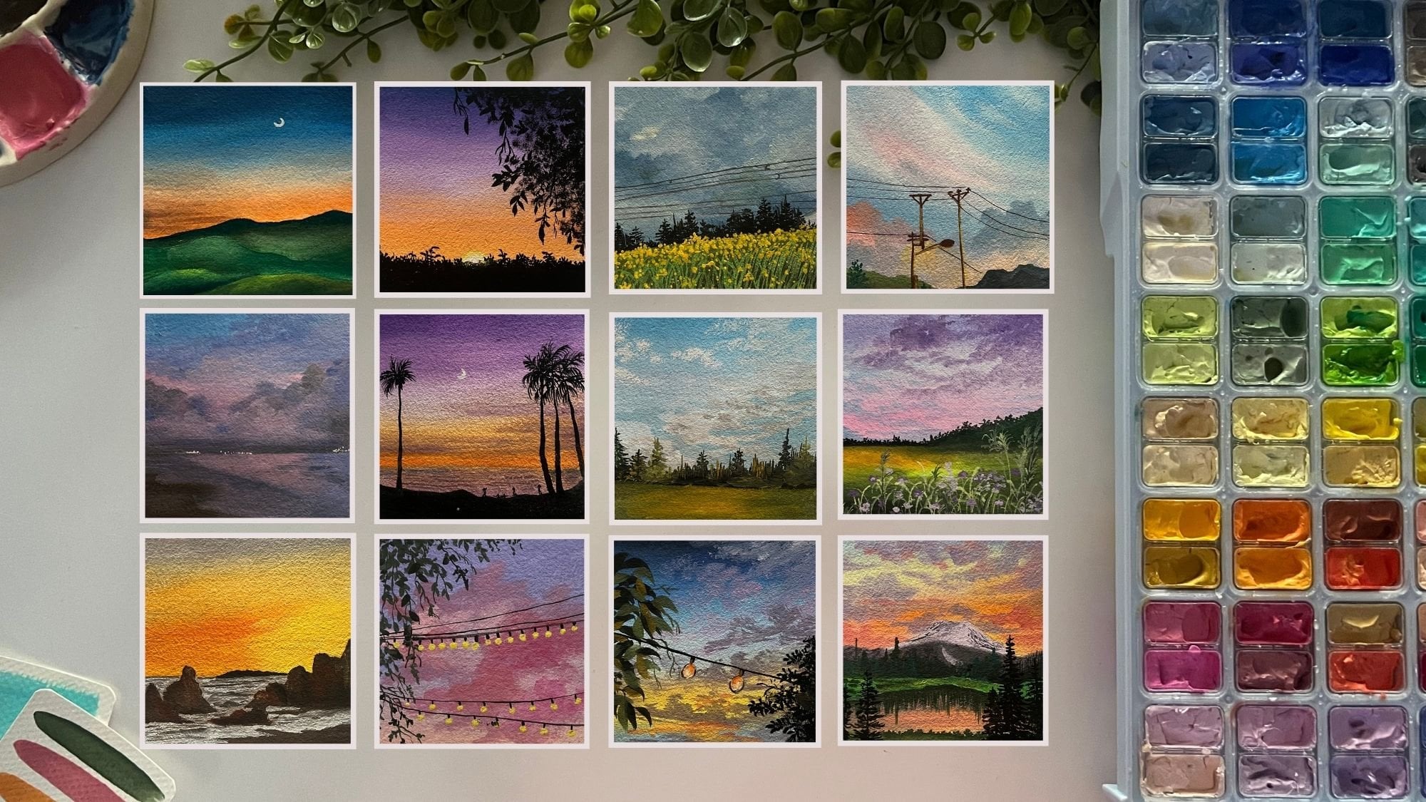
Transcripts
1. Welcome to the class.: Some journeys aren't about
reaching a destination. They are about
returning to yourself. There comes a point in life when we stop asking
what we want. We become busy building
carriers, running businesses, taking care of families, fulfilling responsibilities, living from one
deadline to the next. And somewhere
between all of that, the little artist in us quietly
whispers. What about me? Hi. I'm Mashi Taparia, a chartered accountant
by profession, a watercolor and
a gouache artist, a creative business
entrepreneur, an art teacher, and a mom
to your 2-year-old toddler. Welcome to my creative space, creating From the Heart. If you want to know more about my art and craft creations, as well as customized
handmade gifting, then you can follow me on Instagram under the handle
creating from the heart, where I share all of my
miniature creations, along with easy art
tutorials to follow along. I don't believe that
art is meant only for professionals or for people
who carry the title artist. I believe art belongs to
everyone who chooses to pause to anyone who can
spare 15 quiet minutes. To anyone who has ever
looked on a blank sheet of paper and wondered if they could create
something beautiful. Because watercolor has a way of teaching us what
life often forgets. It reminds us that not
everything has to be perfect, that colors don't compete, they planed, that the
most beautiful moments are often the ones
we never planned. And perhaps that's why I have always loved
painting landscapes. They aren't just mountains, skies, forests, or
dreamy sunsets. They are little
places we build for ourselves, a quiet escape, a peaceful corner of the heart, a home we can return to whenever the world
feels too loud. This class isn't about
finishing 20 paintings. It's about giving yourself
20 moments of stillness, 20 chances to breathe, 20 reminders that even in
the busiest seasons of life, you deserve something that's created simply for
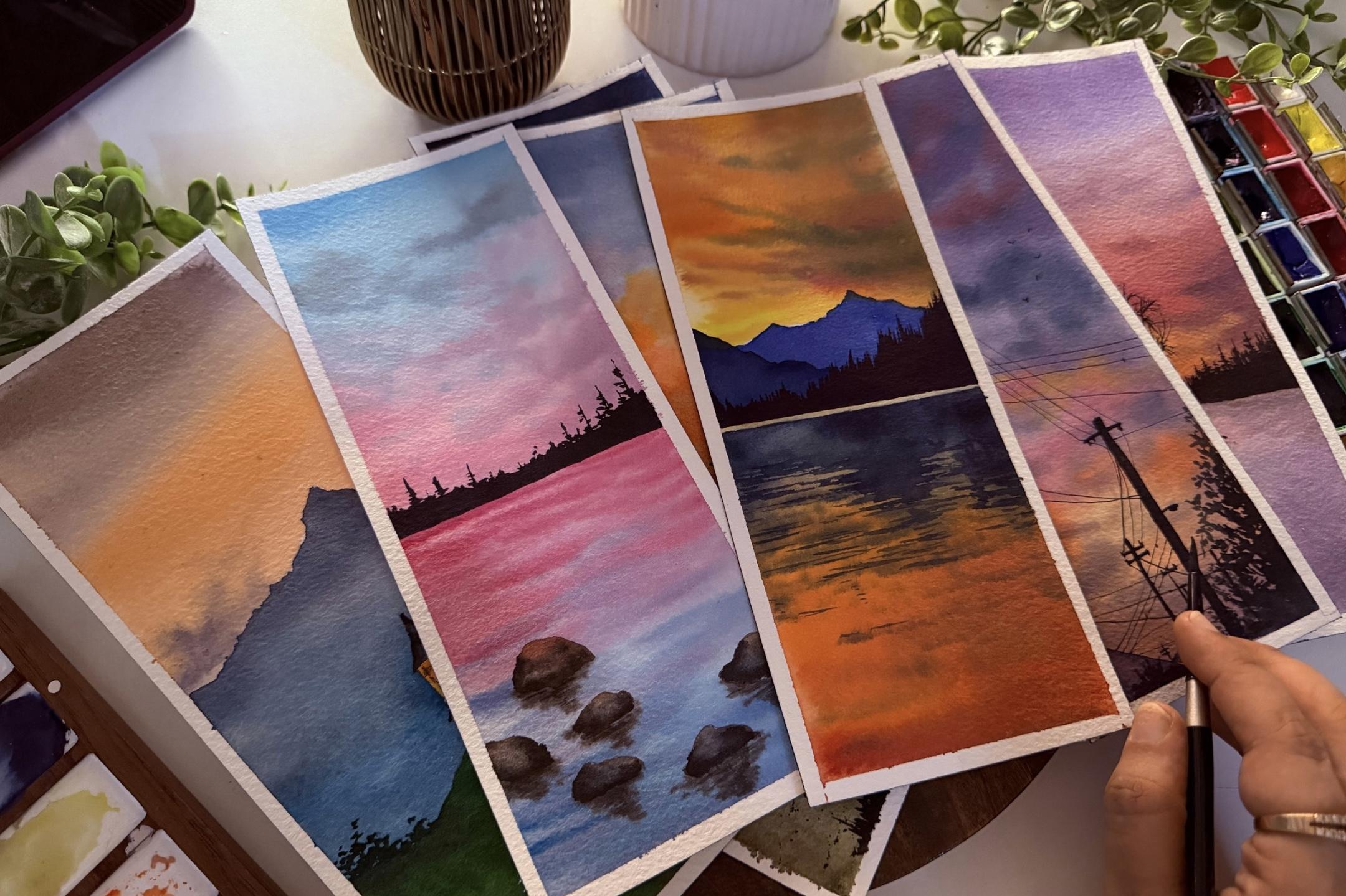
the joy of creating. Over the next 20 days, I will guide you through 20 dreamy watercolor
landscapes one day at a time. Whether you've never held a paint brush or you're
rediscovering a hobby, I'll be right there with
you through every lesson. So find your favorite corner, pour yourself a warm
cup of coffee or tea, and let the world wait
just a little longer. Because for the
next few moments, this little world
of colors entirely belongs only to
you. And who knows? Maybe the masterpiece we
create won't just be on paper. Maybe, little by little, we'll paint a softer, calmer and more colorful
version of ourselves. With that, I'll see you
in the first lesson. Oh
2. Material Guide: So now, before we dive
into the first lesson, let me give you a
quick material guide that you would be needing in. First and the foremost
watercolor paper. I'm using this Archies
rough crane 100% cotton, 300 GSM, what colour paper. This is of size ten
centimeter by 25 centimeter. It's a little bigger than the bookmark size
that usually is. And we'll be painting on
these through the 20 days. You can choose whatever size
of the paper you wish to. You need not stick to the
size that I am choosing in. I would just recommend using in 100% cotton paper and a
minimum of 270 to 300 GSM, so that you can
work wet on wet and create in all of your
beautiful paintings coming in. Up next is a set of
watercolor palette. I'm using this from the
brand white Knights. Now, again, you don't really
need all of these colors. You can just begin in with a
very basic 12 color palette, and we can create in our
own color mixes on the go. As in for many of the projects, I'll be showing you
the color mixes to create your own pistil colors or any darker
lighter shade how you can from
your basic palette. In case if you're using in
colors from tubes or pants, you would be needing
in a mixing palette. I'm using this wooden
palette out here. Alright so that I get enough mixing space to
mix up all of my colors. You can use any palette
that you have a plastic, ceramic palette or a basic
plate also works for it. So this is about the paints, colors, paper that
we've spoken so far. Next up, you would be needing
in a set of few brushes. I will be using this silver
brush, black velvet series. These are natural hair brushes. These hold a lot of water. You can use synthetic
hair brushes as well, which are suitable
for watercolors. You would be needing
one flat brush for giving in the flat washes, and you would be needing
some round brushes and detailer brushes. I would recommend a size eight, four and two in round, a detailer brush,
and a flat brush, and these should do
your job well enough. Make sure you at least have
one brush in your, um, collection that has a
good pointed tip for you to add in all of the
details swiftly and easily. Next up, you would be ing in some basic stationary
like a pencil, some technical pens, which
are waterproof so that we can add in some fine details using this directly
into our painting. Next, you would be needing in
a masking tape to tape down those edges and have those clean white tape
feel moments coming in. You can use any masking tape. I'll be using in this white one. And you would be kneading
in two jars of clean water, one to clean your brushes, and one to always lift
up fresh water on the go so that you do not
have any muddy colors forming in at any moment. Lastly, you would be kneading in a rough cloth or a tissue, whatever you wish to use
to clean your brushes, remove the excess
paints, and, you know, just get those dry brush
textures right by dapping off the excess water and
pigments on your brush as well. So that's about the
materials that you need a basic watercolor palette, few brushes and a watercolor
paper to begin with. Rest everything can be, you know, adjusted like
a painting palette. You can choose a
plate for the pens. You can avoid the pens. If you do not have
waterproof pens, we can directly use
the black color and brush for the fine details. So everything else
is very basic. Go ahead, grab your materials, get them all ready, set up your corner so that
for the next 20 days, you give yourself the
15 minutes that you deserve to bring colors
to a blank canvas. And I will meet you into
the next lesson now. One more thing in case if you are absolutely new
to watercolors and if you want some
very basic to, you know,
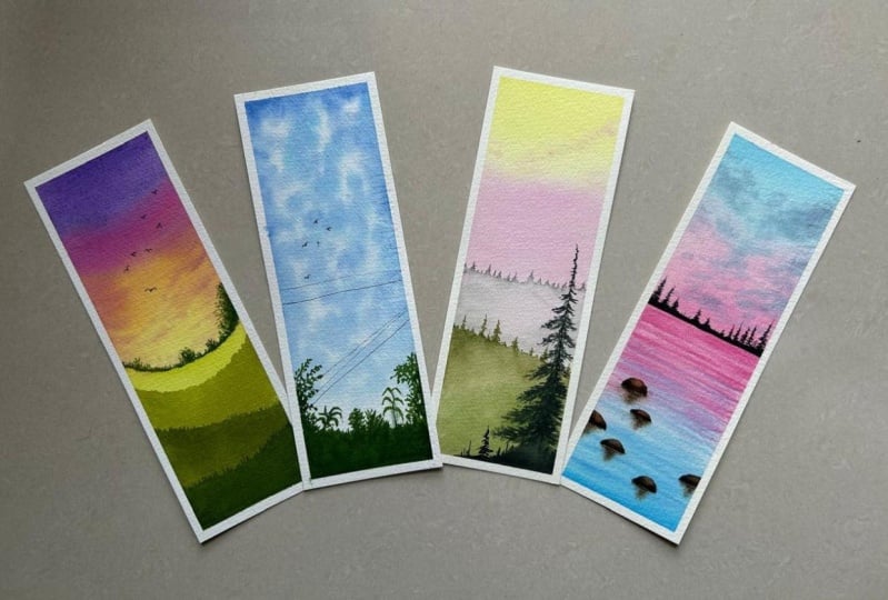
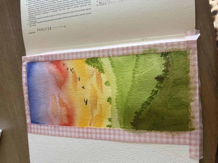
3. Day 1 - Green Meadows : So I have my paper taped down, and we are going to begin
in with our first painting, beginning in with
a layer of water. Just go ahead with a clean layer of water
onto the entire paper. I am using a rough green paper, so you will see beautiful
texture and greens. Even a cold pressed
paper has enough green to get out the
beauty of watercolors. A hot press paper
on the other hand, will not have greens
and will not given that texture effect that a rough green and cold
press paper has in. Beginning in with the
colors into the sky, I will first begin in
with the violet color. So I'm just picking up the
clear violet at the top. Moving to which I will
shift into a shade of pink. You can use carmine, scarlet, quinacin rose, pink, whichever color is
available in your palette. Next, I'm going to shift
into a yellow color. I will be using the
permanent yellow deep with a little hint of
the naples yellow. One of my favorite yellows
to use is the naples yellow. In between, I'm just going ahead with a little hint of
the orange as well. Now, I will just shift
into a smaller size brush, pick up some pink out
here onto my palette, and we're just
going to go ahead, add in simple cloud
details over the orange, covering it up majorly
with the pinks again, just letting little yellow
orangish highlights be there. And over the yellow,
I will just pick up a yellow orange hint and just give in
little lighter values, giving in that beautiful
sunset effect that we need in. At the top, just going
to go ahead with the violet and give it a layer so that it
dries out good and bold, picking up pink, blending it in Just a little values
of the pink more. Over the yellow, little very small dusky pink
clouds that you can add in. Alright. Now we'll
wait for this to dry, then move on to the layers
of the field step by step. Field, beginning in with
a very light green color, you can choose to go ahead
and mix in yellow to your basic green if you do not have multiple
tones of greens. You can always form
lighter greens with the help of yellows and whites and darker greens with the help of indigo, blue, brown. And if you directly
have darker greens, you can use that as well. For the field, just
pigging in with a layer of light
green into the field. At the top, I've given a
good diluted, you know, opaque value and
towards the bottom, I'm just diluting up this color. Now, just creating a very rough, even uneven natural looking effect to the field
out here at the top. Now, we'll have to
wait for this to dry before we move to the next
layer of the field again. Now the first layer
has dried up. Now we move on to a
little darker green. You can keep on using
different greens to create good variations
into the field as well. I'm using up an olive
green color now and just going to go in with the next layer
into the field, just marking out the
same way as we went for the first layer and filling up the bottom space with this layer and a
diluted layer instead. I am taking help off a
hair dryer to speed up the drying process because at most of the
places in India now, it's a good rainy weather, and that makes the drying
process a little slow and, you know, so I just take
help of a hair dryer. You can let it dry
naturally if you wish to. So towards the top here, I've given in little, you know, uneven
space and top here. All right. Now again, I'll
wait for this layer to dry. Now for the next layer, we are going to further use
up darker green values. You can use one base
color and create darker values with the help
of maybe indigos blue, black, pains gray or use in different
greens, as I told you. I am just using the
same green with a little mix of the pains
gray now to create in one tone darker value and moving on to the third
layer of the field. And same way just
going to fill it up. And create up a gradient
towards the base. Onto this layer top as well, I will just go ahead add in a little variations to the
trees tree like effect, just adding small spiky
strokes at the top, you see. All right. Now, by the time
these are trying out, we can go ahead, add in some more details
that we have to. So picking up a
dark green value, I'm just going to go ahead, add in some tiny bush
detail out here. So I'm just using
the tip of my brush first and giving in
some simple details, and towards the base here,
I will just fill it. You can use a smaller
size brush if you wish to and give in these leaf
like structures first, and then go ahead, fill in the space or fill the space first and then
use a smaller size brush. So now I will just shift into a smaller size brush to give
in some detailed leaves. Now, towards the left side, I'm just going to be adding
in some small bush details. All right? Just connecting
in with very fine lines. In between just going to add a very fine pine tree to just give a little break to all of the bush
that we are adding in. All right. Now let's move on to the last layer when
this dries out. Until then, I will just pick
up the paints gray, black, whichever color you
have, and we're just going to add
in some fine birds. You can use a technical
pen for doing so in case if you do not want
to use the black color. But in case if you're
using a technical pen, just make sure that
it's a waterproof one. Otherwise, it may
create unevenness and smudge out when you have to overdo anything
or if by any chance, you have to correct any spots. So a few birds that
we've added into the sky and just the last
layer to add in now. Now finally, for the last
layer into the field, just going ahead with a
very dark green value. And we are going to
just go ahead and create in the last layer. Fill this up completely
with a good bold value. And to the top of this as well, just going to use in
the tip and create in simple spikes to act in
as some far off trees. Wearing the lens, you see, somewhere taller,
somewhere shorter. Now, for these details, you don't always need to keep on shifting to a
smaller size brush. Just try using a
brush that always has a pointed tip so that it can
make your process easier, simpler, faster without multiple times altering
between tools. And that is it. We
are ready with hard phos painting into
this challenge. So let's peel off
the masking tape carefully and see
the final painting. You see the tape
has a lot of paint, so always peel it off
against the paper so that the paints do not come back onto your painting again. Because of the hair dryer, the glue of this tape
had loose enough, so it was easier for me
to peel them off quickly. See, you see here, the
mestis turned out because this layer was wet and
the tape had pigment, which just spread out here. I will just clean it up quickly. So here's a final look
at our painting from day one of this
painting challenge, wherein we'll be painting beautiful watercolor
bookmarks in just under ten to 15 minutes. I hope you guys enjoy
painting this with me today. I will see you guys into
the next painting soon.
4. Day 2 - The Blue Heaven: Hello, everyone. Welcome back to the next painting
of this challenge. And for today's class project, we are going to go ahead with
yet another easy landscape. It's going to be
under 15 minutes with very minimal details to add in and create in depth
into your landscapes. It's going to be easy for every one of you
to follow along. If you're just picking up
watercolors for the first time, this is the right, easy tutorial for you to
just begin with. Alright, so just going ahead
with a good layer of water throughout now for the colors, we're going to go ahead with
blue color into our sky. So I'm picking up the blue
from my palette here. You can go ahead with any blue, say Cerlean blue, sky
blue, peacock blue, turquoise blue,
ultramarine, cobalt blue, whichever blues you
wish to work with. I'm walking up with a
mix of the blue color, and we're just
going to create in some rough, random
cloud details. I have mixed in a little bit of the turquoise along
with the cobalt blue. And I'm intentionally leaving in some white caps into
the sky and just going ahead with building
in a very easy simple sky. You can see how rough and
random my strokes are. White gaps are intentional to
keep the glue into the sky. I will just pick
up a little water, drop in at spots to
create some more blooms. Make sure for such projects, you keep a rough cloth handy. And now we're just
going to go ahead, darken up some values. So just going to use the same
color tones and just add in a little more layers maintaining the whites
intentionally again, so as to let that cloud effect come in naturally Now, to this, I will just
pick up some drop of water and drop in to create some bloom that spots to act in as some
more cloud details. All right, so not much. Drop in and spread it across. That will create a white
space between the sky again. I'm just going to pick up some more of the darker
hints of the blues, add in some more darker values before we let this to dry out. You see every darker
value that I pick up goes less on paper as compared to
the previous lighter value. Only then will you
be able to get in multiple tonal variations into your sky getting in those
different cloud effects. And you see how natural
the sky looks with those white caps that
we've left in, right? If you want, you can, of course, go ahead at certain more spots, create in some more white spaces with the help of some blooms, giving in some more cloud depth. That is it. We'll
wait for this to dry completely,
then move further. So now my sky has dried
out and we are going to go ahead and add
in the silhouette, beginning in with the green. Feel free to use the greens
that are available with you, sap green, olive green, hookers green, dark green, light green by whatever name it is using a medium
to dark tone of the green color
and just going to add in simple bush detail here. So just beginning to dab dab and creating some bush
detail at the top. You can take help of a spoiled round brush
for doing the same. I'm just going ahead
with my round brush, which I will be using ahead. So just picking up some more green and now filling up
this space at the bottom. Again, with the darker greens, just begin tabbing in for the second layer to
create more effect. Now, for the further details, let's switch on to a
smaller size brush. And picking up the same greens, we'll just begin adding in some detailed leaves at the top. You know, create a random bunch of leaves closer to each other. I'm just using in
the tip of my brush, adding in simple leaf
shapes, as you can see. This just adds in
a layer of depth. It's a very simple technique
to add in more detail. You see, simple leaves
that we're adding in. I'm just going to add
in blend at the paste again so that the leaves look well blended into the
paste that we've added. Now, from in between
these, if you want, you can still pull out
some more detailed leaves, which is what I'm
going to be towing. So using a fine tip brush, just pull out some natural
looking bunch of leaves. Not too much. Just a
few here and there. Just on the go blend it into the base again
wherever needed. Adding a small bud
structure here, trying to show a
blooming flower effect. Now, next, using the green, going to be adding in a little more detail
onto this side. Just simple one stroke
leaves that I'm pulling out closer to each
other, creating in a bunch. Now, for this, if you are
an advanced level artist or an intermediate level and you want to level
up your painting, what you can do is
you can go ahead and work with multiple layers of
greens into your painting. So beginning in with
a lighter green, then adding in some
shadow effect with the darker greens and
moving on to a third layer. So that is how you can go ahead, build in more if you
want to, you know, increase your painting
time, add in more details, and level up your
skills as well. But to keep it bigno friendly and simple under
ten to 15 minutes, I'm just going ahead
with one color, adding in a good bunch over
to the left side here. Now, next, I'm going
to go ahead and use in a waterproof pen. You can use any technical pen
that is available with you. Just make sure that
it's waterproof and just add in
some line effects. I'm using a pen
which is waterproof. It's very important that you make sure that your
pen is waterproof. Along with this, I will go
ahead with a 0.5 nib as well, adding in some more
thicker lines in between. You see how the fine
lines really act in as a very in depth detail. You can use 0.5,
0.8, zero point, you know, a few lines
with one MM as well, creating in the
darkness and the depth. All right. So just
a few lines that we've added into a ski. And now, lastly, just go ahead with the black or
the pains gray color. And we'll just add in
two to three birds here. All right. Onto one
spot that I've added. Now, one thing that I
will just go ahead with, which will take me just like
a minute or so or more. So I will just mix in
little hint of the black into my green and creating
in a darker green value, I will just add in little
depth into the paste here, giving in that shadow
effect at the base. Now to blend this in
into the top layer, I will again just use this lighter green and go
ahead and blend it all in. We could have actually done
this while our base was wet. I just missed that, and
right now looking at it, I just felt a little need of adding in some darker values, and that's why I just thought of going ahead, adding in this. So now what I'm doing is with the black color mixed in with
a little hint of the green, I'm just adding in some
darker leaves, as I told you, the ones who want to level up their skill and wanted
to add in more depth. You could first go with
her very light layer, then one layer darker green, and then this darkest layer. And for the ones
we just pinning, you see just a small depth
of the second layer at spots adds in so much more
character to your painting, gives in more depth. Alright, so that is
it. We are ready with our second painting into
this series as well, creating in easy pigno
friendly watercolor landscapes in under ten to 15 minutes. It just took us a
simple ten minute now let's peel off
the masking tape. Make sure you peel it
off against the paper. Be careful if your
green is wet like mine. So you see if the taping
is not stiff enough, the colors may peel off, so I need to from the
next painting, you know, run it strong enough so that
this does not happen again. But nonetheless, here's
our second painting from this beautiful class wherein we are creating big no friendly bookmark paintings in under ten to 15 minutes. I hope you guys enjoyed
painting this with me today. I will see you guys
into the next painting. Thank you so much for joining in and painting along with me.
5. Day 3 - Misty Field: Hello, everyone. Welcome back to the next painting of this
bookmark painting challenge. Win are creating
landscape paintings in under ten to 15 minutes, giving you a full
landscape tutorial. Easy to follow along for every
bigner for this painting, I'm going ahead
with her layer of photo onto my entire sheet. Again, very minimal pencil
sketches that I use. So no pencil sketch
for this one as well, going ahead naturally,
a layer of water. Into the sky, we begin
with a layer of yellow. You can choose any medium tone of yellow that you wish to. I'm going ahead with
this medium yellow. I'm just going to dilute
it moving downwards. So you see, as I just keep moving towards
the bottom space, I'm just diluting that color. Up next, I'm going to
be using in the pink. So just picking up a little
bit of the carmine color, very light hint is
what we need just below the yellow till
the horizon line space. So almost half of the space
is going to be a sky, a little more than
half, actually. And now as I'm moving downwards, I'm just giving in a
wash kind of a layer. Now, we'll move on to a
smaller size brush and just give it a little
character to aski. I will just use this yellowish orange color that is already on my palette with
the hint of the pink. And we'll just add in a little bit of
the cloud details over the yellow orange spaces. You see we've gone ahead
with a very light wash kind of layer for our sky and
very light muted tones. You do not need a lot of
darkness into your sky. We really want it to
look like a misty sky, picking up the pink, adding in little cloud
strokes, very simple ones, and then we'll wait
for this to dry and our main element is going to be a misty range of pine tree, feel and some pine
trees into our sky. Just going to pick
up very light pink again and just using
the tip of my brush, going to keep on adding
in a few cloud strokes, moving towards the top space, Water control is very important when you go
ahead with these layers. If you will have excess water, it will start spreading
across the entire space and will not retain the shape and the space
in which you add them. So you see we've
just gone ahead with very minimal cloud
details, not much, easy simple strokes
from the edges to give little flow into
a sky that is it. We'll wait for this to
dry, then move further. So now my sky is dried out and we move ahead to the
next layer of details. For that, you either pick up the pain spray or
the black color, whichever is available
in your palette and pick it up in a
diluted consistency. You do not need a
very dark tone. Next, we'll begin creating in
a layer of the pine trees. So I will first just
give a rough outline. Now, on top of these, using in this
smaller size brush, I will just give in some
very easy small pine trees. You see, just
moving criss cross, creating in these pine trees. And as we move, I
will just go ahead, add in a layer of water so that this color begins seeping
into the base as well, creating in that mist. Just at the bottom space, add in this layer of water. And we'll just go ahead with a few more of
these pine trees. You see how beautifully
the color just seeps into the base color waterlo
that we've added, creating in that misty effect? See, in between, I'm just adding in some very loose
strokes again. You can also see we've used a very light diluted
transparent layer of this paints gray color
because we'll be adding in some bold trees at the end for which we'll be using
in the bold color. Now, we're just going to pick up this color and just going to add in a little creating in the mist for the first layer. Blending it well into the
pine trees wherever needed. You see somewhere just giving in some darker highlights
using in the tip and the colour just bleeds and flows into the bottom
space naturally. At the base, leaving in some
missed space in between, just going with another layer. Now again, we'll have to wait
for this layer to dry out, then move on to the next layer. Now this layer has also dried out and we move on
to the next layer. For the next layer again, I will just begin with
a layer of water. This time I'm moving towards the bottom space from the top left towards
the bottom right, and we are going to go
ahead with another layer of a similar looking range with the tones of
greens this time. So I will begin in
with the green first, and we'll just begin adding in simple pine trees here
as well with the green. And you see as soon as it touches the water
layer at the bottom, the color begins to disperse, creating in that beautiful
natural misty effect. Just going to go with some
random strokes in between, some detail looking pine trees. Just go ahead, fill
in the entire range. You can leave gaps
in between and just use in some simple strokes. Now, in the base layer, I'm just going to be
picking up the green in a good bold darker value and fill the bottom
space with the green. To darken up, you can take
help of black, dark green, pains gray, indigo, whichever
colors you wish to. After this, we'll just be
left with the last layer of pine trees which
will add in the depth. I'm just darkening
up these values. Now, to create little
misty effect into this, I will just pick
up a drop of water and drop it at random
spots between the green. It will just create in that natural effect
into the field. If you feel the need, you
can drop in more water. Make sure it's not
too watery also. Otherwise, it will just
disperse onto the entire space, and it's not too, you know, less also such that it does not show
the dispersion at all. Just adding in some more
darker hints because remember, watercolors dry or tone lighter. And with that, I
will just splatter some water into the base
layer here like this. Alright, now we wait for this
layer to dry completely, then move to the last detail. So now the last layer here has dried out and we move on to the final layer of our huge pine tree on
the bottom right side. For that, picking up the paints gray or the black color,
whichever you have. And we'll be picking in with a huge pine tree on this side. Towards the base here, I will just create
a rocky space. And now we just add in very simple detail
to this pine tree. You can choose the kind of foliage that you want
to go ahead with, not necessarily to go ahead with the kind
that I go ahead with. You can just use very
limited details. You can go with a
very detailed one, absolutely your choice, how you wish to go ahead with I'm just adding
in the foliage. As I move towards
the bottom space, I will just add some
bigger foliage detail. You see very raw,
natural, uneven. Again, in between
some very limited. You just need to strike
a balance depending on the kind of the foliage
that you choose to. If you want to go ahead
with a detailed one, you go ahead accordingly. If you want to go
with a sparse one, you choose your
layout accordingly. If you want to go ahead with a completely
filled up pine tree, then your flow will
be according to that. So like here at the top, I've given that delicate
look and towards the bottom, I'm giving in huge
bold foliage detail, which are very quick
and easy to fill in. Now, from this, just pull
out some fine strokes. And you see the triangular shape that I've tried to get in, given some detailed
looking strokes to these, and you will see how naturally it all begins to make
sense altogether. Some darker depth.
You see the one tree together here bringing so much more character
to your painting. I will just go ahead with
another small one here. You see I'm just moving
Cris cross using the tip of my brush to create
in the foliage detail. You don't need any, you know, stroke learning or any specific method to add
these criss cross. All you need to do
is make sure to maintain the triangular
look into the pine tree. So you see the triangle
that gets formed, just a very small fine one, and then going slow,
slow slow down. Some foliage adding in here
to balance it all out. Now, using in this black, I will just add some
very little splatters at the base into the
field here. All right. Very little random ones. And lastly, just going to pick up the black color in
a bold consistency. Adding in a few birds. Oh All right. Just some details. And that is it. So let's
peel off the masking tape. Make sure you begin peeling off the masking tape
against the paper. This time, I had pressed my
masking tape more firmly and the bleeds are quite less as compared to the previous
painting, probably. But at certain spots where I've walked in with
extra water layer, the bleed is still happening in. It's okay. We can
fix that up with a white waterproof ink
or whitewash or hell. Nonetheless, I
absolutely love how the painting has turned out and how beautiful the outcome looks. Very simple easy landscape in under 15 minutes to create and frame it for yourself
or gift it to someone. You can choose the size
according to your liking, not necessarily to go with the same size
that I'm working on. Nonetheless, I hope you guys enjoyed painting
this with me today. I will see you guys into
the next painting tomorrow.
6. Day 4 - The Sea Shore: Hello, everyone. Welcome
back to the next painting. And for today's painting, we're going to go
ahead and paint easy, beautiful seaside sunset. I've marked out
the horizon line. Up next, into the water space, we're just going to mark out a few rocks that
we'll be adding in. You can choose the placement of the rocks according to you, need not be the shape or
the placement as mine. You're free to explore and use your own weird
shapes for these rocks. You see, I'm just
adding them very, um, roughly and just keeping
them loose and playful. All right. So that is about
the rocks that we've added. You can add like six
to seven of them. And up next, we have the sky. And then on the horizon line, we'll just add in little
details later on. For the sky, I'm going
to be going ahead with a simple easy sky
for which I will be using a wash of the
blue and the pink tones, and the sea is going
to be a reflection of the same colors of the
blue and the, you know, blue color and the pink color
tones and into the rocks, we'll be going ahead
with the brown tones. So I've just removed
up the brushes. I will be going ahead with a flat brush to first go ahead, add in a layer of
water into the sky. So first, just going
ahead with the sky only. So make sure you give
a good even layer. Now to go ahead with the
details into the sky. Pick up a blue of your
choice, a Syrian blue, sky blue, or cobalt blue, whichever blue you
wish to go ahead with. And just begin in with a simple half area of the sky
covered in with the blue. Next, I will be moving
on to the tone of pink. I will just go ahead, use the pink from my palette. You can go ahead, use light
tone of pink, carmine, permanent rose, scarlet, whichever pink is
available in your palette. Alright? So we've
just gone ahead, added in a simple
wash into a sky. And while adding
in the sky itself, you see we've created little
strokes to the clouds. Now next, I'm just
going to be picking up a little bit of
the indigo color. I'll just clean up my brush. It seems it just has
some green picked up. So I will just pick
up some fresh indigo, and we're just going to add in a few small cloud at the top, using in the indigo color, some very tiny clouds
randomly here and there. Nine case, if you do not have an indigo color,
choose to go ahead, mix in a little bit of the
paints gray to your blue and create in a medium to dark grayish tone
of blue like this. And we're just going to give in little cloud
details with this. You see, I'm just
using in the tip of my brush and adding in this. I'll just pick up a little more, add in a few clouds over to the pink as well,
hovering randomly. There's no fixed placement
for these clouds either. You can just go ahead with your random placements
that you wish to. All right, so just a few here
and there that we've added. Now moving to the pink again. Just some darker values. Either side that you can choose, not necessarily to again choose the same placements
for the clouds as well. Feel free to experiment
and, you know, given your own
placements and see that you need to
have water control while working wet on wet. That is for our simple sky. I took us around four to 5
minutes and our sky is ready. Let's wait for the sky
to dry completely, then move on to the details
into the water body. So now our sky is
completely dried and I'm going to begin
with the water space. Before we begin, I will
just guide you with a basic way how we are
going to go ahead with. So we'll paint the base lear
into the sea and wet on wet, we'll be adding in
the waves quickly. And after that dries out, we'll be adding in the
details into the rock colors. So on the rock spaces, if you want, you can
use a masking fluid. But since our colors that we're using into the sea is light, I'll just let the
colors go in because the rock is going to be of
dark browns and blacks. So I will just try
to keep the colors over the rock spaces very
light or lift them up quickly. One more thing wet on wet
only we'll be adding in the reflection to these rocks while our base of
the sea is wet. So we'll just go
ahead and paint in the base layer waves and
the shadow to these rocks. Then this dries out and we
add in the rock details. So let's go ahead, begin with a layer of water into
the water space. Make sure that your sky is
completely dry, otherwise, the colors may seep into each other and ruin up
your horizon line. So I'm just going ahead with
a good layer into the sea. Now for the reflection, first, we'll be beginning in with
the pink color that we used in closer to
the horizon line. And at the bottom space, we'll be going ahead
with the blue color. Whichever blue you may
have used into your sky, just go ahead with
the same blue at the bottom space and just
creating in a smooth blend. So first, you see I've gone
ahead with very light tones. Now I will pick up the color and begin adding in
some wave details. So while it is wet, just use in a smaller size brush or the tip of your brush
and just go ahead, begin creating in some details. I'm going very slowly closer to the horizon line
because any which ways, I'll be giving some details of pushes on the horizon line. So all of these will
get covered up. You see, just some very
fine lines to act in as the water flow into the
sea that we are painting. I'm using in the
tip of my brush. Now moving into the blue color. Let's begin adding
in some waves. Take some blue waves over
to the pink as well so that the transition looks smooth
and, you know, realistic. And similarly, you
can take a little of the pink tones into
the blue as well. So as I'm moving towards
the bottom space, you see my waves are more thicker as compared to the
ones towards the top side. Now I will go further
one tone darker. So I've just picked up a little more darker
blue, same color, but just in a little
thicker consistency to increase the opacity and the variation to the pins and going ahead with
few more strokes. All right. Now, same way, I will just go ahead
with the pink again. Just adding in some darker waves with the pink, wet on wet. Make sure that your
sea is wet, otherwise, wait for it to dry completely, and you can go with
some wet on dry waves. So that is for the
waves that I've added. Now while this is wet, I told you we'll be adding in the reflection or the
shadows to the stones. So for that, you can either
pick up brown or black, but you need to really have water control while doing
this because sea is wet. So you need to pick up the paint with very minimal or no water. And just under the
spaces of the rocks, go ahead, create a
shadow effect to these. I'm just picking up the color in a little darker consistency. See? Just some fine lines across the bottom edge of the rocks
to create in the shadows. So towards the baseline, I begin with the
line of the rock, and then as I move downwards, I just shorten up the length. If you want, you can add
these reflections as a wet on dry after
everything dries out, but I will just let the shadows
be soft and well blended. You see how I'm tapering
down the shadows. Again, you see my sea is wet and wet on wet
since I've added this and I've used very limited water
into this black color. The shadows have
retained the space, yet have a soft
edge to the edges, and they've retained the shape
in which I've added them. Now, we'll wait for all of
this to dry and then we'll move on to the final
details into this painting. So now our first layer into
the sea is also tried out. Let's begin in with the bon sienna color into
the rocks first. So go ahead with a medium
tone of the bon sienna. You can use bon sienna or
any light brown brown red, whichever color is
available in your palette. Mark the outline to your
rocks that you are adding in. So the first layer is just with a simple tone of the brown. So you see to all of the rocks, I'm just giving in
a simple layer. Now to these rocks, we'll go ahead, create
in mode definition. So go ahead with
pains gray or black, whichever you wish to use. And from the edges, just begin dropping in these darker values using
in the tip of your brush, such that at the tip, the brown is still visible. You see how slowly I'm
just dropping on the edge, using in the tip, such that the browns into the
rocks are still visible. So to each of the rocks, we've added in the second layer with the help of a
black color for now. Now we'll wait for
this much to dry out and then move with the
next layer into the rock. Till then, let's add in the details onto
the horizon line. So you either pick up a black or a brown
color of your choice. I'm going ahead with black. And onto the horizon line, we'll just go ahead
with some fine details. So make sure you do not rest your hand over the wet spaces, and we'll just go
ahead and build in a simple space
first like this. Just going carefully,
defining in the horizon line. Alright, now onto top of this, I'll just go ahead, add in a few pin trees
at random sports. You see, I'm using a brush
which is able to give me such fine lines by
just using in the tip. So always try using a brush
which can have a pointed tip, which can help you
actually add in fine details on the
go without being, you know, needed to
alter between brushes. So this entire painting,
if you may have noticed, I've just gone ahead with this one brush to give in
except for the flat brush that I used for adding in the wash so that the wash
layer can be done quickly. So just some simple pine trees towards the right
side that I've added, and now just some in between. You see how fine and small I've kept them
without trying to add in a lot of details and just simple
foliage criss cross. And now in between, just giving in some random
bush using in the tip. All right. Now, just one thing. You see, when your
paper is movable, you can just get a
perfect hold onto your hand and create
in the details. So it was easy for me to
just rotate according to my hand grip so that I do not
lay over the rock spaces. Now, we are just left to add in the final details into the rock. So now into the rock spaces, just going to go ahead with the black color and going to
drop in more darker values. Define the outline better. So my rocks are semi dry, so they will automatically have some rough patches when
this black dries out. And because of the softness
wherever there is, it will automatically spread and given that color gradiation. If you want, you could add in some dry brush
texture instead of dropping in this black hints
whichever way you choose to. Now, wherever I want
little softness, just using a damp brush and blending it towards
the outside edge. Lightning up wherever the color I feel is spreading in too much to create in the
highlighting spot onto the rocks. Now you see our rock
look so lively. Now the last thing to add in is a little more reflection
or the shadow. So just using in the black
color and my fine brush, I'm going to be adding in some fine lines over the shadow that we've
already created. So some wet on dry shadow
effect, basically. But you see these lines are very fine and less as compared to the previous shadows that
we already added wet on wet. All right. And that is it. We are ready with our painting. So come, let's peel
off the masking tape, see our final painting. Make sure you begin the
peeling against the paper, and once your edges are
completely dried out, I love how simple
this class project is yet so many details
that we've added, bringing the entire
painting to life. So that is it. Yours
our final painting for today's class project. A very simple seascape with some rock details
that we've added in. I hope you guys enjoyed
painting this with me today. I will see you guys into
the next painting tomorrow. Thank you so much
for joining in, painting along and exploring your new love
that's watercolors.
7. Day 5 - The Orange Clouds: Hello, everyone. Welcome back to the next painting and
Feres Class Project. I'm going to be using
in a combination of the Idothrne blue
along with orange. You can choose to go ahead with whichever medium to dark
tone of blue available. You can choose to go ahead
with a Prussian blue color, a light indigo
tone, if you want, or a little bit of a bright blue or a Ceran blue mixed
in with indigo, any medium to dark tone of
a sky color, basically. And we'll be using in orange and a little
bit of the burn Siena. In case if you do not
have a born Siena, you can choose the brown, red color, red brown, any medium tone of
brown that you wish to. So that's the colors
that we'll be using in. So let's begin in with our
entire paper as the sky. So we'll just go ahead
with a wash of the water. Go ahead with a good even
layer of water throughout. Make sure your edges
are taped down perfectly so that water
does not seep through. There you go, we've
almost got a good layer. Now we are going to go
ahead with the colors. So first, I will pick up the Inoterrine blue and we'll
just begin in at the top. Almost approximately 40% of the paper that I will be
covering up with this blue. Next up, I'm going to go
ahead with the orange color. You can choose any
bright orange vermeilon mixed in with yellow if you do not have this bright
orange color, beginning from the base. Moving top, I will just shift to a little brighter
orange as well. Now we need to begin
creating in cloud details. For that, we need to go very carefully over to the blue
space with the orange color. So now pick up the orange and we'll just begin very gently, keep a rough cloth or a tissue paper handy
so that you can just go ahead and begin
creating in random cloud. Now, when orange and
blue mix together, remember, they give
a very muddy tone. So you can either lift up the blues or keep
the spaces empty, or you can choose
to go ahead with a very light patting method. Like you lay the orange
color very gently without much pressure such that the blue color is
not activated again. So just beginning to create
in cloud details now. Now for the next
layer of clouds, you use darker orange. It's all going to
be soft and soft, just some fluffy cloud effect
that I'm going ahead with. So first at the top, I used my yellowish orange
color for the cloud. As I move downwards to
darken up the value, I will move on to the brown, burn sienna, light red, brown red, or if you
want to just mix in red to your brown so that it all remains into the
warm category of the colors that we are using
for these cloud details. At the base, we'll be giving in a good range of the pine trees. So just giving in a
simple wash like this. Now moving to a further
little darker brown color to give in some darker cloud majorly towards
the base side. You see, we are just
beginning to create in a very simple fluffy
cloud painting that we're trying to do in here. Up next, I'm just going to use in a little bit of
a dark blue color. You can choose to use
indigo or you can just mix in any other darker
colors to create in some darker values to give in some dark cloud
effect at the top, and we'll just go ahead
with the blue again. And add in some darkness because you see the blue
was drying out very light, and I just wanted it to dry out a little bolder
than what it was. So while my paper was wet, I could do this
part again of just adding in a soft layer of
the blue gently again. Now we'll just pick in a little bit of a
pinkish violet color. Mixing it in with a
little hint of the brown and just going to add in very small or very muddy kind of a cloud effect
onto this side. You see a little
warm purple hint, very little with that little pink highlight
that's coming in, giving in that depth out there. So just some fluffy clouds. Now I will just pick up a
little bit of the yellow, drop it in between while
the spaces are wet to create some lighter
values at random spots. You see how in
between the browns, the yellow is giving in a little fluffy
effect to the cloud. So just pick up the color in a liquidy consistency
and drop it. It disperses and
creates in that glow. All of this I'm doing
while my spaces are wet, just dropping in some more
darker brown hints at spots to add on to
the fluffy effect. And lastly, just
some little more violet brown effect
at the top space. So I've just mixed in a
little hint of the brown. You can even use orange. I needed a little muddy grayish
effect color. All right. So that is for our
sky, pretty simple, fluffy kind of sky that
we've created with the use of the two
complimentary colors. Let's wait for this to try. Then add in the
silo head detail. So now the first layer is
completely dried and we'll go ahead with our range
of the pine trees. Choose the paints gray, black, whichever color you wish to
for adding in the pine trees. And we'll just begin adding
in some smaller ones first. So first, I'm going ahead
with one wooden log, kind of a detail, another
wooden log close to it. Now just begin adding
in some pine trees. Now for the foliage, you can just book criss cross, and you don't really
need so detailed kind of pine tree because
we are going to add in a good cluster
of them together. So it will automatically
given that depth and detail. So first, I'm just going
ahead with the smaller ones, which are just going to be filling up the
entire bottom space. And after that, I'll be
adding in two of these, which will be very big
and the detailed one. Up till then, just
let's go ahead, add them at the
bottom space here. You see, just a little
foliage to some of these. At the bottom, I'm just going
to be filling up the space. Now, just going to
take them in sync into the trees that
we are adding in. Now, in between these logs
as well, just go ahead, add in some fine looking trees. You see very fine lines
that I'm adding in and just little dots to act in as
the foliage here and there. So we're just going
to quickly like this, go ahead and add in the
entire bottom detail. And then we'll just move on to our final detailed tree
that we have to add in. Now, the first detailed tree
that I will be adding will be here on the left
side, a tall one. And now to this,
let's begin adding in some detailed looking foliage and just carefully
create in depth. Alright, so just going ahead. And as I'm moving
towards the bottom, I will just fill this space in with some darker details like this, just
tabbing it all in. Not just giving it a fine tip, some bigger foliage at sports. You see, overlapping the
previous ones that we've added. And now with our final big
tree that we have to add in. For that, I will just go ahead
with the mean stem first. So it's going to
be like huge one. All right, so you see
how huge is this. And now from this, I
will first give in some fine branches coming out. Again, by the time we
move from top to bottom, I'm just going to make sure that it has that triangular
shape coming in. So in between like this, you can give in some smaller
branches, no issues, but the overall
look has to come in like the triangular
shape that we need in. So some branches, I'm just giving them moving towards
the bottom space here. See overlapping moving
into the field here? Now, from these, we'll just
pull out some mini foliage. So at spots just given
some dabbing like this. In between, given
some smaller taps moving in from the main branch. Just some fine pullos You see how we're just adding
in very random details, creating in the depth
to the foliage. If you choose, you can go
ahead with more details, much smaller size brush, and create in more depth. Now you're giving in some extra foliage detail
towards the bottom space, just dabbing it in overlapping Moving to the top. Now I will just pull out some branches and keep
them loose and raw. Now again, at the base, just going ahead with some overlapping trees
in the foreground again. Okay. Just random strokes
coming in from this side, making it look more realistic. So random strokes in between. Alright, so that is it. We are ready with our painting
for today's class project. So let's peel off
the masking tape. I absolutely love how
the fluffy clouds have turned out with
the complimentary colors that we've used in. I hope you guys
enjoyed painting this, peel off the masking tape, see your paintings with
those clear edges, and adore the beauty that you've created in just like 15 minutes. I hope you guys enjoy
painting this with me. I will see you guys into
the next one tomorrow. Thank you so much for joining along and exploring
what colours with me. Oh.
8. Day 6 - Winter Sunset: Hello, everyone. Welcome back to the next painting of this easy
landscape painting class. For today's class project, we're just going
to go ahead with a very simple window landscape. This is going to
be a small space, and the top will be our sky, and we'll just add a very simple tree with just the branches
without any foliage detail. So for the sky, we
are going to go ahead with beautiful tones of pink and purple and just a little highlights
of the yellow. The snow will have a reflection of the sky
that we'll be adding in. And then using in the black
or the paints gray color, we'll just add in the
silhouette details. All right. So let's
begin in with a clean layer of water
only into the sky first. I'm using rough grain paper, so you see the
texture on my paper. You can use cold pressed hot
press, whatever you like. Just that with watercolors, rough grain or cold press gives beautiful
textures after drying, and the paper texture makes
the paints dry beautifully, giving in very beautiful effect. Hence, I prefer a a rough
green or a cold press. Now, firstly, I will begin
in with the violet color. You can use bright
clear violet, purple, whatever name in your palette, beginning in with the
violet at the top. Almost half of the sky
that will cover a top. Next up, I'm going
to be using in the vermilion color and a
little bit of a bright orange. Now, just for a little
yellow highlight, I will go ahead with
the naples yellow. Naples yellow is basically a beautiful pastel yellow color. Next up, I'm going to shift
into the tone of pink. You can choose a hot
pink if you have a neon pink or an opera pink that would give an
beautiful effect. But for now, I will
just go ahead with the rose color and the carmine color that
I have in my palette. Now, let's go ahead,
blend it all in. So the pink and the purple blend together will give you
perfect tones, no shoes. Just while blending in
the pink and the yellow, make sure that you do not cover up the entire
space with the pink. We want that yellow orange
highlight to be there. So what I will do is I
will pick up a little yellow and go blending
over the pink. Just making sure
that the blending is seamless throughout
till the top. Now next, we are going
to go ahead and begin adding in wet on
wet cloud details. For that, picking up the violet. And just going to begin adding in strokes
from the right side. Now, you need to lay it
very carefully because when the violet mixes with
the orange or the yellow, it will create in that
muddy kind of a tone. And I just need a
little highlight of that kind of a tone
towards the right side. Adding in little strokes
moving in from the left. Make sure you have the water
control while adding these in or go ahead with a
smaller size brush. With this brush, I am
just using the tip of the brush and adding in these
strokes as you can see, small half sea strokes
close to each other. Water control will play a major role because if you
will not have water control, these strokes will
all spread out and cover up the entire specs. Now picking up the pink. This is too dark, so just in
a very light consistency. From the left here,
making sure I just have this little glowing highlight of the yellow and the orange space. Now again, going with
some more darker strokes on the right side
as a second layer. You see, it is
always easy to build up layers and get
more depth into your painting rather
than going ahead with one bold colour altogether. All right. That is for our sky. We wait for the sky to dry, then move to the snow space. So I have painted the snow area, and somehow the part of
this has gone missing. Let me just explain you. We just go ahead with a layer of water and just use in the tones of pink and violet and create in the darker values step by step. I will just show it
to you roughly or to the sheet how we are
going to be going ahead. You go ahead with a
layer of water first. Then you pick up a pink
color, given, like, a very light wash, and then you begin adding in darker values with
a violet color. Alright. We just begin creating in simple strokes with
the Darko values. And as we keep moving further, we are just going to darken up a purple as well
with the help of the pains gray and pull out some darker values from the
bottom like this diagonally. So that's what exactly
I've done here. And over to the horizon
line here, you see, I've just used in
a little mix of the pains gray with
the violet and created in little shadows to the details that we'll be
adding on the horizon line. So on the horizon line, we'll be having in bush and, you know, a little
pine tree detail. For that, I've just added
these little shadows. So it's a basic wash of the pink and the purple color
that I'll be doing here. Somehow this part is lost while recording
or what has happened, I'm unable to trace the video. Hence, just explain to you, it's a simple wash that I've given of the pink purple color, and some darker values
building in with the purple and the
paints gray later on. Now, once this dries
out, we'll go ahead, add in the final details of the silhouette
into our painting. So now everything is dried out. We begin in with the details
onto the horizon line first. So I will just go ahead, create in a space first and fill this up completely with the black or the pins gray
color, whichever you wish to. If you're using a
different size of paper, which is not a bookmark size or not in the shape of a bookma, you can choose these silhouettes according to the size
of your paper till how long of the length till the horizon line you
want to take it. So first, I'm going
ahead carefully, filling in and defining my
horizon line. All right. Now, just using in the tip of my brush onto the top of this, I will just begin pulling out small strokes which will begin
acting as the pine trees. You don't need to give in any kind of foliage
detail or anything, just simple strokes very
close to each other, varying the heights of these, which will make it look like
the fire off pinree effect. In between to some, if you want, just give in some criss
cross foliage detail, giving in a more
realistic effect. So we're almost through
this right space. So you see the reflection
of this a little shadow of this is what I added into
the snow space already. And onto this side, I will just take it a very
small tiny bush space. Okay. And we'll
just fill this in. At the top, just using
the tip of the brush, giving in that uneven shape. Now the last thing to
add in is going to be the tree that we
are going to add in. So first, begin in with
the main stem of the tree. At the bottom here,
you can see I'm just spreading the roots of the
tree into the snow space, trying to make it realistic. And across this, we're
just going to create in some small dry
brush texture or some rocky details to show some of the roots of the tree being
covered up with the snow. All right. For the
dry brush texture, make sure that you have
very limited paint and water and just drag
it across the paper. Now, we'll just keep pulling
out some branches first. Make sure you're using a fine tip brush so that
you can get these details. So first, just pulling
out some main branches. Now, of course, all of these placements can be
different for each one of you. It's not necessarily to be same as mine or as anyone else. Choose your own variation
if you wish to. Feel free to experiment with
the layout of your tree. Just pulling out the dry branch. Now pulling out some
thinner branches from this. Just pulling out fine
branches coming out. So first begin in with
some thicker ones. Then as you keep moving further, make them thin and
very delicate. You can shift into a zero
point like a size zero, zero, zero, triple zero or
detailer brush for this. Se overlapping onto each other. Now I will shift into
a very fine tip brush. So I'm using this liner brush. And now I'm just going to go ahead add in some
very fine strokes. I see very fine, delicate strokes coming out from these thicker strokes
that we've added in? All right, giving in
very fine details. You can choose when you wish to stop and how much detail
you wish to add in. Again, not at all
necessary to go ahead with the same kind of tree or
the same kind of details. You can choose your own
variation, as I told you. Randomly overlaying
some thinner branches. All right. Now, the
last thing to add into this painting is going
to be a white moon. So for adding in the moon, you can either use a
white elpin, white quash, or white acrylic, and I'm just going to add
a small moon here. Uh So I'm going ahead with white quash, and we'll just use a smaller
size drush, add in a fine. You can choose the placement
again as per your choice. See? And that is
it. We're ready. Let's peel off the masking tape, see our final painting. Make sure you begin peeling once your edges are completely dried and always peel it
off against the paper. So here's our final
painting a easy, beautiful winter landscape
in just 15 minutes. I hope you guys enjoyed
painting this with me today. I will see you guys
into our easy landscape tomorrow and keep uploading in your projects if you're
painting along with us. And in case if you
like this class, make sure to draw a review
so that it can reach maximum students
and they can all benefit and begin their
watercolor journey.
9. Day 7 - The Cottage House : Hello, everyone. Welcome back to the next painting of this
20 day painting challenge. For today's class project, we are going to be painting
a beautiful valley kind of view wherein not
exactly a valley, but like a field
with mountains and a small cottage core house and simple details that
we'll be giving in. So first, I've just marked out a simple outline that the top is going to be the
sky, then the mountain. Now at the base here,
just marking out a rough field area that
we'll be adding in. And then at the
top of this field, we'll be adding in
the cottage space. So now I'll quickly go ahead and sketch out the
cottage as well. So I've just gone ahead with a very simple cottage,
the main cottage, that is the tall
one, and around it, I'm just adding in
the simple, you know, three D effect to the
doors, then a background, like a backyard space or, you know, back space for this
cottage that I'm adding in. You can go ahead with any
pencil layout that you want or any reference silhouette that you want to go ahead with. We are going to paint
like a misty mountain, simple green field, beautiful sunset sky, and then showing the glow inside
this cottage house. So first, we are going to
begin with the sky now. I'm going to go
ahead with a layer of water onto the entire sky. Make sure you go ahead with
a good even layer of water. I will not let the water seep through into
the mountain space. Around the mountain outline, I'll go ahead carefully and just mark out the outline
to the mountain well. Now, for the colors
into the sky, I'm going to go ahead with yellowish orange pastel color and a muddy kind
of violet color. So I'm just going to go ahead and mix my own
colors for this. So first for the pastel around the sunset space closer
to the mountain, I'm going to pick up orange, naples yellow and white, and I'm going to
mix these colors. In case if you do not
have a lighter orange, you have a very dark orange, you can choose the
yellow accordingly. Since I had a yellowish
orange color, I've picked that up
directly to that I'm adding in the
white watercolor. You can choose to use
white quash as well. And closer to the mountain, I'm going to go ahead
with this color into the half of the sky. Now, further top color that
is like a muddy violet color. You can even use a
shadow violet color, maroon violet color
red violet color. You just need that little hint of brownish effect into
the violet, basically. For that, I'm going
to mix in the violet. And along with that, I
will just go ahead and mix in a little bit of
the brown tones. So I've picked up a very
little of the raw amber color. And to this, I'm going to
add in the violet now. And you see I've got that maroonish violet color
effect that I needed in. At the top, I've laid
down this color. This is like a shadow violet
color, as I told you, so you can use the
shadow violet colour in a lighter consistency. Now I will just go ahead and darken up the orange a little. Be careful closer to
the violet because when the orange and the
violet form that muddy color, it will not give you
a pleasant view. But the muddy color that
we are mixing in for the violet will not give that
muddy effect on the paper. So that is why you
have to be careful of orange and the violet
blending together. But remember, watercolors
or tone lighter. So always go ahead
with a darker tone. Now using in a clean brush, I'm just running at the
blending point of the violet and orange so as to make
the blend smooth and easy. Now, using the same color, I'm going to go ahead add in little cloud effect
over the orange. I will just dab very gently. I will not apply
pressure on my brush. I just want to create
little cloud effect with this violet color closer
to the mountain line, and I'm gently blending it
with the orange spaces. I'm going ahead very carefully just using the tip of my brush, making sure there is no excess
water, no excess pigment. And, of course, I'm not
adding in a lot of pressure. Otherwise, it will
activate the orange color, and orange and violet mixing together will give you
muddy clouds there. So that is it for the sky. Now we wait for this
to dry completely, then move on to the next layer. Now, my sky is completely dried and we move to
the mountain range. We'll not add the water layer
into the cottage space. So be careful there. Into the
rest of the mountain space, I'm just going ahead with a
light layer of the water. Now, into this mountain area, we're going to
create like a foggy, bluish mountain, giving in that beautiful
sunset vibe effect falling onto the
mountain, as well. So we are going
to go ahead first with a light layer
of the blue color, and then we'll go on
darkening the color, creating in like a mist and
then we'll use water droplets to create that misty effect
in depth onto our mountain. So first here, I'm beginning
in with the endorne blue. But in case if you
do not have it, you can just simply
choose to use a Prussian blue colour and go ahead with a Prussian
blue at the top here. Now, you can see I've just added the water layer into the half
of the mountain for now, because into the
rest of the half, I'll go ahead with
a watery layer, blend, create that
foggy mist eff. As I told you, you can choose any medium to dark
tone of blue for this. Avoid using indigo at the moment itself because we'll
be using indigo and a little bit of the
ultramarine blue to create that misty foggy
effect out here. So I am using endotherne blue. You can go ahead and use
a Prussian blue as well. Now, first, I've defined
the top outline well, and now I'm going to take
in water and just dilute and make these colors bleed towards the bottom space easily. And you will see how beautifully
these colors just flow, creating in a simple layer
of the mist already. Now, next I'm picking
up a little bit of the turquoise blue as well before I move on to
the ultramarine. I'll just try using in the turquoise blue
and create in a mist. You can use aquamarine blue, turquoise blue, cerulean blue, whichever available in your palette colors may
vary a little, but it will give you
the same effect again. First, I'm marking the
outline to the cottage because we want the cottages
to stay white for now. Filling in the rest of the entire space with
this color for now, and then we'll go ahead with the water droplets to create
in that foggy misty effect. Now, first, I'll go ahead
with some indigo color and just go ahead and blend it with the
ndirne blue indigo, and the turquoise color
that I have used in. And you will see automatically the different color patches, the lightness of the water
in the center, the darkness, then the lightness
towards the bottom space, creating in that misty effect. Now, next, I'll go ahead
with some water droplets. And you see I'm just
using the tip of my brush to drop in
some water gently, to create in simple
blooms onto the paper, giving in that beautiful
bloomy effect coming. You see how the blooms just spread out given
that foggy effect. That's all that you have to do. You can even go ahead, splatter little water like this to
get in smaller blooms. For that, make sure that you
do not drop it onto the sky. Otherwise, you'll get in
patches onto the sky, as well. And now we let this
layer as well to dry, and then we'll move on to the
next part of the painting. Now, foggy mountains have
also dried completely, and you can see the
blooms have created such a light foggy effect
into the center space. Now we'll go ahead with the
first layer into the field. Basically, in the
field, we are just going to be working wet on wet. So first, I'm using in this
green colour from my palette. You can use a sap green, olive green, hookers green, whichever green that you
have in your palette, if you want to use
an emerald green or a viridiant green either. I'm filling this entire layer of the field with
this green colour, and then I will just use
some darker greens to create a little flow
into the field as well, giving in just some
darker strokes, wet on wet itself. So Now for the darker values, I'm going ahead with
the pain's gray color, and I'm just going to go ahead, use it in a thicker consistency without water and
very less pigment. And while my green field is wet, I'm just going ahead with
a smaller size brush, adding in some simple strokes
to create in that depth, somewhere adding in shadows, somewhere creating in
the darker values, giving in that foliage detail
into the field as well, very random strokes
and flow into the field that I'm choosing so you can choose your
own flow if you're using any specific reference
for the field again. I always try to choose
different references for one single painting as well
as in for this reference, I may have found the field a little more complicated or too detailed to cover up in the time limit that I want
the painting to be done. So I have choose the field from a different reference wherein the field is very simple, easy, and just simple flow that
we can create with colors wet on wet and still get in a
detailed view to the field. Now, from the field itself, I'm just pulling out
little foliage detail at the top while
the field is wet. I'm using a mix of the
green color that I used in the base along with
a little bit of the paint scray that's
already on my palette. Same way onto the
left side as well, using the tip of my brush, creating in simple bush details. Now let's move on to
the cottage one by one. So first onto the roof, I'm just adding in a outline of the paints gray color
and then using in water, I will just dilute this
outline to the center, create a light
grayish roof effect. So for both the roofs,
I've given the outline, and now just using
water on my brush, I'm diluting that color
to the center and creating in that light
grayish effect for the roof. Now, from the edge,
just dropping in this little paints
gray color again, so it automatically
bleeds to the center, creating in the
dark shadow effect onto the roof at certain spots. Now, we need to wait for all
of these roofs to dry out, and then we go ahead with the next detail
into the cottage. Well so now all the
roof has dried out, the little roof on the
left of the entry as well. Now into the cottage space, I'm first going ahead
with a layer of yellow, and then I will move to
orange and a little bit of the brownish color
to create in that glowing light effect coming
out from the cottage. So using the orange on the edges and blending it with
the yellow in the center, Now, using in the born Siena, I'm just going ahead with some darker highlights
only on the edges. You can use a burn sienna or any other lighter brown
or medium brown color and just create in
little darker shadows. So even in the center,
I'm just adding a very light overlayer on half of the yellow space to
give in that effect. Onto the smaller
cottage as well, I will just go ahead with some brown highlights under the roof to create
some shadow effect. H Now, after this, we again have to wait for this layer to dry
out completely and then add in the door and the window details
to the cottage. And then we'll be ready with our painting for
today's class project. Now, once this is
completely dried, I'll just pick up the paint's
gray color and quickly add in the door and the window outlines that we had marked out. You can choose to
use a blue colour or a brown color as well for
the doors and the windows. It's absolutely a personal
choice that you can vary here. Now up next, I'm
going to go ahead, use in a waterproof pen and just mark some outlines
to the cottage, giving in that little
rustic pen effect. If you want, you can use a very fine fine
line of brush and the paint's gray color in a
little diluted consistency and given these details. But in case if
you're using a pen, make sure you use a pen
which has a waterproofing. Otherwise, it may
bleed through at any spot if you have to redo
any of the color spaces. I'm just giving simple
outlines, creating in, you know, pole effect in front
of the cottage out there. You see, just
simple lines add in so much more depth and a three D effect to
the cottage, as well. With that, we are ready with our painting for today's
class project as well. Let's go ahead, peel off the masking tape and
see our final painting. Make sure to peel the
masking tape against the paper so that you do
not tear off the edges. And here's a final look at a beautiful misty cottage view. I absolutely love everything
about this painting, the pastel sky, the
foggy mountain, and the simple field
that we've created with, you know, a flow
into the field as well with simple wet
on wet textures. I hope you guys enjoyed
painting this as well. I will see you guys soon
into the next painting. Thank you so much for joining
in and painting along.
10. Day 8 - The Mountains Reflection: Hello, everyone. Welcome back to the next painting of
this 20 day challenge. And today, we are
going to go ahead with a beautiful seascape. I'm marking out the horizon line at the center of the paper, and in between the
sea and the sky, we are going to leave
like a very fine space, which is going to
stay of a very light, almost like a white
creamish color, and it's going to act in
like as the beach space. And at the top, you're going
to have a mountain range. So I will quickly just go ahead and mark out
the mountain as well. So we first begin with the sky, then the mountain, then
move on to the beach. And in the water space, we'll add the reflection
to the mountains as well. So let's go ahead, add in the layer of water into
the entire sky first. For the colors into
the sky, first, I'm picking up the
naples yellow, and then closer to the mountain, I'm going to be using in
the lemon yellow color. You can choose to use
any lighter yellow that's available
in your palette. And then on top of
the naples yellow, I'm going to be going ahead with the orangish yellow color. So I have a color called
as yellow orange, which is like a mix of the yellow and the orange
pigments that come in. So I'm going to use this
yellow orange color. You can simply mix in
orange and yellow. You don't really need
every shade separately. Now, next at the
top, I'm going to use in this raw umber color. So this is kind of like a orangish brown
color, as you can see. Now, on top of this, we
are going to go ahead with the cloud details for which I'm going to pick
up a shade of pink. You can choose any pink that's
available in your palette, and I'm going to go ahead with some cloud details at the top space using
in this pink color. You can even use born
Siena if you do not want to use such a magenta
pink kind of a color. Now, over the yellow clouds, I'm going to go ahead
with some orange clouds. So I'm using the yellow
orange color over the yellow spaces that we added close to the mountain space. Now, same, I'm just going to go ahead with another
layer of clouds, darkening the color
one step at a time. So some warm orange clouds
towards the center space, you can see the water control. It's very important to
have the water control. Otherwise, the colors
will bleed and not retain the shape
in which you add them. Oh now I'm going to use the ditherne
blue and going to be adding in some clouds
using in this color. Now, remember when
blue and orange mixed together can form
a very muddy tone. So you need to press
your brush very gently. You do not apply any pressure. You can see the softness in my brush stroke
that I'm adding in. I'm just using in the tip
and quickly lifting it up. So that just the color
gets laid onto the paper, and there is no blending of the orange and the blue together to form in
any muddy tones. If you will apply
a lot of pressure, we are playing with watercolors. The orange and the blue
will begin mixing together, and we begin forming in brown tones and muddy
brown onto your paper. Now, same way, going to add in some more darker clouds
with the blue color again. Now, to blend in the
blue into the orange, I'm going to use in a little bit of the pink colour to add in a few more pink clouds closer to the blue ones that
we've added right now. So we are almost
through the sky. Now, by the time
the sky dries out, we'll quickly go ahead and
paint in the water space. We'll paint the mountain once the sky dries
out completely. So let's go ahead
into the water space. So in the water, we'll first go ahead with a layer
of water again. Now into the water space, we are going to go ahead
with the same colors that we went into the sky. The colors that were closer to the mountain
will be first closer to the horizon line here to show in the reflection of the
sky colors falling in. So I first added in almost half of the space with the
naples yellow color. Now, next, I will move
on to a medium tone of a yellowish orange
color and then going to add in the yellowish
orange color into the center space here. I will pick up more of a bold orange color now and blend it towards
the bottom space. You can choose to use
in an orange color or the Roomba color to reflect the color of
the sky again here. Now, just as we went with the pink strokes into
the sky for the clouds, we are going to go
ahead with a little of the same pink color that you use in the sky for some wave details into
the water as well. Whatever color you used into the sky for adding in
those pink clouds, the same color you can use in here for adding in
the wave details. Now, into the sky, we had added in the clouds with
the Idothrane blue, same blue I'll be using here
to add in some wave details. Again, the trick
remains the same. That is, you do not
apply a lot of pressure, keep your strokes very smooth and gentle and lift
your brush quickly. Also, another thing that
you need to keep in mind is about making sure that you do not
have excess water or pigment onto your brush because we are
playing wet on wet. So in case if you will have
a lot of pigment and water, the colors will begin to
spread out completely instead of retaining the
space in which you add them. Just going ahead with
some more blue waves at the top again here. Now, closer to the horizon line, we are going to go ahead
with a blue color and add in the reflection while
the water space is wet. So our mountains are going
to be of the blue color, and we're going to add in
a reflection to these. You can go ahead
using an Iorine blue, Prussian blue or indigo. So whatever length you've
kept for your mountain, the same length you
will go ahead and keep in for your
reflection as well. And exactly where your
mountain is going taller, just below it reverse, the reflection is going to be elongated depending on where
your mountain elongates. Now, while adding in this reflection to the
mountains as well, you have to make sure that
you do not have excess water, otherwise the blue color
will spread out completely. Now using in a
smaller size brush, I'm giving in some
loose strokes towards the elongated ends
of the mountain. Again, water control plays
a very important role, and we are still working wet
on wet into the water space. Now I'm shifting into one darker tone using
the indigo color, and I will create
more darker shadows towards the horizon line. So I've added in the
layer of indigo and just dragging it towards
the bottom space. And everything is,
again, still wet on wet. My sea is still wet. That is what the paper
makes a difference. When you are walking with
a good quality paper, it helps your water layer to
stay wet for a longer time. In the mountain, also, we
are going to be working in with two to three colour
gradiations to the mountain. And hence to the
reflection, as well, I'm trying to vary a little of the color variations
of the blues, so as to get a real
looking reflection. Now, again, I'm still adding in some fine strokes using
the tip of the brush to show some reflection in between some water
movement as well. Now, going with
some darker waves moving towards the
bottom side as well. So I'm almost through the
water space completely. Now we just have to go ahead
with the three layers of mountains step by step after
this dries out completely. So now my water and my sky both are completely dried and we'll
move on to the next layer. First, I'll go ahead and add
in this small detail here. I'm using a very light
diluted consistency of the yellow ocher color here to give in that creamish effect. You can simply choose any pastel color or
a cream color or just a very light
yellow brown mix with a lot of water in a diluted
consistency and add in here. Now, we'll again wait
for this to dry and then move on to the
mountain step by step. Now, into the mountain,
for the first layer, I'm going ahead with
a very light layer of the Prussian blue color, or you can even choose
the dirine blue. I've mixed in a little of both the colors from my palette, and I'm just going
ahead closer to the mountain outline first and giving in that
perfect outline. Now, here, I'm not
going ahead with a layer of water first
because as it is, we want all of these
layers to dry quickly so that we can go ahead with the next layer to the mountain. So now I've added in
the outline and just going to fill in this
entire white space now. Next I'm using in
a little bit of the indirne blue into this Prussian blue
and going to add in some darker values into the mountain space into the
first layer only for now. So this is the first layer of the mountain that
we're adding in. After this, we are going to be creating in two more layers, making sure that the outline
is bold and vibrant. Now, my first layer
of mountain is dried and we move on
to the next layer now. For the next layer to the same color that's
on my palette, I'm just adding in a little
bit of the indigo color, and I'm going to be creating in the second layer
towards the left side. So I've given in a
rough outline to the second mountain
layer in front of the huge fountain
that we've added in, and now I'm going
to fill it with a medium tone of the indigo. Make sure you do not
use the indigo in a bold black color like
consistency because the last mountain range that
we'll be adding towards the right side is going to be of the darkest consistency
that we'll be adding in. Hence, you can see
on the right side, the shadow that we've added has a very dark shadow effect of the indigo and
paints gray color. Towards the top here,
I'm just dropping in some darker values so that the edges are covered
up completely, and there is no background
layers visible of the colors that are there from the previous layers of
the mountain or the sky. Now, by the time this
mountain range dries out, let's quickly go ahead, add in some wet on dry
waves as well. So I'm just going to
quickly go ahead, use my fine tip brush, and using the indigo color, I'm just adding in
some very fine wet on dry waves to enhance the look of our
reflection and the waves. These are wet on dry waves
that we are adding in. Now, at certain spots to show in a little more of
the reflection effect, I've given in a lot of
waves closer to each other. And at other spots just
using very fine lines close to each other to create in these
simple reflections. Now, by mistakey here, you could see how
the colour just spread it out because
of the excess water. Now, quickly using the
dam brush technique, I'm just trying to blend it with the base layer reflection
that we already had. And you see just using
in the dam brush, I'm running it towards
the top side of the reflection that we added
in and trying to blend it all well in so
that it does not mess up with the reflection
layer that we already had. Now I'm just pulling out
some drybush technique onto the reflection
at the top here, and I will just add in a few more of this drybush
wave details over the reflection to show some botter movement happening in between the reflections. Now finally, let's go
ahead with the last layer, that is the mountain layer. For that, I'm going to
be using in the indigo in almost like a dark
black consistency. You can use Pains gray if you are not using in
an indigo color. And then for the
previous two mountains, you could choose any medium
to dark tones of blue. Again, marking the outline, filling in the space completely. Now, towards the tip of
this mountain range, I'm going to be going ahead, adding in some simple
spikes to show in as a far off pine tree effect. First, I'm defining the line
well of the horizon line, that fine shore line
that we have in. Now, using a fine tip brush, I'm just pulling out these
fine strokes at the top to show in kind of like a pine
tree range in the far off. You can see how simply it
is easy to just rotate your entire board when you have your paper taped down
on a movable surface, making your hand movements
easy and making you adjust according to the hand movements that you need your
paper to be placed. So that is it. We are ready with our painting for
today's class project. Let's peel off the masking tape and see our final painting. Make sure to peel off
the masking tape against the paper so that you do
not tear off the edges. I absolutely love how the reflection in this painting has turned out even
after the mess, and the blue vibrant
mountain ranges look so beautiful with the contrasting yellow
color sunset effect into the water and the sea. I hope you guys enjoyed
painting this and learned to paint in reflections of mountains in simple ways, wet on wet as well
as wet on dry. I will see you guys
into the next painting. Thank you so much for joining in and painting along with me. Oh
11. Day 9 - The Winter Cottage: Hello, everyone. Welcome back to the next painting of this
20 day painting challenge. And for today's painting, we are going to be
going ahead with a beautiful red cottage
cabin in a winter view. So I've just marked the horizon line at a little
below the center line. Now I'm going ahead, marking out the cottage space. You can choose any
reference for the cottage. I'm going ahead with a simple front view layout
of the cottage. So just the front entry
that will be seen Now, from behind the cottages, I'm just going to go ahead, add in a few mountains. So just going ahead,
marking those out as well, which will look in like the snow caped mountain that
we'll be adding in. And lastly, into the
snow space here, we are going to show some
footprint effect into the snow. So that will directly add in once we have our snow area wet, we'll try to work
wet on wet and give that effect of the footprints moving towards the
cottage space. So let's begin with
the sky first. I'll go ahead with a clean layer of water into the sky first. Make sure you have an
even layer of water into the entire sky.
Closer to the mountain. I'll go ahead carefully
and mark the mountain outlines and not let
the water go in there. For the sky, we are
going to go ahead with the colours of yellow,
orange and blue. So firstly into the sky, I will go ahead with
the naples yellow. You can use any pastel yellow or light yellow in your palette. Then I will move on to a
yellowish orange color. And lastly, I would move to a little bit of the orange
hint for the clouds. And at the top for the
blue, I will be using, you know, light layer of the dorian blue or the
Prussian blue. Whichever medium to dark tone of blue you have,
you can use that. And then for the darker clouds, I'll be going ahead with the
indigo on top of the blue. So first, beginning
in with the naples yellow closer to
the mountain range. The Now, next, I've picked up
the yellow orange color and adding it towards
the right side. Now across the mountain line, you see I'm going ahead
carefully so that I do not seep into
the mountain spaces. Now with the orange, adding
in little highlights, when you go ahead wet on wet,
adding in these details, you need to make
sure that you do not have excess water or pigment. If your brush will
hold a lot of water, the orange color that you
drop will completely cover up the space and not retain the shape of the cloud
that you add them in. Now before adding in the blue, I've added a small layer of the white so that when the blue and the white blend blue and
the yellow blend together, it does not give you any
greenish tone in between. So first going ahead with a medium layer of the blue here. Now, next I'm going to pick up the indigo color and begin
from the top over the blue. As I move downwards, I'm just going to
use a damp brush and get the color diluted and get a variegated
wash just picking up a little of the lighter
blue that I used again. Now, very gently,
just going to use in white and lay in the center
at the meeting point so that both of the colors
bleed into each other naturally and have that
natural blend coming in. Along with that, I'm gently
rotating my paper in different directions so that the blend between the yellow
and the blue is soft, smooth without any
muddy or green tones. Now, into the bottom space here, just going to go ahead, add in a little more of the
darker clouds. So I'm just mixing in a
little bit of the pink to the orange and giving in these little highlights
towards the bottom space. We're almost through the sky, and then we'll move
on to the next now. So by the time the
sky dries out, we cannot paint the
mountains or the cottage. So we'll go ahead and paint
in the snow area by then. For this snow area as well, I'm just going ahead first
with a layer of water. Now, the snow area is
going to be very light. So just going ahead
with the same blue to depict the color of the
sky falling onto the snow. So if you've picked up
Prussian blue, medium blue, diran blue, you can choose whichever light blue that
you used into the sky. It's just like a waterli
layer you will see. It's more of water, very less of pigment that I've added in here and just going ahead
and laying this light layer. Now I'll further lighten it up, but always remember
after it dries out, it will still be
one tone lighter. So accordingly, have
that light layer. Now, while the
snow layer is wet, I'll just quickly go ahead, add in little highlights and depth and flow into
the snow as well, using the same blue in a
little darker consistency. First closer to the cottage, I will just add in little
darker effect to show the shadow of the cottage
as well onto the snow. Closer to the mountains, adding in the darker values to depict a little shadow effect
of the mountains. Same way, going ahead at
the bottom to create in little darker spots
into the snow space majorly diagonally that
I'm moving in here. Again, I'm still working wet
on wet into the snow space, so make sure that you do not
go ahead with excess water, neither to dark pigment. Right now, I'm just adding in these basic darker shadow values so that it has a
soft blend and it looks perfectly blending into the snow space and not as a different patch that
we have to add in. Just blending the top shadows
again for the mountain. Now, you remember the footprints or the track trails that
I was talking about. So I'll just go ahead with
this indigo color using a smaller size brush and dabbing off all of
the excess paint, I will just go ahead add
in some simple swirls to show some tire track movements
onto the snow so you can choose to show footprints
or you can choose to show the tire movements or
imprints onto the snow. So for the tire movements, I'm just adding in some fine
lines close to each other. My paper is still wet. This is just the first
layer that I'm adding in. And after this dries out, I'll go ahead and add
in the depth layer. So to lighten up this layer, I just used in the flat brush and quickly just gave
it a smooth blend. So now you can see
the layer has turned very light and
completely kind of, like, inscribed into
the snow space. Now my snow is also
completely dried, and you can see the
lighter values that we added in for earlier of
the track movements. For that, first, I'm
going ahead with the blue again, wet on dry. So I'm using this fine liner
brush and I'm adding in these fine swirls to reflect the track movements
that we were talking about. So basically, this
is the tire of the truck or the car
that you can consider, which moved onto the
snow and giving in that imprint into the snow moving towards the
cottage space. So simple swirls
close to each other. First, we added in a
shadow Leo wet on wet. And now we are adding
in these worlds. I'm using a very fine
line of brush and very fine swirls close to each other to depict
this movement. Just quickly adding in
a few more darker ones. So I'm adding one
darker one towards the rightmost end and one I will add towards
the center space. It will just give in a
little more definition and a three D effect to
this entire thing together. Now, in case if you
feel that this color is turning out too dark compared
to the other spaces, you can gently just go
ahead and dab in a little and lighten it up quickly
while the area is still wet. Now, next, let's move on
to the mountains first. First, I'm going ahead into
this leftmost mountain here. For that, I'm going ahead
with the indigo color. If you do not have indigo, you can simply mix in
pains gray along with your blue and get a darker
blue color like this. Go ahead with this blue
into this entire space at the top here and defining
the edge correctly. Same way towards
the right as well, filling in the first
layer with this. Then when I use in
the white gouache to depict the snow movement
onto these mountains, that is when we'll divide
the mountains again as well. We'll again wait for
the mountains to dry, then move to the cottage. Now my mountains and, you know, the track movements, everything is completely dry. So for the cottage, I'm picking
up the bold red colour. Go ahead with a layer of the red color onto the
entire cottage space. Very carefully, I'm
just filling in this entire space with the
red colour completely first. And while it will be wet, I will just go ahead with some shadow details into
the cottage as well. We'll wait for the
red space to dry out approximately a little
bit, not completely dry. Till then I will
just go ahead with a little dry brush texture of the indigo color onto
the mountain spaces. So just going ahead, picking up the indigo, giving in dry brush, moving diagonally from the top left towards the bottom right, and distinguishing the mountain
ranges as well with this. Now, in case if you have already used a very dark
tone into the background, then you can go ahead and use in a black color to make
these differences. But I have used
indigo in a mid tone. So you can see I
can still go ahead with the dry brush
texture on top of it. On the right side here,
I'm giving in little of the far off pine trees effect using in the dark
layer of the indigo. Now, my cottage is approximately
40% dry, 60% still wet. So I've picked up a
dark brown color, and I will just drop this
color from the top edge here, and you will see it is
getting a soft blend into the red because my red space
is still a little wet, and it is yet maintaining the roof look that
I want at the top. So that is why I had told you your cottage space should
not dry out completely. Now, just using a damp brush, I'm gently blending it in. Now I will just use a little
pinscria outline as well at the top to define more of the shadow
effect to the roof. Very fine line using just
the tip of my brush. Now, by the time the
cottage is drying out, moving on to my mountains again. Now using in the darker color, I'm going to give in
some dry brush texture. So what will happen is my background layer
of the mountains will act as if that is the lighter snow spaces
on the mountain, and this darker value will define the rocky spaces
of the mountain. If you've already
gone ahead with a very dark layer
onto the mountain, you can use white gouache to give in this dry brush texture. So your white gouache spaces will depict in as
the snow spaces and the darker background that
you already have will act in as the rock spaces
visible in between the snow. Either way, whichever
is comfortable to you, depending on the colors that you've used into
the mountain space, Now, I'm going to go ahead with the white wash and add in
my final snow highlight. So you will see I will have three color variations
into my mountain, the lighter background wash that I gave in the white quash, and the darker effect of the darker dry brush technique
that I gave in previously. So all of these will create the realistic effect coming
onto the mountains as well. Same way, I'm just
quickly going to go ahead and add in the details to
the other mountains as well. Simple dry brush with
the white quash. Now, along with a little
of the dry brush, you can go ahead and
add in a few bold lines with a wide to depict
more of the snow being collected in between the darker drybush as
well that you've given. So now you can see the
three different mountain ranges that we have
one towards the right, depicting the pine trees, two towards the left, one showing in as a
background mountain and one as the huge
foreground mountain just closer to the
cottage space. Now, last, I will just use in the indigo in a darker
consistencies and again, just give in a little definition and separate the two
mountains on the left, trying to show in more
of the three D effect. After this, we are
only left to add in little wooden cottage details onto the red cottage
that we've added in. And then we'll be ready with this painting for
today's class project. Now my cottage is
completely dried, and I'm just going ahead
with one darker tone red. Now, in case if you
do not have that, you can simply mix in
your red and brown. That's the same thing
that I'm doing. Along with my red that
I used for the cottage, I'm mixing in a little bit of brown to get one tone darker red colour than the one that
I used into the cottage. And I'm just going ahead, adding in fine lines
into the cottage to depict in the wooden
panel details out there. You can simply even
use a burn Siena or any medium to dark tone
of brown to do the same. So if you have a
closer look now, you can see how I'm just going ahead with
fine lines close to each other to depict some
details onto the cottage. Mm. Go ahead very carefully slowly adding
in these fine lines. I'm using this fine liner brush. You can see it is
able to hold in enough paint to add in two to
three of these lines close to each other and giving in that beautiful detailed
look to the cottage. Though I've just added in the
front space of the cottage, still you can see
just simple details define and add so much
depth into the painting. Now, to a few lines, I'm
just going to give in a little more depth
close to each other, trying to show that rustic wooden effect onto
this, as well. So just using one
ton darker brown, adding in some fine lines randomly at spots
into the cottage. And with that, we are ready with our painting for
today's class project. Let's go ahead, peel off the masking tape and see
your final painting. I absolutely love how
the sky has blended, the blue gently dropping into the yellow and the orange
and the cottage space, the simple track impressions
that we've added, and the beautiful snowy
background mountains. Everything about this painting
is so welcoming, so cold. I hope you guys enjoy
painting this with me today. And if you're liking this class, make sure to drop a
review and upload in your class projects
so that it can help others to join
in the class as well. I will see you guys into the next painting
of this series. Thank you so much once again for joining me into this class
painting along with me.
12. Day 10 - The Pastel Sky : Hello, everyone. Welcome back to the next painting of the
20 day painting challenge. And for today's class project, we are going to be
going ahead with a beautiful pastel landscape. So I have a new part
of the palette here. You can see because
we are going to be forming in our own
pastel colors. So we'll begin in with the
basic colors from our palette. And with the help
of white quash, we are going to go ahead and mix in and create our
own pastel colors. So in case if you're
someone who's just using the basic 12 colors, you just need white watercolors or white quash is
what I recommend. And we can create in and form in our own pastel colors and go ahead with this
beautiful painting. So for beginning in
with the pastel colors, I'll first begin picking up some basic colors
onto my palette, which will include violet, pink, yellow, orange and blue. You can go ahead and
pick up any shade of these color tones that's
available in your palette. You absolutely do not need
the exact same shades. You just need the basic
colours to form in the pastel colors from these
basic colors that we use in. Now, to turn these
into pastel colors, we are going to take
help of the white quash. I will just begin dropping
in white quash in a medium consistency into
all of these basic colors. Now, pastel colors are
usually opaque inconsistency. Hence, when we use
in white quash, the watercolors get an opacity because of the white quash, which is an opaque medium. That is why I recommend
using white quash and not white watercolor
because watercolor will not give you that
opacity to the pastel paints, what white quash can do. White acrylics, of course, is not recommended
because it will turn the watercolor into an
acrylic paste medium, which will make the blending
and drying different. So that is the reason
I recommend using white quash while bending
in your pastel colors. But in case if you
do not have it, just go ahead using your
watercolor as well. Now, I'll begin with
a clear water onto my paper to first begin
wetting up the sky. So I have my five basic pastel colors ready
on the palette. Now as I begin painting
them onto the paper, I will go ahead
and pick them up. So I've gone ahead
with a even layer of water onto my entire sheet. Make sure you are
using clean water and not the messy water that you've used for mixing in the colors. So first, beginning in
with the yellow color. I'm mixing in the
white into the yellow, beginning in at the bottom with the yellow color, pastel effect. I'll just begin first with
the base layer of the colors, and then you'll begin
adding in the cloud depth. On either sides of
the yellow color, added in a little of the
orange highlights and a little of the pink highlights
towards the bottom side. Now mixing in the violet color, and I'll begin in with the
violet color at the top space. This is just the first layer of the sky that I'm building. Into this, we are
going to go ahead with a lot of cloud details with the pastel colors just in one ton
darker consistency. So a major sky is going to have this beautiful violet
effect into the half space, and then I'm adding in
the pastel pink again. As I told you, you can use any base colors to create
in these pastel colors, not necessary to have in the
exact same tone as mine. So we have our first
smooth layer ready. Now to these colors, I will just add in a little more
of our base colors again to tone them
one tone darker so that we can begin
adding in the depth. So into the violet, I added in a little more of the violet and going ahead with the
second layer to build in more. Remember, watercolors will
dry out a tone lighter. So you go ahead with
the layer that you want it to stay vibrant
even after drying. Now moving to a
smaller size brush, picking up the pink in one tone, darker consistency,
and I'm just going to begin using in the
tip of my round brush. I'm using a brush which
has a pointed tip so that I can begin adding
in the cloud details. The only important
things that you need to keep in mind is
the water control. If you will have excess
water on your brush, these darker clouds will
begin spreading into the entire space and not retain the shape and the place
in which you add them. So in order to make sure that these clouds retain the shape, yet have the softness
blend with the base clear, you need to make sure that when you're working wet on wet, your brush shouldn't have excess water, neither excess pigment. Lay these strokes
very gently onto the paper in such a way
that they retain the space, yet have the softness
blended into the base. Now going ahead with
the orange clouds over the dark orange
spaces that we had added. Now, next for the
blue colour clouds, I'm going to mix
in a little bit of the indigo and white
into my basic blue. So I first mixed in
the white to this, I'm adding a little hint
of the indigo color and using in a medium
pastel color indigo, kind of like a
grayish blue color in a pastel consistency, I will begin adding in the
clouds over the violet space. Again, the key here
is going to be the water control and the
consistency of the paint. Make sure that your
paints are not in too much of a
watery consistency. Neither does your brush
have excess water. You see, wherever I'm
dropping in this color, it's retaining the space, yet having that softness because of the
wetness of the paper. We are playing wet on
wet into the entire sky. So using 100% cotton paper makes the task easier
and also makes it convenient for you to
go ahead and add in all of the wet on wet details that you need into your sky. So onto the entire top space of the violet color of a sky, into the right side,
I've gone ahead with huge blue grayish sky. Now I'm going to go ahead, add a little more
definition into the sky before we move on to
the silo heed for the sky. Now, picking up a little bit of the naples yellow directly, which is already
a pastel yellow. So in case if you do not
have a naples yellow, you can just use your
pastel yellow again, pick it up in a thick
consistency and just drop a little
between the blue and the pink clouds so that you have that little sunlight effect
popping out from between. But after every little
paint you drop, make sure to check your brush
such that your brush does not have any excess
pigment left onto it. Otherwise, when you add
pigments onto the blue colour, it may be possible
that the blue colour gets lifted onto your brush. Going ahead with one tone
darker blue mix to add in some more darker effects
of blue into our sky. So just at the blue spaces where we added in
the clouds earlier, going to go ahead, add
in a few darker clouds. Again, I'm still
working wet on wet. It's been almost 5 minutes. My paper is still
wet and I'm able to go ahead with the
wet on wet details. In case if your
paper has dried out, you can choose to go ahead with the rewetting technique and then go ahead and
blend this all in. Now, at the top, just adding in little pink highlights
between the blue, very little and just
blending it all in. We're only left in with a little more details
into the sky. After adding in the
pink clouds here, we'll just go ahead, add in a few purple clouds at
the bottom, yellow, orange spaces to have a flow and blend between
the consistency of the sky. Now, with the violet color
in a pastel consistency, very gently going ahead here over the yellow
orange spaces, adding in little cloud effect. Now, when you do this, be
careful that the orange and the yellow mixed together orange and the purple mix together
may give you muddy tons. So lay your brush
very gently without much pressure just softly
lad and after every stroke, keep cleaning your brush before
picking up fresh colour. Again, you see how
I just go ahead with very minimal paint
and water onto my brush. So I retain the strokes as well as I still have the
softness into the sky. And now we'll wait
for our sky to dry, then move on to the silohit Mm so now my sky is
completely dried. I love how the clouds
have turned out into each of the color
tones that we've added in. Let's go ahead with
the silhouette into this painting now. So for this silhouette,
I'm picking up a greenish black color. You can directly choose
Paine's gray color to use in directly a black color
or a dark green colour. At the base, I'm just going ahead with simple
foliage detail, and I'm just going to go ahead, add in some detail
foliage and then just go ahead and
fill in the spaces. So on the right side,
beginning in with, like, a half pine tree look. Using in some darker
green values, adding in some detailed over the edge side so that we have that detailed
look coming in. So just going ahead,
dabbing in the brush, creating in leaf
strokes together, a bunch of leaves together, some simple branches
here and there. Now, next towards
the center space, I'm going to go ahead
with very little foliage. Towards the left
side, I'm going to be adding in a small roof detail. So here I'm just creating, like, some bushes together
close to each other. So for the roof, I'm mixing in blue and violet color and getting in a bluish
violet color. And I will just go ahead
and create the roof because we'll have to wait for the roof to dry before moving further. So a simple roof outline, I'm using in water and the paint in a
diluted consistency, creating in this bluish
violet roof effect here. And we'll wait for this to dry, then add in more
details on top of it. So into this entire painting, our main toque is into the sky, the clouds, the variations
that we've added into the sky. And the silhouet at the base, you can see is very
minimal, very simple. So towards the roof, I've added in a small
backroof effect, and I will just add in a little back roof towards the leftmost edge here as well. So as I was telling
you, our silhet will do the minimal talking, and our clouds in
the sky is what is going to be doing the major
talking into the painting, the slooete, the bushes, everything is just
to put the painting together and make
it look complete. Now going ahead with the
greenish black color that we have on our palette, I'm just going to go ahead and add in some more siloed details. So if you want, you can go
ahead using a technical pen, which is waterproof for doing these strokes to create in
the poles into the sky. And in case if you're
confident to add them with a liner brush or
a retailer brush, you can go ahead and do so. I'm using my size
four round brush, which has a pointed tip, so I can get these fine strokes close to each other
as I need them. You can use a retailer brush, liner brush or a
technical waterproof pen, but make sure you're
using a waterproof pen. Otherwise, if you have to overdo anything on top
of these strokes, and if you add in
watercolor paints, the ink may spread out. So it's important to use a waterproof pen if
you're using one. Now, to these street pools, just going ahead, adding in
some loose street details. A simple street light silhouette to the top one that
I'm adding in here. And after this using
in a technical pen, I will just give in some
wireline details as well so that we can get in those
fine strokes into the sky. So now I'm going to use a
technical pen size 0.3 and 0.5. You can use 0.1 for some
more fine strokes as well. And very randomly, I'm
just going to go ahead, connect these poles to each
other and make them move into the sky creating in the wireline effect
of the street view, connecting them to
the roofs as well, but make sure that
the roofs are dried. Otherwise, you know, the pen may make it difficult
to work around. So from this tallest
pole that we've added, I'm taking in some wire lines into the top area of the sky. You can see my lines
are not straight. I'm trying to make them look
as natural as possible. A few more lines here and there, and we're almost through this painting just a few
more details to add in. And you can see how simple
silhouets come together and create in an entire detailed
painting come to life, wherein our major work was creating in that beauty
of the pastel sky, and rest of the
details are simple, easy for anyone to just
go ahead and flow in. Now using the 0.5 nab, I'm going to add in some
thicker lines at certain spots. So whichever lines I want to
make it thicker and bold, I will just go ahead
with this pen over it. You can choose to add in a few more lines wherever
you feel the need to. This is absolutely, you know, something that you
can choose as per your wish where you want
to play switch folines. A few small birds into the sky. I'm using that
technical pen itself without shifting into
the black paint again. And now, lastly, my roofs are
completely dried out here, and just in front
of it, I'm going to give in little foliage detail, small bush coming in, using the paints gray color, and just a little more, and we'll be ready
with our painting. So in front of it, I'm
going ahead and creating in another roof detail with the same color mix in
a darker consistency. So we have that like two
roof effect coming in. You can see you can choose to just add in the bush details there if you do not want to go ahead with the second
roof like this. Basically, you let the
first roof dry and just add in another roof view
in front of it. And that is it. We are
ready with our painting. Let's go ahead, peel off the masking tape and
see our final painting. I'm absolutely in love with
the details of this painting. I love the sky. I love the cloud details, and everything in this painting
feels just so perfect. So here's the final look at a painting from
today's class project. I hope you guys enjoyed
painting this with me. And if you're liking this class, make sure to drop a
review so that it can help me reach
Maximum students. And if you're painting along, do upload your class
projects so that others can also join along and see
what they can paint along. I hope you enjoyed creating your own pastel palette
and painting this with me. I will see you guys
into the next painting.
13. Day 11 - Misty Pines: Hello, everyone. Welcome back to the next painting of the 20 days of dreamy painting class. For today's class project, I'm going to go ahead directly
with a layer of water. We're going to be
painting a beautiful, misty kind of a forest
view, but this time, the colors that I
will be choosing are going to be very dreamy and, you know, whimsical
kind of color tones. So I've gone ahead with a layer of water onto the entire sheet. We'll first begin painting
in the background, and then we'll go ahead
with the details. It's a very simple, easy
project to go ahead with. Choose a tone of blue
that you like the most. I'm going ahead with
a little bit of the ultramarine blue
kind of a tone for now. And to that, I'm just adding
a little indigo at the top. So I want a gradient
color of the blue, beginning with the tarkatnes
towards the top side. And as I move towards
the bottom space, I'm just going to add in
a little bluish purple. So I'm picking up purple, adding it to the blue on my palette, and beginning from the bottom with this bluish purple tone. And towards the center space, I will just keep
it very light and, like, you know, just a
washed layer that we need. And just towards
the bottom and top, I will go ahead with these
darker shades of the violet, as well as the blue at the top. And towards the
center, as I told you, I will let the light be there and let the lighter
spots be there, adding in a little more
indigo at the top, because, you know, watercolor
is dryer, tone lighter. So always make sure
that you leave the color in such a
tone that after drying, it has the effect
that you need in. And in the center, I
maintain the light spaces. Now, while this layer is wet, we are going to add in some
background pine trees effect. So I'm just going to go
ahead with a violet color, and I'll mix it with the
same tone of blue that is on my palette and using it in
a very light consistency, I will just go ahead add in some background
misty pine trees. Now one thing to
remember is that when you are adding in
these background trees, you need to have water control because we are
working wet on wet. Our sky is wet on top of
which we are adding in these blurry tree effect
into the background. So if you will have excess water or pigment onto your brush, the paints will just
spread onto that space and not retain the area in
which you're adding them. You can see after every time
that I pick up the color, I first tab it onto
the rough cloth in my hand so that all of the excess pigment and water is grabbed and
absorbed by the cloth, all the tissue that
you're using in. So then you just have little
pigment onto your brush, which will help you given these soft blurry background
pine trees. I've added in two of
these, as you can see, I will just go
ahead with a little more rough details wet on wet. Here this will act in as
the blurry background to our misty forest look that
we're trying to add in. Now, towards the bottom,
while this is wet, I'm just going ahead with
a little bit of the paints gray effect over the violet color because towards the base, we'll be kneading in
a very dark value. So with every layer, I will just keep on adding little values. Now, let's wait for this to dry completely,
then move further. So now my first layer is completely dried
and you can see how the background pine trees have
just dried out so blurry, still having that shape to be retained in even
after drying out. Otherwise, it would have just appeared in
as a violet color. That is the reason water control made a very important role. Now I've mixed in
the same violet and the indigo color again. And I'm going ahead
with the next layer of details of pine trees. For the next layer,
you can see I'm going ahead with a very
mediumish tone. I'm not using this color in
a very dark consistency. And now towards the
bottom, as I go ahead, I will just go ahead and blend this well into the background. So like this, we are adding in the second layer
of our background misty pine effect
into the trees. That is the reason
I'm using just one tone darker purple color
than what I've used into the background layer and
just going ahead and very gently blending the bottom into the background
using in a damp brush, such that it has a blending
effect into the background. So with this color, you can see I'm adding in a few pine trees, a few towards the left, I added one towards the right,
and just in the center, adding in some very
small bans with very rough quick foliage
effect that you can see. Now you're just adding in
simple strokes close to each other to act in a much more
distant pinetree effect, and we'll wait for this layer to dry now, then move further. Now, this layer
has also dried out and we'll go ahead
with the next layer. For that, I've mixed in
the same color again, the indigo and the purple, but just one tone darker than the previous
layers that we've used, and now I'll go ahead with
the next set of pine trees. So you see we're just creating pine tree in different color
variations to create in that misty effect
in the background with some blurry trees in the background and
in the foreground, going ahead with the main trees. Now, as you can see, this
color is not completely dark. It's a very medium to dark tone of the indigo
and the blue mix, sorry, the indigo
and the purple mix. And same way, just as we went in with the
previous layers, blurring it in the
bottom base layer. That's what I'm
going to do here. So completely till the base. I've gone ahead
given in this layer, and now I'll just go ahead with some more pine trees quickly
using in this color. And then wherever needed, I will just create in soft edges into the rest of the space. So now, in between
these two pine trees, I want to create that soft blending effect into
the background. So I'm just picking up
water onto my brush, dabbing it here, and
quickly using in the cloth or a tissue,
I will dab in here. So you will see it will have that soft blending effect into the background without
having in the sharp edges. Same way on the
right side as well. I've just added in
the layer of water. But first, I'll
just go ahead with a few more trees towards the right side before
blending the rest of the space into the
background to give that soft blending
blurry effect. Now, I'm just going ahead with the pine trees in
different high angles, as you can see,
varying the heights, making sure that the background
trees are still visible. You do not have to hide
completely the background trees. Otherwise, it would
make no point of adding them in the
background first. Now into this layer
at the bottom, I'm just going to go ahead with some darker indigo and
blending it in while this is wet so that we have
that darker layer coming in at the
base in the end. Now, I'll let this layer
as well to dry completely, then we'll move on
to the next layer. So I'm just adding
in some more of the indigo hints at the base with a little bit of the
paints gray as well. At any spot if you wish to create in some soft
blurry effect, you can even drop
in a few droplets of water to create
in that softness. Now, here I feel that
the water droplet washed away the pine tree
foliage a little more. So I will quickly just add in a little more of
the foliage again. And now I let this dry again, and then we move on
to the last layer. And now for the last layer, I've picked up the
mix of the indigo and the paint's gray color and using this in a
dark consistency, I've shifted into a
pointed tip brush. This is basically a
Chinese calligraphy brush, but then it has a very
fine pointed tip, helping you to add
in fine details while holding in a
lot of the pigment. So I'm just going ahead, adding in the main branches first, which is going to be completely from the top till the bottom. So in a similar way, I'm just going to add two
to three of these, so I've added two. Now, one, I'm adding
closer to the second one. And now towards the
left side here, I'm going to go ahead
with some smaller ones. Now, to give in a little blend, I'm just going ahead with a
few splatters of these color as well to give in that
background simple, you know, foliage effect
into the background. Now for the base, I'm just
going to go ahead with a darker color and blend
it all in creating in, like, a deep block space of
the foliage at the base. So you can either
use an indigo in a dark consistency
or the pain screen, or if you do not
have both, you can just go ahead with
the black color. Now at the top, just dabbing in, giving in some
simple buche effect. And if you want, you can create a soft blend into the
background again, giving in that softness. Now, to those main stems
or the branch, you know, tree barks that you've added, just go ahead and add
in some simple details. Before that, between these two, I'm just adding in one
gold pine tree using in the black color in
a dark consistency. I'm using pains gray. You can use pains gray, indigo, black, whichever
you wish to use in. Towards the top branches, I'm just going to be adding
in simple branch effect. That is the reason
towards the bottom side, I'm adding in a few
smaller pine tree effect. Now, again, I'm adding
these pine trees in such a way that
the background, different color tones of the purple colour pine
trees is still visible. Another one here on the
left side that I've added. You can see it's a
little diagonal and just half of it visible with
the tip completely visible. Now I've added a
few more branches in between here and to them, you can see I'm just adding in very small dried branch effect. Same way to the
main three branches that we've added
towards the right side. I'm now going to be adding in smaller branches
coming out from these. So you see very randomly, I'm just going ahead with some natural looking branch
effect into these. You can go ahead with
any layout for these. They need not be exactly the
same as I'm laying them. You can go ahead with
your own layout without worrying about where
and how it is going. Just go ahead. A few will be overlapping the main
bars as well on spots. Make sure you do not
add in a lot, also. Otherwise, it will
look like a cluster. We want that dried effect
into the tree coming in, like the trees
completely worn out, just a few dead dry branches
remaining onto these. That is the whole
reason of adding them completely from top
till the bottom. And we're almost through this painting just these
last few branches. So we are ready
with our painting. Let's wait for the
bottom space to dry and then peel off
our masking tape. So let's peel off
the masking tape and see our final painting. You can see I'm peeling it off once the gray
color was dried. Still there is some wet paint onto the edge of
my masking tape. I'm peeling it off against the paper so that I do not
tear off the edges and be careful if any dry paint is collected at the meeting
points of the masking tape. So here's a final look at our misty painting from this
20 day painting challenge, a very simple one using
in simple pine tree, silhouettes in
different color tones, and then some huge trees
in the foreground. I hope you guys enjoy
painting this with me today. We're already on day 11
halfway through the challenge. And if you are
liking this class, make sure to drop a review. And if you're painting along, do a pload in your projects, and we would love to
share with each other.
14. Day 12 - Northern Lights: Hello, everyone. Welcome back to the next painting of this
20 day painting challenge. And for today's project, we are going to go ahead with
Northern light painting. For that, I'm beginning
in directly with a layer of photo onto
the entire paper. We'll paint the entire
Northern sky first, and then at the base, we'll just give in simple snowy mountain and
pine tree details. So first, let's go ahead
with a good layer of photo. So I've just added
in a lot of photo. Now using in my bigger
size mop brush, I'm just going to
go ahead and fill the entire page out with
this clear layer of photo. Make sure you have a
good even layer of water so that the colors can flow
and create in that blend. Beginning in with
a pastel yellow, I'm using naples yellow. You can simply go
ahead mix in white. For the green, I'm going ahead
with a may green colour. Now, this may green
colour is like a pastel green already,
as you can see. If you do not have
a similar one, you can just mix in
yellow to your green and get a pastel green
shade like this. For the first layer,
I'm just going ahead laying down the
colours randomly, and then I will just let water
do its magic and blending. Now I'm mixing in orange along
with white watercolor and using in a little of this pastel orange highlight
closer to the greens. Now I'm making sure that I
don't blend both the colors. I will let them bleed
naturally into each other so that we do not have
muddy color mixings. I'm just laying down the
colors on the paper randomly. Next for the cobalt green color, I'm going to mix in my turquoise along with a little
bit of white or green. So you can form in your own
cobalt green color like this. You can either mix in the
turquoise color with a pastel green or white and get a
similar looking cobalt color. I do have a bal green ready
with different paint brands, but since I'm using one palette, I really like experimenting and mixing my own color tones. Again, you will just see I'm laying down the colors first, and then lastly,
we'll just go ahead, lay down the indigo color. Now, after I'm done
laying down the indigo, I will go ahead with
the same colors that we used along with tilting
my paper in directions, holding it little at a diagonal angle so that the colors bleed and naturally
flow into each other. So towards the pase,
I'm going to just give it a very light
wash at the end because we want the
bottom space to be light for the silhtRgon now, whatever colors I've used, I'm just going to go ahead, lay the same colours on
the same spots again. So you will see that
the blending will happen much more smoother now. So I'm just picking up the
cobaltrene mix that I created, laying it again at the
spots that I add in. And along with that, now
I'm beginning to add in a little more swirls moving
towards the bottom space. Next with the
orange, just laying it at the spot
wherever I need it in, using in a clean brush and
a little bit of white and mixing it out here and
toning it a little pastel. Next, the green color, again, I'm not blending the
colors for blending. I'm just using the technique of rotating my sheets in
different directions. I'm laying down the colors again so that the blends are better. And after drying,
these colors have a beautiful vibrant
effect because remember, watercolors are tone lighter. So on my yellow, you can see a little bit of the
indigo has light down. So I'm again adding in very watery consistency of
the pastel yellow. Now, again, the drill is
that you have to keep rotating your paper in
different directions so that the blends
happens smooth, natural, and the
colors naturally bleed into each other
towards the top, again, adding in a little
more of the indigo as well. And I will just let
little whiter gaps be there of the
lighter indigoiate. Now again, just begin tilting your paper
in all directions. So that is the
reason when you have a paper taped down on
a movable surface, it makes it so much easier to
get these smooth blending. Now I'm holding it upside
down as well as you can see. So the paints from the bottom
space, the yellow, orange, green move towards the indigo naturally and have in
that smooth blend. We're almost through
the sky space. You can see we've got
such a beautiful glow. Now I'm just going to use in a little highlight of
the pink color and drop in towards the bottom area very little, not much of it. And then we'll wait for
this Northern sky to dry. It hardly took us a few minutes, but the entire drill here was the magic play of
colors and waters. Now, let's wait for this to dry. So now this is completely
dried and we're going to go ahead with the
silhouette For the silhouette, I'm using in the indigo color, and I'm just going to create a mountain using the
dry brush texture. So automatically, the
lighter colors that we have towards the bottom space will
act in as the snowy part. So you just need to use in
a dry brush texture and create in any mountain
shape that you wish to show like a
snow caped mountain. Along with the
tribush you can see I'm adding in little patches as well of the color so as to show some rocky parts of the
mountain as well visible. Now, the bottom space, I'm going to completely cover it up using the indigo or the pains gray color,
whichever you wish to. And then we'll add in
little pine trees as well. Now, in the bottom, also,
you can see I'm leaving little snow areas into
this entire space as well, trying to show a little
snow collected in the bottom field space
that we are painting here. Alright, so that is the reason
I'm intentionally leaving little driver strokes in the center space to show some
snow effect there as well. S So I'm done adding that as well. Now here, you can
see a little mishap. A color drop has happened. So I will try to
first lighten it up using a drop of water
and dabbing it off. So I'm just using in water here and trying to lighten it up and dab it using the cloth or the paper towel,
whatever you are using. So such incidences can happen. You can lighten it up
or try to cover it up. So next thing what
I will do is I will take a pine tree on
that spot so that that drop of paints gray color that has gone out
there gets covered. So now going ahead with the pine trees using in
the paint's gray color. So we have that snowy
mountain range, the bottom field space, and now the pine trees
that we'll be adding in. For the foliage, I'm going ahead with
very simple one. You can see just criss cross, making sure that
by the end of it, it has a beautiful
triangular shape coming in. No. Just going ahead, adding in of different heights, making sure that we still have the background mountain range that we've added
visible as well. Now, as I told you, I have
to cover up this space. So just going ahead and adding
in a huge pine tree here so as to cover those dots of the patspray that
fell on by mistake. And to this pine tree, I will add in very limited foliage, not too much of it,
just simple and quick. After we are done, adding
in the pine trees, we'll just add in
some star effects at the top space of the Northern lights using in the white wash, and we'll be ready
with this painting. This painting just
took us around ten to 12 minutes and giving us such a beautiful
play of colours, it's just a very simple technique that you
need to follow. Let the colors do
their own magic. Just that the right
consistency of colours matter, the wetness of the paper makes the entire play of
Northern lights beautiful. Now going ahead with the whiteqh
to add in the splatters. Now, in case if you want, just cover up your side
spaces so that you do not have splatsters all over your table and
everywhere around. I'm just going to
go ahead and add in the splatters towards the
top dark area of the sky. Now, if you feel a lot of splatters are
coming in altogether, you just need to maintain
the distance, right. To close, the
splatters will be big, a little distant and
controlled splatters, you will get in these fine,
minute starlight detail. Now, wherever I've got
those bigger ones, I'll quickly dab and
tone them lighter. I'll just go ahead with
a little more drop, and then I will just
add in a few stars using the tip of my brush
as well to balance out the, you know, size of
the minute stars that we've added using
in the splatters. And that is it.
We are ready with our Northern Light painting
just under 12 minutes, along with all the mishaps
that happened around. Let's peel off the masking tape and see our final painting. Make sure you begin to peel
off the masking tape once your bottom spaces
are completely dried out because if the
space will be wet, the colors may get lifted up and ruin up your white edges. So here's a final look at a painting from
today's class project. We are already on day 12, and I hope you guys
are enjoying painting these mini bookmark
style paintings with me through this challenge. I'm loving each of
your class projects. And in case you are
liking this class, make sure to drop a review
so that it can help me reach maximum students and do share in your crass projects so that we can encourage
each other to try out these easy 15 to
20 minutes daily painting. Thank you so much, once again. I will see you guys
into the next one.
15. Day 13 - The Boat view: Hello, everyone. Welcome back to the next painting of this
20 day painting challenge. And for today's class project, we are going to be
going ahead with a beautiful boat scape
that we'll be painting. And for that, I'm just
going to begin marking out the boats that we'll be having at the bottom space here. So you can choose any
layout for the boat that you need or any placement that you want to follow along. It's absolutely okay to
have your own choice. So I'm just beginning out
with a rough pencil sketch. Now, again, you
are free to choose what shape of the boat you
want to go ahead with, not at all necessary to follow along the shape
that I'm going ahead with. It's going to be a pretty simple painting that
we'll be doing. I've marked out the
outline to the boat, and I will just mark
an inner line as well. So that will help us build in the shadows as well as
the depth into this boat. Alright, now, if you
want, you can go ahead and remove all of the
extra pencil marks. I will just let this
be there as it is. This extra line, it's actually going to get
covered up with the paint, so I'm not removing
it at the moment. Alright. We're going to be going ahead with a good
turquoise green, but moving on towards a very dark blue
and greenish kind of a tone for our um water body. We'll begin with a layer of water leaving the
boat space empty. If you want, you
can go ahead using a masking tape to cover up
that space or masking fluid or just go very carefully only around that space and rest
of the space as it is, we just have to go ahead
with a layer of water. First, across the boat, I'm going ahead very carefully. I'm first laying down the
good layer of water onto the rest of the page and
slowly with every layer, I will keep on moving closer to the boat so that I do not have
excess water there around. Now around the boat
very carefully, I'm laying very minimal water
because they're needed, I will directly add
in the color layer. Now across the boat space, we have to add in the shadows. So while adding the colors, we'll make sure that
around the boat, we add in very dark colors
that will act in as the natural shadow to the
boat into our water space. So I'm done adding in
the layer of water. Now we first begin with
the turquoise green color. So for the turquoise green, I'm first begging in
with the turquoise blue. To this, I'm going
to begin adding in some lighter tone of a green. So you can either
use emerald green, viridian green or you can choose to go ahead add in any
lighter tone of green. And towards the top
space first here, I'm just going ahead with
some lighter values. I'm just going to
go ahead lighten it further with the help
of the green color. Now with every layer, we are going to go ahead
and build it further. So now, I'll just pick up
more of the Turquoise blue. Now in case if you do not
have a turquoise blue, you can simply mix in
cianblue emerald green, and create a similar
looking color. You can even use viridian green. You could even use
cobalt green if you haven't and take help of
blue to form a darker color. Now, I've just added in a
very base layer for now. Now, this space here, I'm
going to keep it light, and the rest of the space, I'm going to keep on adding
one layer darker tone. We're just going
to be picking up the same color mix of
the green and the blue. That's what we are
going to keep in as our color for this
water palette. So just picking up the
mix of the color in a darker consistency and beginning to build
in the darkness. From this sauce, adding
in the light effect. As we move on to
the darker values, I'll take help of
the indigo or pains gray to create
more darker depth. Moving on to the indigo
towards the bottom space here, mixing it with the turquoise. We are working wet on wet. So that is the
reason I told you, make sure that your
paper is perfectly wet so that it stays wet for a longer time for you
to work wet on wet. One more layer of the
indigo at the base. Just giving in some
water movements. Now next, I'm going
to move on to a smaller size brush so that I can have more control over my strokes and the details
that I have to add in. I'm first going to be
picking up the black color. You can choose pain
scrape, black, or a very dark thick layer
of the indigo either. Now across the board space, as I told you, I'm going to add in the shadow and keep in. So going with the black color
first closer to this space, Now, see, I'm using
the tip of my brush and defining the shape
and the edge well. All right. Now we need to
blend this shadow that we've created with the help of the indigo color in
the rest of the space. Picking up indigo, going ahead in the rest of
the spaces again. You see how I'm just
moving my brush and circular motions to give
in that water effect. Now, towards the top again, just going to build in
some darker wave effects into the lighter spaces, just some water wave movements and blending it all in
into the darker spots. See? When you go
ahead with the wet on wet layer to build in
the flow into the water, make sure to have water
control so that you can see these wave effects
coming in and they retain the space in which you add them rather than just going ahead and creating a simple
blend into the water space. Now, I'm going to be
picking up the green color. You can turn it into a
pastel green if you want to, or you can simply choose any lighter color that
is in your palette, and we'll just try adding in some bold lighter strokes
using a very fine tip brush. So I'm going ahead with this calligraphy brush that I have, and I'm picking up
this may green color, which is like a pastel
green in my palette. I'm just going to add
in little lighter spots like this into the bottom space. Very fine strokes at the moment. So you see these may seem
as if they are invisible, but they will just add in that lighter effect into the water space
when it dries out. So very fine strokes
is all you need. You can just simply
mix in white with green and create a similar
lighter looking tone, or you could pick up the
turquoise blue color itself, use in white along with
it like this and use this lighter color to add
in some fine strokes. And in case if you want
much better effect, you can even go ahead use
in white gouache with the turquoise color
to create in more of this their So now very fine
strokes that I'm adding in. So there is, again, no
fixed pattern of using this water ripple effect
that you want to show in at Sports. You see? Very little strokes that are actually adding into the depth. And once these will dry out, they will give in that
lighter value effect at spots creating in that water ripple
wet on wet itself. Now I will just go ahead
with one more layer of the black color
closer to the outline of the boat so as to make sure that the shadow
has a standout effect. All of this is still wet on wet. Now, at any spot
you feel it just needs a little blending
with the edges, go ahead, soften it all up. Another method that
you can use is just some lifting technique. So just go ahead
with a dam brush, lift up little color at spots
to create some wave effect. But for that, you need
to just check whether your pigments are staining pigments or non
staining pigments. Usually indigo turquoise
are staining pigments, so it will not give you
that good lifting effect. So it's better to use
in lighter colors like these to add in some
wave movements. After every stroke, try to
clean up your brush and pick up fresh color because you lift up the color
from the paper. And hence when you go
after a few strokes, you will see that there
is the darker color from the paper onto your brush. I feel that it is
a little extra, so just going to pick up
the darker colors again, blending it at spot, giving in a balanced look. And now I'm just going to be
picking up the dark color. And towards the top here, I will just give in
some very fine strokes. So we're almost through
the water space. Just a little more of
these bold strokes. All right. Just
softening it all up. Make sure and remember
watercolors or tone lighter. So you given that darker effect so that after
everything dries out, you still have the
value staying in. Now on to these
lighter parts using in very light value of this color to add in some water strokes. Very little just using in the tip of my calligraphy brush. So swirls into the water. You see, wet on wet, we
are just trying to create in texture, and that is it. We'll now wait for everything to dry out and then move further. So now my entire base layer of the water is
completely dried, and we'll go ahead with the first layer
into our boat now. For that, I'm using in
the bold red color. You can go ahead and choose any red tone that's
available in your palette. I'm using this permanent
red color as it is. And using in a fine brush, I will begin defining the
outline to this boat first. And as a first
layer to the boat, I will fill it completely
with the red color. And once this will dry out, I will begin in giving in the darker depth with
the brown tones. First, a fully going ahead, marking out the shade. Even if a little of the black color has seeped in anywhere, you can use a very
thick layer consistency of this color and hide
it up completely. You can see a fully going
across the edges first. Now, filling the entire space with a red color
for the base layer. Just giving in a
fine outline again, making sure that we have the perfect boat
shape coming in. All right. Now, we'll wait for
this layer as well to try. Then move further.
My first layer is dried out and we begin
with the next layer. For the next layer,
we're going to go ahead with a brownish
color first. You can choose any medium to dark tone brown, born sienna, light red color,
brownish red color, whatever name in your palette, you can accordingly choose one. I'm going ahead with the
born sienna color here. And now use a pointed tip brush, make sure you do not have
excess pigment or water. Go ahead with a
medium consistency. And you remember the inner
outline that we had marked. We are now going to go ahead and shape our boat
on the inside, giving in the three D effect. All right, so I've
marked the outline now onto the entire
inside space. I'm going to pick the same
brown color in a very light, watery consistency
and cover it up. Okay. Just going ahead with the next layer
on top of this. Now, only onto this
left side of the boat, I want to show the darker part, and I want to keep the
right side light with the shadows falling
in off the left side. So just onto the right side, I'm going to pick up
the pain's gray color and begin dropping
it from the edge, a very light layer, just using the pointed
tip of the brush. Then clean my brush
and slowly just go ahead and blend this on the inside only till approximately a very small line towards the left side, you see. So just on the inside, this much is the line that I'm giving to given
the darker value. Now, this also, I will just go with a damp brush and
blend it with the rest of the space so that it has a very well
blended smooth effect. I'll just go ahead
with one more layer of the pains gray You see, I'm using the paints gray in a very light consistency
only towards the left edge, creating in that darker effect, showing in the shadow falling in off the boat and blending it well using a dam brush with the rest of the center
space of the boat. All right. Now we'll wait for
this layer as well to try and then add in the final
texture details onto the boat. So now, by the time this
is going to dry out, what I will quickly do is I will just pick up
the white quash. I have a little here
on my palette already. So you can use white watercolors
as well if you wish to. I'm just going to give
in some waves detail. But for this, we are going
to be using a quick method. So use the white kah or the white watercolor in
a medium consistency, keep a cloth or a
rough tissue handy, and we're just going to put
in some waves randomly. And as we put them, we are going to go ahead and dab them. So you will see that they will turn like a
muted dull color, but they will give
that depth effect. So just go ahead,
add in and dab. So somewhere you
can just give in very small strokes close
to each other like this, and somewhere we are just
going to go ahead with some bigger strokes like
this and keep dabbing them. So you will see this gives in a little more effect and
depth into your water space, then a little bit of
Oswald effect as well. You just have to be quick with one thing that is
dabbing in quickly and turning it all dull. See? Just the water ripples effect
that we are giving in. Again, dab. So go ahead on small spaces and before the paint dries
out, just dab in. Now here, the dabbing feels
too hard that I've done in, so just going with
another layer and creating in a little
more of that texture. So if you see closely, you will be able to
see that details of the white colors
that we are adding in, which is actually
adding into the depth. Now I will quickly just add in a few more towards the
bottom side as well. All right. So that is it. We've added in little textures which will be visible
to the naked eye. Now, this is also
completely dried by then. Now we'll pick up one
tone darker brown, whichever brown you
wish to pick up. And using that, we'll just
give in little textures. So, that is it. Let's peel off the masking tape and
see a final painting. I hope you guys enjoyed
painting this beautiful water based painting with me and loved adding in
the three D textures. So I guess since I used a very watery layer into the
water with multiple washes, so you can see a little of the paints that has squeezed
out of the masking tape. But that's absolutely okay. I'm still happy with how
my final outcome looks. A dark sea with a beautiful
red boat giving in the depth, the shadow to the boat. We could have kt the color of the boat a little more
brighter, I feel. But nonetheless, I'm still happy with how this painting looks. You can see the
three textures of the waves that we added
with a white color. I hope you guys enjoyed
painting this with me today. I will see you guys soon
into the next painting. Thank you so much for joining in and painting along with me.
16. Day 14 - Street View: Hello, everyone. Welcome
back to the next painting. And for today's class project, we are going to go ahead with
the pastel colors that we had prepared for one of
our previous projects. So to the same colors, I'm just going to go ahead, add in and activate these colors and create
our pastel colors again. So if you're joining in
directly into this painting, let me just give you
a quick thumbs up. All you need to do
is mix in white, along with your basic colors
to wear in pastel tones. I prefer using in white quash because white quash gives in a better opacity
and pastel paints are usually opaque
and not translucent. That is why I prefer using in white gouache with the watercolors
to create them pastel. But in case if you want,
you can simply use in the white watercolor as well to turn these into
pastel colors. So I've picked up yellow, orange, pink so far. I'm going to go ahead
with a little bit of the violet and
the blues, as well. We are going to be
going ahead with a simple evening sky and then go ahead with
a city view slooet. Now, going ahead with the
whiteqh and just going to mix it with all the basic colors
that I have on my palette, I will just begin
dropping the white onto the edges to each color first and then go ahead
and mix them all. Make sure you use in water which does not
have any muddy pigment. Otherwise, it will go ahead with the white and may turn your
pastel a little muddy. So I have all the colors
on my palette ready. Now let's go ahead and
begin wetting the paper. For that, I'm going ahead
with a different jar of water which has clean
water and going ahead with a clean layer onto my entire paper for the background sky that
we'll be painting first. So make sure you have an even
layer of water throughout. No excess water
collected on the edges. Otherwise, it will begin
seeping back into the painting. Now I'm shifting into
a smaller size brush, and we'll begin adding in the
pastel colors one by one. I'm first pinning in
with the blue colors. So I have mixed in aquamarine
mist with the white wash and going ahead with
the blue at the top, so So you see almost 60% of my paper I have added in
the blue color for now, and towards the bottom, I'm going to go ahead
with the yellow. And then on top of
this, we'll be using in the other colours that we've created and add in
the cloud details. So using the pastel yellow
here at the bottom now. Towards the base, I'll just go ahead with a little
bit of a pastel pink. Now, with the same pastel pink, I will begin adding
in the cloud details on top of the blue. When you are working wet on wet, you need to make sure you do
not apply a lot of pressure. Your brush shouldn't
have excess pigment or excess water and go
ahead very gently. You can see my pink clouds are retaining the
space in which I'm adding them yet having the soft blend into
the wet background. So the most important thing that will play the role here is the water control that you do while adding in
these cloud details. Now picking up the
pastel orange, I will go ahead with a few
clouds here and there. Now, when orange and
blue mix together, they give you muddy pigments, but since we're using them in pastel consistency and
very soft and gentle, you will not get in
the muddy tones. You can see I'm not adding
any pressure to my brush. I'm just using the tip to drop the pigment
onto the paper for the cloud effect instead of
adding in a lot of pressure. I'm playing very gentle handedly and just going
ahead, using the tip, dropping in the pins in the shape of the clouds
that I need them, making sure I do not
have excess water, neither excess pigment
onto my brush. Towards the yellow
space as well, I'm going ahead with
a little play of the orange and the pink clouds. Now for the next layer, I will just pick up the base color again and darken up these
colors, one tone darker. I will just pick
up a little pink, add it to the pastel pink. I have one tone darker
pink and just add in some darker highlights
of clouds into the sky. So just a little more of the pink highlights here
and there, and that is it. We are ready with
our sky. We'll wait for the sky to dry
out completely, then move with the
Silet details. So now my sky is completely
dried and I will go ahead with the green
colour for the silhouette. So first, I'm picking up this green colour
from my palette, which is like a medium
dark tone of green. And I'm using this
spoiled round brush, and I will begin adding
in the dry brush texture. Now, the bristles of this brush have turned hard and spoiled. So I'm just dabbing
off the excess pigment and water from this brush and picking up only pigment at the tip and using
it perpendicular. I'm just beginning to dab in to create in the foliage detail. Now you can see I'm
varying the length of these across and
even the shapes. I'm not adding them
in the same way and making sure it's
dry brush texture, so you do not have excess
water, neither excess pigment, and you get in that leafy and bush effect just using
this simple technique. This covers up most
of your spaces, and then we just go ahead with some detailed
look onto this. Towards the right side here, I will take this foliage more
towards the top and create a beautiful elongated view
towards the right side. You see such a simple technique, and this feels like an
entire bunch of leaves and bushes coming in
together in the sky view. Now just imagine to
this dry brush thing only when we go ahead
with the details, it will make it look
so much more in depth. Now, the same technique that we did with the green to the green, I'm mixing in a little bit of the black and making
it a dark color. And I will go ahead
with some foliage with this darker color as well. So again, I'm
cleaning the brush, removing all of the
excess pigment, water, and making it all dry. And now just using the tip,
holding perpendicular, lifting little paint and
going with the dry brrust I'm going in such a way that these black spots act
in as the shadow, and the green remains
as the main focus. So the black will
be quite less as compared to the greens
that we've already added, and it will majorly be towards the bottom and the edge side. Now, I will shift into a
smaller sized round brush, and using the same
dark green colour, I will just go ahead and begin adding in some detailed leaf. You can, of course, use any tone of green that you have in. In between, you can see
I'm just bringing out some fine branches first since I have a lot of
black on my palette. So first, using that,
pulling out the branches. You see, I'm just
using in the tip, creating in simple
leaves towards the end side of the bushes so that they
have a detailed look. It's a very simple
dabbing technique using the tip of the brush, creating in simple leaf shapes. Now, after we are
done with this, I'm going to shift
into my technical pen, which will be a waterproof
pen that I will use in and begin adding
in some violins. Now, if you want, you
can go ahead and add in some small bush towards
the bottom spaces as well. You can see I'm just going
very randomly adding in these. Now, if you want for the um, V elines as well, you can use a liner brush and
the black color. I will quickly pick up my
waterproof technical pen. So these pens are waterproof, and I am using in
nib 0.3 and 0.5. First, I will begin with 0.3, add in some fine lines, make sure your paints are dry wherever you are using
the pen on top of it. Otherwise, the pen may
stop working well. And very randomly majorly
towards the bottom space, I'm adding in these violines. Now, using in this 0.5 nib, I will add in a few bold and thick wire lines into the sky. As I told you, you can
use a liner brush or a detailer brush and use the black color to
add all of these. But in case if
you're using a pen, make sure it's a waterproof pen. Now, next is adding
in the poles. For the poles, I'm going
to go ahead and mix in indigo along with
this pastel blue. So you get a grayish color. You can mix in black, blue and white and get a gray color mix. Make sure it's opaque
so that it stands out over the green and the black
details that you've added. And we'll just begin adding
in some light poles or the street poles in between the bush and the wire
lines that we've added. Now, these placements can
vary for each one of you. So I've gone ahead with
six to seven poles, as you can see of
different heights, and now we'll go ahead with
the details onto this. So once all of these
are completely dried, we can begin adding
in the detail. For that, first, I'm
picking up the white quash. In between the
bushes, just adding in these drops of
white quash to create in the background effect to the light peaking out
from between the bush. So these white spots, I will quickly use
a damp brush and just tone them blurry and dull. So these will act as the
background glowing light effect from the lights that
we'll be adding on top of these
while they dry out. So now, by the time
these are drying out, I'll just go ahead
with a pen and add more details to the
poles that we've added. So after your poles dry out, you can either use a fine line
or brush and black color, or you can use this fine
line or pen and just add this depth of the black color line to
the poles on one side. So I'm trying to show that the light is coming in
from the right side, hence the darker side
is on the left area. Now, same way. Since
I'm using the pen, using the pen
itself, I will just add in some more
details to the pole. Now, these details can vary and you can select in
your own reference. I'm very randomly going
ahead and just adding in simple pool details
that you may see in your everyday life onto
your streets around. Now, to some of
these, I will add in some fine
connections as well, a small pole adding in
the street light as well. In the silhouette form, no light effect coming
in from there. And once your white
spots dry out, we'll add in the light in
between the bushes peeking out, and we'll be ready
with this painting. Now, using the white quash, I will just drop
small white drops in between these blurry
spaces that we've created, and you can see how
it's creating in that glowing light effect coming in from in
between the bush spaces. Now, all of these can vary. Randomly, I'm adding in
some smaller dots without the glowing effect as well
to get everything together. Same way onto the right
side here as well. So with the glowing lights and some just random small
dots of different sizes. You can even use yellow
and orange color to add in these light details if
you want to level up your painting with more details. And now using in the black
color and the fine brush, I will just go ahead add
in a few bird details into the sky before we begin to
peel off the masking tape. So very random silhouets
as you can see, a few onto the re
lines and a few into the sky in
the flight motion. So that is it. Let's begin
peeling off the masking tape. Make sure your bosch area
is completely dried. You can see how with
quick techniques we could get in that realistic
bosch effect and then just some details on top of it and the light
effect as well with some blurry glowing
light effects and the simple street pole
with the gray color and adding definition
with the black then. So here's our final painting
from today's class project. I hope you guys enjoyed
painting this with me. I will see you guys soon into the next painting till then, make sure to upload
your class projects, whatever you're painting
along with us so that all of us can see
and motivate each other. I absolutely love how the
lights are glowing here. Thank you so much
for joining in.
17. Day 15 - Thunder Clouds: Hello, everyone. Welcome back to the next painting of this
20 day painting challenge. And for today's class project, we are going to be going
ahead with a green field and, you know, rainy sort of sky
that we'll be painting. So first, I'm marking out
the outline for the field, very simple one just marking some dimensions wherein
we'll be having in the darker tones
and the flow into the field and a small fence
towards the bottom side. The sky's going to be like
a cloudy rainy weather sky coming in and a simple lush green field
that we'll be painting. Oh so let's begin with a layer of water onto
the entire sky first. We'll go ahead
with a clean layer of water onto the
sky part first, and then slowly, we'll
begin with the sky. Make sure you have a clean, even layer of water into
the entire sky without any extra water accumulated
onto the edges. Otherwise, it may see
back into the painting. Now, beginning in with
the pains gray color in a very light
diluted consistency, mixing it with a little
tint of the terrarine blue. You can use a Prussian
blue as well. Just very small hint of blue to make it like a
grayish blue colour, making it the perfect, cloudy atmosphere for the rain
turning into the sky. So using a very light
tone of this color, let's just begin adding
in a very light layer, leaving in white caps. So that automatically,
it will have those lighter tones coming in
with the water blending in. Just make sure that
for the first layer, you're going ahead with a
very light consistency of this color mix because we
are going to be building in depth using the
same color wet on wet. So now I've just picked
up pains gray in one tone darker
consistency and beginning to drop in creating in
some darker clouds, making sure that we still
have the white caps and the lighter clouds from
the first layer visible. After this, we'll even go ahead with one more darker
layer of clouds. You can see the water
control on my brush. I'm just using in the tip of my brush, very limited pigment, almost no water so that, you know, these clouds
retain the shape, yet have the softness
blending into the background water layer and blending in with the
other base colors as well, creating in that beautiful, soft, cloudy sky that
we are looking for. Now, just with some
darker color going ahead with some very
minimal darker clouds, I won't add in much
of the darker clouds. This is the last
layer into the sky. Then we'll wait for this to
dry out completely before moving on to the field
to add in the details. Make sure each color tones of the clouds that you've
added is visible. Of course, the
placements can vary. Let's wait for this to dry now. Now moving on to the field, I'm going to go ahead and begin adding in first
into the top space. For that, I'm going ahead
with a lighter green color. You can choose whichever
green you wish to, whichever medium to
light tone green that's available
in your palette. You can create a muted
light green colour, mixing in your yellow and green. You can use a light green color. You can use the may green color. You can use sap creen mixed in with white or a
little bit of yellow. You can use emerald green in a lighter consistency
or viridiant green, hookers green, olive green. Whatever name it comes to, you can just go ahead
with a light layer for the wash into the entire
field as the first layer. Now, once you're done with the
wash layer into the field, we are going to go
ahead and add in a few darker depths into the field while
this layer is wet. So now I am picking up one tone darker different
shade of green. So I'm picking up the
olive green color, and I will begin adding in some darker values into the
field while this is wet. So you can see I'm just adding simple darker strokes
of the green, creating in some
flow into the field. You remember the curvy line
we had marked into the field. Once this layer dries out, we'll be adding in the depth and separating both the
layers as well. For now, into the entire field, just dropping in darker values, creating in the darker depth. And I'm just going
ahead with very simple more of the darker values
towards the bottom side. Now, in case if you do not
have darker green values, you can take help
of indigo color to mix in darker greens or brown tones to mix in
muddy darker greens or simple pains gray
for a darker variation. Into the bottom of the field, you can see how I'm creating
darker flow of the patches. Now, across the line
that we had created, while this is wet, I will
just add in the shadow line. Now when you add
in these details, again, water control
will play a major role. Excess water will make
the color spread out. Controlled water and
pigment will make it stay into the place that
you're adding in while giving you
softness into the edges. Same way into the top layer closer to the horizon
line as well. I will just go ahead and add in a darker layer to act in as the shadow with whatever
elements that will be going on top of
the horizon line. Now, let's wait for the field
as well to dry completely. Now, let's go ahead and create in that separation
point into the field. Remember the curvy
line that we added. I'm going ahead just with another layer of the
green onto that spot, and towards the bottom, I will completely fill it up completely with this
lighter green again, and I will go ahead with
the darker values as well. If you want, of
course, you can paint both the parts separately without adding in
the first layer, but just adding in the
first layer gives it a beautiful undertone and makes it easier for
the second layer, which is little
details to add in. Again, going ahead
with a darker value, creating in the shadow to
the flow into the field. Now, picking up a
darker green color, just adding in
while this is wet, creating in some darker
patches into the field. Again, these placements can vary and you can choose your
own layout to the field. You can just go ahead with one single layer into the field. You can go ahead with
a smaller field space. You can add in more
elements into the field. I'm going ahead with
darker values majorly towards the edges and completely
towards the bottom side. Now further darkening this up using in the
pain's gray color. Now, into the top field, I will just go ahead with a
little darker green and give in little dry brush to
create like grass texture. Very simple detail to add in. Just go ahead with the
dry brush technique, creating in some
grass like texture. Now, first, using
in a technical pen, I will go ahead and create a very light muted fence
onto the horizon line. Make sure that your bottom
of the field is wet, so do not let your
hand lay over there. I'm just going ahead with
a very simple light tone, fine fence detail. With the pen, of course, you can use the color and a
fine liner brush as well. But I want it very light and
into the background space. That is the reason I'm
going ahead with the pen. It will create a very light, muted and far off
effect into this fence. Now, next, using in
the green color, I will go ahead add in some
trees onto the horizon line. I'm using my calligraphy brush, which has a fine pointed tip and yet can hold enough water. Now, again, these silhouettes of the tree can vary
for each one of you. You can choose pine trees, you can choose normal trees. You can just choose
some bush effect onto the horizon line, or you can go ahead with
detailed leaves onto the horizon line absolutely your choice to choose and from. Now, in between the trees, I'm intentionally
leaving in gaps as well so that the fence that we
added is also visible. And somewhere I'm just adding
in simple bush details, and I'm going to go with
a mix of everything, so like some simple tree and a few pine trees to
the right that we already added and a
little bush effect, making sure that all the
elements come together well, as well as the fence
that we added on the horizon line is
visible as well. And using in the pointed tip, you can see how I'm pulling out some detailed leaves
towards the outer side. So I'm almost done with this detail onto
the horizon line. You can see a simple
detail that we've created. It hardly took us a minute or two to add in these
fine details. Now, we'll wait
for everything to dry before moving further. Now, into the field,
let's go ahead, add in the fence that we had
marked out with the pencil. I'm going ahead with
a very rough line. I really do not want it to be, like, very dark or
visible kind of a thing. And I don't really
wanted to have a straight line to give it
that realistic wooden effect. And you can see along the way, I'm going ahead and dabbing it, turning it into a lighter
grayish wood color. So this is a simple technique
that you can use as well, just quickly dabbing in
after adding in the paint, but not dabbing too hard either. So I'm going ahead
and marking out the three lines into
the fence first, and then I will quickly go ahead and give it a gentle dab. Now, if you feel
that at any point, the tones are
looking very light, you can just go ahead
with another layer and go ahead with the
same dabbing technique. Now going ahead with more
of the fence detail. Marking out the wooden
logs into this fence now. Now, to these as well, you can see I'm going very randomly. So close to each other, a little tilted, a little crooked, and none of them are
simple straight lines, giving in that weird wooden
accent to all of these. Now, under these logs
that we've added, I will just go ahead and give in very little dry brush texture, trying to show kind
of these wooden logs, you know, into the grass
spaces or trying to show it, you know, build into the field space and
underneath the grass. Now, using in the white gosh, I'm going ahead and creating some very small animal
like outlines here. You can go ahead with sheep, cows or any other field animal that you wish to go ahead with. I'm just going ahead with simple white animal silhouettes, and then using in the plaque, I will just give in
a little outlines. H Now, again, the shapes, the placement can vary. I'm trying to show in, like, a flock of sheeps here together. And I'm just adding in a simple very simple
siloeds that you can see, a small white patch and a small face silloed,
some legs peaking out. And then using the black, I will just give these
a little definition. As I told you, the
placements of these can vary to each one of you wherever
you wish to place them, or if you don't even
want to add them and go ahead with some
florals into your field. Now, using the same white quash, I will quickly add in a few dry brush texture onto
these wooden logs as well. So here you will see how these wooden logs will quickly begin to
get in that little, you know, vintage kind
of an accent, as well. Very little you don't need
to add in into all of the wooden logs onto a few
very simple dry brush. Water control is very important. Now I will also sprinkle some white floral effect into
the bottom of the field. Very little, very simple. If you want, you can
add in yellow floals, pink florals, red florals, or you can just add in some
simple light green strokes of grasses for which you can
take help of white squash, mix in green, and add
in some grass strokes. Now, of course, when you go ahead with these white squash, you can see it goes ahead onto the splatters
everywhere around. So be a little careful about it. And once your white patches of the animal outlines dry out, then we'll go ahead with
the details on that. Till then just using
the tip of the brush, I'm adding in a few outline of the florals in between the
splatters that we've added in. Now, my white patches
are completely dried. On top of it, I'm going
ahead with the black pen and just giving in some
little outlines to define these animals. You can even use a black
colour and a fine line of pen, but I'm going ahead with the pen so that it makes it
easier and quicker as well. And after you're
done adding this, we'll be ready with our painting for today's class project. Another simple painting
in just under 20 minutes, but helping you build in the wet on wet painting into the sky, helping you with the
dry brush texture, understanding the
tonal values when you add in the clouds
into the sky as well. Let's peel off the masking tape, see the final painting, make sure your edges are dried before you begin peeling
off the masking tape. Otherwise, it may
tear off the edges, and even the paints
may seep through. So here's a final look with the clean edges of
today's painting. I hope you guys enjoyed
painting this with me. I love how the sky
has turned out, giving in that perfect
rainy weather view and a simple field with
some field animals, along with the florals
and the fence. I will see you guys into
the next painting tomorrow. Thank you so much
for joining me into this class and painting
along with me.
18. Day 16 - The Beach: Hello, everyone. Welcome back to the next painting of this
20 day painting challenge. And for today's class project, we are going to be
going ahead with a beautiful beach painting. I'm making up the sand, water, and the sky space, and into the water space, we'll have two white
foam lines coming in. First, we'll begin in
with a simple sky, which is going to be
yellow and blue tones. And then from the sand
space on the left edge, we'll just have in two
palm trees moving through the water or space completely view into
the sky out there. So that is how we are
going to go ahead. I'm just marking out
rough outlines for now. You can skip adding in the
tree lines now if you wish to. You can directly go
ahead with the panes. First, we'll begin
in with the sky. So let's go ahead
with a clean layer of water onto the entire sky. The colors for the
sky is going to be choice of blue
along with yellow. It's going to be
like a sunset sky. I'm picking up a little bit
of the aquamarine blue. And with that, I'm just
going to go ahead with a little of the
ultramarine blue, or you can just pick up a Cerlean blue color
or a sky blue color, or you can mix in cobalt blue and a little bit of the
turquoise color if you wish to. So the top of the
sky is going to be like a dark blue color. And from the horizon line, we are going to
go ahead with the yellow and the orange tones. So first, I will add
in a little bit of the orange color closer
to the horizon line. Now, remember, blue and yellow mixed together will
give you green tones. So do not add the yellow
color onto the blue, rather, let it blend naturally
on its own with the help of water by tilting
the paper in directions. So you see, I begin quickly. As soon as I add in
the yellow color, I just keep my paper
tilted so that the colors can flow in
naturally into the blue, and the blending between the blue and the yellow
will be seamless, creating a smooth transition instead of forming
in any green tones. You can see between the
blue and the yellow, I'm leaving that fine
white line gap which will automatically
blending when you keep on tilting your paper up and
down so that the blue flows towards the bottom and the yellow orange
flows towards the top, and both of them
met in naturally. Just adding in a few more
tones into the blue. I'm using a little bit
of the ditherne blue at the top as well to give
in little darker values. You can use Prussian blue or just mix in a little
bit of indigo to your cerulean blue to get in little darker tones
at the top, as well. And now you can see the flow
of the blue color from top to bottom and how the yellow
flows towards the top. Now, I will quickly
just dab off all of the excess paint
that's collected on the edges so that it does not see back into the painting
while the sky dries out. Now, by the time the
sky is drying out, I'll quickly go
ahead and paint in the sand space because we cannot paint the water
space right now because, you know, the colors
from the sky and the sea will keep
moving into each other. So for the sand, I'm first going ahead with the
raw umber colour. Now, if you do not
have a Roomba, you can just mix in
your yellow ocho with a little bit hint of
a darker brown color, or you can use bone sienna
in a lighter consistency or mix in bone sienna with a little hint of yellow
and orange to get, like, a warm sand
colour that we need. Now, into the sand, using
the dark brown color, I'm adding in the shadow line to the waves while the
sand area is wet. So I'm using the
darker brown color and just going ahead with this color and adding in
towards the bottom side, I'm using the CPR color which
is like a dark brown color. And I'm just adding
in the darker values, and you can see how
it is blending in. And once you add in the white waves on top of it later on, it will act in as the shadow. To the trees as well,
I'm just creating a very little shadow
effect because I know my trees are going to
be moving from the left end. So just adding
very little shadow while this is wet so that it looks more realistic
when you create these shadows and
details bet on bit. For the wave line, I
will just go ahead with one more layer of
the shadow line with one more tone darker brown. And while we're working wet
on wet into the sand space, you will see all of
this automatically gets the soft smooth,
blending effect. Now, into the sand space, I'm randomly giving in
some darker values using the darker sepia color
and just lifting up from certain spots to create
some glowing effects and just going ahead and
adding in some darker or, you know, flow into
the sand as well. Now, once the sky and sand
has dried out completely, let's begin adding
in the details into the water space now. Oh For the water, I'm going ahead with the
turquoise color first. You can use the aquamarine
mis turquoise color, or you can form in your
own turquoise color. I have multiple times
shared in the mix that you can use a
mix of the viridian or the emerald green along with your serlean blue can give you a beautiful
turquoise tone. You will have to just
play with the proportions and ratios of the green and
blue that you go ahead with, depending on the choice of
colours that you're using in. Now I'm going ahead with
this turquoise color, wet on dry because not much details to add
in your wet on wet. Be careful while going
ahead the horizon line and the sand line so that the
colors don't flow in there. While this is wet, we'll
just go ahead with little wet on wet
waves detail as well. Now, first, picking
up the indigo color, I'm defining the
horizon line well. So dropping in this
fine line of indigo towards the horizon line to
give in that darker value. Now, I'm just going
to go ahead and use the brush without picking up any more color and just
create a smooth blend. You can see at the moment the top line seems so different. So I will just pick up
little turquoise color and just have a run through of the
color again so that the horizon line
looks well blended. Towards the bottom space, you can see I have
the lighter blue and towards the horizon line, I have the darker blue
effect coming in. Oh Now, using the smaller size
brush and the indigo color, I will quickly just go ahead and create in some wet
on wet wave details. Your wave placements can vary, and you can go ahead
with wet on dry waves. That is you can wait for this
space to dry completely, then add in the waves. Or if you also like
wet on wet details, you need to make sure that when you are adding in the waves, you do not add in excess water, neither excess pigment because when you're working wet on wet, water control plays
a major role. Otherwise, the
paints will begin to just spread completely
and create a patch of the color instead of giving in the distinctive view to the
waves that we are adding in. You remember in the water space, we had added in two lines at the bottom for
the white space. So there you can see, I've created one huge wave for the shadow effect of the whites that we'll
be adding in later on. Now, everything is completely
dried and we'll go ahead first with the palm
trees that we'll be adding in. So for the main branch or
main stem of the tree, I'm going ahead with a dark
indigo pains grail kind of a color and going ahead with a very simple bark
and the stem effect. And just you see at the bottom, I have thickened it up a bit, and as I'm moving
towards the top, I'm further making it
very thin and small. So I'm using a little mix of the brown along
with the indigo, and you can see
towards one side, I've created it a little darker. And towards the inside side, I've kept it towards a
little light brown shade. Same way, I'm going to go ahead and add in the
second bark as well. Again, this one also
towards the bottom, you can see it's
thick, trying to show it rooted into
the sand space. And as we move towards the
top, I'm turning it thin. It's not a straight line. You can see the curves
and the movements happening therein as well. Now at the bottom here,
I'm just going ahead, blending these, trying
to show that these are rooted into the sand space. So just creating in that soft blend with
the help of water, creating in that rooted
effect underneath. Now, first, I'm using in
a medium tone of green, and I'm going ahead with details of the foliage or the palm leaves
that you can say. I'm going ahead with a
medium medium tone of green, and then once this
settles in a bit, I will give in little highlights
with the darker color. Now, again, the
silhouette that you want to choose for
the palm tree can vary and your leaf
details can also vary. One thing that makes
adding in these details handy is taping down your
paper on a movable surface. So you can see I just
wanted to tilt my paper, and I could simply
just do it and adjust it according
to my hand ease. So that is why I
always recommend taking down your paper on
such a surface that you can easily move and get the
comfort and ease of adding in the details with your
hand comfort movement. So I'm almost done adding in the details onto the first tree. Now we'll go ahead
with the light details onto the second palm
tree as well quickly. Now I'm going to pick up
some darker green color and just going to begin
creating in some highlights, moving in from the center space, trying to add in
some darker values. Now, these darker values will act in as the shadow underneath. So for the darker
green, you can mix in green along with Pains
gray and use that. Now let's go ahead and add
in the white foam details. For that, I'm going ahead
using in the white quash. You remember the two lines that we had given
in for the foam. I'm using the white quash
without much of water, so it's going to give
me the dry brush kind of texture that we need in here. And you remember the
shadow lines that we the brown into the sand and with the indigo into
the water space. Now, in between these
tree barks, as well, I will gently take in
these foam effect, making sure that I do not add the whitewash into the
bark of the trees. Same way, going ahead with the second layer of
the foam as well. So just using in the white wash, you can see we created in a
simple foam effect for now. I will go ahead with
one more layer at the base layer because I feel that is drying
out a little dull. So I've just picked
up more white quash without water so that
I get more dry brush, and once it dries out, it
is beautiful and opaque. Now, using in the white,
I'm just giving in little dry brush foam into
the water body as well, so into the rest
of the sea space, just adding in little
foams randomly here and there because of the wave
movement that's happening in. Now, I've mixed in
a little bit of the white quash along with
the green, and using this, I'm just going to go
ahead and create in a few highlighted
lighter green strokes into the palm leaves
that we've added in. So I'm just using in the
green and creating in a center line to give more
definition to the leaf. So as soon as we add
in the center line, we can see the leaves moving in from both side of
these branches. So just using in
white quash mixed in with the same green that
we used in for the leaves. Same way onto the
second tree as well, creating in some
highlights the branches and a few leaf strokes
randomly here and there. So that is it. We are ready with our painting for
today's class project. Let's peel off the masking tape. Be careful that there
is no excess paint onto the masking tape and peel
it off against the paper, making sure that the colors from the masking tape do not ruin
up your clean white edges. And here's a final
look. I absolutely love everything in this
painting, the beautiful, simple sunset, the simple sea sand details and the
palm trees that we added. I hope you guys enjoyed
painting this with me. I will see you guys into
the next painting tomorrow. Thank you so much once again for joining me and painting
along with me.
19. Day 17 - The Winter Cottage: Hello, everyone. Welcome back to the next painting of this
20 day painting challenge. And for today's class project, we are going to go ahead
with another beautiful, yet an easy landscape. So just pigging in with
a simple pencil sketch, it's going to be kind of like a winter landscape that
we'll be painting. So I'm creating in a cottage
house on the horizon line. Now you can go ahead with your
own layout of the cottage. It's not necessary to have
in the same layout as mine. Your silhouette can be different
and as per your choice. I'm just going ahead and making sure that it's not
exactly in the center. You can see it's more
towards the left side. You can choose left or
right as per your size of the paper or your um silhde
that you're choosing in. Now I will just erase
off the extra lines and just turn the pencil sketch also a bit lighter
because remember, as soon as you add in a layer of water, the charcoal marks, that is the lead marks
become permanent, and then you won't be
able to get rid of them. And in case if you
will be working with little translucent
colors around that area, then those charcoal marks
will be visible out there. Now, adding in little
details into the window and creating in the small
grids and keeping in there. It's going to be a
simple class project. It will take us around
18 to 20 minutes to get everything together. Again, I will just make sure that I have
very limited lines. So I'm just going to
make this space also again and turn it into
a very lighter outline. And another small window towards the backside
here, and that is it. We are done with
our pencil sketch. The top is going to be the sky. The bottom we'll create in some snow outline and the cottage that we already
have on the horizon line. So let's go ahead with
the pastel colors. So for one of the
class projects, we had prepared
these pastel colors. So I'm just going to go ahead and use the same
palette in case if you have not joined me into that specific painting
from this class itself, I will just give
you a quick thumbs up about the pastel colors. All you need to do
is mix in white, along with your basic colors
to get in the pastel colors. So I'm going ahead with a
clean layer of water onto the entire sky closer to the outline of the
cottage that we've added. I'm just going
ahead carefully so that we do not run
the water in there. So first, I'm beginning in
with a little bit of the pink. I'm picking up a little
pink from my palette, and to this, I will add
in the white watercolors. In case if you want your
pastils to be more opaque, you can take help of
white wash that will give you beautiful
opaque pastel colors. Usually, pastel colours
are a little opaque as compared to the translucent a property
of the watercolors, but in case if you want to use pastel colors in a
translucent way, take help of white watercolor to create in your pastel colors. And if you want to
turn them into, like, opaque paint so that the whiteness of the
paper is hidden, add in whiteqh that will give
you an opaque consistency. I'm going ahead first with the pastel pink and
then the pastel blue. Now I'm picking up
a little bit of the indigo mixed in with white. And adding in some darker
strokes at the top. I'm intentionally leaving in some white spaces
as you can see, so as to create in
that pastel effect of the sunset that we
are trying to paint in. Up next, I'm going to use
the naples yellow color, which is already
a pastel yellow. You can simply mix
in yellow and white. I'm just giving
you a quick guide about the colours as well on the go so that in
case if this is your first painting where
you're joining me in, you do not feel left
out or do not feel how to mix in the colours and
how to get them out there. So very simple technique
that is mixing your basic colors from the palette with the white to
create in the pastel ones. Now, to the same
yellow, I've mixed in a little bit of the
yellowish orange color, and I'm making sure I do
not have excess water. And my strokes, also,
as you can see, are a little diagonal. And with every layer, I'm making sure the water
control is even less, you know, lesser water
on my brush so that the paints retain the space
in which I'm adding them. Now I'm using a pink
violet color and going to add in some darker
strokes into the sky. Can see I'm holding my brush very loosely using in the tip of the brush and very gently adding in the strokes
step by step, making sure I do not add
in a lot of pressure. Neither does my brush have excess pigment nor
excess of water. Now, with a little bit of the ultramarine
mixed in with white, adding in some strokes into the sky with this
blue color mix. Now using in the purple color, I'm just going to add
in some strokes between the pink and the blue clouds, giving in some purple
highlights into the sky. Now, taking in the
pink colour strokes a little towards
the yellow as well. You can see all my strokes are diagonal from the top left
towards the bottom right. Of course, they can be from the different side
as well for you. And all of my strokes have spaces in between such that
the colors are visible. Different color
consistencies is visible. Now going ahead with a
little bit of the pink, adding in some loose strokes. The entire play of this sky and this cloud is having
in these loose, you know, strokes
effect coming in. And because of the
water control, you will see each of the
strokes is having in a soft edge yet maintaining the space in which
I'm adding them. Now next, I'm picking up a little bit of
the indigo color, and I'll begin adding in some shadows closer to the
cottage that we've added in. So using this indigo in a little liquidity
consistency and just creating in some blurry pine
trees into the background, I'm using the indigo
in a medium tone and just adding some
loose pinetree shapes. The sky's still
wet, so this will automatically have
in that soft edge. To this, I'm adding in a little bit of the
greens as well, and towards the left side, just adding in little
green shadows. So I'm done adding
in the background blurry effect for the foliage. Now, we'll wait
for everything to dry and then move ahead further. Now, everything is
completely dried. I'm going ahead with a layer of water into the bottom space now. For that, first, just go
ahead with a layer of water. Make sure that your sky
is completely dried. Otherwise, the water will
see back into the sky. Next, I'm going ahead
with the blue color, the ultramarine blue in a lighter consistency and creating in the snow
effect out here. I've just picked
up a lot of water and diluted this color a lot, trying to show in
that snowy effect into this entire field
space collecting, the darker hues more
towards the cottage space. Now using in the indigo color, I will just begin adding in little darker values
into the snow. Now, very randomly, I'm trying to create in
this snow space. It's just a very random
thought that I'm just going ahead
with drops of water, adding in the indigo and
the ultramarine and now letting the water bloom
do the snow effect, trying to show in that
snow collected view, adding in a little pink
towards the right side to show a little effect of the
sunset colors coming in here. So just a little bit of the pink and the yellow hue
coming in here. Now, quickly, I will just
use my rough cloth and dab a little on the left side and create in little
textures into the snow. This is absolutely optional, but this even lightens
down the values and create beautiful darker
shadows and lighter values, as well as textures
into the snow space. Now, by the time the
bottom snow dries out, I will go ahead and use the same white and
blue mix and add the roof of the cottage
because the roof of the cottage is also
covered up with snow. So using in this lighter mix, make sure it's a
very light value, but not too light also because watercolors will already
dry out or tone lighter. So this as well I'm just dabbing in little to create
in little textures, dropping in little
darker values just towards the edges to create
in the shadow effect. Now, using the yellow, I will add in the windows of the cottage that we
have added inside here, just the four inside
blocks that I've created, I will paint them with
the yellow color. And into the rest of it, I
had given in a white wash. So just a simple white
watercolor wash you can give in or you can skip and let the whiteness of the
paper do the magic. That's absolutely your choice, how you want to go ahead way. Now, for the rest
of the cottage, we'll have to wait
for the inside and the roof of the
cottage to dry, even the bottom space. Till then using in
a mix of the green, white, and the paints gray, I will create in some
detailed foliage for the background foliage
that we had created. So the background lighter green, blurry spaces that you see will act in as the background
details then. So you can see just going ahead with random strokes of grasses, bushes and creating
in random details. You can go ahead with
mini pine trees, which I'm going ahead
here on the left side. Even on the right, if you want, you can just go ahead with
random pine trees out there. Now, my cottage is
completely dried and we'll begin filling in the
main body of the cottage. For that, I'm using in this
beautiful bold red color. Make sure that the bushes around are also
completely dried, as well as the roof, the windows, the
bottom snow space. Everything is dried out
before you begin adding in this color into the cottage. So very carefully on the edges
I've added in this color, and now I'm using in a
little bit of water and creating in some lighter
values in the center space. And then using in the
brown color, I will again, drop it onto the edges, so you will automatically
see the shadow effect. So while this red is wet, pick up a little bit
of the burnt sienna or a darker brown color. And just on the edge like this, drop in little
darker brown values. You will see because
of the wetness, it will get in that
soft blend and the edges will show in that
shadow effect coming in. You see how gently the
brown is blending into the red color because of the wet cottage
space of the red. And if you want, if the
space is drying out quickly, you can again use in a
little red and blending. Basically, the brown is supposed to have in a soft
blend with the red. So automatically, the browns will create the Daco
value creating in the shadows effect because of the outline of the
roof that we have in. Now, by the time the first area of the cottage dries
out, we'll go ahead, add in some dried branches or boche effect into
the rest of the spaces. So I'm using in the brown
color and just going ahead, adding in simple
branches of the trees. Basically, all of the
foliage has drained out. And at the base, I'm trying to show in, like, the root effect, which is underneath the snow like it is all hidden
into the snow, so giving in that
beautiful root effect into the snow style. At the base, I'm using in a little bit of the
pain spray along with the brown to create a more
three D realistic effect. Now, just pulling out
some dry branches out from these using
the pains gray color. I'm using a mix of brown and pains grey
alternatively, as you can see, so I created the main branch
with the brown color, and now going ahead with
the pains gray to create in these dried branches
onto the tree. Now, I'm even adding in a
little bit of the foliage, just a very little of
it, as you can see, pulling out from the branches
that we've added in. So towards the center,
I will keep it a little dried out and
with very less foliage. And just towards the ends, you see I'm giving
in little foliage as if even they are
about to fall out. Giving in a little dry
brush with the paint screen to the snow space to
create in that texture, very little for the drybush. Very important thing
to remember is the water control as well as no excess pigment
onto your brush, and make sure you dab off all of the excess pigment and paint onto a rough
cloth or a tissue, whatever you are using in. Now, quickly, I
will go ahead and paint this last leg
of the painting, which is the back
of this cottage. Again, we'll follow
the same technique that we use for the front. I will go ahead first with the red colour on the
outlines, using in water. I will just dilute and create in lighter values in the center. And then using in the browns, I will just create in the shadow effect
closer to the roof. Now you can see
when the front has dried out because of the roof, the shadow is
automatically looking that darker brown line that
we added at the top side. So make sure you do not add
brown on all the edges. It is only where you want
to show the shadow effect. So the roof is on the left side, and hence we added in
the shadow just on the left side there so that it creates in the
shadow of the roof. And here, the roof
is at the top. So I've created in
the brown darkness at the top to show the
shadow of the roof and just onto the meeting point
of the front and back to create in that three D effect
into the cottage, as well. Adding in a few more bushes
randomly here and there before we peel off
the masking tape and have a look at
our final painting. Now, using in the pencil, I'm just creating
in little outlines to the window grids that we had added so that it gets in a little more defined shape. And with the pencil itself, just adding a little texture
onto the cottage as well, you can use brown color or use a pencil like this to create
in these little textures. So that is it. Let's peel off the masking
tape and see a final painting. Make sure before you begin
peeling off the masking tape, all your edges are
completely dry. You can see the snow
space is looking so beautiful with that
little highlights of the pink and yellow with
the texture that we created with the water droplets and dabbing technique
on the left, a simple detailed winter
landscape that we've created. I hope you guys enjoyed
painting this with me today. I will see you guys into
the next painting tomorrow. Thank you so much for joining me into this class,
painting along with me. Make sure to share your projects if
you're painting along, and it would inspire
someone else to join in.
20. Day 18 - The Grey Clouds: Hello, everyone. Welcome back to the next painting of the
20 day painting challenge. And for today's class project, we'll first begin with a
very simple pencil sketch. So I've just marked down a
very rough horizon line. You can see it's not a straight, crisp line that I've
gone ahead with. Now picking up
water, going ahead with a layer of water
into the entire sky. It's going to be like
a misty kind of a sky, not exactly misty, but
like the, you know, grayish blue clouds
hovering on the top, and closer to the horizon line, we'll have beautiful
sunset colors coming in. So at the top first,
beginning in with a light layer of
the paints gray, you can choose to go
ahead with a little mix of black into your blue
as well if you wish to. And again, you will
see I go ahead very gently and
lose into the sky, leaving in some white caps
intentionally and letting the water that is a wetness of the paper and the paints do
its own magic by blending, creating in different
shapes into the clouds. For the yellow, going ahead with a little bit of
the naples yellow, and now with a little bit of the yellow ocho on the edges. No. Now, on the left side here, I'm trying to maintain a little
glowing spot to the sun. So I'm just going ahead lifting in the paints from here and keeping it white in a semicircular
shape, as you can see. If you want, you can keep that shape covered up with a masking fluid or
a masking tape. But I want the softness
to its edges as well. Hence, I'm going ahead with
the lifting technique. You will have to lift
in multiple times, keep a rough cloth
or a tissue handy so that you can dab the excess water that you keep on lifting. Now going ahead with
a little bit of the yellow ochre color
again and just going ahead, adding in a few more darker
strokes into the sky. Now, again, just
going ahead with a little more lifting
around this area, making sure that the glowing sun effect
is maintained there, giving in those white spaces. Now, when you go ahead with
the lifting technique, it gives in that beautiful glowy effect, yet the softness. Now, picking up a little
bit of the raw amber color as well and giving in some
darker strokes into the sky. Now, at the top,
going ahead with a little of the darker
paints gray color, trying to show in those rainy clouds forming in at the top, just going ahead wet on wet and dropping
in the darker pins randomly creating in some very natural
cloud looking effect. Again, go ahead
with a medium tone. Don't go with two
darker tone as well, and keep your strokes loose so that the water
can do its magic. They spread, they blend. They create in that softness, giving in all of the
effects that we need in. Now, from the right side, I'm taking in a little
bit of the gray strokes onto the yellow brown
strokes that we've added in. Just adding in some more
darker cloud effects using in the paint's gray color. Remember, watercolors
dry out a tone lighter. So depending on what kind of cloud effect
you're looking in for leave your watercolors at such a point to dry
that after drying, they will turn out
one tone lighter. Onto this right side here, I'm creating in one
very dark cloud, as if it's just about to burst and the showers are
going to begin in, and I will quickly just go ahead after this and, you know, just run up with the lifting
on the sunspot as well, once again, so that I still have that glowing
effect maintained. Just use a damp brush and go
ahead and just clean brush, lift it up and dab in. You need to, of
course, be sure that your pigment was a
non staining one. Otherwise, it may create
difficulty in lifting. Just adding in a few
more brown strokes, blending in, making sure
the effect is maintained. Let's wait for it to dry now. So my sky is completely dry, and now we'll go
ahead with the field. So we are going to go ahead first with a layer of water
into the entire field. So closer to the Horizon nine,
you are going to having, like the yellow brown
tones into the field, and then towards the base, we'll turn it into green
and darker greens. It's going to be a
very simple field that we'll be going ahead with, not much details or much
technicalities to go ahead with. First, going ahead with a
layer of the yellow color, you can choose any lighter shade of yellow that's available
in your palette. Now, using the brown
at the Horizon line, giving in that horizon
line detail and going to blending in with
the yellow or a little, giving in some dried
field effect as well. So at the top, you
can see I gave in that little effect of the
browns coming in from there. Now using in a little
bit of the raw amber in a diluted consistency and
adding in a little bit, you can see where there
is the sun below that, I'm maintaining in the
light space to show in the glow of the sun coming
into the field as well. Going with a darker brown
on the horizon line. But I will make sure that again, under the sun space to show the reflection of the sunlight
into the field as well, I will just go ahead
and make it lighter. So quickly using
in a dam brochure, you can see I'm just
lightening this space up and I will just
blend it all well in. Now I will go ahead
with a little of the medium light green
colors I'm using in the sabreen color
here, just adding in. I'm doing all of
this wet on wet, so you will see
all of the colors automatically blending
into each other. Now picking up some
medium tone of green, adding in some highlights with this color before we move
on to the darkest green. Now, just going to drop in a little green
highlights in between the browns randomly to
show a little mixed match happening into the field so that it's not exactly completely dry just on the top or just
green just on the bottom. And towards the right side, I'm adding in these values
towards the left side. We are still maintaining
in the glowing effect of the sun or falling onto
the field space as well. All of these, I'm still
doing wet on wet. So you will see into the
field all of the wet on wet soft blending happening
between the colors. Now, going ahead with
the darker green, mixing in saprine with a
little bit of the pains gray. You can use pains
gray brown indigo to mix in the green and add
in these darker values. You will see how the
beautiful color into the field creates in that realistic effect
into the field, and the soft blending between the what colours makes
it look natural. And you don't have to worry
much about if the stroke is going somewhere extra or less because that's
the beauty of nature. It can be different
on each one's paper, and still it will give in
that realistic effect. At the base to give
in some more depth, going ahead with a dark layer of the green tone with
more of the pains grey, very less of green into it
and blending it all in. Now, I'm just going to go ahead, create a little more depth
into this field by just adding in a little more of the greens here and there,
trying to blending in. All of this is still wet on wet, and that is the reason I'm
getting in the soft blending. So in case if your paper
is beginning to dry in, let it dry completely. You can go ahead with
the rewetting technique or you can use a light spray of water in between to keep your paper moist and then keep on adding in these details. Now, picking up a little
bit of the Romber color, I'm just going to
go ahead and drop in in between the
greens randomly. So I'm using the color
in a good consistency, loading my brush with an
enough pigment and just dropping it as we use the
water dropping technique. Same way using the technique, dropping in these blooms. So you will see how they
disperse into the greens, creating that beautiful
effect in between the greens, giving in some dried mud effect. Now, everything is
completely dried, and I'm going to go ahead with a little bit of a very
dark brown color. I'm using the CPR color, and I'm just going
to go ahead add in little details on
the horizon line. I'm using a size two brush so that I can
get the details fine. So I've just marked out a very light outline to the mountain, making sure that the glowing sun is not completely hidden. You can see the
whiteness of the paper, which it does not have a sharp edge on the
semicircle outline. Yet it has that glowing effect with the softness into the sky. Now, you're also closer
to the sun space. I'm going ahead and lifting up a little of this dark
color that we've added. You can even use dabbing
technique like this. So automatically trying
to show that little of the sun rays effect falling
onto this field as well. I'm taking help of
a little bit of the yellow to
blending in to show the sunlight effect
falling into the mountain as well to given that glow
in the mountain space. I will just go ahead with a little more layer
of the yellow and the dark colors out here and just create in that
glowing space once again. So going to take help
of little yellow and run the same way
as we did previously. Now, into the field, adding
in very little textures and trying to just show little shadow to the mountains
that we've added in. Blending it towards
the base area, trying to show the reflection or the shadows of the mountain
range coming in there. We're almost through
this class project. This painting took
us roughly around 13 to 14 minutes to create. Air has such a beautiful effect. Just lastly, I will add in
a few bods into the sky. Now, again, your placements
for the birds can vary, your silhouettes can vary. You can choose to go ahead
with very tiny birds or one detailed huge bird flying in or a flock
of birds like these. So let's go ahead, peel
off the masking tape and see the final painting
with those clean edges. Make sure before you begin
peeling of the masking tape, your feel is completely
dried, otherwise, the colors may seep onto
the clean outlines. So here's a final look at our painting from
today's class project. I hope you guys enjoyed
painting this with me. We're just two
paintings away from closing this 20 day
painting challenge, and I'm grateful
for each one of you who's joined this class
and painted along. If you'd like this class, make sure to drop a review,
and if you're painting along, do upload in your
class projects so that it can help me
reach maximum students. Thank you so much once again, and I will see you guys into
the next painting tomorrow.
21. Day 19 - Misty Mountains: Hello, everyone. Welcome to the second last painting
of this challenge. And for today's Casper check, we are going to go ahead with a beautiful misty mountain range. We'll directly begin in with
a clean layer of water. So once your paper
is taped down, we'll begin in with
an entire layer even layer of water
onto the entire paper. Make sure it's not extra
wet, neither extra dry. It's going to be more of a monochromatic
painting that we'll be doing with different
shades of blue, or we'll be adjusting
the tones of blue with the help of
indigo and Pains gray. First beginning in with
a light indigo color, I'm just going to use it in
a very diluted consistency. You can see it's like a very
watery light consistency of the indigo that I'm
going ahead with first. And as I move
towards the bottom, I'm just going to blend
it with the water. We just need like almost no color at the base because
we're going to be painting in the misty
mountains there. For the sky, also, we're
just going in with a very simple layout,
not much of drama, just a flat color wash that
we'll be going ahead with, beginning in with
the darker tone, little towards the
top, moving downwards, we're just diluting
it the color. I'm picking up a little of
the pastel blue that's on my palette already and adding
into the indigo out there. You can take help off a bit of the Altamrene or
Prussian blue or whichever other blue you want to instead of indigo for the sky. I have picked up a bit of the ultramarine again and
blending it with the indigo, giving in that little
differentiation to the sky color with
the help of this mix. Now, we'll have to wait for
the sky to dry completely. I will just go ahead with a little more ultramarine
before I let this dry because I want
to make the top of the sky a little darker
and moving downwards, I'm giving it a gradient wash, making sure that the dark blues are towards the top
and moving downwards, we have very lighter blues. And only 30% of the top is the sky and rest the entire
space, I have left it white. Now, once this dries out, let's begin with the first layer of the mountain on top of it. So once this is completely
dried out like this, go ahead with the indigo color
in a lighter consistency. Lighter consistency is you can achieve with
the help of water, add in more water, less pigment. And I'm just going
to go ahead and begin with the first
misty mountain space. So wherever you wish to begin
in your mountain spaces after your gradient sky, go ahead with a rough
outline into the mountain. Now, using in water, I'm just going ahead and
diluting it all well and just going to give in a gradient
fountain effect as well. So you can see just the
outline of the mountain. We'll have those darker tones of the blue, and moving downwards, I'm just adding in water and blending it into
the bottom space. Towards the right
here, I'm dabbing and blending and merging it
into the sky quickly. Now I will just go
ahead with a little more of the paint and
drop it towards the top, so you will
automatically see with the layer of water it's moving downwards and blending
in all and at the top, I'm giving in a very rough outline to the
mountain, as well. Now using water, I will
quickly just go ahead and, you know, add in a layer
of water completely till the end of the
space and blending in. So you can go ahead and use in a bigger flat brush if
you want to go ahead and quickly add in this entire
layer of water out there. Now, my first mountain
range is dry, and now I'll begin in
with the second layer. So now I'm picking
up the same indigo with a little mix
of the ultramarine, but in a one tone
darker consistency than the first layer
that I used in. Now, this mountain range, also, I'm going to add in over
the first mountain range. So just go ahead and first have a look how I'm
adding this in, and then you can continue. So I'm going ahead, adding in
our darker mountain range, which is covering half of the first lighter
mountain range. So the lighter range
will still be visible from the side that is
the left and the right. But in the center, it's having another mountain
coming in front of it. So the same technique, give an outline with a darker
color and then using water just dilute and create in that gradient wash.
Again, if you want, just drop in some darker
colour drops at the top, and you will see how
beautifully it bleeds with the water and creates in this beautiful gradient
at the peak of it. Now just going ahead and
blending it all in again, just as we did for the previous mountain range with
the help of water. And this is how we are
going to work and keep on creating in a few ranges
of the misty mountains. Every time, make
sure that you take the water layer till a
little end of the page. Otherwise, those dry patches of the water drying may stay in between your mountain ranges. So that's very important
to keep in mind. So, you see, I've
taken the water till almost the space where my
misty mountains will be. Now, once this dries out, we'll begin with the
next layer again. So now let's go ahead with
the third mountain layer, one tone darker than the
previous colors that we used, and now I'm going
to go ahead and add in a mountain
towards the left side. Now, the placements of these
mountains or the shape of the mountains can vary to each one of you as per your choice. To this mountain, I'm giving in a little break in the
center as you can see. So I'm going ahead, creating in the outline first. Now again, using water we'll
create in the gradient. Once the gradient is created, again, picking up little
color, dropping at the top, and at the center here, just using in water and
making these two points meet. And at the top, I'm quickly dabbing it towards the
top space so that we do not have the darker patch of the water after it dries out. Now, again, dropping in water
dark pigment at the top. So you will see it
automatically bleeds with water and creates a
gradient to the mountain. Now, I just defined a
little of the shape of this mountain because
I was finding it very, you know, like, just
a simple steep. So just gave in a little
more of the peaks to this and just going ahead
with the water layer again. And then we'll again wait for
this layer as well to dry. Now, the center space, I do not want this
patch to be there, so I'm quickly dabbing it
while it is wet and blending it towards the top mountain
with my fingertips itself. Now, this mountain
range is also tried, and we go ahead with the
next layer of the mountain. A The process for each layer of the mountain
is going to be same. Go ahead with a
line of the color, the outline or how you want your mountain
range to look in, and then using in water, go ahead, dilute in and drop. Now I'm going ahead with
a little darker color. So you see, I gave
in a broader outline because I want to increase the consistency or
you can call in the transparency of
the color to show in more of the darker
mountain range towards, you know, horizon line or
towards our viewpoint. Oh, Now, using a fine
tip brush at the top, again, I will begin dropping in the darker values of
the indigo while this is wet and you will see how beautifully it bleeds
with the help of water. At certain spots in between, you can see I'm intentionally
leaving in gaps, trying to make sure that we get beautiful variations
to these as well. Just some simple
bleeds and, again, adding in a little more
water towards the pase, and we'll wait for this
to dry as well now. Now I'm going ahead with the last mountain range
that I'll be adding. So just a very small
smoky mountain effect or like the misty mountain
effect here on the left side. And I'm just making sure that wherever I'm just giving
in that soft blend, I quickly use my fingertip
to blending in so that that layout dries out quickly without leaving in
the rough patches. Now, with the help of
a bigger flat brush, I will quickly just go ahead
with a dry brush and blend this water lao towards the
top and make it dry so that, you know, this mountain
looks misty and foggy instead of getting
in that sharp line of the water drying in. So this is how you can
quickly dry it out to not get in those
harsh patches of water. Now we'll wait for this to dry. Now, for the next
layer, I'm picking up the indigo in a
dark consistency, and I'm going to go ahead
and add in a outline. I'm going to fill it
with the dark color completely till
the bottom space. Once we are done,
adding in this layer of indigo towards the bottom,
while this is wet, I'll use the tip of my
brush and begin adding in some very fine far off
pine tree details. So just using the tip
of this mop brush, I'm going to pull out very small spiky pine trees effect in different heights to show in those far off pinetree effects. You can see these
are not detailed. They are quick to
add in just that you need to use a
pointed tip brush, making sure that you vary the heights of these
spikes that you add in. These act in as the very teeny, tiny details that we
add in yet giving in so much more depth and realistic effect to
your landscapes. I'm just going ahead with
a little more indigo towards the bottom
and blending in so that the pine trees
and the color at the base looks well
balanced with each other. I'm just going ahead, adding in a few more strokes here and
there into the pine tree, somewhere elongating
and somewhere just blending it
well into the base. Now, using in a
smaller size brush, I'm using my size two Run brush, which has a pointed tip, and using in the indigo
in a dark consistency, I'm going to add in some
birds into the sky. The silhouettes of the
bots can again vary. The placements can vary. I'm going ahead with
different bots this time, adding in a little more
detailed effect to them. You see, across the
pine trees area, where we had left in
a big foggy mountain. I've given in an entire range of birds flying in there,
and that is it. We are ready with our painting
for today's class project. Let's go ahead, peel off the masking tape and
see our final painting. Make sure that you
begin peeling off the masking tape only once your bottom layer
is completely dry. Otherwise, the indigo
from the last layer may seep onto the white
edges that you're trying to maintain in and always
peel off the masking tape against the paper so that you do not tear off the clean edges. So here's a final look at our painting from
today's class project. I hope you guys enjoyed
painting this with me. I will see you guys into
the last painting tomorrow. Thank you so much for joining
in, painting along with me. Make sure to drop a review
if you like this class, and thank you once
again for joining in.
 Umashree Taparia, Artist, Art Instructor, Entrepreneur