Transcripts
1. Introduction and why you should care?: this class has a specific ambition to give you a new include about how to manage creating digital visual pictures. It's about habits, slash tips for creators I mentioned before, and all of you guys who do visual pictures off architecture, no matter which profession you are, or no matter which technique news. First of all, download these 12 point checklist off habits. When you are going to do your visual picture, go through it on, then watch particulary Dios about each habit. Try to follow the key idea, and that's that It should be effective for you. Fast and straight forward. I believe you can inspire yourself from an architectural effective process, which I teach now, but I was observing on for wishing it for 15 years now, seven years in school and eight years as a professional till now. And I'm still polishing it further because, you know, new technology, new possibilities, new assignments. But these habits should be consistent and timeless. If you want to work on something, you can work on your actual visualization or illustration or any digital picture and try to measure and track several things, including perfectionism or hardest part of the joke. When you review your picture through my card, you will learn something about your work, for example, where you have a critical point, or how long does it take to make this thing? My idea is to make a huge gallery off different approaches with major data, and these way, everyone can see your work from a different perspective and realize how much work is behind . Because what borders me is that everyone sees only those pictures that take God knows how long and God knows in what software's then. It's no wonder that many off creators try to compete. I believe that everyone can be unique. So let's go to be better and more excited about what you are doing. And I hope that my checklist will help you download the checklist and go explore your work . Be my class. See you inside
2. HABIT #1: Plan by Hand First: First category from
the checklist, these blend overall
strategy is Print 3D audio, overlay, draw the
oldies realization. Make photo of a
drawing and food into your software where you want to do post-processing
visualization. Every picture, not
only regionalization, should be blend as a
sketch first, why? There is a much
better connection between the brains imaginations, and then between his head, mouse and computer screen. And also the options and
features in computer. Don't click right away. In Photoshop or aluminum. Scan the sketch and overlay your shot from 3D model in
your post-processing software? No. Just recreate it
in a style it won't. So the process, what I'm talking about here is straightforward. Only lazy architects don't do this because it's
out of comfort zone. The thick pencil is much better than thin marker when you are blending
your repolarization. The thick pencil, you
can avoid a lot of details which is necessary
in a concept face. Many architects are data, at least even perfectionists, and this marker doesn't tell
you if you stick a pencil.
3. HABIT #2: Creative Timemanagement: Maybe you know the situation. You are sitting in front
of the computer last night before the deadline of your project and starting
to do some digitalization. Because until now
we would either to have proper 3D model, you'd think you didn't have final project and you couldn't
do any visual pictures. These way, the visualization
could be ugly or at least rational or
explanatory checkout, our diagram of curve for ugliness visualization
takes time. And the sooner you start, the higher state you can reach. The sustainable way is to do the visualization as a
concept way more sooner. For example, if you have 12 weeks for the
project study phase, you can start with
visualization around fifth or sixth week because you can have the
concepts already. And that means you could
know the main ideas on and strong points
of your concept. We can visualize them. Girth of ugliness depends
on the amount of time. What do you have, your
experience in visualization? Your resources like textures, silhouettes, or even energy. And how complicated the project. Even if your design isn't
finished yet at all, we have to good techniques. You can upgrade to your visualization
continuously in time. Network steep number two.
4. HABIT #3: Pomodoro Tactics: Tip number three, blend the
time of your visualization, the time what you have left
for doing one of pictures. You can plan in
Pomodoro sections where you particularly
know what you need to do. Wait, what is ponder
and let me explain. It's a very simple time
management technique for productive work called After a little tickling machine
from the teaching. In general. It is set for 25 minutes, which is the best amount of
time for the brain mark, then you will get a reward. Five-minutes break for a
social or anything you want. I advise to stand up
and drink and again, go for a some next
four to session. So the key is to
know what do you need to do in your
visualization. For example, the glass on the house or the background
photo for the side are looking for to
particularly silhouettes or cutouts for your
visualization. Simply draw all the elements of how VK they will be
in the visualization. We will know the detail. What do you need to achieve? Checkout our blog about
pomodoro and architect.
5. HABIT #4: Techniques Render / Non-Render: The next category is think
about the visualization. And the first step from
here is about hyper realistic outputs and some frustrations
connected with it. Number four, in the thin
section of visualizations, we have few rules. First of them is self confidence and
not to look on others. Because I had it all lead to very nice various 360 degrees. Why you should hold just one? Okay, The idea is about
rendering techniques. All of us wants
beautiful pictures. He'd doral is thick
and the best, but there is so much styles
don't hold just one of them. I'm exploring them on my PhD
thesis about visualizations. Therefore, I know that
some of them are more suitable for work of architect then the heap
or realistic style. Some of them don't take so much time as you
can see and can express pretty nice the character
or identity of creator. You can choose the style
according to the level of detail and according to
phase of the project. The next time, don't panic. If someone has in competition hyper-realistic
visualizations and you have just SketchUp collages. The key is visualized
benefits for the clients or for the jury, not the shiny materials and
amazing effects. Amazing. Just SketchUp colors,
which is cool.
6. HABIT #5: One Viz One Thought: Tip number 51 of his
realization, one main fault. This one is very simple
but very effective. It's in category rethinking. Remember that one
visualization means one idea. There are two ways approach
to visualization content. First one, I want to show
everything in one shot. This idea is supported
very often by two-point perspective
shots because there is a lot of space. So we want to fill it up. When you choose one. When you choose
one-point perspective, you will be
automatically forced to focus on one thing
and visualization. That's why I recommend
one-point perspective. Actually the way how to approach great
visualization is to choose just the most
powerful moments from your design and these
should be visualized. One more thing is
interesting when you combine more than one
moment into one picture, it is going to be three
or four times more difficult to produce
that idea in one shot. In images, you should show
what do you have designed, not what do you
don't have years, because you cannot focus on everything in the
architecture design. This is true, also individualisation
Or picture itself. Rather, choose the
shots according to what you have to
design, what you like, or what is the core and key of your project and visualize
them, each one separately.
7. HABIT #6: 100 Hours of Resources: Don't look silhouettes or
cutouts for a 100 hours. Personally, try to think what kind of people
do need emotionally, positional by their gestures. Then try to look even on paid pages like stock
photos or Adobe Stock. Do recognize yourself in this looking for hours,
the right phone. Makes sure, Be sure. You have heard in architecture, we have our and thrash. The only way how to avoid it is simply look for
something which is at least 50%. What do you need? And move on. This is the only
agile way and how to not stuck on one task and move forward and later
on to get back and solve. When you will have
more information. You can redraw
them in iPad or by Wacom on in Illustrator
or Affinity Designer. The options are quite wide in the way of simplifying stuff. So don't be perfectionist. I believe you get the
idea of this habit.
8. HABIT #7 : Use the Grid: Finally, we are going
to create a category. And the first tape from here is the grid composition.
What does it mean? When you are going
to create one? Start with the grid composition. It's a crucial thing
in visualization. Very often, you could not know where to put some elements
on visualization scene. So degreed is an amazing helper. This picture from nice
architects studio can explain very well. It looks like composition
without rules, but it is a nice example
of walk with the grid. You can see the horizon is one of the horizontal
lines from the grid. We've run of the vertical guide. We had the lines sun. And the second there
is a walking lighting. Also take a look at
quadrants, how it works. We feel left quadrant, dynamic pupil, a right
quadrant sitting people, and the middle quadrant, the element which is going out from the picture
to us as viewers. An amazing example to show the benefits of the project
in a very simple way.
9. HABIT #8: Compose by Three Plans: It was three plants. There is another tip in the category of creating
visualizations. When you want to build
picture consciously, you need to know that every visualization
has three plants. The first plan is designed
Oreo building itself. The second one is the staff
behind the focus the object. And the third is in the
front of the object. Basically it limits the
attention to the desired object. It also shows the relations between background
and foreground. It helps you to create
all of the picture. The workflow means
you should put your object first,
then the background, and then the foreground
background can create 50% of the final atmosphere
because often takes half of the space
of visualization. You can use this
knowledge also in the interior and
exterior visualizations. Very easy but crucial deep for strong professional output.
10. HABIT #9: Do Self-control of the Picture: Self control of the
visualization. What does it mean? When you work a long
time on one picture? As a visualization,
very often you will lose the ability to
see the mistakes. It's called visual blindness. You can refresh your view on the picture by simply flip
the horizontal picture, your brain will
get a new impulse. So we will quickly
reveal all the mistakes. Let me show you how I
will do it in Photoshop. Digitalization. Amazing.
11. HABIT #10: Print or Die: Number ten, I called it better. If you don't know how to
continue with the visualization branded out and draw
into it by hand. Again, we are not built to see mistakes,
threats on monitors. And again, you cannot inland the visualization
in computer screen because your head is busy. The software tools and controls. So print it, drove into it, scan it, and place into
software, and work again. Next round on your
visualization, I will show you in a little
example of how to do it.
12. HABIT #11: Convert Colours: Rgb or CMYK don't send
visualizations to print in RGB, color space could go out
where it different colors, rather switch them
very easily during the PDF export to CMY
color space in Europe, the most used color space
quoted for graph 39. So let me show you, Hey, but what is actually
RGB and CMYK? Why we use two color spaces? In short transfer. We don't know how to
print with the light. That's why we need
another color space. Imagine you start in a dark black space and you
add three wavelengths, the red, green, and blue. So you're getting
brighter and brighter, teal to the white. This works in all devices where colors are displayed by light. Cameras, scanners,
also in our eye, RGB is a wavelength of light. And CMYK. Those are pigments, cyan, magenta,
yellow, and black. Black K. You start
on a white canvas and each from these
pigment absorbs the light. So overlapping them,
you are getting darker and darker
colors feel the black. First problem is that these two colors systems don't match with the colors in RGB, you can get much brighter
colors then in CMYK. In the second problem
is when you work with RGB in Photoshop or
in other software, you can easily get
to the colors which are out of gamut for printing. And those scholars must be
translated to the brain table, pigment when you are going
to print your picture. That's why is the best
not leave this job on the printer by the do it on
your own graphic software, for example, on Photoshop. Where are good
algorithms for that? Of course, this topic is much deeper than this
simple explanation. But for us creators, I hope it should be enough. So let me show you again how to do it in
Photoshop very quickly. Save as a Photoshop PDF
format, not Photoshop, only. Then add CMYK and behind
the name of the file, socio quickly know it's CMYK. The options doesn't matter here. In the next dialog, we will change the settings. Here we just change standard
profile to pdf x 12001. In output, you can control your core as a
working CMYK profile. That change. You can also see no Photoshop
Editing Capabilities. Let's save to PNG. Because we wanted to see RGB, all ours. In the PNG. You can set up three
sizes of the file. Let's check the difference
between CMYK and RGB. The darker is CMYK. And of course, you
want to print in CMYK because it's much
safer to get colors. What you want.
13. HABIT #12: Save continuously: Control loss s. The number 12, control plus S is a very obvious
and easy, right? But what if you forget your software shutdown
accidentally, then play. And you didn't hit
Control S for four hours. Okay. That's a misery. Tried to have a reflex
when you do something complex or you finish
your Pomodoro session, you can hit Control S as a
basic thing in your brain. You need to adjust
that shortcut. Maybe the new generation
of young people will never need to use
these shortcut again. Because software nowadays is
so intelligent the day safe every moment when you
don't do anything on BC or every step is
saved right away. For example, concepts
up in tablet. This is the last deep, just for explaining
and just for fun. Cm.
14. Final Thoughts and a Bonus Habit: so days was it? Beast are 12 habits which I use a gross different tools when I do visualizations or other architectural pictures or presentations and when I need to explain to my clients how they should approach to their presentation off pictures and works. Don't forget to do an analyzes off your picture and share with me. What was important here are free categories. So plan think and create three parts of creative process Big One, which you can apply to your work for right away. Give me you know which one was the most interesting and most help for you and the 13 having almost one do a review off your work constantly. Only then you can learn and girl proficient. Build your library off, analyzed works and be the best in what you do. So thank you one more time and CEO maybe on another class by by Why is this important
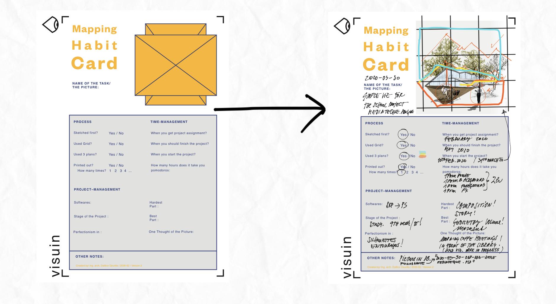
15. Bonus to the Task: Explaination How to Review Your Visualization: So if you want to do a review off your visualization, let's download review card from the glass projects and resource is stop here. A new window will open where you can just type email on name on the card will be immediately said to. And then you can place your card in whatever software award for the shop in design Illustrator or iPad ups. Such a snot ability, concepts or even Apple oats. And let's go analyze your visa, Liz Ation. Okay, now I mean iPad, concepts up where I placed my review card. Let's place my visual here. We will start with the name of the project MediaTek in Brock. Now let's start with the Great and Guides analyzes. We will stretch the guides to the whole visuals to find if the composition is okay. Here I am trying to find a whole great composition for the picture, so basically duplicated and stretch it about the whole picture. Great. Then let's check the composition off entourages. How they are placed in the whole picture. Sitting in garage is placed in front of the buildings. Edge on. It could be a little shifted. The woman her head should be on the rise in line. So I marked it. Now the analyzes off the shapes fully line on threes is something what I like. So I will make the visual note about it and the bully line off the building. Okay, now move further into the process itself. Did I sketch it a first? Yes. Did I used the Greek for the composition? Yes. Did I use free plants according to greet? Yes. So let's drove these three plans rule into the visual so I can later remember it. Let's make a little legend to these three colors. Did I print it out? And how many times did it help me? If yes, try to make mark about these or a little knowledge bodies. Great. So that was the process. And now let's go with time management. When I started this project just tried to ride down the month or the day. When should it be finished? And what was the reality? So these free roses about these also important piece riel Time off my work on this picture . I went we for Maduro technique. So writing there in Maduro's particulate, her sections of my regionalisation, the next big topic is project management. Let's start with software I've used sketch up. And then I import my pictures straight to the 40 show right down. Also importance or stage off the project where I made the realization. And of course, in Walt Parts I waas perfectionist. And what was the critical point or the hardest part on my visual? Did I enjoy something or what I enjoyed most or what was the best on my work? If you have something other, what you need to note in use bottom part? In my case, I used the name of the file and where I can find thes violator in my computer. And I forgot for the main thought off the picture. For sure there should be one story, not mawr. If so, try to put an exclamation as a warning for the future regionals. Check a number five from the checklist or the video from the class about one thought in one picture. Okay, and that's it. You can easily right these data in the war in design, photo shop or in iPad, as I mentioned before. And of course, write down the date when you create this review card, and that's it. Now you can upload your review car, tow our gallery. I will be the most pleased if you do. And thank you once again on use it as much as you can. If you want to be great in these kind of visuals, all the best buy.
 Dalibor Dzurilla, Strategic Architect Presentator