Transcripts
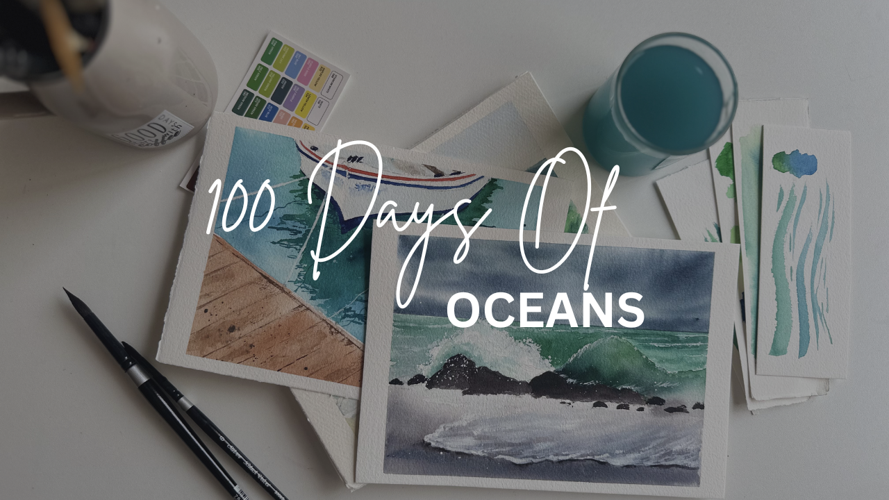
1. Welcome to 100 Days of Oceans: No Hi. Welcome to 100 days of
Oceans in watercolor. Yes, you heard it
right. Hundred days. Before we begin, you might
be wondering why oceans, why water for an entire
100 days challenge. The answer is simple.
Water is one of the most fascinating and unpredictable subject
an artist can paint. No two waves are ever the same. The ocean can be calm
and peaceful one moment and wild and
dramatic the next. It reflects the
sky, the weather, light, even our emotions. Every time you paint it, it
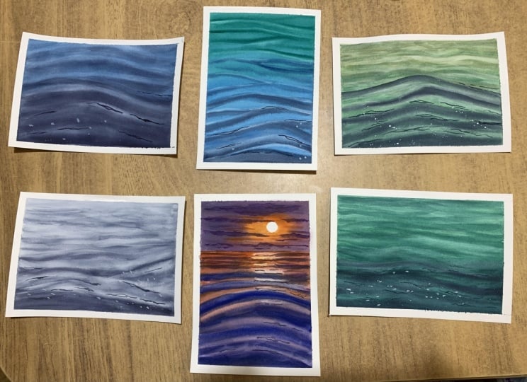
tells a different story. Within this single subject, there are endless possibilities. We can paint gentle waves, calming waves, crashing waves, glowing sunsets over the
horizon and colorful boats, moody seas, quiet
beach mornings. Really, the ocean is
so unpredictable, we will never run out
of ideas to paint. I chose this subject
because it gives us the perfect opportunity
to practice one of the most important
watercolor skills. It is to learning to control water while also
learning to let it go. More you understand water, the more confident
you will become, not just in painting oceans, but also painting in
watercolor as a whole. Throughout these hundred days, we will begin with
the fundamentals, simple ocean waves
and water movement. Then little by little, we will build on those
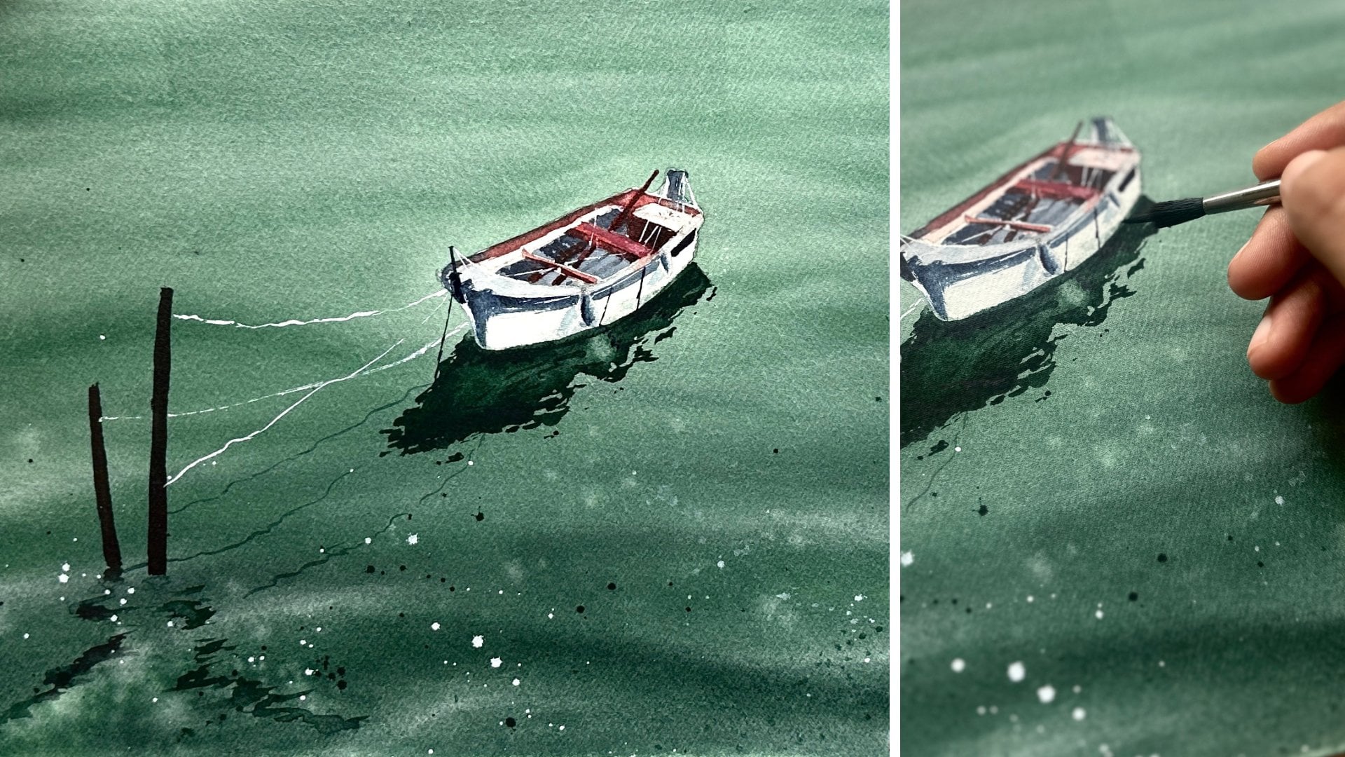
skills, introducing horizons, skies, reflections, boats,
different lighting conditions, and a variety of ocean modes. Every lesson is designed to build naturally on
the previous one. So by the end of the challenge, you will be amazed at
how much you have grown. Hi, I'm Sukrutha, watercolor
artist and teacher. Over the years, I have created so many challenge based
classes here on Skillshare, but this is by far
the biggest and most exciting project
I have ever shared. My goal isn't just for you to
complete hundred paintings. It's for you to
develop confidence, consistency, and deeper
understanding of watercolor. Some days your painting
might surprise you. Some days it won't
go as planned, and that's perfectly normal
because learning watercolor, just like Ocean itself
isn't always predictable. So grab your brushes, your paints, and your paper. Let's dive into this
journey together. One ocean, one wave, one painting at a time. I will see you in Devon.
2. Your Journey Starts Here (Class Overview): Now that you know what this
challenge is all about, let's take a quick look at how this class is going to work. This challenge begins on July 1 and will continue over
the course of 100 days. To make this journey
enjoyable and sustainable, we will be taking
every Sunday off. Think of these Sundays
as your catch up day as a chance to complete any
projects you have missed, practice your favorite
techniques again, or simply take a
well deserved break before starting a new week. Let me give you a quick
overview of the curriculum. I have designed this challenge
very thoughtfully so that every lesson builds
on the previous one. Instead of jumping into
complex paintings right away, we will gradually develop our
skills one step at a time. The first five days dedicated
to fundamentals of oceans. The next five days
will introduce you to beautiful sunset
ocean scenes. After that, we will spend another five days painting
a variety of ocean sunsets, beach I'm in waves
with horizons. The next five days are all about energy movement as we
paint crashing waves. Once we are comfortable
with the ocean itself, we will begin adding
our first subjects during the following five days. The tiny boats on the horizon
with their reflections. The next five days, we'll
take those ideas a step further by combining boats
with colorful sunset skies. After building all these
fundamental skills, we will move on to one of the biggest sections
of this challenge, 30 days dedicated to entirely boats and
their reflections. Finally, we'll bring
everything together in our advanced seascapes where we will paint
dramatic lighthouses, moody beaches, crashing
waves, and so on. By the end of this hundred days, my goal is not just for you to have 100 beautiful paintings. I want you to understand
why each painting works. I want you to be able to look at an ocean reference
or even imagine one yourself and confidently paint it from scratch to finish. Whether it's a peaceful
beach, a colorful sunset, a dramatic wave or a boat
with beautiful reflections, you will have the knowledge and confidence to create your
own ocean paintings. I'm really excited to take this journey with you
if you are ready. We will move on to the next
lesson where we will go over all the art supplies we'll need for this challenge. I
will see you there.
3. Gather Your Supplies: Let's quickly go
over all the art supplies I'll be using throughout this
hundred days class. First, let's talk
about the paper. I will be using
Fabriano artist co, 300 GSM, 100% cotton,
cold pressed paper. I usually buy my paper in large rolls because
it's more economical, and then I cut it
into smaller sheets. The size I'll be using
for this class is roughly six point sorry, six into 9 " or about
16 into 23 centimeters. Normally, I cut the sheets myself using a ruler
or a craft knife, but this time, I had
them professionally cut at a nearby
stationery store. Of course, if
you're buying rows, you can easily cut them
yourself at home as well. Moving on to the brushes, I kept things really simple. I used silver black velvet
round brushes in sizes ten, six, and two for
almost every painting. For larger washers, I used
Princeton wash Brush, and also I used a
Princeton Heritage series round brush size eight. For a palette, I simply
used a ceramic palette, which is my personal
favorite because it makes color mixing
so much easier. As for the paints, I used a mix of professional
watercolor brands, including Sennelar
white knights, a brand called QR, Winsor and Newton and Aquaton. I will always mention
the exact colors we will be using right before
each project begins, so you don't have to worry
about remembering them now. Finally, there are just a few extra supplies you will need some masking tape to create clean white borders
around your paintings, a water container,
paper towels to remove excess water or pigment from your brushes
whenever needed. And that is everything. These are all the supplies I'll be using throughout the class. Don't worry if you don't
have the exact same brands. I always believe it's the
techniques that matter most, and you can absolutely
follow along with whatever quality materials
you already have. Next lesson, we will begin our very first class
project where we will paint a beautiful
gentle wave scene together. I will see you there.
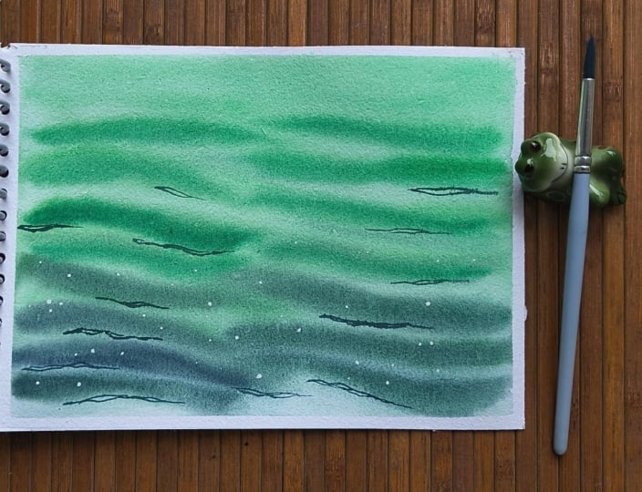
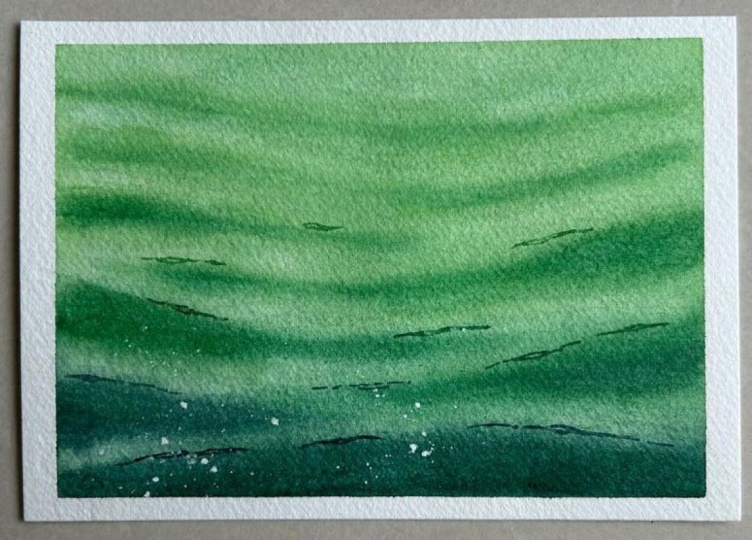
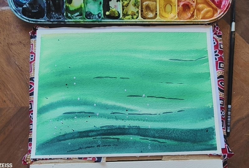
4. Day 1 - Gentle Ocean Waves : Hey, guys. Welcome to
Class Project one. So we are keeping it very simple today because the
first few days, if you have seen the curriculum, the first few days
would be all about painting the basics
like ocean waves. So it may be simple,
but you need this, you know, to move ahead and paint the next modules
of the curriculum. So if you haven't seen it, I have already sent out a mail
regarding the curriculum. So please check it. And yeah, I will begin by
taking the colors. So this is Naples yellow. From Seneliar and hookers
green again Senear. If you don't have hookers green, you can use sap green as well. Or viridian green, emerald green. All these
colors would work. And this is indigo from the
band Windsor and Newton. So I will start. Sorry. I have to first watch out the colors. I'll take the tissue. I forgot to take it, Mom. And ready. This
is naples yellow. We will be using very
light shade of it, and also we'll be mixing it
with hooker's queen first. So this is Hooker's queen. It's very nice to paint the water greenish water.
This is a perfect color. I'll mix a little
bit of naples to it, and I get this very light color. Yeah. So this is indigo. Again, I'll be using
very light shade of it. So we are painting
ocean waves today. It starts with this color and followed by hookers cream,
followed by indigo. Now, I'm ready, so let's go. I'll first wet the paper using clean water
and my wash brush. Wet the paper thoroughly. Do not leave any puddles
lying around on the paper. As you can see, I'm taking
lots and lots of water. This is why 100% cotton and 300 GSM paper
is very important. It holds lots of water. And you can absorb if
you use 100% cotton, 300 GSM, that the paper stays wet for a long time so that you have lots
of time to work. Now I will remove all
the excess water. By tilting the paper like this. On the water is now removed. And also, I will clean up the edges to remove
extra water as well. So now I tate my silver
black velvet brown brush, and I will first
take this hooker's green mixed with tiny
bit of maples yellow. I will start from here. We
will do a quick gradient wash. But this is not gradient. You know, I will start adding hookers green
in the middle. Yep, and start with hooker
screen mixed with Indigo. Now this is just
the initial wash. We will now begin the
second wash, second layer. When the paper is still wet, I'm taking my silver black
velvet number six brush, and I will take Hooker screen. I have to stand up
from my chair because I can't see properly from here. And I will start with
adding the waves. So if you add straight line, it doesn't look like a wave. Add it like this, this
looks like a wave, right? So we are following
that steps now. Now, as we come down, I will mix hooker's green
gradually with indigo. Do not add directly
the darker color. The transition
should be gradual. Oh Now I will add more indigo because
we are coming we are painting almost at
the bottom of the paper. Now again, more
indigo, and that's it. Since we painted wet on wet, you can see that
paint has spread, so I will quickly adjust
it using a damp brush. And Yep. I like how this has turned out. I want this part to look
darker a little bit. So I'll quickly add in the devo. Yeah. This is okay. I'm okay with how
this is looking now. So I'll keep this for drying. Once it dried, we'll see
what changes we can make. And if I like how it
looks after it dries, I will add the reflections
and wrap up today's project. So I will see you guys
in a couple of minutes. Hi. I'm back. My paper has dried up. I have, I don't want to paint anything on this right now because it
is looking so perfect. If I add anything, I'm scared that I'll ruin it, but I have to go ahead and
paint some reflections. So I will take indigo
mixed with hookerscreen. And we will start painting
the reflections now. So reflections I will be adding at only at specific places. Okay. Here. And this is the perfect place because
there is a lot of glare. The white is the
glare from the sun. It's the light, actually. So you can add
reflections over there. Yeah. Go on here. Yeah. I know here. And with a bit darker color that is more indigo
and less cars green, I will add reflection
over here as well. Yep. That is it. And now, as a final step, I will take white wash
and splatter some paint. Tiny bit to indicate
the glare from the sun. Yep. And that is it for today's class project. And that is it. That is today's class project. This may seem very
simple and that is very intentional because I want you guys to get used
to painting oceans and views before we proceed
with boats and reflections. So this is you can
think of this as the foundation for our
hundred days class. The next couple of days, I think not more than five
would be the foundation class. I hope you enjoyed painting this very simple ocean
waves scene today. I will see you guys tomorrow
with another project. So thank you so much
for joining me. And, yeah. See you tomorrow.
5. Day 2 - Whispers Of The Sea: Um, today we are using
only one color indigo, but several values of it. I'll show you how. So I'm taking indigo from
Windsor and Newton. And we will do Swatch Na. So basically, this is
how indigo looks, right? So basically, this is the color, but we will be using several
values of the same color. That is, you take water and
a very little bit of paint. You get one value. And then you increase
the paint a little more. You get another value. And finally, we will
use indigo asides. That is less water
and more indigo. Here we have taken more
water and less paint. Here, somewhere 50 50, 50% water, and 50% paint. Here, almost 80% of
paint and 20% of water. So this is how you get different values of the same color. So we will be using this to
paint today's ocean waves. So without delay,
let's get started. I will take my wash brush and I will start wetting the paper. Take your time with this step because this is the
main, you know, main step in painting
the rest of the work because you need to somehow you need to keep the paper wet for a
long time, right? So we have made short we have made sure to
use the right paper, 100% cotton, coal pressed
paper, 300 Son paper. So it holds lots of water. And second step is to paint
sorry, add water thoroughly. And I will remove the
extra water like this. You can either remove the
water using, you know, this technique that
is wiping around the edges or this one,
you know, like this. By tilting your board. Whatever is comfortable for you. Now, I will take my silver
black velvet round brush, and I will start with the
first value of the color. That is this one. More
water and less paint. As we come down, we
will start adding the We'll start
adding more pigment. Now we have to adjust this now. I'll just take a damp brush and startbnding it into the paper. I will add darker
shade at the bottom. Now, I will take my
silver black velvet, number six round brush. This is a bit smaller than
the one I had before. So with this, I will start
adding detail waves. I'm working faster
because it's very hot here and my paper
is getting dried up. As we have already discussed
in previous past projects, your brush strokes
are very important. Now, if you paint
a straight line, it doesn't look like a way. But if you paint it like this, it does look like a wave. So that's what I'm
following here. So yeah, this is looking good. And I'm going to keep
this for drawing. Once this dries,
we will see what to add the reflections part. So I will see you guys
in a couple of minutes. Hi, my paper has dried up now, so I will take my
silver black velvet, number two, small brush, and I will start adding
the reflections. So wherever you see
the white part, you add reflections over there. It's important to not overdo
this part because easily, you will ruin your painting if you add reflections everywhere. Oh Yeah, I think I'm okay with
how this is looking. So now I will take whitewash. Remember, this is a
very simple painting. We're just warming up for
100 days with this simple, ocean waves exercise.
This is the glare. And that's it. We are now
done with our class project. I will remove the tape
since my paper is dried. And that's it.
There you have it. Today's class project. I hope you enjoyed painting
this with me today and tomorrow we'll be painting a different scene, a
different project. So I'm very excited about that. I'll see you guys
in my next video. Thank you so much for
joining me today.
6. Day 3 - The Roaring Sea: No. Hey, guys. Welcome to today's
class project. So we are painting a very
simple ocean wave scene today. We have painted them so far, but a few so far. I mean, but today's
is a bit different. I mean, I think we have covered only the calm ocean
waves scene so far, I think. So today, we will be covering
how the ocean would look, especially the waves if
there was a storm storm. So basically, the waves would
be very, you know, wavy. And then, yeah, I think, basically, that's the idea. I don't know how
it'll pan out because I'm not following any
reference for this. I have two colors here. Turquoise blue from the brand white Knights and
Indigo from WinsorgNwton. Let us quickly
swatch these colors. We'll take my brush. I have to take a paper towel. Let me go ahead and get it. Done. So I'll be taking
very light version of it. And we will be mixing
a tiny bit of indigo to this turquoise blue because I don't want the
water to look like this. I want it to look
somewhere in the middle of this turquoise blue
and indigo color. So let's go. Diluted version. This is great, but I need
a little bit of indigo. Yeah. And then eventually, I will dacken it using indigo
without mixing tocosbl. So this is indigo
color, by the way. So on the top, the water would
look very light in color. So as we come down,
it gets darker, and we have to paint the water in the shape of waves.
I will show you how. So basically, this is horizontal lines using
your brush, right? But if you are
painting the wave, it should look like this. I should look like
this from Yeah. This is basically
the shape of a wave. So this is the idea. Now, I will begin by wetting the paper using my wash
brush and clean water. Yep. Now, I will remove all the extra water
from around the edges. If you are a complete beginner, you need to practice
these breast strokes a lot because we will be
painting oceans and beaches, sorry, oceans and
waves after all. So that is the key
for the hundred days. If you master these wave shapes, you will get you can even paint your own ocean scapes without
relying on any tutorial. Now, let's begin. I will
take my turquoise blue, I will mix it with indivo
I will start from the top. On the top, we'll be
using very light color. As we come down, the
color gets darker. That means more indigo
and less torquoise. Now, while the
paper is still wet, I will paint some waves
over here as well. This is a stormy ocean
wave scene, right? So there will be a lot of
bends here in our strokes. Now I will adjust the
shapes once again. I'm not taking any paint on
my brush I'm simply using a wet hungry brush
so that it absorbs all the paint and
give me that I mean, it gives me that white
space in between the waves, which is essential to
differentiate between two waves, we need that white color. Now, I will take Indigo. These wests. I have to work while
the paper is still wet. And also, I would suggest
you guys to work a bit faster because this
is wet on wet after all, and the paper won't stay
wet for a long time. Yep. Now, it looks like the
sea is kind of disturbed, and that is because
there is storm going on. If the waves look, you know, flat with less carw here, that means the ocean is calm. Now I will keep
this ford drying. Once it dries, we will see what reflections
we can add here. So I will see you guys
in a couple of minutes. So my paper is now dried. So I will take Indigo. I will add a few reflections
here and there because uh Um, I don't know
if I should add. This is looking great
now. I don't know. Okay, let's go ahead and add the reflections and
see what happens. The reflections
should be added in the white spaces only, guys. That is the one thing that
you need to remember. Lighten the color a little bit. No, dark color I'm going to add one more
near this way, I think so. Yeah, that's it. Now I
will take whitewash. So with whitewash, I'm
going to add a few details. I will also change my brush. This is Silver Black
Velvet number two, smaller brush smaller than
these two that I was using. I will take whitewash. Just lightly splatter it. Do not spatter too
much of this colour. Whitewash. Just a
little is enough. This is the glare. You can even use a masking fluid to
cover up the white area. That will look even better. But we are keeping it
very simple for today. And yeah, this is
our class project. I will remove the tape. Yep. Here. You have to remove
the tape here as well. Remove the tape only if
your paper is dried. If it is wet, we can wait for a couple of minutes. Here you go. I hope you guys enjoyed painting this Tawny beach ocean
wave scene today. And thank you so
much for joining me. I'll see you guys tomorrow with a brand new class project.
7. Day 4 - Stormy Emerald Waters: Hi, everyone. Welcome to
today's class project. So yesterday, we have painted
a stormy ocean wave scene. Today we are painting the
similar similar scene but with different colors. So I thought that to be a
great practice as well. So I'm taking Yesterday, we only took about
blue shades, right? So today, I'm taking
so many colors. I think I'm going to
skip one of these. I don't know which.
So I'll just take naples yellow on
the brand elliar. And actually, with
naples yellow, viridian would look great. But I want to see what color I would get if I add
sap green instead. So, naples yellow, sap green, viridian is out
and hookers green. These make perfect colors, but I want a darker
green as well. So I think I'm going to
take indigo, as well. No to darken this green color. So this is Indigo, a tiny bit. The focus should be
on the green shades, not on the indigo,
the blue shade. So we are going to
use indigo only to darken the hooker's green shade. So now I will take
naples yellow, I'll watch these colors. So this is naples yellow. This is my favorite of all
the yellows and sap gray. Sap glue. Of course, we'll be mixing
maples and sap to get the greenish shade that
I'm actually looking for. This is hooker's green, and this is indigo. We're gonna mix these
two together, of course. You can see the
dark green shade. So that's exactly what
we want. See. Yeah. Now, I will also mix
these two colors together and see
what color I'll get. Oh. Great. So we're going to
be using three shades here. This, which is a mix of these two and hookers creen and hooker screen
mixed with indigo. So this is our color
palette for today. Now, I will tape my wash brush
and quickly wet the paper. Yes, now, as you guys know, the next step would be to remove all the extra
water from here. They'll just take my
board and dump out all the water onto my board and then clean it
with my paper towel. H Now, I'll take my
Princeton brush. First color is this. We're gonna mix naples
yellow with sap grain. And we get this color. Lightly, I will start
painting with it. I think there's there's right color on my brush and I'm going to
quickly clean it. It's from a previous,
you know, project. Yep. It's good. I think it was born Sienna. I was using it to paint
a cityscape yesterday. This is the base layer, so it can be very light. Now, I will take my
Princeton brush. Round brush and then mix maples yellow and sap green to get that
light colored with. And let's begin painting. And I have mixed a
little bit of hookers green with my sap green. I just wanted to see
what color I get. Yep. Now, let's start
with Hookers green. Now, let's mix hookers
green with indigo. And we can paint the
bottom part of the waves. Made it to be a bit darker
here. And over here. And over here. Thought it was
unintentionally darker. So I'll just add darker shades
at the bottom, as well. I need to lift
something over here. And I will keep
this about drying. Once it dries, we will see what, I mean, where the
reflections are going to go. And I don't if I don't see
any reflections to be added, then I'll wrap up this
painting session. So yeah, I'll see you guys
in a couple of minutes. Hey, guys. Welcome back. My paper has dried, and I'm gonna be going
with the reflections here. For that, I will be taking Hoka screen with a tiny bit
of indigo, just a little bit. You know, your reflections
should not look. They are painted with indigo. So probably dark
green, not dark blue. So this is the color.
I hope you are seeing the shade in the
camera. So this is it. So I'll take that. And I will add reflections
here and there. Oh I'm gonna be adding more
reflections for this, for this scene
today because, no, I kept adding very minimal
reflection so far, and I want to see what
happens if I add a lot more. I'm liking the scene so far. I'm actually now scared
what What if I overdo it. So I'm scared to paint the reflections here in
this area and here as well. But, uh, yeah. My curiosity always
kills my doubts, so curiosity always
wins. Let's go. I don't want to I don't want to find out what
happens if I add there. I have a feeling that
I'm gonna ruin it, so I'll just take my white wash. I'll splatter something. That'll be our glare. Take the smallest brush I have. This is silver black
lot number two, and lots of white wash. Done. So this is
our project today. I hope you enjoyed painting
another stormy beach scene, but with a different
color today. I'm gonna remove the tape. My paper is dried, so I'm gonna just remove
it very quickly. And here you go.
Today's class project. I hope you guys enjoyed
painting this with me, and I will see you guys tomorrow with a brand
new class project. Thank you so much for joining me for this hundred
days project. It's kind of overwhelming, but even if you paint ten, 50 or 100, I would still be very happy that you joined. Thank you so much.
8. Day 5 - The Color of The Sea: Hey, guys. Welcome to
today's class project. So yesterday we have painted
stormy beach we've seen, but in green colour, right? So today we are going to paint ocean wave scene but
with two different colors. So the top part would be blue, and the bottom part
would be green. So this is mostly useful when you are painting
underwater scenes. So that's what I have
kept in mind while I designed this particular
class project today. And today is the last day
for our foundations module. So we have finished five days, sorry, today is the fifth day. So by the end of today, we will be finishing
our first module that is our fundamentals or
foundations of ocean waves. And from tomorrow, I mean, from the next class project, we will be focusing on
a different module, and I will talk about it all when we will, you
know, when we get there. I think tomorrow is Sunday, so there won't be
any class project because we are
taking Sundays off. On Monday, um, let's start
with our module too. Coming to the colors, I have
taken Hooker's green from the brand Cinela and Azure glue from the brand White Knights. And third is indigo. Of course. This is my must have
color on my palette, especially for painting water. I'm done. So I'm going to quickly swatch
these colors out. First I'll take hookers green. And I will mix occas
green with sorry, faster swatch the Azure glue. This is such a beautiful
blue color and indigo. Now, I will mix hookahs
queen with Azure. Yeah, this is the color
that I'm looking for. And Azure mixed with indigo. This is another color. So our color palette for today is these three
colors, one, two, three. Not this, these three. So this is a mix sorry, this is not a mix of any color. This is hookers green. If you don't have hookers green, you can use sap cream, and we're going to
use this color. This is the mix of hookers
green with Azure blue. And this is another
color that is the mix of Azure
glue and indigo. So these three colors
will be painting. So the top part would
be hookers green. The middle part
would be this color, hookers green and Azure mix, and the last is azure
blue with indigo color. So that's the idea. Now I will start by
wetting the paper. Oh And, uh, I mentioned why I
usually take Sundays off. You guys know that I have
a tiny, tiny daughter. She's now seven months,
but that's not the reason. I will we have a different,
you know, system at home. I will discuss it while I
send out an email today. The paper is now evenly wet. I will take my silver
black velvet, wrong brush. This is number ten.
This is hookers green. First hookers green.
Ivy green each. So at the top,
Hooker's green, right? And sorry. At the bottom, it's green. I'm confused now.
Okay, we can go ahead. So this is hookers
green at the top. As I come down, I will be using Azure blue mixed
with hookers green. And Azure glue. Oh This is a gradient variegated
wash, if you're wondering. That is mixing a
couple of colors. You can take any number
of colors, S two, three, and then making
a gradual blended wash. If you are a beginner attempting variegated wash for
the first time, you need to have the right
kind of paper for it. M and, of course, brush. Paint comes later. And now I
will take my pristan wash. I will start with hookers green, and I will start
adding the waves. You can go with either stormy
waves or calm sea waves. It's completely up to you. For this gas project, since this is our
last in foundations, I won't be, you know, guiding you which type of
ocean waves you have to paint. I will leave it up to you. Okay. Now, as you can see, I've just removed all the
water from my brush, and I will carefully use my damp brush to create these whites
in between the waves. Again, if you're a big enough, you need the right kind
of paper for this. I'm using lifting
technique mostly to create the create these white
spaces in between the ways. Yep. I like how this is. This has turned out so far. And I especially like these
white white, you know, gaps. That is that is sunlight falling on the waves. Okay, now I will keep
this for drying. Once this paper has dried up, we can we will come back
and add the reflections. See you guys in a minute. Hi, guys, my paper has dried up. Now, I'll quickly start
adding the reflection spat, and I think I made
a mistake of saying that this class would
be going live today. But no, this is today
we will be discussing about we will be discussing day four project. I'm
so sorry about that. I kind of forgot
today was Saturday. So this will be live on Monday. So this is the last class
in our foundations. And I will take Azure blue mixed with a tiny bit of indigo. And I will add reflections
here, here and here. And we'll see I will
first add this, and then we will think
about where to add next. No, I just move the extra paint. I want it to be dull, not in a bright color. I don't think I would like
the reflections on this one. But let's see. I should
have left it alone. Oh, I think I don't want to risk this risk adding reflections because this is looking
good, and I'm okay. I'm very happy about how this
painting has turned out. So I'm just going to
take the white wash and add the glare and wrap
up this class project. Yeah. Done. So this is our class project and the final class project in
our foundation section. With this, we are wrapping
up our module one. I'll remove the tape. My
paper has dried up now. I like the double colour
on this painting, the blue and green. If you are painting
any underwater scene, this color combination
is perfect. If you have sun coming
from this side, you can add green
and blue over here. And if the sun coming on usually from this
side or from this side, you can add or from the top. If you are adding the horizon
line here and if the sun is over here at any
side at the top part, you can just go with
the green color here. And as you come down,
you can add blue. And if you want to emphasize the underwater stones or rocks, then you can go ahead and paint the blue on top and
green at the bottom. So it's just
whatever you decide. That's the beauty of ocean. I like, you know, how flexible the
ocean subject is, whatever colors you choose, and however you paint them, they still look great,
the ocean landscapes. So that is it for
today's class project. I will see you guys tomorrow
in our new module. Bye.
9. Day 6 - Sunset Beach Day: Hello, everyone. Welcome
to today's class project. Today we are painting a beautiful
ocean with sunset view. So so far, we have
painted the ocean waves, ocean, the beach
scenes and everything. So today, we are trying
something different, the ocean with a sunset view. So, of course, today's project
will be very colorful. That's why I have even taken a very big swatch
card for colors. But first, we will start
with a simple sketch. By sketch, I mean,
we only have to draw a single line to divide
the horizon. That's it. Very simple. So we will
have the sunset scene here, the sky, and here
the beach scene. Now I will take the colors. So now I'm back with the colors. First color is primary
yellow from Semar. This is to paint
the sky, of course. Next is orange from
white knights. I like this particular shade of orange. It's not too bright. It's almost like a very
mild neutral orange. I don't know if that's the
thing. And this is red, again, from white knight. I love bright red from sennelar, but this one is very subtle. So I like that one. I like this color for that. And then a little
bit of royal blue. This is such an unique color, In my collection, this is
from ScenariaRoyal blue. It's like sky blue color. And teeny tiny bit of purple. I don't want to paint purple
too much in this painting. I want to I want I want only a few
colors to be the highlight. Those are yellow, orange and blue blue for the water and yellow and
orange for the sky. And this is blue senear. The color itself is
called blue Senelar. So I think it's very similar to Prussian
blue or Iantanblue. So that is it. Our
color palette. Now I will do the colors watch. This is yellow, primary yellow. And so, sorry, white
nights orange. I told you this is very mild orange color, not too bright. And yeah, this is a red color. Even this color is
not too bright. This is royal blue. Perfect to paint Sattle skies. Okay, we should not
mix these two colors or else we'll get muddy colors. Or not. I think I'm okay
with mixing it very lightly, as you can see,
and purple color. And this is glue celia. Similar to rustianblue. And that is it.
Today's color palette. There are so many colours. But first, before we
start with the painting, I want to cover the ocean part right at the horizon line
using this masking tip. Let's begin. First I will with the paper
using my wash brush. Now, I'll take my round brush. Start with primary yellow. Quickly followed by orange and
very little amount of red. I don't want the red
to be the highlight. I want orange to shine through. So I'll just mix a little
bit of red to orange and I'll paint with itself instead
of using red directly. Now, tiny bit of
purple at the top. Followed by royal blue. Now, let's blend these
colors together. Take a little bit of orange. Now, I will show you
a cool technique. This is my paper towel. I will wrap my finger around it. I will dab some paint away
to create the sun. Okay? Now, take this small
brush and lots of red mixed with orange color. And let's start
painting with it. O. That's it. Now, I will keep. Wait, hold on. I'll see if I
can paint with purple here. Okay. That's enough. I don't want to overdo this
and create muddy colors. Okay. Now, I will let the paper dry completely before we move
on to painting the ocean. So I will see you guys
in a couple of moments. Hey, guys. Um, welcome back. My paper now is dried. So I will start
painting the ocean now. But first, we have to
remove this masking tape. Perfect. Now, we'll be using
orange color here, and gradually we will
change it to blue. I'll paint with royal
blue and then followed by blue scenea No violet. First, I will wet the paper. Done. Now I will take my
silver black velvet but ten. Let's start with yellow. Followed by orange and red mixed with orange. Now, we will paint
with royal blue. Followed quickly by blue colour. As we start painting
with the blue, we have to start painting
the waves as well. You know, the wave shapes. Oh, there is a color. There's a green
color over there. That's because orange is getting mixed up with blue. It's okay. I can manage with that. Now, I will take my silver black velvet number six
brush, a small brush. I will take tiny bit of
violet mixed with royal blue. That's it. There is
a tiny bit of blue, but that's okay. I
can cover it up. It's quit. No, I need to darken
the bottom part. So I'm taking more blue. Yeah. Perfect. So I
think this looks good. I don't want to, you know, ruin it by adding too
many layers of the paint. So I will keep this
one for drying. Once this dried, we will
see if we have to add any reflections or I
can leave it as it is. So I will see you
guys in a minute. Hey, guys, I think the
paper is now dried. I will I was thinking to paint a few
reflections on the water, but I don't think they
would look good if I paint. So I will stop, and I will add white gouache
to create the glare. So after that, we are
done with our project. I will also add a few birds, but I don't know if they
will look good or not. So I don't know. I will
decide once I add the glare. So I've taken my
silver black velvet, small brush and just platter
some white gouache paint. Yeah, that's it. This looks very plain.
Um, I don't know. I will add the boards after all. So for the boards, I will be taking my, um, blue inelar colour
with a little bit of purple in it and royal blue. Now we platter some paint. That's it. I don't know
if it is looking good up. You guys beat the edge of it. Now I will remove
the masking tape. We are done with our
class project today. Oh And there do you go? The beginner friendly
sunset beach Ocean sine. Uh, yeah, thank you so
much for joining me today. I will see you guys with
a new project tomorrow.
10. Day 7 - Painted by Sunset: He Hey, everyone. Welcome to today's
class project. So we are in the second
module of our oceans class, and this is all about
painting sunset waves. So yesterday, I have uploaded
one project that was actually supposed to be added in the Module
three, but it's fine. Um, the techniques are all same, and I actually love
that I have already added that in Module two itself. That gave me an idea
on how to paint. I mean how to take this
Module two further. So yeah, today we are painting sunset waves like
I have already discussed. For that, I will be kneading. Of course, this
entire module has, you know, we will be using so many colors for
this second module. Now this is Naples yellow from Snelar This is orange
from white knights. Sorry, this is actually
vermeilion color. Now, this is Aazarin crimson. This is my favorite color. I mean, in the reds. I mean. But in the blues, I will
always go with indigo. This is diaxenPurple. And this is cobalt blue. I rarely use this color, but today I thought I
would give it a try. Notice I did not take indigo for today's
project, but actually, I am intentionally avoiding it, but I will probably
use it if I have to. Not to paint darker colors. I'll keep it here just in case. And let's quickly
swatch these colors. Maple slo. I think there
is some blue on my brush. Okay. You can see the
green colour is forming. That's because there is a blue. You see? Very light share of it. Naples yellow. I will swatch it
here once again. And this is vermilion. And this is Alizarin Crimson. And purple. And we have cobalt blue. Yep. Very nice set of
colors. I'll keep it here. I mean, I'll keep the
swatch card here. And let's move ahead and
paint the class project now. I will take my wash
brush, of course, and we'll start
wetting the paper. Do now I will take my silver black
velvet, number ten brush. I will take Naples. Start
with Naples at the top. Slowly adding red to naples. You know, this is sunset scene, so that's why there is a
mix of all these colors, and we'll be painting the views in all these colors as well. And laser and crimson
mixed with red. This is a base, um, wash. That is the background wash. We will
be painting the waves later. So this is purple. And
finally, cobalt grove. Perfect. Now I will remove all the extra water
from around the edges. As you can see, the
tape is different. The masking tape because my the previous
masking tape was, you know, I ran out
of it, and I ordered, but they delivered
different size. These things happen, so I just
did not think much of it. I thought to return, but, um, I did not have time for it. Now I will take Alsarin
mixed with purple. To get this reddish, blue color, can say reddish, violet, sort not blue. So this is the color. You know, I'll add more violet. So this is the color
that I'm looking for. I will start adding
the waves with this. First, I have to stand up
from my chair because, uh, a I can't paint
if I sit down. Yeah, this is it. These are
the wave colors at the top. Slowly, we will be painting
with purple color. And then we will be adding
purple to cobalt blue. Beautiful color. I never
actually explore cobalt much, but it's a beautiful color. You need to be faster here
before the paper dries up. You can already see that my washers are not,
you know, flowing. They're just there where
wherever I paint them. The paint is not moving. That means the paper is drying. Yeah. And I will give
this what drying. Once it dries, I will see if I have to add
any reflections. For reflections, I may
need Indivo but we'll see. So I will see you guys
in a couple of minutes. So someone asked me if I use hair dryer to dry
up my paintings. Actually, that depends. I do have the hair
dryer here with me. You can see it here. But it
depends on my time, actually. If I have to be fast on the day, you know, I have other
commitments as well. So if I have to hurry
up the process, I will use hair dryer. But if I don't have anything
scheduled on that day, then I'll just switch
on the fan in the room, and I'll wait for it
to dry naturally. Yeah. So I will see you guys
in a couple of minutes. Hey, everyone, my paper
has dried up now. So I will take my silver black
velvet number two brush, and with cobalt
blue and a mix of, uh, purple, I will start
painting the reflections. I won't be using indigo. So, yeah. I know you must be bored of painting the same thing
over and over again, but trust me, you need these
kind of practice sessions, you know, the repetition of same techniques, same
landscapes, sorry, same ocean scapes to
master the subject. Yeah, um, the reflections. I have been painting oceans for the past at least seven years. So now I'm able to
make the class. So I have painted similar
subjects over and over again, you know, to understand the technique to understand
the pattern of the waves, the reflections and everything. So in the beginning of the class that I mentioned that
you need to have a lot of patients to
go through 100 days. So that's why there
is no pressure. If you want to paint
only 50 or 20, it's completely up to you. Yeah, I think, I'm gonna take white cost
to splatter some of it. It's not compulsory to paint, you know, to splatter white gosh at the end for every painting. I just do it because it's
been my habit, you know, since the past seven years since I've been painting
painting the oceans. So, again, if you want to
skip this tip, you can. But I just think how
it looks so, you know, put together once I
splatter some of gosh. So, yes, that is stuff. I'm going to remove
the tape now. And here we go. We are done
with today's class project. I hope you guys enjoyed painting today's sunset
Wave seeing with me. I will see you tomorrow with
a brand new class project. So bye. Oh
11. Day 8 - Sea of Sunset: Hi, everyone. Welcome to
today's class project. So today, we are painting another sunset
portion wave scene. So the colors I'm
going to use today are vermilion color on the
brand, sorry, white knights. So this is a red color. If you don't have white knights, you can use sennelia French vermilion or any red that you have on your palette. And then this is quinacron rose, but I don't have the label, but I swear this is quin rose. This is from the
brand white knights. Oh. I think the pigment is
tried, so just quickly. Mm. Okay. Yeah, I just
removed that dried paint, so now I got quinros. And this is violet, DaxinPurple. Sorry. DaxinPurple from
Cmdiar and Indigo. Okay. So this is
from White Knight. So I'm gonna quickly
swatch these colors. I don't have a paper. Okay. Um I don't have a spare paper, but I have one over here. I'm going to quickly swatch
the colors. So this is right. So we won't be using the red, and this is quindos. We won't be using the
quindos just like this. We'll be mixing these two
colors to create some kind of peachy sunset colors. This is the color. It's actually my favorite color to
paint the sunset. Now this is purple. And this is indigo. And of course we won't be using these two colors
just like this. We're gonna be mixing these two. Yeah. So this and this
are our color palette. Let's start painting now. Mm. I don't know if I
should be going with horizontal or
vertical orientation. I think I'm gonna
go with horizontal. Yep. Now, let's begin. Wetting the paper
with clean water. Now, I will take sorry, I will first remove all
the extra water by just, um, dabbing my around the edge just dabbing the
paper using my paper towel. Yeah, this is good.
Now I will start with silver black velovet number ten. And we're going to be using
this color, the peach color. And for that, I'm
mixing right with pink. Sorry, rose quart front rose. So first, I'll start by adding the color from
the top to bottom. And quickly, I will
take this color. I will start adding
here as well. So the top part would be
purple and the bottom part. I mean, the middle part would
be the pink, and again, the bottom part would be the
purple mixed with indigo. This time, this is a bit
darker than this. Yeah. Perfect. Now I will take my Princeton brush and I will
start adding the waves now. So first, I'll take the
purple mixed with indigo. We'll start from here. Don't be afraid to
go dark dark shades here at the bottom. We need the dark
color for the waves. Now I quickly washed off
the paint on my brush, and I've taken a damp brush by removing all the extra water. And now with the damp brush, I will blend these waves
with the background. The climate is very humid here. That's why the paper
is drying up fast. That's also the reason why I'm working very fast, as well. I'm intentionally adding small
ways here in the middle. Yeah. O. Yeah, I will stop now
because the paper is drying up really fast and
I don't want to ruin it. So I will keep this
for drying now. Once this dries, we will
add the reflections. So see you guys in a
couple of minutes. I think I'm going to have
to adjust this one a little bit because the edge
is a bit harder, harsher than what I wanted. I need soft edge, but this one turned
out to be a hard edge. Yeah. Okay. That's good. Now I will see you guys
in a couple of minutes. Alright, my paper has dried up, so I will take my silver
black gold number six brush, and I will quickly add the
reflections using the mix of indigo and purple
colours. So let's begin. So far so good. I'm very, um, careful while adding
these reflections for all of my projects because
in my experience, I have always overdone it and mostly kind of
ruined the painting. Then now I even take
my silver black, sorry, the whitewash
and splatus some pink. Um, using the smallest
crush that I have. That's it. Um, yeah. And that is it. We are done
with our class project. So I hope you guys enjoyed
painting this one with me. We'll remote a tape
because my paper has dried up. Yeah. Done. So I'm gonna see you guys tomorrow with the
new class project. Bye. On that.
12. Day 9 - Dusk by the Sea: No. Hey, guys. Welcome to
today's class project. So today, we are painting a very simple ocean wave scene that is Sunset waves, of course. So this is Quinos. The label is not there, but it's quinosF White Knight. And this is milion from the
brand Again White Knight. We're gonna make a beautiful
peach color with this. And this is dig scene purple. Yeah. I'm not gonna be using any dark colors today like indigo or blue today,
just these colors. Uh, so we are not going to be
using any dark blues for today's class project. So I'm just looking
for a spare piece of paper to swatch
out the colors. I think I found one.
Actually, I did not. Oh. Huh. I found one. So yeah. I'm going to take my
eribablack velvet, number six brush,
and this is quinros, right? A beautiful pink. And this is Vermeion. So we are going to be mixing these two colors to
create a peach shed. So I will take red next bid. Think. Yeah. Yeah, I'm gonna take the
lightest shade of this. Yes. So this is the color.
Just add more water. And then this is purple,
***** in purple. And I'm gonna be taking the
light shade of it. Not dark. See, this is the colour padded. Now, let's begin. I will
take my Princeton brush. First I'm gonna have
to take a paper towel. Okay. Now I'm ready. This is, of course,
my Princeton brush. Okay. And I will wet the paper
using clean water. Now, let's see if I have any
extra water on my paper. I'm gonna just remove it
by dabbing onto my paper. I need to clean my dsk. Yes, now that the paper is wet, I will take my
silver glass brush, and I will start with
purple light shade of it. Another light shade. Again, I'm going to
start mixing purple with the peach color. And then slowly, I will start adding the purple shade itself. So this is just a base layer. Done. Now, let's start with, I'm gonna quickly
change my brush. This is Princeton brush. So I will take I mean, I will mix the color
again, the peach color. I'll take a tiny bit
of purple in it. Yep. And let's start painting
the waves with this. Now, I will slowly
start adding purple. Instead of just directly
adding the purple, you know, the transition would be very difficult to look at if we
add two different colors. You need to slowly
introduce these colors. So now I will take the purple
color and purple again. And another. I mean, one more time. One more waves. So Again, this time, lot of lots of purple. Yeah. Now, remove
all the extra water and caint from the
brush, dab a little. Then with the damp brush, we will blend these colours. Blend these waves, I mean, blend these waves
into the background. We need that white color as
well. That's very important. So what I have observed so far, painting waves and reflections is that you need to
have a good paper. So the paints and brushes
are completely secondary. You need to have the good paper
so that these colors and, you know, your breast
strokes will be blending easily if
you have 100% cotton, 300 years of paper. You can see I'm slowly blending these colors with
the background. Yeah. So I think I'm okay
with how this has turned out. I don't want to
overdo this because I I had in my mind that I'm going to be going with very
pastel shades for the waves. So if I add violet more over
here, that's gonna ruin it. So I'm going to just
stop right here and let the paper dry. Stat. Um, yeah. So I will see you guys in a couple of minutes once this is all dried up, and we will see what
needs to be added then. So I'm gonna see you guys in
a couple of minutes, bye. So, hi. My paper is dried up. So today is the last in the module that we'll
be painting these waves. Tomorrow, I'm planning
something different like. We're gonna be painting
the waves in two layers. The same sunset waves, but there's going to be two
layers, so bear with me. This is a last practice session. So I will be adding
a few reflections. No, um here there As you can already see, I'm adding them a little
bit differently this time. And of course, I'm
using purple colour instead of using Inpo which might have looked
out of place because we are using light shade
light shades today, right? And yeah, that is it. Now I will, of course, you know the next step is
finishing up with whitewash. Mm oh Okay. This is looking good, and I'm going to have
to remove the tape. I have a habit of
overworking my paintings, so I always stop myself most of the times
before I let myself go. And that is turning out to be a bad habit recently because my paintings are
looking too stiff these days, instead of floe and, you know, soft
watercolor paintings. They used to look
like that, like real watercolor paintings. You know, that character
of watercolor. I need to work on it. Thank you for churning me today.
13. Day 10 - Evening Tide : Hey, guys. Welcome to
today's class project. So I'm using my
QuinacronRose color. This is from White Knight, and this is permanent
orange from aquaton. And I have a cobalt alco slight
from Windsor and Newton. And I have indigo. This indigo, I'll be using
less I'm in very light shade. Like, I will be using lots
of water, and less pink. Let's quickly do a
swatch of these colors. So this is permanent orange. And this is Quena Cronos. So we will be mixing these
two colors to create certain pink or peach color
for our class project today. As you can see, the
color is here, right? Ah, yes. So I'm going to
mix these colors now. Yep. So this is the color,
but I'll be using the light version of it that is more water and less paint. And then turquoise color. And followed by Indigo. So this is our color
palette for today. Now let's go. So I'm going to be
honest with you. Today, I'm not using
Fabriano paper. This is arches. I just had this paper lying
around on my table. It was for a different study, but I'm using it for
today's project. Let's see if this one works
out better than Fabriano. I'm gonna be switching
to arches from non cots. But I don't think so because
both are 100% cotton and both are, um 300 GSM. So I am guessing both will
give the same result. I'm gonna remove all
the extra water. Now I will take
silo black or red. Now, let's begin with
that peachy colored. Use light shade of it? It's more pink. Oh gradually, we will start adding
our turquoise color. Slowly. Let's take turquoise, mixed with tiny bit of indigo. No using dark indigo
color if you guys can see because I want today's
colours to be very light. So in yesterday's flash project, I have told you that, um, we may probably use two layers to paint the
waves. So I know that. I mean, I'm planning for that, but, uh, let's see. Because, so far, we haven't painted the
waves in two layers, so I'm thinking to
incorporate this incorporate that in today's project. So I will start taking
the peach color, and it's time to start
adding the vase. Now, I will take trachs. We may need to add indigo as we, you know, gradually come down towards the
bottom of the paper. And The paper is drying, so I may have to, you
know, work faster here. I wash off on the paint, and I will start to use damp brush and adjust the
moisture of these ways. Alright? So I think
I may have to add a tiny bit of indigo
to the turquoise. I want this wave to be similar
in colour to this one. So I just have to darken it it. And a little bit
over here, as hope. Yeah. Um, I'm I'm okay with how
this has turned out so far. And I think I have to stop, um, painting and
let this layer dry. Yep. Done. So now we will keep this for drying. Once this dries,
we will come back and we're gonna paint
the reflections. So see you guys in a minute. Hey, guys. Welcome back. My plan was to, you know, vet and paint the
waves once again. I mean, paint the
waves in layers, but I have a problem. This paper I have right here is expired paper.
How can you tell? It's simple, actually. So you can see these marks here. You know, that is not a bloom. It's actually a paper
that has sizing issues. You can see these lines. So this paper won't
hold up if I rewet it. So I'm going to just paint
a few reflections on it, and we will wrap up
this session today. I'm taking indigo mix
a little bit of tacos. You can see here how the
paper is looking, right? See? This part. So that means the
paper is expired. So now I will paint
the reflections. Mm. It doesn't mean that only
Arches has these issues, but, but in my experience, I have observed arches behaving like this a lot
more than any other brand, but it's not particularly
about the quality. Most of the times it's
about the stories, how you are storing your paper. So that matters a lot. And how old is the paper? Now, I would I'll
take whitewash. Yes. Um, very little. In small brush. And we'll splatter some paint. That's it. And with this, we are done with our class project. What today? And tomorrow is Sunday, so I won't be available. That means there will
be no class project. So I will see you
guys on Monday. I'm gonna remove the tape now. You can clearly
see how the paper has these sizing issues. It's called sizing issue. And eta. Thank you so much
for joining me today. I will see you guys on Monday.
14. Day 11 - Glowing Ocean Landscape: Hi, guys. Welcome to today's
class project. So we are beginning a
new module today that is painting sunsets with a
small boat at the horizon. So this is the start of our
future module that is boats. Um, yeah, we'll be painting
boats for 30 days. So consider this as a small practice session
for the next five days. So I will begin by
selecting the colors. Since this is a sunset or
sunrise kind of module, I mean, sunset or sunrise module, we will have a very
colorful palette for the next five days. So I will start by taking naples yellow from the brand
sunler and this is permanent orange from
the brand aquatone. The I'll just remove the pink
that had gotten on my hand. Yep. And then this is lazarin
crimson from the brand. Again, Cener. And we have tags in purple from Sniv and white knights Sorry. Indigo from white knights. So now, obviously,
we will be covering the horizon with a masking
tape, the horizon line. So I'm thinking the horizon
line should be here a little top then instead
of the middle of the paper. Um, I'm thinking if I have to sketch the boat or I
can directly paint it. I think I'll sketch the boat. But after painting
the sky. So let's go. First, we will
paint the sky now. Sorry, I have to swatch
the colors first. So this is my silver black
velvet, number six brush. This is naples yellow. I love naples yellow because
it's such a glowy color. And this is orange. And Alysa and crimson. Purple. We have such glowy sunset. We can achieve glowy sunset
with these colors, you know? And of course, indigo. In this order.
I'll show you how. So I'll take naples followed by orange Alzarin crimson. And puppy. See, this is the
technique to create that loe sun in the middle
of all these colors. So now I will start
painting the sky. Let's wet the paper
using my instant brush. Remove all the water. And now I will take my silver black
velvet brush. Let's begin. I'm thinking to paint
the sun over this side.
15. Day 12 - Embrace of the Evening: Hi, welcome to today's
class project. So we are painting
another horizon, sunset with horizon
and a tiny pot scene. So for that, I
will take colours. This is naples yellow from the brand inelarPermanent
orange from aquaton This is my favorite
color in this brand. This is it gives such a
nice, bright orange color. And in sanelia, I
love french amelia. And this is diaxenPurple. Again, from Senia. And finally, we have indigo. I will start by wetting
the paper or the sky area. As you can see, I've
already put the tape in the middle of the horizon. Sorry, middle at
the horizon line. Okay. I'll remove
the extra water. I need to take tissue. So I think I have to
watch the colors first. I always forget this
step for some reason. This is naples yellow. And this is orange. And this is French
vermilion red colour. And we have purple. And we have indigo. So this is our color
palette for today. And I will start by painting
here painting the sunset. I have purple here on my brush
from previous um, shoot. It's important to clean your
brushes properly or else, you know, I have purple here. And if I put this
brush in the yellow, you know, I could
get muddy colors. So now I will start. Orange. Now French amelia. You can see how bright
these colors are, right? The orange and red. And now purple. I will probably not use indigo. I will use it directly
in the water. Now, I will remove all the
extra water from the brush, and carefully, I will blend
these colors together. Especially here. Careful not to ruin that white empty white on the paper
because that is our sun. I'm trying to paint the clouds. Oh I'm done. So I will stop now because I like how
this has turned out. And I will let the paper dry for a couple of minutes
and then I'll come back and paint the ocean. See you guys in a minute.
The paper has dried up. I will remove the tape. Now, let's wet the
paper at the bottom. This is the water
area. The ocean park. One tip, there shouldn't be white gap between the
horizon and the water. You need to blend
those together. It'll take a little, you know, practice, but that
is the concept. You should not leave
that white line. Now I will repeat
the same process that we have done on the top. Now, the paper is drying, so I have to be quick and
blend these colours to it. A Now I will take Indigo and paint the
rest of the bottom part. This is the white line
I was talking about. You need to carefully. Um, you know, cover it up. I will quickly switch the brush. And, yeah, I'm going
to leave it as it is. I like how this has turned out. So I will see you guys
in a couple of minutes. My paper has dried
up. Of course, I have used the hair dryer. Now I will take my silver black
velvet, very small brush. This is, number two. Yep. Um, I will
paint the pot now. I will take indigo
because I need it. I have run out of
indigo on my palate. I have a new tube of indigo, but I don't know where it is, so I have to clean that up later. But first, we need to paint. It's gonna leave a bitness.
I'll just cover it. Some random details on the boat. Now, I will take red mixed with purple and start
painting the reflections. As we come down towards
the bottom of the paper, the reflection has
to get darker. That's why I'm mixing indigo. I'm done. So this is our class project for today. I'll get you cleaned. This is working me. Done. So now I will remove the tape from
around the paper. This is today's class project. I hope you guys enjoy
ping this with me today. I will see you tomorrow
with a new one. Thank you. Go.
16. Day 13 - Horizon Glow: Hey, guys. Welcome to
today's class project. So we are painting, another sunset motion
we've seen today, and these are my colors. So this is naples yellow
from the brand celluliar. I have a white wash, um, leftover from one of
my previous paintings, so I'm going to
keep it like that. So this is permanent orange
from the brand, aquatu. Oh and this is French vermilion from
the brand annelia. And this is royal blue. This looks similar to sky blue. And it's a bit opaque as well. So you can just add white
watercolor to your um, any blue that you have
like ultramarine cobalt. I would prefer ultramarine. So you can add white watercolor, not white gosh to ultramarine, then you'll get the shade
similar to royal blue. And finally, we have indigo. So this is our color
palette for today. I'm gonna quickly swatch these colours for
take a paper towel. Yeah. So so this
is naples yellow. This is, um, permanent orange. So if you mix royal
blue with orange, you will get a muddy color. You can see the color
turning into a brown. So I wanted to avoid this. That's why I have picked red. If not, I would have
directly gone with, um, you know, directly gone
with blue after orange. So I will take a
little bit of red. And now I will add royal blue. You can see the color
hasn't turned muddy. This is where the red is, and you can see the color
is remaining intact, right? And of course,
followed by indigo. So this is the color palette. I'm going to quickly take my Princeton brush, the wash brush. I will start by
wetting the paper. Oh And I have also intentionally avoided using purple because in our
last two class projects, we have used purple
right after the reds. So I wanted to avoid, you know, the repetition
of the same color palette. I remove the extra water? I think I should have
applied the tape first. I forgot about it. Okay, I can, you know, uh, take my paper towel. This is the next step
to just slightly tap the paint off. Yeah. No. I will taste
my masking tape. Color. The water is
off now on the paper. Well, I will tape it here. Right? Now, while the
paper is still wet, I'm gonna take my
silver black velvet. I will start with
naples yellow. Orange. Red. Make sure to cover the
orange with red on all sides so that you don't
get the muddy colors. Now slowly start
adding the royal. Now, this will give a light purple shade,
but that's okay. Now with a damp brush, let's blend all these
colors together. The tiny bit of indigo to royal blue and start
adding a few cloud shapes. A bit darker because
this is just looking really light shade. Yeah. I like how
this is turning out. So I will remove all the
water from my brush. With a damp crash, I will slowly blend these
colors do well. I want the colour to look a
bit darker here at the top. Yeah. Nice. Yep, I like how this is looking now. So I'm gonna stop working, and I will let the paper dry. Once this dries, we will start working
on the water, right? I will see you guys in
a couple of minutes. Hey, guys, um, my
paper has dried up. I'm gonna remove the tape now. This is looking good, um, considering the
error I have made. Okay, now I will start
wetting the water area. The ocean part of it. I want extra water. Now, I will take my
silver black or white. And again, we are repeating the same process that we have, uh, you know, done on
the sky part, right? This is the reflection.
So obviously, it'll look similar
to the sky orange. And there is red. And now I will take. Sorry, I don't
have royal blue on my palette. Royal glue. I'm gonna quickly blend
these colors together. Right? Now with Indigo
and Royal glue, we will start adding the waves. Here, we will not be
painting the clouds. Now I will take my small brush. Sorry, this one. This
one, the Princeton brush. And Okay, Fury, start
painting the waves. Oh Now, digo. Oh You can see I'm not adding much here at the top because
even this area, since it has blue color, the color is running muddy. So I'm just lightly
touching it instead of just completely going full blend. Okay. I'm going to stop now, and I will let the paper dry. Once it's dried,
we can come back and add the boat and
its reflections. So I'm gonna see you guys in a couple of minutes. All right. The paper is dried now, so I've used hair dryer
to speed up the process. And now let's go ahead and
paint the boot the small boat. So I will take my small
number two brush, and this is silver black velvet, and I will take indigo. And I will place the boat. I don't know
where to place it. I'm not following any
reference picture. So I'm gonna I can
place it here or here. Um, I can place it here. Here. Now, just track the pink
that is already there. You can see if this
is a bit bigger. 1 second. I'm not getting
the proportions right. Now, I will take red
azure for the reflection. Yes. Um, I think I'm okay with the reflections
on how they are looking. So I'll just leave it as is. So this is our um, class project for today. I hope you guys enjoyed
painting this with me. If I could get something
right, it's this sport. I don't know why it
kind of it's kind of looking weird because I was, um, you know, following
some reference picture, but I stopped following
in the midway. So that's why I got
confused. So this is it. I hope you guys enjoyed
painting with me, and I will see you tomorrow with a brand new class project. All right. Bye.
17. Day 14 - Sunset Serenity: Hey, guys. Welcome to
today's class project. So we are painting yet another, um, ocean waves scene in sunset. So I will take my colors now. So these are the colors. If cover up the horizon line. I mean, I'll put
the masking tape there because if not,
I'll just forget it. So I don't know if I have, I'll go with horizontal
orientation itself. I thought I'd go vertical, but yesterday's project,
we painted a vertical, so I'll I'll switch
up for today. Now this is naples
yellow from Cinela. And this is French vermilion
red colour from Cinela. And this is cobalgblue. And I have indigo
as well with me. So I'm not taking more
colors like purple, Alizarin, or all those
colors extra colors. I'll just use very minimal
palette for today. For sunset, this is minimal. Only four colors we are using. And this is my silver black
let number two brush. And with this, let's
wash the colors. This is naples iloc. I forgot to take
the paper towel. I'll be in a I'll take it now. I always forget
to keep one here. And this is red. Followed by Cobol pl. You can see there is no
muddying of the colors. Nice. If I had taken orange instead of
red, there would be, uh, you know,
muddying of colours, which I don't like, actually. Of course, no one
would like that. So you should know
the color theory to be to have an idea of what colours to use
and what to avoid. And as you can see,
I'm wetting the paper. Remove all the extra water. Right? No. Now, I'll take my
silver black alvet starting with Naples. This is red. Make sure you cover the
entire of the paper. Wherever you see the yellow, you cover red with it. Now we will use cobalt. You can already see
the color is turning purple wherever the red is touching the blue and
that's perfectly normal. What we don't want is green. And, of course,
the brown colors, which you don't usually
see in the sky right. I'm now blending all
these colors together. I'll take slight indigo
and mix it with cobalt, and I will add it here. Blend it until it
feels right to you. Nice. Now I will take my Princeton brush with
indigo and cobalt blue. That is more indigo
and less cobalt. I'll just slightly add a
few clouds here and there. Now, let's adjust adjust a
few things with a damp brush. You can see this color
the color is bleeding. Largest that. And here as well. My paper is getting dried up, so I need to be faster. Yeah, this is very subtle and
I like how this is looking. So I'm going to stop right
now and let the paper dry, and I'll come back and
we'll paint the ocean. So see you guys in a
couple of minutes. The paper has dried up and I have used hair
dryer for this. I'll remove the tape
very carefully. Perfect. Now, let's sweat the ocean
part, the ocean area. Oh, yeah. Now, I will
remove all the extra water. Let's go. I'll take
my silver black vet. And we will paint the same we'll paint with same colors like we
have painted above. First, I have taken naples
yellow, followed by red. Followed by cobol Blu. I need to be faster
because the paper is drying up much faster
than when we were painting the sky
because I did not use much water. Yeah. Take a damp brush slowly. Blend these colors together. Be very careful
with horizon line. You should not leave
any white spaces there. I'll take Indepo. It's time to quickly switch the brush and start
painting the vase. I'll take indigo mixed
with tiny bit of coal blue. And let's begin. I'll stand up and
paint because I can't see the horizon correctly. Samba. Yeah. Yeah, perfect. Now, I need to darken a little
bit at the bottom. So I will use only Indigo instead of mixing it
with cobalt blue. Perfect. Now, I will
let this one dry. I need to adjust a
few things here, but, um, paper is already dried. So even if I tried, it won't it won't look, as soft as if the paper was wet. So I'll just keep it as it is, and I will, you know, paint the boats and reflections
once the paper is dried. So I will see you guys
in a couple of minutes. Alright, the paper is dried. I will start painting the boats. This time, I will be very careful while painting the
boat because, you know, in Australia's paint
I was not very, happy with how the
boat has turned out. Oh, Scott Now I will paint the
reflection of the spot. Of course, I'll be mixing
a little bit of red in it. Yeah. I think I'll take my silver black velvet
number two brush. You know, to get the
reflections short. Uh I'll darken the reflections a little bit here 'cause
they're not visible. Oh This is looking perfect. And I think I'll Should I
add one more boat here, or should I stop it right here? I don't know. I'm just
I'm still deciding. Okay, I think I'll stop because
I know we are doing it. Now, I will remove the tape. You know what? I will add one more boat. But this one will be very small. Yeah. Now let's add the
reflection of the spot as well. That's it. Perfect. Now I
will remove the masking tape. D. This is our class
project for today. I will see you guys
tomorrow with them, brand new class project. Take care. Bye bye.
 Sukrutha Jagirdhar, Watercolor Artist I Creative Entrepreneur