Transcripts
1. Hello, Welcome..!: Hi, welcome to ten days of therapeutic winter
watercolor landscapes. I'm so happy that
you guys are here. Back in 2023, I
created ten days of therapeutic watercolor
landscape class where we painted calming landscapes
each day for ten days. To my surprise, it became one of the most loud
classes of the year. I think it's because many of us discovered something simple but powerful that when you carve out a little time
each day to paint, it does wonders for your
mind and your mood. And that class inspired me so much that I had decided
to create another one. This time, we're gonna paint a winter themed landscape
for the next ten days. Let me be honest with you, life has changed quite
a lot for me recently. With pregnancy, my days
feel completely different. I don't have endless hours to sit and finish big
paintings anymore. In fact, I have plenty of unfinished large paintings
lying around my table, waiting for some day that
never seems to come. And if you're busy with work, family, and life in general, you probably know
what I mean, right? So I had to find a new way. I started working on
tiny pieces of paper, just ten to 15 minutes a day. Mini landscapes or landscape
that take very less time. Nothing too ambitious, but something that I could
actually finish. And you know what? I worked. That little pocket of time became my creative
pause in a day. That's exactly what this
class is all about. For the next ten days, we will paint one winter
landscape each day. Each project is short calming and designed to
help you build consistency. By the end, you will not only have ten finished
winter landscape, but also a new habit
of painting daily, even if it's only for
10 minutes a day. And trust me, those minutes will add up to something
really beautiful. Hi, I'm Sakrta, watercolor
landscape artist and teacher. I've been painting since 2015, and I've been teaching
online since 2019. My focus is on creating moody atmospheric landscapes
with limited palettes. I love making art approachable
and calming for everyone. Over the years, I have
guided thousands of students through my classes
here on Skillshare. Showing them how even a
few minutes of painting a day can bring such joy
and peace into their lives. We will begin by going over
the materials you will need, then dive right into our first
winter painting together. From there, each day, we will build on this practice, one cozy winter scene at a time. And before we get started
in the very next video, we will discuss why
it's important to even have a creative habit in
the first place and also why spending even
10 minutes painting a day really makes such a
huge difference in your life. So let's move on and
explore that together.
2. Why Create Daily..: Welcome back. Before we dive into our first
class project, I want to take a few minutes and talk something very important. It's the why behind this class. Why should we even
bother making time for painting when our lives
are already so busy? The truth is, most of us think
of art as something extra, something we will
do when we have a free afternoon or
when the mood strikes. But in reality, having
a creative habit is like giving your mind
and soul a daily reset. Even just 10 minutes with a brush in your hand
can calm your thoughts, reduce stress, and also
leave you feeling lighter. I have experienced
this firsthand. There have been so many days recently where I felt
too tired to paint. But when I decided to
simply sit down for 10 minutes and paint
a small landscape, it really shifted my whole day. And here is the thing.
Creativity doesn't need hours and hours
in your day to thrive. It needs consistency. Just like reading a
few pages every day, eventually completes the book. Painting just ten to 15
minutes a day really builds up your skill and
your confidence over time. I know it's not always
easy to carve out time, but if you can give yourself
even 10 minutes while your coffee brews during
a lunch break or before winding
up for the night, you're telling yourself,
my creativity matters, my piece matters, and
that's really powerful. That's exactly what this
class is designed for. Each project is short,
simple, and manageable. So you can truly make a painting part of
your daily routine. And by the end of
these ten days, you will not only have a beautiful collection
of winter landscape, you will also have
built a creative habit. You can continue long
after this class. So now that we have
set the foundation, let's go ahead and talk about all the
materials that we're going to need to get started in the next video. So I'm
going to see you there.
3. Art Supplies : Before we begin our ten days of therapeutic winter
watercolor landscapes, let's quickly go over all the art supplies that we'll be using
throughout this class. First comes the most
important part, the paper. I'm using Fabriano 100% cotton, 300 GSM, cold pressed
watercolor paper. It has a beautiful texture and holds multiple layers of
watercolur really well. I usually buy them in
rolls and cut them up into smaller sizes
depending on my project. And it's super convenient
and saves a lot of time. Next, let's talk about brushes. I mainly use a flat brush for wetting the paper at the
beginning of each painting. It helps to get that
even sheen of water, and this flat brush is
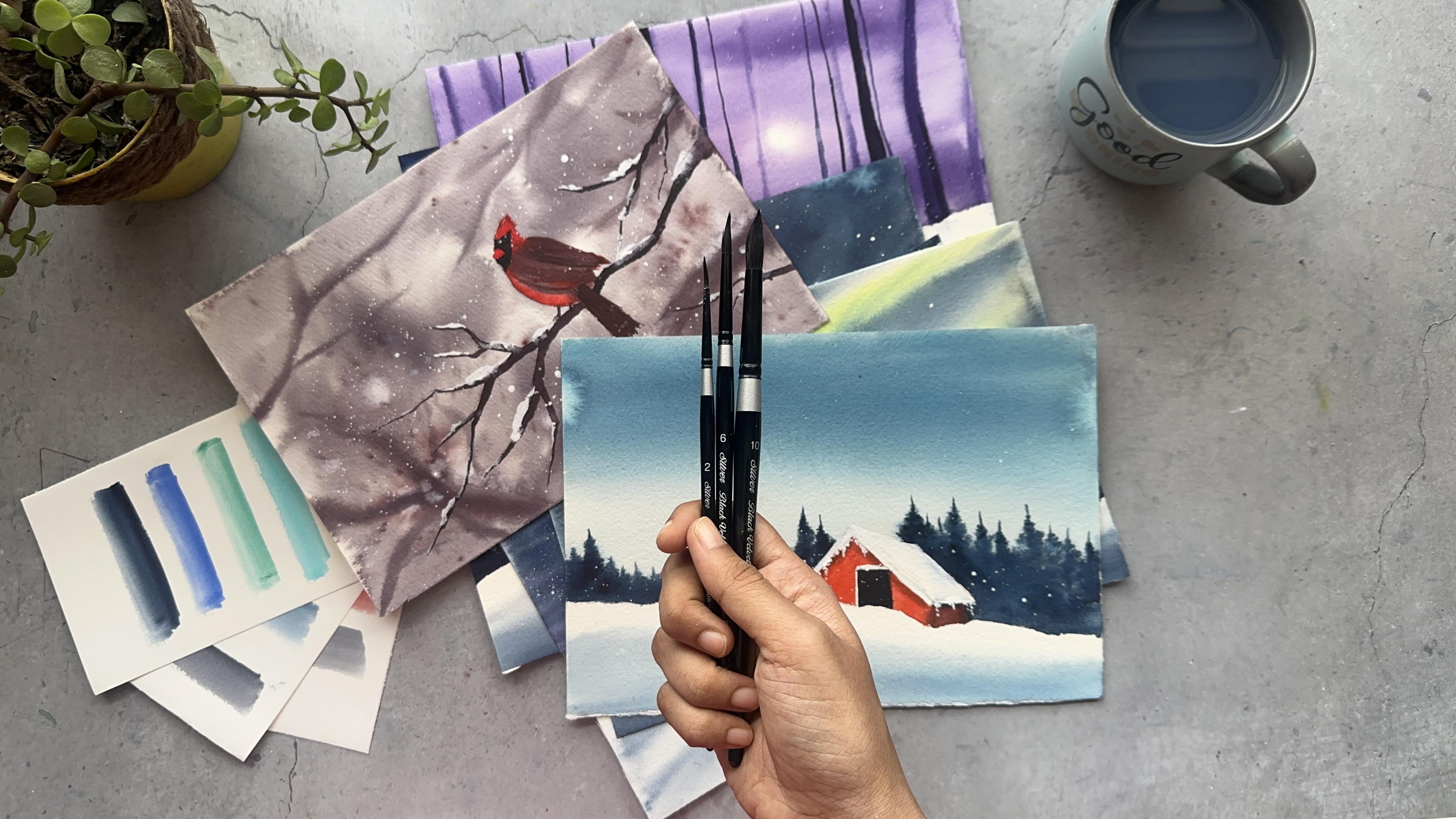
from the brand, Princeton. For painting, I use my favorite silver black velvet round brushes in various
different sizes. The larger ones,
size 14 and ten are perfect for painting skies
washes and, you know, larger trees and
the smaller ones, the sizes six and four
are great for adding those tiny details and finishing touches at the
end of each painting. Now for the colors, I use a mix of three different brands, white knights,
aquatone and sennelia. Each painting in this class will have its own color palette and we'll discuss those
specific shades right before we
start each project. And now finally, a few
miscellaneous essentials, a water jar, a mixing palette, some tissues to blot excess water or to lift
paint, and of course, a pencil for sketching the basic outlines before
we begin the painting. That's all you need.
Nothing fancy, just simple reliable tools that help us focus on
what really matters, the jay and calm that
a painting can bring. Alright. Once you have
your supplies ready, let's move on and start our
first class project together.
4. Class Project 1 - A Quiet Winter Evening: Before we start painting
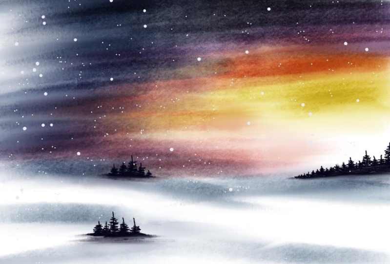
our first class project, the Winter sunset landscape, let's take a quick look at the color palette
we'll be using today. We'll be working with
a beautiful mix of warm and cool tones that perfectly capture the
magic of a winter evening. This color combo is
my personal favorite. And today's colours are
primary yellow from the brand eneliar carmine from the brand aquaton Dagon purple
from the brand Sennelier, French ultramarine, from the brand aquaton and indigo from the
brand, white knights. And finally, we are using
white gouache as well. Just a touch at the
end to add highlights or some snowy details if needed. Now, before we
begin the painting, I always like to do
a few swatches of each color on a scrap
piece of watercolor paper. This exercise will
actually help me a lot to see how transparent or intense the pigments are and how they behave when
diluted with water. So I always I mean, it always helps me to
better plan my paintings. So let's do that now as well. So I'll start by taking
a little yellow, and you can see how bright and transparent it looks
when I add more water. Next, I will swatch
out the carmine color. Then we move on to
purple, Dakin purple. This is such a lovely transition between warm and cool shades. This purple is kind of in
the middle of warm and cool. Now, French ultramarine, it has that soft and slightly
grainy texture, which is a great
addition to the sky. And finally, indigo. You guys know how much
I love indigo, right. It's such a deep,
rich and moody color, and it's also perfect
for bringing it all together in our winter
sunset landscape today. Keep this little swatch card
beside you while painting. It really helps to visualize
your colors before they go on to your
final painting. Alright, now that we have
our colors ready and tested, let's move on to our
first class project, a peaceful winter sunset
with glowing skies and soft pine trees
at the horizon. I'm so excited to paint this first landscape with
you, so let's get started. All right. Welcome to our
very first project of this ten days of therapeutic winter watercolor
landscape class. We are starting the series with something really
carming and simple. A sunset themed
winter landscape. This piece is all about
soft transitions and that warm wintry sun glow
and gentle winter stillness. Let's begin by wetting the
entire paper with clean water. I'm using my flatbush
for this step. It helps to distribute
the water evenly and make sure your paper has a
nice even share of water, not puddy and not dry either. This step is so important
because the amount of water on your paper decides how
your colors will flow blend. And also, remember, watercolor
has a mind of its own. That's what makes it so magical. The paint flows, merges and creates effects that we
could never quite plan. So let's always remember to
be flexible before we paint. And also, no expectations. Now let's start
adding the colors. I'm using my silver black velvet number 14
round brush for this. In watercolor, we
always go from light to dark because it's
a transparent medium. And so once a darker
pigment goes down, it's hard to bring
back the light. That's why we always start gentle and build up
the colors slowly. Bfore I start, I
will quickly add a line differentiating between the foreground and background. And don't draw a straight line. Just follow what I'm doing here. This is the only sketch that we need for today's painting. I'm beginning with a
soft wash of yellow right around where I want
the sunset glow to be. But I'm making sure
to leave a bit of white space in the middle. That's where the sun will be, but the glow will be
in the yellow color. So I hope I'm getting
this one right. Use a diluted mix of yellow. That means add a
little bit of water and let the color flow
naturally. Do not overwork it. Next, I'm blending in a
little carmine color. Letting it merge very
softly into the yellow. You can already see that
beautiful transition right. Slowly, I think you guys know
where this is going right. We are building up one
color after the other. So light from dark. The lightest color is yellow. Next light is carmine and
purple and then blue, and then finally indigo. So now I'm blending yellow
and purple together. You can already see that
bright orange sunset color. Let's keep on blending until
this feels right for us. Then comes my favorite
color tags in purple. I'm taking a bit of extra on my palette because I had
taken very little of it. And this is where the
evening sky sets in. Make sure while you're working, the surface is still wet. So all these colors that we are adding will melt into
each other perfectly. So once we have added that purple blend with carmine color. Finally, I'm adding
the last color, which is a mix of blue, French ultramarine blue,
and indigo at the top. I did not want to add only just indigo because
I don't want to make the sky too dark because this
is still the sunset, right? So the sky should be
a little bit lighter, even though it's at the top. So this dark indigo ultramarine mix of
color is very moody, which is perfect
for the sky now. Now we have that classic
gradient of the colors yellow, pink, purple, blue, and indigo. This is a very rare
color combinations that we don't usually go for, especially for winter skies. I don't know about
others, but personally, I have only tried this color combination
only once or twice. So this is interesting. There is no time limit on how much time you need for blending of
these colors perfectly. You can blend all these colors
until the paper dries up, or you can re wet and blend them again till your
heart feels right. For me, I think this is perfect. So I'm going to stop right here. And let this first layer dry completely before
moving into the next step. You can use a hair dryer if
you want, but personally, I don't use because we don't want to push the
pigments around too much, especially when we are using
so many of the colors. So I'm going to keep it here and I'll come back once
the paper is dried up. This is dried, and
once it's dried, we will start adding those distant pine
trees at the horizon. I'm switching to a
smaller round brush now and using a mix of indigo and that altamarine blue to get that deep cool
tone for the pine trees. Start from one end and create uneven pine tree lines
tall, short, clustered. Main thing is to avoid making
them look symmetrical. And this unevenness gives
it a natural forest feel. Try this tip once
and you can see how realistic your
pine trees will look. No paint the pine trees
throughout the horizon line. I'm only adding a few scattered
trees here and there. But all of these pine trees are different are in
different sizes. So that's what the tip was
about, I have said earlier. One more tip is to always take a second and frequently step back from your painting and
just look at it. If you think you need
any corrections, go ahead and do them right now. And if you think it's amazing, we'll just admire your painting, this is what I love
about watercolor. It just doesn't
demand perfection. It's about flow and feeling and just being there at your
table and just painting. It's really therapeutic for me. I will add a few pine trees
over here on my far left. So like I've said, a few pine trees in
scattered places. Now, I'm taking my
flat brush again and gently wetting the entire foreground area
with clean water. We just want a soft
and even layer, not too much of water, just enough to make
the surface damp. Now I'm taking my
silver black velvet, number ten brush, and a
very diluted mix of indigo, almost like a tinted wash. I will lightly brush this
across the bottom part of the paper to create the
suggestion of wintry land. This should be soft, hazy, and distant as if
covered with fresh snow. So keep your strokes
horizontal and gentle. The idea here is to not paint a solid area
with a dark color, but to give just a hint of that glow and wintry atmosphere. That's still slightly damp. I'm switching to a
smaller brush to paint a few more pine trees
along that white snowy land. Use the same indigo or a mix of indigo or
amaran for this. Make some taller trees and a few shorter,
keep them random. So they look more natural. This is the This is one of
the most important tips. I even talked in one of my previous classes called
misty landscapes, I think. So I hope you guys have had time to check
that class as well, where we have discussed
a lot about pine trees. I have talked about painting the pine trees on
the winter land, but I have started painting at the Horizon line. I'm
so sorry about that. I just get carried
away sometimes. I just paint what I
feel I should paint. I don't usually follow any reference pictures
for most of my paintings, and this is also one
of the examples. I just go with the flow. Mostly that's why my
paintings always have that moody and flowy
nature to them. Now, for the most magical part, the final touch
that brings it all together, white
gauche splatters. I'm loading my brush. This is my favorite part
in all of the painting. So I'm so happy. I'm loading my brush with a slightly thick white
gouache colour and gently tapping it with my
finger to create light snowfall effect
across the entire painting. And also, it's important
to not to overdo this few splatters here and there makes it
look soft and dreamy. It's honestly my favorite step. Moment those white dots
fall on the paper, the entire scene
transforms, as you can see. It instantly looks like a
peaceful, snowy evening, right? Such a calm and meditative start to our ten days of
therapeutic painting. I hope you guys enjoyed
painting this as much as I did. And remember, it doesn't
have to be perfect. The goal is to relax and went and find a few minutes of
peace throughout the process. In our next project, we will continue exploring this cozy winter theme and paint another soothing
landscape together. So I'm going to see
you guys tomorrow. Thank you so much for
joining me today.
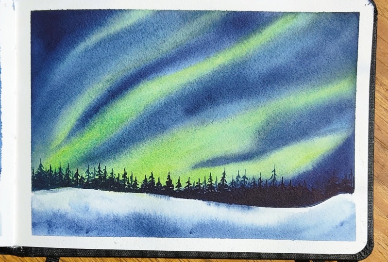
5. Class Project 2 - Northern Lights in Winter: Evan, I hope you all enjoyed painting our very first
class project yesterday, that beautiful sunset in winter. I really hope you found it relaxing and
therapeutic to create. And today, we are moving on to something truly magical
Northern Lights. This is one of my all time favorite winter
subjects to paint. There is something
so captivating about those ribbons of light
dancing in the night sky. I hope you guys agree
with me as well. Started with a simple sketch, just a light line dividing
the sky and the foreground. Nothing too detailed
because most of our magic will
happen in the sky. And before we start painting, let's take a quick look at the colors we'll be
using today because the right palette makes all the difference here while painting the
Northern Lights. Now for the colors, first, I have cobalt blue, or if you don't have it, you can use Turquoise blue
or Turquoise green as well. So the one that I have here
is cobalt blue from indigo, and next is viridian green. I might or might not use it, but I will keep it on my
palette just in case. Then primary yellow from
the brand Sennelier. This will help us create those glowing luminous streaks when it gets mixed
with cobalt blue. And French ultramarine
blue from Aquatone, it gives that rich
velvety night sky tone, and finally, indigo. From white knight, and Indigo should always be there because
it's my favorite color, and it helps us to give
that deep and moody shade, which also adds a contrast
to the light yellow color. Let's quickly swatch this
out before we begin. This step helps you
understand how each color behaves and
looks actually, when they are combined together on a scrap piece of paper. So I'm going to take a minute
and prepare my palette. So it's very important
for you guys, especially if you're
a beginner to create your color palette before
you start painting. And also, you can test the colors on a scrap
piece of paper. And once that's done, you can dive right
into your painting. We have watched our colors, let's begin with
the class project. Let's get started with
our second class project, Northern Lights in Winter. We are going to begin
by wetting the paper, but only the sky area,
not the foreground. And I'm using my flat
Princeton brush for this step just to make
sure water spreads evenly. Make sure your paper
has an even sheen of water and you don't
want puddles here, and you also don't
want any dry spots. Change of brush. Now I have taken my silver
black velvet number ten, and I have started mixing cobalt blue with a touch of primary yellow to get that luminous glowing greenish tone. That is the signature color
of Northern Lights, right? Start applying this in
soft curved motions. Think of how the
Northern light swirls and waves across the sky. Also, don't overthink
the shape here. Just go with what feels natural. You need to let your
hand dance here. Now we will start
building the depth. Gradually, bring in
the ultramarine blue, blending in gently into
the lighter areas. Keep your brush strokes
fluid and very soft. We want smooth transitions here. Once we have added ultramarine, I will deepen the edges of
the sky using indigo color. This adds contrast and really makes those lighter
aurora areas glow. You have laid down
all your colors, it's time to remove the
excess water from your brush, dab it gently on a tissue. Now your brush
should be just damp. With this damp brush, start blending the
colors where they meet. Move very softly, letting the pigments merge
into one another. And also, it's
important to remember, do not rush this step. It's where all the
magic happens. Continue until you feel happy with the
smoothness of the blend. And it's also important to remember that this only works
when your paper is wet. And if your paper
started to dry, you cannot achieve this
smooth transitioning effect. I'll add some more
of the indigo at the edges to bring
in more contrast. So you're satisfied
with your sky, set your paper aside and
let it dry completely. This is important before
we add any more details. Now let's move to
the foreground. Once the paper is dried, I'm going to add a
few simple pine trees along the horizon line. And I'm going to be using my silver black velvet
number six brush and also indigo color for this. I'm keeping it very minimal, just a few here and there, but you can also cover
the entire horizon line with trees if you prefer
a denser forest look. It's all about our choices here. Can I add a few more
over here as well. Wet the foreground
area slightly, drop in a soft mix of indigo and ultramarine blue to create
gentle shadows in the snow. We have done this step in yesterday's class
project as well. And always remember,
while going for this, you should keep it very light. And it should at the end, looks like a cold, calm and wintry scene. So do not overdo it
with a darker color. Finally, the most fun part,
white gauche splatters. Take your white gosh, add a touch of water to
get a creamy consistency, and splatter it gently
across the paper. These platters can
represent stars in the sky or snowflakes falling
through the night sky. Either way, it adds a
magical touch to the paint. And that's it for
today's class project. I hope you guys enjoyed painting this beautiful Northern
Light scene with me. Tomorrow, we have a very
interesting subject coming up and I can't wait
to paint it with you. Make sure to upload
your class projects. Once you finish, I would love to see your
beautiful versions. And, uh, if you're enjoying
this class so far, please consider
leaving a review. It really helps me reach more students and keep
creating classes like this. Thank you so much for
painting with me today. I will see you tomorrow with another cozy winter landscape.
6. Class Project 3 - Winter Galaxy Sky: Hi, everyone. Welcome
back today three of our ten days of therapeutic
winter watercolor landscapes. I hope you guys enjoyed painting the glowy Northern
Lights yesterday. It was such a magical piece
to work with, wasn't it? Today, we are going to paint
something equally dreamy, a winter Galaxy sky. Before we begin, let's take a quick look at the colors
I'll be using today. First up daxin purple
from the brand canelar. This is such a stunning
rich violet color. Next, cobalt blue from the
brand Winsor and Newton, that cool winter tone, which pairs beautifully
with purple, and then indigo from white nights go to for
adding depth and darkness. And finally, pines gray
from the brand aquaton. It is to bring in those
mysterious night sky shadows. We will also be using white gouache later for
stars and snowy touches. Pines gray at the end of my palette, which you can't see because it's from my previous painting. There's a leftover
on my palette, so I just kept it there.
I'm sorry about that. I'm just watching
all these colours together now, and look at that. What a gorgeous and cool
tone palette right. It instantly gives that
calm winter night feeling. Right. Now let's begin
with a simple sketch. Just draw a light horizontal
line across the paper. That's our division between
foreground and the sky. Keep it minimal because
we want the sky to be the main focus in this one
as well, just like Ted's. Now, I'm wetting only
the sky area just till that horizon line using
my Princeton flatbush. Make sure the water
is evenly spread. We want a nice smooth surface
for wet on wet technique. That is done, we will start
painting from light to dark. So first, I'm mixing a soft combination of
purple and cobalt blue. Make sure you have more
of the Oh, no, no, sorry, equal amounts of cobalt
blue and purple, but make it a very
lighter mixture. That means no more pigment, lots and lots of water. And I'm gently now brushing that mix
around the center area, leaving a bit of white
space in the middle. That's where our galaxy
will shine through. So do not add any
color in the middle. You will get that once we
proceed to the next layer, then you'll see clearly
what I'm talking about. For now, just follow what
I'm doing right here. Next, I'm deepening both
sides of the sky with a touch of indigo and yeah, indigo to the daxene purple
and cobalt blue mixture. With a slightly damp
brush, not too wet, I'm blending all the
colors gently in a circular motion until everything feels
connected and fluid. You can already see that glowing galaxy shape forming
in the middle. This is such a satisfying
moment, especially for me. Now, for the final step to make that galaxy
really stand out, I'm taking indigo again and darkening the very
edges of the sky. This step instantly makes that white swirly glow in the center feel brighter
and more luminous, like a soft cosmic light
against dark winter night. You will see that once we
completed this blending of indigo around the edges. Blend and blend until it
feels right to you and also make sure your paper is
wet while you're blending. That is very important. So you're happy with
the depth and contrast. Keep the paper aside
to dry completely. When it's dry, we will add
details in the foreground. I'm thinking maybe to add a few pine trees along
the horizon line. We will keep this minimal, so the sky remains
the main focus. So I'm going to see you guys in a few minutes once my paper
is completely dried up. See you soon. Now that the paper is completely dry, let's begin adding some
details in the foreground. I'm going to start by painting pine trees all along
the horizon line. This will beautifully frame
our glowing galaxy sky. For this, I'm going
to use indigo and my silver black
velvet number six brush. It's small enough to help me get those nice sharp details. We'll start from one side and slowly move
toward the other, adding pines one by one. Remember, the key
here is variation. Not every tree needs
to look the same. Some can be taller,
some can be shorter, and the spacing can also
change a little bit. That makes it look more
natural and more realistic. I have given this tip in one of my previous classes as well. Also, here is a quick
tip for bigness. When painting pines,
always begin with a thin central line
for the trunk and then add small zigzag strokes downward on each side
to form those branches. Start with lighter
pressure near the top and gradually widen your strokes
as you move downward. Like side zigzag strokes. This creates that
classic pinetree shape. And if you want, you can also practice
on a spare piece of paper before you paint them
onto your main painting. A Once all the trees are done, I'm adding a few extra
details to the foreground. We have already done this one in our earlier
class projects, simply wet the area
below the horizon with clean water and then drop in
a very light wash of indigo. I think we have done this
in both the class projects, previous class projects, right? And this creates that
beautiful snow shadow and makes the landscape
feel soft and realistic. Now, I'm adding one
last subtle detail. A few individual
pine trees along the horizon line on the
foreground instead on that line. Maybe just four or five
of them is enough. This adds that extra layer of depth and brings a
lovely balance against that glowy galaxy sky and also those pine trees
along the horizon line. Finally, for the
most exciting part, let's splatter our stars. I'm using white gauche for this. Load your brush with paint
and gently tap or flick it to create a tiny starry
dots all across the sky. You can vary the amount
of water depending on how big or small you want
your stars to appear. If you take less water, you will have very
tiny, tiny stars. And if you take lots of
water onto your brush, you'll have those big
sized white dots, which can also looked at
as snowflake or snowdrops. So either is fine because we are painting magical
winter landscape, as well as a galaxy night. It's your choice
on how much water you need to take on your brush. A Once you're happy
with the splattering, take a step back and
look at your painting. It's truly magical how those tiny stars transform the whole scene, and that's it. Our Winter Galaxy
Sky is now complete. I hope you enjoyed painting this dreamy night
landscape with me. Don't forget to upload
your class project in the project section below. I absolutely love
seeing your versions, and tomorrow we will continue with a brand
new winter landscape, one that just as
colming as beautiful. Thank you so much for watching. See you in the next video.
7. Class project 4 - Winter Forest glow: Welcome back,
everyone. I hope you all enjoyed painting
yesterday's project, the Winter Galaxy Sky. That one was all about painting dramatic
contrast and glow. Today we are slowing
things down a bit with a softer and more peaceful
subject a winter forest Glow. Before we begin painting, let's take a look at
our colors for today. We are using a very
small palette, just three main colors and
white for final touches. The first color is carmine
from the brand Aquatone. The second color is
daxin purple from the brand Sennelier and the third one is indigo
from white knights. Indigo is my favorite color, and of course, it should be there in all of our paintings. And finally, of course, white guash, which we
will use at the very end. Now, let's do a
quick colors watch. I always recommend
swatching before starting because it helps you visualize
how your colors interact. Today we are mixing
carmine and diaxen purple and you get this
glowing pinkish hue color, which is our main color
to paint the forest in. I'm going to take I'm going
to swatch Indigo as well. We're going to have to
mix three colors together to create that wintry
forest background. This is a perfect balance
between warmth and cold because when you mix
digs in purple and carmine, you get some kind of warm, pinkish color, and it'll be perfectly balanced
with indigo, which is a cool color. And isn't this palette
looking beautiful already. Et's move on to painting. We will begin with a
very light sketch. Nothing complicated here. Just draw a simple line that separate the
sky from the land. This line will act as our horizon and so keep
it soft and faint. We don't want any
harsh pencil line showing through the paint later. And this composion is
all about subtle layers, so keep everything
gentle and gradual. Once you are done
with the sketch, it's time to wet the sky area. I'm using my Princeton
flat brush for this step. We will wet only the
background area. That means from the top of the paper down to
our horizon line. Make sure the paper has
an even shen of water. You don't want puddles. You also don't want
any dry patches, also. Take your time with this step. Good water control sets the foundation for
our entire painting. Now let's start with
our first color, a mix of carmine
and diaxen purple. I'm switching to my silver black velvet round brush size ten. While adding this color, leave a white circular area
in the center of our paper. That's where our glowing
winter sun will be. You don't need to outline it. Just leave that part untouched and paint around it very softly. T by gently applying the pinkish purple color
around that white circle. Work from the center outwards. Use light sweeping strokes and don't overload your brush
with lots of paint. Remember watercolor always flow better when they are
allowed to move naturally. As you move outward, begin
to deepen the color by adding a little bit of
daxen purple if you wish, you can add indigo as well. Let the pigment spread
and bloom into the water. Allow watercolor to do
its magic right here. This is my favorite part in
the entire of the painting. Keep the center bright. That's where the
light is coming from. Think of it like
painting a glowing aura. If the edges feel too harsh, just clean your
brush, make it damp and lightly blend
those transitions. Let's give it a
couple of minutes. You want the paper to be damp, not soaking wet before
adding the background trees. If it's too wet, your
trees will bleed too much, and if it's dry, you won't get that soft hazy look
we are going for. And I think my paper
is feeling good. Now I'm switching to silver
black vet number six brush, and I'm going to load it
with a very light shade of purple and carmine mix, or I can take the very
light shade of indigo as well. Any color will work. Now start painting
thin straight trees from one end of the
horizon to the other. Keep your brush vertical and use gentle upward flicks to
create that point at tops. The trees can vary in sizes that makes it
look more natural. And at these days, we are
not adding any branches. These background trees
should stay soft and simple. That's what we are
going for here. Even turn your board sideways for better control
and for better angle. That's what I'm doing here. I have decided to cover the entire background
with these trees, but I'm making sure to
leave some gaps between those trees in the middle
because we're going to come back and add the
foreground trees as well. All the background
trees are in place. We will let the paper
dry completely. Then in the next step, we will add the foreground trees to bring more depth to this
peaceful winter forests in. So I'm going to see you guys
in a couple of minutes. Oh that our background has
completely dried, it's time to move on
to the foreground. This step will bring more depth and contrast
to our landscape. And you'll see just how a few additional details can transform the
entire painting. So I'm going to begin by adding one more layer of trees this
time using indigo color. Um, or you can use dig in
purple and indigo mix as well. Just make sure, it doesn't matter actually
which color you choose as long as these trees appear darker than the previous
layer in the background. That contrast is very
important because it's what gives us a beautiful sense of distance between
these two trees. Of course, I'm using my silver black velvet number six brush as usual for this step. It's perfect for getting
fine sharp tree shapes. I will start adding these darker trees one by
one along the horizon. Make sure to vary in
the shapes as well, just like we have done
in previous layer. Some can be wider, some can be very thin trees. That irregularity makes
the forest look natural. Here is to not overdo it. Once you feel that the area looks more balanced,
stop right there. It's always tempting
to add one more tree, but sometimes less is
more in watercolor. While I contemplate to
add more trees or not, I'm going to move on and start working on the
foreground land first. I'll take my Princeton
flat brush and wet just the lower area of
the paper with clean water. Make sure it's evenly
wet and not dripping. Now switching to my silver black velvet number ten round brush. I'll pick up a mix of digs in purple and indigo
or just indigo. With this mix, I'll gently add a few horizontal strokes here and there,
nothing too heavy. These soft touches to give that wintry essence
to our snowy land. Remember, this should
feel very light like soft shadows casted
on the snowy land. This is something that
we have done before in our previous class
projects as well. That technique of layering diluted colors to show the
form of snow covered land. The goal here is to
suggest texture and light, not to paint every
detail on the land. That the land is taking shape, I can see a few small gaps
near the base of the trees, and I think I'm going to add a few more extra trees to
make it look more connected. This time, I will
drag the base of those trees slightly
into the foreground. This creates the illusion that some of these trees
are growing right out of the land rather than floating behind just
in the background. It's a small but very
interesting detail that gives the scene more depth. Once you're happy with the
placement and color balance, it's time for our final
step, the snow splatters. So take your white wash, mix it with a little
bit of water, and gently tap your brush to splatter paint
across the paper. This instantly transforms
your painting. The tiny white dots look
like falling snowflakes. You can add a few more
concentrated splatters near the top to create the
light snowfall effect. And that is it. Our Winter forest glob
painting is now complete. It is such a simple composion so beautiful and
satisfying to paint. I hope you guys enjoyed
painting this one with me. And as always, if you are
enjoying this series, please consider
leaving your review. It really helps me reach more
watercolor lovers like you. Thank you so much for watching and painting
with me today. I will see you tomorrow with
a brand new class project. Another peaceful winter
scene that you're definitely going to love.
So see you tomorrow.
8. Class Project 5 - Northern Lights Scene: Begin with Class Project five. Today we are painting a
magical Northern light scene a little more advanced than
the one we have done before. It's going to be a
really fun project because we'll work with light, glow and depth all
in one painting. To start, I'm going to
draw a very simple sketch, just a single line dividing the sky and the land. That's it. Before we jump into painting, let's look at the colours
we'll be using today. The first color is primary
yellow from the brand Snelar. This one has that
perfect warm glow we need for the Aurora. The second color is cobalt blue. You can use cobalt
green, turquoise green, or turquoise blue, and this
one is from Windsor Newton. It's soft and mixes beautifully with yellow to create that
magical greenish tone. Then we have indigo, again, from Windsor
and Newton, rich, deep blue that will help us create those mysterious
night shadows. And finally, pines gray
from the brand aquaton my favorite for darkening skies and creating the contrast. Do a quick swatch of these
colors before we start. It's always a good idea to see how they look
together on paper. Now we will start painting. Begin by wetting the
paper with clean water. I'm using my Princeton
brush for this step. Gently glide the brush
over the surface, making sure the water
is evenly spread. Not too much and
also not too little. And remember, we
are only wetting the background area,
not the foreground. The paper is evenly wet. We will start painting
the northern lights. In watercolor, we always
work from light to dark. So we will begin with
the lightest color, that glowing aurora in the sky. Mix a little primary
yellow with cobalt blue. If you prefer, you can
also use turquoise blue or even a touch of sap green. I'm using a mix
that leans slightly towards yellow to keep
that bright glow. Now start painting those
flowing bands of light. Make them slightly
curved or wavy. If they are dancing across
the sky, it looks realistic. So keep your hand free. Don't worry about
being perfect here. The beauty of Aurora lights is that they are very soft and
also they are very irregular. I will start building the
darker areas of the sky using a mix of pines
gray and indigo. Apply this gently around
the yellow and green bands, leaving the center
areas lighter. This contrast is what gives
the Aurora its glowing look. Time with blending, use a clean damp brush to softly merge the colors
where they meet. If you feel it's too
harsh somewhere, just lift a little colour with
a tissue or a clean brush. And my watercolor now
is looking perfect because the paper
is rightly wet, so it's easier for me to wet
these two colors together, the yellow and green mixture
with the darker color. Make sure your paper also
stays wet while blending. If it starts drying, lightly rewet the area, but only if it's still workable. We don't want hard
edges at this stage, especially while
painting the auroras. Since this layer is in place, I'll take some more of Pines gray and indigo and
start to darken the edges top edges
of the sky so that the contrast will be more visible and the auroras
will pop even more. So pause whenever you want and
let the layer settle down. You can also take
a few seconds to just observe how the
colors are interacting. Sometimes the most
beautiful effects happen when you let
watercolor do its own thing. Especially that magic you can only see while
the paper is wet. Once the layers are
completely settled, we can move on to
painting the foreground. But now I will only check if I want to paint the pine trees in wet
on wet or wet on dry. So I'm going to just
take some darker color. You can take indigo or Pine
square or a mix of both, and let's start painting
a few pine trees. If the paint is spreading too much and you can't hold the
shape of the pine tree, then we will wait and we
will let the paper dry. And then we will
come back and paint the pine trees wet on dry
instead of wet on wet. This is not the right way to paint the pine trees
because especially now, for this painting, I
want the pine trees to be holding their shape, and they should look sharp. So I'm going to
stop it right here, and I will wait for a couple
of minutes so that the paper gets dried up and we will
paint the pine trees then. All right, the paper
is dried up now. Let's paint the foreground
with pine trees. The foreground for this
scene is quite simple. It's just a stretch of pine
trees along the horizon line. Even though it's simple,
this step is what crowns the whole painting and gives it that sense of place
beneath the glowing sky. Uh You can see I have changed my brush. This is silver black
velvet number six. This is a small brush
so that I will get the detail detailed pine trees and also sharp edges that
is very important for me, especially for this painting. Using a mix of indigo and
pine gray for this part, it is a very rich and
deep colour combination that perfectly complements the cool tones of
the Northern sky. In one of our earlier
class projects, we painted only a few pine trees scattered
here and there. But this time you will fill the entire horizon with trees, a continuous line of dark slots. It'll help make the
landscape feel dense, more cold and full of mystery. Oh some tips to paint those pine
trees to perfection. Hold your brush
vertically and begin painting small upward
strokes for the tree trunks. Then with quick short
flicks on either side, start forming with the branches. And it's important for you to keep the strokes very loose. Do not try to make
each tree identical. Nature is never perfect, and that little unevenness
is what makes it look real. More across the horizon, vary the size and shape
of the pine trees. Some can be tall and slender and others
shorter and bushier. You can also overlap
a few of them slightly to give a sense
of depth and layering. And light and confident. Remember this is all
about the movement. You will notice that
as you go along, the trees start to balance naturally across
the horizon line, and that is the magic
of painting pine trees. Once you have filled the
entire horizon line, take a step back and see how it looks against
the glowing sky. You will see how the dark indigo really makes those northern
lights shine even more. Now it's time to
let this layer dry. Because indigo is
a darker pigment, it can take a little
while to dry completely. I usually let watercolor
a dry, but in this case, since we are using
a darker color and want to move quickly
to the next step, I'm going to use a hair dryer. Just remember to keep it on
a low or medium heat setting and hold it at a distance so you don't disturb
the paper surface. Dry it evenly until the shine on the paper disappears and it
feels cool to the touch. The trees are completely dry. We will work on the
land below them. I'm going to lightly wet the
foreground with clean water, just a soft wash,
nothing too heavy. Then I will drop in
a little indigo, diluted with plenty of water. This will create that soft wintry shadow
effect on the snow. For the final touch, we will add a bit of white wash platter. You can use a small
brush for this. Load some slightly
thick white wash, tap your brush gently and let the paint sprinkle
across the sky. Those little splatters
can represent either distant stars
or soft falling snow. It's up to your interpretation. Both work beautifully for
this sin, and that's it. We are done with the
class project Pi. We have painted a magical
Northern light sky. Added glowing colors
balanced with dark pines and finished it
off with a gentle snowfall. I hope you enjoyed painting
along with me today. Take a photo of your
finished piece, share it in the project gallery. I would love to see a version. I will see you tomorrow with Class Project six until
then happy painting.
9. Class Project 6 - Winter Lake Reflections: Come to Class Project six. Today we'll be painting a
beautiful winter scene, a calm and serene
composition that captures the stillness
of cold winter day. Let's begin with a sketch. Now, today's sketch
is going to be a little bit more
detailed than some of our previous ones because we are not only drawing a
horizon line this time, but also sketching a lake
and the foreground land. New to sketching
landscapes, don't worry, follow along with
me step by step, and it'll be very simple. I'm starting with a
light pencil sketch and sketching the horizon line slightly above the
center of the paper. Below that, I'm sketching
the curves of the lake, making sure the
perspective looks natural. These small slopes
and curves represent the snowy banks and the frozen
land surrounding the lake. Keep your lines very light
just enough to guide your painting. That is it. Our basic sketch is now ready. The horizon, the winter
land, and the lake. A let's take a look at the colors we'll
be using today. The first color is hookers green from the brand Sennelier. The second one is Indigo from
the brand Winsor Newton, and the third is Pies
Gray from aquaton. We will also, of course, be using whiteqh later
for final highlights. Let's do a quick swatch of
these shades before we start. When you see these colors
together in these watches, it already feels so
moody and wintry, very calming and
atmospheric as well. The hooker screen gives
that subtle forest stone indigo add depth and Pines
gray will add contrast. Now that our colors are
ready, let's begin painting. A step is to wet the sky area only up
to the horizon line. I'm using my Princeton
flat brush for this step and just evenly coating
the area with clean water. Once the paper is evenly wet, I will begin with a mix of
indigo and hookers green. When these two colors blend, you get a rich, dark, bluish, greenish tone that feels
perfect for a winter sky. I will start painting
from the top of the paper and slowly
bring the color downward, fading it as I move
toward the horizon. Leave a few light
patches in between. These will act as
soft glowing areas of the sky and give it
more character and depth. While the sky is
still slightly damp, I will start painting
pine trees in the background using pine scray. Remember, these trees are so far away and we don't
want too much detail. Just tap your brush gently to create tangular
pine tree shapes. Make sure the trees
are uneven in height and shape that gives
a more natural look. Also paint only about
one or 2 centimeters above the horizon line so that they don't
overpower the sky. You're happy with the
background trays, we will let this
layer dry completely. You can either let it air
dry or if you prefer, use a hair dryer
on a low setting to speed up the process. But I'm not going to be
using any hair dryer. I'm going to keep it
for drying naturally, and I will come back once
this is completely dried up. So we will move on
painting the foreground. That means you're going
to paint the lake, my favorite part in
this class project. If the paper is completely dry, we will move on
to the next days, painting the lake
and the foreground. Before I start,
I'm just going to make a small adjustment
to my sketch. I feel like the land area near the lake is slightly
out of perspective, so I am redrawing a small
section of the winterland. These little tweaks
are perfectly fine. They actually help you balance your composition before
adding the paint. So you're happy
with your sketch, we will begin painting
the lake area. So I'm wetting the
entire lake portion with clean water
using a round brush. Make sure it's a soft brush
that holds water evenly. Don't flood the paper. We just need a smooth, glossy surface. I'm mixing the same
color combination that we used for Indigo
and hooker screen. I love how these two colors together create that
cool, moody winter tone. We will start by laying down a very light wash of this
color across the lake. Remember, since this
is a reflection area, the tone should be lighter
than the sky above. This helps us create
that illusion of water, calm, frozen, and softly
mirroring the surface. So we will deepen
the reflections, but only till half
part of the leg. To do that, take a little
more of the pigment, mix indigo if you need to
make it a bit stronger. Now, we will once again
deepen the reflections, but with even more
stronger pigment. So take as much as
indigo you need and mix it with a bit
of a hookah screen. Now gently paint vertical lines along the lake's top edge
right below the land. That's where you will see the
darker reflections forming. Reflections in watercolor are all about direction
and softness. Always move your brush
vertically here, and keep your strokes
smooth and loose. Try not to overwork it. That's one of the key points. We want the reflections
to look natural and slightly diffused
and not too defined. So you're happy with that, let's add a bit of shadow detail. I'm mixing indigo and
hookers green and also a little bit of pines
gray to create that deep pan. Now I will paint a very thin
line under the snowy land. This helps define the separation between the snowy ground
and its reflection. You can also add a few
small broken lines here and there to suggest that edge of the lake isn't
perfectly smooth. That gives it more realism. Do not forget to add those vertical lines here
under the snowy land as well. That is also important. These are the reflections
of the land in the water. Have to mirror
every single detail of the subject in
the reflection. Just add hints of darker areas to suggest that there
is a reflection there. This way, your leg
doesn't look too heavy or artificial
or overworked. You're happy with
the reflection, we will move on to
wintry land area. With a very diluted mix
of focus green and nigo, I'm just brushing a few soft
shadows on the snow area. Keep your brush moment
light and quick, almost like dry brushing. These shadows give the
snow some shape and depth while keeping
it clean and minimal. This is one of the simplest
and most effective ways to show that light and shadow and snow without
adding too much detail. Remember, in our
previous class projects, we have the way we have
painted the winter land. We just added the shadows. It is same here, but instead
of keeping it plain, we are adding different shadows, different spaces to show that the land is not
even, it is uneven. There are so many shapes and so many subjects to
paint in watercolor. But if you know the technique, you can apply that technique to paint just anything you want. So that's why it's important to get the tips and techniques right so that you can
paint the landscapes on your own without having
to rely on any tutorials. It would take so
much time to paint these details in your landscape. I just have a problem that
I don't know when to stop. So I will keep on
going and adding these details over
and over again. So if your landscape looks
perfect at any point in time, you can just stop and
move on to the next one. Now that everything is softly blended and our landscape
looks complete, it's time for my favorite part, adding the snow splatters. I'm taking my white wash, mixing it slightly mixing it in a slightly
thick consistency. And with my smaller round brush, I'm gently tapping and splattering the paint
across the paper. Adds that magical snowy effect and brings the entire
painting to life. You can choose to keep
it subtle or go for a heavier snowfall look
totally up to your choice. That's it. We are done with Class Project six winter
like reflections. I hope you enjoyed
painting this calm, moody winter scene with me. Remember, each project in this class builds upon
the previous one. If you have painted
all six so far, you're already seeing
how much control and confidence you have gained with your watercolor techniques. Do not forget to upload your painting in the
project gallery. I would love to see your
version of this landscape. If you are enjoying this class, please take a moment
to leave a review. It really helps me reach
more students like you. Thank you so much for
painting along with me today, and I will see you tomorrow
for Class Project seven.
10. Class Project 7 - Winter Cabin Scene: Class project. He's one
of my absolute favorites. We are painting a beautiful
winter cabin scene, but not just any
other winter cabin. This one is very special to
me because it features one of my most loud colour
combinations soft to blue greens and in
the background and a warm contrasting cabin
in the foreground. It's that perfect
balance that brings Cozy and the cold that
I absolutely love. So I am beginning
with a simple sketch. This sketch, Okay, sorry, this is not a simple sketch. This is slightly more detailed than what we have done before, but don't worry, we will take
it step by step together. Start a simple cabin by sketching a rectangular base
with a triangular roof. You can add a door or a
window later if you wish. This cabin sits
slightly off center, which gives a more natural
and balanced composition. While we are at it, also draw a horizon line just a little below the center
line center of your paper. Take your time with this step. Remember, even though it
looks a bit complicated, once you follow along slowly, it'll be completely doable. Now that our sketch is ready, let's look at the colors
we'll be using today. The first one is cobalt green or turquoise
green you can use. I'm using the one from
Windsor and Newton, but any brand will work. The second color is indigo, again from Windsor and Newton, a deep moody blue that
I can never get enough of the third color is
vermilion red from sennela, a beautiful warm
red that contrast perfectly with the cool
tones of our background. You don't have vermilion red, make sure whatever the red that you have is bright red color. Do not use brownish
red or orangish red. Let's quickly swatch them on paper to see how
they look together. You will notice how vibrant and fresh this
combination feels. The blue tones set that
icy and wintry mood, while the vermilion adds a
cozy warmth to the cabin. There is a little bit of pines gray stain on my palette that
just refuses to go away. But that's totally fine. I'm going to ignore
it and I encourage you to do the same if you have
a messy palette like mine. Now, let's begin with
painting the sky first. Start by wetting the area
above the horizon line, carefully avoiding
the cabin sketch. You don't need to wet the
cabin area, just the sky. We will begin by dropping in a mix of cobalt
blue and Indigo. Be careful not to add
too much of indigo. We want the sky to remain
more blue than dark. Start darker at the top and let the colour fade as you move
down toward the horizon. This creates a nice
atmospheric depth. While the paper is still wet, we will add some background
pine trees using indigo. Since this is wet on wet, don't worry about getting
perfect tree shapes. The idea is to
suggest the trees, not define them just yet. Just dab in soft triangular
shapes here and there. They will naturally blend
into the background, creating that distant
and misty effect. That is the magic of wet on wet technique in
watercolor as well. To paint the pine trees
only at certain areas, but I have decided to paint
them along the horizon line. So I'm doing just that now. So I'm going to cover the
entire horizon with pine trees. While we are working
on wet paper, let's move to the foreground. Lightly wet the area
below the horizon line, drop in a faint wash of indigo. This gives a subtle,
shadowy snow effect. We have done something similar in a lot of our class
projects before. Keep it very light. We just want that suggestion of winter
light reflecting on the snow. We will let the whole
layer dry completely. So I'm going to see
you guys in a bit once my paper
completely dries up, so we can move ahead and
paint further details. We have a dry paper now, so we can move ahead and
paint a few details. So take a smaller round brush and pick up a bit of indigo. We will now start defining
those background pine trees. Use very gentle upward strokes
for the tip of the trees. Let the rest of the tree softly blend into
the background. Remember, we are only correcting the top
part of the pine tree. Make sure it is looking sharp. I mean, literally sharp. Don't try to, you know, make the tree very perfect but we still need that softness, and it is what gives the sense of depth and tranquility
in our landscape. Oh, we will move on to
painting the cabin, which is honestly my favorite
part of the entire project. There is something so magical about bringing this little cabin to life in the middle of
a cold wintry landscape. We'll begin with our
bright vermilion red, such a vibrant and warm color. I absolutely love how
this color contrast with the cool blue background. That pop of warmth
instantly draws the eye and creates that cozy feeling we associate with winter cabins, like there's a little
fire burning inside. Start by carefully covering the entire cabin area
with vermilion red. Make sure your strokes
follow the shape of the cabin and don't worry
if it looks flat at first. We will be adding
shadows and depth next. Stack in the side of the cabin, this part is in
shadow and it helps us define the light
direction in our painting. I'm mixing a touch
of indigo into the vermilion to create
that deeper shade of red. Use that mix on the side walls
and under the roof line, you will see how it instantly
adds that dimension look, one side catching the light, the other slightly
receding into the shadow. The door, I'm going
to use Indigo again. It's a great choice
for shadowed areas and helps balance out the cooler
tones in the background. You can even add a tiny window
or a bit of reflection, if you like, but I'm keeping
it simple for today. Well, I have indigo
still on my brush, I'm going to take a moment
to sharpen a few of the nearby pine
trees just to add a little more detail to
those shapes using indigo. You don't want to overdo
it just enough to keep the scene, feel
cohesive, unbalanced. Everything is painted. I will quickly dry this area
using a hair dryer. Normally, I let my
paintings dry naturally, but since we are working
with Daka pigments here, it's perfectly fine to
speed up the process. Once the paint is
completely dry, I will take a bit of white gosh that is our little magic touch. We will use it for two things. First, to perfect the
shape of the cabin, covering up any uneven
edges or mistakes. Second, to add snow drips
from the roof edges. Just lightly touch your
brush along the roof line, let the paint fall naturally. And it instantly gives that
beautiful snow covered effect like fresh snow had
just settled on the roof. One of my favorite finishing
touches the paint splatters. I will take some white gah
again, load it on my brush, and gently tap it to create tiny splatters
across the painting. You can interpret these either as either snowfall or stars, both work beautifully in
this winter night setting. It's such a simple
but powerful way to bring movement and
atmosphere to your painting. Is it, we are done with
our winter cabin scene. It's cozy, colorful
and full of contrast, a perfect example of how a limited but thoughtful palette can create something
truly stunning. I hope you allowed painting this project as much as I did. I will see you all tomorrow with our next class project until then happy painting
and take care.
11. Class Project 8 - Moonlit Winter Night: To Class Project eight. Today we are painting
something very simple but incredibly magical, a night sky glowing
with moonlight, surrounded by soft pine trees resting on a snowy winter land. This one isn't inspired
by any reference photo. It's actually something I imagined and wanted
to bring to life. And I have to say it turned out exactly how I pictured it. So let's get started. We will
begin with a simple sketch. This one doesn't require
much drawing at all, just a horizon line across
the lower part of your paper. That's all we need to separate the sky from the snowy ground. Now that the sketch is ready, let's look at the colors
we'll be using today. There are only three colors. The first one is indigo
from Windsor Newton. The second is cobalt green. From Windsor and Newton, you can use turquoise
green if you prefer. The third one is white cash, which we will use at the
end for highlights and snowy effect. That's it. Three colors, very
limited palette, but trust me, they
blend together beautifully to create
that rich night sky glow. Let's quickly swatch them out
on paper before we start. You will notice
that when you mix, we're going to have
to mix indigo and cobalt green for this landscape, but I will explain that later. Now that our colors are ready, we will move on to painting. We will begin by
wetting the sky area, not the whole paper, and I'm using my Princeton
flat brush for this. Carefully wet the paper from top to down to the horizon line, making sure the water
layer is smooth and even. We don't want any puddles here, but the paper should
have a nice even shine. Once the surface is ready, I'm switching to my silver black velvet round
brush size ten. Now I will make
ScobaltGreen with indigo, and we will start painting the sky with this
gorgeous color. Here's the interesting part. Before we begin
covering the paper, I'm going to draw a
small circle near the center or slightly off
the center in the sky. That's where our moon will be. We won't paint
inside that circle. We will leave it white for now, and that white area will later
become our glowing moon. Start applying the color around the circle using soft
sweeping strokes. As you move outward,
gradually deepen the color by adding more
indigo to your mix. This helps create
that natural gradient lighter near the moon and
darker toward the edges, which makes it the glow
look even more realistic. That's where I take
more indigo as well. I'm going to add this indigo color around the edges and also in the
middle wherever I see fit. I have this image of dark
cloud surrounding the moon, so I'm just going to I'm just going to
try to replicate it. Now, I will show you a
little trick that I love. Wrap your finger with a clean
tissue and very gently tap the area inside the circle to
lift off any stray pigment. This helps perfect
that round moon shape and also gives it a
subtle glowing edge. It's such a simple technique, but it works
beautifully every time. You can also use
this technique to paint sun during
sunset or sunrise. Satisfied with the indigo yet. So while the paper
is still damp, I'm going to start adding few clouds across
the sky once again. Use soft uneven
strokes for this. Clouds at night don't have
sharp edges or sharp shapes. They're more like drifting
shadows across the sky. Don't worry too much
about the placement, just go with the floor and let
the clouds form naturally. Since this painting isn't
based on a reference, it's really about how you
feel about the scene. Loose, spontaneous
and intuitive. At least that's what I
felt while painting this. That's why I love watercolor. You can just let yourself go and be present completely
in the moment. All the class projects, I thoroughly enjoyed painting this one because in this one, I did not feel the
pressure to be perfect because I was not following any
reference picture. To be honest, this one felt such a therapeutic
session for me, and I hope you guys
feel that, too. Sometimes you can with all the techniques that
we have discussed, you can go ahead and
paint on your own. Just try and just
place the sky moon, some trees and some birds without following any
reference picture, then you will know what
I'm talking about here. Right now I'm gonna
keep this for drying, and once my paper is dried up, I will come back and add a few
details in the foreground. Our paper is completely dry, we can move on to
painting the foreground. This part is simple
and peaceful. We are going to keep the
composition very minimal with just three pine trees resting
on a snowy winter land. I'm taking my silver
black velvet, small round brush, and I'll be using indigo for the trees. With a tree in the middle. This one will be medium sized just around the center
of the painting. Then on the right, we will paint a
slightly smaller pine. Think of it as a younger tree or the one that's a
bit farther away. And finally, on my left, paint the largest pine tree. This one will frame the entire composition
beautifully and help balance the scene. This is exactly how I
pictured it in my mind. The trees, each with a slightly different size standing quietly under
the glow of the moon. When painting pine trees, remember to use light
upward strokes for the trips and broader looser
strokes as you move down. Don't aim for perfection. The nature that
natural irregularity of your brush moment will make
them look more realistic. We are done with the trees,
let's work on the foreground. You already know this technique. We have used it in many of
our previous class projects. Simply wet the land area with clean water and drop in a
very light wash of indigo. Paint paint will create the effect of snow shadows cast by the moonlight
over the snow. Keep your wash light. You want the snow to still look
bright and glowing. You can even lift a bit of
pigment with a damp brush in a few places to show areas where the moonlight
is hitting directly. And also take a
moment and step back. See how your painting
is looking now. It already feels so
peaceful, doesn't it? The final touch, we
will add the magic. Take your white wash, mix it with a bit of water, and gently splatter it across the painting
using your brush. Shiny dots of white will instantly transform
your painting. There can be stars
twinkling in the night sky or snowflakes gently falling
under the moonlight. It's up to you how you
want to interpret it. I personally love to
think of it as a mix of both snow glowing softly under the starry winter
sky. And that's it. We are done with
our class project eight moonlit Winter night. I hope you enjoyed painting
this peaceful scene with me. It's simple, but it
captures so much feeling, the quiet, the stillness
and soft glow of the moon. Thank you so much for
painting with me today. Don't forget to upload your
project in the class gallery. I would love to see your
versions of the night sky. And as always, if you
are enjoying this class, please consider
leaving your review. It really helps the class reach more watercolor
artists like you. I will see you tomorrow with
a brand new class project. Take care and happy painting.
12. Class Project 9 - Snowy Branch At Sunset: Welcome to Class Project nine. Today, we are going
to paint something very simple but
absolutely breathtaking, a soft glowing
winter sunset with a delicate snow covered
branch in the foreground. This project is all
about light and warmth, even though it's a winter scene, the glow from the sunset adds a feeling of quiet joy and calm. And the best part, there
is no sketching involved, we'll be working directly
with the colors today, which makes the process
even more freeing. Let's start by looking at
the colours we'll be using. The first color is naples
yellow from Sennelier. Second color is permanent
orange from the brand aquaton. Third is vermeilion red from
Snelar and the fourth is carmine from aquaton
and the fifth is daxen purple from
the brand sanelar. Let's do a quick color swatch
before we begin painting. I almost forgot one more
important color, pies gray. We will use this later for
the foreground branch. Of course, we'll be
using white gauge as well at the end for the
snow and final touches. You will notice how
beautifully these colours flow into another
from soft yellow to orange to warmer reds and
finally subtle pink tones of carmine and also
finally purple color. This colour palette
is my favorite, especially when painting
with winter landscapes. If you don't have pines gray, you can absolutely
use indigo instead. Both will give you that
rich and deep tone. We are looking for the branches. Our palette is ready.
Let's start painting. We will begin by wetting
the entire paper with clean water using our
Princeton flat brush. Make sure the water
layer is even. It should glisten softly under the light but
not have any puddles. This even coating will help all those sunset colors
blend smoothly later. Like I said before,
I almost forgot to add Pines Grey color palette
video, so I'm adding it now. This is Pines Gray
from White Knights. I will also watch it
out on the paper so you guys will have an idea what this color
should look like. It should be any darker color. That's why I have also
suggested to use Indigo. Quickly switched my
brush from Princeton to silver black velvet round
brush. Now comes the fun part. We will start dropping
in colors light to dark. Start at the middle of the
paper with naples yellow, apply it gently in
horizontal strokes. The color forms the
softest part of the glow, that warm and golden
light near the sun. Next, we will move slightly downward and start
adding permanent orange. Let it blend naturally
with yellow. You don't need to
force the transition. Water will take care of most
of the blending for you. Then move on to vermilion red. This one adds a touch of warmth and richness
to our sunset. You can lightly mix
a bit of orange into it for a smoother
shift in color. After this, I'm going
to also take carmine, that lovely pinkish red tone, and blend it into the vermilion. Mixing these two gives a
beautiful peachy glowing hue, the kind of light that you see just before the sun
is completely set. Finally, for the outer
edges of the paper, use dix in purple, add it gently at the
very top corners and blend softly into
the red orange areas. This step helps
create that contrast, the deepening
twilight that makes the sunset colors look
even more vibrant. Your time here. This blend is what brings the
painting to life. Go back in with a damp brush and smooth out any harsh
lines between the colors. Also be generous with the purple because at
the edges, I mean, because that's what brings in the contrast to our
warm yellow color. You will see how everything
is melting together into that glowing gradient of
warm and cool colors. That is the magic of wet on wet. Happy with the blend, step back for a moment
and just look at it. You will see how luminous and
peaceful it already feels. That's the magic of watercolor, the way they flow and
merge on their own. Now, we will let this layer dry completely before we move
on to the next step. You can leave it to
air dry naturally, or if you prefer, use a hair dryer on low heat
to speed up the process. I'm going to let
it dry on its own. So I'm going to see you guys in a couple of minutes so that
we can paint the foreground. Now that my paper has
completely dried, we will move on to
painting the foreground. You might notice a few blooms around the edges of
your paper here. That's perfectly fine with me. That's what happens when I
don't tape down the edges. And honestly, I
don't mind at all. I knew this would
happen, and sometimes those soft blooms just add a little bit of character
to the painting. So let's move on and start painting the foreground branch. It's very simple. You don't
need to paint an entire tree, just a branch stretching
in from one side. I'm taking my small round brush and using pines
gray for this step. Start painting the main
line of the branch. It can come from either side
of the paper, right or left. I'm choosing my left. Don't make it
perfectly straight. Let it have some small
bends and natural cows. Branches are never uniform. So those little irregarts
make them feel more real. Once the main
branch is in place, start adding a few smaller branches sprouting out from it. Keep your hand light,
just a few flicks with a tip of your brush. He's the magical
part. And, trust me, you're going to allow this. I'm going to mix a tiny bit
of white cash with tags in purple to create a beautiful
opaque, light lavender shed. This will be our snow
color for today. Soft, cool, and slightly glowy. Using this mix, start covering the upper edges of the
branches and smaller twigs. This shows that the branch
is covered in fresh snow. Take your time here and
just enjoy the process. You will start to see
how the landscape transforms right in
front of our eyes. Little contrast of the
glowing sunset behind the soft purple snow is what makes this
painting so special. It's one of those quiet, simple composion that
carries so much emotion. I'm going to take my round brush again and add a
few more branches extending from the main one just to make the scene
look a little fuller. Then I'll go back
and add more snow on top of each branch using the
same lavender white mix. You can even vary the amount, thicker snow on some areas
and lighter on others. That variation gives the
branch more texture and life. And now for the final step, everyone's favorite part,
take your whitewash, make sure it's a
medium consistency that is not too watery and not too thick like a cream and splatter it
across the painting. This little splatter will create that magical
snowfall effect. And that's it. Our class Project nine snowy branch
sunset is now complete. This project is one of the
simplest in entire series, and yet so beautiful and
satisfying to paint. It's perfect for beginners
who are just getting started with winter landscapes
and also great quick, relaxing warm up for
experienced artists. I believe we have come this far. Tomorrow is our
final class project, the last one in our ten days of therapeutic
winter landscapes. I hope you have been enjoying this journey as much as I have. Tomorrow's painting is going to be something really special, a beautiful calm
finale to our series. So make sure you join me
again for Class Project ten. Thank you so much for
painting with me today. I will see you tomorrow.
13. Class Project 10 - Bird on a Snowy Branch - Part 1: Welcome. We have arrived at the final chapter ten days of therapeutic winter
watercolor landscape. This final project
is a little bit more lengthier and
complicated than the others. So I split into two parts. In this video, we will do the sketching and
the background. In the next video, we will paint the foreground
and a few details. We will start the sketch first. This is a relaxed process, and I will walk you
through every step. Grab a pencil eraser.
Now, let's start. Keep your sketch very light. We want guidelines and not heavy lines that
show through the paint. Start by deciding where your composition will
sit on the paper. I feel the bird placed
slightly off center for balance with three branches coming in from the
right side of the page. So lightly mark a
vertical guideline about one third in
from the right side. This helps keep the branches
and the bird anchored. So as you can see, I have first
started drawing the bird. We just need the shape
and outline of the bird, not very detailed sketch. If we want details, we can add them later
while we are painting. So this is a very
simple process. I can also attach a reference
sketch for you guys to, you know, to sketch
on your paper directly in the
resources section below. Told you guys about
the branches, right? So start from the edge from
my right of the paper. So there is one branch in the middle on which
the bird is sitting, and other two small ones, one on top, one on the
bottom of the main branch. Y, draw the main branch lines, slightly curved,
slightly tapered, as they extend into the page. Branches are thicker
when they connect and get thinner
towards the tips. Add a couple of smaller
tweaks offshoots, so the branch looks
more natural. Note about this project. This project is intended
to be thoughtful and slightly challenging
but not stressful. If the proportions of
the sketch anywhere, the bird or the branches
feels off, erras and redraw. If the sketch isn't perfect, you can always take
your time and see the reference picture in the resources section and
take your time to paint. Slowing down really helps while practicing for
complicated subjects. Our sketch is ready, let's move on to one of my favorite parts,
the color palette. For this painting, we
are going to work with just a few handful of
colors around four or five, and together they will give us the perfect balance of
warmth and contrast. Let's start with
the first color, a red from the brand
white knights. Now, this shade is actually
a bit more orangish. So if your red looks too warm, you can absolutely use a
proper orange instead. The second color is pyrrole
red from the Aquatone. This is a very
saturated red color. Third color is Alizarin crimson
from the brand Sennelier. The fourth is Pines gray
from the brand Aquatone. And, of course, as always, we'll be using white
wash at the end, for snow highlights and all those final
sparkling touches. There's a bright red hind
the patch on my hands. That's not a paint.
It's actually mainly. It's from my recent baby shower. This was shot right after my, you know, ceremony, so
please ignore that. Doing a quick search
of these colors. This will help you see how each color looks on
paper so that you can select your own shades and your own colors based
on the references. Now the top palette is ready and we have seen how
the colors look. We're all set for the next step, that is painting
the class project. So let's go. Let's start
painting the bird. This step is all about taking it slow and enjoying how the
colors flow together. I'm going to start by gently
wetting only the bird area, not the background, not
the branch, just the bird. Use a clean brush
with clear water and make sure the paper
has a nice even shine. If you look at it under light, you should see a soft gloss. That means it's perfectly
ready for wet on wet painting. I'm using my silver black
velvet round brush size six, which is small
enough for control, still holds a good
amount of water. Now, for the first wash, I'm mixing a bit of
white Knights red, which is a lovely orange tint and pyrrole red from
the brand Aquatone. It was that perfect warm base
for our little winter bird. Start painting from the
head area and work your way toward the body using light
and confidence strokes. Is that I'm not leaving any
space around the ice for now. We will come back and
add those details later. The fshwhes down, we will
move on to the next layer, adding depth and contrast. For this, I'm taking a mix of Pyrrole red and lyserin crimson. This colour is deeper and
cooler than the Bytone and it will help us bring out the shadows and
dimension of the bird. Start by applying this darker
color over the wing area. This part of the bird
usually catches less light, and it appears darker as well. Use short and control
strokes and let the paint merge
beautifully and softly. If the paper is still
damp, that's great. The colors will
blend beautifully. And if your paper is not wet
and it's starting to dry, I think it's time that
you stop painting the bird and let the paper
dry completely and come back, re wet and paint once again. Now, as I move toward the tail, I will also deepen that area using the same
color combination. Now, I will use some
lifting techniques to lift off some paint to give
shape and shadow to the bird. You don't have to
worry about painting the actual detailed bird yet. We are just laying down
the color at this point. I'm going to add one
more thin layer of Alyzarin crimson and Pyl red mix on the upper part of the bird. Then I will lift off some paint. This lifting technique gives the illusion of light reflecting off the feathers and adds that lovely softness
to the form. If you overdo it, don't worry. You can always repaint if the area looks
too light in shade. And with a mix of
Alyza and crimson and pyrrol red once again, and a bit of pines
gray, of course, we're going to paint the
area around the eye. Done with the bird. For now, we will add
details later if need be. Now, I will use a hair dryer
to dry this first layer. Normally, I prefer letting things a dry, but in this case, since the paper is wet and we are working multiple layers, it's okay to speed up the
process a little bit. Now that the bird
is completely dry, we can move on to
painting the background. Let's begin. I'm going to
gently wet the entire paper, but very carefully
around the bird. You can use your flat
brush for this step. And if you are more comfortable, you can also use
a round brush to control the edges around
the bird's outline. Try not to let the water pull
up too close to the bird, make sure the paper around
it is evenly moist. But the background color, I have mixed Azar and
crimson with a touch of pins gray to create
this beautiful, moody, brownish purplish tone. It's such an interesting colour, warm and cool at the same time, and it compliments the warm
tones of the bird perfectly. I'm going to lay this color
softly across the background. There is no need to
make this an even wash. In fact, uneven washes and
texture add more character. Going for a slightly
mottled atmospheric look, something that feels
soft and misty like the blurred winter
forest behind the bird. So just follow what I am painting here,
especially the background, I mean, you can see those
blooms in the middle of the paper and on the side,
that's very intentional. Paint flow freely. You can also move your
broad gently if you want those natural watercolor
blooms to form. That randomness makes it look
more organic and dreamy. The paper is still wet. I'm adding a few dots
of the same paint, and I will also add a little white wash
here and there as well. This is just basic splattering. This will create
subtle variations and hints of depth
in the background. And again, I'm going to take the same Alysarin crimson
and pines gray mix, and while the paper
is still wet, I will start painting the
branches in the background. These are wet on wet branches, meaning they will appear
blurred and distant, which is exactly what we want. Use the tip of your brush, paint thin uneven lines that stretch across
the background. Let them taper off naturally. Don't worry about
the perfection. These branches are just
suggestions of shape. They shouldn't distract
anyone from the main subject. As you continue, step back for a moment and look at how
the painting is looking. If you see you want
to make any changes, do it now because paper is wet. So I think I'm happy
with how this turns out. So I'm going to let the
paper dry completely. You can let it a dry naturally, or you can use a hair dryer
at a very low setting. Now, I'm going to stop
this video with this step. In the next video,
we will continue painting the foreground.
I'm going to see you there.
14. Class Project 10 - Bird on a Snowy Branch - Part 2: That the background
has completely dried, it's time to move on to the most exciting part
of this final painting, the foreground branches
and final details. This is where all the magic
starts to come together. For this step, I want
to I want a darker, more defined tone that stands out against our soft,
misty background. So I have mixed Azar and crimson with generous
amount of pine scray. This combination gives
us the beautiful, deep, cool brown color,
perfect for painting those strong snowy covered
branches in the foreground. I'm using my round brush
with a sharp tip for this. You can use any brush that gives you control
for thin lines, something that allows
you to vary pressure easily between thicker
and final strokes. We have already started painting over the
branches we have sketched earlier right
under and around the bird. These are the same
branches that we drew back in the initial sketch. Now we are just tracing and
refining them with paint. Move your hand lightly, let the lines be a bit organic. Branches in nature are
never perfectly straight. Let them curve taper and
split in natural directions. Strokes confident but loose. That's what gives life
these tiny details. You can even let some
branches overlap softly behind the bird to make the composition feel
cohesive layered. But I'm not going
to do that today because this class project
was intended to be simple. Now comes my absolute
favorite part, the white quash details. I have taken a bit of whiteah
on my palette and added just a few drops
of water to make it creamy, but still opaque. Using my silver black
velvet number six brush, I will begin adding lumps
of snow along the branches. Of where snow would naturally settle on top of a thicker parts of the branch and at the joints
where smaller twigs meet. You don't need to be precise. Just let your brush glide and dab small rounded
shapes here and there. As soon as you start doing this, the whole painting
begins to feel alive. It's such a magical
transformation, and it is happening right
in front of our eyes. Keep going until you feel
happy with the snow placement. Then while you still
have that guash ready, it's time to add that final wintery sparkle,
the snow splatters. Load your brush with guash and hold it above the painting, gently tap it with
your finger to create tiny splatters
across the paper. You can make the
splatters denser near the top or lighter towards
the bottom, as you wish. This is completely up to
one's personal choice. We wrap up. Let's add a few small finishing
details to the bird. Using Alizarin crimson
and Pine scream mix, I'm adding a few soft
shadows under the wings. Just a hint of shading
where the feathers met. Then also paint the
legs with the same mix. We completely skipped
that earlier, so now is the time to give
our little bird some footing. And finally, the
most delicate touch, add a tiny white dot on the
bird's eye using whiteqh. This single detail brings
the bird to life instantly. It gives that gentle sparkle
of light in its case. There we have it. Our final class project
and the completion of our ten days of therapeutic winter
watercolor landscape. Whether you painted along every single day or
joined in between, I truly hope this class
helped you slow down, reconnect with
your art, and find a little piece in the
process of painting. Thank you so much for spending
these ten days with me, your presence and your
energy means so much. I love seeing your
progress, your projects, and interpretations of
these winter scenes. Forget to upload your final projects in the class gallery. I would love to see a version of this painting and celebrate the end of this
journey with you. Of course, if you
enjoyed this class, please consider
leaving a review. It really helps this class reach more artist who might be looking for a
little art therapy. I'll see you guys again
very soon in my next class. But for now, take a deep breath, look at your finished painting, and let yourself feel proud. You have completed ten days of therapeutic winter
watercolor landscapes. Thank you so much
for joining me once again until next
time, happy painting.
 Sukrutha Jagirdhar, Watercolor Artist I Creative Entrepreneur