

Top Tips for Designing Your Own Custom Icons
Learn how to design an iconic logo and icon, from concept through to export.


Icons are everywhere, from social media to food labels to street signs. They tell stories, share information, and contribute to the way people think about the world around them.
Icons are powerful because they make concise statements. The brain processes visual cues much faster than textual cues, so an icon can convey a message much faster than the written word. “A good way to think about the power of visual communication is to think about the most important information that you encounter daily, and that's health and safety information,” says Edward Boatman, co-founder of the Noun Project and the instructor behind the Skillshare Original Icon Design: Creating Pictograms with Purpose. “That information is almost always communicated visually through pictograms because these little images can make a huge impact. They're incredibly powerful.”
In both personal and professional situations, icons can be a cost-effective way to help people easily recognize the content you create. But trying to design your own can be an overwhelming process. Icons can be used anywhere, including social media, flyers, signs, and product packaging, and landing on an image that works in all of those environments can feel like an impossible task. Fortunately, understanding a few basic principles can help you create an icon that works seamlessly in multiple contexts—and can be tweaked as needed. Here, we’ll look at how to create an icon for a website, sign, or publication.

Create Icons That Drive Action
Join Noun Project co-founder Edward Boatman as he guides users through icon design using Adobe Illustrator in his Skillshare Original.
Finding the Right Idea
Every great design project starts with a brainstorming session, and icon design is no different. Consider how the icon will be used, who will see it, what you want it to represent, and what colors or images you want it to contain. Consider the style, too. Is it professional or whimsical? Colorful or monotone? Flat or 3D? Hand-drawn or precise?
Right now, don’t censor yourself—just write down thoughts and ideas until you flesh out what you want to create. You can even start doodling as ideas come to you. If you get stuck, try looking around for inspiration—all it takes is opening your phone and looking at the home screen.
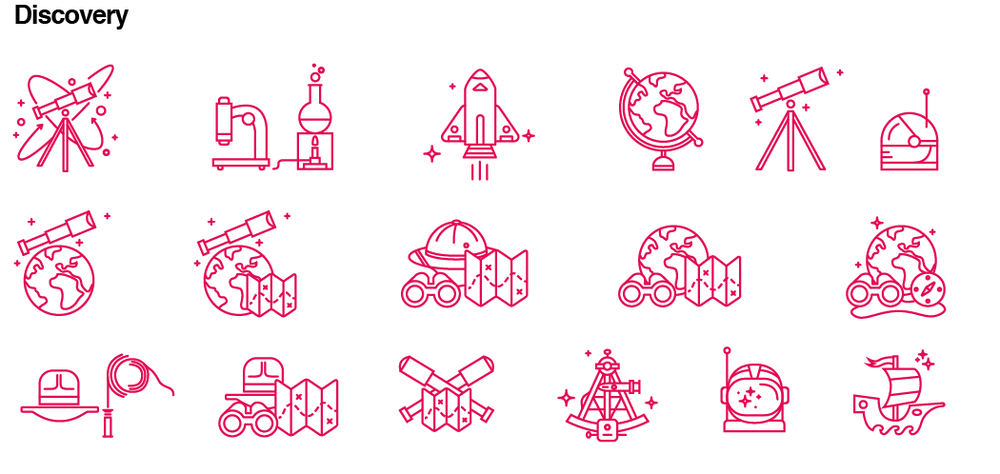
Often, designers will produce icons as a set to correspond with different products or ideas. When you tackle a project like that, start by considering the overall theme and what individual elements you might include. “I make a list in my Illustrator working file,” says designer Adam Whitcroft, who shares tips in his Skillshare Original Icon Design: Create a Cohesive Icon Set. “This list is basically just a brain dump of ideas under the theme. I do this with every single project I've done. It really helps me think ahead.” While the individual icons should stand on their own, you’ll also want the set to flow together and blend cohesively. Think about how you can use font, shape, or color to tie the set of icons together.
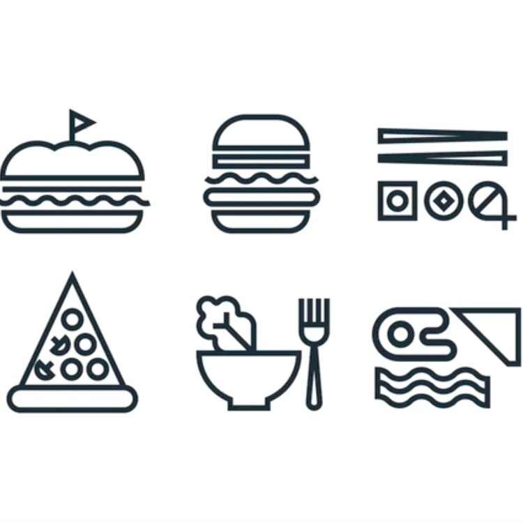
The best icons are simple and don’t need text to be understood. Many icon designers start with basic shapes like triangles, squares, or circles, and turn them into streamlined, clean graphics. Remember that icons are small, and you want people to be able to recognize them fairly quickly. They shouldn’t be fussy or have lots of extra features. If things seem too complicated or obscure, they probably are.
Once you have a relatively solid idea, do some research and see if there are any similar icons in the marketplace—after all, you don’t want to waste time creating something that already exists. If you spot a comparable icon, tweak yours so that it stands out and better distinguishes your brand. Try running ideas past friends in an informal focus group during the brainstorming process, too. Think about how your icon will resonate with people in one, five, or ten years. The best icons can stand the test of time with little or no tweaking.

Create an Icon Set in Photoshop
Follow along as designer Adam Whitcroft walks through the process he uses to design a series of icons.
Making a Plan
With an idea in mind, it’s time to figure out the technical details you’ll need to execute. First, what size and shape will your icons be? Website icons are commonly 16, 32, or 48 pixels. But it is possible to make them other sizes: One growing trend is to create scalable sets of icons that you can adapt depending on the needs of the program or project.
“When we start sketching, we usually like to have some type of template,” says Nathan Goldman, who hosts the class Illustrating an Icon Set: Design a Cohesive Series with his business partner Dan Kuhken. Working within a shape—they suggest starting with a circle, can offer a helpful starting point. “There's plenty of ways to illustrate an icon, and you don't have to have it in a perfect circle,” adds Kuhlken. “It could be in a square, it could be in any shape that you want.”
Regardless of the size or shape you choose, plan for a buffer of two pixels around the outside of your icon, especially if there is a border. As you work, use a grid so you can imagine how it will all fit together. A grid can help align pixels and make it easier to find similarities between icons in the same set. Using a grid also helps keep things symmetrical, especially when you use different angles and curves. Symmetry and alignment are an important part of icon design: If the angles and lines don’t match up perfectly, viewers can tell that the icon wasn’t professionally designed.

How to Create an Icon Series
Dive into icon design with DKNG Studios co-founders Dan Kuhken and Nathan Goldman.
Designing Your Icon
With the planning complete, it’s time to get to the fun part. Design is where icons come to life. If you take the time to thoroughly plan, the design process will be easier and smoother. But that doesn’t mean that you should expect to quickly whip out your set of icons. Your icons can still change and evolve: You might be struck by a new wave of creative genius, or you might realize that your plan doesn’t look the way you want it to.
There are several programs available for creating icons, ranging from online programs for beginners, which are usually free, to professional-level programs, which are much more expensive. Here are a few of your options.
Adobe Illustrator
Adobe Illustrator is by far the most popular program for designing logos—and for good reason. Its vast capabilities cater to maximum customization, allowing users to increase the size and zoom without creating pixels, which is helpful for detailed work and higher-res icons. It can take some time to understand the program mostly because it can do so much, but with a few online tutorials and some experimentation, most people can use it to create a basic icon. In Illustrator, everything is completely customized, so it’s your best bet for a final product that’s unlike anything else out there.
Adobe InDesign
While it’s often overlooked in favor of Illustrator, InDesign offers plenty of functionality for icon design. While it’s best for creating icons on the more basic side and comes with a slight learning curve, once you’ve mastered the drawing tools, you can create almost anything in InDesign.
Adobe Photoshop
Though it is best known as a photo-editing application, Photoshop can also be used to create icon designs. The popular Adobe program includes many filters, gradient tools, and textures. Anyone already familiar with the program—for photo editing or other purposes—shouldn’t have a problem using it for icon design. Still, while Photoshop offers plenty of capability, other programs are slightly easier to use, so beginners might be better off looking at other options.
Canva
Canva is a free online tool with pre-populated icons that can be customized to meet your needs. This option, which doesn’t require any design background, is the easiest and least time-consuming, but it also provides the least amount of personalization. Although you can adjust the colors, sizes, fonts, and other details, your final result will be very similar—if not nearly identical—to other icons in the marketplace. Still, though the options are relatively limited, Canva’s tools can fit specific needs, and the program may be right for small, personal jobs.
Corel Draw
Corel Draw is largely designed for the production of icons and logos, which makes it an ideal choice for users looking to create vector drawings and graphics. With tools like power trace, connectors, and paint, Corel Draw helps beginners and advanced designers alike create crisp, bright logos. This program doesn’t integrate with the Adobe Suite, but it can be a solid standalone option.
Microsoft Publisher
Many users already have Publisher installed on their computers as a part of the Microsoft Office Suite, and although the program requires a little more skill than its web-based counterparts, it’s fairly easy to learn. Still, Publisher’s capabilities are somewhat limited, and customizing your graphics could be a challenge if you have something specific in mind. Think of the program as a middle-of-the-road option that can get the job done if you don’t have the skill, need, or resources for a more advanced option.
Not sure where to start with these programs? There are a ton of online classes, videos, and tutorials to get you started, from learning the basics to playing with more advanced techniques. The key is to experiment and practice (and practice, and practice) until you find your groove.
Export your design—and put it into action.
When your icon design is complete, your work as a designer isn’t quite finished. “We've reached the final stretch,” explains illustrator Kevin Moran in his course, How to Create Geometric Icons Using Adobe Illustrator. “We have an amazing set of visuals that we can use for a variety of situations. Now what we have to do is prepare these visuals to work for those situations.” That means exporting your files in a way that works for the intended application.
If you’re using professional design software, be sure to save your icon in the Scalable Vector Graphics (SVG) format, which allows it to be scaled and edited. That will allow you to use the icon in a variety of places—and in different sizes—without having to create a different version for every use. (Unfortunately, this capability is not an option on most free web-based platforms, like Canva—something to consider as you select your software.)

When you export a design from programs like Illustrator or InDesign, there are several SVG exporting options, so it’s important to go through the preferences and create a saved file that matches your plans for the icon. Does it need to be editable? Are you using outside images that need to stay linked? Adding more features creates a larger file size, so try to include the most necessary features without creating a file that’s too large or cumbersome.
For example, preserving Illustrator’s editing capabilities can add another 400 kb to a midsize file. In many cases, it might be better to create a separate .ai file to have on hand for future edits and remove the in-program editing abilities from the SVG file.
In general, the simpler the design, the easier is it to export without compromising the design elements. If you add custom fonts or color gradients, they should transfer when you save the file as an SVG. But they can make the file size much larger, and when opened on another device with a different program, they could make it difficult to get exactly the same look.
Files that are only being used in a specific document, such as an icon for your resume or website, can be saved in simpler formats like .png or .jpg. Simpler formats don’t offer the editing and scaling capabilities of other formats, and there’s no guarantee that the icon will look the same when opened somewhere else. But they are smaller and easier to use if the icon is being exported for a specific purpose.
Create Custom Icons for Your Personal Brand
Kevin Moran shares the fundamentals of great icon design—including how to set up your programs and export your files.
Conclusion
Logos are powerful ways to showcase your brand, share a message, and create a lasting impression. Take the time to brainstorm and build a design brief, and look for ways to make your designs cohesive. Pay attention to the fundamental principles of design, like symmetry and grids, and look for ways to use colors or shapes to express an idea completely visually. You just might find that your new icon says more than a series of words ever could.
“Just like when a word is legitimized by its acceptance into a dictionary, when you create a new symbol for an idea, it is a memorializing act that signals to those around you that that idea is important,” says Boatman. “It literally allows people to see that idea in a new light.”
Get started today: From pictograms and geometric designs to full icon sets and beyond, you could be one course away from producing your own eye-catching creations.
Try Skillshare for free! Sign up for a 7 day free trial today!
Get Started- Unlimited access to every class
- Supportive online creative community
- Learn offline with Skillshare's app


