

Learn Block Lettering: A Step-by-Step Guide and Video
Learn how to create block letters with this tutorial and guide that will teach you everything you need to know about block lettering.
Table of Contents


There’s something about good handwriting that never stops being cool. When you see a friend hand over a beautifully hand-lettered card or a colleague mock up a logo using just pen and paper, you know you’re a little impressed. Even in a world in which so many of the words we see are typed out on a screen, knowing the basics of block lettering can help you stand apart and give you a leg up in personal and professional projects. Plus, it’s a fun skill to have!
Keep scrolling to learn more about how to do block lettering.
What Is Block Lettering?
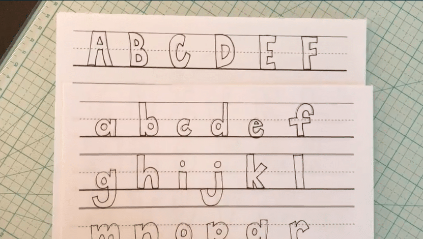
“Block lettering” is the phrase used to describe any style of writing that is done by hand and with attention to neatness and consistency from letter to letter. There are multiple block letter styles and block letter fonts, but you’ll know block lettering when you see it because of the obvious care used to create it! Many block lettering styles are non-cursive, and even the styles that resemble cursive writing feature disconnected letters. Once you learn the basics, you’ll be able to branch off into dozens of typefaces and looks.
Block lettering is well-suited for use in many projects, including DIY greeting cards, wooden lettered signs, logos, and more. Taking time to practice block lettering will pay off in the form of a much cleaner, more complete finish for any project that requires text of some kind.
What font is block lettering? It depends on what you’re looking for. Let’s talk fonts! Here are a few examples of common styles to inspire your own mission to learn how to write block lettering.
Examples of Common Block Letter Fonts
Basic Block Letters
The basic letters in this block lettering tutorial are created using a series of straight lines as a sort of block lettering template. Once you have this simple alphabet down, you can mix it up with different variations and details to create a range of block lettering fonts and styles.
Bubble Letters
With rounded edges and a more relaxed look, bubble letters add some fun to block lettering. Letter height and other details should remain consistent whenever possible.
Serif Block Letters
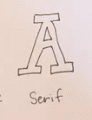
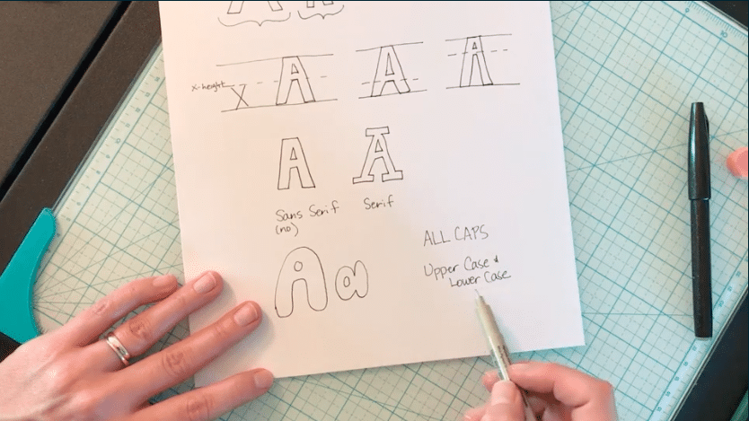
Common in language around fonts and typefaces, a “serif” is a slight projection used to finish off the stroke of a letter. See those extra strokes at each corner of the letter A above? Those are serifs, and they can be added to block lettering to put a twist on standard letters.
Narrow vs. Wide Block Letters
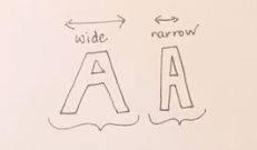
You can help determine your block lettering font of choice simply by playing with the width of your letters! Small details and changes have a big impact.
Stippled Block Letters
The stippling technique involves adding a line of dots—of any size!—in a border around your block letters. You can experiment with the look of the dots until you find a style you’re happy with.
Shadow Block Letters
With a little extra time and attention, your simple block letters can be transformed into a three-dimensional style. And once you practice how to shade block lettering, you can create a really effective shadow effect for your text.
Practice Lowercase Lettering
Lowercase Letterform Study: Create a Hand Lettered Quote with Minimal Sketching
How to Make Block Letters
Now that you’ve seen the possibilities that are available once you’ve learned even the basics of block lettering, you’re probably anxious to get started. The good news is that practicing this skill requires just a few simple materials, along with your time and attention!
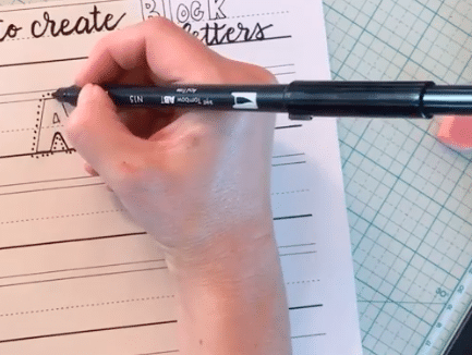
This block lettering tutorial from illustrator Kiki B covers a very simple block lettering font that will help you lay the groundwork for more creative styles in the future.
What You’ll Need for Block Lettering
There’s a good chance that you already have some or all of the materials needed for basic block lettering around your house, even if you don’t know it. Get yourself a pencil, a pen, an eraser, a ruler, and a few pieces of printer paper.
(Yes—that’s really all you need to get started!)
Step 1: Draw Horizontal Guides
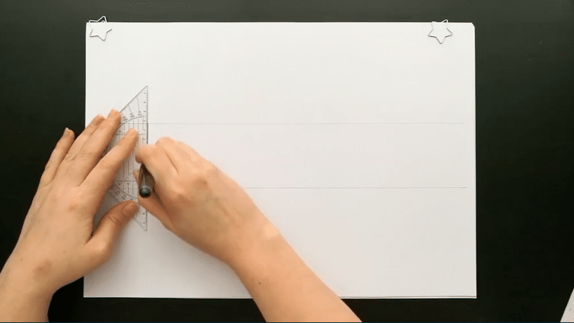
Since one of the hallmarks of block lettering is the consistency in height between letters, it’s helpful to start with horizontal guides to help you stay on track. Use a ruler to draw two straight lines across a piece of paper. The amount of space between the two lines is entirely up to you! Set up the guides based on how tall you’d like your finished block letters to be.
Step 2: Practice the Letter I
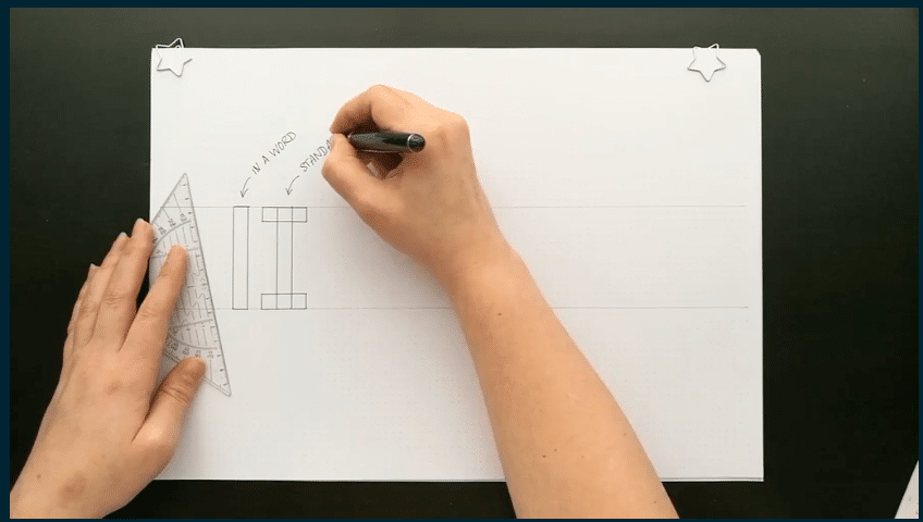
Since so many other letters develop out of straight vertical lines, the letter I can be a great place to start with block lettering. You can work with both versions of the capital letter I: the one with the crossbars on the top and bottom and the one without. Use your ruler and pencil to draw straight lines between your horizontal guides, then connect them at the top, with or without the crossbars. Once you are happy with the look of your Is, you can move on to add other elements to your block lettering skill set.
Step 3: Practice Slanted Letters
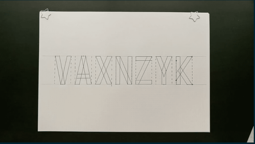
Draw another set of horizontal guidelines. Decide how wide you’d like your letters to be, then mark out vertical guidelines of that length as dotted lines from top to bottom. Use your ruler to experiment with drawing slanted lines between those vertical lines to represent letters like V, A, X, N, Z, Y and K. Maintain a consistent width for every line in each letter for a clean look.
Step 4: Add Rounded Letters to Your Repertoire
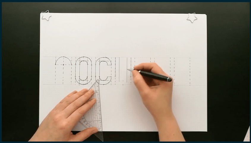
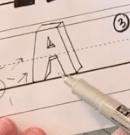
In order to draw the remaining letters in the alphabet, you’ll need to master curves. In this tutorial, Kiki B recommends that you draw your curves using a compass, but if you don’t have one, you can also draw a few dots along your desired curved line and simply connect them. Draw these curved shapes within the same dotted vertical guidelines that you used in the previous step. When drawing letters that incorporate a straight line and a curve—like a D, for example—draw the straight line using a ruler first, then mark a point exactly halfway between the top and bottom of that line. That will be the furthest point of the curve in the rounded segment. Play with these elements until you’re comfortable.
Step 4: Complete the Finishing Touches
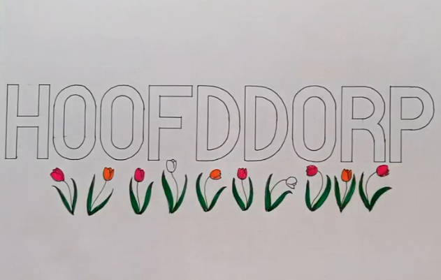
Once you’ve practiced a bit with your pencil, you can erase the guidelines, outline your block letters in a darker marker and add colorful details!
Master this simple block lettering style and you’ll be able to get creative with other funky styles down the road.
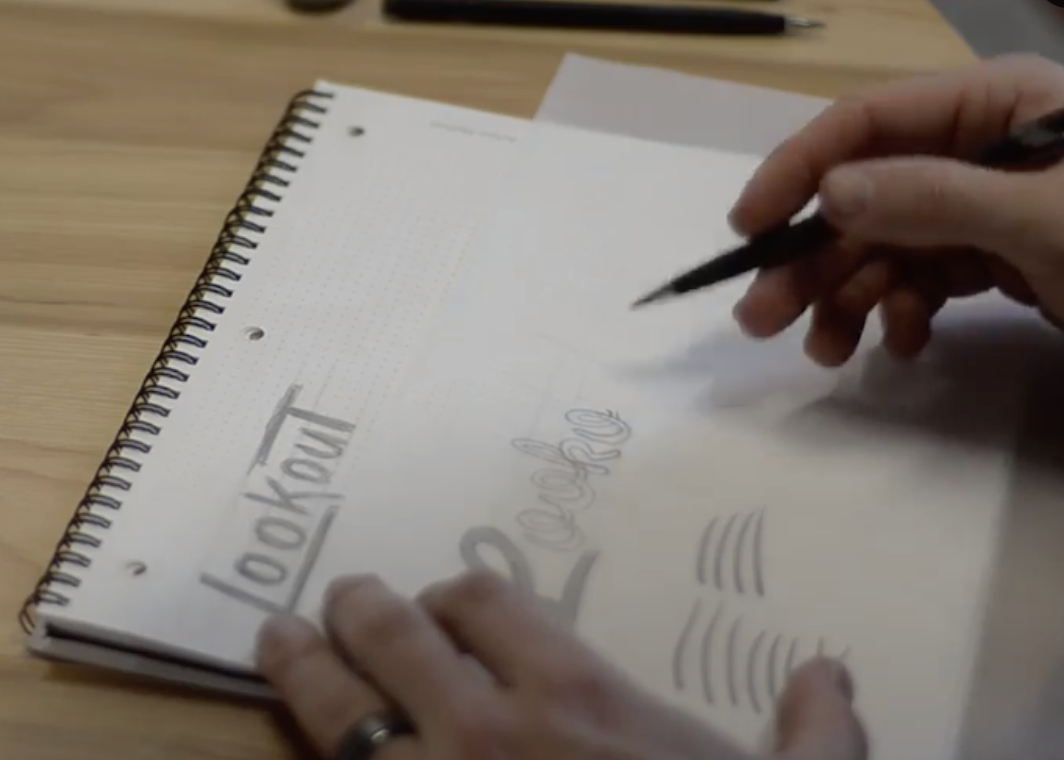
Take Your Lettering Skills Into Logo Design!
Logotype Design: Create Brand Marks with Typography
Try Skillshare for free! Sign up for a 7 day free trial today!
Get Started- Unlimited access to every class
- Supportive online creative community
- Learn offline with Skillshare's app


