

How to Create a Color Palette for Your Art Practice
Even if you don’t know color theory, creating a color palette is simple. This artist-led tutorial will help you build your own color palette for painting.


Color is powerful. It sets the mood for the story you are telling through your art. It can also bring a sense of cohesiveness to a body of work or be part of your signature style.
But color can sometimes be a stumbling block for many artists because it is such a broad and deep topic. Don’t worry, though, if you don’t know the ins and outs of color theory—it’s absolutely not a prerequisite to make art.
All you have to do is pick some colors you like and use them. It really is that simple! Here’s a simple process any artist, professional or aspiring, can use to create color palettes.
Step 1: Go Exploring
First, simply find a few images that you like. You don’t have to explain why you like them—it’s enough that you are drawn to them. You can go old school and grab a stack of old magazines and start ripping out pages. You can go for a walk in your neighborhood, with the intention of noticing color. Stop and take note (and pictures) of the little vignettes around you, like a little pot of flowers gone to seed, a doorway, a bicycle, anything. Or, use many artists’ favorite resource for inspiration—Pinterest!
No matter which method you prefer, give yourself a 20-minute time limit.
Step 2: Identify a Theme
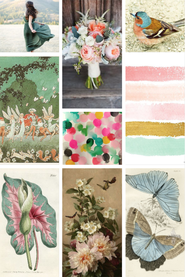
Now, review your collection, whether it’s online or off. Are there colors that appear in more than one (or all) of them? See if you can pick out one or two colors that keep showing up for you. This is the foundation of your color theme. In the collection above, for example, the images trend toward green, sea foam, and sage hues.
Step 3: Expand Your Theme
From here, go back to your image sources and collect five to 10 more images based on the color theme you’ve discovered. Keeping with this example, you’d want to continue searching for and collecting images with sage or sea foam green in them.
Step 4: Build a Color Palette
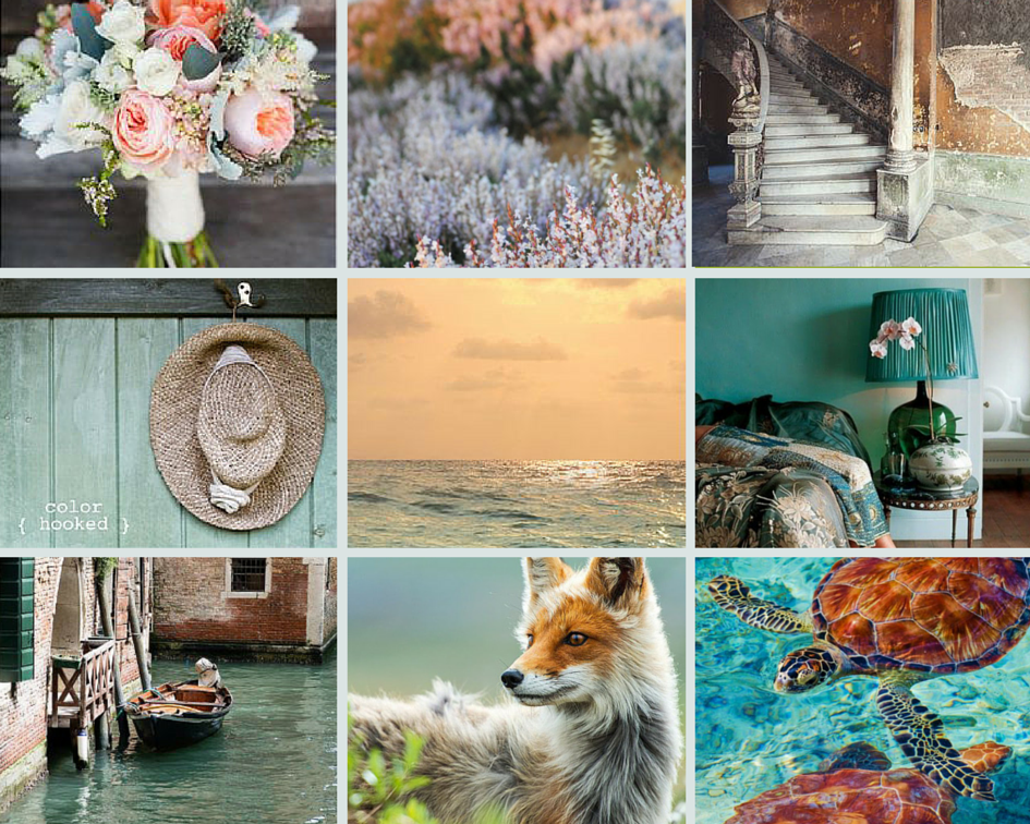
Next, review this new collection of images and make note of the other colors that appear with those in your original color theme. In the set of images below, for example, the peach in the flowers also shows up a bit in the brick walls of Venice. There are also copper tones in the turtle and the fox, as well as darker muted blues and purples in the stairs and water.
Go through your images and pick three or four colors that complement your original color theme. This collection of four to six colors is your color palette!
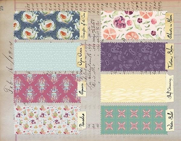
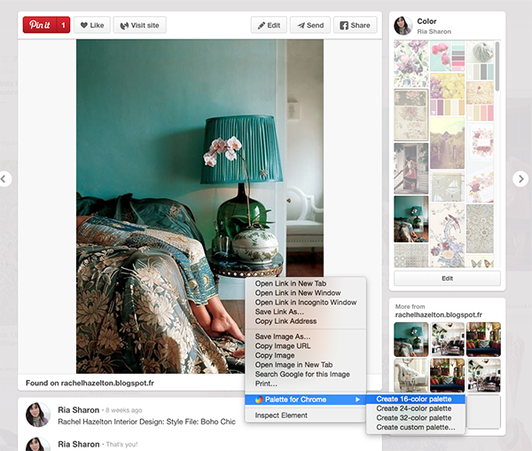
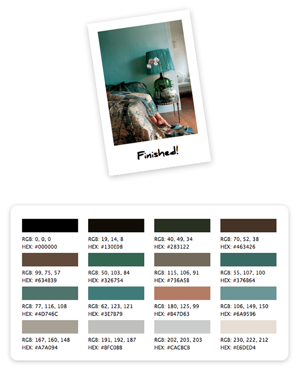
There are some handy tools that can help you identify colors in images, such as the Google Chrome extension Palette for Chrome. Once it's installed, you can right-click on any image online and it will create a color palette from that image.
Step 5: Mix Your Colors
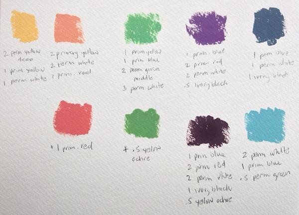
Once you’ve planned your color palette, it’s time to mix the colors in your medium of choice so you can use it in your art. Make note of the "recipe" you used to mix each color so you can recreate it if need be. This is especially important if you use acrylic paint because acrylics dry very quickly, and you’ll have to make a fresh batch of each color every time you paint.
Step 6: Make Some Art!
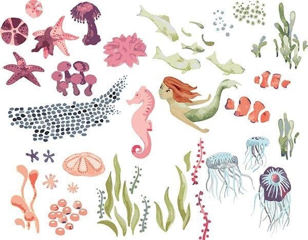
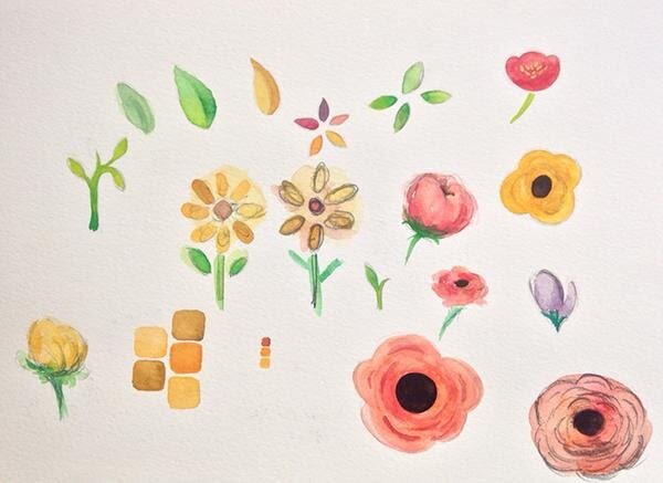
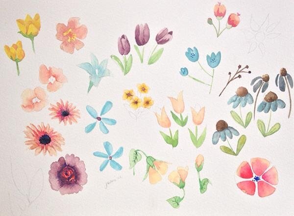
Here’s the fun part: Get creating! As you can see, a single color palette can be used in countless different ways.
Start Your Creative Practice the Easy Way
Sketchbook Magic: Start and Feed a Daily Art Practice.
Try Skillshare for free! Sign up for a 7 day free trial today!
Get Started- Unlimited access to every class
- Supportive online creative community
- Learn offline with Skillshare's app


