keeping it simple
This was my original sketch. I then looked around for a colour palette via Instagrams "Colourscafe" which always inspires me a lot. I naturally don't go for vibrant colours. One reason more I like Lisas work... the use of bold colours is just something I would love to pull off.
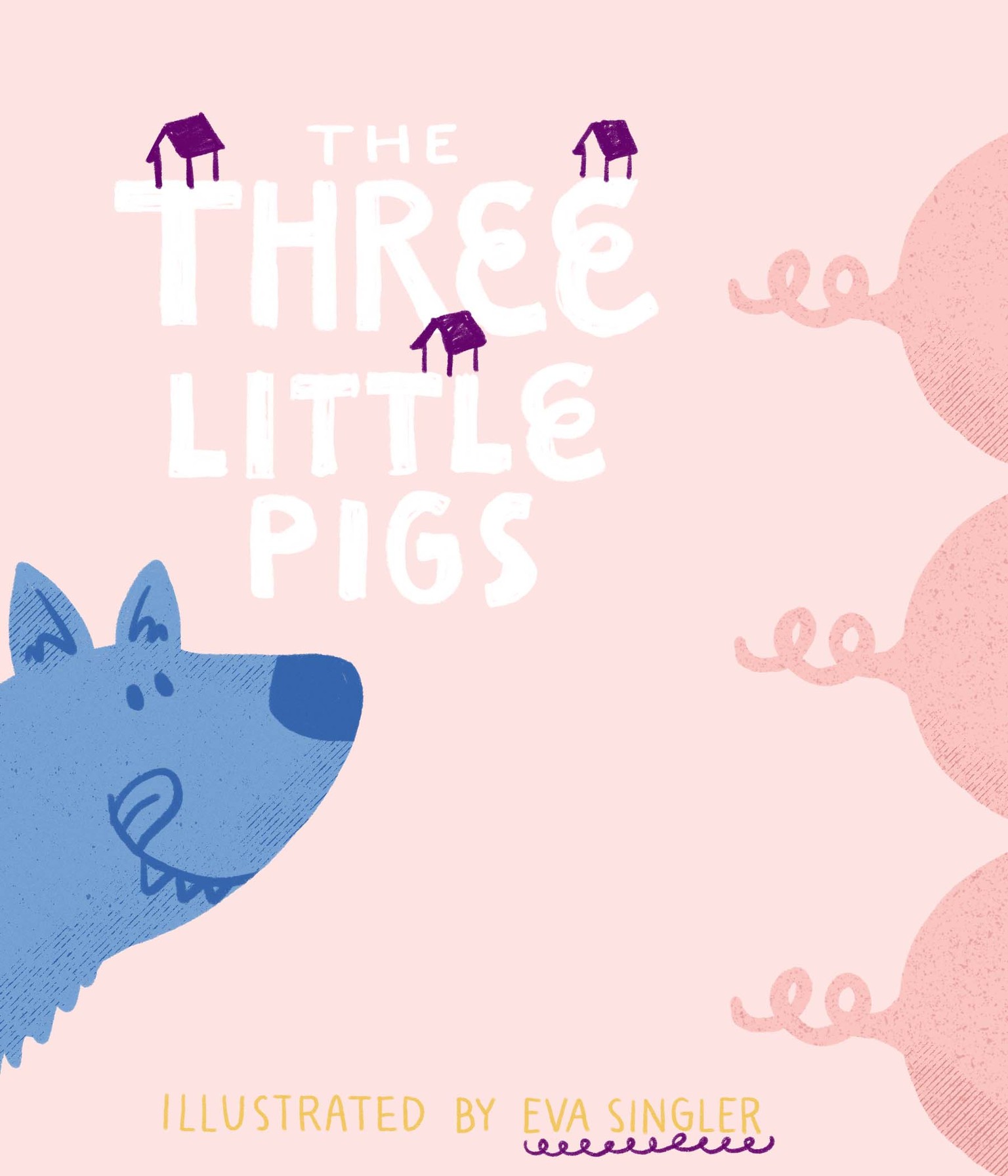
My cover:
I intended to only put some hints onto the cover rather than giving away the whole story. I then had a lot of fun coming up with handlettering the little piggy tail font. Probably could have given that one a vibrant colour aswell. I am learning ;)
Little extra idea: I probably could have deleted the little houses but I liked the dark touch in the image.
Actually I am quite happy how it turned out :)
Quite enjoyed the realistic briefing character, too. Thank you very much, Lisa!