chimesdesign Signature Palette V1
What a great class! I've wanted to make a signature palette for a while and this method made it really easy to develop.
What I found particularly helpful was pulling the mid, light, and dark tones for each hue. I design my work in grayscale first to ensure good color contrast, so the mid/light/dark hues will make finished art easy to recolor. I also found pulling the color harmonies into palettes in the workbook was helpful as well—that gave me lots of ideas!
MY WORKING SIGNATURE PALETTE
I added grayscale and another orange (because I love pumpkin orange!). And another column or two of colors because I wanted blues AND teals, more green, and more variety of purple/pink since I use these a lot in my work.
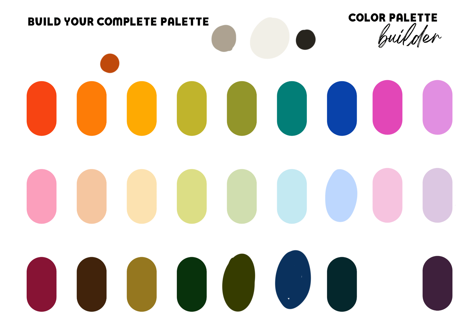
I am drawn to bright, poppy colors and MCM / 70s palettes. I think this palette captures that.
ARTWORK WITH REVISED COLORS
Here are a couple of repeat patterns colored with random palettes and the revised versions with my new palette. I am already in the midst of reviewing, refining, and revising my surface design portfolio, so this was class was a perfect fit for me right now!
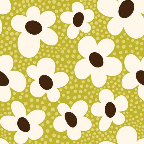
ORIGINAL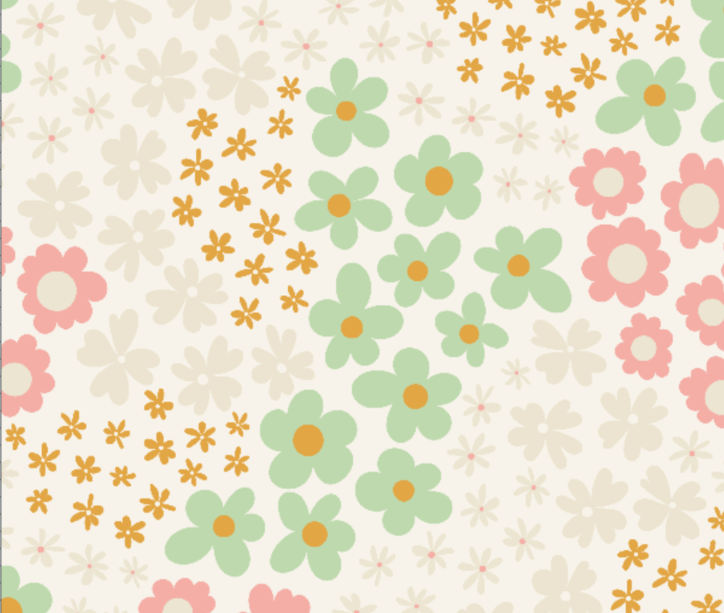
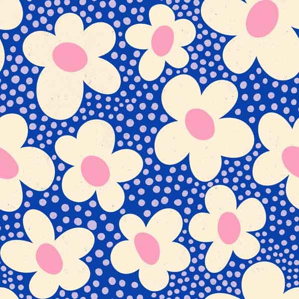
RECOLORED (and redrawn)
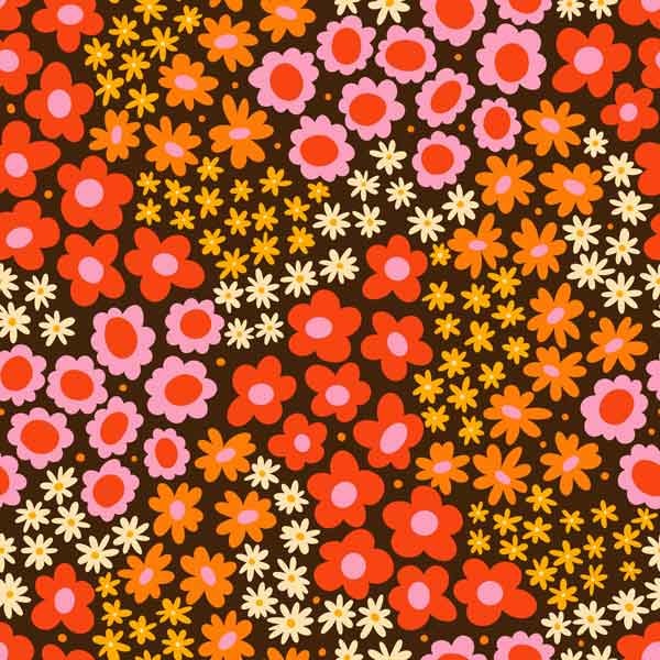
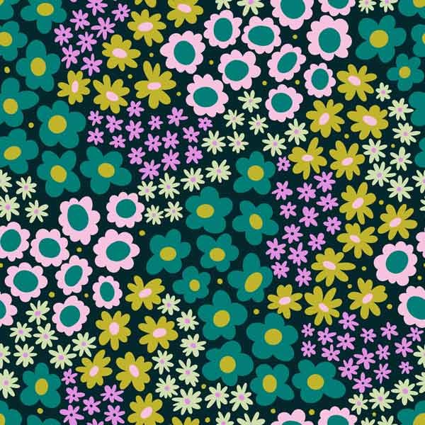
ORIGINAL
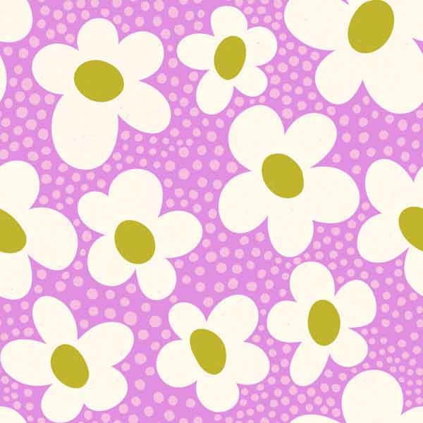
RECOLORED (and redrawn)