Workday UX Improvement
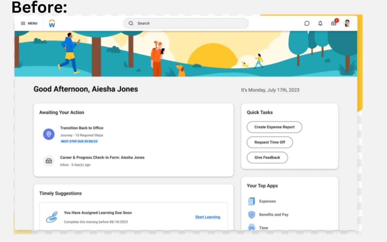
Before:
The current Workday UX does not prioritize the most common tasks users log in for. Things like awaiting tasks or timely suggestion does not need to be on the cover page, as most users do not log in primarily for that and can be viewed in the notification bar and emailed to those users.
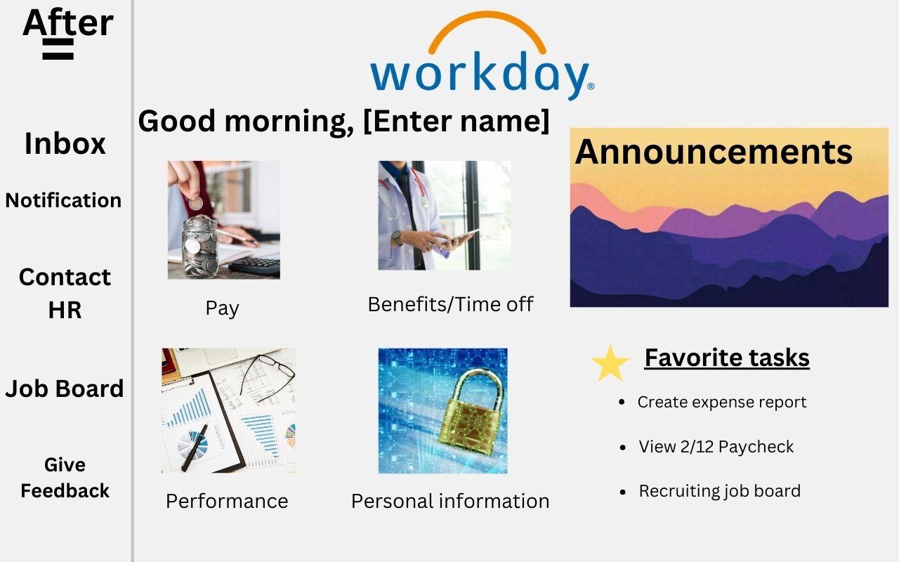
After:
My improved UX from Workday prioritize the most common tasks which includes images to indicate the most common action when logging in to workday. Instead of awaiting tasks and suggestion, it prioritizes one looking at paystubs, view performance and edit their personal information. And most important announcement are on the homepage, to show any critical reminders or upcoming events. On the toolbar on the left, it has other options (not as common but still important) to view and browse over.
I also added a favorites tab to in this layout, so that the consumer can quickly access their top viewed tasks instead of having to click on multiple pages to get to it.