Wildfires
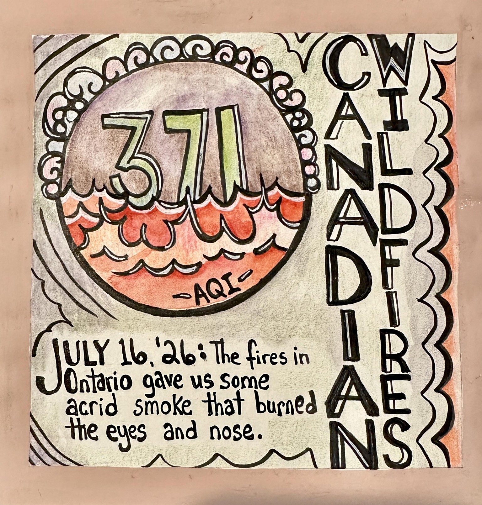
Fab's method gave me a much different composition than I would have chosen on my own. I'm mostly happy with the result. If I had to do it again I would put the date on the side, and the "Canadian Wildfire" part at the bottom with the rest of the text. Also, I'd make the font less complicated. Thank you for teaching this class -- I enjoyed it and found tools I can adapt to my own practices. This was fun.
Thankfully the AQI is "only" 200 here today, but the AQI in the neighboring county hit 500 ppm. Holy cow. That region is ridiculously rural to be getting Beijing-in-the-80s level pollution.
Elisabeth Wellfare's class on Tamara de Lempicke used simplified forms and we combined paint and colored pencil, so I tried that here. The photo doesn't do the image justice -- I'm very pleased with the texture of the final result. The edge is posca, and I used gel pen too.
Hopefully everyone is okay that I substituted this really odd event for ... well ... holiday.
I would love to be on holiday.
Ocean. Need ocean.