Why Waze’s UX Design Drives It to the Top: A Model of Simplicity and Safety
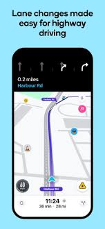
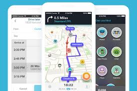
Every day, I rely on the Waze app for my navigation needs, and it’s a prime example of effective UX design. The app is incredibly intuitive—within just 20 seconds, even a new user can grasp the basics and start navigating. This simplicity is essential for an app that users depend on while driving, where safety and quick access to information are paramount.
Waze’s interface is designed to be as clear and concise as possible. Every feature, from directions to traffic alerts, is presented in a way that minimizes distraction and keeps the focus on the road. It’s no wonder that Waze is one of the most widely used navigation apps worldwide; its UX design doesn’t just make it easy to use—it makes it dependable and safe. The user experience is fine-tuned to deliver essential information exactly when it’s needed, with no unnecessary extras to clutter the screen or confuse the user.
The brilliance of Waze’s design is in how it balances simplicity with functionality. Behind the straightforward layout lies a sophisticated system that ensures the app is responsive, accurate, and user-friendly in high-stakes scenarios. This level of UX sophistication is what has earned Waze its reputation as a top-tier app and a must-have tool for drivers globally.