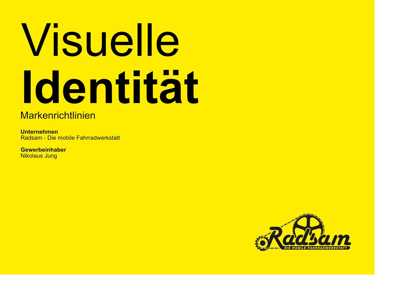
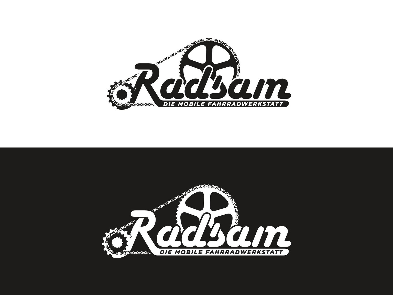
Visual Identity - Radsam Company
 This bicycle workshop has the mission to give people a safe and joyful feeling when riding a bicycle.
With the mobile service. The workshop comes to you, no matter where your breakdown occurs.
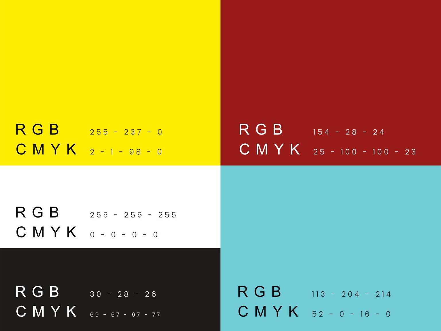
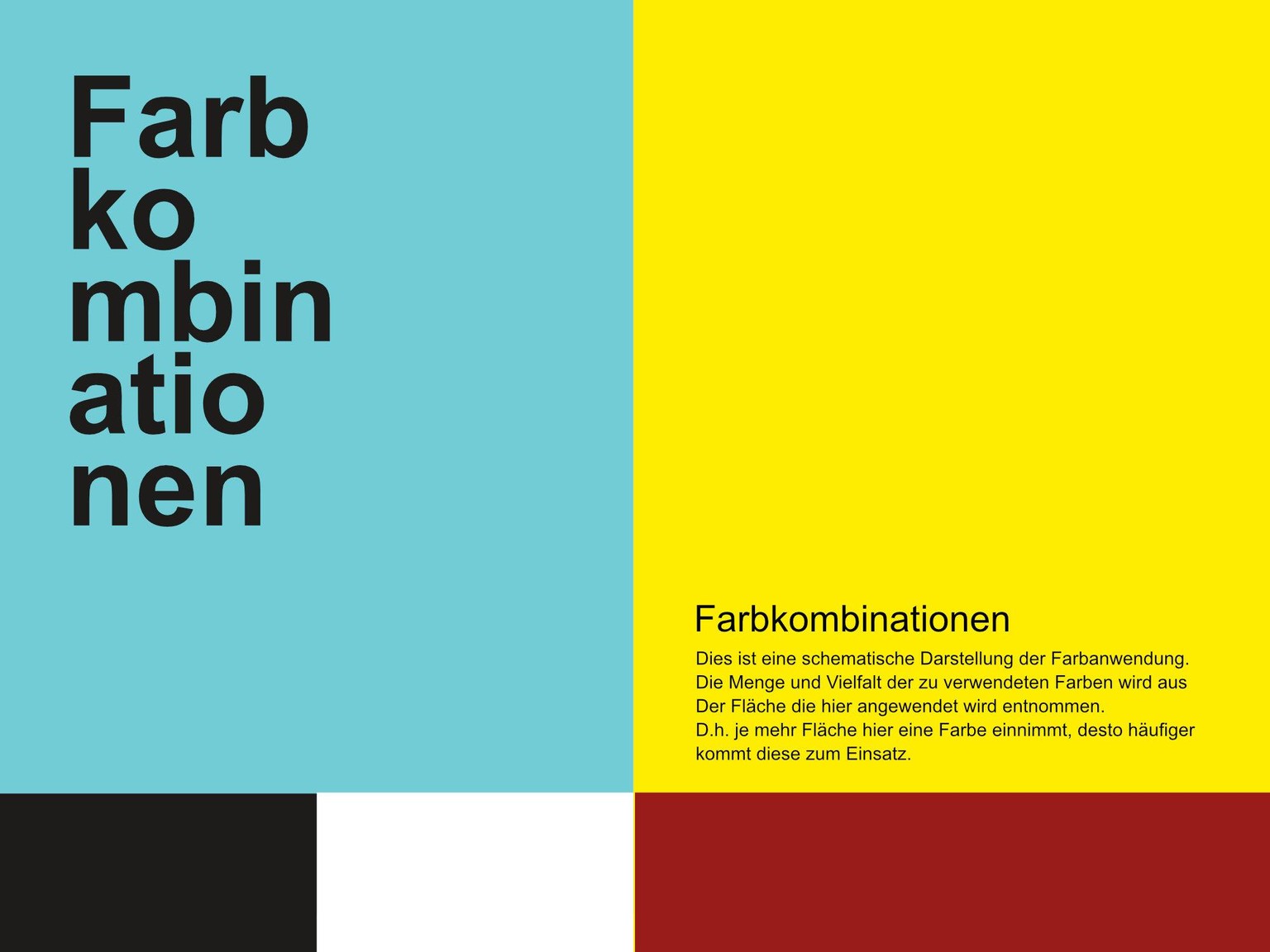
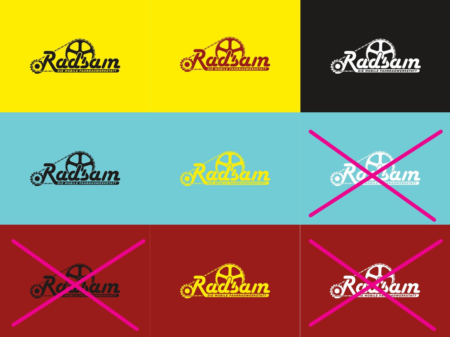
I use the color yellow because it communicates a kind of joy and serenity. On the other hand, blue, which conveys reliability. Nevertheless, the design as a whole, combined with the font, appears soft and slightly playful.
This is my first manual and it is very small. It was important to me that the most relevant aspects of the Radsam design were described.
What do you think about it?
Best regards
Alex