Using AI in Design - Rare Design Terms You Want To Use!
Want to do this student project or learn more about AI for Designers? I have a brand new AI (Artificial Intelligence class not Adobe Illustrator) class that just launched here on Skillshare.
Check it out here:
AI for Designers: How It Works, Prompt Writing & Design Inspiration
There are two student projects and decided to focus on the second one for mine.
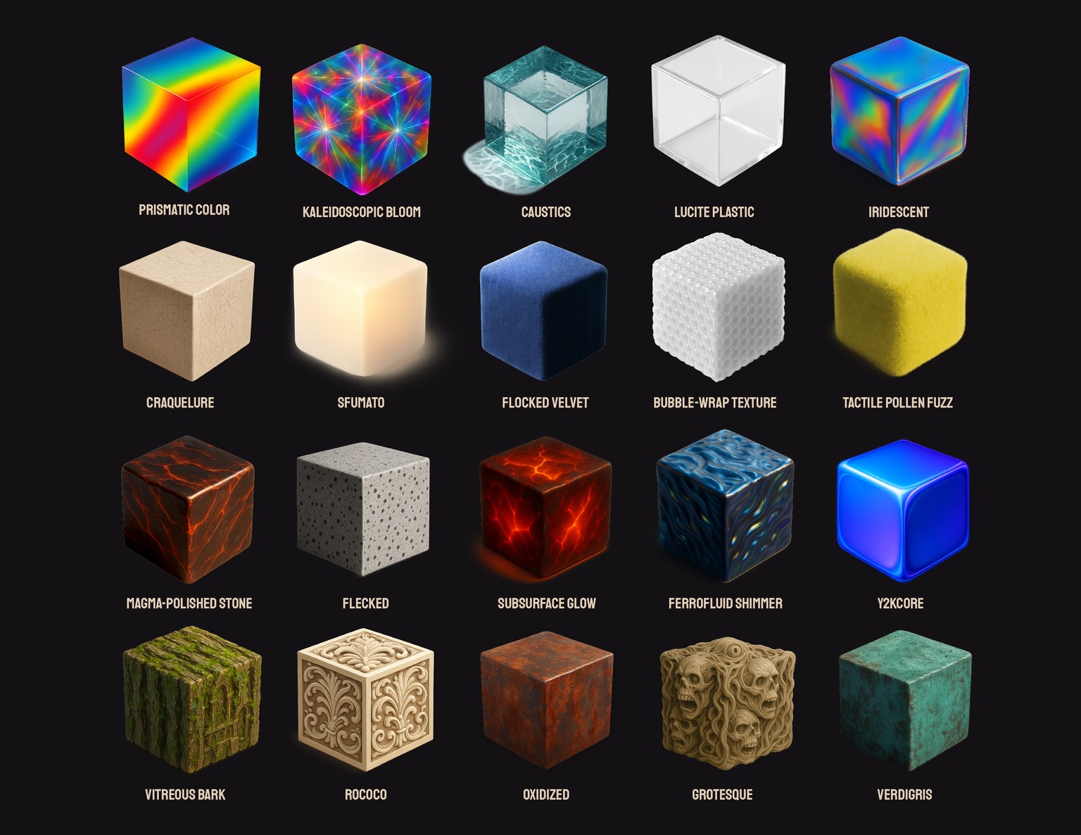
In the class we get to go over some very nuanced design vocabulary words. Words that I noticed were used in really good image prompt results. Things like "Grotesque style" or "flocked velvet".
I asked ChatGpt to list and review some really detailed design vocabulary words so I can expand my knowledge on each of them. This was super fun to do and really made me feel more confident as a designer moving forward.
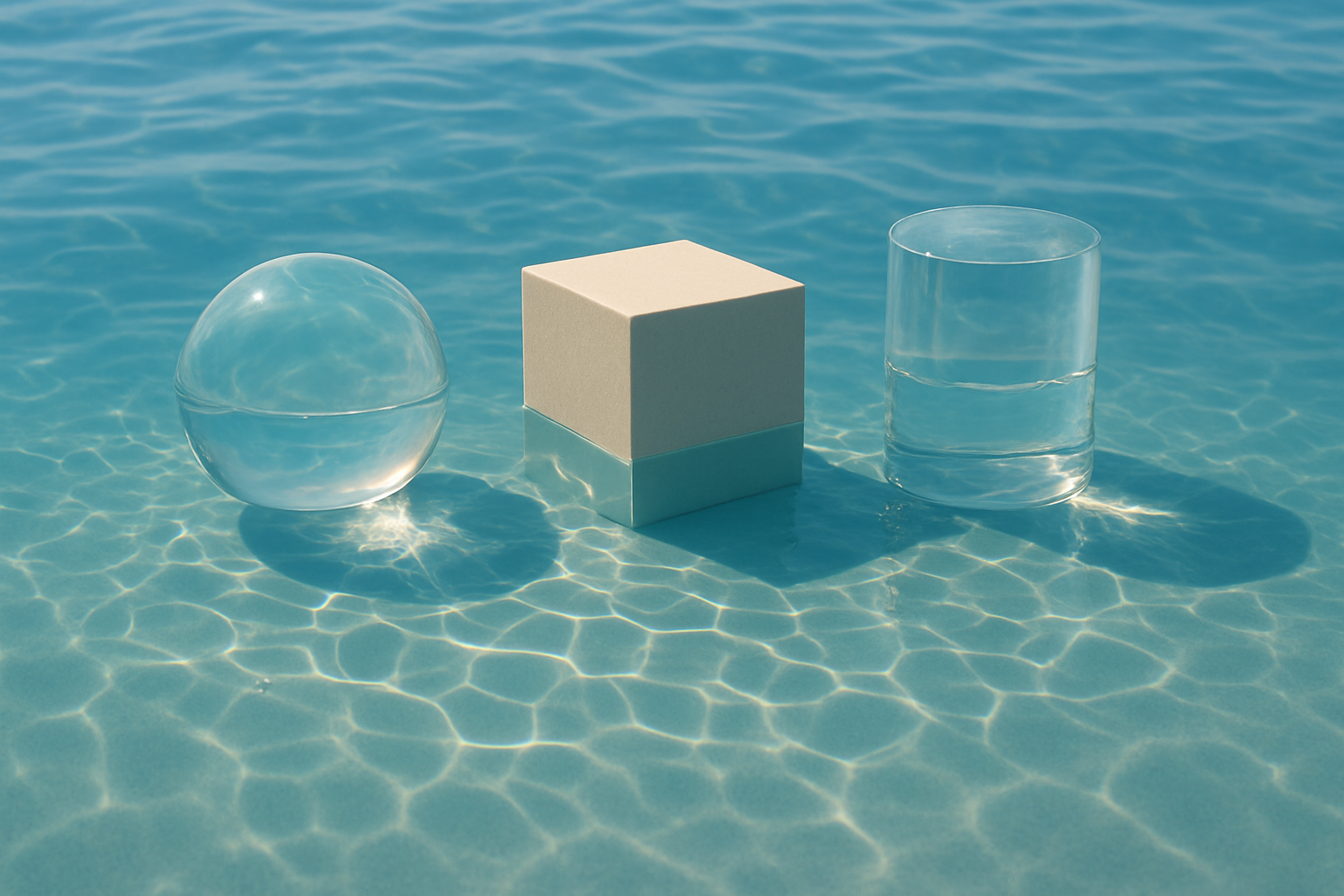
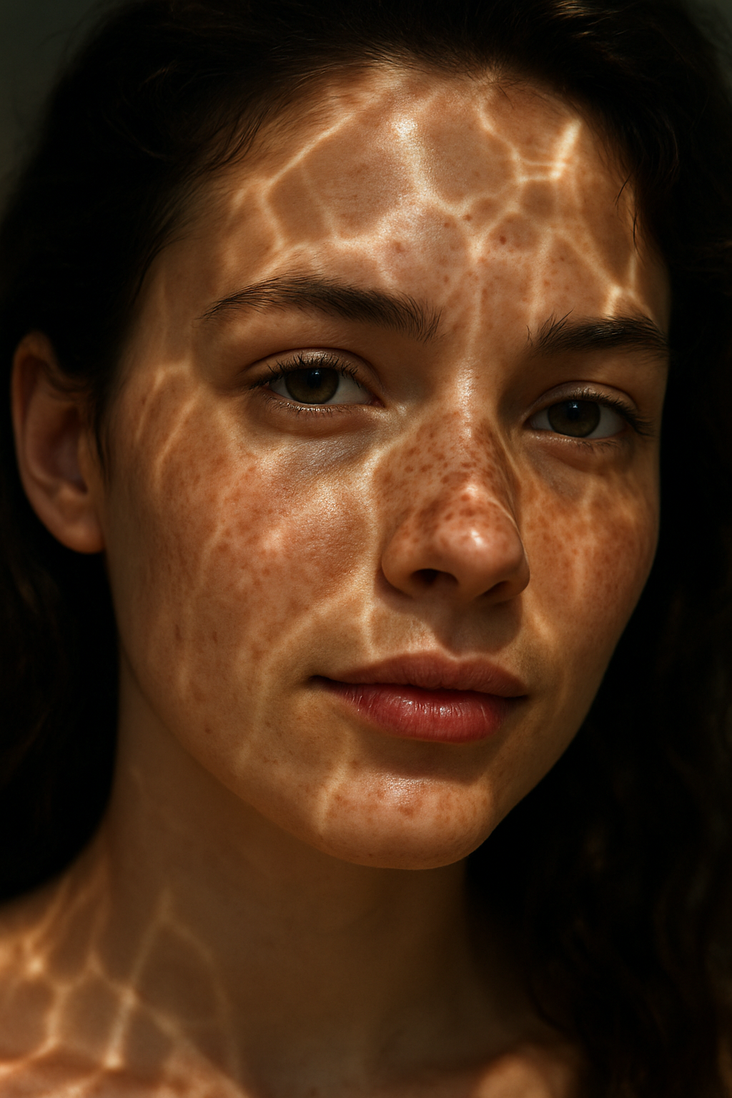
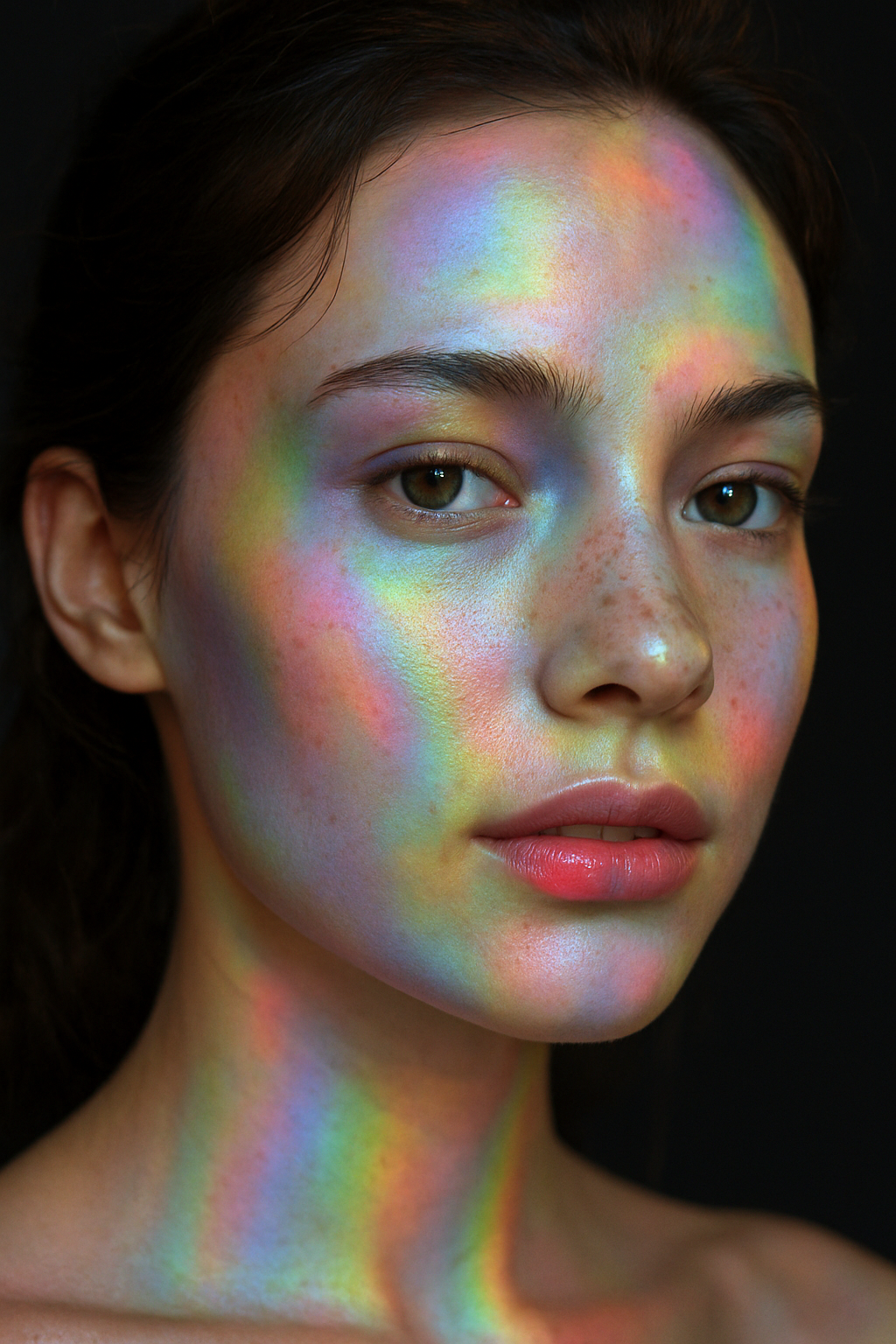
The first term I studied was the word “caustics” this word give me precision when describing how light behaves in an environment. I personally love how light reflects against glass and water so this was a fun deep dive. Here are some of my results using this term after studying examples of it. 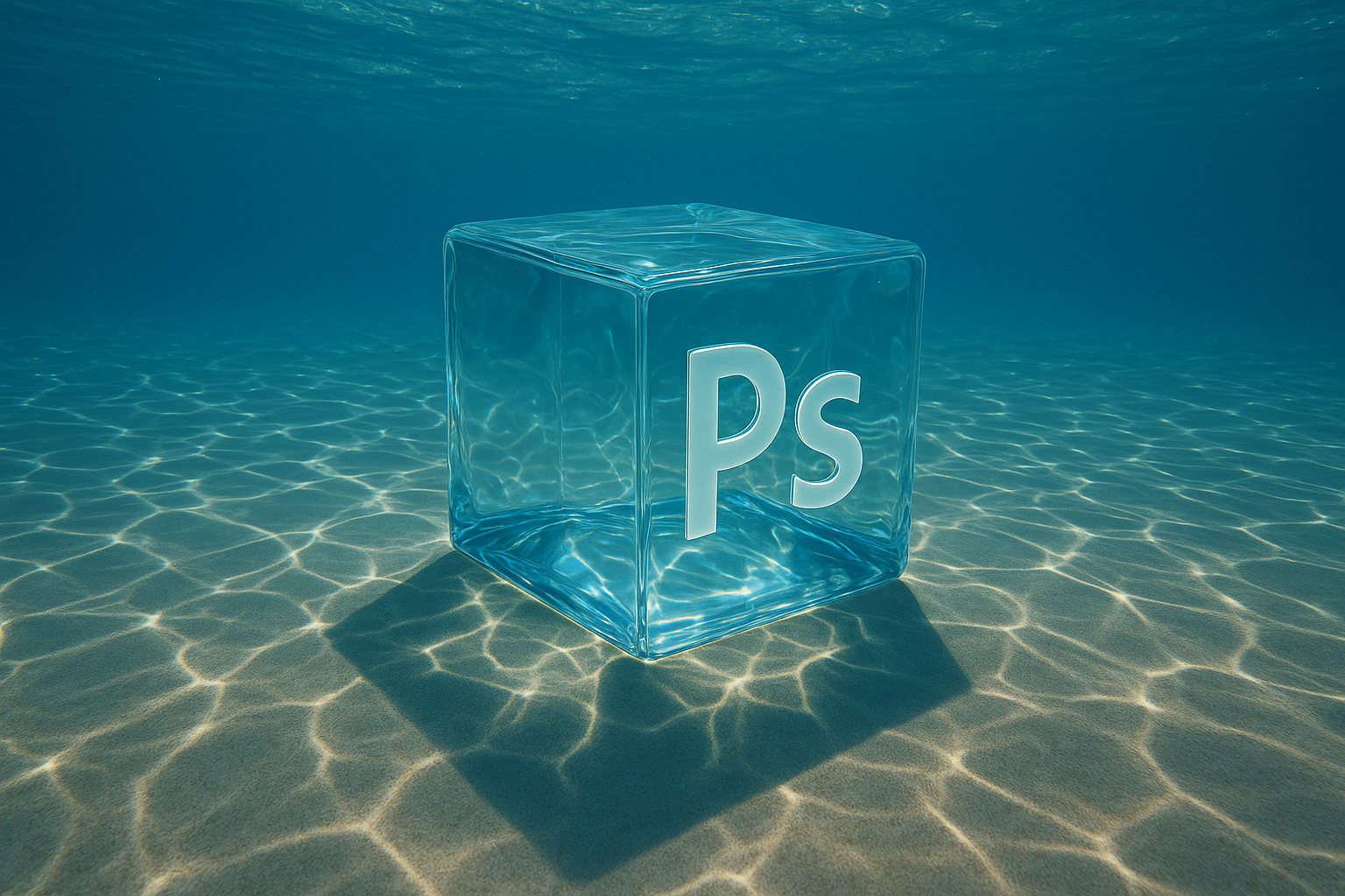
-
Definition in design/visual terms: Caustics are the wavy, rippling light patterns formed when light passes through glass, water, or other refractive surfaces and projects onto another surface. Think of sunlight dancing at the bottom of a swimming pool or light scattering through a glass of water.
-
Why it matters in prompt writing:
-
Instead of writing “sunlit hallway with interesting shadows,” which is vague, you can write “sunlit hallway with caustic light patterns rippling across the floor.”
-
This tells the AI to simulate specific light physics, producing far richer and more accurate visuals.
-
It shifts the output from “generic lighting” to “cinematic, photorealistic detail,” which is critical in architectural renders, product mockups, or atmospheric photography.
-
-
Professional takeaway for students:
Knowing terms like caustics allows you to command light and texture in prompts instead of hoping the AI “guesses” the look. The more specific the more control.
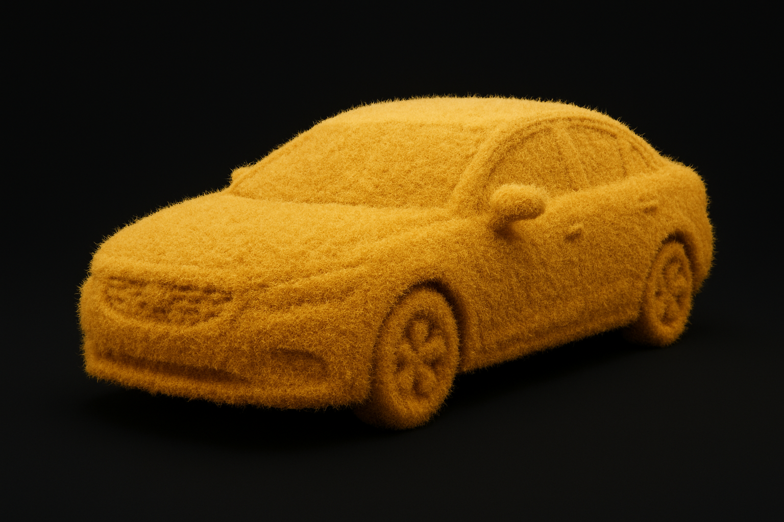
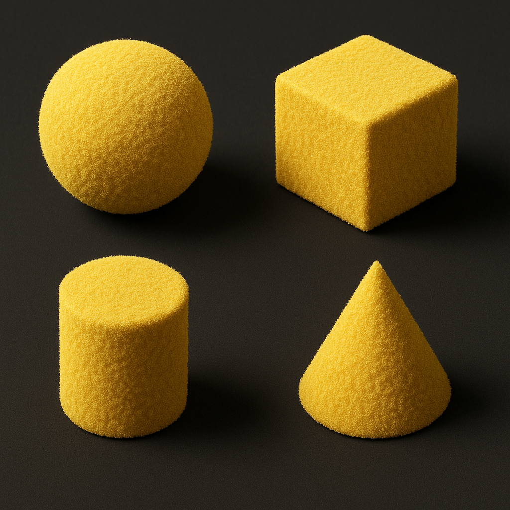 My next term I wanted to study was Tactile Pollen Fuzz. I love how the Tactical term really adds a feeling of wanting to reach out and feel it. I think it really stimulates a viewers senses.
How it helps knowing this term:
-
It shows how texture vocabulary (like pollen fuzz) can completely change the emotional perception of a shape.
-
A cube or cone becomes less “cold and geometric” and more approachable, playful, or even unsettling depending on context.
-
In prompt writing, specifying “tactile pollen fuzz” tells the AI to simulate a micro-surface quality that goes beyond simple color or material.
Lastly, I wanted to do a deep dive on the word Iridescence. There are many ways in which an object can shine or reflect. Iridescence always fascinated me and how it shows the whole spectrum of color all at once and not just one color in a moment. It shows up in many ways...
-
Organic forms (like this beetle, butterfly wings, or fish scales)
-
Everyday objects (soap bubbles, oil slicks, CDs)
-
Design/Architecture (iridescent glass panels, holographic packaging, fashion textiles)
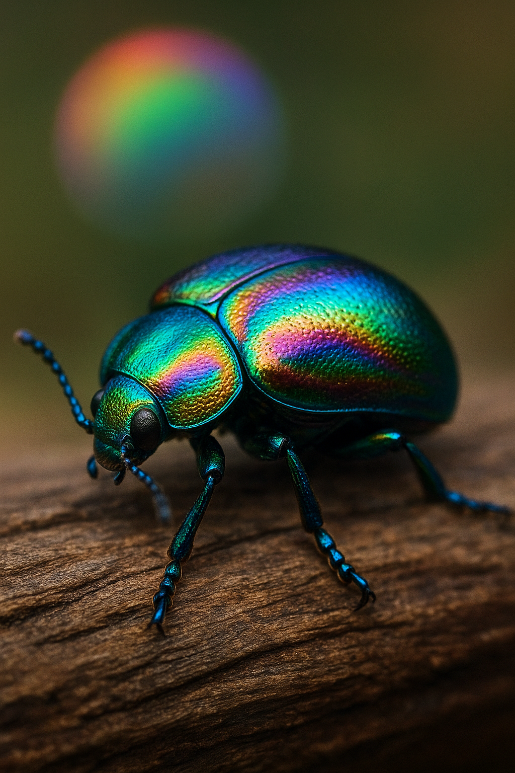
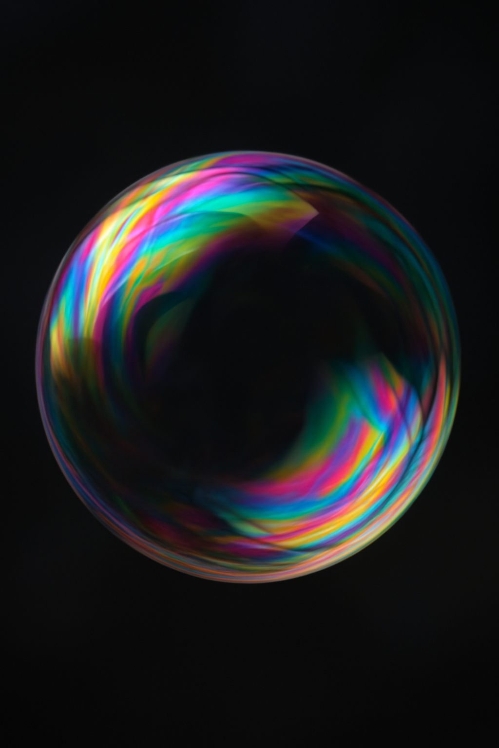
Takeaway for Designers:
-
Caustics communicates the movement of refracted light.
-
Iridescence communicates the color-shifting nature of surfaces under light.
-
Both are light-driven effects, but one is about patterns of brightness, while the other is about spectral color shifts.
What terms did you want to study further? Here are some more word examples below.
Make sure to watch the class and my lesson on nuanced design terms to get some inspiration. AI for Designers: How It Works, Prompt Writing & Design Inspiration
Nuanced Design Vocabulary Light & Color Effects
-
Caustics – wavy light patterns formed by refraction/reflection of water or glass
-
Iridescence – rainbow-like color shifts on surfaces (soap bubbles, beetles, oil)
-
Pearlescence – soft, milky shimmer like mother-of-pearl
-
Opalescence – translucent, cloudy, with shifting embedded colors
-
Chromaflux – flowing gradient shifts, liquid-like color transitions
-
Void shimmer – dark surfaces catching subtle iridescent highlights
-
Diffraction pattern – rainbow fragments from light bending around edges
Textures & Surfaces
-
Craquelure – fine cracking patterns on paint or varnish
-
Verdigris – green-blue patina on aged copper
-
Oxidized – rusted or weathered metal surface
-
Flocked velvet – matte, fuzzy, tactile fabric texture
-
Tactile pollen fuzz – fine, powdery organic surface fuzz
-
Bubble-wrap texture – inflated grid of repeating circular impressions
-
Brushed circuitry – metallic surface with linear grooves like microchips
-
Weathered stone memory – eroded, worn-down stone surface with history
Organic / Biomorphic Terms
-
Vitreous bark – glass-like layered surface resembling tree bark
-
Barklike rhythm – repeating, organic striations inspired by wood
-
Ferrofluid shimmer – oily, magnetic liquid spikes shifting under force
-
Subsurface glow – inner illumination beneath a translucent surface
-
Magnetized ripple – wavy distortions as if pulled by invisible forces
-
Serotonin fuzz – playful, tactile, almost chemical/organic surface energy
Stylistic & Conceptual Terms
-
Grotesque – distorted, exaggerated, or uncanny form
-
Brutalist – raw, heavy, concrete-focused architecture/style
-
Solarpunk ruins – futuristic ecological decay, nature reclaiming tech
-
Rococo – ornate, elaborate decoration with flourishes
-
Y2Kcore – glossy, futuristic aesthetics of the early 2000s
-
Post-digital – design that merges analog imperfection with digital clarity
-
Dynamism – sense of motion and energy frozen in form