The Oh! Lemontomes process (Unfinished)
As I go through the lessons, I'll be uploading my progress and sharing my insights.
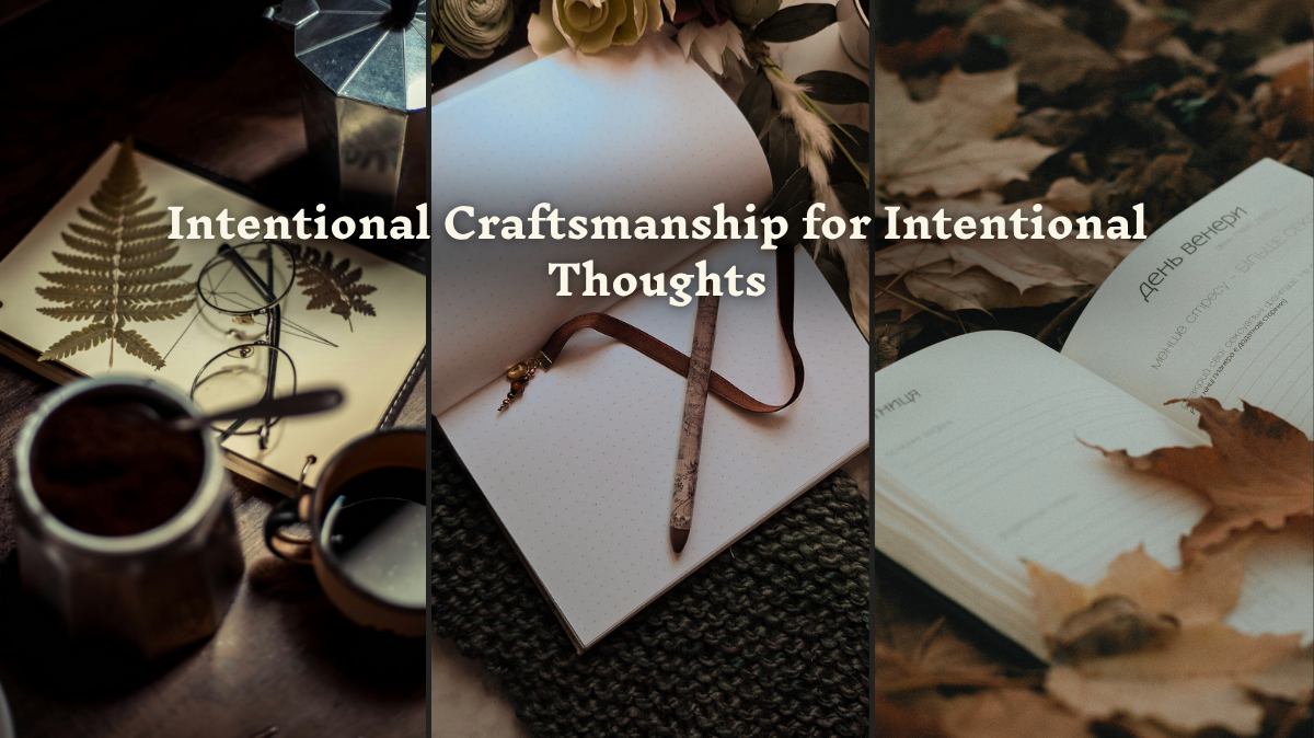
For the first exercise, building my brand kit, here are some of my pages. My business is a home bindery where I make handmade (printed, sewn, and covered) journals and notebooks. The 4 words I chose to represent my brand were: Sustainability, Uniqueness, Quality, Longevity because each book I make is one of a kind, I attempt to use all of the waste created to make other items (such as recycled paper, paper beads, bookmarks, etc) and each book is designed to last a long time.
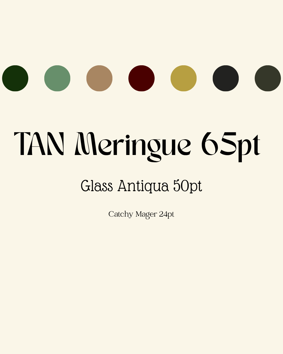
I love the idea of a very old-world, art-nouveau style to my brand and posts, so I chose some very vintage style colors, and fonts.
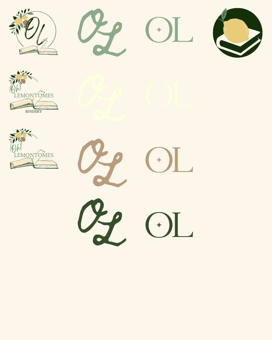
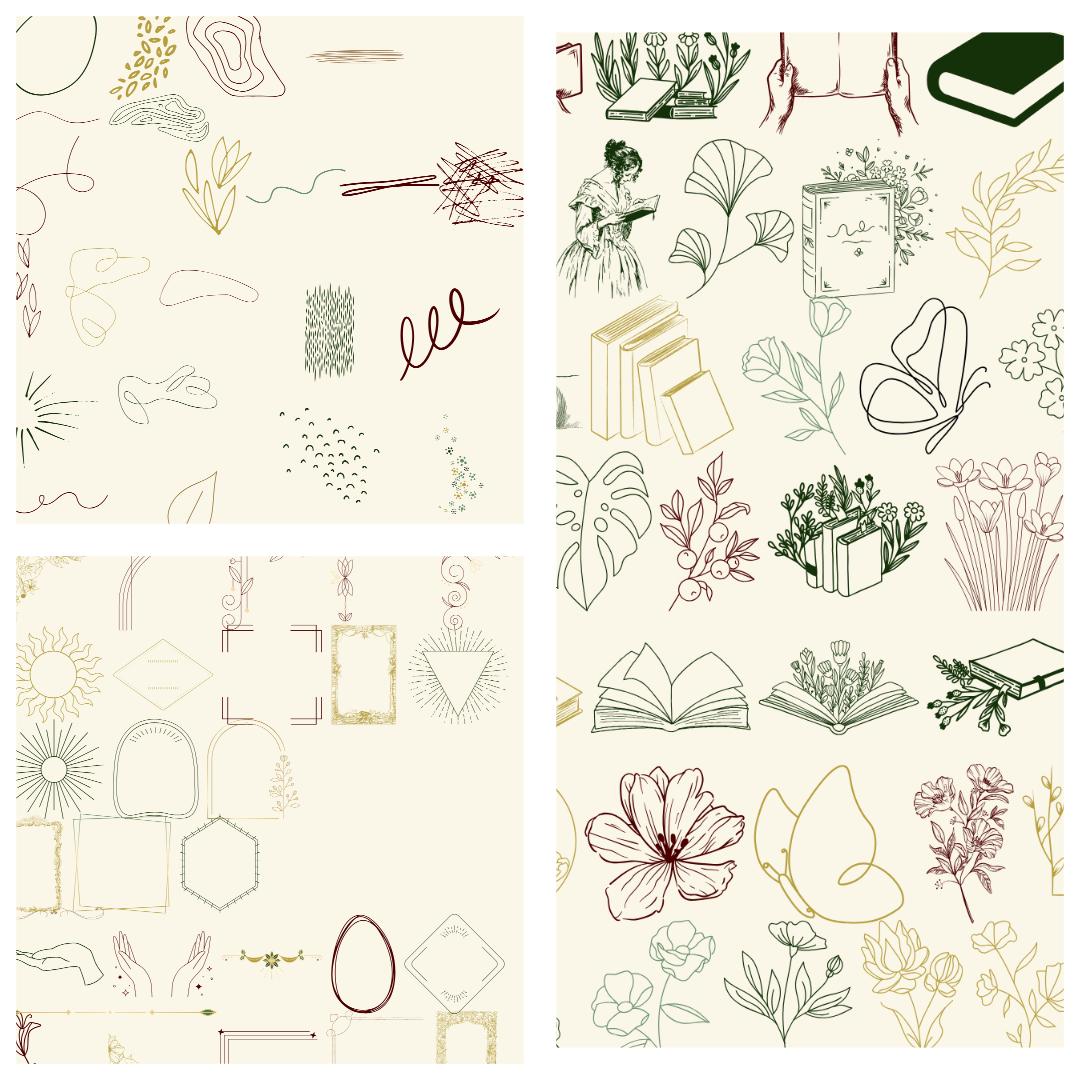
These are some of my logos, watermarks I can use, and a favicon. Then I also went through and found a bunch of elements I might like to use and made a few pages of those for handy reference later.
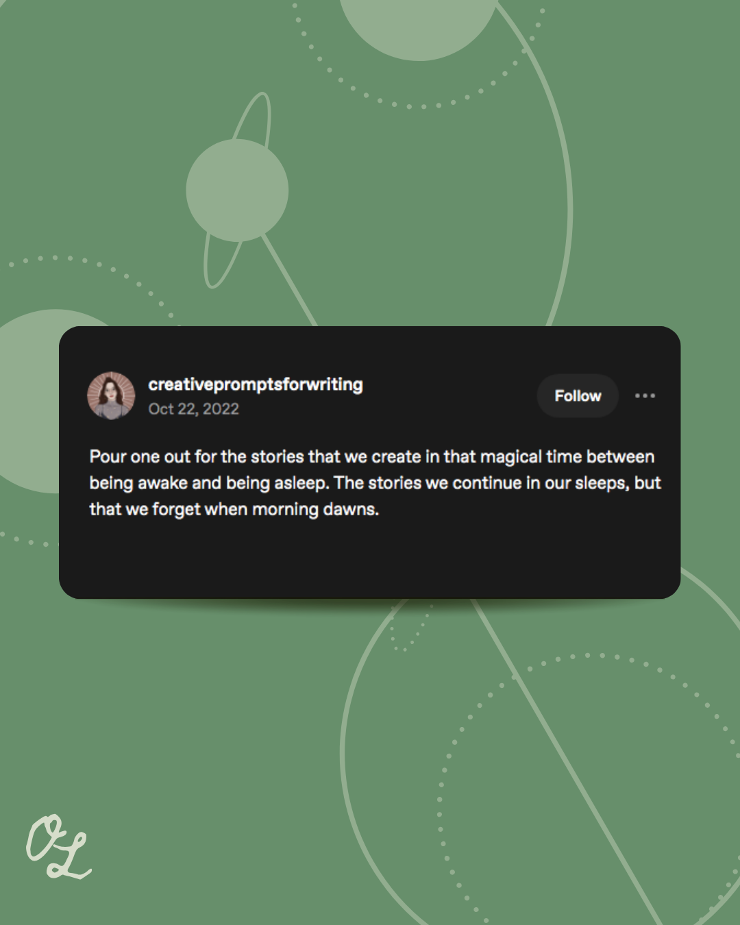
Next, as I went through the lessons, I kept practicing each of the different techniques. Here are my practice Inspirational quote type posts:

And an example of a crosspost (I don't use Twitter/X, so I got my crossposts from Tumblr instead)
And my Facebook Cover/Banner:
{Instagram Carousel will go here when completed}
Moving on, here is the next exercise, Fix My Design. I went in a different direction, thinking of it more as a Facebook post, maybe posted into a neighborhood group, not just on a specific business page, so I kept different information than most of the other examples I've seen.
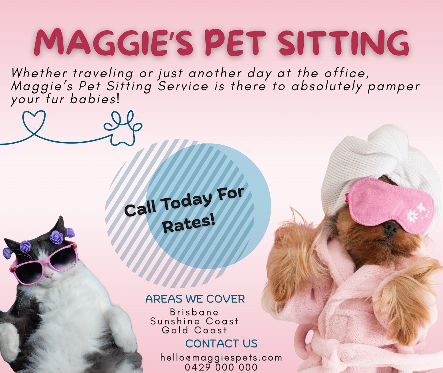
I kept the color theming, but reduced it a little, and brought the fonts down to 3, with 2 being very similar. I went for a slightly playful and fun vibe, and found some images where the animals looked a little less miserable (just my opinion). I added a CTA and let the images do most of the talking, I also pared down the text a bit, so it was a little less overwhelming ( though looking back at it now, I see some more wording I could have eliminated as well... oh well) I have a habit of over-designing, so I tried to go for a very simple clean design... I hope I achieved it.