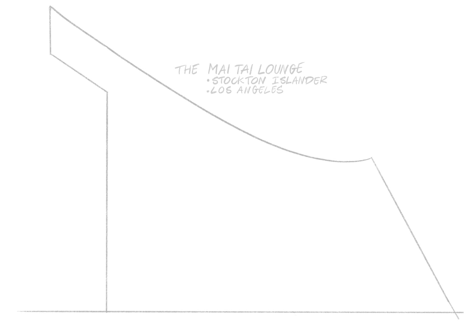
The Mai Tai Lounge - Stockton Islander LA
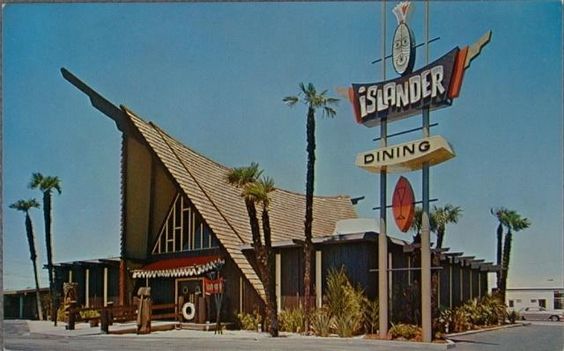
I decided to start with a theme: Create a tiki bar. I was reminded of the lettering from that era when you mentioned interlocking type, so I went for a tiki/surf theme, in combination with an old tiki bar in their typical shape: the Stockton Islander in Los Angeles (from the 1960s, demolished now). Here's an old photo:
Outline:
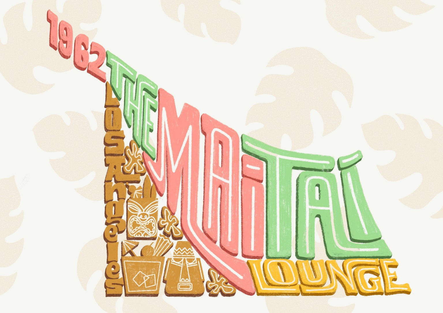
I added a few details to fill up the space (tiki mugs, flowers, text), whilst keeping the same shape. I'm interlocking the letters as much as possible, and not making it too neat and clean. Sketch: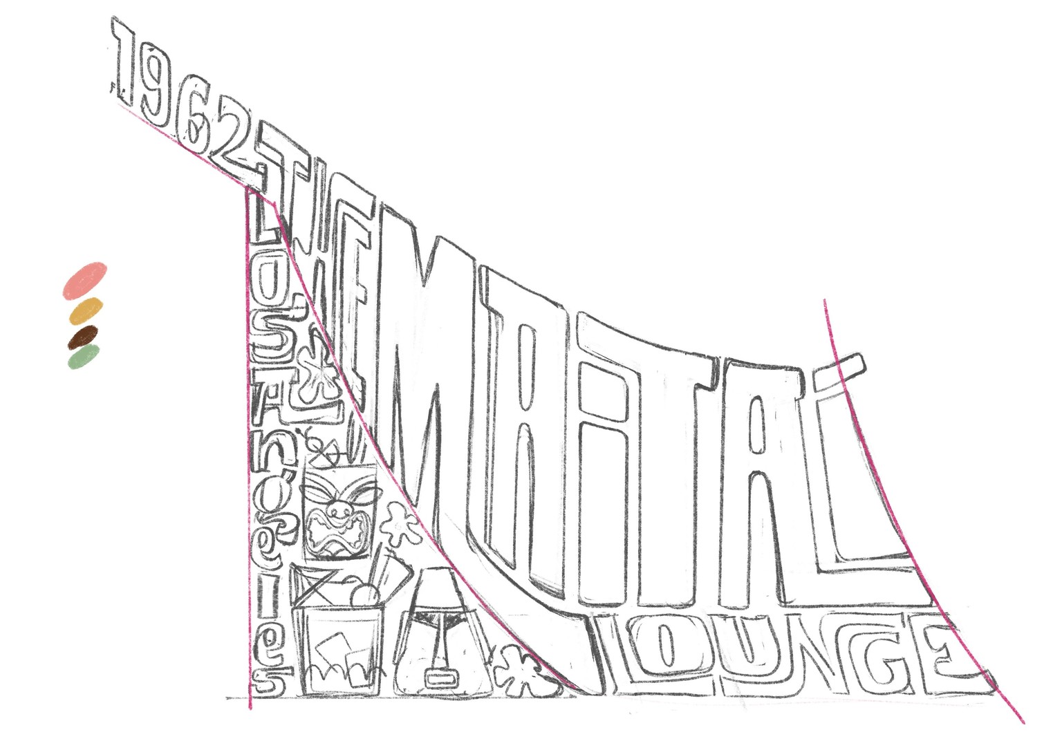 I added a simple background. I didn't play around with textures too much, but used a textured brush to create the letters. Using the colors from the building didn't quite set the right tone, so I added some pink to make it brighter. Finally, I added some shading to create depth. Final result:
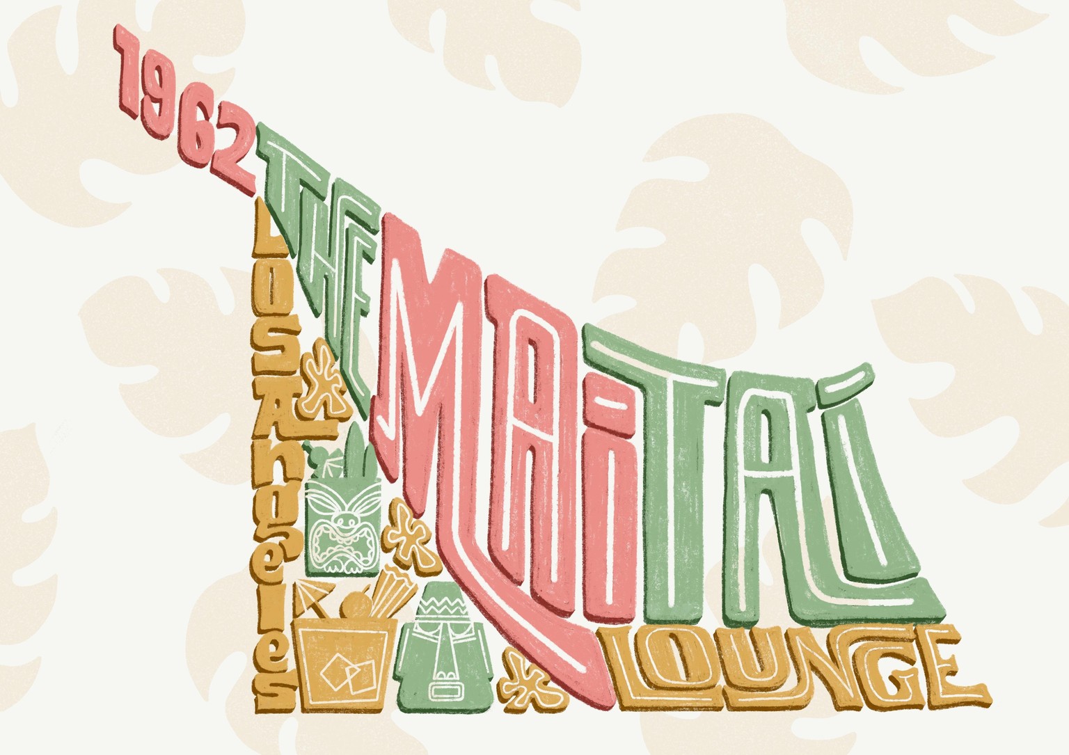
I'd love some feedback on use of colour and legibility. Thanks for the fantastic class!
After a couple of edits: