Thanks!
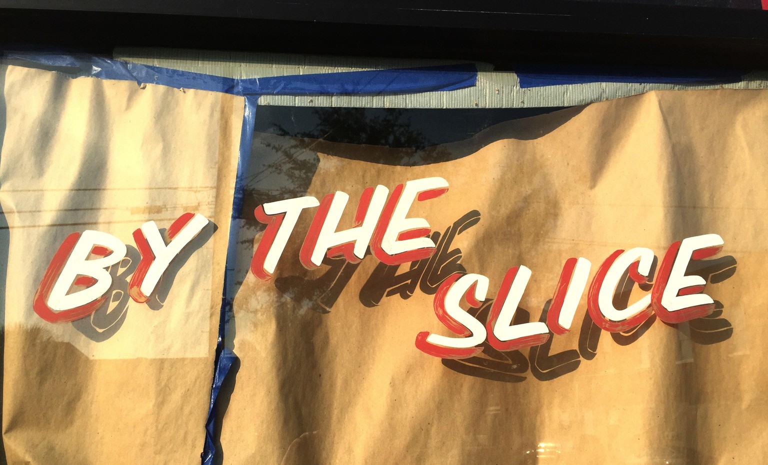
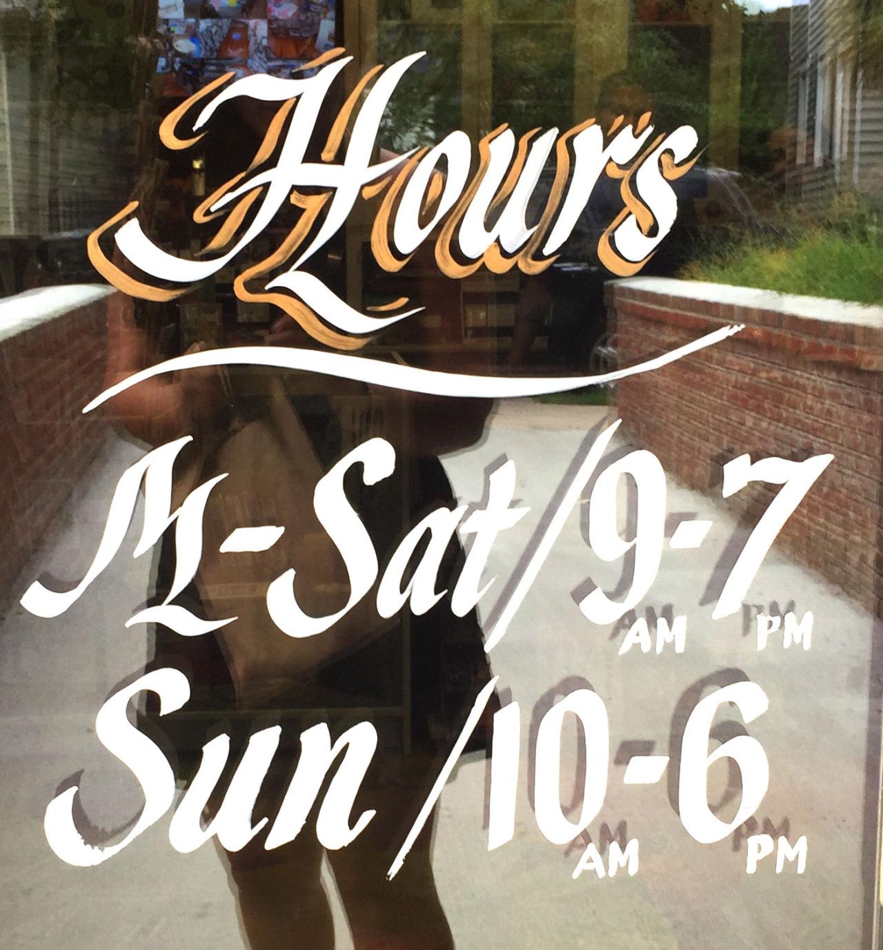
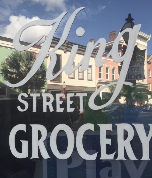
Super pumped to start this project! I decided on illustrating "Thanks". As for style I think I want to go with something scripty. Not sure yet on all capital script letters vs. a mix. I feel like all capitals will be more of a challenge and look more like a monogram, so we'll see! I also really want to do something that has a feel of painted glass. Love these signs that I've snapped in and around Charleston:
Definitely want to add some kind of shadow ornamentation
I also looked at House Industries' Studio Lettering book as well as Scripts by Louise FIli. The last one has some specific script monogram examples in the back that are beautiful.
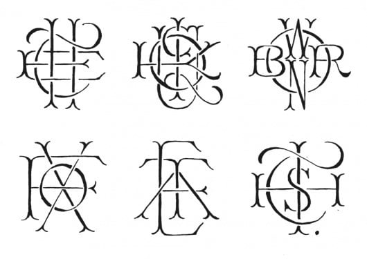
And on Pinterest I found this image that I love for the way letters intersect (if you know the artist please let me know!) *UPDATE: Secily Zepeda found out that they are by James T. Edmondson. Thanks Secily!
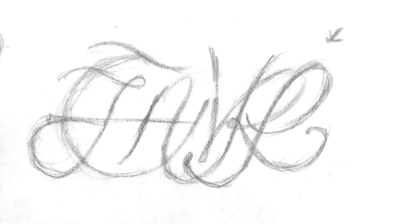
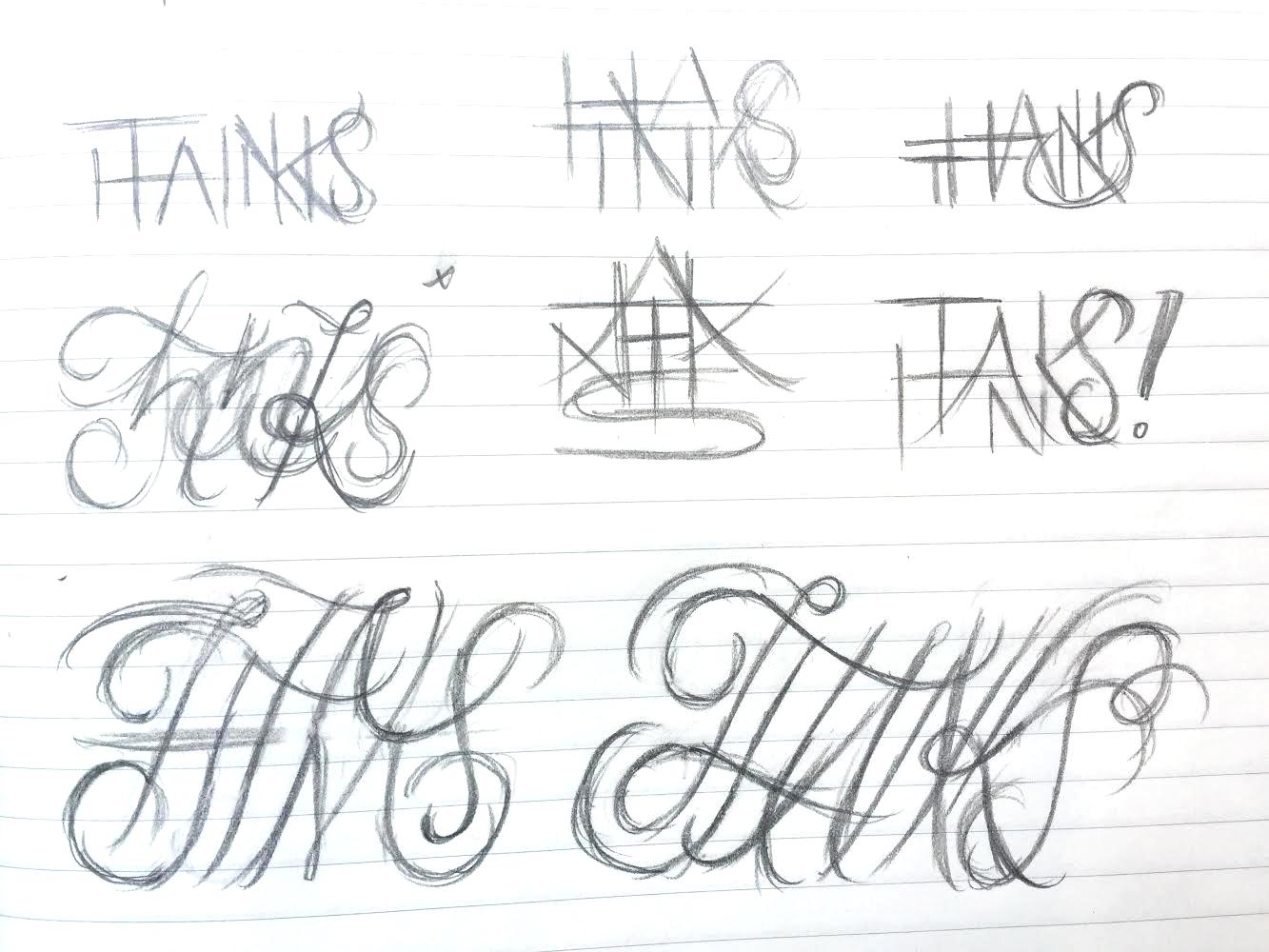
Here's my first round of sketches; quickly moved on from the upright letters and started working on the script! Going to continue to work especially with the A-N-K composition in each.
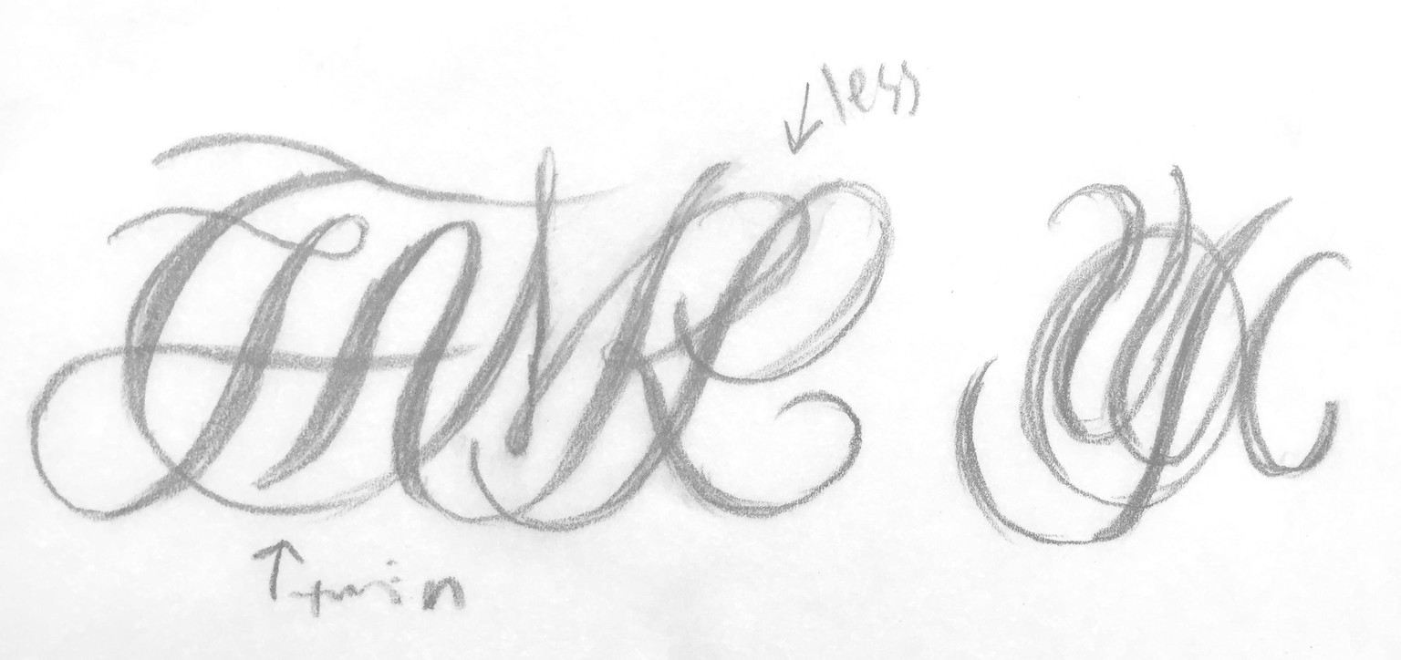
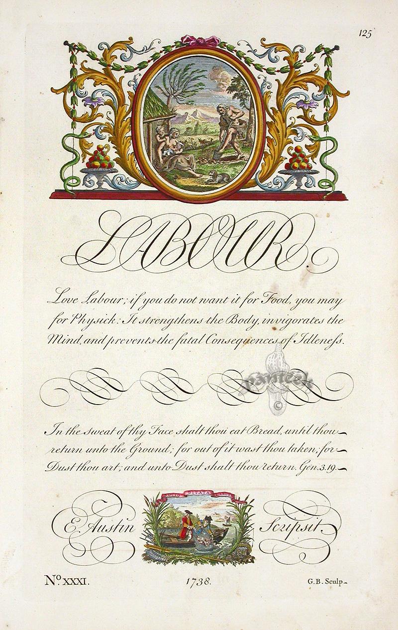
Second round of sketches! Focused on making a well-spaced composition and the flow of letterforms into one another. Also thanks to Kelly for pointing me in the direction of George Bickham! His work below:
With that in mind I decided to shift away from making one crammed monogram as and more on making something that was legible and beautiful: