Style Exploration
I'm a huge fan of Andy's podcast, and listening to it regularly gave me to confidence to apply for a job as a full-time illustrator for a gift company early last year. I always worried about sticking to one style, but in this job it was an advantage to work in lots of different ways.
The company I worked for laid off a lot of people due to Covid-19, and I'm now a freelancer. It's now important to establish a style and identity for my work.
My dad was a professional musician, and I got to listen to a lot of interesting stuff growing up. I went to an unusual school, with a wonderful teacher who seemed to step out of a Roald Dahl novel. I daydreamed a lot, and preferred stories to reality.
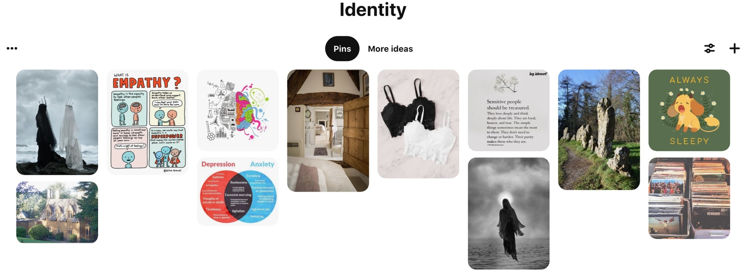
Like a lot of people, I've battled mental health issues most of my life. I'm sensitive and empathetic, soft-spoken and shy but I find the courage to speak up when needed. The thing that surprises people most is that I'm interested in analysis and logical reasoning as well as imagination, and often make unusual connections.
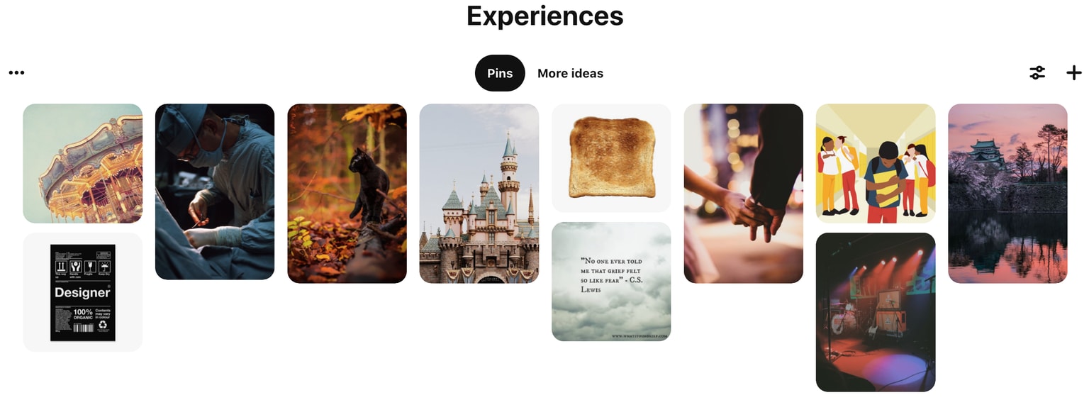
I was around stage lights a lot when I was younger, waiting in the wings for my dad to finish his set, hoping to catch him before he had time to hit the bar. The closeness to the stage didn't cure my shyness, and I had no desire to be on stage myself. The atmosphere was exciting though, and something I'll always remember.
My parents divorced and Dad wasn't really around. I became withdrawn and was bullied relentlessly at secondary school, everything from my red hair to my worn-out shoes were targets. I dreaded "non-school uniform days", when it was clear how little money we had. I read a lot, spent time with animals, looked after my younger siblings as much as I could, and kept daydreaming.
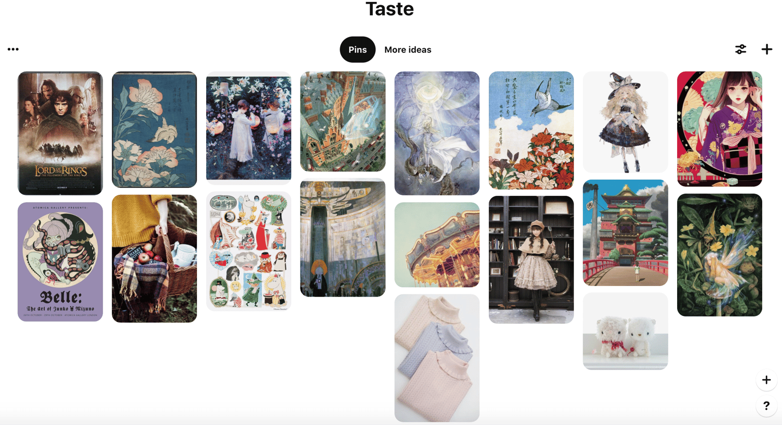
My brother and I were obsessed with the Lord of the Rings movies growing up, while I shared my love of Harry Potter with my sister. Junko Mizuno, Brian Froud, Shaun Tan and Stephanie Pui Mun Law defined my teen years with their surreal illustrations of faeryland and the macabre. I loved manga in general, and the artists here have a beautiful, delicate style. It wasn't until creating these boards that I realised how much I like illustrations and photographs with a warm glowing light against a cold night sky background.
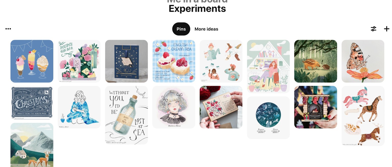
Here are my experiments! It's hard to narrow them down into just one. I'd like to create illustrations for women's lifestyle magazines, so that will inform some of my choices. I'd like to course-correct rather than start from scratch, but I'm interested in seeing what happens with the class.
Lesson One: Dice
Experiment 1: Classic Inspo + Happy Accident
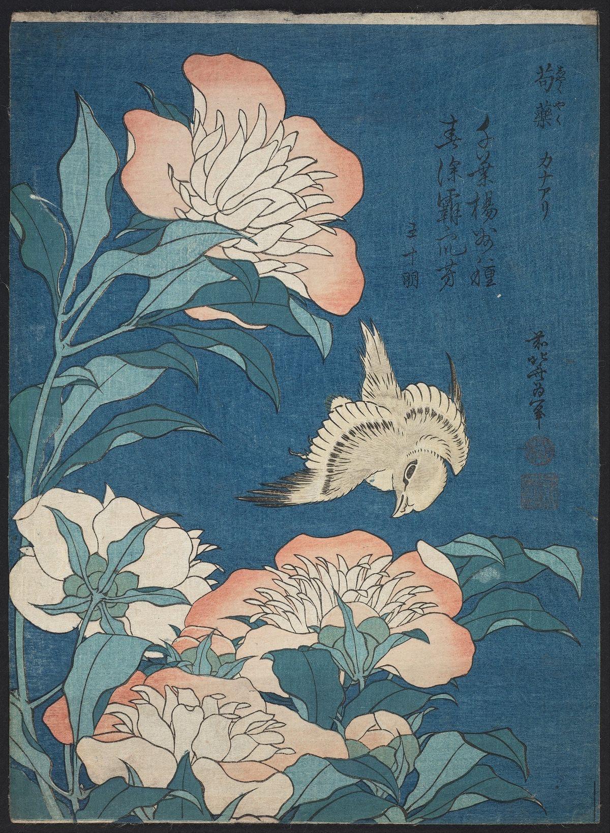
I chose this Hokusai print I love...
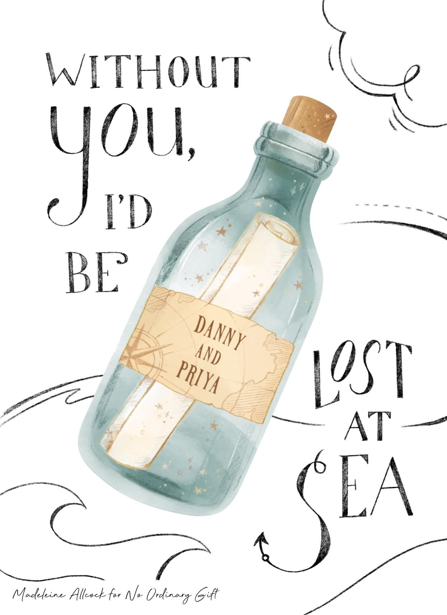
Created for No Ordinary Gift
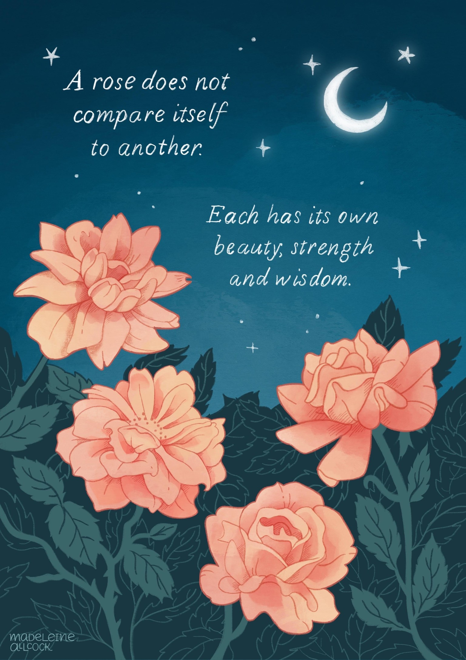
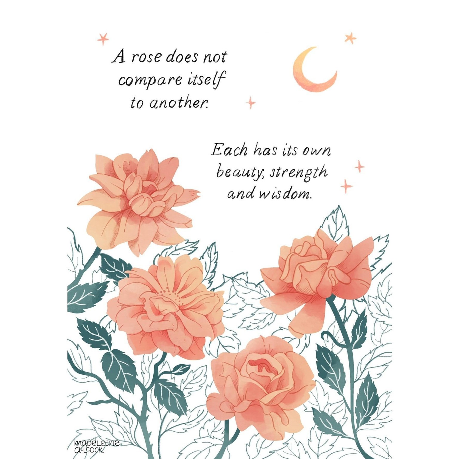
And this piece I’m really proud of, where I explored different textures and hand lettering.
I used similar colours and composition to the classic inspiration, with textures from my accidental work.
I also made this version, so it fit better with the bottle artwork. I asked my friends and they were pretty torn on which they preferred!
Experiment 2: family history + copy yourself
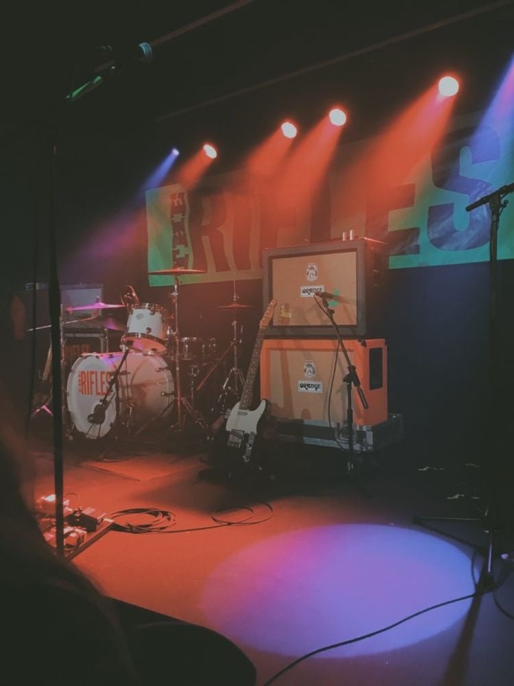
Photo by Ethan Judd on Unsplash
My Dad passed away in 2018, so I wanted to create a memorial piece for him and celebrate his past as a musician.
Created for and owned by No Ordinary Gift
I thought this piece I made last year would work well to copy from, and matches my love of “glowing lights in the night”.
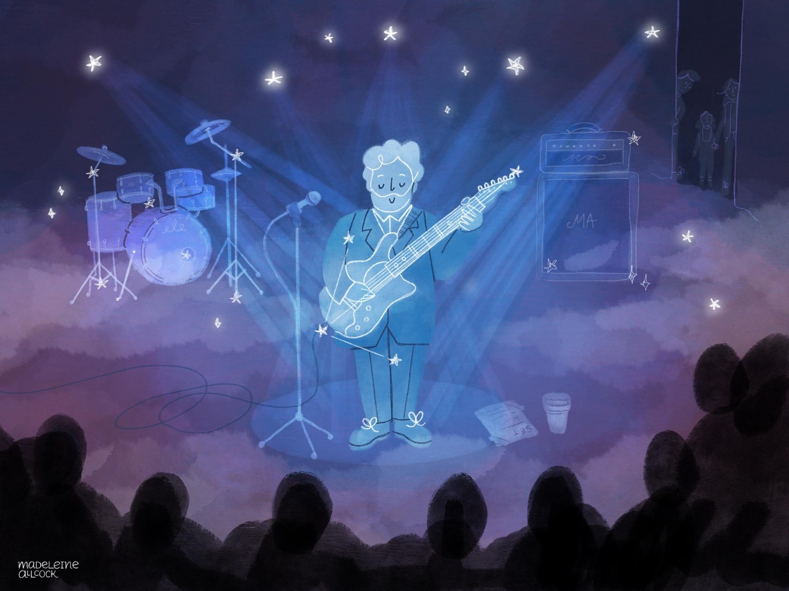
...which resulted in this after a lot of trial and error with colours, brushes and layer opacities. Something didn’t feel quite right – the crowd looks threatening, and my siblings and I in the background feel sad and distant.
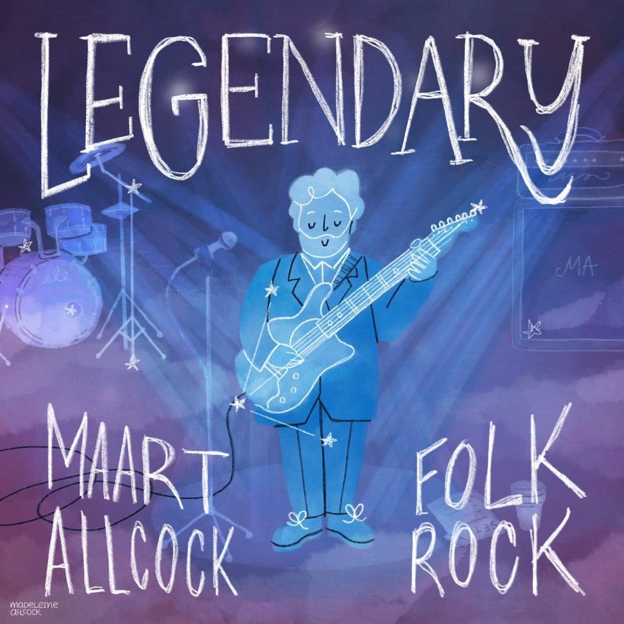
I cropped it, removed the elements I didn’t like, and add hand lettering – I intended to draw over it, but I liked the messy look in the end. I thought it looked nice as an album cover, and think he would have liked it.
Experiment 3: Your past + current inspo
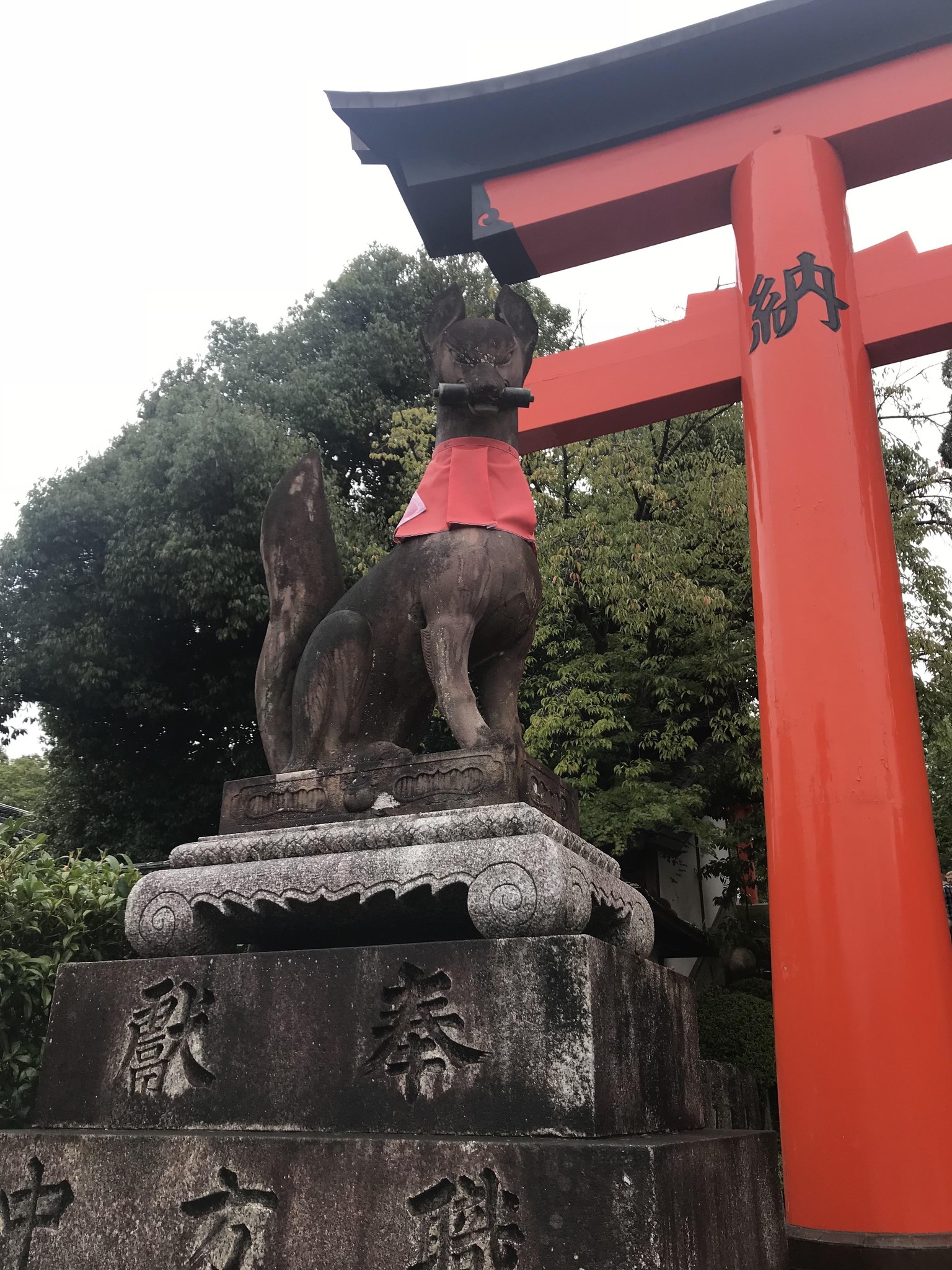
I chose a trip to Japan, specifically Kyoto, and map illustrations by Tom Froese. I love his combination of graphic style with hand drawn lettering and textures. I'm cheating a bit with this one because I already started the illustration three months before this class, but the dice felt like the fates were giving me a nudge to finish it.
(sometimes I wonder if I became an illustrator due to being a lousy photographer, haha)
Illustration by Tom Froese, map class on Skillshare
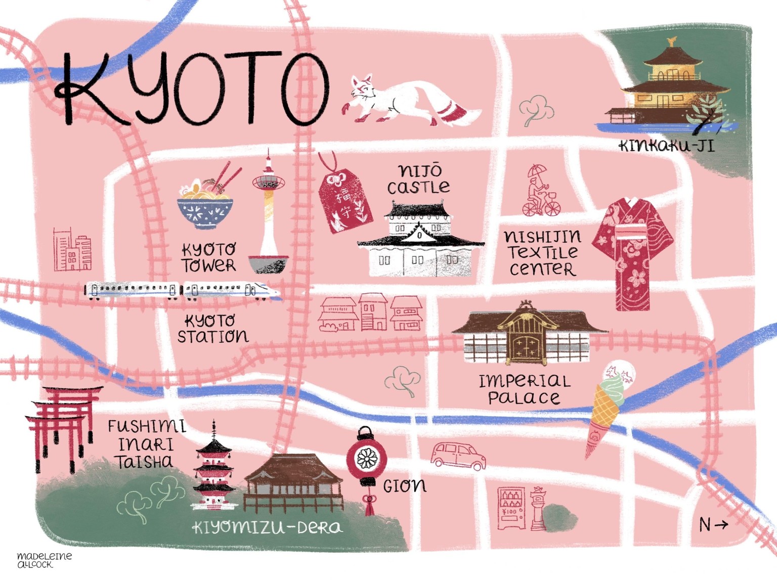
My map project. The colours need tweaking a bit but otherwise I'm really happy with it! The colours seem really bright on iPad/Procreate, then really dull once exported as a jpg and uploaded online. I'm not sure how to get around this issue, so any tips would be much appreciated!
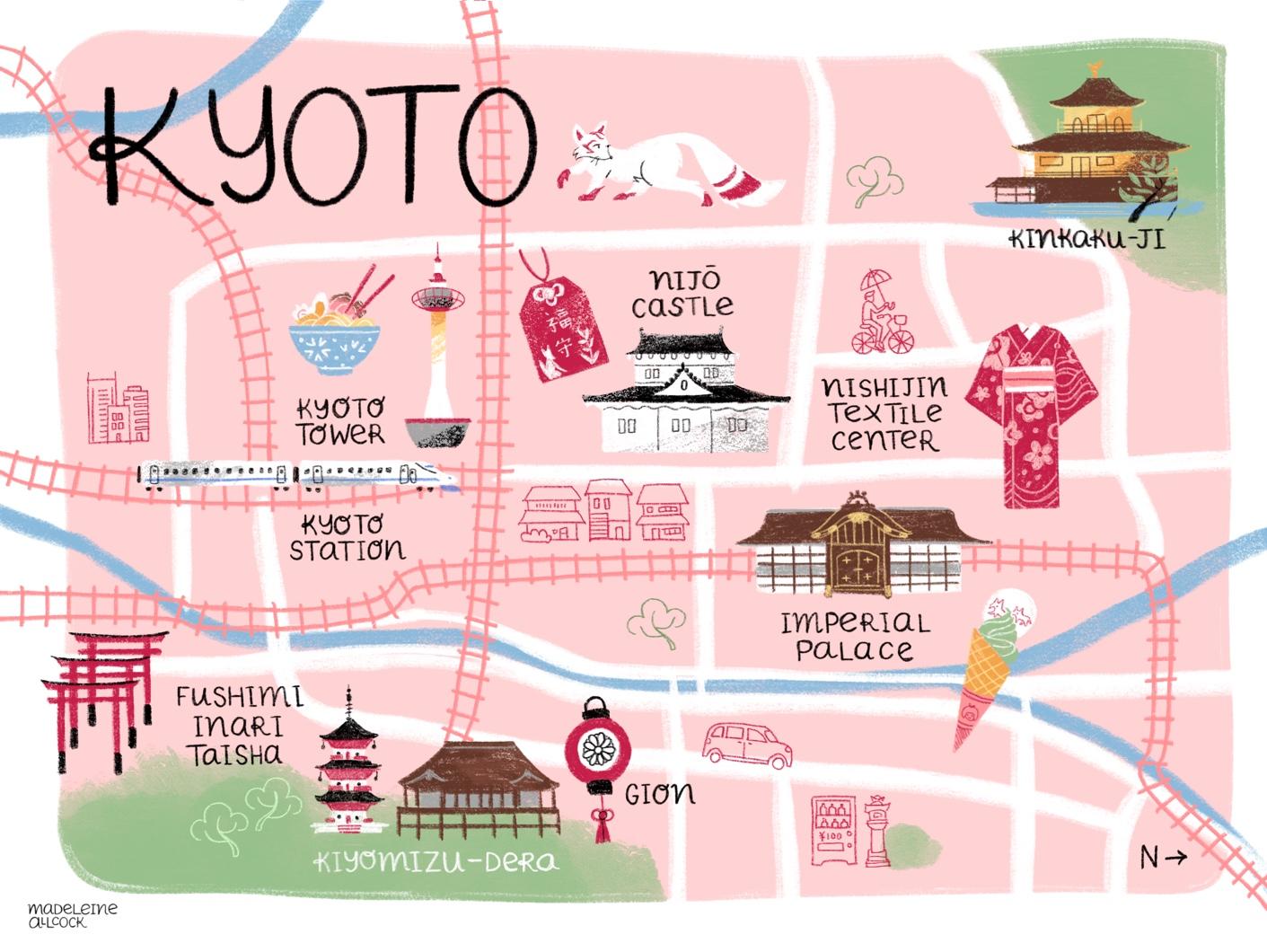
After colour tweaks. I looked into the issue, and it seems the default Procreate colour setting is "P3 display", which means it's optimised for Apple retina products. I stupidly assumed it would be set up in sRGB. Unfortunately there isn't a clear fix, you can either export it as a PSD and change the colour profile in Photoshop, or you can flatten the canvas and copy it into a new file on Procreate that you've set up as sRGB to begin with. If you'd like more pointers on that, feel free to comment and I'll try to help you. I recommend always checking your colour profiles before you start work in future!
While creating these illustrations, I realised I was asking myself the wrong question: "which one of these hundred ways of working looks best?". I started asking myself, "which styles do I enjoy? Can I have more than one?". It turns out I have three styles that I love. The chalky, flat, minimal style will be my main one for editorial projects, and the detailed digital paintings with hand lettering will be a secondary style for gift and packaging. A local gallery is interested in my traditional watercolours, and I'll keep that as originals and prints rather than applied illustration. To make it more consistent, I set up different websites for each one. If I end up dropping a style, that's ok! It's probably inevitable. I'm excited to see what happens regardless. After all, my Dad was a multi-disciplinary musician, so maybe it's in my genes to be a Jack of all trades...
UPDATE 17/11/20
I created A LOT of images, partly for a daily project in October, and some I spent a little more time on. I decided to stick with the main style – the chalky, flat, fairly minimal style (at least compared to the others), mainly because I knew I could get them done quickly, and would enjoy making them.
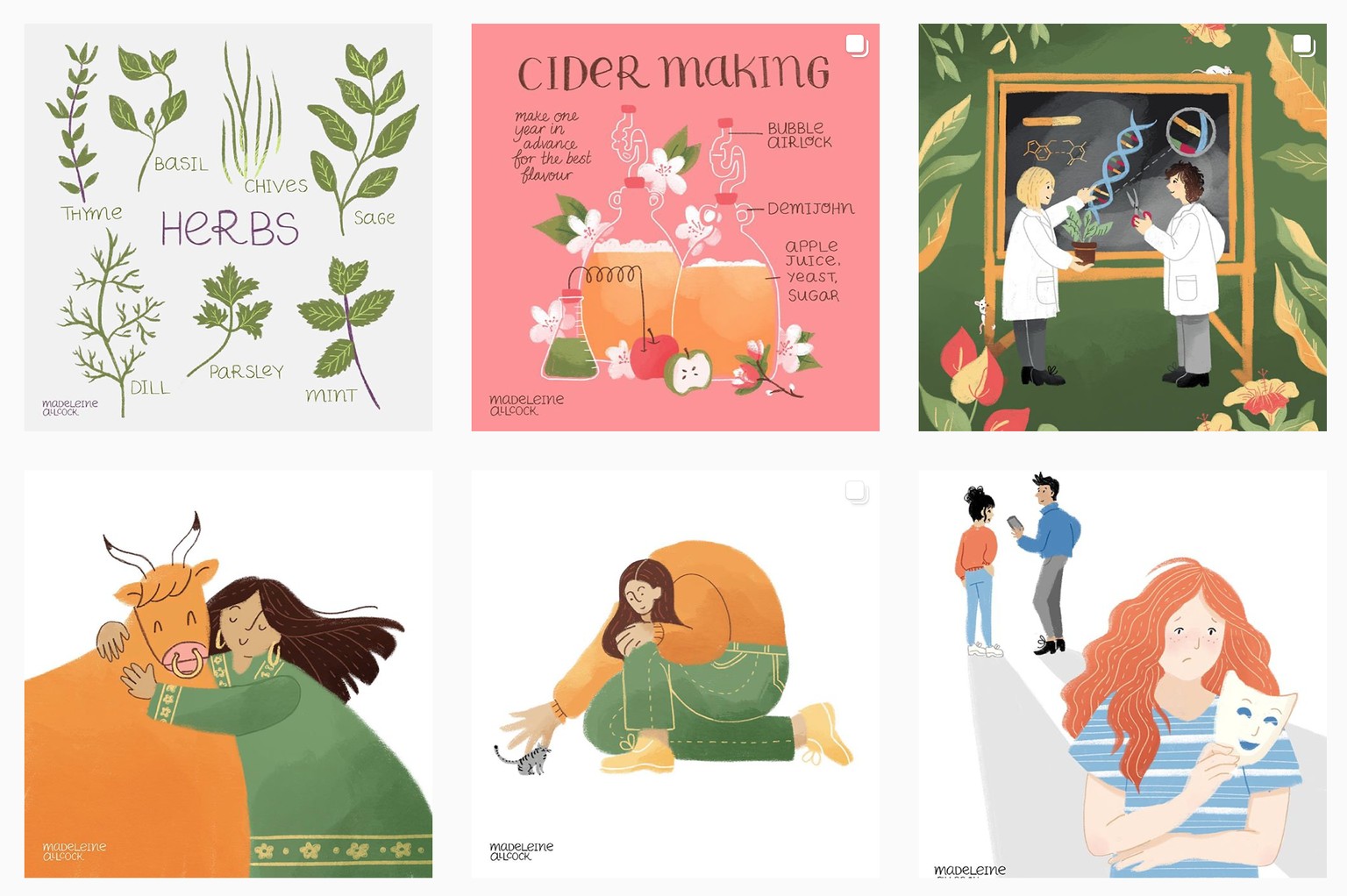
Images from my Instagram, experimenting with subject matter, particularly people, trying out different shapes, colours, etc.
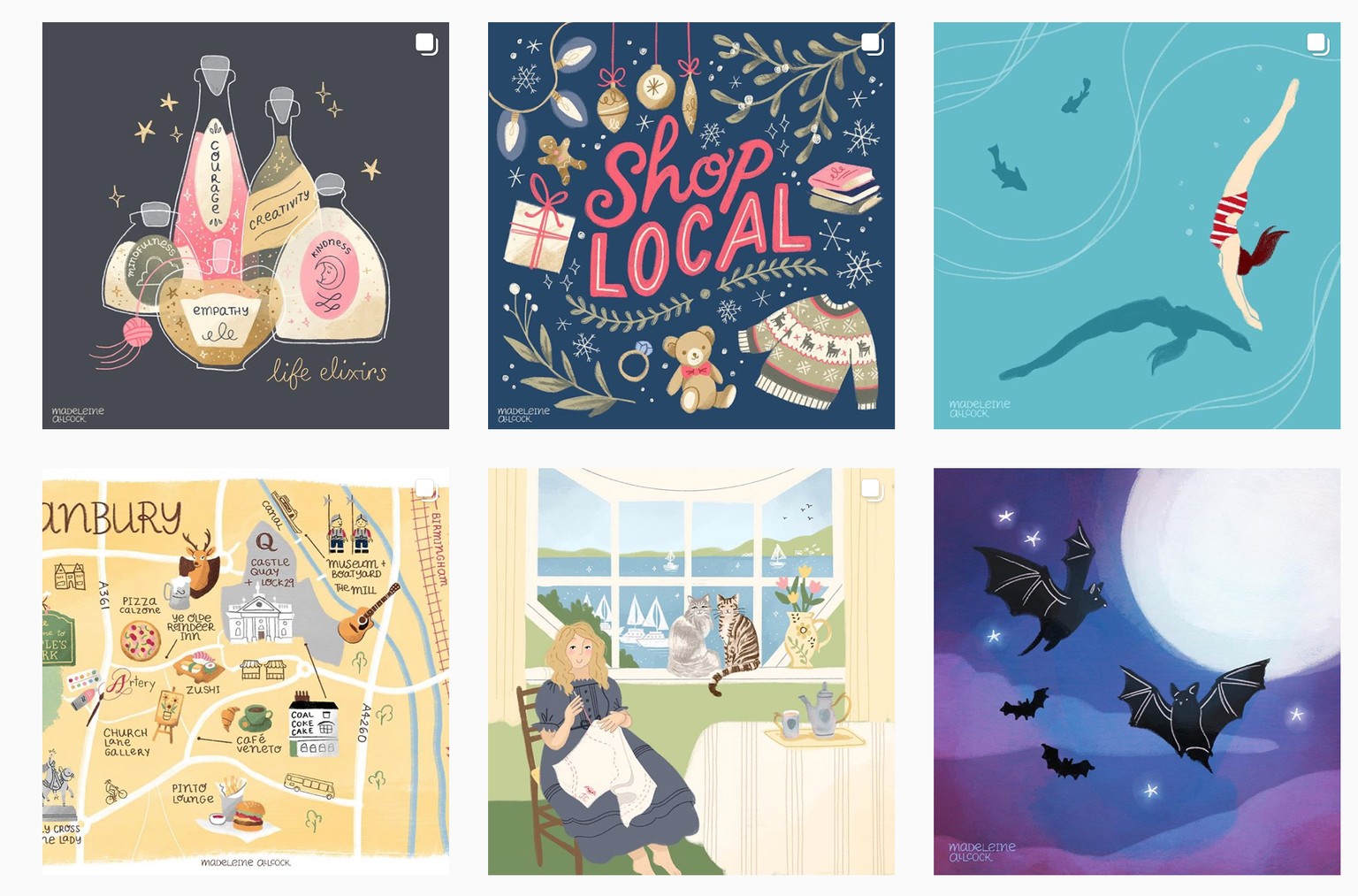
These ones all look a little different, but I think it's fair to say it's the subject matter that is different, not the style. I think the only one that doesn't really work here is the bats for Halloween, and I'm not convinced about the aqua colour in the swimmer piece. I was particularly pleased with the "shop local" image, as it was made to help indie businesses in my local town, along with the map. Some of the shops featured reached out to say thank you. The bottles are a redraw of an old piece (you can see the original in another Skillshare project) and I had a lot of fun making them!
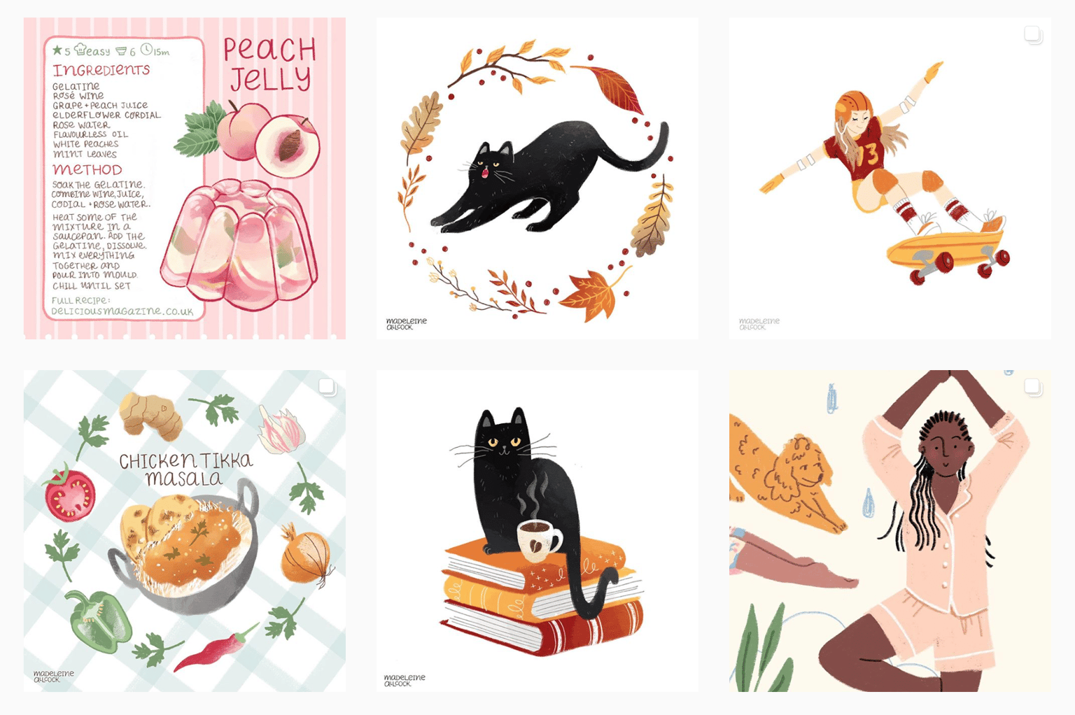
This is where I felt I was really hitting my stride. My brother messaged me to say he felt my work was really recognisable now. It seems small but he's the type of person that's excellent at everything, so it felt like high praise! The skateboarder is also based on a previous project – interestingly, when I made the sketch for her a year ago, I had no idea how to colour her and felt she didn't fit in with my work. I draw that way naturally, or "from the heart", and it's so true how Andy says your style is part of you already. It wasn't until I stopped searching for a million ways of doing something, and did what came naturally or even felt lazy, that I made consistent work like this.
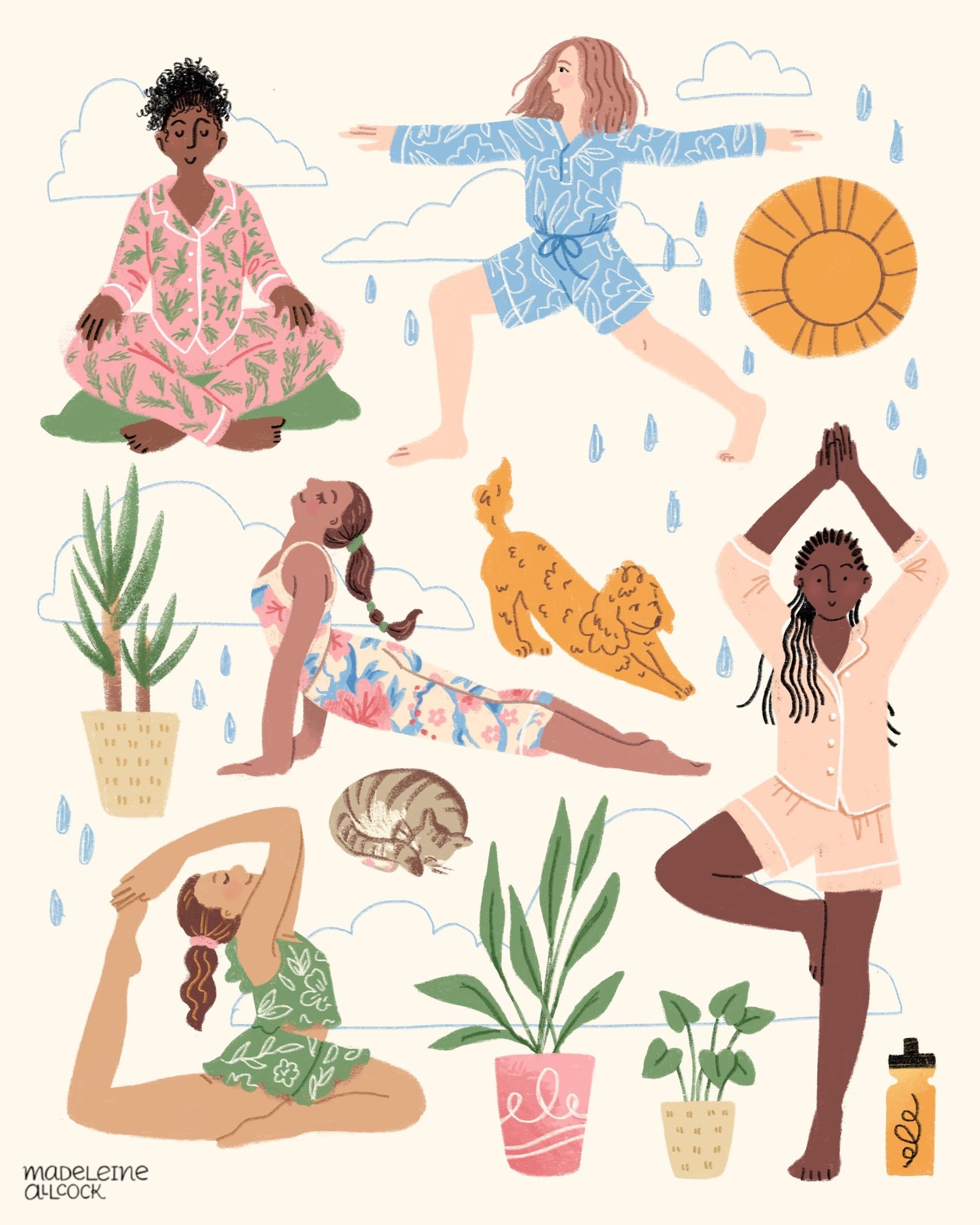
I like to illustrations that look on the bright side, sees humour in a situation or is just pure escapism. These girls are making the most of lockdown, with stay-home workouts, pets and plant babies.
I'm going back on my idea to have three styles, and the more detailed stuff can just be for fun, I won't worry about making style guides for those since I don't intend to seek work from them.
Next, I'll create a style guide, I can't wait!
--
Connect with me on Instagram @Madeleine.allcock or view my entire portfolio on my website.