Sailor
Mindmap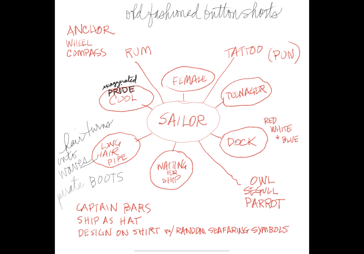 First Sketches
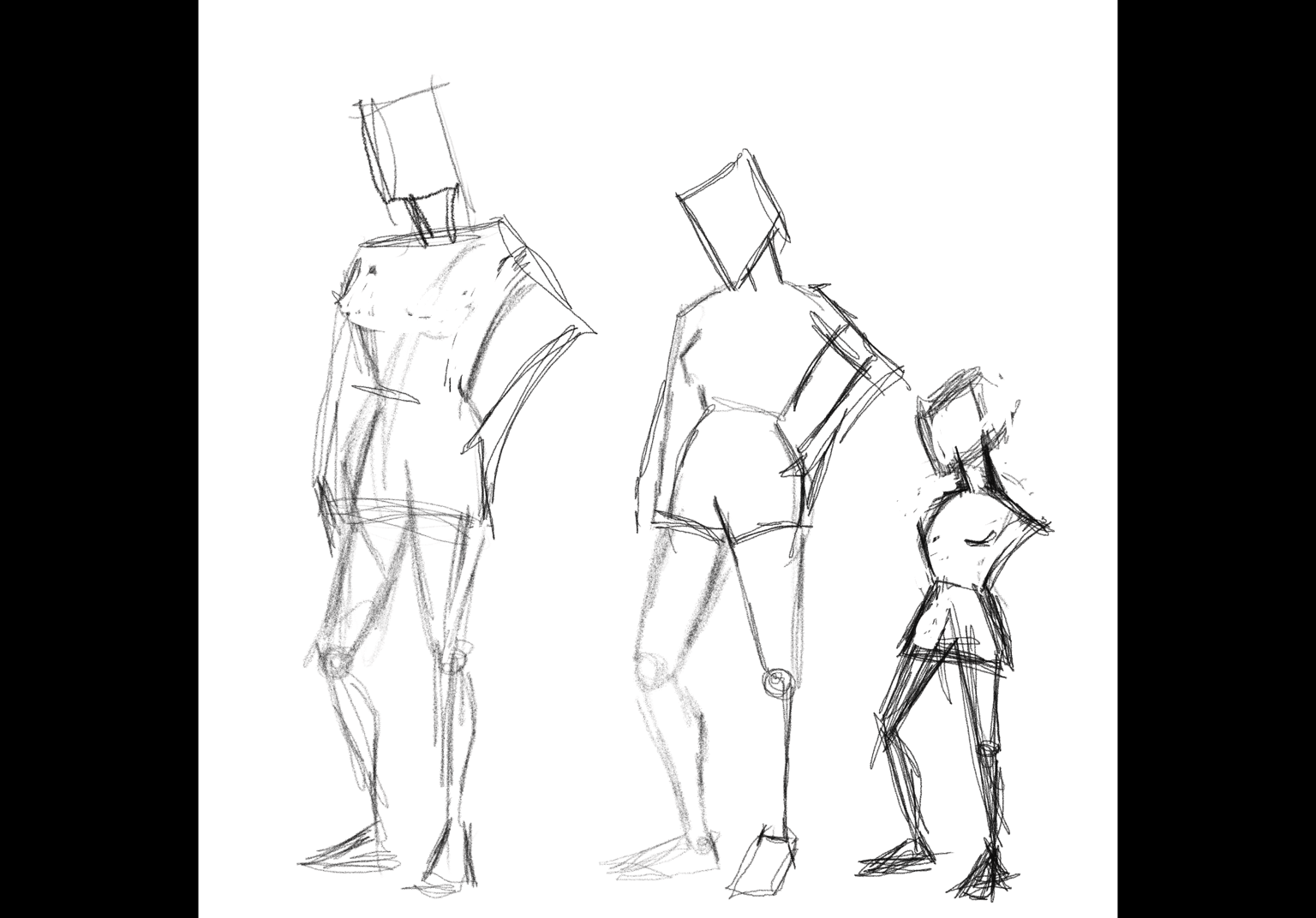 I wanted the proportions to be distorted…I’m a big head, small body kinda gal.
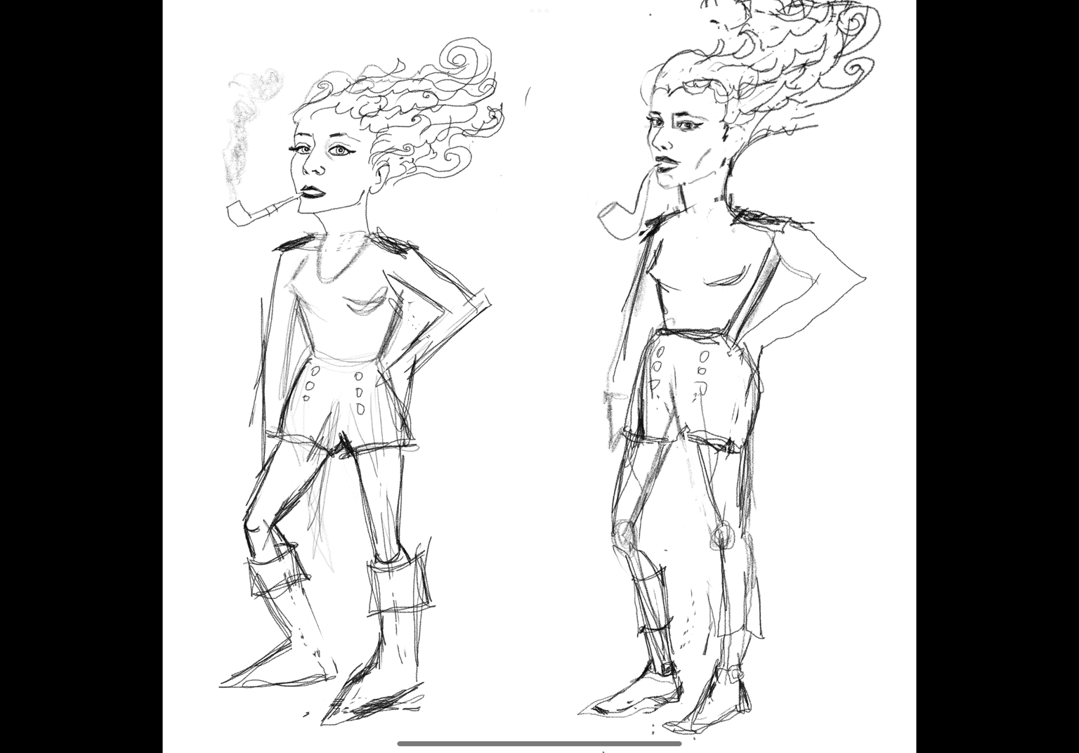 Then I got ahead of myself and put in too many facial features trying to get that feeling of pride. It’s in the eyes and tilt of the head. Waves for the hair seemed like a good idea.
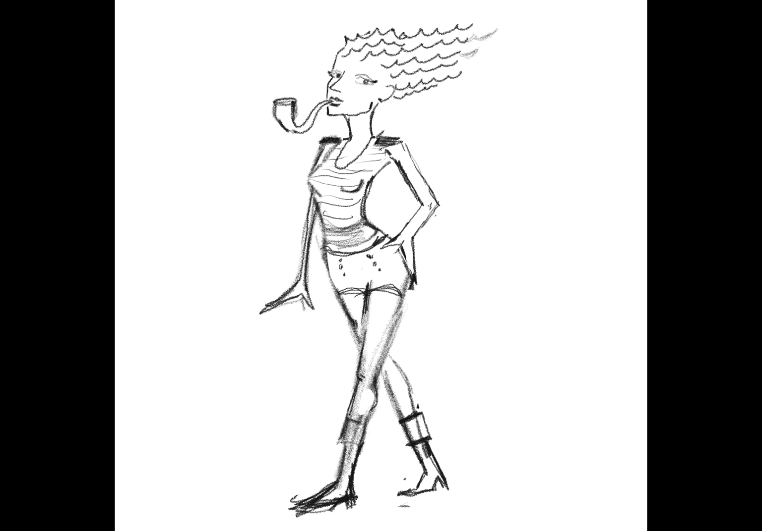
 So I tried to simplify. I thought the stance was off so I tried again:
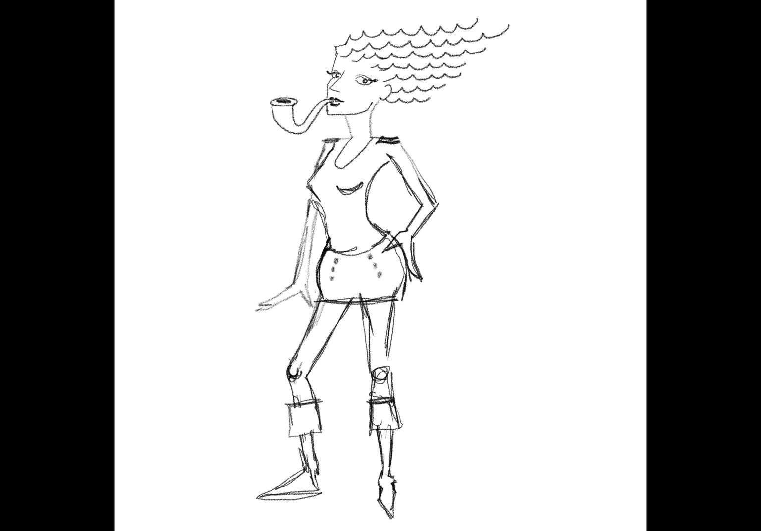
 I decided to go totally basic to exaggerate the body, then I shortened the body to the head…
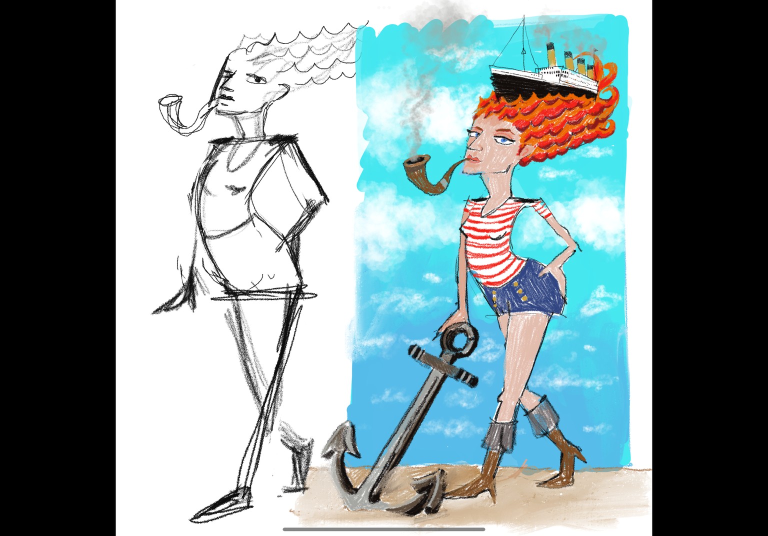
…and then got carried away adding smoke, ship and anchor and some color. I had only watched your video up to the sketch section so now I’ll check out the rest. I posted early…back to work!
I tried playing around with the colors in 4 sketches. I felt a great accomplishment being able to download the class brush options and creating 4 of the sketches on one page! These are the things that usually bog me down. Anyway, I wanted to see what one would look like with blue hair as waves since that was my initial idea, but I didn’t do it because I thought it would look trite. Ehhh, I felt I had to do the whole piece in blues to make it work. I think it makes her look older…but there was a Marie Antoinette thing I kinda like about it. Also I noticed her chin makes her look older so I’ll have to fix that later. I definitely liked the oranger hair and the red stripes on the shirt for punch plus I liked thicker stripes rather than thinner. I preferred her on sand instead of the dock…kinda like she was claiming territory! So I think I’ll go with #4 except I think I’ll reverse the sky by putting the turquoise color on top and the bluer sky on the bottom like my original sketch. It feels more daytime. Ohhh, and I need to find a better skin color so she looks like she has a nice tan!
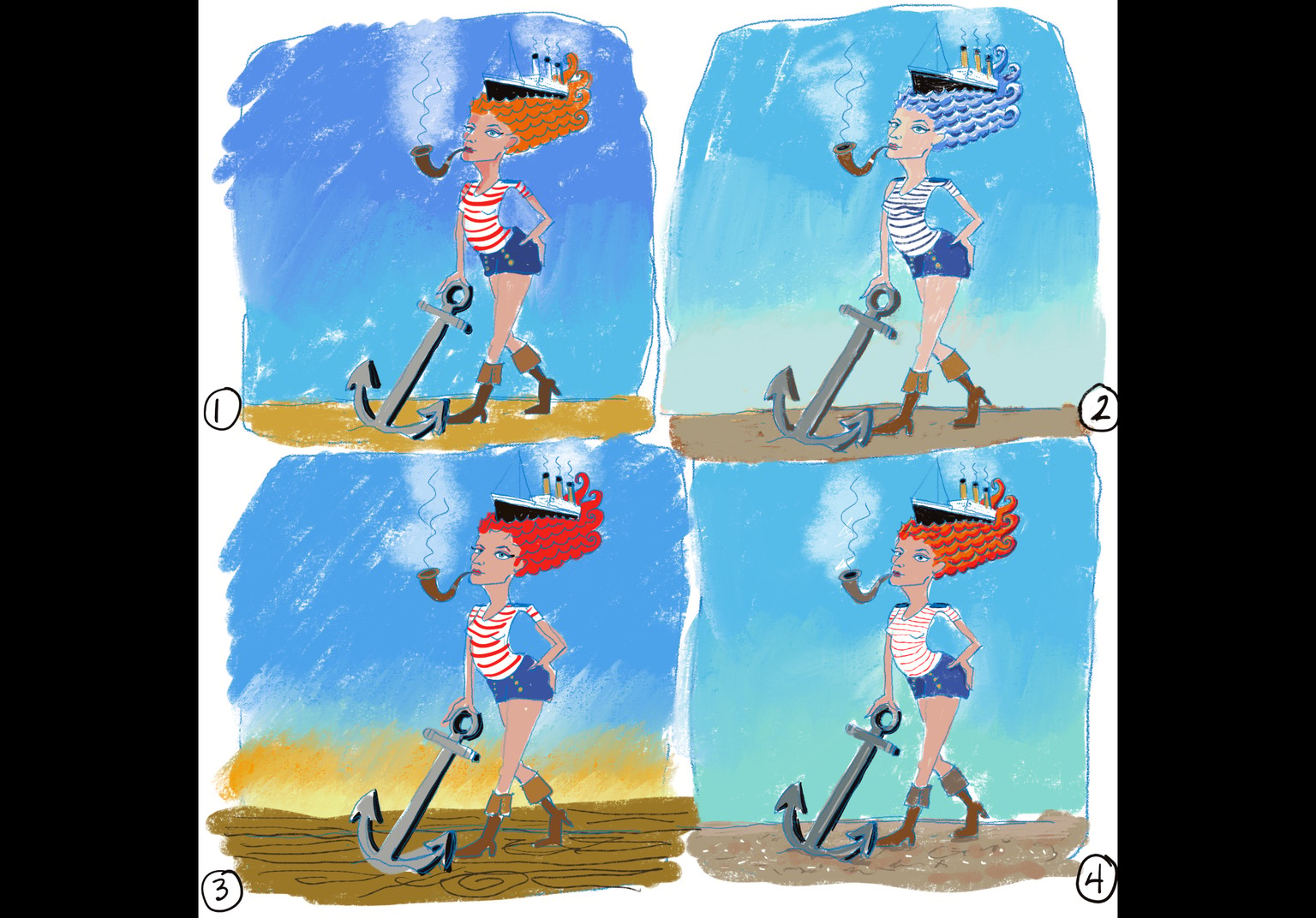
The value sketch helped a lot. I found it interesting that it also gave me a peek into warms and cools. Clouds should help the background. I’m undecided though…I’m deciding between #2 and #4.
