SAMPLE PROJECT - Wichita Area Attractions
************************************************************************************************
DISCLAIMER
I am posting this project only as a reference for how you MIGHT structure your own project. There is no right or wrong way to go about the creative process, each person has a unique perspective that they bring to every project. Take from it what you will and use some of these techniques to help you along the way.
This is a thorough look at my process, but really just the high-level to give you an idea of where to start each section of the course. I'll really get into the nitty gritty of the structure of the series, design theories, how to use shape and information about Illustrator in the video lectures in the course so tune in to those for in-depth information.
************************************************************************************************
INTRODUCTION
When first asked to teach this class I had no idea exactly what I wanted to talk about. I had some loose ideas and I worked with the folks at Skillshare to refine those ideas down to drawing with Geometry, something that I have experience in and really enjoy. After being inspired by the new stickers inside of Path by Always with Honor I thought that it would be great to great a small series of icons/badges that could be about anything that you wanted. You can never have enough graphic badges. They could be stickers, web icons, something you e-mail to a friend, part of a poster or birthday card, really almost anything. I figured if I kept the parameters loose I could spend more time on the design aspect and using shape as a tool to illustrate. And so the class was born and I got working on this example project.
------------------------------------------------------------------------------------------------
SECTION 1 - BUILDING IDEAS
The main purpose of this section is to work through all of the bad ideas to find a few good ones. Your ideas can be anything really. If they have a purpose, great! If they're just something you want to explore drawing, that's great too!
------------------------------------------------------------------------------------------------
************************************************************************************************
MIND MAP
I've been told that I'm a good writer, but I don't really believe it. Regardless, I often think verbally and one of the easiest ways for me to start a project is a mind map. Just drop the topic in the center and think freely, drawing from one word to the next until you think up a different topic and then start again. Easy enough.
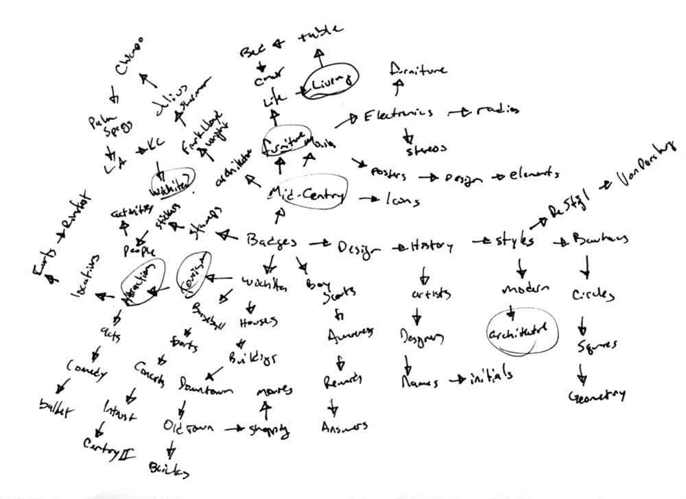
After about 15-20 minutes or so I go back and see what I can pull out of my word list. I circle a few things that I think might be good ideas and keep pushing. I love Mid-Century Illustration, love it. And it comes up in almost all of my personal projects, but I wanted to challenge myself a little bit more. As I thought about it I realized that I was interested also in Mid-Century architecture but knew nothing about it. I spent a few days researching the architecture of Frank Lloyd Wright, Richard Neutra and the like and thought maybe I was on to something. I could do a series of badges featuring famous mid-century architecture. But then I came across this series by James Provost and thought it was too close to what I was imagining and wanted to find something more unique.
I went back to the mind map and found a few other things that I had thought about, the interiors of mid-century homes and attractions in my local city, Wichita. The Wichita idea actually spawned from thinking about the Allen Lambe house by Frank Lloyd Wright which is less than a mile from where I live. These were two ideas that I thought had merit and I decided to keep on trucking.
************************************************************************************************
SKETCHES
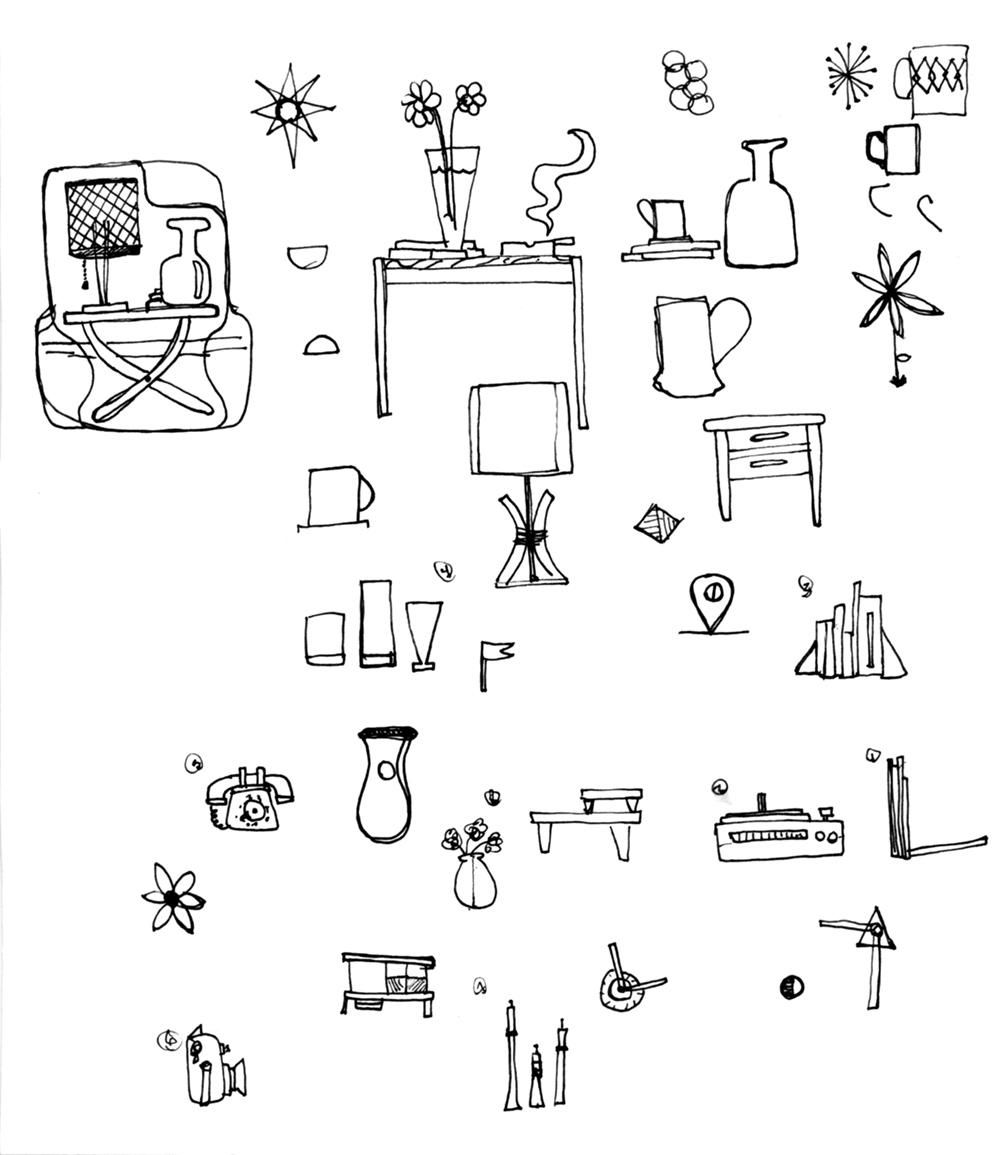
I was really liking this idea that I was calling "Mid-Century Living" more so than the Wichita idea and so I started seeing what I could come up with. I did some sketching and even drew up a table (below left) as a sticker and posted it on Dribbble. After thinking about it and working on it more it quickly became more complicated than I wanted it to be for this. I did end up doing a small series of them though so it wasn't a total waste, nothing ever is. The first section of this course should be all about exploring and investigating ideas to figure out which ones will work the best.
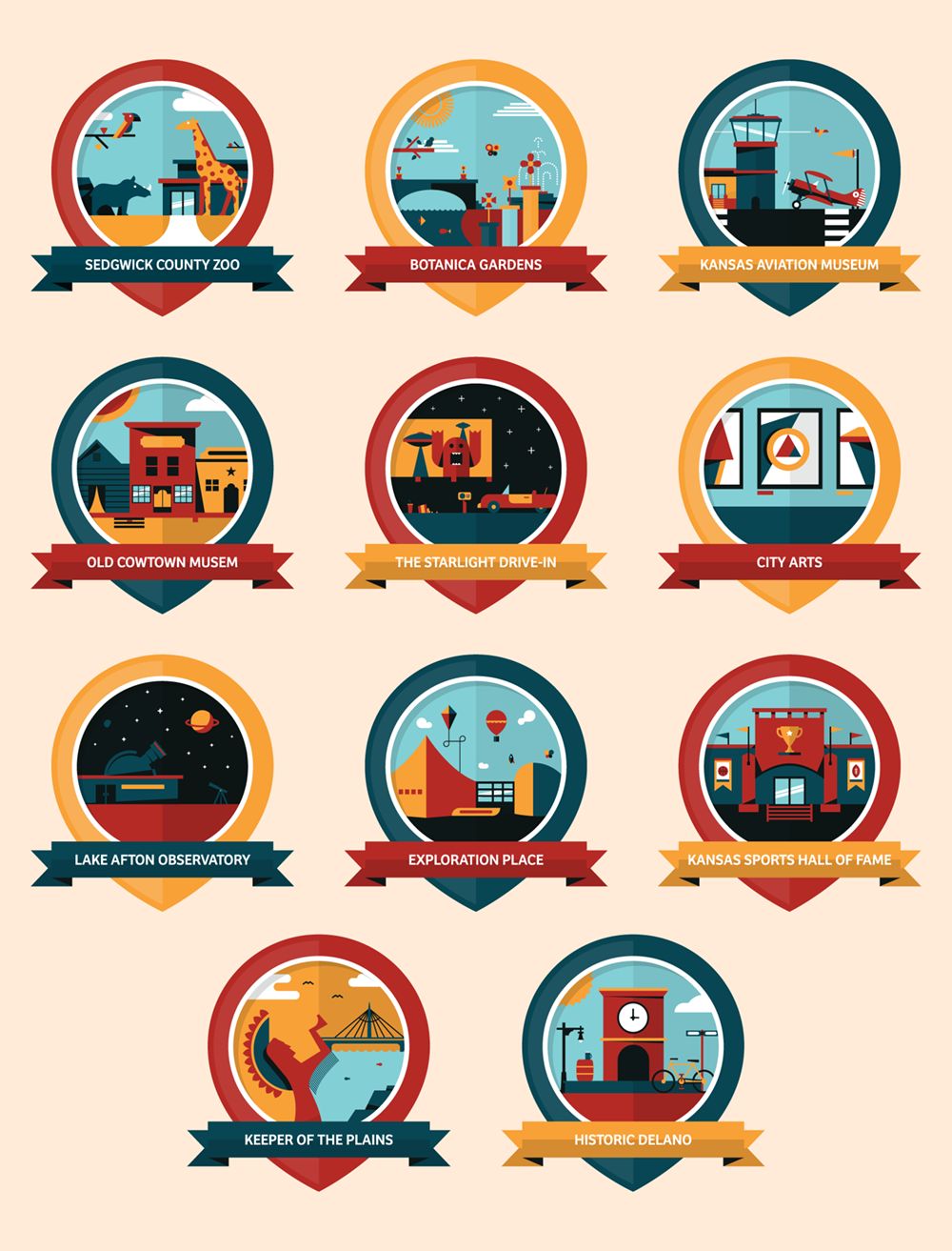
After my mid-century exploration I went back to the Wichita idea. I enjoy living in Wichita, which a lot of people find surprising since it's in the middle of Kansas, but it really is a fun town to reside in. I spent a while trying figure out how to build a whole series of things and was actually stuck for a day or two trying to work out that Allen Lambe house, it just wasn't quite coming together. Then one day while taking my morning shower I thought of a map marker as the graphic container and then it clicked to do kind of a tourist attraction series of badges for things to do around the city. So I spent some time sketching it out.
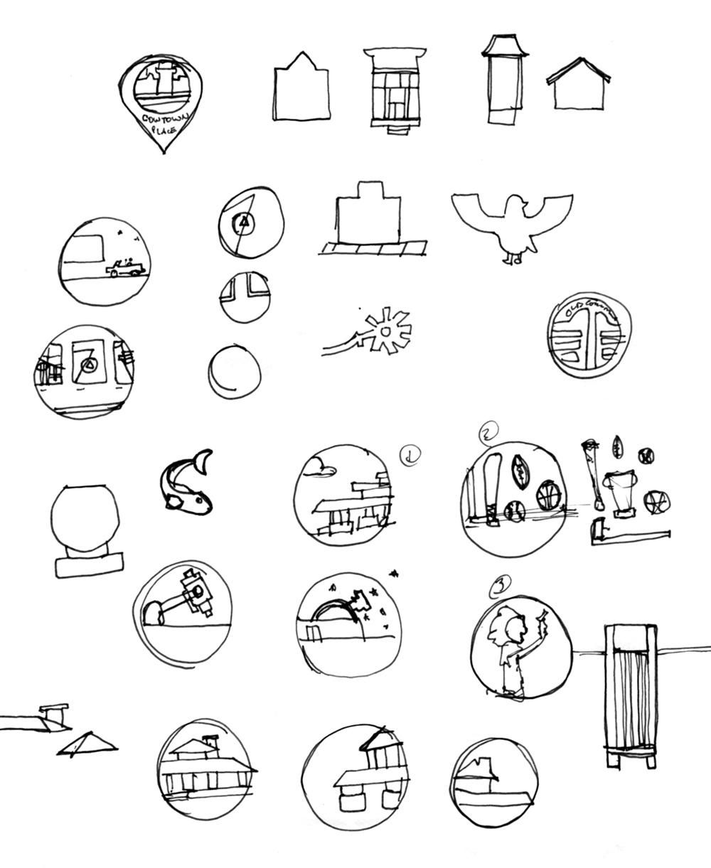
I made a list of locations and divided them into different groups, shopping, attractions and culture. I thought that maybe even the different sections could be different colors, but that didn't end up working out. I went through and made sure I could sketch ideas for a good chunk of different things before confirming it was a good idea and translating it to the computer. This is just to make sure I can build a whole series out of the idea before even getting going.
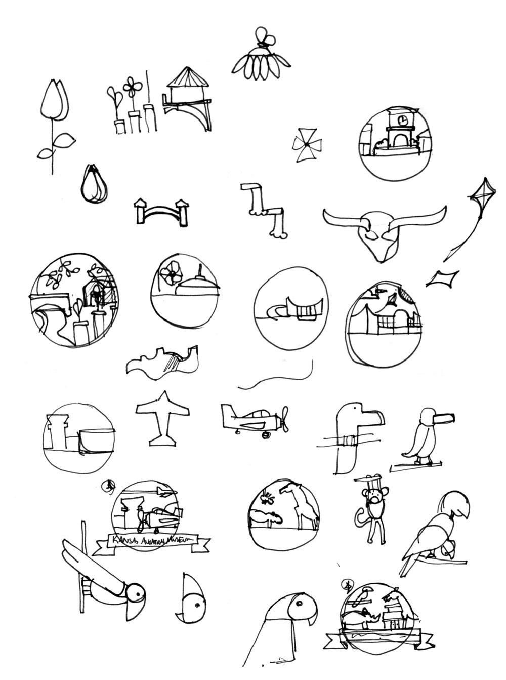
You'll notice that my sketches are very rough. I tend to sketch quickly, just to get my ideas down on paper. I'm not the most excellent freehand illustrator but sketching really helps me figure out ow to translate the ideas into visuals.
------------------------------------------------------------------------------------------------
SECTION 2 - BUILDING CONSISTENCY
Time to start exploring the look and feel and figure out just what your icons or badges will look like. There is no wrong way to do it so feel free to try a few different styles.
------------------------------------------------------------------------------------------------
************************************************************************************************
MOOD BOARD
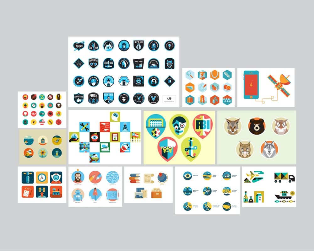
After I generated my initial ideas I did a quick scour of Dribbble and the internet for icons and badges that I liked. I gather these into a mood board and this becomes a quick reference tool for me to jumpstart my brain whenever I get stuck during a process. I don't spend a whole lot of time doing this or pore back over it very often in the project because I don't like to feel like I'm copying anything. It's just a quick exercise to get the brain going. It's more than worth your time, but put stock in your own creative abilities first and don't depend on a mood board as a solution to your problem.
************************************************************************************************
WORK IN PROGRESS
I picked a place called Old Cowtown Museum and got started on the computer. Below are three shots of my work in progress. You can see I started out with a totally incorrect color application which took me a while to get right. By the time I had the application right I didn't like the colors at all any more and I've included some swatches of things I explored before finally landing on the red, blue, yellow color scheme. I added the name with a banner across the front and things started coming together.
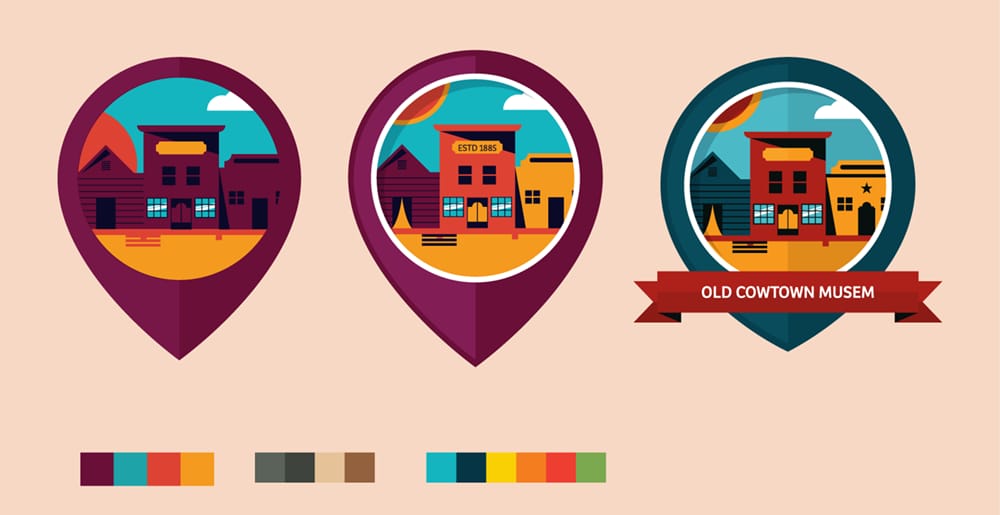
I quickly choose two more and made sure that I could get at least three different ideas down. The 2nd and 3rd ones went much faster than the first one. I think it's important in this second section to try and get 2 or 3 into the computer sooner rather than later so you can work the bugs with the idea and structure of the series.
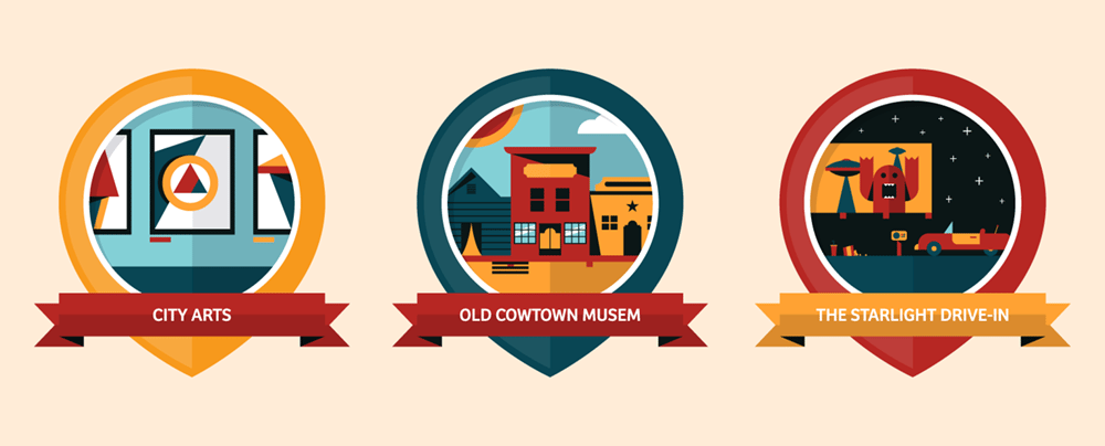
I wanted to play up changing the colors as much as possible and built out a palette that was robust enough to be pretty flexible, this let me change things from badge to badge however I needed to.
------------------------------------------------------------------------------------------------
SECTION 3 - BUILDING A SERIES
Now it's time to take the style that you've established and figure out how it expands over the entire series. The goal is to keep it unified but consistently interesting so that each badge or icon brings something new to the table.
------------------------------------------------------------------------------------------------
************************************************************************************************
SERIES OF BADGES
After the first three were down on paper it was just a matter of going back through and tightening the bolts. I worked through a lot of different solutions and tried different ideas along the way for each one in an effort to keep a consistency across the series while changing things up from badge to badge so that it didn't get boring. In most cases I feel like 6 is a good number for a series of something like this, but I had too many ideas to not keep going. So far I'm up to 11 and have a list of about 8-12 more that I'm going to continue working on during the class.