Q: Crunchy or Smooth?
A: Crunchy Please!
Great class Jamie! I have to say I saw your pennant in Jon's class and thought, "Hmm, i wonder how she got that tasty texture." And here it is! Yay! So thank you very much for posting this class!
Anyways,
I began this project with a couple of sketches (that I forgot to take pictures of). I knew I wanted some kind of banner with a combined 'R' and 'V'. (Mainly because my name is Ryan Vatzlavick, but RVs are also cool). At first I wanted to go with a more slab serif look and the letters weaving in and out of each other. This was cool, but it didn't seem to fit in with the "classic banner" look I was going for. So for my next attempt I tried my hand in something more scripty, with the 'V' coming off of the 'R'. Yea, I think I will run with that.
Here are my options in digital form:
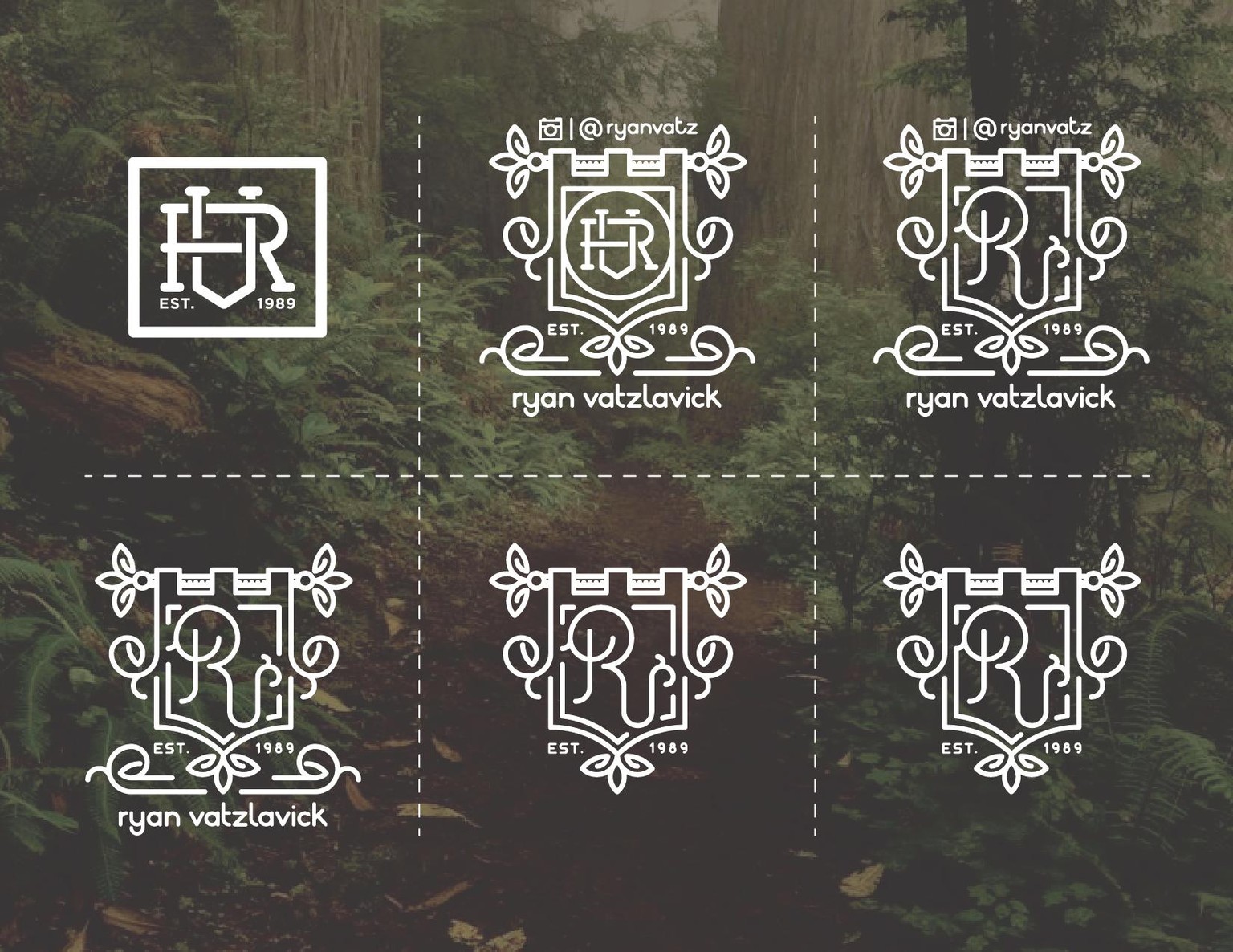
As you can see in options 2 and 3 I shamelessly tried to apply a little self promotion for my instagram account: @ryanvatz (Follow me for daily uploads. :) smiles)
I eventually thought, "Hey that looks pretty busy, just do that self promotion stuff in your project workspace above this comment, and not in your stamp like a total tool." So after rudely talking myself out of it I removed the Instagram stuff and left it at my name and banner, but this was looking too busy as well. So I broke out the ole chisel and did some more refining till I got to my final banner, I mean stamp, I mean bookplate, Stamp-banner-plate.
Lets add dat texture:
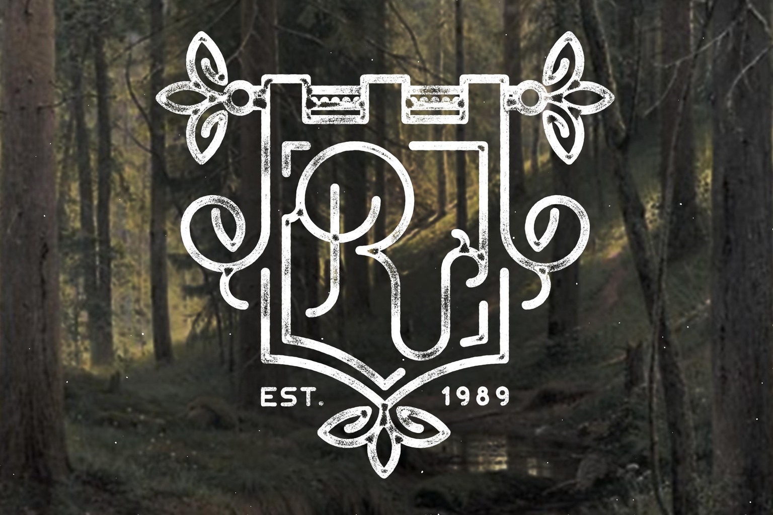
Ta-da :)
Hope y'all like it!
And if you do follow me on Instagram @ryanvatz I am uploading fun things daily!
Also if you are interested, check out my class "Icon Do This: Creating Your Own Icon Set"