Prompt Engineering
In this chat, I worked on creating a vertical brochure visual direction for the FI Africa + ProPak MENA Co-location brand.
First, I uploaded and reviewed the FI/PP Co-location Branding Guideline – March 2026. The guideline helped me understand the correct visual system for this brand, including the twin-mark logo system, the co-location theme, the use of reshaped organic imagery, and different execution styles such as mono, hued, blank, and visualized layouts.
Then, I asked for a suggested layout for a vertical brochure. The question was improved into a stronger creative brief that included more brand-specific details, such as layout hierarchy, image placement, color direction, typography, CTA placement, and print/social media usage.
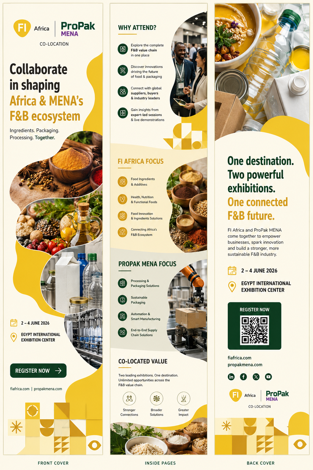
After that, a recommended visual direction was created. The final output was a premium vertical brochure concept with three main parts:
Front Cover
A clean branded introduction using the FI Africa and ProPak MENA co-location identity, bold headline, event date, venue, CTA button, and rounded food/packaging imagery.
Inside Pages
A structured content layout showing “Why Attend,” “FI Africa Focus,” “ProPak MENA Focus,” and “Co-located Value.” The design used a mix of text blocks, icons, curved image masks, and brand pattern elements.
Back Cover
A strong closing message with QR code area, registration CTA, website links, social icons, event details, and the co-location logo system.
I learned how to turn a brand guideline into a real design direction, instead of just making a random brochure layout.
I also learned how important it is to follow the brand system carefully, especially in co-branded designs where two brands need to appear balanced and connected.
The main design lessons were:
- Use the brand guideline as the foundation
The design should follow the official visual rules, not just personal taste. - Build a clear hierarchy
The brochure needs a strong headline, clear sections, readable body copy, and obvious CTA placement. - Balance both brands
FI Africa and ProPak MENA should feel like one connected event, while still keeping each brand recognizable. - Use imagery with purpose
Food ingredients, packaging, processing, and manufacturing visuals should support the message and not just fill space. - Create a flexible system
The same visual direction can be adapted for brochures, social media posts, stories, banners, and digital ads. - Prompt writing matters
A stronger prompt gives a better design result because it includes the brand rules, layout needs, mood, usage, and visual restrictions.
The result was a premium vertical brochure mockup using warm yellow, cream, green, rounded image collage sections, organic brand shapes, and co-location pattern elements.