Project Assignment Submissions
___________________________________________________________________________________
Layout Assignment
My project on layout and alignment.

_____________________________________________________________________________________
Visual Assignment
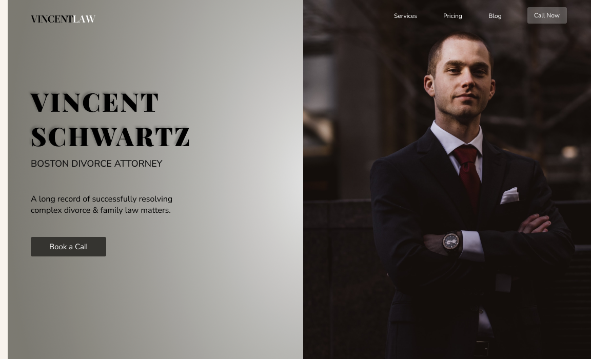
This project demonstrates visual hierarchy by arranging the elements size, shape, and positioning. I want to give more emphasis on the attorney's name, so I gave it little pop by adding a light drop shadow in the same direction where the light (right) to dark (left) radial source is shining.
_____________________________________________________________________________________
Typeface Personality Assignment
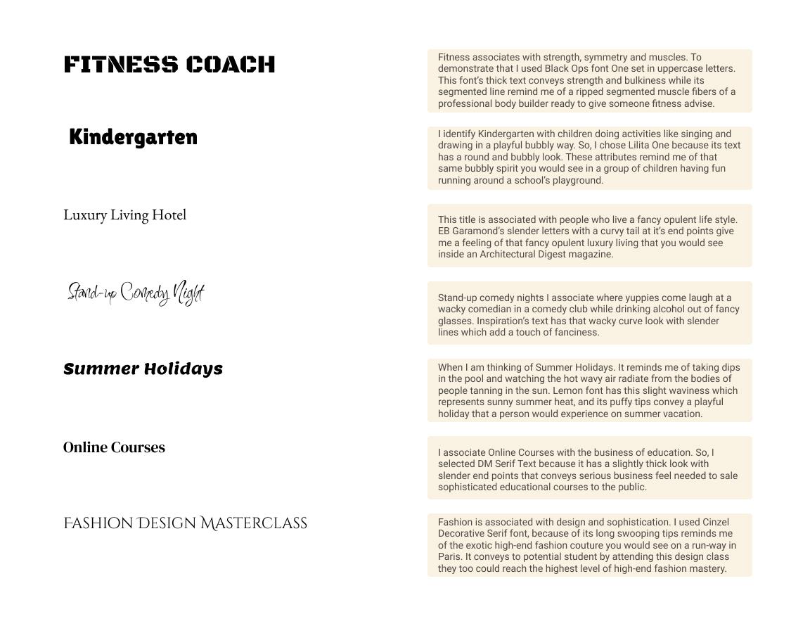
In this project the task it to select and pair the right font with the name of the title.
_____________________________________________________________________________________
Setting Type Assignment
The assignment submission tasks me to apply the appropriate type settings for the headlines and paragraphs. Utilizing techniques like font size, line height, and font weight which creates a visual hierarchy making clean to read and scan.

_______________________________________________________________________________________
Typeface Assignment
This is the typeface pairing assignment which requires me to choose a font for the headline and a different font for the paragraph that compliments each other.

_____________________________________________________________________________________
Color Sample Assignment
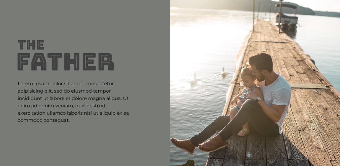
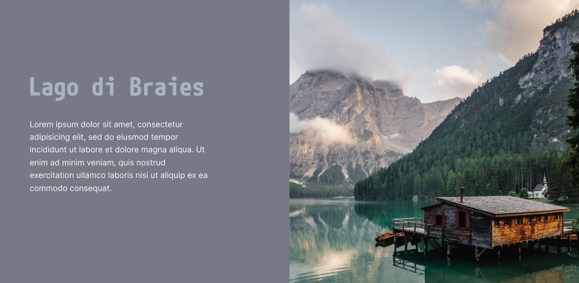
This color sampling technique task me to extract colors from a blurry photo. Then assign the extracted colors to the text and the left side background.

_______________________________________________________________________________________
Assignment: Fine-tuning Colors
This assignment involves fine-tuning top image’s color until it looks like the image on at the bottom clear, color more vibrant, and text has more pop.


_______________________________________________________________________________________
Assignment: Image Overlays
In this assignment I use different overlay techniques to make some of the design elements more visible to read.



_______________________________________________________________________________________
Assignment – Photo Cropping
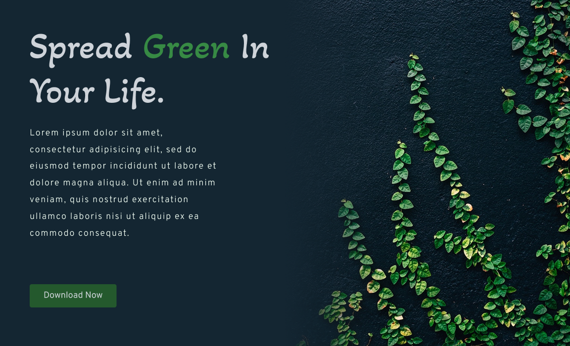
In this assignment three types of cropping are demonstrated in this lesson.
1. Extreme Crop: I applied a dark (color sample: subject shirt) horizontal fade to the subject in the image. Then I extracted color samples from the photo and used them for the headline (color sample: eyes), paragraph (color eyes: increase the HSB brightness to near white) and the CTA Button.

2. Soft Crop - White Fade: I used a Gradient radial circular fade to position the user’s eyes to look at the subjects through an offset tunnel vision effect.

3. Soft Crop Color: I sampled color from the photo not only to create a smooth crop transition, but I used some of the color for the headlines, paragraph, and the CTA button.
_______________________________________________________________________________________
Assignment: Finding Photos
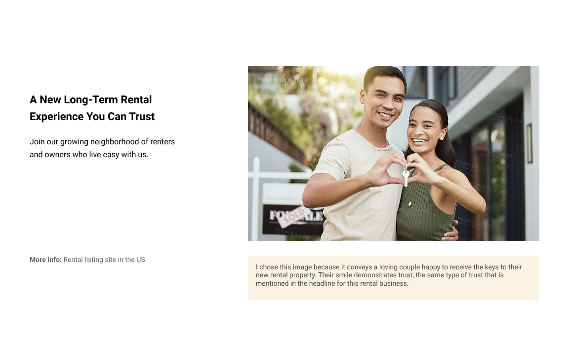
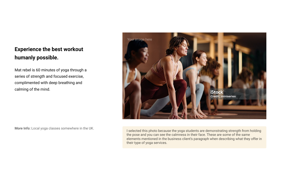
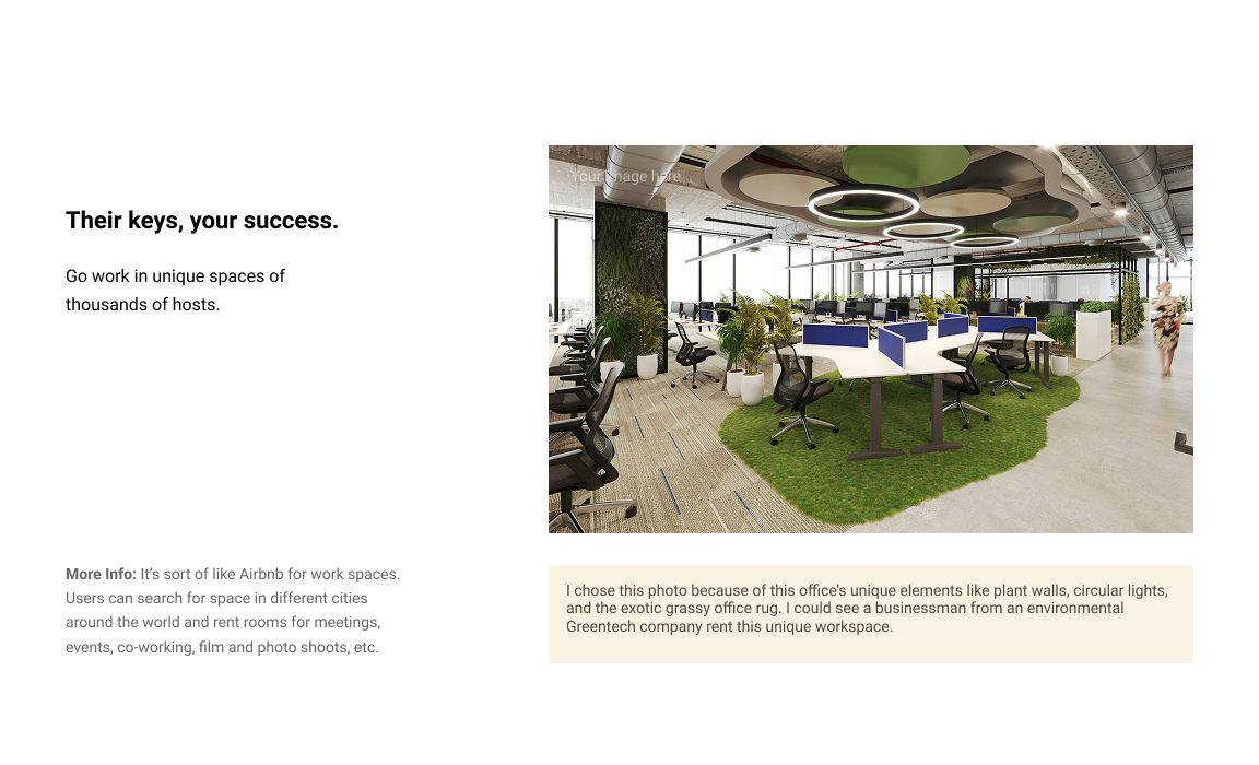
In this assignment we must pick an appropriate photo from a stock photo website and assign them to the business.
_______________________________________________________________________________________
Assignment – Overlapping
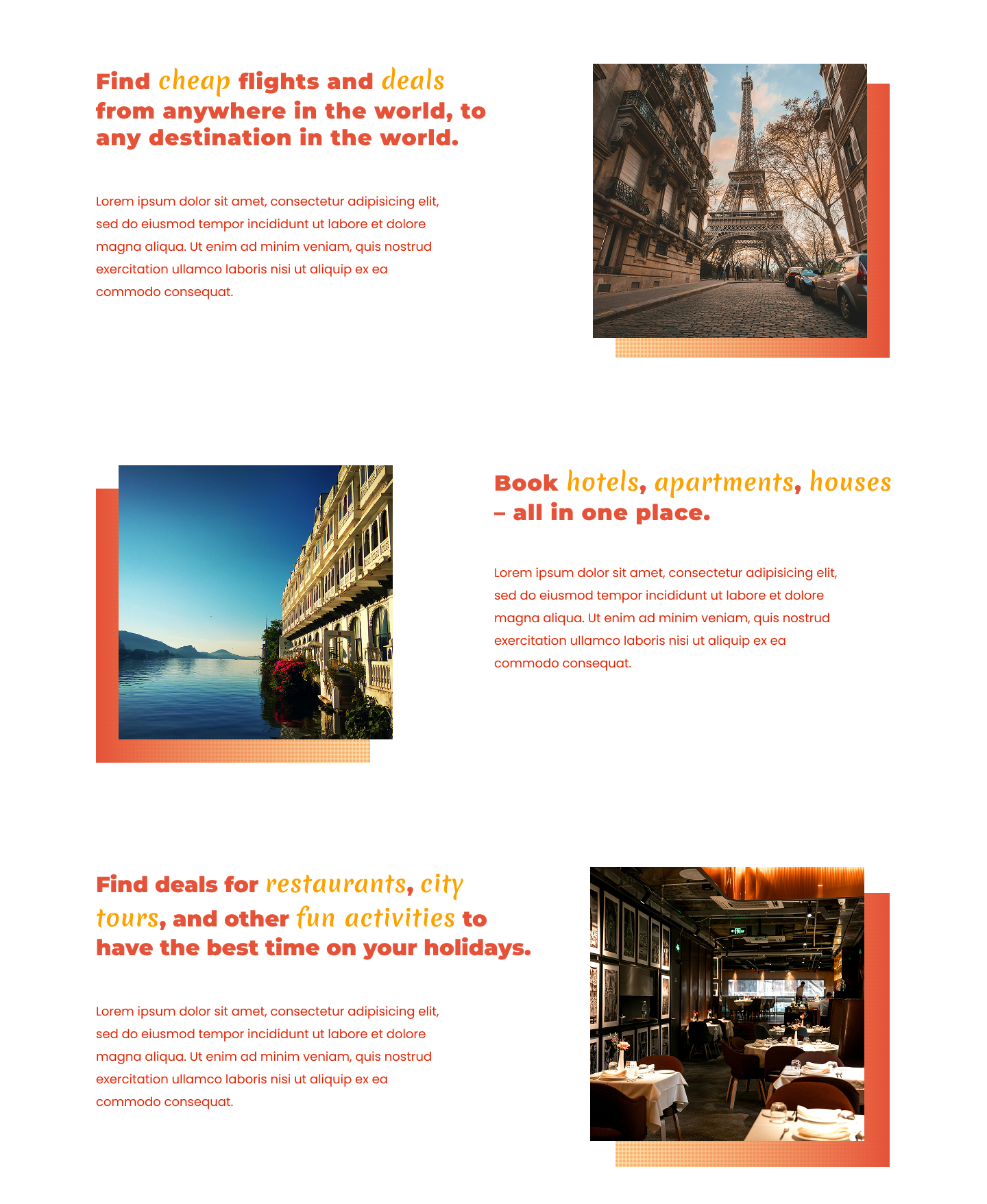
In this assignment I demonstrate design tricks overlapping and repetition.
Assignment – Tension
In this assignment, I explored ways to create visual tension through two key techniques:
· A multi-angled background mask that adds movement and energy to the composition.
An overlapping effect that helps connect the subject in the photo with the content on the left.

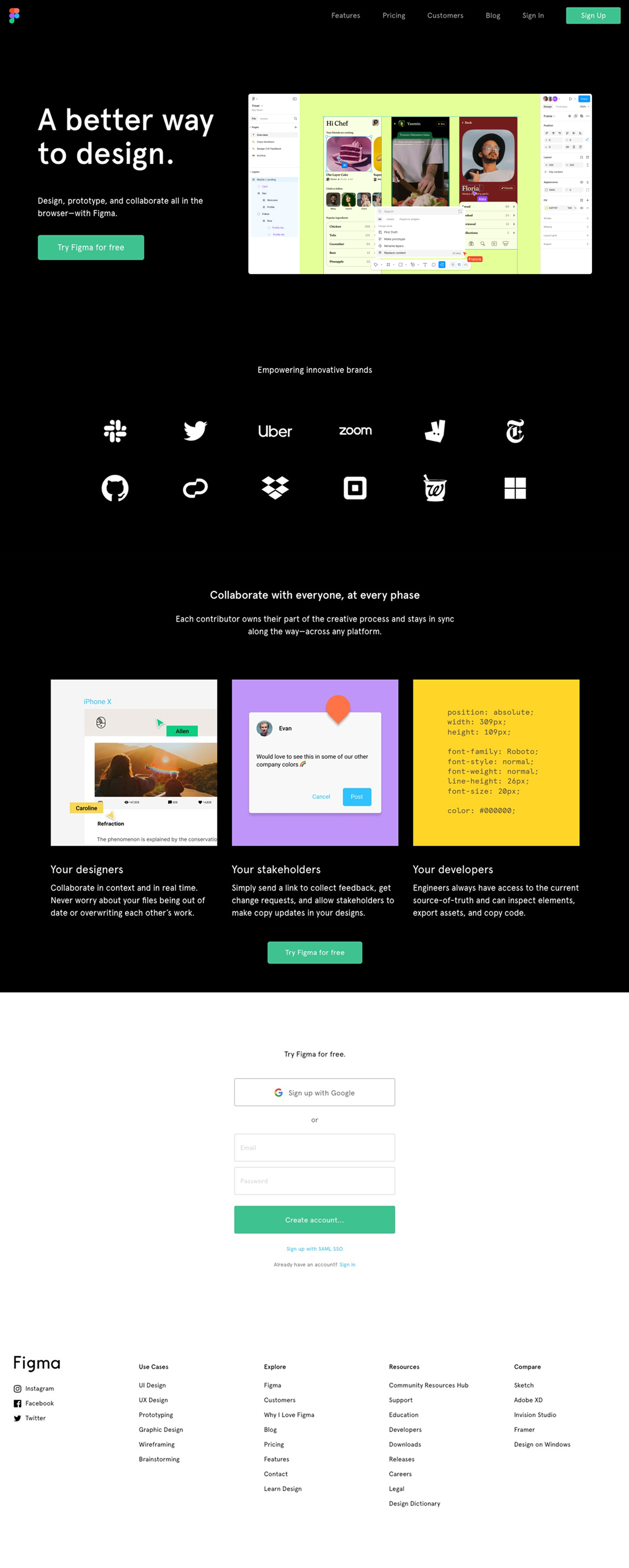
The task for this assignment is to mimic the design of an existing homepage.