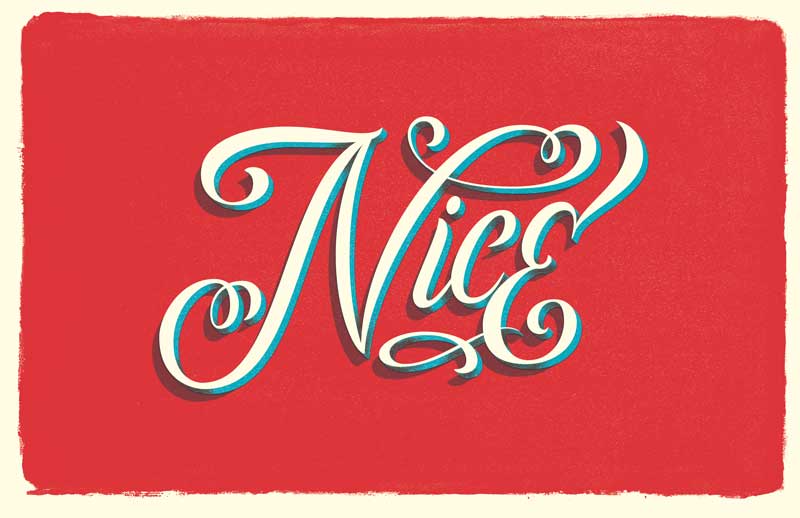
"Nice" Lettering for a postcard
Hi There.
I am Erick Ortega, also known as CaliDoso. A freelance illustrator, lettering enthusiast and a quote junkie from Cali, Colombia.
Here you can check some of my work so we can keep in touch trough other plattaforms.
www.be.net/Cali2o // www.instagram.com/cali_doso_
I've loved the sourse and I feel like my skills and the design process have been improved. Great info, tips and tricks. Plus the vectoriizing chapter has helped me a lot since I have tried before but never got such results.
The idea for the postcard was to make a lettering for a simple word wich is actually one of my favorites and the name of my clothing brand project. Nice Clothing Co.
The starting point was to improve a lettering that I did a few months back as a logo.

But i felt it needed a big lift. So this was a great chance to improve it and improve my lettering skills, and actually feel like I have. Thanks a lot Martina !!
Now since the word was choosen it was time to sketch it up. My inspiration brush lettering so I looked for som inspiration and ended up with a lettering from Erik Marionich that I liked and decided to use it as a reference for the constrast. Here are some first attemps working on the lettering skelleton :
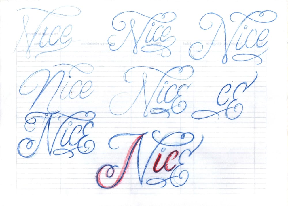
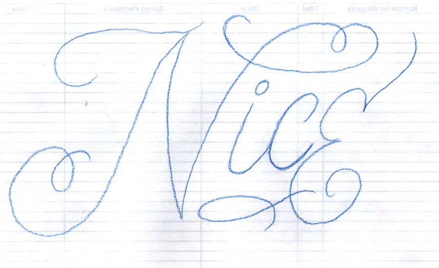
From this first sketches the winner was the last one. So I scaled it up and started working on. Added some more layers to get the thicks and thins similar to Marinovich's reference.
The Reference image:

And here's a gif of the process :
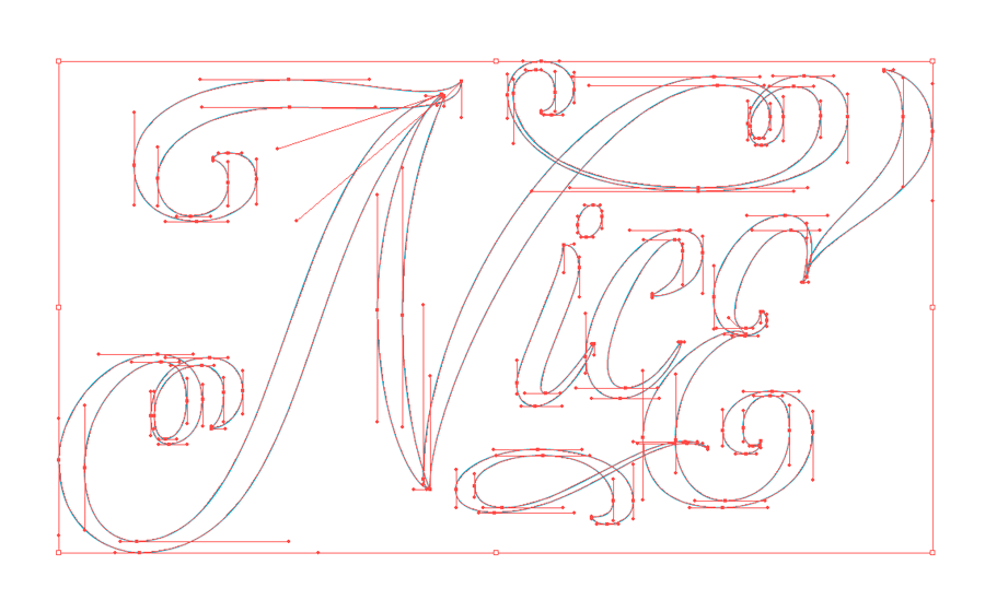
Then I moved onto Illustrator and vectorized the lleterforms using the vertical and horizontal handles technique. Here's a gif of the digital process :
From there I exported the file to Photoshop to give it a texture treatment and finished the piece.
Hope you liked it and enjoy the project step by step.
Thanks a lot -again- Martina for all the knowledge not to mention the inspiration and keep as nice as you are !!
¡Salusita!