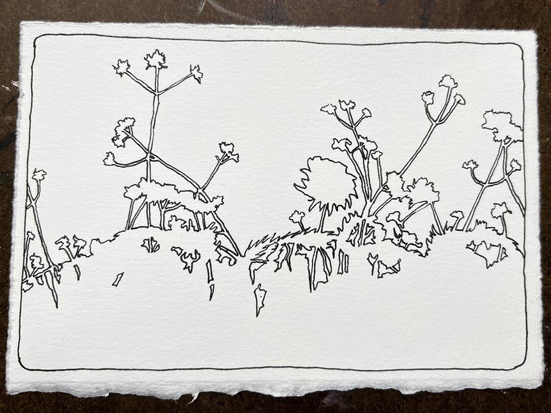
Negative Space Shapes - botanicals against blue sky
I began by drawing the shapes of the blue sky between the leaves, branches and blossoms of the plants with a Platinum Carbon Ink fountain Pen filled with Platinum Carbon Ink. I used photographs as a reference. Just as it is easy to get lost when drawing negative space shapes while sketching en plein air, it's easy to get lost sketching negative space shapes when working from a photograph. That's perfectly okay. As you become more familiar with seeing and drawing sky shapes that are cut out by botanical anatomy, you will begin to recognize where you need small, medium or large shapes on your sketch and you will look for them in the landscape or in the photograph. You will never duplicate reality exactly. As you deviate from reality you will encourage the natural flow of your creativity.
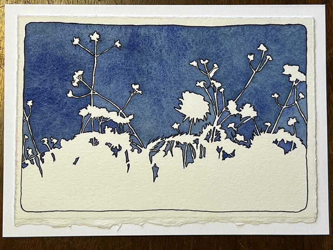
I had originally planned to paint the negative space sky shapes a pale blue and the positive shapes of the botanicals a dark value of some sort. As soon as I started mixing up a few blue samples, I couldn't resist the richness of the colors and decided to keep it simple. I painted in only the blue negative space sky shapes and left the positive botanical shapes unpainted.
This set of cards will look beautiful tied with blue and white silk ribbons.
With every card I want to learn something ... anything. For these four cards, I mixed different blues and watched how some mixes granulated more than others. I observed how the high contrast cards and the low contrast card evoked very different emotional responses in me. I noticed how the distribution of large, medium and small shapes spoke to me very differently. I couldn't help but think of the shapes working together in the same way that words work together to create a poem.
The goal of all the projects in the "PAC Series - The Elements of Art" is to learn new skills and hone current skills. You will end up with sets of note cards BUT creating sets of note cards is not the goal ... it is the pleasant result of your art practice!
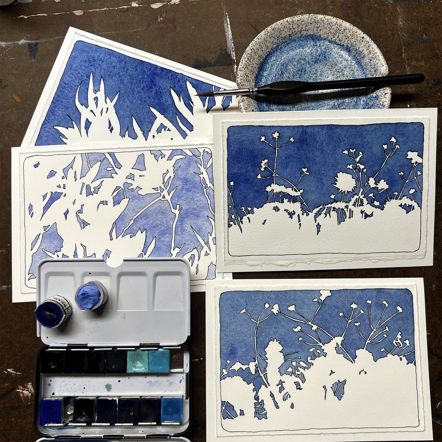
I used a Golden Maple #6 brush to paint the negative shapes. It is a VERY inexpensive brush and remarkably good. It keeps a fine point so that you can paint into the tiny areas even when the brush is loaded with paint. The triangular grip is comfortable to hold and helps to control the tip of the brush.
The paints I mixed were the following:
Beam Paintstones: Handmade Watercolours
MKWUM'AANDE - Ice Colour
GCHI GAAMING - Great Ocean
A. Gallo: Handmade Watercolours
Ultramarine Blue
Midnight Blue
Zirconium Blue
Harbor Blue
The paper is Rives BFK Printmaking Paper that I mounted onto folded 85 pound card stock with double-sided tape after the images were painted.