My Top 3
Coming up with my top 3 logos was oddly difficult! Believe it or not, I hadn’t listed them before and it’s challenging to separate the logo from my thoughts on the brands and companies themselves. Which is okay, that’s the point of a logo anyway. So, here are my thoughts in terms of versatility:
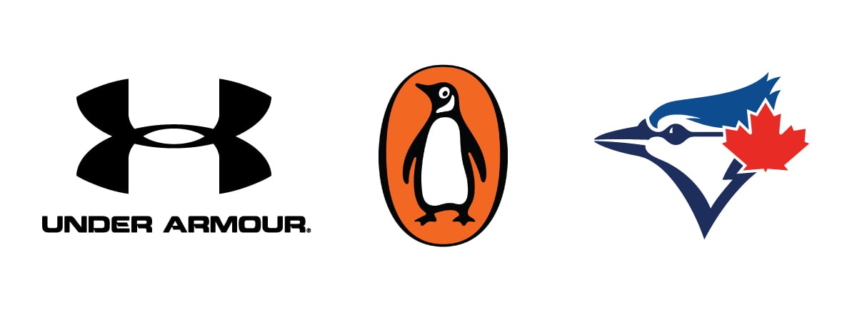
1. Under Armour
I’ve always been a sucker for a bold strong abstract symbol. I love them! Even though this logo is actually a stylized “U” and “A” in a monogram treatment, I tend to see it more as a unique abstract design. I think it’s great and can be used everywhere at any size.
Of course, this uses the traditional concept of a word mark and a symbol, which is almost always the most versatile way to make a logo. So this design is great.
Personally, I don’t actually like the font used in the name. I would love to see that re-branded, but that’s beside the point.
2. Penguin Books
I love animals and I love seeing simplified logos based on them. Generally speaking, this is about as much detail as you should ever include in a symbol, but it is still largely versatile for most purposes. It isn’t going to work flawlessly on everything like the Under Armour symbol might, as the small details like the little dot in the ye might not reproduce well in a small embroidered logo for example. But it’s still great and it has a ton of character. Add in their orange and this isn’t only the best book publisher logo I’ve ever seen, it’s one of the best all around designs I’ve ever seen.
3. Blue Jays
Remember I said it’s hard to separate the logo from the brand, or in this case, team. Well, the Toronto Blue Jays are my favourite team. But that doesn’t mean they haven’t had some ugly logos. Although this is the most current design, it’s really a re-branded version of their original logo. Truthfully, in theory this design is too complicated to be a corporate logo. But as a baseball logo, it’s fantastic. Also, sports merchandise proves that it is more versatile than I would think, since they’ve put it on just about anything you could think of.
So that’s it! 3 great logos. Of course, they are more complex than some of the examples I showed in class, but as I said, once you know the rules, you can choose when to break them.
I hope you all enjoyed the class. I’m excited to see your projects!
Be sure to follow me on Skillshare and Instagram @JonBrommet
Thanks everyone!