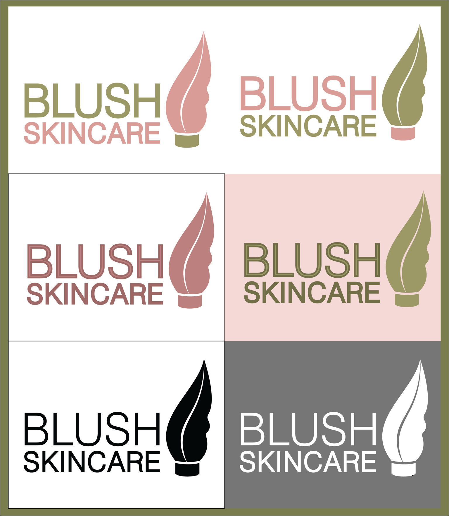
My Project
Hi there
Thank you for sharing such useful information with the students. Learned a lot from this course.
As for the logo I designed, there is always a difficult part for me when I try to do or create anything which is choosing the right color or color combination. Do you have any suggestions or tips for that?
Please point out anything that looks incorrect or that should be added to this logo.
This is what I made
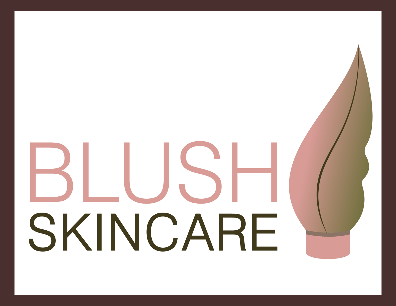
Explanation
* Picture of a cream/moisturizer tube representing the brand type.
* The tube has a leaf-like structure that shows that the brand sells organic and natural products.
* The colors I chose are pink and green which depict beauty, calmness, Feminine as well as Freshness, nature, health, growth, and cleanliness.
* Used san-serif (Swiss721) font as for the brand's modern, honest, and sensible nature. Also because I found many other cosmetic brands' logos have san-serif font.
I tried to follow the tips you shared for making a good logo. I tried to make it appropriate, memorable, responsive, being able to work well in black or white color, and tried to make it simple. (Well, I don't know whether it is simple or not).
These are some variations I made to the logo
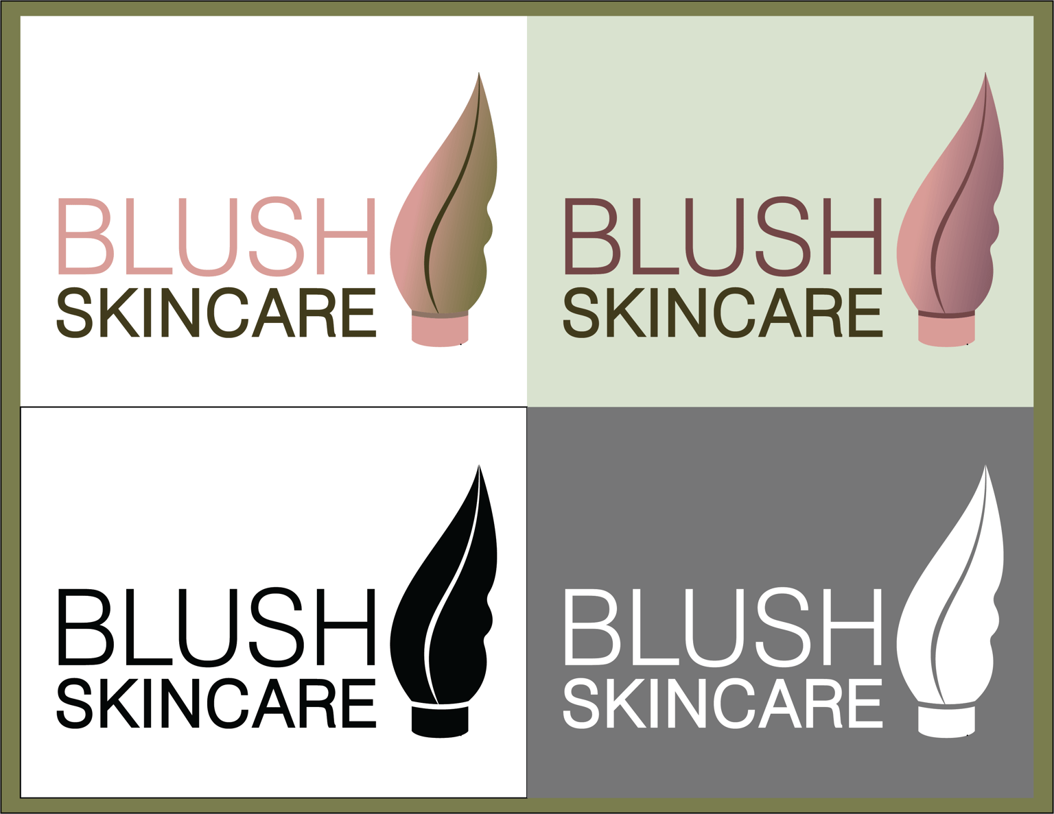
Waiting for your response.
Thank you.
(I am editing my project
After posting my project I thought about why I put gradients and many different colors in the logo. Then I change my color scheme. This is how it looks now.