My First Shot at an Abstract Gradient Artwork
Starting off I was pretty happy with the shapes I was getting. The look of a vortex spiraling down is quite cool.
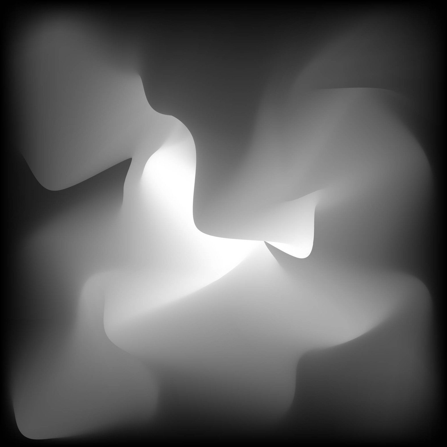
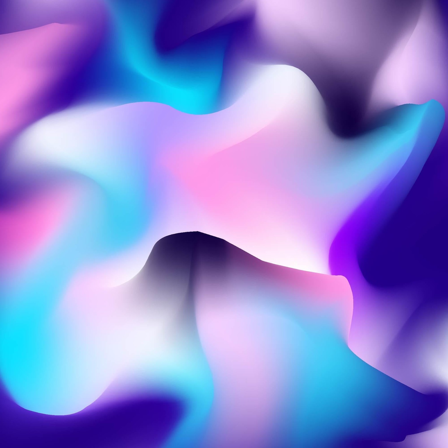
Then the some more definition and interesting shapes.
I rotated it and was focusing in on a single spot. I wasn't entirely happy with where it was going but hoped that putting in some more tweaks could bring it back.
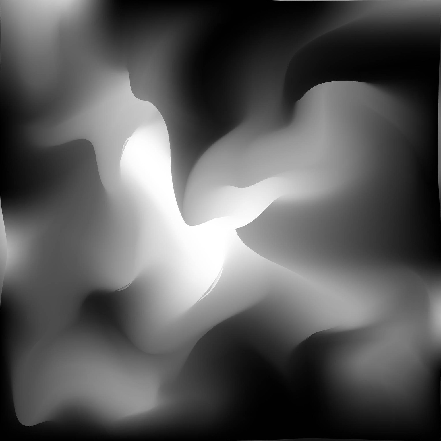
With color it looked quite boring.
I attempted to add more stops and colors to make it more interesting, but just ended up with a bright mess.
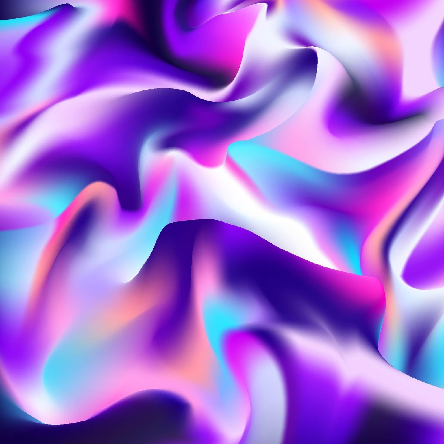
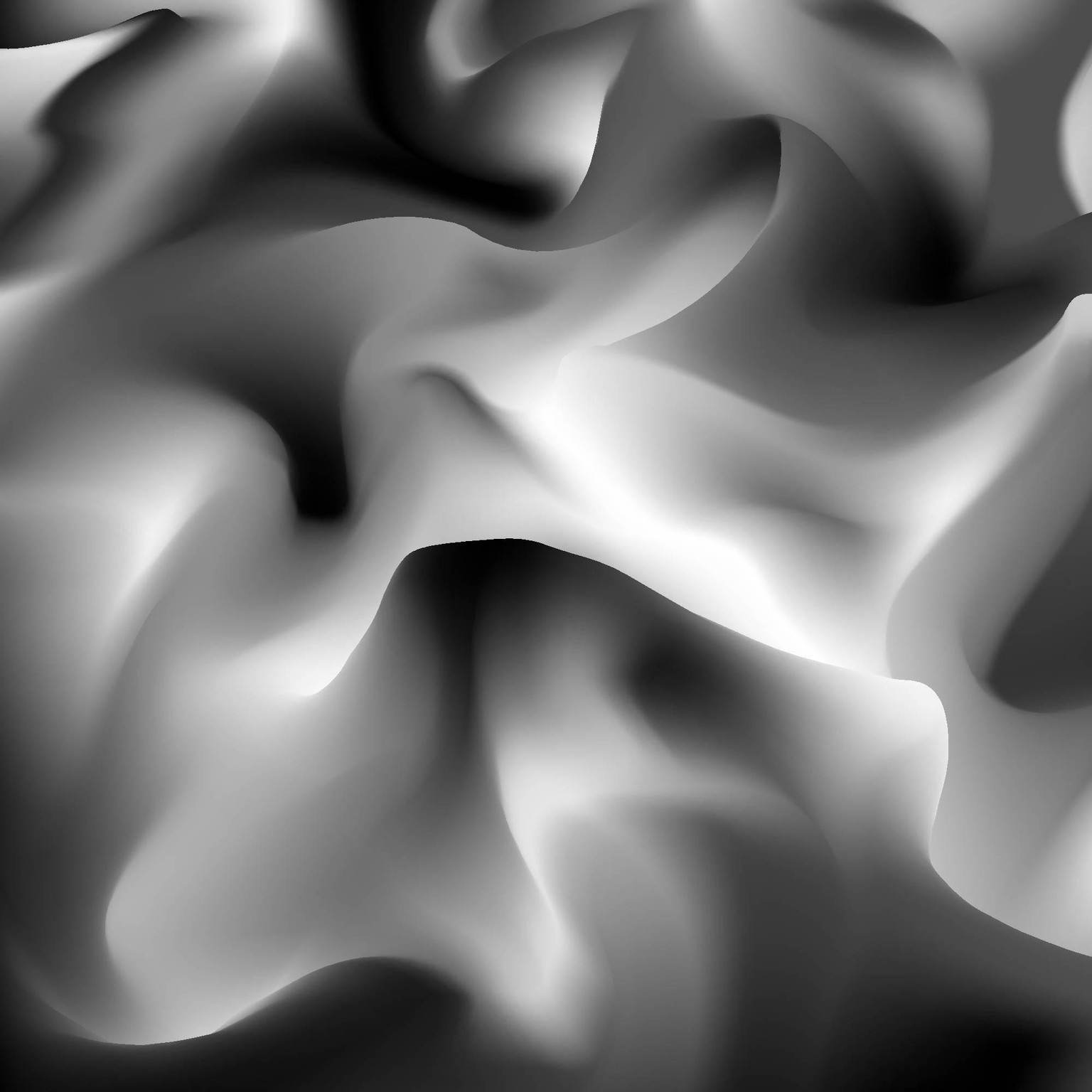
I decided to go back and stick with the vortex look and use a different color pallet. I really liked the S shape up at the top that dropped down below the pillar in the center.
More definition, colors, and general refinements to everything. Specifically, the brighter pops of colors made the edges less dark and dull.
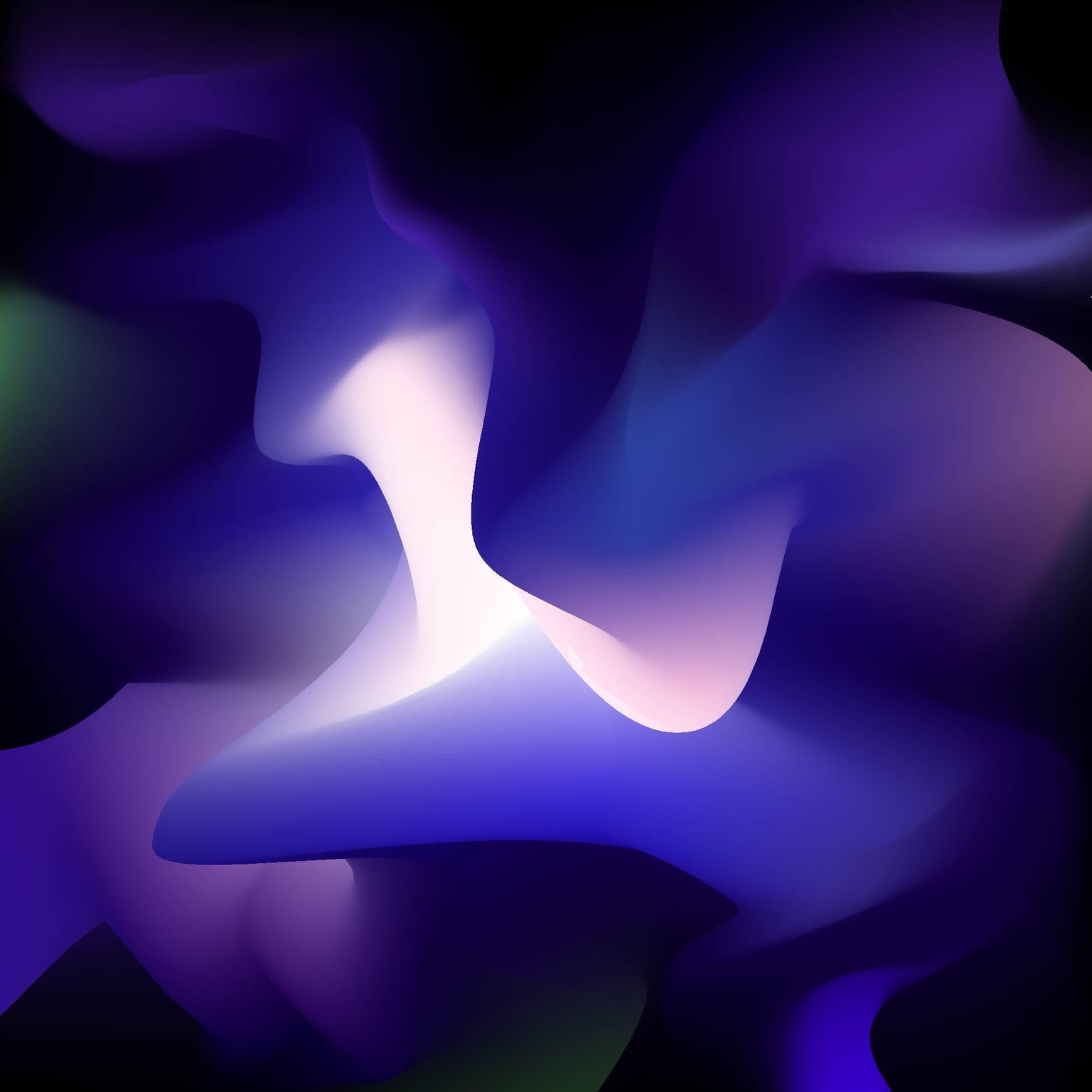
Finally, was the highlights, grain, and shapes. Even though you only used a single highlight in your project, I went crazy and added them all over. I felt they really added the bright glow I was going for.
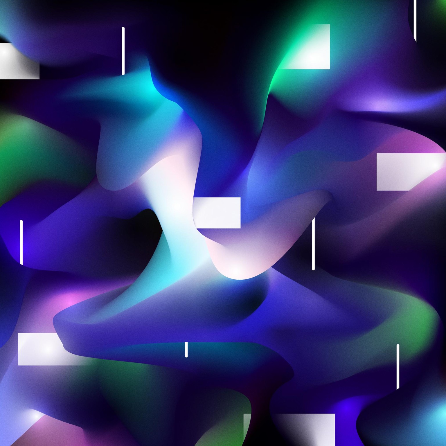
Thanks for such a great class! Everything was comprehensive and easy to follow along with. I'm very happy with my end result and excited to use what I've learned in my other projects.
Edit:
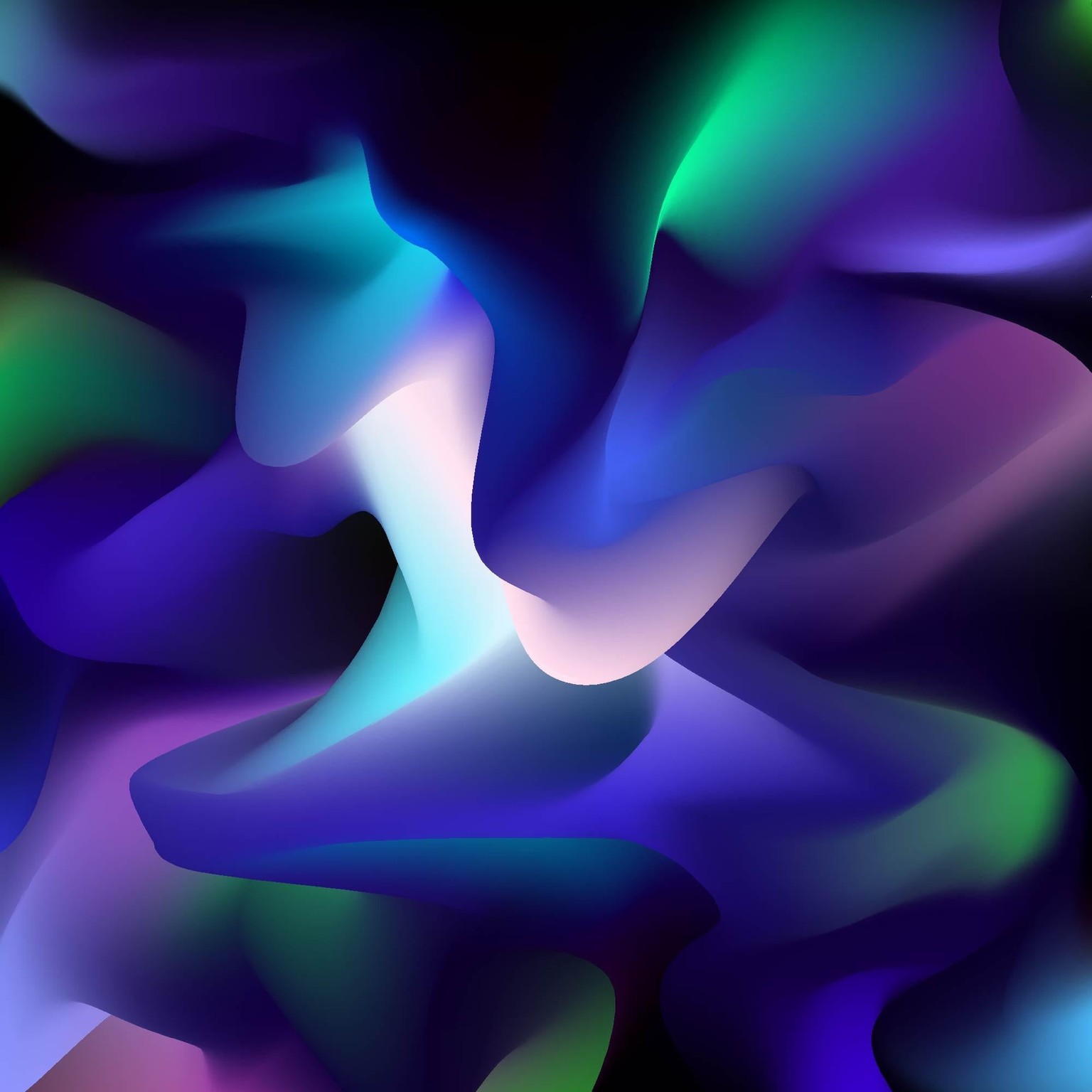
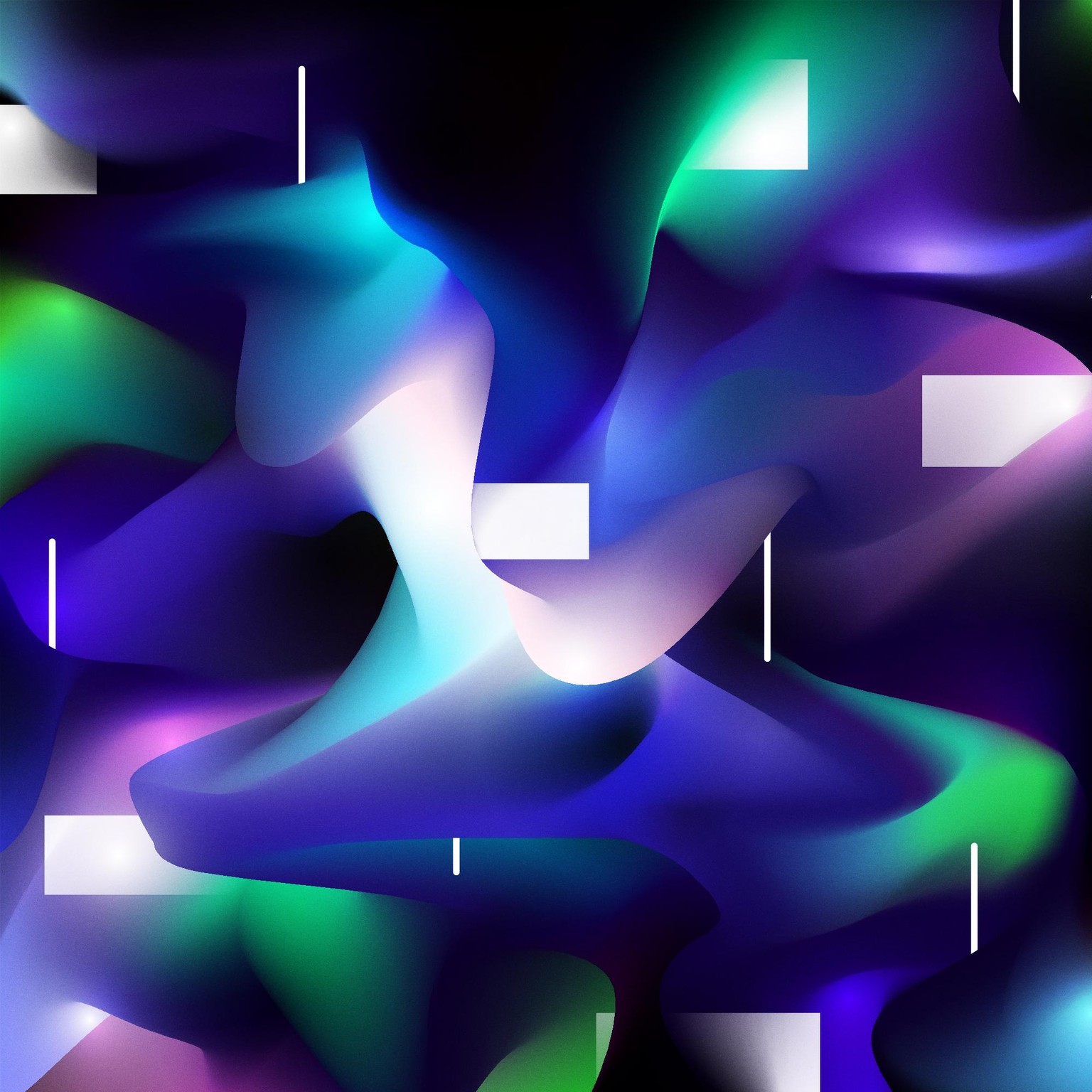
I took a second look at those greens and didn't realize how drab they were. It's always great to get fresh eyes on something you've been working on for so long you lose some overall perspective!
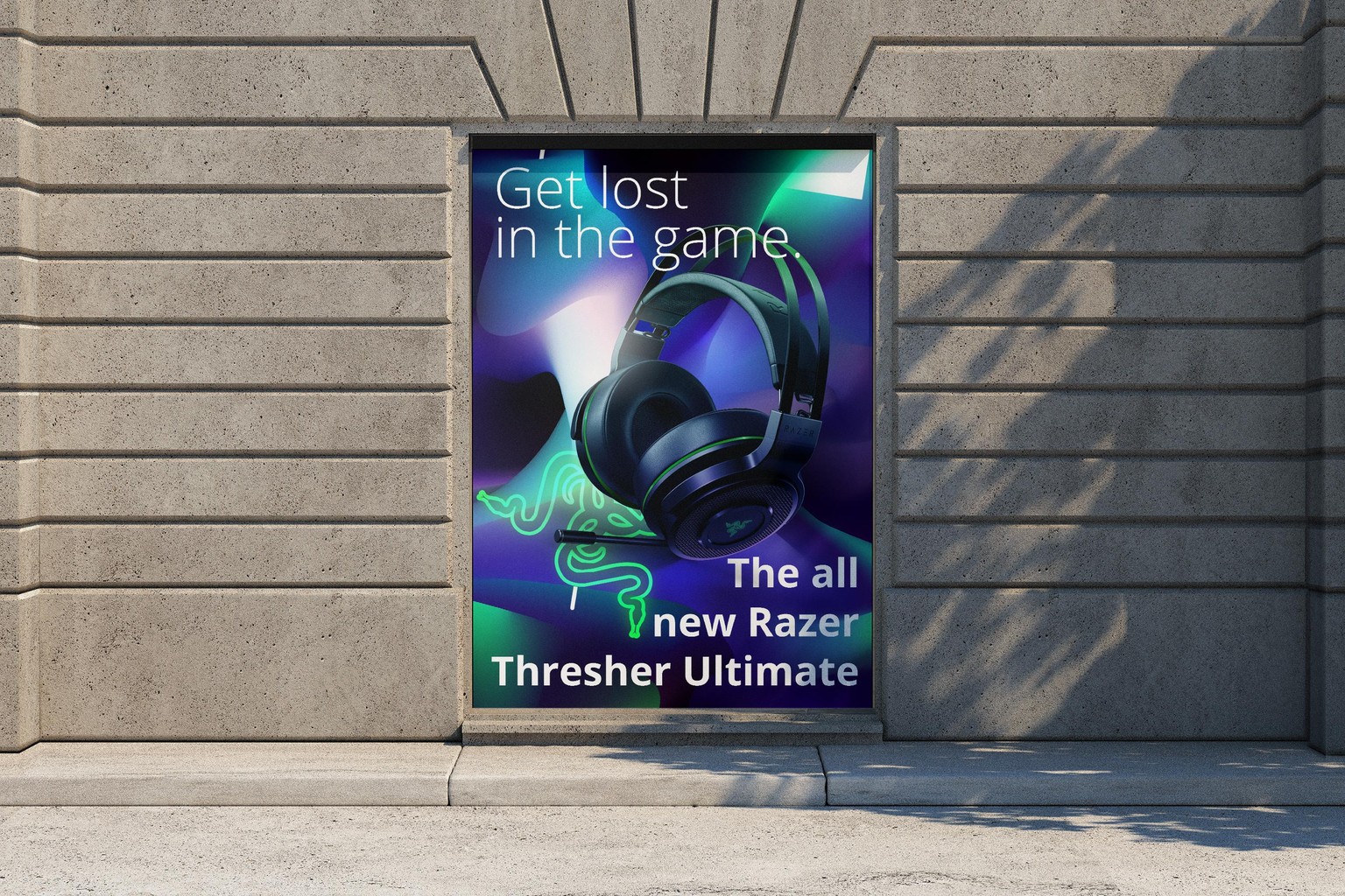
And while I don't have any specific plans for this artwork, here is a quick mockup ad I used it for.