Mixed Media Adventures with Acrylic Gouache
While you can absolutely combine as many mediums as you want in each painting (after all, mixed media work is about understanding your mediums so you can always use the right tool for the job), I focused each lesson on just that medium and gouache so that I could really dig deep into the super-power of each medium. Here’s what I learned:
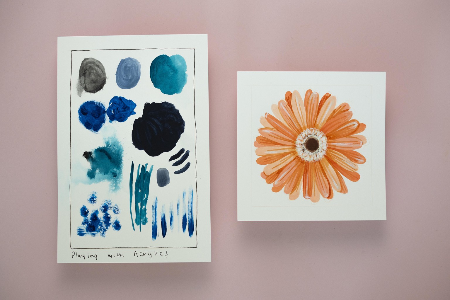
Lesson and Project 1: Acrylics
As I was playing with different viscosities of acrylic paint, I worked my way through the prompts. Making areas of colour was easy. It was translucent, and shiny and does not really granulate. With the thinner acrylic paints, I could add a lot of water, but the heavy-bodied acrylic wasn’t as stable when watered down. There was no loose pigment. It was easy to make fine lines and details, depending on the brush I used. It doesn’t smudge and dries quickly. The paint is plasticky and kind of fills up the tooth of the paper, so it could be hard to draw on top with a harder medium like pencil, but you could easily use something softer on top or paint. I switched to a stiffer brush with the heavy-bodied acrylic and was able to get more textured and sculptural effects.
Because of these observations, I wanted to paint a flower with layers of colour, so I picked a Gerber Daisy. I thought the translucency of the acrylic could work well to create shading and details, and I thought that the thicker heavy-bodied paint could create the texture around the centre of the flower. I was right! I wish I has spent more time building up deeper tones in the shadows for more contrast. Also, I missed having something scribbly to add details with. The acrylic is great for areas of colour but makes it harder to get loose lines, which I love.
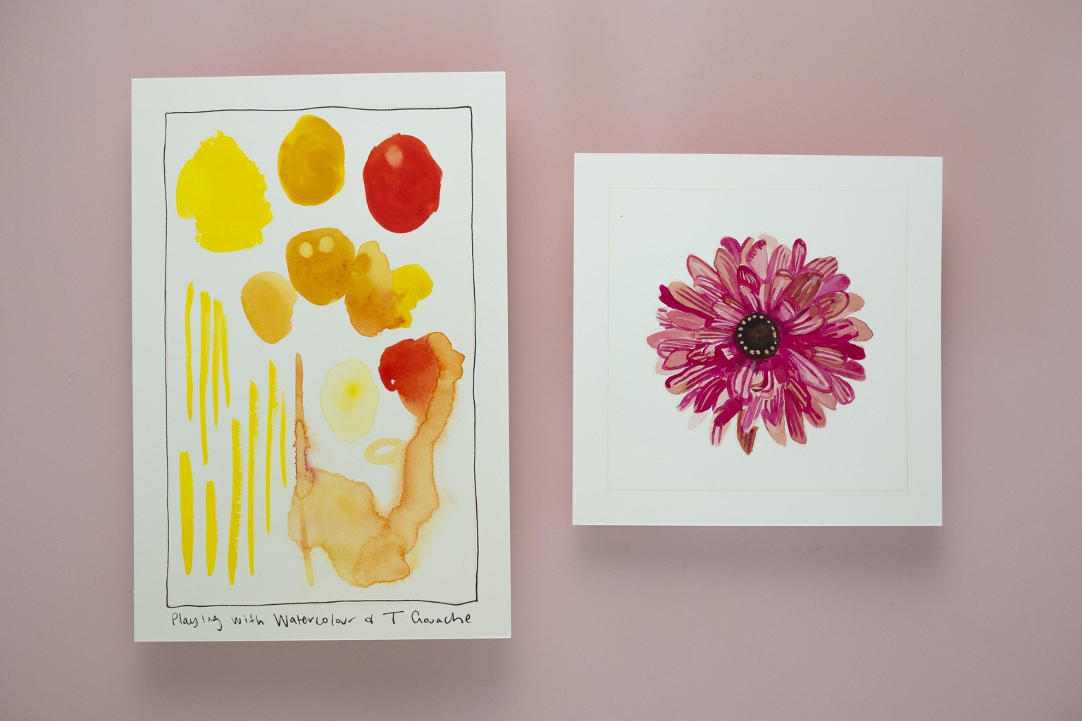
Lesson and Project 2: Watercolour and Traditional Gouache
I have a tumultuous relationship with watercolour. When I started making art, I started with watercolour. It was affordable, portable and there are so many tutorials online. But I just kept struggling to get the effects I wanted. I wanted it to be brighter, and more opaque. I basically wanted it to be gouache, so when I finally tried gouache, I set aside my watercolour for years.
This was the perfect moment for me to let myself play with watercolour and traditional gouache. I worked my way through the prompts. In most ways, traditional gouache is very similar to acrylic gouache. Although it doesn’t fill up the tooth of the page in the same way (it’s not plasticky), and it is not waterproof, so you can lift up paint even after it has dried. But watercolour is where my true interest was. Watercolour is closest to water on the milk scale. It’s translucent. It flows and bleeds and granulates in unpredictable and often beautiful ways. However it takes longer to dry, and there is a significant colour shift as the paint dries.
I loved the translucency I could get, and the way the paint flowed, so I thought I could use it for a many-layered flower, like a zinnia, where the natural variation of the paint could create extra depth and dimension. I layered gouache on top since the watercolour is watery and translucent. I love the unpredictable colours the watercolour created.
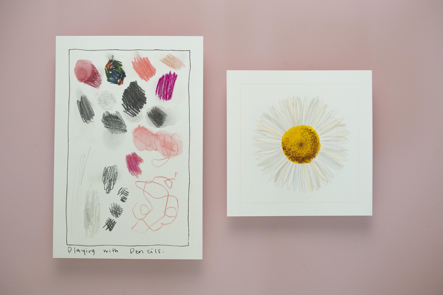
Lesson and Project 3: Pencils
Ah, at long last we get to Pencils. Aside from Acrylic Gouache, Pencils are where I feel most at home. I love to scribble and scrawl with them and I love their soft fuzzy texture. I was excited to play with them a bit more to stretch and find new superpowers that pencil might have. As I worked through the prompts, I loved how pencils gave different possibilities for mark-making. I also noted that pencils required a fair amount of pressure to make marks (aside from the very soft 6B pencil).
If I’m being perfectly honest, I have no idea what kind of flower this guy is. Perhaps some kind of daisy. I fell in love with his pointy petals and couldn’t wait to paint them. Because this is a white flower, it added an extra creative challenge that I thought I could solve by using a pale, warm grey pencil to outline some of the petals to create dimensions and differentiation between them. I also used a range of tones in the gouache, from pale peaches to pale blues to add more life to the petals.
Because Acrylic Gouache can be a little plasticky and fill up the tooth of the page, I slathered on a layer of clear gesso to give the page back some tooth so I could create crisper marks and details. That is also how I created the texture at the centre of this flower, by building up light and shadow using small circles in different coloured pencils.
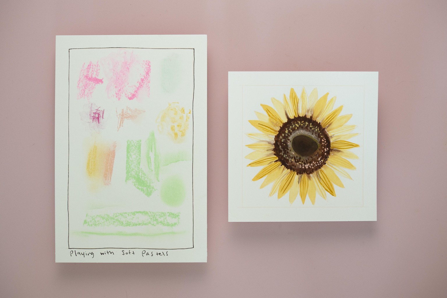
Lesson and Project 4: Soft Pastels
As we moved out beyond pencils and into Soft Pastels, I left my comfort zone behind a little bit. Thank goodness I still had Acrylic Gouache to ground me. As I worked my way through the prompts, a few of the things I noted were the beautiful textures you could get from the pastels, depending on your grip, the absolute opacity of the pastels and the way you can blend them to make buttery soft transitions between areas of colour.
So I decided to paint a sunflower. I thought the opaque pigment could really shine on the textured centre of a sunflower, and I wanted to play with using the softness of the pastels to create shading and shadows. In an ideal world, I likely would have started with a mid-range tone, to build up shadows more gradually, before jumping into that dark brown, but I didn’t have a mid-range tone so I jumped right in.
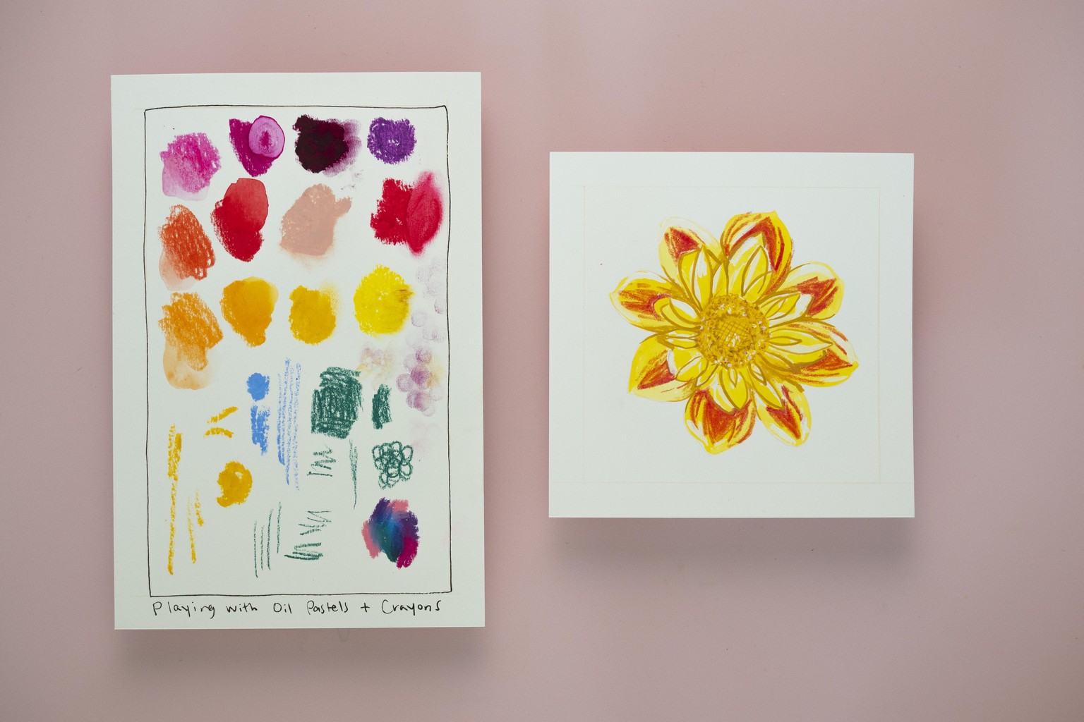
Lesson and Project 5: Oil Pastels and Crayons
I’ll have to admit, I was antsy about this one. I love the scribble-ness of oil pastels and crayons when other artists use them, but I tend to get a little nervous when I can’t make fine lines or details. I also get nervous when I’m working with a messy medium that I can get all over my hands. But as soon as I jumped into experiments, I immediately relaxed. I loved the bright bold colours, it didn’t smudge nearly as much as I’d feared, and you can certainly create some beautiful texture with crayons and oil pastels. I learned that it is opaque (and that crayons are not at all waterproof like I’d imagined). I couldn’t wait to jump into a real painting with these insights.
Since the colour in my reference photo actually matches my crayons better, that’s what I decided to play with. I knew that I’d have to use them on top of gouache, since they fill up the tooth of the page, and would bleed into wet paint if I tried to work on top. I tried to play with how I could change my pressure to create finer lines, including sharpening the crayon as needed. This painting was actually the biggest surprise, and I can’t wait to play with crayons more in my work. The texture is just so yummy.
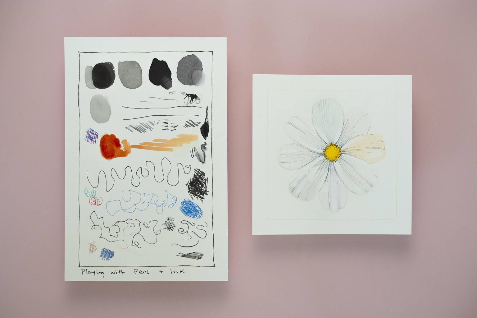
Lesson and Project 6: Inks and Pens
Inks are such a varied medium, I really tried to play with all its various iterations as I started to experiment to really understand how it works. I loved seeing the different tones of black in the bottled ink and definitely wanted to play with that more, I also loved the consistency of the lines from the fine liners, regardless of the pressure I applied. Some of the pens and inks were waterproof, some were not, so I made sure to pay careful attention to that so that when I began my painting.
I decided to paint a cosmos because I am obsessed with them, their petals are so light and airy they almost seem to dance. I really wanted to capture that. I thought the cool grey Copic fine liners would be the perfect tool for the job because it would allow me to add contour lines easily (to create more depth in the petals) and because they are waterproof I could easily paint on top of them without fear of smudging. I also tried to use some bottled ink to create one petal with more depth and texture. Because ink tends to have a colour shift between wet and dry, and because I added contour lines and white highlights on top, I’m not sure how effective this was, but I’d love to play with the idea more.
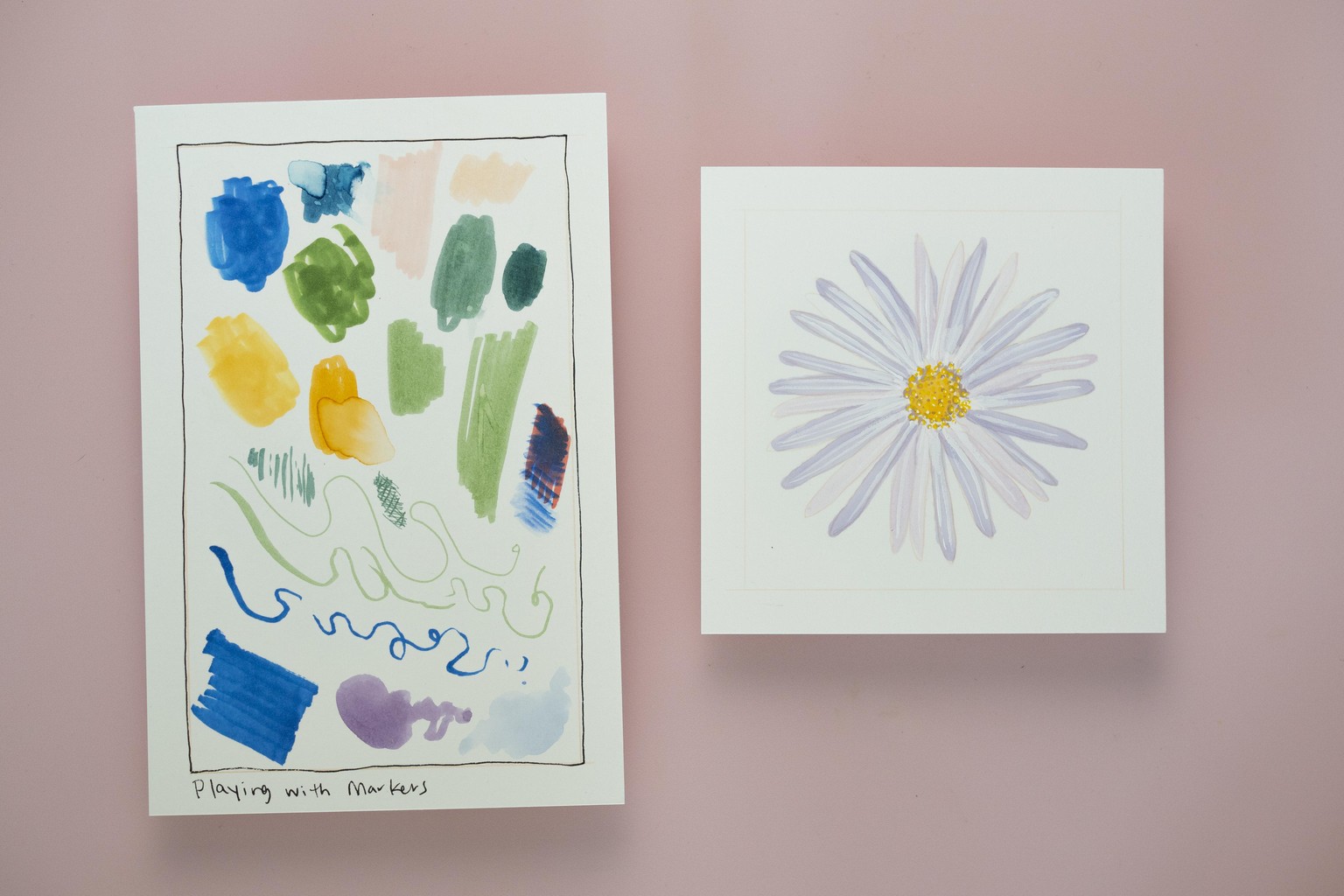
Lesson and Project 7: Markers
And here we come to our final lesson! Markers! Because Markers are dye-based (rather than pigment-based) they are completely translucent, which makes them best used under acrylic gouache. However, Water-based Markers, like Tombows, can also bleed, or reactivate with water, so it’s best to keep that in mind as you employ them in mixed media applications. I absolutely loved the streakiness of the markers when applied to marks or areas of colour, and the softness of the Copic markers, so that’s what I decided to use for my floral project.
Now, to be real, this is not the best thing I have ever painted. And that is okay! We are taking a hypothesis from our loose and free experimenting and applying it to an actual painting. Sometimes you may discover more about the medium as you start to apply it to a real subject. It’s the perfect opportunity to iterate and keep experimenting to get the effects you want. Or maybe it can be an opportunity to say: Maybe this material doesn’t need to join my mixed media arsenal. That’s fine too. There are some things I love about the painting, like the in the middle and the variation intones on the petals. I do wish there were more contrast in there. Maybe I could have added another layer of line work in gouache to really make it feel like a finished piece. Or in actuality, what I’d really like to do is go in with some coloured pencils, which is perfectly fine. There’s nothing wrong with using the right tools for the job.