Map Drawing III - Icons and Labels
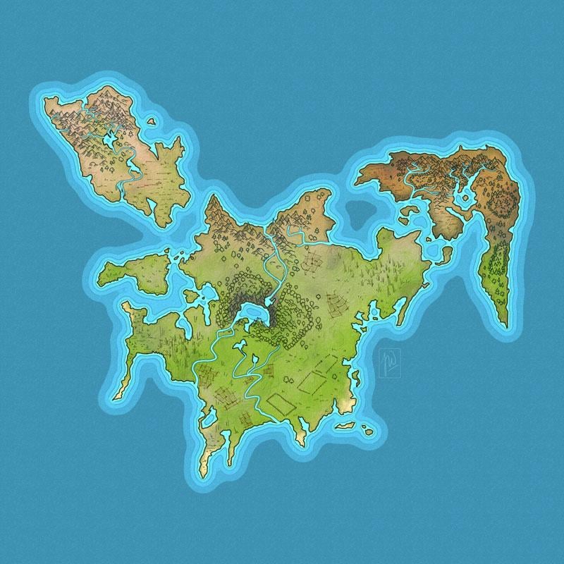
Starting with map from lesson II.
In this class I learned to put icons and labels on my map from class I and II. The lessons exeeded my expecations, couse the Icons are not only dots and circles, but full blown handdrawn icons with tiny houses and castles. Once again a fun class and very good explanations by Daniel. Looking forward to part IV.
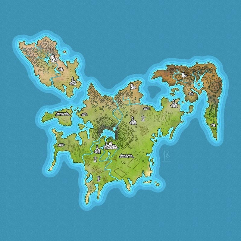
Step I - Creating the Icos.
Thanks to Daniels instructions I found a nice and clean way to make my icons. Once again, the small size of my map was a hindrance. But I am sure with a bit of practising (or a bit more) my icons could like as good as Daniels. It was a great lesson!
Step 2 - Creating a hierarchy for fontstyles and placing the lables
Daniel explained the rules for placing the lables und had a great example for a good looking and (more important) understandable hierarchy for font size and styles. I strayed a bit, but not much.
Placement was unexpected difficult in some areas.
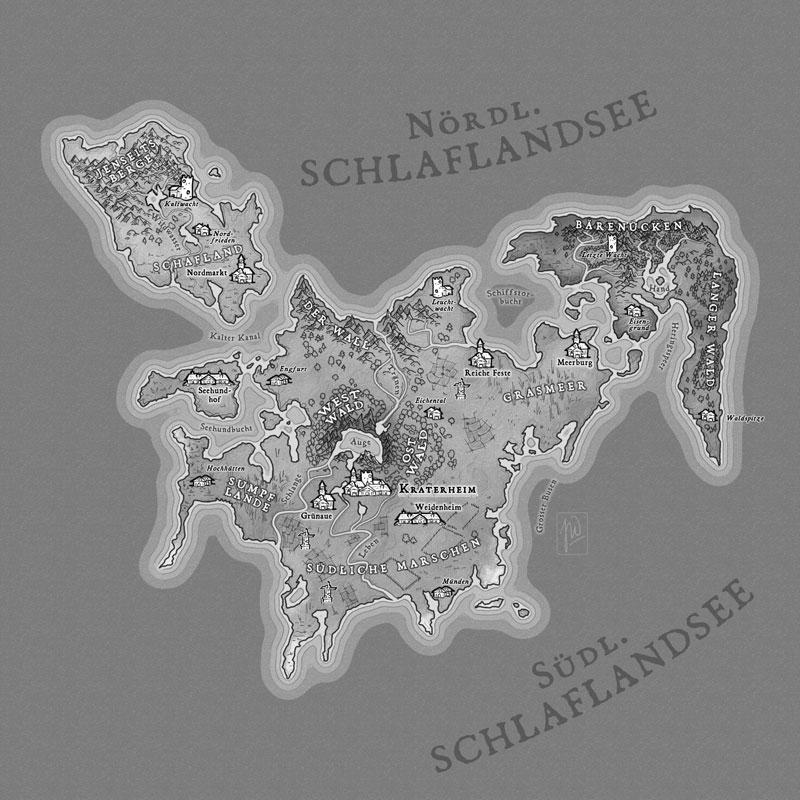
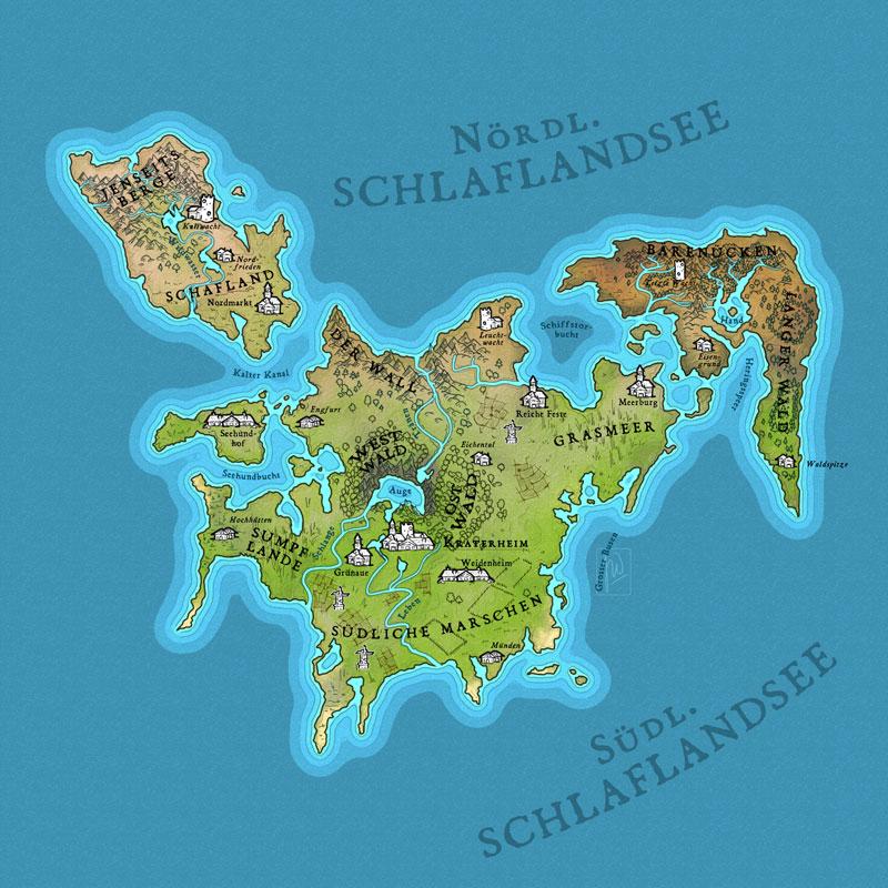
Step 3 - Making the labels readable. This was an easy lesson as it was all about applying 1 or 2 layereffects to the names. I made a quick check in greyscale (placing black layer with layerstyle "saturation" on top of it all) to see, if contrasts are okay and readable.
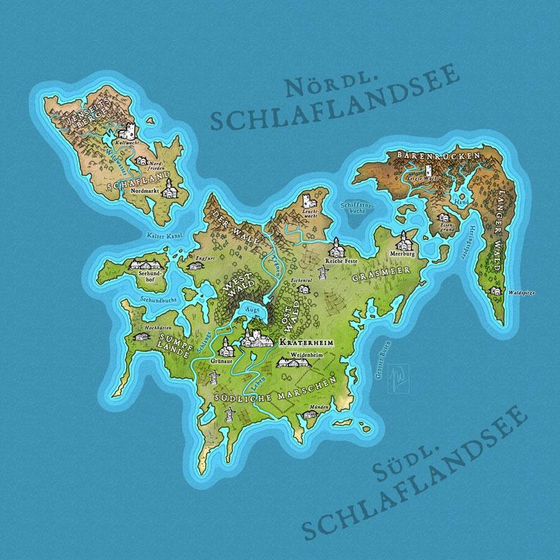
Step 4- Fixed a type. Addjusted contrasts and switched back to color mode.
So this is my final map for class IV with Daniel. Looking forward to the final coloring lesson.