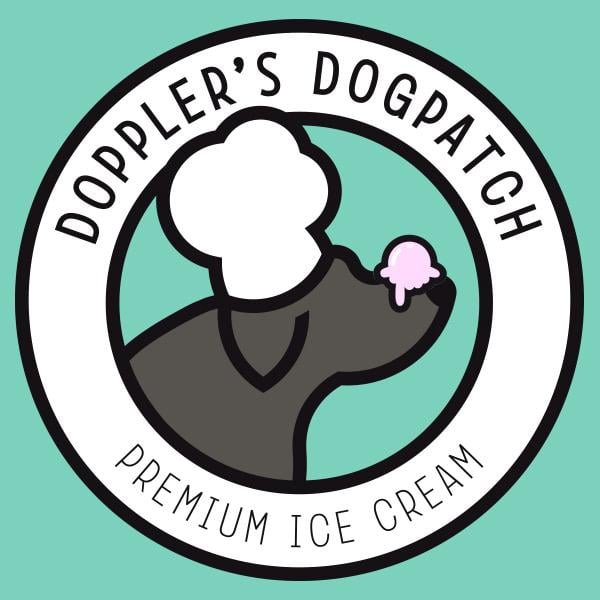
Logo for an ice cream company
This is a logo that I designed for an ice cream company. The company is named after the owners' dog, Doppler. They wanted him featured in the logo with a chef's hat. I came up with putting the ice cream scoop on his nose.
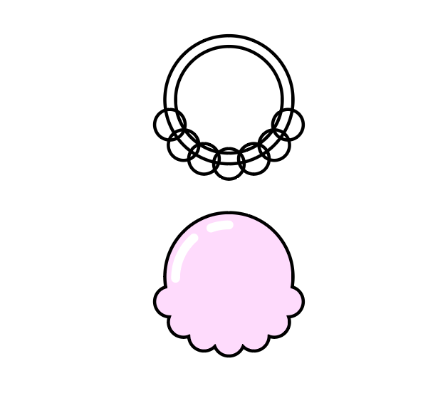
I started by using the circle I have handy in my symbols palette. And quickly layered them roughly over the image above. I created the head entirely out of circles (an idea I stole from the Twitter logo).
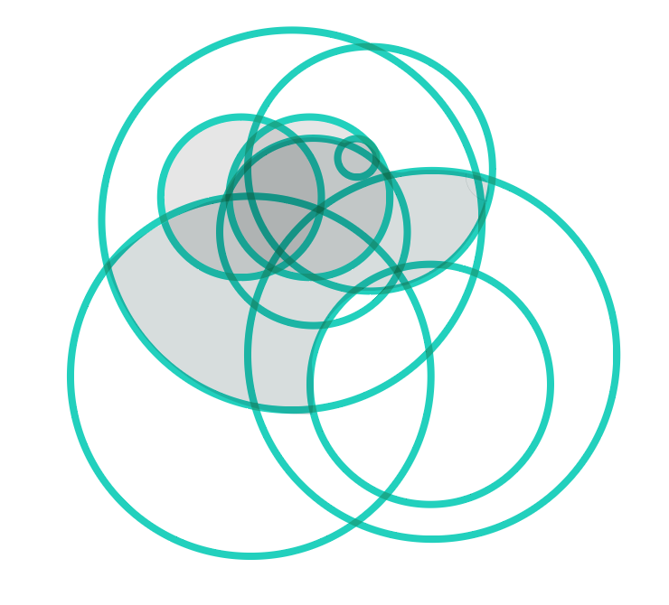
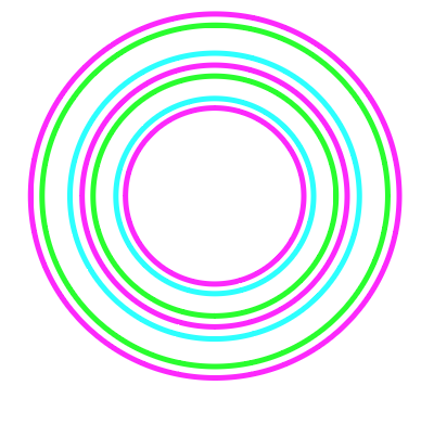
Rather than use all the divide/unite/minus front/etc tools, I used the "Shape Builder tool". Like Aaron said about the divide tool you do have to be careful about things not perfectly lining up. But even with that, It's still quicker for me to work with complex shapes like this.
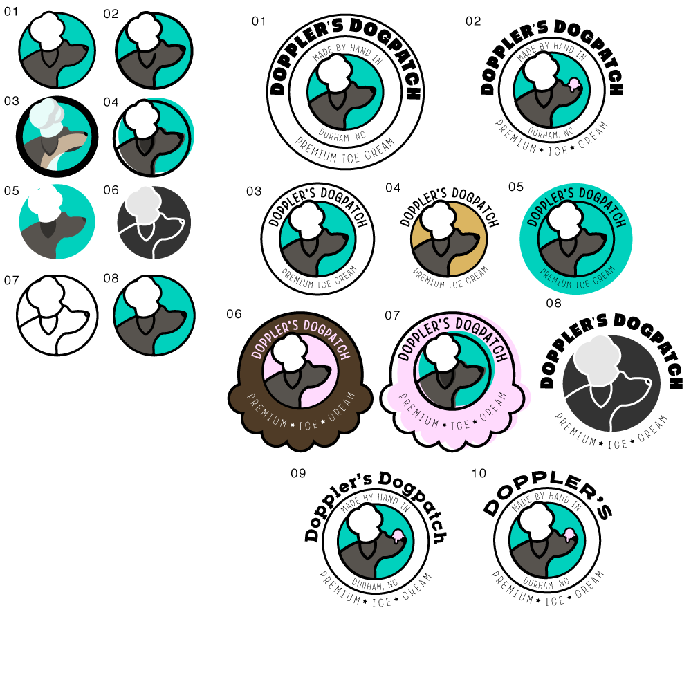
I then iterated on the design trying out different looks.
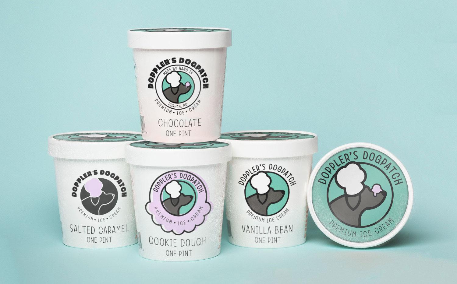
I chose a few of these to present to the client on ice cream pints.
The ice cream and hat were also made from circles.
I used Aaron's technique from another skillshare class for doing the text in the circles.
I think becoming an AirDrop master is the best tip. I use this all the time. I'm also a iOS app developer and I'm thinking of making an app that scans the image flat as a small image file so I don't have to waste time in Photoshop optimizing it. I can just airdrop it and load it right into Illustrator!