Lettering
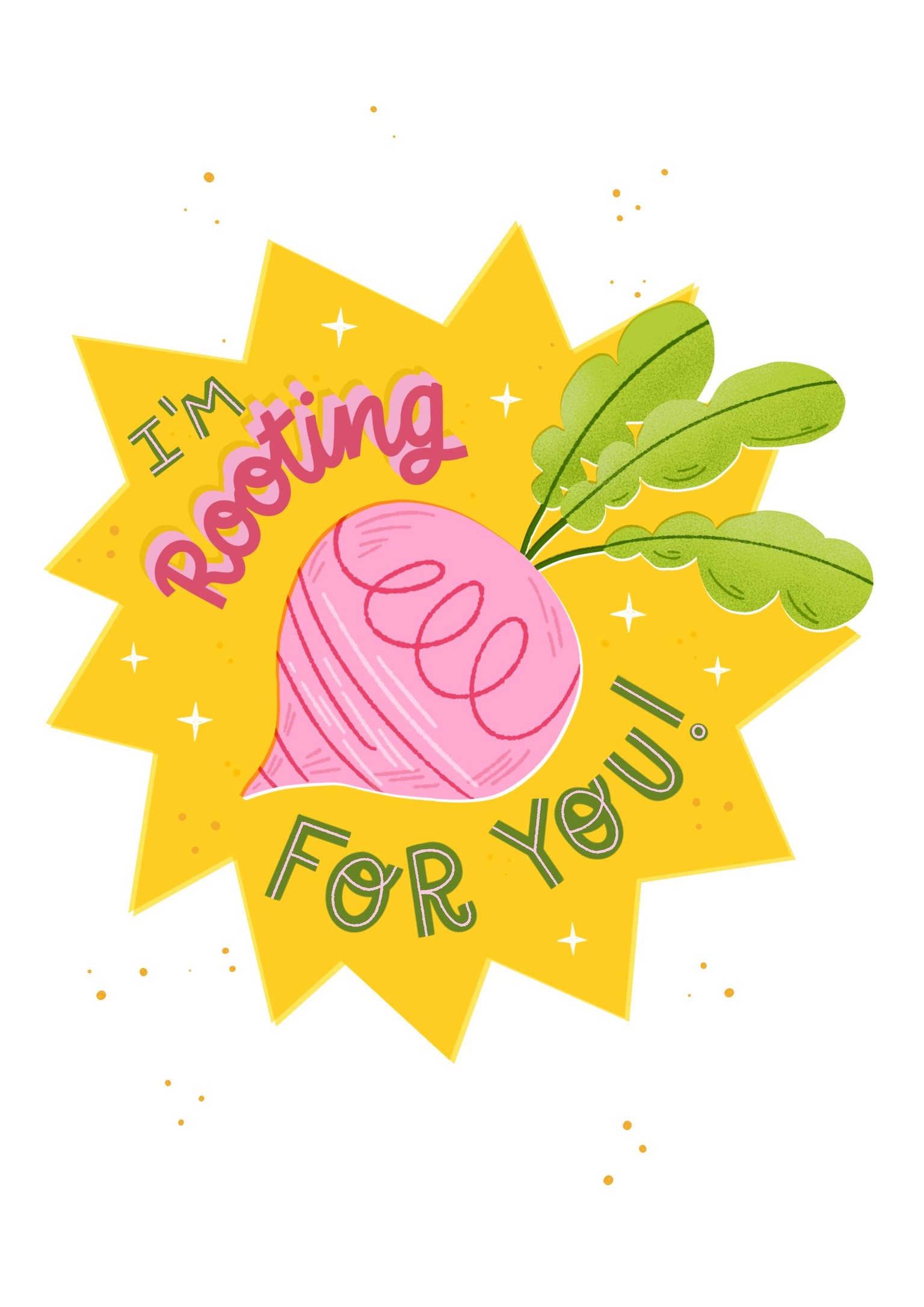
Initially I had intended to make the rooting pop using different colors but that didn’t work out also my text didn’t seem legible.
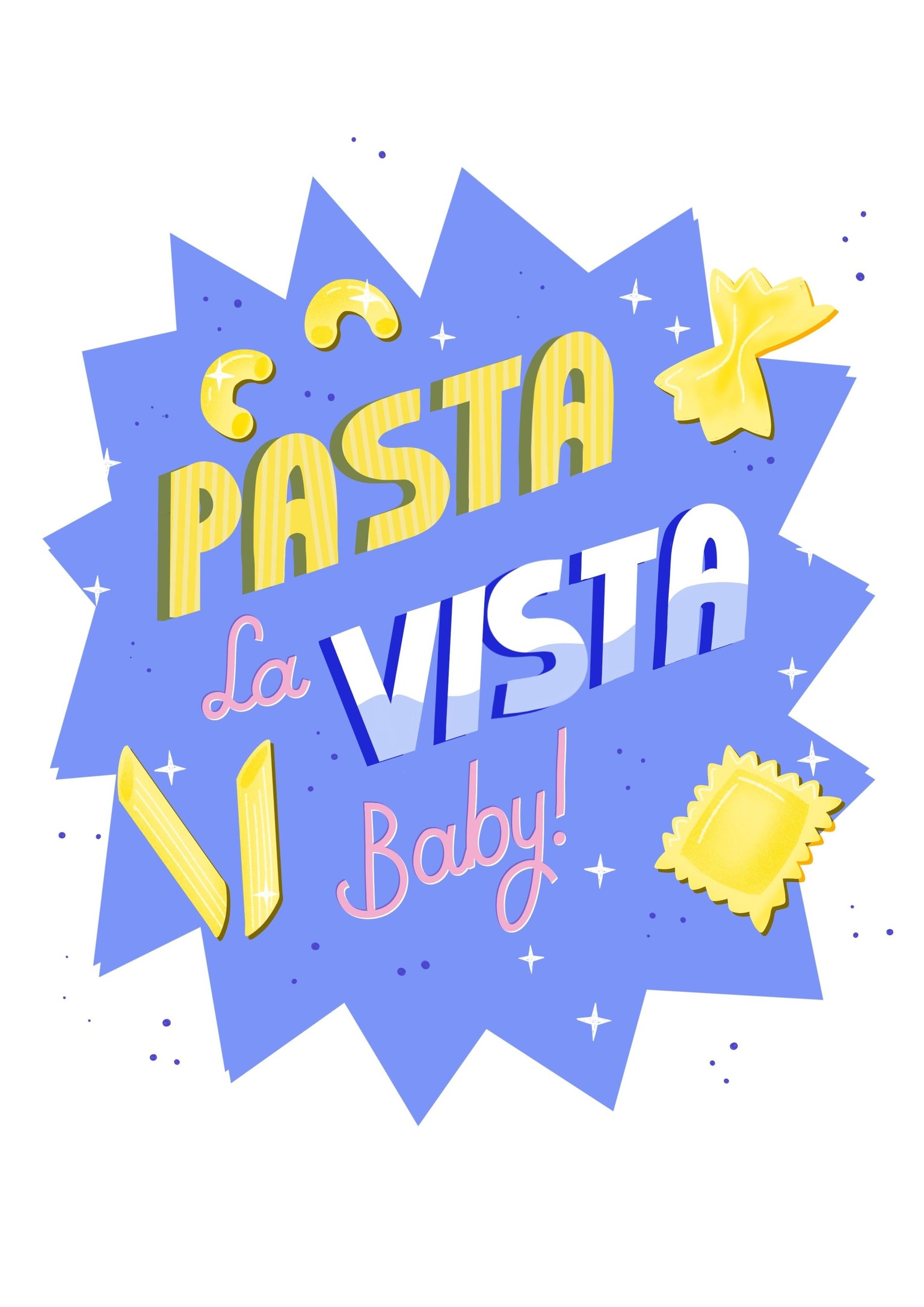
The minute I saw the word pasta I knew I had to give my letters the resemblance it’s also something I love to incorporate in my letterings. The effect that I love is the offset, adding it to your letters make them look so much better.