'Lemon Tree' Typographic Postcard
Thank you Martina for a wonderful class! I’m a big fan of your work and it was awesome to gain an insight into your process. I had already established quite a similar process myself, but this course helped me to gain confidence in that method, and taught me an extra trick or two as well! Without further adieu, here is an insight into my class project… ‘Lemon Tree’.
------------------------------
I'm on Instagram: @neverlandstudio :: My online home: www.neverlandstudio.com.au
------------------------------
The Words
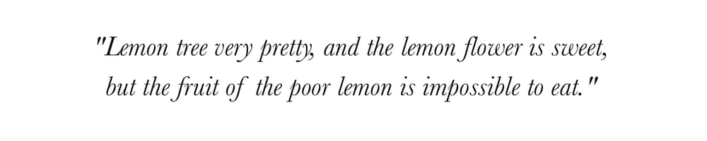
The words ‘Lemon Tree’ stem from an old song by Peter Paul & May, which my mother used to sing to me as a child. It’s a kooky little song, comparing love to a lemon tree. I live in an old Italian neighborhood in Melbourne, Australia, where the streets are lined with lemon trees and the song is always on my mind, so I’ve adopted the words for this project.
The Inspiration
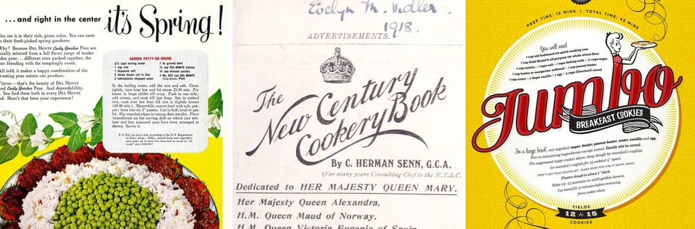
I wanted to use a script-style in combination with a more structured serif to achieve a vintage postcard, or recipe card, sort of feel. I was inspired by old recipe books, back in the days when family recipes were treasured secrets. I wanted to make the script quite curly to reference the arc of a lemon leaf.
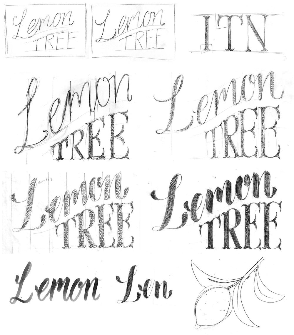
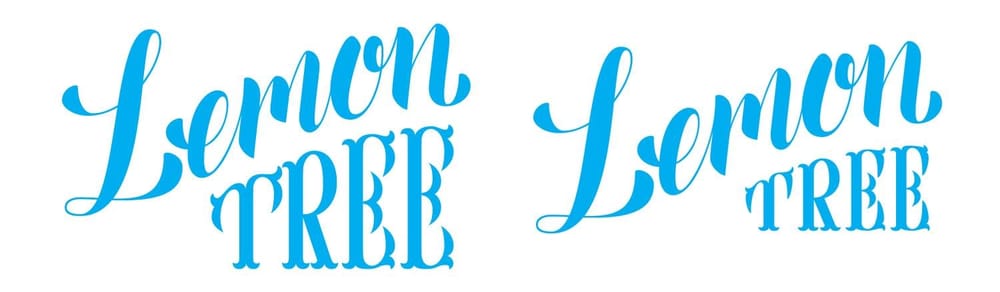
The Sketches
I am guilty of spending too much time on initial sketches so while following this course I tried to keep my sketches super quick. I really enjoyed thickening the letter forms up in the tracing paper stage and got good clarity on the design at this point. Before defining too much detail, I quickly drew the words with an expansion tool (brush tip pen) to check on the corner angles of the letters. Finally, I experimented with flipping angles on the curls (at the end-points of the letters) to see how that might look. And I did a quick sketch of a lemon which I wanted to use as an illustrative element in the design, to fill a letter gap after the L.
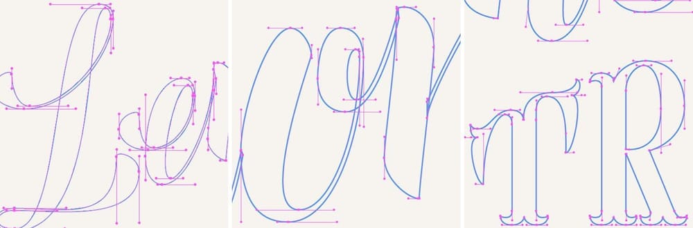
Digitizing
As a graphic designer & digital artist I have a lot of experience in Illustrator, but I had never attempted to create type using strictly horizontal & vertical Bezier handles before… I usually allow a little leniency for tricky corners/angles and thinner areas. I used this project as a challenge and limited myself in this way.
The most challenging part of this process was the top of the word ‘tree’. I had chosen a bifurcated lettering style which was a real challenge for me to execute in a smooth and symmetrical fashion with the curved top-line.
Post-Illustrator adjustments
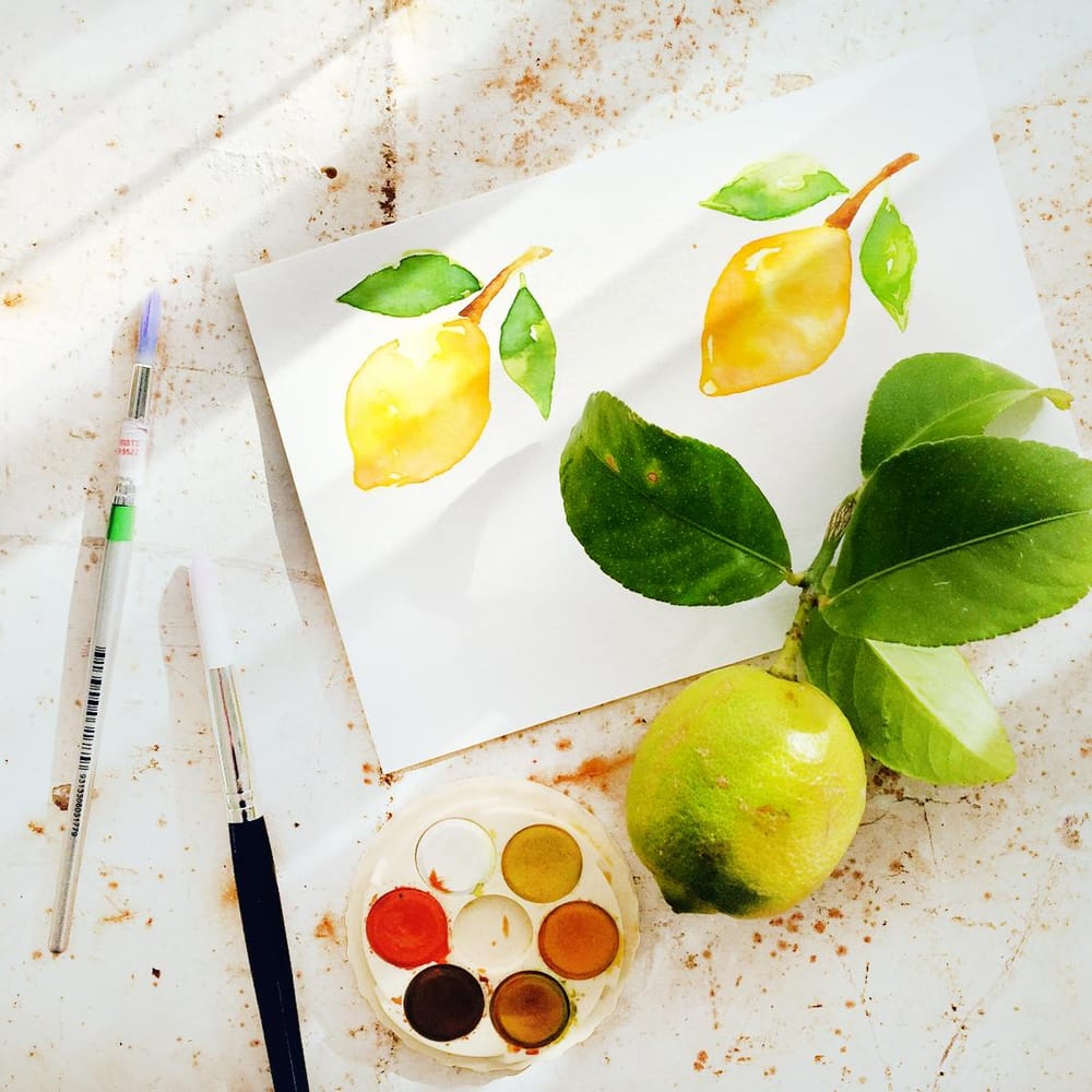
Once I had digitally converted the type, I felt the word ‘tree’ was given too much limelight, so I reduced the scale quite drastically. I enjoyed playing around with the detailing, which edged the design closer to the vintage realm. I experimented with various texturing and shadowing techniques, but in the end kept it quite simple with clear-cut edges. To give it that real hand-crafted feel, I finished off the project by whipping out my watercolours and painting a lemon branch to fill the gap created by the capital L.
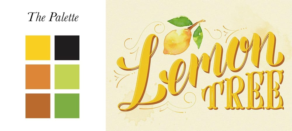
Colouring
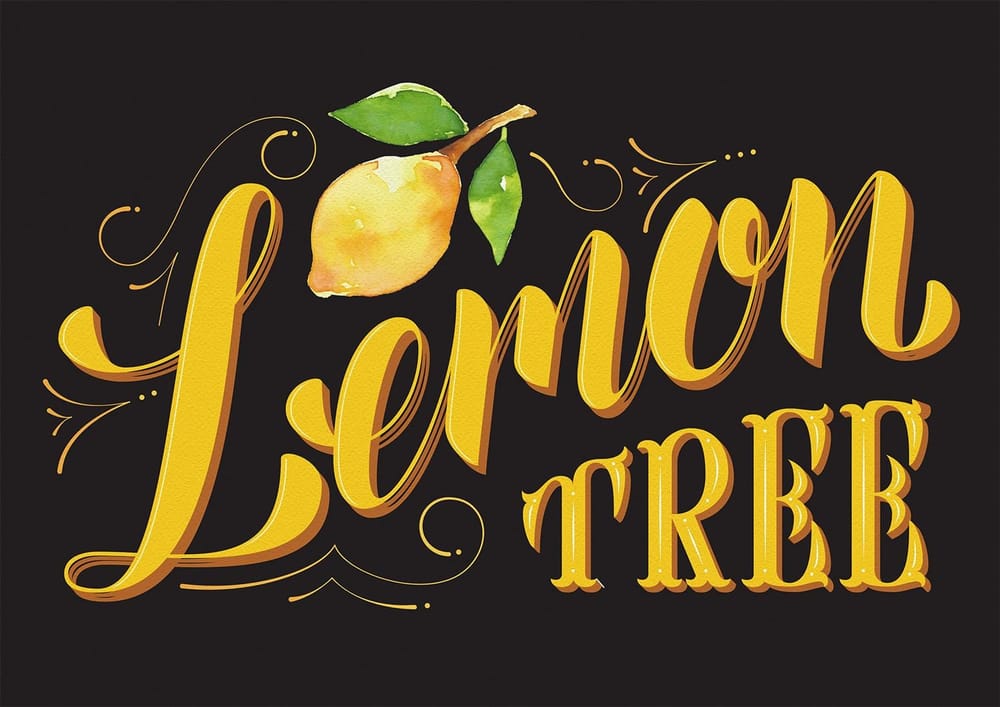
Sampled from a lemon tree, of course! Originally, I had a pale yellow / cream background and it had a very authentic 1950’s feel… but I was drawn towards giving it a modern-day edge, and changing the background to a charcoal really achieved this well.
The Finished Piece!
------------------------------
I'm on Instagram: @neverlandstudio :: My online home: www.neverlandstudio.com.au
------------------------------