Kill Bill
First off, that was an intriguing course. very brief but power-packed.
This is one of my favorite movies of all time. It just came back to theaters in a longer cut. This was the true version of this tale.
I did have three concepts for this poster. Two of them made the cut.
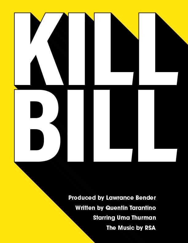
The first one here is a version that I've seen in the past with a smaller font layout that retains a lot of space. My version has a larger font with a series of credits to match the slope of the shadow.
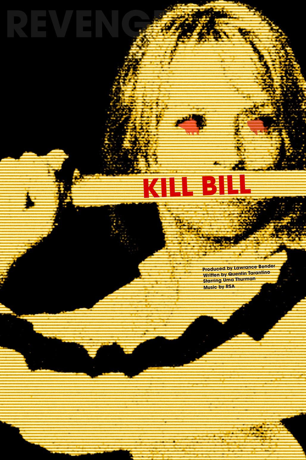
This second one is a bit gritty and dark. I took a little bit of inspiration from the Mosinski piece in the simplify section.
So I initially uploaded this and noticed that the text for kill bill needed to be slightly rotated to match the sword ... then I wanted to match the rotation of the credits below. The text would need to follow the subject, the bride.
have fun