Kate Miss Jewelry Shop
Hey, gang!
I'm so excited for this class! I love using a simple set of tools to design these stores. The point of this class is to get you selling your goods through a beautiful shop, but it's kinda nice to take a minute and have fun with your store design while you're at it. Also, you'll learn a few things about your brand- what works and doesn't work visually. So let's jump into my project, shall we?
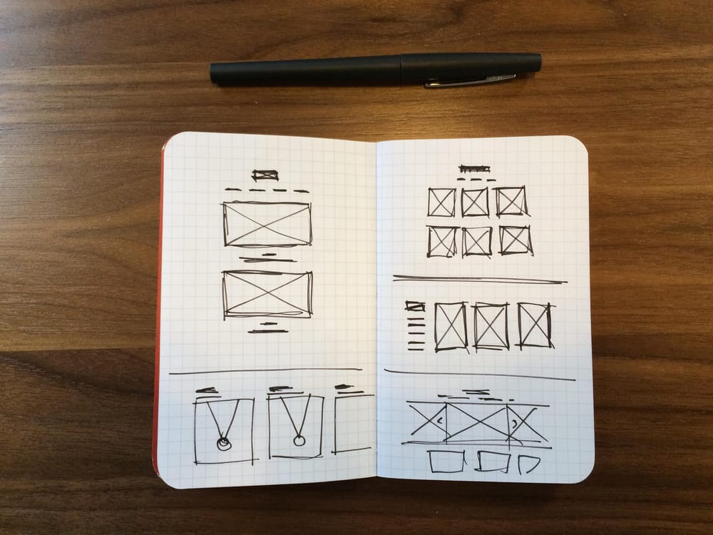
I started off sketching with pen and and a little sketchbook. It helps to start to even visualize the elements I'll be dealing with. I looked through the Big Cartel themes to get an idea of what I could play with, and sketched a few ideas of how I'd like my logo, photos, and navigation to work together. it's a good exercise to get you thinking about all the parts of a page.
Once I had an idea of how things would work together- I added a few products, wrote up some descriptions, and jumped in the customization area. The default theme was "Sidecar" which gave me a nice, but unexpected sorta moodiness to my shop. Kinda fun to see how the images looked in a way I wasn't expecting.
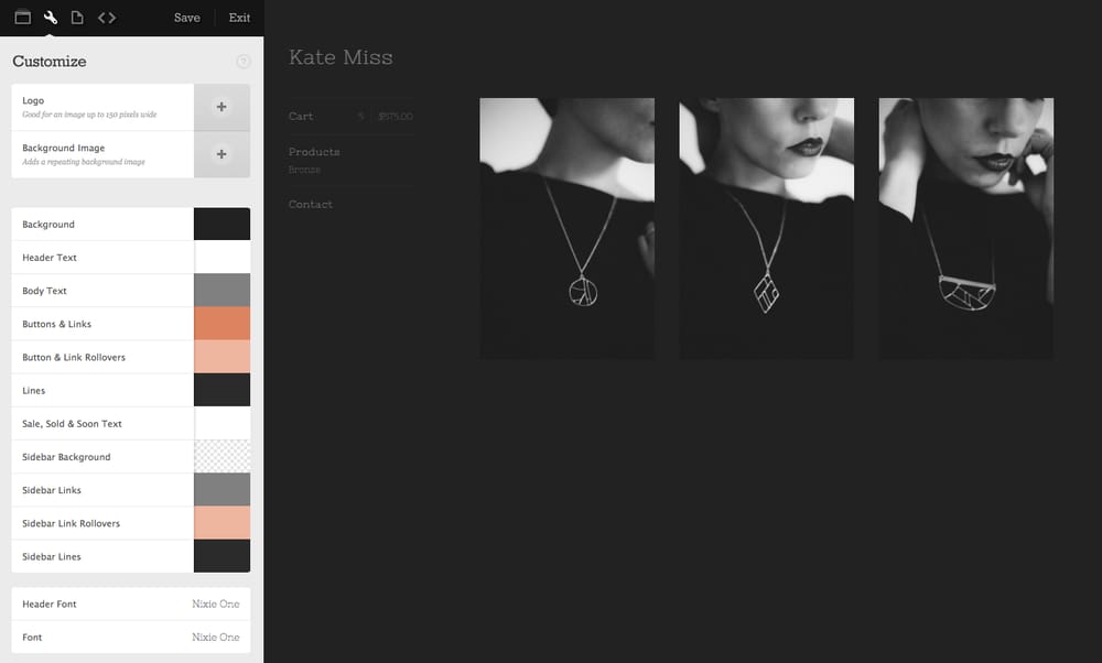
I added a few colors I've been liking lately, a peach/orange/grey combo that I've used in some of my photos. It was really nice to see how a little bit of color made this shop instantly feel more like home.
It was also nice while I was in this theme to see which fonts worked with the brand I've designed for myself. It was also pretty clear which fonts and colors DIDN'T work, which is also helpful.
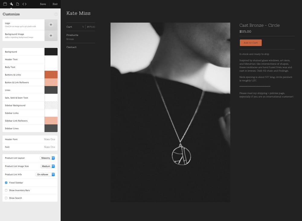
I played with the background color which instantly made the shop feel lighter and fresher:
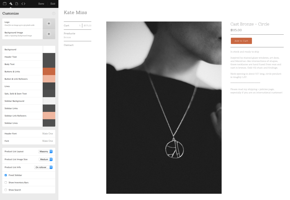
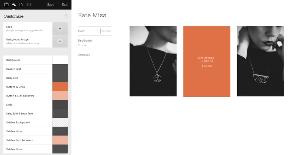
I loved the way the colors worked in this theme. Accents in just the right places. I uploaded my logo as well to see how this theme could start to work-
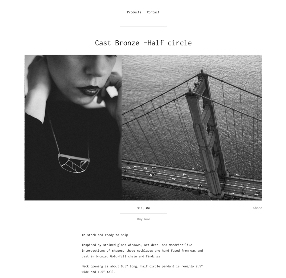
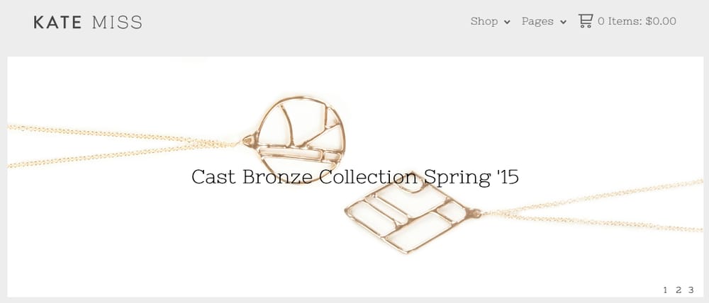
Sidecar wasn't really what I had in mind, but I was loving how my photos looked in a series. I wanted to find a theme that promoted the mood in those photos a litte more, so I worked with Nova a little bit-
I realized quickly that the photo format I had wasn't really jiving with Nova, so, taking a hint from the architectural inspiration in my necklaces, I grabbed some free images from Unsplash to use as some visual texture, and also help me get a different format to work with the theme:
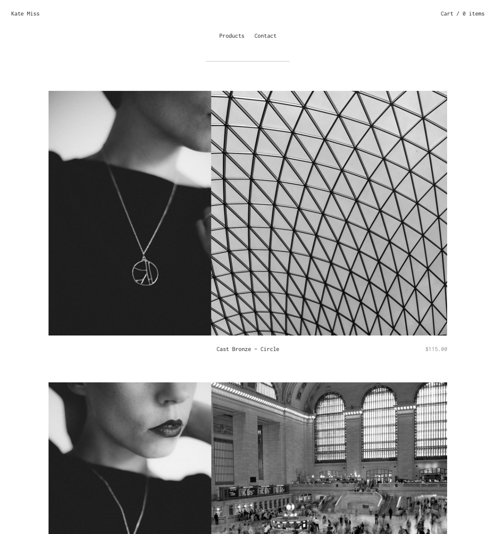
The wider format of the photos was so nice in this context! I'm loving how this makes the shop all about the photos.
I felt really good about this theme and the way these photos worked, but needed to get some more elements of my brand in there- and more color/style in general. Plus, I'm just having fun building this thing so I'll just keep playing around.
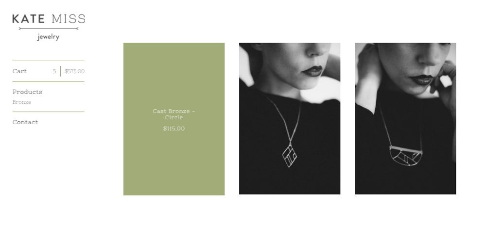
The new theme, Good Vibes dropped right as I was putting my project together, and I had to give it a try.
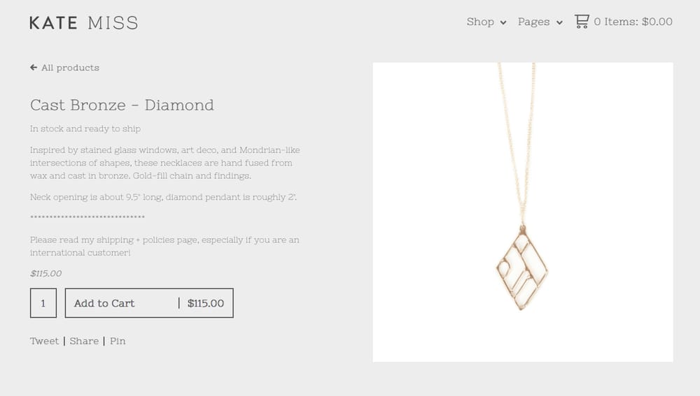
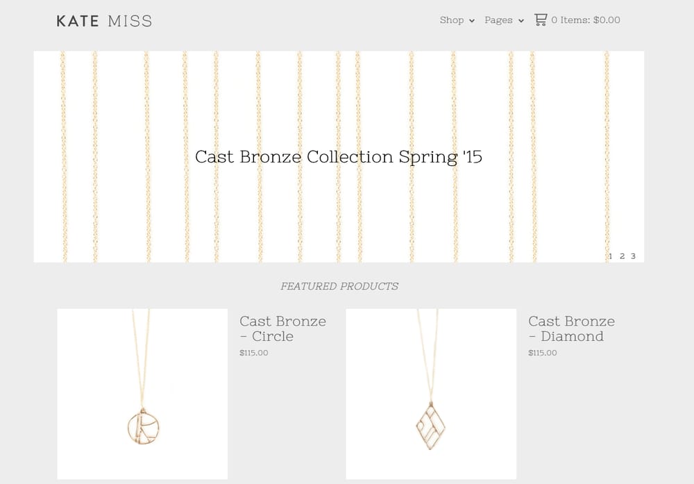
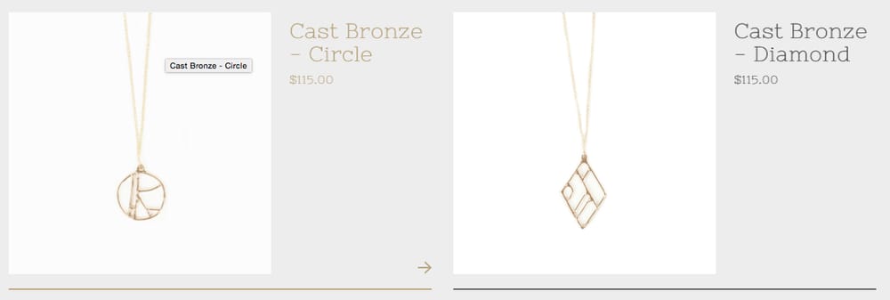
It was sort of just what I was looking for. A little more style, with the chance to tweak elements in just a way that it gave the right amount of focus on my pieces. I used the bronze color from the necklaces as the detail color in the shop, and let the white images pop off of a light grey background.
I'll keep playing around with my shop design and am really excited to see the shops and combinations you come up with! Feel free to ask any questions and I'll be sure and jump in to give feedback on your new shops!