Interior sketching - one point perspective
Session one
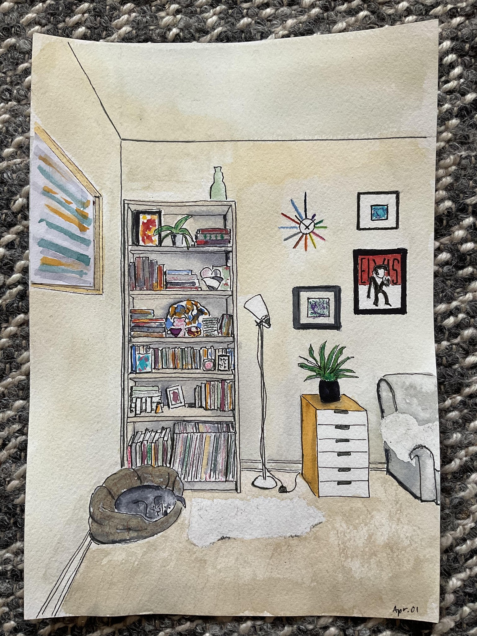
I needed a challenge today and something different. I nearly gave up in the middle but I’m glad I didn’t. I’m very new to art-making of any kind and was nervous about the drawing part in particular. I ended up really enjoying this and got totally absorbed. Given this is my first attempt at anything like this, I’m pleased with my results. Obviously there’s a lot to work on but the learning is in the doing!
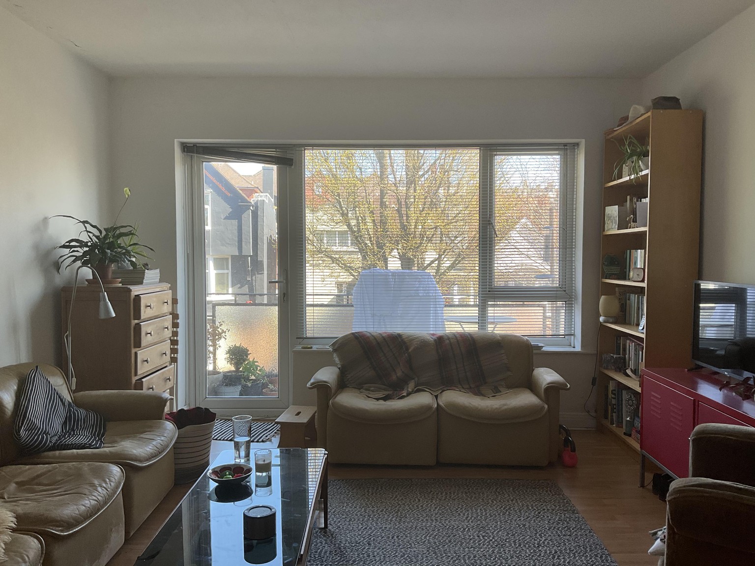
Source photo:
After the initial inking stage:
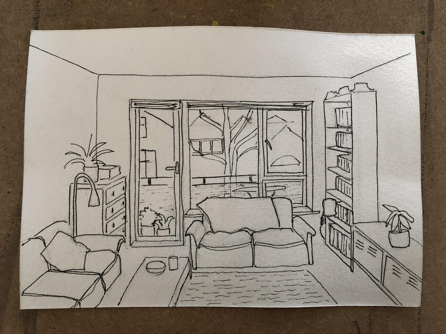
I went in again with the pen to create some shadows:
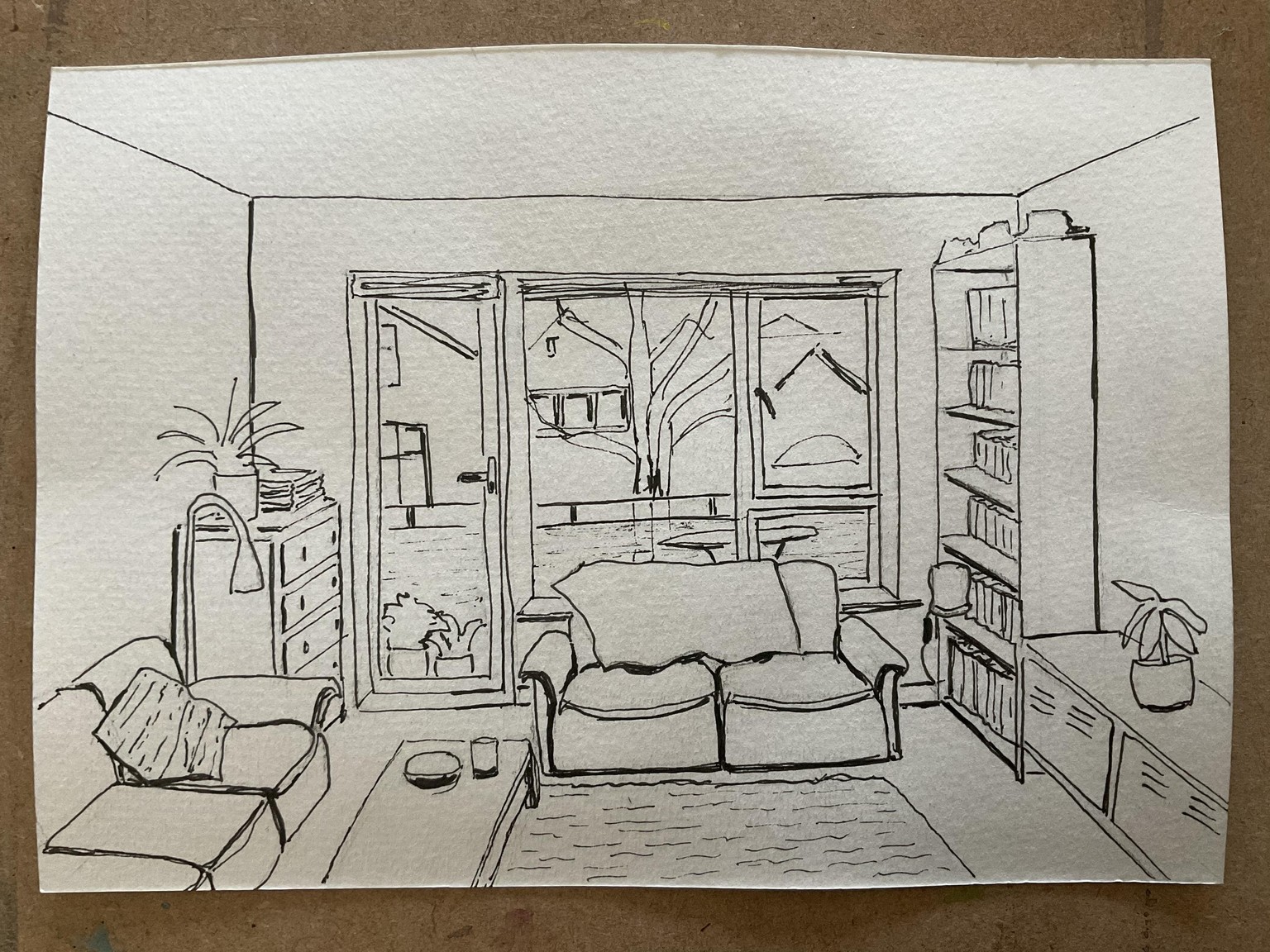
I almost left it there as was amazed I’d got that far and was worried I’d ruin it with the watercolour.
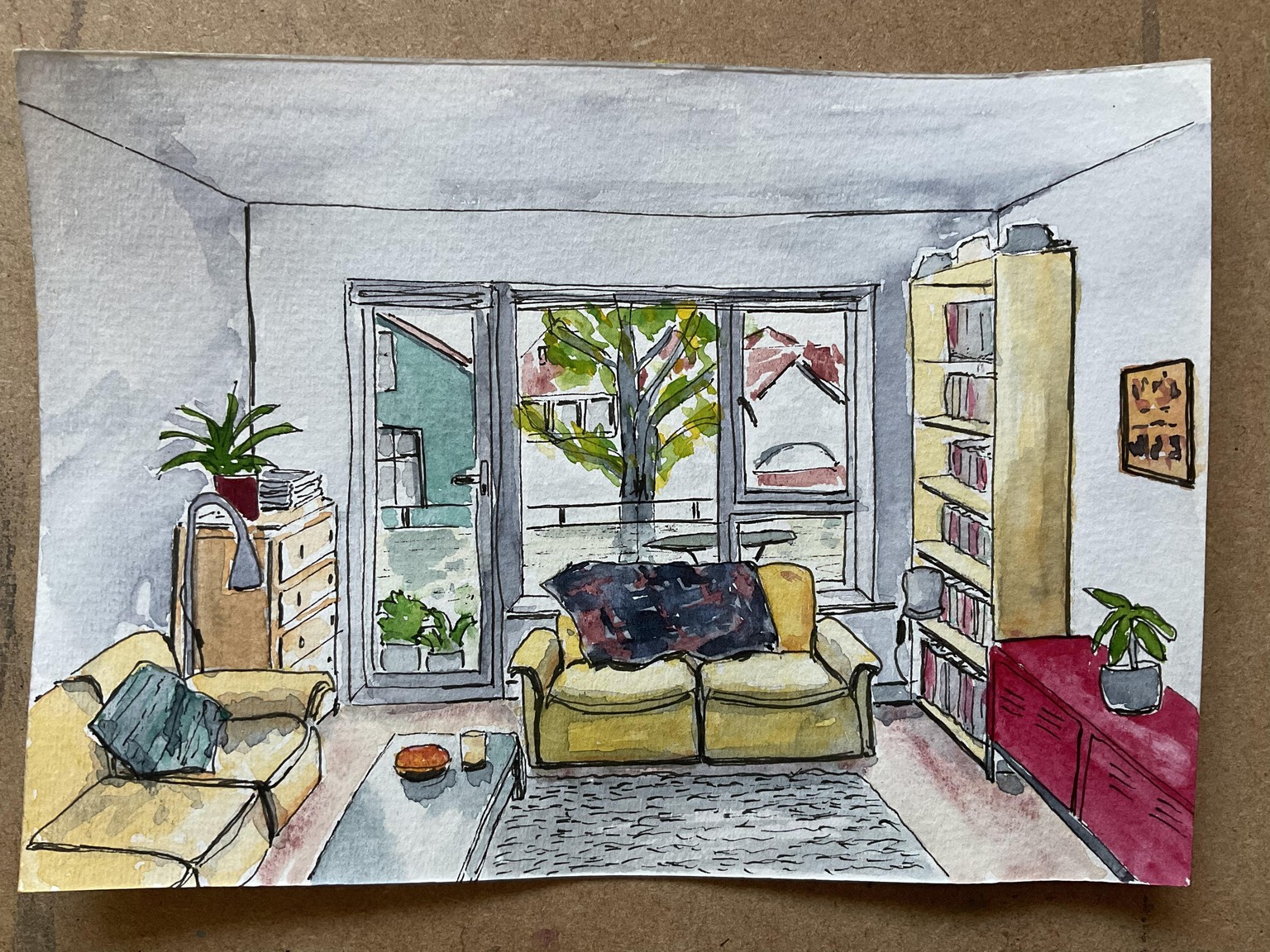
I’ve taken some artistic licence - all our pictures are on the walls to the side and behind me so I moved one into view, plus I omitted the washing on the balcony :-)
Some of the proportions aren’t right. I could tell things were wrong at the drawing stage but couldn’t see how to fix it. Ah well. I’m going to resist the urge to list all the parts I don’t like and leave it there. Also, I forgot to leave some details to finish in coloured pencil.
Thank you Amy, great class, I’ll be back for more!
Session two
I came back to this to tackle a different view of the room. In my head I could see what I wanted to achieve. It didn’t turn out that way. I have had several days’ break from painting due to a heavy workload so I’m out of the habit and dog-tired!
I pretty much sabotaged the piece at the final hurdle, when it came to the picture on the left wall - it’s the periodic table of elements. I wished I’d left it out! I made a right mess of it, then covered it up with a piece of paper in desperation, but I’d lost patience by then. Not a great finish! Reminding myself this is all a learning process.
I’m not happy with the colour and value being so similar on the walls, floor and sofa. Maybe I’ll have the patience to go back and add some variation - or maybe I’ll just move on and cut my losses.
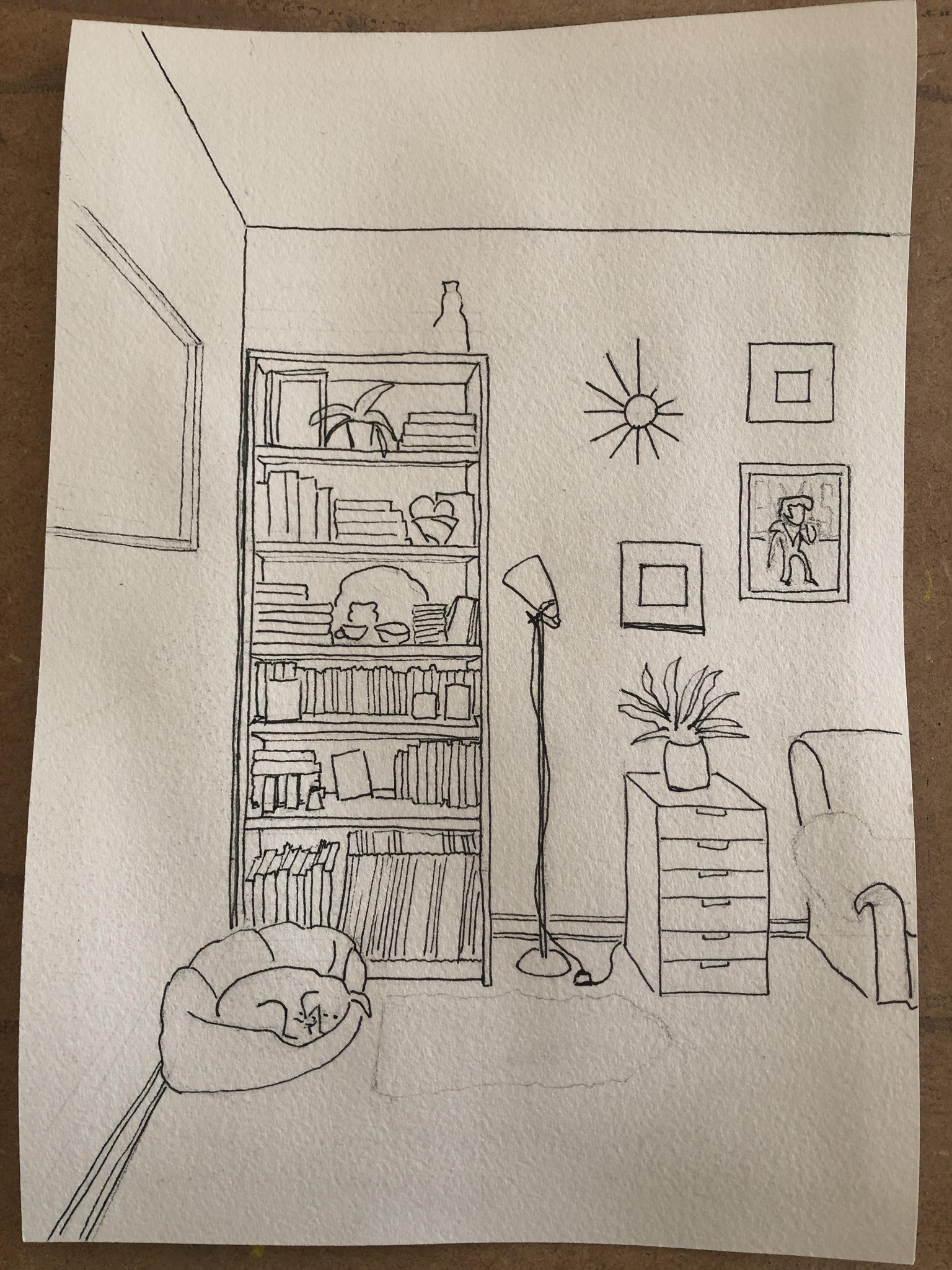
I’m living with laminate flooring and yellowing pine shelves I don’t like - which I mainly ignore, but painting them has really brought them to my attention!
I've now got myself some smooth paper which should make drawing easier, I found this cold-pressed paper a bit bumpy for this level of detail.
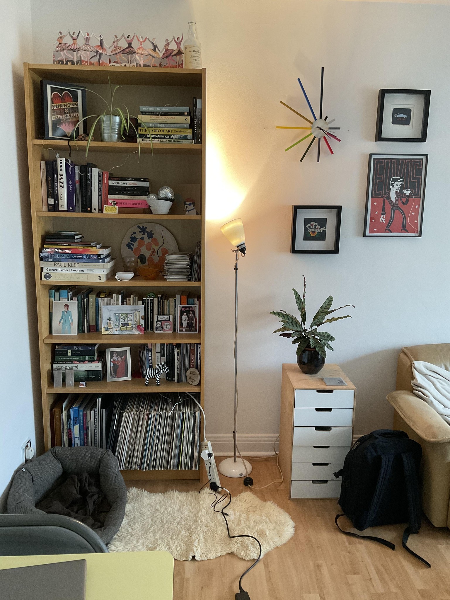
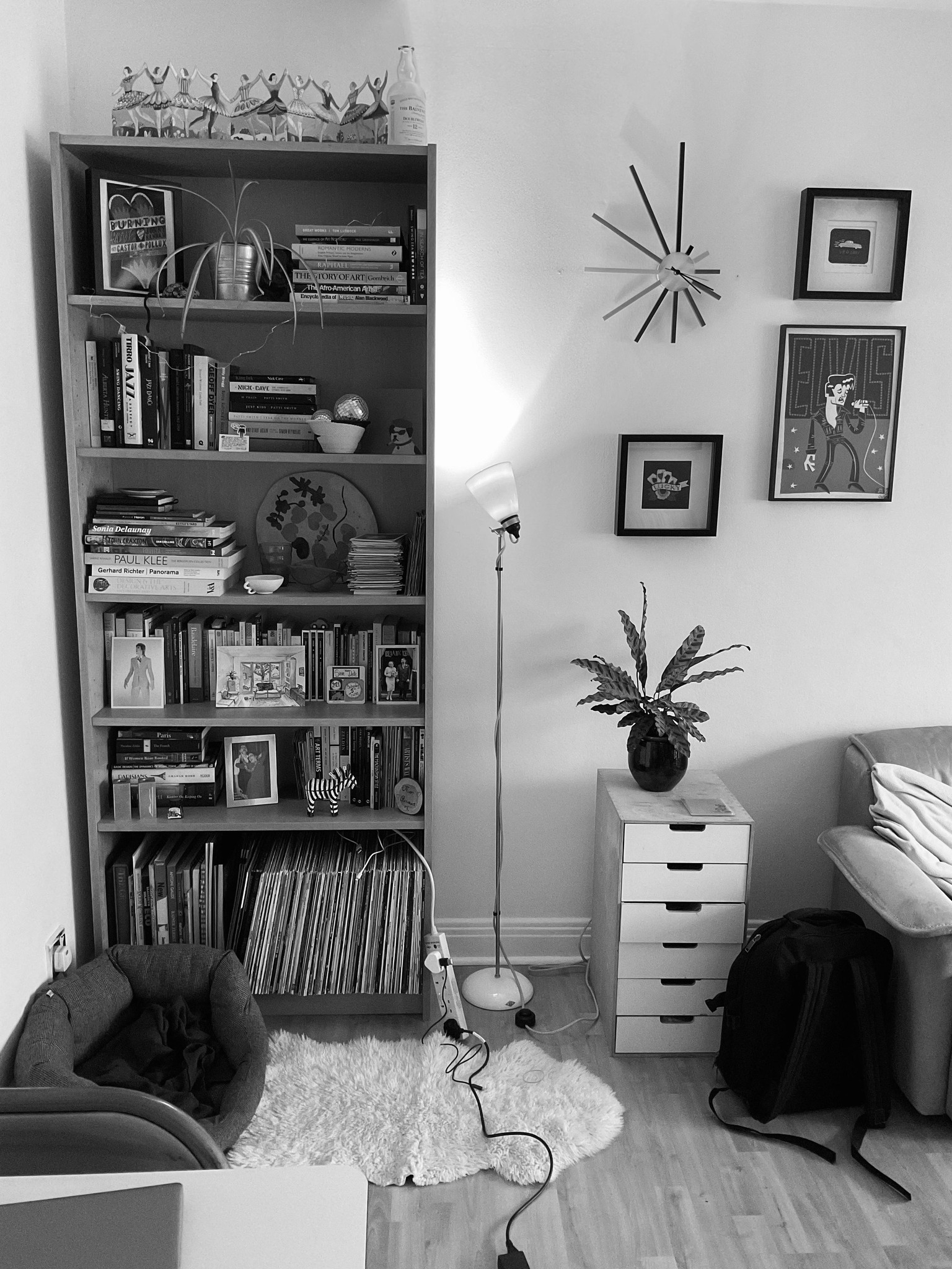
I’m adding the photo of my shelf corner in black and white. Thank you Amy for that great advice, I’ll take it on board next time. It really shows up the difference in values and how I could have made more of this in my piece. Shelves: darkest. Floor: medium. Walls: lightest.
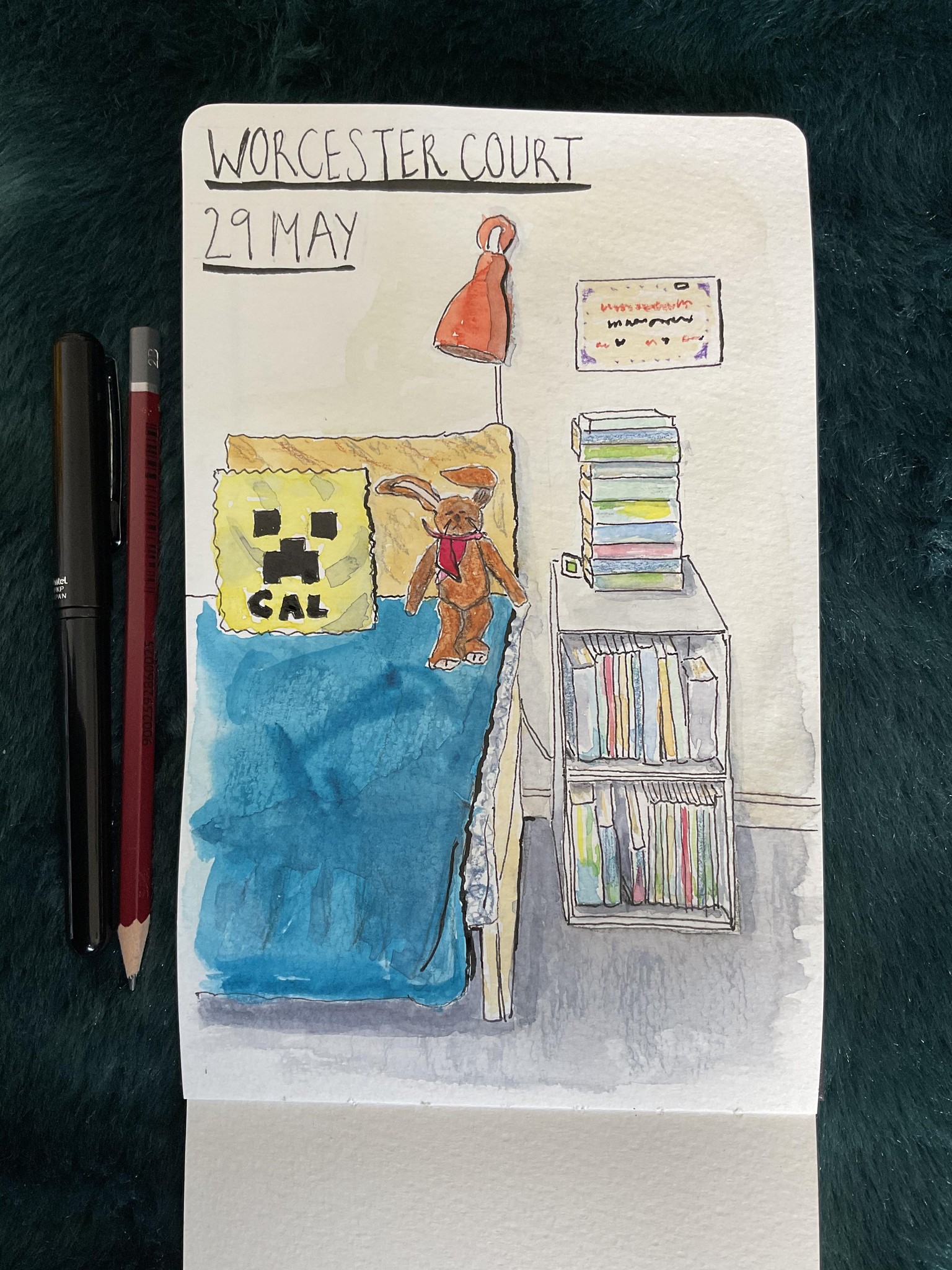
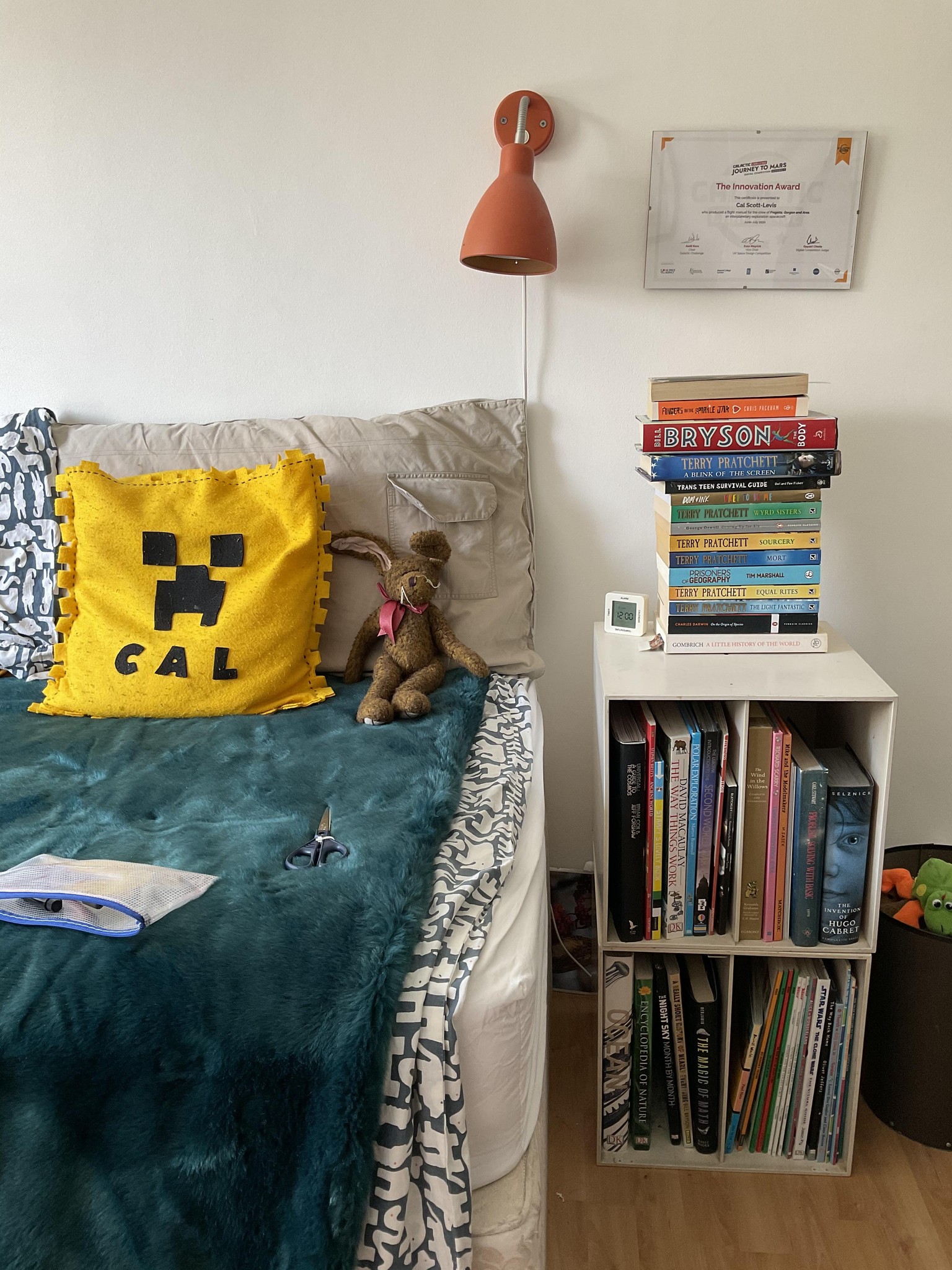
Session three
Today’s little project felt harder. I found the perspective quite hard, especially as I had to sit so close to my subject - in my daughter’s room, which is quite small.
The other major challenge for me was showing the change in plane of the bed cover, which has a velvety texture. I tried to add a later of shading but even though the under layer was dry, it seems to take colour away.
im also wondering if I could have made my shadows a darker value.
Anyway, I enjoyed it. I’m finding I like this way of sketching, and am looking forward to doing some more.