Home
Hello! Thanks for checking out my monogram. First of all, Thank you Kelly for putting together this class. I recently moved back home to Wisconsin after two years of working as a package designer in NYC, so I decided to make this project in honor of my move back Home.
I will first show you my final project and a gif of the process, and then I will take you through my process step by step :)
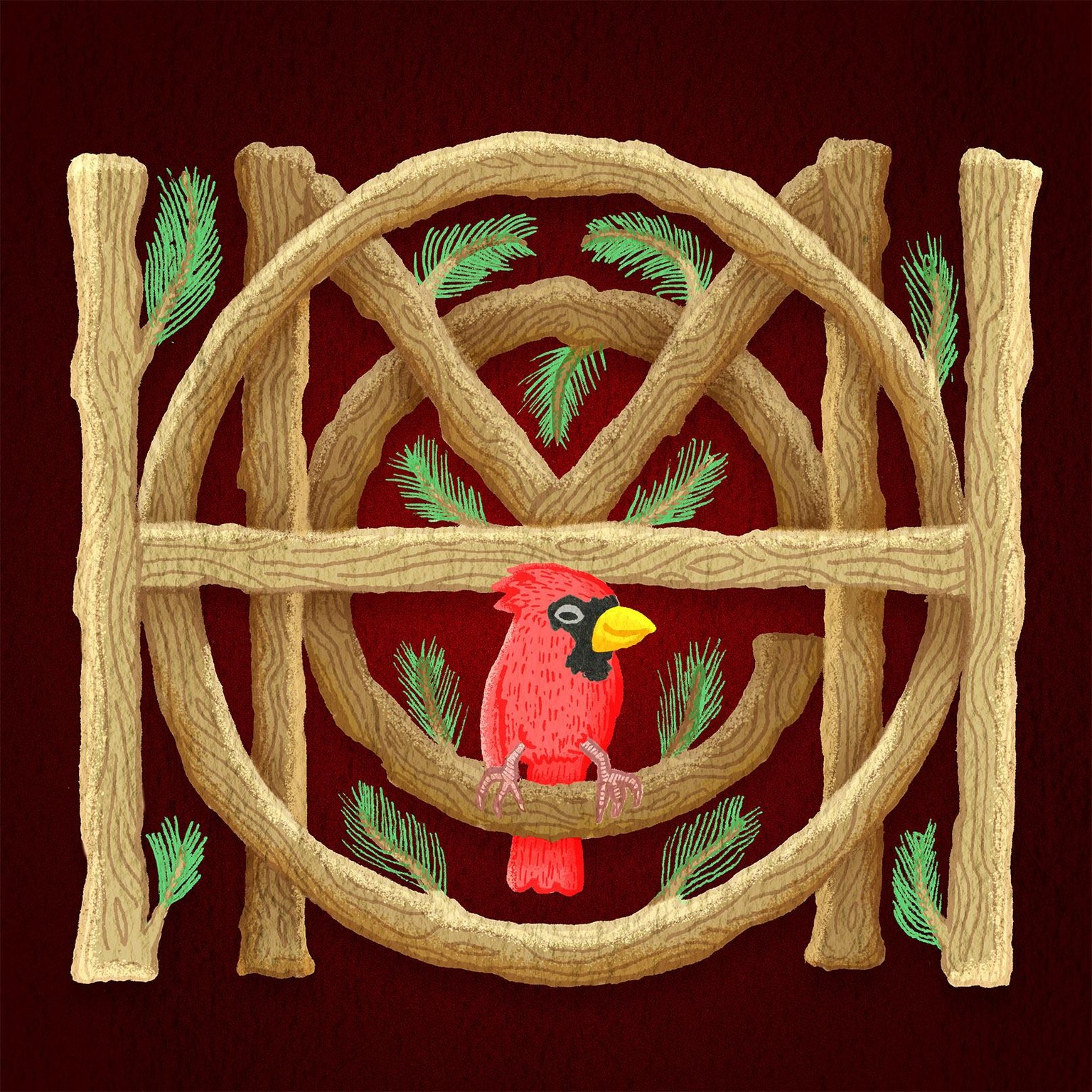
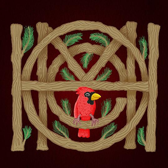
Above is my final illustrated monogram and just below is a gif of my process. It starts with the refined sketch that acts as a skeleton for the illustrated piece. This original sketch felt a bit sterile and too perfect for my taste, so I decided to draw over top of the sketch to create a bit of variation within each letter.
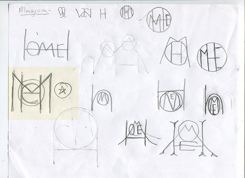
So, I started out with sketching small and mostly loose ideas. A litte embarassed to show these, but yea, this is how I got to where I got! When I stumbled across the idea of having the letter "o" relate to the letter "e" as a larger round character and having the straight stokes of the letter "m" relating to the letter "h" I decided this is where I wanted to move forward and start refining.
Here these are the swipe reference material that helped inform my design.

Above is a word monogram from Friends of Type. If you are not following these dudes, you need to be! They are a collective of a couple dudes who keep in touch by creating awesome custom typography and lettering. I love how the letters read from left to right and from out to in. This graphic helped inform my more refined sketches.
Once I had decided on creating my lettering piece inspired by FOT, I wanted to find a style that would connect to the idea of what the word "Home" means to me. And for me, Home, Wisconsin, means nature and the outdoors.
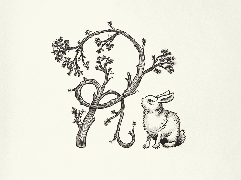
I found this piece of illustration from the all mighty Ryan Putnam on dribbble, to help inform my style .
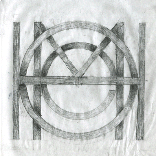
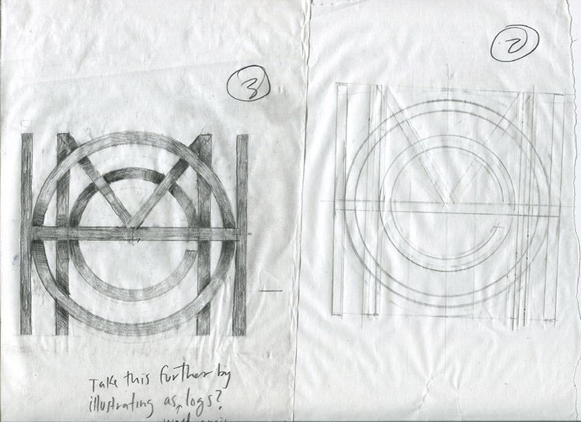
So below is my initial sketch. This was the first step toward planning out the larger composition. Number 2 on the right was actually the first attempt, and then number 3 was the filled in version where I decided on how shadow could be used to help with readability.
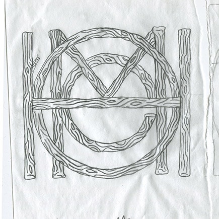
Now that I had this refined sketch, I used it as a skeleton to draw on top of. I wasn't happy with how straight and perfect the lines were, so I decided to move forward by taking into account the referece from Ryan Putnam. I now started to think about added a little contrast within each letter so they weren't so perefect. And I also laid out the ground work for how the wood texture would be drawn.
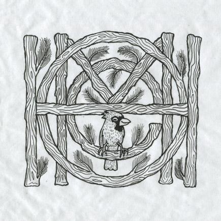
After creating the above image, I decided on adding a cardinal, and pine needles to act as supportive elements to my wood type inspired by nature in Wisconsin. In this inked version, I added a thicker stroke to the outside of each letter, and exagerated the line work to be a bit more uneven and organic.
Once I had this inked version, I scanned it and brought it into photoshop where I added all of the color and shadows.
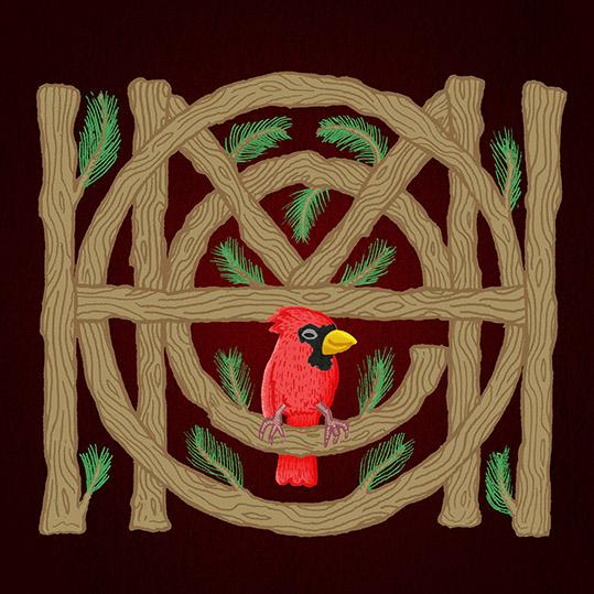
Then I added the shadows to help separate each letter.
And I finished off the piece by adding shadow and highlights to the top, bottom, left,

and right of each letter :)
Thanks for checking out my project! If you like my work, feel free to check out more of my work on my website www.raymawst.com and Follow me on Instagram
Thanks and Cheers!