He-Man and the Masters of the Universe
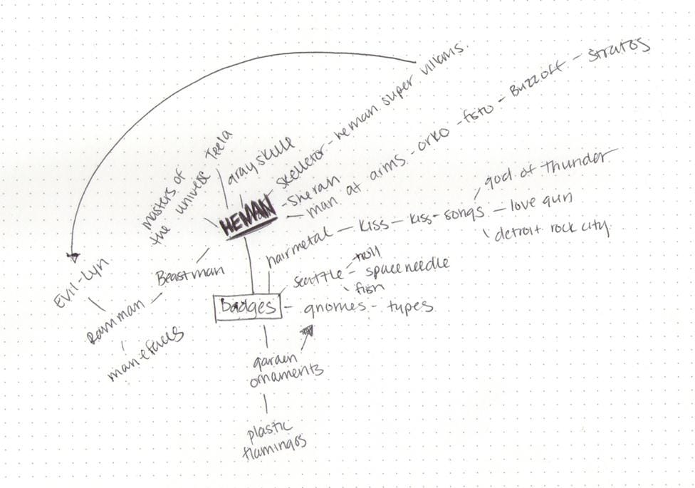
Mindmap
When I first signed up for this class, I had no idea what I wanted to design my badges around. Actually, until 15 minutes go I was still clueless. Some of the ideas I bounced around were hair metal icons, KISS song badges, lawn ornaments, and tourism ideas. Then about 5 minutes into my mind map the gods of Castle Grayskull struck me with inspiration: He-Man and the Masters of the Universe.
Needless to say, I am super excited to get started on these. Part of me wants to go big or go home and create badges for all the major Characters and even places in He-Man, but for the sake of time, I should start with 6-8 and focus on quality.
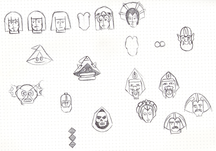
Sketches
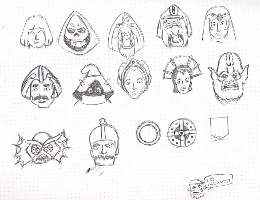
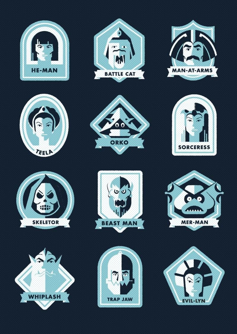
I initially wanted to keep this project to badges, but when sketching out the characters there were many I felt like I couldn't have without keeping others, and also felt this need to have the same amount of villians as heros, so now it looks like I am doing 10: He-Man, Man At Arms, Battle Cat, the Sorcoress, Teela, Orko, Skeletor, Mer-man, Trap Jaw, Evil Lyn, and Beastman.
I noticed this quirk about my illustrations a few months ago, but it is obvious I am way more comfortable drawing men than women. The men look semi-normal, while the women look herp-a-derp with a dash of crazy. And a little masculine.
And that strange sketch at the bottom is a portrait of my boyfriend. He saw me drawing all of the He-Man sketches and asked if I could do a quick portrait of him, so that is exactle what he god: A 5 secon portrait. It will be in museums one day, right next to Picassos sketches of women's anatomical parts.
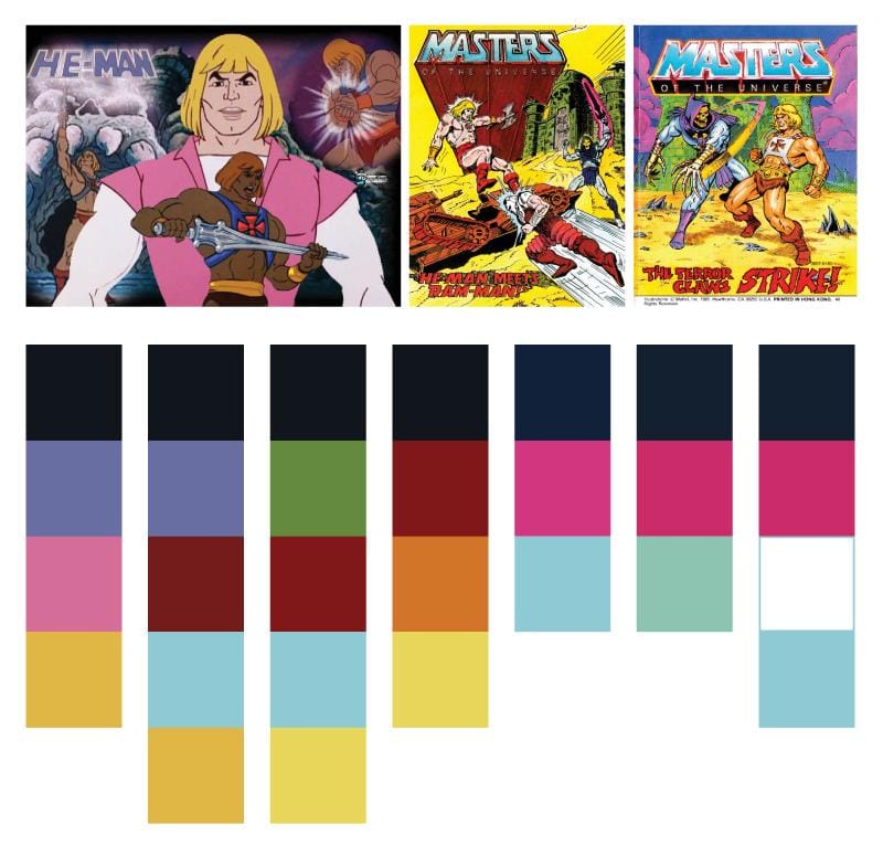
Mood board
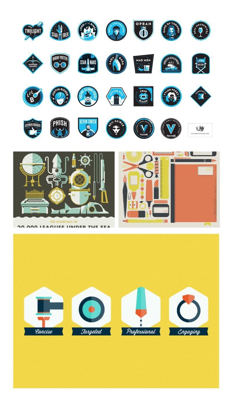
I want to have a bold limited color palatte. I'm hoping to keep the shading as minimal as possible, but we will see how that goes once I dive into the actual illustration. I really enjoy the colors in the first photo in the second row: muted, yet there is still a decent amount of contrast.
This project is making me want to invest in a button maker.
April 22:
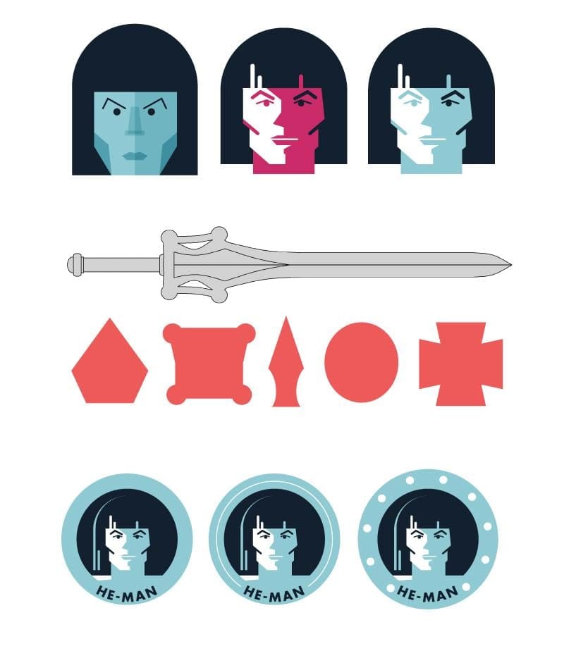
After doing my initial sketches I decided to go back to start drawing them as I would with basic shapes.
Once I felt I had as good of a grasp as I ever will with sketching, I moved on to color. I decided to gather inspiration He-Man comics and the TV show. I played with an array of colors, but decided to go with an up-to-date 80s palatte - for a little bit at least. When it came down to putting together the actual badges, I ended up simplifying my palatte further.
It took a while to get to the decided style, and it wasn't a pretty path either, as you can see with the first example (and that wasn't even the worst one - I somehow made He-Man look like Michael Jackson). It was a mix on inspiration from high-contrast comic art and happy accidents/ah-ha moments that lead me to final outcome.
As for the frame, I tried to take inspiration from He-Man's sword. All of the more 'inspired' shapes just weren't doing it for me, and settled on a simple circle. I can't decide which too go with - if any of them. I think I might be more partial to the simple line. I tried to take notes from He-Man's shield (3rd example), but it's looking more nautical than a shield. I'm especially open to feedback/suggestions on the frame.
April 25:
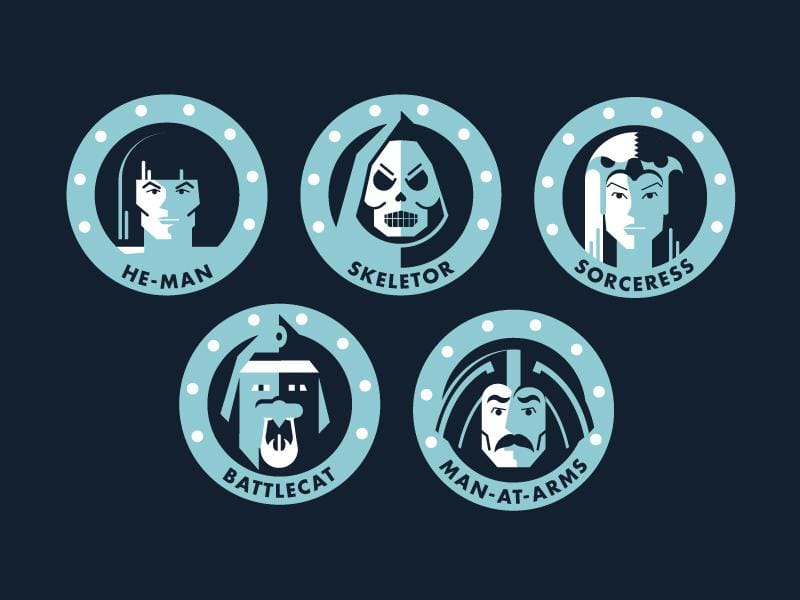
I've made some progress. After putting the badges together the shield idea didn't seem nautical to me anymore, so I decided to stick with it. I might go back and add some shading to the studs, but we shall see!
Battlecat and Man-At-Arms still need some work. Battlecat just looks odd to me. I tried multiple ways of applying color and shape, and this looks the best out of all of them. It could be because he is just an odd looking thing to begin with.
Man-At-Arms just needs some more love. I was ready for bed when working on him, so I rushed through it, and he ended up looking quite concerned, so I just need to go back and correct his facial expression. I might add some more white to him as well. With the badge, there is just too much of the blue.
Any feedback and constructive criticism is much appreciated and welcomed. I am having so much fun with this project. This may be my first Skillshare class I've actually been able to complete, and this is the 4th one I have taken. Slacker, I am.
April 28
After some of the feedback I recieved I decided to do an overhaul on the badges. I sometimes get so stuck on keeping everything consistent, I completely overlook adding some variety. I think I got a good sense of balance between unity and variety, and they are definitely far more interesting than the circles I had initially.
I also completed the first batch of characters. For the sake of time, I limited myself to 12 (6 heroes and 6 villains), but I would love to turn this into a huge set of badges showcasing all the characters.
I wanted to post the final gemoetric shapes before I go back and apply texture. I want to give it more of a hand drawn, and subtle half tone texture to relate it back to the comic book feel.
Any feedback is most appreciated before I make the final revisions.
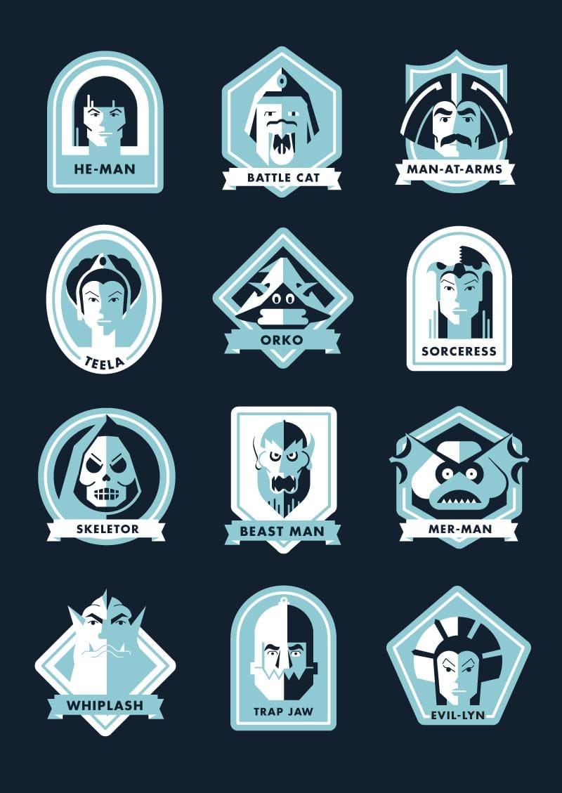
April 28 FINAL
It's done! Or at least this part is. As I said before, I really would like to continue to grow this series. There are so many characters left out that I would love to include, and maybe turn this into a poster. I added some texture to soften up the shapes a bit, and overlayed some halftone textures to hint at the comic reference.