Gouache and Watercolor
Hi,
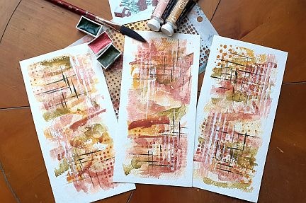
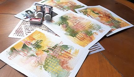
In this class I tried so many different things. This first set of three uses the same gouache colors from the Holbein Irodori spring set - light ochre and pale coral. I combined them with a grass green and metallic red ochre from the Komorebi Japanese style watercolors and some white, copper and dark green acrylic paint. I feel I over worked the gouache and watercolors on these so I did another set.
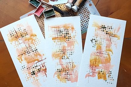
After taking a break I had to rethink what colours I was using so I created this set using the light ochre gouache with olive green, white and copper acrylic paint. Nothing in this set was created with a brush. I used stencils with sponges and a gift card to make all of the marks. I like that there is more white showing through. I also preferred the copper and olive green over the grass green and metallic red oxide.
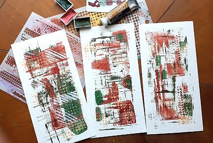
I decided the try the light ochre and pale coral again but this time added the olive green and copper. I diverged from the color palette here, but I like these much better than the first ones.
Keeping with this colour way, I created this first set of four. Here I am using more of the olive green with the light ochre, a red ochre in the background and then the copper or bronze with gold and pale coral for mark making.
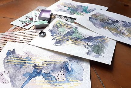
After playing with some colours, I became inspired with a White Knights grey rose mist. When it granulates I see pinks, greens and some blues. Here is a set of four I made using the gray rose mist with the pale coral or the Kuretaki No. 13, Komorebi metallic purple, metallic green and dark blue colours with some gold lines.
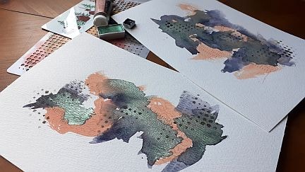
In the large pieces I switched things up again. I used the pale coral gouache with the White Knights grey rose mist watercolor and the Komorebi metallic green. I used some pastel pencils and black acrylic for the mark making.
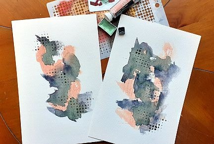
Hopefully you can see the metallic green in this photo.
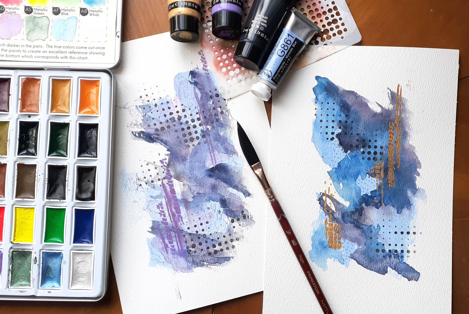
Inspiration struck again and I used the Myosotis Blue gouache with the White Knights grey rose mist and some Kmorebi dark blue to create these two pieces. The one on the left has black and purple acrylic with pastel pencil marks and the one on the right has gold and black acrylic with pastel pencil marks. The blue one is my favourite and it looks so much more vibrant in person. It was fun watching the way the watercolor, metallics and gouache reacted with each other.