Fun with Colour (example project)
In this example I show three options for class projects.
You can select just one or try all if you wish.
Option 1: Your set of favourite colours captured with the Eyedropper Tool.
Here is my current favourite colours set presented as triangles.
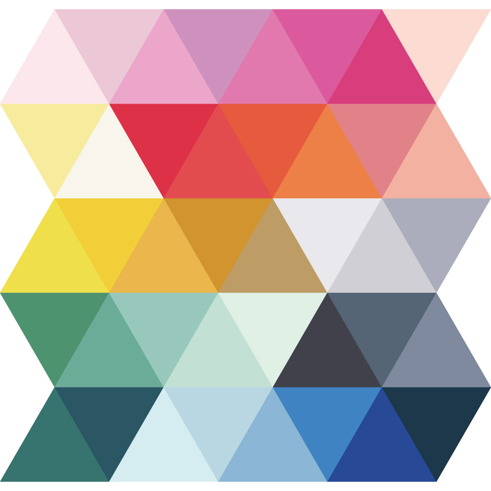
I noted down that my preferences are for warmer colours, brights and neutrals mixed, contrasting palette application, colourful, light, and contemporary. I like to sweeten my work with pink.
Option 2: Your artwork with different palettes applied via Recolor Artwork Tool.
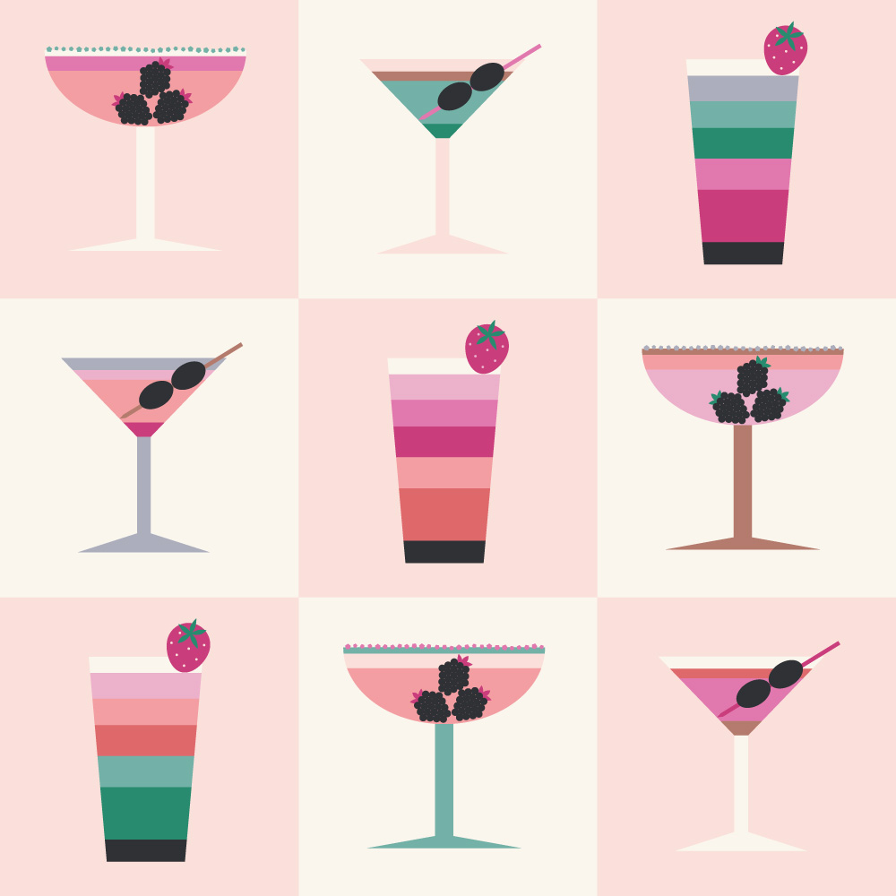
Here is the cocktails recolouring chequerboard that I created during the class.
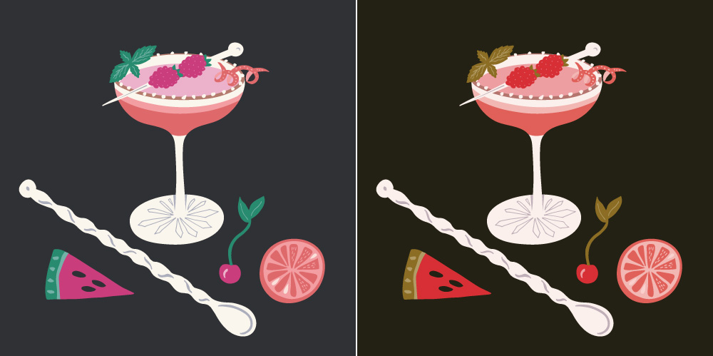
Extra! Here is my raspberry mocktail in 2 different colourways as well.
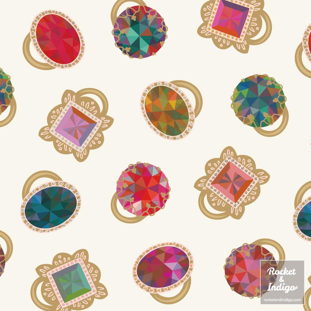
Option 3: Your choice of colours and Transparency Blending Modes applied to stacked artwork.
I used transparency blending to produce interesting colours in gemstones. Extra! I liked the colour combinations so much that I made a design with the gems as well.
Thanks for taking a look at my example projects. I’m looking forward to seeing what you create too. Have fun :)