Fridge App Prototype
Object:
I also selected the fridge as the object that can improve in the kitchen.
Problem:
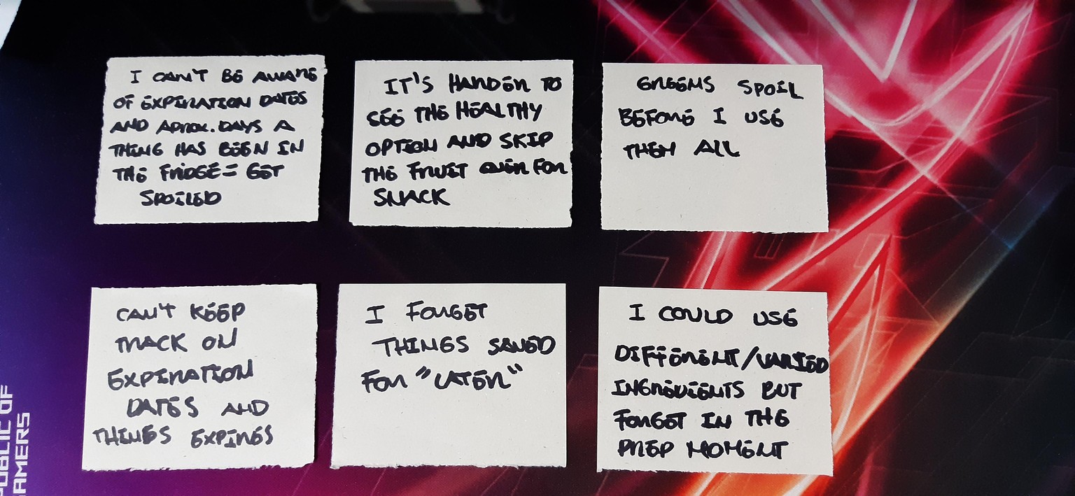
I love to cook and try new and healthy things so I took note on all the problems I get when cooking and specially in relation with the use of the fridge
From all the notes I found a constant theme related to the difficulty in keeping track of what and how fresh things are in the fridge.
Solution:
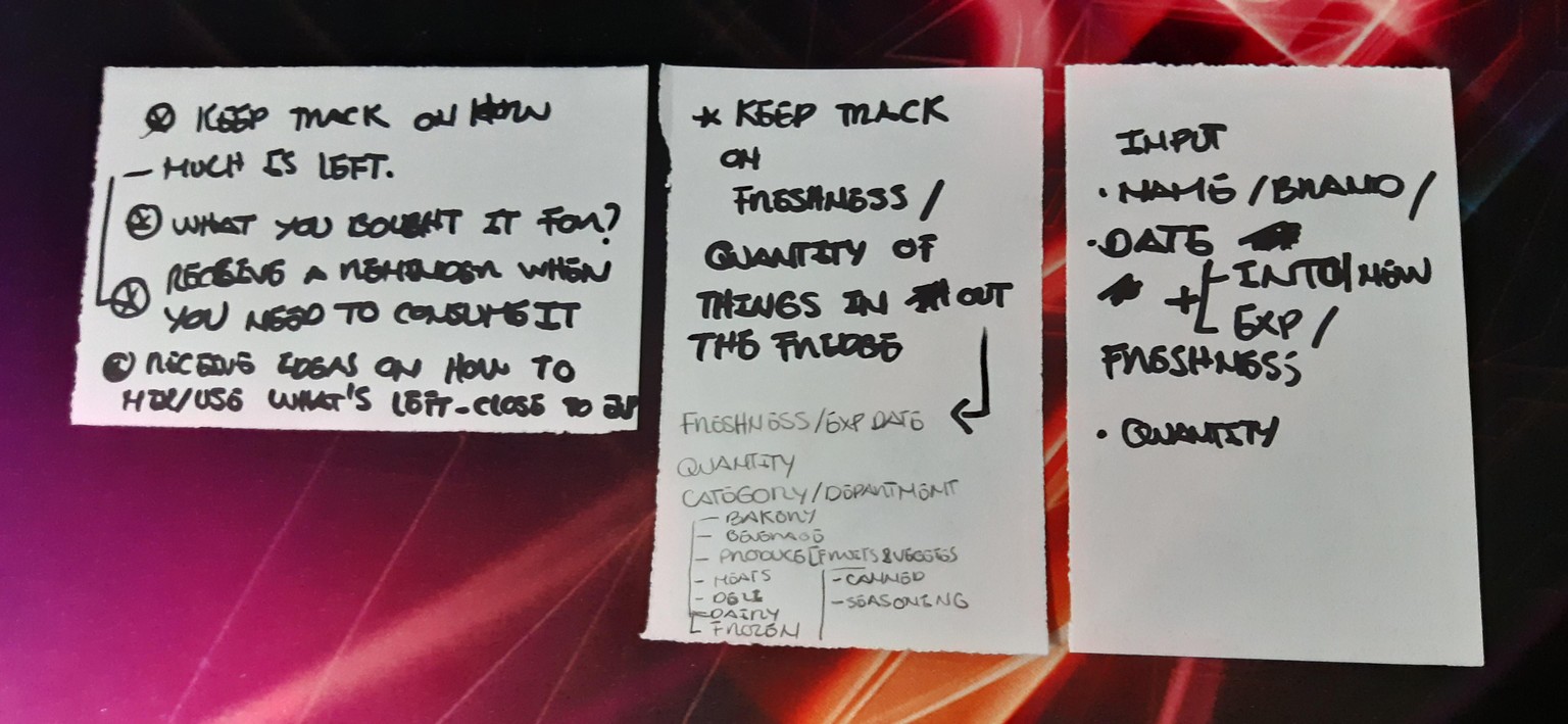
I thought of possible ideas on how to keep track of things while actively improving what you eat by consuming things while fresh, reducing waste and receiving matched ideas to get the most out of the currently available ingredients. Being the main task to keep track of the elements and it’s expiration / freshness date.
User Story
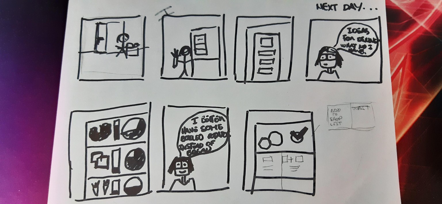
This is an idea about a possible user storyline for using the app and it would be focused after shopping so the user can log the elements and during the day when thinking about what to cook / eat.
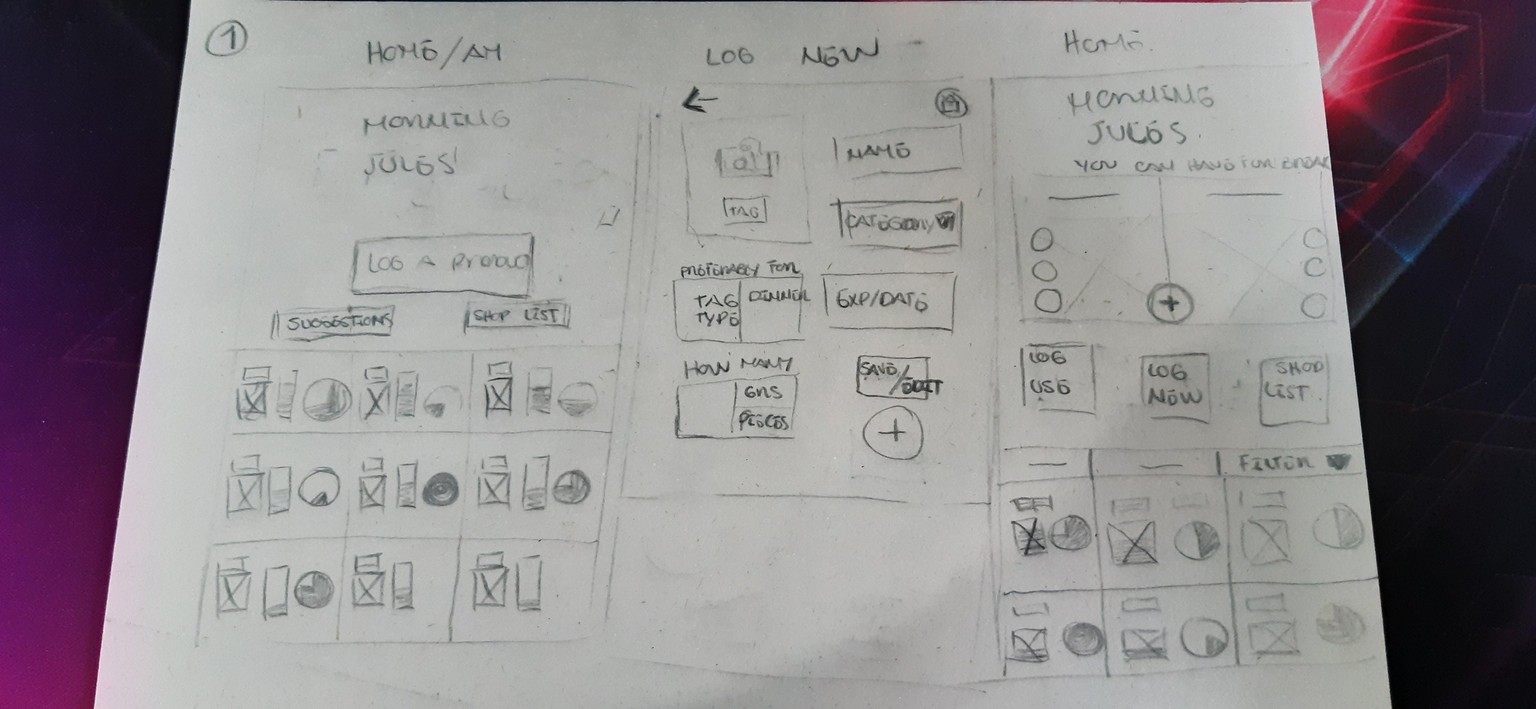
Screens / Paper
Based on that storyline I figured how many screens I could use and focused the prototype in the main task actions. (I was getting some allergies from the marker smell)
Prototype. Digital Wireframing using XD
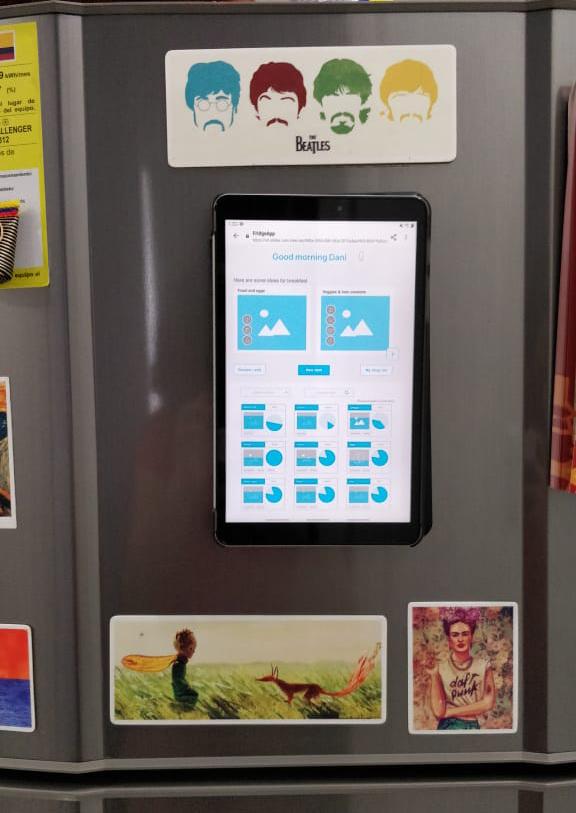
I took my paper screens to XD and linked the actions to create a live prototype in my tablet.
- Home screen:
- It contains a hello message that adapts to the hour.
- A button to activate voice mode. Some suggestions for meals for that hour.
- Main task buttons: Review/Edit, New Item, My shop list
- Showroom of current ingredients and relevant information about it’s name, freshness, quantity, category and use.
- New item screen:
- Options to add information like image, names, dates, quantity and tags.
- Review screen:
- Here you can review the recently logged item, edit it or add a new one.
- Search screen:
- This one allows the user to easily find and item
- Logging use screen:
- Allows you to change the current quantity and takes you to shop list if needed
- Shop list screen:
- This is a secondary function that comes from tracking items. You know when something is over but can also keep a list of what you need next.
- Recipes screen:
- This is also secondary and helps the user consume items more efficiently
User Testing(My girlfriend)
I prepared the testing by getting some notes and ideas of what to say. I stuck the tablet to the fridge to make the environment feel more real, recorded the session so I couldn’t miss any reaction, created a google form with some questions for the user and took notes in the moment.
Results
It was kind of a sloppy experiment. I can understand how important it is to prepare not only the questions but to know how to guide - give space to the user. It’s hard. At least I got tons of questions while testing! And I didn’t want to spoil her natural impressions.
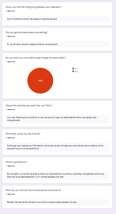
Things she liked:
That the app offered options according to available items and type of meal for the hour.
Being quickly aware of what you got in the fridge.
Being offered with the option to add to the shop list once you’re running out of the item.
Thing she didn’t liked:
Some elements were hard to read
The freshness level coloring in the image was confusing
Not sure if she would get used to entering and updating every new item and its usage in a long term period.
Sharing the list instead of getting live updates that could also work reversely when shopping to update the new items.
Post - results
This is the second version of my prototype fixing what I gathered from the user testing phase.
The elements to improve where:
- Size and proportion of elements inside the screen. It was hard to read.
- Improved how the freshness of an item was represented because it was confusing.
- In the Shop list, removed the share option and added the idea of a live synchronization with the user account across devices.
Final note
When I reviewed my inputs after testing it was amazing to see how many things I could improve. There were things I never even considered that my test user noted at first glance. Also it’s so true that no matter how much you think and correct the prototype, you’re going to see more easily the pain points when actually using it and this takes way less time to do!
*Voice mode is a total future option. I imagine it could be like talking to my girlfriend: "What do we have in the fridge?" "What can we prepare for dinner?" "Would you like some fruits and yogurt?...Oh yes and nuts, I forgot we had those"