Fred Bednarski Monogram / Personal Logo
Coming up with my monogram was surprisingly difficult. I didn't want just a simple, overlapping FB, I wanted something that I could use as a personal logo in the future. Something more sleek, that didn't look like a monogram at first, but where you can see the initials if you look close enough.
I took my inspiration from personal branding I researched on behance, and from old logos of my home country (Poland), especially the CPN logo, which was a major gas station chain up to...mid 90s I think:

For the longest time I couldn't zero in on something that both, looked good and represented who I am. I spent few days sketching and ended up with over 150 variants...
...and then proceeded to use none of them. Apparently, quite a few combinations of F and B (especially when using straight corners and thick lines) can end up resembling a swastika. Which is not really something you want to be associated with. I ended up choosing some sketches and tweaking them inside Illustrator. Sadly, I didn't keep majority of those tries and errors, because one day I got too frustrated and deleted the file to start anew. Below is the second file I started, with the designs that eventually led to the creation of the final monogram.
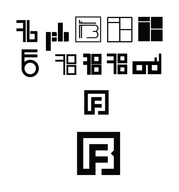
I chose this monogram because I really like geometric designs with hard edges. Sure it might not look like a classic monogram, but it still holds my initials inside. I am a sucker for things hidden in the negative space, so depending which way you will look at it, you will either see the black F or the white B. The whole design is simple enough to be used as a watermark (as I quickly experimented with in the header), or even as a logo for personal branding - which was something I wanted to make for some time.
Now I just need to find a good color scheme and a matching font to write my full name in, and I can start using it as my personal logo.
P.S. Pictures of my sketchbook coming soon, I need better light than my living room lightbulb.