First draft!
Hi Ania,
Thank you for this inspiring class! I am working on a bouquet illustration for a gift so this came at the perfect moment :-)
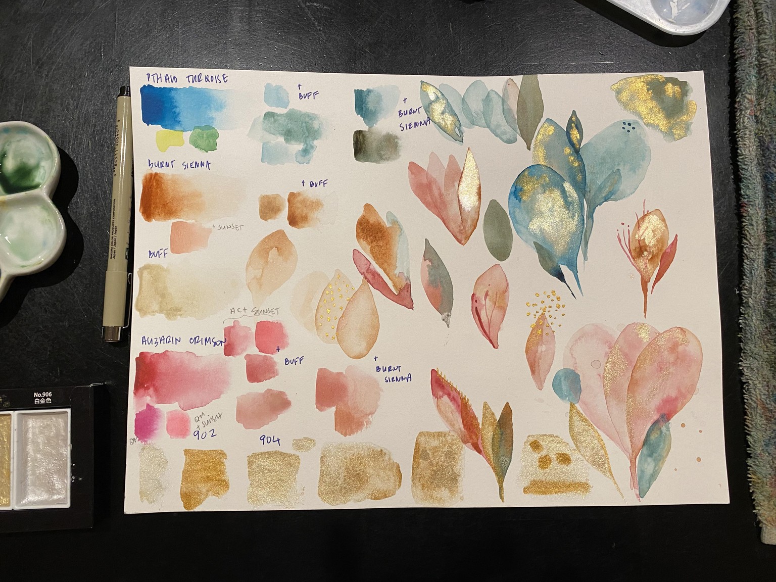
Here is my color/texture exploration:
And my draft:
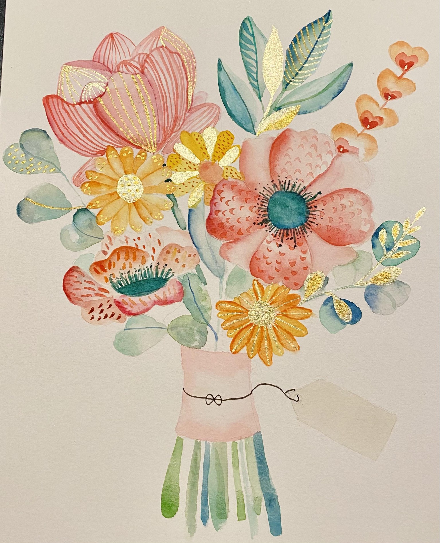
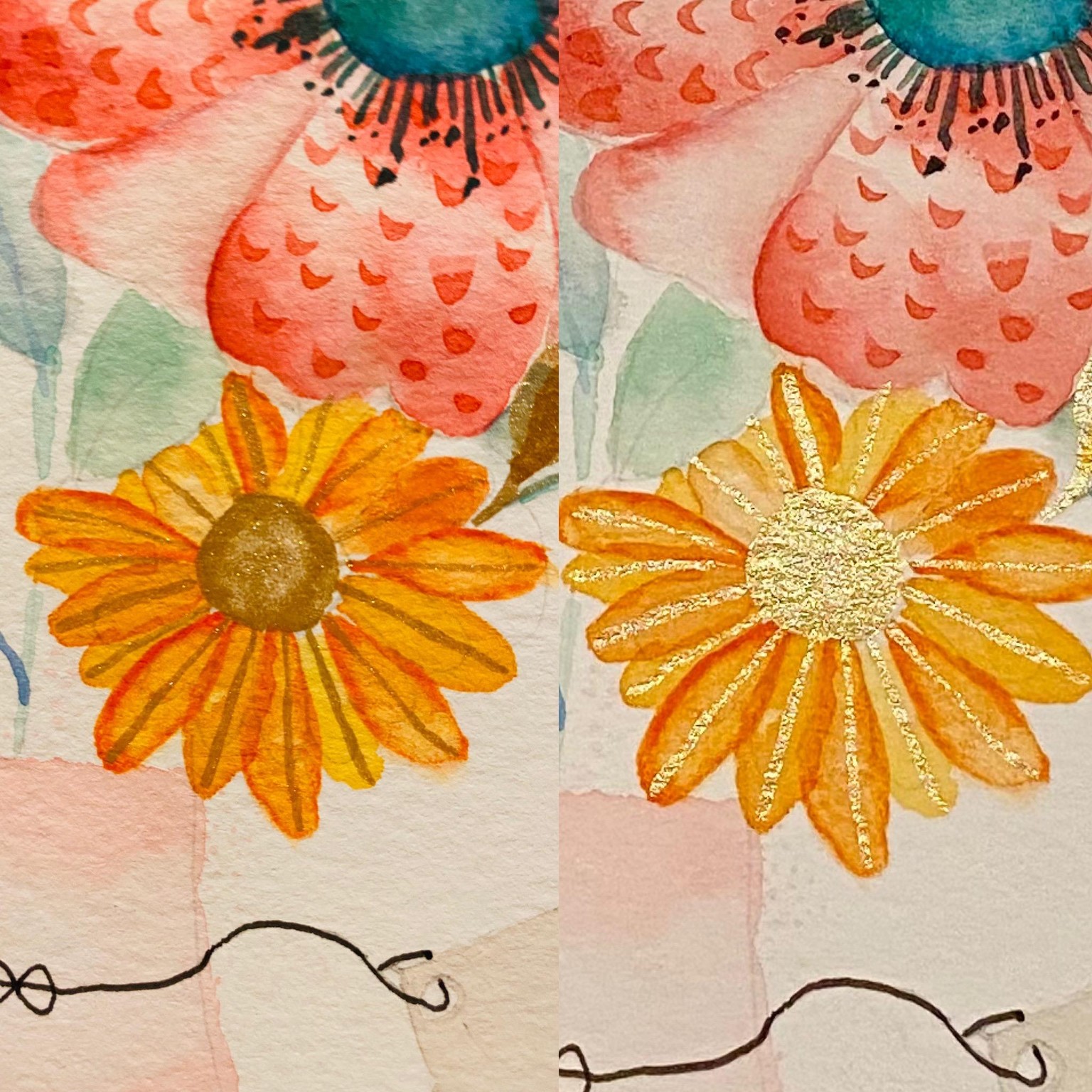
I'm open to any feedback you might have re: color choice and composition (it seems a little busy the composition - maybe I could simplify somehow - fewer layered details?). I have one specific question. I adore how the gold paint shimmers in the light, but I feel like it looks not so nice when it's "flat"- see comparison of two photos below - same flower but two directions of paper. Do you have any suggestions on how to make it also look nice when it's "flat"?