Fight Night 347

The Project:
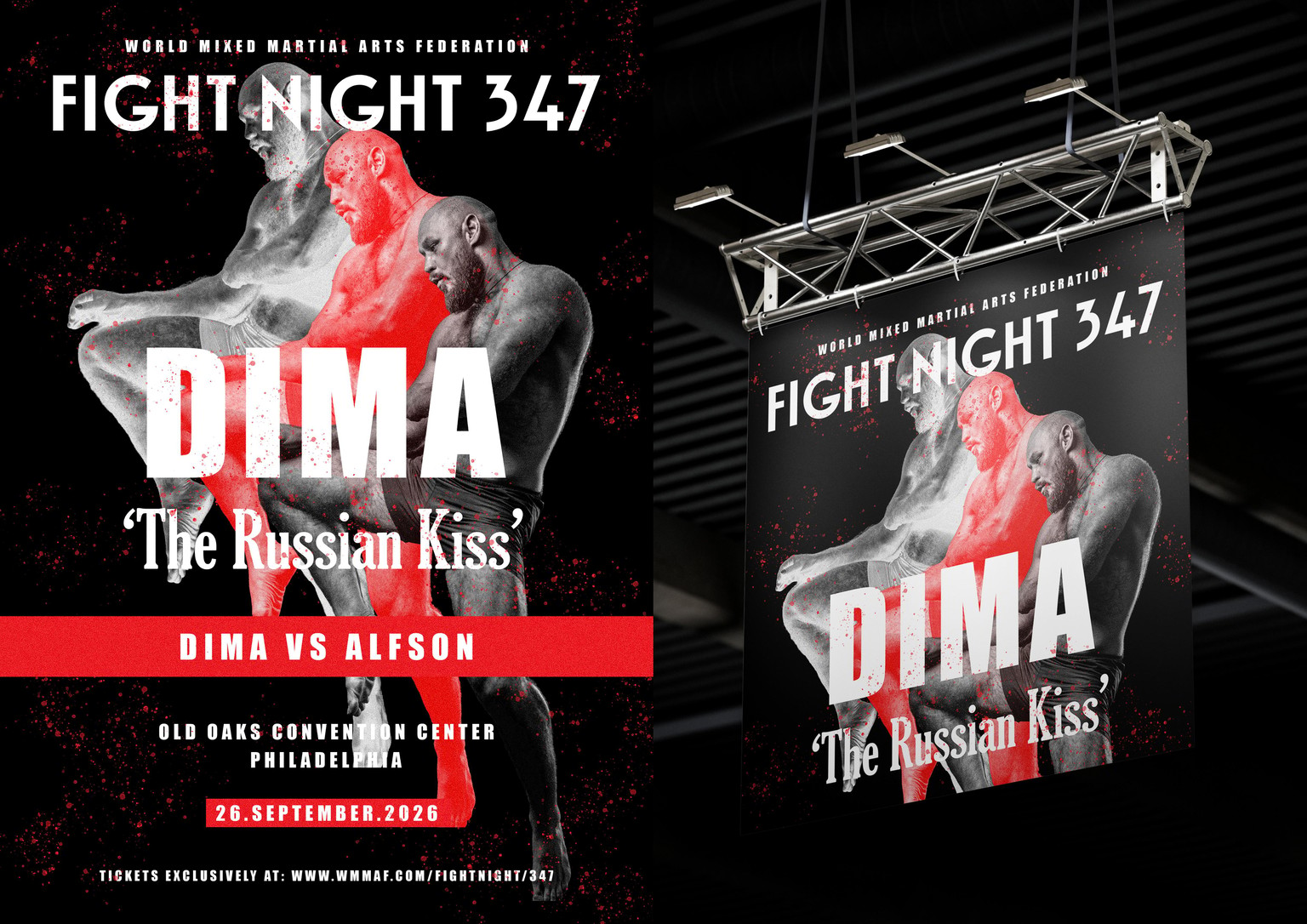
I used the concepts around Threshold Manipulation in Photoshop to create a poster for a MMA Fight Night (all fictional, of course). The poster would be for the promotion of a fighter called Dima (ideally Russian, quiet yet theatrical). The poster features the name of the opponent, date and location of the fight and means to buy tickets to the event.
Since this is a fight event, the ideal places / formats for the design to appear would be a simple stick-on-wall poster or an event banner.
Credits:
Image: Alexa Popovich (Unsplash)
Mock-Ups: https://mockups-design.com/
Concepts Used:
I decided to take a slight deviation and used the concepts on an already masked image / cut-out that I had also desaturated. The point of this to create a black and white layer and a coloured layer for a theatrical effect to the design. Since I was using the cut-out, it made sense to use Select -> Select Subject, rather than use the selection tools.
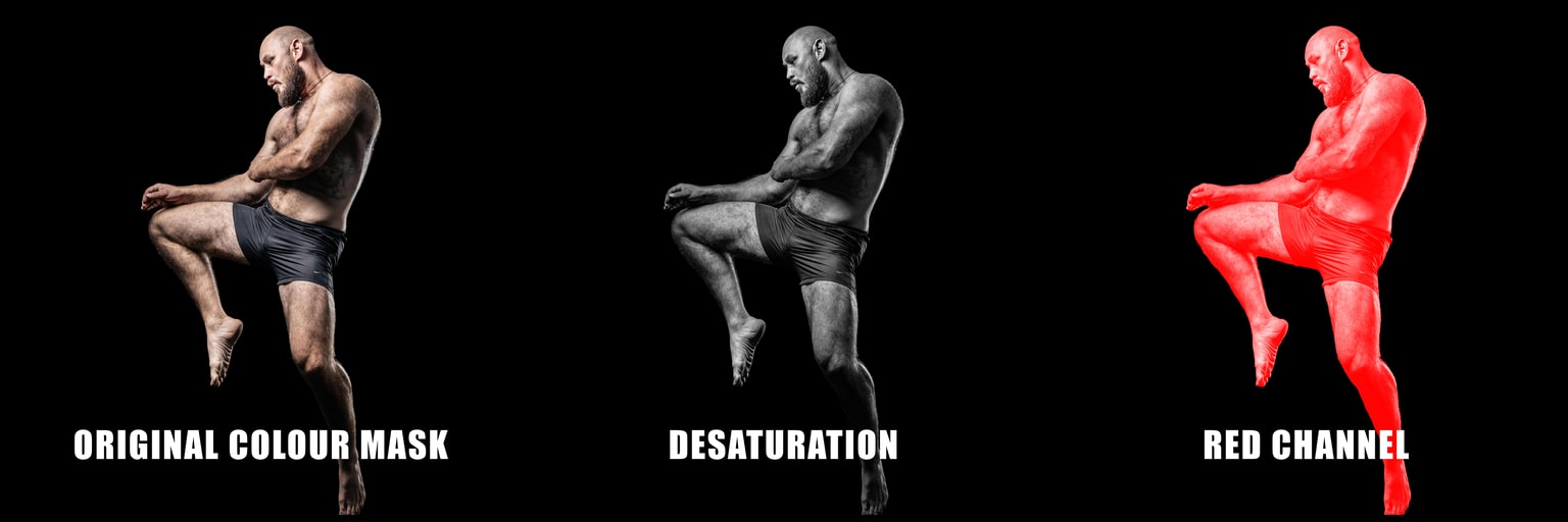
Step 1: Using the RED Channel
Setting the foreground as white for the RED Channel gave me this rich red cut-out, which would be the centrepiece of the design.
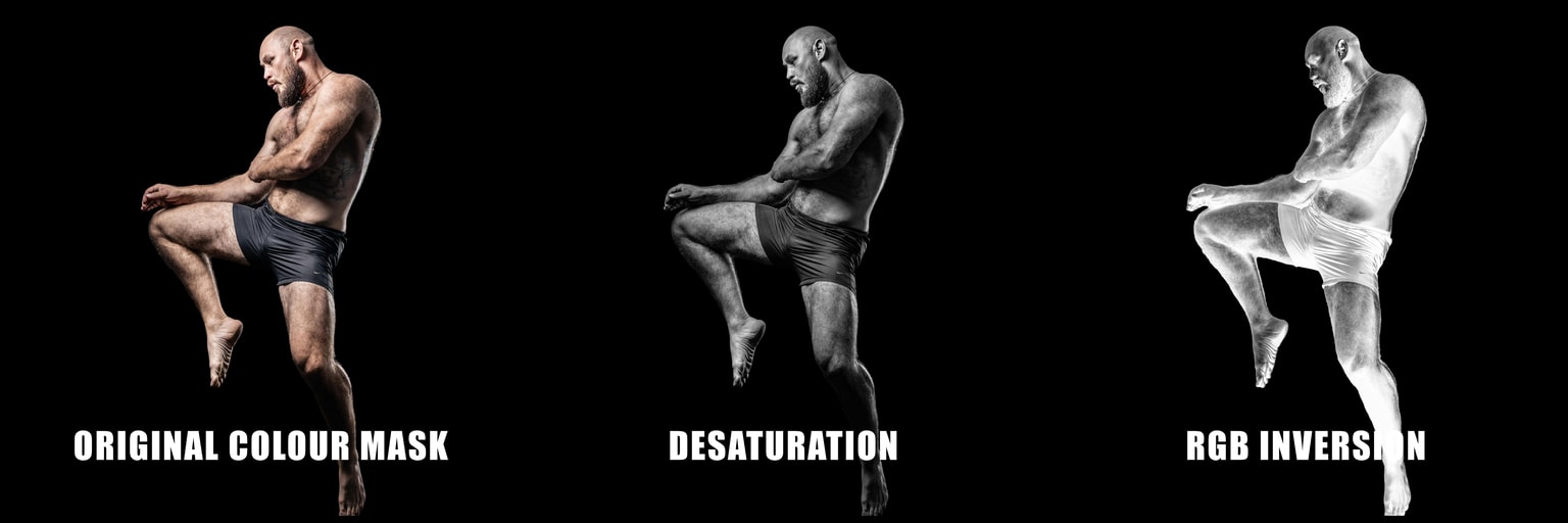
Step 2: Using Inversion
I wanted to enhance the theatrics on the poster, so decided to introduce a sort of an 'ethereal' layer. The Inversion effect from the course was helpful to achieve this. Instead of using inversion on a particular channel, I did it on the RGB channel and since the original was desaturated, I got this beautiful Black-White, sort of X-Ray type image.
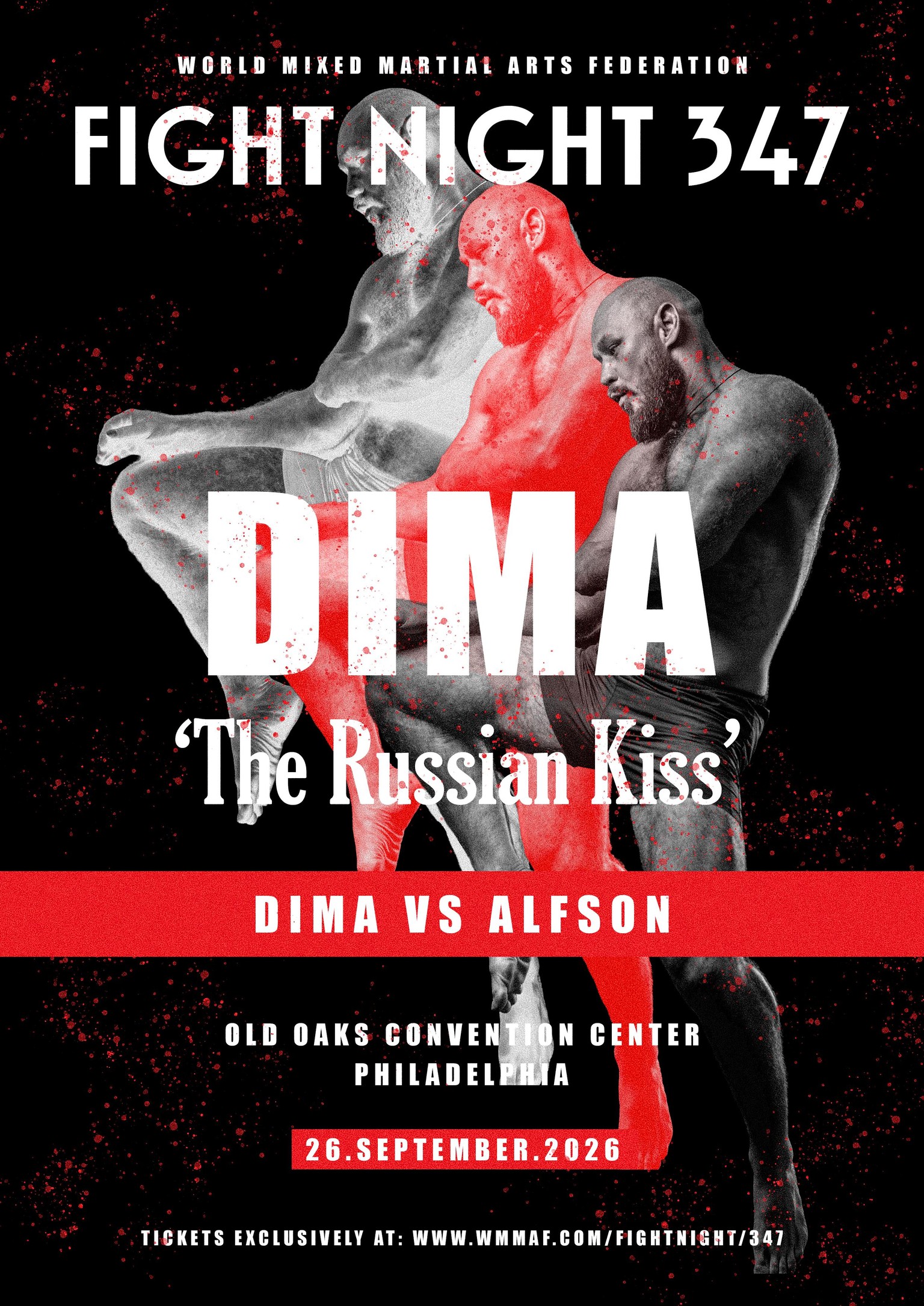
Step 3: Arrangement of Layers
I layered the three images in an ascending manner, with the 'ethereal' effect on top, the red layer in the middle and the black and white in the foreground. I think it gives the poster a dramatic, yet event-appropriate look, since MMA events have a fair bit of theatrics in their programmes.
Step 4: Laying out text. Fonts used: Impact, Waverly CF and Gloucester MT Extra Condensed.
Step 5: A 'Blood Splatter' Layer, using a default scatter brush from Photoshop.
Step 6: A Grain Adjustment Layer.
Final Design:
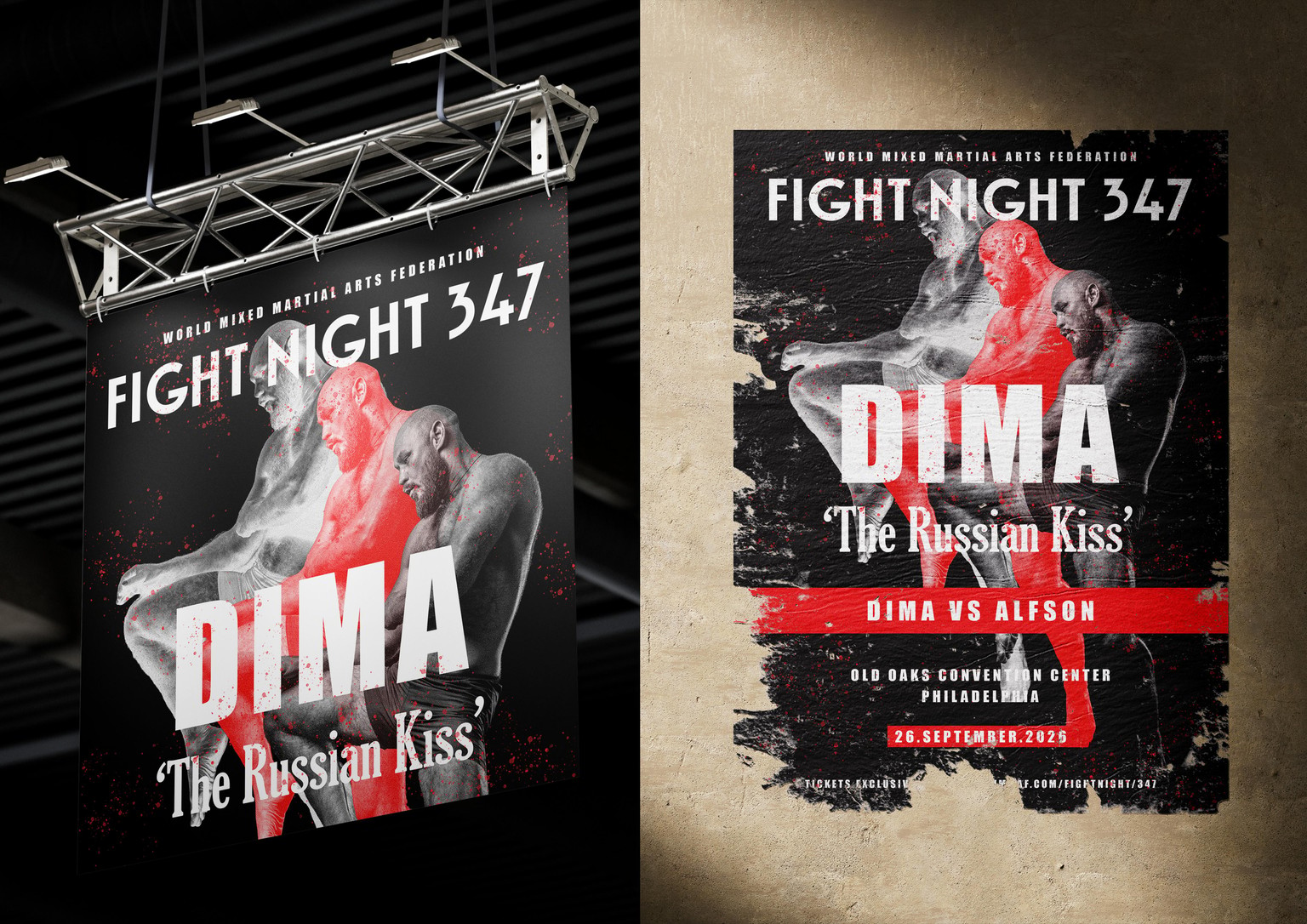
Mock-Ups:
Takeaways:
- Less is more.
- Simple techniques give effective results. The trick is to know the functions and plan your project accordingly.
- Pre-cut images (masked images) are better handled using Select -> Select Subject.
- Channels do not work on individual layers in a multi-layered image (I think).
Here's a final look at the design with a mock-up:
Thank you for visiting my project. Constructive feedback would be deeply appreciated.