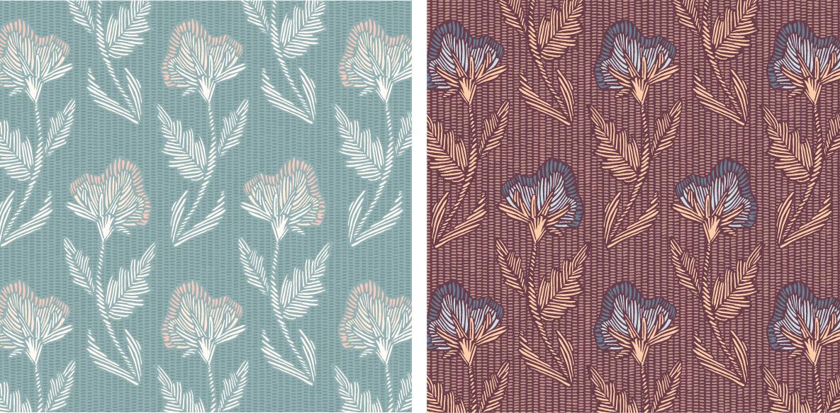
Embroidered Beach Rose Bud Pattern
I've been playing a bit with color to work alongside a collection I am working on, and have pulled one of the patterns to play with. The one on the left is the original colorway #1 - a softer color palette that didn't print very well when I ordered a printed fabric swatch. If you look at it even in digital view, it looks a bit "blurry" along the edges of the motifs, and surprise suprise, it also printed a bit blurry.
After taking Xhico's class, I updated the swatch (on the right, colorway #2) to add a bit more contrast and also applied many of the suggestions from the class to all of the patterns in colorway #2 of the collection. I think colorway #2 is much more successful in relaying my intent - a faux embroidered look, and it really pops.
It pains me to say I will need to go into colorway #1 and update a few colors - Ahhhhh - never done! Thanks Xhico!!