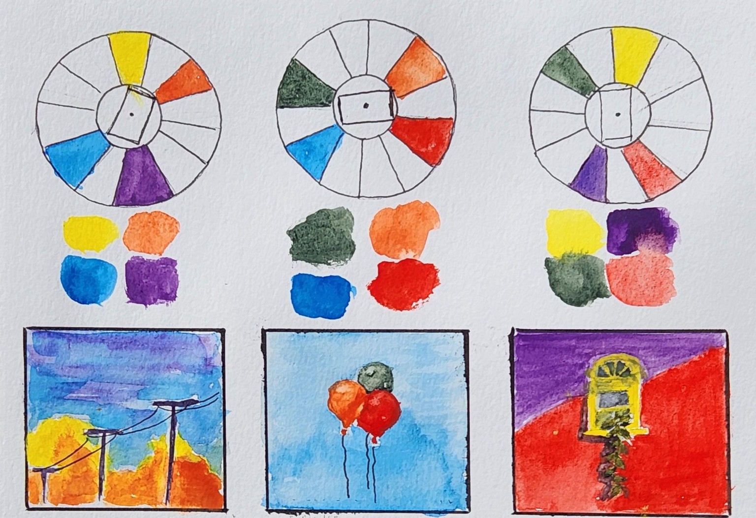
Double Complementary Colors
A new version of the Project: Just more experimentation. I'm not even sure what I want it to look like. I am always on the fence between loose and flowy, and realistic. It drives me nuts.
.
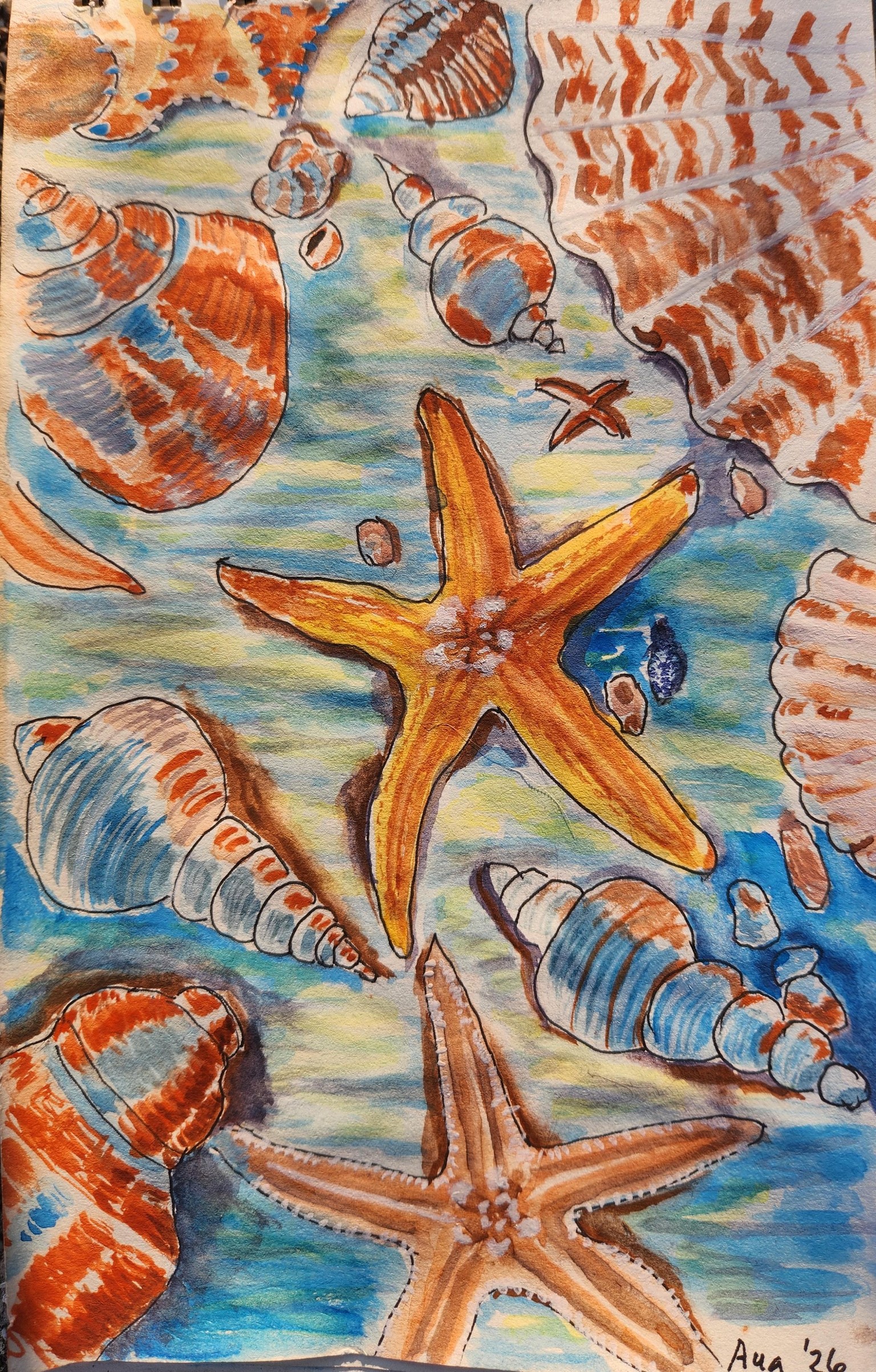
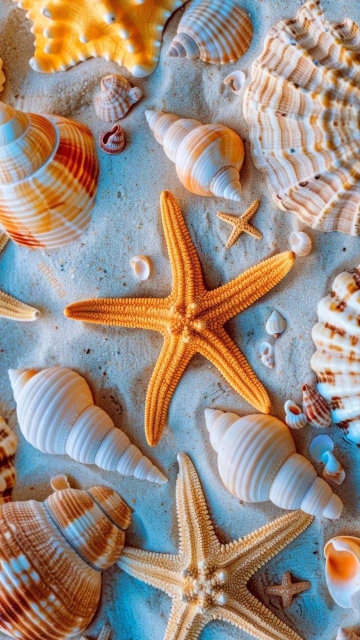
Updated Project: I wanted to work through this lesson to grasp the material better, and starting from scratch with a new image would help. I chose a photo of seashells on the ocean floor, as the Blue-Orange would work well. I chose the Violet-Yellow as the second pair, since I liked the violet, but was trepidatious about how I'd use the yellow. My unease showed up when the yellow was not working well, so it's mostly a backwash in one, and then I planted yellow highlights in the other. Were I more skilled maybe I could have made it look like sunlight shining on or in the water, but that's for another time. So these two practice paintings are loose, to play with the Double Complentary pairs, and it was fun, though quite laborious as all my work is, thus the new "Slow Creator" identity here. I never tired of looking at the photo, so that kept me taking this as far as I did.
I could rant about the struggle with brushstrokes and other miscreations, but I'm just going to transform the judgment to "experimentation" instead.
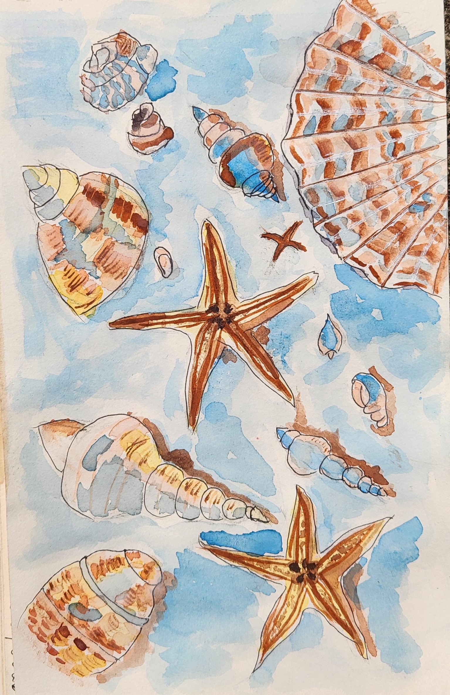
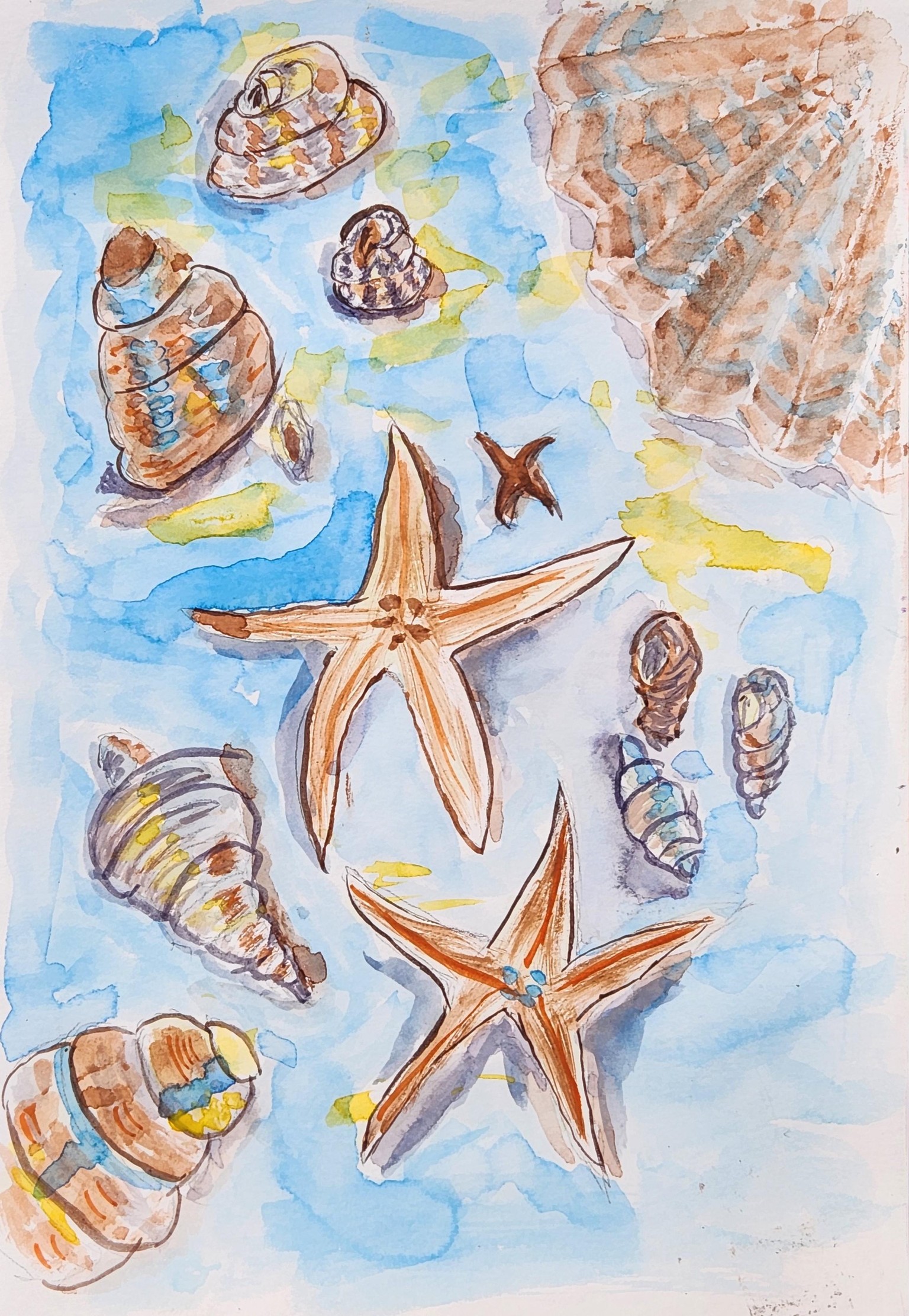
It was fun seeing these four combinations of colors. I didn't let myself stress over the minis, even though there were issues with the painting. I'd like to think that the paper has at least a little something to do with it, as it is not labeled 100% cotton, though it is designated as being for watercolor.
I hope to do anupdate with an individual piece of my own choosing, but ran out of time today. Thanks for another very good exercise for me, and with the further education on color combinations, Tamas.
These photograph so much better in broad daylight, so I replaced the old photo with a better one.