Decluttered Informational Media Site
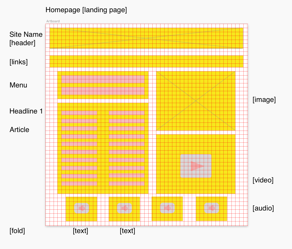
The example I chose to work off of is the CNN website. Because the website is already filled with a lot of pertinent content and has a pretty good skeletal structure, I redesigned a very Lo-Fi wireframe that felt less cluttered, user friendly and in a way that is potentially optimized for accessibility with less distracting elements on the page.