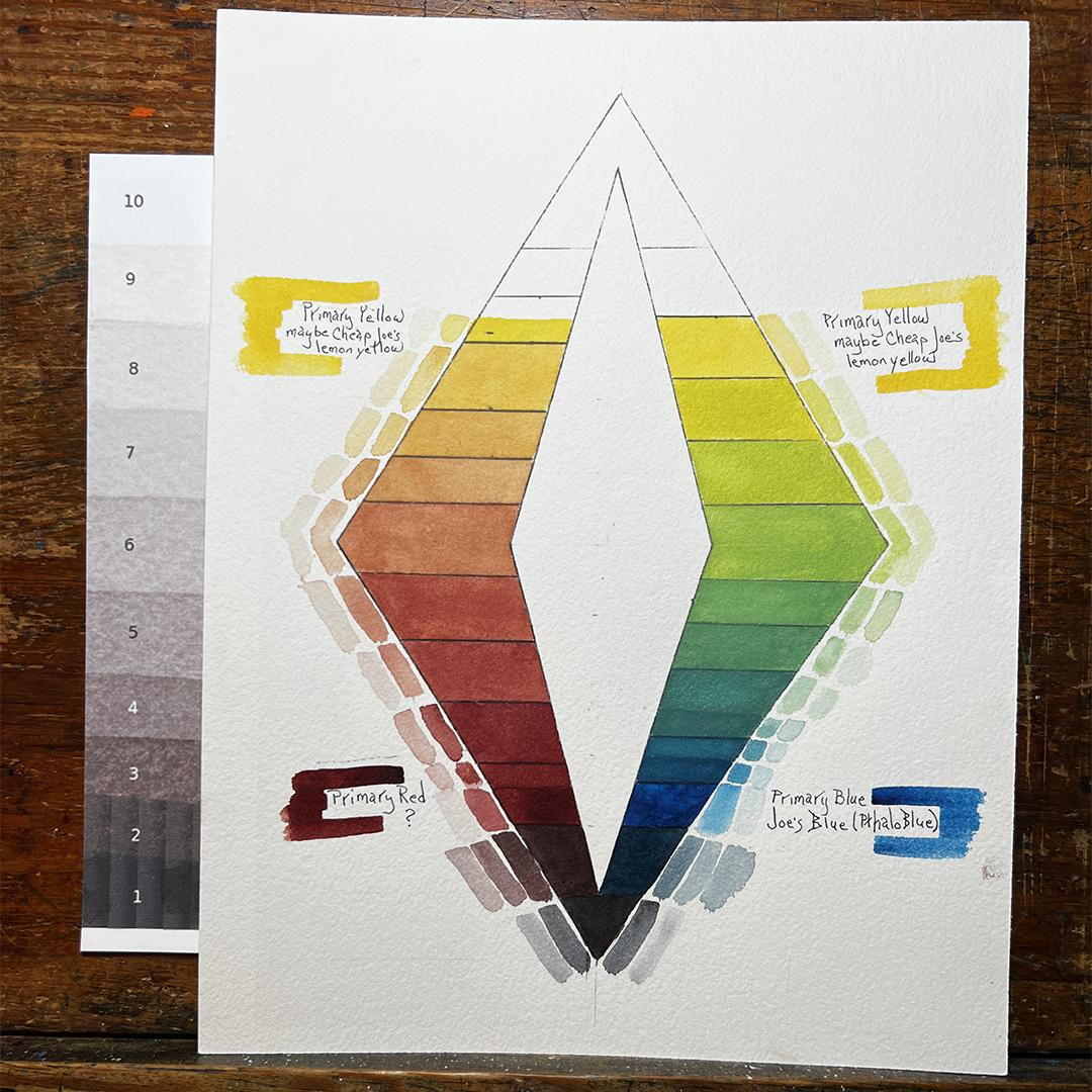
Color Value Chart with Limited Palette of 3 Colors
There is rarely a right or a wrong way to create a color chart of any kind. Just about ever chart I've ever made, and I've made hundreds of them, has been far from "perfect". I've had to adjust, readjust, remix, add a glaze, paint over the top or start all over again.
Why do I keep making charts? Because with every single chart I've made, I have learned something new about color, color value, about a pigment, about how two pigments react with one another, how pigments with the same name can vary drastically depending on who manufactured the pigment. Even pigments made by the same company (or individual) can vary due to differences in the batch or the source of the pigment powders.
My curiosity gets the better of me when I find paints I haven't used in a while or haven't used because I didn't like them, or I didn't mark the pan to identify the pigment and I'm not even sure what it is. That's when I like to grab three of the orphan pans, one each that can act as a primary yellow, red or blue. the further away from the standard yellow, red and blue, the better.
For the color value diamond above I chose Joe's Blue (American Journey), and unknown pigment as my red (it's a bit more neutral than alizarin crimson) and what I think is lemon yellow (American Journey). I adore Joe's Blue. I didn't have felings one way or the other about the mystery red. I didn't like the lemon yellow at all because it's slightly opaque and creates strange results when mixed with other pigments ... far from the results I expect from a lemon yellow.
One variable when creating a color value diamond in watercolor is the paper. I don't know what the paper is that I used for this diamond. Another is that most pigments will dry much lighter than the value when it's applied wet. The paper plays a significant role in the resulting dry color. I find that pigment painted onto Rives BFK printmaking paper dries closer to the wet version of the color and value. The paper I used for this diamond had the opposite effect. the colors dried much lighter. Even though I used a test strip to compare the value before applying it to the diamond, after sitting for ten minutes, it became even lighter.
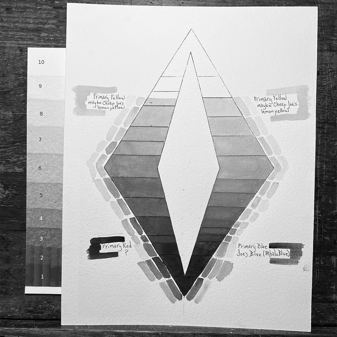
Adjustments had to be made. I had to apply multiple glazes of the color over the swatches i had painted on the diamond. Even when i thought i had it close, when I photographed it and converted the photo into black and white I could see that the values were still wrong. I adjust again with a few more glazes and ended up with the results I've shown above ... not perfect ... but acceptable.
What did I learn from creating this chart? I learned that this particular lemon yellow, when mixed with phthalo blue produces a better turquoise than my other lemon yellows that are more transparent. This lemon yellow also produces fabulous flesh tones very easily when mixed with the mystery red as well as a lovely range of neutralized oranges. The Phthalo blue and mystery red easiy create a rich black that can either be similar to a lamp black or foresty brown/black or blue/black. The fully sturated lemon yellow is darker in value than most of my other lemon yellows. It remains on the dark side of "light values"
The last point I would like to mention is that I like adding the tiny swatches of two or three dilutions of the saturated color. This diamond provides a fantastic amount of information which I can use to make better decisions if using this palette. If I were to do a large painting with this palette I would definitely test the pigments and the pigment mixes on a sample of the same paper I plan to use for the large painting. I like my watercolor paintings to be fresh and somewhat spontaneous rather than de-energized by too many layers of glazes to adjust values.