Color Analysis

Color Analysis
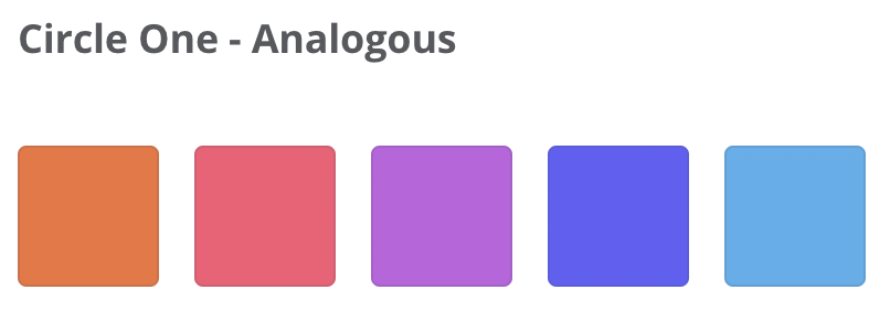
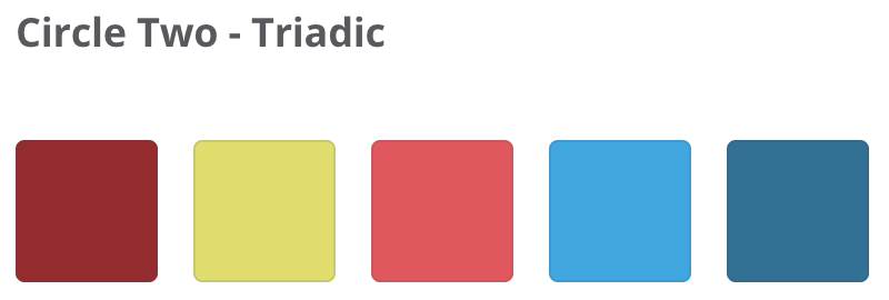
Palette: yellow, green-blue, pink (triadic); purple, red, orange (analogous)
Balance: Yellow draws the eye to the center of each image, except for the bottom right where it is used as an accent. Purple, red, and orange are used as accents.
Contrast: Somewhat. The white text is a bit difficult to read against the soft tinted speech bubbles, but the black hand drawn style outlines offer personality and flow. Also 3 of the sticker designs are warmer while the bottom right is cooler.
Appropriate: Yes, the color palette is appropriate for back-to-school stickers. The primary colors are...primary colors essentially. Likely meant for elementary students given the lightness of the colors.
Color Palettes
Design
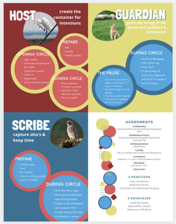
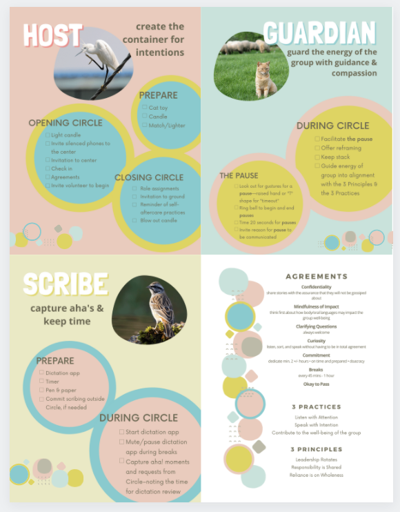
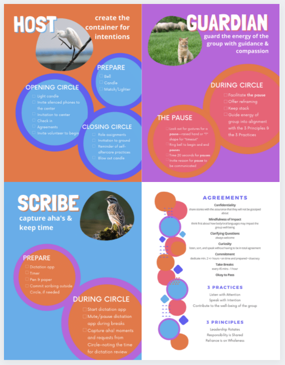
Original Design - Role Cards and Agreements for holding Circle at my intentional community.
Circle One Palette
Circle Two